
Statistics
We looked inside some of the posts by stefanemmanuel211 and here's what we found interesting.
Average Info
Notes Per Post
1
Likes Per Post
1
Reblog Per Post
0
Reply Per Post
0
Time Between Posts
7 days
Number of Posts By Type
Text
10
Last Seen Tumblr Blogs


Fun Fact
Total funding amounts to $125.3M.
Text

Last Illo?
Chosen Topic: Do it Yourself
Here are my analog drafts

Do It Yourself
Collage:
Paper Cutouts:
Final Topic and creative concept
Do it yourself. I wanted to create a grundgy aestic that modern hip-hop artists are inspired by generational psychelic rock and roll artists used. I used analog type and trippy typography. The photos are taken by me of my album cover. I initially was drawn towards collage but I really wanted to dwell deep into this.
Keywords
Moody
Rockstar
Trippy
APP
Software: Photoshop
Analog
0 notes
Text

Supreme Geometry: Never Forget...
Topics of Interest:
Supreme Geometry= Simple, geometric, negative
Triangulation= pointy, thin weighted
Perfect Rectangles= even, geometric
Keywords:
Horrific
Dreadful
Collateral
Tragic
Chosen Topics: Supreme Geometry
My inspiration as I was wondering down interest:
Concept Concept and description.
As Artists and Designers, we all should contribute collective memory of events.
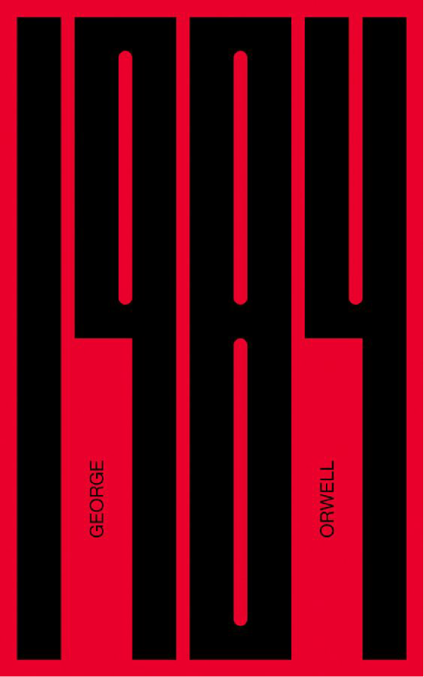
One before the last. The end is near for our weekly illo explorations. Although I was in favour of attempting perfect rectangles I instead opted for supreme geometry. This is a topic that I haven't really tackled in the past. My work may seem very graphic and gory but have a deep significant meaning. So It was tough to show importance through some shapes. But simplicity is the key to nail the subject. This is my inspiration was drawn from the terrifying 1984 book cover and also from New Yorker magazine covers. My design decisions started with my DOB then I wanted to portray the significant events that happened in that year specifically the tail end of the year. I utilized the 00 zeros as the reference to the Twin Towers. And added a figure of a plane in the height of the distance moving with motion as it aimlessly wanders. For the number 1, some rectangular shapes imply motion for the plane. Thus without my texture pack coming in handy, the message would not have been portrayed for sure. My message was to have an expression of design in its absolute reality form. This week's topic really made me try to convey specific impressions and expressions through the use of shapes. I added a colour burn filter to show the poignant message of this tragic day that we shall never forget and will keep remembering for years to come.
0 notes
Text

Term Project 8: Public Service Announcement
CANAD EH CANNOT EH? BILL C 18 EH?
Possible topics:
Culture Jamming
Propaganda
Public Service Announcements
Chosen Topic: Public Service Announcements
I wanted to poke fun at the Trudeau government at the recent bill c 18 law that they passed though. I experienced this issue being an international student I can't view news from my own country. And this message kept popping up. it was an issue I didn't know what is happening when my parents called me and I had no idea at all. This really made me want to put something out poignant. It is funny that my Canadian friends also agreed on this topic that it should be removed. I know that the law was to displace misinformation and limit hate speech or fake news affecting Canada. But it has caused even more frustration among peers.
Software: Illustrator
0 notes
Text


Topics of interest:
Less is More: symbolic, minimal, empty
White Space: monotone, negative space, blank space
Pictograms: Shapes, Angular, Geometric
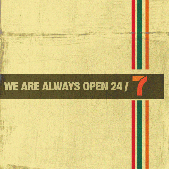
Final Chosen Topic: White Space
I wanted to tackle white space. Because most established brands tend to be recognizable through this method. The iconic 7-Eleven logo and colour palette already catch the reader's eye. The visual identity of the brand is already established.
I felt I could have done a better job in terms of the background colour and maybe making it stand out more. I played with a pastel colour and used the vibrant colours of the logo to make it stand out. My initial take was going less is more but then I tweaked the background colour added texture and voila.
APP: Adobe Illustrator
0 notes
Text
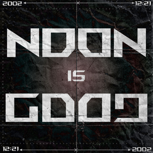
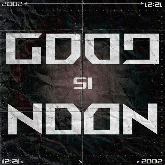
Inverted version of Ambigram:
Mind Map:
Roughs:
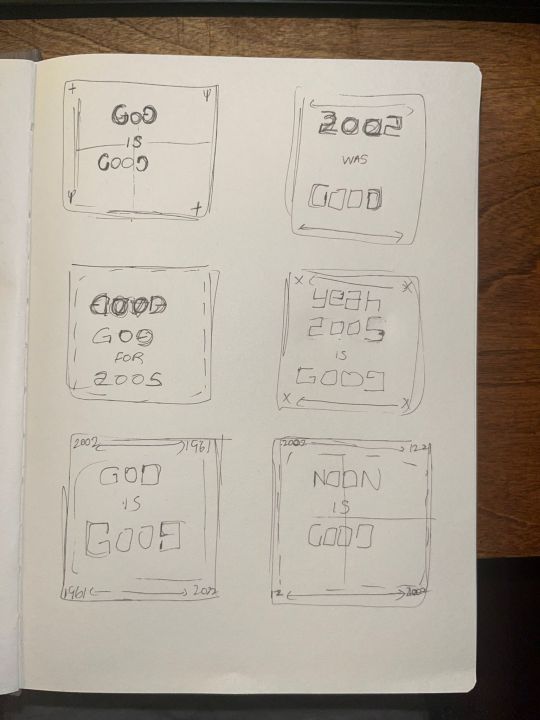
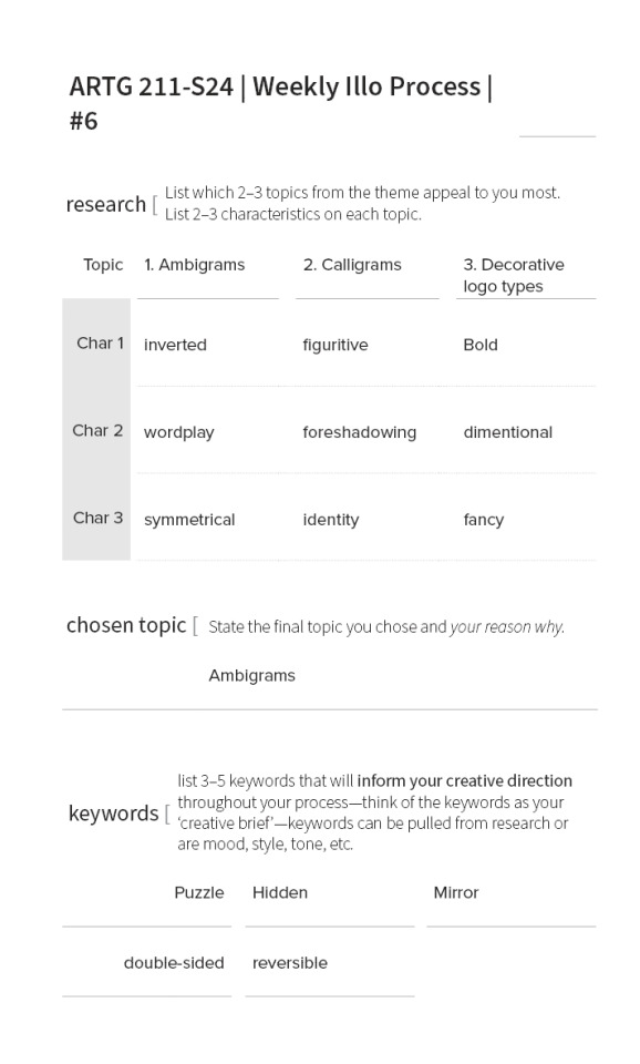
Final Chosen Topic: Ambigrams
This week's choices felt like a lot to pick from and overwhelming. However, I stumbled upon three choices at first calligrams, ambigrams and decorative logo typefaces. I ended up going with ambigrams because of the visual puzzle it presents when you look at it at first sight. It is a composition that reads one or more words from different angles of orientation. This can be left to right, front to back or upside down. The main purpose of an ambigram is to form a wordplay which intrigues the audience in the first place. The visual puzzle can also appear as an image which can be inverted etc. My ambigram was actually inspired by my laptop manufacturer's typeface. So Asus had a pre-installed typeface called ROG font. And when I was experimenting with different typefaces to suit my ambigram I found that this one worked quite well for my idea. So I tried a lot of combinations and ended up stumbling with NOON is GOOD. If you were to ask me if there is any significant meaning behind that, well not really it was just to match my topic to create a wordplay. So I also decided to add numerical values of the time 12:21 and the year 2002. My ambigram should manage to read the same thing either inverted or upside down. To make this look more appealing I added a gradient of metallic and cool colours and added a dated paper texture feel. I tried to go with an old cyberpunk gamer field in the early 2000's era with a lossless quality.
Keywords:
Puzzle
Hidden
Mirror
Double-sided
Reversible
0 notes
Text

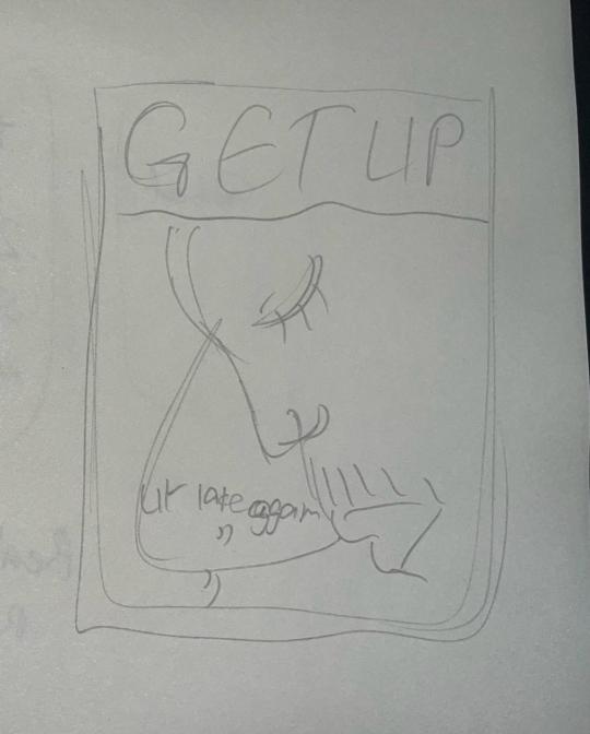
Term Project 5: Get up, ur late again (Scale)
Topics of Interest:
Extreme Close-ups: Sensual, Detail, Attractive
Big Book Look: Assymetry Minimalism Surreal
Super Graphics: Retro Colourful Competing
Keyboards: Eyes, Melodrama, Paralysis
APP: Adobe Photoshop
Creative Concept:
This was quite the result. It's funny cause compared to my initial decision to now is very drastic. I wanted to first do a replication or sort of do my own personal take on the famous Get out movie poster because of the emotion showed in that one frame by one of the actors. A close up up view of him tearing which depicted such emotion and fear. Later I ended up changing the phrase from GET OUT TO GET UP. It sent me spirallying to a personal journey. Last week has been pretty rough specially catching up with all the classes and also working part time as an international student. The idea was potray you need to learn to balance a work and study life. And no matter what sleep is key. This is a poster depicting me sleeping through my alarms last week and arriving late to class. This picture was actually photographed by one of my classmates during our trip to Victoria over the reading break last year. As usual me being the last one to be up late and wake up last. This post hopefully serves a reminder to never be late again as long as bus service is in place otherwise walking will do.
0 notes
Text
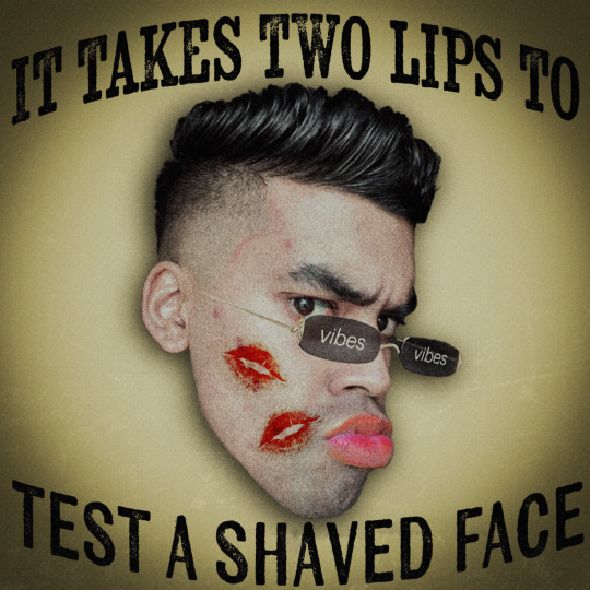
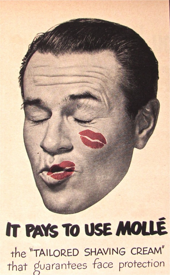
Term Project 4: It takes two lips to test a shaved face (Human Body)
Topics of Interest:
Pointing Figures: Sensual, Detail, Attractive
Provocative Gestures: Seductive, Relationships, Emotions
Popping Heads: Satirical, Mockery, In your face
Keywords: Humour, Sensual, Persona
APP: Adobe Photoshop and Adobe Illustrator
Creative Concept:
Looking back my illo wasn't what I had in mind earlier. I wanted to start towards the direction of Provocative Gestures but its somehow ended up with me doing a bubbly popping head. My inspiration was to recreate those 1900s seductive satirical shaving advertisements. This kind of takes play on gender roles by portraying females thirst for shaven men. Which really shows the mentality back in the day. The morality in this post shows and what era it is referencing. It is popular selfie I took which has now turned into a class meme for the modern day word know as "rizz". And I found this funny quote on an old shaving advertisement. So I thought why not use it. I which I could have done more with the tectures or brightened the image but overall I think I sort of portrayed my idea. The inspiration for my illo is this shaving ad commercial i came across pintrest and really wanted to put myself in that position.
0 notes
Text
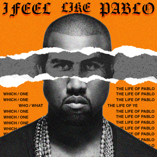
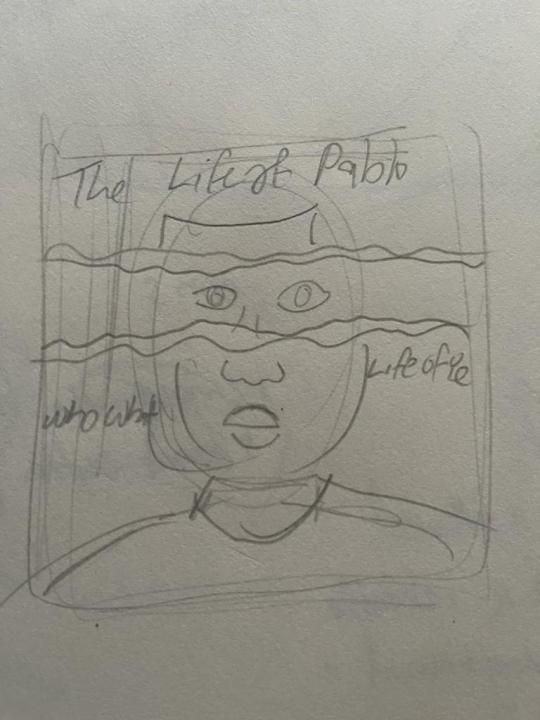
Term Project Illo 3: The Life Of Pablo is a Life of Parody
Creative Concept:
I had an avid interest towards modern celebrities and artists who depict themselves as these past famous and controversial villains or public figures personas. So I decided to choose the topic Parody to mock Kanye West who recently had a mental breakdown where he believes he has lived the life of notorious drug criminal Pablo Escobar.
Description:
Following from last week's illo I wanted to use another public personality in the music industry who has been making a lot of controversial takes and decisions on topics. Kanye West may be one of the best musicians produced in the 2000s and 2010s but lately, he has had a mental breakdown due to his bipolar condition. His music doesn't disappoint though. In his studio Album The Life of Pablo, he portrays himself as this visionary just like how Pablo Picasso was a pioneer in the art movement of Cubism. But my take on it was to poke fun at him and portray him as this notorious controversial drug criminal Pablo Escobar. I decided to do the paper tear effect where it shows a picture of Kanye West initially but someone decided to tear the poster to reveal the true identity and meaning of the Life of Pablo he means. I used various film grain and half-tone effects for the edits to my image. I added 2 competition typefaces on different ends of the spectrum sans serif and a serif decorative type. Giving is a traditional yet modern-looking posterWhich is kind of a satirical take on a famous Public persona.
THE LIFE OF PABLO WAS THE BEGINNING AND END OF KANYE WEST
APP: Photoshop
Type: Helvetica and Amador
0 notes
Text

Thumbs
Reference

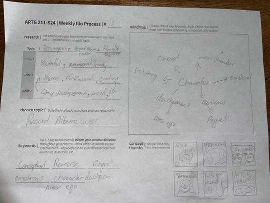
Chosen Topic: Record Album Cover
Software used: Adobe Photoshop
Keywords: Alter ego, Character development, Remorse, Emotions
Creative Concept:
Since the first year when we experimented with incorporating type into photography, I have always been a fan of making album covers. Similar to the M&M assignment. In this edition, I felt the need to create an alternative record album cover art design for one of my favourite artists. I decided to use Photoshop especially since I am using photography in this illo. Over time, album covers have definitely left a huge impact on the history of graphic design. And this piece really speaks a lot of the thoughts and ideas that go into creating this artwork by the musician portrayed by the designer.
Illo Description:
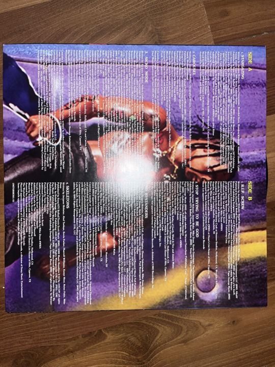
The title of my album cover is a portrait of the sensational XO singer “THE WEEKND”, taken from his 2020 album titled: AFTER HOURS. Being an instant classic R&B along with Hip-Hop elements soundtrack of 2020, from one of my beloved artists. His album culminates the emotional thoughts & and feelings of late nights, being the ideal time to listen to this type of music. The album is portrayed like a scene from a movie, where his music is being used as a vessel for depicting him as this After-Hours character, who wears a red suit jacket with a pair of shades & and has a blinding smile. His effective use of storytelling hints that his After Hours narrative shows The Weeknd evolves into a Michael Myers type of murderer. This has resulted in a mental cost for him where his thoughts are taking over his actions as he is being dragged into his old ways. Due to his past toxic relationships, it has become a psychedelic journey filled with heartbreak and addiction as it reveals the progression of his character across the 14-track list.
When creating my thumbs I made it very rough since I always tend to work more in the program through trial and error, expressing my thoughts and ideas for the final cover. I felt in terms of analogue I have good enough experience but I wanted to improve more on the digital side of things. I am still an avid learner of Photoshop and want to explore more stuff day by day.
After the COMPLETION of my work, I was impressed with the way it turned out to be. Proving that the half-tone, film grain and tweaking with Photoshop's built-in camera raw feature really suited the photo I had hand-picked. His highlighted vibrant shadow in the background showing off his messy afro hairstyle & and unshaven beard; brought out his raw mixed emotions through his facial features behind his blinding shades and bloodied bruised wounds, revealing the uncertainty of his character, which made it so profound. Layering multiple effects on a photo to tweak it to your heart's desire. The image used is from the photoshoot he did when premiering the album. And I managed to find a close enough typeface to his original one which I really loved. Album covers have been the foundational elements which got me interested in design in the first place.
1 note
·
View note
Text
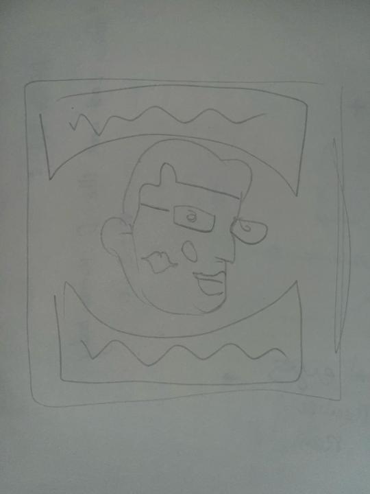
illo 1: Design History


Dadaism: Adolf Hitler's Sri Lankan Doopleganger.
Topics of Interest:
Dadaism: Provocation, Anti-Art, Experimentation
Constructivism: Bright colours, Primary Contrast, New Knowledge
Art Deco: Linear Lines, angular, geometric, symmetry.
Chosen Topic:
Dadaism, mainly on its humourous and mockery towards politics and normal rules and elements has a surreal twist to it which really drew my interest.
Keywords: Surrealism, Narcissist, Mockery, Satirical
Art Movement:
For this week’s illo exploration, I selected the theme of DADAISM for my illustration. To give some context the art movement is called Dadaism or also known as Dada, dada art. An artist who evokes Dadaism is therefore called a Dadaist. The reason why I went with this was when researching about the movement I learnt it pokes fun with humorous and satirical purposeful jokes at art. It provokes and encourages the mockery of normal rules and elements and goes against the grain. To give some historical context the movement was formed during the breakout of WW1. Where artists joined forces to create the anti-art movement. The main purpose is to experiment with against conformity. It is an art form which evokes absurdity. You could compare it similar to surrealism where dreams and reality go hand in hand.
My Concept:
For my illo, I wanted to discuss the unfortunate economic crisis Sri Lanka had to undergo during covid era. So, I wanted to poke fun at politics using Dadaism and criticize the good fortune my beloved prime minister his excellency Mr. Mahinda Rajapaske aka “Myna” has done for his service to the people and nation of Sri Lanka. This is a shameless billionaire who robbed his own country for the past 20 years and has blindly fooled an entire nation to vote for him and his brother Gotabaya Rajapakse aka “Gota”. He isn’t the only one to be blamed but his family of Rajapakse’s. A tyrannical government under a dictation rule by a “Myna” and a “Gota” is indeed a true love story. One down but many more Rajapakse to go.
0 notes