
Statistics
We looked inside some of the posts by steph-ann-bean94-blog and here's what we found interesting.
Average Info
Notes Per Post
2
Likes Per Post
2
Reblog Per Post
0
Reply Per Post
0
Time Between Posts
2 hours
Number of Posts By Type
Link
1
Photo
12
Text
4
Last Seen Tumblr Blogs


Fun Fact
Hackers stole 65M passwords from Tumblr in 2013.
Photo
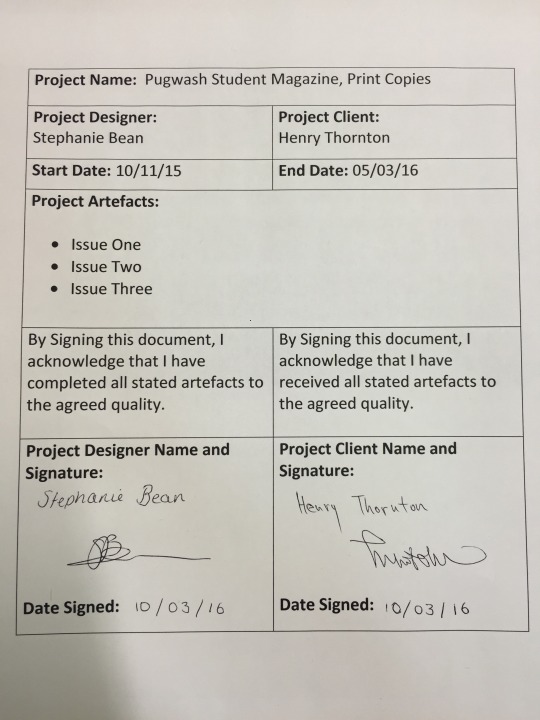
Signing Off the Project
As the client dropped out of the project just before completion, this was signed off by the Deputy Editor who was acting Editor at the time of sign off. Henry was part of testing all the way through, so he was well aware of each issue and he was more than happy with the finished product.
0 notes
Photo
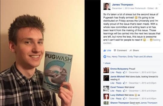
Signing off the Project: With the original client James Thompson
As the client had to step down from his position, he did not sign off the whole project, but he was very happy with the two issues that went to print and these pictures were posted on social media.
0 notes
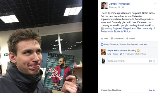
Photo
Artefact: Meeting the needs of the client
Even with the last minute change of client, the whole committee expressed their satisfaction with the artefacts created, especially the obvious improvements and improving quality that they had seen.
As the whole committee had tested each issue, been involved in the processes, they were able to comment on the aspects of the designs. This made them feel involved and valued.
While the conventional design processes were not strictly followed with the making of the issues, due to time constrains meaning research was minimal, the help and expertise of the design team ensured the last two issues were of a much higher quality than the first.
The client also commented on this, and was overall very happy with the finished issues.
0 notes
Photo
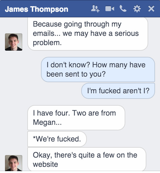
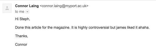
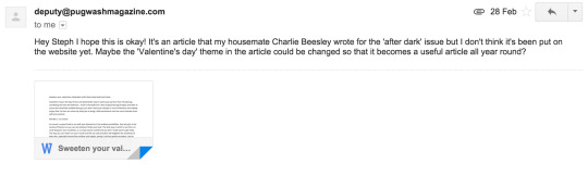
Client Dropping Out: Correcting Errors
The client was unable to dedicate enough time to properly help with the design process, a few days before the deadline he made a public statement that he was stepping down.
While this was difficult to deal with and Henry (the Deputy Editor) insisted that James should still write the Editor’s letter, I had already done the leg work and had the contacts in the union to ensure the print ran smoothly. The deputy was adjusting to his new responsibilities, so I corresponded directly with the union.
The main issues were with the lack of adverts ready for print, as the client had forgotten to request them. This is one aspect that has taken the quality of the issue down, and I could have made better design decisions and included this in my risk assessment. This oversight is the main error.
0 notes
Photo
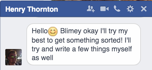
Correcting Errors: Checking the deadline for issue 3
Closer to the deadline the client informed me that he was unsure if he had updated the union on the new deadlines decided in January. This was obviously a major concern, so I decided to email Connar to double check.
He replied to say that the printers had space and would be willing to change the deadline short notice.
0 notes
Photo


Issues Three
Complications With Content: Correcting Errors & Checking Assumptions
When checking what had been submitted for the next issue, after the writers deadline to ensure the project was running to plan, the client informed me that very few articles had been put forward. Unfortunately this turned out to be four articles that were suitable for print, as one of these was about ‘sex toys’ which I did not feel comfortable designing layouts for. I could have taken content from the website, but only three articles were current and I was reluctant to re use content so this left me with three articles for a 44 page document.
I asked the deputy editor, the writers and friends to create last min content for me over social media and in person. This all ate into the two week window for designing the issue. Thankfully all the articles were sent over speedily and I soon had almost enough for the issue.
At this point I turned to my design team, as I had postponed our weekly meet due to no content, to arrange another day to meet and any ideas for more content. They were all willing to be flexible and help out to ensure that there was enough quality content for the issue.
In the end, one of the design team had a friend who did not mind his personal blog content published and two of my design team were keen travellers so they undertook some travel articles as well as the illustrations for them.
Thanks to the help of the writers, committee and my design team I was able to collate enough content over two days, which left a good amount of time to get the design done .
1 note
·
View note
Photo

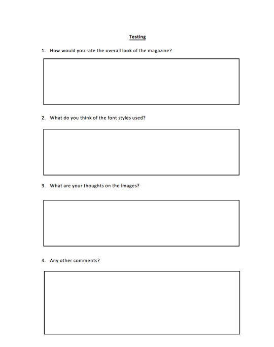
Testing
As it was previously mentioned that hyphenated text was hard to read, I went through the whole document to hunt down orphan lines and ensure it was all easy to read.
In InDesign, this tool was quite hard to track down, but I eventually worked out that the ‘hyphenate’ check box had to be un ticked and this was in the spacing toolbar, not the first text toolbar.
0 notes
Photo

Testing Issue Three
As I only had the PDF version of the issue to test, it was harder to gain overall insight.
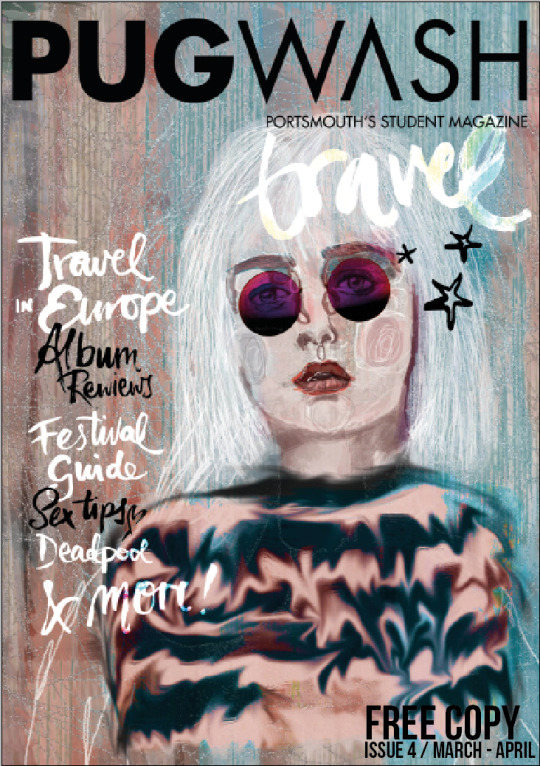
1. Comments suggested that this issue was the best yet, that layout was much nicer to read, and that a ‘house style’ had been achieved. Some were still skeptical, but many comments highlighted the standardised page numbers all the way through and that went a long way to creating the house style.
2. As fonts were very similar, again people expressed their like of the title fonts, and it was observed that the hand drawn fonts worked much better in this issue.
3. It was appreciated that the illustrations were both similar to the last issue, and that sections had similar images. The ‘Travel’ section in particular was well received.
4. Other comments were far fewer, people suggested that some of the ‘Uni Life’ sections were less interestingly designed and the images were more dull, but they agreed that these pages still looked pleasing.
As this was the last issue I was very pleased with the responses from the testing, I feel as though the magazine has come a long way.
0 notes
Photo
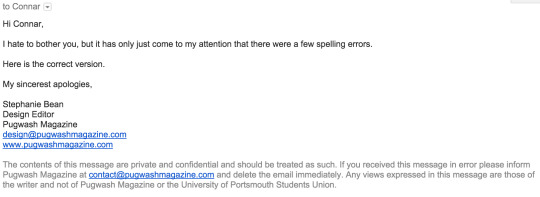
Correcting Errors
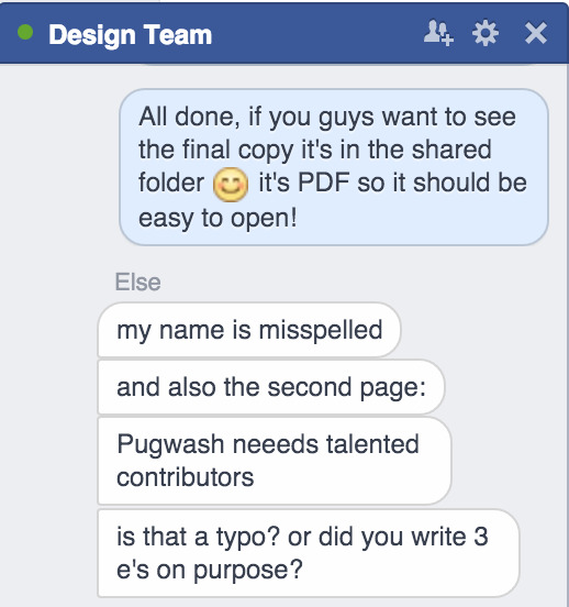
As the issue had been checked over, I sent it on to print. However after it was send, the deputy editor found a few spelling and grammar errors that needed to be addressed. I emailed the contact within the union to make sure the correct copy was sent to print.
Other errors that were unfortunately not picked up included that printers cutting off the very bottom of the feature article page. This was unfortunate, but post print there was nothing that would be done to fix this.
0 notes
Text
Checking Assumptions
Issue Two
I once again met with the client and the committee to talk about the second issue after print. They were much happier with the way that it was laid out and the content of the issue as well.
It was proposed that the content for the next issue be collected as soon as possible to allow for better planning of each section and so that I would not have to write as much content myself, as this took a lot of time.
0 notes
Photo
Testing the Issue Before Print: Issue Two
My design team looked at the PDF that I sent a few hours before the deadline, they helped to pick out the minor details and issues with both the design and the process.
Natalie mentioned that each person doing separate pages was not a good way to keep consistency. This is something that will need to be addressed in the next issue.
0 notes
Photo

Testing: Issue Two
Again I asked for feedback on the printed issue, from both writers and the Art & Design Society. As many of the society members were already part of my design team, they gave me their alterations previous to print.
1. Overall positive again, with comments on how improved the whole issue was compared to the last one, how much the contents page had improved and that the overall look was much sleeker and nicer to read. There were also many comments on the inconsistency of the section title underlines, slight errors within the body of the articles and hyphenated text was hard to read.
2. There was a very positive reaction to the title font style, many asked where they could download it. There was also a positive reaction to the hand drawn titles, but that these should be used more sparingly and in tandem with the usual title font.
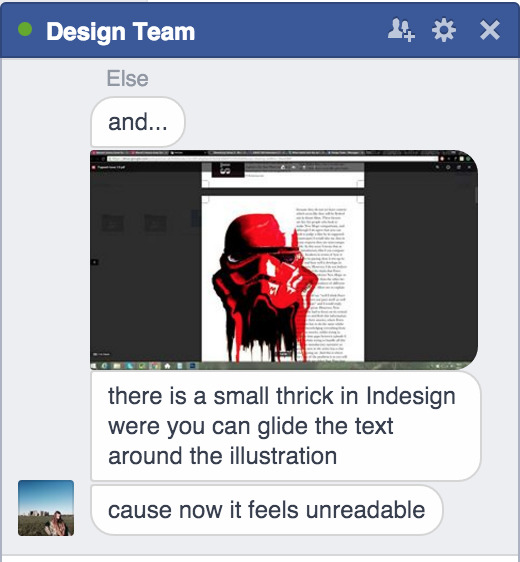
3. The reaction to the hand drawn images was very positive, many comments were about how good particularly the Star Wars illustrations were and how well they fit with the design. There were also positive comments about how there were fewer pixelated pictures, but that especially the ‘loot crate’ pictures were quite low quality. Another positive was particularly the ‘ink in water’ effects, and how good they turned out.
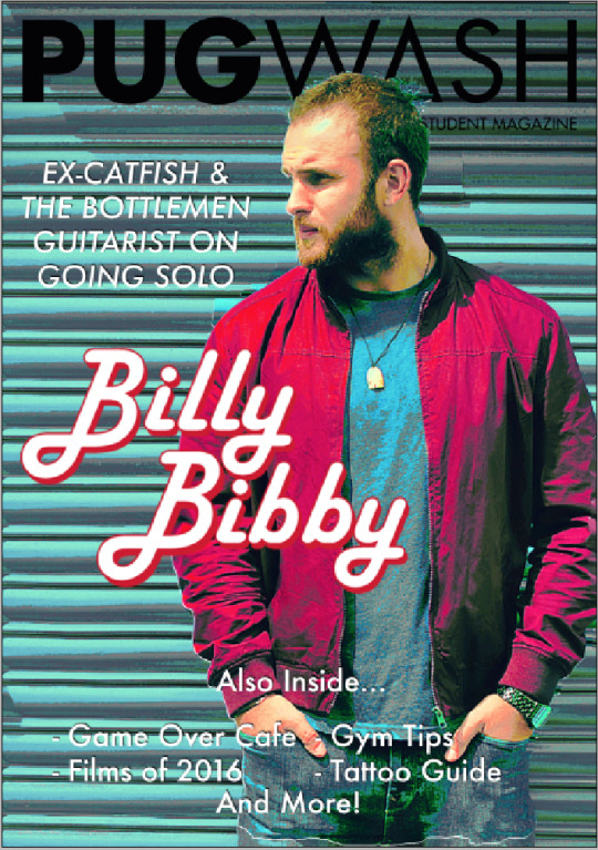
4. One issue many people commented on was the quality of the cover, the artist had not been cut out well and his head was covering the logo. There were also comments that as the artist is not very well known, this was a less effective cover considering the other content.
In hind sight a cover that had the Star Wars art or more recognisable images may have been more eye catching. However the improved overall quality and design went down well and showed that the design as a whole was much closer to the house style that was wanted and professional look.
0 notes
Text
Checking Asumptions
Issue One
I had a meeting with the client and committee post printing of the first issue to discuss the suggestions made in the testing stages. It was agreed that a more minimalist look should be the new goal and that both the Copy Editor and the Deputy Editor would check the PDF files for errors before the issue goes to print.
Alterations had to be made to the design process as it did not work well for this issue, I had to ensure that there was time for testing, feedback and more research before undertaking the next issue.
In light of this, an extra week for design was decided and I was to arrange meetings with a design team prior to the production to exchange further ideas and layouts.
0 notes
Text
Project Deadlines
Issue One
The first issue missed the deadline to be sent to print, this was supposed to be in October, however as I was new to the role and had to learn the software and create the issue from scratch, It was decided that this deadline would be pushed back to January. This also gave the magazine time to become established on social media, the new committee time to adjust to their roles and time to establish a good group of writers to create content.
With all this in place, when I undertook the project there was only one week to create the issue before the christmas break. This did not turn out to be a sensible time scale to create the issue. The time for creation was extended to two weeks, and I was given the christmas break to learn the software and prepare.
However this deadline change was not discussed with the print company due to miscommunication between the client and the student union who communicate with the company. Therefore the printers said they would print the 1000 copies whenever a space opened up in their workload.
1 note
·
View note
Photo
Testing With Different Groups: Issue One
I gave these sheets to both the writers at the writers meeting I attended, as well as other more creatively minded people on my course, and within the Art & Design Society that I am VP of.
1. The first question overall gained a positive response, many people said that the overall look was good, although particularly from the more creative respondents, it was brought to my attention that it was too cluttered and a lack of house style made it look less professional.
2. The writers were particularly happy with the fonts, many mentioned that they liked the way the fonts matched their articles. However, others pointed out that the range of fonts was too wide and some were not the right choice for a professional document.
3. As the images were sourced from google, it was noticed that they were good quality, however some of the original images, particularly the banner title on ��Park Run’ was highlighted to be too pixelated and too big for the article.
4. Other comments ranged from mentioning the backgrounds made the text hard too read, to the slight errors missed before print, like the blue box around the blue controller on the ‘Top Games’ page and the white background on the green controller ruining the image it was placed over. The contents pages in particular were highlighted as a major design flaw.
I was happy with the feedback given, it was more constructive than the client’s feedback and gave me some pointers on how to improve the next issue. It also prompted me to gather a design team and strive to have better quality and attention to detail for the next print.
0 notes
Text
Correcting Errors
Issue One
Due to slight misinterpretation on InDesign, the client informed me that the inside guidelines were the print cut offs. I didn’t check this at the beginning of the project, which would have been easy to do. Simply exporting the issue to PDF highlighted that every page was too small and needed to be extended to the outer white edges. This didn’t take too much time, as I simply selected everything on each page and ensured ‘shift’ was held down for an accurate scale.
As the timeframe in which the issue was created was far too short, the day of the deadline the client informed me that the issue should actually be 44 pages long, as opposed to his earlier answers at the beginning of the project.
This left the issue with four blank pages and no content to fill them. With only hours before the deadline there was very little that could be done. I proposed ‘meet the committee’ pages that filled two of the blanks, and the client insisted that the contents fill the remaining empty pages. While I expressed my concerns over a four page contents, the client was happy and insisted there was no other content attainable in the time frame.
0 notes