stingandsnoutbindery
Sting & Snout Bindery
Bookbinder. Perpetually crafting and trying new things! My Works | Sideblog of @drangercore
61 posts
Don't wanna be here? Send us removal request.
Last Seen Blogs
takeme2disney
*have a disney day*
legitanawkwardmess
A4AxoI4Iris

bananitass
lily

runes-menagerie
Rune's Menagerie
devilsmenu
God's Menu
Text
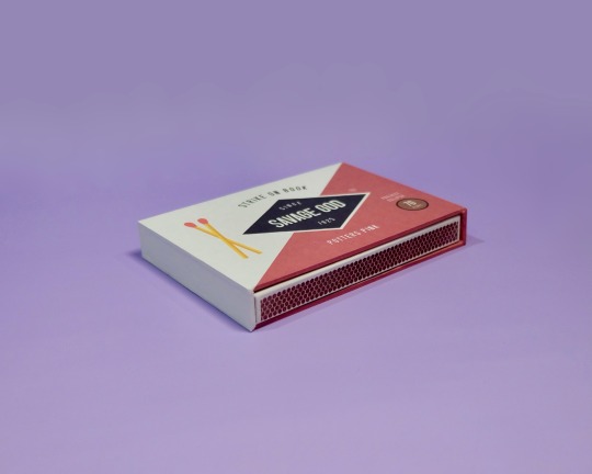
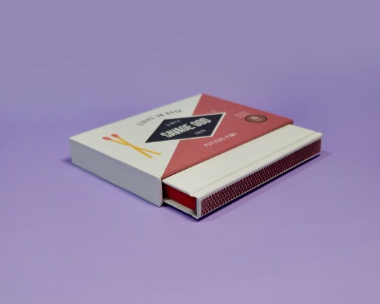
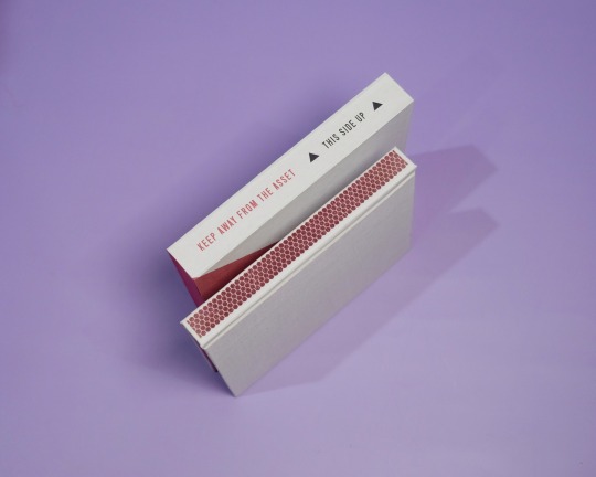
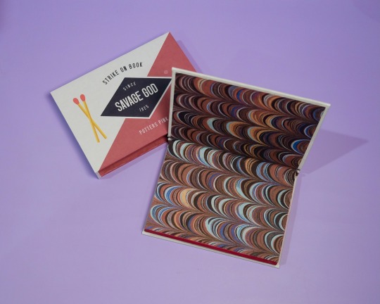
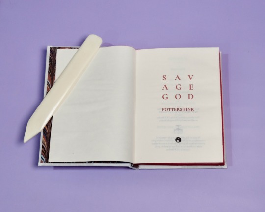


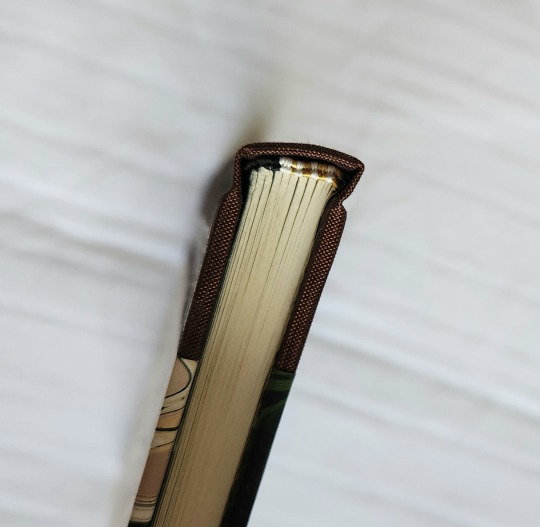
Savage God by PottersPink, binding by DCB Bindery
Summary:
Past, present, future, Steve knows Bucky Barnes. It’s why he recognized him when he found him in that alley in April of 1942, even though Bucky was older, stronger, wearier; he called himself The Asset, and had a metal fucking arm. He flinched when Steve tried to touch him, and when Steve told him he loved him, his first response was to ask why.
The Asset was only with Steve in 1942 for a few days, but it’s enough to change the course of Steve’s life forever; the journey to becoming Captain America is coloured with urgency, with an undercurrent of fear and determination that in the end he just can’t manage to hide from everyone — But it was all for nothing. Steve saves Bucky from Zola, just to lose him on the train. Their second chance, wasted.
Seventy years later, Steve wakes up in the twenty-first century, and he doesn’t know whether to be heartbroken or hopeful when some of the things Bucky revealed to him in 1942 start falling into place.
Specs:
Square back bradel, red edges, marbled patterned endpapers and endbands, A6, with slipcase.
A gripping read from @potterspink, undoubtedly one of my all time favorites. I’ve revisited this fic over and over again and it is no less satisfying to read each time!
On the process:
I knew I wanted to base the design of this binding around a matchbox, and decided to go with Diamond matches. Really liked how it turned out, especially with the striker design on the spine of the book. Had a lot of fun bringing in elements of the story into the slipcase design too, and the slipcase construction was so much simpler and easier than I expected!
I’m quite pleased with the matches marking parts one to three as well, adding a little pop of red that ties everything together. I’m binding three editions of this fic for Binderary so check out the rest (coming soon) for a more in depth look at the typeset!
More DCB Bindery Projects
259 notes
·
View notes
Text
i feel this to the core
I have that toxic crafter mindset (seeing any physical object going… I could make that)
319 notes
·
View notes
Text
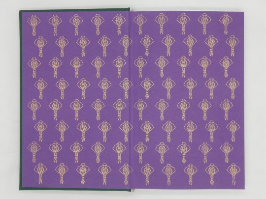
Bookbinding: A Stitch in Time
My mom has been hoping to get her hands on a hard copy of A Stitch in Time, which, as I'm sure most of you are aware, tends to be pricey if you can find it. (It's currently listed for ~$115 on eBay, and more expensive elsewhere.)
So, I decided to put my bookbinding skills to use and make her one for her birthday.


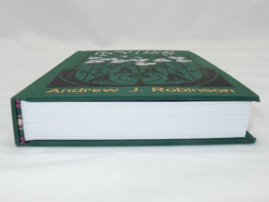

Notes on the design and construction:
The cover design was inspired by (or rather adapted from via considerable photoshopping) this book cover from 1901 that happened to cross my dashboard in a post with a bunch of other cool old book covers:

I created the Cardassian building silhouettes based on a screencap, and the DS9 silhouette is borrowed from the Niners logo. The orchid on the back cover emerging from the Obsidian Order logo is one I found in Cricut Design Space.

(Feel free to use these in your own projects, if you like.)
The bookcloth is by BOOKCRAFTSUPPLYCO on Etsy (dark green). The cover designs are HTV, Cricut Everyday Iron-On (black), Cricut Foil Iron-On (gold), and Vinyl Frog Metallic Foil (holographic silver). The Cardassian Union logos on the end pages were done using Cricut's foil transfer system (gold). The fonts on the cover are DS9 Title and DS9 Credits from st-minutiae.com.
549 notes
·
View notes
Text
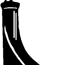
Wish Carefully by Ten Toes
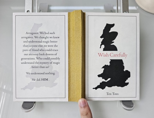
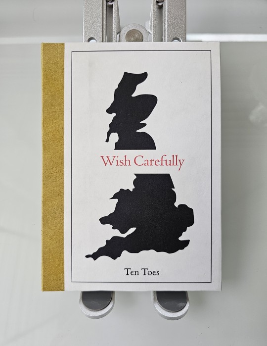

Another old blast from the past! This time, it's a Harry Potter fic from 2008 that asks the question "what if the Death Eaters win but all the good guys just leave Britain?" The result... was not pretty. In fact, the level of how much Wizarding Britain fell apart genetically, socially, and economically was a shock to the 'winning' Death Eaters.
For this bind, I wanted to go easy and decided on a simple sewn-board binding with a relatively uncomplicated design and color scheme. With that said, I now wish I could've added some details like cracks on the Britain silhouette to signal how things fell apart.
It's actually nostalgic to read such fics during or just after the books' publication, since a lot of fanon was still up in the air and thus there was a lot of experimentation in fanfics. The number of "things fall apart" fics for Death Eaters who 'won' are comparatively rare today. Hence, me binding this for posterity!
78 notes
·
View notes
Text
To folks (friends, authors, and artists) I’ve promised books to, I have not forgotten about you or your books. They are all in various stages of progress, but given my schedule and time conflicts, it seems that most binding activities will be resumed by next year. Please know that I’ll work on them again as soon as and whenever I can, and that I’ll get them to you all soon!
Thank you for being incredibly patient with me <3
1 note
·
View note
Text
930 notes
·
View notes
Text
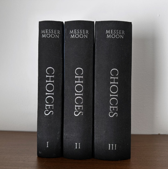
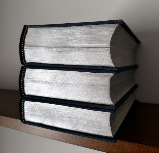
this is the most stunning set of books for this fic that i’ve ever seen!

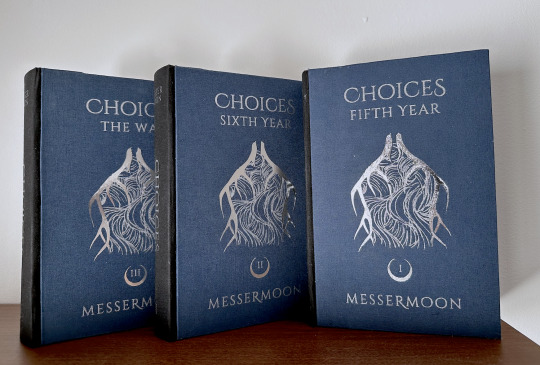

Choices by MesserMoon (@sophsicle)
People make mistakes, but they also make choices. It’s important to James, that difference. He does his best not to confuse the two.
Fandom: Harry Potter
Pairing (s): Regulus Black/James Potter, James Potter/Lily Evans, Remus Lupin/Sirius Black
AHHHH I am SO excited to share this bind—but first, I want to say thank you to Soph for letting me make (my first ever) author copies for this story. I'm definitely a beginner bookbinder but I truly hope I've done this fic justice <3
The design process for this bind was probably one of my favorite parts. I decided to go with some really simple design elements in comparison to my other binds, primarily because I felt it was more fitting for the story, and I was inspired by some of the design choices made in my personal copy of Song of Achilles.
Photographed here are the author's copies, so I've held off on posting about them until now:

(The dedications are all pulled from Soph's playlist for the fic, and each quote reminds me of that particular volume, given that there are three. Pictured above is the dedication for the first volume.)
624,188 words | 1,945 pages
Title Font: Cinzel Decorative
Body: Crimson Text
Headers/Capitalization/Dedication: Palatino Nova
Some elements of this bind were entirely new to me, such as the fact that it was an in-boards three piece bradel binding. It was also my first time painting edges, as well as rounding spines. Neither of these things turned out perfect, even after completing personal copies, but i did learn a lot of don't's.
One of the things that I did in the process of this bind that I LOVED was combining two different decoration styles. I've done covers that are either completely foiled, or completely HTV—but not both. For this cover design, I was struggling to figure out the best way to make the upside-down antlers on the cover pop. Adding HTV over a full foil cover was the perfect way to get the look I wanted:


(The contrast/shininess is best pictured in the process photo on the left.)
Special thanks to both @maybebabyplease for listening to my rants about this bind since July, as well as the @renegadepublishing discord server.
As large a bind as this was, it was so so much fun to bring to life this incredible story that holds such a special place in my heart as well as the fandom's.
291 notes
·
View notes
Text

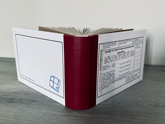

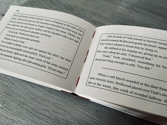

CAUSE OF DEATH (See instructions and examples) by @floofyfluff
So, one morning I woke up to notifications of the first four chapters of this dropping. I opened the first one, went into a fugue state, and emerged hald an hour later with the design concept READY TO GO.
I typeset this fic as it came out (which is not the smartest or most efficient way to go about it, but I just couldn't help myself), and it was A BLAST. The last two chapters doubling the word count might have given me a pause, but no, I CRAVED THAT CONCEPT.
The format of this thing is pretty interesting, because it's like half an A5 or A6 but sideways? I had a lot of fun figuring out how to make it happen.
And for the cover design/materials I went with a reference that’s funny only for me: it looks A LOT like a late Soviet-era medical record. They obviously didn’t have a third of an American death certificate on the cover, but I needed that, because it’s pretty much title page/table of contents rolled into one. Oh, and I carved my imprint logo into a stamp for the back cover, and found an actual stamping pad, because why not.
I went for that even heavier in the typeset, with each chapter being a box in the certificate, so first lines look like they were written into the box by hand. Ish.
And for the author’s notes I chose another reference — they are vintage prescriptions. A neat stack of them lives in a pocket cut into the back cover.
All in all, extremely proud of this project! And if my rabid rambling was not clear enough, let me quote Bigolas Dickolas Wolfwood: read this. DO NOT look up anything about it. just read it.
589 notes
·
View notes
Text
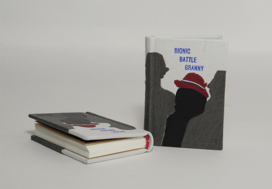
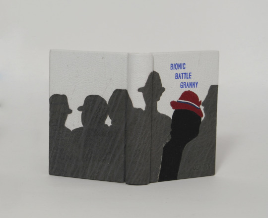


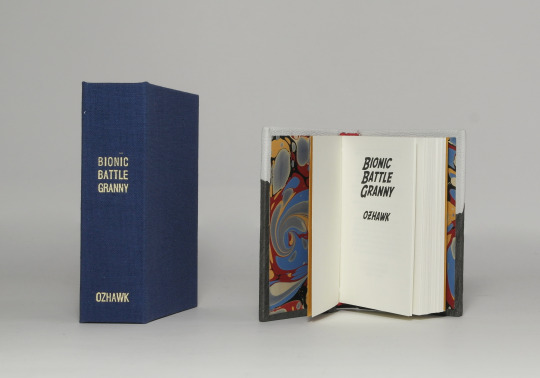
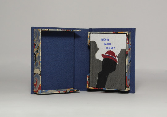

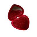
Bionic Battle Granny - ozhawk
These books were part of the Renegady Publishing Tiny Books Bang 2023 event
The typeset was provided by @claudeng80
The story was written by @ozhawkauthor, check out their work!
Full leather binding with leather onlays in clamshell box.
case materials
binders board 1,5 (case)
different leathers, goatskin, (covering material)
heat reactive foil, blue (hot stamped title)
blind tooled author name
inner book
Munken polar 100gsm (book body)
@renato-crepaldi marbled paper (endpapers)
wibalin (second fly leaf, tipped on the first)
button hole silk (endbands)
clamshell box
binders board 1 and 1,5 (boxes and case)
uncoated blue book cloth (covering material case)
@renato-crepaldi marbled paper (covering material boxes)
heat reactive foil, cream (hot stamped title)
108 notes
·
View notes
Text


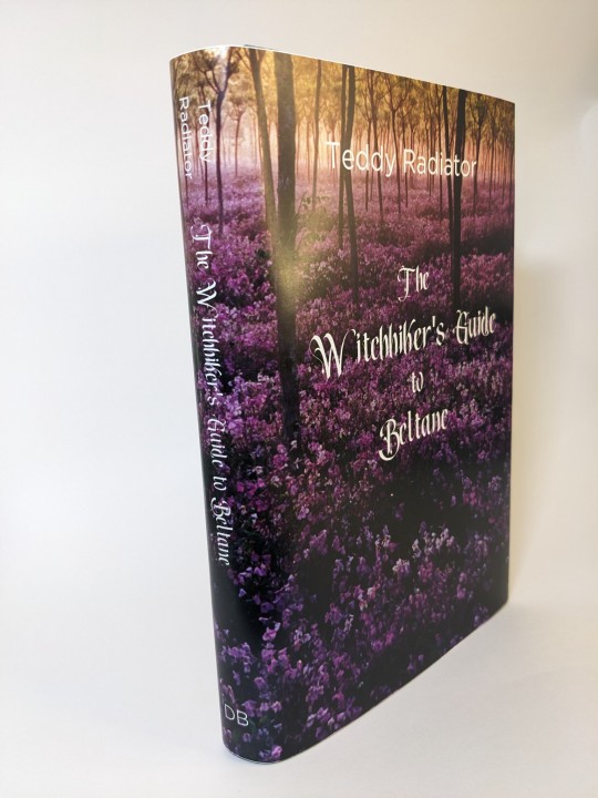

I had a lot of fun participating in @renegadepublishing Fanfiction Writer Appreciation Day (FFWAD) this year!
The Witchhiker's Guide to Beltane by Teddy Radiator. This story has a lot of Spring (Beltane) vibes and I wanted to bring that to life in the binding of it.
This is an in-boards bradel bind. (My first) The paper is a lokta that's beautifully textured. The spine is made of green & purple color shifting duo "Skarabaus". The edges have been sprinkled with ink and the headbands are soie perlee thread. (That handles beautifully, I understand why it's a favorite now)
144 notes
·
View notes
Text
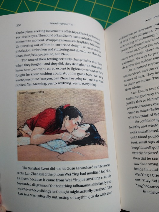
when the sun goes out
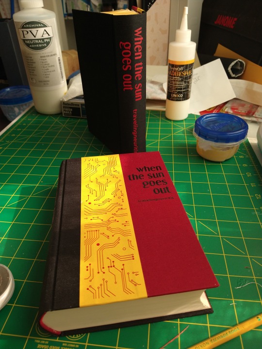

It's fanfiction writer appreciation day! This year I made a copy of when the sun goes out for @travelingneuritis. It's a modern-with-magic MDZS AU where Wei Wuxian uses technology to work with resentful energy. You should all go out and read it immediately. I really love how it hits all the important character beats, but doesn't rehash the plot. Plus, there's day-to-day cultivator work that we don't get very much of in canon, and wwx's affinity for the dead, in both the "help them move on" sense and the "go fuck them up for me" sense. (Both of these are heartbreaking, of course)
And the art! I've been wanting to bind this for ages, but I had to wait until I got a color printer to do this justice.


Lots of rambling under the cut!
It is somewhere around 550 pages long, which is apparently the exact max that my guillotine will take, so that was lucky. I tried an oxford hollow for the first time, and I love it! The text block feels so secure in the case.


The red on yellow design for the cover is supposed to look like the donghua talisman design - I'd hoped to make something that looked more like a talisman with circuit board imagery, but graphic design is not in fact my passion, so I just went with clipart.
I even learned how to turn a image into a font for the scene dividers! This is the circuit diagram symbol for a battery, because batteries are an important plot point and I'm a nerd.

And there are juniors! I love them so much.
Anyway, thank you @travelingneuritis ! I appreciate your contributions to fandom and had a lot of fun making this!
165 notes
·
View notes
Text
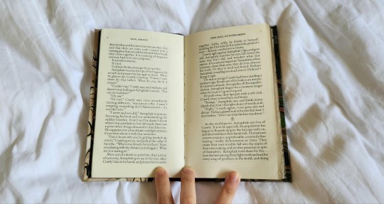
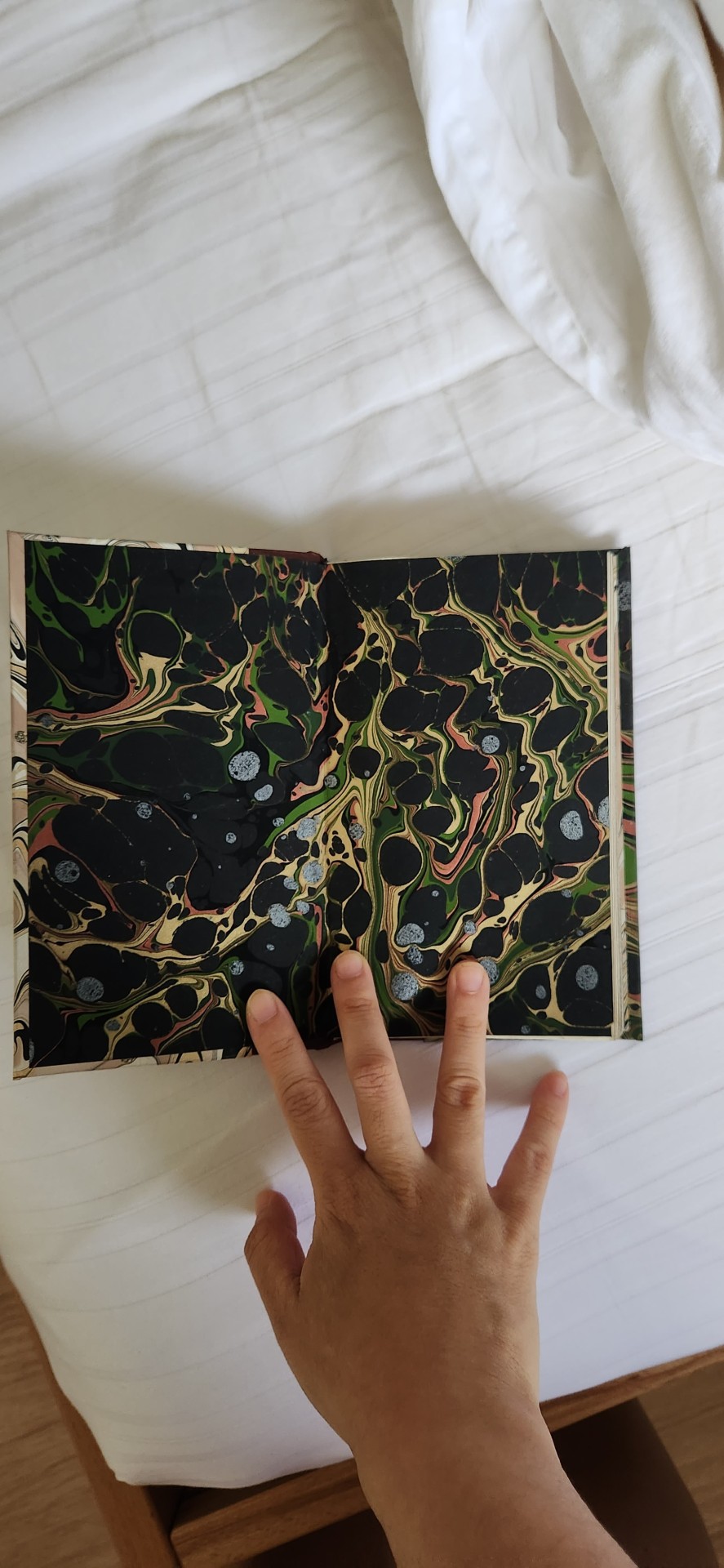
The Lightness of You // This Soul Outstreaming - a @rendherring duology

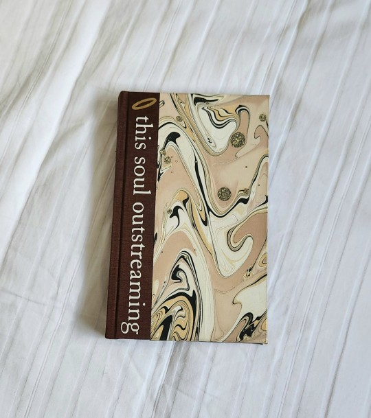
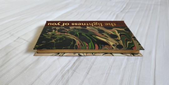
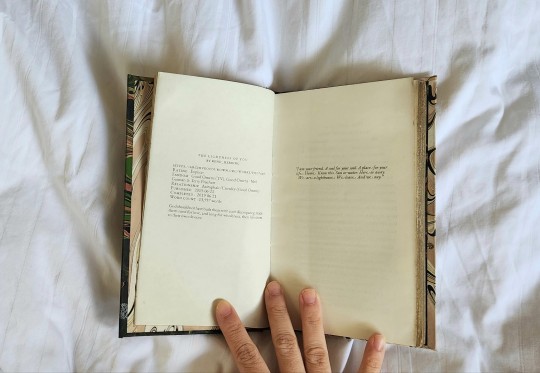
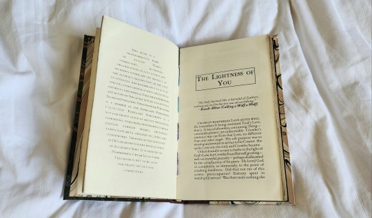


The entire origin for this bind was because I was extremely excited to use my newly purchased legal paper and I had wanted to make a tête-bêche quarto - and I just had so many feelings about Good Omens after watching the second season and I needed very much to bind something that is my love letter to Good Omens and express ALL MY FEELINGS ABOUT THOSE TWO LOVEABLE IDIOTS.
Stats:
36055 words || 153 pages
Body text: EB Garamond 11 point
Accents: Alchemist Serif font
I bound these two little fics written by the same author (in 2019, so they are spoiler-free fics), of which they are opposing points of view but also are slightly different stories. I mainly used the character point of views to guide a lot of my design choices.
did quite a few new things with this bind: a tête-bêche, also a quarto! a legal quarto! plus edge gilding! and a half-bind which i have legitly not done since my first bind 1 year ago.
the tête-bêche is a trial run for an author copy - and thankfully is easier than expected.
i chose decorative papers (renato crepaldi, because i have a Stash) that specifically gave me aziraphale and crowley vibes - and leaned into the elements of light and dark, contrast and harmony, while matching it with forest floor colibri. AGAIN PLANT VIBES, JUST BECAUSE.
I kept my typesetting very classic - a) because i wanted to speed bind this (which i did in 2 days) and b) because i wanted to preserve old book vibes. i also practiced++++ and took the electric sander for a whirl because by god i was going to get some foiled/gilded edges on this bind so it would look like a fancy pancy book Aziraphale would covet for his shelf. this is my third attempt at sanding and gilding and it's still a little patchy - not perfect enough yet for a consistent result but i hope to get there one day and to be able to do foiled edges for author copies, hopefully soon. i would say despite the patchiness, it looks pretty fucking fancy and i really liked how it turned out.
Endpapers are the same papers on the cover but on the contralateral endpaper sides, which is a great contrast and an amazing idea from @pleasantboatpress because i was befuddled by Options.
For the endbands, i took inspiration from @celestial-sphere-press's recent beautiful gradient endbands, but leaned more with the usage of sunlight breaking through the contrast of light and darkness, for Aziraphale's side, while Crowley's side is done with green, black and gold because PLANTS. i stitched the main textblock with lovely variegated galaxy thread (IFYKYK :)) hand-dyed by @pleasantboatpress.
i actually really like how the bind came together and i'm rather proud of its simplicity and how intentional it feels as a bind, design-wise. every design choice was done with love, for the show, the book, the author, the characters and the fic and i am just FILLED WITH FEELINGS, Y'ALL. i'm not ashamed of them.
my only (small) gripe is my legal paper grain snafu because i am one of those grain purists and i only ever like using the correct grain but despite the textblock being in the wrong grain, it is still a lovely book and my fears were unwarranted, the book lies flat and open (it's not a monster book of monsters, which i had always assumed erroneously was a grain issue) and is still very readable other than a little sticky-outyness of the pages. am also very grateful because paper supplier is replacing it for free (they are legit the nicest).
112 notes
·
View notes
Note
do you have a link to the tutorial for the cardboard cradle? 🥰
Yes! https://www.herringbonebindery.com/blog/2014/01/03/tutorial-collapsable-punching-cradle/
Warning: tis mildly addicting and I am tempted to make another one in different colors
4 notes
·
View notes
Note
happy binding anniversary! what are your plans for this year? any WIPs??
Thank you so much! I apologize for taking long to respond, just so much real life stuff going on atm lol.
I have several books in progress which I am so thrilled about, as most of these I have planned back in summer of last year, and have only had the time and resources to work on recently. Sadly, I am on a semi-binding hiatus to prepare for important exams this late October (send help). I say 'semi' because I have the worst self-control and will find every opportunity for any hobbying.
Anywho, the 6-ish projects underway and some other stuff:

Most books are for my personal shelf. I've also got author and artist copies, an exchange, and some gift notebooks. There's a three-volume set for Manacled which I've been putting off for the longest time because as it turns out, none of my plans to execute the cover design has worked out, and I require help from construction folks aka my dad and brother.
and more pics...

Times I wish I had a Cricut.


13 notes
·
View notes
Text


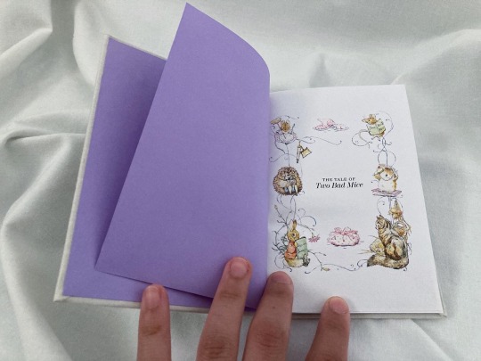

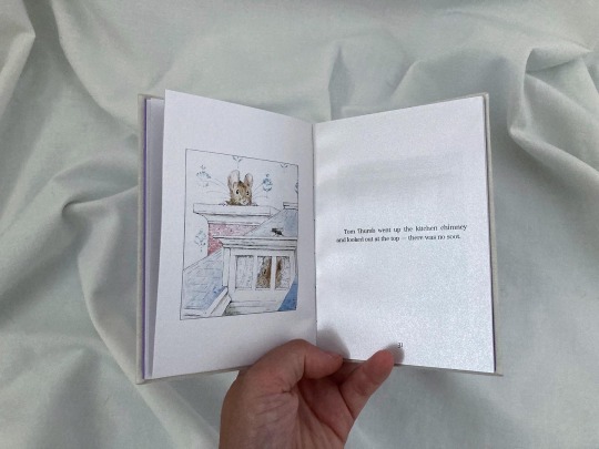


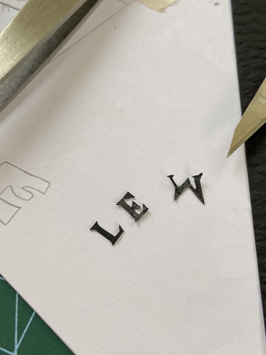
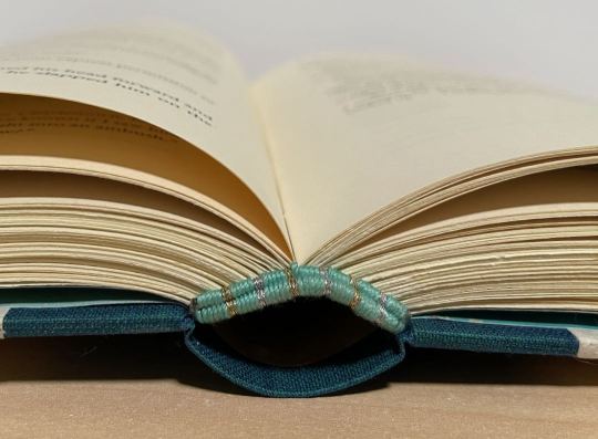
Here's a little project that I made to keep myself busy for a little while.
It's The Tale of Two Bad Mice, by Beatrix Potter (text and illustrations) - a delicious children's classic.
My favourite part was definitely embroidering the spine because it made me fall in love with embroidery all over again. I need to do this more often!
Overall, it's far from being perfect (I even forgot the headbands 🤦🏻♀️), but i think I still really love it.
70 notes
·
View notes
Text
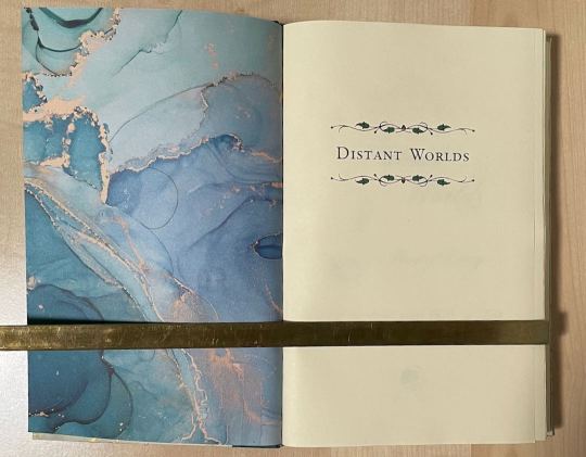
Distant Worlds

At long last! I have finished Distant Worlds by MooeyDooey, a hilarious OFMD fic where Stede thinks Ed’s lonely and appoints himself as Ed’s matchmaker, to predictable results. I cannot count the sheer number of times I laughed out loud. This was the first fic where I thought “I need to bind this” before I was even 25% of the way through.

The fic actually starts off with a beautifully dreamy poem that juxtaposes with the absolute hilarity of most of the fic, so I tried to go for a more whimsical theme. The author requested blues and golds, so color-shifting Duo Dragonfly bookcloth and the celestial-themed Lokta paper was a great fit. I don’t have photos, but I custom-dyed a bright teal thread for sewing the textblock.
Some of the neatest endbands I’ve ever done!!
Continuing with the ocean theme with Craft Consortium Ink Drop endpapers. I incorporated some scrolly text ornaments throughout the fic.
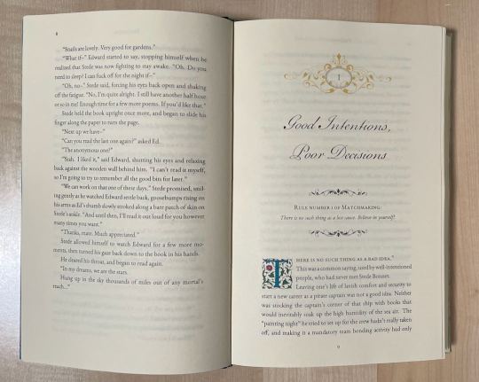
Because Stede is so very Extra™ throughout the story, the chapter headers and drop caps also needed to be Extra. I colored in all the dropcaps to match the overall teal theme. If I were going to do this again, I would probably try foiling the chapter headers as well, but this bind took me a year to do (!!!) so I think we’re good where we landed. :)
164 notes
·
View notes
Text
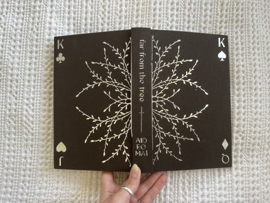
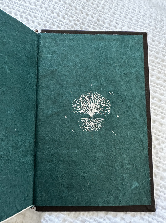
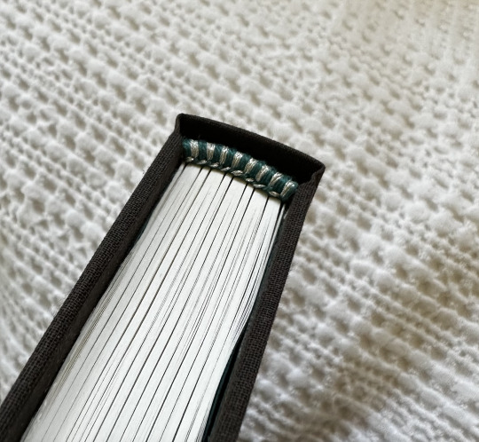
Far From the Tree, by aideomai. 112,572 words.
This is, by far, one of my favorite fics ever. I say that about a lot of fic, but this one deserves ALL the praise. Everything is just so vivid—I couldn't decide, in the end, what I even wanted the decorations to be because I had so many ideas.
In the end, there ended up being this mix of various things from the story—the card game, trees and leaves (obviously), and, well, swords. I LOVE the swords in this (and swords in general).

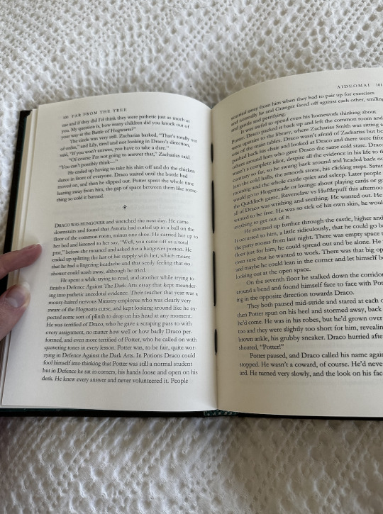
For the actual construction of this bind, there were a few new techniques I tried—the foiling of the endpapers (which uses a silhouette and a foil quill), heat transfer vinyl (the new bane of my existence), and sewn endbands (which I loved, surprisingly). Overall, so so happy with how this turned out!
Design Details:
Title Page: Portal
Cover/Spine: Kingred Modern
Body: Garamond
(If you have not read this fic yet—I highly encourage you to do so. In fact, read ALL of aideomai's works.)
380 notes
·
View notes