
We help companies model data and present it in Microsoft Power BI. Our specialization in Microsoft business applications can help your company navigate the data analytics landscape, which means greater ROI. http://stratada.com/
Don't wanna be here? Send us removal request.
Statistics
We looked inside some of the posts by stratada and here's what we found interesting.
Average Info
Notes Per Post
4
Likes Per Post
4
Reblog Per Post
0
Reply Per Post
0
Time Between Posts
26 days
Number of Posts By Type
Text
17
Last Seen Tumblr Blogs


Fun Fact
28.6 is the average number of monthly visits per US mobile user.
Text
Mastering Microsoft Project Reports: A Comprehensive Guide
Microsoft Project is a powerful tool for project management, allowing teams to plan, track, and manage projects of various sizes and complexities. One of the key features of Microsoft Project is its robust reporting capabilities, which enable project managers to communicate project status, progress, and key metrics effectively. In this guide, we will explore the intricacies of Microsoft Project reports, how to create them, and how to leverage them to drive project success.
Understanding Microsoft Project Reports: Microsoft Project offers a wide range of reporting options, allowing project managers to generate insightful reports tailored to their specific needs. These reports can include information on project timelines, resource allocation, task progress, costs, and more. By providing stakeholders with timely and accurate information, project reports help ensure transparency, facilitate decision-making, and keep projects on track.
Key Components of Microsoft Project Reports:
Project Summary Reports: These reports provide an overview of the entire project, including key milestones, timelines, and overall progress. Task Reports: Task reports focus on individual tasks within the project, detailing their status, duration, dependencies, and assigned resources. Resource Reports: Resource reports highlight resource allocation, workload, availability, and costs associated with project resources. Cost Reports: Cost reports outline project expenses, budgets, variances, and other financial metrics. Custom Reports: Microsoft Project allows users to create custom reports tailored to their unique project requirements, leveraging a variety of data fields and visualization options.
Creating Microsoft Project Reports:
Selecting Report Types: Determine the type of report that best suits your project needs, whether it’s a summary report for stakeholders or a detailed report for internal analysis. Customizing Report Parameters: Customize report parameters such as date ranges, resource filters, and data fields to ensure that the report reflects the most relevant information. Designing Report Layout: Design the report layout by selecting appropriate fonts, colors, and formatting options to enhance readability and visual appeal. Adding Visualizations: Incorporate charts, graphs, and other visual elements to present data in a clear and compelling manner, making it easier for stakeholders to interpret. Reviewing and Sharing Reports: Review the generated report for accuracy and completeness before sharing it with stakeholders. Microsoft Project allows users to export reports in various formats, including PDF, Excel, and PowerPoint, making it easy to distribute them to the relevant parties.
Best Practices for Microsoft Project Reports:
Keep Reports Relevant: Focus on including only the most relevant information in your reports to avoid overwhelming stakeholders with unnecessary details. Maintain Consistency: Establish consistent report templates and formats to ensure clarity and facilitate comparison across different projects. Provide Context: Include contextual information and insights to help stakeholders understand the significance of the data presented in the report. Update Reports Regularly: Keep reports up-to-date with real-time project data to provide stakeholders with accurate and timely information. Seek Feedback: Solicit feedback from stakeholders on the usefulness and effectiveness of the reports, and make adjustments accordingly to improve their quality over time.
Conclusion: Microsoft Project reports play a vital role in project management by providing stakeholders with valuable insights into project progress, resource allocation, costs, and other key metrics. By mastering the art of creating and leveraging Microsoft Project reports effectively, project managers can enhance communication, drive informed decision-making, and ultimately ensure the successful delivery of projects. With the right approach and best practices in place, Microsoft Project reports can become powerful tools for driving project success.
#power bi time line#microsoft project task board#kanban board in power bi#microsoft project analysis#azure devops dashboard
0 notes
Text

Project SPI & CPI - Stratada
You don’t see stuff like this very often. That’s because color grids in scatterplots are not built into Power BI. With a little hack, we put together this color-grid scatterplot that makes it easy to interpret project performance. Cross-filter on the scatterplot or slice everything by project owner. https://www.stratada.com/project/project-online/
#oneplan microsoft#jira custom reports#power bi visuals#project online microsoft#power bi gantt chart visual#project online power bi
0 notes
Text
Power Bi Online in Washington - Stratada
Can you use Power BI online?
Absolutely, you can use Power BI online through the Power BI service, which is a cloud-based platform provided by Microsoft. This service allows users to create, collaborate on, and share interactive data visualizations and reports.
Through Power BI online, you can:
Create Reports: Import data, create data models, and design interactive reports using various visualizations.
Publish and Share: Publish your reports and dashboards to share them securely with others within your organization or publicly, if preferred.
Collaborate: Collaborate with colleagues by sharing reports, dashboards, and datasets, allowing for real-time collaboration and commenting.
Access from Anywhere: Since it's cloud-based, you can access Power BI online from any device with an internet connection.
Manage Data: Manage and refresh datasets, schedule data refreshes, and keep your reports up-to-date.
The Power BI service also offers various additional features like AI-powered insights, natural language querying, and integration with other Microsoft services like Azure, Excel, and more.
It's a powerful tool for data analysis, visualization, and sharing insights across teams or organizations.
#Power Bi Smartsheet#Azure Devops Gantt Chart#Power Bi Jira Dashboard#Jira Custom Chart#Power Bi Scatter Chart#Power Bi Drill Through#Power Bi Online
2 notes
·
View notes
Text

Missing Persons by Age Group - Stratada
This report complements the summary report by looking at specific age groups. You can select an age group to find out what percent of the total missing it represents. Dynamic text changes based on your selection, informing you what year saw the greatest number of missing persons. The bar chart then displays the missing count for that year by city. https://www.stratada.com/project/missing-persons/
#smartsheet dashboard#power bi online#smartsheet power bi#power bi drill through#power bi time line#microsoft project task board#kanban board in power bi
0 notes
Text
Power Bi Scatter Chart - Stratada
How do you show values on a scatter plot in Power BI?
In Power BI, you can show values on a scatter plot by enabling data labels for the individual data points. Data labels display the actual values associated with each data point, making it easier to interpret the scatter plot. Here's how you can show values on a scatter plot in Power BI:

Create or Open a Scatter Chart: Start by creating a Scatter Chart visual or opening an existing one in your Power BI report. Ensure that you've already configured the X-axis and Y-axis for your scatter plot with the respective numerical fields.
Enable Data Labels: To show values on the scatter plot, you need to enable data labels. Here's how:
a. In the "Visualizations" pane on the right side of the Power BI Desktop interface, select the "Format" icon (represented by a paint roller) to open the "Format" options for the Scatter Chart.
b. In the "Format" options, expand the "Data labels" section.
c. Toggle the switch to turn on "Data label" by clicking the switch to the "On" position.
Adjust Data Label Settings (Optional): You can further customize the appearance and behavior of data labels to meet your needs:
You can change the position of the data labels (e.g., "Center," "Inside end," "Outside end") from the "Position" dropdown within the "Data labels" section.
Adjust the text color, font size, and font family using the formatting options available in the "Data labels" section.
View Data Labels on the Scatter Plot: After enabling data labels, you should see the actual values associated with each data point displayed on the scatter plot. These labels will appear next to or on top of each data point, depending on the label position you've chosen.
Customize Additional Settings (Optional): Depending on your preferences and the specific requirements of your report, you can further customize the scatter plot's appearance, including axis labels, titles, and other formatting options.
Save and Publish: Once you've configured and customized your scatter plot with data labels, save your Power BI report and publish it to the Power BI service or share it with others as needed.
Enabling data labels is a helpful way to provide more context and information when working with scatter plots, especially when you want to see the exact numerical values associated with each data point.
#power bi python#power bi projects online#azure devops reports#power bi histogram#python with power bi#power bi azure devops dashboard#azure devops progress report#jira status report
0 notes
Text
Advanced Data Visualization in Power BI Using Python - Stratada
Analysts and developers, proficient in R, have been able to incorporate R visuals in their Power BI projects for quite some time now. It made sense that Microsoft started with R implementation in Power BI, as they acquired Revolution Analytics and its implementation of the R language back in 2015. However, Python has been on the rise, even bypassing R in the realm of data science. https://www.stratada.com/advanced-data-visualization-in-power-bi-using-python/
#project online microsoft#power bi gantt chart visual#ms project power bi#project online power bi#microsoft project custom reporting#power bi visualizations#power bi scatter chart
0 notes
Text

Using Power BI to Extend and Streamline Project Online Analytics
Demos and Webcasts, Project Analytics, Tricks and Tips
We recently recorded our first webcast on using several key features in Microsoft Power BI to extend and streamline your project analytics (or business analytics, in general). While there are numerous features of Power BI that enable you to perform more advanced analytics, and new-and-improved features are released on a monthly basis, we decided to focus on three unique features: buttons, bookmarks, and drillthrough. We would be remiss not to leverage these in the reports that we develop for clients. They are powerful, dynamic, and impactful. They enable end-users to navigate reports with ease, switch between measures, perform drilldowns on multiple visuals at the same time, mine the data for deeper insights, etc. You get to use your imagination.
Data from line-of-business applications, such as Microsoft Project Online, can be challenging to explore, uncover hidden stress points, and derive actionable insights. Power BI can immensely simplify this data analytics process. We’ve actually developed a Project Online report pack to do just that.
Below is the recording of our webcast. Not only do we show you how we’ve put these features to use in our report pack, but we subsequently demonstrate how you can implement this yourself on your own set of reports. You’ll learn how to create bookmarks and link them to buttons, as well as configure drillthrough on your reports, enabling the ability to navigate from a high-level view of your data to a more granular view. All of this is performed in Power BI Desktop. Please keep a lookout for future webcasts like this one and let us know if there is something specific you would like us to cover.
0 notes
Text

Project Owner Score - Stratada
This report compares the performance of project owners based on a score that is a weighted average (weighted on the number of projects) of several performance metrics, such as cost variance and work variance. The color-grid in the dot plot allows you to quickly compare scores. https://www.stratada.com/project/project-online/
#azure devops dashboard#microsoft project analysis#kanban board in power bi#microsoft project task board#power bi time line#power bi drill through#smartsheet power bi#power bi online#smartsheet dashboard
0 notes
Text

New Product Development Taskboard - Stratada
Agile methodology and associated reports are not just for app development anymore. Here is an example of using the Stratada Taskboard to visualize the progress of a new product development initiative. https://www.stratada.com/smartsheet-report-pack/
#microsoft project analysis#kanban board in power bi#microsoft project task board#power bi time line#power bi drill through#smartsheet power bi#power bi online
1 note
·
View note
Text
Data Strategy - Powerbi Timeline Visual - Stratada

Power BI does not have a built-in "Timeline" visual as of my knowledge cutoff in September 2021. However, you can create a similar timeline effect using other visuals and features available in Power BI. One common approach is to use a combination of a line chart and slicers to achieve a timeline representation. Here's a step-by-step guide:
Prepare your data: Ensure that your dataset contains a date or time-related column that you want to visualize on the timeline.
Create a line chart: Insert a line chart visual onto your Power BI report canvas. Choose the date or time-related column as the X-axis of the line chart.
Customize the line chart: Format the line chart to your desired style, such as removing the line and markers, adjusting the axis labels, and resizing the visual as needed.
Add slicers: Insert slicer visuals onto the report canvas. Choose relevant date or time-related columns to use as slicer fields, such as year, quarter, month, or day.
Connect slicers to the line chart: Select the line chart, go to the "Format" pane, and find the "Edit interactions" option. Use this option to define the interaction between the slicers and the line chart. Typically, you'll want the slicers to filter the line chart, so choose the "Filter" interaction.
Customize slicer styles: Format the slicers to match your desired visual style, such as adjusting the orientation, layout, and appearance.
By using this combination of a line chart and slicers, you can create a timeline-like visual in Power BI where users can filter the data based on different time periods. Keep in mind that Power BI's features and visuals may have been updated since my knowledge cutoff in September 2021, so it's always a good idea to explore the latest Power BI documentation and resources for any new timeline-related features.
0 notes
Text

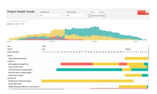
Azure Devops Dashboard - Stratada
The dashboard report for Azure DevOps enables high-level insight into the various work metrics managed. This view is useful for senior leaders, stakeholders and managers. Drill through from this view to see more details like the reports below. https://www.stratada.com/
#power bi timeline#Data Strategy#Continued Updates#microsoft project task board#microsoft project analysis
0 notes
Text
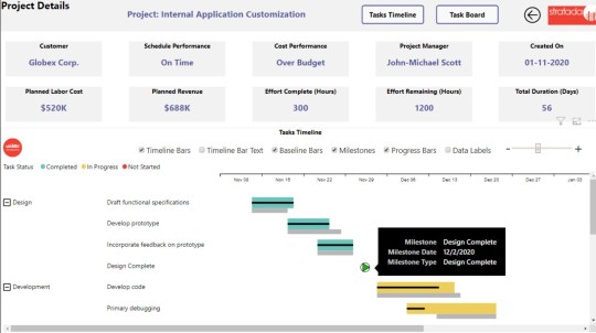
Ms Project Online - Stratada | Power BI Ms Project | Ms Project Dashboard
Our Microsoft Project Online reports help you stay on top of key performance indicators, analyze project progress, drill into project and resource details, and much more. Additionally, we work with you to develop professional-grade reports that meet the specific needs of your PMO. https://www.stratada.com/microsoft-project-online/
#power bi azure devops#power bi jira#power bi online#power bi drill through#Ms Project Online#Power BI Ms Project
0 notes
Text

Power Bi Smartsheet
Power BI and Smartsheet are two powerful tools that can help organizations manage their data and gain valuable insights. Power BI is a business analytics service provided by Microsoft, while Smartsheet is a cloud-based project management and collaboration tool. Both tools have unique features that make them useful in different scenarios, and when used together, they can provide an even more comprehensive solution for managing data.
Power BI is designed to help users visualize and analyze data. It can connect to a wide range of data sources, including Excel spreadsheets, cloud-based data services, and databases. Once connected, users can create interactive visualizations and reports that make it easy to understand trends and patterns in the data. Power BI also includes a variety of tools for data modeling, such as calculated columns and measures, which can be used to create more sophisticated visualizations and reports.
Smartsheet, on the other hand, is a project management tool that can help teams collaborate on tasks and projects. It provides a flexible and customizable interface that can be tailored to meet the specific needs of different teams and projects. Smartsheet includes features such as Gantt charts, calendars, and task lists, which make it easy to track progress and manage deadlines. Smartsheet also includes integrations with other tools, such as Salesforce and Jira, which can help teams streamline their workflows.
When used together, Power BI and Smartsheet can provide a powerful solution for managing data and projects. For example, a sales team might use Power BI to analyze sales data from different regions and products, and then use Smartsheet to manage the tasks and deadlines associated with following up on leads and closing deals. In this scenario, the sales team could use Power BI to create visualizations that highlight trends in sales data, such as which products are selling well in which regions.
For More Information Visit At:-->
0 notes
Text
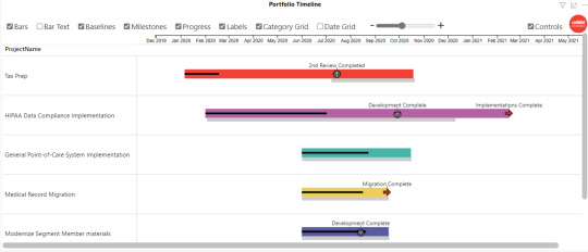
Stratada Timeline overview | Project Online Power Bi
Now that we have a good working knowledge of your business, types of data sources, and your overall goal, we will start brainstorming on the best approach to meeting your data analytics needs. This is where we hash out the prerequisites for step 3, such as optimizing data sources, compiling key metrics, and discussing the best way to visualize your data.
0 notes
Text

Five Steps To Business Success - We Help Companies Analyze Their Most Important Data
The following 5 steps serve as a general overview of the process involved in delivering high quality, professional-grade service to you. Each step is critical to the data analytics process, ensuring the ongoing success of your business, which means the success of our business. https://www.stratada.com/service/
#Companies Analyze#Five Steps To Business Succes#power bi timeline#power bi task board#power bi agile
0 notes
Text
Microsoft Power BI: Everything You Always Wanted To Know

Businesses work with a lot of data including information about customers and employees as well as metrics for corporate goals, sales, and acquisitions every day. However, you won't be able to produce anything if you can't connect with or access that essential data. Thus, you are preventing your organization from getting value. This is where Power BI (Business Intelligence) comes into play. It helps you quickly resolve the problem with data exchange and visualization. This blog contains some of the best Power BI use cases for your company.
What is Microsoft Power BI?
Microsoft Power BI is a collection of software services, connections, and apps that combine to turn unrelated data into visually spectacular and interactive insights. Both simple data sources like Microsoft Excel and complicated ones like cloud-based or on-premises hybrid data warehouses are compatible with Power BI.
Power BI components
The technology is made up of three components: Power BI Desktop, Power BI Service, and Mobile Power BI Apps that can be used on Windows phones and tablets, as well as Google Android devices and Apple iOS. These components allow users to most efficiently produce, distribute, and utilize actionable insights.
The fundamental components include visualizations, datasets, reports, dashboards, and tiles.
Power BI usage and role
Your approach to using Power BI may change depending on the position you hold. As a project stakeholder, for instance, you might want to use the Power BI Service or the Mobile app to gain a general idea of how the business is going. On the other side, a developer would utilize Power BI Desktop regularly to publish Power BI Desktop reports to the Power BI Service.
Power BI flow
Typically, a report is prepared at the Power BI Desktop, where the flow begins. This prepared report can be shared with others and uploaded to the Power BI Service so that people can access it from mobile apps.
The most typical method for exchanging reports is this one. There are other methods, but for the duration of this course, we'll stick with this flow to help you understand the many components of Power BI.
The typical activity flow in Power BI is as follows:
Import data into Power BI Desktop and generate a report Submit your work for publication to the Power BI service, where you can develop dashboards or new visualizations Make dashboards available to others, particularly mobile individuals Using Power BI Mobile apps, a view shared dashboards and reports and interact with them It is now easier than ever to gain insights thanks to Microsoft Power BI, a business intelligence tool that merges many data sources and generates dynamic, cohesive, and immersive graphics.
In conclusion, Power BI is an excellent and reliable option for businesses to gather, look through, and analyze data across the entire firm. The open and transparent insights it offers into operations and performance facilitate the ability to make well-informed decisions based on real-time data.
By harnessing the full potential of this fantastic Microsoft ecosystem technology, we, as experts in Power BI can assist businesses in gaining insightful data.
#power bi timeline#power bi gantt chart#power bi roadmap#power bi task board#Continued Updates#power bi agile
0 notes
Text
Importance Of Microsoft Power Bi
Non-technical business people may use Microsoft Power BI to gather, analyze, visualize, and share data with little effort. Excel users will have no problem getting to grips with Power BI's interface because of its tight interaction with other Microsoft applications and low learning curve.
Small and medium-sized businesses can use the accessible version of Power BI; a paid version called Power BI Plus is available. Power BI Desktop, Windows 10 software, and native mobile apps for Windows, Android, and iOS devices are available for download.
For businesses who need to keep their data and reports on-premises, Power BI Report Server is an option. From 2014 to 2018, the vendor's global market share of business intelligence and analytics software.
It is estimated that SAP's share of the business intelligence and analytics software market was 8.6% in 2018.Power BI Desktop for Power BI Report Server is the desktop program required for this specific version of Power BI.
Microsoft Business Applications:
Microsoft SharePoint Online We can unlock the potential of this knowledge base and business platform. Microsoft SharePoint Online lets users create individual sites as an organization and management entity.
Microsoft Dynamics CRM
We can help you better understand your opportunities and customers through deeper analysis, Customer relationship management (CRM) is a set of integrated, data-driven software solutions that help manage, track, and store information related to your …
Microsoft Project Online
Microsoft Project Online is the right way to manage portfolios, programs and projects. Let our reports give you the insights you need to stay on time, deliver great quality and manage your resources.
Visit Site For More Information: www.stratada.com
#power bi advantages and disadvantages#power bi benefits ppt#features of power bi#disadvantages of power bi#advantages of power bi over excel#benefits of power bi dashboard
1 note
·
View note