#Data Modeling
Explore tagged Tumblr posts
Visit Tumblr Blog
Explore Tumblr blogs with no restrictions, modern design and the best experience.
Last Seen Tumblr Blogs


Fun Fact
In 2020, Tumblr had 29.4 million users in the US.
Text


#lava lamp#tumblr screenshot#found on facebook#cybersecurity#data modeling#cyberpunk dystopian background stuff
46 notes
·
View notes
Text
Discover the Best Data Modeling Tools to Elevate Your Data Strategy
In today's data-driven world, organizations increasingly rely on data modeling to turn raw data into valuable insights. As businesses accumulate vast amounts of data, the need for effective data modeling tools becomes crucial. These tools not only help in creating structured data models but also enable data architects and analysts to make informed decisions. Let's explore some of the best tools available in the market for data modeling that can transform your data management approach.
What is Data Modeling?
Data modeling is the process of creating a visual representation of a data system's structure, which includes defining the data elements and their relationships. This process aids in identifying how data will be stored, accessed, and utilized across various applications. By using data modeling, organizations can design efficient databases, minimize redundancy, and maintain data integrity, ultimately leading to better business decisions.
Top Data Modeling Tools to Consider
With a variety of tools available, selecting the right one for your business needs can be challenging. Below is a rundown of some of the most popular and effective data modeling tools used by professionals today:
ER/Studio: Known for its powerful data modeling capabilities, ER/Studio offers a comprehensive suite for designing, documenting, and managing data models. It supports both logical and physical data modeling and integrates well with major databases.
ERwin Data Modeler: A leader in the market, ERwin Data Modeler provides a user-friendly interface and supports collaboration among teams. It offers robust data governance features, ensuring consistency and compliance across data assets.
IBM InfoSphere Data Architect: This tool is ideal for enterprises needing extensive data integration and modeling capabilities. It offers a range of features, such as automated data modeling, data mapping, and reverse engineering, making it suitable for complex data environments.
Toad Data Modeler: A flexible solution for both novice and experienced data architects, Toad Data Modeler supports multiple databases and allows for efficient data model creation, validation, and modification. It also provides powerful visualization tools for easier data understanding.
PowerDesigner: Developed by SAP, PowerDesigner offers robust capabilities for data modeling, enterprise architecture, and data governance. It is particularly useful for organizations that rely heavily on SAP environments.
Choosing the Right Data Modeling Tool
The right data modeling tool can significantly impact how effectively an organization manages its data. When selecting a tool, consider factors such as ease of use, integration with existing systems, scalability, and support for different database platforms. Additionally, think about your organization's specific data modeling needs—whether you require a tool for simple data models or a comprehensive solution for complex data environments.
Why Invest in Data Modeling Tools?
Investing in effective data modeling tools offers several benefits. These tools help in designing and managing data systems that are scalable, efficient, and aligned with business objectives. They also enhance collaboration among data professionals, reduce errors, and ensure data consistency and accuracy. As data continues to grow in volume and complexity, the importance of robust data modeling tools becomes even more pronounced.
Conclusion
Data modeling is an essential practice for organizations that aim to harness the power of their data. With the right data modeling tools, businesses can design effective data architectures that support their strategic goals, drive innovation, and provide a competitive edge in the market. By understanding your organization's unique data needs and selecting the most suitable tools, you can optimize your data management processes and unlock new insights from your data.
2 notes
·
View notes
Text
Bought a database design book older than me. Let's find out how the best practices have evolved since the 90s...

#data modeling#data model#vintage IT books#the language is very “CS Degree dense”#but the author near immediately made a not very covert dig at people who reuse free text fields for random other data#so he has my attention and support#(dys)functional analysis
3 notes
·
View notes
Text
Data Modelling Master Class-Series | Introduction -Topic 1
https://youtu.be/L1x_BM9wWdQ
#theDataChannel @thedatachannel @datamodelling
#data modeling#data#data architecture#data analytics#data quality#enterprise data management#enterprise data warehouse#the Data Channel#data design#data architect#entity relationship#ERDs#physical data model#logical data model#data governance
2 notes
·
View notes
Text
What is Logical Data Modeling and Why is it important?
Learn what logical data modeling is, why it matters, and how it bridges the gap between conceptual and physical models. Check out benefits, best practices, and how tools like ER/Studio support logical data modeling for scalable, platform-independent design.
Visit us to know more: https://erstudio.com/blog/what-is-logical-data-modeling-and-why-is-it-important/
1 note
·
View note
Text
Maximizing Report Creation: A Comparison of Power BI and Tableau Migration
Introduction: The Evolution of Business Intelligence
In the fast-paced business world, data visualization plays a pivotal role in driving strategic decisions. The choice of a business intelligence (BI) tool significantly impacts how organizations analyze and present their data. With technology continuously evolving, staying ahead with cutting-edge BI solutions is crucial for maintaining a competitive edge.
If you are currently using Tableau but are considering a switch to Power BI, you may be wondering whether it’s worth the effort. In this blog, we’ll guide you through the transition process, explore the key advantages of Power BI, and highlight best practices to ensure a smooth migration.
Data Source Connection: New Beginnings vs. Existing Connections
Building from Scratch: In Power BI, starting fresh with report creation means establishing new data connections.
Migration from Tableau: During migration, you connect to the pre-existing data sources that were used in Tableau, ensuring continuity and reducing the need for data reconfiguration.
Rebuilding in Power BI: Replication vs. New Creation
Building from Scratch: Creating reports from scratch allows full customization of visualizations and structure without constraints from existing designs, giving greater creative freedom.
Migration from Tableau: Migration requires replicating Tableau’s reports and visualizations, often involving reverse-engineering the work done in Tableau to rebuild similar dashboards and reports in Power BI.
Read More about Why Move from Tableau to Power BI: Key Benefits Explained
Translating Logic: Adapting Tableau’s Logic to DAX in Power BI
Building from Scratch: When creating reports from scratch, you have the flexibility to design new calculations using Power BI’s DAX language.
Migration from Tableau: One of the most intricate parts of migration is converting Tableau’s calculated fields and logic into Power BI’s DAX language, ensuring that functionality is retained while adapting to Power BI’s unique environment.
Styling and Formatting: Matching the Look vs. Redesigning from Scratch
Building from Scratch: Rebuilding reports in Power BI from scratch allows for more flexibility, offering a fresh, modern design aligned with current brand aesthetics and business needs.
Migration from Tableau: During migration, it’s often necessary to match the style and design of Tableau reports to ensure a consistent user experience.
Migration Challenges: Balancing Consistency and Flexibility
Building from Scratch: Starting fresh presents no challenges in maintaining consistency with previous designs but allows for full creative control.
Migration from Tableau: The migration process is more challenging than building from scratch, as it requires careful attention to replicating Tableau’s functionality and design to ensure the Power BI reports mirror the original in both appearance and performance.
Post-Migration Support: Ensuring a Smooth Transition to Power BI
Once the migration from Tableau to Power BI is complete, providing comprehensive post-migration support is vital to ensuring a smooth transition. This includes offering training sessions, preparing documentation that outlines the differences between Tableau and Power BI, and establishing dedicated channels for users to ask questions or report issues. These efforts will facilitate user adoption and ensure the transition to Power BI is both successful and sustainable.
Know more about Tableau to Power BI: Save Costs & Gain AI-Driven Insights
Key Considerations for Migrating from Tableau to Power BI
Calculated Columns and Measures: Understanding the Differences
Tableau: Tableau’s calculated fields enable users to perform a wide variety of in-platform calculations and dynamic analysis, creating new metrics and applying complex formulas.
Power BI: Power BI uses measures for similar functionality but requires translating Tableau’s logic into Power BI’s DAX language, which might involve some fine-tuning to maintain consistency.
Chart Creation: A Shift from Modularity to Flexibility
Tableau: Tableau uses a modular approach where each chart resides in a separate worksheet. This makes it easier to analyze individual visualizations but requires more effort to manage multiple charts.
Power BI: Power BI allows multiple charts to be placed on a single page for efficient comparison and analysis, offering greater flexibility and ease of comparison within a unified workspace.
Both Power BI and Tableau provide powerful charting capabilities. Power BI’s design allows for dynamic and interconnected visualizations, while Tableau’s modular approach emphasizes individual analysis of specific datasets.
Why Choose Acuvate?
At Acuvate, we help businesses seamlessly transition their BI tools to stay ahead in today’s data-driven world. As a trusted Microsoft partner, we ensure efficiency, security, and governance in analytics modernization.
Try our migration calculator: Seamlessly Transition from Tableau to Power BI with Acuvate
How Acuvate Supports Your Power BI Migration
1. Efficient Migration Strategy
Migrating from Tableau to Power BI can be complex, but Acuvate streamlines the process. Unlike traditional BI firms, we leverage automation and best practices to accelerate migration with minimal disruption.
2. Faster Adoption with Self-Service Analytics
Power BI empowers business users with self-service analytics. Acuvate ensures teams can independently create reports while maintaining data security and governance.
3. Seamless Microsoft Integration
As a Microsoft Solutions Partner, we integrate Power BI with Office 365, Azure, and Dynamics 365 to enhance insights and decision-making.
4. Scalable and Cost-Effective Solutions
We offer flexible managed services for security compliance, data governance, and ongoing support tailored to your business needs.
5. Cutting-Edge BI Technologies
Acuvate stays ahead of BI trends, collaborating closely with Microsoft to bring the latest innovations to our clients.
6. Reliable Support & Maintenance
Beyond migration, we ensure your Power BI environment remains optimized with continuous support and performance tuning.
7. Accelerated Data Transformation
Acuvate enhances Power BI migration with AcuWeave, our advanced Microsoft Fabric accelerator. AcuWeave streamlines data ingestion, transformation, and modeling, ensuring faster insights and seamless integration with your existing BI ecosystem.
Get Started with Acuvate Today
Whether you need a full-scale migration or phased transition, Acuvate is here to guide you. Contact us to leverage Power BI for smarter insights and decision automation.
Conclusion: Unlock the Power of Advanced BI
As businesses strive for smarter analytics and improved decision-making, Power BI emerges as a powerful alternative to Tableau. Its deep integration with Microsoft products, cost efficiency, and user-friendly experience make it an excellent choice for organizations looking to enhance their BI strategy.
With a structured migration approach and best practices in place, transitioning from Tableau to Power BI can be a game-changer for your business. Don’t hesitate to make the switch and unlock new insights to drive your company forward!
Ready to migrate? Reach out to our experts today and take the first step towards an optimized business intelligence experience with Power BI.
#powerbi#automation#tableau#migration#power bi solutions#Data visualization#data modeling#data governance#Migration tool#data transformation
0 notes
Text
DICS – Your Trusted Data Analytics Institute in Laxmi Nagar

In today’s data-driven world, the demand for skilled data analysts is skyrocketing. Whether you’re a student, working professional, or career switcher, mastering data analytics can open the door to numerous opportunities across industries. If you’re looking to start or advance your career in data analytics, choosing the right institute is crucial. Look no further — [Institute Name] is recognized as the best data analytics institute in Laxmi Nagar, offering industry-relevant training, expert faculty, and hands-on learning experiences that set you up for success.
Why Choose Us?
At [Institute Name], we believe in delivering more than just theoretical knowledge. Our mission is to equip you with the practical skills and insights needed to thrive in real-world data environments. Our data analytics program is designed by industry experts and regularly updated to match current trends and technologies. We focus on tools like Excel, SQL, Python, Power BI, Tableau, and R, ensuring that our students are proficient in all the key technologies employers are looking for.
Best Data Analytics Course in Laxmi Nagar
Our comprehensive curriculum makes us stand out as the provider of the best data analytics course in Laxmi Nagar. Whether you’re a beginner or have some background in analytics, our course structure is tailored to meet diverse learning needs. The course includes:
Introduction to Data Analytics
Data Visualization with Power BI & Tableau
Programming for Data Analytics (Python & R)
Statistical Analysis & Predictive Modeling
SQL for Data Management
Capstone Projects and Case Studies
With a strong emphasis on practical application, our course helps students build portfolios through real-time projects, giving them an edge in job interviews and professional scenarios.
Expert Faculty and Personalized Mentoring
We take pride in our experienced faculty, who bring years of industry and academic experience to the classroom. Our instructors not only teach but also mentor students, helping them with resume building, mock interviews, and job placement support. Our small batch sizes ensure personalized attention for every student.
100% Placement Assistance
Being the best data analytics institute in Laxmi Nagar, we offer complete placement support. We have partnerships with leading companies and regularly conduct hiring drives. Our dedicated placement team ensures that you are well-prepared for interviews and job roles, offering guidance every step of the way.
Convenient Location and Flexible Batches
Located in the heart of Laxmi Nagar, our institute is easily accessible by metro and public transport. We offer flexible batch timings — weekday, weekend, and online classes — making it convenient for both students and working professionals.
#Data Analysis#Data Visualization#Big Data#Data Science#Machine Learning#Predictive Analytics#Statistical Analysis#Data Mining#Business Intelligence#Data Modeling
0 notes
Text
0 notes
Text
Growth Warrior Capital Invests in AI Startups MenuData & Simulacra to Transform Data into Actionable Insights
New Post has been published on https://thedigitalinsider.com/growth-warrior-capital-invests-in-ai-startups-menudata-simulacra-to-transform-data-into-actionable-insights/
Growth Warrior Capital Invests in AI Startups MenuData & Simulacra to Transform Data into Actionable Insights

Silicon Valley-based Growth Warrior Capital (GWC), led by seasoned operator-turned-venture capitalist Promise Phelon, has announced two major investments into emerging AI startups MenuData and Simulacra Synthetic Data Studio. These investments precede the firm’s inaugural fund close, marking a strategic push into AI-driven consumer insights and data analytics.
GWC, alongside Brickyard, co-led a $2 million seed round into MenuData, an AI-powered platform leveraging the world’s largest proprietary dataset of menu items and ingredients to provide critical insights for the food and beverage industry. MenuData will use the funding to expand its team, accelerate product development, and pilot its technology with major brands such as Church’s Texas Chicken, Hyatt, and Dole.
Additionally, Simulacra Synthetic Data Studio secured $750K in pre-seed funding from GWC to scale customer growth and refine its AI-powered synthetic data platform. Simulacra’s proprietary technology enables real-time, high-quality synthetic data generation, allowing businesses to conduct advanced market research with greater speed and efficiency.
Revolutionizing Consumer Insights with AI
With U.S. consumer spending reaching an annualized $20.2 trillion in late 2024, businesses are under pressure to extract actionable insights from vast datasets. However, current data collection methods remain inefficient, resulting in high costs with limited returns. Recognizing these gaps, Phelon identified MenuData and Simulacra as leaders in AI-driven solutions poised to disrupt the consumer research space.
Promise Phelon, Founder and Managing Partner of GWC, said: “The Food & Beverage Big Data market is on track to hit $6.7 billion by 2030 at a staggering 35.4% CAGR, but brands still struggle to keep up with rapidly changing consumer preferences. Both MenuData and Simulacra bring next-generation AI capabilities to the table, offering precision, efficiency, and accuracy that legacy data providers simply cannot match.”
MenuData: AI-Driven Consumer Insights for Food & Beverage
MenuData is redefining how food brands, manufacturers, and distributors analyze consumer trends. Using AI-powered social listening and data aggregation, the platform predicts menu innovations, optimizes product strategies, and helps brands reduce the industry’s staggering 85% failure rate for new product launches.
The company’s AI-driven insights help manufacturers boost sales, enable operators to craft innovative recipes, and empower food distributors with targeted lead-generation tools. From identifying trending flavors to analyzing regional culinary shifts, MenuData provides real-time intelligence that allows businesses to act ahead of emerging trends.
Sunny Khamkar, CEO of MenuData, said: “GWC’s investment propels us forward in a way no other funding could. Promise’s deep operational expertise and network have been instrumental in refining our product and scaling our impact. We’re on a mission to become the go-to AI resource for food and beverage companies looking to stay ahead of evolving consumer demands.”
Simulacra: Synthetic Data for Advanced Market Research
Simulacra Synthetic Data Studio (SDS) is at the forefront of AI-driven synthetic data generation, enabling businesses to conduct predictive modeling and scenario-based research with unmatched precision. By transforming existing datasets into robust synthetic data, Simulacra allows companies to simulate consumer behavior, refine marketing strategies, and predict trends without the need for costly real-world studies.
The platform’s proprietary Conditional Generation technology ensures statistically significant, bias-free data generation, making it an indispensable tool for CPG brands, market researchers, and retailers. Co-founded by former Gastrograph AI executives Jason Cohen and Gerard Schweitzer, Simulacra is leveraging GWC’s investment to expand leadership, grow its customer base, and enhance its real-time data modeling capabilities.
Jason Cohen, Founder & CEO of Simulacra Synthetic Data Studio, said: “As seasoned founders, we value a VC partner who brings more than just capital. Promise’s network and strategic insights have already accelerated our market penetration, helping us land pilots and convert key customers. With her backing, we’re set to scale and redefine consumer data analysis.”
GWC’s Vision for AI-Powered Market Disruption
Growth Warrior Capital’s approach to venture investing is built on operational expertise and a deep understanding of industry phase changes. With Fund I, GWC aims to generate outsized returns by backing ‘dangerous’ founders—visionary entrepreneurs who are set to redefine their industries through AI-driven innovation.
Beyond capital investment, Phelon is committed to supporting underserved founders who may lack traditional venture network access. By offering hands-on guidance in strategic hiring, product roadmaps, and customer introductions, GWC is not just funding startups but actively shaping their success trajectories.
Looking ahead, GWC plans to increase its check sizes in 2025 as it continues to build momentum with its Fund I portfolio. With MenuData and Simulacra leading the charge, Phelon’s firm is poised to set a new benchmark in venture-backed AI investments, driving scalable growth and reshaping how businesses harness data to understand consumer behavior.
As AI continues to transform industries, Growth Warrior Capital is firmly positioned at the forefront—fueling groundbreaking technologies that will shape the future of consumer insights and market intelligence.
#2024#2025#ai#AI-powered#amp#Analysis#Analytics#approach#Behavior#benchmark#Bias#Big Data#billion#brands#CEO#chicken#Companies#consumer behavior#consumer data#CPG#craft#culinary#data#data analysis#data analytics#data collection#data modeling#data platform#datasets#development
0 notes
Text
Accepting, for the time being, that the Moon was born in some sort of giant impact, was the fact that two planets hit each other in a way that would form a large moon unlikely? In some ways, such questions do not matter. It happened, or it didn't; look at the evidence, make the models, get new data and deal with it.*
* Measurements of oxygen-isotope ratios in rocks from Venus would be very handy; if they are Earth-like, turn Theia could have been, too, and Mars is just an outlier. But getting rocks back from Venus is no easy task, and if there are any meteorites from Venus on Earth, they have yet to be identified.
"The Moon: A History for the Future" - Oliver Morton
#book quotes#the moon#oliver morton#nonfiction#questions#moon#impact#theia#tellus#theory#venus#mars#oxygen#isotope#meteorite#data modeling
0 notes
Text
[DataModeling] Tip DAX para autoreferencia o recurrencia de tabla
Hace tiempo que no nos sentrabamos en acompañar un escenario de modelado. En esta oportunidad, nos vamos a enfocar en como resolver una situación de auto referencia o recurrencia de tabla. Suele ocurrir que una tabla puede tener ids o claves de referencia para si misma y las formas de resolverlo pueden variar.
En este artículo, vamos a mostrar como valernos de DAX para resolver un esquema jerárquico corporativo que ayude a develar un organigrama organizacional basado en niveles o posiciones/cargos superiores.
Contexto
Entre las formas de modelar bases de datos transaccionales, buscamos normalizar los datos para evitar la redundancia lo más posible. Así es como pueden aparecer escenarios donde hay tablas que van a referenciarse a si mismas. Esto quiere decir que podemos tener una clave foránea apuntando a una clave primaria. Para no abordar tanta teoría veamos un ejemplo que ayude a enfocar el caso.
Nos enviaron un requerimiento que pide detallar un organigrama o estructura jerárquica en la organización que permita explorar la cantidad de empleados según distintos focos de mando. Piden que la información sea explorable, puede ser una matriz o árbol del siguiente estilo:
Árbol de decomposición
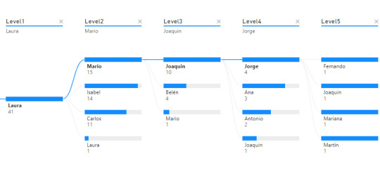
Matriz

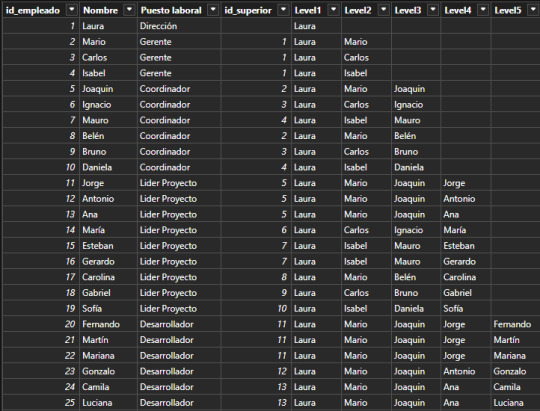
Supongamos que tenemos una tabla de Empleados en nuestra base de datos. La organización tiene un gran volumen de personal, lo que hace que naturalmente haya una estructura jerárquica con cargos de mando o de management. Todas las personas institucionales forman parte de la tabla empleados fila por fila. Sin embargo, necesitamos guardar información sobre la persona a la cual responden. Aquí aparece la auto referencia. Para resolver esta operación en vistas de base de datos transaccional, será más performante y menos costoso delimitar una nueva columna que autoreferencie a otra fila en lugar de otras tablas para los cargos pertinentes. Veamos como quedaría una tabla con la nueva columna:

Fíjense que la columna id_superior pertenece a un id_empleado de otra fila. Cuando esto ocurre, estamos frente a un caso de auto referencia.
Dependiendo el proceso y escenario a delimtiar en nuestro modelo semántico, puede ser resuelto de distintas formas. Podríamos generar fact factless que orienten un mapeo de quienes responden a quienes o podemos tomar esta tabla como dimensión y generar columnas que representen el mando jerárquico como columnas categóricas de la dimension.
Este artículo se enfocará en la segunda solución. Vamos a generar columnas categoricas que nos ayuden a construir algo semejante a lo siguiente:

La idea es generar columns por cantidad de niveles jerárquicos que se presenten. Si bien la mejor solución es implementarlo lo más temprano posible, es decir en un warehouse, lakehouse o procesamiento intermedio; aquí vamos a mostrar como crear las columnas con DAX.
Vamos a crear una columna calculada de la siguiente manera:
Level1 = LOOKUPVALUE( Empleados_Jerarquia[Nombre] , Empleados_Jerarquia[id_empleado] , PATHITEM( PATH ( Empleados_Jerarquia[id_empleado], Empleados_Jerarquia[id_superior]) , 1 , INTEGER ) )
Vamos a nutrirnos de tres funciones para generar un recorrido dentro de la misma tabla.
LOOKUPVALUE: Esta función busca un valor en una columna específica de una tabla, basándose en criterios de búsqueda. En este caso, está buscando el nombre de un empleado con criterio de igualdad entre id_empleado que mapee al id_superior de la fila actual.
PATH: Esta función crea una cadena que representa la jerarquía de empleados, utilizando los id_empleado y id_superior. Busca los ID y los separa por Pipes. Entonces por ejemplo en la fila de ID = 5 de Joaquín. El resultado de Path será "1|2|5" representando que los ID de sus superiores son primero el empleado 2 y luego el empleado 1.
PATHITEM(..., 1, INTEGER): Esta función toma la cadena generada por PATH y extrae un elemento de ella. En este caso, está extrayendo el primer elemento (el id del empleado que está en la posición 1). Aquí, el 1 se refiere a la posición que queremos extraer (el primer ítem en la jerarquía). Si Joaquín tenía 3 valores, vamos a buscar el de la primera posición, en este caso "1".
Resultado: lookupvalue buscara el nombre del empleado con ID 1 para la columna.
Esta función podríamos replicarla para cada nivel. La función antes vista traería el primero de la cadena, es decir la dirección de la empresa. Para llegar al siguiente nivel cambiamos el parametro de pathitem de manera que traiga el segundo resultado de Path en sus pipes.
Level2 = LOOKUPVALUE( Empleados_Jerarquia[Nombre] , Empleados_Jerarquia[id_empleado] , PATHITEM( PATH ( Empleados_Jerarquia[id_empleado], Empleados_Jerarquia[id_superior]) , 2 , INTEGER ) )
En primera instancia esto parecería resolverlo. Este sería nuestro resultado:
Esta puede ser una solución directa si solo queremos navegar por nombres de personas en cadena (filtramos Level5 <> Blank). Sin embargo, si también quisieramos conocer la cantidad de personas que tienen a cargo, es necesario contar a la persona al mando como parte del equipo, sino generaríamos una cadena de "Blanks" como pueden ver en niveles del 2 al 5. Esto lo podemos corregir copiando el nivel anterior cuando ocurre un blanco.
Level2 = VAR __lvl2 = LOOKUPVALUE( Empleados_Jerarquia[Nombre] , Empleados_Jerarquia[id_empleado] , PATHITEM( PATH ( Empleados_Jerarquia[id_empleado], Empleados_Jerarquia[id_superior]) , 2 , INTEGER ) ) RETURN IF ( ISBLANK(__lvl2) , Empleados_Jerarquia[Level1], __lvl2 )
De esa forma el equipo de Laura (primera) cuenta con tres gerentes y si misma al conteo total de empleados.
Las visualizaciones pueden ser construidas por cada nivel como columnas categóricas de las dimensiones:
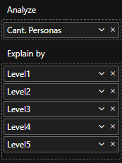
Así mismo podría usarse el nombre del cargo como nombre de columna para ver la pirámide institucional de una manera más sencilla.
De esta forma llegaríamos al resultado esperado y mostrado en la primera imagen de requerimiento.
Ojala esta solución les sirva para resolver situaciones de modelado recursivo. Recuerden que si podemos ejecutar esto en SQL en nuestra capa de transformación, sería lo mejor para construir la dimensión. Como siempre pueden descargar el archivo de ejemplo de mi GitHub.
#dax#dax tip#dax tutorial#dax training#data modeling#powerbi#power bi#power bi desktop#power bi cordoba#power bi argentina#power bi jujuy#ladataweb
0 notes
Text
What is Data Science? A Comprehensive Guide for Beginners

In today’s data-driven world, the term “Data Science” has become a buzzword across industries. Whether it’s in technology, healthcare, finance, or retail, data science is transforming how businesses operate, make decisions, and understand their customers. But what exactly is data science? And why is it so crucial in the modern world? This comprehensive guide is designed to help beginners understand the fundamentals of data science, its processes, tools, and its significance in various fields.
#Data Science#Data Collection#Data Cleaning#Data Exploration#Data Visualization#Data Modeling#Model Evaluation#Deployment#Monitoring#Data Science Tools#Data Science Technologies#Python#R#SQL#PyTorch#TensorFlow#Tableau#Power BI#Hadoop#Spark#Business#Healthcare#Finance#Marketing
0 notes
Text
Data Engineering Interview Questions and Answers
Summary: Master Data Engineering interview questions & answers. Explore key responsibilities, common topics (Big Data's 4 Vs!), and in-depth explanations. Get interview ready with bonus tips to land your dream Data Engineering job!

Introduction
The ever-growing volume of data presents exciting opportunities for data engineers. As the architects of data pipelines and custodians of information flow, data engineers are in high demand.
Landing your dream Data Engineering role requires not only technical proficiency but also a clear understanding of the specific challenges and responsibilities involved. This blog equips you with the essential Data Engineering interview questions and answers, helping you showcase your expertise and secure that coveted position.
Understanding the Role of a Data Engineer
Data engineers bridge the gap between raw data and actionable insights. They design, build, and maintain data pipelines that ingest, transform, store, and analyse data. Here are some key responsibilities of a data engineer:
Data Acquisition: Extracting data from various sources like databases, APIs, and log files.
Data Transformation: Cleaning, organizing, and transforming raw data into a usable format for analysis.
Data Warehousing and Storage: Designing and managing data storage solutions like data warehouses and data lakes.
Data Pipelines: Building and maintaining automated processes that move data between systems.
Data Security and Governance: Ensuring data security, access control, and compliance with regulations.
Collaboration: Working closely with data analysts, data scientists, and other stakeholders.
Common Data Engineering Interview Questions
Now that you understand the core responsibilities, let's delve into the most frequently asked Data Engineering interview questions:
What Is the Difference Between A Data Engineer And A Data Scientist?
While both work with data, their roles differ. Data engineers focus on building and maintaining data infrastructure, while data scientists use the prepared data for analysis and building models.
Explain The Concept of Data Warehousing And Data Lakes.
Data warehouses store structured data optimized for querying and reporting. Data lakes store both structured and unstructured data in a raw format, allowing for future exploration.
Can You Describe the ELT (Extract, Load, Transform) And ETL (Extract, Transform, Load) Processes?
Both ELT and ETL are data processing techniques used to move data from various sources to a target system for analysis. While they achieve the same goal, the key difference lies in the order of operations:
ELT (Extract, Load, Transform):
Extract: Data is extracted from its original source (databases, log files, etc.).
Load: The raw data is loaded directly into a data lake, a large storage repository for raw data in various formats.
Transform: Data is transformed and cleaned within the data lake as needed for specific analysis or queries.
ETL (Extract, Transform, Load):
Extract: Similar to ELT, data is extracted from its source.
Transform: The extracted data is cleansed, transformed, and organized into a specific format suitable for analysis before loading.
Load: The transformed data is then loaded into the target system, typically a data warehouse optimized for querying and reporting.
What Are Some Common Data Engineering Tools and Technologies?
Data Engineers wield a powerful toolkit to build and manage data pipelines. Here are some essentials:
Programming Languages: Python (scripting, data manipulation), SQL (database querying).
Big Data Frameworks: Apache Hadoop (distributed storage & processing), Apache Spark (in-memory processing for speed).
Data Streaming: Apache Kafka (real-time data pipelines).
Cloud Platforms: AWS, GCP, Azure (offer data storage, processing, and analytics services).
Data Warehousing: Tools for designing and managing data warehouses (e.g., Redshift, Snowflake).
Explain How You Would Handle a Situation Where A Data Pipeline Fails?
Data pipeline failures are inevitable, but a calm and structured approach can minimize downtime. Here's the key:
Detect & Investigate: Utilize monitoring tools and logs to pinpoint the failure stage and root cause (data issue, code bug, etc.).
Fix & Recover: Implement a solution (data cleaning, code fix, etc.), potentially recover lost data if needed, and thoroughly test the fix.
Communicate & Learn: Keep stakeholders informed and document the incident, including the cause, solution, and lessons learned to prevent future occurrences.
Bonus Tips: Automate retries for specific failures, use version control for code, and integrate data quality checks to prevent issues before they arise.
By following these steps, you can efficiently troubleshoot data pipeline failures and ensure the smooth flow of data for your critical analysis needs.
Detailed Answers and Explanations
Here are some in-depth responses to common Data Engineering interview questions:
Explain The Four Vs of Big Data (Volume, Velocity, Variety, And Veracity).
Volume: The massive amount of data generated today.
Velocity: The speed at which data is created and needs to be processed.
Variety: The diverse types of data, including structured, semi-structured, and unstructured.
Veracity: The accuracy and trustworthiness of the data.
Describe Your Experience with Designing and Developing Data Pipelines.
Explain the specific tools and technologies you've used, the stages involved in your data pipelines (e.g., data ingestion, transformation, storage), and the challenges you faced while designing and implementing them.
How Do You Handle Data Security and Privacy Concerns Within a Data Engineering Project?
Discuss security measures like access control, data encryption, and anonymization techniques you've implemented. Highlight your understanding of relevant data privacy regulations like GDPR (General Data Protection Regulation).
What Are Some Strategies for Optimising Data Pipelines for Performance?
Explain techniques like data partitioning, caching, and using efficient data structures to improve the speed and efficiency of your data pipelines.
Can You Walk us Through a Specific Data Engineering Project You've Worked On?
This is your opportunity to showcase your problem-solving skills and technical expertise. Describe the project goals, the challenges you encountered, the technologies used, and the impact of your work.
Tips for Acing Your Data Engineering Interview
Acing the Data Engineering interview goes beyond technical skills. Here, we unveil powerful tips to boost your confidence, showcase your passion, and leave a lasting impression on recruiters, ensuring you land your dream Data Engineering role!
Practice your answers: Prepare for common questions and rehearse your responses to ensure clarity and conciseness.
Highlight your projects: Showcase your technical skills by discussing real-world Data Engineering projects you've undertaken.
Demonstrate your problem-solving skills: Be prepared to walk through a Data Engineering problem and discuss potential solutions.
Ask insightful questions: Show your genuine interest in the role and the company by asking thoughtful questions about the team, projects, and Data Engineering challenges they face.
Be confident and enthusiastic: Project your passion for Data Engineering and your eagerness to learn and contribute.
Dress professionally: Make a positive first impression with appropriate attire that reflects the company culture.
Follow up: Send a thank-you email to the interviewer(s) reiterating your interest in the position.
Conclusion
Data Engineering is a dynamic and rewarding field. By understanding the role, preparing for common interview questions, and showcasing your skills and passion, you'll be well on your way to landing your dream Data Engineering job.
Remember, the journey to becoming a successful data engineer is a continuous learning process. Embrace challenges, stay updated with the latest technologies, and keep pushing the boundaries of what's possible with data.
#Data Engineering Interview Questions and Answers#data engineering interview#data engineering#engineering#data science#data modeling#data engineer#data engineering career#data engineer interview questions#how to become a data engineer#data engineer jobs
0 notes
Text
Understanding Database Sharding
Imagine you have a library with thousands of books, and finding a specific one becomes time-consuming. To speed things up, you decide to split the collection into smaller sections based on genres, making it quicker to locate any book.
Similarly, Database Sharding divides a large database into smaller, more manageable pieces to improve performance and scalability.
Fig: Database Sharding Banner Image
What is a Sharding Database
Database sharding is like storing a huge database across several machines. Imagine one server trying to handle all the data—it can only do so much before it starts slowing down. By splitting the data into smaller chunks, or shards, and storing these across multiple servers, we can manage and process large amounts of data more efficiently.
As an application grows, more users and data can turn the database into a bottleneck, slowing everything down and frustrating users. Sharding also helps by allowing parallel processing of these smaller datasets, keeping things running smoothly even as demand increases.
Scaling Techniques in Database Sharding
Scaling database sharding involves several techniques to ensure efficient management and distribution of data. Here are some key methods:
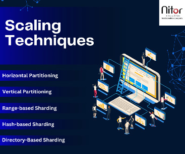
Horizontal Partitioning
This technique involves splitting the data across multiple servers based on a sharding key, such as user ID or geographic region. Each server, or shard, contains a subset of the overall data. This approach allows the system to scale out by adding more servers, thereby distributing the load and improving performance and reliability.
Vertical Partitioning
This technique divides the database into smaller tables, each stored on different servers. Each server handles a specific aspect of the application, such as user profiles, transactions, or product details. By separating the data based on functionality, vertical partitioning can improve query performance and make it easier to manage and scale specific parts of the application independently.
Range-Based Sharding
Distributes data management based on a continuous range of values. For example, user IDs 1-1000 on one shard, and 1001-2000 on another.
Hash-Based Sharding
Uses a hash function on the sharding key to evenly distribute data across shards. This helps avoid uneven data distribution.
Directory-Based Sharding
Maintains a lookup table or directory that maps each data item to its corresponding shard. This allows flexible and dynamic distribution of data.
Each technique has its advantages and is chosen based on the specific needs and growth patterns of the application.
Benefits of Database Sharding
Database sharding offers several benefits:
Improved Performance: By distributing the data across multiple servers, each server handles a smaller subset of the data, reducing the load and improving query response times.
Scalability: Sharding allows horizontal scaling, meaning you can add more servers to handle the increased load, making it easier to scale the database as the application grows.
Increased Availability: With data distributed across multiple servers, the system can continue to operate even if one shard fails. This redundancy enhances the overall availability and reliability of the application.
Efficient Resource Utilization: Different shards can be optimized for specific workloads, allowing better use of hardware resources. For instance, high-traffic shards can be allocated more resources, while less busy shards use fewer resources.
Reduced Maintenance: Smaller databases are easier to back up, restore, and maintain. Sharding breaks down the database into more manageable pieces, simplifying administrative tasks.
Factors to consider before Sharding
Before deciding to shard your database, consider the following factors:
Database Size: Sharding is typically suitable for large databases that have outgrown the capacity of a single server.
Traffic Patterns: If your database experiences uneven traffic patterns, sharding can help balance the load.
Growth Projections: If significant future scaling is anticipated, sharding can be a beneficial strategy.
Complexity: Sharding introduces additional complexity to your database architecture and requires careful planning and ongoing maintenance.
Cost: Sharding can be costly due to the need for extra hardware resources and infrastructure to support multiple servers.
So, database sharding offers both advantages and challenges, and it is important to determine if it aligns with your application’s requirements.
To know more about database management, reach out to us at Nitor Infotech.
#Database Sharding#Nitor Infotech#software development company#database management#big data#data modeling#data architecture#software services
0 notes
Text
Creating an Effective Power BI Dashboard: A Comprehensive Guide

Introduction to Power BI Power BI is a suite of business analytics tools that allows you to connect to multiple data sources, transform data into actionable insights, and share those insights across your organization. With Power BI, you can create interactive dashboards and reports that provide a 360-degree view of your business.
Step-by-Step Guide to Creating a Power BI Dashboard
1. Data Import and Transformation The first step in creating a Power BI dashboard is importing your data. Power BI supports various data sources, including Excel, SQL Server, Azure, and more.
Steps to Import Data:
Open Power BI Desktop.
Click on Get Data in the Home ribbon.
Select your data source (e.g., Excel, SQL Server, etc.).
Load the data into Power BI.
Once the data is loaded, you may need to transform it to suit your reporting needs. Power BI provides Power Query Editor for data transformation.
Data Transformation:
Open Power Query Editor.
Apply necessary transformations such as filtering rows, adding columns, merging tables, etc.
Close and apply the changes.
2. Designing the Dashboard After preparing your data, the next step is to design your dashboard. Start by adding a new report and selecting the type of visualization you want to use.
Types of Visualizations:
Charts: Bar, Line, Pie, Area, etc.
Tables and Matrices: For detailed data representation.
Maps: Geographic data visualization.
Cards and Gauges: For key metrics and KPIs.
Slicers: For interactive data filtering.
Adding Visualizations:
Drag and drop fields from the Fields pane to the canvas.
Choose the appropriate visualization type from the Visualizations pane.
Customize the visual by adjusting properties such as colors, labels, and titles.
3. Enhancing the Dashboard with Interactivity Interactivity is one of the key features of Power BI dashboards. You can add slicers, drill-throughs, and bookmarks to make your dashboard more interactive and user-friendly.
Using Slicers:
Add a slicer visual to the canvas.
Drag a field to the slicer to allow users to filter data dynamically.
Drill-throughs:
Enable drill-through on visuals to allow users to navigate to detailed reports.
Set up drill-through pages by defining the fields that will trigger the drill-through.
Bookmarks:
Create bookmarks to capture the state of a report page.
Use bookmarks to toggle between different views of the data.
Different Styles of Power BI Dashboards Power BI dashboards can be styled to meet various business needs. Here are a few examples:
1. Executive Dashboard An executive dashboard provides a high-level overview of key business metrics. It typically includes:
KPI visuals for critical metrics.
Line charts for trend analysis.
Bar charts for categorical comparison.
Maps for geographic insights.
Example:
KPI cards for revenue, profit margin, and customer satisfaction.
A line chart showing monthly sales trends.
A bar chart comparing sales by region.
A map highlighting sales distribution across different states.
2. Sales Performance Dashboard A sales performance dashboard focuses on sales data, providing insights into sales trends, product performance, and sales team effectiveness.
Example:
A funnel chart showing the sales pipeline stages.
A bar chart displaying sales by product category.
A scatter plot highlighting the performance of sales representatives.
A table showing detailed sales transactions.
3. Financial Dashboard A financial dashboard offers a comprehensive view of the financial health of an organization. It includes:
Financial KPIs such as revenue, expenses, and profit.
Financial statements like income statement and balance sheet.
Trend charts for revenue and expenses.
Pie charts for expense distribution.
Example:
KPI cards for net income, operating expenses, and gross margin.
A line chart showing monthly revenue and expense trends.
A pie chart illustrating the breakdown of expenses.
A matrix displaying the income statement.
Best Practices for Designing Power BI Dashboards To ensure your Power BI dashboard is effective and user-friendly, follow these best practices:
Keep it Simple:
Avoid cluttering the dashboard with too many visuals.
Focus on the most important metrics and insights.
2. Use Consistent Design:
Maintain a consistent color scheme and font style.
Align visuals properly for a clean layout.
3. Ensure Data Accuracy:
Validate your data to ensure accuracy.
Regularly update the data to reflect the latest information.
4. Enhance Interactivity:
Use slicers and drill-throughs to provide a dynamic user experience.
Add tooltips to provide additional context.
5. Optimize Performance:
Use aggregations and data reduction techniques to improve performance.
Avoid using too many complex calculations.
Conclusion Creating a Power BI dashboard involves importing and transforming data, designing interactive visuals, and applying best practices to ensure clarity and effectiveness. By following the steps outlined in this guide, you can build dashboards that provide valuable insights and support data-driven decision-making in your organization. Power BI’s flexibility and range of visualizations make it an essential tool for any business looking to leverage its data effectively.
#Dynamic Data Visualization#Business Analytics#Interactive Dashboards#Data Insights#Data Transformation#KPI Metrics#Real-time Reporting#Data Connectivity#Trend Analysis#Visual Analytics#Performance Metrics#Data Modeling#Executive Dashboards#Sales Performance#Financial Reporting#Data Interactivity#Data-driven Decisions#Power Query#Custom Visuals#Data Integration
0 notes
Text
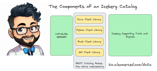
ICEBERG REST CATALOG DEEP DIVE
Apache Iceberg catalogs serve a particular purpose to enable tools to discover the most current version of a tables metadata. Each catalog can be queried and returns the file location of a tables latest “metadata.json” where snapshots, partitioning and schemas can be understood.
Creating a catalog requires not only designing the server application but client libraries that pair with the iceberg library in each language (Java, Python, Rust, Go). This means you have to maintain 5 things for a custom catalog.
- The Server Application Code
- 4 clients libraries for each language
The REST catalog specification eliminates the need to write the 4 client libraries. If the server application implements all the REST endpoints in the specification the existing REST catalog libraries in each language can be used.
This enables catalogs to be written in any language, makes them easier to maintain and gives them access to most of the Iceberg ecosystem out of the gate without having to solicit vendors to create custom support for each catalog.
Nessie, Polaris and Gravitino are catalogs that have two compelling points in their favor:
- Open Source, so you can self-manage your own catalog if you prefer or use a service (Dremio provides hosted Nessie catalogs and Snowflake will provide hosted Polaris)
- They implement the REST Catalog specification allowing them to connect to any tool that supports REST catalog.
0 notes