struppimax
struppimax
Einige Links zu anderen Seiten:
Instagram
YouTube
66 posts
Don't wanna be here? Send us removal request.
Last Seen Blogs

crozicrs
ERROR

dj3755626
Untitled

plain-old-dope-blog
Mr. Universe

bronnie-shipping-on-ebay
Colour in Furniture

buronson-r
Through the Insanity
Photo
what the frick frack tickity tic tac snick snack i mean not entirely my fandoms, but i am not very active but... how?


Welcome to Tumblr.
828K notes
·
View notes
Photo
hmm, i doubt it will work but maybe...?
Welcome to Tumblr.
828K notes
·
View notes
Photo
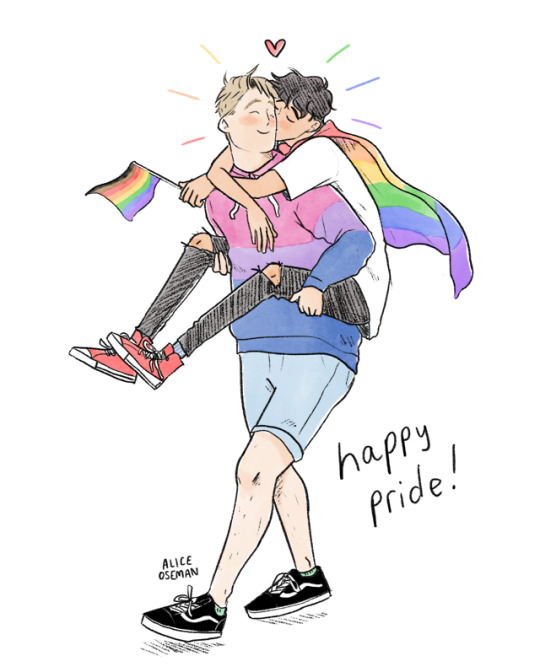
HAPPY PRIDE MONTH, EVERYONE! I of course had to draw a new bit of Pride art featuring my dear Nick and Charlie from @heartstoppercomic
Thank you so much for all the pride-themed prompts!! I have so many things I want to draw for pride month now…
4K notes
·
View notes
Photo


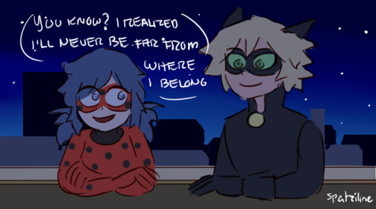
You know, for a show entirely designed around the concept that “flaws” are wonderful and how we should tolerate and understand differences… the fandom sure has a problem accepting characters going slightly off-model…
25K notes
·
View notes
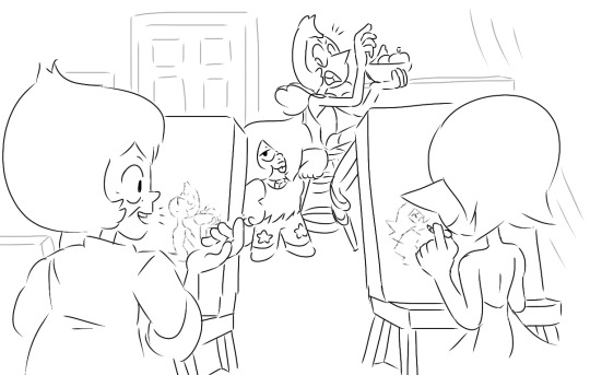
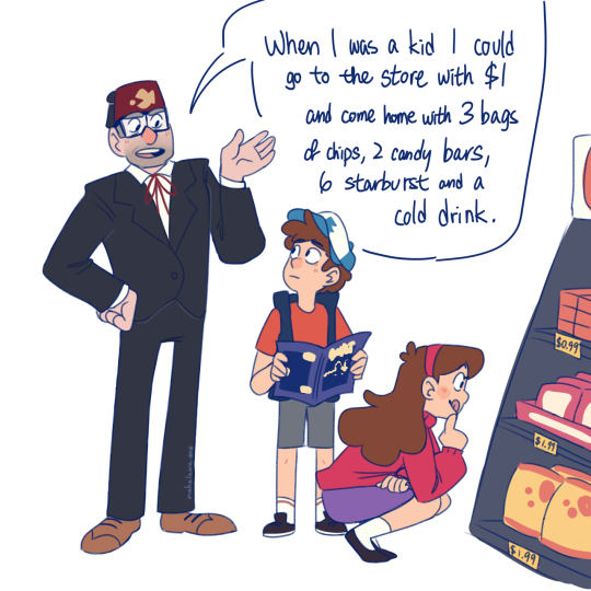
Photo
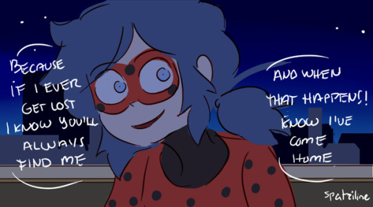
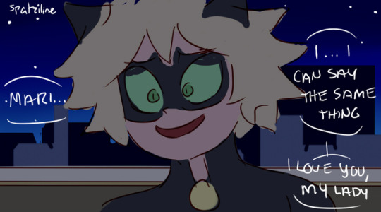
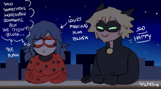
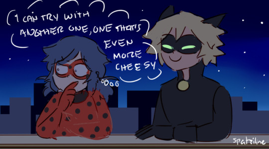

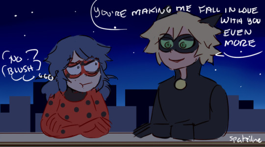
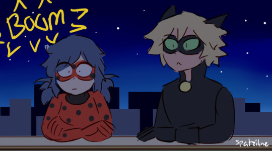
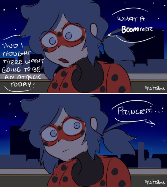
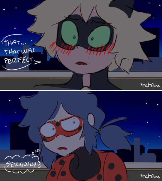
Seriously??! That!? (Post-Reveal) Don’t get me wrong, Adrien LOVED all the romantic things Mari said lolol.
+Patreon+
5K notes
·
View notes

Text
How to change back to the old dashboard design!
since all our eyes are bleeding because of the new design
guess this only works for computers, but idk
1. install "stylish" to your browser!
2. go back to tumblr
3. click on the stylish symbol
4. search for "old tumblr dashboard colour" or sth like that
(found that here: https://userstyles.org/styles/168394/old-tumblr-dashboard-colour)
5. click "install style"
ywc,
struppi
1 note
·
View note
Text
This is were it all started!
It isn't cleaner. It looks like somebody scratched off the protection film of tumblr. Now our eyes and heads hurt.
#36465D was the colour of tumblr. Now that it is gone it doesn't feel like tumblr anymore.
"Goodbye, #36465D. You’ve treated many of us well, but #001935 will treat every single one of us even better." Excuse me... what!? It literally gave some people physical pain and made some very sad.
That's why I say: Bring back #36465D!
Tumblr is getting a facelift
Some time ago we took a long, hard look at how we stacked up to the recommendations outlined in the Web Accessibility Initiative of the World Wide Web Consortium. This is the initiative that sets standards for accessibility for people who may need assistance using the internet. It outlines steps to take and tools to use to create as seamless of an experience online as possible, whether you have auditory, visual, or neurological disabilities, are using a limited device, are on a slow connection with limited bandwidth, or…well, a whole bunch of other reasons.
The result of that long, hard look? Not great. We needed to make sure Tumblr was accessible to anyone who wants to use it.
Over the past few weeks we’ve been making changes to do just that. Our inaccessible menus are more accessible, we fixed our poorly described elements, and increased overall readability. You can read more about all that in our most recent @javascript post about the mobile web.
Part of making Tumblr more accessible involved upping the color contrast in our UI, most notably on the dashboard and everywhere else that familiar blue touches. The light grays and muted blues had a contrast ratio of 2.02:1. What does that mean? Bad. It was bad, and we needed to do better by people with visual impairments.
Enter your new dashboard:

It looks…cleaner, doesn’t it? Like someone dusted off the poorly accessible bits. The blue is darker, the grays are lighter, all the buttons and icons are brighter with our new brand colors, and it has a contrast ratio of 7.87:1 What does that mean? Good! Very good.
The switch to your brand new, higher contrast, less dusty dashboard has been slowly rolling out this week. If you haven’t seen it yet, you’ll get it sometime in the next few days.
A note: We know that this color change on the dashboard negatively impacts the beautiful bluespace art so many of you have created over the past few years. Seeing these older posts lose the utilization of the dashboard—something that made them so special and unique to just Tumblr—is certainly not a great feeling. There’s no way around that. We hope, however, that this change only means newer, more bluespace art will be created, and that this time around it will be easier for everyone to experience.
Goodbye, #36465D. You’ve treated many of us well, but #001935 will treat every single one of us even better.
#36465D#bringback36465D#001935#tumblr why the colour change#tumblr no#bring back the old colour#bring back 36465D
57K notes
·
View notes
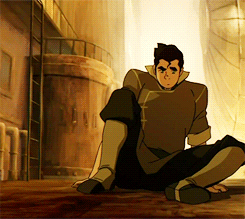
Photo
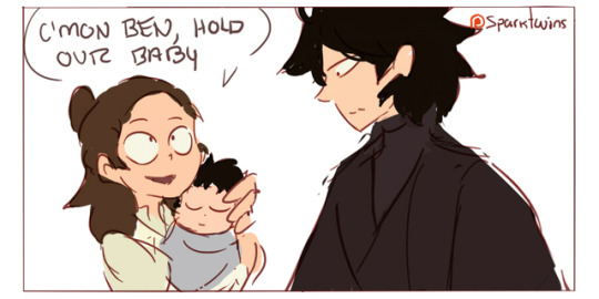
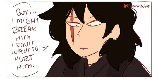

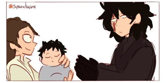
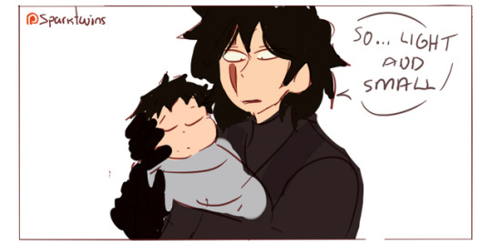
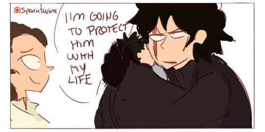
Hold Him (This was posted two weeks on Patreon, thanks for your support!)
4K notes
·
View notes
Text
Yeah, #001935 is quite ugly. And the text almost blinded me so… that
6 notes
·
View notes
Text
female-presenting nipples bad
#36465D bad
#001935 good
18 notes
·
View notes
Text
i miss #36465D
1 note
·
View note
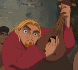
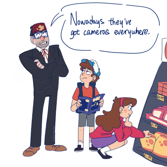
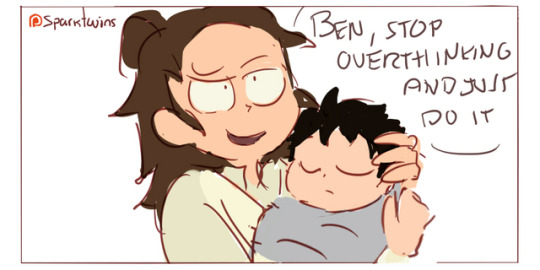
Photo
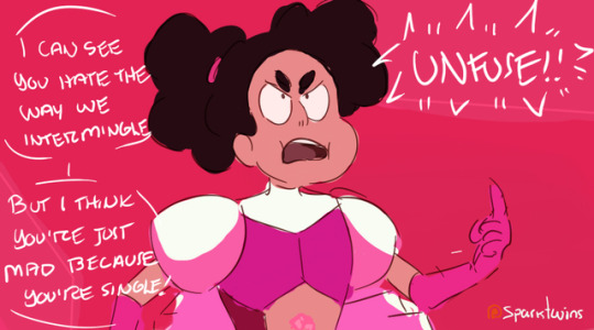
Good One! (This was posted two weeks ago on Patreon, thanks for your support!) But oh how different things were two weeks ago before the season finale…
3K notes
·
View notes