
sugarfreemaplesyrup
Just Another Trekkie Side Blog
star trek side blog.
tos/tng/ds9/voy.
mostly garak and ds9. i like neelix and pulaski.
main is amortaldothapproach.
1632 posts
Don't wanna be here? Send us removal request.
Last Seen Blogs

introspx
tyniepixels

johnbrowton-blog
Untitled

staypositivexstaytrue
live for yourself

velrenxy-rhoven
Welcome to Velrenxy's world.

alvagf
Untitled
Text


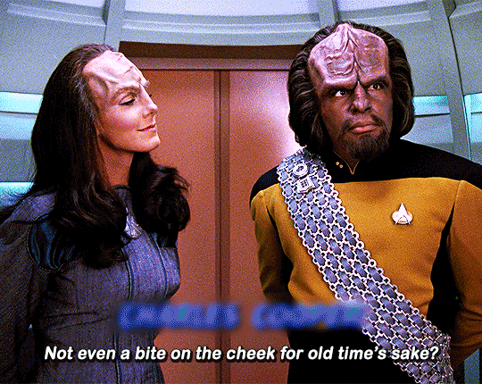
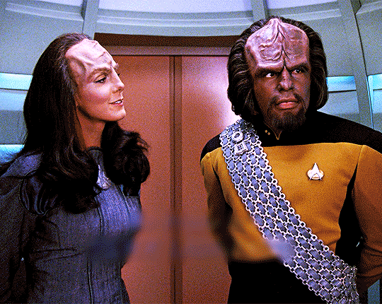
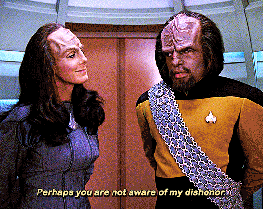
Worf and his Klingon shenanigans
2K notes
·
View notes
Text

One of my favorite scenes in Star Trek Enterprise's "Regeneration."
199 notes
·
View notes
Text


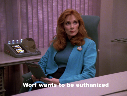
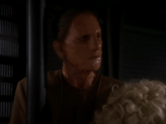
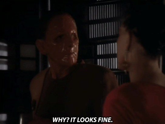
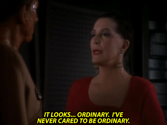
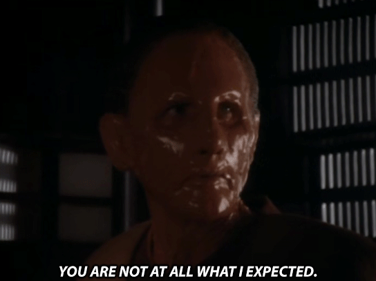
Star Trek: The Next Generation - 4x23 "The Host"
554 notes
·
View notes
Photo


Star Trek: Deep Space Nine // S01E17 The Forsaken
4K notes
·
View notes
Text
I had a powerful urge come upon me and I was helpless against it.
14K notes
·
View notes
Text
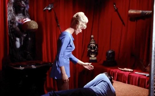
spock’s room decor is actually fucking bonkers. The weapons??? the big red velvet curtain??? like ok phantom of the opera go crazy.

for reference jim’s room has some photos and a plant so we can surmise this is uniquely a spock being a dramatic weirdo thing
40K notes
·
View notes
Note
Hey, I was just reading your post about the eyeshadow (love it by the way) and you mention something about the gold uniforms actually being green? Do you have more info on that because that’s blowing my mind right now.
Sure! I’m veryglad you enjoyed that post. I hope you enjoy this one as well.
There’s not ahuge amount to tell, as far as I know, but yes, the original commanduniform shirts on TOS were meant to be green, and evidently lookedperfectly green on set. But something about the fabric they were madeof made them show up as yellow/gold with the combination of studiolights and camera weirdness. Here’s a bit from an old interviewwith William Ware Thiess [source]:
The three Starfleetcolors were blue, red and green. Lime green, to be exact. “It wasone of those film stock things;” Theiss states, “it photographedone way - burnt orange or a gold. But in reality was another; thecommand shirts were definitely green.”
There’s anoticeable remnant of this design in the show, which is that Kirk’swraparound shirt, and the command dress uniform tunics, are greeninstead of yellow. Evidently this is the green we were meant to beseeing all along, which appeared more accurately on film because ofthe different composition of the fabrics.

[ID: Threescreenshots of Kirk. On the top left, Kirk on the bridge wearing hisgreen wrap-around tunic. On the top right, Kirk attending Spock’scourt martial in his green and gold dress tunic with the medals onthe chest. Bottom center, Kirk standing next to the captain’s chairin his regular gold uniform tunic.]
The regular uniformshirts for the first two seasons were made of velour, but all thatarticle says about the other two is that they were ‘differentmaterials.’ I don’t know much about fabric, so I consulted with acostume designer (my mom). Her opinion upon looking at the wraparoundshirt and dress uniform was that they were likely also made ofvelour, just a different composition and thickness, which was enoughto affect how it caught the light.
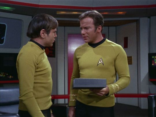
While the regularcommand shirts never look as outright green as the other two, there’sdefinitely a noticeable variance in what they do looklike. Compare this shot from Court Martial withone from The Naked Time.
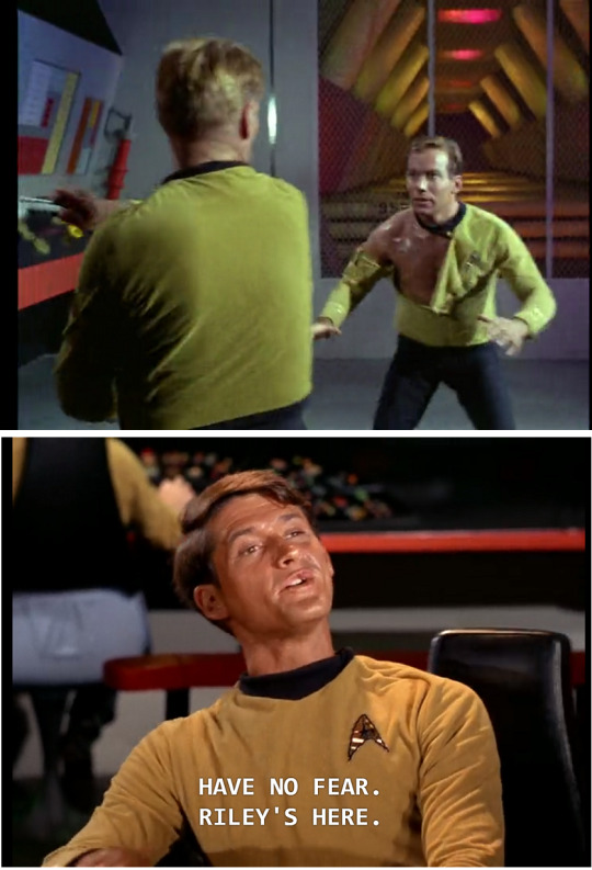
[ID:On the top, a screenshot of Kirk and Finney’s fight in CourtMartial, with both men wearingcommand tunics that appear greenish-yellow. On the bottom, ascreenshot of Riley from The Naked Time,wearing a command tunic that appears much more gold-yellow.]
That’sa pretty extreme example, but a look through my screenshots foldershowed that the exact color of the command shirts fluctuatesregularly in a less dramatic way depending on the lighting. Anin-depth analysis would take some time, but at a glance they seem tome to be a bit paler and more green under outside lighting, and moregoldish or even slightly orange under studio lighting. (Pardon thecut-off caption in that last one there.)

[ID:Six images in two rows of three. On the top: Kirk and Sulu in the airforce base from Tomorrow Is Yesterday;Kirk in Trelane’s manor in The Squire of Gothos;Kirk on the bridge in The Naked Time asMcCoy gives him the vaccine. On the bottom, Kirk in ShoreLeave kneeling down to look atthe ‘rabbit tracks’; Kirk in Arena standingin the desert; Sulu in Shore Leave puttinghis hand on McCoy’s arm.]
Anyexcuse to use that screenshot of Grumpy One-Sleeved Kirk again.
Thisis actually a more common kind of occurrence when it comes tocostuming than you might think—differences in lighting can havesome very dramatic results. One of the stories I’ve heard from myaforementioned industry consultant is of another designer who put anactress in a robin’s-egg-blue dress for Fiddler on theRoof, to the consternation ofthe director, who wanted her in white. She convinced him to hold hishorses until he saw the costume under the lighting it would be inonstage—whereupon, sure enough, it looked white. And that’s inreal time.
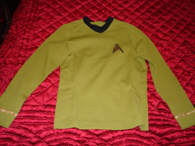
Thiess’sinterview says that the issue had to do with the cameras, and who amI to argue with him on that (on plenty of other things, sure, butI’ll pass onthis one). As described in the original eyeshadow post, cameras canhave an odd relationship with color, especially 1960s TV cameras, sothat probably had something to do with it. But, you can see fromthese two pictures how much difference just a bit of lighting canmake. This is the same shirt, just photographed without flash in thefirst image and with it in the latter. (Sourceis from Star Trek Prop Authority.)
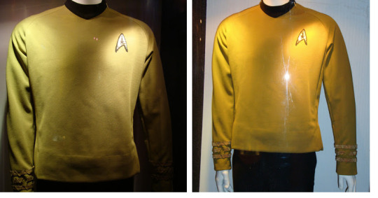
[ID:Two images of a glass case containing a mannequin wearing a commandtunic. In the image on the left, the shirt appears greenish, while onthe right, under brighter lighting, it appears more yellow.]
Forthe third season of TOS they switched to another fabric for theuniform shirts because the velour had a major problem with shrinkingwhen washed (and they had to wash those shirts a lot).According to Prop Authority, this was a nylon diamond double-weavefabric, and the command uniforms were still the same green color.Here’s one of their pictures of a third season command tunic[source]:
[ID:A command tunic laid out on red fabric; under the lighting it appearsslightly greenish.]
Andhere’s a screenshot from the third season. (I’m sure it’s notthe exact same tunic,but, y’know.)
[ID:A shot of Kirk on the bridge talking to Chekov, both wearing uniformshirts that look gold(ish).]
Now,the original post where we were discussing this was here,and was in regards to the Gold Key comics, where all the commandtunics except forKirk’s are green, and I gotta issue a bit of a correction to myselfon that. Originally I said that I didn’t know when they made thedecision to canonically portray the command uniforms as gold butassumed it must have been a decision made for TNG. I was forgettingsomething there which I don’t know how I could ever forget: TAS.
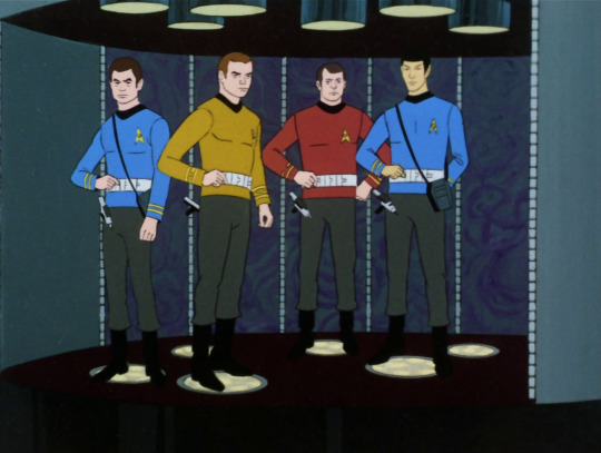
[ID:A shot from The Animated Series of McCoy, Kirk, Scotty and Spock onthe transporter pad. Kirk’s shirt is definitely golden yellow; allof them have dark gray uniform pants.]
TASran from 1973-74, and as you can see, they clearlywent with gold for the uniforms there. Wikipedia has this to say:
Theperception by fans of the command uniforms being yellow/gold insteadof green, thanks to set lighting and other factors, resulted in theproducers committing to a definitive gold-color for animationpurposes. The command dress uniforms remained green to match theperceived colors represented by the live action series.
Sothat would answer that question—the canonical color of the uniformswas decided in 1973. The Gold Key comics started in 1967, before Wordof God came down on that, and so presumably the artists just had tomake their own judgments based on what they could see on screen.Assuming they saw the show at all. I’m still not totally convincedthey did.
Although,thatWikipedia statement also says:
However,the uniform pants were colored gray to match the actual fabric usedin the live action series as opposed to the black they had appearedto be when filmed.
Which,eh. If this picture from the same shoot as earlier is anything to goby, it’s true the pants weren’t solid black, but they seem tohave been more ‘black speckled with silver’ than the straight upgray seen in TAS.
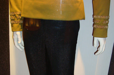
[ID:A photo shot at waist-height of a mannequin wearing a TOS uniform,showing the bottom of the shirt and top of the pants, which are blackwith barely discernible silver sparkles.]
Whichleaves me to wonder if that choice may not have had more to do withthe animation (such as it was)–big chunks of solid black aregenerally something you want to avoid in animation, especially ifit’s something you have to show in motion regularly. But, ofcourse, the animation choices of TAS are a whole other topic (andwhat atopic).
Sothere you have it! Theoriginal command uniforms were green, but we have all been deceivedby the illusory nature of film all this time. It blew my mind toowhen I first found out about it. Just goes to prove you really can’tbelieve your eyes.
113 notes
·
View notes


Photo
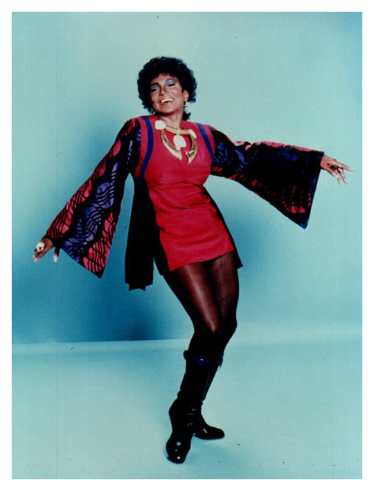
I have no idea why this particular photo of Nichelle Nichols is in the Star Trek III: The Search For Spock press kit, but I’m very glad it is.
3K notes
·
View notes
Text
i literally can’t listen to tik tok by kesha without thinking about that goddamn star trek tos fanvid…you know the one
88K notes
·
View notes
Text

Repurposed TMP-movie era chairs on The Outrageous Okona

And the Battle Bridge Viewscreen shows up as a partition between the front and back of the Atlec command centre. Also there's a matching Burke's Chair (I don't know if it's a TOS original repainted or they just made one)
56 notes
·
View notes


Text
im still sick and also on vacation rn but weve been updating our ageswap garashir au Does Your Mother Know? (~400k words slowburn) a little and recently reached the start of season 6 which brings some interesting developments to the plot and character dynamics! be sure to check it out :-)
#i am so behind on this series and need to catch up#but also y'all should read it if you haven't already#fic rec
27 notes
·
View notes
Text
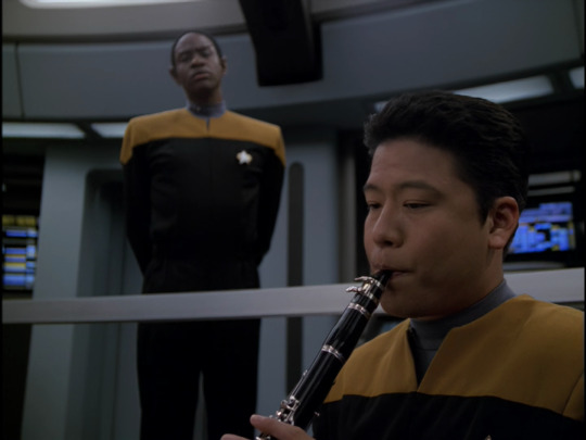
the voyager theme is just bEGGING for a kazoo cover
0 notes
Text
I got a copy of “The Ferengi Rules of Acquisition” and the whiplash I got going from rule #112 to #113...
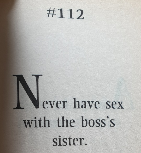
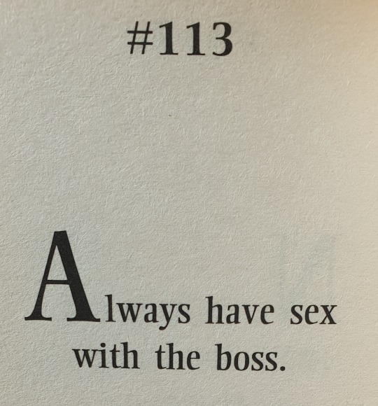
'by Quark as told to Ira Steven Behr' indeed lol
2K notes
·
View notes