
Don't wanna be here? Send us removal request.
Statistics
We looked inside some of the posts by sunnnnnn7 and here's what we found interesting.
Average Info
Notes Per Post
0
Likes Per Post
0
Reblog Per Post
0
Reply Per Post
0
Time Between Posts
4 days
Number of Posts By Type
Text
17
Last Seen Tumblr Blogs


Fun Fact
Kazakhstan’s Minister of Communications and Informatics has blocked the Tumblr site because it contained 60 sites of terrorism, extremism, and pornography in 2015.
Text
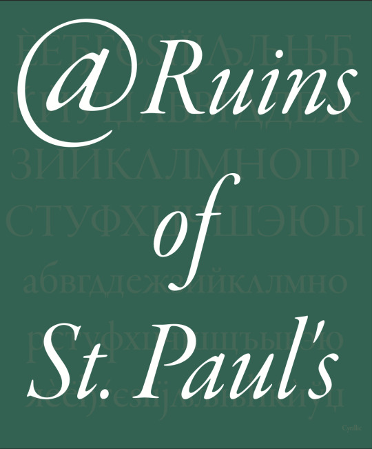
DESN512: Links and references to my type specimen written part - week 12
Research on the type designer and the origin of the type.
Macau Sai Van lake research
0 notes
Text

DESN512: Successful change - week 12
I think the adjustment of margin made this. page look a lot more confined and organised as the Cyrillic text are more compacted and doesn't touch the side.
0 notes
Text


DESN512: Adjustments after margin adjustments - week 12
Originally I used pt 14 as one of the demonstrations, but it didn't fit after the margin adjustment so I changed the size to 12 instead.
0 notes
Text


DESN512: Adjustments with overlapping and legibility - week 12
With the written feedback about this number and currency page, I decided to separate the two pages into individual pages. With in class feedback from the instructor, I removed the dotted lines which were distracting the design of the type and I made sure that the numbers are laid on top of a white background, so it is higher in contrast and easier to see. Also, with the suggestion of the repetition of currencies being unnecessary, I made them larger and one selected three symbols. It is also quite cool how the symbols could be used as letter "yes".
0 notes
Text

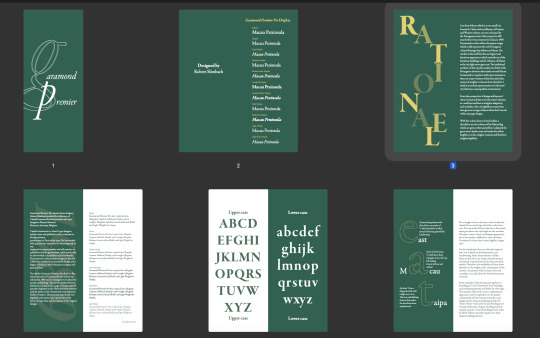
DESN512: Adjustments to my type specimen booklet - week 12
First, with the given feedback of paragraph hyphenation and my text being too close to the side of the page, I turned off paragraph hyphenation and I adjusted the margin from 4mm to 10mm. I actually think it looked better, especially the cover page. With this adjustment I had to adjust some of the text size and content, to make sure that they fit within the margin.
0 notes
Text
DESN512: Final edits and audio - week 12
I did adjustments to the puddle in terms of the position and opacity, so it has a smoother transition. Also, I adjusted the offset of "South of Macau" so it fades out better.
Lastly, I decided to add an audio to my clip. I tried recording the sound of rain, but I didn't get the effect that I wanted. Therefore I attempted to record the tap water sound as the water is adjustable, which turned out better. In After Effect, I adjusted the wave from from 0 to -45 so the audio first fades in, stops at the transition between the two effects, continues and fades out towards the end.
With the credits/conclusion, I used Garamond Premier Pro light display and I did a fade in for each line of text before they all fade out to black.
0 notes
Text
DESN512: Draft for final kinetic typography - Week 12

I first typed in the letters individually, then I adjusted their angle of rotation when they fall below the "melt" layer. Next, I adjusted the level so the melt effect ease better.
I think this effect of puddle really worked well with the drops of water from the beginning, so I decided to use this for my final.
0 notes
Text
DESN512: Melt technique - Week 12
I wanted to create the idea of text melting into a pond of water.
0 notes
Text
DESN512: Saivan river like technique - Week 11
I created this in a square before combining them together. I think the words are still moving a bit too quick as I wanted my overall video to be more calm and tranquil.
Also, I tried combing the wave technique and this river technique together, and they didn't have a smooth transition between the two techniques.
0 notes
Text
DESN512: Morphing text technique - week 11
This effect took me quite some time to make. I like the idea of the text gliding across smoothly, but it was missing the water element that I'm looking for.
0 notes
Text
DESN512: Saivan flow - week 10
Tried with the idea of water flowing and describing my pepeha with relevant words.
First I used Garamond Premier Pro Bold display for Sai Van and Medium display for "South of Macau".
Then I applied the water drop technique from After Effect called CC Mr.Mercury. I adjusted the blob size, direction and birth rate (speed).
After that, I adjusted the offset and opacity for "South of Macau" to make it perfectly match with the blobs of water. When the blob reaches "Macau" it lightens up the text.
With the waves effect I used the After effect Wave Warp to create the wavy looking text and CC reptile to create the repetitions.
Then I used the fast box blur to create the shadows for the wave.
I want to try another effect as this is quite repetitive and simple.
0 notes
Text
youtube
DESN512: Looking for inspirations - Week 9
Watched video of how others present Sai Van lake.
0 notes
Text


DESN512: Plan for kinetic typography - week 9
Made three plans for my kinetic typography and tried to create a flow like water as Saivan is a lake.
0 notes
