Don't wanna be here? Send us removal request.
Text
Rendering in a PS1 style
This post is more of a technical overview of how I use blender to create 3D renders resembling a PS1 style. It’s both for myself to have a self-guide to various techniques in case I forget about them both for other people interested in developing this style.


The PS1 style is not the same as a low-poy style or an N64 style. All the different 1990s and 2000s consoles have different hardware limitations and glitches, which makes each graphic style unique in its own merit.

The theory has been taken mostly from this article, while the blender tips are from various sources, which I point out at the end of the post.
What defines a PS1 Style in 3D Graphics? The main components that come to mind are the low-poly models, the pixelated textures and the generally low resolution of the image, but there are several more. David Colson, in his article, points out 7 factors:
Low poly models and low-resolution textures
Polygon jittering
Lack of depth buffer
Warped textures
Popping and jittering texture mapping
Per vertex lighting
Depth cueing fog
His article goes into depth on all of them, while, for the sake of doing it in Blender, we’re going to focus on the first two. You can read the full article and do it if you want to create a full rendering engine based on the PS1 specifications.
Low poly models and low-resolution textures
The low poly models were created due to the hardware limitations of the PS1, mostly of the geometry transformation engine (GTE) not being able to process that many polygons per frame. This Wikipedia article states that the GTE could only process 90,000 polygons per second with texture mapping, lighting and smooth shading, but it depended on the GTE used. Compare it to modern GPUs, which can render millions of polygons per frame, let alone per second, and you start to understand why creating a realistic-looking old 3D model is not as easy as it sounds.

The low-res textures come from a hardware limit as well: 256x256px. And most of them were not even this high. They were created in a plethora of ways: hand painting, reducing the resolution of photos, and a mix of these two ways. Many of them used UV Mapping and Tiling to reduce the stress on the PS1-limited hardware even more.
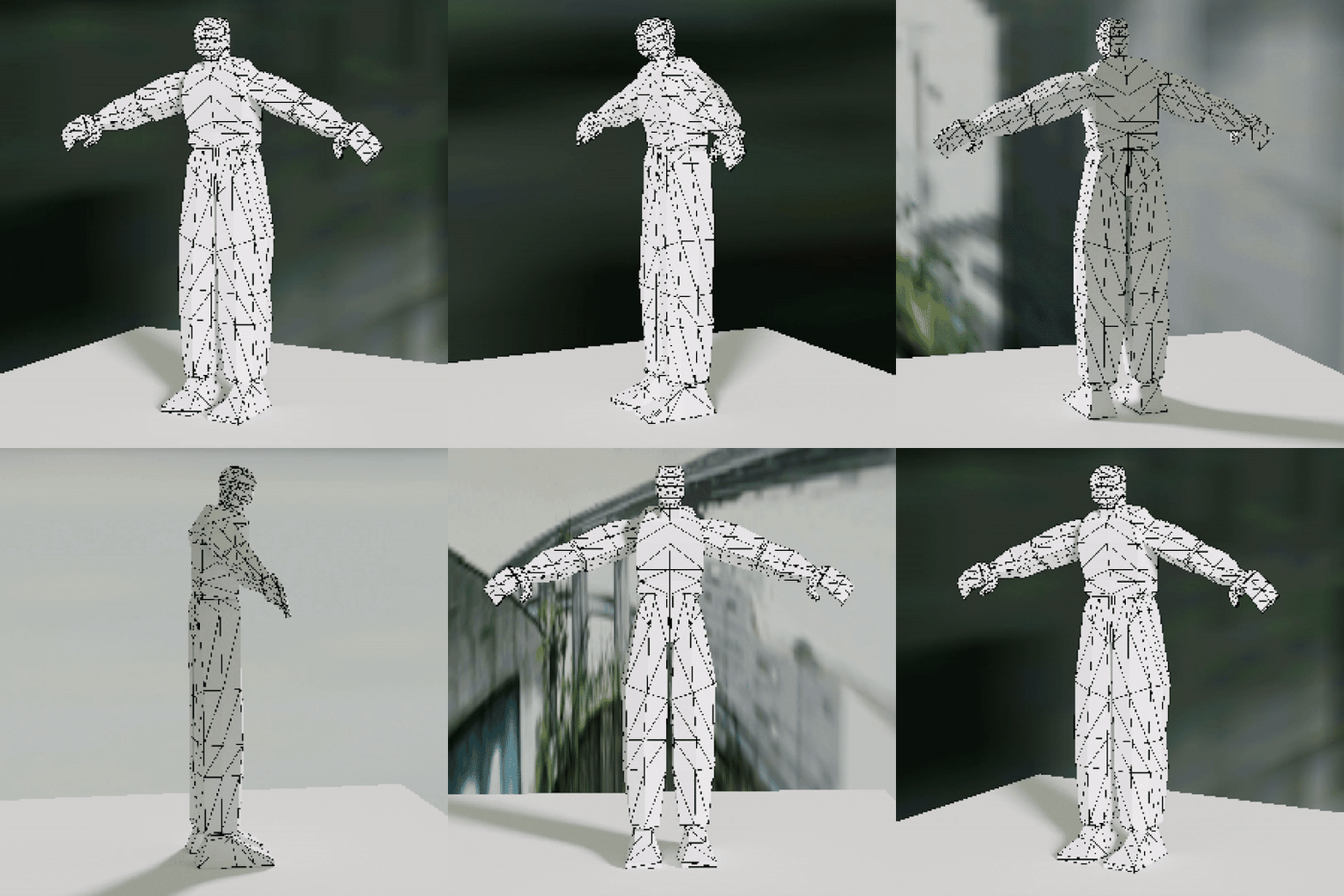
I’ve tried several techniques to create low-poly 3D models of characters and environmental objects. For characters, the easiest way I’ve found is to model them entirely on Blender using a reference image (I’ve used this one for the male) and try to keep the poly count as low as possible. After creating the model, I modified the proportions slightly. I still haven’t tried texturing the model I made, so I think I’m gonna make another blog post just for Texturing and UV Mapping cause it’s a complicated but interesting topic.
For props and environments, I’ve found that there are mainly two ways of operating: the easiest is just to think of everything as simple polygons and planes. For example, a supermarket can be divided into isles, the floor and the ceiling. They can all be simplified into blocks.

On the other hand, a plant can’t be a block, or it’ll look like Minecraft. That’s why you can intersect two planes, both textured with a png texture of a plant. It’ll look janky, but that’s how PS1 plants were made.


Another way I’ve worked with planes was with a shopping cart. Besides the handle, the model is composed of planes and textured accordingly. This proved to be an interesting way of working, and the result was quite interesting, but it took a lot of time and had a steep learning curve.

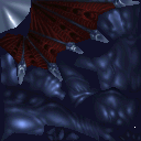
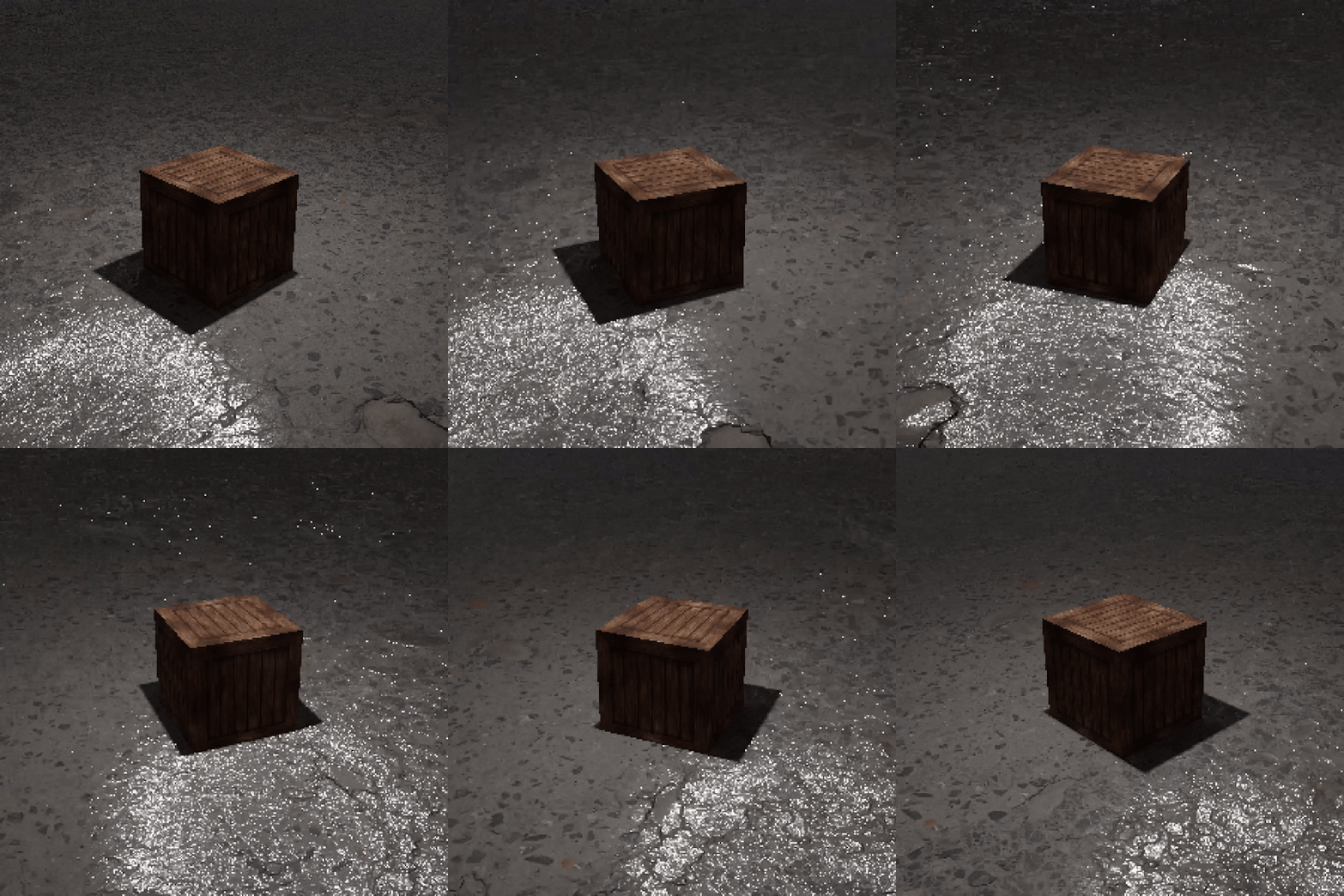
For the textures, I’ve worked mostly on reducing the resolution of high-res textures found on Quixel Megascans and other websites (or even google images) and sometimes retouching them a bit in photoshop. For example, this crate I’ve made comes from a texture found on google images reduced to 128x128px, applied equally to all the sides of the cube. Remember to choose “nearest neighbour” as the interpolation method to keep the image pixelated.



What I’ve found is that on some models, while not exactly true to the PS1 style, inserting a roughness and normal map on the texture leads to visually interesting results. With the crate above, the floor has a normal map, so the reflections of the light show up quite heavily.

Polygon jittering
The jittering and shakiness of the graphics on the PS1 are well-known. On a hardware level, this happens due to a lack of subpixel rasterization and the geometry transformation engine (GTE) having only fixed-point maths. The inexistence of anti-aliasing makes the models and textures, when seen from different points of view, distort, jitter and sometimes change their shapes altogether. To show it, these are two videos that David Colson made.

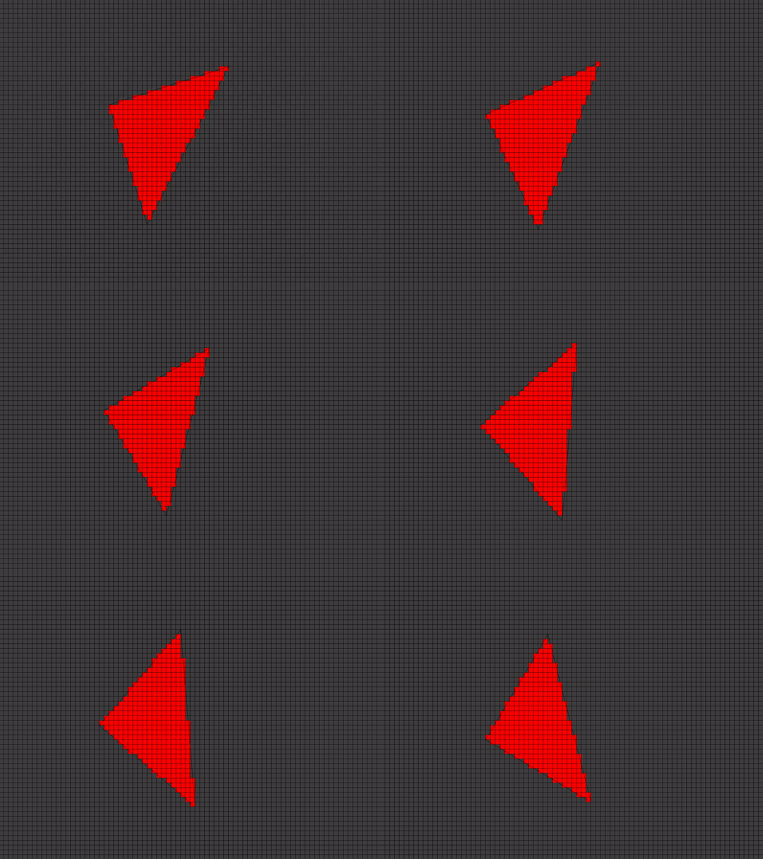
Through a forum post, I've found an incredibly easy way to recreate this effect on Blender. Select the model you want to jitter and add the “displace” modifier. Then change a couple of parameters:

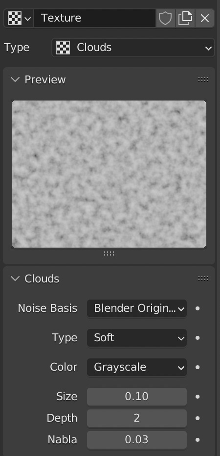
Now the model jitters and modifies as the camera moves. It’s not exactly the same effect used by the PS1, but it’s easy, and in most cases, it’s good enough.
Rendering
Now you have the models and the jitter, but how do you render the scene to create a PS1-looking video? First, as we’ve discussed, it’s imperative to completely remove the anti-aliasing. The pixelated look is defined by this. In Blender, you can do this by going into the render properties > film and changing the filter size to 0.01.


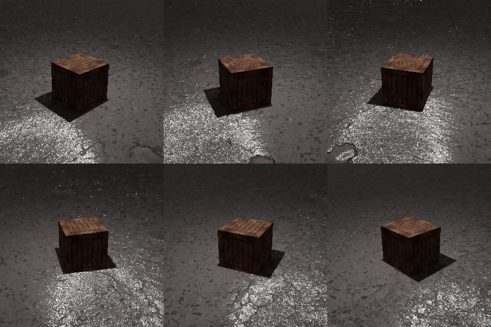
The second step is the resolution. The PS1 outputs 320x240px images, but you can play around with it depending on the use case you need. For the sake of this blog, the videos are rendered at 300x300px. The important factor is that the pixels must be visible. Then you can render your video.


The last step is exporting this low-res video at high-res without ruining the pixelated effect. I’ve found a way to do this through Blender. First, you create a new video editing project; then you import your frames into the timeline. Change all the blender settings on the resolution that you want it to render at, the output and so on. Lastly, go into the “view” bar of the Sequencer tab in Blender and use “Sequence render animation”. Now you have a high-res ps1 style rendering!

Another way of doing it, easier but that requires paid-for software is rendering the original sequence in After Effects into a high-res composition and scaling the frames using the nearest neighbour interpolation method.


And this is the final output video:

This is just the start of the process though: creating PS1 styled images and videos can be as exciting as boring, and the new technologies offer multiple interesting ways to approach them in new and interesting ways. Experiment, try out things, find your own style, because retro-styles are becoming more and more trendy lately, and as such you may get lost in the thousands of sterile “inspiration” images online. Visuals are important, but if they don’t transmit anything they’re completely useless.
Resources used:
How to make PS1 style graphics
PS1 Style Graphics - Green Ranger Model and Texture Time Lapse
How to create accurate ps1 and n64 styled graphics
The Sickly Wizard
World4Jack made some time ago an archive of 2000s textures catalogued in several categories. The archive is now offline, but I’ve managed to find it and I saved on a drive. Access it here.
28 notes
·
View notes
Text
On Touching: a review
I was confused when I first saw Karen Barad's talk at the Hold Me Now conference at Stedelijk Museum Amsterdam in 2018. Quantum Field Theory is a complex theme to grasp, and even though I have studied it several times, it seems as arduous every time.
In this post, I'm gonna summarize the contents of the talk–both for myself and the readers–and then say what I think about it.
So, what did Karen Barad talk about? The main notion is changing what it means to touch thanks to the Quantum Field Theory. In a physical sense, touching can be described as an interaction with the electromagnetic field between the electrons present in all matter. So, we don't literally touch things; we just interact with their electromagnetic field.
This is old news, though, so how does Quantum Field Theory come into play? First of all, thanks to the introduction of the famous theorem E=mc², we know that both fields (the energy) and the particles (the mass) are simultaneously one and the other. A quantum, the particle, is the minimum amount of a field. But most importantly, the theme of indeterminacy is brought up. In classical Physics, there is the matter and the void: two separate beings. But in Quantum Field Theory, they put a question mark on that idea: how do we know that the void is devoid of all matter? We may think of the void as a vacuum, a quantum state without energy. But virtually (a fundamental term), it isn't empty: it contains fleeting electromagnetic waves and particles that pop into and out of the quantum field, vacuum fluctuations. When studied not as fields but as quanta, these quantised indeterminacies are called Virtual Particles. They exist, but not in the present/presence.
The example that Barad gives is that of an electron, the subatomic particle that occurs in all atoms, entirely devoid of structure, inside the vacuum. As a result of time being indeterminacy, the electron does not exist as an isolated particle, and it constantly interacts with all the virtual particles of the vacuum in all possible ways. Infinite ways.
The physics community deemed this infinity of interactions perverse and immoral, as it involved the "touching" of potentially everything at every time. Even self-touching. To "normalize" it, they used the only other infinity present in the Quantum Field Theory: the presence of a single bare, "undressed" electron and the void as separate from one another, as it is surrounded by and filled with its infinite interactions. To "dress" the electron, physicists used these infinities against one another, creating a finite number.
This means that everything results from the subtraction of infinities; entailing everything is a massive overlaying of perversities. According to physicists, monstrosity and perversity are at the core of existence. Touching entails experiencing all others and the self. And touching the self entails feeling the stranger within. We all exist at every moment in an indeterminable number of instances throughout space and time, rendering identity indeterminable as well. What do existing and becoming mean in this context? Touching is not an act of the matter; touching is the matter, as a condensation of response-ability.
Finished the sum. I really hope that it is comprehensible. Writing it, I discovered that I started to understand what Barad was talking about and finally understood just a bit more Quantum Physics. Writing is essential for understanding.
So, on a less intelligent note, I found this talk incredibly interesting: the philosophical implications of this quantum theory are incredible, mainly from a queer standpoint. Identity, normality and stability are questioned, and it even highlighted male physicists' bias toward "abnormalities." As I see it, we all are in a constant flux of being, constantly changing and developing. There is no fixed gender, sexuality, societal role, etc. Everything can and will change, but our culture has put an enormous effort into opposing this. We are fundamentally scared of change, and the inexplicability of things: myths were created to explain natural events, and religions were invented to sort out the reason for existing. Culturally it's not easy identifying with a gender different from the one assigned to you at birth; changing identity again is even less accepted. This applies to sexuality as well, and even your work and marital situation. People don't take change for granted; they always consider it a rational explanation for everything. But what is rationality? Being something or someone is not a mathematical decision. It results from a feeling, an inside touch with the stranger within yourself, showing you their presence in that fixed moment in time.
Flesh and muscles don't define us. The interactions we have, the "touching" with everything at every time, make us who we are at a certain point of the fourth dimension. We are change.
4 notes
·
View notes
Text
Stories without Heroes
Reading "The Carrier Bag Theory of Fiction" by Ursula K. Le Guin, I had quite an enlightenment. In short, Le Guin puts forward a theory in which the central part of a story doesn't concern a hero that often recurs to violence to accomplish something and be considered a saviour. A killer story. Now the story becomes a carrier, a bag holding meanings. No heroism is involved because being human doesn't mean being a hero: it's about relationships, what we do and feel, and how we relate to each other. To be human, you no longer have to feel like you want to be a killer.
Since I was little, my mind completely missed the aggressive part of what being a "man" seemed to mean in the culture I was living in. It was always about the hero, which when I was a child meant being a soccer player or an actor, and often the actor played roles where he was "cool and badass". I wasn't like that, but for years I wanted to: I even dreamt about being a hero, saving and being loved by girls. The whole package. I liked what I wasn't cause I wanted to feel accepted by others and myself.
Now, in retrospect, it makes sense that I consider myself non-binary: I don't fit into the gender role of a man. Being born as one, though, estranged me from my peers. This hero perspective, the fact that you have to be aggressive to be human, not only involves women but everyone who doesn't fit into a specific "man" category. The "Carrier Bag Theory of Fiction" could relieve a lot of people, which often are the ones already with problems about their identity or not being treated equally by society.
We should change the meaning of what a story is because our lives, dreams, and hopes are based on them. Making them more inclusive makes our world more inclusive, and we should aim at that.
Edit: I've watched a couple of youtube videos on the manosphere*, and they introduced many concepts around man's role in our society that intersect interestingly with this post. A significant factor that F.D Signifier, the author of those videos, points out is the presence of a certain kind of cultural hegemony in the world that we live in: hegemonic masculinity. Coined by Raewyn Connel in 1987, the term describes "a set of values, established by men in power that functions to include and exclude, and to organize society in gender unequal ways. It combines several features: a hierarchy of masculinities, differential access among men to power (over women and other men), and the interplay between men's identity, men's ideals, interactions, power, and patriarchy." [1] The values differ from culture to culture, but I think that, through globalization, the hero that Le Guin talks about is a product of this hegemony. What I didn't have, and these heroes had, are the values of masculinity, which are often enforced on female and queer protagonists.
To change the meaning of what a story is, we need to change the cultural hegemony surrounding it; we need to start by changing the masculine hegemony that has historically defined the hero.
*: to the lucky uninitiated, the manosphere is, as defined by Wikipedia, "a collection of websites, blogs, and online forums promoting (to varying degrees) masculinity, misogyny, and opposition to feminism." What makes it interesting is this cultural phenomenon's prevalence on the internet. For example, the Urban Dictionary defines it differently: "A group of websites made for men to discuss men's interests and issues without women nagging them." There are other definitions on the side of Wikipedia, but they have many dislikes. This proves the pride people in that community feel about themselves and their numbers online.
1: Jewkes R., Morrell R. Sexuality and the Limits of Agency among South African Teenage Women: Theorising Femininities and Their Connections to HIV Risk Practices. Social Science & Medicine. 2012.
3 notes
·
View notes
Text
Y is Y2K Appealing?
As you can observe, my blog has been made with a particular aesthetic focus: the simple HTML and CSS, the glow effect on all the texts, and the WoW-inspired cursor. All of these call back to the Early Internet age of graphic design, and I'm not the only person to like this nostalgic wave of aesthetics.
The Aesthetics Wiki defines Y2K as:
"Y2K (also known as Kaybug) is an aesthetic that was prevalent in popular culture from roughly 1997 to 2004. Named after the Y2K Bug, it is characterized by a distinct aesthetic period, encapsulating fashion, hardware design, music, and furnishings shining with tech optimism — sometimes literally."


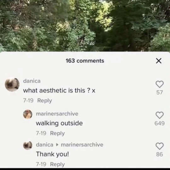
People are now returning to this very recognisable style for many reasons. But first, As Günseli Yalcinkaya points out in her Dazed Digital article "Why are we all so obsessed with early web nostalgia?" we have to understand why it started at all:
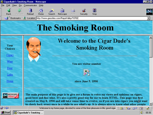
From a Political standpoint, early cyberspace provided a liberating and autonomous dream world beyond the confines of capitalist structures. People could design their own websites thanks to services like Geocities, which allowed users to create, publish and browse websites for free, and each of them was unique in its own kind of way. Considering the almost inexistence of Big Tech in the early 2000s, being online was virtually living in a borderline socialist dimension.
From an Aesthetical standpoint, Y2K is glittery, brash, pixelated, and generally in-your-face. On the web, this kind of visual style is derived from the utter freedom of personalization—even if the elements were mostly just images, gifs, texts, and the background—and, as pointed out by several users on Quora, most people had no design training at the time. They just did what they liked, not thinking about usability or readability. But Y2K, at its peak, had lots of excellent and sleek designs, and most of them derived from optimism about the future of technology as the world reached a new millennium.

These two reasons for existence, translated and morphed into the modern era, are almost identical. The brash look contrasts the minimalist corporate look that we are now used to, setting an uprising both on the visual and political meaning of the modern style. One of the first things they taught me at Design school was "Less is more", and here that theorem is inverted. More is, in fact, more, as it is transparent of what is happening behind the curtains of tech. Ed Finn, in his book "What Algorithms Want. Imagination in the age of computing", compares this technological shadowing to a black box:
"As I click on the link to the news site, a cascading series of actions unfurls behind the static pixels of my screen, obscured from human view not just by design but also by the boundaries of my temporal perception. In a matter of milliseconds, my request for the page has reached one of the company’s servers, triggering a flurry of activity as the site identifies me through cookies, IP address, and other means. The server contacts other machines in the company network to pull together not just “the news” but my news, curated in various ways to capture and maintain my attention (e.g., through recommendations for what to read next) and establish a familiar context by referencing previous interactions with the site (e.g., items saved in my “history”). But before the page loads, my query also triggers a number of other requests to companies, including Google, Facebook, and Twitter. Advertising algorithms engage in an automated auction to decide which ads will be shown to me on the news site, taking into account prevailing bids as well as my own history, social media presence, and membership or nonmembership in various predetermined target populations."
The Y2K style goes back to the roots of the internet, trying not to shadow anything and show a bit too much.
The tech optimism characteristic of that Era instead translates into the possible modern transition into Web3, which promises a decentralized web removed from tech monopolies. The contemporary tech evolution corresponded with shrinking possibilities, and now those monopolies control most of the time we spend online. With their economies of scale, they seem to be able to crush all up-and-coming challengers. The optimism is not the same, though: when the style was created, it was a hope for the future, as it could change how we lived and interacted. Now that change has happened, we don't want it to go the way Web2 did. We're not optimistic; we're just frustrated over how things have been going for the last 20 years, and we want to do better. Although the founding spirit is commendable, Web3 has the potential to ruin everything even more, as several sources point out [1] [2] [3]. But that's a topic for a different blog post.
As we can tell, the political premises are fundamentally intertwined with the aesthetical choices of Y2K.
But we haven't tackled the most crucial factor of Y2K: Nostalgia. According to the article "Why Do Fashion Trends Come Back?"¹: "Trends repeat every 20-30 years because of generational changes as well as designers taking inspiration from styles their parents wore." But now something is different: the style is from our youths, not our parents. We have been influenced by the celebrities we know and love, and now we're bringing back what they represented back then. Of course, this is not the first time fashions have worked like this, but the swiftness with which it exploded is incredible, considering how minimalism was and still is very big. This, in my opinion, has two different reasons:
Thanks to our current technology, every type of information travels faster than before. What needed to be known through television, newspapers, magazines and so on can now be discovered through smartphones. This allows the growth of styles at a rate before unimaginable. Still, studies suggest that, due to the ever-growing stream of information present on the web, shorter intervals of collective attention are given to individual topics. We now embrace and forget as fast as we ever did, but Y2K seems to remain².
The second reason is a bit more philosophical and delves into my personal experience. The 2000s was not a happy decade. First, the twin towers collapsed, changing the political stance that the USA, sadly one of the most influential countries in the world, had towards foreign countries. Then, the 2007-2008 financial crisis happened, making our upbringing in the world desperate, not even considering the climate crisis that is now upon us. But Y2K was not sad: it was the opposite. It was hoping for a brighter future, and we are nostalgic for that. The article "The Brain and Nostalgia" by Heidi Moawad says, "Sometimes nostalgic triggers [...] are sought out as a means to bring comfort and happy feelings." And that is precisely what we are searching for. It's not essential that we lived that age or not; what we thrive for is the peace and hopefulness that the 2000s had in their own personal way. It may have been through the sparkly gifs, the neon colours and the overall nonchalance of the people who used to live it, but Y2K means something important to the youth now: the hope for happiness and peace. The longing to not live like we've always lived.

1: Interestingly, the article cites a DSN English report on fashion trends, which is now down. Thanks to the Wayback Machine, I found a snapshot of it, which led me to another article, accessible as well only by a snapshot. This article points to other websites as sources, and I couldn't find any "report" on this matter, but multiple websites cite it talking about fashion throwbacks. My only explanation for this occurrence is that someone mentioned it as a "report", and other writers started using the first article source without checking it.
2: One of the first instances of the throwback to this style I've found online was Hailey Bieber's 2019 Met Gala Look.
3 notes
·
View notes
Text
Welcome to my Blog!
Hi!
I'm Niccolò Abate, a 23 yo Design student from Italy. I'm now moving to London to join the MA Digital Direction at the Royal College of Arts, which first assignment was to start a blog: so here it is.

I'll be posting my thoughts, WIPs on projects, reviews of readings, films and so on, and random stuff that comes into my mind. I'm a chaotic person so I don't want to set boundaries on what to put here.
So, first thing first, I want to credit the creator of the theme I'm using: @ps1. I've modified it a bit to be responsive even on mobile phones, but I've still got some things to adjust. The blog will grow over the year as I will. Second thing I want to mention is my background, which is Bladee's Red Light cover album. I love the graphic so much, and I think it really matches the blog aesthetic. Lastly, my profile image is a crop from an image I found on archivio.slamjam.com, which is an archive of images that the Italian streetwear shop Slam Jam collected over the years. It's a really great place for random inspirations of graphics and clothes.
So, it was nice meeting you here, and I hope that what I post will interest and inspire you :-)
4 notes
·
View notes