#[And I am talking specifically about this one Ominis instance]
Text
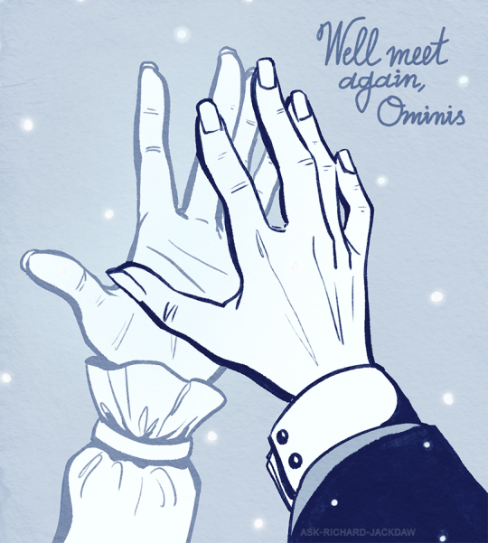
Out of character: thank you @pandanscafanfiction for the wholesome and sweet Gauntdaw rp we shared, even if we didn't get to explore far 🤍 Your Ominis was sweet and charming, quick witted and very alluring. The softness (and playfulness they shared early on) made Richard feel like he is more than just an unfortunate, destined to exist alone soul. You are the Ominis of my Richard's heart.
#richard jackdaw#ominis gaunt#gauntdaw#hogwarts legacy#[I apologize I was only able to find your side blogs for the tag]#[Those were also some really tough rps mechanically]#[Because what can be more difficult than writing a man that cannot see]#[and a man that cannot touch]#[a lot of the things between them would've had to be solved with words whether they want to or not]#[And before anybody gets upset just a reminder that my Richard in general is a neutral party]#[And I am talking specifically about this one Ominis instance]#[Consider all Richard relationships as a different timeline]#my Scribe draws
37 notes
·
View notes
Video
youtube
Gretel & Hansel by Osgood Perkins, 2020
I just finished watching this movie and I am so in love with the aesthetics, the architecture, the coloured lighting that appears from time to time, and the not so traditional costumes, that I can’t quite move on to something else just yet (although I really must get back to my translation of Lascia ch’io pianga, due tomorrow morning). But it’s too late to start writing a proper review, so I’ll just let you know what I thought about it, and get back to my actual review later.
If you know me well, you know that I’m a former art history major with a slight obsession for folklore, the history of fashion, and matching colour palettes (among other weird / random obsessions). I guess that after studying art for so many years, literally every day, for hours on end, before, during and after school, I ended up seeing “art” in the littlest things IRL. Thus, I am even more sensitive to it when it is "done on purpose”, so to speak, namely for cinematic purposes (but not just: it’s what makes me especially attracted to certain opera stagings and contemporary art performances).
Everything about this movie looks and sounds like something I’d have wanted to write or film, if I had to make an adaptation of a folk tale. Even more troubling, parts of this film look exactly like a very disturbing nightmare I had just two days ago. My nightmare’s setting was 1900′s Romania, granted, and this is 1800-something Ireland, but the reason why the two are so similar, and why this speaks to me on a personal level isn’t because I’m so vain I see my life in other people’s more talented works, or because this style is so overdone that I even dream about it. It’s because Osgood Perkins is extremely well-read on the source material of Hansel and Gretel, the history of witchcraft in Western Europe, and masters the aesthetics of Romantic painting and Gothic literature.
The artistic direction of this film is simply stunning. It is set in Fall, with the beautiful contrast of red leaves against ash-coloured fog. The costumes are reminiscent of Norwegian and Swedish folk costumes, with some German and Welsh hats here and there that make you wonder: where does this take place, really? There are no traditional headdresses or intricate embroideries that might give an additional hint, in fact, the costumes are very, very plain but made in a way that tells you “once upon a time, in a faraway land...”
This doesn’t have to be precise, as it is a fairy tale, but it is still precise enough to hint at real places, real cultures, and all kinds of stories. Likewise, it is difficult to pin point an actual era during which this took place; the lord of the local manor seems to be dressed in late 18th century knee breeches and certainly wears the makeup of the nobility of the time, but later, we see a huntsman with a late 14th century German houppelande. Meanwhile, most of the people in the witch’s backstory flashbacks, as well as the two children, seem to wear folk clothing of the 18th-20th centuries, which keeps things even more vague.
The architecture is very reminiscent of what can be seen in Midsommar. On the one hand, there is traditional, local 18th century architecture you’d see in Ireland, Brittany and possibly elsewhere in the British Isles or beyond, but on the other hand, there is angular, geometric, wooden architecture reminiscent of the “temple” in Midsomar. Are we in Scandinavia or the British Isles? Who knows. There’s an interesting play on windows, especially their colour and the shape of the glass; you might notice that contrarily to the architecture, they almost never have angles, there are no triangles or rectangles, only rounded shapes. Most of them are coloured too, which adds different kinds of atmospheres to different scenes, of course.
There’s a play on coloured lights too, as mentioned above, whether it’s moonlight during the nighttime scenes, or just plain coloured light emanating from an ominious place. Coloured smoke also comes into play at different times, especially during one specific flashback. The main colour palettes are cold, neutral colours: grey, blue, white, black for scenes meant to reflect a character’s depression, nighttime or a rainy day- perhaps the cold and loneliness of the abandoned children in the forest. Other times, the colours are red, orange, and mustard yellow against the grey of the fog and leafless trees. This is most of the time, and is highlighted by the children: they are wearing grey-blue clothing with some burgundy highlights, and Gretel’s short red hair is mirrored by Hansel’s red cap. The only striking exception of these very neutral, cold colour palettes is the “child with the pink cap”: she is wearing a pink and yellow ensemble, which looks completely out of place and almost painful in this scenery and among the people wearing colours that blend into the setting. But this, of course, is symbolic.
Likewise, the choice of lighting is key: many of the characters are shot in back-light, while many of the scenes that take place in nature have a low, white-coloured light-source at the horizon, respecting the 1/3 - 2/3 proportions rule. And as mentioned previously, the lighting of interior scenes is usually coloured, so as to reflect a specific character’s mood or influence on the scene taking place.
The scenes’ composition were so carefully crafted that almost every shot could have been a 19th century painting. This is particularly true when it comes to the witch’s flashbacks, which seem to follow mostly what we call “bas-relief” composition in art history: when most of the characters and important elements (plants, objects, architecture) of the painting are lined up in a single vertical line composed of different grounds (the most important elements being in the foreground, and the least important elements being in the background). A variation of this is several horizontal lines. But when we look at Gretel, the protagonist, as a single character, the composition of the shot is often “pyramidal”, with Gretel being in the middle, and various elements (usually furniture, frescoes on the walls, stairs, etc) either above or beside her, on both sides, to frame her as the important character she is. In French, we call this trick a repoussoir: you are creating a setting that might seem insignificant, but that highlights the scene or character in the foreground, by “pushing” against them from the sides of the picture. This visual “trick” was very popular in 18th century painting, especially “historical” paintings with a historical, heroic and/or mythological setting.
The whole movie is sprinkled with references to art history: the witch’s flashbacks refer to Courbet’s Realist movement (long, horizontal paintings depicting peasants’ daily lives in very neutral colour palettes), many of the forest scenes seem straight out of a 17th century landscape painting or a 19th century Romantic painting, the windows have some Art Nouveau elements to them, and the coloured lights, folk costumes and eerie atmosphere are evocative of Norwegian Romantic painter Hans Dahl, whose works have been featured on several Black Metal album covers. Funnily enough, some reviewers actually noticed this resemblance and stated that the movie was “too long” and “should have just been a Heavy Metal music video”- which I strongly disagree with, but that’s beside the point.
Talking about music: I will definitely have to re-watch this movie or listen to its score, because as someone mentioned elsewhere, the music isn’t, interestingly, your average Hollywoodian / Second Viennese School creepy strings and dissonances. Rather, it’s all smooth synthesizer, 80′s styled background melodies. I can’t really say more about the music, it didn’t catch my attention and I’d rather listen to it again before commenting on it. What really grabbed my attention was the visual aesthetics, of course, and the way the story was developed with some interesting interpretations of the myth and additional side-plots that eventually change the ending.
Now many, many people disliked this film because they thought that it was “boring” and “too slow”. Let me set things straight: this movie is slow in the way that Robert Eggers’ “The Witch” was slow. So was Lorcan Finnegan’s “Vivarium”, and so was Night Shyamalan’s “The Visit”. But I loved it because it is a contemplative work of art that requires time to truly enjoy every side plot, every reference, and the sheer beauty of the shots. It would be just as absurd to dash through a museum exhibition without stopping to take in and enjoy every piece put on display, or to rush through a Byronic poem. That said, it is still well paced, in my opinion, and definitely not as slow as films like David Lowery’s “A Ghost Story”, for instance. It’s not an action-packed blockbuster, but it’s not slow either. It’s a beautiful indie movie with a powerful plot twist in the end, the best coming of age movie I’ve seen for a while, and definitely the best movie adaptation of “Hansel and Gretel” I’ve ever seen.
In other words: go watch it!
#Films#Horror#Reviews#I intended something else but then I just wrote and wrote so here goes#I'll write a proper review later on#Movies#Critique#Art History#References
0 notes
Last Seen Blogs


