#. i struggle to think of anything made in the 90s that was remade better now
Text
so here’s what i thought of MSBE
as i expected, pretty much a scene-for-scene copy of the original, just with weirdass CGI
that said, everything besides the humans looked pretty damn awesome; the environment and buildings (esp the layout of mewtwo’s castle) were beautiful
dialogue was subpar overall; a nice line here or there but what was changed wasn’t for the better, and some scenes were clearly less impactful because of the changed or nonexistent dialogue
the movie seemed to simultaneously drag shit out by repeating itself over and over, or just rush things through because hey we’ve been through this song and dance before so we should all know it by heart (which begs the question why this movie was necessary to begin with)
Amber isn’t in this nor is there any mention of her (i knew this already but still :/)
some of my headcanons or implications I drew from the original movie were supported / outright stated in the ‘new’ one, which I am happy with. examples like Mewtwo not considering himself a human or a pokemon, but superior to both; seeing Pokemon as superior to humans but despising those who choose to serve and obey humans...
several important scenes in the movie literally had no background music??? which was made even more obvious because the original had a really fuckin epic soundtrack, so the lack of it was just JARRING and made the scene feel empty
also speaking of music, as I felt when I first heard the OST online months ago, the music in the movie was generic and uninspired as hell. sometimes the music didn’t even match the tone of the scene it was covering. it was just... bad.
the voice acting wasn’t terrible (sometimes it was though), but it wasn’t great. they brought Dan Green back to voice Mewtwo, who voiced him back in Mewtwo Returns. he’s not bad, but I still prefer Jay Goede, the original VA. the voice acting for the pokemon’s voices were hilariously bad sometimes though lmao
they watered Mewtwo’s character down significantly and the events leading up to and surrounding his creation and him dealing with the scientists & Giovanni feels so disjointed?? the build up to his anger isn’t shown or developed very well, nor was it given the same justification that it had in the original. also he even says “Humans I don’t intend to cause you harm” but like... he did?? in the original he intended on wiping out the human race, even if he was willing to spare Ash & co for the moment, knowing they wouldn’t be able to escape their inevitable end. so I’m just ????????
also it never stops being hilarious to me that every human acts surprised when they find out Mewtwo was created from Mew. like you dumbasses it's literally IN HIS NAME...........
i could break things down scene by scene as to what was missing or done wrong (but i don’t have the time or patience for it and i don’t think anyone else does either lol). they put what little focus they had on the wrong things. none of the minor new things they included added anything of worth. i feel bad for anyone who saw / liked this movie but never saw the original, because Yikes. even though the original had its problems, it did so much right.
all in all, graphically it’s pretty and beautiful, although sometimes the pokemon look very plastic / play-doh-y?? the humans are, of course, disturbing.
other than that, nothing about MSBE did anything to improve or expand on the original, and a lot of things were done worse. much like the plastic-y look the pokemon had, the movie felt empty, boring, awkward, lifeless and recycled.
i still hate that they kept the ridiculous “fighting is bad even though this is literally a series about children using their pet animals to fight” sentiment that the original english dub was changed to. “originals and copies, they’re all living creatures! does winning or losing really matter?” i dunno ask your entire franchise misty lmao
but like i’m glad that mewtwo hasn’t faded in popularity at all and still gets attention and content 20+ years later. i would love more movies including him. but like... new stuff please? we already have to deal with disney’s shitty remakes. please don’t start with pokemon too....
#. at least this movie will make for decent graphic fodder#. some new icons. a new banner maybe#. oh wait my banner is already from MSBE mskldfjdfhk#. i'm sorry i sound like such a boomer for being like#. 'man back in MY day shit was GOOD' or smth#. but it really do be like that#. at least when it comes to stuff made in the 90s that gets remade in the present day#. i struggle to think of anything made in the 90s that was remade better now#. i heard RE2 was good but i don't play RE so i wouldn't know#⊰ ✦ ⊱ ┋ it hurt itself in its confusion. 「 OOC. 」
5 notes
·
View notes
Text
End Of Year Project
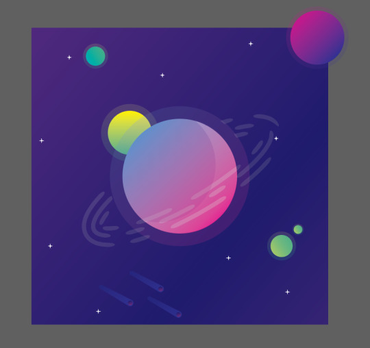
I set myself the task of creating a space themed album cover/poster for the song ground control (David Bowie-Space Oddity). I’ve never really attempted album covers or posters before knowing that they require good colour coordination which I struggle with, so that’s why I chose this brief, but before I started anything I had to research graphic design and find out how this could help me to create an effective album cover/poster. After conducting the research (see below this post) I noticed most of the covers are relatively simple, with each element only being made of a few shapes, because of this I came to the conclusion that I should try not to overcompensate the design.
I’ll admit I often don’t plan as long as I should, I try go straight into the designing stage of the task, but when starting this I took my time to teach myself how to do this properly. I spent time looking for tutorials to try and help me learn the style and techniques of modern graphic design after a while I felt comfortable enough to start.
I found an interesting tutorial describing how to make a cool looking planet (the image below shows my attempt) and I really like the art style so I’ll try to create a similar one in my design.
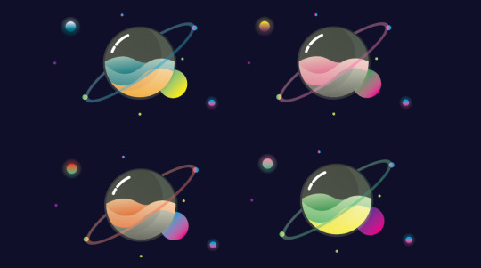
I tried out varying styles and colours to find the right planet design for the cover. After a while I came to the conclusion that I would use the pink and blue planet (see below or above), believing they had the best colour coordination and would work best with the space theme I was trying to emulate. However I may consider using the other designs later on to try and create some sort of solar system, with all the planets orbiting each other, or being spaced out around the page.
After analyzing my work and assessing it against other album covers/posters I found that most are done in a square format, which means for my final design I will need it to be on a square document, however for the design stage I will keep to a rectangle (above), as this leaves me with more room to experiment.
The image below shows the process of how I made my planets (the descriptions their as well), all of them were made the same way just with altered gradients. When changing the colour of the planets I had to find ones that compliment each other, as mentioned in my brief, I tend to struggle with colour theory and have had to teach myself about it in order to achieve an effective design.
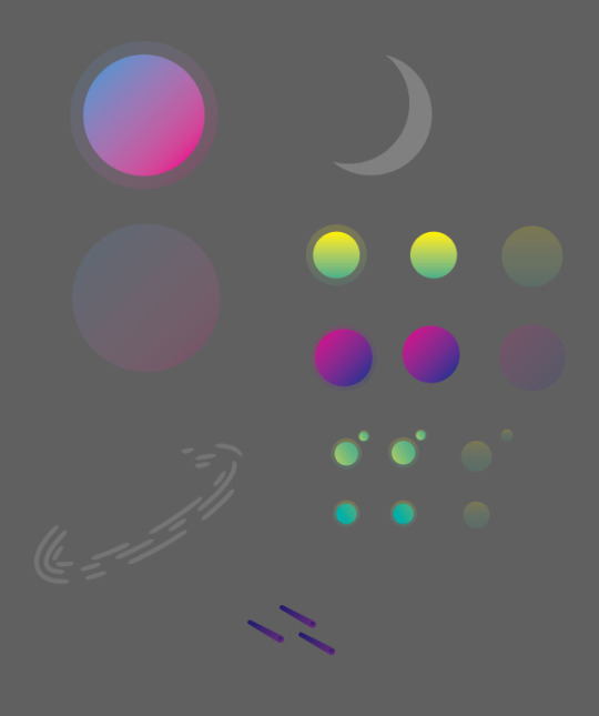

The image above shows what elements I used to construct the planet, showing. most of the sections started as ellipses that I changed using the direct selection tool, once I had the shapes I wanted for the inside I added a gradient to them, sticking to my theme of bright colours. The ellipses that make up the outside of the planet stayed to their original shape just having the opacity lowered to make them appear transparent. After I placed the inside and the outside together, I felt they needed more emphasis on the fact this is meant to be a 3D shape so I added a shine and glare to the right side (the crescent shape in the image above) adding to the glass effect.
The ring around the planet took surprisingly long to get right, I struggled to find a way to make the independent shape without effecting the planet. eventually I got it to work, using a mask to take away the middle, however this did make the section behind the planet disappear but you don’t see it so it’s not that important.
Finally their are the moons that orbit the planet and the large moon at the top left. similar to the actual planet their made from ellipses that have had a gradient applied to them. I used three gradients in total for all the moons, the first (being the bottom right moon) going from a dark green to light green. The second a warm yellow to vibrant green, you can see this above the left of the ring. finally (on the top right side of cover) the last moon follows a similar colour scheme of the main planet, directly going from dark purple to vibrant pink.
In conclusion to the design of the planet, I like the colour scheme I used, trying to stick to more vibrant colours. I like how I laid it out keeping the spacing nice and I’m happy with how it looks.
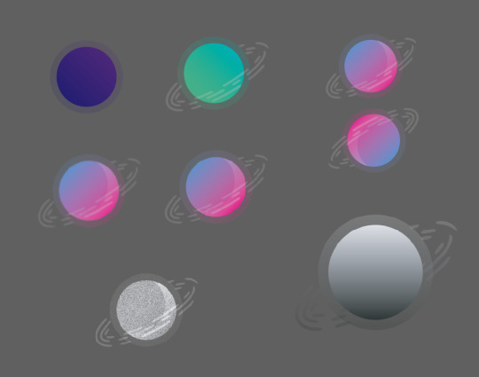
After deciding a colour for my planet I went thorough lots of development to decide weather I want to add an effect to the design or not, the images above show what I tried. out of what I did I think my favorite is the image above, I’m not entirely sure how I made it but I like the repeating shapes and the solid colour, it reminds me of a cover the early 90s and if it worked then, it could work now.
above you can see I separated out the design, I did this because I wanted to try and find an angle that looked good for the design, however none of them really compliment the whole thing so I chose to keep it the same.
I removed the gradient from the design on the left, which led to the one on the right, personally I still like the gradient version more, but the solid colour version could be used for something else. I chose to keep trying new things with the solid colour version, removing parts, changing colours and adding new effects. removing the front of the planet yielded an interesting result, making the colours appear brighter, however removing the illusion that the planets contained within some sort of orb.
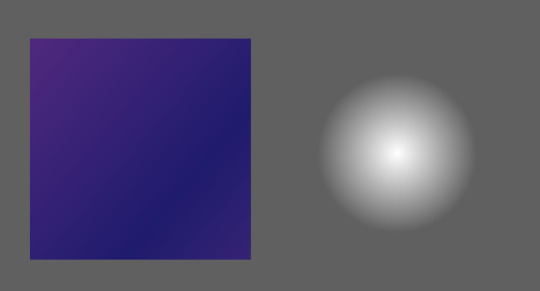
The background was fairly simple to make only using a radial gradient that I lowed the opacity on to create the glow effect (see image above).
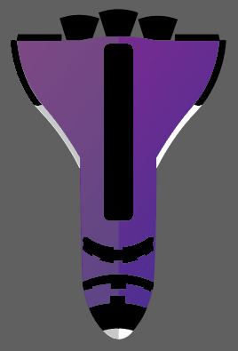
Previous design-not being used. The space shuttle was too realistic not following the rest of the style (graphic), however I do like how it looks and might consider using it at another point. besides that I like the planet and will use this in the final design.
I remade the rocket, trying to keep it simpler and to a nicer colour scheme using tone to try and add shape. I like this rocket much more to the other and will most likely use this in the final design to replace the role of the rocket above (entering the atmosphere)
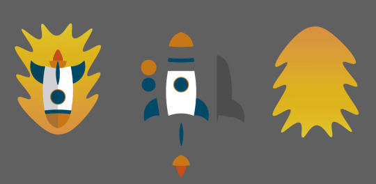
I went through a few designs for the rocket trying different styles and proportions, but came to the conclusion I wanted to use a simple design sticking to the theme of the rest of the album cover/poster. The image above shows how I constructed the the rocket, once similar to the planet being made of ellipses which I warped to make the shapes I want. The only section of the rocket I didn’t make this way is the shadow that cover the left side (facing down), I made this by placing a rectangle of the top of one half of the rocket lowering it’s opacity and then using the shape combiner to remove all the rectangle that doesn't cover the rocket.
The flame that surrounds the rocket I made by hand individually movie points to create the effect, later adding a gradient going from a dark orange to a brighter orange (bottom to top).
In conclusion to the rockets design I think it follows the rest of the album cover/poster and I feel the colours aren't to out of place. However I’m still unsure weather or not I’ll use it in the final cover
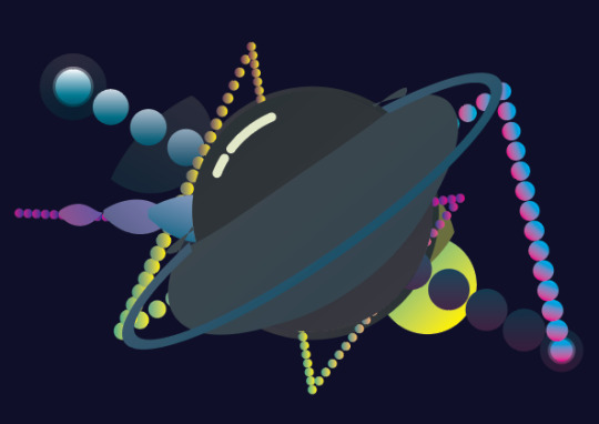
The layout of my work-space, containing all the designs, tests and assets.
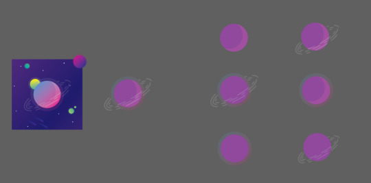
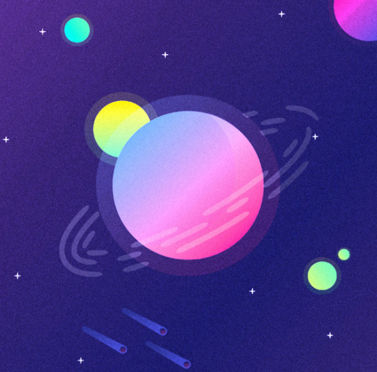
As mention previously I was debating weather I wanted to use the multiple planets. But as you can see I chose to use and I think they work quite well, bringing more variation to the design and generally making the whole thing more interesting. Out of the designs I tried with the planets, I think my favorite is the one below, with the planets being different sizes it makes the layout more like a solar system, adding both character and emphasizing the space theme.
To answer the question was it successful at being a cover, I think so yes, the colours are vibrant and would draw attention, they compliment each other and follow a space theme. The entire design has been done in a graphically pleasing style and it isn’t too complicated being made primarily of simple shapes, yet the design still retains some complexity not being too simple.
Throughout the process of making the cover I’ve come to appreciate even more how important colour and direction can be when creating a poster or still image, learning how it must have direction drawing the attention of whoever sees it, moving their eyes around the image emphasizing certain sections. Learning new techniques on how to make an effective design taking inspiration from previous album covers and researching into their history. Adding effects to my work to try and give them texture and depth and experimenting with layers to change colours and gradients, using Photoshop more than I ever have before.
In conclusion to the entire design, I’m happy with how it turned out, I like the colours and think the design follows the target I set myself, however I would work on the spacing for the final album cover/poster refining the design even further, moving the smaller sections round the page emphasizing on the direction mentioned previously. I would also look at the colours I have chosen assessing weather they really were the right choice, or weather their were colours that would have better followed the center planet. Regardless of these points as said I’m still happy with the design and will take these into consideration in the future.
0 notes
Last Seen Blogs

annexynexus
an inchident

fokarfokar
Untitled

star-universe
Legendary Pretty Cure

greed-matsuyama
GREED BLOG

littlekourtxstuart
Fala rapeize!