#CSSTypography
Explore tagged Tumblr posts
Visit Tumblr Blog
Explore Tumblr blogs with no restrictions, modern design and the best experience.
Last Seen Tumblr Blogs


Fun Fact
The “We are the 99%” Tumblr blog became the slogan for the Occupy Wall Street movement.
Text
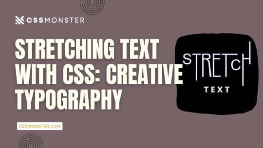
Stretching Text with CSS: Creative Typography
1. Introduction
Typography is a critical element in web design, influencing user experience, readability, and aesthetics. With the power of CSS (Cascading Style Sheets), web designers can enhance their text's visual impact, making it more engaging and expressive. In this blog post, we'll explore various techniques for stretching and warping text with CSS, allowing you to create captivating and unique typography on your website. Let's dive into the world of creative typography through CSS.
2. Understanding CSS Typography
Before we delve into the creative possibilities of text stretching and warping, it's essential to have a solid grasp of CSS typography fundamentals. Understanding these basic concepts will provide a strong foundation for the exciting techniques we'll explore later. Key CSS Typography Properties CSS offers several properties for controlling the appearance of text, allowing you to fine-tune the typography of your web content. Here are some key CSS typography properties: - Font Properties: CSS enables you to set font family, size, style, and weight to define how text appears. - Text Alignment: You can control the alignment of text within its container using properties like 'text-align.' - Line Spacing: 'line-height' determines the vertical spacing between lines of text, affecting readability and aesthetics. Font Stacks and Fallbacks When specifying fonts, it's essential to provide a font stack. A font stack lists multiple fonts in order of preference. For example: CSS font-family: 'Arial', 'Helvetica', sans-serif; If the user's device doesn't have the first font (Arial), it will fall back to the second font (Helvetica), and so on, until a suitable font is found or the generic 'sans-serif' font is used. Responsive Typography Consider implementing responsive typography by using relative units like 'em' or 'rem' for font sizes. This ensures that text adapts well to different screen sizes, making your website more user-friendly. Web Fonts and @font-face For unique and custom typography, web fonts are a game-changer. You can use the '@font-face' rule to load custom fonts on your website. There are numerous web font services available that provide a wide range of fonts for use in web design. Typography Best Practices Effective typography should prioritize readability and accessibility. Choose fonts that are easy to read and provide enough contrast between text and background. Maintain consistent typography across your website for a professional and cohesive look. Using CSS for Typography CSS plays a crucial role in controlling the appearance of text. We'll now explore how you can use CSS to stretch and warp text creatively, allowing you to design unique and visually striking typography for your web projects.
3. Stretching Text Horizontally
Stretching text horizontally is a creative way to modify the appearance of your typography. This technique can be particularly useful for creating eye-catching headings or stylized text elements. Let's explore some CSS properties and methods to achieve this effect. Using 'letter-spacing' The 'letter-spacing' property allows you to control the space between characters in a text element. By increasing the value of 'letter-spacing,' you can make the characters spread out, effectively stretching the text horizontally. For example: CSS h1 { letter-spacing: 5px; } This CSS rule increases the letter spacing for all h1 headings, resulting in stretched text. You can adjust the pixel value to achieve the desired effect. Applying 'text-transform' The 'text-transform' property is another tool in your arsenal. While its primary purpose is to control the capitalization of text, it can be creatively used to stretch text. For example, by applying 'text-transform: uppercase;' to a text element, you can make all characters in the text appear in uppercase, effectively stretching them horizontally. Combining Techniques To create more complex effects, consider combining 'letter-spacing' and 'text-transform.' By adjusting both properties, you can achieve unique typographic results. For example, you can increase 'letter-spacing' while applying 'text-transform: uppercase;' to make text both wider and in uppercase letters. Responsive Considerations Keep in mind that while stretching text horizontally can be visually appealing, it may impact text legibility. Be cautious when using extreme values for 'letter-spacing,' as it can cause text to become less readable, especially on smaller screens. Always test and optimize your typography for different devices and screen sizes to ensure a positive user experience. Examples Let's take a look at a couple of examples to see the impact of stretching text horizontally using CSS: Original TextStretched TextCreativeC r e a t i v eTypographyT y p o g r a p h y In the table above, you can see how the 'letter-spacing' property can be used to stretch text horizontally. Stretching text horizontally with CSS is just one of the many techniques available for creative typography. In the next sections, we'll explore more ways to manipulate text and achieve unique typographic effects.
4. Stretching Text Vertically
Stretching text vertically is another intriguing way to manipulate your typography creatively. While this technique is less common than horizontal stretching, it can add a unique and eye-catching touch to your web design. Let's explore how to stretch text vertically using CSS. Using 'line-height' The primary property for stretching text vertically is 'line-height.' The 'line-height' property determines the height of each line of text. By increasing the 'line-height' value, you can stretch the text vertically. For example: CSS h1 { line-height: 2.0; } This CSS rule doubles the line height for all h1 headings, effectively stretching the text vertically. Adjust the 'line-height' value as needed to achieve your desired effect. Using Pseudo-Elements Another approach to stretching text vertically is by using pseudo-elements, such as '::before' and '::after.' By adding extra vertical space above or below the text, you can create a vertical stretching effect. Here's an example: CSS h2::before { content: ""; display: block; height: 20px; } This CSS rule adds 20 pixels of empty space above every h2 heading, stretching the text vertically. Combining Techniques As with horizontal stretching, you can combine techniques to create more complex effects. For instance, you can adjust both 'line-height' and use pseudo-elements to achieve a visually appealing vertical stretch. Responsive Considerations Keep in mind that stretching text vertically can affect text legibility and line spacing. Use this technique sparingly and consider its impact on different screen sizes. Ensure that the text remains readable and aesthetically pleasing across various devices. Examples Let's take a look at a couple of examples to see the impact of stretching text vertically using CSS: Original TextStretched TextCreativeCreativeTypographyTypography In the table above, you can see how the 'line-height' property can be used to stretch text vertically. The examples illustrate the impact on specific words. Stretching text vertically offers a unique way to enhance your web typography, and it can be particularly effective for headings, titles, and other prominent text elements. In the following sections, we'll continue exploring more creative text manipulation techniques with CSS.
5. Skewed Text Effects
Skewing text is a fascinating way to create dynamic and visually striking typography. CSS provides the 'transform' property to achieve skewing effects, adding a sense of motion and depth to your text. Let's dive into how you can apply skewed text effects with CSS. Using 'transform: skew()' The 'transform' property in CSS allows you to apply various transformations to elements, including skewing. The 'skew()' function within the 'transform' property lets you specify both horizontal and vertical angles for skewing. Here's an example: CSS h1 { transform: skew(20deg, 10deg); } This CSS rule skews the text within all h1 headings by 20 degrees horizontally and 10 degrees vertically. Adjust the angle values to create different skewing effects. Skewing Elements on Hover To create interactive and engaging text effects, you can apply skewing on hover. This way, text elements skew when users place their cursor over them. Here's an example: CSS h2:hover { transform: skew(10deg, 5deg); } In this CSS rule, h2 headings will skew when hovered over, providing a dynamic and playful user experience. Combining Skew with Other CSS Properties Skewed text can be even more exciting when combined with other CSS properties like color, background, and transitions. You can create eye-catching text effects by incorporating skewing with these elements. Responsive Considerations Keep in mind that skewed text can impact text legibility, so it's important to use this technique thoughtfully. Ensure that your text remains readable on different screen sizes and devices. Consider fallback styles for unsupported browsers that don't handle CSS transformations. Examples Let's take a look at a couple of examples to see the impact of skewing text using CSS: Original TextSkewed TextCreativeCreativeTypographyTypography In the table above, you can see how the 'transform: skew()' property can be used to create skewed text effects. The examples illustrate the impact on specific words. Skewing text adds a dynamic and visually captivating dimension to your typography. When used effectively, it can make your web design stand out and engage users. In the following sections, we'll continue exploring more techniques for creative text manipulation with CSS.
6. Warping Text with CSS
Warping text is a creative and eye-catching way to make your typography truly unique. CSS offers several properties and techniques to bend and distort text, providing a playful and dynamic aspect to your web design. Let's explore how you can warp text using CSS. Using 'transform: perspective()' The 'transform' property in CSS includes the 'perspective()' function, which allows you to apply a 3D perspective effect to text. This can give the illusion of text being bent or wrapped around a virtual surface. Here's an example: CSS h1 { transform: perspective(500px) rotateX(20deg); } This CSS rule applies a perspective to all h1 headings, making them appear as if they are bent along the X-axis. You can adjust the 'perspective()' value and the 'rotateX()' angle to achieve different warping effects. Using 'transform: warp()' CSS introduces a 'warp()' function within the 'transform' property that allows you to warp text. This function enables you to specify the curvature, or 'warp' of the text, creating the appearance of text being bent along a curve. Here's an example: CSS h2 { transform: warp(bulge 10% 50%); } This CSS rule warps all h2 headings in a bulge pattern, with a 10% curvature and a 50% offset, resulting in a text that appears to follow a curved path. You can experiment with different warp patterns and values to achieve various warping effects. Combining Warping with Other Properties Warping text can become even more exciting when combined with other CSS properties like colors, backgrounds, and animations. This allows you to create captivating and dynamic text effects that engage your users. Responsive Considerations Warping text can be a visually compelling technique, but it's essential to consider its impact on text legibility. Test and optimize your warped text to ensure it remains readable on different screen sizes and devices. Additionally, consider fallback styles for browsers that don't support CSS transformations. Examples Let's take a look at a couple of examples to see the impact of warping text using CSS: Original TextWarped TextCreativeCreativeTypographyTypography In the table above, you can see how the 'transform: warp()' property can be used to create warped text effects. The examples illustrate the impact on specific words. Warping text adds a dynamic and playful dimension to your typography, making it visually appealing and engaging. When used creatively, it can enhance the overall design of your web content. In the following sections, we'll continue exploring more techniques for text manipulation with CSS.
7. Overlapping Text
Overlapping text is a creative technique that allows you to add depth and dimension to your typography, creating visually engaging designs. By layering text elements over one another, you can achieve various effects that draw the viewer's attention. Let's explore how to overlap text using CSS. Using 'position' and 'z-index' CSS provides the 'position' property, which allows you to control the positioning of text elements within their containers. By using 'position: absolute;' and 'z-index' values, you can stack text elements on top of each other. Here's an example: CSS h1 { position: absolute; z-index: 2; } h2 { position: absolute; z-index: 1; } In this example, the 'h1' and 'h2' headings are positioned absolutely, and 'z-index' values determine their stacking order. The heading with a higher 'z-index' appears on top of the other, creating the overlap effect. Creating Text Shadows Another approach to overlap text is by using text shadows. By applying a subtle text shadow to text elements, you can give the impression of depth and overlapping. Here's an example: CSS h3 { text-shadow: 2px 2px 4px rgba(0, 0, 0, 0.5); } This CSS rule adds a text shadow to the 'h3' heading, making it appear as if it is overlapping the content below. You can adjust the shadow's offset, blur, and color for different effects. Combining Overlapping Techniques To create more intricate and dynamic overlapping text effects, you can combine different techniques. For example, you can use both 'position' and text shadows to make text elements overlap and cast shadows simultaneously. Responsive Considerations When implementing overlapping text, it's crucial to consider its impact on readability. Overlapping text can reduce legibility, especially when overlaid on top of each other. Use this technique selectively and test its effects on various screen sizes. Ensure that your text remains clear and accessible. Examples Let's take a look at a couple of examples to see the impact of overlapping text using CSS: Original TextOverlapped TextCreative C r e a t i v e Typography Typography In the table above, you can see how the 'position' property and text shadows can be used to create overlapping text effects. The examples illustrate the impact on specific words. Overlapping text is a creative way to add depth and dimension to your typography, making it more visually engaging. When used thoughtfully, it can contribute to a unique and memorable design. In the following sections, we'll continue exploring additional techniques for creative text manipulation with CSS.
8. Combining Techniques
Combining various text manipulation techniques in CSS can lead to even more exciting and dynamic typography. By layering, skewing, stretching, and warping text elements, you can create visually stunning and unconventional text effects. Let's explore how to combine these techniques for truly unique typography. Layering and Skewing Combining layering and skewing effects can produce intriguing results. For example, you can position two text elements on top of each other using 'position' and 'z-index' and then apply a 'skew()' transformation to one of them. This creates a dynamic and 3D-like appearance, with one text element appearing to bend while overlapping the other. Stretching and Warping Stretching and warping text elements can be combined to create even more unconventional typography. For instance, you can stretch text horizontally with 'letter-spacing' and then apply a 'warp()' transformation to bend the text. This combination can lead to text that appears to be pulled and twisted, adding depth and movement to your design. Interactive Hover Effects You can take your typography to the next level by adding interactivity. Apply hover effects to your text elements to make them respond to user interactions. For example, when a user hovers over a text element, you can simultaneously apply skewing, stretching, or warping transformations, creating an engaging and playful experience. Layering with Shadows Combine layering with text shadows to create a shadowed depth effect. By positioning text elements with 'position' and 'z-index' and then applying text shadows, you can make text appear as if it's floating above or below the surface. Adjust the shadow's blur and color for different shadowed effects. Responsive Design While combining techniques can yield exciting results, it's essential to consider responsive design. Test the combined effects on various screen sizes and devices to ensure that your typography remains clear and legible. Read the full article
0 notes