#TextStyling
Explore tagged Tumblr posts
Visit Tumblr Blog
Explore Tumblr blogs with no restrictions, modern design and the best experience.
Last Seen Tumblr Blogs


Fun Fact
Tumblr has 4 main sources of revenue.
Text
✨ Want to add a touch of style to your text on iPhone? Let's italicize! ✨
Here’s how you can do it:
Messages App: Highlight the text you want to italicize, tap "B/I/U" in the pop-up menu, and select "Italic."
Notes App: Similar to Messages, highlight the text, tap "B/I/U," and choose "Italic."
Mail App: Highlight the text, tap the "Aa" icon, then select "Italic."
📱 Tip: This works for most Apple apps that support text formatting!
Have you used this feature? Share your favorite tips below! 👇
#iPhoneTips#TextStyling#AppleHacks#MobileTech#iOSFeatures#SmartphoneTips#TextFormatting#TechTricks#ProductivityHacks#TechSavvy
0 notes
Text
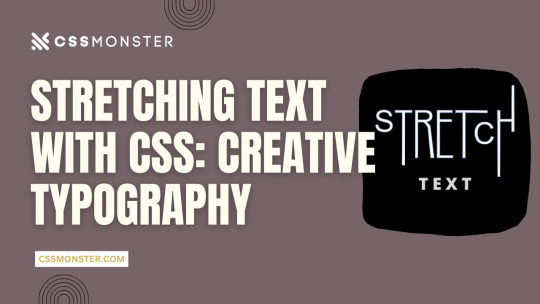
Stretching Text with CSS: Creative Typography
1. Introduction
Typography is a critical element in web design, influencing user experience, readability, and aesthetics. With the power of CSS (Cascading Style Sheets), web designers can enhance their text's visual impact, making it more engaging and expressive. In this blog post, we'll explore various techniques for stretching and warping text with CSS, allowing you to create captivating and unique typography on your website. Let's dive into the world of creative typography through CSS.
2. Understanding CSS Typography
Before we delve into the creative possibilities of text stretching and warping, it's essential to have a solid grasp of CSS typography fundamentals. Understanding these basic concepts will provide a strong foundation for the exciting techniques we'll explore later. Key CSS Typography Properties CSS offers several properties for controlling the appearance of text, allowing you to fine-tune the typography of your web content. Here are some key CSS typography properties: - Font Properties: CSS enables you to set font family, size, style, and weight to define how text appears. - Text Alignment: You can control the alignment of text within its container using properties like 'text-align.' - Line Spacing: 'line-height' determines the vertical spacing between lines of text, affecting readability and aesthetics. Font Stacks and Fallbacks When specifying fonts, it's essential to provide a font stack. A font stack lists multiple fonts in order of preference. For example: CSS font-family: 'Arial', 'Helvetica', sans-serif; If the user's device doesn't have the first font (Arial), it will fall back to the second font (Helvetica), and so on, until a suitable font is found or the generic 'sans-serif' font is used. Responsive Typography Consider implementing responsive typography by using relative units like 'em' or 'rem' for font sizes. This ensures that text adapts well to different screen sizes, making your website more user-friendly. Web Fonts and @font-face For unique and custom typography, web fonts are a game-changer. You can use the '@font-face' rule to load custom fonts on your website. There are numerous web font services available that provide a wide range of fonts for use in web design. Typography Best Practices Effective typography should prioritize readability and accessibility. Choose fonts that are easy to read and provide enough contrast between text and background. Maintain consistent typography across your website for a professional and cohesive look. Using CSS for Typography CSS plays a crucial role in controlling the appearance of text. We'll now explore how you can use CSS to stretch and warp text creatively, allowing you to design unique and visually striking typography for your web projects.
3. Stretching Text Horizontally
Stretching text horizontally is a creative way to modify the appearance of your typography. This technique can be particularly useful for creating eye-catching headings or stylized text elements. Let's explore some CSS properties and methods to achieve this effect. Using 'letter-spacing' The 'letter-spacing' property allows you to control the space between characters in a text element. By increasing the value of 'letter-spacing,' you can make the characters spread out, effectively stretching the text horizontally. For example: CSS h1 { letter-spacing: 5px; } This CSS rule increases the letter spacing for all h1 headings, resulting in stretched text. You can adjust the pixel value to achieve the desired effect. Applying 'text-transform' The 'text-transform' property is another tool in your arsenal. While its primary purpose is to control the capitalization of text, it can be creatively used to stretch text. For example, by applying 'text-transform: uppercase;' to a text element, you can make all characters in the text appear in uppercase, effectively stretching them horizontally. Combining Techniques To create more complex effects, consider combining 'letter-spacing' and 'text-transform.' By adjusting both properties, you can achieve unique typographic results. For example, you can increase 'letter-spacing' while applying 'text-transform: uppercase;' to make text both wider and in uppercase letters. Responsive Considerations Keep in mind that while stretching text horizontally can be visually appealing, it may impact text legibility. Be cautious when using extreme values for 'letter-spacing,' as it can cause text to become less readable, especially on smaller screens. Always test and optimize your typography for different devices and screen sizes to ensure a positive user experience. Examples Let's take a look at a couple of examples to see the impact of stretching text horizontally using CSS: Original TextStretched TextCreativeC r e a t i v eTypographyT y p o g r a p h y In the table above, you can see how the 'letter-spacing' property can be used to stretch text horizontally. Stretching text horizontally with CSS is just one of the many techniques available for creative typography. In the next sections, we'll explore more ways to manipulate text and achieve unique typographic effects.
4. Stretching Text Vertically
Stretching text vertically is another intriguing way to manipulate your typography creatively. While this technique is less common than horizontal stretching, it can add a unique and eye-catching touch to your web design. Let's explore how to stretch text vertically using CSS. Using 'line-height' The primary property for stretching text vertically is 'line-height.' The 'line-height' property determines the height of each line of text. By increasing the 'line-height' value, you can stretch the text vertically. For example: CSS h1 { line-height: 2.0; } This CSS rule doubles the line height for all h1 headings, effectively stretching the text vertically. Adjust the 'line-height' value as needed to achieve your desired effect. Using Pseudo-Elements Another approach to stretching text vertically is by using pseudo-elements, such as '::before' and '::after.' By adding extra vertical space above or below the text, you can create a vertical stretching effect. Here's an example: CSS h2::before { content: ""; display: block; height: 20px; } This CSS rule adds 20 pixels of empty space above every h2 heading, stretching the text vertically. Combining Techniques As with horizontal stretching, you can combine techniques to create more complex effects. For instance, you can adjust both 'line-height' and use pseudo-elements to achieve a visually appealing vertical stretch. Responsive Considerations Keep in mind that stretching text vertically can affect text legibility and line spacing. Use this technique sparingly and consider its impact on different screen sizes. Ensure that the text remains readable and aesthetically pleasing across various devices. Examples Let's take a look at a couple of examples to see the impact of stretching text vertically using CSS: Original TextStretched TextCreativeCreativeTypographyTypography In the table above, you can see how the 'line-height' property can be used to stretch text vertically. The examples illustrate the impact on specific words. Stretching text vertically offers a unique way to enhance your web typography, and it can be particularly effective for headings, titles, and other prominent text elements. In the following sections, we'll continue exploring more creative text manipulation techniques with CSS.
5. Skewed Text Effects
Skewing text is a fascinating way to create dynamic and visually striking typography. CSS provides the 'transform' property to achieve skewing effects, adding a sense of motion and depth to your text. Let's dive into how you can apply skewed text effects with CSS. Using 'transform: skew()' The 'transform' property in CSS allows you to apply various transformations to elements, including skewing. The 'skew()' function within the 'transform' property lets you specify both horizontal and vertical angles for skewing. Here's an example: CSS h1 { transform: skew(20deg, 10deg); } This CSS rule skews the text within all h1 headings by 20 degrees horizontally and 10 degrees vertically. Adjust the angle values to create different skewing effects. Skewing Elements on Hover To create interactive and engaging text effects, you can apply skewing on hover. This way, text elements skew when users place their cursor over them. Here's an example: CSS h2:hover { transform: skew(10deg, 5deg); } In this CSS rule, h2 headings will skew when hovered over, providing a dynamic and playful user experience. Combining Skew with Other CSS Properties Skewed text can be even more exciting when combined with other CSS properties like color, background, and transitions. You can create eye-catching text effects by incorporating skewing with these elements. Responsive Considerations Keep in mind that skewed text can impact text legibility, so it's important to use this technique thoughtfully. Ensure that your text remains readable on different screen sizes and devices. Consider fallback styles for unsupported browsers that don't handle CSS transformations. Examples Let's take a look at a couple of examples to see the impact of skewing text using CSS: Original TextSkewed TextCreativeCreativeTypographyTypography In the table above, you can see how the 'transform: skew()' property can be used to create skewed text effects. The examples illustrate the impact on specific words. Skewing text adds a dynamic and visually captivating dimension to your typography. When used effectively, it can make your web design stand out and engage users. In the following sections, we'll continue exploring more techniques for creative text manipulation with CSS.
6. Warping Text with CSS
Warping text is a creative and eye-catching way to make your typography truly unique. CSS offers several properties and techniques to bend and distort text, providing a playful and dynamic aspect to your web design. Let's explore how you can warp text using CSS. Using 'transform: perspective()' The 'transform' property in CSS includes the 'perspective()' function, which allows you to apply a 3D perspective effect to text. This can give the illusion of text being bent or wrapped around a virtual surface. Here's an example: CSS h1 { transform: perspective(500px) rotateX(20deg); } This CSS rule applies a perspective to all h1 headings, making them appear as if they are bent along the X-axis. You can adjust the 'perspective()' value and the 'rotateX()' angle to achieve different warping effects. Using 'transform: warp()' CSS introduces a 'warp()' function within the 'transform' property that allows you to warp text. This function enables you to specify the curvature, or 'warp' of the text, creating the appearance of text being bent along a curve. Here's an example: CSS h2 { transform: warp(bulge 10% 50%); } This CSS rule warps all h2 headings in a bulge pattern, with a 10% curvature and a 50% offset, resulting in a text that appears to follow a curved path. You can experiment with different warp patterns and values to achieve various warping effects. Combining Warping with Other Properties Warping text can become even more exciting when combined with other CSS properties like colors, backgrounds, and animations. This allows you to create captivating and dynamic text effects that engage your users. Responsive Considerations Warping text can be a visually compelling technique, but it's essential to consider its impact on text legibility. Test and optimize your warped text to ensure it remains readable on different screen sizes and devices. Additionally, consider fallback styles for browsers that don't support CSS transformations. Examples Let's take a look at a couple of examples to see the impact of warping text using CSS: Original TextWarped TextCreativeCreativeTypographyTypography In the table above, you can see how the 'transform: warp()' property can be used to create warped text effects. The examples illustrate the impact on specific words. Warping text adds a dynamic and playful dimension to your typography, making it visually appealing and engaging. When used creatively, it can enhance the overall design of your web content. In the following sections, we'll continue exploring more techniques for text manipulation with CSS.
7. Overlapping Text
Overlapping text is a creative technique that allows you to add depth and dimension to your typography, creating visually engaging designs. By layering text elements over one another, you can achieve various effects that draw the viewer's attention. Let's explore how to overlap text using CSS. Using 'position' and 'z-index' CSS provides the 'position' property, which allows you to control the positioning of text elements within their containers. By using 'position: absolute;' and 'z-index' values, you can stack text elements on top of each other. Here's an example: CSS h1 { position: absolute; z-index: 2; } h2 { position: absolute; z-index: 1; } In this example, the 'h1' and 'h2' headings are positioned absolutely, and 'z-index' values determine their stacking order. The heading with a higher 'z-index' appears on top of the other, creating the overlap effect. Creating Text Shadows Another approach to overlap text is by using text shadows. By applying a subtle text shadow to text elements, you can give the impression of depth and overlapping. Here's an example: CSS h3 { text-shadow: 2px 2px 4px rgba(0, 0, 0, 0.5); } This CSS rule adds a text shadow to the 'h3' heading, making it appear as if it is overlapping the content below. You can adjust the shadow's offset, blur, and color for different effects. Combining Overlapping Techniques To create more intricate and dynamic overlapping text effects, you can combine different techniques. For example, you can use both 'position' and text shadows to make text elements overlap and cast shadows simultaneously. Responsive Considerations When implementing overlapping text, it's crucial to consider its impact on readability. Overlapping text can reduce legibility, especially when overlaid on top of each other. Use this technique selectively and test its effects on various screen sizes. Ensure that your text remains clear and accessible. Examples Let's take a look at a couple of examples to see the impact of overlapping text using CSS: Original TextOverlapped TextCreative C r e a t i v e Typography Typography In the table above, you can see how the 'position' property and text shadows can be used to create overlapping text effects. The examples illustrate the impact on specific words. Overlapping text is a creative way to add depth and dimension to your typography, making it more visually engaging. When used thoughtfully, it can contribute to a unique and memorable design. In the following sections, we'll continue exploring additional techniques for creative text manipulation with CSS.
8. Combining Techniques
Combining various text manipulation techniques in CSS can lead to even more exciting and dynamic typography. By layering, skewing, stretching, and warping text elements, you can create visually stunning and unconventional text effects. Let's explore how to combine these techniques for truly unique typography. Layering and Skewing Combining layering and skewing effects can produce intriguing results. For example, you can position two text elements on top of each other using 'position' and 'z-index' and then apply a 'skew()' transformation to one of them. This creates a dynamic and 3D-like appearance, with one text element appearing to bend while overlapping the other. Stretching and Warping Stretching and warping text elements can be combined to create even more unconventional typography. For instance, you can stretch text horizontally with 'letter-spacing' and then apply a 'warp()' transformation to bend the text. This combination can lead to text that appears to be pulled and twisted, adding depth and movement to your design. Interactive Hover Effects You can take your typography to the next level by adding interactivity. Apply hover effects to your text elements to make them respond to user interactions. For example, when a user hovers over a text element, you can simultaneously apply skewing, stretching, or warping transformations, creating an engaging and playful experience. Layering with Shadows Combine layering with text shadows to create a shadowed depth effect. By positioning text elements with 'position' and 'z-index' and then applying text shadows, you can make text appear as if it's floating above or below the surface. Adjust the shadow's blur and color for different shadowed effects. Responsive Design While combining techniques can yield exciting results, it's essential to consider responsive design. Test the combined effects on various screen sizes and devices to ensure that your typography remains clear and legible. Read the full article
0 notes
Video
youtube
How to create doted text outline in Adobe illustrator | KavuCreative
Dive into the world of creative design with my latest tutorial on Kavu Creative! Today, I'll guide you through the process of creating a stylish "Doted Text" outline in Adobe Illustrator. Follow these simple steps: select the Type Tool, write your chosen word (I'm using 'DOTED'), customize the font style and size, play with colors, and align to perfection. I'll show you how to transform it into a sleek outline with a dash of flair. Ready to master this design trick? Watch now, and let your creativity flow! 🚀💡 #AdobeIllustrator #TextEffects #DesignTutorial #CreativeDesign #IllustratorMagic #DotedText #DesignTips
#youtube#kavucreative#logodesign#doted#dotedtext#3dtext#textstyle#logomaker#logomaster#adobe#illustrator
1 note
·
View note
Text
Microsoft Publisher 97 - TEXTSTYLES
77 notes
·
View notes
Text
What are HarmonyOS NEXT-StyleDecorator:@Styles and @Extend?
HarmonyOS NEXT - Style Decorator: If the style of each component needs to be set separately, there will be a large amount of code repeating style settings during the development process. Although it can be copied and pasted, for the sake of code simplicity and easy maintenance in the future, @ Styles, a decorator that can extract common styles for reuse, has been introduced.
@Styles decorator can extract multiple style settings into one method, which can be called directly at the location of the component declaration. @Styles decorator allows for quick definition and reuse of custom styles.
@Styles Decorator: Define Component Reuse Styles @Styles decorator can extract multiple style settings into one method, which can be called directly at the location of the component declaration. @Styles decorator allows for quick definition and reuse of custom styles.
Disadvantages of @Styles Decorators: @Styles only supports universal properties and universal events. @Styles method does not support parameters
@Styles Decorator Restrictions: @Styles method cannot have parameters, and an error will be reported during compilation, reminding developers that the @ Styles method does not support parameters. @Styles method does not support the use of logical components, and properties within logical components do not take effect.
@Extend is used to extend native component styles [code] @Extend(UIComponentName) function functionName { … } [/code] @Extend only supports global definition and does not support definition within components The method of @Extend decoration supports parameters
@Extend Usage Rules ·@Extend supports encapsulating private properties, private events, and globally defined methods of specified components. ·The @Extend decoration method supports parameters, and developers can pass parameters when calling, following the TS method for value passing calls. ·The parameter of the @Extend decoration method can be a function, which serves as a handle for the Event event. ·The parameter of @Extend can be a state variable, and when the state variable changes, the UI can be refreshed and rendered normally.
@Extend Restrictions @Extend only supports global definition and does not support definition within components.
Code Examples [code] @Entry @Component struct StylesPage { @State message: string = '@Styles And @Extend';
@Styles reuseStyle(){ .backgroundColor(Color.Orange) .width(200) .margin(10) // .fontSize(20) }
build() { Column() { Text(this.message) .fontSize(20) .fontWeight(FontWeight.Bold) Text('1').reuseStyle() Text('2').reuseStyle() Text('3').reuseStyle() Text('a').textStyle(100) Text('b').textStyle(150) Text('c').textStyle(200) } .height('100%') .width('100%')
} }
@Extend(Text) function textStyle(w:number){ .width(w) .backgroundColor(Color.Green) .margin(10) .fontSize(20) } [/code]
Combining @Styles and stateStyles @Styles is only used for style reuse on static pages, stateStyles can quickly set different styles based on the internal state of components. Code Examples [code] @Entry @Component struct MyComponent { @Styles normalStyle() { .backgroundColor(Color.Gray) }
@Styles pressedStyle() { .backgroundColor(Color.Red) }
build() { Column() { Text('Text1') .fontSize(50) .fontColor(Color.White) .stateStyles({ normal: this.normalStyle, pressed: this.pressedStyle, }) } } } [/code]
StateStyles can bind regular and state variables within a component through this [code] @Entry @Component struct CompWithInlineStateStyles { @State focusedColor: Color = Color.Red; normalColor: Color = Color.Green
build() { Column() { Button('clickMe').height(100).width(100) .stateStyles({ normal: { .backgroundColor(this.normalColor) }, focused: { .backgroundColor(this.focusedColor) } }) .onClick(() => { this.focusedColor = Color.Pink }) .margin('30%') } } } [/code]
0 notes
Text
A Guide to Building Responsive Flutter Apps with responsive_framework 1.4.0
Introduction: In today's fast-paced digital world, creating responsive mobile applications is essential to providing users with a seamless experience across different devices. Flutter, Google's UI toolkit for building natively compiled applications for mobile, web, and desktop, offers various tools and packages to achieve responsiveness. One such tool is the responsive_framework package, version 1.4.0. In this blog post, we'll explore how to utilize this package to build responsive Flutter apps that adapt to different screen sizes and orientations. For businesses, working with a Flutter app development company can further enhance the responsiveness and functionality of your app.
Understanding responsive_framework 1.4.0: responsive_framework is a Flutter package that simplifies the process of creating responsive layouts in your Flutter apps. With version 1.4.0, developers have access to enhanced features and functionalities for building responsive UIs. This package offers a grid-based approach to handle layout scaling, allowing developers to define breakpoints and adjust the layout accordingly.
Getting Started: To integrate responsive_framework into your Flutter project, you need to add it as a dependency in your pubspec.yaml file:
yaml
Copy code
dependencies: responsive_framework: ^1.4.0
After adding the dependency, run flutter pub get to install the package.
Usage:
Import the package: First, import the responsive_framework package in your Dart code:dartCopy codeimport 'package:responsive_framework/responsive_framework.dart';
Wrap your MaterialApp or CupertinoApp with ResponsiveWrapper: Wrap your MaterialApp or CupertinoApp widget with ResponsiveWrapper and configure it according to your desired breakpoints and settings:dartCopy codeResponsiveWrapper.builder( BouncingScrollWrapper.builder( MaterialApp( // Your app configuration ), ), maxWidth: 1200, minWidth: 450, defaultScale: true, breakpoints: [ ResponsiveBreakpoint.resize(450, name: MOBILE), ResponsiveBreakpoint.autoScale(800, name: TABLET), ResponsiveBreakpoint.resize(1000, name: DESKTOP), ], ) Here, you can specify the maxWidth, minWidth, and breakpoints for different device sizes such as MOBILE, TABLET, and DESKTOP.
Building Responsive UIs: Utilize the provided widgets from responsive_framework to create responsive UIs. For example, ResponsiveRow, ResponsiveColumn, and ResponsiveGridList help in organizing widgets in a responsive manner.
Example: Let's create a simple example demonstrating the usage of responsive_framework:
dart
Copy code
import 'package:flutter/material.dart'; import 'package:responsive_framework/responsive_framework.dart'; void main() { runApp(MyApp()); } class MyApp extends StatelessWidget { @override Widget build(BuildContext context) { return ResponsiveWrapper.builder( BouncingScrollWrapper.builder( MaterialApp( title: 'Responsive Framework Demo', theme: ThemeData( primarySwatch: Colors.blue, ), home: MyHomePage(), ), ), maxWidth: 1200, minWidth: 450, defaultScale: true, breakpoints: [ ResponsiveBreakpoint.resize(450, name: MOBILE), ResponsiveBreakpoint.autoScale(800, name: TABLET), ResponsiveBreakpoint.resize(1000, name: DESKTOP), ], ); } } class MyHomePage extends StatelessWidget { @override Widget build(BuildContext context) { return Scaffold( appBar: AppBar( title: Text('Responsive Framework Demo'), ), body: Center( child: Text( 'Welcome to Responsive Framework Demo!', style: TextStyle(fontSize: 24), ), ), ); } }
Conclusion: Building responsive Flutter apps has never been easier with the responsive_framework package version 1.4.0. By leveraging its grid-based approach and breakpoint system, developers can create adaptive layouts that cater to various device sizes and orientations. Partnering with a Flutter app development company can ensure that your app achieves the highest standards of responsiveness and usability, delivering a consistent and user-friendly experience across all devices. Start incorporating responsive_framework into your Flutter projects today and take your app's responsiveness to the next level!
0 notes
Text
EP 1 - Devil Theme Pictorial
EP 3 - TextStyle Nude
EP 4 - Giant and Small People
EP 6 - Identical Twins
EP 9 - Guerilla
EP 10 - Jewelry Commercial
EP 11 - Harper Bazaar's Cover Shoot with Mentors
0 notes
Text
Understanding Flutter Widgets: The Building Blocks of Your App
In the world of mobile app development, Flutter has quickly gained popularity due to its fast development cycle, beautiful UI, and cross-platform capabilities. At the heart of Flutter lies its widget-based architecture. Every visual component, from buttons and images to more complex user interfaces, is a widget. But what exactly are Flutter widgets, and why are they so important? Let’s dive into understanding Flutter widgets and how they play a crucial role in Flutter app development.

What Are Flutter Widgets? In Flutter, everything is a widget. From simple UI elements like buttons, text, and images to complex layouts like lists, forms, and navigation bars, everything is created using widgets. Flutter’s architecture is based on a declarative style, which means you describe the UI and let Flutter handle the rest. A widget in Flutter is essentially an immutable description of a part of the user interface.
Widgets can be divided into two main categories: Stateless Widgets and Stateful Widgets.
Stateless Widgets A StatelessWidget is a widget that doesn't change over time. Once built, a stateless widget does not need to be rebuilt unless external changes are made. These widgets are ideal for static content, such as displaying a label or an image that does not change during the lifecycle of the widget.
Examples of Stateless Widgets:
Text: Displays a string of text. Icon: Displays a material design icon. Container: A box that can contain a child widget, with customizable padding, margins, and decoration. Since they don't change, stateless widgets are more lightweight and faster to render, making them a great choice for static elements.
Stateful Widgets A StatefulWidget, on the other hand, is a widget that can change during its lifecycle. Unlike stateless widgets, stateful widgets have mutable state. This means they can update their appearance based on user interactions, network responses, or other changes during the app’s runtime.
For instance, think about a button that increments a counter when clicked, or a form that dynamically updates based on user input—these require stateful widgets.
Examples of Stateful Widgets:
TextField: For user input. Checkbox: To show a checked or unchecked state. Slider: For selecting values from a range. These widgets are perfect for interactive components, animations, or complex UI structures that need to respond to changes in real time.
Core Flutter Widgets Now that we have an idea of the basic types of widgets, let’s explore some of the most commonly used Flutter widgets that you’ll work with to build your app.
Text Widget The Text widget is used to display text. It's the simplest way to display a string in your Flutter app. You can customize the font size, color, style, and alignment using the TextStyle class.
Container Widget The Container widget is a powerful and versatile layout widget. It can be used to create boxes around other widgets with custom padding, margins, borders, and background colors. Containers are often used to wrap other widgets for layout purposes.
Column and Row Column: A widget that displays its children vertically, one on top of the other. Row: A widget that arranges its children horizontally, side by side. These layout widgets allow you to structure your UI elements and create responsive designs.
Stack The Stack widget allows you to stack widgets on top of each other. This is useful for designing complex layouts, such as positioning text or images over other widgets, creating card-like effects, or managing multiple overlapping components.
ListView The ListView widget is one of the most powerful and widely used widgets for displaying a list of items that can scroll vertically. It allows you to display a dynamic list of elements like text, images, or custom widgets.
Scaffold The Scaffold widget provides a basic structure for implementing the visual layout of your app. It includes elements such as the AppBar (top navigation bar), Body (main content area), FloatingActionButton (for actions), and Drawer (side navigation).
Drawer The Drawer widget is a sliding panel that typically contains navigation links. It's commonly used for app navigation, especially when your app has multiple sections. Users can open the drawer by swiping from the left side of the screen or clicking on a menu icon.
Layout Widgets When building your app’s UI, you’ll need to arrange widgets within the screen. Flutter provides a rich set of layout widgets that allow you to structure content easily.
Padding: Adds space around a widget to ensure it doesn't touch the edges of its parent. Align: Helps position a widget inside its parent by aligning it to specific points (top, bottom, left, right, etc.). Expanded: Makes a widget fill the available space within a parent widget like Row or Column. Flexible: Similar to Expanded but allows you to allocate space proportionally between multiple children. These layout widgets help organize and present your content efficiently.
Gesture Widgets User interaction is a big part of any mobile app, and Flutter provides several gesture-related widgets to detect and handle user input.
GestureDetector: A widget that detects different types of gestures such as taps, drags, and swipes. InkWell: A material design widget that responds to taps with a ripple effect, commonly used for buttons or interactive elements. Custom Widgets Flutter also allows you to create custom widgets by composing multiple existing widgets together. This is essential for creating modular and reusable components, making your codebase cleaner and more maintainable.
For example, you can build a custom card widget that combines an image, title, and description into one reusable component.
The Power of Flutter’s Widget Tree One of the unique aspects of Flutter is its widget tree. The widget tree is a hierarchy of widgets that describes the UI of your app. Each widget can contain other widgets, and those in turn can contain even more widgets. This tree-like structure allows you to compose complex UIs by nesting widgets.
When the state of a widget changes, Flutter efficiently rebuilds only the parts of the widget tree that need to be updated, minimizing the performance cost and ensuring smooth UI transitions.
Conclusion Widgets are the foundation of Flutter’s UI framework, and understanding how they work is essential to mastering Flutter development. Whether you’re creating simple UI elements or complex interactive screens, you’ll be using Flutter widgets to construct your app. By composing stateless and stateful widgets, along with layout and gesture widgets, you can build beautiful, responsive, and dynamic apps.
Flutter's widget-centric design is not only powerful but also flexible, enabling you to create cross-platform apps with a single codebase. As you continue to explore Flutter, mastering widgets will be your first step toward becoming a proficient Flutter developer
0 notes
Text
receive_sharing_intentとは、Flutterで他のアプリから共有されたテキストや画像、URLなどを受け取るためのプラグインです。このプラグインを使うと、Flutterアプリがシェアメニューに表示され、選択するとアプリが起動して共有されたデータを取得できます。iOSではShare Extension、AndroidではIntentという仕組みを利用しています。このプラグインの使い方は、以下のようになります。
- pubspec.yamlにreceive_sharing_intentを追加します。
- iOSとAndroidのプロジェクトに必要な設定を行います。詳細は[公式ドキュメント](^1^)を参照してください。
- Flutterのコードで、ReceiveSharingIntentクラスのメソッドやストリームを使って、共有されたデータを受け取ります。例えば、以下のようにテキストを受け取ることができます。
```dart
import 'package:flutter/material.dart';
import 'package:receive_sharing_intent/receive_sharing_intent.dart';
class ReceivePage extends StatefulWidget {
@override
_ReceivePageState createState() => _ReceivePageState();
}
class _ReceivePageState extends State<ReceivePage> {
String? _sharedText;
@override
void initState() {
super.initState();
// アプリが起動しているときにテキストを受け取る
ReceiveSharingIntent.getTextStream().listen((String value) {
setState(() {
_sharedText = value;
});
}, onError: (err) {
print("エラー: $err");
});
// アプリが起動していないときにテキストを受け取る
ReceiveSharingIntent.getInitialText().then((String? value) {
setState(() {
_sharedText = value;
});
});
}
@override
Widget build(BuildContext context) {
return Scaffold(
appBar: AppBar(
title: Text('Receive Example'),
),
body: Center(
child: Text(
_sharedText ?? 'テキストがありません',
style: TextStyle(fontSize: 24),
),
),
);
}
}
```
このプラグインについてもっと知りたい場合は、[公式ドキュメント](^1^)や[参考記事](^2^) ³をご覧ください。
ソース: Bing との会話 2024/2/22
(1) Flutterでブラウザなどからシェアでアプリに情報を渡す - Zenn. https://zenn.dev/kentaroh/articles/8ec2962a5fadfe.
(2) Flutterでブラウザなどからシェアでアプリに情報を渡す - Zenn. https://zenn.dev/kentaroh/articles/8ec2962a5fadfe.
(3) 【Flutter 3.16】Share Extensionの画面をFlutterで作り .... https://zenn.dev/sora382/articles/cdeee519f3c7f7.
(4) 【Flutter】テキストファイルを共有で受け取れなかった話 - Qiita. https://qiita.com/mimi_sss/items/9cb3de98004d557291b4.
(5) undefined. http://www.apple.com/DTDs/PropertyList-1.0.dtd.
1 note
·
View note
Text
How to Design Custom Flutter Buttons

Flutter provides a flexible and powerful framework for designing user interfaces, including buttons. While Flutter offers a variety of built-in button widgets, you may want to create custom buttons that match your app's unique design. In this blog post, we will walk through the steps to design custom Flutter buttons.
Step 1: Define the Button Design
The first step in designing a custom Flutter button is to define its visual appearance. Consider the following aspects:
Button Shape: Decide whether you want a rectangular, circular, or any other shape for your button.
Button Size: Determine the dimensions of your button, such as width and height.
Button Colors: Choose the background color, text color, and any other colors you want to use for your button.
Button Typography: Select the font style, size, and weight for the button text.
Step 2: Create a Custom Button Widget
Once you have defined the design of your custom button, you can create a custom widget to encapsulate its functionality and appearance. Here's an example of how you can create a custom button widget: import 'package:flutter/material.dart';
class CustomButton extends StatelessWidget {
final String text;
final VoidCallback onPressed;
const CustomButton({required this.text, required this.onPressed});
@override
Widget build(BuildContext context) {
return ElevatedButton(
onPressed: onPressed,
child: Text(
text,
style: TextStyle(
fontSize: 16,
fontWeight: FontWeight.bold,
),
),
style: ElevatedButton.styleFrom(
primary: Colors.blue, // Set the background color of the button
onPrimary: Colors.white, // Set the text color of the button
shape: RoundedRectangleBorder(
borderRadius: BorderRadius.circular(8), // Set the button shape
),
),
);
}
}
In this example, we create a CustomButton widget that extends the StatelessWidget class. The widget takes two required parameters: text for the button label and onPressed for the button's callback function.
Step 3: Implement the Custom Button
To use the custom button in your Flutter app, follow these steps:
Import the custom button widget into your Dart file.
Add an instance of the CustomButton widget to your app's widget tree.
Provide the necessary parameters, such as the button text and the callback function.
Here's an example of how you can implement the custom button in your app: import 'package:flutter/material.dart';
void main() {
runApp(MyApp());
}
class MyApp extends StatelessWidget {
@override
Widget build(BuildContext context) {
return MaterialApp(
home: Scaffold(
appBar: AppBar(
title: Text('Custom Button Example'),
),
body: Center(
child: CustomButton(
text: 'Click Me',
onPressed: () {
// Add your button's functionality here
print('Button clicked!');
},
),
),
),
);
}
}
In this example, we create a simple Flutter app with a custom button. When the button is clicked, it prints a message to the console.
Conclusion
Designing custom Flutter buttons allows you to create buttons that align with your app's unique design requirements. By following the steps outlined in this blog post, you can easily create and implement custom buttons in your Flutter app.
I hope this blog post helps you in designing custom Flutter buttons. Happy coding!
0 notes
Text
How to Display a Circular Timer in Flutter?
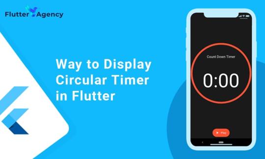
You can make stunning, native-looking apps for Android and iOS using the popular cross-platform Flutter mobile app programming framework. Circular timer creation is just one of the numerous things you can accomplish with Flutter. A countdown clock or a stopwatch are two examples of circular timers that are excellent for displaying the amount of time left on a job.
In Flutter, there are some different methods to build a circular timer. This article will teach you how to design a circular clock in Flutter. In addition, you will know how to change the timer’s look. You can learn more about displaying a circular timer in Flutter by reading the tutorial below. Also you can read this blog from our official website Circular Timer in Flutter.
Developing a Custom Circular Timer in Flutter
There are several methods in Flutter for displaying a circular timer outside the circular_countdown_timer package. As an illustration, you might make a circular progress bar using the RadialGauge widget. The circular_countdown_timer box, on the other hand, is a more specialized widget made just for showing countdown timers. You may make a customized circular timer by following the instructions in this article after installing Flutter:
import 'package:flutter/material.dart';
import 'package:circular_countdown_timer/circular_countdown_timer.dart';
void main() {
runApp(const MyApp());
}
class MyApp extends StatelessWidget {
const MyApp({super.key});
@override
Widget build(BuildContext context) {
return MaterialApp(
title: 'Flutter Demo',
theme: ThemeData(
primarySwatch: Colors.blue,
),
home: const HomePage(),
debugShowCheckedModeBanner: false,
);
}
}
class HomePage extends StatefulWidget {
const HomePage({super.key});
@override
State<homepage> createState() => _HomePageState();
}
class _HomePageState extends State<homepage> {
final int _duration = 10;
final CountDownController _controller = CountDownController();
@override
Widget build(BuildContext context) {
return Scaffold(
appBar: AppBar(
title: const Text("Circular Counter with countdown timer"),
),
body: Center(
child: CircularCountDownTimer(
// Countdown duration in Seconds.
duration: _duration,
// Countdown initial elapsed Duration in Seconds.
initialDuration: 0,
// Controls (i.e., Start, Pause, Resume, Restart) the Countdown Timer.
controller: _controller,
// Width of the Countdown Widget.
width: MediaQuery.of(context).size.width / 2,
// Height of the Countdown Widget.
height: MediaQuery.of(context).size.height / 2,
// Ring Color for Countdown Widget.
ringColor: Colors.blue,
// Ring Gradient for Countdown Widget.
ringGradient: null,
// Filling Color for Countdown Widget.
fillColor: Colors.red,
// Filling Gradient for Countdown Widget.
fillGradient: null,
// Background Color for Countdown Widget.
backgroundColor: Colors.amber,
// Background Gradient for Countdown Widget.
backgroundGradient: null,
// Border Thickness of the Countdown Ring.
strokeWidth: 20.0,
// Begin and end contours with a flat edge and no extension.
strokeCap: StrokeCap.round,
// Text Style for Countdown Text.
textStyle: const TextStyle(
fontSize: 33.0,
color: Colors.black,
fontWeight: FontWeight.bold,
),
// Format for the Countdown Text.
textFormat: CountdownTextFormat.S,
// Handles Countdown Timer (true for Reverse Countdown (max to 0), false for Forward Countdown (0 to max)).
isReverse: true,
// Handles Animation Direction (true for Reverse Animation, false for Forward Animation).
isReverseAnimation: true,
// Handles visibility of the Countdown Text.
isTimerTextShown: true,
// Handles the timer start.
autoStart: true,
// This Callback will execute when the Countdown Starts.
onStart: () {
// Here, do whatever you want
debugPrint('Started Countdown');
},
// This Callback will execute when the Countdown Ends.
onComplete: () {
// Here, do whatever you want
debugPrint('Ended Countdown');
},
// This Callback will execute when the Countdown Changes.
onChange: (String timeStamp) {
// Here, do whatever you want
debugPrint('Changed Countdown $timeStamp');
},
),
),
);
}
}
</homepage></homepage>
Function to format the text.
Allows you to format the current duration to any String.
It also provides the default function in case you want to format specific moments as in reverse when reaching ‘0’ show ‘GO,’ and for the rest of the instances, follow the default behavior.
Inside the CircularCountDownTimer we have to add these below lines:
timeFormatterFunction: (defaultFormatterFunction, duration) {
if (duration.inSeconds == 0) {
// only format for '0'
return "Start";
} else {
// other durations by it's default format
return Function.apply(defaultFormatterFunction, [duration]);
}
},
Add inside the scaffold widget to control the counter
floatingActionButton: Row(
mainAxisAlignment: MainAxisAlignment.center,
children: [
const SizedBox(
width: 30,
),
_button(
title: "Start",
onPressed: () => _controller.start(),
),
const SizedBox(
width: 10,
),
_button(
title: "Pause",
onPressed: () => _controller.pause(),
),
const SizedBox(
width: 10,
),
_button(
title: "Resume",
onPressed: () => _controller.resume(),
),
const SizedBox(
width: 10,
),
_button(
title: "Restart",
onPressed: () => _controller.restart(duration: _duration),
),
],
),
Function return button
Widget _button({required String title, VoidCallback? onPressed}) {
return Expanded(
child: ElevatedButton(
style: ButtonStyle(
backgroundColor: MaterialStateProperty.all(Colors.purple),
),
onPressed: onPressed,
child: Text(
title,
style: const TextStyle(color: Colors.white),
),
),
);
}
Example
import 'package:flutter/material.dart';
import 'package:circular_countdown_timer/circular_countdown_timer.dart';
void main() {
runApp(const MyApp());
}
class MyApp extends StatelessWidget {
const MyApp({super.key});
@override
Widget build(BuildContext context) {
return MaterialApp(
title: 'Flutter Demo',
theme: ThemeData(
primarySwatch: Colors.blue,
),
home: const HomePage(),
debugShowCheckedModeBanner: false,
);
}
}
class HomePage extends StatefulWidget {
const HomePage({super.key});
@override
State<homepage> createState() => _HomePageState();
}
class _HomePageState extends State<homepage> {
final int _duration = 10;
final CountDownController _controller = CountDownController();
@override
Widget build(BuildContext context) {
return Scaffold(
appBar: AppBar(
title: const Text("Circular Counter with countdown timer"),
),
body: Center(
child: CircularCountDownTimer(
timeFormatterFunction: (defaultFormatterFunction, duration) {
if (duration.inSeconds == 0) {
// only format for '0'
return "Start";
} else {
// other durations by it's default format
return Function.apply(defaultFormatterFunction, [duration]);
}
},
// Countdown duration in Seconds.
duration: _duration,
// Countdown initial elapsed Duration in Seconds.
initialDuration: 0,
// Controls (i.e., Start, Pause, Resume, Restart) the Countdown Timer.
controller: _controller,
// Width of the Countdown Widget.
width: MediaQuery.of(context).size.width / 2,
// Height of the Countdown Widget.
height: MediaQuery.of(context).size.height / 2,
// Ring Color for Countdown Widget.
ringColor: Colors.blue,
// Ring Gradient for Countdown Widget.
ringGradient: null,
// Filling Color for Countdown Widget.
fillColor: Colors.red,
// Filling Gradient for Countdown Widget.
fillGradient: null,
// Background Color for Countdown Widget.
backgroundColor: Colors.amber,
// Background Gradient for Countdown Widget.
backgroundGradient: null,
// Border Thickness of the Countdown Ring.
strokeWidth: 20.0,
// Begin and end contours with a flat edge and no extension.
strokeCap: StrokeCap.round,
// Text Style for Countdown Text.
textStyle: const TextStyle(
fontSize: 33.0,
color: Colors.black,
fontWeight: FontWeight.bold,
),
// Format for the Countdown Text.
textFormat: CountdownTextFormat.S,
// Handles Countdown Timer (true for Reverse Countdown (max to 0), false for Forward Countdown (0 to max)).
isReverse: true,
// Handles Animation Direction (true for Reverse Animation, false for Forward Animation).
isReverseAnimation: true,
// Handles visibility of the Countdown Text.
isTimerTextShown: true,
// Handles the timer start.
autoStart: true,
// This Callback will execute when the Countdown Starts.
onStart: () {
// Here, do whatever you want
debugPrint('Started Countdown');
},
// This Callback will execute when the Countdown Ends.
onComplete: () {
// Here, do whatever you want
debugPrint('Ended Countdown');
},
// This Callback will execute when the Countdown Changes.
onChange: (String timeStamp) {
// Here, do whatever you want
debugPrint('Changed Countdown $timeStamp');
},
),
),
floatingActionButton: Row(
mainAxisAlignment: MainAxisAlignment.center,
children: [
const SizedBox(
width: 30,
),
_button(
title: "Start",
onPressed: () => _controller.start(),
),
const SizedBox(
width: 10,
),
_button(
title: "Pause",
onPressed: () => _controller.pause(),
),
const SizedBox(
width: 10,
),
_button(
title: "Resume",
onPressed: () => _controller.resume(),
),
const SizedBox(
width: 10,
),
_button(
title: "Restart",
onPressed: () => _controller.restart(duration: _duration),
),
],
),
);
}
Widget _button({required String title, VoidCallback? onPressed}) {
return Expanded(
child: ElevatedButton(
style: ButtonStyle(
backgroundColor: MaterialStateProperty.all(Colors.purple),
),
onPressed: onPressed,
child: Text(
title,
style: const TextStyle(color: Colors.white),
),
),
);
}
}
</homepage></homepage>
Output
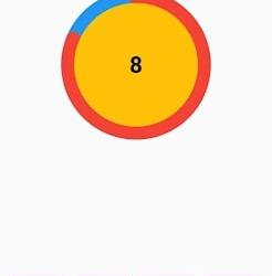
Why Should You Display a Circular Timer in Flutter?
You can choose to show a circular timer in Flutter for various reasons. Here are some of the most typical causes:
1. To start the countdown to an upcoming event. The most typical application for circular timers is this. They help count down to the beginning of a presentation, the end of a timer, or any other event you wish to keep track of.
2. To provide user feedback. The user can receive feedback about the passing of time through circular timers. This is advantageous when performing duties like preparing meals or watching for a bus.
2. For a visual component for your app. Circular timers may provide an optical element to your app that will increase its aesthetic appeal and make it more engaging.
Hire Flutter developer to create a circular timer. It is an excellent alternative if you are searching for a way to show the passing of time in your Flutter project. They are versatile, easy to use, and serve several functions.
Conclusion
The article has shown how to display a circular timer in Flutter. First, you will set up the widget to show a circular countdown timer from the circular_countdown_timer package. It can also utilize the widget to exhibit a ten-second countdown timer by creating a simple example. By defining the colors, border width, and text style, the article also provided information on how to alter the timer’s visual look.
Connect with the top Flutter app development company for your project if you want to create mobile apps with the circular timer for your business. But if you’re still unclear and want more information about the Flutter framework, browse our blogs!
Frequently Asked Questions (FAQs)
1. How is a dart timer used?
The timer starts at the given duration and counts down to 0. The given callback function is called when the timer approaches zero. To repeatedly count down the same interval, use a periodic timer. The same rules apply to negative durations as to durations of 0.
2. How can I create a widget with a countdown timer?
Press the addition (+) sign in the top left corner to add a widget. A Countdown widget can be selected. Click Add Widget. Please tap on the widget once it shows on your Home Screen.
3. What does Flutter’s circle indicator mean?
The CircularProgressIndicator widget uses a circle to represent progress. It can be used as a progress indicator for determined and indeterminate work. The value attribute must be left empty or unspecified to create an indeterminate progress indicator in Flutter.
#flutter app development#flutter#hire flutter developers#flutter agency#hire flutter developer#flutter developers#flutter app developers#FlutterTips#FlutterTimer#CircularTimer
0 notes
Text
Styling and Theming in Flutter: A Comprehensive Guide

Styling and theming are essential aspects of creating visually appealing and cohesive user interfaces in your Flutter app. By applying styles and defining themes, you can customize the look and feel of your app to create a consistent and engaging user experience. This comprehensive guide will walk you through the process of styling and theming in Flutter, providing you with the knowledge and tools to design stunning app interfaces.
Prerequisites
Before we dive into styling and theming, make sure you have the following prerequisites in place: - Flutter SDK installed on your machine. If you haven't installed Flutter yet, refer to the official Flutter installation guide for your operating system. - A Flutter project set up and ready for development.

Applying Styles to Widgets
Flutter offers a flexible and powerful styling system that allows you to customize the appearance of individual widgets. You can apply styles using properties such as color, fontFamily, fontSize, fontWeight, and more. Let's see an example of styling a Text widget: In this example, we apply a specific color, font size, and font weight to the Text widget using the TextStyle class.
Creating and Applying Themes
Themes provide a way to define a consistent visual style across your entire app. Flutter allows you to create and apply themes to customize the overall look and feel. Let's see how to create and apply a theme: In this example, we define a theme using the ThemeData class and set properties such as primaryColor, accentColor, and fontFamily. The theme is then applied to the MaterialApp widget, which serves as the root of our app.
Customizing the Theme
Flutter allows you to customize the theme further by overriding specific properties. For example, if you want to change the primary color of a specific widget, you can wrap it with a Theme widget and define the desired property. Here's an example: In this example, we wrap the RaisedButton widget with a Theme widget and customize the primaryColor property to Colors.red. Additionally, we apply the theme color to the button's background, set the text color to white, and define a rounded border for the button.
Styling Buttons with ElevatedButton and TextButton
Flutter provides specialized button widgets, such as ElevatedButton and TextButton, that come with predefined styles for different button types. Here's an example of styling an ElevatedButton and a TextButton: In these examples, we use the style property along with the styleFrom method to customize the button's appearance. We can define properties like primary for the background color, onPrimary for the text color, padding for button padding, and shape for the button's shape.
Conclusion
Styling and theming are crucial for creating visually appealing and cohesive Flutter apps. By applying styles to widgets, defining themes, and leveraging specialized button widgets, you can customize the look and feel of your app to create stunning user interfaces. Experiment with different styles, explore theme customization options, and master advanced button styling techniques to build beautiful app interfaces with Flutter. Happy coding and designing captivating app experiences! Read the full article
1 note
·
View note
Text
Decided to try and swap out the text editor on this for suneditor, like is discussed here on the feather wiki website
it's actually surprisingly easy, following the instructions from the website you just Save the SunEditor extension file that is a small script downloaded off the website to the same folder as your Feather Wiki file and add <script src="./suneditor-replacement.js"></script> to the "Custom Head" text area in Wiki Settings. After that go to the github repo of SunEditor and download the suneditor.min.css and suneditor.min.js codes and put them in the same folder as feather wiki as well.
The hardest part which wasn't terribly hard at all, open up the suneditor-replacement.js script in notepad or notepad++ and go to where it says css.href= and replace the link in quotes with this "suneditor.min.css"
Then go to where it says script.src= and replace the link in quotes with this "suneditor.min.js" the whole lines should look like css.href="suneditor.min.css"; and script.src="suneditor.min.js";
respectively, the punctuation is important and so is the capitalization!!!
after that save the script, make sure the wiki page is saved and reloaded and it should be up and running, but in order to enable video, you'll want to modify one last thing in the script. Look for where it says buttonList in the code, and you'll see a sort of list where it shows the options for the text editor that you want enabled, like ['undo', 'redo'], and so on. you can highlight all the options and replace them with this chunk:
['undo', 'redo'], ['font', 'fontSize', 'formatBlock'], ['paragraphStyle', 'blockquote'], ['bold', 'underline', 'italic', 'strike', 'subscript', 'superscript'], ['fontColor', 'hiliteColor', 'textStyle','lineHeight'], ['removeFormat'], ['outdent', 'indent'], ['align', 'horizontalRule', 'list'], ['table', 'link', 'image', 'video', 'audio'], ['fullScreen', 'showBlocks', 'codeView'], ['preview', 'print'], ['save', 'template'] So the whole thing should look like
buttonList: [ ['undo', 'redo'], ['font', 'fontSize', 'formatBlock'], ['paragraphStyle', 'blockquote'], ['bold', 'underline', 'italic', 'strike', 'subscript', 'superscript'], ['fontColor', 'hiliteColor', 'textStyle','lineHeight'], ['removeFormat'], ['outdent', 'indent'], ['align', 'horizontalRule', 'list'], ['table', 'link', 'image', 'video', 'audio'], ['fullScreen', 'showBlocks', 'codeView'], ['preview', 'print'], ['save', 'template'] ],
Remember, punctuation is important. If anything borks it's likely you accidentally erased a comma or parenthesis. Don't panic. You can always just redownload the vanilla script and try again as there's not a lot to modify in this code. If you've done it correctly however, it should work as soon as you save and reload, so you should be able to embed media like this:
An amazing little personal wiki doodad
Once again trawling itch.io I came across another amazing thing, this time it is a wiki framework called Feather Wiki that loads up and can be edited on your browser, pretty much no more tech skills needed than being able to use tumblr. Here's a test page that I made copying some content from wikipedia to see how it works. The hyperlinks all lead to wikipedia straight from pasting in, but I could easily change it to my own nested pages. It took all of 5 minutes to figure out and get up and running. It's super lightweight and fast as well. I'm planning on using it to put down all the accurate info and stuff I come across on the web so I can at least have something to reference back to for when my memory loss gets worse. My wiki is completely offline and hosted on my desktop. I just click on the shortcut and I can edit, so I do like it a lot, but it can also be hosted on a web server according to the info page.
Tbh in an age of disinfo and misinfo, having your own personal wiki where you can log accurate information you find may not be a bad idea. Especially if it's something not only free but simple and easy to run, and useable offline to ensure privacy.
6 notes
·
View notes
Text
did tumblr changed its text style or am i tripping
1 note
·
View note
Text
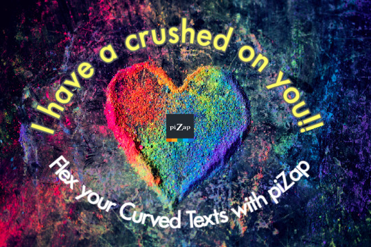
Design Trend Alert! Curved Text. 📷 #piZapTrend
Sometimes your design needs a little movement. Transform your text into beautiful curves for an aesthetically pleasing design look that will pop off the page!
Show us your curved text designs!
We'd love to see them. :)
#pizap#photoeditor#collage#borders#stickers#photoediting#photography#filters#fonts#effects#curved#curvedtexts#textstyles
0 notes
Text
just don’t use orange bold text in front of me (panman textstyle) I get reallly flustered reallly fast
highlighting a key item so people know its important later on
61 notes
·
View notes