#CTEC709
Text
CTEC709 Semester 2 Week 2 (v2.0) - Sitesafe AR
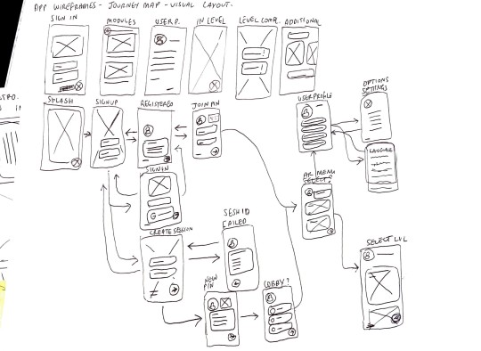
I worked on doing app mock ups free handed following the App User Journey with Ray. The beginning stages were intro pages like Sign in, Sign up, splash screen etc. but I had trouble the most with the content pages such as create session and lobby because they were the hardest to keep consistency in design especially when it comes to multiple user accounts fitting into a single wireframe and not much visual space to select opions.


0 notes
Photo
Studio 6 sem 2 2022
Week 12-13
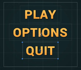
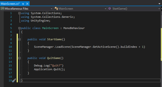
For the last two weeks I worked on getting the start menu UI working by implementing buttons on written text within unity. I created a simple design and created a script that allows these buttons to be pressed and lead into the start game phase when play is pressed. We were not able to implement this into our main project file as we were unable to meet and scripts were buggy when sent online but intend to continue to work through this project even after university and implement all these scripts into the main file. After so much coding I decided to take a break and focus on designing out some UI for our actual project file.
0 notes
Text
iRMNSC
FINAL VISUAL THREE - STUDIO VI PROJECT
"Foods that feel like home."
0 notes
Text
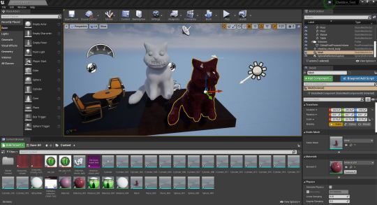
W11 Studio - In over my head?
3D Model Update
After learning my lesson yet again as to why saving is important, I finally got around to giving Cheshire cat eyeballs and teeth. The results are horrifying.
Cute...
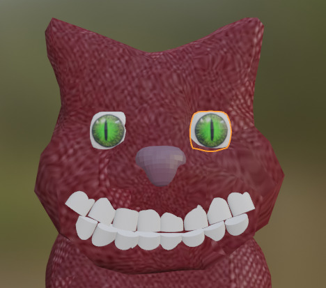
To evil...
Before continuing, I had to see what was the best way of exporting the model and importing it into unreal. Exporting it as an OBJ kept the body shape nice, but took away the texture and wouldn’t let me interact with the eyeballs and teeth seperately. Exporting as an FBX kept the texture and the eyeballs and teeth seperate, but the body was full of edges and assembling all of the pieces would be tricky.
I am not as far along with the process as I would have liked to be, but I am proud of what I have been able to accomplish so far considering I am essentially learning a new software with only youtube as my teacher.
My next steps from here are:
- Find the best way to export it (with the help of my team, especially Milo and Max who are doing the Unreal Engine side)
- Animate the model: cut up the mesh on the tail so he can wag, maybe add eyelids so he can blink, and maybe animate the smile?
Next steps in general:
- Meeting to discuss what we want done by the submission
- Who will make the video for the digital submission
- Making sure everyone is happy :)
2 notes
·
View notes
Text
assignment one progress
hello finale sem
case study / key research works
interviewing two special humans
empathy mapping
lexus crit session
code prototyping
creative workflows
the knitty gritty
after effects newbie
2 notes
·
View notes
Text
The Final Touches
After gaining user feedback I have been using that to continue the development of the BroBot models, constantly gaining advice as I go, talking to friends and family to get their opinions as I've been unable to hold more user surveys in person. This process has taken more weeks than I expected, as I've been learning plenty along the way.
Creating the Arms and Hands
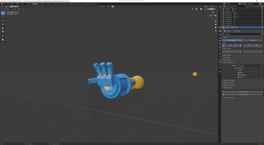
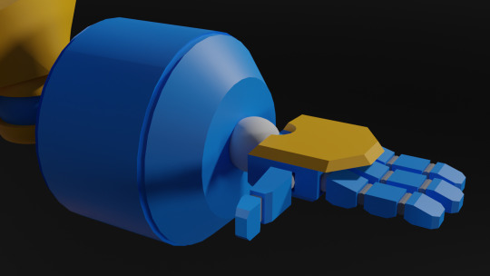
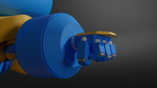
Creating the Legs
Final BroBot Model Design
Colour Customisation
Something else I've messed around with is the concept of individuals being able to customize their BroBots as they're playing, being able to choose whatever colours they'd like.
The Future Plans
When creating the previous BroBot model, I didn't understand how much went into creating a game-ready character/asset. Initially, I would've assumed that the model would be now ready to animate and import into Unity, however, I've recently discovered a workflow that is crucial to game assets. By creating a high-resolution model and a low-resolution model you are able to 'bake' the high-resolution details onto the low-resolution model ultimately increasing the performance of the game. This means my next steps from now are to retologize the current model, then creating the low and high poly versions.
2 notes
·
View notes
Text
Week 8
18-19/09/2021
Saturday-Sunday:
Rewrote movement system (reformatted)
During the weekend I rewrote the player movement system. My previous movement system handled player movement, mantling, and the magnetism mechanic. Due to it handling all three of these areas the code was exceedingly long and difficult to follow. The rewritten code has been separated into 3 different scripts. They are the ‘Player Manager’, ‘Player Movement’, and ‘Player Magnet Gloves’.
The ‘Player Manager’ is where the code written in the ‘Player Movement’ and ‘Player Magnet Gloves’ is executed. This new addition allows myself and others to easily understand and rearrange my code. The ‘Player Movement’ script now only handles moving the player character normally and when mantling. The ‘Player Magnet Gloves’ purely handles the magnetism mechanic. This rewrite has proved beneficial as it has removed some small issues that were caused due to the previous code’s erratic execution order.
Sticking players to magnet walls
I also made the player stick to a magnetic wall when the player is attracting themselves to it. This was simple to add as I just had to freeze the player's position when they are colliding with a magnetic wall and are using the magnetic gloves positive pole on the wall. I then made them unfreeze when they stopped using the magnet gloves.
Gif of mantle movement:

Post-processing effects
I also add post-processing effects to my scene within the project. While working on our space image and sound project I learnt more about these effects and was able to add some effects that I feel complement the look of the game.
1 note
·
View note
Text
Guess who's back! Back again!
After my lack of posts last half of semester, I thought it was time for another post.
Studio:
Now, thanks to COVID my project has taken a rather large detour. I had planned to create a final 1:1 prototype that functioned but sadly now it will all be digital. This isn't the worst though, this allows me to focus on the design of multiple items of furniture and model them in Fusion 360. My idea is to model all of these different pieces of furniture and photoshop them into different home environments to show of the furniture in an realistic way.
Now to some of the work I have done, I have moved away from the hammock style chair and into a more compact chair/sofa style. I took reference from a large obtrusive staple of architecture, acoustic mirrors.

These large objects have a brutalist style to them with the solid material and the angular design. I used this style and played around with the angles and the concave circle to try and form some what of a seat. I made a few mock ups and rendered them out, although to wood texture really sucks. I might have to make my own texture to really get the aesthetic I want.
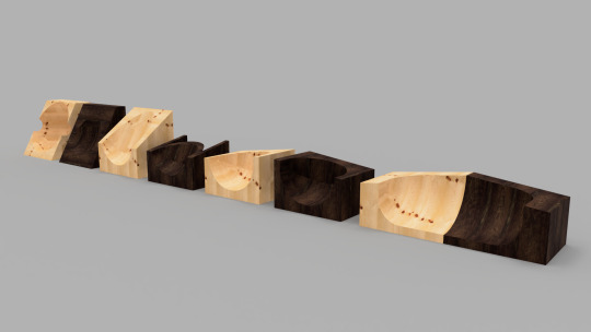
These designs make use of the angular style of the acoustic mirrors and the concaved circle. These designs due to there material would be rather uncomfortable but with the use of felted wool we could make cushions and comforters to go with them. This would make use of different waste materials and in different ways. Also by carving out aspects of the chairs it could be used as storage for the likes of book and other items.
Space, Image and Sound:
Nothing has really happened in this class as of yet. So going well! Banter aside, I have decided to focus on the film aspect of the installation, this way I can show of audio and visual all at the same time. But how to elevate the project further?
From here I plan to look at the learning objectives and work my installation around some of these points, while also keeping it within the scope that I personally want. Clinton spoke about ‘where you would like to present and/or where you could present’, it could be in digital space, it could be a car park, it could be VR. The idea is to imagine it in heaps of different spaces. What if I did an animation/ Overall it would be nothing but I could show a virtual space reacting with virtual nothing, which wouldn’t be nothing because it is digital therefore there is something (pixels and/or other digital mediums) This could be another way I could show off my idea in a different medium. Other than that, the plan is to continue with the film concept, I don’t have an ideal space such as the art gallery as my nothing can be anywhere. The ideal space/the white cube would actually be to plain for my topic, which could also be rather cool in the same respect. Due to my project being about nothing and how everything reacts with my nothing, if it was in the ideal gallery space it actually wouldn’t do anything at all. It would be a vaguely invisible plinth in a stark room within buzzing audio around it. Now I need to go further, I need some good locations with interesting environments. If lockdown persists to the point where I cannot leave my house to film on location then I will have to settle for places around my house but ideally I would like to go out and film in other places.
Intelligent Agents:
Now that the essay is out of the way it is time to focus on the project. For the project I would like to write a short story outlining the topic I did for the essay.
At this stage the story consists of two character that are suffering from similar situations, one is a robot with many organic augmentations that it doesn't know whether it is still a robot or not and the other character is a human with many cyber-organic augmentations and doesn't know whether they are still human. The ideal of the story is that they will have different stories and eventually will meet up at the end to settle there inner conflicts. More or less it is a play on the 'Theseus' Ship' analogy. "The ship of Theseus is a thought experiment that raises the question of whether an object that has had all of its components replaced remains fundamentally the same object." - they are struggling with this dilemma about themselves, whether they are robot or human.
So far I have written about two paragraphs for each character. Ideally I'd like the story to be around 10,000 words, but we will see how it goes as I write more, it might be less or more depending on how it all goes.
1 note
·
View note
Text
Project Bibliography
[ Written Individually ]
Food Waste General Research
Junn, J. (2019, May 6). New Zealand creates tonnes of food waste. Supermarkets are trying to close the loop. Retrieved from The Spinoff: https://thespinoff.co.nz/food/new-world/food-waste/06-05-2019/supermarkets-create-tonnes-of-food-waste-every-week-heres-what-happens-to-it/
Woolf, A.-L. (2020, February 13). The world's 'tragically high' food waste problem is worse than previously thought. Retrieved from Stuff.co.nz: https://www.stuff.co.nz/environment/climate-news/119449508/the-worlds-tragically-high-food-waste-problem-is-worse-than-previously-thought
https://lovefoodhatewaste.co.nz/food-waste/what-we-waste/
https://lovefoodhatewaste.co.nz/wp-content/uploads/2019/02/FINAL-WasteMINZ-National-Food-Waste-Prevention-Study-2018.pdf
Anaerobic Digestor Research
Cox, B. (2020, August 31). Let’s not pit anaerobic digestion against composting in the food waste fight. Retrieved from The Spinoff: https://thespinoff.co.nz/food/31-08-2020/lets-not-pit-anaerobic-digestion-against-composting-in-the-food-waste-fight/
Walmsley, K. (2020, August 23). Why industrial anaerobic digestion is not the answer to food waste. Retrieved from The Spinoff: https://thespinoff.co.nz/food/23-08-2020/why-industrial-anaerobic-digestion-is-not-the-answer-to-food-waste/
https://www.epa.gov/agstar/how-does-anaerobic-digestion-work
Consumer Guilt
Monique Mitchell Turner, A. M.-F. (2018). The Effects of Guilt-Appeal Intensity on Persuasive and Emotional Outcomes: The Moderating Role of Sponsor Motive. Journal of Nonprofit & Public Sector Marketing, 134-150. Retrieved from https://www.theguardian.com/books/2015/feb/06/point-of-view-why-shame-make-world-better-place
Dana-Nicoleta Lascu (1991) ,"Consumer Guilt: Examining the Potential of a New Marketing Construct", in NA - Advances in Consumer Research Volume 18, eds. Rebecca H. Holman and Michael R. Solomon, Provo, UT : Association for Consumer Research, Pages: 290-295.
Inspiration
https://www.tepapa.govt.nz/visit/exhibitions/mixing-room-stories-young-refugees-new-zealand
https://kurzgesagt.org/
Animation Tutorials
https://www.youtube.com/watch?v=QKCR-Az7Oy0&t=364s&ab_channel=SonduckFilm
Free Vector Images
https://docs.google.com/document/d/17ftd6Nm3rZnWIpaYJ-sDN5RumjweWUij-Y4hmBmSuNo/edit?usp=sharing
3 notes
·
View notes
Text
CTEC709 Semester 2 Week 5 - Sitesafe AR
This week was the first week of creation where I took a lot of the research and planning done and followed the layouts for the user journey based on the information designed in the app mockups. This was my favorite week because I could design freely within the research collected. In terms of progress I think it is going slow because the AR portion is already in functioning state while I am still working on the designs of the app. I also haven’t finalized the app color scheme because there is conflict between dark accent colors and bright backgrounds.
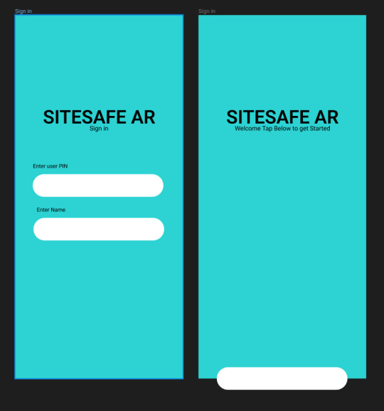
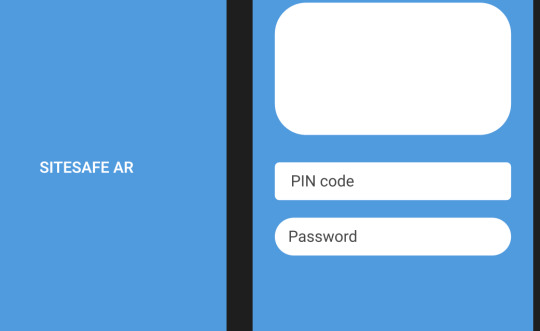
For now I’ve gone with dark accent colors to keep the color scheme consistent throughout the pages and non-distracting while I complete it . I decided to add shapes as a placeholder because the app layout lacks depth, there is too much white space that distracts from the center of the app (Login and general content is centralized in our design)
In the beginning I was having trouble with app fields being inconsistent and not looking like mobile fields, I took inspiration from Google and a few other examples in my Mood Board which used a stroke around the fields instead of a colored field padding. This way the user doesn’t need to worry about the colored field being visually distracting when entering text. My buttons had the same issue and found that instead of curved sides like I initially did, I used slightly rounded ‘edges’ but the side swerve still straight in the center (left and right sides) This gave the illusion of a keyboard like visual footprint in the app which psychologically could be interpreted as an interaction button.

0 notes
Photo
Studio 6 Sem 2
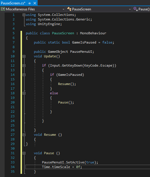
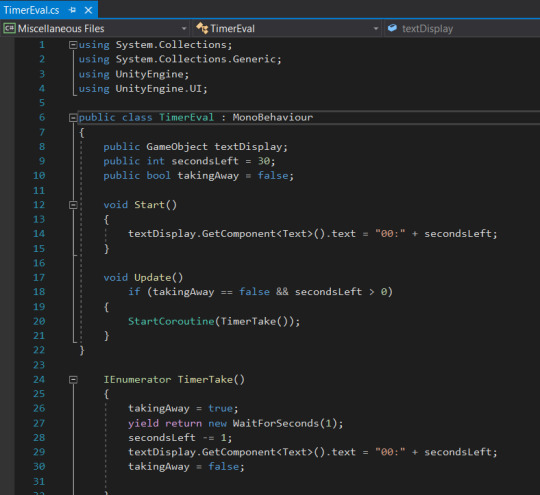
Week 10-11
In week 10 throughout 11 I continued to work on scripting in mechanics but had shifted my focus towards the UI after completing a timer evaluation script that was more refined than the last one. I started by creating a pause menu script but had to go through many different iterations in order to get the script somewhat functioning as I did not have a UI screen already designed to test it out on. This was a bit of a challenge to do alone as games require many different mechanics and UI buttons to create a seamless and immersive experience which made me use a much smaller scale for a start and start implementing some assets to help.
0 notes
Text
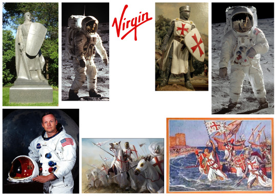
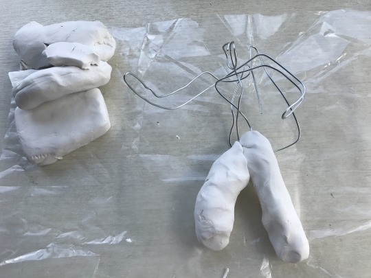
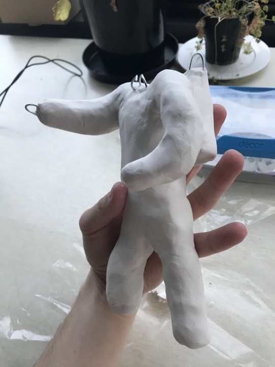
Making Richard Branson
Still got more to go but here is the journey of making a Richard Branson Crusader astronaut. Starting with a mood bored.
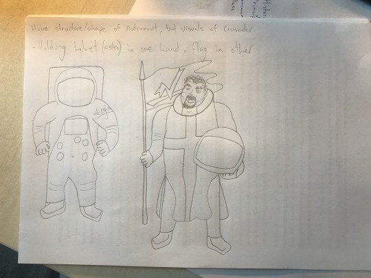
I did several different versions of the above sketches and got my flatmates to give feedback.
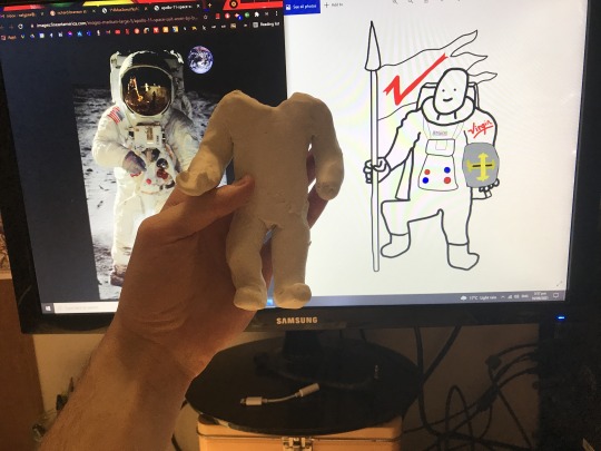
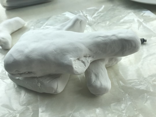
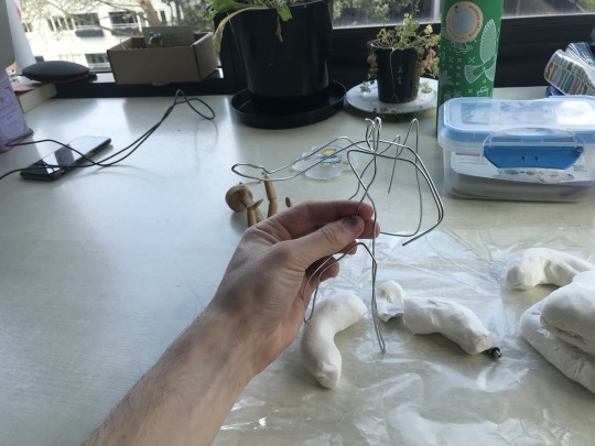
I made a rough drawing on photoshop of the design I was most happy with after feedback and different iterations. Unfortunately the modeling clay kept falling apart so I made a wire frame to create the structure I needed.
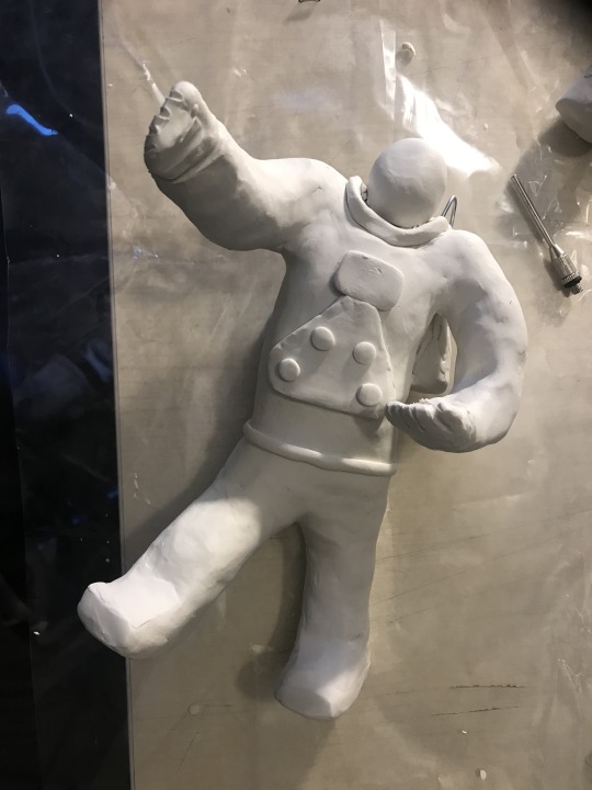
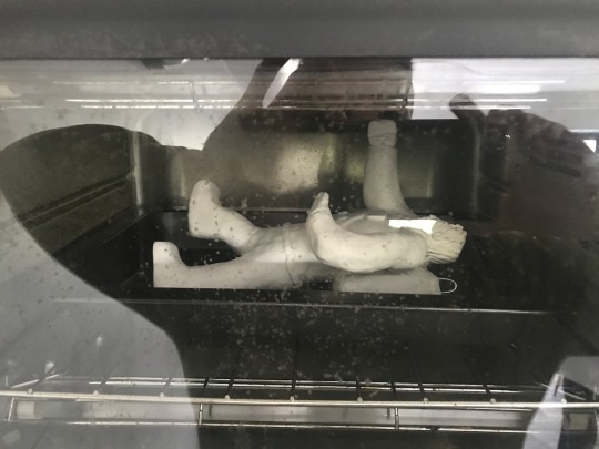
Baking (above) went well, thankfully nothing cracked. And painting (below) has begun with several base coats of white.
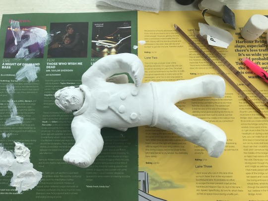
I don't have any other colours currently so I'm going make the flag and figure out how to get it standing upright.
There are small things I'm not 100% happy with, but it's the kind of thing I could spend ages trying to get perfect, however I've got to move on the other parts of the project.
2 notes
·
View notes
Text
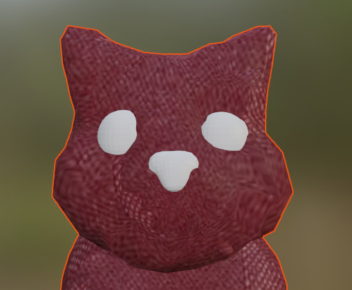
W10 Studio - We’re all mad here
3D model update
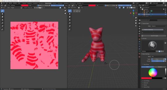
I wanted to give painting within Blender a go - and it turned out exactly how I was expecting - looking like roadkill. I am still learning how to do texturing but I’m becoming a bit overwhelmed with all of the new things I am trying to learn at once so all I can do is my best.
After our meeting this week the team all prefer the ‘soft toy’ Cheshire Cat that I accidentally made last week, but I hadn’t shown them until this week’s meeting. I’m secretly glad because I too loved the look of the fabric Cheshire Cat, and since Alice in Wonderland is kinda imaginatory its as if Cheshire Cat was never real after all, and actually Alice’s toy.
What I need to do for next week:
- Create eyes, a seperate mesh so that they can become visible and invisble without the body, so it becomes more ‘Cheshire Cat’ in unreal.
- Create mouth. This may require me reshaping the original meshball’s used for the body in order to create cheeks for the mouth, but I am hoping I can find a way around it. The smile needs to be seperate, as it also needs to be visible and invisible at will.
1 note
·
View note
Text
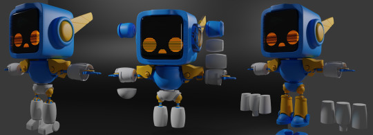
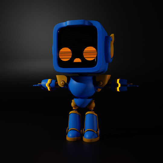
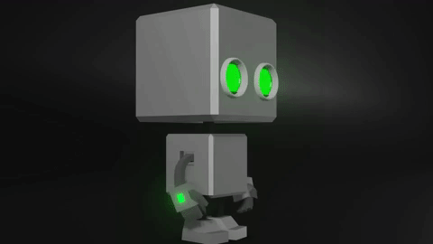
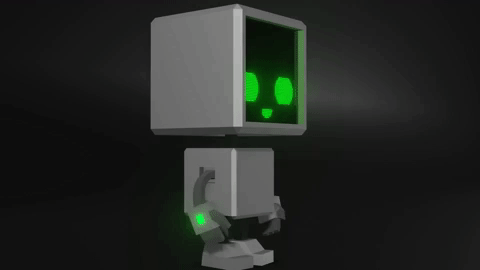
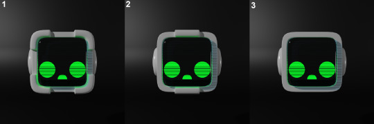
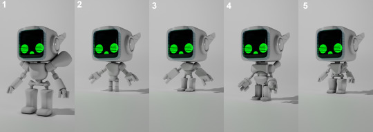
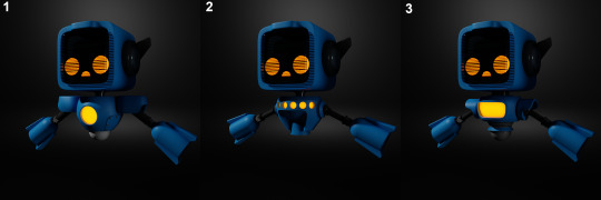
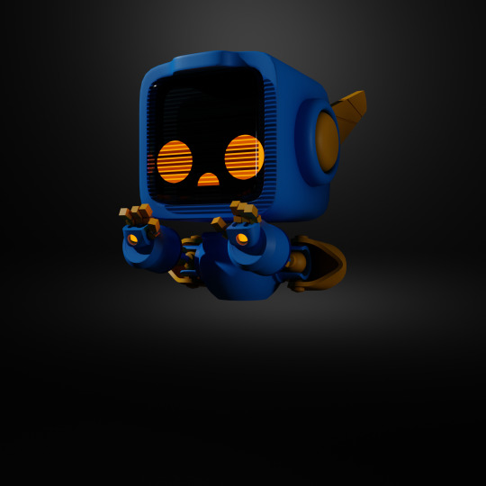
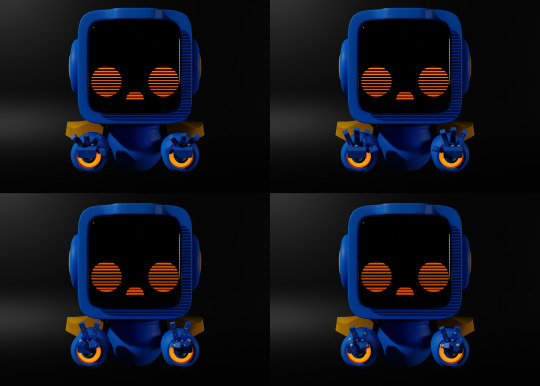
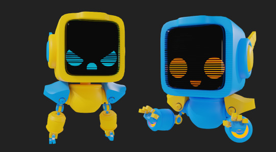
BroBots Redesign
Matt, Nate, and I have decided to continue working on BroBots for semester 2 this year. However, we felt that with the new skills we've acquired, we would completely change how the game currently is. So for me, the first half of this semester has been to focus on remastering the BroBot character model.
We wanted our new character model to be loved by as many people as possible, resulting in increased overall enjoyment while playing BroBots. This meant rather than just producing models based on my own opinions, I would make as many different concepts as possible, then show these to peers to gain user feedback, ensuring we would end with the perfect model. I made sure to get as large of a data set as possible, so we got 30 different users as feedback for each different question. Every week I had new concepts to get votes and opinions on.
Eye Concept Comparisons
To begin with, I prototyped two different eye concepts, one being a screen face with plenty of personalities, and the other simple circular eyes that are able to blink. Although the screen face adds about 2x more workload, I knew it had the potential to be a great feature for the characters.
This first test was very obvious which head style would go-ahead to become the new BroBot style, with 27 of our respondents voting for the screen face and only 3 votes for the circle eyes.
Screen Eyes: 27
Circle Eyes: 3
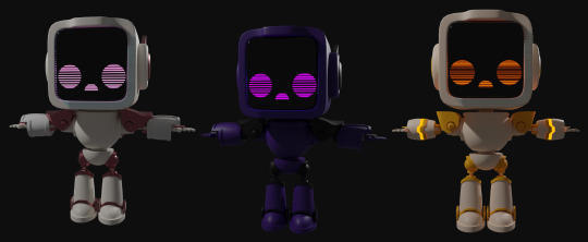
Head Comparisons
Next to gain feedback on were different head styles. All three heads were somewhat similar but we wanted some guidance on which kind people preferred. Resulting in head 3 having 23 individuals vote for that style as their personal favorite. Another easy round of feedback.
Head 1: 2
Head 2: 5
Head 3: 23
Body Proportion Comparisons
After the heads, came the body proportions. I quickly used basic shapes to prototype potential shapes and sizes of different BroBot bodies, to see which kind people would prefer to play as.
Proportion 1 (Big): 1
Proportion 2 (Small): 2
Proportion 3 (Small body, Big hands): 4
Proportion 4 (Medium): 6
Proportion 5 (Small Body, Big hands + Feet) - 18
Body Comparisons
The last survey I was able to hold before lockdown was different styled body types for the BroBots. This was the very first survey we held where the feedback was relatively close in results, making it harder to make a decision, which is why for the final BroBot design I used a blend of body 1 & 2 as they had the highest amount of votes.
Body 1: 13
Body 2: 5
Body 3: 13
Testing With a Quick Rig
Testing out hand rigs/styles
Prototyping the temporary rig
After receiving all the feedback for all parts of the BroBot, I have a much clearer picture of how the models should look, and it was incredibly beneficial to gain feedback from peers.
2 notes
·
View notes
Last Seen Blogs
nihilisticzingers
Nihilistic Zingers
savage-affinity
A SAVAGE AFFINITY
19daysoldxian
English Translation of 19 Days

cascmartin
Ghost to Guest
simmedy
get in losers we're going simming