#ChartingTools
Explore tagged Tumblr posts
Visit Tumblr Blog
Explore Tumblr blogs with no restrictions, modern design and the best experience.
Last Seen Tumblr Blogs


Fun Fact
After the announcement of the deal with Yahoo!, there were 170K signatures of unhappy Tumblr users petitioning to prevent the sale in 2013.
Text
Practical Applications of Mekko Charts in Business Analysis and Reporting
Data Visualization: Key Queries Explained
1.What is a Mekko chart good for?
A Mekko chart, also known as a Marimekko chart, is useful for visualizing categorical data across two dimensions. It effectively displays market share, revenue distribution, or performance metrics, allowing for easy comparison of different categories and their sizes. The variable-width columns and variable-height bars help identify trends and relationships within complex datasets immediately.
2. How to create a mekko chart?
To create a mekko chart, gather your data and categorize it into two dimensions (e.g., market size and market share). Use spreadsheet software like Excel to create a stacked bar chart, adjusting the widths of the bars to represent one dimension and the height to represent the other. Label axes and add data labels for clarity.
3. How do I edit a Mekko chart?
To edit a Mekko chart, use chart editing software like Excel or specialized tools. Click on the chart to select it, then modify data in the source table, adjust chart elements (like titles and labels), or change formatting options. You can also add or remove series and categories as needed to reflect the desired information accurately.
4. How do you add a title to a chart in Mekko?
To add a title to a chart in Mekko, select the chart, then look for the title option in the chart settings or properties panel. Enter your desired title in the provided text box and adjust font size or style as needed. Save your chances to apply the title to the chart.
5. What is Mekko chart and what is the difference between bar and Mekko chart?
A Mekko chart, or Marimekko chart, visually represents categorical data with varying widths and heights, showing both category size and value. Unlike bar charts that have uniform widths, Mekko charts combine bar height and width to convey two dimensions of data simultaneously, making them more effective for comparing market share or product performance across multiple categories.

Visit: VS Website See: VS Portfolio
0 notes
Video
youtube
BINGX OFFERS $50,000 FOR TRADING: JOIN THE PROGRAM AND TEST YOUR SKILLS
#cryptocurrency #trading #BingX #cryptoexchange #opportunity #referralcode #exclusiveaccess #perks #highroller #legit #tradingprogram #money #chance #cash #teamofexperts #accountsetup #firsttrade #thrillingride #digitalcoins #bankaccount #toolsandresources #marketdata #chartingtools #fiftygrand #provethebest #cryptotrader
#youtube#cryptotrader#provethebest#fiftygrand#chartingtools#market data#marketdata#toolsandresources#bankaccount#bank account
0 notes
Video
youtube
Heikin Ashi Mastery Elevate Your Trading Game with Powerful Strategies 2023
#youtube#youtube trending#HeikinAshiStrategies#TradingTechniques#CandlestickPatterns#DayTradingSuccess#TechnicalAnalysis#MarketInsights#TradingWisdom#ScalpingStrategies#ChartingTools#FinancialMarkets#TradeSmart#ProfitableTrading#CandlestickAnalysis#TechnicalIndicators
0 notes
Video
youtube
CRACK THE CODE: BINGING ON BINGX TIPS FOR SUCCESSFUL CRYPTO TRADING ON BINGX PLATFORM
#CryptocurrencyTrading #CryptoTips #BingXPlatform #SuccessTips #CryptoSecrets #TradingAdvice #CryptoExperience #CryptocurrencyExchange #BingXCommunity #TechnicalAnalysis #IndicatorTips #RSI #MACD #SupportAndResistance #TrendAnalysis #TradingSuccess #OrderExecution #ChartingTools #CryptoMasters #CryptoStrategies #ReferralCode911 #ProfitPotential #BingXMagic #CryptoTradingLegend #RakingInTheProfits
0 notes
Text
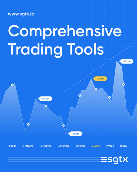
🔧📈 Unleash your trading potential with our comprehensive toolkit. From advanced charts to real-time data, we've got you covered. Elevate your crypto journey now! 🚀
Visit www.sgtx.io
#TradingPowerhouse #SGTX #TradingEssentials #AdvancedTradingKit #TradeLikeaPro #CryptoTools #MarketAnalysis #TradingSolutions #RealTimeData #ChartingTools #TradeSmart #CryptoInvesting
0 notes
Photo

Tips To Become The Best Forex Traders https://www.westernfx.com/blog/tips-to-become-the-best-forex-traders/
#Forextradingstrategies#FearofLosing#chartingtools#tradertips#tradingmarkets#Forexdemo#Missingouttrade#Traderegrets#forexnews#tradersir
0 notes
Text
How Gantt Charts from think-cell Improve Efficiency
Data Visualization: Frequently Asked Questions Explained
1.How to use Gantt charts in think-cell?
To use Gantt charts in think-cell, first, insert a Gantt chart from the think-cell menu in PowerPoint. Then, input your tasks, start and end dates, and dependencies directly in the Excel data sheet that opens. Adjust the timeline and formatting as needed. Finally, update the chart in PowerPoint to reflect any changes made in the Excel sheet.
2. How do I create a Gantt chart?
To create a Gantt chart, follow these steps:
1. List tasks and their durations.
2. Determine start and end dates for each task.
3. Use a software tool (like Excel, Google Sheets, or project management software) to create a timeline.
4. Plot tasks on the timeline, representing durations with horizontal bars.
5. Adjust dependencies between tasks as needed.
3. How do you modify the date range of a Gantt chart think-cell?
To modify the date range of a Gantt chart in think-cell, click on the chart to select it. Then, adjust the start and end dates by dragging the date markers or by editing the date values in the data table. This will automatically update the chart to reflect the new date range.
4. What is a Gantt chart example?
A Gantt chart is a visual project management tool that displays tasks along a timeline. For example, in a construction project, tasks like "Design," "Foundation," "Framing," and "Finishing" are shown as horizontal bars spanning the duration of each task. This allows teams to see task overlaps, deadlines, and overall project progress briefly.
5. What are the 3 uses of Gantt chart?
Gantt charts are used for project planning, allowing teams to visualize timelines and task durations. They help track progress by showing completed versus pending tasks. Additionally, Gantt charts facilitate resource management by identifying who is responsible for each task and ensuring that workloads are balanced across team members.

Visit: VS Website See: VS Portfolio
0 notes
Text
Clarifying Data Changes with Waterfall Charts in Think-Cell
Data Visualization: Common Questions Answered
1.How to create a waterfall chart in Excel using think-cell?
To create a waterfall chart in Excel using think-cell, first install the think-cell add-in. Then, open Excel and input your data in a table format. Select the data, go to the think-cell tab, and choose the waterfall chart option. Adjust the chart as needed by dragging and dropping elements or modifying the labels. Save your work.
2. What is the concept of a waterfall chart?
A waterfall chart is a data visualization tool that illustrates the cumulative effect of sequentially introduced positive or negative values. It starts with a column representing an initial value, followed by columns that show incremental increases or decreases, leading to a final value. This helps in understanding how different factors contribute to a total overtime or across categories.
3. How do you insert a waterfall chart?
To insert a waterfall chart in Excel, first select your data. Then go to the "Insert" tab, click on "Insert Waterfall or Stock Chart," and choose "Waterfall." Excel will create the chart based on your selected data. You can then customize it by adding titles, changing colors, and adjusting the layout as needed.
4. What are subtotals in the think-cell waterfall chart?
Subtotals in a think-cell waterfall chart represent intermediate totals that summarize the values at specific stages of the data flow. They help clarify the contribution of different categories to the overall total, making it easier to visualize how individual components combine. Subtotals enhance understanding of the data by breaking down complex information into digestible segments.
5. How to analyse a waterfall chart?
To analyze a waterfall chart, start by identifying the initial value at the left. Observe how each subsequent bar represents increases or decreases, leading to the final value on the right. Assess the contributions of each segment to understand the overall trend and key drivers. Look for patterns, significant changes, and outliers to derive insights on performance or variations in data.

Visit: VS Website See: VS Portfolio
0 notes
Video
youtube
HOW TO BECOME A BINGX TRADER AND GET UP TO $50,000 IN REAL TRADING FUNDS?
#crypto #trading #BingX #cryptocurrency #trader #investment #referralprogram #liquidity #education #technicalanalysis #orderexecution #chartingtools #tradingstrategies #experiencedtraders #marketanalysis #tradingplatform #cryptoexchange #financialfreedom #investmentopportunity #profitpotential #cryptogains #tradingcapital #cryptomarket #cryptoenthusiast #tradingtips #tradingexperience
0 notes
Video
youtube
"BINGX" GUIDE: HOW TO TRADE THE HOTTEST CRYPTOCURRENCY OF 2024
#BingX #CryptocurrencyExchange #CryptocurrencyTrading #2024HottestCryptocurrency #Bitcoin #Blockchain #DigitalAssets #TradingPlatform #CryptoMarket #Volatility #RegulatoryLandscape #SecurityMeasures #SocialTrading #CopyTrading #MobileApp #EducationalWebinars #KYC #FundingOptions #TradingBasics #DemoAccount #SpotTrading #MarginTrading #FuturesTrading #RiskManagement #StopLossOrders #Diversification #ChartingTools #RealTimeMarketData #BingXCommunity #CautionInTrading #PatienceAndDiscipline #HaveFun
0 notes
Video
youtube
BINGX": THE ULTIMATE GUIDE TO TRADING AND INVESTING IN THE NEW CRYPTOCURRENCY
#BingX #Cryptocurrency #Trading #Investing #CryptoExchange #CryptoCommunity #SocialTrading #Bitcoin #Ethereum #Litecoin #MarketAnalysis #Security #TwoFactorAuthentication #ColdStorage #Encryption #OrderTypes #CopyTrading #RealTimeData #TechnicalAnalysis #ChartingTools #Staking #Lending #YieldFarming #Compliance #AML #KYC #CustomerSupport #Education #Webinars #Seminars
0 notes
Photo

Forex Trading: How To Get Started Without Losing Your Shirt https://www.2oceansvibe.com/2019/11/04/forex-trading-how-to-get-started-without-losing-your-shirt/
#retailtradingmarket#richquickscheme#goodbroker#demoaccounts#forexeducation#currencypairs#chartingtools#copytrading#tradersir
0 notes