#Christiana typeface
Photo
First Set of Design Images to Include in My Essay
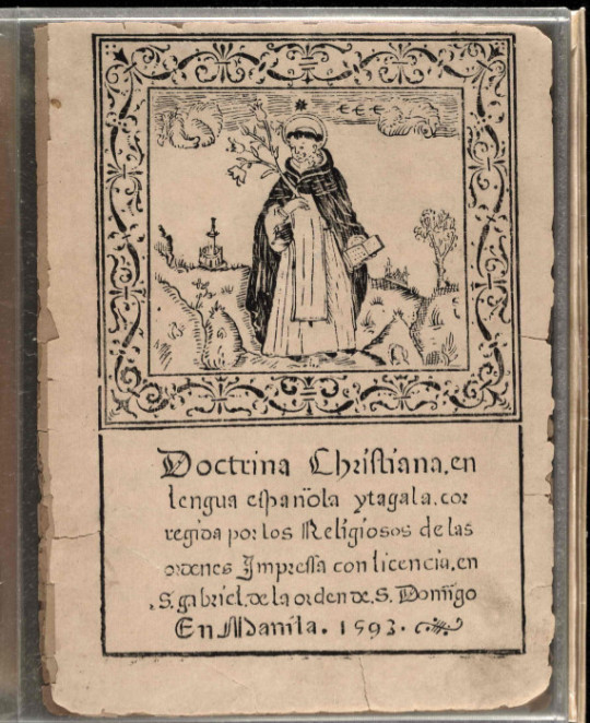
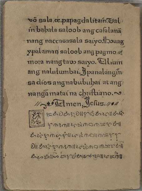
Here are some images of some pages of a book dating back to 1593, one of the first books to be published in the Philippines. This book represents a lot in terms of the Spanish colonisation and how much the Philippines changed in result to that.
For my essay, I wish to research a little more into what kind of style the typeface, its implications and what inspired it.
Source of Image
https://blogs.loc.gov/international-collections/2019/10/doctrina-christiana-more-than-four-hundred-years-of-filipino-american-history/
0 notes
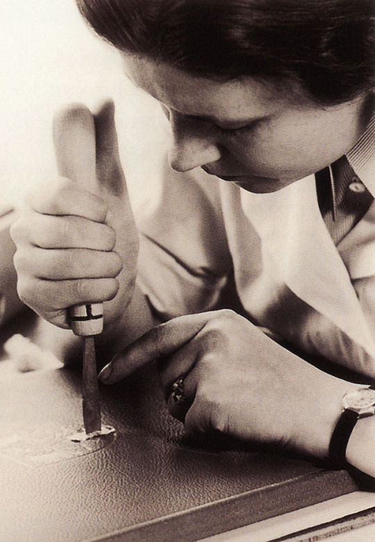
Photo
Typography Tuesday
Women Type Designers: GUDRUN ZAPF VON HESSE
One of the great women type designers of the 20th and early 21st centuries was the German designer, calligrapher, and book binder Gudrun Zapf-von Hesse, who died in 2019 at the age of 101. Von Hesse’s several noted typefaces stem directly from her practice of calligraphy. She believed that all good type design required the “human touch” and that a mastery of calligraphy was essential to becoming a good type designer.
Initially, von Hesse’s calligraphy practice was largely self-taught, learning from the same books by Rudolf Koch and Edward Johnston used by her future husband, the prolific German calligrapher and type designer Hermann Zapf. In 1941, after receiving her Masters degree in book binding, she began a formal course of study with the calligrapher and painter Johannes Boehland in Berlin. Afterward, she worked as a professional bookbinder, calligrapher, and educator when the D. Stempel AG Type Foundry scooped her up in the late 1940s for her design work, issuing her first typeface Diotima in 1951. She went on to design a dozen distinctive typefaces in her career for Stempel, Berthold, URW Hamburg, and Bitstream. In 1991, she became the second woman (but not the last) to win the Frederic W. Goudy Award, and in 2018, in honor of her 100th birthday, the Monotype Corporation released the typeface Hesse-Antiqua, which is based on an alphabet she designed in the late 1940s.
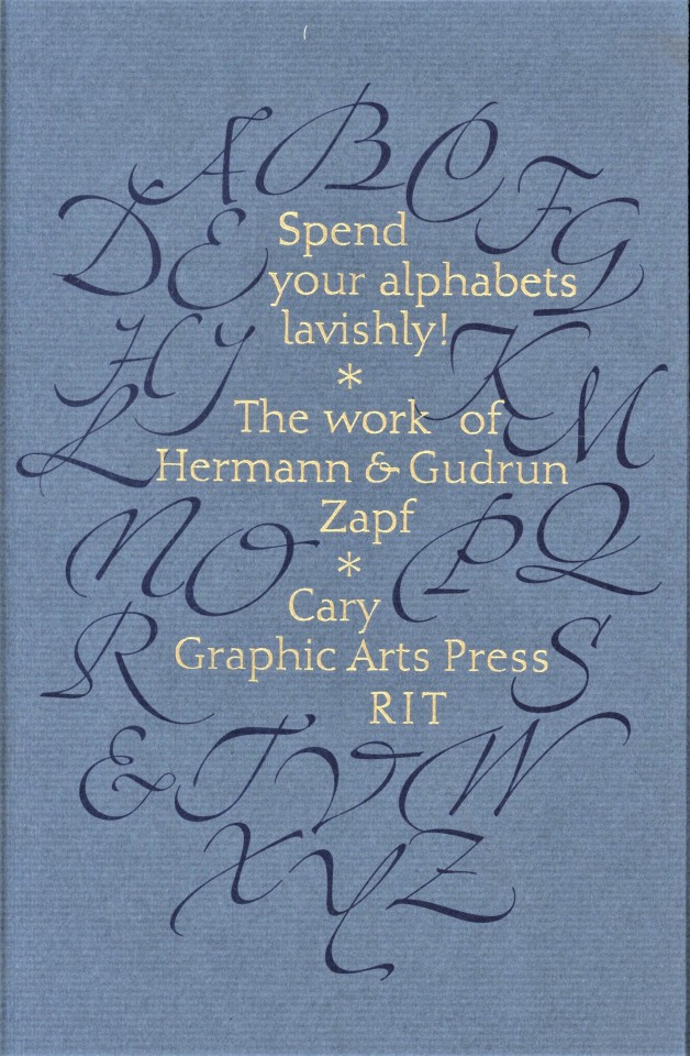
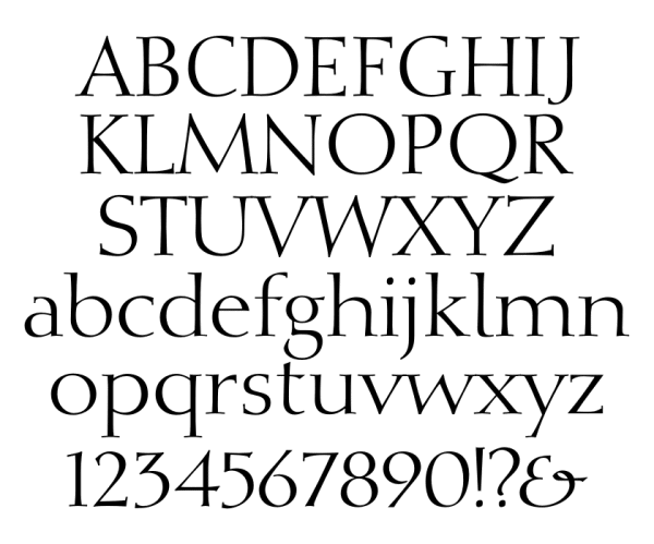
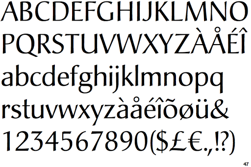
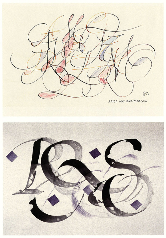
Shown here from top to bottom:
1.) Cover for the 2007 exhibition catalog Spend your alphabets lavishly! at the Rochester Institute of Technology, designed by fellow Goudy Award winner Jerry Kelly in 10 pt Nofret, designed by von Hesse, for The Typophiles in association with RIT Cary Graphics Art Press, Rochester, in an edition of 800 copies.
2.) Display set of Diotima pilfered from the internet.
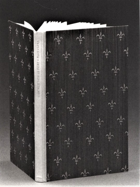
3.) Quarter-vellum and paste paper binding by von Hesse for Plus Ultra, published by the Trajanus Press in 1950, the first book printed in Diotima. Photograph from Spend your alphabet lavishly!
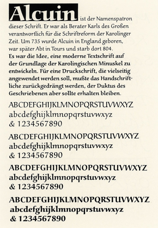
4.) Display set of Alcuin from the internet, a design inspired by the advisor to Charlemagne and his Carolingian minuscule, released by URW Type Foundry in 1992.
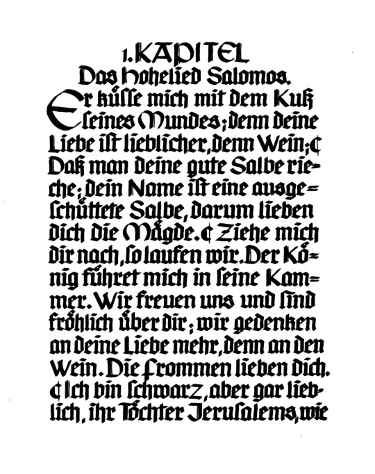
5.) Das Hohelied Salomos, a manuscript book written and bound by Gudrun von Hesse in 1936. Image from Spend your alphabet lavishly!
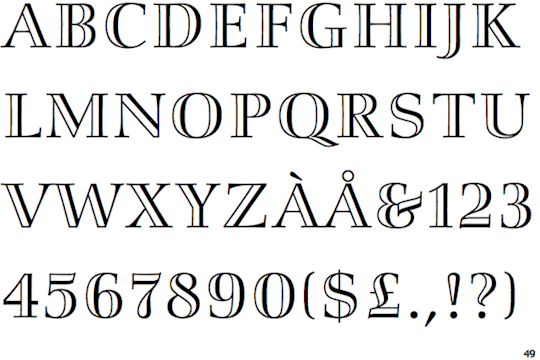
6.) Display set of Smaragd from the internet, released by Stempel in 1954.
7.) Carmina type specimen, released by Bitsteam in 1987, from Spend your alphabet lavishly!
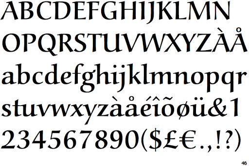
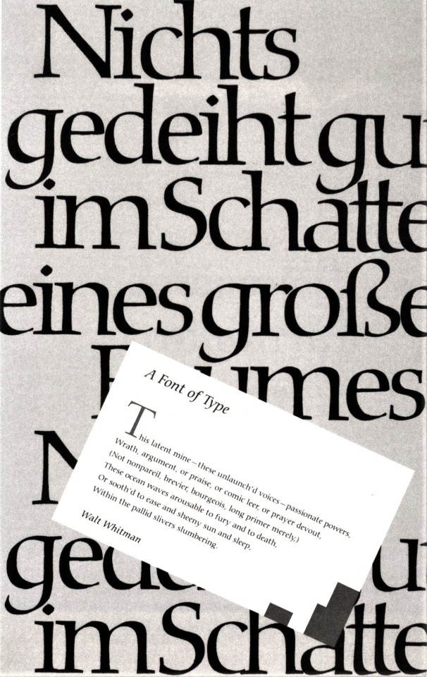
8.) Display set of Christiana, by the Berthold Type Foundry in 1991.
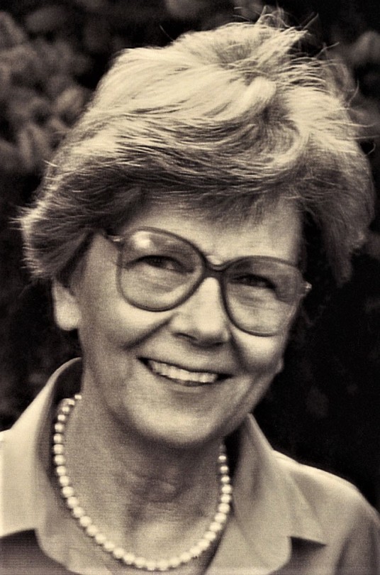
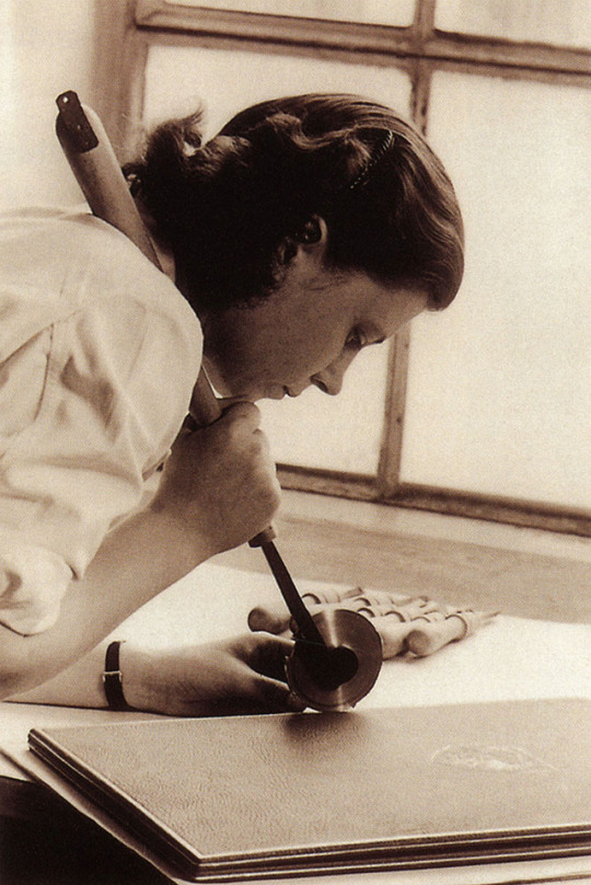
9.) Photograph of Gudrun Zapf-von Hesse from our copy of Gudrun Zapf von Hesse published in 2002 by Mark Batty in an edition of 20 copies bound by Judi Conant.
10.) Display set of Hesse-Antiqua, released by the Monotype Corporation in 2018 in honor of von Hesse's 100th birthday.
View our other post on Gudrun Zapf von Hesse celebrating her 100th birthday.
View posts on other Women Type Designers.
View our other Typography Tuesday posts.
View more Women’s History Month posts.
#Typography Tuesday#typetuesday#Historic Woman Printer/Publisher of the Week#women's history month#Gudrun Zapf von Hesse#women type designers#type designers#women calligraphers#calligraphers#Diotima typeface#Alcuin typeface#Smaragd typeface#Carmina typeface#Christiana typeface#Hesse-Antiqua#Jerry Buff#Typography Tuesday#20th century type#21st century type
100 notes
·
View notes
Text
Access Bank's New Brand Identity
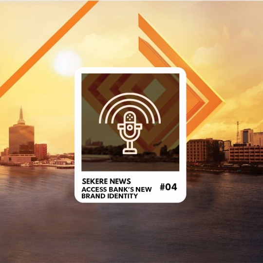
Welcome to Sekere’s Podcast, On this episode, the Sekere Team and our guests will be sharing their opinions on the Access Bank's New Brand Identity.
https://soundcloud.com/user-243775710/access-banks-new-brand-identity
Christiana: Hello, welcome to Sekere News. My name is Christina and I'll be your host today.
Christiana: My guests today are Imoh, he is the head of communications at a media firm. Frank a brand marketing consultant, Semira content developer at a Communications firm
Christiana: Today, we'll be talking about Access Bank’s rebrand. The Rebrand comes after Access Bank took over Diamond Bank and the two banks merged.
Christiana: Access bank recently unveiled the post-merger brand identity. As part of the post-merger brand identity, they unveiled the logo.
Christiana: The logo fuses Access Banks colours, which are orange and blue with Diamond Banks green and diamond-shaped symbol.
Christiana: In the new logo, the Diamond Bank symbol is orange and is maze-like. If you haven't seen the logo, go to Sekere, type in Access Banks new logo to view it.
Christiana: So let's hear from our guests to find out what they think about the post-merger brand identity and logo… Frank.
Frank: All right…Thank you…First of all, I like to say that both banks have been very very careful with their rebranding.
Frank: I remember when Access bank acquired Intercontinental Bank, they also changed their identity, which is very very, you know, not too distinctive from what it was before.
Frank: So what a lot of brands do when they try to Rebrand is that they try to do a whole lot of different typefaces and different icons. And so you begin to look for the former brand identity and consumers a bit confused as to what changed and all of that.
Frank: So they've done that very well…also Diamond Bank as well.. when they moved from the initial brand identity, which was great. And then they infused new colours. I think they had red, lemon, blue and orange that was very good too and they introduced new products, with the campaign "you need another bank" with Bovi and all of that
Frank: So both banks have carefully at one point or the other you done some very good rebranding which you know helped them to be stronger and what they are today.
Frank: And talking about the merger right now, whichever agency worked on the merger. I think they did a very fantastic job.
Frank: First of all, I could see both banks in the new identity. I could see…the initial icon Diamond Bank had was now stripped with those arrows that Access Bank had. Those arrows I told you moving forward I could see them.
Frank: And basically we also had both banks exhibiting both colours, you know… in the overall identity.
Frank: So I think it's a very fantastic job. The bottom line is that when a bigger brand or when one bank tries to buy or merger with a seemingly smaller Bank, you will expect that. It should be cannibalized and you wouldn't find it a bank in new identity.
Frank: But this wasn't the case I could see Access bank and I could see Diamond Bank in the new identity both ways.
Frank: So I think it was very good one. I'm talking about the brand value propositions. You can see that Access bank was a very very Innovative Bank while Diamond Bank was vibrant and dynamic.
Frank: So both banks, I think coming together…both in terms of value proposition, in terms of brand personality, in terms of whether they are going to survive the next couple of years. I'm not you know bothered about that… I am very very confident that this new partnership and association is going to deliver for Nigerians and their customers, whatever value they enjoyed in the past and even more.
Frank: So I mean, this is my two kobo thought
Christiana: All right. Thank you very much… Imoh
Imoh: All right. Thank you… For the transition of the brand. I think he did a very good job in the sense that throughout… from the first announcement to the final day they unveiled the logo. Their key customers all the customers they had, there was no panic.
Imoh: You know how banks are with transitions and all…Customers panic and they want to withdraw their money and all.
Imoh: But the way it was portrayed… they sold it…very good storytelling… right from when they announced it to the partnership, the Access Bank marathon.
Imoh: Their storytelling was very key and it was portrayed more of a merger than a takeover and they tried to infuse both elements into… of both brands…into the new logo Imoh: Personally….I feel with redesigns for brands and companies should not be…should not deviate too much from the initial concept that they had.
Imoh: It should be more of a refinement and maintaining the brand essence, so the transition can be seamless... So I see it as the Bold move and I wish them all the best in their endeavours.
Christiana: All right. Thank you… Semira.
Semira: Thank you for having me on the show. I think my opinion… the merger between the Access Bank and Diamond Bank was very interesting actually because mergers can be very… like Imoh said can be like a takeover and then you find the smaller brand or the brand that��s being taken over superimposed into the new bank kind of watered down.
Semira: But for Access Bank what they've done here is they've kept the brand identity. They found a way to make it work the brand identity of Diamond bank and the current brand identity of Access bank
Semira: They have found a way to make it work and then create a brand that you know is still relatable to the customer whether you're a Diamond Bank customer and Access bank customer. You kind of feel like you're being included in the whole merger. I kind of feel like okay. This is the brand you can trust that you can work with.
Semira: So I feel like it was a very great branding tactic on the path of Access bank and I feel like this is going to be lead to a stronger brand obviously for the two Banks… now one back of obviously.
Semira: And so for that I feel like it was a good decision and then the branding elements used…the over branding strategy was very good and very very effective. So yes, I think it was a good move for them.
Christiana: All right. Thank you.
Frank: One more thing please… just before we round up and I think this was a point we try to make the last time we talked about this… about when a particular brand just woke up one morning and change their whole logo and name and every that.
Frank: So the brands in Nigeria should learn that the Nigerian market is peculiar. Well, I mean, we don't like unpleasant surprises. We're very very Petty. So if you should make a very very significant brand change, you should at the very very early stage start to prepare the minds of your customers that have been loyal to you.
Frank: You should put their minds ahead of time. You should be…they should be ready to know what they are expecting
Frank: Especially when it has to do with money… people are very very careful with their money…Its their life savings. So I think I mean their communication was right in this regard.
Christiana: Yes it was very good, as you said you can see the two Banks just looking at it. So customers will still trust the bank, If you are a Diamond bank customer…you know… I can trust the bank… if it's Access bank… you still feel close to it.
Christiana: So I think it was a good job for them. And as everyone has said it was… the brand communication…It looks like a stronger bank together now and you didn’t see… when the news first broke, it seemed like Access bank was taking over Diamond Bank.
Christiana: But they've been able to be retell the story and based on the story it seems more like a merger.
Christiana: They keep using the word merger…I don't say hostile takeover or when they bought the bank. So it's was very good job by Access bank.
Christiana: So does anyone have anything to add?
Imoh: Well for the implementation, I think they also scored high in it… because if you go around town, you can’t tell which bank is which…From the implementation of their logo, to how they applied the colours and all their elements…Yeah…Kudos to them
Christiana: Yes. All right, so thank you very much for coming in today to share your thoughts and insights.
Christiana: And I want to thank the viewers for also listening. If you have any more thoughts, opinions or insights to share about the rebranding. Please leave a comment below. Thank you.
Read the full article
#AccessBank#AccessBank'sNewBrandIdentity#DiamondBank#Podcast#SekereNewsPodcast#SekereNewsReview#SekerePodcast#SekereReview
0 notes
Text
Hispanic Heritage Month: Early Titles by the Americas’ First Printing Press
Hispanic Heritage Month: Early Titles by the Americas’ First Printing Press
By Wendi Maloney
Published October 11, 2018 at 02:28PM
This is a guest post by John Hessler, curator of the Jay I. Kislak Collection of the History and Archaeology of the Early Americas at the Library of Congress.
Title page to the “Doctrina breve muy provechosa,” by Juan de Zumárraga.
On June 12, 1539, a boat set sail from the Spanish city of Seville containing a cargo that would change the face of the Americas forever. On board was Giovanni Paoli (1500–61), perhaps better known by his Spanish name, Juan Pablos. He had been sent to the New World by Juan Cromberger (d. 1540), one of the most successful printers in Spain, to establish the first printing press on the new continent; with Pablos came all the materials and knowledge necessary to start publishing books in the Americas.
Juan Pablos arrived in Mexico City in October 1539 and quickly set up a press that would become known as the Casa de Juan Cromberger. Between Pablos’ arrival and his death in 1561, he published 37 titles, taking over full ownership of the press after Cromberger’s death in 1540. Only some the titles printed survive to the present day.
His first book, the earliest known to have been published in the Americas, came off the presses in 1539. It was titled the “Breve y más compendiosa doctrina Christiana en lengua Mexicana y Castellana,” which translates to “Short Compendium of Catholic Doctrine in Both Nahuatl and Spanish.” The first archbishop of Mexico, Juan de Zumárraga (1468–1548), wrote the book, apparently in both the indigenous language of Nahuatl and in Spanish. Unfortunately, no copies of the book have survived. Through the centuries, it has taken on legendary status, as scholars, collectors and antiquarians have continued to seek it out.
The distinction of being the first book printed in the Americas that can still actually be read goes to another Zumárraga title, “Doctrina breve muy provechosa,” or “Brief and useful Catholic Doctrine,” dating from 1543–44. The Library’s Rare Book and Special Collections Division holds a copy of this extremely rare book.
In it, one finds explanations and philosophical arguments related to the moral and theological principles necessary for a Christian life – the book was part of Zumárraga’s project to convert the peoples of Mexico to the Catholic faith.
Specialists who sit down to read book – which because of the typeface is not for the faint of heart – are immediately struck by the fact that it copies, in Spanish translation, much of the content of a far more famous book, the “Enchiridion,” translated as the “Handbook of a Christian Knight,” by the great humanist scholar Erasmus of Rotterdam (1466–1536).
The “Doctrina breve” contains much more, however, than a simple copy of Erasmus’ text. It narrates the Catholic articles of faith, explains the sacraments, talks about the various kinds of sin and works of mercy, and it delves deeply, in its 168 pages, into the importance of living a moral life.
Title page to the Nahuatl-Spanish section of Molina’s “Vocabulario en lengua castellana y Mexicana.”
The early printing press, wherever it was found, was often controversial. The one set up in Mexico City by Cromberger and Paoli in 1539 was no different, as it opened up the Americas to the revolution of print that was sweeping through Europe. In 1559, nine years after Zumárraga died, the Mexican church temporarily banned the “Doctrina breve,” somewhat mysteriously. The “Enchiridion” was also considered by many in the church to contain heretical doctrine; it, too, was prohibited reading in 1559.
As publishing increased in the New World, however, it was not only church doctrine that became the subject of the new print culture. Indigenous languages, histories and customs also began to be more widely studied and read, quickly producing such printed masterworks as Alonso de Molina’s (1514–79) “Vocabulario en lengua castellana y Mexicana,” a bilingual dictionary of Spanish and Nahuatl. Originally called the “Aquí comiença un vocabulario en la lengua castellana y mexicana,” it was edited by Juan Pablos in 1555 and was the first dictionary of any kind to be published in the New World.
In the Americas, the printing press gave voice to both indigenous and European thought, as the two cultures began the long and difficult process of accommodating each other in the 16th century. What started as a trickle of books in 1539 increased rapidly and became, to quote Johannes Guttenberg, “a spring of truth” that would “scatter the darkness of ignorance and cause a light heretofore unknown to shine amongst men.”
Read more on https://loc.gov
0 notes
Photo

Historic Woman Printer/Publisher of the Week:
Gudrun Zapf von Hesse (b. 1918)
Yesterday, our little beehive was so busy making honey, we just couldn’t get to posting our usual Typography Tuesday blog. So, we thought we’d take a little diversion in our usual Historic Woman Printer/Publisher post and combine it with Typography Tuesday to focus on the work of the great German typographer, calligrapher, and book binder Gudrun Zapf von Hesse.
Von Hesse worked as a book-binding apprentice, studied the calligraphic work of Rudolf Koch and Edward Johnston, and learned punchcutting at the Bauer Type Foundry in Frankfurt before setting up her own bookbinding shop after WWII. She began working as a type designer for the Stempel Type Foundry in Frankfurt soon after -- where she met and married the prolific German type designer Hermann Zapf -- and continued a long and successful career. Among the several typefaces she designed for Stempel are Diotima, Ariadne, and Smaragd, but she also designed typefaces for other companies, notably Alcuin for URW and Carmina BT for Bitstream.
In 1991, she became the second woman (but not the last) to win the Frederic W. Goudy award. Her husband was the first recipient of this prestigious award in 1969. In honor of her 100th birthday this past January, the Monotype Corporation released the typeface Hesse-Antiqua, which is based on an alphabet she designed in the late 1940s. Happy Birthday Gudrun!!
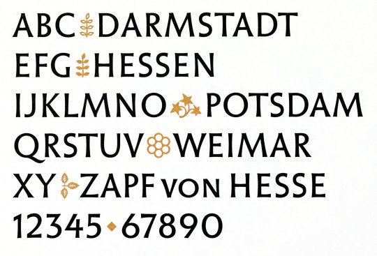
The images and designs shown here are from another, yet-uncataloged donation from our friend and benefactor Jerry Buff, Gudrun Zapf von Hesse published in 2002 by Mark Batty in West New York, New Jersey, and printed in Von Hesse’s Norfet Roman which was originally designed for the Berthold Type Foundry of Berlin. Our copy is one of 20 copies bound by Judi Conant in Vermont and singed by Von Hesse, including an extra suite of 13 specially-printed specimens, among which are six original, hand-printed specimens signed by Von Hesse.
View our other Typography Tuesday posts.
View our other posts on Historic Women Printer/Publishers.
#Typography Tuesday#Historic Woman Printer/Publisher of the Week#Gudrun Zapf von Hesse#Stempel Type Foundry#Jerry Buff#typographers#type designers#calligraphers#book binders#women's history month#hermann zapf#women printers#20th century#women type designers
48 notes
·
View notes
Last Seen Blogs

dream-fearless-love-limitless
Nobody's perfect.

astroarchaeology
Astroarchaeology and Archaeoastronomy

frivolousartisan
Dino Ghiranze

ncutisgatwas
Ew, David!