Photo

Library Shelfie Day
For Library Shelfie Day, a shelfful of incunabula in chronological order:
Martial. Epigrammatum. Venice: Johannes de Colonia and Johannes Manthen, 1475.
St. Antoninus. Confessionale. Venice: Raynaldo de Novimagio, 1479.
Nicholas de Lyra. Moralia super totam Bibliam. Mantua: Paulus de Butzbach, 1481.
St Augustine. De civitate dei. Venice: Bonetus Locatellus, for Octavianus Scotus, 1486.
Horace. Opera. Venice: Bernardo di Tridino, 1486.
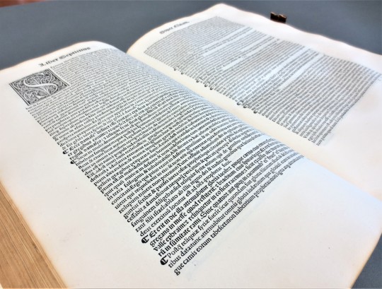
St. Augustine. Liber Epistolarum. Basel: Johann Amerbach, 1493
St. Jerome. Commentaria in Bibliam. Venice: Joannes and Gregorius de Gregoriis, de Forlivio, 1497-98. 2 volumes.
Biblia Latina. Venice: Hieronymus de Paganinis, 1497.
Pomponium Laetum. Romanae historiae. Venice: Bernardinum Venetum de Vitalibus, 1500.
View other posts on incunabula.
View posts from Library Shelfie Days past.
113 notes
·
View notes
Photo
Typography Tuesday
GIOVANNI AND GREGORIO DE GREGORI
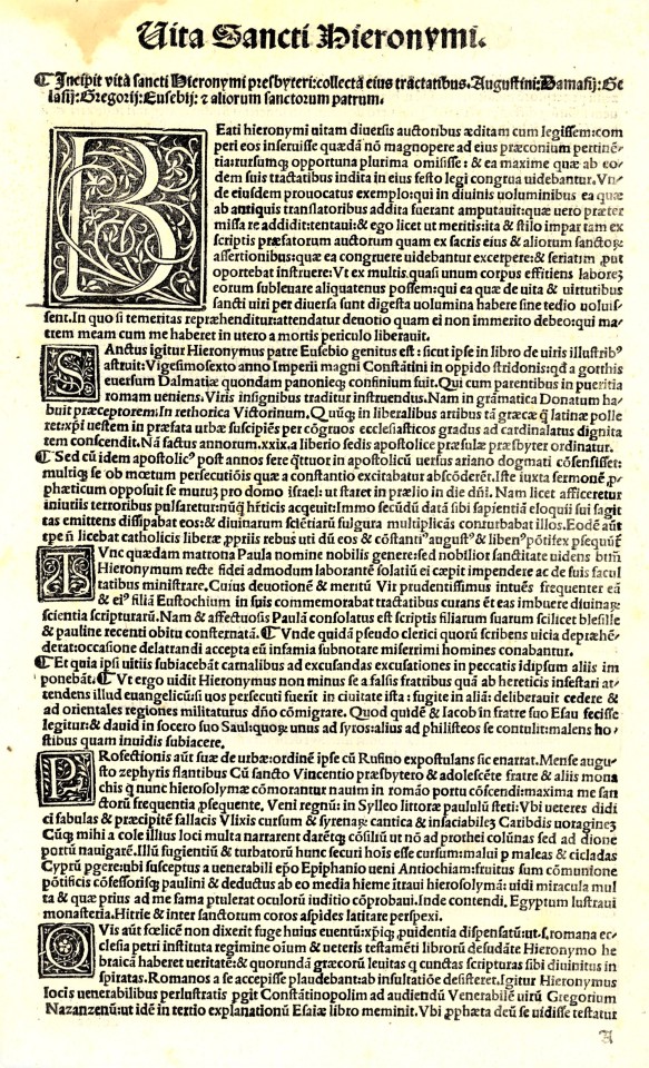
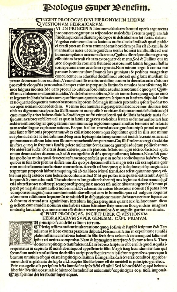
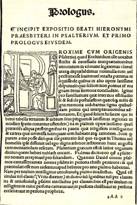
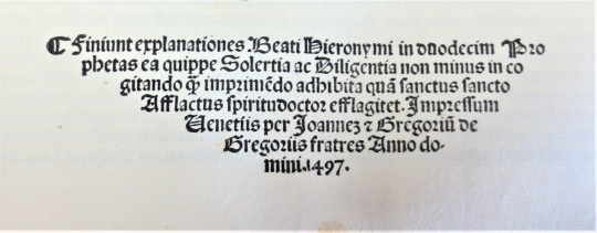
Among our collection of incunables (books printed before 1501) is a two-volume Venetian edition of St. Jerome’s biblical commentaries, Commentaria in Bibliam, edited by the scholar monk Bernardino Gadolo for the Gregori brothers, Giovanni and Gregorio (originally from the city of Forli, therefore often referred to in Latin as Joannes et Gregorius de Gregoriis, de Forlivio), and printed in 1497 and 1498.
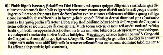
The Gregori brothers began their printing business in Venice around 1480, and were certainly producing books by 1482. They continued printing together until at least 1505 (when Giovanni may have died), after which Gregorio printed on his own until about 1510. They were known for their fine typography in both Roman and Gothic fonts and were among the first to design and cast a tiny, elegant, and readable Roman typeface in what was known as the nonpareil size, or 6-pt. font, which they produced right around the same time as the printing of these volumes. In 1886, the noted American printer and type scholar Theodore Low De Vinne observed about this “remarkably neat Roman letter on a nonpareil body” that:
Considering the difficulty of cutting symmetrical letters on so small a body, and of casting them in types at this early period in the history of type founding, when tools were imperfect and experience was limited, this font of nonpareil may be regarded as a feat in type founding. . . . Types as small had been made before. . . . but these types . . . were not well cut or cast.
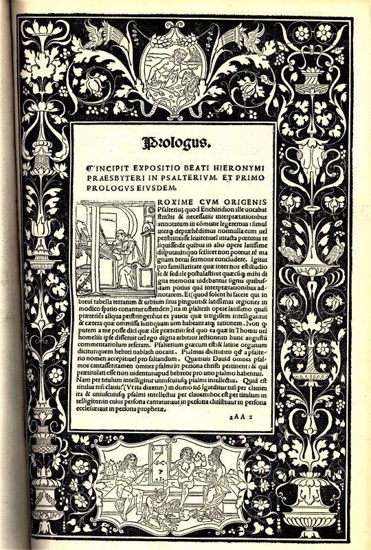
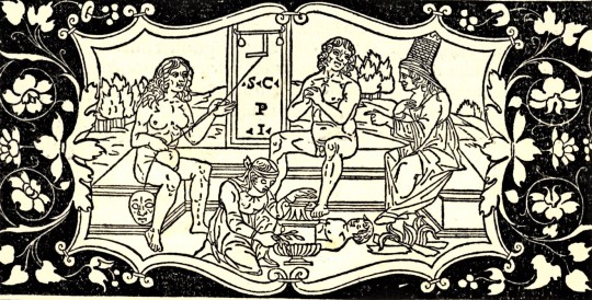
The elegance of their type design in both Roman and Gothic fonts is clear from the examples shown here. Gregorio was also a skilled woodcut artist and probably produced many of the decorative and historiated initials in these volumes. The fine woodcut border for the incipit of the Expositio in Psalterium shown here, however, is a re-use of one of the finest woodcut borders of the fifteenth century, drawn and cut by the Paduan-born Venetian miniaturist Benedetto Bordone for a Herodotus issued by the Gregori brothers in 1494.
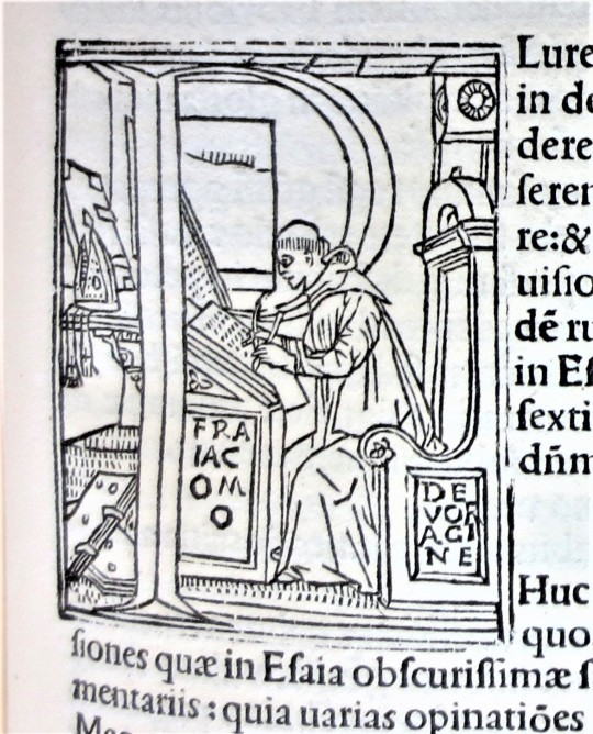
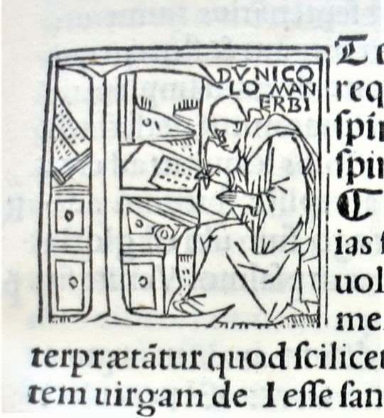
The border frames a text that includes a fourteen-line historiated initial showing St. Jerome at his desk. There are several other scholar portraits that serve as historiated initials in these volumes. Shown here, for example, is the initial P, the same as the one used for Jerome, but identified here as the medieval scholar and archbishop of Genoa Jacobus de Varagine. Another for the initial E is identified as the 15th-century Italian biblical scholar Nicolò Manerbi (or Malermi).
View some of our other incunabula.
View our other Typography Tuesday posts.
#Typography Tuesday#typetuesday#Giovanni and Gregorio de Gregori#Joannes et Gregorius de Gregoriis de Forlivio#Gregori bothers#nonpareil type#incunabula#Roman fonts#Gothic type#15th century type#St. Jerome#Commentaria in Bibliam#Theodore Low De Vinne#Bernardino Gadolo#Benedetto Bordone#Jacobus de Varagine#Nicolò Malermi#historiated initials#woodcut initials#Typography Tuesday
76 notes
·
View notes