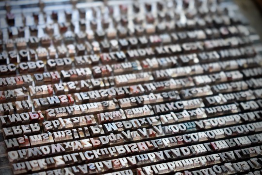
#Gothic type
Photo


Typography Tuesday
BLACKLETTER
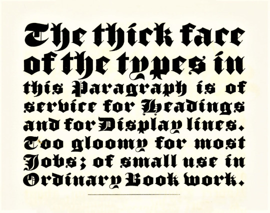
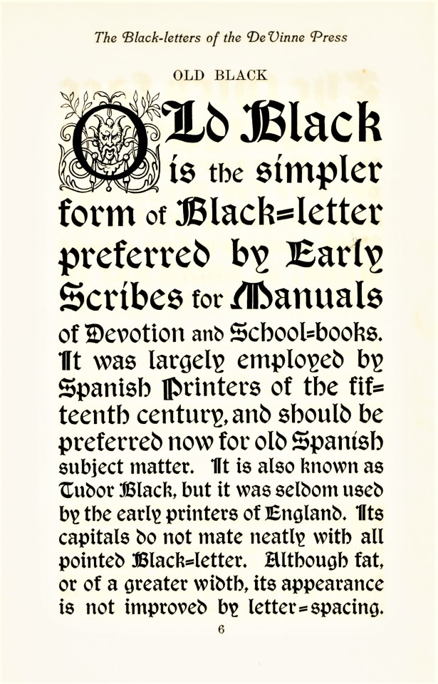
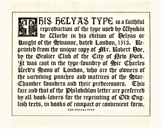
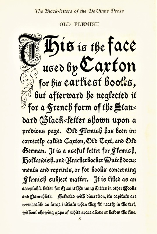
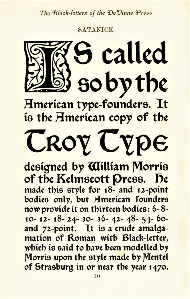
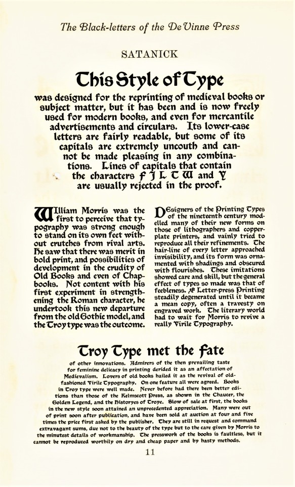
Blackletter, also called Gothic, was the first typographic form to be founded in metal type by Johannes Gutenberg in the mid-fifteenth century. The first book printed in English was in blackletter, as was the first book printed in England (both by William Caxton; the first printed in Bruges in 1473, which was also the very first book printed in Bruges, and the latter in Westminster in 1476). It is called blackletter because its narrow, condensed forms produce a darker appearance on the page than do Roman fonts. By the late 16th century, most Western national printers had dropped blackletter in favor of the arguably more readable Roman-style fonts, except for some Scandinavian countries which held onto blackletter forms until the late 18th century, and Germany being the last holdout until 1941.
Blackletter fonts are still used today, however, as display faces, for ceremonial use, and for certain kinds of emphases. That’s certainly how Theodore Low De Vinne (1828-1914) would have used it at his De Vinne Press in New York. These examples come from Types of the De Vinne Press, published in New York by the De Vinne Press in 1907. Theodore De Vinne founded his press in 1883. He was also a co-founder of the prestigious Grolier Club and one of the leading commercial printers of his day, whose enterprise had a profound influence on American printing and typography. This book was intended as a promotional specimen book “for the use of compositors, proofreaders, and publishers,” to demonstrate the wide variety of typographic possibilities that could be available to their clients.
View more posts from Types of the De Vinne Press.
View more posts on Gothic/Blackletter type faces.
View more Typography Tuesday posts.
#Typography Tuesday#typetuesday#Typography Tuesday#Blackletter#Gothic type#Theodore Low De Vinne#De Vinne Press#Types of the De Vinne Press#book history#20th century type
236 notes
·
View notes
Photo
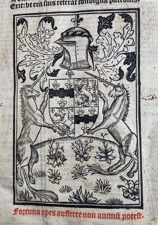
Another entry for our “dragons and unicorns” week: Two unicorns hold up a crest decorated with two more little unicorns, again from Constitutiones provinciales ecclesiae Anglicanae.
The caption reads: Fortuna opes aufferre non animu potest.
#woodcut#unicorn#unicorns#crest#heraldry#latin#rubricated text#gothic type#16th century#fleur-de-lis#armor#canon law#english law#legal history#old books#rare books#riesenfeld center#magical creatures#umn law#law library
244 notes
·
View notes
Text


2 November 2023 | Der Klubhaus
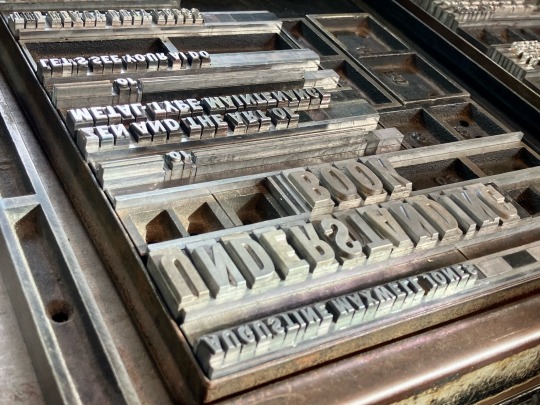
Work(s) in progress. Here we are seeing type that is set but not printed for Understanding This Book, folios printed late last winter for the same title, and the prototype for UTB, along with the basic idea for a miniature accordion-fold book titled Hail, Holy Queen, which will feature a collage recently posted here, made from prints of drawings by JoAnna Poehlmann. These projects are top priority for the next 30 days, attempting to complete them both in time for the Oxford Fine Press Book Fair, which is December 9-10, only three months earlier than expected. Not especially happy about not having all winter to work on these projects, but so much of the way things go is out of one’s own control, so we have no choice, really, but to roll with it.
#Der klubhaus#klubhaus#heavy duty press#heavydutypress#creative process#artists books#letterpress#metal type#understanding#art#kunst#books#franklin gothic#hail holy queen#UTB#type#typefaces#gothic type
22 notes
·
View notes
Text
Cinder
youtube


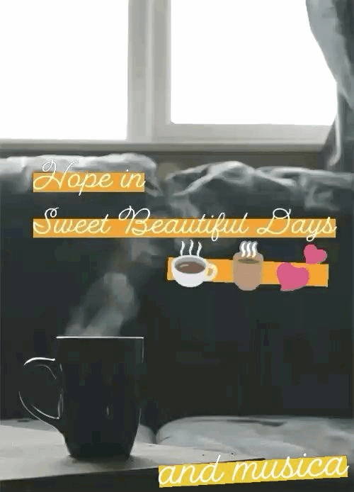

Check out " Cinder " by Autumn in Helen hey lick on video link for more info!!!!:-) Sweet beautiful days inheart💗💗

#Youtube#new2023/2024#autumn in helen#singer/songwriter#elia berardi#peacebewithu💕#hope you like👍🎶👼😇☕🌹🍃🌻✨#gothicdarkwave#goth rock#music style#lovemetal#gothic type#goth electro magnetic dark wave musica#strangegirlwithaheart#havestrangmelodies#musiciscreativityofthesoul#peace be with you💕🎼#godblessu inheart💋💕🎶🌹
3 notes
·
View notes
Text

1K notes
·
View notes
Text

“Loving you was like loving the dead..”
#type o negative#pastel goth#creepy cute#cute#goth aesthetic#pastel#cemetery#type 0 negative#aesthetic#gothic#pink goth#aestheitcs#graveyard#loonarclaws#song lyrics#song lines
4K notes
·
View notes
Text

#gothic aesthetic#goth club#gothique#alternative goth#purple goth#vampirecore#vampire lover#vampire aesthetic#goth love#goth aesthetic#gothgirl#soft goth#gothic#goth#dark gothic#mall goth#gothgoth#gothicc#peter steele#type o negative#2000s goth#gothcore#goth subculture#victorian goth#alt goth#creepy#grunge#cute gore#gore lover#not mine
1K notes
·
View notes
Text
im perfectly normal about them
#im making kissy noises as i type this#critical role#bells hells#imodna#southern gothic#imogen temult#laudna#fanart#my art#wlw
3K notes
·
View notes
Text
#type o negative#goth metal#gothic metal#music#glitter#glitter graphics#glitter gifs#goth#gothic#goth aesthetic#gothcore#gothgoth#purple goth#my edits#tw eyestrain#𓆩♡𓆪
913 notes
·
View notes
Text
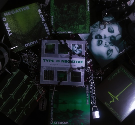
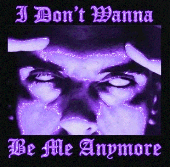
★† Type 0 Negative †★
#aesthetic#photographers on tumblr#myself#alternative#altfashion#art#fashion#artists on tumblr#punk#emo aesthetic#nu metal#gothic metal#peter steele#type o negative#alt kid#album#cds#music#music cds
892 notes
·
View notes
Photo


Typography Tuesday
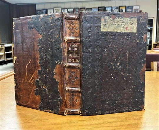
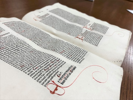
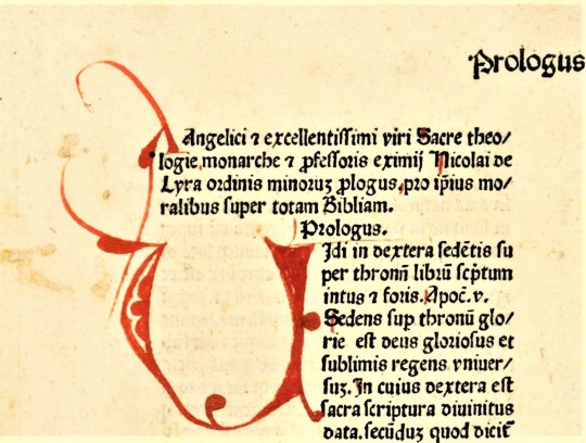
ITALIAN ROTUNDA GOTHIC
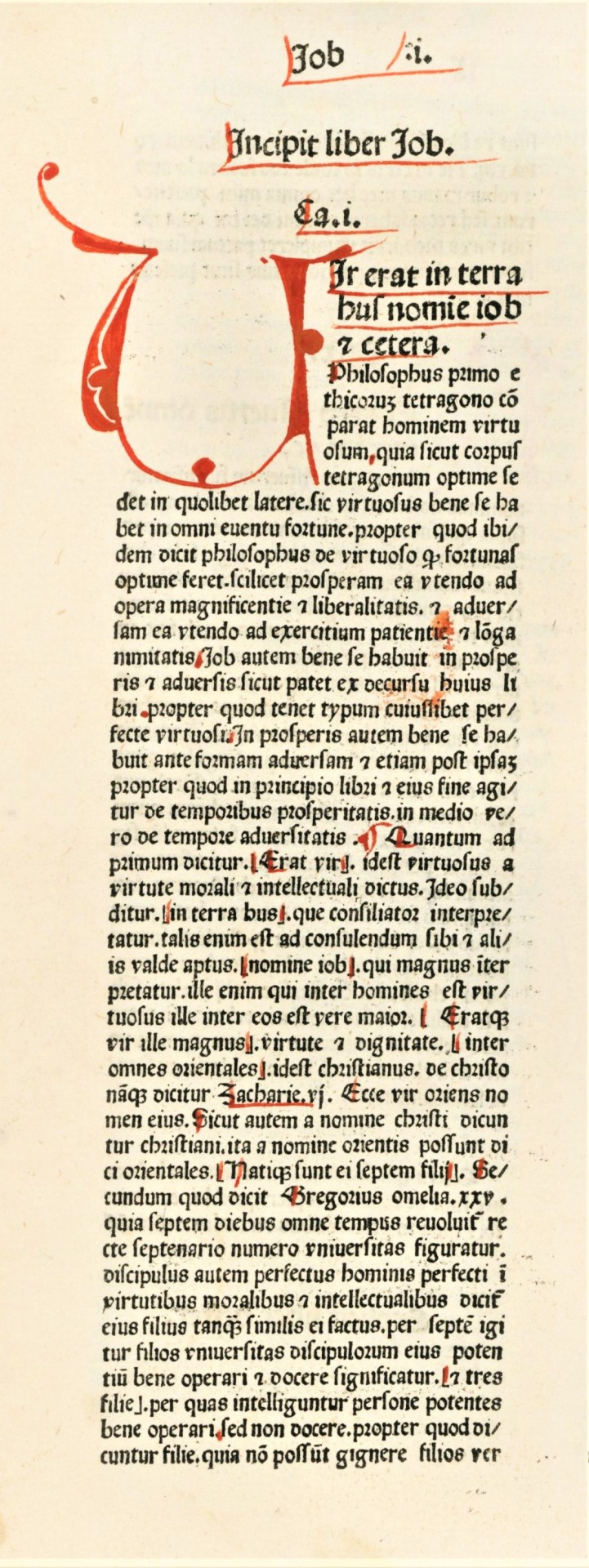
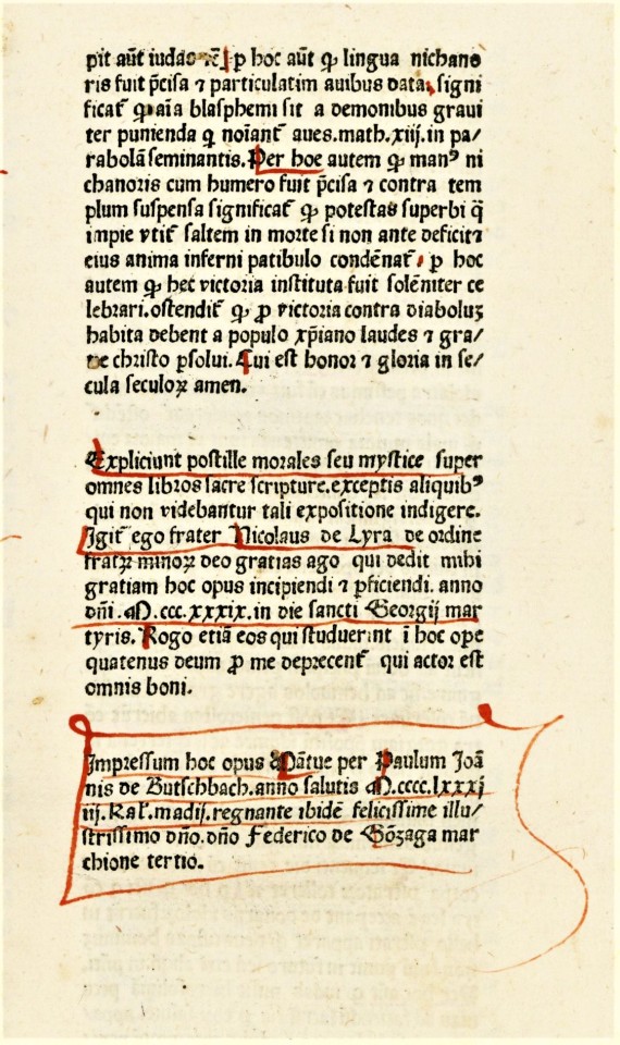
One of the few incunables we hold that have all the initials rubricated (i.e., initials completed in red manuscript) is a 1481 printing of Nicolas De Lyra’s biblical commentary Moralia super totam Bibliam, printed in Mantua by Paulus de Butzbach. It uses a typeface modelled after a rounded Gothic manuscript hand known as Rotunda.
The Italian version of the Rotunda, that this typeface is based on, was developed for copying manuscripts at the University of Bologna in the 13th century, and is sometimes referred to as littera bononiensis. This rounded form seems to have developed to accommodate more rapid copying to provide materials for a voracious academic clientele. However, this also increased the amount of space letterforms would occupy, so a series of abbreviation conventions were developed to save space that are especially associated with the Italian Rotunda.
These can be seen throughout the examples shown here, but they are especially vivid in the colophonic text of the last image. For example, the lowercase q with a line beneath the bow signifying the word "qui," or the r rotunda (ꝛ) which follows a letter with a rounded stroke on the right side, such as the one following the o in the word ordine in the second paragraph, following the underlined name of “Nicolaus de Lyra.” You can also see the use of the visually-related Tironian et ⟨⁊⟩ used to signify etcetera. The rubricator has not only completed all the initials, but has also highlighted capital letters in red, marked paragraph openings, and underlined certain words or phrases for emphasis. The humorous artery-like illustration around the rubricated n in the second to last image was likely added much later, perhaps after William Harvey published his findings on the circulation of blood in 1628!
Not much is known about the printer Paulus de Butzbach, although he is quite well-noted as a printer for one of the first three editions of Dante’s Commedia, all three of which appeared in 1472. However, using the raw data in the Incunabula Short Title Catalogue (ISTC) we can say that he seems to have had a relatively short career from 1471/2 to 1481, when our book was printed. A German printer (as most early printers in Italy were), he appears to have begun his career with another German printer Georgius de Augusta at Verona in 1471 or 72. After printing a handful of classical titles in Verona, they moved operations to Mantua in 1472 where the Commedia was printed. They continued to work together and for others there until 1475, when Butzbach’s name begins to appear in colophons by itself, and he continues to print alone until about 1481. In those ten years, Butzbach participated in the printing of some 30 editions. Our copy of Moralia super totam Bibliam is one of only 95 worldwide noted in ISTC.
View other posts on 15th-century types.
View more Typography Tuesday posts.
#Typography Tuesday#typetuesday#Typography Tuesday#Italian Rotunda#Gothic type#littera bononiensis#rubrication#rubricated initials#Paulus de Butzbach#Nicolas De Lyra#Moralia super totam Bibliam#abbreviations#Incunabula Short Title Catalogue#ISTC#15th century type
64 notes
·
View notes
Photo
This dragon seems ready to bite a piece off of the letter Q.
It’s all about dragons and unicorns at the Riesenfeld Center this week, simply because this book of Canon law features so many.
#woodcut wednesday#woodcut initial#canon law#english law#gothic type#dragon#dragons#historiated initial#16th century#old books#rare books#riesenfeld#riesenfeld center#umn law#law library#magical creatures
186 notes
·
View notes
Text
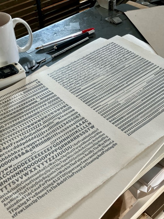
14 November 2023 | Der Klubhaus
Running out the 14 pt Franklin Gothic Italic with some improvisational typographic jazz poetry, to be printed in the forthcoming Understanding This Book, or Zen and the Art of Metal Type Maintenance, or Let’s See Your AI Do This, from The Heavy Duty Press.
#ai#metal type#understanding#utb#book arts#artists book#creative process#heavy duty press#franklin gothic#gothic type#gothique#jazz typography#jazz poetry#typesetting#typogrpaphy#zen
7 notes
·
View notes
Text
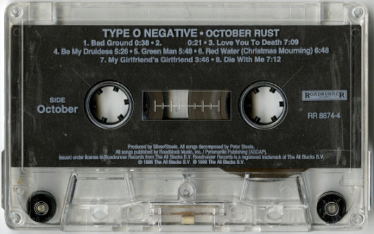
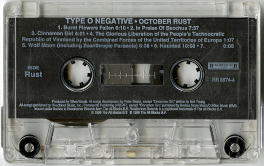
Type O Negative - October Rust (1996)
#gothic#goth#type o negative#gothique#music#cassette#album#album cover#goth music#gothic rock#october rust#doom metal#gothic metal#alternative metal#october#autumn#90s music#90s goth#90s metal
1K notes
·
View notes
Text
Type O Negative on the Terrorizer cover [90s]
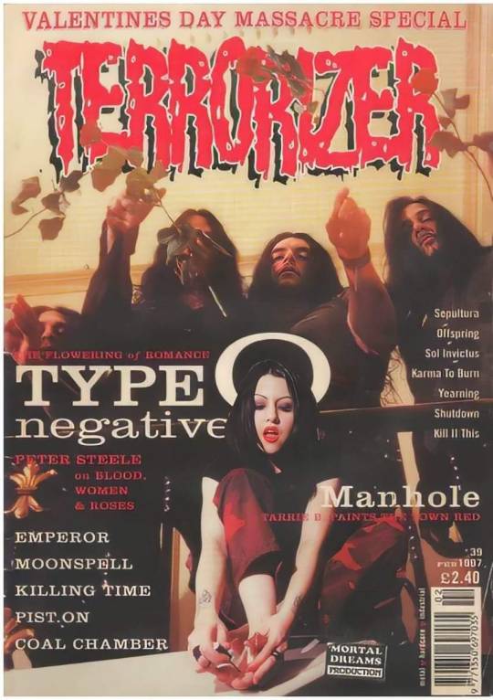
#type o negative#cover#terrorizer#peter steele#johnny kelly#josh silver#kenny hickey#goth#90s#metal#ton#type o negative forever#peter ratajczyk#gothic#gothic metal#the drab four#stay negative
817 notes
·
View notes
Text

Peter steele
#tumbrl#early 2000s#late 1990s#band#music#live#live music#gothic#gothic metal#type one diabetic#metal#type o negative#peter steele#peter ratajczyk
995 notes
·
View notes
Last Seen Blogs

pelisplustheequalizer3
[PELISPLUS] Ver The Equalizer 3 [2023] Película Completa Online

syubseokie
0 6 1 3 | 1 0 2 4

crimsonclxrion-blog
clarιon oғ revelaтιonѕ (autoplay.)

kittypride-archive
moved

hijinxinprogress
KhaosAmongTheAsterales