#Dominique Sirois

Text
FOIRE SINGULIERS - 11 AVRIL 2024 - 14 AVRIL 2024 / Fonderie Darling (CA)
11 AVRIL 2024 – 14 AVRIL 2024
ENTRÉE LIBRE
VERNISSAGE
JEUDI 11 AVRIL, 17H À 23H
Créé par et pour les artistes non-représenté.e.s en galerie, SINGULIERS souhaite célébrer une pluralité de pratiques marginalisées et présenter des artistes parfois –ou trop souvent – exclu.e.s de la sphère artistique. Aux abords de la Foire Plural, cet événement ponctuel se tiendra du 11 au 14 avril prochain à…

View On WordPress
#745 Rue Ottawa#Alexandre Guay#Andes A. Beaulé#Émilie Bernard#Camille Lescarbeau#Carl-Philippe Simonise#Celine Goudreau#Cindy Dumais#Claudia Bernal#CLUCA#Dominique Sirois#Eugenia Reznik#Florian#FOIRE SINGULIERS#FOIRE SINGULIERS - 11 AVRIL 2024 - 14 AVRIL 2024 / Fonderie Darling (CA)#Fonderie Darling#Frédéric Chabot#Isabelle Lapierre#Léa Martin#Longueuil#Maryam Izadifard#Mathilde Varanese#Mégane Voghell#Melissa Paredes#Montréal#My-Van Dam#Nathalie Batraville#Nathalie Vanderveken#OSKI#Paumé arts et littératures
0 notes
Photo

A close-up from Gr.gory Chatonsky and Dominique Sirois’s installation Telofossils, 2012. Courtesy of Xpo Gallery
0 notes
Photo
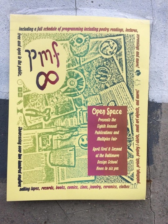
Open Space is pleased to present the Eighth Annual Publications and Multiples FairIt’s no joke!
Saturday, April 1 from 12 – 6pm
Sunday, April 2 from 12 – 6pm
at the Baltimore Design School
Stop by the fair for a program outlining all of the on- and off-site programming this weekend!
MORE INFORMATION HERE!
The Publications and Multiples Fair is an annual exposition of contemporary artist books, prints, publications, sculptures, jewelry, textiles, and works produced in multiple. This event has grown tremendously, from having 15 vendors in its first year to having 150 in its seventh year. Taking up one weekend in the spring, PMF acts as a beacon for artists across the country. People traveling from both coasts come together to sell the wares they have produced throughout the year and stay for the connections made with makers they may have never met before. In more recent years have we curated additional on-site programming throughout the weekend that includes panel discussions on contemporary identity issues, poetry readings, musical performances, motivational speeches, and artist talks.
Formed in 2009, Open Space is a DIY artist-run gallery and collective located in Baltimore, Maryland.
Vendors:
0202FF
0Zone
200 Nam Nam
A. Jarrell Hayes
ACRES
Adam Amram and Gabriella Grill
Adult Punk
Alex Ebstein, Jessie & Katey
Alexandra Bravar, Angela Heaps and Caeli Carr-Potter
Alexandra DeStefano
Amy Scovil, Allen Hiu
Anime Ceramix
Ann Xu
Anna K Crooks
Anna Silina
Anna Strain
Art Vandelay
Aurora Engle-Pratt
Baltimore Print Studios
Baltimore Youth Arts
BDS kids
Beast
Beast Grrl Collective
Bellfugees
Ben McNutt / Wrestling
Bernard Stiegler
Better Lovers
Blind Arch
Brad Ziegler
Bred Press
Brooks & Rosebud
Brown and Proud Press
Carmen Johns
Carolyn Conn & Grace Davis
Castle Printshop
Celeste Fichter
Chaimi Food Studio
Charlotte Anne Laurance
Cherub
Christina Haines
Christopher Adams
Christopher Mahonski
Claire Felonis + Spencer Shope
Clr’D
CLUBHOUSE and Leyla Rzayeva
Cryptogram
Ctl+P
Dana Bechert Ceramics
Dog Pasta
Dominique Hellgeth
Dylan Thadani Presents
Eclectic Collective
EGOHEADS
Ehse Records
Eleanor Farley
Elena Johnston
Ella Clayton
Elle Johnson
Endless Editions
Flannery Cashill
Freda Mohr
Friends of Friends
Friends Records
Fume Room Press
Fuse Works
Gaby Velez
GenderFail Press
General Matters
Get Lost Press
Girl Group
Gloomy of PlayGurlClubb
Gratuitous Type
Handwork Quilts
Heart & Soil
Hey Thanks! Herbal Co.
High Tide
HYRSTERIA ZINE
Illogical Comics
Ink Press Productions
InterMedia + Digital Arts of UMBC
Jack Reese / Weakly Comics
Jason Roy
JEDICOM
JESSICA’S WORLD OF FLOWERS
Joe Maccarone
Josh Dean
Julie & Jane
Kali Stull + Noel Freibert
Kat Kennedy
Kate Haberer & Will Ryerson
Katherine Gottsegen
KB pots
Kodi Fabricant and Maggie Fitz
Kyle Tata, Kristin Tata, Tyler Davis, and John Zimmerman
Laila Milevski
Lane Harlan
Lesser Gonzalez Alvarez
Lily Herman
Liz Langa Ceramics
Local 1 Youth Press
Lorre-Mill
Lucia Maher-Tatar, Audrey Gair
Lunar Insurrection
M Reisenwitz
M.uckotter \ charles.S
Make Studio
MAKE Ü SMILE
Mara Hyman
Matt Carignan
Matthew Scott Gualco
Melody Often
Miata Upshaw
MICA Design League
Mikael Flores-Amper
Mishka Colombo
Morgan Vessel
Mother Mother
MRDN
Mt. Home Arts + Matthew Van Asselt
Munu Editions
Natalia C. Arias
Natalie Geagraphic
NewAM++
NICKNACKS
Nothing Left to Learn
Nowhere Zone
Object Of
Olivia Gibb
Open Works
P.O. Box
PaperBase
Paul Shortt & Christopher Kardambikis
Pellinore Press
PHKKED
Pioneer Works
Press Press
Project Dispatch
Publication Studio Hudson
Rachel Hayden
Rachel Rymont
RAW MEAT Collective
Red Emma’s Bookstore Coffeehouse
Revolving Family Distribution
Rob Brulinski
Rock Pile Western
Ruby Waldo
s P L e e N C o F F i N
Saint Lucy Books
Sarah Juanita
Sassafras
Sea Farm City
severed books
Sexmagick Press
Shelby Rosabal and Jasmine Cindy
Shreyas R Krishnan
Shy Pup
Small Editions
Soberscove Press
Soft Blonde
Soft City Printing
Soumya Dhulekar & Nicole Rodrigues
Spencer Compton
Stephen Grebinski
Stephen Hendee
Studio-HH & Kevin Lowenthall
SYBIL PRESS
TABLOID Press
Ten09
Terrault Gallery
the Bettys
The Coalition Zine
The Contemporary
The Joint Youth Movement
The New Canon Project
The Unofficial Press
Thousand Island/Emily Burtner
Total Pansy
Toy Story 5
travis hallenbeck
TXTbooks
Ultraviolet Light
Under + Over
Vivien and Abbie Wise
Wei Xie Hann
White Lighter
Whitney Simpkins
Whittled Wizards & HandsandCurls
Will Laren
William Chapman and Lauren Barbour
Women in Sound
Woven Autonomo
Zimmerman Woodworks
ON-SITE FAIR PROGRAMMING:
Saturday:
Madeline Campbell of Women in Sound: 1-2pm
A complement to Women in Sound zine, this talk is an introduction to the impact of women and queer people on electronic music and recorded sound. It will discuss the equipment and creative processes employed to produce unheard sounds and pioneer a genre. No prior knowledge of electronic music necessary to enjoy this program!
Pecha Kucha Series on “SciFi Optimism”: 2:30-3:30pm
Pecha Kuchas are back! This year six presenters will explore the idea of “scifi optimism” and how it relates to their life and work. Featuring Claire Mirocha, Alexis Skinner, Lunar Insurrection, Umiko Niwa, Jen Kirby and Vincent Seadler.
ACRE TV screening: 4:00-5:00pm
ACRE TV co-director Andrew Mausert-Mooney will present selections from the archives and speak to the Chicago-based project’s four year history. ACRE TV is an artist-made livestreaming tele-vision network (found online at ACRE.org) that features live and canned video, performances, durational works, and experimental broadcasts. ACRE TV was born out of the collaborative spirit of ACRE(Artists’ Cooperative Residency and Exhibitions) based in Chicago and Steuben, Wisconsin.
Nam Nam 200 5:00-6:00pm
The world premier screening of video work by Marcelline, Travis Levasseur and Corey Hughes.
Sunday:
Zoe Ligon in conversation with Stefani Levin about Female Ejaculation: 1-2pm
Zoe Ligon artist and founder of Spectrum Boutique in Detroit will talk to local sex therapist Stefani Levin about female ejaculation.
LES FLEURS DU MAL: Readings on Erotic Decadence and Decay 2:30-4:00pm
LES FLEURS DU MAL is a performance of poetry, sound, and provocative imagery inspired by Post-Baudelairean erotic decadence and decay. This show features 14 Poets, a large scale painting as backdrop by Viveca Licata, and intermission sounds by QUNA. Featuring readings by Max Guy, Grace Davis, Anna K. Crooks, Adam Marans, Lane Harlan, Lexie Mountain, Adam Beaver, Maya Martinez, Lindsay Raspi, Saida Agostini, Lily Herman, Jasmine Pullen-Schmidt and Janea Kelly.
The show is curated by Lane Harlan exclusively for PMF.
Reading by Jason Harris and Olu Butterfly: Selections of Speculative Fiction: 4:00-5:00pm
Nam Nam 200 5:00-6:00pm
Screening of video work by Marcelline, Travis Levasseur and Corey Hughes.
Workshops:
Satruday
Beast Grrl Zine, 3:00-4:00pm
Beast Grrl Zine will be running a mini-zine workshop– all materials provided! Come out to listen to tunes and chop up magazines with us. Beast Grrl Zine is a youth-run feminist organization, promoting youth empowerment, feminist education, and activism.
Sunday
Intro to “Dungeons and Dragons” 1:00-3:30pm
–local novelist and game maker Justin Sirois will give a 2 hour introduction to tabletop role playing and the basic system The Black Hack.
HAIR CLUB (with Kelly Lloyd) 4:00-5:00pm
Hair Club would like to invite participants to use a variety of materials to construct their own merkin, or pubic wig. Merkins were originally worn by sex workers, but are now used as decorative items by people of all genders, and for “modesty” purposes by actors. During this event, while constructing our merkins with a variety of materials including sequins, fringe, felt, faux-fur, yarn, ribbon and glitter paper, we will engage participants in a discussion around body hair, specifically pubic hair, looking at the vilification of women’s body hair and the portrayal of pubic hair in pop culture. This workshop will explore a humorous DIY strategy to processing culture’s dictates about where hair should and should not be, while Kate Bush plays in the background. Co-founded by Suzanne Gold, Kelly Lloyd, and Michal Lynn Shumate, HAIR CLUB is an interdisciplinary, research-based art collective whose work is centered around the multivalent topic of HAIR.
Formed in 2009, Open Space is a DIY artist-run gallery and collective located in Baltimore, Maryland.
#baltimore#baltimore art#zines#jewelery#CERAMICS BALTIMORE TAPES PHOTOGRAPHY JEWELERY#photography#sculpture#tapes#light city#artists on tumblr#artistsoninstagram#openspace#zinesters
3 notes
·
View notes
Text
Mon Carnet du 21 décembre 2018
Mon Carnet du 21 décembre 2018
Au sommaire :
Actualités :
Facebook – Texto publicitaire -Angry Birds – Lovot – Sextos – Père Noel
Suggestions audio
« Lettre à mes abonnés » de Matthieu Dugal
BDaudio Paul dans le Nord
Randstad Canada rencontre Dominique Anglade (la série)
Entrevues :
Prospective UX avec Jean-Francois
Luc Sirois rencontre Stéphane Roche de l’INRS
Billet :
Stéphane Ricoul s’intéresse aux bornes intelligents
Colla…
View On WordPress
0 notes
Text
The Dead Web - La fin
1. L’objet de l’Internet de Projet EVA:
This art work was the most interactive piece, as it started to work only when one would go inside it and sit. As you sat and watched the mirrors and lights of the machine go faster and faster, you began to get lost, dizzy and overwhelmed. This to me represents the internet in the sense that it is so fast and so out of our own control, that it is easy to become overwhelmed. It also represents what it would be like if the internet shut down, because just as the machine is at it’s fastest, it surprises you and shuts down. This feeling of surprise is similar to the feeling of surprise we would feel if we lost the internet, surprised and lost.
2. Mémoires éteintes III de Grégory Chatonsky & Dominique Sirois:
As the curator Nathalie Bachand explained, this piece was meant to represent what an archeological site of the 21st century would look like. The different videos and imagines displayed on the televisions showed popular internet fetishes, like cat videos and destruction of technology. The piece was to show how a dystopian future archeologist would view the internet and its technologies if they were to completely shut down. This installation was somewhat interactive because you could walk around it and watch the videos.
3. Infinitisme.com Forever A Prototype de Frédérique Laliberté:
This piece demonstrates the vastness of the internet. There is so much information on the internet, it is never ending, and this piece is made to prove how many random things can pop up. By refreshing the page of the computer, it continuously generates to a new page, and helps us realize how eternal the internet is. It is relevant to the theme of the show as it presents you with so much information and so many pages that when you think about it, if the internet shut down, where would they go? To many, the internet is so unknown and vast, it is really mysterious. The piece itself is like the internet because it is always in progress of expansion. It is interactive because one needs to refresh the page on the computer for it to work.
4. BPM 37092 de Julie Tremble:
It took me a while to figure out how this piece might be related to the internet, but I guess that’s just it; it is not easy to understand and full of connections, just like the internet itself. It is not necessarily physically interactive but it makes you think, which is a type of interaction with oneself.
5. Memento Vastum de Julien Boily:
I think that the skull in the oil painting represents how if the internet were to shut down, we humans wasted so much time on it, but is now lost forever. It is not necessarily physically interactive but it makes you think, which is a type of interaction with oneself.
0 notes
Text
Logo Design Awards: 8th Annual Winner Galleries
It was a year of firsts for the HOW Logo Design Awards, the competition that began recognizing great logo design in 2008. This year, the two Reader’s Choice winners will get a Big Ticket registration to HOW Design Live 2017, and all 20 winners will be featured in the pages of the Summer 2017 issue of the award-winning HOW magazine. (Subscribe today to get the issue on your doorstep!)
HOW is proud to present the 20 winners of the 8th Annual HOW Logo Design Awards in the gallery below. These winning projects were selected from among nearly 1,200 submissions by Landor New York’s Wally Krantz, with support from the HOW editorial staff.
All 20 winners went head-to-head in an online Reader’s Choice voting. The GUND Rebrand received 39% of votes in the logo design category, and Vallier Bistro received 39% in the identity applications category, making them the Reader’s Choice winners this year.
Reader’s Choice in the Logo Design Category: GUND Rebrand
DESIGN FIRM Cynda Media Lab, Englewood Cliffs, NJ; www.cyndamedia.com
CREATIVE TEAM C. J. Yeh, Christie Shin, art directors; Fred Pirlot, designer
CLIENT GUND
DETAILS GUND is the oldest manufacturer of soft toys in America, and also the first teddy bear manufacturer to truly capture emotion and facial expression in their product shots of plush toys. GUND’s new brand identity design pays homage to this tradition by focusing on the most emotionally expressive elements of GUND’s signature products. It emphasizes the intangible qualities of the company’s work over the physical, reflecting the emotional investment that develops among their consumers.
Reader’s Choice in the Identity Application Category: Vallier Bistro
DESIGN FIRM Phoenix the Creative Studio, Montreal, Quebec; www.phoenix.cool
CREATIVE TEAM Louis Paquet, creative director; Christopher Nicola, art director; Clement Piganeau, Anthony Morell, designers; Fouad Mallouk, account manager
CLIENT Vallier Bistro
DETAILS Ten years ago, Mr. Vallier Dufour founded Vallier. Wishing to “dust off” the place, he closed for a winter and has undertaken a major facelift. Result: Vallier is a restaurant that specializes in creative and comforting cuisine with French bistro-style dishes. Vallier offers its customers a whole new menu and a whole new decor to make the restaurant warmer, lighter and add comfort. Phoenix was asked to tackle the brand identity, a new logo and all of their communicational tools, in addition to the design and development of their new website.
Winners in the Logo Design Category
1. Cochon Dingue
DESIGN FIRM LMG Communication graphique, Québec; www.lmgcom.com
CREATIVE TEAM Jacques-Dominique Landry, Louis Martin, creative directors; Mathieu Tremblay, art director/designer; Laurent Grislain, designer/photographer
CLIENT Groupe Restos Plaisirs
DETAILS Fascinated by France, the client wanted to bring back, from 36 years ago, the spirit of French bistro in his restaurants. In this rebranding project, the challenge was to translate that in a clearer, simpler design compared to the original logo. And all of that with a funny side (Cochon Dingue means « crazy pig »). With vintage-French-poster–inspired typography and its famous bleu-blanc-rouge palette, the new branding clearly shows his French roots. The logo now features a more energizing and crazier pig. Jumping on a trampoline or walking on his front legs—it’s up to you to imagine it!
2. Craft
COMPANY/CLIENT InVision App, New York City; www.invisionapp.com
CREATIVE TEAM Aaron Stump, art director; Jared Granger, art director/designer
DETAILS Craft is a suite of plugins that empowers designers to create digital products using real, relevant data. The Craft logo illustrates the concept of joining as well as unfolding; specifically, the joining together of all the aspects within the design process to reveal the final product. The logo also reflects movement, which echoes the ongoing, iterative process inherent to thoughtful design.
3. DIRT // Logo
DESIGN FIRM helium creative, Fort Lauderdale, FL; www.heliumcreative.com
CREATIVE TEAM Christopher Heller, Ryan Sirois, art directors; Kelly Gedvilas, designer
CLIENT DIRT
DETAILS Miami Beach farm-to-counter eatery and wellness bar DIRT approached helium creative in desperate need of help. They had a name that didn’t fit their audience and no identity at all. After the firm’s naming + brand development process, DIRT was born, and since then it has soared to be one the most popular restaurants in Miami. Helium creative gets almost daily compliments on its brand work for DIRT, including the logo. Purposely clean-cut and structured, the logo is meant to give way to focusing on the important stuff—the food. The little tilt in the ‘I’ and the tagline, EAT CLEAN, is a nod to living life a little different and a little healthier.
4. Dixie Identity
DESIGN FIRM Landor, Cincinnati; https://landor.com
CREATIVE TEAM Dale Doyle, executive creative director; Grant Collinsworth, creative director; Zack Mueller, designer
CLIENT Georgia Pacific
DETAILS Saul Bass designed the Dixie identity back in 1969. Over the years the mark evolved into a more dynamic and expressive wordmark to bring to life the positioning of the brand. Landor wanted to bring back the simplistic spirit of the original identity that Saul Bass created in order to connect with today’s consumer. The new mark is modern, simple, yet full of life.
Note: The judge was unaware that the Dixie logo was a Landor design when he selected it. HOW acknowledges the judge’s connection to Landor. The Dixie logo was evaluated and seconded as winner by a HOW art director and the HOW editorial staff.
5. Drei Brüder
DESIGN FIRM Peppermill Projects, Annapolis, MD; www.peppermillprojects.com
CREATIVE TEAM Jennifer Culpepper, art director; Grace Rudder, designer
CLIENT Old Stein Inn
DETAILS Drei Brüder is the brand name for a line of packaged goods made in the kitchen of the Old Stein Inn, a German restaurant in Maryland. Drei Brüder means “three brothers” in German and is named for the three young sons of the owners. The team designed the Drei Brüder logo to fit within the Old Stein brand by using similar fonts and colors. They also illustrated the three toe-headed boys who frequently help out in the garden to share a bit of their personalities.
6. L’Espace Public
DESIGN FIRM Écorce, Montreal; www.ecorce.ca
CREATIVE TEAM Karl-Frédéric Anctil , creative director; Xavier Coulombe-Murray, Julie Poulin, art directors; Rafik Andraos, production designer
CLIENT L’Espace Public
DETAILS The microbrewery’s new brand image needed to represent all five master brewers at Espace Public, including their passion for beer and pride in the Montreal district they are based in. The pigeon—a bird that always travels in flocks, is not shy about staking out its place and can be found everywhere, especially in public places—was made the emblem of the brewery and will be featured on all of the company’s communications.
7. Majorette
DESIGN FIRM Almanac, Saint Louis, MO; www.brandalmanac.com
CREATIVE TEAM Nathan Sprehe, art director; Katie Hileman, designer
CLIENT Majorette
DETAILS Majorette is St. Louis’ latest event space and is a younger (wilder) sister to Boo Cat Club. With a loud voice and tassels everywhere, Majorette brings together the curious, creative people of St. Louis. After uncovering a brand voice, Majorette’s visual identity quickly came to life, demanding everyone around her to have fun. The vibrant and arresting print collateral, exterior signage and (ahem) attention-grabbing website immediately draw you in to Majorette’s spirit
8. Publicis.Sapient
DESIGN FIRM/CLIENT Publicis.Sapient, New York City; www.publicis.sapient.com
CREATIVE TEAM Gaston Legorburu, chief creative strategist; Matthew Jacobson, executive vice president, design; Allison Bistrong, creative director; James Alleman, associate creative director; Matt Keeler, senior art director; Jonathan Candelaria, Jordan Rivero, art directors; Cindy Maria Jimenez, senior designer; Wailam Pan, design manager; Katarina Bromberg, marketing director; Leyvani Escallon, manager project management; Tim Tonsel, senior manager technology; Mike Zevitas, Dustin Mershon, senior interactive developers; Sergio Gutierrez, senior manager project management; Kevin Williams, interactive development manager; Chris Tomotsugu, Sofia Puerto, interactive developers
DETAILS The Publicis.Sapient platform represents a new model within Publicis Groupe, which demands a visual identity that defines a culture of collaboration.
he firm needed to show C-Suite business leaders and analysts how it’s built to leverage an unprecedented scale of seamless capabilities, and at the same time show the internal team how they fit in to the bigger picture of P.S while remaining connected to their current agency.
To that end, the team created a modular identity system, built on the idea of alchemy—the magical process of transformation, creation and combination. The firm is both a collection and a connection of elements—while every day they are hydrogen, some days they get to be a part of creating water. So far our brand rollout has been articulated through a digital style guide, and applied through digital communications, an exhibit at the Adobe Summit, stationery, swag, promotional materials, even on Fenway Park’s Green Monster.
9. Sharpie Slam ATL
STUDENT Tayllor Battle, Atlanta; www.tayllorbattle.com
INSTRUCTOR Colleen Finn, www.colleenfinn.com
SCHOOL The Creative Circus, Atlanta; www.creativecircus.edu
DETAILS Top Atlanta artists went toe-to-toe in an exciting, interactive art competition. Teams were given a theme, a foam board and unlimited sharpies to develop their masterpiece. Battle created this logo as a celebration of the event, incorporating the rooftop environment and the triumphant power of the marker.
Winners in the Identity Application Category
1. 1907 Meat Co.
DESIGN FIRM Ghost, Oklahoma City, OK; www.ghostokc.com
CREATIVE TEAM Matthew Pickett, art director; Ryan Fuller, Hannah Ashford, designers
CLIENT 1907 Meat Co.
DETAILS From farm-to-plate is at the heart of the quality meat offered from 1907 Meat Company. This startup maintains close relationships every step of the way—from the farmers and animals to the facilities processing the cuts—ensuring a premium standard that did not exist in this market previously. 1907 is the year of statehood for Oklahoma. That state pride is captured in an identity system that includes a strong palette, tags and stamps parted with great photography of the actual farmers and animals in the story. The tagline was also developed through this exploration: “The premium standard wasn’t available. So we created it.”
2. Addison Elementary
DESIGN FIRM Tompert Design, Palo Alto, CA; www.tompertdesign.com
CREATIVE TEAM Claudia Huber Tompert, art director; Adam Houghton, designer
CLIENT Addison Elementary School
DETAILS Based on a superhero theme, Tompert Design created a new logo for Addison Elementary School (Palo Alto, CA) as part of the annual fundraising auction—the firm’s pay-it-forward project for 2015. The bright primary colors and fresh design approach were just what was needed to achieve powerful participation for the incredible event. And then Whoosh! The logo design morphed into ever-more adventurous projects befitting these heroic agents of education.
3. Adventure Philanthropist
DESIGN FIRM wkrm design, Austin; www.wkrmdesign.com
CREATIVE TEAM Jiwon Park, art director; Emily Jarvis, brand design lead; Hillary Henrici, designer; Emily Jarvis, Hillary Henrici, brand system designers; Whitney Chen, Denise Zaldivar, UI designers
CLIENT Adventure Philanthropist (Erin Michelson)
DETAILS Adventure Philanthropist is an interactive media company that provides the mechanisms and motivation for individuals to participate in philanthropic activities.
The philanthropic personality test carefully assesses individuals to discover and define their philanthropic personality type. At the end of the quiz, a set of curated philanthropic activities will be revealed based on the defined philanthropic personality type and the chosen cause.
A unique pattern-filled badge system generates personalized badge symbols that each user will build up themselves while answering the ten questions. This personalized visual system not only highlights the fun of philanthropy, but also nurtures motivation and promotes the infinite possibilities for good-doing.
4. Cochon Dingue
DESIGN FIRM LMG Communication graphique, Québec; www.lmgcom.com
CREATIVE TEAM Jacques-Dominique Landry, Louis Martin, creative directors; Mathieu Tremblay, art director/designer; Laurent Grislain, designer/photographer
CLIENT Groupe Restos Plaisirs
DETAILS Fascinated by France, the client wanted to bring back, from 36 years ago, the spirit of French bistro in his restaurants. In this rebranding project, the challenge was to translate that in a clearer, simpler design compared to the original logo. And all of that with a funny side (Cochon Dingue means « crazy pig »).
With vintage-French-poster–inspired typography and its famous bleu-blanc-rouge palette, the new branding clearly shows his French roots. The logo now features a more energizing and crazier pig. Jumping on a trampoline or walking on his front legs—it’s up to you to imagine it!
5. L’Espace Public
DESIGN FIRM Écorce, Montreal; www.ecorce.ca
CREATIVE TEAM Karl-Frédéric Anctil , creative director; Xavier Coulombe-Murray, Julie Poulin, art directors; Rafik Andraos, production designer
CLIENT L’Espace Public
DETAILS The microbrewery’s new brand image needed to represent all five master brewers at Espace Public, including their passion for beer and pride in the Montreal district they are based in. The pigeon—a bird that always travels in flocks, is not shy about staking out its place and can be found everywhere, especially in public places—was made the emblem of the brewery and will be featured on all of the company’s communications.
6. Method + Standard Vodka Identity
DESIGN FIRM Device Creative Collaborative, Winston-Salem, NC; www.wearedevice.com
CREATIVE TEAM Ross Clodfelter, Shane Cranford, art directors/designers; Noemi Zelaya, designer; Stephanie Campisi, Reid Thorpe, copywriters; Dianne Sutherland, illustrator; V.K. Rees, photographer
CLIENT Piedmont Distillers, Inc.
DETAILS Method + Standard is a vodka for those who care equally about what goes in to the bottle as what comes out of it. This dual-concept approach is embodied in a brand identity as carefully crafted as the vodka itself. Embracing the spirit’s all-natural, additive-free, small-batch sensibility—following it from the sourcing of its off-the-branch ingredients to the memorable experience of the final pour—each design element underpins the notion that it’s the method that creates the standard, and that the two are inseparably intertwined.
7. Press Cafe
DESIGN FIRM Pivot Group, Portland, OR; www.askpivot.com
CREATIVE TEAM Alyssa Wise, Joey Bianco, creative directors; Rachel Getsinger, art director/designer; Kelsie Montgomery, designer; Amanda Kate Howard, production coordinator
CLIENT Press Cafe
DETAILS The Press Cafe logo was created out of a desire to represent the pride the cafe has in its rich Northwest heritage. The brand contains versatile marks that are used across a variety of applications. The brand and space grew into a cozy and modern lodge. Dark wood, antique metal canteens and cups, and framed maps of Oregon’s forest areas contribute to the cozy atmosphere. The focal point of the space is undoubtedly the fireplace with beautiful shelving surrounding a white ceramic deer head. Press Cafe captures a unique experience and taste of the Northwest.
8. The Cobbler at 1558
DESIGN FIRM Conduit Studio, Grand Rapids, MI; www.conduitstudio.com
CREATIVE TEAM John O’Neill, art director; Ryan Mitchell, Kelly O’Hara, designers;
CLIENT The Cobbler at 1558
DETAILS As he took over a generations-old cobbler shop in the quirky neighborhood of Eastown, Conduit Studio’s friend Romie wanted a brand that respected the shop’s history while signaling a new, modern-day outlook. Based on studies of historical industrial lettering, the studio created a custom typeface with roots in the past and enough eccentricities to feel fresh. This became the touchpoint for the brand. They renamed the shop, which specializes in shoe repair and bespoke leather coloring and treatment, to highlight the address and emphasize its hyper-local, neighborhood focus.
9. Wulf’s Fish
DESIGN FIRM Vervaine Design Studio, Chatham, MA; www.vervaine.com
CREATIVE TEAM Alison Parker, creative director/designer; Joe Fox, brand messaging; Claire Woodward, design assistant
CLIENT Wulf’s Fish
DETAILS Founded in Boston in 1926, Wulf’s Fish Market was a neighborhood cornerstone that thrived on word of mouth for 90 years. To position the company for growth, they needed to elevate their brand and tell a story that would be relevant to savvy customers nationwide.
The studio designed a logomark that is both modern and timeless, a vibrant emblem that pops on packaging, signage and apparel. The angular form evokes a diving fish, with a subtle nod to history: the arrowhead “deli counter” tickets that Sam Wulf’s customers pulled when they lined up for his cuts. Wulf’s heritage for quality, traceable seafood suggested a tagline that says it all: “New Fish. Old School.”
Subscribe to HOW today and be the first to get a copy of the Summer 2017 issue that’ll go behind the scenes with the Reader’s Choice winners of the Logo Design Awards. When you subscribe, you’re also supporting print and setting yourself up for success with a year’s worth of design inspiration, profiles and case studies from the people and agencies you want to know about, and cutting-edge how-to content that can’t be found anywhere else.
SUBSCRIBE TODAY!
The post Logo Design Awards: 8th Annual Winner Galleries appeared first on HOW Design.
Logo Design Awards: 8th Annual Winner Galleries syndicated post
0 notes
Text
Artists Imagine Life After a Total Internet Collapse
Julien Boily, Memento Vastum (2012). Images courtesy the artists and Eastern Bloc
At symposium at the British Royal Society in 2015, experts warned the internet could collapse by 2023 because of a “capacity crunch.” Picking up where this idea left off, curator Nathalie Bachand put an exhibition together called The Dead Web - La Fin, in which several artists explore how such a collapse might impact society, art, and technology.
“Each work address the exhibition’s concept through very different lenses, but they all relates to an idea of the after-web world and of technological obsolescence as well,” Bachand tells The Creators Project. “And of course through their own artistic practices, which are positioned at opposite points in some case: from 3D animation to oil painting, just to mention the two most extremes.”
vimeo
ODI_PROMO_PHONE from Projet EVA on Vimeo.
In The Object of the Internet, Projet EVA creates a kinetic installation inspired by Bryon Gysin’s dream machines. Viewers sit on a bench with their heads inside the machine, and when the machine starts moving around its axis the viewer’s face gets “virtualized.” This, according to Projet EVA, creates an immersive spectacle of the viewer’s own face.
“We sort of drifted from [the idea of] a video projection to a purely electro-mechanical reflective machine,” Projet EVA’s Simon Laroche and Etienne Grenier tell The Creators Project. “The use of one-way mirrors as a primary medium allowed us to explore the theme of online narcissism in a novel way.”
Grégory Chatonsky & Dominique Sirois’ Extinct Memories III
Laroche and Grenier built models and mockups with pieces of mirrors, lazy susans, and flashlights before creating the final product. They were only able to see what it could do a week before the show, once they had done the final build with materials and coding.
“We want people to experiment a progressive dissolution of the self in a not-so zen way,” the duo says. “We are hoping that through aggressive abstract modifications of their own reflection, people will think about the vacuity of their online existence.”
Image from Frédérique Laliberté’s Infinitisme.com Forever A Prototype
In Infinitisme.com Forever A Prototype, artist Frédérique Laliberté envisions an eternally “progressive” web project: a makeshift, autonomous internet that generates semi-random virtual compositions. A web project with a computer as a papier-mâché hard drive that visitors can navigate, it is, as Bachand tells The Creators Project, a desperate attempt to create the internet as a hand-crafted data center.
This desire to resurrect that which is dead is also depicted in Extinct Memories III by Grégory Chatonsky and Dominique Sirois. Now in its third iteration, the installation project imagines an archeological-like exhumation of Internet servers that are still readable. Internet obsessions like the techno-fetishes for devices and cats appear in these servers, amongst other digital artifacts.
Project Eva, The Object of the Internet (2017)
Bachand also included a painting in the show by Julien Boily, which she feels is a bit of a provocation since the Eastern Bloc venue itself is all about digital art. Titled Memento Vastum, the painting features a skull on a desk facing a blank white computer screen, with a recently extinguished candle to its left. As Bachand says, the painting tells of a lost memory—in this case, the loss of know-how, whether artistic or traditional knowledge immediately replaced by the new, often in the form of information or data.
Julie Tremble’s BMP 37093 is a short 3D animation that depicts the death of a star and its slow transformation. With the universe and internet’s deaths comes the birth of a diamond.
Julie Tremble, BPM 37093 (2014)
Bachand hopes The Dead Web - La Fin will get people to rethink their personal relation and our collective to the internet. Ideally, it will also get people to ask themselves what, ultimately, we want from the web.
“Many think that the Internet isolates people from each other, when in fact we are constantly and furiously in communication together,” Bachand says. “I’m currently reading Kenneth Goldsmith’s book Wasting Time on the Internet (2016), and I realize that I never thought about how it actually improved my everyday life on so many levels, often unnoticed.”
“And it seems it won’t stop going further,” she adds. “[I] can’t wait to see the future of the internet—what’s to come we can’t even imagine.”
Project Eva, The Object of the Internet (2017)
The Dead Web - La Fin runs until February 15th at Eastern Bloc in Montreal.
Related:
Kenneth Goldsmith Printed Out 33 GB Of The Internet In Support of Aaron Swartz
An Artist Draws The Entire Internet With Crowd-Sourced Input
[Premiere] Chromatic CGI Artwork Interrogates Empathy in the Digital Age
from The Creators Project RSS Feed http://ift.tt/2jtW3lM
via IFTTT
0 notes

Text
But First, Let Me Take a Selfie!
It started with an 3D animation exploring a mountainous landscape made up of photos of Kim Kardashian’s skin.
French-Canadian artist Grégory Chatonsky’s “Perfect Skin II” 2-minute long video is as equally grotesque as it is intriguing, offering a bird’s eye view of an environment covered with detailed patches of Kim K’s flesh.
The video was inspired by an articleon self-design by Boris Groys, a…
View On WordPress
#body image#Boris Grays#Diagonale#Digital consumerism#Dominique Sirois#Gregory Chatonsky#Kim Kardashian#Ocean DeRouchie#Perfect Skin#sculpture#selfies#skin#tonight
0 notes
Photo
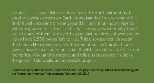
Media artist Gr.gory Chatonsky’s Telofossils (2013), a collaboration with sculptor Dominique Sirois and sound artist Christophe Charles, picks up on this context of technologies, obsolescence, and fossils. The exhibition at the Museum of Contemporary Art in Taipei, Taiwan, focuses on the slow, poetic level of decay that characterizes technopolitical society and nature. The “future archaeologist” perspective that Chatonsky summons with immersive affective moods created in the exhibition’s installations is akin to Manuel Delanda’s figure of the future robot historian that gazes back at our current world emphasizing not the human agency of innovators but the agency of the increasingly automated and intelligent machine (as part of the military constellation). The future archaeologist in Chatonsky’s installations and immersive narrative is a displacement of the human from a temporal perspective (the future) and from the Outside (alien species)...
Indeed, for Chatonsky, the double role of technology becomes understood through future as a fossil: in his words, “they participate to the exhaustion of our planet but they also constitute traces of our existences.”...
Hence the fossils of the future are the ones we live among, and in this speculative fiction, the extrapolation of current technopolitics is returned to us via memories of the future. This link of present and the forthcoming is implicitly there in any kind of an apocalyptic future scenario.The question is, why are we imagining now such postextinction futures, worlds that are mediated and in medias res—a mediated technological future?
The notion of the fossil is a hint at a future grounded in dysfunctional technology: indeed, similarly as in new insights in technology and repair studies, we need to be able to rethink the modernist fantasies (also visible in the historical maps of past imaginary futures in paleofuturism) of technology as clean, smooth, and progressing and replace such with the primacy of the accident.
Jussi Parikka,. A Geology of Media. University of Minnesota Press, 2015
0 notes
Text
Mon Carnet du 30 novembre 2018
Mon Carnet du 30 novembre 2018
Au sommaire :
Actualités :
Nintendo – Sony – Instagram – Apple Watch – Firefox Reality – Alexa/AppleMusic
Entrevues :
Rencontre avec Pierre Denis du service audio Tootak
Pascale Dominique Chaillez parle de Code MTL
Jean-François Poulin parle R&D chez D-Box avec JF Ménard
Luc Sirois rencontre Isabelle Cayer de Matane
Billet :
Stéphane Ricoul parle de cyberviolence faite aux femmes.
Collaboration :
View On WordPress
0 notes
Photo

Dominique Sirois, "Office Silence II" 2014
20 notes
·
View notes
Text
Help Us Choose the Logo Design Awards Reader’s Choice Winners
It was a year of firsts for the 8th Annual HOW Logo Design Awards.
This time, the two Reader’s Choice winners (one from the logo category and one from the identity applications category) will get a Big Ticket registration to HOW Design Live 2017, as well as a beautiful trophy to be presented at the conference.
Also for the first time ever, all 20 winners of the Awards will be featured in the pages of the Summer 2017 issue of the award-winning HOW magazine. (Subscribe today to get the issue on your doorstep!)
Below, you’ll see the 20 winners that were selected from among nearly 1,200 submissions by Landor New York’s Wally Krantz, with support from the HOW editorial staff.
The team at HOW is now asking all of you to weigh in as well and select a winner from each category to receive a Reader’s Choice award.
Until 12:00 pm EST on Monday, February 6, 2017, we invite you to vote for one Reader’s Choice Award winner from each of the two categories (surveys located at the end of their respective sections).
Logos Category Reader’s Choice Contenders
Please remember to read the project descriptions, watch videos and enlarge any thumbnails before casting your vote!
1. Cochon Dingue
Vote for this project
DESIGN FIRM LMG Communication graphique, Québec; www.lmgcom.com
CREATIVE TEAM Jacques-Dominique Landry, Louis Martin, creative directors; Mathieu Tremblay, art director/designer; Laurent Grislain, designer/photographer
CLIENT Groupe Restos Plaisirs
DETAILS Fascinated by France, the client wanted to bring back, from 36 years ago, the spirit of French bistro in his restaurants. In this rebranding project, the challenge was to translate that in a clearer, simpler design compared to the original logo. And all of that with a funny side (Cochon Dingue means « crazy pig »). With vintage-French-poster–inspired typography and its famous bleu-blanc-rouge palette, the new branding clearly shows his French roots. The logo now features a more energizing and crazier pig. Jumping on a trampoline or walking on his front legs—it’s up to you to imagine it!
2. Craft
Vote for this project
COMPANY/CLIENT InVision App, New York City; www.invisionapp.com
CREATIVE TEAM Aaron Stump, art director; Jared Granger, art director/designer
DETAILS Craft is a suite of plugins that empowers designers to create digital products using real, relevant data. The Craft logo illustrates the concept of joining as well as unfolding; specifically, the joining together of all the aspects within the design process to reveal the final product. The logo also reflects movement, which echoes the ongoing, iterative process inherent to thoughtful design.
3. DIRT // Logo
Vote for this project
DESIGN FIRM helium creative, Fort Lauderdale, FL; www.heliumcreative.com
CREATIVE TEAM Christopher Heller, Ryan Sirois, art directors; Kelly Gedvilas, designer
CLIENT DIRT
DETAILS Miami Beach farm-to-counter eatery and wellness bar DIRT approached helium creative in desperate need of help. They had a name that didn’t fit their audience and no identity at all. After the firm’s naming + brand development process, DIRT was born, and since then it has soared to be one the most popular restaurants in Miami. Helium creative gets almost daily compliments on its brand work for DIRT, including the logo. Purposely clean-cut and structured, the logo is meant to give way to focusing on the important stuff—the food. The little tilt in the ‘I’ and the tagline, EAT CLEAN, is a nod to living life a little different and a little healthier.
4. Dixie Identity
Vote for this project
DESIGN FIRM Landor, Cincinnati; https://landor.com
CREATIVE TEAM Dale Doyle, executive creative director; Grant Collinsworth, creative director; Zack Mueller, designer
CLIENT Georgia Pacific
DETAILS Saul Bass designed the Dixie identity back in 1969. Over the years the mark evolved into a more dynamic and expressive wordmark to bring to life the positioning of the brand. Landor wanted to bring back the simplistic spirit of the original identity that Saul Bass created in order to connect with today’s consumer. The new mark is modern, simple, yet full of life.
Note: The judge was unaware that the Dixie logo was a Landor design when he selected it. HOW acknowledges the judge’s connection to Landor. The Dixie logo was evaluated and seconded as winner by a HOW art director and the HOW editorial staff.
5. Drei Brüder
Vote for this project
DESIGN FIRM Peppermill Projects, Annapolis, MD; www.peppermillprojects.com
CREATIVE TEAM Jennifer Culpepper, art director; Grace Rudder, designer
CLIENT Old Stein Inn
DETAILS Drei Brüder is the brand name for a line of packaged goods made in the kitchen of the Old Stein Inn, a German restaurant in Maryland. Drei Brüder means “three brothers” in German and is named for the three young sons of the owners. The team designed the Drei Brüder logo to fit within the Old Stein brand by using similar fonts and colors. They also illustrated the three toe-headed boys who frequently help out in the garden to share a bit of their personalities.
6. GUND Rebrand
Vote for this project
DESIGN FIRM Cynda Media Lab, Englewood Cliffs, NJ; www.cyndamedia.com
CREATIVE TEAM C. J. Yeh, Christie Shin, art directors; Fred Pirlot, designer
CLIENT GUND
DETAILS GUND is the oldest manufacturer of soft toys in America, and also the first teddy bear manufacturer to truly capture emotion and facial expression in their product shots of plush toys. GUND’s new brand identity design pays homage to this tradition by focusing on the most emotionally expressive elements of GUND’s signature products. It emphasizes the intangible qualities of the company’s work over the physical, reflecting the emotional investment that develops among their consumers.
7. L’Espace Public
Vote for this project
DESIGN FIRM Écorce, Montreal; www.ecorce.ca
CREATIVE TEAM Karl-Frédéric Anctil , creative director; Xavier Coulombe-Murray, Julie Poulin, art directors; Rafik Andraos, production designer
CLIENT L’Espace Public
DETAILS The microbrewery’s new brand image needed to represent all five master brewers at Espace Public, including their passion for beer and pride in the Montreal district they are based in. The pigeon—a bird that always travels in flocks, is not shy about staking out its place and can be found everywhere, especially in public places—was made the emblem of the brewery and will be featured on all of the company’s communications.
8. Majorette
Vote for this project
DESIGN FIRM Almanac, Saint Louis, MO; www.brandalmanac.com
CREATIVE TEAM Nathan Sprehe, art director; Katie Hileman, designer
CLIENT Majorette
DETAILS Majorette is St. Louis’ latest event space and is a younger (wilder) sister to Boo Cat Club. With a loud voice and tassels everywhere, Majorette brings together the curious, creative people of St. Louis. After uncovering a brand voice, Majorette’s visual identity quickly came to life, demanding everyone around her to have fun. The vibrant and arresting print collateral, exterior signage and (ahem) attention-grabbing website immediately draw you in to Majorette’s spirit
9. Publicis.Sapient
Vote for this project
DESIGN FIRM/CLIENT Publicis.Sapient, New York City; www.publicis.sapient.com
CREATIVE TEAM Gaston Legorburu, chief creative strategist; Matthew Jacobson, executive vice president, design; Allison Bistrong, creative director; James Alleman, associate creative director; Matt Keeler, senior art director; Jonathan Candelaria, Jordan Rivero, art directors; Cindy Maria Jimenez, senior designer; Wailam Pan, design manager; Katarina Bromberg, marketing director; Leyvani Escallon, manager project management; Tim Tonsel, senior manager technology; Mike Zevitas, Dustin Mershon, senior interactive developers; Sergio Gutierrez, senior manager project management; Kevin Williams, interactive development manager; Chris Tomotsugu, Sofia Puerto, interactive developers
DETAILS The Publicis.Sapient platform represents a new model within Publicis Groupe, which demands a visual identity that defines a culture of collaboration.
he firm needed to show C-Suite business leaders and analysts how it’s built to leverage an unprecedented scale of seamless capabilities, and at the same time show the internal team how they fit in to the bigger picture of P.S while remaining connected to their current agency.
To that end, the team created a modular identity system, built on the idea of alchemy—the magical process of transformation, creation and combination. The firm is both a collection and a connection of elements—while every day they are hydrogen, some days they get to be a part of creating water. So far our brand rollout has been articulated through a digital style guide, and applied through digital communications, an exhibit at the Adobe Summit, stationery, swag, promotional materials, even on Fenway Park’s Green Monster.
10. Sharpie Slam ATL
Vote for this project
STUDENT Tayllor Battle, Atlanta; www.tayllorbattle.com
INSTRUCTOR Colleen Finn, www.colleenfinn.com
SCHOOL The Creative Circus, Atlanta; www.creativecircus.edu
DETAILS Top Atlanta artists went toe-to-toe in an exciting, interactive art competition. Teams were given a theme, a foam board and unlimited sharpies to develop their masterpiece. Battle created this logo as a celebration of the event, incorporating the rooftop environment and the triumphant power of the marker.
Now vote for your favorite logo!
Identity Applications Category Reader’s Choice Contenders
Again, please remember to read the project descriptions, watch videos and enlarge any thumbnails before casting your vote!
1. 1907 Meat Co.
Vote for this project
DESIGN FIRM Ghost, Oklahoma City, OK; www.ghostokc.com
CREATIVE TEAM Matthew Pickett, art director; Ryan Fuller, Hannah Ashford, designers
CLIENT 1907 Meat Co.
DETAILS From farm-to-plate is at the heart of the quality meat offered from 1907 Meat Company. This startup maintains close relationships every step of the way—from the farmers and animals to the facilities processing the cuts—ensuring a premium standard that did not exist in this market previously. 1907 is the year of statehood for Oklahoma. That state pride is captured in an identity system that includes a strong palette, tags and stamps parted with great photography of the actual farmers and animals in the story. The tagline was also developed through this exploration: “The premium standard wasn’t available. So we created it.”
2. Addison Elementary
Vote for this project
DESIGN FIRM Tompert Design, Palo Alto, CA; www.tompertdesign.com
CREATIVE TEAM Claudia Huber Tompert, art director; Adam Houghton, designer
CLIENT Addison Elementary School
DETAILS Based on a superhero theme, Tompert Design created a new logo for Addison Elementary School (Palo Alto, CA) as part of the annual fundraising auction—the firm’s pay-it-forward project for 2015. The bright primary colors and fresh design approach were just what was needed to achieve powerful participation for the incredible event. And then Whoosh! The logo design morphed into ever-more adventurous projects befitting these heroic agents of education.
3. Adventure Philanthropist
Vote for this project
DESIGN FIRM wkrm design, Austin; www.wkrmdesign.com
CREATIVE TEAM Jiwon Park, art director; Emily Jarvis, brand design lead; Hillary Henrici, designer; Emily Jarvis, Hillary Henrici, brand system designers; Whitney Chen, Denise Zaldivar, UI designers
CLIENT Adventure Philanthropist (Erin Michelson)
DETAILS Adventure Philanthropist is an interactive media company that provides the mechanisms and motivation for individuals to participate in philanthropic activities.
The philanthropic personality test carefully assesses individuals to discover and define their philanthropic personality type. At the end of the quiz, a set of curated philanthropic activities will be revealed based on the defined philanthropic personality type and the chosen cause.
A unique pattern-filled badge system generates personalized badge symbols that each user will build up themselves while answering the ten questions. This personalized visual system not only highlights the fun of philanthropy, but also nurtures motivation and promotes the infinite possibilities for good-doing.
4. Cochon Dingue
Vote for this project
DESIGN FIRM LMG Communication graphique, Québec; www.lmgcom.com
CREATIVE TEAM Jacques-Dominique Landry, Louis Martin, creative directors; Mathieu Tremblay, art director/designer; Laurent Grislain, designer/photographer
CLIENT Groupe Restos Plaisirs
DETAILS Fascinated by France, the client wanted to bring back, from 36 years ago, the spirit of French bistro in his restaurants. In this rebranding project, the challenge was to translate that in a clearer, simpler design compared to the original logo. And all of that with a funny side (Cochon Dingue means « crazy pig »).
With vintage-French-poster–inspired typography and its famous bleu-blanc-rouge palette, the new branding clearly shows his French roots. The logo now features a more energizing and crazier pig. Jumping on a trampoline or walking on his front legs—it’s up to you to imagine it!
5. L’Espace Public
Vote for this project
DESIGN FIRM Écorce, Montreal; www.ecorce.ca
CREATIVE TEAM Karl-Frédéric Anctil , creative director; Xavier Coulombe-Murray, Julie Poulin, art directors; Rafik Andraos, production designer
CLIENT L’Espace Public
DETAILS The microbrewery’s new brand image needed to represent all five master brewers at Espace Public, including their passion for beer and pride in the Montreal district they are based in. The pigeon—a bird that always travels in flocks, is not shy about staking out its place and can be found everywhere, especially in public places—was made the emblem of the brewery and will be featured on all of the company’s communications.
6. Method + Standard Vodka Identity
Vote for this project
DESIGN FIRM Device Creative Collaborative, Winston-Salem, NC; www.wearedevice.com
CREATIVE TEAM Ross Clodfelter, Shane Cranford, art directors/designers; Noemi Zelaya, designer; Stephanie Campisi, Reid Thorpe, copywriters; Dianne Sutherland, illustrator; V.K. Rees, photographer
CLIENT Piedmont Distillers, Inc.
DETAILS Method + Standard is a vodka for those who care equally about what goes in to the bottle as what comes out of it. This dual-concept approach is embodied in a brand identity as carefully crafted as the vodka itself. Embracing the spirit’s all-natural, additive-free, small-batch sensibility—following it from the sourcing of its off-the-branch ingredients to the memorable experience of the final pour—each design element underpins the notion that it’s the method that creates the standard, and that the two are inseparably intertwined.
7. Press Cafe
Vote for this project
DESIGN FIRM Pivot Group, Portland, OR; www.askpivot.com
CREATIVE TEAM Alyssa Wise, Joey Bianco, creative directors; Rachel Getsinger, art director/designer; Kelsie Montgomery, designer; Amanda Kate Howard, production coordinator
CLIENT Press Cafe
DETAILS The Press Cafe logo was created out of a desire to represent the pride the cafe has in its rich Northwest heritage. The brand contains versatile marks that are used across a variety of applications. The brand and space grew into a cozy and modern lodge. Dark wood, antique metal canteens and cups, and framed maps of Oregon’s forest areas contribute to the cozy atmosphere. The focal point of the space is undoubtedly the fireplace with beautiful shelving surrounding a white ceramic deer head. Press Cafe captures a unique experience and taste of the Northwest.
8. The Cobbler at 1558
Vote for this project
DESIGN FIRM Conduit Studio, Grand Rapids, MI; www.conduitstudio.com
CREATIVE TEAM John O’Neill, art director; Ryan Mitchell, Kelly O’Hara, designers;
CLIENT The Cobbler at 1558
DETAILS As he took over a generations-old cobbler shop in the quirky neighborhood of Eastown, Conduit Studio’s friend Romie wanted a brand that respected the shop’s history while signaling a new, modern-day outlook. Based on studies of historical industrial lettering, the studio created a custom typeface with roots in the past and enough eccentricities to feel fresh. This became the touchpoint for the brand. They renamed the shop, which specializes in shoe repair and bespoke leather coloring and treatment, to highlight the address and emphasize its hyper-local, neighborhood focus.
9. Vallier Bistro
Vote for this project
DESIGN FIRM Phoenix The Creative Studio, Montreal, Quebec; www.phoenix.cool
CREATIVE TEAM Louis Paquet, creative director; Christopher Nicola, art director; Clement Piganeau, Anthony Morell, designers; Fouad Mallouk, account manager
CLIENT Vallier Bistro
DETAILS Ten years ago, Mr. Vallier Dufour founded Vallier. Wishing to “dust off” the place, he closed for the winter and has undertaken a major facelift. Result: Vallier is a restaurant specializes in creative and comforting cuisine with French bistro-style dishes. Vallier offers its customers a whole new menu and a whole new decor to make the restaurant warmer, lighter and add comfort. The mandate of Phoenix included brand identity, new logo and all of their communicational tools, in addition to the design and development of their new website.
10. Wulf’s Fish
Vote for this project
DESIGN FIRM Vervaine Design Studio, Chatham, MA; www.vervaine.com
CREATIVE TEAM Alison Parker, creative director/designer; Joe Fox, brand messaging; Claire Woodward, design assistant
CLIENT Wulf’s Fish
DETAILS Founded in Boston in 1926, Wulf’s Fish Market was a neighborhood cornerstone that thrived on word of mouth for 90 years. To position the company for growth, they needed to elevate their brand and tell a story that would be relevant to savvy customers nationwide.
The studio designed a logomark that is both modern and timeless, a vibrant emblem that pops on packaging, signage and apparel. The angular form evokes a diving fish, with a subtle nod to history: the arrowhead “deli counter” tickets that Sam Wulf’s customers pulled when they lined up for his cuts. Wulf’s heritage for quality, traceable seafood suggested a tagline that says it all: “New Fish. Old School.”
Now vote for your favorite identity application!
Subscribe to HOW today and be the first to get a copy of the Summer 2017 issue that’ll go behind the scenes with the Reader’s Choice winners of the Logo Design Awards. When you subscribe, you’re also supporting print and setting yourself up for success with a year’s worth of design inspiration, profiles and case studies from the people and agencies you want to know about, and cutting-edge how-to content that can’t be found anywhere else.
SUBSCRIBE TODAY!
The post Help Us Choose the Logo Design Awards Reader’s Choice Winners appeared first on HOW Design.
Help Us Choose the Logo Design Awards Reader’s Choice Winners syndicated post
0 notes
Quote
From the Italian Futurists to hip hop by way of musique concrète, the sound of sirens and alarms has long shown its musicality and discursive possibilities. For the sound of sirens expresses a social condition tied up with industrialisation. Initially associated with a kind of glorification of workers and machinery, the siren gradually changed into an allegory of control and surveillance, thereby eloquently demonstrating the breakdown of the leisure society myth. This lost hope of human emancipation by the machine is materialised by Dominique Sirois in the figure of the siren. Its sound reflects an awareness of history on the march, like an intuition of the failure of modern liberal ideologies.
Alarm Songs: Leisure Machine thus explores the tension between the concepts freedom and work, conveyed by Sirois through a fine-grained observation of the conditions of the industrial revolution up to the promise of a leisure society. She borrows from the mythological model by granting her characters narrative meaning and value. They are thus both discursive tools and the anthropomorphic manifestation of the industrial revolution. Indeed with her ingenious style Sirois can be seen to be working at the boundary of the machine-human and the human machine in such a way as to let the bodies and places narrate their era and condition. Strolling, the Romantic figure par excellence, combined with a ghostly recollection of a siren, thus embodies the course of history like a slow choreography with no other objective than its own creation in time.
Alarm Songs: Leisure Machine exhibition essay by Dominique Sirois-Rouleau. Read the full text on our website.
0 notes
Photo

Dominique Sirois, still from “Military techno” with Krzysztof Mróz
Come join us on Saturday afternoon at 1:30 for a talk by Dominique Sirois about her Alarm songs: leisure machine project. Join the event on Facebook.
1 note
·
View note
Last Seen Blogs

modelbeautytools
Model Beauty Tools

emyoo
bunny'n_trgers☆skn

nuruinemuri
NURUI NEMURI

snkrsgirls
无标题
snkrsgirls
无标题