#Georg Scharf
Text

Eurasian hoopoe, 2023 - by Georg Scharf, Luxembourger
51 notes
·
View notes
Text
Eric Hananoki at MMFA:
While some Republicans have tried to distance their party from Laura Loomer, her show’s guest list indicates how closely linked the GOP is to the far-right extremist.
More than a dozen GOP nominees, elected officials, and Trump advisers have appeared on Loomer’s show, including Trump running mate JD Vance, senior Trump campaign officials Corey Lewandowski and Jason Miller, and members of Congress.
[...]
Republicans have routinely supported Loomer by sponsoring her newsletter and appearing on her streaming show since it launched last year. Here is a list of those appearances:
October 26, 2023: Jason Miller, Trump campaign senior adviser.
November 3, 2023: Dave Williams, then-head of the Colorado Republican Party.
November 7, 2023: Then-Rep. George Santos of New York.
January 30, 2024: Sigal Chattah, national committeewoman for the Nevada Republican Party.
October 17, 2023, February 13, 2024, July 23, 2024: Roger Stone, a longtime adviser to Trump.
February 13, 2024: Sen. JD Vance of Ohio.
March 19, 2024: Rep. Cory Mills of Florida.
March 21, 2024: Rep. Nancy Mace of South Carolina.
April 25, 2024, and June 4, 2024: Will Scharf, Trump attorney.
April 30, 2024: Lynne Patton, Trump campaign senior adviser.
May 21, 2024: Kari Lake, then-U.S. Senate candidate and now nominee in Arizona.
May 23, 2024, and July 17, 2024: Corey Lewandowski, who helped with the Republican National Convention and then again joined the Trump campaign as a senior adviser in August.
July 25, 2024: Bernie Moreno, U.S. Senate nominee in Ohio.
Since the launch of Loomer Unleashed by Laura Loomer on Rumble last year, more than a dozen GOP electeds and Trump officials have appeared on her podcast.
#Laura Loomer#Loomer Unleashed#Rumble#Kari Lake#J.D. Vance#Nancy Mace#Roger Stone#George Santos#Bernie Moreno#Lynne Patton#Corey Lewandowski#Cory Mills#Jason Miller#Will Scharf#Dave Williams#Sigal Chattah
11 notes
·
View notes
Photo


George Condo, Carole Davis and Kenny Scharf at Bud’s in New York City on December 28, 1985.
Photos by Andy Warhol
43 notes
·
View notes
Text

Scharf, George 1788-1860 : Reptiles restored, the remains of which are to be found in a fossil state in Tilgate Forest, Sussex / G. Scharf del 1833. This served as a sketch for a picture 3 yards long. Iguanodon, calculated from the remains to have been 100 feet long; Monitor; Megalosaurus; Plesosaurus.
5 notes
·
View notes
Text

Sketchbook page by George Scharf, 1871 © National Portrait Gallery, London
6 notes
·
View notes
Text
"Die Wahrheit schreiben" George Orwell. Entwicklung und Methode seines Erzählens - von Dominic Angeloch, eine Rezension von Simon Scharf - Literaturkritik.de
“Die Wahrheit schreiben” George Orwell. Entwicklung und Methode seines Erzählens – von Dominic Angeloch, eine Rezension von Simon Scharf – Literaturkritik.de
Hördauer 14 Minuten
https://literaturradiohoerbahn.com/wp-content/uploads/2024/02/Literaturkritik-de_Eintauchen-in-Fremdheit_MP.mp3
Eintauchen in Fremdheit und den Widerspruch atmen lassen
Dominic Angeloch seziert in „Die Wahrheit…

View On WordPress
#Die Wahrheit schreiben#Dominic Angeloch#George Orwell#Literaturkritik.de#Matthias Pöhlmann#Simon Scharf#Uwe Kullnick
0 notes
Text

"Duria Antiquior, a prehistoric lake teeming with saurians eating each other or attempting to do so". Lithograph print made by George Johann Scharf in 1830 based on Henry De la Beche's original watercolour. Prints of this were sold to raise money for Mary Anning's benefit.
#duria antiquior#henry de la beche#ichthyosaur#plesiosaur#pterosaur#palaeoart#1830#george johann scharf#mary anning
0 notes
Text


Roe deer in Winter by Georg Scharf
337 notes
·
View notes
Text
ABC News' George Stephanopoulos clashed with Trump attorney Will Scharf over his hush money conviction on Sunday, with the anchor threatening to cut the lawyer's mic.
Say what they want or get censored!
35 notes
·
View notes
Text
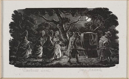
Darkness Lane by Joan Hassall [ x ] - the piece that most inspired my recent woodcut-style piece.
When I found out I was drawing for @gorgeousundertow's regency AU fic, Half Agony, Half Hope, as part of the @ineffableidiotsbigbang, I started looking up Jane Austen novel illustrations for inspiration and ended up finding some really cool art and websites! I'm posting about some of the images and resources I found because I think it may be interesting to others too (and even if it isn't, I'll have gotten the infodump out of my system haha).


Illustrations from Mansfield Park by Joan Hassall [ x ]
The link above points to a gallery on pemberley.com which has deliciously old-school DIY website HTML and a wealth of Jane Austen illustrations, as well as references for regency clothing. This was where I discovered Joan Hassall's work and decided I wanted to do a woodcut style piece (and then subsequently regretted it many times during the process of making it because I had no idea what I was doing). The detail, visual texture and dramatic lighting in her work is so cool and I just got more obsessed the more I saw.
See more Joan Hassall on tumblr via @uwmspeccoll (a very cool account!) here, here, and here.
The gallery on pemberley.com also had a bunch of Charles Edmund Brock illustrations, which I could not get enough of and so returned to the searchpage and found Molland's Circulating-Library. SO COOL! Jane Austen fans have bought illustrated editions of her novels and uploaded scans of them and oh my gosh they are all so beautiful.
Northanger Abbey watercolour illustrations by C.E. Brock [ x ]
Side note about Henry Tilney (Catherines' love interest in NA), I also came across this old fan page for him from a mostly-broken-links-now site called THE CULT OF DA MAN and um it's great haha, check it out. (reviews of artists representations of him, more delicious HTML, and pixel art (!) of da aforementioned man)
There's also an article on Molland's about Charles and Henry Brock and their Jane Austen works that I found interesting. Charles is better known and did far more JA illustrations, but I do really enjoy Henry's tinted line pieces! (the article also dunks on some bad reproductions of them haha)


Pride & Prejudice tinted line illustrations by H.M. Brock [ x ]
C.E. Brock also did really cool title pages and when I found out that fic banners were a thing I knew what I wanted to do! (with the help of the symmetry tool and undo haha, so much respect for traditional art)


Title pages illustrated by C.E. Brock [ x ] and my banner - the banner design uses elements of both of the Brock images.
So, research in hand/bookmarks folder and banner completed, I decided on a scene from Chapter 10 where our beloveds are standing beside the Thames in the moonlight after walking around London for hours together and talking (CUTE). I wasn't sure what buildings to include in the background, so @gorgeousundertow gave me a few suggestions: Old Southwark Bridge, London Bridge, Southwark Cathedral, and Clink Prison. I realized after a bit of sketching that bridges would be hard to show with the straight-on view I wanted to do, so I decided on the Cathedral, partially because I had also considered drawing a scene that takes place in Salisbury Cathedral in Ch. 7.
OK BUT HOW? I struggled finding reference images for a while until I realized this was LONDON and would be very Google Earth-able. Big ups to Frank Cosgrove, whoever they are, for uploading this haha. This was also where I found out that all the suggestions were from a very small area!


View of Borough High Street, London, 1830, by George Scharf [ x ]
The building in front of the cathedral looked too new, so I went searching for an older image and found the second image. It's a completely different angle but it was enough to get me past the 'oh no idk what do'.
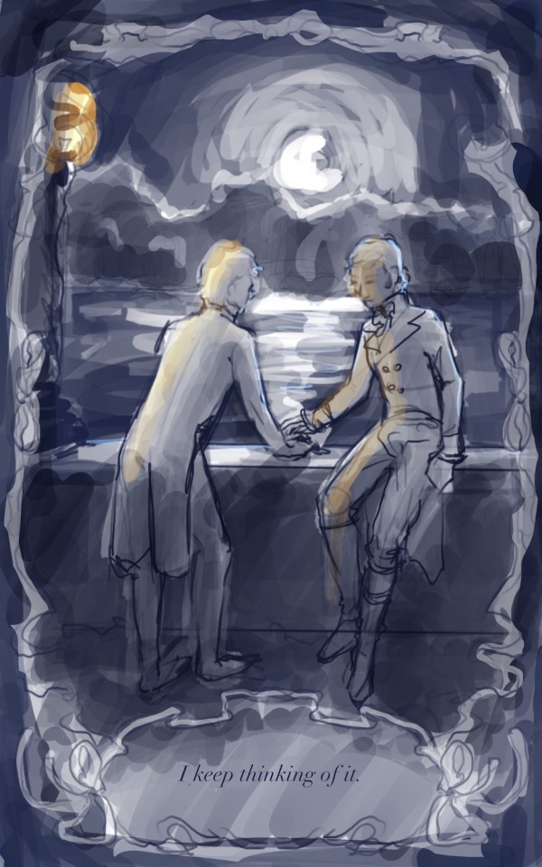

the much brighter concept vs the much darker finished product, featuring a barely-visible Southwark Cathedral
While looking for images of the Thames pre-Google Earth, I also found this website called Dictionary Of Victorian London which has a whole bunch of old images and excerpts from newspapers, etc on a variety of topics. One of the categories, Sex > 'unnatural offences', had this excerpt from The Times (1863), which reads:
Thomas Lane, a coffeehouse keeper, No.9, Love-lane, Eastcheap, city, and James Mortimer, a seaman, were charged with unlawfully meeting each other to commit an unnatural offence. ... The Magistrate committed both prisoners for trial.
Ugh. I hate that so much. Some sexy stuff happens right after the moment I'd chosen, and reading that reminded me that such things would be much more comfortable and safe in darkness (or if ppl just stopped being homophobic, but barring that). I wanted them to feel alone, like the whole world was asleep and it was just them, outside of time.
With that in mind, the iconic Thames Walk Lamp had to go bye bye, and when rendering the background I tried to minimize any light - it's just the suggestion of buildings. I also added tree cover! I tried to imitate how Joan Hassall does trees in some of her artwork, but when she rendered trees like this they were usually farther away/smaller, so my version looks more stylized with how prominent they are.
The ribbon border and book quote presentation is of course more Brock, but by making it black and having the interior image use it as a border instead of a fade-out inside it, I made it a bit of a reference to the very cool foliage edges you see in the very first Hassall image at the top.
I used the procreate brushes from this post on the Procreate Folio forums if anyone wants to try them!
Also fun fact! The font for the quote is called Chanson D'Amour <3 (I initially downloaded it when making the banner before changing the banner font to one called Dark & Black)
------
That's all I have to say about the process for the piece, but here's a comic from Dictionary Of Victorian London, Thames > Sanitary condition that I thought was cute (and gross ig? but also cute):
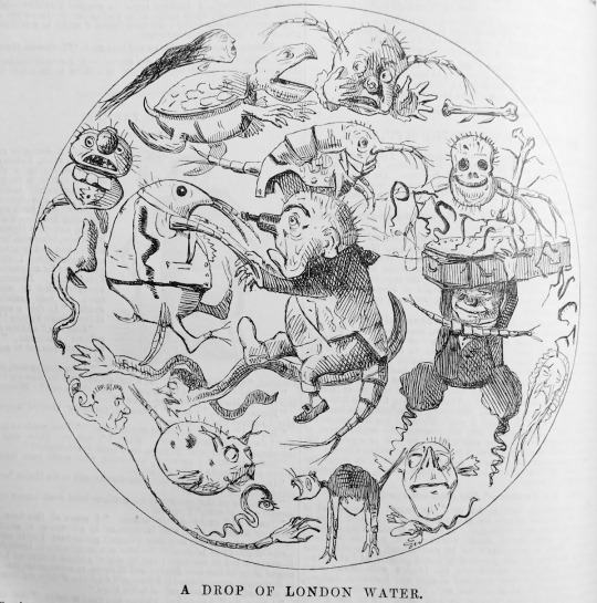
a Punch comic from 1850, I can't link the page due to how the website URL system works but it's from the Thames > Sanitary condition page
#lol anyway back to reading fanfiction from the bang!#joan hassall#charles edmund brock#henry matthew brock#art process#eccles makes#ineffable idiots big bang#jane austen#illustration
18 notes
·
View notes
Text

St. Martin’s Church Lane, St. James, London 1828 by the German artist, George Johann Scharf (1788-1860), who lived on this street in the City of Westminster. (FTP)
4 notes
·
View notes
Text

Shirley MacLaine, Jerry Lewis, Dorothy Malone, Dean Martin in Artists and Models (Frank Tashlin, 1955)
Cast: Dean Martin, Jerry Lewis, Shirley MacLaine, Dorothy Malone, Eddie Mayehoff, Eva Gabor, Anita Ekberg, George Winslow, Jack Elam. Screenplay: Herbert Baker, Hal Kanter, Frank Tashlin, Don McGuire, based on a play by Michael Davidson and Norman Lessing. Cinematography: Daniel L. Fapp. Art direction: Tambi Larsen, Hal Pereira. Film editing: Warren Low. Music: Walter Scharf; songs: Jack Brooks, Harry Warren.
2 notes
·
View notes

Text

Wozu Kontrafakturen?
1.
Um anfangen zu können. Immer dann, wenn irgendetwas anfängt, dann fängt auch Recht an. Anzufangen ist eine juristische Technik und eine juridische Technik, dazu gibt es ganze Bibliotheken zur Geschichte des Anfangens, wie zum Beispiel Karl-Heinz Ladeurs Der Anfang des westlichen Rechts, Fritz Schulz' Prinzipien des römischen Rechts, Jean-Pierre Vernants Die Entstehung des griechischen Denkens oder Cornelia Vismanns Aufsatz zur Macht des Anfangs, in dem es so schön heißt, alle gelungenen Gründungen kämen zweimal vor. Sie bezieht das auf römische Institutionen und weist darauf hin, dass sie einmal wie privat, wie niedrig, klein und wie schwach angefangen haben - und einmal wie staalich, wie hoch, groß und stark. Das heißt nicht, dass erst mit dem Staat der Anfang gelingt, denn von Anfang an ist der Anfang der ganze Anfang und das Gelungene ein mimetischer Zug, dessen Stationen Halbwertzeiten haben.
2.
Das, was an unserem Tun einen Anfang markieren kann ist eine feine und scharfe Linie, in der Antike nachlebt, zum Beispiel das pomerium. Die normative Kraft des Kontrafaktischen liegt durchaus in Formen, also in etwas, aber sie ist ein Zug, ein Regerlein. Die kommt kräftig und schwach vor. Besser wäre es darum, man würde vom normativen Zug des Kontrafaktischen sprechen.
Vom Scheiden ist ein Schmuggel, mit dem ich nachgeholt habe, was in Regel und Fiktion schief ging. Damals tauchte die Formulierung von der normativen Kraft des Kontrafaktischen selbst als Kontrafaktur, als Referenz zu Georg Jellinek auf. Bazon Brock verwendete die Methode, der verkehrt jede Formulierung, um ihre Spannung zu begreifen und zu verstehen, was jemand vermeiden wil.
Regel und Fiktion ist hmpf, fängt an, aber nicht als Buch. Am besten gefällt mir in dem Text eine kleine Liste mit 4 Stufen zur Geschichte und Kosmologie der Fiktion - und das Foto eines Fähnleins Genüsse Steinhauer. Man kann sagen, dass das Verfahren leicht umstritten war, aber mal wieder Glück gehabt. Ging durch. Right now it's only a notion, but I think I can get the money to make it into a concept, and later turn it into an idea. Die Kontrafaktur ist dann aber doch noch, 15 Jahre später, ein Buch geworden, mit dem ich was anfangen kann. Das Cover ist Carl Schmitt in Stützstrumpfarbe, darüber war ich auch besonders glücklich, obwohl ich dem Verlag erst die Farbe Rosa vorgeschlagen hatte. Das wollten sie nicht. Erst dachte ich, die würden sich nicht trauen, jetzt traue ich ihnen einfach und benenne die Farbe beim Namen. Vorbild war unter anderem Schmitts Ex captavitate salus, da hat der Verlag die gleiche stumpfe Pappe und das weiße Zopfornament verwendet. Ist der Inhalt des Buches Dezisionismus? Ja, aber umgekehrt würde ich sagen.
2.
Die Kontrafaktur hat einen doppelten Sinn: Sie ist die Fabrik, aus der heraus Texte und Bilder enstehen, als seien sie vorher nicht in der Welt gewesen. Der zweite Sinn meint die einzelne Produktion, wie etwa das Buch vom Scheiden. Bei der Anfertigung kommen Gelegenheiten und Gegebenheiten zusammen, etwas davon hält man wie in der Hand, der Rest kommt von alleine. Das Kontrafaktische kann des Fiktive oder das Artifizielle, das Künstliche oder Kunstvolle eines juristischen Textes genannt werden, andere Bezeichnungen sind auch möglich. Für einen Umgang mit dem Kontrafaktischen empfiehlt es sich, darauf zu achten, was ein Text kreuzt und was er austauscht. Kontrafakturen sind widerständig und insistierend, auch dem Autor, man hat den Einsatz nicht souverän in der Hand. Die Kontrafaktur zieht sich kapillar durch den ganzen Text, würde man sie Grundnorm nennen, wäre sie eine Tafel, auf der der gesamte Texte steht, und die damit nicht nur am Anfang des Textes vorkommt, sondern den ganzen Text durchzieht.
Das Buch ist schon alt. Inzwischen würde ich, wenn ich etwas zu Kulturtechnikforschung sagen möchte, die Bild- und Rechtswissenschaft ist, vom Scheiden, Schichten und Mustern sprechen. Die Techniken des Scheidens sind zum Beispiel allen logischen Operationen der Unterscheidung assoziiert, allen Verfahren und Stragien, etwas zu entscheiden zu bescheiden, oder zu verabschieden, etwas zu bescheiden, zu definieren, zu präzisieren oder etwas als Montage zu präsentieren. Juristen könnten mit dem Vokabalur fremdeln, o.k. so, so soll es sein, insoweit handelt es sich bei der Antrittsvorlesug von 2015 um eine formalistische Arbeit. Weil ich mich aber auch mit Geschichte und Stratifikaton befasse, müsste ich einen zweiten Band zum Schichten schreiben. Und weil ich mich mit Bildern, dabei unter anderem der magischen Rationalität, vaguen und voguem Assoziatione bei Warburg befasse, müsste es einen dritten Band zum Mustern geben. Ich würde bei Censoren anfangen, den Haruspizen, und bei Armin Nassehi aufhören.
3.
Man kann sich die Kontrafaktur als eine Linie und einen Zug vorstellen, als Tragendes und Trachtendes eines juristischen oder juridischen Objektes (zum Beispiel einer Norm, eines Textes oder eines Bildes). Die Kontrafaktur stellt das Objekt her und stellt es dar. Die Kontrafaktur lässt Texte nicht nur so schreiben, als seien sie bisher nicht geschrieben gewesen. Sie lässt Texte auch so schreiben, als sei alles in dem Text schon so in der Welt gewesen und würde nun nicht verrückt. Schreiben, als ob man abschriebe und abschreiben, als ob man schreibe: Diese Kreuzung und der Austausch ist der kontrafaktische Zug juristischer und juridischer Objekte. Das vergleiche ich mit Vismanns Texten zum Canceln. Ich vergleich das auch mit Ino Augsbergs Arbeiten zum Versäumen, mit Pottages Arbeiten zur Involution, zur Einfaltung - und sicher auch, Bingo!, mit Warburgs Gestellschieberei. Machen tun es alle, die genannten explizieren es aber deutlicher.
Die Kontrafaktur lässt sogar einen Text so schreiben, als käme nicht drin vor, was der Autor vermeiden will. So kommen zum Beispiel alle Arbeiten von Cornelia Vismann in den Medien des Rechts von Thomas Vesting vor, es sind aber Linien eingezogen, die den Text so stellen, als käme sie nicht drin vor. Wäre das Buch von Vismann später, die von Vesting früher erschienen, müsste man an beiden Büchern nichts ändern, die Kontrafaktur arbeitet auch so - und liesse den Text von Vismann so lesen, als dringe sie in Denkräume vor, wo Vestings Denken nicht vorkäme. Anders herum ist es auch so.
Die Kontrafakturen haben eine logische Geschichte, wissenschaftshistorisch sind sie zum Teil der Logik und Dialektik und der Paradoxie geworden. Sie haben aber überall Geschichte, nicht nur in der Logik. Sie kommen auch diagonal/durchgehend kantig, eckig, zügig oder schwillend vor, durchgehend winkelig und winkelnd. In der Graphik und der Choreopgraphie haben sie ein lange Geschichte, des pomerium ist ein Teil dieser Geschichte.
6 notes
·
View notes


Last Seen Blogs

protecvm-blog
cuddly vmin

maryleja
Maryleja

hwn05g
applepie
babydolllblogger
୨ৎ 𝓸𝓹𝓱𝓮𝓵𝓲𝓪 ୨ৎ
babydolllblogger
୨ৎ 𝓸𝓹𝓱𝓮𝓵𝓲𝓪 ୨ৎ