#HTMLTables
Explore tagged Tumblr posts
Visit Tumblr Blog
Explore Tumblr blogs with no restrictions, modern design and the best experience.
Last Seen Tumblr Blogs


Fun Fact
There were a total of 171.5 billion posts on Tumblr in 2019.
Text
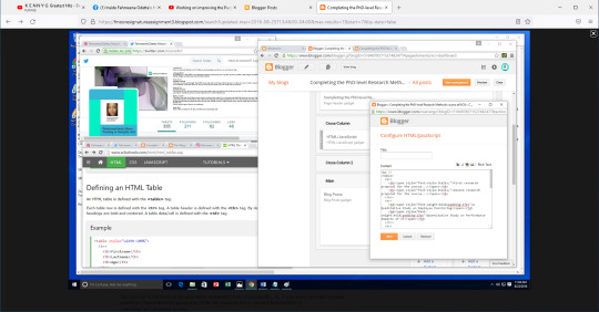
Using HTML for Blog
More on the Blog: Completing the PhD-Level Research Methods course at NCU https://fmooresignatureassignment3.blogspot.com/ from yesterday....
I stumbled upon a post on creating the header for the blog - I used HTML in the Blogger/Blogspot settings to create a table to organize the information in the header. I learned how to create tables on websites using HTML at UMBC. I was rusty at the time so I needed to look up the syntax/code (for HTML tables) at W3Schools.com.
(From Blog post: https://fmooresignatureassignment3.blogspot.com/2016/08/internet-up-again.html)

(From blog: https://fmooresignatureassignment3.blogspot.com/)
I learned a lot of HTML and CSS at UMBC. I recall an assignment to practice using CSS to add styles to various elements on a webpage. There was a long list of items to use CSS for. It was very interesting.
In other news....
Students will be writing the country-wide Secondary School Entrance Examination (NGSA also known as the Common Entrance Examination) today and tomorrow in Guyana. I recall my exams so long ago. Good luck to all the students.
See article: Nervous but confident: Grade six pupils begin writing NGSA today https://guyanachronicle.com/2022/07/06/nervous-but-confident-grade-six-pupils-begin-writing-ngsa-today/

(Guyana Chronicle article https://guyanachronicle.com/2022/07/06/nervous-but-confident-grade-six-pupils-begin-writing-ngsa-today/)

(LinkedIn profile of Fahmeena Odetta Moore https://www.linkedin.com/in/fahmeenaodetta/)
0 notes
Photo

Veja um modelo simples de como construir uma tabela em HTML 🤓👨💻 Siga-nos: @ilustra.code #htmlcss #html5 #htmltables #desenvolvimentoweb #ilustracode #ilustraCode https://www.instagram.com/p/BveWstUBxSI/?utm_source=ig_tumblr_share&igshid=ovnxapdxbhoy
0 notes
Text
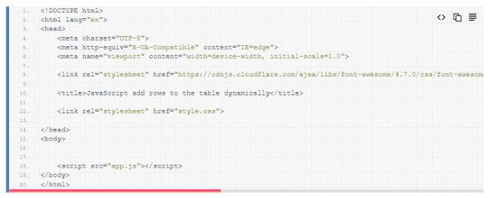
JavaScript add rows to the table dynamically
JavaScript add rows to the table dynamically: This type of component can achieve using JavaScript without any plugins or third-party code.
Now let’s see how to make this Component:
Open your code editor and create three files:
HTML
CSS
JavaScript
Write the basic structure of HTML like given below:

How to connect CSS files with HTML?
Connect your CSS file with HTML by using
<link href="stylesheet" href="yourstyle.css" />
How to connect JavaScript with HTML?
Connect your js file with HTML by using
<script src="app.js" ></script>
In this project, we need some icons for that I am using “fontawesome 4.7” Icon’s CDN. here is the CDN with link tag, copy and paste it inside the head tag.
<link rel="stylesheet" href="https://cdnjs.cloudflare.com/ajax/libs/font-awesome/4.7.0/css/font-awesome.css" integrity="sha512-5A8nwdMOWrSz20fDsjczgUidUBR8liPYU+WymTZP1lmY9G6Oc7HlZv156XqnsgNUzTyMefFTcsFH/tnJE/+xBg==" crossorigin="anonymous" />
After adding CDN code should look like this:
Read Full Article...
0 notes
Video
how to make a tables in html | html tutorials-Urdu Hindi | table tags an...
0 notes
Text
Html table layout written in html and css for beginners. Check link below
https://code.bydev24.com/snippets/table-layout
#html #css #htmlcode #csscode #htmldesign #htmltable #webdesign #websitedesign #bydev24 #uidesign

0 notes
Video
youtube
Table layout is a brilliant way to format your content display in a webpage. This video series shows how you can use table tag to create Tables in HTML.
0 notes
Text
Jimmy, Get an iPhone
On Episode 13 of the Supertop Podcast we recount stories of our first iPhones and reflect on how indie development has changed over the past 10 years.
You can find the episode in:
Castro
iTunes
Overcast
Pocket Casts
RSS
Sponsors
This episode is brought to you by:
Steamclock: Steamclock crafts polished products for iPhone, Android, and the Web.
MarkUpDown: the most helpful Markdown editor for professional, efficient HTML editing on Windows 10.
Our First iPhones (00:20)
Pádraig got his first iPhone in Santa Monica at launch
Physically dismantling the phone to unlock it
I had to open the case, run something on my Mac, and hold a wire so it connected two points within the phone… and then with my nose reach down and hit space bar to make the program run
Oisín remembers hearing about the iPhone for the first time and being shocked by the price.
The day I got my first iPhone 😳 pic.twitter.com/vdBRr1ygqI
— Oisín Prendiville (@prendio2) January 13, 2017
I just enjoyed the box that day
Supertop origin story: In Lemon With An iPhone
The moment I unlocked my first iPhone… any notion based on this screenshot what I would have used to unlock it? (February 2008) pic.twitter.com/GC2tPwbplO
— Oisín Prendiville (@prendio2) January 16, 2017
What happened Oisín’s first iPhone?
It was stolen from me at gun-point… well, and machete-point, on a night-bus in Mexico
What happened Oisín’s second iPhone?
I only had that one for about two weeks, and then I got off a bus and left it on my seat in Bogotá… chased the bus as fast as I could down the road but couldn’t catch it
Sponsor: Steamclock Software (15:38)
Allen Pike on Release Notes podcast:
Part 1
Part 2
We’re product people, just sometimes we build products for other people.
10 Years of iPhone (17:32)
Thread by Michael Love who makes Pleco Chinese dictionary app
10th anniversary of iPhone is somewhat bittersweet for me - there are quite a few things I miss about antediluvian mobile development.
— Michael Love (@elkmovie) January 9, 2017
Our interview with Jared Sinclair in which we discuss Ben Thompson’s blog post about Pleco
With the iPhone there’s a whole new ecosystem of apps that are possible
Hard to believe that in just a decade, Apple pretty much wrecked the indie software scene and decimated software’s perceived monetary value.
— Matt Gemmell (@mattgemmell) January 9, 2017
An industry trend towards free software
Apple could have fought against it and didn’t
The Mac is still a good place for indies and that hasn’t gone away
The iPhone also ushered in the gold rush of indie development for a while
Culturally we moved on from obsessing over which new apps we have on our phone
@elkmovie I bought a palm solely for Pleco and Supermemo! You could have charged double.
— Ben Thompson (@benthompson) January 9, 2017
Does anyone chose an iPhone over another phone because there’s an app they want?
There were probably times when that was true
For God’s sake, Jimmy, get an iPhone!
iMessage is probably less of a draw now than it used to be because of cross platform solutions like WhatsApp
Apple Music on Android and the move towards generating more service revenue
Should Apple release iMessage on Android?
Software as lock in to a platform like iOS or Mac
Thoughts on Microsoft’s Surface Studio with the Surface Dial, and Apple’s Touch Bar on MacBook Pro.
Sponsor: MarkUpDown (33:51)
MarkUpDown Multiline Table & Bootstrap Grid support.
Beautiful Easy Actions that keep the Markdown flowing.
HTML paste to paste HTML source into your documents.
Making Apps On Windows (34:56)
Pádraig talks about trying to get work done on Windows
It would be good to have a Plan B for if Mac ever goes away
Is the Mac in trouble?
What Has The iPhone Made Possible? (37:46)
Podcasting did precede the iPhone but the iPhone and mobile revolution has played a huge part in making podcasts as popular as they are now
Oisín remembers using Instacast for the first time
The role of smartphones in the growth of social networks
The glory days of twitter
Twitter took off when I could be at an airport waiting for my bag and complain about being at an airport waiting for my bag at the same time
Micro.blog (41:17)
Manton Reece’s Kickstarter: Indie Microblogging: owning your short-form writing
Since recording Manton announced a stretch goal to hire a part-time community manager
manifesto-y-ish
Would Supertop ever run a kickstarter campaign?
Podcasts (48:18)
What podcasts was Oisín subscribed to when he first started using a podcast app?
The Talk Show
Hypercritical
Build & Analyze
Podcast recommendations
My Dad Wrote A Porno
Pod Save America
Hello From The Magic Tavern
You can say “porno” right, I mean like it’s just “porno”, it’s not like there’s anything explicit about “porno”… will I stop saying “porno” now?
Wrap Up (54:47)
We’re looking for advertisers again. For only $100, we’ll introduce an episode as being sponsored by you, then read your ad during the show. Email or DM us if you’re interested.
If you’d like to support the podcast directly please send us a tip on PayPal.me.
Thanks to everyone who has reviewed the podcast in iTunes. If you’re enjoying it please take a moment to leave a review.
Thanks Dermot for this one:
Ever wanted to understand what the life of an indie app developer is like? Hear from the developers of Castro and Unread (amongst others). Refreshingly honest as they deal with the realities of the app store economy. The guys speak openly of their search for sustainable revenue streams. Give it a listen.
1 note
·
View note
Text
VISUALIZING UNCERTAINTY IN HOUSING DATA
Source: http://ift.tt/2hnsnuw
VISUALIZING UNCERTAINTY IN HOUSING DATA
PUBLISHED WED, APR 26, 2017 BY LEN KIEFER
HOUSING DATA ARE OFTEN MEASURED WITH CONSIDERABLE uncertainty. Estimates are usually based on small samples that are subject to sampling variability. The various government statistical agencies usually report estimates of uncertainty with their releases. For example, both the New Residential Construction and New Residential Sales reports include estimates of sampling uncertainty along with their point estimates.
In this post I want to explore ways to visualize sampling uncertainty with R. I am reminded of article from a the New York Times Upshot blog a few years ago.
Data
For data, let’s go ahead and use New Home Sales estimates from the U.S. Census Bureau and U.S. Department of Housing and Urban Development. The Census provides a nice .csv file you can download here. The spreadsheet includes estimates of sampling uncertainty.
If you go to this link you can get a zip file that contains the data we’ll use. If you open the .csv file in Excel, you will find the data actually begins on row 705 (as of April 26, 2017, it will move over time). Let’s proceed you’ve unzipped the .csv file and saved it somewhere as RESSALES-mf.csv.
Note that this file is laid out much the same as the housing starts data we used last week.
################################################################################## # Load libraries ################################################################################## library("animation") library("ggplot2") library("scales") library('ggthemes') library(viridis)
## Loading required package: viridisLite
library(tidyverse)
## Loading tidyverse: tibble ## Loading tidyverse: tidyr ## Loading tidyverse: readr ## Loading tidyverse: purrr ## Loading tidyverse: dplyr
## Conflicts with tidy packages ----------------------------------------------
## col_factor(): readr, scales ## discard(): purrr, scales ## filter(): dplyr, stats ## lag(): dplyr, stats
library(readxl) library(ggbeeswarm) library(zoo)
## ## Attaching package: 'zoo'
## The following objects are masked from 'package:base': ## ## as.Date, as.Date.numeric
library(data.table)
## ## Attaching package: 'data.table'
## The following objects are masked from 'package:dplyr': ## ## between, first, last
## The following object is masked from 'package:purrr': ## ## transpose
################################################################################## # Load Data ################################################################################## df.sales<-read.csv("data/RESSALES-mf.csv",skip=704) ################################################################################## # The following information comes straight from the .csv file # and describes the keys in the data file ################################################################################## ################################################################################## # CATEGORIES # cat_idx cat_code cat_desc cat_indent # 1 SOLD New Single-family Houses Sold 0 # 2 ASOLD Annual Rate for New Single-family Houses Sold 0 # 3 FORSALE New Single-family Houses For Sale 0 ################################################################################## ################################################################################## # DATA TYPES # dt_idx dt_code dt_desc dt_unit # 1 TOTAL All Houses K # 2 NOTSTD Houses that are Not Started K # 3 UNDERC Houses that are Under Construction K # 4 COMPED Houses that are Completed K # 5 MEDIAN Median Sales Price DOL # 6 AVERAG Average Sales Price DOL # 7 MONSUP Months' Supply at Current Sales Rate MO # 8 MMTHS Median Number of Months For Sale Since Completion MO ################################################################################## ################################################################################## # ERROR TYPES # et_idx et_code et_desc et_unit # 1 E_TOTAL Relative Standard Error for All Houses PCT # 2 E_NOTSTD Relative Standard Error for Houses that are Not Started PCT # 3 E_UNDERC Relative Standard Error for Houses that are Under Construction PCT # 4 E_COMPED Relative Standard Error for Houses that are Completed PCT # 5 E_MEDIAN Relative Standard Error for Median Sales Price PCT # 6 E_AVERAG Relative Standard Error for Average Sales Price PCT # 7 E_MONSUP Relative Standard Error for Months' Supply at Current Sales Rate PCT # 8 E_MMTHS Relative Standard Error for Median Number of Months For Sale Since Completion PCT ################################################################################## ################################################################################## # GEO LEVELS # geo_idx geo_code geo_desc # 1 US United States # 2 NE Northeast # 3 MW Midwest # 4 SO South # 5 WE West ################################################################################## ################################################################################## # Dates are indexed one a month from 1963-01-01 to 2017-03-01 # e. g. # TIME PERIODS # per_idx per_name # 1 1/1/19563 # 2 2/1/1963 # .... # 651 3/1/2017 ################################################################################## ################################################################################## # Construct a lookup table for dates dt.lookup<- data.table(per_idx=seq(1,651), date=seq.Date(as.Date("1963-01-01"), as.Date("2017-03-01"),by="month")) ################################################################################## ################################################################################## # Append dataes df.sales<-left_join(df.sales,dt.lookup,by="per_idx") ################################################################################## ################################################################################## # print a table using the htmlTable library, round numeric to 0 digits for readability # Note we won't round in analysis) ################################################################################## htmlTable::htmlTable(rbind(tail(df.sales %>% map_if(is_numeric,round,0) %>% data.frame() %>% as.tbl())))
## Warning: Deprecated ## Warning: Deprecated ## Warning: Deprecated ## Warning: Deprecated ## Warning: Deprecated ## Warning: Deprecated ## Warning: Deprecated ## Warning: Deprecated
per_idxcat_idxdt_idxet_idxgeo_idxis_adjvaldate 165131030342017-03-01 265130130102017-03-01 3651310401442017-03-01 46513014062017-03-01 565131050622017-03-01 66513015072017-03-01
Let’s organize the data a little bit more.
################################################################################## # Filter to just the us, total sales at an annual rate new.sales<-filter(df.sales, cat_idx==2 & (dt_idx==1 | et_idx==1) & geo_idx ==1 ) ################################################################################## ################################################################################## # Rearrange the data new.sales<-new.sales %>% filter(year(date)>1999) %>% select(date,val,et_idx) %>% spread(et_idx,val) # Rename columns colnames(new.sales)<-c("date","sales","e.sales") ################################################################################## # Check it out: htmlTable::htmlTable(rbind(tail(new.sales %>% map_if(is_numeric,round,0) %>% data.frame() %>% as.tbl())))
## Warning: Deprecated ## Warning: Deprecated ## Warning: Deprecated
datesalese.sales 12016-10-015688 22016-11-015738 32016-12-015517 42017-01-015858 52017-02-015878 62017-03-016218
VIZ 1: Ribbon Chart
First, let’s remake a viz we’ve done before. We’ll plot a standard line chart and add a ribbon capturing uncertainty.
################################################################################## # Compute ribbon size new.sales <- new.sales %>% mutate( up=qnorm(0.95,mean=sales,sd=e.sales/100*sales), down=qnorm(0.05,mean=sales,sd=e.sales/100*sales)) ################################################################################## ################################################################################## # Make Plot ggplot(data=new.sales, aes(x=date,y=sales, label = sales))+ geom_line()+ scale_y_continuous() + scale_x_date(labels= date_format("%Y"), date_breaks="1 year" ) + geom_ribbon(aes(x=date,ymin=down,ymax=up),fill=plasma(5)[5],alpha=0.5) + theme_minimal()+ labs(x=NULL, y=NULL, title="New Home Sales (Ths. SAAR)", subtitle="shaded region denotes confidence interval", caption="@lenkiefer Source: U.S. Census Bureau and U.S. Department of Housing and Urban Development")+ theme(plot.caption=element_text(hjust=0))
Viz 2: Gif
Instead of using a ribbon, let’s draw random samples and animate them to highlight uncertainty.
################################################################################## # Function for sampling myf<- function(sales,e.sales){ rnorm(250,sales,e.sales/100*sales) } ################################################################################## ################################################################################## # draw samples using map2, then unnest to blow up data and group output.data<-new.sales %>% mutate(sales.samp =map2(sales,e.sales,myf)) %>% # draw our samples unnest(sales.samp) %>% # unpack the samples group_by(date) %>% mutate(id=row_number()) %>% ungroup() # this gives us an id for each sample ##################################################################################
Now we can animate it:
################################################################################## # Animate plot! ################################################################################## oopt = ani.options(interval = 0.25) saveGIF({for (i in 1:100) { g<- ggplot(data=filter(output.data,year(date)>2015 & id<=i),aes(x=date,y=sales.samp,group=id))+ geom_line(color="gray50",aes(alpha=ifelse(id==i,1,0.2)))+ #geom_line(data=filter(output.data,id==i),color="red",alpha=1,size=1.05)+ guides(alpha=F)+ geom_point(size=3,color="black",aes(y=sales))+ theme_minimal()+ labs(x="",y="", title="New home sales (1000s, SAAR)", subtitle="Black dots estimates,each gray line a random sample from normal with survey standard error", caption="@lenkiefer Source: U.S. Census Bureau and U.S. Department of Housing and Urban Development")+ coord_cartesian(xlim=as.Date(c("2016-01-01","2017-03-01")),ylim=c(400,700))+ theme(plot.caption=element_text(hjust=0)) print(g) ani.pause() print(paste(i,"out of 100")) } },movie.name="newsales_04_26_2017 samp ex.gif",ani.width = 600, ani.height = 450)
Viz 3: Beeswarm
We can also make a beeswarm plot (for more see here).
ggplot(data=filter(output.data,year(date)>2015), aes(x=date,y=sales.samp,color=sales.samp))+ scale_color_viridis(name="")+ guides(color=F)+ geom_quasirandom()+theme_minimal()+ geom_point(data=filter(output.data,year(date)>2015 & id==1), aes(y=sales),color="black",size=3) + scale_x_date(date_labels="%b-%Y",date_breaks="2 months")+ labs(x="",y="", title="New Home Sales (1000s SAAR)", subtitle="Estimates (black dots) and sampling uncertainty", caption="@lenkiefer Source: U.S. Census Bureau and U.S. Department of Housing and Urban Development\ncolored dots represent draws from a normal distribution centered at estimate with standard error of estimate.")+ theme(plot.caption=element_text(hjust=0))
And we could animate it:
################################################################################## # Animate plot! ################################################################################## oopt = ani.options(interval = 0.2) saveGIF({for (i in 1:200) { g<- ggplot(data=filter(output.data,date>="2016-03-01" & id<=i), aes(x=date,y=sales.samp,color=sales.samp, alpha=ifelse(id==i,1,0.2) ))+ scale_color_viridis(name="")+ guides(color=F)+ geom_quasirandom()+theme_minimal()+ geom_point(data=filter(output.data,date>="2016-03-01" & id==1), aes(y=sales),color="black",size=3,alpha=1) + scale_x_date(date_labels="%b-%Y",date_breaks="2 months", limits=as.Date(c("2016-02-15","2017-04-15")))+ scale_y_continuous(limits=c(400,800))+ guides(alpha=F)+ labs(x="",y="", title="New Home Sales (1000s SAAR)", subtitle="Estimates (black dots) and sampling uncertainty", caption="@lenkiefer Source: U.S. Census Bureau and U.S. Department of Housing and Urban Development\ncolored dots represent draws from a normal distribution centered at estimate with standard error of estimate.")+ theme(plot.caption=element_text(hjust=0)) print(g) ani.pause() print(paste(i,"out of 250")) #counter } },movie.name="new home sales swarm.gif",ani.width = 600, ani.height = 450)
Conclusion
Visualizing uncertainty can be challenging. Depending on the audience, uncertainty can be a difficult concept. I’m not sure the data visualization field has a consensus on the right way to visualize uncertainty.
But communicating uncertainty can be quite important. Maybe one of these ideas could work for you.
via Blogger http://ift.tt/2wP7Yk9
0 notes
Text
How to build a sweet histogram for your HTML email
If you’ve ever coded HTML emails, you know it’s not like coding a web page. (Unless the last time you coded a web page was in 1996.) Many of our favorite CSS techniques just aren’t available.
Embedded images are a fallback, but many clients, including Gmail, don’t display them by default. The result is a bad first impression for new mail-ees.
At Conspire, we engage our users with a weekly email. It’s kind of like FitBit for email geeks. The first item in our mailer is a histogram of the user’s sent and received message volume for the week:
(Shameless plug: To get your own email volume histogram—along with a bunch of other cool, personalized email data—sign up at goconspire.com.)
The coolest thing about the graphic above? It’s all built without a single image or any tricky CSS. Just plain, old-school HTML tables.
Want to build your own HTML email histogram?
We’ll start with a simplified version:
So you can see what’s happening, here’s the same table with 1 pixel of red background peeking through between the cells:
We’ll go through the code <tr> by </tr>.
Disclaimer: Some details necessary for proper rendering in Outlook and other, less common email clients have been omitted. For example, some clients won’t render table cells with no text inside. For the nitty-gritty, check out the template code at the end. Campaign Monitor has some very helpful advice, too.
Row 1
https://gist.github.com/pauljm/6999717
The first row does two things. It—
establishes the widths of the table columns, including the histogram bars (32 px wide) and the spacers between them (8 px wide) and
creates the padding (8 px tall) at the top of the table.
Notice that the spacer cells all have rowspan=6, so they will span down into the remaining rows.
Row 2
https://gist.github.com/pauljm/6999969
Rows 2–6 are the histogram bars.
In Row 2, going from left to right, we have:
A spacer cell 15 px tall to set row height
A cell that fills the space above Bar A
A cell that fills the space above Bar B
A cell for Bar C
A cell that fills the space above Bar D
As with the cells in Row 1 above, which set the widths of the table’s columns, the first cell in each of Rows 2–7 sets the height of the row.
Notice the rowspan attributes on the second through last cells. Because Bar A is 2 units tall, the spacer above it spans 3 of the 5 histogram rows, leaving 2 for the bar. Bar C fills all 5 rows, so its <td> goes here in the first row, with a rowspan of 5.
Remember that the spacer cells in Row 1 above span down through Rows 2–6. That’s why there are only 5 cells per row.
Rows 3–6
https://gist.github.com/pauljm/6999986
Each of Rows 3–6 starts with a spacer that establishes the height of the row. Row 3 has no other cells, since the cells from Row 2 are still spanning. Bar B starts in Row 4, Bar A in Row 5 and Bar D in Row 6.
Row 7
https://gist.github.com/pauljm/6999995
The last row contains the bar labels, A through D. Because it has a different background color than the histogram itself, the spacer cells end in Row 6 above, and Row 7 has its own spacer cells between the labels.
And the closing </table> tag means we’re done.
Of course, it’s only interesting if it’s dynamic.
Drawing a table like the one above for real data, and so that it looks right in every email client (whole-hearted plug for Litmus here—a small island of sanity in an ocean of HTML email madness), is a larger task and one that’s mostly left to the reader.
The first step is to reduce the code above to a generic set of functions/blocks/subtemplates in your favorite templating language. We’re a Scala shop, so we use Play templates via a handy, whimsically-named project called Twirl.
By cranking up the number of rows and decomposing stuff like spacer cells and font tags out into helper functions, we’re able to draw the histogram at the top of this post.
For those lucky enough to be building in Scala, and as an illustration of the concepts for anyone else willing to dig in (Conspire has lots of love for Ruby/Rails/ERB too), here’s the code… Enjoy!
https://gist.github.com/pauljm/7000013
0 notes