#HTMLandCSSMastery
Explore tagged Tumblr posts
Visit Tumblr Blog
Explore Tumblr blogs with no restrictions, modern design and the best experience.
Last Seen Tumblr Blogs


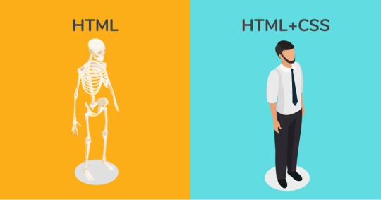
Fun Fact
In 2020, Tumblr had 29.4 million users in the US.
Text
Getting Better at HTML and CSS: Useful Tips
Introduction
Welcome to the world of HTML and CSS mastery! In this section, we'll dive into the fundamental aspects of web development, exploring the essential building blocks that create visually appealing and functional websites. Whether you're a beginner seeking a solid foundation or an experienced developer looking to refine your skills, this blog post is designed to provide valuable insights and tips to help you become more proficient in HTML and CSS.
The Importance of Clean Code

Clean code is the backbone of successful web development, influencing not only the aesthetics of a website but also its functionality and maintainability. Writing clean, organized, and well-documented HTML and CSS code is crucial for several reasons: - Readability: Clean code is easily readable, making it simpler for both developers and collaborators to understand the structure and purpose of the code. This readability is essential for efficient collaboration and code maintenance. - Maintenance: Well-organized code is easier to maintain over time. When updates or modifications are necessary, clean code allows developers to quickly identify and address issues without unraveling a convoluted mess. - Scalability: As a project grows, clean code facilitates scalability. It provides a solid foundation for adding new features, making enhancements, or even restructuring the codebase as needed. This scalability is vital for long-term project success. - Debugging: Clean code simplifies the debugging process. With a clear and organized structure, developers can pinpoint errors more easily, reducing the time and effort required to identify and fix issues. - Consistency: Consistent coding practices contribute to a cohesive and uniform design. This consistency extends beyond individual projects and can enhance the overall quality of a developer's work, fostering a professional and standardized approach. Consider implementing the following best practices to maintain cleanliness in your code: - Indentation: Consistently indent your code for better readability. Use a standardized number of spaces or tabs to maintain a clean and organized appearance. - Comments: Include descriptive comments to explain complex sections of code or to provide context for future developers. This documentation is invaluable for understanding the purpose and functionality of different code segments. - Use of Classes and IDs: Employ meaningful and descriptive class and ID names. This not only enhances the clarity of your code but also makes it easier to style and manipulate elements in CSS or JavaScript. - Remove Unused Code: Regularly review your codebase and eliminate any unused or redundant code. This not only reduces the file size but also streamlines maintenance and debugging efforts. Coding with cleanliness in mind not only benefits the current project but sets the stage for a more efficient and enjoyable development experience in the future.
Responsive Design Techniques
Responsive design is an integral aspect of modern web development, ensuring that websites are accessible and visually appealing across various devices and screen sizes. Employing effective responsive design techniques is crucial for providing a seamless user experience. Here are some key strategies: - Fluid Grid Layouts: Utilize a fluid grid layout that adapts to different screen widths. This allows your website to maintain proportionality, ensuring that content looks well-structured on devices of all sizes. - Flexible Images: Implement responsive images by using the max-width: 100%; CSS rule. This ensures that images scale proportionally within their parent containers, preventing them from overflowing on smaller screens. - Media Queries: Harness the power of media queries to apply specific CSS rules based on the characteristics of the device, such as screen width, height, or orientation. This enables you to tailor the styling of your website for different devices. - Mobile-First Approach: Start your design process with mobile devices in mind. This approach involves creating a base design for smaller screens and then progressively enhancing it for larger screens. It ensures a smooth transition and a better experience for mobile users. - Viewport Meta Tag: Include the viewport meta tag () to control the viewport width and scaling. This tag is essential for responsive design, allowing users to zoom in and out appropriately. Additionally, here's a handy table summarizing common breakpoints for responsive design: Device Type Viewport Width Mobile Phones < 768px Tablets 768px - 1024px Desktops > 1024px By incorporating these responsive design techniques, you can ensure that your website delivers a consistent and optimal experience across a diverse range of devices, contributing to increased user satisfaction and engagement.
CSS Flexbox and Grid Layout
CSS Flexbox and Grid Layout are powerful tools that revolutionize the way we create layouts in web development. These layout systems provide flexibility and control, allowing developers to design complex structures with ease. Let's explore the key features and benefits of each: - Flexbox: Flexbox is designed for one-dimensional layouts, either in a row or a column. It allows for easy alignment and distribution of items within a container, making it ideal for building navigation bars, sidebars, or any other dynamic layouts that require content to be arranged in a single direction. - Grid Layout: Grid Layout, on the other hand, is a two-dimensional system that excels in creating both rows and columns simultaneously. It provides precise control over the placement of items within a grid, enabling the creation of complex and responsive layouts. Grid is particularly useful for designing entire page structures. - Responsive Design with Flexbox and Grid: Both Flexbox and Grid Layout play a crucial role in achieving responsive designs. Flexbox's ability to adjust item sizes and order, along with Grid's responsive column and row definitions, make them essential tools for creating layouts that seamlessly adapt to various screen sizes. - Alignment and Justification: Flexbox simplifies alignment along the main and cross axes, offering properties like justify-content and align-items. Grid provides similar capabilities with properties like justify-items and align-items, allowing precise control over item placement within the grid. - Nesting and Combining: Both Flexbox and Grid Layout can be nested within each other. This enables developers to combine the strengths of both systems, creating intricate layouts that meet specific design requirements. Here's a quick reference table highlighting some key properties of Flexbox and Grid: Feature Flexbox Grid Layout Layout Type One-dimensional (row/column) Two-dimensional (rows and columns) Browser Support Well-supported across modern browsers Increasingly supported; widely adopted Main Use Case Dynamic content alignment in a single direction Creating complex layouts with rows and columns Whether you choose Flexbox, Grid Layout, or a combination of both, mastering these tools opens up a world of possibilities for crafting versatile and visually appealing web layouts.
Optimizing for Performance
Performance optimization is a crucial aspect of web development, ensuring that your website loads quickly and efficiently. A faster website not only enhances user experience but also positively influences search engine rankings. Here are key strategies for optimizing the performance of your HTML and CSS: - Minification: Minify your CSS and HTML files by removing unnecessary whitespace, comments, and indentation. This reduces file sizes, resulting in faster loading times for your web pages. - Compression: Enable compression for your CSS and HTML files using tools like Gzip. Compressed files reduce the amount of data transferred between the server and the user's browser, leading to quicker page loading. - Lazy Loading: Implement lazy loading for images and other non-essential resources. This technique defers the loading of certain elements until they are about to be displayed, reducing initial page load times. - Optimized Images: Optimize your images for the web by compressing them without sacrificing quality. Consider using image formats like WebP, which offers better compression while maintaining high visual fidelity. - CSS Sprites: Combine multiple small images into a single sprite sheet. This reduces the number of server requests, as the browser only needs to fetch one image instead of several, enhancing overall page speed. Additionally, keep in mind the following best practices to ensure optimal performance: - Use Efficient Selectors: Write CSS selectors that the browser can quickly interpret. Overly complex or inefficient selectors can slow down rendering times. - Avoid !important: Minimize the use of the !important declaration in your CSS. This helps maintain a clear and predictable styling hierarchy, reducing the risk of unintended side effects. - Reduce HTTP Requests: Minimize the number of HTTP requests by combining CSS and JavaScript files when possible. This reduces latency and speeds up the loading of your web pages. - Responsive Images: Implement responsive images with the srcset attribute to deliver different image sizes based on the user's device. This ensures that users receive appropriately sized images, improving performance on both desktop and mobile devices. By incorporating these performance optimization techniques, you can significantly enhance the speed and efficiency of your website, providing users with a seamless and enjoyable browsing experience.
Advanced CSS Selectors
Mastering advanced CSS selectors empowers developers to apply precise styling to specific elements, enhancing the flexibility and efficiency of their stylesheets. Here are some powerful CSS selectors and how they can be utilized: - Descendant Selector (Space): Selects all elements that are descendants of a specified element. This allows for styling nested elements without the need for additional classes or IDs. - Child Selector (>): Targets direct children of a specified element. It is particularly useful when you want to style only the immediate children and not nested elements further down the hierarchy. - Adjacent Sibling Selector (+): Selects the element that is immediately preceded by a specified element. This is handy for styling specific sibling elements based on their relationship in the HTML structure. - General Sibling Selector (~): Selects all elements that are siblings of a specified element. Unlike the adjacent sibling selector, this includes all siblings, not just the one immediately preceding the specified element. - Pseudo-Classes: Pseudo-classes, such as :hover, :active, and :nth-child, allow for styling elements based on user interactions or their position within a parent container. Additionally, here's a quick reference table summarizing some essential advanced CSS selectors: Selector Description E F Descendant Selector (Selects all elements that are descendants of a specified element) E > F Child Selector (Selects direct children of a specified element) E + F Adjacent Sibling Selector (Selects the element immediately preceded by a specified element) E ~ F General Sibling Selector (Selects all elements that are siblings of a specified element) :pseudo-class Pseudo-Classes (Styling based on user interactions or element position) By incorporating these advanced CSS selectors into your stylesheets, you gain a more nuanced and granular control over the styling of your web pages, allowing for targeted and efficient design implementations.
Working with CSS Preprocessors
CSS preprocessors are powerful tools that enhance the capabilities of standard CSS, providing developers with features like variables, nesting, and functions. By using a preprocessor, such as Sass or Less, developers can write more maintainable and efficient stylesheets. Let's delve into the advantages and key features of working with CSS preprocessors: - Variables: One of the most significant advantages of CSS preprocessors is the ability to use variables. Variables allow developers to store and reuse values throughout their stylesheets, promoting consistency and making it easier to update styles globally. - Nesting: CSS preprocessors enable the nesting of selectors, mirroring the HTML structure. This not only improves readability but also helps maintain a logical hierarchy within the stylesheets, making it clear which styles apply to specific elements. - Mixins: Mixins are reusable pieces of CSS that can be included in multiple selectors. This promotes code reusability and reduces redundancy, as developers can define complex styles once and use them wherever needed. - Functions: Preprocessors introduce the concept of functions, allowing for dynamic and calculated values in stylesheets. This can be especially useful for creating responsive designs or applying consistent spacing and sizing throughout a project. - Importing: CSS preprocessors support file importing, enabling the organization of styles across multiple files. This modular approach facilitates code organization and maintenance, particularly in large projects. Here's a quick reference table highlighting key features of popular CSS preprocessors, Sass and Less: Feature Sass Less Variables Yes, with $ Yes, with @ Nesting Yes Yes Mixins Yes Yes Functions Yes Yes Importing @import @import By incorporating a CSS preprocessor into your workflow, you can take advantage of these features to write cleaner, more maintainable code and streamline your development process.
Accessibility Best Practices
Ensuring accessibility in web development is not only a legal requirement in many regions but also a fundamental aspect of creating inclusive and user-friendly websites. By following accessibility best practices, developers can make their websites accessible to users of all abilities. Here are key considerations and practices for creating an accessible web experience: - Semantic HTML: Use semantic HTML tags to provide meaningful structure to your content. This includes proper use of headings (
to ), lists, and other semantic elements. Screen readers rely on these tags to convey the document's structure to users with visual impairments. - Descriptive Text: Always include descriptive text for images and other non-text content using the alt attribute. This ensures that users who rely on screen readers can understand the purpose and content of visual elements. - Keyboard Navigation: Ensure that all interactive elements, such as buttons and links, are accessible via keyboard navigation. Users with mobility impairments may rely on keyboards or other assistive devices to navigate your website. - Color Contrast: Maintain sufficient color contrast between text and background to enhance readability. This is crucial for users with low vision or color blindness. Tools like the Web Content Accessibility Guidelines (WCAG) provide guidelines for acceptable color contrast ratios. - Focus Styles: Clearly indicate focus styles for interactive elements to make navigation easier for keyboard users. Avoid relying solely on color changes, as some users may not perceive these changes. Here's a quick reference table summarizing additional accessibility best practices: Practice Description Readable Font Sizes Ensure text is readable at various font sizes to accommodate users with visual impairments. Accessible Forms Design forms with clear labels, error messages, and logical tab order to assist users filling them out. Video and Audio Accessibility Provide captions and transcripts for multimedia content to assist users with hearing impairments. Testing with Accessibility Tools Regularly test your website with accessibility tools like screen readers and validators to identify and fix issues. By incorporating these accessibility best practices into your development process, you contribute to a more inclusive digital environment, ensuring that your website is accessible and usable by everyone, regardless of their abilities or disabilities. Backend developers after writing CSS for 20 minutes: pic.twitter.com/CzIvYuSQNK — Marko Denic (@denicmarko) November 13, 2023
FAQ
Explore answers to common questions about HTML and CSS to enhance your understanding and troubleshoot potential challenges: - Q: What is the difference between HTML and CSS? A: HTML (Hypertext Markup Language) is used for structuring content on the web, defining the basic elements of a page. CSS (Cascading Style Sheets) is responsible for styling and presentation, allowing you to control the layout and appearance of HTML elements. - Q: How can I center an element in CSS? A: To center an element horizontally, you can use margin: auto;. For vertical centering, consider using flexbox or grid layout, setting the container's height and using align-items: center;. - Q: What are media queries? A: Media queries are CSS rules that apply styles based on the characteristics of the device, such as screen width, height, or orientation. They are crucial for creating responsive designs that adapt to various screen sizes. - Q: How do CSS preprocessors enhance development? A: CSS preprocessors like Sass and Less offer features such as variables, nesting, and functions. Read the full article
0 notes