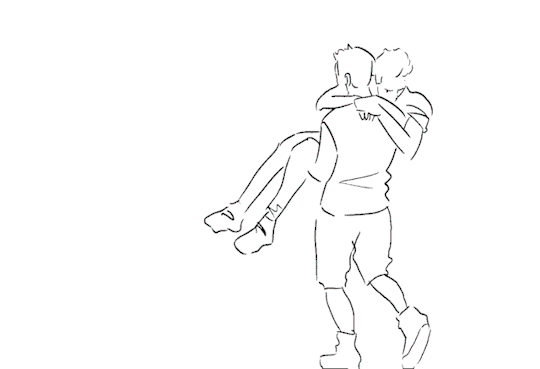
#I am practising rotoscoping so have this
Photo
i say your name
in hopes you hear it
in the stars
and carry me out
- carry me out, mitski
419 notes
·
View notes
Note
hello dear! first off i want to thank you for making the art that you do. it truly is lovely and reminds me of looking into a sweet cake box! also, how hard was it to learn animation? did you go to artschool? if not, then without artschool how was it possible to learn? i'm so curious because i'm at the point with my illustrations where i want to delve into learning animation, but i don't know if going to artschool would be worth it for the cost. tysm for reading!
hello, my love! 💗💕🌸 firstly, ahh, thank you for the cutest compliment of ‘looking into a sweet cake box’! it really is so adorable! and as i’ve answered here that nope, i havent gone to art school (yet? 👀), and that i’m self-taught!
learning animation (or learning anything art-related tbh) without art school really depends on how determined you are in learning it! determination and passion is really what kept me going when i got stuck upon learning animation (or art in general), and i know that without those two, i wouldve stopped doing art a long time ago. it is possible, i’m telling you that right now, but again, it takes a lot of time, practise and lots of mental strength.
i personally dont believe you need art school to learn animation, bc well i didn’t, but then again, everyone is different! if you want to learn about the formal and proper way of animating, then maybe you can consider art school, but on the contrary, you can search up online on how to animate! i definitely learnt everything about art and animation online, i searched through multiple sources from tumblr, i watched youtube videos and re-watched them all over again until i entirely understand the concept of animation, etc. i’ve answered an ask here where i recommended one of the best ways (in my opinion) to learn animation as a beginner. spoiler: rotoscope animation!
as for me, it took me a whole 3 years of practising animation on my own to get where i am right now! it seems long, but really we will all learn on how to just go with the flow :) it was hard for me too, trust me, my first animation (or gif) is a tragedy lmao, but we all start from somewhere, so really, its okay! (and i still have the gif tbh lol) !!!!though!!!! the reason why it took so long for me is bc i made graphics before illustrations, so my animations were more of motion graphics than the animations you see me do now (and this whole graphics journey is a story for another time lol), and i believe that if you know what you want to go for, it’ll take a shorter time! it took me that long bc ive been venturing different types of animations rather than only on one kind.
so yeah, i believe in you and i know you can do it! i’m rooting for you :’) all the best, love! 💖🌸💘💕💖💕
301 notes
·
View notes
Text
Creating an Album Cover - Shagg’s Own Thing
The main aim for this brief was to design an album cover. Before I knew what band we would be designing for, I had a little look at some album art on my spotify that I liked to give me some ideas.

Some observations I made in my search was that generally (at least in the music that I listen to) the more famous the artist is, the more likely they are to feature photography and/or portraiture of the artist. For example, the David Bowie album is all about David Bowie, whereas all of Tom Rosenthals albums feature artwork by illustrators and don’t tend to feature any portraiture of him.
I thought that the use of text was pretty interesting on these album covers. In most of them, the text is really small, but in some of them, the text is intergrated within the image and is larger. Something I did find looking through my spotify was that text is getting smaller through time on album covers. (Again, this is just from the music that I listen to, this may not be a trend in general) Back in the 70s and 80s, it seemed there was a lot of text on the album cover, often with big graphic titles, such as in this album: United - by Marvin Gaye and Tammi Terrell.

But in more modern album covers, there seems to be smaller and less text, sometimes none at all, such as this one by Lizzo.

The Shaggs - Shaggs Own Thing
If you have never heard of The Shaggs, enjoy what time you have left not knowing them. A day doesn’t go by now without my Spotify trying to play The Shaggs at me.

These are the Shaggs.
Our brief was to create an album cover for their album “Shaggs Own Thing”
Firstly, I played the album through my headphones and just started drawing what felt right. Then, my tutor gave the class prompts to draw (draw a collection of objects that you feel relate to the music, draw the setting you think this music should be played, draw some shapes that go with the music etc.) These prompts really helped me come up with ideas that I otherwise wouldn’t have necessarily thought of, and the spontaneity of drawing with ink and a brush really helped to draw things in a more simple, yet more abstract way, which I really enjoyed. This technique is definitely something I want to take forward to future projects.

These were my drawings from this exercise. My favourite elements were foot-foot in the bottom picture, and the wiggly trees and sun in the top picture. I thought that these elements really summed up my view of the shaggs, and I also thought that they would work quite nicely together in a scene.
I took these elements and started to put some rough ideas together.

I wanted to use quite big text in my ideas to go with a lot of the other 70s album covers that I had looked at previously.
I was planning on trying out a few of my ideas from this selection, but I started with the top right one, and I was really happy with how it turned out once I played around with it a bit, so I stuck with it.


I played around with a few colour options but I was most happy with the 70s, brown and yellow theme in this last one. I think that the colour scheme works well with the themes in the music, as well as the era it was written in.
With hindsight, I now wish I had tried out some of my other ideas before sticking with this one, as I think some of my other ideas had some more potential than I initially thought. That being said, I did have fun with this design and I am still happy with the finished result.
We then had a few lessons learning how to animate elements of our work, we practised two different ways of animating, layer-as-frame on photoshop as well as rotoscoping also using photoshop. This was my attempt at making a gif using layer-to-frame animation in our first workshop.

Unfortunately, my attempt at rotoscoping from our second workshop didn’t save properly and Tumblr wont let me upload a video from my folder (I took a video of it on my phone).
I then used these animation skills to animate my album cover.

I think for my first attempt of using animation, it isn’t too bad. It is definitely something I want to experiment with more in the future.
0 notes
Text
Cinemagraph research
What are Cinemagraphs?
Cinemagraphs are still images yet contains the little movement of an object or part of the image which is repeated which could create a short video similar to a gif, this could also look like an animation.

As you see the image is still yet the water and steam are moving
What equipment is needed to create a cinemagraph?
To create a cinemagraph you only need a camera which records video and a tripod, you will also need photoshop. An optional piece of equipment would be Premiere Pro to edit and grade the shot to look fit specific needs.
What techniques are commonly practised when making cinemagraphs and what common errors can occur with cinemagraphs?
To use the tripod to capture movement within the video but to try and move the actual camera as little as possible. Relating to this another technique is to only capture one object moving or multiple objects if they make each other move like this example the bird moving yet the water moves also:

The video captured also tends to be short since this would save time and make the cinemagraph more effective. They also tend to be from real life, however, there are still many examples of cinemagraph used in cartoons.

There are some errors which can occur when creating cinemagraphs, for example, having a shaky video due to either the tripod not being set up correctly or recording free hand, also if the object you wanted to move during the cinemagraph was connected or affected by something else that moves it could cause other the connection to move which would look off-putting like in this example below where the stick moves causing quick, sudden movement.

5 cinemagraphs I chose to evaluate:
Cinemagraph 1:

Where and how was this cinemagraph taken?
I think that this was taken at a train station, possible grand central station in New York since this would be an area to capture many people in a somewhat small area, I think the camera was placed on a tripod with glasses fixed to the camera so that they wouldn’t move, I also think the original video was about 5 minutes long since I can see the full moment of when the cinemagraph starts of where someone is to where they are when it finishes. I think they may have used a blur tool in photoshop to blur everything not through the glasses view, this is a good way incorporate depth in a rotoscope and a sense of realism since people tend to see better with glasses.
Cinemagraph intention:
I think that this cinemagraph was used to advertise a pair of glasses and exaggerate how well they work but also how they can change someone's eyesight.
Is the cinemagraph effective?
I think that this cinemagraph is effective since it gets it’s point across, also since the video through the glasses looks detailed this would further exaggerate how good the glasses are, and since the footage is of public spaces this also makes the cinemagraph relatable to the viewers.
What I like about the cinemagraph:
I like how effective the time lapse is since it shows so much in such a little amount of time. I also like how the video is symmetrical which is pleasing to the eye.
What I don't like about the cinemagraph:
I don't like how little shakiness there is, I know that a tripod would be more effective in most cases but since this is to represent how people view the world, to make the video more realistic some shakiness might have been more effective.
How could it be improved?
Apart from possibly adding more shake, the people could have been more evenly distributed, not having many more people in the left lens than the right, this could have been done by waiting a longer amount of time to get the perfect capture but it’s not much of a big deal.
Cinemagraph 2:

Where and how was this cinemagraph taken?
I am pretty confident that this image was taken in New York City due to the empire state building being in view, I also think that this was quite far off the ground and probably on the top of another building, if I had to guess I would say the Chrysler building since the height seems accurate although the positioning may be off, the object which is moving would be used to view far away areas. I think that this was done using a tripod since the height of a tripod would be appropriate since the thing moving tends to be placed at a bit lower than the head level for people to look through, I also think that some blurring was used but not as much in the previous cinemagraph. I also think that this image took two to three seconds to film since I don't think the timing of the video was altered during the editing process.
I found an image which could be of the same location as this cinemagraph:

Cinemagraph intention:
I think that the intention of this cinemagraph was to possibly advertise the skyline viewer or for artistic filmmaking reasons since the capture is quite detailed and effective in itself.
Is the cinemagraph effective?
I think that this cinemagraph is very effective since it includes a lot of depth from the blurring but also from the shine off the skyline viewer, this would also grasp people’s attention.
What I like about the cinemagraph:
I like that it’s simple and that the video managed to capture one of the main buildings in New York City in almost full making the cinemagraph look recognisable.
What I don't like about the cinemagraph:
I think that this cinemagraph could get boring quite quickly since not much happens in it apart from slight repetitive movement.
How could it be improved?
I think to make the sky move also would have made this cinemagraph more effective since it would give the viewer more movement to look at which would leave them to get bored less quickly and retain attention.
Cinemagraph 3:

Where and how was this cinemagraph taken?
I think that this image was taken in either Alaska or Russia, more likely Alaska due the train looking like a steam train which isn’t common in Russia, I could be off by a long distance but I am only saying these locations due to the types of trees and how much snow is in view, I think that this cinemagraph was made by using a tripod, I think the actual video was around 1 second long since the smoke is slowed down I also dont think that any of the video is blurred and taken with a very high-resolution camera due to the smoke having great detail.
Cinemagraph intention:
I think that this cinemagraph was for purely artistic reasons due to the camera clearly being high quality from the detailed smoke, I think it could also be used alongside an article about steam trains since this would be interesting to look at for a brief moment.
Is the cinemagraph effective?
I think that this cinemagraph is very effective since the movement doesn’t draw attention away from the train but instead adds life to the piece if this were to be a normal non-moving image it would appear much less effective.
What I like about the cinemagraph:
I like how detailed the smoke is since it adds a lot of depth and realism to the cinemagraph. I also like the colour scheme of simplistic colours since this is pleasing to the eye.
What I don't like about the cinemagraph:
I don't like how there is empty space on the bottom left of the cinemagraph since everything else looks interesting yet that area looks kind of bland and doesn’t fit the rest of the detailed cinemagraph well.
How could it be improved?
I would crop the bottom area of the cinemagraph to fit the theme of grids and look more even and better distributed as a whole.
Cinemagraph 4:

Where and how was this cinemagraph taken?
I think that this video was taken in San Fransisco United States due to this looking light the golden gate bridge, I also think that this video was taken at night due to the dark sky, I think this was taken at night so that the light from the cards, bridge and city stand out, I think this was taken using a tripod again and recorded for around two minutes guessing by how fast the traffic seems to be moving, I dont think that any blurring techniques were used, I just think that since the traffic was spead up this would create a blurry like effect.
Cinemagraph intention:
I think that the intention of this cinemagraph was to represent the narrative of time and how it passes. It could also have been made to show how beautiful San Fransisco is.
Is the cinemagraph effective?
I think that this cinemagraph is semi-effective since it does show how nice San Fransisco can look, however, there is very little movement and wouldn’t be that noticeable at a quick glance.
What I like about the cinemagraph:
I like the good contrasting and harmonising colours, but also how they were able to capture the full bridge at an angle which adds depth.
What I don't like about the cinemagraph:
I don't like how little movement there is and how it gets boring quite quickly in my eyes.
How could it be improved?
I would improve this cinemagraph by making the water or even just the light of the traffic in the water have motion since this would make the cinemagraph much more interesting to look at.
Cinemagraph 5:

Where and how was this cinemagraph taken?
I have no idea where I think this video was taken I could guess in a hotel corridor due to the long hallway and what looks like multiple doors on the left and right of the image, I think that this image was created using freehand with no tripod due to the shakiness, I can't tell if this is of multiple images of the woman in different positions or a full video of the woman walking around her finger, I also think that this rotoscope took around ten seconds to film if it is a video, I also know that some blurring affects were used in this cinemagraph on the everything apart forom the woman to draw attention to the finger itself.
Cinemagraph intention:
I think that this cinemagraph was used to possibly represent the solar system and orbits or maybe an advertisement for a short film where something paranormal or confusing happens.
Is the cinemagraph effective?
I think that this cinemagraph is effective since it is grabbing attention, it also looks like one of them gifs where you can see something or someone rotating both ways which would link to the idea of confusion.
What I like about the cinemagraph:
I like that the finger is used as an anchor point for the woman making me more interested in the cinemagraph.
What I don't like about the cinemagraph:
I don't like the fact that the woman is not rotating at a constant speed around the finger, it looks as if she stops in some places.
How could it be improved?
I think unblurring the floor and ceiling of this cinemagraph would look more interesting and add more depth, this would also make the view more confused since I think that this was the cinemagraphs original intention.
What are the 5 most common themes used in cinemagraphs?
From the many examples I have seen I would guess that the 5 themes include water/liquid, smoke/air, light, people and shadows.
10 original Ideas I have for a cinemagraph;

These ideas include;
An Ant

I would want to film an Ant from afar with motion in the background such as traffic, I would then have the only thing in motion being the Ant, I also might blur out some of the surroundings to focus the attention towards the Ant more. I would place the tripod slightly above the height of the Ant but at an angle to see the traffic also, I would use a tripod so the cinemagrpah would look smoother. I would record close to the Ant so hopefully, I would get a clear view of the Ant’s full journey across the camera’s view so I could speed up the footage and have it repeated like a cinemagraph. I couldn’t find an example which would represent something that I had in mind.
Ball in motion

The idea behind this would have the ball enter and exit the video so when I was to repeat this as a cinemagraph it would look like a continuous loop, the background could also be blurred to focus more attention onto the ball. I would use a tripod and have it around four feet from the ground, I would choose a background with contrasting colours to the ball so that it would be easier to see the ball, I would probably carry out the video in a park since this would allow me to make things pause in time such as people which would make the cinemagraph. The closest cinemagraph I could find that would represent this idea would be...

I would improve this example by having the ball actually exit the shot so it can be repeated more effectively and look more realistic.
Water/pond

This cinemagraph would look like the water and ducks would move but nothing else in the scene would, the idea would be created by choosing a pond with a small island in the middle with maybe a few trees on to freeze in time like in Vernon park or having a fountain frozen in time like at the Arboretum park. I would have the tripod set up so it would be in a position to capture a lot of the water but also the majority of the island. I would try to capture a moment where the ducks would be most still since if they were to move drastically in terms of location this would make the cinemagraph not flow like a loop since the duck would be in one area of the footage then in the next be where it started and not look continues but more like gif which is obvious to tell when it repeats. This is the closest example I could find which would best represent my idea...

I would improve this example by trying to capture from a wider angle to make the cinemagraph look more interesting, I would also try to have the motion last longer since the footage actually moving looks like less than two seconds from when it repeats again, I know that a cinemagraph is meant to have motion in a short space of time but with a capture such as this where little is happening it could look a lot more impactful if the motion was longer.
Bus/tram/train digital signpost


This would be captured by recording the whole sign then have the only thing in motion being the bottom line since this would repeat itself and look realistic since the bottom line tends to move from right to left, I could also try to capture traffic in the shot since this would be another thing I could keep still since this would actually look more like a cinemagraph, I would have to set up the tripod at a high height to get a good view of the sign. I would record the time it takes for the bottom line to repeat itself twice so I would have an option of what part of the video I would want still to make the cinemagraph look more interesting. I couldn’t find an example but the image above might help explain how this idea would be carried out.
Shadow movement

This idea would be executed by recording a person moving but standing still maybe waving their arms or bending their knees with the shadow in view behind them, I would then make the person stand still yet keep the shadow in motion using photoshop, I would try to make the movement quick and end in a similar position from before the motion started so that they would blend into each other and look continuous. I would record using a tripod at around 5 feet and record at an angle so that both the person and the shadow would be in view. The example below is close to how my idea would look if it were to be executed...

To improve this cinemagraph I would make the shadow have more motion like moving the legs, also the looping transaction doesn’t look smooth and gives more of a glitching effect this could be fixed to look smoother by adding opacity effects in the digital process so they fade into each other.
Water from tap

This would be done by recording a tap releasing water then having the only thing move being the water. I would record for around 30 seconds so I could choose which part had the most motion in terms of the water movement, I would record at an angle from above so I could view the water hitting a surface so I could freeze the impact in Photoshop but keep the stream of the flowing water in motion. The example below is similar to how the idea would look...

I like the colour scheme chosen since it makes the water stand out more and have a bigger impact, however, to improve I would get a different angle of the water hitting the sink since then the impact could be frozen also which would focus more attention on the stream of moving water.
Sunrise

This idea would be to go to the coast and record the sun “wake up” until the sun had gone out of shot, I would then time lapse the footage and make the only thing be in motion the sea and the sun, clouds and birds would be frozen. This would have to be recorded on the east coast since this is where it would “wake up”, I would also have to film when the weather is most optimal since if clouds would be in the way the sun wouldn’t be in view, I would also have to record at a specific time for when the sunrise would occur, I would use a tripod and record at a low position since this would save time in terms of how long I would need to be recording since the sun would exit the camera view quicker. This example below would be something like how my idea would look...

To improve this example I would try to capture more in the shot to be frozen since at the moment it looks more like a gif than a cinemagraph.
Traffic

The camera would be set up next to a road at an angle facing the same direction of the road to capture as much of the cars as possible, during the recording I would jump in front of the view so that the camera would only capture my feet and some parts of my legs to add depth, I would then time lapse the footage and have the only thing in motion being the cars, I also might blur them to have a more powerful effect, I would freeze my feet and legs in a position where they would be off the ground but would be the main object in focus, in addition I would set the camera at a low position since it would capture my feet, I would record for as long as it took to record me jumping in front of the camre multiple times to get the best shot of my feet in view, hopefully centred and not covering up a lot of the traffic. The example below is almost how I would want my idea to look...

To improve this cinemagraph I would have chosen to wear different coloured shoes/trousers since it would contrast better with the background, I would also have tried to make the legs and feet more central in view.
Soda into glass

This idea for a cinemagraph is very common where the camera would be at an angle to view the liquid leave the can and pouring into a glass, a glass would be chosen to view the pouring motion. I would record the whole process of pouring the liquid since this would enable me to choose a frame where I move the can the least so that the looping cinemagraph would look smoother. The only thing to be in motion would be the stream like in the tap idea so this would look continuous. The example below would look like how my idea would look...

I like how the shadow of the stream is moving also, this also looks continuous and flows well, I find this difficult to find something I would improve on since I think it is very well done, if anything I would experiment making the reflection of the coke can move also to make the cinemagraph look more impactful.
Smoke from building

This idea would be done by filming a building which is releasing smoke with other objects in shot such as cars and other buildings, I would then make the only motion be the smoke and have everything else still. I would record for around 30 seconds so that I could capture an interesting frame to make the cinemagraph look most powerful, I would use a tripod so that the footage would be still and the loop would look the most smooth. I couldn’t find an example which would represent how I would want this idea to look like.
Sources:
Niagra falls cinemagraph -
https://imgur.com/gallery/PgozJmY
Bird in Hands cinemagraph -
http://www.rmp.nyc/cinemagraphs-too-hot-to-handle/
Cartoon cinemagraph -
https://www.reddit.com/r/adventuretime/comments/282y65/as_a_follow_up_to_my_marceline_cinemagraph_heres/
Failed cinemagraph -
https://www.pinterest.co.uk/pin/242279654929917040/
Glasses cinemgraph -
https://www.whudat.de/new-york-focused-through-glasses-animated-cinemagraphs-5-gifs/
New York cinemagraph -
http://allthatsinteresting.com/new-york-city-cinemagraphs
New York picture -
https://www.dreamstime.com/editorial-photography-tower-viewer-telescope-binoculars-over-looking-new-york-city-skyline-overlooking-image57459572
Train smoke -
http://knowyourmeme.com/photos/824859-cinemagraphs
Original source video of golden gate bridge -
https://www.shutterstock.com/video/clip-1127737-stock-footage-time-lapse-of-the-golden-gate-bridge-at-night-san-francisco.html
Golden gate bridge cinemagraph -
https://giphy.com/gifs/cinemagraph-RuoL8YlTt6Ula
Woman spinning on an axis of her finger cinemagraph -
https://petapixel.com/2012/07/12/cinemagraphs-of-people-and-objects-spinning-on-an-axis/
Tennis ball cinemagraph -
https://giphy.com/gifs/cinemagraph-tennis-11exmLO0igZpbq
Pond cinemagraph -
https://giphy.com/gifs/cinemagraph-river-rainy-S0d9Bbv21Xm5W
Bus stop picture -
https://www.pinterest.co.uk/pin/513832638727904783/
Woman’s shadow cinemagraph -
https://www.pinterest.co.uk/pin/458522805791569230/
Running tap water cinemagraph -
https://debooworks.wordpress.com/2016/06/28/tap-water/
Sun at beach cinemagraph -
http://prasannaellanti.com/stunning-art-in-motion-cinemagraphs-tumblr-blog/
Shoes in ront of blurred traffic cinemagraph -
https://www.pinterest.co.uk/pin/138767232247733082/
Coke cinemagraph -
https://www.hongkiat.com/blog/cinemagraph/
0 notes
Text
editing week


over my editing week i had a lot of fun experimenting and testing out all of the skills i had learnt from rob’s premiere workshop, where i asked him to show me very advanced techniques like rotoscoping and greenscreen work. it was very informative, very helpful and crucial to my editing week.
i was perfectly fine and very confident with my rotoscoping although i had to refresh myself on it again but it is a complicated and lengthy process so i am glad to have even more experience with it. i was very confident within animating my text on after effects as i taught myself how to do this many weeks ago and had practised a small bit however i did run into a massive issue, i returned to my project a day later and was greeted with all these errors of missing links. this did send me into a bit of a panic but after looking up advice and a solution online and keeping calm and positive i resolved the problem and continued working hard for the rest of the week.
i am extremely proud of my new attitude toward issues and negative situations and am happy my practise at being a mature, open and professional creator has stuck and is really paying off because i so far really like this piece and am actually very proud of it.
0 notes
Text
Evaluation
Overall this module was fun and overwhelming, with all the planning of making an origional film. Starting with getting inspiration from images on the internet and films I’ve watched. I wanted to make a film that would help inspire people and have an unique story. I managed to narrow down my ideas to my bubble idea, where a man would be living his life with his personal bubble. I explored this idea by having my character go through his day with him going to work and going through a journey of difficulties. However I had to narrow down my idea to make it more simple and that you can focus on the character. I found this most difficult, as I kept on making adjustments to my storyboard and the idea. It was quite hard and stressful to go through, but I am happy I went through it, to know what it is like to critic my own work and to gain a storyboard with many alterations.
Making my animatic was fun to do, drawing all the scenes in PhotoShop and finding sounds to go along with it. Also with trying out different styles to know what colour schemes to go for. I made many adjustments to my animatic , also with considering the Dutch angle and trying not to “cross the line” in my camera shots, this was very important to study so that I can adapt my animation to flow smoothly. Studying Studio Ghibli’s My Neighbour the Yamadas, was very beneficial to what I want my style to look like and the style I want to convey to the audience. I made concept art to reflect what I want my scenes to look like, with the gradient look on the background, like in the film. Creating a soft and pleasant look to my animation. My animation tests were important to create to get to know how my animation would look like and to practise my method of animating. I am quite happy with the technique of making the drawn aspects in PhotoShop and transferring them to AfterEffects to edit. The only areas I would like to improve would be the drawing style to be more detailed and that I can be happy with. Also have more tests of trying rotoscoping a bubble and have a go with another technique of animating. However I am happy with the overall preparation stage of my animation and all the stages I did so far. I got positive feedback from my peers and tutors on my final presentation, with comments, such as good colour scheme, my progress of getting here and how my animatic flows well now. I got some improvements to my document, which I will take into consideration in my next module to present a nice looking document, that contrasts good with my animation pieces.
0 notes
Last Seen Blogs

forever-colado
[PcQ] - Bobby

sabzinehmaralkood
Untitled


daftsongbird
Paracosm
sabzinehmaralkood
Untitled