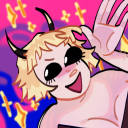
#I click the link to see the full uncensored art
Text
god, I miss having porny fanart on tumblr. we didn’t know how good we had it.
#I see a nice fanart with the spicy parts cropped out#I click the link to see the full uncensored art#and if it’s not a Patreon I can’t afford it’s a Twitter post I can’t see because I don’t have an account
9 notes
·
View notes
Text
Steddie art for a Steddie fic for the @steddiebang
This gal got to draw some Steddie art for two writers over the summer and I get to share the first set today (well okay, number two is a teaser but the pic and the link to twitter for the full uncensored version is below the cut 😘)
Thank you to @skwistok for both inspiring me with your fantastic fic snippets as well as just being such a lovely person all around that it was more joy than work! I'm excited to start diving in over the weekend, and if you'd like to as well, click here.
Here's a few more close ups:


And below the cut is a teaser for the NSFW second piece, but it's blurred in the middle - to see the full uncenceored version, you'll have to head to twitter via the link below 😏
See the full version here via twitter 🔥
23 notes
·
View notes
Text
ok question since i would need this explained. like ive seen artists post a cropped picture and in the text of the post the full uncropped and uncensored image in a hyperlink, and the image link being a tumblr image url like you would see when clicking "open in new tab" on a regular image on a post.
what is the usual process for doing this? for having an image avaliable to be linked to but not showing in a post? do the artists who do that have a private sideblog for dumping images or is there another method. i wanna go about in posting not sfw art on a sideblog i have and i wanna know whats the usual process for that lol
5 notes
·
View notes
Text
Here’s the artwork (below the cut) I created for the fic Say My Name for the @officialzutaraminibang this art is NSFW, but is covered up by emojis. If you want to see the full uncensored version, click on the link, read this amazingly smutty fic and see the art at the end of the fic.
I can’t wait for you to find out who wrote this. They are a wonderful writer! Find out on December 23rd!
Summary: Zuko isn’t sure if she feels the same. But he can’t get her out of his mind, especially not at night, with the water pouring over his skin. The water almost feels like it’s caressing him, just as she would... Pent up tension leads to a steamy conclusion.
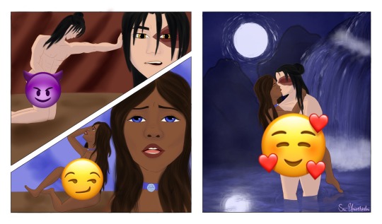
[Image Description: panel one: Zuko is pleasuring himself as he fantasizes about Katara. Panel two: Katara pleasuring herself while thinking of Zuko. Panel three: Zuko and Katara being intimate with each other in the moonlight]
15 notes
·
View notes
Link
Artists: Dorothy Iannone, Juliette Blightman
Venue: Arcadia Missa, London
Exhibition Title: Prologue: Juliette Blightman and Dorothy Iannone
Date: September 19 – October 22, 2020
Click here to view slideshow
Full gallery of images, press release and link available after the jump.
Images:
Images courtesy of Arcadia Missa, London
Press Release:
Arcadia Missa is pleased to present Prologue: Juliette Blightman and Dorothy Iannone. The work (Ta)Rot Pack (1968-69) by Dorothy Iannone can be thought of as the starting point for this exhibition, which presents work by these two artists, who use their own lives as the material for their work. The exhibition will travel and expand to the Kölnischer Kunstverein on the 30 th October 2020 and then in 2021 to the Vleeshal Middelburg.
Love is the inspiration of my work. I made (Ta)Rot Pack, a series of twenty-seven cards depicting the life of Dieter Roth, my beloved and my muse, in the early period of our relationship. During 1968-69, I worked on the cards while we were living in Düsseldorf where Dieter was professor at the Academy of Art, and in Reykjavik where he sometimes lived in order to see his children from a former marriage every afternoon for an hour, and in Villefranche-sur-Mer in France where I sometimes visited my close friends, Marianne and Robert Filliou.
Each card of my (Ta)Rot Pack, which has virtually no relation to the original Tarot cards, brings something. That something is the consequence of the activity which is visually presented. For instance, DR teaching his students brings “Patience”, DR and DI joined in a complete embrace “Brings What Everyone Wants”, DR cooking brings “Innocence”, DR embracing his children brings “Warmth”, “Reverence” depicts DR engaged in cunnilingus. On one corner of the cards, I copied an image from DR’s works. In the Introduction to the New Museum’s edition of my (Ta)Rot Pack, the curator, Jarrett Gregory, wrote: “In her depictions of the couple, she evokes profound love and pleasure by portraying both the divine and mundane aspects of their life together.” When we weren’t together, I made artworks about our relationship, and that enabled me to remain immersed in the beloved.
— Dorothy Iannone
I replicate the original Tarot cards, titling each work after one of the major arcana, using different motifs that reoccur in my work, like a toilet, to represent for instance, the throne. By drawing from my personal experience and the boundaries my domestic responsibilities and motherhood have on my ability to create, I review working methods through domestic space, exploring the different rhythms and atmospheres each room has, of my home, and other peoples. This allows different life experiences to coexist next to each other, I incorporate painting, drawing and photography. The rooms in a home hold different purposes, environments and atmospheres, as well as different relationships to the other inhabitants of the home, or the isolation of being alone.
An important work for me, and similar to the (Ta)Rot Pack but with a more narrational form, is Iannone’s The Story of Bern (Or) Showing Colors (1970), a publication that was made immediately after a series of real-life events around the censoring of her work in an exhibition at the Kunsthalle Bern. Without this book, the record of these events could have been otherwise forgotten. When I first met Iannone in 2014, hearing her recall the experience from 1969, led me to making a series of penis portraits. In 2016, with the support of the first female director of the Kunsthalle Bern, my works were able to be exhibited uncensored.
— Juliette Blightman
Link: Juliette Blightman, Dorothy Iannone at Arcadia Missa
The post Juliette Blightman, Dorothy Iannone at Arcadia Missa first appeared on Contemporary Art Daily.
from Contemporary Art Daily https://bit.ly/3jcQV4i
0 notes
Photo

Winter shore leave - 03 (Reboot Jim)
Fandom: Star Trek (reboot)
Timeline: AOS (2.0)
Series: Winter Holidays [3/4]
Reposted: January 2019 (previous post failed to pass Tumblr appeal)
Again, the timelines might be different, but some things will be the same. Aka, that one time when Jim Kirk dragged his cold-blooded pet Vulcan First Officer to a cozy cabin to spend their winter shore leave and they never bothered wearing clothes during the whole time - part III.
This blond, gorgeous-lipped little shit has plenty of good arguments to convince even the most balky Vulcan to get holed up somewhere surrounded by snow. It's just a matter of how you put your talents to use, really.
Who can resist him when he looks like this? Spock can't: it's a battle lost from the start.
[until Tumblr implements a “delete flagged image if the original flagged post is deleted”... link to original pic by clicking on the censored image. If the link doesn’t work, it’s most likely they changed server: watch the number before the “http://” bit by opening the censored image and change accordingly to the url of the uncensored]
———————————————————————————————
Tec stuffs (aka Behind The Manip)
I have a love/hate relationship with this specific pic. I love the pose, and the butt called for Jim (you just can't give this marvel to a Spock: it belongs to a Jim Kirk), but he was full of chest hair and I had to turn myself into an beautician because no Jim Kirk can have a chest full of hair (even if Pine has a shadow of hair on his chest, as you can see in every movie in which he's chest-naked). The quality is one of the worst of the whole photoshoot. The background included too much wall and I didn't like it so I changed it. This was the last manip of the series I set up and I wanted to use TOS!Jim's background just to be able to set the Jims together as I did for the Spocks... but it didn't satisfy me.
Finding a Pine face for this pose was a nightmare. And, what's funny, it's that I have plenty of pics with models in this same pose (face/neck speaking) in my base folders. *groan*.
Crossposted
Livejournal: prue84.livejournal.com/58865.html
Dreamwidth: prue84.dreamwidth.org/53891.html
Deviantart: prue84.deviantart.com/art/Winter-Holidays-03-652931422
0 notes
Link
Artists: Uri Aran, René Daniëls, Rochelle Feinstein, Peter Hujar, Quintessa Matranga, Libby Rothfeld, Martin Wong
Venue: BUREAU, New York
Exhibition Title: Beauty Can Be the Opposite of a Number
Date: January 31 – March 8, 2020
Click here to view slideshow
Full gallery of images, press release and link available after the jump.
Images:
Images courtesy of BUREAU, New York
Press Release:
Dear Jenny,
I’m working on an exhibition which I think is about naming and codes of language and how wonderfully slippery those codes can be: how a depiction of a thing is separate from its name, and the many ways that the depiction and the name can diverge and intersect. I wanted to write to you because so much of your poetry is about the slipperiness in constructing meaning, but also the belief in how words can be simple and economical while also bearing immense depths and intricacies. Our decades-long friendship has been built in part on an implicit love of language and its logic – and illogic. I hope you don’t mind that I used a line from your last book as the title for the exhibition, “Beauty can be the opposite of a number,” and here, the book’s first line:
“There is a window of time to make language how the mind works. Words as milk so the mind survives on language.”1
The exhibition is intergenerational and includes painting, sculpture, photography, and video. Two silver gelatin photographs by the late, great Peter Hujar are strange and beautiful outliers in the show. One features two scruffy dogs lying nestled in a dense mess of hay with oblique light streaming in from an out-of-frame source. It looks like a dusty barn in the morning. The other photograph shows an unbridled horse running towards the camera. Hujar is well-known for his portraits of humans – friends, lovers – but his animal portraits share the incredible empathy and pathos with which he captured his subjects. I’m certain that these two pictures of non-verbal beings is a kind of clue to the show. I’m probably projecting onto the animals as “innocent observers” of the mayhem of language found in the other works.
Uri Aran’s video, ‘Untitled (I Love You)’, shows the artist’s hands at a desk picking up small figurines of sea creatures from a shoebox full of maps. Each object is held like a talisman. The artist’s fingertips consider the objects haptically as he divines a meaning intrinsic to each one, which he then names with a word or phrase. The group of plastic animals is lined up and then played like a synthesizer; when touched, its phrase is recited: “I love you,” “Stay,” “I have respect for you and you’re beautiful…” The piece is so intimate and strange; the naming of these plastic toys feels so absurd and nonsensical but also so undeniable and true. I think the intimacy of the work comes from the feeling that we viewers are privy to the very personal space of the artist’s contemplation about a lover slipping away. It feels so candid and uncensored.
You know Alice and Dada were some of my first loves. I find a joy in the ease with which we can play with words and logic to say things which make no sense. The joy is now less freeing with the dissolution of truth in our current political state, but even more so, there is value in studying how pliable language and meaning can be. René Daniëls’s painting uses words to confuse the image he’s depicting; not in a straightforward non-equation like Magritte’s, but more enigmatic. In the painting, ‘Kades-Kaden’, Daniëls depicts a series of orange-faceted and green-shaded forms in the center of the canvas. Is the light blue background a sky? Is the horizon a shelf or a street? Scale is unclear, so perhaps we are looking at a group of books on a desk, or townhouses on a boulevard. Written over the orange rectangles, the word “Architecture” suggests buildings, but maybe it is a series of books about architecture? One unit is called Grote Zwaan, one Kleine Zwaan, big and little swan, respectively, in the artist’s native Dutch. The painting is, finally, I suppose, undecipherable, but a delight to puzzle over. Daniëls was famous for his mysterious scenarios, challenging the depiction of space and flatness on the picture plane. Flying above, in the cool sky background, is a kind of title, Blauwe Reiger: Great Blue Heron.
In a painting, a word can fly like a bird, or it can speak as the mouthpiece for the painting itself. In Rochelle Feinstein’s diptych, ‘Wrong Wrong’, the eponymous word appears multiple times: contained within comic speech bubbles and drawn out in the artist’s own hand-written font against stark and bright monochromes. The painting’s central axis, where the two canvases meet, serves as a mirror – the looking glass through which orange reflects as fuschia. On the left, where there is a slight suggestion of an illusionistic space, the words are written forward, on the right they are mirrored in reverse. Wrong Wrong. It’s a chorus of criticism, but the painting anticipates it and thus beats its detractors. The repetition brings a rhythm and humor to the word, an absurd mantra of incorrectness, a delight in just never being right. This painting makes it feel ok to rest our minds in a place without certainty because forwards or backwards, it’s always wrong, and that’s that.
Quintessa Matranga’s painting also considers the ‘wrong’. Rather than using words, the depictions suggest a phrase or state of mind where things do not line up or make sense. The doubling here is our vision: we, the viewer, are together with the painter in an unusually confused perspective from underneath a table, where a trio of beverages hovers dizzyingly at the edge. Perhaps they are revolving in an orbit of choices so seductive when full and so disorienting when nearly empty. Gravity seems to affect things differently on this planet; beer foams out of its pint and a pair of black and white, marbled ice cubes nearly escapes the warm comfort of the whiskey glass(es). The yellowing, lacquered table floats amidst a field of magenta snakeskin. Close in, the woodwork of the central table leg seems utterly clear and stable: a pillar to cling to.
When I talked to Rochelle about Libby Rothfeld’s work, we shared a look of excitement, agreeing that Libby had guts to use the numbers “2” and “5” in her work. We all have deep associations with simple signs, and these numbers – indivisible, abstract, and so real, too – loom large in our minds. Sculpturally, these iconic numbers also have a dominant, central position in the exhibition. Each integer sits atop a stepped, tiled base; each piece a small universe. The sculptures are patinated with the most beige, basic laminate and tiles, as if to suggest a theoretical realm, a constructed possibility, not a depiction of a place. Libby’s work often wrestles with the problematics of taste and how our banal choices construct our identity. What does it mean to place a number in space? We speak numbers, use them, play with them, show signs of them on paper and with our hands, but how do they stand? Her sculptures offer, to me anyway, an expression of how logic feels. We don’t often get to stand next to a number, to a choice, to look concretely at the building blocks of logic.
I am really thrilled to be able to show Martin Wong’s work in this context. The painting that we’re showing is one of his sign-language works. It has this incredible trompe-l’oeil tile frame, which I am excited to see in the same room as Libby’s work. I love the way Wong used bricks as a kind of repeating texture in so many of his works – within these patterned, crowded structures, intimate spaces and hidden identities emerge. Wong was obsessed with codes and language, too. Some of his paintings showed the zodiac, a system invented to make sense and stories of the stars. Taken from what was probably a tabloid paper, this painting shows a series of hands spelling out a headline in ASL: “doctors astounded / man carries / unborn twin / inside head / twenty one years.” What an idea: to draw hands spelling in ASL. Written words or a picture would have sufficed for a deaf person, but Wong wanted to employ a code to translate his subject and make it more obscure. Anneliis, who works on Wong’s estate at his gallery, also mentioned that he was really interested in the constellation of Gemini in particular and the nature of twins as the poetic potential of a perfect genetic match but an imperfect mirror.
This show features all sorts of translations and miscommunications through mirrors and double vision. In incantations and exclamations, we name in order to protect, confuse or enrich meaning. I like the idea of you experiencing this work first through my words – another translation.
Love, G
1. Kronovet, Jennifer, The Wug Test, (New York: Harper Collins, 2016)
Link: Group Show at BUREAU
Contemporary Art Daily is produced by Contemporary Art Group, a not-for-profit organization. We rely on our audience to help fund the publication of exhibitions that show up in this RSS feed. Please consider supporting us by making a donation today.
from Contemporary Art Daily http://bit.ly/2vGjfbY
0 notes
Last Seen Blogs
daddysgirl77
Daddy Issues

meshimellow
faces pressed against the window?

afrogsview
A Frogs View

samantaborer
Cad Cam Masters