#I got bored I have matching layouts for every. single. group.
Text


No One Asked; Matching MMJ Layouts (1/2)
No Kin/Me/Etc on Minori
Like and Reblog if Saved/Used
#I got bored I have matching layouts for every. single. group.#apart from VS I’ll probably do that next#marionette.indulgent#project sekai#project sekai icons#project sekai layouts#pjsk#pjsk icons#pjsk layouts#minori hanasato#minori hanasato icons#Minori Hanasato layouts#haruka kiritani#haruka kiritani icons#haruka kiritani layouts#Haruka my wife….
20 notes
·
View notes
Text
One Touch - Part Three - Soulmate AU
Note: This is a soulmate AU that when you first touch someone, you feel tingles all over your body and your soulmate can channel different emotions through the bond. In this piece, the reader is not originally aware of soulmates.
A/N: This is dedicated to @mermaidxatxheart. You is kind, you is special, and you is important.
P.S. Feedback is always welcomed and appreciated.
Pairing: Steve Rogers x Reader
Warnings: Mild panic attack(s), Description of Accident, Swearing

Recap:
Sam was the first to break, his face breaking out into a look of unease and uncertainty. “Yeah, about that...you can’t leave because you’re supposedly dead.”
Panic blossomed in your chest. Was this hell?
“Jesus, Sam. You’re going to scare her,” Bucky growls, fingers twitching, itching to smack his comrade upside the head. He then turns his attention to you, an apologetic look. “He doesn’t mean that you’re actually dead. What he means is that we ran your DNA through a database and that the only match we found matched that of a four-year-old who died in a car accident twenty years ago.”
“With your name,” Sam finished.
“I’m sorry, but what the fuck did you just say?”
You feel yourself reeling and you stagger against the wall. This is just too much, you think to yourself. Your chest feels like it’s collapsing in on itself and you feel yourself gasping for air. You lean forward, place your hands on your knees and let your head hang down. This was absolutely crazy. Your thoughts are racing, trying to make sense of this mess.
You recognized the accident that they were talking about. You knew all about it. It was the accident that claimed the lives of your parents and brother. Except, you had survived.
What kind of sick joke is this?
“Hey, hey, hey. It’s okay.” You look up, still panting, to see that Bucky was crouched in front of you, his blue-grey eyes watching you with concern and empathy. “Just breathe in, breathe out. Follow me.” He exaggerates his breathing, in through his nose, out his mouth, chest lifting with every breath.
You mimic his actions and you can feel your heart rate slow and your breaths become more even and regulated. Your thoughts began to slow down and you felt more steady.
Your mind clears and you realize something. This is all in your head.
You were in an accident. Not the one from twenty years ago that claimed the lives of your family, but more recently.
You had been on your way home from work, having just received a promotion to partner in your law firm. You were crossing a bridge over a highway when a coworker sent you a text. Distracted, you hadn’t realized that you swerved into the next lane over until a semi-truck was blaring its horn at you. Shocked, you dropped the phone and jerked the wheel in an attempt to get out of the way, but it was too late. The semi clipped your side of the car, sending your car spinning into the guardrail. The cement guard broke on impact and your car went tumbling over the side. You remember a broken piece of concrete crashing through your windshield and hit you in the head before your car smashed into the highway below.
You know that there is no logical explanation for how you could have survived. Either this is the afterlife or this is your brain trying to protect you from the trauma.
Trying to figure it out right now was futile.
You take a deep breath to settle yourself once again and you feel the tension leave your body. You brush the invisible dirt off your hands, stand up straight, and turn to face Sam and Bucky.
In an eerily calm voice, you say, “I’m good now.”
Bucky and Sam share a worried look, but otherwise, don’t question it. Sam goes over to Bucky and whispers something in his ear that Bucky gives a nod to in response, both not taking their eyes off of you.
“Well,” Sam drawls out, stuffing his hands into his pockets, “As much fun as this shindig is, I’m going to...go do...things.” And without a further goodbye, takes off out the door.
You look to Bucky, raising an eyebrow in question of Sam’s strange actions, but otherwise, don’t say anything. He just shrugs, not offering any explanation before saying, “Let’s go on a tour.”
Bucky heads down the hall, not looking back to see if you would follow.
You stand there for a minute, debating whether to follow along or try to make a run for it. Since you had no idea the layout of the building or knowledge of what Bucky’s skills were, you erred on the side of caution and decided to chase after him, catching up in just a few steps.
He leads you through the building, pointing out different areas of interest, but you aren’t paying much attention. Instead, you’re lost in your thoughts.
The one thing you were certain of is that you crashed off of a bridge and that you had hit your head. Logically, this reality that you were in was just a projection your mind is giving you in order to protect you from the real trauma. What you couldn’t figure out is if this’ was just some play-by-play of some deep set fantasy. You were never someone who had been into Marvel Comics, nor were you the type to romanticize relationships. Yet you were in New York, surrounded by bickering idiots, and had Captain America claiming to be your soulmate.
Trying to make sense of anything was giving you a massive headache.
Instead, you turn to face the mountain of a man. "So, how come Sam called you grandpa? Is that a kink of yours or something?"
Bucky stops walking, turns around to look down at you, and gives you an amused look. "He thinks it's so funny just because I was born in 1917."
What the fuck? You think to yourself, but manage to keep a straight face. "Well, you should tell me what skin care product you use because you don't look a day over twenty-five."
“Skip the ageing cream,” he comments casually, starting to walk down the hall again. “If you want to stay this fresh, I recommend experimentation by either German scientists or terror groups. Really does wonders for the body.” He pauses, tapping his chin with a silver finger, feigning that he was deep in thought. “Oh! And being frozen either in ice or cryogenically. That helps too.” He gives off a sardonic laugh, shaking his head at himself.
His response makes you pause, needing a moment to process everything that was just said. A half second later, you give a small shake of your head, clearing it. “Sounds realistic.”
Bucky comes up on an unmarked door, stopping and turned to give you a smile. “Yeah, we’re an interesting bunch.” He doesn’t leave room for you to comment, quickly changing the subject. “Do you like to read?”
“Are you implying that there are people who don’t like to?” you retort, crossing your arms over your chest, raising an eyebrow at him.
He lets out a little laugh before opening the door and gesturing you in.
You’re in awe. Never in your life had you seen so many books in one room beside in a library. Without further invite from Bucky, you rush forward to the first group of shelves and begin to peruse the section. Your eyes go over the classical literature that was sitting before you, flickering through the many titles. Glancing over at Bucky, you point to a certain book and ask, “Can I grab one to read?”
Bucky comes up over your shoulder to see what you were pointing at and gives you a look of surprise. “You want to read Animal Farm over some trashy romance novel?” he questions in a skeptical tone. You nod in affirmation and he just shrugs. “Go crazy.”
With a smile, you pull the book out from its spot and turn to face Bucky. Giving him a quick pat on the head, you happily skip over to where a group of plush armchairs are and plop down in one of them and immediately begin to read. Bucky grabs his own book from the same shelf and you glance over the cover of yours to see it was The Picture of Dorian Gray. Seems like you weren’t the only one who like classical literature.
You’re only half a chapter in when Bucky speaks up. “What do you do for a living?”
You look up from your book, quirking an eyebrow. “Are you going to ask me what my favorite color is next?”
Bucky rolls his eyes at your sassy response and closes his book, setting it down in his lap. “I am curious what life looks like for normal people.” He pauses, glancing at you sideways. “Normal being a relative term.”
His last comment has you snorting. “Yeah, who’s normal anymore these days? Normal is boring.” You dog ear your page and close the book. “I work as a child psychologist. It’s….a difficult job. Not a lot of people want to work with children just because every single child is different. Adults are arguably easier because they can articulate their thoughts and feelings better whereas children, you have to be incredibly intuitive. There are only three of us in the county where I’m from, but I had just received word that I was given funding to start a larger program…one where I’m in charge of recruiting other child psychologists, developing family groups, teaching my ways of treating these children and so on and so forth.”
Bucky was silent. When you looked up, you were amused at the awestruck look on his face.
“What, cat got your tongue?” You tease.
He shakes his head in disbelief. “Not at all, doll. I’m just...that’s amazing. I can’t believe how far we’ve come from locking up people in looney bins.”
“Primitive asses,” you mutter, pinching the bridge of your nose. “It’s still not perfect, people wanting to medicate their children at any sign of not being immediately compliant, but at least we don’t shame and degrade them.” You allow yourself a deep sigh and change the topic. “Anyways, what do you do?”
“I keep Captain America from getting into too much shit,” Bucky chuckles, getting a fond look on his face. “That man has no sense of self-preservation but, he comes from a good place. You wouldn’t believe it looking at him now, but he was a scrappy little punk back in the day. Didn’t matter, I was constantly pulling him off of guys three times his size. I always told him I looked forward to 70 years down the line when he wouldn’t be picking fights anymore. I shouldn’t be surprised that’s not the case.”
You take note of his “back in the day” story to investigate further at a later time. “Bucky, do you have a man crush on Captain America?,” you ask in a teasing tone, raising an eyebrow in mock speculation.
Bucky just laughs, “Steve’s a good guy, but he’s not my type.”
Before you could respond, you hear a knock on the door followed by a familiar face walking in.
Steve Rogers stands by the door awkwardly, rubbing his hands together in a nervous manner as he looks to you.
Bucky looks over and his face splits into a large smile. Stomping his feet on the ground, he gracefully leaps up from the couch and heads to Steve, grabbing him in a quick hug before pulling away. “Steve! Glad you could make it! I’m going to go catch up with Mama Red Wing!” He then turns to you and nods a goodbye. “I’ll see you around.” And with that, he’s out the door.
Traitor, you think, slightly irritated he just left you alone with this man who was notorious for making outrageous claims.
You’re sorely tempted to ignore Steve’s presence and just continue reading, but Steve had this pathetically soft look on his face and you find yourself taking pity on the man. “You can come take a seat, I don’t bite.” Hard.
Steve takes the invitation and walks over, moving surprisingly graceful for a man of his size and stature, and claims the same chair Bucky had previously occupied that faced you.
He sits there and stares at you for a moment in silence and you take the opportunity to check him out yourself. You have to admit to yourself that he’s a very attractive man for a delusional person. Then again, you've always been a sucker for blond hair and blue eyes. A part of you wonders what that says about you, that you created this gorgeous man and he's completely insane and supposedly your soulmate.
Steve clears his throat and gives you a nervous smile. “I imagine you have some questions?”
Tags for Everything: @mermaidxatxheart @bettercallsabs @thinkwritexpress-official
Tags for One Touch: @blackcat-midnight-thatsme @kittylovesfandom @angryteapot @chonisberonica @delusional-of-love @unknownuserhasjoined @toews-a-peek @dryerpet
*Can’t tag you
#One Touch#Steve Rogers#Captain America#Steve Rogers Soulmate#Soulmate AU#Captain America Soulmate#Steve Rogers x Reader#Captain America x Reader#Steve Rogers fanfic#Captain America Fanfic#Marvel#Marvel Fanfic
149 notes
·
View notes
Text
The week in review:
Raw 11/30
NXT 12/02
NXT UK 12/03
Smackdown 12/04
Takeover War Games 12/06
+
Main Event 12/03

Raw:

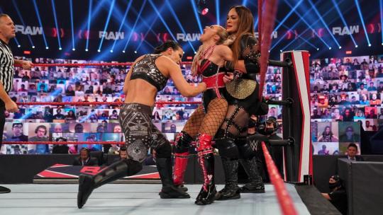
...Yeah hi, what the fuck is with the doll trapped inside of the table? Is that a metaphor for Alexa??
I’m so happy for her being able to have segments with Orton. Good for her.
Alexa’s like a mere inch taller than me so she’s a nice gauge as to to how tall the men’s roster is in comparison, and Randy? Fucking tall.
So the writing was on the wall; Fiend cares about Alexa (whether the nature is abusive is irrelevant to this point) and Randy has figured out how to use Alexa as a pawn to manipulate Fiend. I was kind of hoping Fiend/Alexa were in control of the gameboard, but it seems I’ve been duped.
The only complaint I have about this is how... compliant and helpless Alexa was in this segment. She’s not only been possessed/traumatized into caring about Fiend, but furthermore she does care about him, so why wouldn’t she be fighting against Randy when she was in his arms? The writing of her character in this particular segment seemed shallow. I know she can play whatever emotion they want from her, so to not ask for any emotions at all is curious.
Also the only person who isn’t a heel here is Alexa, and I won’t really hear any argument on the manner. Fiend is a predator at best. Orton is a psychotic douchebag.
My head hurts. Imagine Becky being stuck in a tag team with Lana rather than throwing a huge fit about not being able to defend her title for fucking months.
“Sarah you wouldn’t understand, but Shayna and I are about to-- *starts smiling like a fucking idiot*” Wow I want to defend wwe’s incessant need for giving Lana a storyline but I’m so fucking tired of abysmal promos. God. I. Miss. Becky. WHY is the Raw women’s champion wrapped up in this??
“First of all... ew.” lolololol
Shayna’s hatred for Lana is fucking hilarious.
Why is it, whenever Nia and Shayna do their dual barricade ragdoll move, Nia always gets the lighter one?
Nia fucking pummeled Lana lmao.
I kind of wish this story had a live crowd, I’d like to see if all of this was actually buying Lana some goodwill from the audience.
Hilarious watching Lana sit on the bottom rope for a few seconds before climbing through onto the apron, before slinking down to a sitting position, before finally collapsing onto the floor barely peering into the ring. Tf is she doing rofl.
Now she jumped up onto the apron lacking any enthusiasm, tagged herself in, and is climbing onto the turnbuckle while seemingly sobbing. What in the fuck lmao.
God Asuka is working overtime here.
*Bonus* online exclusive: how fun, Lana and Asuka are singing and dancing together. This division is turning into a garbage fire rq.

Oh is Mandy still out with an injury in kf?
Love it when new debuts get no fucking entrance. Yikes.
Mia Yim had such a dope theme song and entrance, I can’t believe it’s been scrapped so that she can call herself “Reckoning” and hang out in some dead-end group. Shame.
Oh my god. Mia loses to Dana via rollup after taking virtually no offense. What a waste of everyone’s time. I see this going nowhere, absolutely nowhere.

*Bonus* online exclusive: lmfao the Nikki Cross interview was worth a mention. First off, Nikki looks gorgeous. Second, I feel like this is the beginning of her run of not appearing on Raw because she isn’t deemed developed enough outside of a tag team, which is sad. Third, rofl @ her giving Sarah sheep’s stomach chicken to eat, I have no words. Anyway, she should be a solid midcarder. Get it together wwe.
Highlight: Probably the Nikki Cross online exclusive
---
NXT:

They got Shotzi something that glows. Wow.
Why is there a silhouette as if Io isn’t already added to the team? Why wouldn’t she be? Shayna was in last year’s, why wouldn’t Io be in this year’s? Is this supposed to be suspenseful?? lmao plz.

Indi did not take a bullet for you, she was just an idiot. Also why does this bitch still have a neck brace on? It was an Eclipse, let’s get real for a second.
Why you acting like your team is cohesive anyway? Doesn’t Dakota hate you? Didn’t Toni just turn heel for virtually no fucking reason, after defending/consoling Shotzi and attacking Candice like a sore loser? *sigh*
I know fans are really into WarGames but I find the alliances really fucking weak every year. It’s as bad as Survivor Series, just with more weapons and brutality.

So Xia Li lost some matches and now she’s being tortured... okay. I’m gonna keep my comments on this to a minimum cuz I can tell this will be some long-term story.
Oh I really like how their respective team members are standing up in the back on balconies. I really fucking like the layout of this arena. Huge fan.
Why Shotzi vs Raquel though? Why is the team captain fighting? That’s not typical for these, is it?
Ugh failure to throw Shotzi through the ropes. There’s just... a skill gap in the division, you know? And Shotzi and Raquel are on the lower end of that gap. I don’t care if people love Shotzi, she’s MILES away from being a champion. What saves her is her risk-taking, but it’s just a matter of time before that bites her in the ass.
Shotzi’s offense is doing a minimal amount of potential damage to her opponent while taking herself out in the most convoluted way possible. She’s Sasha Banks on steroids.
You call it innovative, I call it foolish.
Raquel just standing there waiting with stairs in her hands. Beast.
Shotzi can’t have a kf leg injury, that negates 95% of her offense!
Limpy vs Gimpy
Setting up that ladder in the corner was clunky as shit.
A pure ladder stip is hard to have in a women’s singles match, but this match is a big pile of meh.
Honestly I’m not about to complain about all of these women getting involved because this is borderline boring.
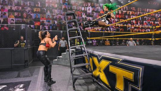
AYYYEEE it’s Io! Io saved this match tbh. Love her, THAT’S my champion.
Give Shotzi’s team the advantage, I doubt they win anyway.
To be honest; you have former nxt champion Ember Moon, inaugural UK champion and former nxt champion who fought against Charlotte fucking Flair at WrestleMania Rhea Ripley, and current champion that beat Charlotte fucking Flair for the title Io Shirai. The idea of that team losing is laughable at best in kf. But they will, cuz fuck babyfaces.
*Bonus* online exclusive: What surprises could you possibly have in store aside from some random weapons? Also fuck your howl. Edit: she was talking about her stupid new tank, wasn’t she...
Highlight: Io showing up at the end of the ladder match
---
NXT UK:

Who’s this green-shirt bro and why did he run over there to break up the brawl as if there aren’t 2 dozen officials already? Men needlessly getting involved in women’s fights irritates the shit out of me.
He also got in the way of the shot for the majority of this clip. I hate him.
I hope Jinny wins this future match.

This Aleah girl is like a cross between Kacy and Alexa, and honestly I hate it. Which is odd cuz I love them. She pisses me off though. Not sure what to make of it.
So supposedly Valkyrie is undefeated? That’s good. Let’s keep that going.
Valkyrie has nice counters and is super athletic. I say this every time I watch one of her matches but she deserves more praise.
I hate that women on UK get so little time. Send Valkyrie and KLR to nxt and send Dakota and Rhea to the MR, thanks.
I’d pay to see Valkyrie vs KLR too!
Still not a fan of Valkyrie’s finisher. Love her gear though, it looks different.
Highlight: Always a pleasure watching Valkyrie
---
Smackdown:

Lmfao Bayley “fails” to break the count before rolling back outside, so she rolls back in and fucking stomps her feet while yelling at the ref. She’s good. She’s good at the basics, good at paying attention to her surroundings, and good at improvising.
Bayley and Nattie are smooth together. They’ve never had a match, right? Other than this?
Love how Bianca has all of Bayley’s attention.
Bayley just used Nattie’s discus clothesline against her lmao. What a troll.
I remember when Bayley tapped, her entire fanbase was crying claiming she was buried. Watching it myself, she is so obviously entering into a program with Bianca. Christ 90% of her attention was on Bianca throughout the match.
*Bonus* online exclusive: Bianca just told Bayley her hair ain’t even and she looks dusty, good fucking bye.

mmmm not sure if Sasha has the admiration of the wwe universe. Look she’s a remarkable talent in the ring, but she is insanely annoying outside of it. She’s changed nothing from the time she was heel, other than no longer cheating to win. She obnoxiously cackles, she’s egotistical, she gets along with legit nobody. I’m not convinced the crowd would even cheer her, even if she’s one of the best bell to bell. Her fans can call her the number 1 babyface, but that’s a stretch if I’ve ever heard one.
“I won the first 2 women’s mitb” aaggghhhhh I hate that Carmella still claims that. Debatable. De-ba-ta-ble.
Lol “I can’t help if men are obsessed with me,” alright sure. That’s good tbh. Carmella is a notorious cheat but regardless, that’s good.
Well the reason y’all never faced one on one is because Carmella’s a Smackdown veteran and you just got here, but I digress.
So where’s the army that still runs around crying that Becky buried her when she called her the greatest woman to never be great (facts)? Where’s the outrage for Sasha demeaning Carmella and claiming she’s not in her league? Sasha fans are wild.
“With half the work I’m better than you. I held onto that Smackdown woman’s title longer than all of your title reigns combined.” omg she’s dead. Shots fired, target hit. Someone call Sasha a hearse.
Instead of sitting there making ugly faces, Sasha really should’ve gotten up and left. Lick her wounds or something kekek.
Highlight: I’m into this Bayley/Bianca thing they’re building
---
Takeover WarGames:
I just think it’s so cool that wwe shelled out the money for a Black Sabbath song. Of course they can afford it, but for a Takeover? Points.
Nobody wants to come take out Candice rq? No? Nobody at all???
Oh hell yeah Dakota gets to start? Good for her, since she skipped out on it last year.
I don’t fucking get Ember Moon’s persona, but I like her lit gear tonight.
“Aiming it square at Team LeRae” sometimes I wonder if Vic is simply blind.
The concept of this match is fun, but it always feels a little hollow until the match actually starts.
So cool that they got Wade Barrett on commentary in nxt.
Sloppy headscissors by Ember, but Dakota sold well per usual. Not sure why they’d have Ember run the marathon.
I’d pay so much money to see the 4hw in a WarGames match.
Oh that’s cool, Raquel put her hand up to protect Ember’s face from Dakota’s kick. We appreciate a performer that protects her coworkers.
That sunset flip powerbomb by Shotzi onto Raquel off the ropes was neat.
Toni up in here just removing all the turnbuckles. I wonder if running into exposed turnbuckles actually hurts that much.
Toni barely taps Ember with a kendo stick and she acting like she’s dying.
Man that 6 woman thing was so choreographed. Even did a countdown.
Io ma’am we don’t-- we don’t need ladders... okay. Okay.
Io scaling the cage and Raquel knocking her off like in Super Mario Brothers.
I feel like WarGames is convoluted enough, but sure, let’s get into the winter of overbooked women’s matches. New season, same bullshit.
AHAHAHAHAH IO’S FUCKING SMILE. She is standing on top of the cage putting a garbage can over her head, and has the audacity to wear a shit eating grin. I cannot, this girl is crazy and I love her.
Stupid spot? Maybe. Is Io batshit insane for jumping like 10 feet down completely blind? Absolutely. Points.
CLEAN ddt by Io onto Raquel. Spiked.
Candice is dumb. Got a trash can lid standing opposite Shotzi who’s wielding a chair. Candice throws the lid, says ‘hold on’, then climbs through the ropes to grab a kendo stick while crying ‘help’. Grabs her kendo stick, goes to bat against Shotzi, gets her hand smashed lmao. Idiot.
Oh that was perfectly timed. Dakota busts Shotzi with a chair strike and barely even begins to turn around before Io missile dropkicks the chair into her from out of nowhere.
Dakota stuck a trash can over Io and then did a double stomp that impacted the trash can so badly she couldn’t slide it off lol. eesh.
Is Ember gonna attempt to Eclipse someone onto a set of upright chairs... Omg no. You’re gonna take the brunt of this, jfc don’t.
Oh good god what a fucking beautifully bad idea. I hope you’re okay bro. Man Dakota FLIPPED over. Nasty, nasty move.
That Storm Zero through a trash can was ace. Honestly I see a lot more potential for Toni here in nxt than over on UK.
This is a really good match.
It’s not that I hate the coffin drop off the ladder onto Candice, but Candice really ruined it by preemptively grabbing a chair and holding it on top of herself. Kind of spelled out exactly how that was gonna go.
Io and Rhea make an amazing team.
Rhea and being thrown into the cage on the outside of the ropes, name a more iconic duo. I’ve heard that’s the worst part about cage matches cuz your skin legit gets dragged against the links as you slide down.
Holy shit Io just got powerbombed through a ladder. OOF.
That’s the ending?? Raquel pinned Io for the ending??? Holllllyyyy shit.
Interestingly enough, I’d have to say the 2 team captains did the least amount of notable work.
What took out Shotzi: On screen the last bump she took was her coffin drop onto Candice, which kept her from saving Io. Mess.
Some great spots for sure. Recency bias might be a thing, but I feel like I enjoyed this one more than last year’s.
Highlight: That Eclipse onto the chairs to Dakota was WICKED
---
*BONUS*
Main Event:
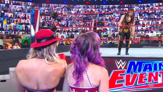
Main event giving people promo time? Is this typical??
Okay look. You acknowledged Alexa is brainwashed. You acknowledged that she chose him (even though she’s brainwashed so you really shouldn’t be upset). Now you’re claiming SHE came out and slapped you, as if you haven’t been relentlessly bothering her about her boyfriend that she chose because she’s brainwashed, and as if you weren’t the one who came out and confronted her. Is this not super problematic to anyone else??? Nikki this doesn’t make you a victim or even a decent person/friend lmao.
It’s a good promo though. Good delivery, very buyable.
WHY DO I GOTTA HEAR THE CAW MUSIC???
I know Lacey’s being a bitch, but it’s an awful hair style, Sarah. I’m sorry.
Lmao Lacey is so god damn funny when she has someone to play off of. I can see the appeal in her and Peyton, I can see it. I can see it. The pairing should absolutely not last long because Lord they’re abysmal in the ring together, but outside? Swell, just swell.
Lacey will always have a job solely for her character work if nothing else.
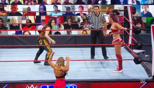
Haha Lacey running from Nikki. She’s a treat.
Really thought that spinning heel kick was gonna be the end of it.
This match is definitely Main Event(tm) worthy, but I’m glad it has some semblance of a story going into it.
Peyton’s jump kick looks dumb.
Probably for the best that Nikki loses this, even if Peyton is awful.
---
*WarGames was definitely the highlight in an otherwise really lame week of wrestling. I don’t even have a runner-up, I’m just thankful for WarGames.
#wwe#issa review#feel free to ignore these#cuz who tf cares lesbihonest#today's props goes to:#dakota kai
1 note
·
View note
Link

Not every fictional TV apartment is created equally, according to interior designers.
Interior designers liked some of the apartments seen on "Friends" and "The Mindy Project."
But apartments from series like "Gossip Girl," "Sex and the City," and "How I Met Your Mother" weren't as popular.
Visit Insider's homepage for more stories.
Television is filled with some truly eye-catching abodes, but not all on-screen apartments are created equally when it comes to style.
Insider had a group of interior designers critique some of the most famous living areas on TV.
Here's how the pros reacted to the apartments, plus what they loved or hated about each.
FOLLOW US: Insider is on Facebook
Experts thought Monica and Rachel's apartment from "Friends" had plenty of personality, but needed a few updates.
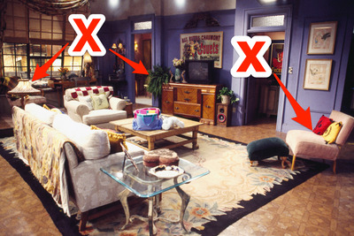
Few television spaces are as iconic as the New York City apartment where Monica and Rachel lived during the early seasons of "Friends."
Katie Stix, design director of Tennessee-based Anderson Design Studios, told Insider that she appreciated the vibrant walls and eclectic styling of the classic sitcom abode.
"The purple walls are bold but iconic. The mismatched furniture properly relays the women's young, single, New York lifestyle in the '90s," said Stix. "Though I cringe every time I see the table lamp; it's too old looking for them. Maybe Monica's aunt left it behind."
Another interior designer praised the apartment's floor plan but thought some of the styling details needed a second look.
"This apartment layout works because it leaves a circulation path from the bedroom," Lonni Paul, an interior designer based in Los Angeles, told Insider. "However, the unruly plant on the TV cabinet looks like it needs some help."
Paul also said she didn't like the red and yellow pillows on the small chair off to the side since they "stand out and feel out of place."
Read More: We had professional stylists rank 'Friends' characters from least to most fashionable
Designers thought the layout of Frasier Crane’s apartment from "Frasier" was confusing.
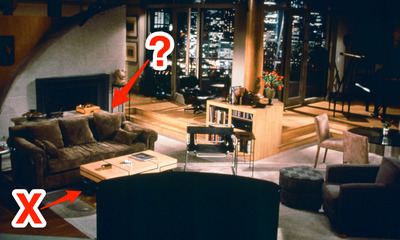
The swanky Seattle apartment of television's most famous radio psychologist may have been Frasier Crane's pride and joy, but NYC-based interior designer and former TV writer Alec Holland told Insider that the apartment's floor plan and styling could use an update.
"Why would anyone have their furniture facing away from that fireplace? I'd turn everything around, and open the living space up," said Holland.
He also suggested giving the coffee table a face-lift.
"If you replaced that horrible coffee table with something more modern and square, stacked some picture books on it, and added a few [art objects], it would up the elegant vibe," Holland told Insider.
Stix took issue with the bland color palette of the apartment and also vetoed Frasier's eye-catching coffee table.
"A little color would be welcome in this room, it is just so vanilla and beige. I wish they placed the Eames lounge chair in a more prominent place and got rid of the heinous coffee table," she said.
Ted Mosby's apartment from "How I Met Your Mother" was not a hit with designers.

Although Ted Mosby may be employed as an architect, some of his design choices left interior designers scratching their heads.
"Yikes! I don't even know where to begin on this one. The clutter is out of control and every inch of space is filled with something. The red everywhere is overwhelming," said Paul.
The layout of the apartment also seemed counterintuitive to Holland, who suggested rearranging the furniture and adding curtains to make the space more functional.
"This is another example of a TV apartment where the fireplace isn't the focal point. I'd flip this room around pronto. If the office has to stay, I'd hang a good drape that can close it off so you don't have to look at it," he said.
However, interior designer Kobi Karp of Miami's Kobi Karp Architecture and Interior Design appreciated some aspects of Ted's abode.
"I do see a drafting table in the back of the room near the window, which is exactly where I would place it if it were my apartment," said Karp.
The designer also said Ted's apartment could benefit from some hidden-storage solutions to help him creatively hide all of his clutter.
The loft from "New Girl" inspired mixed reactions from designers.

The apartment from "New Girl" is a huge space with a distinctly masculine vibe — but it's not perfect.
For starters, Paul told Insider that the furnishings of this apartment might be out of sync with its massive proportions.
"Everything here feels out of scale. The sofa is too small as well as the coffee table. The chair and ottoman feel too big by contrast. The side table to the left of the sofa is too high. I wish the sofa was a lighter color to brighten up the place. The apartment is too dark," she said.
However, Stix raved about the roomy loft and its "fresh" vibe.
"I really love everything here. The space itself is amazing and I love the sectional. The 'found' collected items are hip and fresh," she told Insider.
Although the designer did like the combination of the sofa and a bookshelf, she conceded that the apartment could benefit from brighter light fixtures or additional floor lamps.
Stylists found Mindy's apartment from "The Mindy Project" to be totally trendy, especially her home office.

Mindy's combination brownstone apartment and medical practice seems like a stylish marriage of elegance and maximalism — and designers love it.
"This space is on-point and on-trend for current design styles. I like the decorative molding and the two-tone wall colors in her office," Joe Human, NYC-based interior designer of Designs By Human, told Insider.
That said, even though the Lucite desk is cool and works well with the room, it's not exactly practical, Human pointed out.
Paul also gave Mindy's office a big thumbs up, praising the color choices and soft character of the furnishings.
"This is a super chic office and the transparent desk makes the room appear larger than it is. The light colors mixed with the pastels also give the room a feminine vibe," said Paul.
Carrie Bradshaw's apartment from "Sex and the City" earned mixed praise from stylists, who especially had issues with her bedroom.
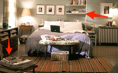
Fans of "Sex and the City" know Carrie Bradshaw for her fashion obsession and cavernous closet, but her apartment, in particular, her bedroom, provoked mixed reviews from interior designers.
"The asymmetry of the room denotes that the owner has an artistic mind," said Karp. "I like the placement of the bed, allowing the morning sun to act as a natural alarm clock for the person sleeping."
Karp also pointed out the magazine problem in Carrie's bedroom, saying perhaps she could benefit from another bookshelf so she could cut back on the tabletop clutter.
Holland, however, wasn't in love with the casual vibe of Carrie's bedroom, calling it "lackluster."
"I'd get a good shag rug, put a headboard on that bed, and maybe wallpaper behind it to create a more interesting focal wall. I'd also lose the off-center bookcase above the bed — a disaster waiting to happen — and paint that radiator a glossy black," he said.
Jerry's apartment from "Seinfeld" is surprisingly modern but also a little boring.
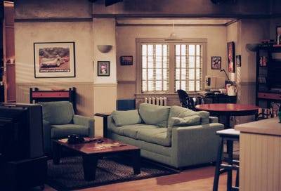
Even though "Seinfeld" debuted in 1989, designers say Jerry Seinfeld's apartment has actually aged pretty well.
"I've always liked this apartment. It's orderly with everything having a place to go. The sofa color pops making the room brighter and the modern style gives the room a point of view," said Paul.
Of course, there's always room for improvement. Stix told Insider that she would have liked to see more personality in the apartment's styling.
"My first thought is that this apartment desperately needs art. I love the couch color but it drives me nuts when the accent pillows match the couch," said Stix.
Although Stix approved of the sofa color, she disliked the apartment's muted color palette.
"The wall color is drab and looks too much like a TV set. it would have been better if the paneling and trim was a deep olive green," she said.
The Humphrey loft from "Gossip Girl" needs a total makeover, according to designers.

On "Gossip Girl," the Humphrey family's Brooklyn loft is meant to be a cool and quirky living space, but designers didn't appreciate its awkward layout and confusing combination of furnishings.
"This is such a weird space. The window and rattan-type shades are awesome, but everything else should be a start over," said Human.
Stix also found the apartment to be a little unappealing, and noted that it didn't feel like a real family's home.
"This set seems too 'decorator' and staged. I don't care for the tile floors; a stained concrete or distressed hardwood would be more appropriate," she said. "The entry area takes over the entire space and the sitting area is squished in the corner."
She suggested that adding ceiling beams would help accentuate the "warehouse" vibe that the designers may have been going for.
Read More: The first and last outfits of 12 characters on 'Gossip Girl'
Sheldon and Leonard's apartment from "The Big Bang Theory" was a total flop with interior designers.
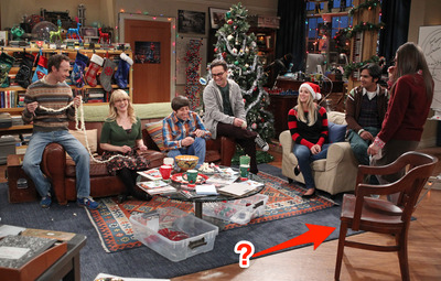
Although Sheldon and Leonard may be bonafide brainiacs, designers told Insider that the design of the physicists' apartment is anything but genius.
"This is an eclectic bachelor pad that is begging for a makeover," said Paul. "The leather sofa looks really lumpy and uncomfortable, and the wooden chair next to the lounge chair looks out of place. There's also too much clutter."
Karp was also not a huge fan of the apartment's styling, especially its eclectic mix of furniture.
"This looks like a very simple apartment that is very organized. However, the mismatched collection of furniture and décor makes the apartment look a bit like a thrift shop," he told Insider.
The designer added that the apartment could use matching pillows, and that the items displayed on the shelves could use better integration into the space as a whole.
Read More: 10 plot holes and inconsistencies you never noticed on 'The Big Bang Theory'
Don Draper's apartment from "Mad Men" is the epitome of mid-century style.

It doesn't get more mid-century modern than Don Draper's Manhattan apartment on "Mad Men."
Paul told Insider that the advertising guru's home is a great visual representation of the character's personality.
"This retro-style apartment is masculine and perfect for a type-A personality. It's organized and nothing feels out of place," said Paul.
That said, Paul has some suggestions, pointing out that the apartment would look much better with a patterned rug.
Holland was also taken with the sleek styling of Draper's urban abode.
"There's not much wrong here. I could see a more festive fabric on the sofa, but those stools are perfection. The hanging light and wood features are also all a big 'yes' for me," he said.
Read More:
We had professional stylists rank 'Friends' characters from least to most fashionable
8 relationship lessons you can learn from 'The Office,' according to a therapist
14 celebrities who got rejected by 'Saturday Night Live' and went on to become famous in their own right
from Design http://bit.ly/2VmtP04
0 notes
Text
1929 Ford Model A Roadster is a True Time Capsule, Preserved Just as it was Built in 1949
Time machine.
Blessed with a keen engineer’s mind, Tom Morris could do just about anything. Throughout his life, he approached everything that interested him with an all-consuming passion, whether that interest was in British motorbikes, clocks, or music.
“We used to call Tom the ‘Renaissance Man,’” said his longtime friend Bill Grant. “He covered the spectrum. He could write a book. Build a clock. Run a milling machine. He just knew things.” Including, Bill said, “how to design, cast, and build a quick-change rearend. Which is still under the car!”
Sixty-some years (and a paint job) separate these two views of Tom Morris’s Model A roadster. The car today is essentially the same as it was when Tom built it in 1949.
At first glance, this ’29 Model A roadster seems to be a nicely proportioned, if somewhat mild looking, A/V8. But the car isn’t as simple as it first appears. “The more you look, the more you see,” David Stoker told us as we walked around it prior to our photo shoot.
Like Bill Grant, David and his father, Terry, who run Stoker’s Hot Rod Factory in Upland, California, were friends of Tom’s. Just before Tom passed away in 2011, he asked the Stokers to get his roadster running again, so his family could drive it after he was gone.
Tom built the car in 1949, raced it at the dry lakes, took it to Bonneville, but then parked it in around 1956 or 1957, Bill says. Tom remained interested in hot rods and went with Bill to the L.A. Roadsters Show “every Father’s Day for 40 years.” But his roadster stayed parked. So today, this Model A is both a testament to the ingenuity of a talented young postwar hot rodder and also a remarkable time capsule, essentially unchanged over some 60 years.
Two views of the Model A chassis Tom built for the roadster show off the ’48 Mercury flathead under construction, the replacement ’32 K-member, stock front axle with ’32 wishbones, and the Model A rearend, which at this point had not been upfitted with Tom’s quick-change. Terry Stoker pointed out the unusual exhaust layout: From the cutouts, pipes merged into a single (homemade) muffler on the passenger side, which has two exits, also on the passenger side.
Hot Bed of Hot Rods
After graduating high school, Tom and a friend left their hometown of Madison, Wisconsin, astride two Triumph motorcycles. “They got as far as Oklahoma City before his buddy’s bike broke, and he ran out of money,” Bill relates. The friend elected to stay in Oklahoma, but Tom rode on to California, what he considered “the hotbed of hot rods.” Tom landed in Pomona and got a job in a machine shop at a company called Kilgore Industries. “He was a drill press operator, an apprentice at first,” Bill says, “but Tom was pretty talented, and he worked his way into a pretty good job at Kilgore’s.” He must have made an impression with the owner, as Tom wound up living in an extra room at the Kilgore home.
“Mr. Kilgore’s son, Bud, was also an incredible hot rodder,” Bill recalls. The Kilgore garage became the local car-guy hangout. “That’s where the action was. Tom was super innovative. He had so many ideas. We’d hang around him just to listen to him. We thought he was a far-out guy, but he was right on and just light years ahead of what was going on.”
Tom trailers the roadster’s body behind his Model A coupe. Bill Grant recalls that the coupe, powered by a ’41 Merc flathead, was Tom’s driver, the roadster his race car. Terry wasn’t sure if Tom used a 1928 roadster body (which didn’t have external door handles) or a 1929 body with its handles removed and filled. We don’t see any obvious signs of bodywork on the doors, so we’re guessing the former is true.
Tom was four years older than Bill. “He was here in 1948, when I was still in high school. Bud was a year ahead of me. But in those days, if you were a hot rodder, age wasn’t as important as what you were driving. The high school caste system—you weren’t anything until you were a senior—didn’t prevail among hot rodders.”
Pomona didn’t have a roadster club at the time, so Tom and a friend, Jack Clifford, became members of Pasadena’s Velociteers car club and were their “local reps” in the Pomona area. Bill would tag along with the other Pomona guys when Tom and Jack ran Russetta meets at El Mirage. “We wanted to be there when he ran 100 mph.”
Tom Morris wrenching on his roadster.
Tom-Built
The locals had a way to describe the handiwork on Tom’s and Bud’s hot rods. “It was ‘Tom-built’ or ‘Bud-built,’” Bill says. “If it was Tom-built, you wouldn’t find it anywhere else. Like that quick-change.”
Photos from Tom’s family show the roadster’s beginnings: a chassis under construction and a bare body being towed behind Tom’s flathead-powered Model A coupe. Like the roadster itself, the story behind its buildup survives from the 1950s, via a magazine article Tom wrote for Speed Mechanics magazine in 1953. (That article formed the basis for Tony Thacker’s story about the Morris roadster in the Winter 2017 issue of Hop Up magazine, from which Hop Up’s Tim Sutton graciously let us use his scans of Tom’s scrapbook photos.)
Tom’s roadster evolved over time. The license tag on the version without fenders is from 1950; the later shot is from 1952. Bill Grant says the fenders were Tom-built, and he attached the fronts to the brake backing plates so they’d turn with the wheels. Note that Tom also mounted panels to fill the rear quarters.
Tom built the car on a ’29 frame. He swapped the stock crossmember for a ’32 K-member, and ’32 wishbones located the Model A front axle. The rearend and suspension were stock Model A except for the Tom-built quick-change center section.
Bill says Tom “figured out” how to match the gears in the q-c with the transmission to get speed from the car. “People asked, ‘How can you go so fast in Second gear?’ He used those old, 26-tooth, long Lincoln gears when he went to Bonneville.”
Tom built the flathead using a 59A Mercury block that was bored, stroked, ported, and relieved. It’s fitted with Sharp heads and a three-pot Sharp intake. When Tom raced the car, all three carburetors were fed by a fuel block that dangled from the hood struts. On the street, just the two outboard carbs were plumbed.
Then, and now, the roadster has a ’32 dash filled with Stewart-Warner gauges and late 1940s Chevy switches and knobs. The drop for the ’40 column is Tom-built. Terry says Tom complained about paying $18 for a new Crestliner steering wheel in 1951.
“I can see Tom, just as plain as it was yesterday, with a quarter-inch piece of plywood with slots in it,” Bill recalls. “The slots corresponded to carburetor jets. He had his own jet board. If you needed a lot of gas, a little gas, to go lean or rich, he had the board. Depending on who he was racing and how fast he wanted to go, he jetted.”
Tom also took a unique approach to the flathead’s ignition. In Tom-built fashion, he converted a Lincoln Zephyr V12 distributor and coils to fire eight cylinders.
“The Spalding brothers, they took that ignition idea and ran with it,” Bill says. “They made a lot of money equipping hot rods, but Tom didn’t care. He built one, and that was for himself.”
Terry and David Stoker are both tall guys, and they say, “We can’t drive the car. We don’t fit. Tom was 6 foot 3, we don’t know how he did it.” Tom did move the seat back 3 inches, but even so, “the wheel was right in his belly button, and his knees were folded out,” remembers Bill. “It was something else.”
Tom ran at El Mirage from 1949 to 1952, and he took the car to Bonneville in 1953. Russetta timing tags show speeds ranging from 100 to 113 mph, and at Bonneville his fastest speed was 110.
Bill says Tom drag raced the roadster, too. “Tom became an influence for the younger people in town to go to the Pomona Valley Timing Association dragstrip on Sundays, to knock off all the illegal crap on the highway.” When we mentioned seeing a very grainy photo online of Tom in the roadster looking like he had been pulled over by two police officers, Bill asked if one of the cops had sergeant’s stripes on his uniform. “That would be Bud Coons,” he said, referring to the Pomona police officer who went on to play an integral role in the formation of the NHRA as a leading member of the Drag Safari. “Tom cooperated with Coons to help stop illegal drags. That photo was probably set up.”
Tom had the Mercury 59A block bored to 3-3/8 inches and the crank stroked to 3-7/8 inches, bringing displacement to 277 ci. The Sharp cylinder heads and intake manifold were chrome plated, “but you’d never know it now,” says Terry.
Parked
Tom Morris put his roadster in his garage in the mid 1950s and left it there. “He just parked it,” says Bill.
“Tom got into a lot of things,” Terry says. “That’s why the hot rod sat parked.”
“Tom started collecting guitars,” Bill adds. “He’d tinker with his motorcycles. He played the bass guitar and had a stand-up bass fiddle. He played in a musical group, weddings and such. And he had his ’29 coupe in the garage. But he kept the roadster parked. Every once in a while he’d go out and look at it, and I’d go out with him and ask, ‘When are we going to get it running again?’ He’d say, ‘One of these days.’”
On the street the flathead was fed by the two outboard Strombergs, but in race trim Tom had all three flowing, with fuel delivered via a block hung from the hood struts. When the Stokers rebuilt the carbs, Terry cleaned their internal passages but did not dip them, so their patina would remain undisturbed.
In 2008, Tom, Bill, and the Stokers put the roadster on a trailer and took it over to the Pasadena Reliability Run, where Tom renewed acquaintances with members of the Velociteers. The car was a hit, but Tom didn’t seem to grasp the significance of his historic hot rod, and back in the garage it went. It wasn’t until Tom’s deathbed request of the Stokers to get it running again that the car finally reappeared.
Terry and David performed a sympathetic refurbish of the roadster’s running gear. Coker supplied Firestone tires to replace the originals, as “chunks of the tires were coming off as we were pushing the car around,” says Terry. He rebuilt the carburetors by cleaning their internal passages, careful not to disturb their external patina. Speedway Motors supplied a brake master cylinder, wheel cylinders, and hoses to get the brakes working; Bill McGrath at the Early Ford Store provided brake shoes.
Tom figured out how to use the distributor and twin coils from a Lincoln Zephyr V12 so they would fire the flathead’s eight cylinders. As he did with the carburetors, Terry “didn’t touch the case” during the engine’s freshening in 2012.
“The engine fires, it’ll run,” Terry says, “but it’s tired.” We elected to push the roadster around for our photos.
The Stokers are active caretakers of the car, showing it whenever possible. They want people to see it, appreciate it for its historic value, and get a sense of who Tom Morris was and all the neat Tom-built tricks he put into it.
Likewise, Bill Grant is “glad to spread the good word, the good news” about his old friend. “Tom was a pioneer hot rodder. He enhanced my life incredibly, in his way of influencing the guys around him. He’d always help you. We’d relish the moment Tom was going to do something. It was going to be fun.”
All the chassis component remain just as Tom built them in 1949. The brake hoses are new (from Speedway Motors) in the interest of safety. See the keyed latch on the hood side? Tom put one on each side, sourced from ’36 Ford gloveboxes.
The rearend remains Tom-built, including the one-off quick-change. Only the brakes have been freshened. The roadster will be on display at the special Model A 90th anniversary exhibit at the 2019 Grand National Roadster Show. Terry says they were asked to “clean up” the car for the show. “I’ll wipe down the body, but I won’t clean the chassis. That’s caked-on El Mirage dirt, part of the car’s past.”
Tom cast his own headlight stanchions, and mounted ’40 Ford commercial headlights to them. Coker provided Firestones to replace the disintegrating original tires, 5.50-16 front, 7.00-16 rear. They’re mounted to 16-inch Kelsey wires.
Inside the trunk, the battery is in that wooden box next to the fuel tank. The wooden crate holds seatbelts, while the car’s tonneau is folded next to it. Terry has seen photos of the car with a fuel tank mounted in the cockpit next to Tom. He pressurized it with a hand pump mounted under the dash.
Vintage photos show the roadster painted black, though at some point it was repainted red with yellow wheels. Terry remembers that Tom preferred it in its original dark hue.
Racing Roadster
These shots from Tom’s scrapbook show the roadster at El Mirage, date unknown. The cam credit lettered on the quarter-panel: Hammer-Chisel.
The post 1929 Ford Model A Roadster is a True Time Capsule, Preserved Just as it was Built in 1949 appeared first on Hot Rod Network.
from Hot Rod Network https://www.hotrod.com/articles/1929-ford-model-roadster-true-time-capsule-preserved-just-built-1949/
via IFTTT
0 notes
Photo

Retail Insights February 17, 2018
http://ift.tt/2ExhQr7
Click on an image below to zoom in & open photo gallery >>
Would u buy a see-thru luggage
www.myer.com.au
Mall wants u to buy more with its iPhone App
Stores Directory orient u to ur destination
Does your country's mall communicate roller door safety message
Find Cosmetics as u tear open ur presents
Onesie propped up akin to Mannequin max profits
Never get Bored with this Push-Up kit
Minnie Mouse warm ur toes for u
Quick access to Clean Baby with this outfit
Study Desk strategically displayed at store's entrance max product awareness
Chat with ur mates in style in this futuristic seating dome
Engage Gamers to Read Books with this Book Cover Design
Design of Nail Polish Shelf attract attention
Switch from Paper Towels to Air Dryers for the environment
TABBED shelves reduce shoppers frustration in finding product in giant store
Magnifying mirror allow u to focus on perfecting every pore
Mysterious Game Trailer wrapped in Style
Be Pampered with the Gymnastic skills of this Masseuse that guarantee u a happy ending
Smelly Air Dryer with poor design
Game Trailers on TV by cashier blasting to queuing customers max return business
Incline Display TV max vantage angles to up profits
Freak out the Girls with this Infrared Spider
Mannequin wired design allow 3-dimensional view of product that would be otherwise unviewable
What to do when u ran out of space to hang SALE signage
Escalator near mall's entrance max traffic to upper levels
Let shelf pack help to organise your luggage
Beauty of Display Mannequin maxed by not having glass edges
Having fun with LOREAL app
Give shoppers a reason to buy with ur clear communication
Layout of arrows by grouping avoids confusion on directory
Being upfront about max pricing of items draw customers into jewellery store
How to organise sleeping bags for quick view and access
Brochures holder communicate company website
Mall's flooring symbolise brand logo
Glittery feather light bird
Frame the perspective of customers with repetition
A year worth of CHANEL perfume for ur pleasure
Dome case adds prestige to product
Inviting floor space at store entrance max profits
Gold plated SALE sign differentiate from the others to max profits
iPhone without heavy security cables
Mannequins advertise Clearance SALE
Mysterious veil peaks your curiosity on brand name
Turn dull shelf backdrop into selling point to attract shoppers
Quirky line attract mothers to buy maternity wear
Would you go on a blind date with books selected by bookshop
Balloons float product n capture attention by reflecting people's face
Cute turtle shrinks head to evade attack
Brochures targeted for different purposes
Shelves with tags that summarise product brands
Malls info desk offer free newspapers for your reading pleasure
Watch repair shop with Giant clock that attracts customers from afar n tell time
Books designed to attract music lovers to read
Beauty salon reinforce its service through mirrors that customers face at
Pet shop advise customers not to tap into puppies enclosure
Tear off tab of tissue box remove fine prints for ur retention
Happy children found with Mickey n Minnie at Highpoint mall
Just mucking around at Highpoint shopping mall
Which petshop allow your pets to walk around in the store
How to build brand reputation with waiting customers at the cashier or weighing machine
Attract wider customer demographic with a range of discounts versus a single discount
Mysterious UNIQLO mannequin hiding behind SALE signage
Multiple tags of same pricing max item outreach to passing customers
Balding mannequin in sparse clothing draw u closer to salon
Imagine mannequin shouting SALE in speech bubble
Furry ball adds style to winter beanie
Don't miss out on current deals before u board the escalator
Who says exposing more flesh is sexy in this bikini outfit
Imagine a giant book icon alerting u of items location from afar
Tabbed shelves reduce stress from finding item in Giant store
SALE signage does not obstruct each other from key vantage point
Max toy profits by communicating adventure vision with low-cost design
Mirrors assist customers with informed headphones purchase
How do u turn dull corridor into cool art
Ergonomic Scissors designed at the right angles for easy usage
Jewelry DIY Brochures Guide positioned by materials on shelf
Lamp + Magnifying Glass in one expedite jewellery making
Shopping Baskets with Conspicuous Signage to encourage usage max profits
What could supermarket learn from this store to install similar signage that could max profits?
Advertise staff ability to speak tourists languages max store's profits
Mannequin wearing spectacles got bullied by others
1 x Mannequin per product shelf
Cross-sell umbrellas at Men's Business Wear
Mannequin in athletic poses max sports profits
Would u choose this baby wipe
How to use sex to attract attention to store SALE
Signage upfront alert potential customers on presence of other shops
How to show exclusivity of product with price tag
MUST HAVE price tag compel u to buy
Price tag guarantee u get the best deal
Engage the imagination of customers with product on smiley to max profits
Wat better way to sell a best seller by communicating with bestseller tag
Artspace in Melbourne
Max brand awareness by communicating product demonstration times at storefront
Giant price tag capturing attention max product profits
Sell girl's toys with ad with sparkling lights
3D model of Self-available at Officeworks
Group of Mannequins with same facial features n skin colour project uniqueness of outfit
Simple One Worded Ad on Pillow gets to the point
Beautiful Flowers Paired with Lingerie Product Max Profits
This Heel keep the sides of ur feet protected
Red light indicator indicates power adapter's surge protection is active
TV at the foot of each escalator advertise mall's style
STD = Standard or Sexually Transmitted Disease Clothing
Fashion Items hanging from Rotating Belt
Tyrannosaurus Icon max toy sales
Turn boring mall's pillar into captivating tree to max profits
Auto Business Shoe Polisher Found at the Gym
Giant Flag helps customers identify location of store from afar
Brand VALUES message on displayed clothing max profits
Brand VALUES message on displayed clothing max profits
Play on words from REBEL to REBELLE max toy profits
If only label tag at ankle level incline upwards to eye level where customers are standing upright
I wish you well. Please see enclosed photos and my feedback below:
Learning from Woolworths and COLES, I hope that label or price tags at ankle or thigh level would incline upwards facing customers standing upright at most populous vantage point; in order to allow easy view and maximise message outreach to as many customers as possible.
Please kindly investigate this matter and share this feedback with your circle of influence.
Thank you for your time in reading this letter.
Explicitly communicate gift idea with tag max profits
Communicate actual savings on tag make clothing profits
Side view of heels to populous vantage point make store profits
Mannequin in array of freedom poses max profits
Model snuggling in comfy clothing max shopping craze
Price tag on expensive product at store's entrance vantage point turn customers away
Panties with ribbon adds spice to foreplay
Curvy waistline of mannequin max profits
Purple feathered backdrop max profits
Conspicuous round tag organise clothing by sizes
My newly designed Kathmandu bag with flap that guards against rain
Brochures stand at store entrance attract shoppers to buy out of their budget
Happy phone mascot
3-dimensional design of lighting alert user standing further away
Position discount sign beside brand name max profits
Y do u not need ID to buy a knife in your country
Reduce customer hassle by buying container n cookies separately with this design
Men in colourful jumpsuits capture your attention on pen's brand
Giant product category signage installed around the electronic store
How to nurture kids with a gracious heart to raise adoption rates
Mannequin with power pose max profits
Mirror integrated with clothing shelves allowing customers to quickly match with skin colour max profits
Clothing shelf with NEW sign
Chic mannequin checking out some tunes
Design of marker tip caters to wider range of lines thickness
Petrol station hopes that u will keep quiet as u exit the premise
Petrol mart communicate all services at entrance with sign to max profits
Hi,
Thank you for reading this post. I hope you have enjoyed it.
Unfortunately, my son Ethan is born small, unwell and I need your help, please :(
If my insights have benefited you & your circle of influence, I am begging for your help by:
clicking on the advertising banner below to earn a few cents for my baby's medical bills.
I will appreciate if you could share this site with everyone in your sphere of influence.
It costs you nothing; you don't need to buy anything after clicking the advertisement; it only takes a few seconds of your time (No scam promise)
Thank you for your kind help, and God Bless you and your family.
Our Ideas, Our Ideas - Retail
February 17, 2018 at 11:15AM
0 notes
Text
UX Design Patterns for Mobile Apps: Which and Why
Developers and designers don’t always get along. We spend days working on something and then hear “That’s not possible, change your design” or “we’ve changed our minds — change your code”. But fortunately, designers and developers do agree that what matters in the end is shipping a useful app that is enjoyable to use.
The apps we create aren’t completely unique. For example, Uber, YouTube, and Slack solve three very distinct problems: getting from A to B, video access and creation, and communication.
Along with their differences, these widely used mobile apps also have similarities. Consider that they all face the recurring (and boring) problem that is authentication, and they do it by using the recurring solution that is the log-in form.
Solutions for recurring problems like this are known as UX design patterns. UX design patterns offer three main advantages:
Cost savings: You can reuse and adapt solutions rather than start from scratch.
Reduced risk: Patterns emerge after a solution has been tried and tested by many, making it more likely to result in a good outcome with fewer bugs than usual.
Familiarity: Patterns enable a shared vocabulary between designers and developers and reduce barriers between groups in the organization.
UX Design patterns can be composed of smaller, more specific patterns, such as a password visibility toggle that reduces mistakes from not being able to see what you’ve already typed.
Which UX Design Patterns
In this article, we’ll skip basics such as lists, search or log-in forms. Instead, we’ll focus on these five advanced UX design patterns for mobile app UX — speed, security, and comfort:
Skeleton Views
2-Step Authentication
Accelerator
One-Handed Usage
Intelligence
Each UX design pattern is described in detail below, with tips on how and when to use it, along with some real-world examples of each.
Skeleton Views
The Skeleton view makes your app feel faster.
My experience is that users are more time-sensitive than you think. Research by Google suggests even delays as small as 200ms push users away. This is why Google has invested heavily into making content appear faster with a fast web browser, and numerous other technologies such as AMP, HTTP2, and many other initiatives.
Instagram, now with 700 million users, understood very early that speed matters. To drive engagement, it made posting and other common actions in its app appear to happen instantly for the user.
When To Use It
Skeleton views should be used whenever network or processing speed limitations prevent your app from responding immediately to user choices.
Do not assume everyone has a fast network connection or a fast processor in their phone. At the same time, creating a skeleton view for every single view and screen is unnecessary if the view doesn’t depend on the network, or if it’s not accessed daily by most of your customers.
A skeleton view can be used to replace a launch screen. Facebook does this on its web, Android, and iOS apps. It’s the first thing you see when you launch the app.
You can also provide a skeleton view for specific items in a list, grid, or any other view. This is particularly relevant if you’re doing partial data loading, such as when you’re loading just the bytes you don’t have already cached.
Instagram loads likes for a post and a few of the post’s comments when that post is displayed in the timeline, but it only loads the full comment thread once you tap to see the details of that post. Interestingly enough, it doesn’t yet provide a skeleton view for the comment thread or timeline posts like Facebook does.
Tips
When I first started adding skeleton views to the apps I design, I had to ask myself: Which views should have a skeleton equivalent? How tall should the skeleton of a text label be? Which shade of grey should I use? How do I transition from skeleton to the loaded view? How should I animate the skeleton views?
As you likely have similar questions, I’ve included the answers in the form of a video and list of tips below.
Your browser does not support the video tag.
Some tips on creating skeletons:
The skeleton views use a subtle grey for placeholders.
Use a subtle transparent-white-transparent gradient, animated left-to-right on all placeholders.
Images/Icons simply become grey frames.
Text becomes a slightly rounded rectangle with a height matching the lowercase x character of the font used in it.
States have no skeleton, e.g. tab bar selected state.
The layout is simplified with conditional and smaller icons or details removed. For example, Foursquare only displays skeleton views for title and description of a search result, not the visit count detail or optional last visited time text.
Prioritize frequently accessed screens that depend on network or processing speed to be displayed
Create skeleton views for elements such as images and lists so they can be reused throughout the app, instead of creating a skeleton for the screen itself.
Two-Step Authentication
Two-step authentication improves the security of user accounts.
The problem with the traditional username and password UX design pattern is that passwords aren’t changed often, they’re shared between services, and password managers are often required to handle hundreds of service-specific passwords.
Two-step works by generating a temporary One-Time Password (OTP) remotely on the server when the user starts the log in process, and sharing that temporary OTP with the user via SMS or Email. The user then types the temporary OTP, completing the log in process and causing the password to expire. See the tips below for ways to avoid the typing step.
The temporary nature of OTP and their delivery methods means that users don’t need to create or remember passwords, nor they can share them between services.
When To Use It
For most services, Two-Step offers a balance between security and convenience.
Two-Step is the primary authentication method for mobile apps such as WhatsApp, with 1.2 billion monthly users. Others such as Facebook, Google, Dropbox, and Apple offer Two-Step as a fallback for Two-Factor Authentication.
Without going into much detail, the drawback of Two-Step is that SMS and email, with some effort, can be compromised. Two-Factor is a stronger but harder to use alternative. Two-Factor is stronger because it doesn’t rely on SMS or email.
Instead, codes are generated locally within an app or dedicated hardware as the second factor, the first being the username or email. This makes it harder to access the OTP for both attacker and user.
The bottom line is this: While not perfect, Two-Step is an improvement over username and password authentication. Most users will make the claim “as a user, I don’t want to install an app so I can register or log in to my account” — despite what you may have read in other (fantasy) user stories.
Also note: as Two-Step requires an SMS or Email sender, you may have to weight OTP distribution costs based on how many users you’ve got.
Tips
You can make Two-Step even safer for your customers by pairing it with Delayed Registration, Magic Links, and Android’s SMS Access.
Delayed Registration means the first thing your users see isn’t a form or an onboarding flow. Foursquare is an example of this. You’re allowed to browse freely without an account, but certain actions and screens promote registration and log in (see the image above).
The advantage is that users are more likely to register after they’ve tested your app and understand how it’s valuable to them.
During this period, it’s likely the user has provided a phone number or email while ordering or booking a cab, so you can even prefill the Two-Step registration form for an even simpler registration flow.
One tricky bit is merging data created by the user during their usage as a guest. What happens when the address provided during a guest booking is different from what is in the account they then log into?
My recommendation is to adopt a save-everything approach.
For properties that may contain multiple values, save all existing values; for single-value properties, the best you can do is display a review screen where the user can pick the desired version. Optionally, you may simply override older values with the latest ones provided by the user.
Magic Links: Apps like Slack generate what they call “Magic Links”, which is a fancy name for a URL containing the One-Time Password. When followed, this URL opens the app, which can then read the OTP from the URL itself instead of relying on the user to manually type it in. You can implement your own Magic Links with App Links (Android) or Universal Links (iOS), and send them via SMS or email.
SMS Access: On Android O, you can add a new method to automatically retrieve One-Time Passwords sent via SMS, saving the user from manual inputting and allowing your app full SMS access.
This was the method I chose for a previous client, as it offers by far the best experience on Android (or any other platform) as it takes literally seconds for a user to log in or register.
In one case, my client went from a 12-field form down to a 2-second registration process. Consequently, conversion rates for registration went way, way up.
Ensuring account access: Although unlikely, users may change phone numbers or lose access to email.
Always remember to collect multiple contact details to use as a backup contact method for sending OTP codes. This is mainly a non-issue, as the longer the user uses your service, the more likely it is for a backup method to be in place.
Immediately after registration, you may not have a backup contact method, but there’s also no data to lose in the newly-created user account.
Tips
To increase the likelihood users don’t loose access to their account, ensure you gather alternative contact methods.
Be mindful of places where users naturally provide their contact method, and prompt for authentication when they’re not mid-task, such as when they’re waiting for their order to be completed.
Use Android O’s new SMS Retriever API to retrieve the authentication code without burdening the user. Full SMS access might work on older Android versions. Consider using Magic Links as detailed above.
Copy matters! Place the authentication code at the very beginning of your message so people can see it in the system notification preview. Use Chunking to make it easier to read by splitting the 6-digit code in two 3-digit parts.
Accelerator
Your browser does not support the video tag.
Accelerators are hidden shortcuts that allow users to perform actions or view content more efficiently.
Because they’re hidden, Accelerators should never be the only alternative, but instead complement slower ways of using your app.
This single Instagram screen contains five hidden accelerators:
Tapping the status bar instantly takes you to the top, faster than scrolling.
3D Touch on the author (or long-press on Android) displays an account summary with name, post/follower/following count, and the top six photos. While a simple tap would display the same information, 3D Touch shows it as fast as tapping, unlike long-press, and exposes the three most used actions. More importantly, it allows for instant dismissal by releasing the finger. This is valuable for those who peek into multiple photos or accounts in a short space of time (as seen in the above video).
Swiping left/right lets you create a story/direct message, which is easier than tapping the icons on the hard-to-reach top area of the screen.
Long-pressing the tab bar plus button invokes post from your Photo Library, which is one less step compared to tapping the plus icon, waiting for the animation to finish, and then tapping library.
Long-pressing the tab bar account button displays the account picker. This is easier than tapping account, tapping settings, and scrolling down past all settings.
The takeaway is that all these shortcuts are hiding in plain sight, facilitating or doubling functionality without adding extra buttons to this screen.
When To Use It
Use Accelerators when you want your app to serve the majority of your users who need an obvious but slower interface, as well as serve advanced users who are willing to learn shortcuts to get things done more quickly — without compromising the experience for either of these groups.
In a content app such as Instagram, the majority of users will skim through the timeline, and you’ll want to promote content interaction by making it obvious and dead-easy to use. A smaller group will post content more often, grow their follower base, and have multiple accounts. In this case, Instagram has filled its consumption interface with shortcuts for the creators, as seen above.
Even when all your users are part of the advanced group, accelerators are still a better option than alternatives such as customizable interfaces that, while powerful, burden everyone with thinking about the right settings. This also makes your app more complex to use and maintain.
On authoring apps such as Final Cut Pro, or code editors such as Xcode or Android Studio, the majority of users are familiar with accelerators such as keyboard shortcuts, and rely heavily on them to get work done. Without keyboard shortcuts, giving emphasis to this piece of text would’ve taken me more than a simple Command+B. As a developer, searching the project navigator and clicking the file I want to edit would be a distraction compared to Shift+Cmd+O (Quick Open) or Ctrl+Tab.
Tips
Accelerators should not be the only way to access a feature or content in your app.
Use analytics and talk to customers to determine what content and features should be made more accessible through accelerators
Educate your users, as accelerators are usually invisible to your users. Show them where the accelerators are, how they work, and what users get out of them.
Consider all available triggers for your accelerators:
Tap
Double-tap
Long-press
3D Touch (Peek & Pop, Quick Actions)
Swipe Navigation (swiping between screens, dismiss by swiping upwards)
Swipe Actions (swiping on list items)
Look for common accelerators on Android and iOS. Users are more likely to know them and expect them to work on your app as well. For instance, swipe actions are now part of many iOS and Android apps. Apps like Mail and Gmail let users swipe left on an email to reveal archive, toggle unread, or other common actions.
Use long-press only when 3D Touch isn’t available, such as on Android or older iOS devices. Long-press adds a 1-second delay and is more likely to be triggered accidentally compared to 3D Touch.
When using an accelerator, people aren’t looking for the full content or all possible actions. Pick a goal such as searching for a specific venue on a map so you can get directions to it, and instead of showing all photos/reviews/full address, show only one photo, overall rating, and the distance. Narrow down the possible actions to getting directions, calling, sharing, viewing the website or seeing full details.
One-Handed Usage
Your browser does not support the video tag.
One-handed usage makes your app easier to use on larger screens as well as on regular-sized devices where you only have one hand available. To allow for one-handed usage, navigation and primary actions must be possible without repositioning the holding hand or use a second one.
In the video above, Apple Music is used as an example of an app where playback, browsing, and functions like Add to Queue can be performed without reaching beyond the bottom area of the screen. Notice how Edit (library shortcuts), User Account, Add (to library) and other secondary, less-used actions are nearer the top of the screen and thus can be put out of easy reach.
Android and iOS already provide components such as bottom/tab bars, floating action button and swipe navigation, but it’s up to you to use them in a way that makes your app easy to use.
Built-in behaviors like iOS’s swipe navigation or Android’s back button are designed with one-handed usage in mind. But it’s up to you to use built-in components like the bottom/tab/tool bar, floating action button, bottom sheet or snack bar, to make your app easy to use with one hand.
When To Use It
With enough effort, any app is usable with one hand. What one-handed usage aims for is effortlessness, as opposed to balancing your phone in your hand while trying to beat the world record for the longest thumb just so you can book a cab while holding your luggage at the airport.
If you’re not designing a desktop or tablet app, one-handed usage should always be on your mind. It doesn’t mean that every single thing in your app should be usable with one hand, but the main actions should be within easy reach.
The above screenshots show the Lyft app before and after it was redesigned for one-handed usage. When ordering a Lyft, users primarily need to select the service type and pickup location. Notice how in the redesign these actions are within the easy and average comfort zones, but account and free rides remain out of reach as they’re less-frequently used secondary actions.
Tips
Exhaust the possibilities of system-provided user interface components first, such as tab bars, bottom sheets, floating action buttons, swipe navigation and swipe-to-refresh, before creating custom solutions users may not be familiar with and ones that you’ll have to spend time creating and maintaining.
On every screen, think about what has and what doesn’t have to be reachable. Make sure you don’t clutter the bottom of the screen with unrelated or too many features that are unrelated to the goal the user is trying to achieve or doesn’t use often.
Keep in mind that techniques such as double-tapping or swiping up/down to zoom in/out and edge-gestures lack discoverability. Therefore, you’ll have to educate your users about them during the on-boarding process.
Use icons on the navigation bar to also display state, such as adding a red dot to the Direct Messages icon to inform about unread messages.
Educate users about adjacent screens. For instance, Instagram shows Stories and Direct Messages buttons on the navigation bar, which is also accessible by swiping left or right anywhere on the screen.
Intelligence
“A computer should never ask the user for any information that it can auto-detect, copy or deduce.” — Eric Raymond
Eric’s right: Computers can access and understand large amounts of data, and use that data to make predictions or act on our behalf.
Users expect your app to have some basic intelligence, they’ll use it more and rate it higher.
When To Use It
Basic intelligence doesn’t require you to be a machine learning specialist. Something as simple as setting an input field type enables the OS to offer its own intelligence in the form of password suggestions or credential autofill. A good example is the Android O Autofill from the 1Password blog.
With a little bit more code, you can let the OS understand content in your app and present that content in a context that makes sense for the user. In the example above, Apple Maps shows a venue I’ve looked at recently on Foursquare, making it easy to get directions.
You can also be smart about using sensor data to present relevant suggestions for a given moment. Uber avoids suggesting you get a ride home when you’re already there. Instead, they display recent destinations that exclude your current location.
The Awareness API is built-in to Android. Recently, I’ve used it to offer driving directions, if the user is driving, or walking directions when the user is on foot. It also supports other forms of intelligence based on time, location, place, activity, weather, beacons, headphone status, or a combination or multiple characteristics.
The Card.io Uber integration for automatically adding a credit card was what allowed me to signup to Uber and quickly get out of a dodgy neighborhood at night the first time I visited San Francisco. Instead of typing in the 12-digit card number, name, and expiry date in the street at night, I simply pointed it at the card and moments later I’m counting the seconds until my driver arrives.
Users of ASOS, a UK online retailer, were finding it difficult to find the right product in a catalog of thousands of products, even with advanced search and filtering. What ASOS did was relatively simple: they trained a basic image recognition algorithm with images from their catalog, and allowed users to upload arbitrary images so they could be matched with similar products in their catalog.
Natural language processing is an interesting way to add intelligence to your app. In the past, I’ve used it to present people with trivia and products related to the content they were reading and watching.
Back then, I had to partner with a machine learning specialist company, later acquired by Microsoft. Fun fact: the app wasn’t able to understand that when Big Bird says “C is for Chair”, he wasn’t talking about an “Electric Chair”. Nowadays, natural language processing is built right into Android and iOS. It probably still doesn’t know it’s inappropriate to show electric chairs to kids, but the technology itself has become a commodity.
Another interesting example shown at WWDC 2017 involved using NLP to group content from multiple social networks into themes. Searching “hiking” photos given a search term of “hike”, “hiked”, “hiker”, or any other variation.
Tips
You don’t need a machine learning model to suggest event locations. Simply look at similarly-named events and their location. Move up to machine learning only when necessary.
Give the user an opportunity to review and accept suggestions.
Explore and understand available sensors, such as camera, GPS and others, along with available data sources, such as the Photo Library, Contacts, SMS, Apple Pay, Android Pay, and Autofill.
When accessing data sources, use a just-in-time approach when the user accesses the feature, or use pre-permission dialogs to set things up ahead of time.
Research available technologies. Android and iOS make it easy to add general intelligence and Machine Learning to your app.
Summary
You’ve covered five advanced UX design patterns to address users’ needs for speed, security, and comfort:
Speed matters when it comes to retaining users. Skeleton Views make your app appear faster and are used by Facebook, Slack, others.
The convenience of 2-Step Authentication increases registration metrics and account security.
Advanced users can count on Accelerators to get more done in less time.
For when you’re out-and-about, One-Handed Usage is crucial.
Finally, our apps must use Intelligence to make our lives simpler and stand out against competitors.
As a good next step, keep an eye on how users use your app. Talk to them and understand their problems in a deep and meaningful way. Prioritize those problems by looking at how often they occur and how many people experience them. Focus on frequent problems, experienced by the majority.
Once you understand the problem, then turn to UX design patterns and Apple’s and Google’s design guidelines to see if there is a feature that would solve those problem and make users’ lives simpler. If you manage to solve their problem and improve their experience, you’ll see a related boost in app ratings — and app revenue!
Do you have any UX design patterns you’d add to this list? Let me know in the comments!
The post UX Design Patterns for Mobile Apps: Which and Why appeared first on Ray Wenderlich.
UX Design Patterns for Mobile Apps: Which and Why published first on http://ift.tt/2fA8nUr
0 notes
Text
All The Gritty Details On Chevy’s New 755hp LT5 Powerhouse!
There’s a New King of the Hill.
In 1990, regular production option ZR1 was a special performance package intended to transform a base Corvette sport coupe into the fastest production car that could be sold in the U.S., and it was nicknamed “King of the Hill.” Federal exhaust emission regulations started horsepower numbers falling in 1971, and when they bottomed out in 1975 the Corvette’s base 350 was left with 165 hp before slowly making a comeback, reaching 245 hp in 1989. But in 1990, power-hungry buyers had a choice. The ZR1 package included the 375hp LT5 which would reach 405 hp in 1993, all out of the same 350ci displacement. At the time, however, it was thought it took four camshafts, 16 fuel injectors, and 32 valves to stay within current federal emission standards while making this kind of power. Articles on the ZR1 started appearing in 1988 (anticipating a 1989 introduction), but when its launch was pushed back to 1990, instead of losing interest, power-starved horsepower junkies like us just got more excited, and for 10 years this author owned the 39th ZR1 ever built.
The 1990 LT5 was such a sensation that noted author Anthony Young wrote a book about it titled “The Heart of the Beast,” and for the time what a beast it was. With the Corvette’s base 350ci L98 rated at 245 hp, the 350ci LT5 started with 375 hp and reached 405 hp in 1993. The first LT5 remains the Corvette’s only double overhead cam, 4-valve-per-cylinder engine, and was manufactured under contract by Mercury Marine in Stillwater, Oklahoma.
Lotus in Hethel, England, was part of GM at the time, and they designed the LT5 based on their stillborn Etna 4.0-liter V8 architecture, with CPC (Chevrolet-Pontiac-Canada) Powertrain division developing the induction system in Warren, Michigan. CPC Powertrain Engineering was also rethinking their 30-plus-year-old pushrod V8 to determine what it was going to take for it to produce the DOHC LT5’s 405 or more hp. They started by redesigning most of its major components. This brought the second-generation LT1 350ci V8 up to 300 hp in 1992, with an optional 330hp version, the LT4, coming out in 1996. But to make further gains required an entirely new architecture that all later generations have been built on. The 1997 Gen III 345hp LS1 shared nothing with the past except 4.40-inch cylinder bore centers. The LS1’s 90-degree aluminum block had cast-in iron cylinder liners which reduced its displacement to 346ci, with four-bolt main bearing caps cross-bolted through deep side skirts. The heads were also cast aluminum with equally-spaced identical ports topped by a composite intake manifold flanked by individual ignition coil packs over each cylinder on cast aluminum rocker arm covers.
The LS1 was introduced with the fifth-generation Corvette coupe, which was followed by a convertible in 1998 and a hardtop in 1999 that became a dedicated extreme performance model in 2001, which was named after the 1963 Sting Ray’s Z06 racing package. Unlike the 1963 Z06, this version included a hopped-up engine, the LS6, that easily bested the 1990 double-overhead cam, 32-valve LT5 by 10 hp, and matched its 1993-and-later 405 hp in 2002 with four fewer cubic inches, a single camshaft, 16 valves, and a pushrod valvetrain. The innovative architecture of the C5 Corvette’s chassis and the Gen III small-block V8 were an entirely new beginning, and after two generations of upgrades and refinements their basic layout remains in production today. When we asked Dave Hill, the Corvette Engineering Director from 1992 to 2005, about the similarity of the C5 and C6 Corvette chassis he responded, “Why start over again when you can build on success?”
After skipping a generation, the C6 Corvette brought a second coming of the ZR1 in 2009. This time it was supercharged with its LS9 engine producing 638 hp from the same 376 ci as the base naturally-aspirated 430hp LS3.
A forced-induction engine first appeared on the Corvette’s option list in 1987 with the Callaway twin-turbo package available through Chevrolet dealers, but not installed by GM. It boosted the L98’s output from 240 to 345 hp. This system was effective, but bulky and hard to package, while Eaton would later develop a more compact, belt-driven roots-type supercharger with finned intercooler tubes over its rotors in the same housing.
This is the type of supercharger currently available on production Corvettes, but the first supercharged engines to be installed on the Corvette Bowling Green assembly line were LC3 444hp Northstar V8s in the two-seater Cadillac XLR-V in 2006. The Corvette got its first Eaton blower three years later on the Gen IV 376ci LS9, rated at 638 hp for the Gen VI incarnation of the ZR1. The seventh-generation Corvette will eventually have two supercharged fifth-generation small-blocks in its engine lineup: the 650hp LT4 introduced with the 2015 Z06, and 2019 ZR1 will have a whopping 755hp from the newest LT5.
HOT ROD staff editor Brandan Gillogly concluded his article about the LT4 in the December 2014 issue with this comment about the 650hp Z06 Corvette: “Chevrolet had every right to call this car the ZR1, yet they didn’t. What do you think the Corvette team is working on now?” At the time this article was written, Jordan Lee, chief engineer of the small-block engines’ team of engineers, had been working on the second coming of the LT5 for over a year, and the Corvette it was going into would be the next ZR1. Assistant chief engineer John Rydzewski led the team that squeezed an additional 15 percent—or 105 hp—out of the already supercharged LT4, which is no small feat with an emission-controlled engine of the same displacement.
The 2019 iteration of the famed LT5 with 755 hp.
What has increased in displacement is the LT5’s supercharger. It grew from the LT4’s 1.7 liters to a newly-developed R2650 Twin Vortices 2.65-liter supercharger which was largely designed by GM’s Small-Block Group working with Eaton’s engineers. Scott Halsall has been the supercharger design release engineer since the LT5 reached the gamma level two years ago, and the blower housing which mounts directly to the cylinder heads was almost entirely designed by GM’s Global Propulsion Systems Engineering Center in Pontiac, Michigan. The LT5’s four-lobe compressor rotors are larger in diameter and longer with a tighter 170-degree helical twist than the LT4’s 160-degree rotors. The LT5 produces 14 pounds per square inch of boost, compared to the LT4’s 9.4 psi. The passenger-side rotor is driven by the crankshaft pulley through an 11-rib belt—three ribs more than the LT4—with a pulley ratio of 2.4:1 for 15,860 rpm compared to the LT4’s ratio of 3.1:1. A wider pair of spur gears also drive the LT5’s second rotor.
The LT5’s supercharger assembly features a larger 2.65-liter compressor which generates 14 psi of boost at 15,860 rpm.
In order to sell the C7 Z06 Corvette in Europe, it had to meet stringent regulations. This meant taking three inches off the height of the LT4’s supercharger, which was an unacceptable compromise for the new “King of the Hill,” so the 2019 ZR1 won’t be available in Europe and the LT5’s massive supercharger is 2.5 inches taller than the LT4’s. The R2650 blower is under a carbon-fiber dome mounted to its housing cover that protrudes through the ZR1’s hood and visibly moves as torque reaction rocks the LT5 on its motor mounts, making this the Corvette’s first “shaker” hood.
The first-ever shaker hood for a Corvette.
Air is drawn into the LT5’s voluminous supercharger housing through a newly-tooled electronically controlled 95mm throttle body—Chevy’s biggest ever. The air increases in temperature as it is compressed going through the rotors. The hot, high-pressure air goes up into a plenum chamber in the top of the supercharger housing cover and then turns downward into a pair of stamped aluminum plate-and-fin intercoolers which are 30-percent larger than the LT4’s, with coolant running through them in tubes lowering the temperature by 140 degrees. The intercooler’s cooling system is similar to the engine’s, with both its heat exchanger and the radiator grouped together near the front of the car, with pumps circulating their coolant through them and back to their heat sources. The LT4 has a butterfly bypass valve controlled by a vacuum diaphragm through a mechanical linkage to reduce excessive boost pressure, while the LT5’s bypass valve is an electronically controlled throttle-body sourced from the L5P Duramax turbo diesel. This approach more precisely manages the amount of pressurized air that reaches the intake ports, particularly at idle and low engine speeds. This makes for better torque management and improved throttle response.
The 1990 LT5 had 16 intake valves with eight small primary fuel injectors spraying into its primary intake ports, and eight larger secondary injectors for its secondary ports which were only available when the power or “valet” key was turned on. The 2019 LT5 has only eight intake valves, but it also has 16 fuel injectors, eight large primary cylinder injectors that it shares with the LT4, and eight smaller injectors that spray fuel into the intake ports from the base of the supercharger housing. The engine normally runs on the direct-injection system with the port injectors providing additional fuel only when the DI system cannot keep up with demand. The PFI system is supplied by the fuel tank’s electric pumps at a pressure of 58 psi and for fuel injected directly into the cylinders delivery pressure in increased to 2,900 psi by a high-pressure pump. This mechanical pump is driven by an extra lobe on the camshaft in the same location as the Gen I cam’s distributor drive pinion and was first used on the 2014 naturally aspirated LT1. This pump was bored and stroked to increase its capacity for the supercharged LT4, and now the LT5.
The LT5 has a secondary set of port injectors to supplement the direct injection. They operate at 58 psi and come on once the DI system is at full capacity.
Dustin Gardner is the design system’s engineer for the LT5 duel fuel system and most of the internal components below it, many of which carry over from the LT4. Nevertheless, there are some necessary upgrades, starting with the crankshaft and torsional damper. The crank is forged from higher-strength steel and its damper pulley has an additional groove for the 11-rib supercharger belt with a nodular cast-iron hub and a steel inertia ring. It is driven by the crank through a stronger key to handle the higher loads. The crankshaft runs in new tri-metal main bearings to support the higher loads, and the LT4-sourced forged powdered steel connecting rods also have new coated bearings to withstand the additional heat and pressure. All Gen V V8s except the LT5 and manual Camaro ZL1 with the LT4 have valve lifters that can be deactivated on half of their cylinders by an active fuel management system, while the lighter conventional hydraulic roller lifters used on the other cylinders activate all 16 of the LT5’s valves.
Like the LT4, the LT5 will be assembled by hand in GM’s Performance Build Center at the Corvette assembly plant in Bowling Green, Kentucky, and both engines will be built on the same aluminum cylinder block. This Gen V block is also used for the LT1 and has 4.06-inch bore cast-iron cylinder liners that, with the 3.62-inch stroke crank, add up to 376 cubic inches. The block features nodular-iron six-bolt main bearing caps and has a provision for oil-spray piston cooling. The forged aluminum pistons are designed to withstand the pressure of forced induction, and their flat crowns have a recessed bowl and other topography to guide the directly injected fuel and encourage it to mix with the air for combustion. The piston pins float in the rod bushings and pin bores, which reduces stress, and both V8s have a 10:1 compression ratio, which is unusually high for supercharged engines, thanks to the precise fuel control of direct injection.
Dry-sump lubrication has been a feature of ultimate high-performance Corvette engines since the 2006 427ci naturally-aspirated 505hp LS7, and both supercharged 2019 engines will be equipped with a similar but more sophisticated dry-sump system. In this set-up, oil draining back after lubricating the engine is scavenged from the pan and returned to a remote sump tank which for the LS7 was an eight-quart cylindrical tank mounted vertically on the passenger’s side of the firewall. The LS9-and-later oil tanks are in the same location and hold 10.5 quarts, with a gerotor scavenge, and on Gen-V engines, a variable displacement vane pressure pump driven by the nose of the crank in the same housing. Jets in the crankcase spray oil on the underside of the pistons for cooling, and on the surrounding cylinder walls, with the oil temperature kept within the optimal range by the engine’s cooling system through an external cooler.
Engine oil pressure also controls a cam phaser on the front of every Gen-V camshaft which changes its angular relationship to the sprocket, allowing the valve timing to be advanced for idle and retarded for maximum power. Large lightweight valves are used in the forced-induction heads with 2.13-inch titanium intakes and 1.59-inch hollow steel sodium-filled exhaust valves. These valves, looking at them from the front, are inclined inward 12 degrees for exhaust and 12.5 degrees for intake. Viewed from the side, intake and exhaust valves converge slightly toward the centerline of the cylinder, forming a twisted-wedge 65.47cc combustion chamber, and by comparison the naturally-aspirated LT1’s 59.02cc chambers give it a higher 11.5:1 compression ratio. These heads are rotocast with the mold rotated as the molten A356 aluminum alloy cools (a T6 hardness is spec’ed), and are topped by the distinctive Gen-V rocker arm covers with their ignition coils mounted between internally baffled domes. An integrated positive crankcase ventilation system is incorporated into these covers that separates oil and air from the crankcase vapors. The LT5 has a center-feed version with a revised oil vent system that has additional holes for a faster oil return.
The front of the 2019 Corvette ZR1 is masterpiece of airflow management that walks a tightrope between aerodynamics (drag & downforce) and thermal management for the 755hp LT5.
Six months is the average amount of time it takes for GM’s dynamometer laboratory to develop a new version of a high-performance engine, but lead dyno development engineer Gary Price Jr. and his team spent nearly a year getting the most out of the LT5. Dyno cell D116 took most of the beating as test engines started producing enough power to overheat its exhaust system and take in more air than the combustion air handling system could provide, thus lowering the barometric pressure in the cell. With these problems overcome and special ultra-high flow fuel carts, LT5s were run 16 hours a day for months, and occasionally around the clock. This was to complete particular tests tuning and calibrating every system with a lot of attention given to spark and fuel. The program wrapped up with 105 hp over the LT4.
We asked Jordan Lee if, with GM spending billions on electrification and autonomous vehicles, the LT5’s 755 hp at 6,300 rpm and 715 ft-lb of torque at 4,400 rpm was the high watermark for GM’s internal combustion engines. We were very relieved to hear that development of new combustion engines is far from over or even winding down, and that the small-block pushrod V8 has a bright future.
This is what Jordan Lee’s boss Dan Nicholson, vice president of GM’s Global Propulsion Systems, has to say about the end results of the Small Block team: “The LT5’s horsepower puts Chevrolet and our small-block over the 700-horsepower threshold for the first time, but just as important, that power is very driveable in the ZR1. Painstaking engine integration with a dynamically capable vehicle enables the use of all 755 hp. The sensation behind the wheel of this dual fuel-injected, blown small-block is something hard to find elsewhere in a lifetime.”
Captions:
With an anticipated 1989 launch, the author did a blue rear-view of a ZR1 for Chevrolet, and a yellow front view for a fold-out MOTOR TREND cover in 1988, making this an illustration of a ZR1 that never was. Chevrolet had the author update it with the 1990 interior and wheels, which had exposed lugnuts.
The 2001 Z06 was the ultimate fifth-generation Corvette, just as the 1990 had been the ultimate fourth-gen Corvette. Its single-cam, 16-valve LS6 bested the ZR1’s DOHC 32-valve LT5 by 10 hp, and in 2002, the LS6 matched the 1993 LT5’s 405 hp.
Both the 1990 and 2019 ZR1’s systems are so tightly packed they presented quite a problem to do justice to in a cutaway illustration, which the author met on the 1990 version by levitating the throttle body and intake manifold. The 2019 LT5’s dual fuel-injection system made it necessary to go a couple of steps further and suspend the DI system over the block valley with the PFI system above it and the supercharger cover on top of the stack.
An open view of the LT5’s intake manifold with the intercooler assembly removed and showing the internal bypass valve—a throttle-body from the L5P Duramax turbo diesel.
The LT5’s 2.65-liter Eaton supercharger assembly with 11-rib compressor pulley.
For the sake of reference, here’s David Kimble’s cutaway illustration of the 650hp LT4 in the 2015-and-up Corvette Z06.
Another view of the LT5 showing the exhaust manifold with the heat shield in place.
The 755hp LT5 V8 with the exhaust manifold heat shield removed.
The 2019 Corvette ZR1’s carbon-fiber shaker hood assembly.
The post All The Gritty Details On Chevy’s New 755hp LT5 Powerhouse! appeared first on Hot Rod Network.
from Hot Rod Network http://www.hotrod.com/articles/gritty-details-chevys-new-755hp-lt5-powerhouse/
via IFTTT
0 notes
Last Seen Blogs

sazae-oni
Sazae Oni

mystudlymen
Studly Men

nrhpiah
The Person Who Loves Moon, Star, and All Universe.

meltcandy
Melting fluffy Candy