#I need to edit my tag to add two r’s but I’m lazy
Explore tagged Tumblr posts
Visit Tumblr Blog
Explore Tumblr blogs with no restrictions, modern design and the best experience.
Last Seen Tumblr Blogs


Fun Fact
Tumblr has a low social media market share in South America.
Text
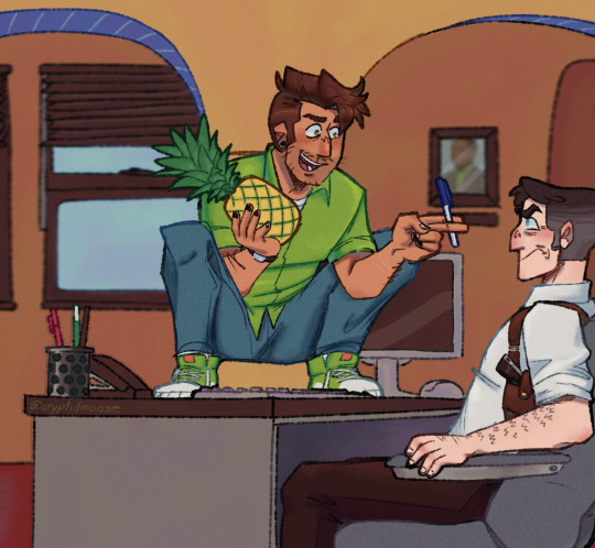
Pineapple Pen 🍍🖊️ (Apple got ate😔)
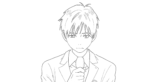
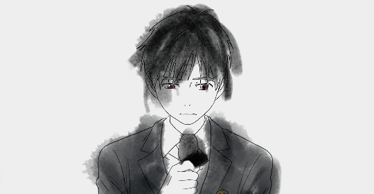
#don’t even ask me what a proportion is cause apparently I do not know 💔#I JUST TEALIZED I FORGOT TO ADD THE BLUE LIGHT THINGY TO LASSIES HAIR NOOOO😭😭😭#I’m not going back to fix it I’m just accepting it as it is💥💥#forest draws#I need to edit my tag to add two r’s but I’m lazy#psych#psych USA#shawn spencer#Carlton Lassiter#shassie#psych lassie#psych Shawn#it’s been so long since I’ve been able to draw these bastards and their wackass hair#the apple is Shawn’s ass- WHOA WHO SAID THAT
1K notes
·
View notes
Text
Editing tips, I guess?
Hey uhhhhh, so I've gotten lots of new followers over the past few weeks and wanted to do some kind of thank you?? Also, I have seen a fair share of "omg HOW" in the tags on my edits (which??? always make my day?? my week??? my life????)
Anyway, I thought I'd share some of my ~techniques with y'all? So here goes:
(lmao this got really fuckin long so cuuuuuut)
1. Make EVERYTHING a Smart Object
Okay, maybe not EVERYTHING, but seriously. Do it. It will save ur editing life. You ever shrink something down and then an hour later change your mind and decide you want it bigger? If you're not using a smart object, it’ll get blurry when you scale it back up and you’ll be fuCKED!
To make a layer/group a smart object, just right click on it in the layers panel and select "convert to smart object". This makes Photoshop store the layer's original data in a separate space for safe keeping (an embedded .psb file, to be exact) -- so you can shrink it and enlarge it as many times as you want without any lossiness.
As soon as I paste/place a screencap, texture, or whatever into my document, the first thing I always, ALWAYS do is convert it to a smart object!!
Why, you might ask?? Continue to item No.2 :)))
2. Harness the POWER of Smart Objects!!
The reason I am obsessed with Smart Objects is because I am obsessed with making any edits as non-destructive as possible. If you use “Image > Adjustments > Levels/Selective Color/etc” on a regular layer, that’s a destructive edit. Same goes for any Filters (such as blur/sharpen) and transforms (Warp, distort, perspective). You lose the original data that was there and the only way it can be undone is with ctrl+z. Might not seem like a huge deal at first, but if you keep chugging along for an hour and decide, “hmm, maybe i went too hard on that levels adjustment after all...” your only options are deleting the layer and starting over, or uh... hoping it’s still in your history panel.
However, it's really easy to avoid destructive edits when you use smart objects!! Because all those adjustments, filters, and transforms become “Smart Filters”. Smart Filters have all the non-destructive advantages of performing these adjustments via adjustment layers, but have the added bonus of ONLY effecting the layer they’ve been applied to, instead of cascading down and effecting all the layers beneath. (Which can be a good thing sometimes, but that’s a whole other topic)
Smart filters are attached to their ‘parent layers’, and can be hidden, deleted, or modified (by double-clicking their names) at any time:

Can I hear a wahoo???
Other cool things about Smart Objects:
You can copy a Smart Filter with all its settings to another layer by alt+click+dragging it over
You can change the order in which Smart Filters are applied by clicking and dragging them around
You can edit a smart object independently/in a sort of 'isolated' mode by double-clicking on its thumbnail!! I like to use this for edits that are specific to a given screencap-- like cutting out the background and any initial adjustments, like levels and selective coloring. Once you’re done editing the contents of the smart object, hit ctrl+s and it will automatically update in the main document!
But really, the biggest thing for me here is psychological. I know I’m much more willing to try things and experiment when I know that I can easily go back and tweaks things at any time. Otherwise, I’d stick with adjustments I don’t really like all that much simply because it would take too much time/effort to redo them.
3. Don't even THINK ABOUT using the eraser tool or I will STOMP YOU to death with my hooves!!
Use a layer mask instead. Please I am begging you. It all comes back to making your edits as non-destructive as possible. If you erase something, it's gone forever. When you mask something, you can make changes to which parts are visible/not visible as often as you want.
For the newbies or the otherwise unacquainted, a mask is a greyscale ‘map’ attached to a layer (or layer group) that controls its opacity. Black areas give the layer 0% opacity, white areas will give it 100% opacity, and you can use shades of grey to achieve partial transparency. You ‘draw’ on these layers with the your trusty brush and paint bucket tools.
You can create a mask by selecting a layer and then clicking the little mask icon at the bottom of the layers panel (it’s the one with the little circle inside the box). Draw black on the parts you want to hide, and if you erase too much on accident? Just paint back over it with white!
I love masks, and sometimes i will throw an already masked layer inside a layer group and apply a second mask to said group. This way I have two masks that can be edited independently from each other. Like layer mask-ception.
So anyway, yes. Eraser tool? Don’t know her.
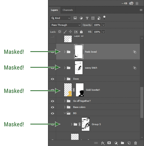
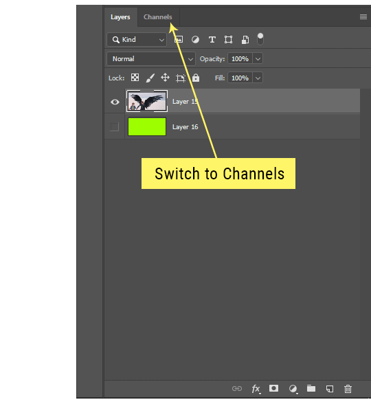
4. Try using channels to create masks!
This is a technique that works REALLY well for cutting out complex shapes, such as wispy hair (or feathers!) -- provided there's strong contrast between the subject and the background, and the background isn't too busy.
This is also a fantastic method for capturing alpha transparency. For example: If you have a neato paint stroke/splatter/watercolor texture you want to use as a mask, but has a solid background that’s getting in the way of things. This method will capture all the semi-opaque areas flawlessly!!
While editing your image (which you had better have made into a Smart Object!!!) do the following:
Switch from the "layers" panel to the "Channels" panel.
Toggle through the R, G, and B channels, and decide which one has the most contrast for the areas you are trying to mask.
Ctrl+Click that channel's thumbnail. This will create a selection marquee.
Switch back to the layers panel
Click on the target layer/group (the one you are trying to mask)
Click the mask icon at the bottom of the panel (the one with the circle inside a box)
Release the selection and invert the mask if necessary
If you're using this method to cut out a subject from its background, you probably won't want alpha transparency. In this case, select the mask thumbnail and use a levels adjustment on the mask itself to bump the contrast until you have more of a cutout effect!
It sounds like a lot of steps, but it’s really simple! So I made this handy GIF: (click to view from beginning)
Sometimes you won’t want to use this method for the entire image, but just a specific part. For example, if you’ve cut out a character with some other method (magic wand, manual brushwork), but are having a hard time with their hair in particular. Use this method to create the selection, but instead of converting the whole selection into a mask, use the brush tool to apply the mask only where you need it! You can invert the selection itself with shift+ctrl+i.
5. Outlining text
The font I used here is Salomé, which is actually a solid typeface with no outlined version. But you can make virtually any font into an outlined version if you so desire!
There's two possible methods here, actually:
The Easy Way:
Add a stroke layer effect to the text layer (by selecting the layer, clicking the little “fx” button at the bottom of the layers panel, and choosing “Stroke...”)
As far as settings go, aligning the stroke to the inside usually yields the best result/maintains the integrity of the letterforms.
Make the color of the text itself match the background.
If necessary, use the lighten/darken blend modes to create the illusion of transparency.
If you need true transparency (which I didn't until I decided I wanted to apply a gradient over the text), you'll have to try something else-- The Also Easy But Less Than Ideal Way:
Right click the text layer in the layers panel and select "convert to shape".
Now you can edit the fill/stroke the same way you would any other vector shape.
Again, you’ll want to set the stroke alignment to ‘inside’. For vector shapes, those settings are a little hidden. You’ll wanna open up that little dropdown in the toolbar with the line in it, and click “More Options”.
This is semi-destructive, so if you're working with a lot of text you might have to edit later, consider duplicating and hiding those text layers first so you'll have a 'backup' of it.
And while I’m on the topic of text...
6. Try breaking up your text layers!
I know a lot of people like to draw a neat little text box to put their text in, and then they center it all nice and neat and probably use a small font size to make it subtle and stuff... and that’s cool. Everyone’s got their different styles and things they like to emphasize in their edits and there’s absolutely merit to that sort of thing (case and point: the bulk of my dear @herzdieb’s work), but. Listen.
I love typography. I love a good typeface. The stroke widths, the letterforms, the ligatures, the serifs... I get like, horny on main for a good typeface. I like to make the text on my edits BIG, so that those details can shine. I also like doing interesting things with the text. Jumbling words/letters around, distorting them, deconstructing them and just... letting the text really ~interact with the rest of the composition instead of just kinda politely floating on top of it.
I’m not saying you have to do that kinda stuff. Or that I think neat little floaty text boxes are boring, or lazy, or whatever. It’s just... personally, I get really inspired by type. Fun type treatments are one of those things I LIVE FOR, something of a ~signature of mine, and I encourage everyone to just... try it? To use text as more of an integral Design Element and less of a... idk. A caption?
So if you have a quote, or even just a word... put each word (or letter) on its own text layer. And then: make ‘em different sizes. Make the words so big they don’t fit on the canvas. Rotate each one at a fun angle. Scatter them around. Go nuts. Use masks to chop parts of the letterforms off. Make ‘em overlap. Just have at it. Or, as the kids these days are saying: go absolutely fuckin feral.
If that really just isn’t your style, or doesn’t work/make sense for the edit you’re doing, fine. Delete all the layers and just do a text box or whatever. But. I’m tellin u.
Give it a try.
At least once.
Just... a lil taste.
7. Understand the difference between lighten/darken vs screen/multiply
For a while in my photoshoppin' youth, my understanding of these blend modes basically amounted to "darken makes things darker, and multiply makes things really darker", and vice versa for lighten/screen. But there's an important difference between how these blend modes work, and if you understand them, you can use them more... strategically? I guess?
Darken and Lighten are kinda misnomers tbh, because they technically don't really darken or lighten anything. What they actually do is make it so that only the areas of the layer that are darker or lighter than the content of the layers beneath them are visible. This produces some pretty nifty layering effects that you can't achieve with screen and multiply.
Here’s an example: (if you’re reading this on a phone with the brightness dimmed down you probably won’t be able to see the differences)
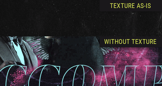
Without any the texture applied, you can really see the noise/graininess of Crowley’s jacket in the screencap. You can also see the ‘seam’ where Crowley fades into the background-- the jacket is a green-ish black, while the background it’s fading into is more of a purple-black.
With the texture set to ‘Screen’, the whole image becomes lighter across the board. Crowley’s jacket gets lighter, and so does Aziraphale’s jacket and the pink cloud thing. This does little to nothing to obscure the poor image quality and disguise that ‘seam’.
But with the ‘Lighten’ blend mode, ONLY the dark parts of the image appear lightened, and not only do they appear lightened, but they get kinda equalized. Notice how the patchy jpeg artifacts on Crowley’s jacket disappear, how that color seam smooths out, and how the brightness of Aziraphale’s jacket and the pink cloud doesn’t change at all.
This isn’t to say that lighten/darken are better and that you shouldn’t use screen/multiply. They each have their uses. But most often, I find myself using lighten/darken because the way they work is honestly really helpful? And just cool af?
8. Masking individual frames on gifs
If you ever feel like torturing yourself by making a gif that has frame-by-frame masking, my advice is don't try to mask each frame from scratch. You'll get patchy/wobbly results from the masks being slightly different on each frame.
Instead, mask the first frame, then alt+click and drag that mask onto the next frame. Make any minor adjustments to the new mask as needed, and repeat for each frame. This saves time and more importantly, keeps the masking consistent on areas with little to no movement, which makes a HUGE difference in how smooth the final product will be.

If you look at the edges of the animation, they’re nice and steady and consistent. It’s only the parts that have a lot of movement (like the back of his neck) where you can see any ‘ghosting’/wobbly-ness happening.
Sometimes the mask will move when I copy it to the next frame. Like, for the whole document. It gets nudged 20 pixels down or to the left or s/t every time. I have yet to figure out why, but I’m betting it has something to do with shooting myself in the foot with the frame 1 propagation settings at some point during editing?? ANYWAY, when this happens, just unlock the mask from its layer (click the little chain icon between their thumbnails) and move it back into place.
In these cases, I also like to pick a spot with a hard edge (such as the shoulder in the above gif) as a reference point of where it needs to be moved to. It kinda sucks having to do this for every frame, but you already signed up for some suckage when u decided to mask every frame of a gif, so I mean... 👀
9. Don't be afraid/too intimidated to do manips as needed!
Manips can be tricky if you're really striving for realism. There's light sources and color grading and perspectives to reconcile!! But when you're doing an artsy Edit with a capital E, odds are those kinds of discrepancies will be thoroughly camouflaged by all the levels, black and white, etc adjustments you're doing!
Something I run into often is, "I like this screencap, but the top of their head/hair is chopped off :(" But if I go back through all the screencaps from the scene, there's usually another frame where the camera is planned/zoomed out enough that I can steal the rest of their head/limb from it! And since it's from the same scene/shot, the lighting and color grading should already be a perfect match!
A super simple example:
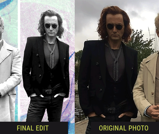
So I wanted to use this picture of David and Michael for this edit, but 1) They’re standing on the wrong sides for their characters, and 2) part of David’s arm is covered up by Michael’s.
Of course, the easiest course of action would be to just mirror the photo so they’re on the correct sides, but 1) mirroring faces tends to yield wonky results, and 2) that still wouldn’t give me a perfect, free-standing cutout of Crowley to place wherever I want in my composition (as opposed to being forced to awkwardly position him off the edge of the canvas to hide the fact that the other arm is missing)
Fortunately, it only took all of like, two (2) minutes to draw a crude selection around his good arm, copy and paste it into a new layer, flip it around, and add any necessary masking to get the shape right.
My point here isn’t to teach y’all how to do manips, or to pass this off as an impressive example of one. Because it’s really, REALLY not. My point here is to demonstrate that even something as tiny and simple as this can really open up your options for what you can actually do with an edit/composition.
So next time you’re feeling limited/inconvenienced by the crop of a screencap, just... you know. Consider whether or not it’s worth attempting a quick and dirty manip to fix it.
Another Example:

Sometimes you’re torn between two screencaps. You like one element from Screencap A but also want some other element from Screencap B. What to do? Just frankenstein ‘em together. Layer one on top of the other, get them lined up, and mask out the necessary parts.
It’s easy to get hung up on stuff like “Uh... should Crowley’s shoulder be doing that?” but let me assure you that like... the people looking at the final product are none the wiser to your butcherwork and will not notice. Especially if you’re going to add a bunch of contrast and color adjustments later on. (in fact, sometimes I’ll apply those adjustments first so I’m not distracted by any discrepancies that are going to come out in the wash anyway)

“I dunno... 🤔🤔 doesn’t seem anatomically correct... 🤔🤔🤔🤔” thought no one.
Point is... point is... dolphins you can get away with a LOT more than you think you can. Don’t let the desire to make these kinds of manips perfect get in the way of just... making them good enough. The bar isn’t that high, I promise.
10. Know what inspires you
What types of edits get you EXCITED? What kind of work do you see on your dash and go, "oh, I'm reblobbin' THAT!!1!"
I know for herzdieb, she's all about emotional pieces. She likes matching words/lyrics/poetry to on-screen moments and punching you in the feels with both. She hears a song, or reads a poem, and the lightbulbs go off for her, and she does her thing.
As for myself, I just live for the aesthetics of an edit. The colors, the fonts, the composition. I almost never know what text/screencaps I'm going to use when I start an edit. I just see a font I like, or a color palette, or a texture, and think, "I wanna use that!"
And once you know what inspires you, collect that inspo! I hoard textures and fonts. I have them organized into neat lil folders. When I wanna make an edit, that’s where I start. I just browse through them all until one or two start calling my name. Herzdieb collects songs and quotes and poems. Maybe your thing is color palettes, or aesthetic-y photos. Or whatever.
The point here is make the kinda stuff you like/want to see. Not the kinda stuff everyone else is making or the kinda stuff you notice gets the most notes.
11. Be able to let go of things that aren't working
I often begin an edit with a rough idea of the style, colors, or layout I'm going for. And I almost always end up doing... something totally different.
So don't get too fixated on what your initial ideas are. Be open to experimenting and just let the edit be what it wants to be. If something looks nice, do it. If it doesn't, don't try to force it just because, "well, I was inspired by this piece that did xyz and I wanna try it too".
When you see a certain effect that inspires you, just keep it in mind as a possible solution for the next time you make something-- don't make it into a benchmark, or some imaginary 'goal' you have to meet for This Edit You Are Working On Right This Moment. In fact, sometimes the elements I end up ditching are the very ones I started with, that initially sparked my inspiration. And that's okay. Inspiration can be a moving target, and if your vision for something changes, let it.
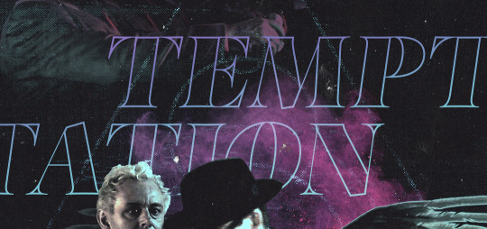
You wanna know what inspo reference I was looking at when I started that “Temptation Accomplished” edit?
Fucking this: https://search.muz.li/YTdiNjkwN2Rh
You might be thinking, “how the fUCK was that the inspiration??!! Your edit looks nothing like that at all!” ...and you would be 100% correct, and that is 100% my point. I spent a good hour or two trying to incorporate that cutout text layering effect before finally accepting the fact that it just wasn’t working for the edit I was making. And it wasn’t until then that it actually started to come together.
12. Be patient, and take the time to explore all your options!
I’m not gonna lie, y’all. I spend hours on my edits. I usually complete them over the course of 2-3 days/sittings. I rarely have a plan. 99% of the time I'm just throwing things at the wall and seeing what sticks. When I get stuck (when, not if), it helps to step away from it and come back later with a fresh perspective/set of eyes.
Every single edit I've posted, I have at some point felt like giving up on because I thought it looked like garbage (and not just because I was being self-deprecating/doubting myself, but because at those points, they simply weren't finished/something about the composition just wasn't working for me)
Work through those moments, and if necessary, take a break/sleep on it. It's always after I've exhausted my early ideas that the really good ones start to come to mind!
Here’s how the character poster edits I did progressed:

In Classic Me™ Fashion, I literally started off with just... textures I liked, and a font that I liked. Now, there were obviously a lot more ‘steps’ involved in both designs, but hopefully at the very least this gives a sense of how things get from point A to point B.
So uh... thanks 4 comin 2 my TED talk. I hope u learned at least one (1) cool new thing or maybe just feel vaguely inspired by this rambling mess?
157 notes
·
View notes
Text
QUICK TUTORIAL: lineart gifs & watercolours
i’ve received a few asks about how i made this gifset, so here’s a quick guide! i’m skipping right to the interesting parts, so you need to have basic knowledge of how to use photoshop to make gifs or you’re not going to get much out of this tutorial. the basic idea is very simple but the process can be extremely frustrating, as usual. proceed at your own risk.
things you’ll find behind the cut:
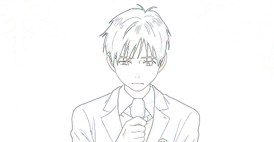
how i get from this:

to this:

and to this:

still with me? great! let’s begin!
i use photoshop cc in this tutorial! all features should be available in other versions too, but they might be called something else. in that case please consult google.
YOU WANT YOUR GIF TO HAVE AS FEW FRAMES AS POSSIBLE! get them ready and do your basic thing ie resize, remove excess frames and set the framerate. next, flatten the frames into layers and download this action (19 frames at most) or do the following manually:
duplicate your first layer
set the copy to divide
add gaussian blur (approximately radius 0.6px) to the copy
use smart sharpen on the original layer. play around with the setting until the lines look clear and smooth (my settings: amount 300%, radius 0.3px, reduce noise 10%, remove gaussian blur)
check that the blurred layer is on top of the sharpened one
merge layers
repeat with every single layer :))))
now your gif should look something like this:
as you can see, if you wanted you could just paint over the parts where the background is still visible, add some colour or overlays and tadaaah, a perfectly fine gif! but we don’t want that today. we want to make our lives hell.
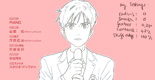
NEXT, WE’LL DO SOME MASKING AND GET RID OF THE BACKGROUND. i use the quick selection tool because it’s quick (lol), i’m lazy and these kind of gifs have nice and clear lines so it works like a dream!

make sure you’ve selected everything, it can be difficult to tell what’s part of the background and what’s the selection as you can see.
all done? next you’ll need to click mask and select. i invert the selection at this point, so the following settings only work with that! i forgot to put it in the pic but in addition to these setting, i usually have the output set to “layer mask” so that saves me a few clicks. when you’re happy with what you’re seeing, click ok and go though any bits that didn’t mask properly by hand.
can you guess what the next step is? yeah. now do the same to all your layers...
... and you’ll end up with something like this!
you probably can’t notice much difference, because it doesn’t show up properly on my blog, but the background is transparent! i’ve also added two adjustment layers to clean up the lines a bit:
black & white
levels (my settings: shadow 60, midtone 1.00, highlight 230)
//EDIT: naturally, the settings i used for the tutorial don’t work for all scenes but in my experience they’re a pretty good place to start from! also, if the scene has a very busy background i usually mask it before resizing and applying the lineart effect to make sure it looks as good as possible (and it also gives you the option to use the same frames in other projects without having to do it all over again)! in those cases the blurred layer leaves a fuzzy border around the image when you merge the layers, so you need to select the sharpened layer’s pixels before merging and mask the resulting layer with the selection. oh and i usually convert the layers for the first frame into smart objects before sharpening or blurring so i can easily adjust the settings to be optimal for the scene.
again, you could stop here, walk away with a nice transparent lineart gif and call it a day.
no? then we’ll start adding the watercolour.
this is, of course, all done manually as well, frame by frame. don’t blame me, i told you this was going to be frustrating.
add a white layer to act as a background, and adjust the output levels of the levels layer you just added a few minutes ago! my setting are: shadow 0, highlight 238
THE NEXT STEP IS TO START PAINTING
the gif should give you the basic idea of what to do from here on. basically, it’s something like this:
create a new layer on top of everything, pick a brush, add colour to appropriate spots, don’t mind if you can’t stay inside the lines. it’s actually better if you don’t! i usually have the colouring layers set to linear burn.
check what frame you have selected! you want to find the corresponding lineart layer, right click it and pick select pixels.
create a mask for your coloring layer from that selection. now the outline should be rather nice and smooth, and all you need to do is mask the inner parts using either a selection tool or do it manually. in this case i prefer the latter.
if your gif doesn’t have much movement, you can get away with duplicating the colouring layer for the next frame instead of painting everything from scratch! just duplicate the layer, delete the old mask, move the layer a bit if needed and add the mask from the next lineart layer.
repeat these steps until you run out of frames.
keep or delete the white layer you’ve used as a background.

before you even notice, you have a super pretty lineart gif painted in watercolour style, ready to be posted on tumblr or edited more!
i edited mine a bit more and ended up with this baby! i kind of lied in the beginning, since i’m not telling you how i turned it into this lmao oops. basically i just added the bg image and a few gradients on top of everything? super easy!
//EDIT: i can’t not tell you guys i feel so guilty lmao. okay, we’re starting from the bottom up!
changed the white background colour to #e6e6e6
a picture of flowers on top of it, color burn 60%
levels adjustment: shadow 60, midtone 1.00, highlight 230 and output adjustments are shadow 0, highlight 220
linear gradient fill layer, 90angle, colours #f3bfa5 and #fbeebc set mode to soft light 100% jump to between the lineart adjustment layers and colourings
color fill layer in #f3bfa5, set mode to soft light 100% jump on top of everything
vibrance adjustment layer, +100 vibrance and +31 saturation
gradient map adjustment layer, colours #f3bfa5 and fbccbc set mode to overlay 30%
duplicate the adj layer you just made, chance mode to color burn look at your beautiful gif and cry tears of joy

and that’s about it! i hope this cleared up the process a little!
thank you for checking out my tutorial! if you have any more questions, my ask box is always open ♥
oh and feel free to tag me if you post something made with this tutorial! i’d love to see your creations! i track #nikiforoov so just tag your post with that :)
#yuri!!! on ice#chaoticresources#photoshop#fyyoi#yuuri katsuki#tutorial#my edits#please let me know if there are some clear errors#in my defense it's 5am here rn and i should've been asleep ages ago#but noooope#here i am#what can i say i really love playing around with photoshop lmao
2K notes
·
View notes
Link
This Week in the WWE will go down as the week to build up the Crown Jewel event in Saudi Arabia. And with that comes the fact that Smackdown gets pre-empted on FOX due to World Series game 3 between the Nationals and Astros, sending the WWE to Fox Sports 1 and many fewer available viewers. So, yes, a challenge to be had even with FOX airing a special one-hour episode of Smackdown on Sunday either before or after the NFL game depending on where you live and what game you get. For instance, here in New England, it will air after the 1pm Eagles vs. Bills game and directly up against the Patriots vs. Browns game, so there will be no traction there.
As for the build, the one thing that’s stood out has been the WWE doing a nice job building up the Brock Lesnar vs. Cain Velasquez WWE Championship match. We get another beatdown on “la familia” as Lesnar, on Friday Night Smackdown does the honors as Rey Mysterio, Jr. and Velasquez stand helpless in the ring and ultimately F5’ing Mysterio into a wall and then Velasquez onto a prone Dominic on a trainers table. But, with Crown Jewel on Thursday, are we done of the buildup with only RAW left Monday Night or do we get a pre-produced vignette? Either way, it would be better than what we got last Monday night from Velasquez. We’ll get into that in our RAW review.
Outside of that, RAW and Smackdown held little outside of the build. Missed opportunities all around but maybe in their eyes, here’s hoping that the WWE has a revamp starting on Friday after Crown Jewel with Survivor Series and Royal Rumble just around the corner.
Still, the best show for my money continues to be NXT on Wednesday night! Pound for pound, it’s the best ring action of the week with the triple threat North American Championship Match between Roderick Strong, Keith Lee and Dominic Dijakovic going down as a Full Sail classic. Add in an epic heel turn and a strong effort from Rhea Ripley and Bianca Belair and you may have the best two hours of WWE product all week long!
These men are NOT holding back as @roderickstrong, @DijakovicWWE, and @RealKeithLee BATTLE for the #NorthAmericanTitle! #WWENXT pic.twitter.com/kfuY1LXH4H
— WWE (@WWE) October 24, 2019
I’m still waiting for that breakout edition of Monday Night RAW that we can finally say Paul Heyman put his complete stamp on. For now, we get small doses. The Street Profits, Humberto Carrillo and a returning Kevin Owens. But the seeds are planted for a big heel turn coming for the Universal Champion Seth Rollins. The rub, IMHO is that Heyman can never push the limits as far as his ECW days, the Attitude Era or even AEW’s current product. The WWE is just too mainstream with too many general sponsors that won’t allow its content to go non-PC and push that TV-14 limit. But, I’m sure Heyman will keep trying!
RAW
RESULTS
Drew McIntyre defeated Ricochet
Aleister Black defeated Jason Reynolds
Andrade defeated Sin Cara
Sunil Singh defeated R-Truth to win 24/7 WWE Championship
Non-Title Match: RAW Tag Team Champions The Viking Raiders defeated Ryder & Hawkins
Non-Title Match: Universal Champion Seth Rollins defeated Humberto Carrillo
The Street Profits defeated The OC – Karl Anderson and Luke Gallows
What we loved:
Respect is earned, not given. The future is bright my dude. Welcome to #Raw …I’ll see ya down the line. @humberto_wwe pic.twitter.com/e136HZRVJP
— Seth Rollins (@WWERollins) October 22, 2019
Humberto Carrillo – Building up the new young stud of a draft pick against the reigning champion is a shout out to the yesteryear of the territory days. A well-done match that leaves you wanting more. Plus, the next few hints of a Seth Rollins heel turn are planted. It’s what Rollins needs. Definitely a Heyman stamp on this one.
The Street Profits (and Kevin Owens)– A very cool entrance to the ring through the crowd. Check! A win, aided by a returning Kevin Owens as the Street Profits mystery partner to take out AJ Styles. Check! Dancing with a baby to close out the show. Check! New blood to give some energy.
Ric Flair – The Nature Boy shooting on the Cleveland Browns in the front row is always pure enjoyment! Getting Drew McIntyre over in an entertaining match against Ricochet, paying over his King of the Ring upset, is a bonus!
Vignettes anyone – The build for Aleister Black, Authors of Pain and Buddy Murphy through quick vignettes is giving a good backstory without the standard WWE stand in the ring or backstage feel.
What we didn’t like:
Rusev/Lana/Bobby Lashley angle – Between the King’s Court and the restaurant beatdown between Bobby Lashley and Rusev, this love triangle angle is played out. Lashley has no personality to carry it out and it all looks too forced. Finish it, scrap it and move on. Best line of the segments goes to Lana yelling at Rusev “take him to jail!”
The announce team – Is it me or is there a lack of energy at times there? Jerry Lawler’s one-liners are a lift but it seems like Vic Joseph and Dio Maddin are lost at times.
Where are the ladies? – I get that there are no women matches on Crown Jewel thanks to the Prince in Saudi Arabia, but at least throw us a bone of a match while you’re still in the States. Lazy creative there WWE!
The good & the bad (and sometimes ugly!) – Cain Velasquez, Rey Mysterio, Jr. and Shelton Benjamin – Loved the real-life backstory of Shelton Benjamin being friends and roommates with Brock Lesnar back at the University of Minnesota. Loved Benjamin trying to push Mysterio around in looking for a title match, just like Velasquez used Rey to get a title shot from Lesnar. But then Velasquez comes in and manhandles Benjamin with punches that weren’t even close. Ruined the segment for me. The physicality didn’t match up to the promos. Missed opportunity and made both Velasquez and Benjamin look bad.
NXT
RESULTS
Rhea Ripley defeated Bianca Belair
Matt Riddle defeated Cameron Grimes
Breezango & Isaiah “Swerve” Scott defeated The Forgotten Sons
Angel Garza defeated Jack Gallagher
Tegan Nox & Dakota Kai defeated Marina & Jessamyn to win a shot at WWE Women’s Tag Team Titles vs. Kabuki Warriors next week
North American Heavyweight Championship Match: Roderick Strong defends title over Dominic Dijakovic & Keith Lee (Strong pins Dijakovic)
What does this mean? Could this be a glimpse into @FinnBalor's future? #WWENXT pic.twitter.com/LzJ9jpDGLs
— WWE (@WWE) October 24, 2019
What we loved:
OMG Finn Balor – What a well-done heel turn! Did NOT see that one coming. Just when you thought Balor was back to complete his “future in his present” and help Tomasso Ciampa & Johnny Gargano against the Undisputed Era, BAM! A Pele kick to the head of Gargano. It certainly leaves me wanting to see where it goes next. Does Balor Club include the UE now? Or is it just a means to an end to get the NXT Championship?
Main event triple threat – Just before Balor’s heel turn, we get an epic triple threat where Roderick Strong steals the pin, letting Keith Lee do the work to get Dominic Dijakovic down for the count and Strong runs in for the win! Beautifully laid out as Strong adds another layer to the feud between Lee and Dijakovic.
The Kabuki Warriors are coming to NXT – We’ve been waiting for the Women’s Tag Team Championship to be defended on NXT and next week we get it as Asuka returns to Full Sail with Kairi Sane. Next up: Tegan Nox & Dakota Kai.
What we hated:
NOTHING!
SMACKDOWN
RESULTS
Bobby Roode & Dolph Ziggler defeated The New Day
Lacey Evans defeated Cameron Conners
Kalisto defeated Drew Gulak
Nikki Cross defeated Mandy Rose
Ali, Gable, & Roman Reigns defeated King Corbin, Shinsuke Nakamura, & Cesaro
What we loved:
A main event that delivered – After a Miz TV start to the Friday Night Smackdown night with Ric Flair and Hulk Hogan facing off with their respective members of their teams for Crown Jewel, we get a very solid finish highlighting Ali and Shorty Gable in helping Team Hogan get the victory with Ali pinning Cesaro. BTW: nice to see Cesaro subbing in for an “injured” Sami Zayn as well. Crowd was well into this one, as was I!
The offer – Sami Zayn and Shinsuke Nakamura offering a hand and a stable spot to join them to Daniel Bryan is intriguing. I like Bryan walking the face/heel line and letting it play out to see if they eventually go back to the YES movement, something Bryan again said was dead or continue to let Bryan play full heel, something he’s embraced.
Pure CARNAGE. #SmackDown #WWECrownJewel @BrockLesnar @cainmma @reymysterio pic.twitter.com/yQFRm8QJPP
— WWE (@WWE) October 26, 2019
Brock vs. Cain – As we mentioned above, keeping the heat on “la familia” keeps that personal emotion going. Plus, Brock gets an F5 in on Velasquez gives him some momentum headed into Crown Jewel. Well done, especially after the misfire on RAW with the Velasquez/Benjamin interaction.
What made no sense:
New Day – How does the New Day still have a title shot next week on Smackdown yet lose to Roode & Ziggler this week? How is that effective booking?
Firefly Funhouse– It just flat out made no sense and seemed like a throwaway. If it’s not going to be special, don’t do it. It’s a red-hot segment that the WWE had nothing with this week. Breer Rabbit’s funeral leads to his rebirth only to have Buzzard eat him? Really? No thanks!
Drew Gulak – What’s the need to bury Drew Gulak, this week losing to Kallisto and then abused by Braun Strowman, on back-to-back weeks? Isn’t there a better way to build Strowman?
Thanks for letting us share our thoughts! Shoot me an email at [email protected]. We’d love to hear you comments and suggestions! You can also check out my blog, The Crowe’s Nest as we delve into more pro wrestling, sports entertainment and the World of Sports. My apologies ahead of time – I AM a Patriots and Red Sox fan! If you’re not down with that, I’ve got TWO WORDS for you…. NEW ENGLAND!
0 notes
Text
How to Exhume Your Buried Site and Get Recovery From Google
New Post has been published on https://netmaddy.com/how-to-exhume-your-buried-site-and-get-recovery-from-google/
How to Exhume Your Buried Site and Get Recovery From Google
Is There Really a Recovery From Google Slaps?
If you head out on Google and search for ‘recovery from Google’ or ‘recover from Google Penguin,’ or Panda or algorithm updates, you’re going to find a ton of people out there touting that they’ll get you back on track for X amount of dollars.
You’re told you have to contact site owners and have links removed coming into your site. You’re told you have to do this – do that – do something else, create new links this way, listen to “gurus” tell you this is the “new way” to build links post-Panda and post-Penguin.
And for a limited time, you can get our services for $997! What?
Seriously, why would you want to pay someone for something you can do – and should do – yourself?
My e-commerce site was not only slammed by Google’s algorithm updates in September 2012, it was buried – cremated may sound even better. How, you might ask? To this day, I’m not really too sure if it was the Penguin or Panda update, but one of those bad-asses animals took me down – HARD.
My site went from about 150-175 unique visitors a day to TWO – overnight. Like many, many other site owners out there, I was devastated! In less than 24 hours, my site got buried back on page 15+ on Google.
And if that wasn’t enough, Google started de-indexing my pages – one by one until I was left with nothing but the handful of solid backlinks I’d gotten over the last few years of being in business.
I didn’t know what to do. I’d actually had the site and business up for sale for a couple of weeks before the take-down but after Google hammered me, I couldn’t have given the site away.
So I left it to sit for about another month or so while Google systematically de-indexed about 85% of the site’s pages. Slow but sure death and cremation of a site I’d worked hours and hours and hours to build and rebuild. Gone.
Now, I have to say, this wasn’t one of those “niche sites” just for making AdSense or Amazon cash. This was a full-fledged storefront for a product that I design and sell myself.
And I’d taken it from nothing to being on the front page of Google between #1 and #8 position for most of the primary keywords I wanted. I was just gaining an edge on some of my top competitors when – BAM – Google decided my site just wasn’t good enough.
I’d worked on this site for the better part of four years and had registered a brand new NON-exact match domain name about six months before the slam. So I was rather livid, to say the least. I will say that hearing some mega-major corporations being slammed as well did make me feel a little better. At least I knew I wasn’t alone, for whatever that was worth.
So what did I do get back into Google’s good graces? I didn’t file a reconsideration petition. I didn’t follow the “advice” from the “gurus” and buy a new domain name or contact the site owners from where my allegedly “spammy links” were coming from. In fact, when I did a backlink analysis, there really wasn’t much there to be concerned with. So that left on-page issues like overusing certain keywords and/or lacking significant content.
Some “gurus” said my site was worthless now so I may as well ‘put my big girl panties on’ and accept it. Quit. Do something else. You’re done. You did something wrong and now you can’t undo it.
I am so glad I didn’t listen to any of them!!
I knew I had a valuable website with something to say, a great product to offer and content that just needed some updating to be more valuable. So I decided to start on my path to recovery, exhume the ashes of my now more-than-dead site and get to work.
Step One – Remove the Site from Google Analytics That’s right. They de-indexed the site so why bother analyzing it anymore. They took it from me, I took it from them.
Step Two – Take It Down. Yup. I removed every last file from the server and replaced it all with only two files – the index and the custom 404. Regardless of where people landed, they got the same message – and this is crucial in retaining visitors even during downtime.
I did not use any “under construction” images or anything like that. I did a video – me on camera – explaining that I had taken the site down temporarily while doing a complete renovation, to please bookmark the site and stop back around December 5.
Why did I give them a date? Because I didn’t want to have to do another video, for one, and it gave me a deadline to work towards so I wouldn’t get sidetracked doing anything else. The same video announcement went on both the temporary home page and on the custom 404 page.
Step Three – Get Educated. This was something I learned while wandering around YouTube in a daze one day wondering what to do with my site. Sometimes a good redesign with some updated content can do the trick. But you have to know what is wrong and how to fix it. And that takes some research.
My site was built as an HTML/CSS static site, which now that I know more about WordPress, I know using an HTML site leaves a HUGE margin for error if you’re not careful. And now I believe this was one of the main negatives for my site. The URL structure was not correct for the site and the way I was copy/pasting pages to use for other pages encouraged the dreaded “duplicate content” within the site.
The duplicate content actually came in the form of repeated meta tag keywords and meta descriptions showing up on more than one page. Google does not like that – at all. And they’ll let you know by starting to de-index those alleged ‘spammy’ pages.
So I knew I had to rebuild the site using WordPress. And that meant learning a lot more about WordPress than just setting up a content blog. This was serious business here. My old HTML site had the lightbox effect for the product images and a custom order form. I had to replicate that in the new site.
Step Four – Go to YouTube And watch a lot of instructional videos about WordPress. On YouTube I found out how to install the lightbox plug-in, includes the plug-in for WordPress, and how to structure the URLs for a solid site that Google would love.
Step Five – Dig In and Start to Work! I’d already started to get familiar with the Atahualpa theme since using it to rebuild another site, so I figured I’d start with that theme and go from there. Again, because I’m a self-admitted YouTube junkie, I go there first when I need help with stuff. So I spent a lot of time with two browser windows open – one with a YouTube instructional video, the other with the WordPress dashboard open following along.
I’ve also learned a lot about PhotoShop via YouTube so that helped me design a new header image for the site.
Once the framework was done, i.e., color scheme, layout, CSS adds, etc., it was time to start copy/pasting over 200 pages of HTML into Pages and Posts. I love using shortcodes and Include files so I went back to YouTube and found the video I needed to learn how to do that in WordPress. A piece of cake.
Step Six – Time for the New Sitemap! After about 60 hours, yes, an entire week of “overtime,” the site was ready for its new sitemap and re-add to Google Analytics.
Step Seven – Time, Patience, Education and WORK Paid off! I added the site back to Google Analytics along with a brand new 267-page sitemap on December 1. December 2 I checked and they had already indexed 179 pages! And that was after they’d de-indexed all but 23 of 260 pages a couple of months earlier!
So what did I learn from this?
First, when it needs to be done right – Do It Yourself! There are just some things that can’t and shouldn’t be outsourced to anyone else. And when it comes to your business website, this is something that needs to be taken on by you alone.
Why? You know what you want and it’s beneficial to actually get the education and learn new things along the way because they’ll be easier to fix in the future if you have to edit something.
Also, as I moved along through the rebuilding, I recognized several areas where what I had created the first time probably was seen by the Google ‘bots as spamming and duplicate content. If I’d outsourced the job to someone else to “copy/paste” their way through rebuilding, they may not have recognized it.
The ‘Gurus’ Aren’t Always Right! I’d been told by so many people over the last couple of months that my site was dead in the water. Forget it. Start over with something new. Let the domain name expire because it’s worthless now.
And a lot of people probably would have. A lot of people have, especially if they were only small niche sites set up only for the purpose of making Google AdSense or Amazon Associate cash.
I also think there are a lot of people who may be afraid to start over because they may not have invested the ‘blood, sweat & tears’ into their businesses to begin with. They may feel they have nothing to lose so why bother, right?
I could have just ditched this business too, but I was like, I’m gonna beat you, Google! I am not going down without trying! LOL
And then there are the “stereotypical” online marketers who are pretty much just too lazy to put in the effort it will take to exhume their sites from the Google cemetery and they’re perfectly content to start over. Whatever works for them!
But I had a feeling that if you can show Google you’re 100% serious about your business by doing what it takes to survive out there, they’ll work with you. And – I never filed any of those stupid “Reconsideration” things either. Not necessary. I would have felt like I was begging for mercy or something.
I didn’t touch any of the already incoming links to the site either. I left those as they are, wherever they’re coming from. I don’t think I got hit over that, to begin with. I still think it was on-page “over-optimization” – in Google’s algorithms anyway – that nailed my site. And I think reconfiguring and rebuilding all of my ‘old’ content into some fresh stuff made the difference.
Going Forward from Recovery Content – Content – Content. There are two main people I have to give a shout-out to during this entire process both for their encouragement, the way they keep their websites at the top and their 100% focus on building quality content.
Lisa Irby of 2createawebsite.com. Lisa absolutely refused to let me give up on my site. So I’ve been keeping her posted on my progress.
David Boozer of Online Mentor Now. I only just started following David recently after finding him on YouTube and immediately signed up for his email list and free mentoring.
Both David and Lisa will tell you what works – Content. Regularly building high-quality content is the only way to go today and going forward. They’ll tell you that the ‘gurus’ with their latest allegedly push-button, no-work schemes that promise you thousands of dollars overnight – those things don’t work. I know they don’t. I tried them and I got “punished” for using them – harshly.
So with the insight and education of these two awesome online marketers, I put everything else aside and dug my website out of the Google Cemetery. Will it rank high again on Google? I’m expecting it will, now that I have it all in place the way it should be.
So Can You Make a Recovery from Google Slaps? Yes, but you have to WANT it bad enough and then put in the work to make it happen. If you only have a five or ten-page niche site only set up for ads and affiliate links, maybe not.
But if you redesign it – in WordPress – stay away from the shortcuts, do your due diligence and add quality content, you should be able to pull yourself back up.
0 notes