Note
I remember that you had a drawing of the Harkers looking normal but also showing that they are Not So Normal but cannot find it!
Hi Anon!
Are you talking about THIS POST HERE?
#Art#I need to update this with their proper colour pallets#I think I painted this post-DD last year
12 notes
·
View notes
Text

‘Tis the season, the festive spirit is in the air and I want to share the contents of this advent calendar I got my hands on. It’s either this or 24 days of chocolate and I know what’s (slightly) better for my body. The newest window will be added each day until Christmas, so keep checking back!
(It’s available online here, so you can have one too! This isn’t a sponsored post, it’s just nice to share.)
Overview + days 1, 2 and 3:
I’m throwing a chunk of stuff in at the beginning to get us up to speed, since it’s day 3 of this calendar already and I’ve only just decided to blog this adventure. Future updates will be done on a day-by-day basis!
Getting it out of the way early: I’m very aware this is a calendar meant for little kids, and with a price tag of £19.99 the contents of each window will be worth around £1 or less. Nothing in here is going to be great quality, so I’m not going to focus on that aspect more than necessary!
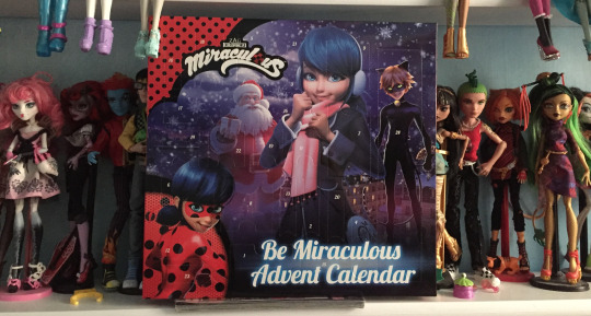
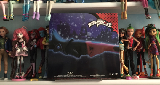
Here’s the outside of the box - there’s an external sleeve, but this is the ‘unwrapped’ design which doesn’t display the calendar contents (and I’ve looked at these already, I’m not going in completely blind, but since deciding to buy the calendar for myself I haven’t refreshed my memory in hopes of keeping it surprising). It’s a promotional image for the Christmas special - which coincidentally I hear is the only ML media they’re airing on TF1 all through December, yikes - and despite Marinette being front and centre it’s a pleasant surprise to see Chat Noir on the cover too. Nice to see Protagonist #2 is back on the roster!
I’m probably going to pin the back panel up on my wall after Christmas because it’s adorable and I love it. This is the content I’m here for.
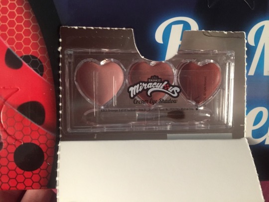
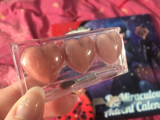
Day 1 kicks things off with a nice surprise - some cream eyeshadow! It’s just a generic pallet with the Miraculous logo slapped on, as I’m sure most cosmetics in here will be, but it’s a cute start. I like to think these are the colours Marinette wears - they’d definitely suit her.
I’ve sworn ahead of time to actually try these cosmetics out instead of just shoving them in a drawer and leaving them untouched forever, so - as I’m going out that evening - I decide to try this in place of my regular eyeshadow. I’ve never applied cream eyeshadow before (only powder), so I have to Google how to do it - the instructions tell me to “spread the cream liberally across the eyelid like butter, working quickly before it dries”, and I figure that can’t be too hard. Kids are supposed to be able to put this on, after all.

It’s hard to get a good photo, but the colours in this are a nice nude range which make a surprisingly pretty combination. The cream is appropriately princess-shimmery, and while the brush is teeny-tiny and low quality (a couple of the bristles were trying to come out in the pallet) it works well enough with broad strokes and narrower highlights. You wouldn’t pick one up at Sephora, but out of a £1 window in a kiddie Christmas calendar it’s decent. However.
However.
With this pallet, applying it “before it dries” isn’t just possible, it’s unavoidable. This does not dry. It’s more of a gel-based substance than actual cosmetic cream, and plays absolute havoc with any eyeliner you might be wanting to put on afterwards. I managed to battle it into submission with some powder eyeshadow over the top (I could have just wiped it off and started again with proper makeup, but I was determined), but even out at dinner hours later my eyelids still felt damp. I guess this is why Marinette doesn’t wear much visible eyeliner, because if this is the eyeshadow she chooses it’s just going to melt all over her face and really send Adrien running.
Regardless, it’s a cute item to start the calendar off with, and as a kid excited about the Adventures of Makeup I think I’d be happy to get it. At the very least, now I know how to apply cream eyeshadow.

Day 2 grants us some... hair chalk? Is this the secret of Marinette’s unnaturally blue hair revealed at last? @rosebomber says I have to put all these cosmetic things on at once at the end of the month and I’m already beginning to get nervous.
The presentation here is much more creative than the eyeshadow - the wrapper boasts a pattern of the “Lucky Charm” catchphrase with little doodles of Tikki and various magical items. I like this a lot - it’s something clearly tailored to Ladybug and not just a logo slapped onto a generic piece of girly makeup. I wouldn’t blink if I got that shimmery eyeshadow set in a Disney Princess calendar, but blue hair chalk is very clearly Marinette. Good going, calendar people.
I’ve already showered before opening today’s window, so I leave this wrapped up until the following morning when I can test it and then wash it out afterwards.
This turns out to be good foresight, because the hair chalk is... well, it’s a stick of blue chalk. It’s extremely messy. The label looks like it should be able to slide up and down as a clean place to grip the chalk while you rub it over the hair, but it appears to be stuck in place so I have to choose between removing the label completely or trying to awkwardly crayon colour into my hair with the narrow end. I choose the latter, because if I take the Ladybug label off then it’s just a stick of chalk. The magic would be gone. It makes things more difficult than they need to be, but as with the eyeshadow, I am filled with determination.

Since it’s chalk (as opposed to any liquid colour) you’d think it would come up nicely on dark hair, but it doesn’t show very well. I have to rub on quite a lot just to make it visible, and the amount in my hair at this point releases little powdery showers whenever I touch it. My hands look frostbitten. I’m glad I chose to try it out immediately before washing my hair, because the amount of smeary blue has made me look like I’ve been punched in the face (or assaulted by a Smurf) and I don’t need my parents worrying.
On the plus side, all inconvenience and messiness aside, it looks really nice in the mirror. I think I could utilise this chalk again in the future if I’m just sensible enough to put it further away from my face. I get the feeling this is intended for kids with lighter hair than mine (it would show up a lot more easily on blonde hair, I bet), but I’d be concerned about the ease of washing it out since the blue colour is so vibrant.
At any rate, it’s a fun addition to Marinette’s makeup counter, if a very messy one. It’s imprisoned back in its calendar window for now.
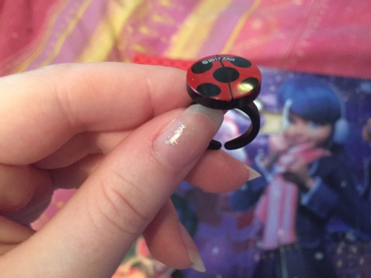
Day 3 is simpler fare, and I’m glad about that since I’d just cleaned up the chalk explosion before realising I hadn’t checked if more messy cosmetics were closing in on me. It’s the infamous Ladybug ring, so I’m hoping the Chat Noir earrings are also in this calendar somewhere to give me the full set of in-show Miraculous.
I haven’t forgotten that this is a calendar for little kids, but this ring is teeny-tiny! I can barely fit it on my smallest finger (and my hands are little). You’d think there would be a bit more adjustability to it with the growth spurts kids go through, but I don’t think I’d wear this around anyway - the gigantic copyright mark splashed across the top is a bit offputting, aesthetically speaking. The design is stamped directly onto the plastic, so it’s not a sticker; why not print the copyright around the edge or on the underside?
I can imagine this is a little accessory Marinette made, it’s pretty cute and I’d be happy to get this in a calendar (IF IT FITTED ME, I’M A GROWN ADULT BUT MILDLY SALTY ALL THE SAME). There’s not much else I can say about it, so here’s hoping more wonderfully terrible cosmetics are on the way.
#josie talks about things#miraculous ladybug#i don't even know if i should be tagging this with anything lmao#i've just been plaguing the discord chat with this adventure for the last few days so i thought i should channel the energy here instead#i'll reblog this with future calendar windows under read-more cuts because they'll have pictures in 'em#ml calendar
1K notes
·
View notes
Photo

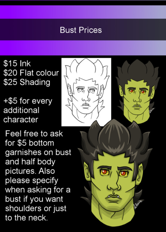
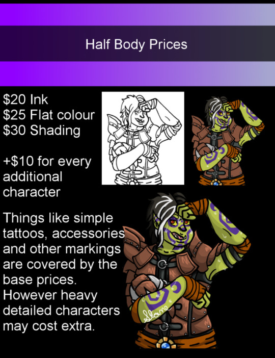
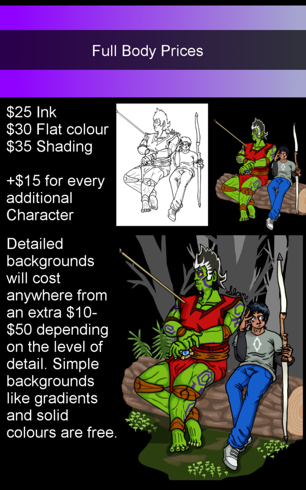

Hey, guys, I've made a new updated Commissions Sheet because I really need help.
If there is any hope in me continuing my Webcomic over the summer I need work, even if it’s just a few small things a month.
Please help me by signal boosting. Not shown above but I also offer Reference Sheets:
$150 includes one shaded picture of your character fully dressed from the front. A picture of your character from the back fully dressed not shaded and another front and back image of your character naked or in underwear (if they're under 18 or don't feel comfortable with your character being depicted completely undressed.) As well as the base colour pallet. +$25 to add an additional shaded face study of your character. Things I’ll draw:
Official Characters Fan Characters Couples (LGBT friendly) Anthro/Furries/Monsters/Original species Mecha NSFW/Fetish (Please read NSFW rules below) Things I won't draw: Gore, torture, and cannibalism (small amounts of blood is okay) More things I won't draw are listed in the NSFW rules below.
NSFW rules:
Everything must be legal and consensual so that means no incest, rape, bestiality, or necrophilia among other things. This includes pokephilia. No gore, torture, cannibalism fetishes and the like. Biting with small amounts of blood are okay. Furries and Fantasy monsters such as, but not limited to, werewolves, merfolk, Centaurs, tentacle monsters, and dragons are okay. If a character is young I can age them up into adulthood for the image but I won’t do any child porn or anything that could be mistaken for child porn. Such as a 100+ year old vampire that looks like a child. Regardless I’m free to refuse to take an NSFW commission. Contact: Use any of these methods to contact me PM’s on my Art Tumblr Notes on my DA Email me at [email protected] Just make sure you have “Commission” in the subject box so I don’t think it’s spam in my notes. Be sure to send your character(s) reference(s) (Visual references preferred) + Emotions portrayed for the image. Payment: PayPal Only You will only pay after you approve the sketch. After that, I’ll be able to continue the process in proper. Creative process: First just Contact me about what you would like with references. I’ll draw a sketch and calculate the price based on what you want. Once a draft sketch is given and approved I’ll give you my PayPal address. From there you pay in full and once I get the PayPal notice I’ll begin the process in proper. Once the illustration is complete I will contact you for a final review. You're allowed 2 free edits.(Charge is applied for more edits) If everything is approved; I will provide you with an HQ-PNG/watermarked final illustration and ask if I can post the finished product in my gallery. Copyright & Use: All commissions will serve non-commercial purposes. You can not print and resell the artworks as physical/Digital merchandise or claim it as your own. Full rights to original designs are for sale anywhere from the for mentioned $150-300 depending on the detail/size of the design.
Slots:
1)
2)
3)
If you like my art but my menu doesn’t have what you’re looking for? Send me a note/message/email and ask and see if I can do it. I’m always eager to try things out and maybe add it to my commission menu. If you have any comments, concerns, or just curious about what I’m offering please Note/Message/Email me and I’ll make sure to answer them as soon as possible.
31 notes
·
View notes
Text
homework
Client Questionnaire
Date:
Name:
Address:
Contact:
Phone:
What are websites that you like and want to take a similar approach as?
what is the purpose of this website? sales? information?
what is your budget for this?
what is your deadline for this?
do you have any logo/imagery that you want me to use already?
will you manage the website yourself after its created? or did you want some assistance?
what information do you have for the site?
Are the images you want enhanced for web (72)
Do you have a certain colour pallet that you want to use?
-
websites to compare:
weebly is a do to yourself easy to use website creator, its got tones of templates for your webpage.
pros:
Simplicity It would be difficult to create a more intuitive and simple user interface than you’ll find at Weebly.
Lets You Build a High Quality Free Site If you’re looking to build a website for free, you have other options. Most free web hosting, however, is severely limited compared with what you can do on Weebly. You won’t, for example, have to put up with forced third-party ads on your free site.
Good Selection of Templates This allows you to create a professional looking website and one that is relevant to your niche, whether your site is based on your personal interests or your business.
Mobile Apps You can create and edit your site on your phone or tablet using Weebly’s mobile apps.
Bonus Even with a free account at Weebly, you get a $100 coupon for Google AdWords.
Easy to Upgrade Because Weebly offers several premium plans, you can start off at whatever level you’re comfortable with and upgrade later if you choose to.
cons:
Your Site is Hosted on Weebly’s Domain If you have a free website (using their free plan), you will be using Weebly’s domain and not your own. If you want to optimize your site for the search engines and build your brand, this is not ideal. You could, upgrade to the Starter premium plan at $4 per month. On the other hand, you can find many web hosts that charge that price or even less.
Blog Options are Limited While Weebly does have a blog tool, it’s far less customizable than using a blogging application such as WordPress. If you want to make changes to the layout, you will have to do some coding.
Premium Accounts Are Not Cheap While Weebly’s Starter plan, where you can connect your domain, is not a bad deal at $4 per month, once you start upgrading beyond this you will be paying more for hosting than you would with most conventional web hosts.
For example, the eCommerce plan, at $25 per month, gives you lots of useful features, but you could also set up a free shopping cart with shared hosting for $3- $5 per month with a host such as Bluehost. On the other hand, you are paying for the convenience of using Weebly’s extremely user-friendly platform.
evaluation: Weebly seems quite good and has a very simple but premium look to it, its one of the websites builders that caught my eye the most.
Wordpress Creates free websites or easily build a blog on WordPress.com. Hundreds of free, customizable, mobile-ready designs and themes. Free hosting and support.
Pros:
Easy Content Updates – This is the possibly the number one reason to use a CMS. Basic sites can be set up with easy access to all on page text and images. Beyond that, with a little upfront technical work, there are many ways to set up custom modules and text areas which, once implemented, can easily be accessed and edited by anyone with rudimentary computer skills.
SEO Integration – There are many SEO plug-ins for WordPress that can be set up to help you get a handle on your search engine results. These plug-ins allow for basic SEO additions to each page, including Meta Title, Meta Description and H1 tags (words and phrases parsed by search engines to determine search results listings). Some of these plug-ins can even give you an estimate on how well your site is optimized for SEO. It’s safe to say that WordPress’ strength in this area is the availability of great third party plugins to suit your needs.
Flexible E-commerce Options – There are also plug-ins created for e-commerce applications that work within the existing themes to allow for cart processing, ordering, and even shipping. There are suitable e-commerce integrations for nearly any size site or application, and many basic plug-ins are free.
Optimized for Tablet/Mobile/PC – Properly setting up a responsive theme for your site is the best and most efficient way to ensure users on PC’s, mobile devices and tablets all receive a positive experience on your site. It insures that your content and branding is consistent and usable on all devices. On a responsive sit,e the only thing should change is your layout/styling depending on what device is being used to access the site. WordPress offers simple responsive starter themes and, in the hands of a skilled developer, the opportunity to create complex custom themes with this same functionality.
Built-In Blogging – WordPress started as a blog engine, and though it has changed considerably since, blogging is still at the platform’s core. Therefore setting up and maintaining a basic blog is simple and intuitive.
Big Companies Use It – The WordPress platform is completely scalable and is used for everything from one page blog sites to massive international news sites. One of the strongest statements for WordPress is the number of large companies that use it. Current users include Time Inc., Sony Music, Xerox, The New York Times, and even AMC (home of Mad Men, Breaking Bad and The Walking Dead).
Large Developer Community – The WordPress developer community is the largest of its kind. Users are constantly improving the site software as well as constantly creating and revising custom plug-ins for various uses. WordPress is used for over 20 percent of all the websites on the internet. Its popularity attracts skilled developers and hobbyists alike, and one of the most amazing things about WordPress, is that anyone can contribute to the source code that makes the platform better.
Cons:
Custom Layouts and Themes Can Be Tricky – As with most CMS solutions, WordPress offers plenty of basic themes and layouts to choose from. But what if you don’t want your site to look like everyone else’s? Making truly custom websites does require a certain amount of development know-how and time. Working with experienced responsive website designers and developers is the best way to make sure your site fits all of your business’ needs. Of course once you have your custom site set up, it’s possible to edit content and create new pages and posts with little to no previous experience.
WordPress Software Needs to be Updated Regularly – WordPress is essentially a large piece of dynamic software running on your website’s server. Various updates and patches get released every year to combat pirates and hackers as well as to provide improvements to code and themes. You will want to make sure you have the proper skills to make these updates yourself or that you work with a web development company to ensure your site software is always up to date.
Web Development and Marketing Experience Helps – Even a perfectly built flashy new website will not inherently draw traffic. In order for your site to be successful, it will need a concerted, ongoing marketing effort to draw users and customers in. Creating a website is in a sense the simple part of online marketing, far more complex, is ensuring that your site gets found. Most websites require an ongoing SEO marketing plan to stay competitive in their online sector. For this, we recommend either having someone in-house with online marketing experience who can manage your site or working with an internet marketing agency. Staying proactive and having a specific marketing plan is the best way to ensure your website is attracting the users that are in a need of your service or products.
Evaluation: word press looks reasonably good, although it looks like it would suite someone thats not as new to creating websites, a bit of knowledge with these things would help although its not terribly complicated.
Squarespace:
square space is a website builder thats not entirely free like the ones before, although you can still sign up without using a credit card, you get a 14 day free trail before starting payment. it is a web builder.
Pros:
Templates and Designs: Squarespace is a pretty sophisticated product that offers great-looking templates that are optimized for mobile devices (responsive web design). But do keep in mind that the template quality can vary, as it relies heavily on the images used. If you replace the ones they provide, your website’s look will be completely different.
SEO: Squarespace offers everything you need to get found in search engines (eg. custom page titles and URLs, descriptions texts and 301 redirects).
Blogging: their blogging capabilities are second only to WordPress. You can even host your own podcast on Squarespace’s platform.
Cons:
The website editor: although they’ve improved the editor’s usability, working with it is still a rather dull experience. For one thing, it’s not quite as easy to use as Weebly and Jimdo but that’s due, in part, to a wider feature range; the other drawback is the convoluted interface, which looks gray and drab.
Pricing: $12 per month for a website with only 20 pages just doesn’t feel right. Pretty much all their competition let you create unlimited pages. Your 21st page will increase the price to $18. Also their e-commerce plans seem far too expensive: at $26 and $40, it’s hard to find a reason not to use a dedicated online store solution such as Shopify.
Only one sub-navigation level: Squarespace is not suitable for larger websites that require a deep menu hierarchy.
Page Speed: their templates score low ratings by Google’s Page Speed Tool, which could lead to a poor user experience on smartphones and possibly harm your search engine rankings.
No Preview Mode: all site edits you make are visible to the public immediately. This can be a bit inconvenient when doing larger updates.
evaluation: SquareSpace seems like a very nice website builder, but it is not entirely free like the ones before hand, this aspect of it throws me off although the price might be worth it.
0 notes