#I want to redraw so many scenes from this movie all the shots are beautiful
Text

M
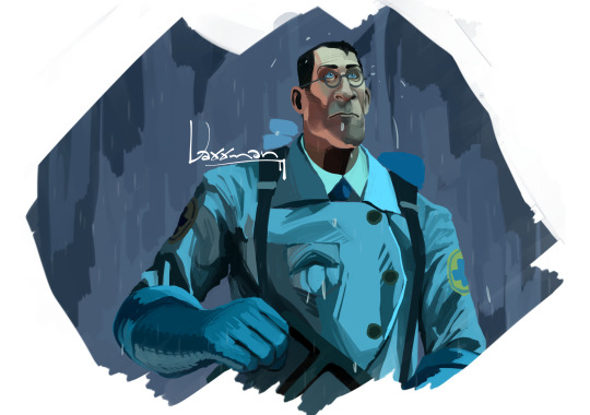
#team fortress 2#tf2#tf2 medic#emesis blue#when I said “I will stick to black and white”? I lied screencap redraw be upon ye#Dr Ludwig is the unreliable narrator ever#I want to redraw so many scenes from this movie all the shots are beautiful#I normally dislike horror movies because I'm a wuss who can't watch scary things#10 seconds into the movie and I had to look away when the camera zoomed in onto the respawned soldier's face but#when doc beheaded that guy in the chapel? and the whole congregation was applauding????#insanely cool
848 notes
·
View notes
Text
Anne inktober
I’m going to run an anne inktober this year. For those who don’t know inktober is a event where everyday of October you draw something new, usually halloween themed, every day. If you decide to post some artwork, please tag it as anne inktober and tag me if you want. I will try and reblog as many as possible.
The themes for every day are as follows:
To start Halloween month, draw a character standing alongside a classic Halloween monster (vampire, werewolf, etc.)
Draw the character alongside their actor. How would they interact?
In addition to having great protagonists, this show has great antagonist. Pick one and draw them as a great cinematic villain. (For the purposes of this day, yes Miss Rose does count as a villain)
There are so many ships, but so few couples. Today, pick one of those ships and draw them in a couple’s costume.
The Island is so beautiful. Today, don’t focus on the characters. Draw the island in all it’s fall colours. (You can use Google images to help you if you need it.)
Jerry is under-appreciated. Draw Jerry.
Draw your favourite character doing some magic. Could be spells, potions, riding a broomstick, anything.
Adventures in screen capping!!! Go back, and redraw a screen shot from the show.
Today, there is too much shirbert going around. Draw a couple/person, that is not shirbert/Anne/Gilbert.
October is candy month as well as just Halloween month. Draw your favourite character eating your favourite candy.
Miss Stacey is under-appreciated. Draw Miss Stacey.
Draw your favourite behind the scenes moment.
Tomorrow is thanksgiving for all us Canadians. Draw everyone getting ready for thanksgiving at the Green Gables.
Draw the actual thanksgiving scene today! (Bonus points if you include Gilbert, Bash, Mary and Delphine at the table)
Free Space! Draw whatever you want!
Draw older Anne talking to younger Anne. What words of wisdom do you think she would pass on?
There are many ghosts on the show (John, Marilla and Matthew’s brother, their mom, Miss Stacey’s husband, etc.) Draw them surrounded with their loved ones.
Diana is under-appreciated. Draw Diana.
How would the show be different if it was set in your town instead of Avonlea? Draw the characters at your favourite spot in your hometown.
There is nothing better than having a sweater. Draw your favourite character curled up in their sweater. Possibly with a book or cup of tea.
Draw Anne surrounded by all the fall colours/scenery.
Today, redraw one of your favourite promotional shots/a shot from the trailer.
Bash is under-appreciated. Draw Bash.
Anne loves Jane Eyer. Draw her into the story.
Draw the character dressed up in their halloween outfit. What would this character want to be dressed up as?
Draw your favourite character in your favourite Halloween movie.
Since I am writing this on the 30th of September, I have no idea what has happened since then. What is the biggest surprise I have received in the past month
Who do you think is under-appreciated? Draw them.
IDK what is happening with Shirbert at this point, but lets not focus on that. Draw Shirbert 15-20 years in the future, having already gotten married and had a bunch of kids.
Yall getting ready for Halloween? Draw one of the households getting ready too. (Green Gables/The Blythe-Lacroix Household/etc carving pumpkins/decorating/sewing costumes)
Since Harry Potter is very centred around Halloween, pick a character and draw them in their Hogwarts house.
43 notes
·
View notes
Text
VRAINS WEEKS “LINK-14″ - Daily Prompts 2019

Hello again Minna-saaaaaaan!
How are yooou? Did you miss me? Did you miss the 2 weeks we were talking about Vrains and Vrains only?
Yes I missed them, too. =D So I sat down and started thinking about the prompts for these year’s Vrains Weeks.
But first a little information!
As some of you remember I asked for another name for the Vrains Weeks because...”Vrains Weeks” sounds too normal and kinda boring even if any of you understand what they are. (I had a minute I wanted to call them Double Week but that was even worse.)
So I asked around if you guys have an idea how to call them and actually...
One person had the perfect idea!
So first let me introduce to you the new name of the Vrains Weeks:
Link-14 (Weeks)
And I think it fits. 2 Weeks have 14 days and everyone in the Vrains fandom knows what you mean when you say “Link-”.
My special thanks for this name go to @mythicalartisttm
Thank you so so much, my brain never ever would have thought this way!
Thank you! Danke! ありがとう!
Before we start with the newest Vrains Prompts for 2019 let’s take a look at the rules again (So noone can say they didn’t read or find them!)
NO Bashing of ANY content! That means no BASHING or INSULTING over any Headcanons, Theories, Shippings, Works and and and.
NO NSFW. Sexual and / or Gore content or similar for some people in a fandom are exciting ofc but since I can’t control the age of this blog’s followers I have to keep this free for minors. Also I hope this will keep triggers away from some followers.
NO Copying, Stealing or Reposting of other people’s work! Not even with credits! This is unfair and really NOT a way to show YOUR content. Also you hurt the real artist with this and we don’t want and don’t need this. YouTube Videos musiclinks or similar for special topics for a day are excluded as long as credits such as the directlink are included. (Please contact me if someone reposted your art over the #vrainsweek or #VRLINK14 tag)
Don’t forget! If you break one of those rules you will be banned from VRAINS WEEKS!
Also I want to inform you that every content is allowed as long as it doesn’t break the rules. Drawings, Cosplay, Theories, AUs, everything aslong as it fits with the topic!
About the tag you have to use to find your work you can use 2 tags now:
You can still stick with the #vrainsweek from last year or use #VRLINK14
I will look at both of them to check your guys’ works. Just don’t forget to tag!
Ok, here we go!
Ready for the 2019 prompts?
Monday (15th July 2019)
“Favorite Headcanon”
To start the Link-14 weeks let’s begin with something easy.
Show me your most favorite Headcanon you had so far after 2 years of Vrains.
Draw something, describe it, whatever you like! It doesn’t matter if this headcanon is old or brand new just show us you always wanted to show all of us!
Tuesday (16th July 2019)
“Androids”
Wouldn’t it be great if we see the Other Ignis as Andoids as well? Or even Yusaku and the others?
I wonder how they survive in the real world? Do they eat like normal humans? Will they ever feel tired?
How would the Ignis look like?
Aaaah so many questions~
Wednesday (17th July 2019)
“Happy Hot Dog Day!”
Of course the newest LINK-14 Week again is the same date as the National Hot Dog Day as well!
And again you can do whatever you like aslong as it includes a Hot Dog (I am sorry if it sounds a bit NSFW But I DON’T MEAN IT THAT WAY ///)
Thursday (18th July 2019)
“Babies”
Last year we had a prompt which I wanted you to put our favorite characters into adults.
This time let’s go back in time and show them as little kids and babies.
I think Vrains has too less of some past shots from when our favorites where small and cute, let’s change that!
Friday (19th July 2019)
“Memories”
Thinking of the past can be beautiful but also pretty cruel. We all know that everyone of us thinks of the past knowing that it made us what we are today.
So do Yusaku and the others.
They think of the past and appreciate every memory they have no matter if they are hurt- or beautiful.
Saturday (20th July 2019)
“Gaming Champs”
Ok ok so...
I played some League of Legends a while ago and suddenly I thought:
“How would Yusaku look like as a LoL champ?”
I went too far and even thought about his skills but hey!
Wouldn’t that be a great prompt as well?
If you guys are actually gaming something why don’t you put Yusaku or Ryoken or whoever you like into a game? No matter if it’s an MMO or something like Super Mario or Sims 4 or whatever you like.
Maybe...I will design Yusaku as a LoL champ as well *laughs*
Sunday (21st July 2019)
“Vacations”
We all are soo thirsty for a beach episode but it looks like we never get it...sadly ... *cries*
BUT
That’s why the LINK-14 Week is here for so let’s get the boys and girls into some sweet vacations!
They really REALLY need a break!
It doesn’t have to be the sea, send them wherever you want them to be.
Another place, another country, wherever you like!

Monday (22nd July 2019)
“What if?”
What if Ryoken / Revolver never was able to save the children from the Lost incident?
Tuesday (23rd July 2019)
“Share some music”
Music is my way to happiness I always say.
What are the songs you relate the most to when you think of Vrains?
It can be anything, songs to some AUs or to a special character or shipping or a scene you liked the most.
You can share Spotify playlists or YouTube Links or just the title and singers of the songs (Please don’t upload music files).
If you want you can use this prompt as well to show some relating from Vrains characters to music (For example Hanois as a band)
Wednesday (24th July 2019)
“Me when I watch VRAINS”
I am curious and maybe this prompt is a bit stupid but Vrains and the LINK-14 week only works with the people who actually watch Vrains.
And I want to give you a “stage” cause you matter a lot!
What do you look like when you watch VRAINS? (Describe it or draw it or even take a photo of it haha)
Thursday (25th July 2019)
“VRAINS goes Hollywood”
So I have two tasks and whatever you like more is what you gonna do:
Drawers: Redraw a movie cover / movie poster from whatever movie with Vrains characters.
Writers: Take a scene of a movie you love and rewrite that scene with Vrains characters.
Those movies can be anything (Disney, Marvel, Ghibli or other Animes, Romance movies or Hunger Games stuff) as long as they still fit with the LINK-14 Rules.
Friday (26th July 2019)
“VRAINS Manga”
I don’t know how long we will wait till we finally get a VRAINS Manga
But we all have a lot of imaginations of how it will be.
So share!
Saturday (27th July 2019)
“Happy Birthday!”
Imagine it’s Yusaku’s birthday.
No other comments needed just be creative ;D
Sunday (28th July 2019)
“???”
This day will be a surprise.
Just wait till 28th July to see what’s up.
AND ALWAYS REMEMBER!!
DON’T FORGET TO TAG YOUR POSTS WITH #vrainsweek or #VRLINK14!!!!!!
See ya in July Minna-san!!
Choco
Note: I got the render pic of Yusaku for the header from here: LINK ME
83 notes
·
View notes
Photo

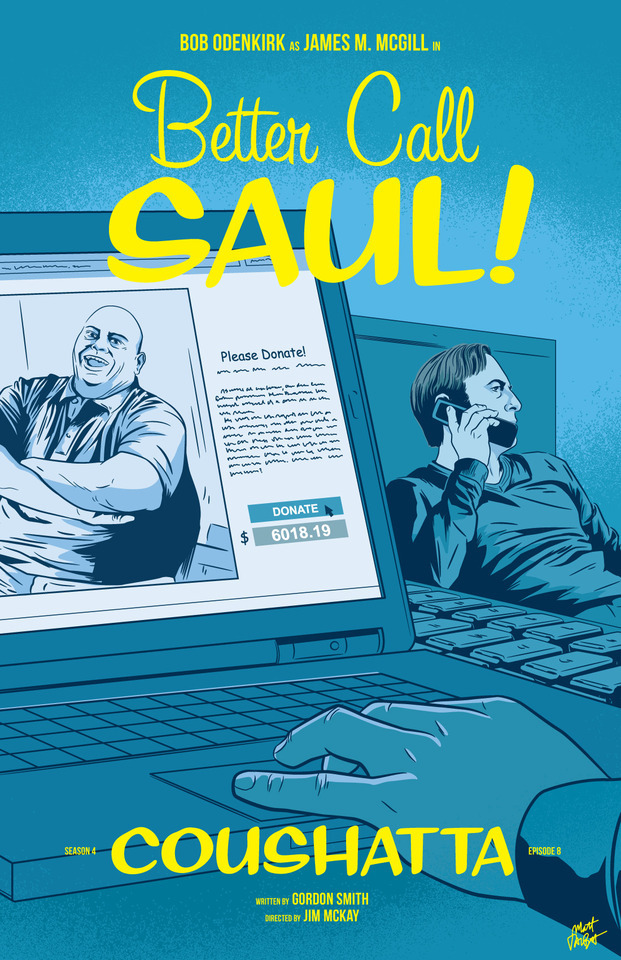
APPRECIATION & INTERVIEW
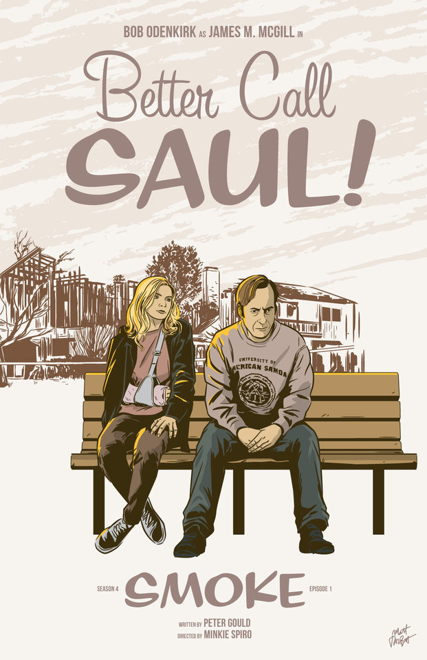
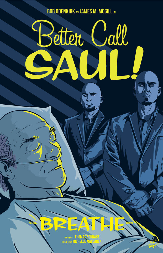
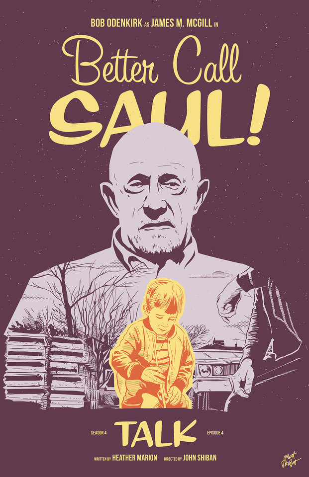
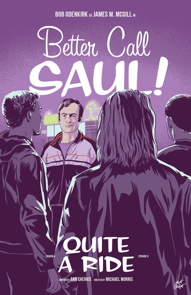
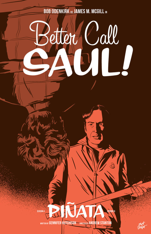
Better Call Saul episode posters by Matt Talbot
After 4 nearly years, I thought it was time to catch up with Matt Talbot about his Better Call Saul poster project. The last time we talked during Season 1, Matt was deep in the hustle of making his name as an illustrator: juggling a full-time job, freelance projects, as well as band. Finding time for personal projects like this one can be a significant challenge. (Not to mention surviving the death of your tools: During Season 1 his Mac laptop died, and this season, his Wacom tablet bit the bullet). But despite these challenges, the 43-year-old New Hampshire native has persevered to create a clever and thoughtful series of episode posters that has garnered considerable attention, and brought with it new high-profile clients and art exhibitions.
First, congratulations on all of your success and recognition with this series of posters. It’s well-deserved. What’s been the most gratifying feedback you’ve received?
Thank you! Every interaction I’ve had with anyone from the show has delighted me. I've been surprised by all of the cast and crew members who have said nice things – every note I’ve gotten has meant a lot to me. That being said, Michael McKean randomly tweeting at me that he has my poster for Chicanery hanging in his home blew my mind. I was eating dinner when my phone showed the notification and I literally jumped up from the table. I’ve been a fan of Michael’s since I saw Spinal Tap in the ‘80s and never in a million years would I have guessed I’d make something he valued enough to hang in his home.
Tell me about your contributions to Gallery1988 exhibitions. How does that process work?
It's a pretty simple process. They invite me to be part of a show, and I make something to send them. I’m very excited for the opportunity to show there, and I feel like it’s a milestone in my art-making career.
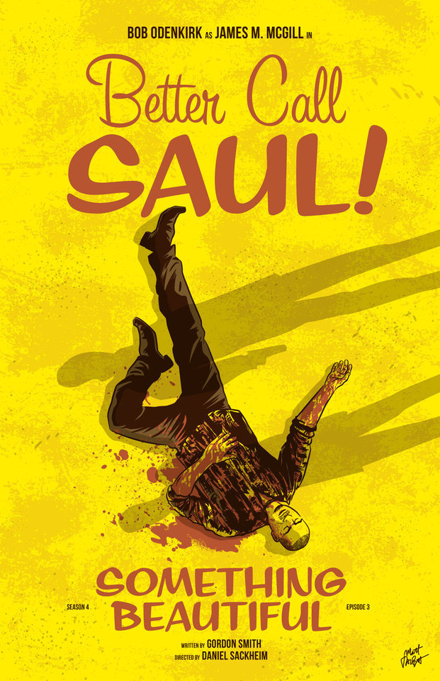
Across the 4 seasons, which BCS posters are your favorites? Which one are you most proud of? I’m particularly fond of Rebecca, Rico, Marco, Switch, Sunk Costs and Something Beautiful.
Oh man, it's hard for me to evaluate my own stuff. I tend to like the posters where I find a way to get a different take on something they did in the episode. I would say that “Sunk Costs” is also one of my favorites because I did something differently than how they shot it, and because Mike is so recognizable even from the back. I was also pleased with “Off Brand” because it was when I finally figured out how to draw Bob Odenkirk.
How has your process for creating these posters evolved over 4 seasons?
When I started this project I had a vague idea that I would focus on scenes rather than portraits or likenesses, but that didn’t even last half a season! The characters were too good not to include. In that way, the posters have evolved in my willingness to draw characters, and also, hopefully, my ability to draw them.
My process is now something like: Watch the show on Monday; think about it on Tuesday, figure out what stood out to me and do a thumbnail sketch or two; draw it on Wednesday night; post it Thursday afternoon. I’m a bit faster at drawing these now compared to when I started. And I’m a bit more decisive on choosing which subject matter to depict.
There have been quite a few changes on the visual side of Better Call Saul over the last 2 seasons. New directors (Minkie Spiro, Daniel Sackheim, and Andrew Stanton), a new cinematographer Marshall Adams, even new cameras. What are your thoughts on how the show’s visual grammar has evolved? Has any of this impacted your posters from Seasons 3 & 4?
I try not to just redraw literal scenes from the show, and I don’t need to tell you that they shoot the show in an incredibly beautiful way. I mean, they always, always, pick the best angle, the best shot to capture something. For that reason, it’s sometimes hard to to come up with another take on a moment from the show.
That being said, the visual style hasn’t really impacted my posters as much as the evolving subject matter has. The show, I think, is substantially darker than it was in the early going. It was easier to depict Jimmy’s hi-jinx in the first couple seasons. But with Chuck’s deteriorating mental state, the cartel stuff, Mike going deeper into Fring’s world and of course, Jimmy’s loosening sense of morals, the funny moments are harder to spot. That’s lead me to some more somber layouts and color choices.
We didn’t discuss this in our first interview. Which typeface are you using in your posters, or is this custom typography?
The main logo and episode titles are set in Sign Painter, from the excellent House Industries.
The Heisenverse is known for it’s color theory and use of color. How has that impacted your color choices in these posters?
I’ve kind of adhered to their blue=good/red=bad symbolism, but I also try to balance out colors between episodes and not repeat myself in sequential posters.
Many of your posters (especially ones this season) use a monochromatic, or simple palette of 1-2 colors. Tell me more about why you chose that approach. Is this a signature of your style? I’ve seen this approach in a lot of your work.
You know, in the early seasons, I was trying to use simpler color palettes, but I wasn’t very disciplined and I got away from that. I’m trying to stick to a more consistent style in season 4. It is a conscious decision. I also feel like with the week-to-week nature of this project, it helps quickly set apart each poster. And, I really do love limited color palettes. Giving myself color constraints helps me figure out different ways to solve layout problems.
I’ve heard other illustrators say that Bob Odenkirk’s facial features are tricky to capture. Do you share that sentiment? Which characters are more challenging to illustrate?
I do agree with that. I had a really hard time with him at first. I kind of think I have a better handle on it now, but I’m always trying to get better. I feel like if you can get his mouth right, it goes a long way.
I found Hector hard to capture both times I drew him. Mike, on the other hand, is just pure fun to draw. Jonathan Banks is so distinctive and iconic.
What’s been the most difficult poster thus far? Why was it challenging?
Maybe it’s because a lot of time has gone by, but I can't think of one that stands out as having been really difficult.
Francesco Francavilla did alternate posters for some of his Breaking Bad posters. Inevitably, when artists look back at their work, they consider revising or redoing it because of a variety of reasons – their point of view has changed, their skill/style has evolved, or maybe they were never truly content with the final product. Looking back at 4 seasons worth of posters, are there any that make you want to scratch the revision itch?
Yeah, more than I would care to admit. I would really like another crack at Amarillo. I know I could do a better job and that drawing is just super flat. In season two, I decided to to experiment with style and I kind of wish I hadn't. I like Cobbler, but I wish I had drawn it in my normal style. I would redraw Nailed for sure. Oh man, if I start going down this road it's not going to end well, so I'll just stop.
You mentioned earlier this season you were excited to draw Track Suit Jimmy. Who or what haven’t you drawn, that you are eager to illustrate?
Howard! It bums me out to no end that I haven't drawn him, but it just hasn't worked out. And I need to include Kim more. It's kind of criminal that her face only appeared for the first time in a poster this season.
What’s your opinion of Season 4? Tell me about your favorites – episode, scene, character.
I think season 4 is brilliant so far. The Kim/Jimmy relationship has deepened so much this season, and feels so real, but full of inevitable heartache. Oh, the flash-forward to Breaking Bad’s timeline was amazing. Mike doing his audit in the Madrigal warehouse. Really, anything Michael Mando does on screen. It's hard to pick. I so enjoy the deliberate pace of this show.
Where’s your favorite place to discuss the show?
I honestly don’t talk about it too much online, though I lurk in a few places and read a lot. I actually discuss it mostly with my wife!
I know you get this question a lot, so let’s cover it here so folks understand: Do you have plans to sell any of this work online?
I really appreciate that people like it enough to want to buy it or hang it, but I don't plan to sell the Better Call Saul posters online. I’m doing this for fun, not to make a buck off the show, and I don’t own the rights to sell it anyway.
What’s next for Matt? Do you have any other poster or illustration projects in the works? Is you band performing soon?
I have several more pieces for Gallery1988 shows coming up. I’m pulling together an art show at a local brewery for whom I design all of their labels and stuff. I’m patiently waiting for a t-shirt I designed for one of my all-time favorite movies to be announced. And for the past several Octobers, I spent the month drawing a horror poster per day. I’m not sure if logistically I can do that again this year, but I’ll probably fit at least a few in. We’ll see how it goes. Sadly, with all of my illustration work, I haven’t had any time for music making, but someday I hope to get back to that!
Follow Matt: Web site / Tumblr / Twitter / Dribbble / Instagram / PosterSpy
– Interview by Shayne Bowman, Heisenberg Chronicles
#better call saul#artist interview#matt talbot#mine#heisenberg chronicles#illustration#fan art#posters#favorites#mattrobot#bcs season 4#gallery1988#g1988#house industries#sign painter
90 notes
·
View notes
Text
Which 2d Animation Software Is the Best?
Let's begin by looking at what animation is and answering the question, "What exactly is 2D animation?"
This type of animation is likely more familiar than you might think. This type involves creating two-dimensional characters within a flat space. Consider it this way: Everything you draw only has width and height. No depth.
How does one get flat objects or characters to move? This is where the artist would transfer the images from the page to 2D animation software.

Animations can display one drawing for every 2 frames of standard 24 frames per seconds (24fps). This means that each second there is 12 drawings. This may differ depending on the animation style. For example, in anime, "threes", rather than "twos", are the preferred frame rate. When creating 2D animations, think about what frame rate you prefer for the work you are doing.
These classic Disney movies are excellent examples of 2D animation that can be used on the big screen. However, this type work is not just available in cinema. Many people might be asking "Is 2D animating dead?" but this technique is still very popular in advertising, corporate marketing and gaming.
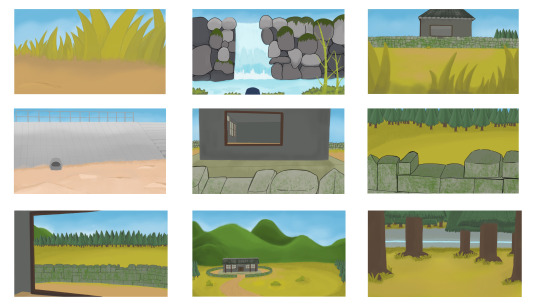
Examples of 2D Animation
Do you want to see the 2D animation at work in action? Here are a few examples.
While most Disney films and cartoons use 3D animation now, it was not the case for many of our favorite Disney classics.
The Pixar Computer-Animated Production System was introduced to The Little Mermaid in 1989. It replaced years of manual pencil 2D animation. The Walt Disney Company designed this 2D animation software specifically for post-production.
The Simpsons, America's longest-running animated series, has a distinctive look and feel. This is despite many improvements in animation tools and techniques.
Pencil Check Pro costs around $400 to download, making it not the most affordable option for beginners who want to learn 2D animation. This software is used to create 15 animated scenes that are based upon static storyboard ideas.
Learn the Basics Of Animation
2D Animation: Is it easy?
Animation, like all creative arts, can be as easy as or difficult as you'd like. 2D animation requires only a pencil with basic whiteboard animation software. To create beautiful animated cartoons, you should first master static drawing.
You should not overlook the ability to draw accurately and quickly if you are interested in a career working in 2D animation. A studio can charge a lot to rework 2D drawings when the creative direction changes. If you want to succeed, it is important to be able to draw and redraw the same object or character in thousands of different ways.
Technology has made 2D animation easier and faster for amateur and professional artists alike. Even if your first experience with animation software has been a challenge, there are many classes to help you make the first steps towards creating your own characters.
Animation can seem intimidating for beginners. Some people may confuse 2D animation with programming. It's not all about programming and solving complex math problems.
Top reasons to choose an animation company that does 2D animations for your video
Animated video is a powerful tool for communicating new ideas and information. It brings life to the animated characters.
Even if 2D Animation is new to you, you can still get started. This guide will show how to make your very first 2D animation video. It is a guide for all beginners.
Basic steps in 2D Animation
You can now dive into animation by keeping the 12 basic principles of animation in mind. These tips and techniques will help you get started animating.
1. Create a storyboard to set you up for success.
A storyboard is a visual representation of the animation project you are working with. Keep in mind that animation is not the same thing as graphic designing. While they go hand in hand, an animator or video graphics should use a graphic specialist to create the animation blueprints before moving on with the project. It will be more difficult to find the right principles for any animation if you don't have a plan or a script.
A storyboard acts as the visual framework for the project. Either search for storyboard templates online, or make your own. A good storyboard will include the video title and purpose. It also includes a place for the shot number and graphic orb-roll footage.
2. Choose your animation software.
Research is a good idea if you don't know which software you'll use to animated. Canva is a good place to learn the basics and get your teeth cut. You might use it to create a GIF animation or a short piece. Adobe After Effects is where the magic happens, if you intend to continue animating.
Learning either software can be slow. For help with specific animation techniques, use YouTube. Find the skill you want and search for a tutorial. Udemy provides professional guidance and more intensive animation classes.
3. Start each animation with still images.
After you have created your storyboard and a plan for animating it, it's now time to get started with the animation. After you've made the entire layout, save it as a still picture. The principle of solid drawing really applies here. Images must have depth and feel like they are moving, even if they're not on the page. This will make movement feel natural.
Graphic designers can help you if your skills aren't in-house. Sean said that "I couldn't do my job without a support network--my coworkers." If you're serious about animating, then you need to take art classes so you can create still images.
4. Keep your animations organised.
When you start the project, you will create assets such as backgrounds, characters and shapes. Then, you can animate them in groups. If you have the same zoom setting or push animation applied to each asset, group them together. This saves you time, improves efficiency, keeps things organized, and helps keep everything in order. Then, order the assets. Select the assets that you want to sequence first, and then pull them down the timeline. To create natural and realistic animation, it is important to ensure that everything falls in the right order.
5. All your resources should be used.
These tutorials are not the only ones available on YouTube or Udemy. You don’t have to find expensive resources. Anything that helps with shape and movement can be an invaluable help in animation. You don't have to spend a lot of time on them, since you can write, draw, and paint in the same way as animation. Your arm movement and wrist movement will translate to After Effects text and shape movements.
0 notes
Text
AX3002: Animation Production and Professional Awareness (January-February)
21/01-25/01
At the beginning of this semester, all of us showed the process that we have done during this Christmas vacation. We also had feedback about something that we did last semester.
I need to finish the practical project this semester, but there are lots of deficiencies in my animatic. There are some feedbacks from this Thursday.
Firstly, my main character- the stone, I need to set a target for him. Why he wants to travel? He needs motivation. So, this is should be presented at the start of the film. Secondly, turning to a smooth stone is a long term process, but in my animatic, I haven’t shown it in the correct way. The background needs to change. Thirdly, probably I can do some changes to my animation’s style. Don’t do everything in Maya, combining 2D environments with 3D characters together. It can save much time. Fourthly, I should think more about my camera movement, because I had some same shots in my animatic, it must be boring for the audience.
Actually, I also want to do a little change to my main character, he is the hero in this film. he needs more emotion and expression.
According to Pete’s advice, I also need to do some researches on a short film, which is called ‘the monk and the fish’(https://www.youtube.com/watch?v=K2u96bMm0Os https://www.youtube.com/watch?v=Jrz4AAq-izA) I am not sure if it is called the brush line animation. it is quite simple but cute. There are also not too many colors, but it presents what we have and where is the character. This might be one method that I choose to design my environment.
And there is not only the film that I need to finish this semester. I need a plan because there are much more works to do. The action plan, the CV, essay, poster and the art of the film. So, I will talk about the changes in my film with Pete, Mario or Mark, decide what should I do next and draw up a detailed plan until the final deadline next week.
28/01-01/02
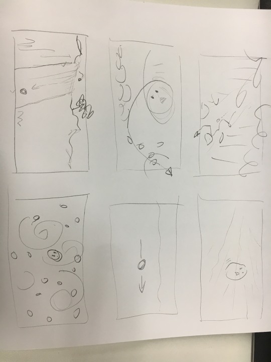
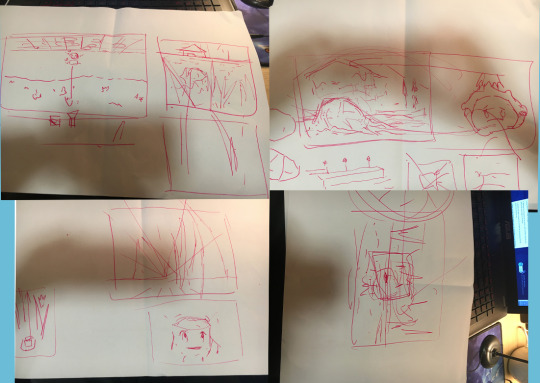
Tuesday: About the motivation that why the stone wants to be more smooth. I think he has to see something which attracts his eyes. The following picture is a draft of camera movement.
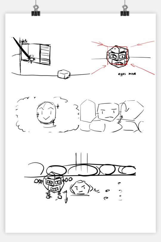
I want to show that the stone that lives on the wall which is surrounding a house sees an amber through the window. He thinks it is beautiful, and he is upset because he is dirty and full of moss. And the camera zooms in and shows the stone’s dirty body. He thinks if he becomes shining, he will be proud of himself. So he tries to escape from the wall. After he falls down from the wall, he gathers some small stones to be his arms and legs.
PETE said that there could be a person who put the amber on the desk so it can make everything seem logical.
About the way of how to present the time goes by, I think I can show it by turning the forest into a small village and then turning into a modern city.
PETE said maybe I can show the forest and the stone together, or let the camera moves between the forest and the stone.
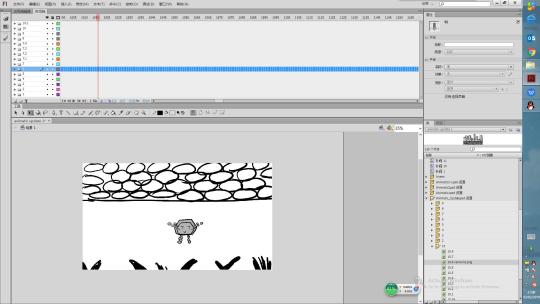
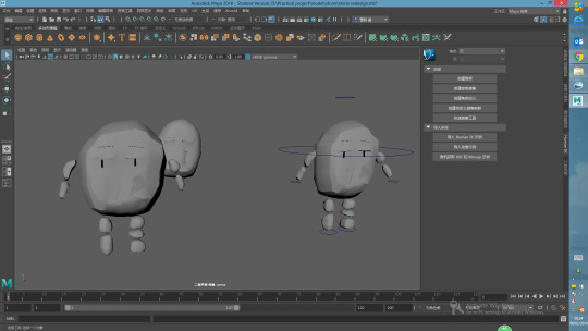
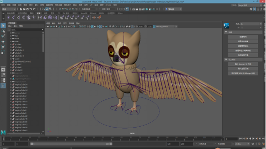
Thursday: Because I haven’t decided which parts will be drawn, so I keep modeling until the answer is out. I try to practice the rigging, painting the skin weight in Maya, it brings a lot of problems to me. The percentage of one joint should occupy on the skin is hard to control.
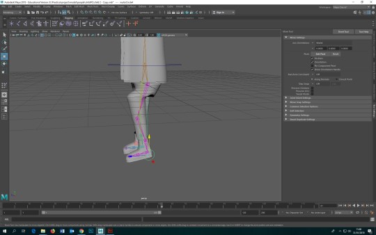
So I need to find more reference and data and try more times.
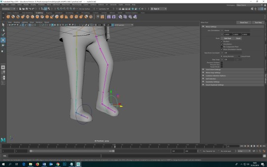
So I restart rigging, this time the legs can move better but I haven’t solved the problems with the arms.
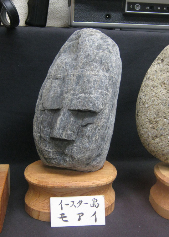
And about my main character- the stone, I show two kinds of stone to Mark, the left one’s eyes and mouth are separating from the body.
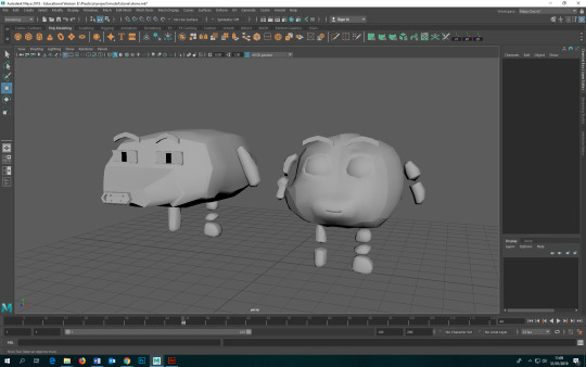
I think it may be more difficult to rigging. But Mark’s feedback is that the eyes and the mouth are more like having been made by people, it is not natural at all. So I need to redesign the stone. And Mark gave me some advice about some stones with natural faces.
https://www.thisiscolossal.com/2016/11/the-japanese-museum-of-rocks-that-look-like-faces/
It provides a good example because maybe I can use the irregular bumps on the stone to be its feature. Also, Mark’ s feedback includes a movie called GALAXY QUEST. There is also a good example of a stone monster.
https://www.bing.com/videos/search?q=rock+monster+galaxy+quest+youtube&FORM=HDRSC3
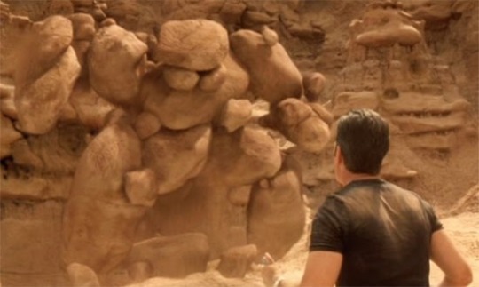
It is a monster that is bigger than human and it is comprised of many stones, so it is not as same as the stone in my film. But it is a good example of a stone monster.
On the way of how to show the time passage, my idea is to show the changes from a large forest to a small village and then to a city. Also, there is some research on different ways to show this change.
LAVA: https://www.youtube.com/watch?v=uh4dTLJ9q9o
ONE FROGGY EVENING: https://www.bing.com/videos/search?q=Full+Cartoon+One+Froggy+Evening&FORM=RESTAB
These two methods also tell the time passage by the change of the environment. But one is about the natural environment, and another one is about the human building. I prefer to choose the natural environment.
There is feedback from Mark, it is about the different shots of how this stone rolls in the river. It should be more fun with more different angles. And also, there is something have been changed about the script. Such as maybe I will insert a waterfall in my script.
About the script update, maybe the appearance of the factory breaks the balance in my film. Maybe it can be better than everything is natural without man-made. So my idea is to change the factory to a pipe, and then the pipe inhales the stone. The stone rolls in the pipe and then is transported to a beach.
Setting sun a shadow of the child picks the stone.
one night passes
The stone appears in a beautiful garden. The light let it look more shining.
So I will keep drawing the new animatic and redesign the character this week.
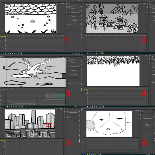
Saturday: animatic update
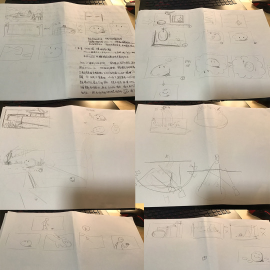
In order to make sure that there are no other big problems with doing the formal film. I need to redraw some shots in the animatic.
In some scenes, it is a little hard to draw the correct perspective angle. So I only provide rough positions. After the animatic is all right, I will find reference pictures when I start to draw the final environment design.
I have different ideas about some shots, so I need to talk about these next week. And if I need more details and sound in this new animatic, I will finish it before the first milestone.
04/02-08/02
Monday: main character- stone redesign
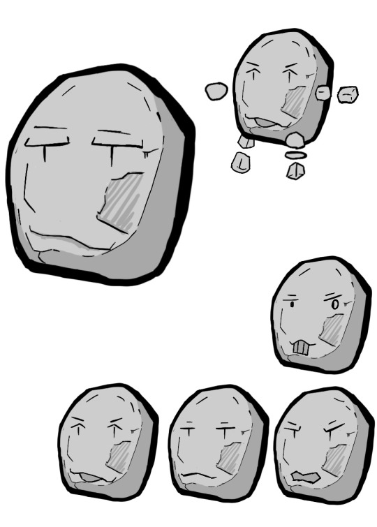
In order to show a natural stone, the eyes, and the mouth are redesigned by some irregular shapes. So I will show it to Pete or Mark tomorrow, if it is OK, I will model it this week. I got this idea from this picture.
I like this style rather than that stones which have three shallow holes on it. Because this kind of rock is more shape. The stones with three shallow holes are usually smooth. I think they have been washed for a long time. So I like this shape nose and eyes.
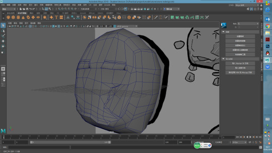
So, this is the process of rebuilding the stone model, but I am not sure how to arrange the line. I need to rebuild again.
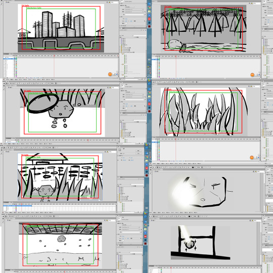
Tuesday: FEEDBACK OF ANIMATIC FROM MARIO
There are shots that can be presented in a better method.
1. After the stone falls down to the ground, changing the camera to look down shot until the stone walks into the grass.
2. Show the stone and the time passage in one scene, after the time passes, the stone will be hit and drop to the bottom of the waterfall
3.cancel the zoom in when the eagle is catching the stone
4. Walking out of the grass by the stone’s view. And then using the shot that as the same height as the stone.
5. Simplify the pipes underground and keep the city building when the stone is crossing the city.
6. When the light hits the stone's eyes, the stone needs to show the feeling of being unable to open its eyes. And the effect of light doesn’t look like light.
Also, after this shot, there is a shot that needs to show the shining amber. Don’t need to zoom in, just show the amber directly after cutting the shot before.
When the camera comes back to the stone, show more expressions that should be aiming to show he likes to be more beautiful and smooth.
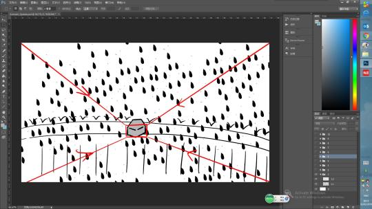
So these following pictures are the changes in some shots.
Thursday: FEEDBACK OF ANIMATIC FROM MARK
We discussed a lot of things that need to be changed. The most common problem throughout the animatic is that the shot doesn't show what I need to express myself. Will make the audience feel very confused. At the same time, a lot of camera shots in my film are not necessary, which cause a lot of waste. In some scenes there is also a lot of space, making the picture very empty. According to Mark, when making the whole animation, not only the direct connection of the lens should be considered, but also the audience should be able to understand the meaning of the picture. Therefore, most of the modifications were made on the lens structure. Through the adjustment of the angle, as far as possible to reduce the inharmonious elements in the picture. From the beginning of the film to the plot of falling stones, have been greatly modified. The rest of the plot, scene, and perspective have been modified. Because the formal scene and character production have not yet started, so the modification is relatively rough. Before next week's milestone was originally planned to start the final design of the characters and scenes after completing the animatic. But the animatic modification took a long time. After the feedback of the new animatic next week, there must still be some changes to be made, but it needs to be carried out together with the character and environment design.
11/02-15/02
Tuesday: I start to think about the character re-modeling and the environment design. It is not easy to model an object that I can’t find around myself. So, I need many references. today, I am forced on the remodel the eagle in my film.
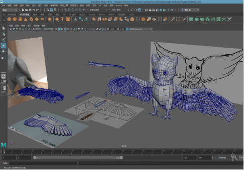
I also think something about how to build the wings could make the rigging easier. I searched some pictures in these following links that I need to know how many parts do one wing divided into.(https://www.google.com/search?sa=X&rlz=1C1GCEA_enGB814GB816&q=bird+wings+without+feathers&tbm=isch&source=univ&ved=2ahUKEwjOlsfqjrbgAhXjUxUIHSe4BmYQsAR6BAgCEAE&biw=1920&bih=1040 https://www.google.com/search?rlz=1C1GCEA_enGB814GB816&biw=1920&bih=1040&tbm=isch&sa=1&ei=_KFiXLmXPJSW1fAPoK6diA8&q=bird+wings&oq=bird+wings&gs_l=img.3..0l10.865596.873010..873201...3.0..0.76.593.13....3..0....1..gws-wiz-img.......0i67j0i5i30.17ziqR2XCJ0#imgrc=IVFyKXl84J7LmM:)
I have modeled two types of wings at the left corner in this picture. one is made by extruding(https://www.youtube.com/watch?v=YPZ_vhjxHS0), the other way is pieced by every single feather.
https://www.youtube.com/watch?v=7xThiBnEyPs
this link is about how to rig the birds’ wings, but it starts with the feathers that have been bind skin. so I try to control one feather in the same way that can be chosen to rig the human’s fingers. to add an attribute and then connect them.
https://www.youtube.com/watch?v=S870qa7gu0c
this the link is to teach how to create and connect the finger controls. I don’t know how to duplicate the feather like the man did in the former video. but if I use the duplicate special to copy the model only, when I rotate the handle of the first feather, all the feathers can move together. but the spread levels of the wings are different, so I think if I can do it by more handles. but I am not sure that if it is the correct way to rig, so I need to ask my tutors about this question.
the eagle isn’t the only one object, the head, the body, the tail, the wings, and the legs are all separated from each other. so maybe there will be some problems when I start to paint the skin weight, but I hope it won’t be a serious problem that I can’t use this model in my final film.
18/02-22/02
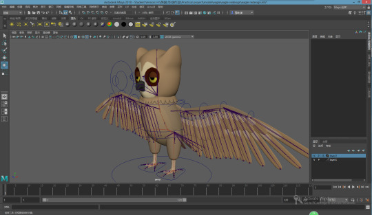
a model update
I have started rigging the eagle this week, and I want to finish it this week and finish some environment drawing. I am studying how to rig in the video in the following link.
https://www.lynda.com/Maya-tutorials/Rigging-Winged-Animal-Maya/166505-2.html
the summary of this week
25/02-01/03
I am still working on the rigging of the bird. and there are only the bones of wings without rigging. I have no idea about it. to be honest, I cannot understand how other people did in those videos.
so I am looking for some other video to refer.
to save time, I am drawing the environment now. I am not good at drawing, in order to keep the angle in each scene is alright, I build a rough model of the environment, and then take pictures from different angles that I need to use in my animation.
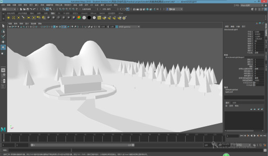
these following scenes are those which have nearly been finished.
at first, I was worry about the color, although Mark suggested that I can draw in Sumi-e style, I have not tried this style in the past. I drew in the color that is a little grey, but my animation is easy, not melancholy, so I tried to use some lighter color. I think next I should consider the moving parts of the scene, such as the river. Of course, these scenarios are not completely finished, and some details need to be added or modified.
0 notes
Last Seen Blogs
pokemonpo
man......
schnees-and-schnugs
SCHNEEBLING APPRECIATION

smmpans
smmpans
mynewtype
SILENT VOICE

amittribekids
Untitled