#I wanted to try the new Tumblr trend with the colorful background and text effects
Photo
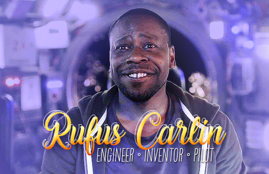
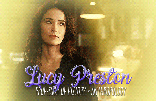

SPTV's Timeless: a summary of the TimeTeam
#Timeless#timelessedit#Lucy Preston#Wyatt Logan#Rufus Carlin#eloedits#The SPTV stands for Sony Picture Television since they got the rights back#NBC doesn't own it anymore since the movie#NBC can burn LMAO and they can fuck off with their revival of Quantum Leap while we're at it#I wanted to try the new Tumblr trend with the colorful background and text effects#Took me over 4 hours for 3 gifs bc I wanted it to be great but urgh it never will be
137 notes
·
View notes
Text
Thoughts on fandom: inclusion and engagement.
(Art credit to the kindhearted @penpanoply!)
There’s been some stuff floating around on Tumblr about strife in the CO/WS fandom, and though I haven’t been explicitly named-dropped on anything public, my DMs have been... active. lol Rather than rehash what’s been said already, I just want to impart a little wisdom and perspective in the hopes it may soothe frayed feelings and offer a way ahead for cultivating a respectful community. As someone who has been an active participant in online fandoms since the mid-’90s, which was the advent of online fandom content creation (shout out to my fellow X-Philes!), and who has also spent a chunk of her professional life managing social media for the federal government and for activist groups, I can promise you it’s all gonna be okay.
Here’s some context for why strife happens and what we can do to create a more inclusive and communicative fandom environment.
1) It sounds cliché, but fandoms go through growing pains.
In the case of the Simon Snow fandom, what was once a small and cozy space untouched by cataclysmic events (such as the release of *gasp* a sequel) has grown exponentially in a relatively short amount of time following the release of Wayward Son. Newcomers are eager to find a home in this space at the same time as folks who’ve been here a while may be consciously or unconsciously wary about widening their circle, and It’s important to remember that this is not necessarily an expression of bad behavior on either side but just human psychology doing its thing.
The byproduct, however, is that tension and stress builds over time from the lack of meaningful communication across the divide, which subsequently fuels misunderstandings. Ironically, the interfaces we use to communicate don’t help with this because any existing communication about the tension happens in tiny vacuums until a trigger goes off and bad feelings go public.
Way Ahead: These moments of destabilization are opportunities to see where we can be more self aware about how we engage with fandom and the kind of community we want to be. Can you promote, support, or befriend someone trying to gain a foothold? If yes, please do! Each person must reach their own decision about what they can do within the confines of their available energy, health, and time, but a little self awareness goes a long way as long as you’re honest with yourself and others if applicable about what you can contribute. Anyone who judges you for it isn’t worth the strife.
2) In a fandom comprised of vulnerable/marginalized people, it’s more accurate to say that cliques are “bubbles of trust.”
This one's important. Just by nature of the source material, the CO/WS fandom includes fans with a wide array of backgrounds and experiences, especially when it comes to those who identify with the characters’ queerness, mental illness, and/or trauma. I really believe––based on individual conversations/group chats––that the difficult lived experiences that so many of our fandom peers have endured has produced one of the most open, aware, and accepting fandoms I’ve had the pleasure of participating in. Our vulnerability is, in a real way, our strength.
That said, a community of survivors also has the side effect of cultivating small circles of engagement that I call “bubbles of trust.” When you’re a survivor of abuse, marginalization, mental illness, fill-in-the-blank, it’s often quite hard to risk casting a wide net and expanding your circle to include new faces––which can subsequently be internalized by equally sensitive and vulnerable newcomers as rejection, judgement, or inadequacy.
Way Ahead: First of all, there may indeed be gatekeeping and exclusion going on. But before internalizing someone’s cagey behavior as gatekeeping or purposely exclusionary, ask yourself if you have all the information. Many people are private (I include myself in this assessment) because life has regrettably taught them to be this way, and so they may insulate themselves to a small group of people who have earned their trust. Some people might also triggered by certain content (case in point: smut triggers my anxiety) so they don’t engage with it. Others might have something in their pasts that define how they handle certain subjects (for example, a person of color should not be tone policed for getting angry when confronted with a racialized microagression, however accidental it was). You just don’t know what you don’t know.
The solution here is to regularly check your privilege and ask questions in a private space if you sense you’re being treated unfairly by someone. If you go public with your grievances in hopes of mobilizing the mob, you may accidentally find yourself stepping into the role of the aggressor instead of the victim.
3) Social Media is not built to help you get engagement. It’s built to help itself make money off of you.
Repeat after me: Hits/likes are not a measurable indicator of talent or worth. There are ridiculously talented folks on Tumblr and elsewhere who, for whatever reason, haven’t had their viral moment, and it’s not their fault. Loads of factors come into play where things like likes, reblogs, and comments are concerned, among them being posting frequency, subject matter, the time of day, the day of the week, the week of the month, the month of the year, the current administration, the stock exchange, the concentration of middle class users, who just won the Superbowl, a madman trying to steal an election and undermine the democratic process, a PANDEMIC, do you get where I’m going with this?? lol
At the end of the day, my humble successes have been helped along by good luck, good timing, high profile signal boosters, and an absurd amount of work. (This is why I try to signal boost new work whenever I get a chance over at @vkelleyshares.)
So while you cannot control Tumblr’s interface, trends at large, or your fellow users, here’s what you can do to ensure you give your work the best possible chance of exposure.
Have an image ready to go with your post. Tumblr is a visual platform (no matter what it says about being good for text). Not good with images? Set up a Canva.com account and get access to free graphic software with a gazillion templates to create whatever attractive image you want to attach to your post.
Keep the outward facing text brief and easy on the eyes. Too long and eyes will glaze over. Put excess text behind a “read more.”
You may think you’re being cute when you do this, but don’t put yourself down in your posts. (Don’t put yourself down in general, of course.) Doing so acts as engagement repellant. If you don’t believe in your work, no one else will.
Related: Be your best cheerleader. Confidence is a magnet, and if you don’t have it, go ahead and fake it until you start to convince yourself you are worth the buzz. So promote yourself! You have gifts that only you can impart. Use that knowledge to fuel everything you do from your art/fiction writing to your outreach with other content creators, and by golly, if someone’s done it already, acknowledge that contribution and then tell the world that this is YOUR unique take on it.
Treat your fellow fandom creators as human beings, not art/fiction/content boosting machines. I cannot count how many times I’ve had folks slide into my DMs with offers of friendship only to disappear once they realize I’m not available to draw a picture for their fic. It hurts because it’s manipulative and it makes me want to hole up and not signal boost anyone. Creators who truly support each other will not give off a transactional vibe. I want to help you reach more people, but not if that’s all I’m good for in your eyes.
The long and short of it: Lead with compassion, do your best with the opportunities at your disposal, and remember that fandom belongs to everyone in it. ❤️
What saves a fandom made of sensitive and vulnerable souls from imploding when it goes through growing pains is radical compassion from those who can offer it. Begin with the assumption that your fellow fandomers are not trying to harm you, and wade into the water knowing that your insight into the lives of your peers is limited by default and you may need to temper your words or actions accordingly. If you’re a content creator, save compassion for yourself as well, as there are indeed challenges to gaining an audience, and lack of engagement does not mean you lack talent or skill. Be your best advocate, and if you have the bandwidth to lift up a fellow creator and make a new friend, please, go ahead do it!
And finally, fandom belongs to everyone, and no one has a monopoly on characters, tropes, or themes. Create and consume what you love (with respect for your more vulnerable peers), and bask in the variety, my friends!
That’s all I’ve got in my head at the moment, although I’m sure there’s more I’m forgetting. Thanks so much to @penpanoply for letting me use her art for this and to everyone else, hang in there and try not to judge each other too harshly. These are unprecedented times, and most of us are doing our best in circumstances that are pushing us to our limits.
As always, if you have questions or want to sound off on anything, shoot me a message or an ask, or ping me on Discord. It might take me a second to respond (thanks, Covid) but I’ll get to it! Love, love, and more love to all.
432 notes
·
View notes
Text
LGBTQ VN Week: Day Two! (6/19)
Welcome back for my second day of LGBTQ visual novel recommendations! If you didn’t check out my first post, I recommend at least skimming the "One note before we get started” section to get a handle on what this series of posts is. (And especially, as the case may be, what it isn’t.)
Today’s topic is “crafty creative design”, so I’ve pulled out Marccus’s Eldet, Geek Remix and ChicMonster’s Pairanormal, and Team Rumblebee’s Love Is Strange to talk about their development teams’ ambition (and ability to deliver), followed by a discussion with Boys Laugh+ about their 2017 NaNoRenO entry, //TODO: today!
Keep on reading to hear about treasure hunts with hot guys, mysterious twists and turns, power in reimagined narratives, and why taking time to look for brand-new visual novels you’ve never heard of before can be worth your while!
ELDET (MARCCUS)
Kickstarter Tagline: "A medieval fantasy themed visual novel with emphasis on LGBT characters and people of color.”
Genre(s): Historical fantasy.
Release Date: July 1st, 2017(?) (updated demo); TBA (full version).
Content Warnings: Fantasy violence.
When it comes to aiming for new heights with visual novel storytelling and art, Marccus’s Eldet is one of the most standout examples of ambition — if it’s a possibility or a feature you could potentially implement, you’ll probably be able to find a mention of it somewhere in Marccus’s Eldet development updates on Kickstarter. They’re jam-packed with information about ways he’s exploring different ideas for interlocking narratives, replay value, or using the absolutely gorgeous art to its full potential. If the final version lives up to even a tenth of what Marccus has demonstrated working to include over the past two years, that ambition and drive to see things through as much as possible will almost definitely provide one hell of a visual novel.
Strictly looking at the demo alone, though, still provides a uniquely detailed experience where focus on trying out new things that suit the story is crystal-clear. The writing is sharp and captivating, with an interesting plot and gorgeous scenery that’s complimented by a smart use of animated effects. There have been more and more visual novels that have branched into the use of things like Live2D or animated sprites, but for me as a player, it’s been interesting to see how far use of effects like that can go before they just plain old start to be distracting. Idle animations or things like blinking and breathing can be charming, but the uncanny valley is very real and very easy to dive headlong into if you’re trying to include as many of those as possible.
So Eldet’s demo is noteworthy to me not just for trying out all of the visual effects it can manage, but even moreso for knowing by and large where to place those effects and varying sprites for the best possible impact. Characters are integrated into different backgrounds for special conversational scenes, or specific parts of event graphics glow, and none of it — to my eyes, at least — felt overused or poorly-executed. In fact, it all seemed especially suited to the fantasy genre Eldet is fitting itself into, with all of the pieces working together to create a world that feels alive and breathing. And it’s a world that seems well worth waiting for a final version of!
Eldet’s demo is available now on Kickstarter; you can also keep up with the final version’s progress on its development blog, or follow Marccus on Twitter and Patreon (18+).

PAIRANORMAL (GEEK REMIX, CHICMONSTER)
Itchio Tagline: "Love is a mystery and so are ghosts.”
Genre(s): Mystery, romance.
Release Date: April 1st, 2018 (Chapter 1); TBA (Chapters 2+).
Content Warnings: Glitches and static (can be turned off); jumpscares.
There have been a couple "real person dating sim" visual novels in the past few years, but I've never really been all that interested in actually playing any of them; I can see the connection back to all those elaborate magazine quizzes about which celebrity you'd date, so I think they're interesting conceptually, but none of them have really pulled me in. I'm equally wary of the trend of Western visual novels from first-time developers that want to "subvert genre conventions" because of how many have fallen woefully flat of even understanding what that means beyond a very limited scope — I'm talking "oh, I don't really like or play any visual novels, the whole medium isn’t for me" visual novel developer commentary, here — so if an EVN promises a twist on a genre, or even if its players do, it's unfortunately a lot harder to sell me on it.
To my pleasant surprise, Pairanormal's demo sold me on both its "real person-inspired characters" aspects and its departure from the dating-based focus I'd been expecting into sharing space with another genre! I don't want to spoil anything about the plot, but upfront, the turn in the demo alone was a genuinely interesting look at a “blank protagonist” and well-served by being placed where it was. That’s to say nothing of the charming art style! Mechanically and visually, it's also one of the most interesting visual novels I've played; the character movement, the individual soundfonts, and the pacing of the dialogue all come together to work consistently well. (I love smartly-used soundfonts! Please give me all your VNs with good soundfonts!)
Even as someone who's watched a handful of YouTube playthroughs by two of the YouTubers being shown here, Mari and Stacey of Geek Remix, the writing in Pairanormal was sharp and fast-paced enough to actually make my brain draw a pretty easy divide between the real Mari and Stacey versus "Mari Sashimi" and "Stacey Croft". I'm sure there's plenty of rewarding jokes for their primary audience of a Geek Remix fanbase, too — but one of the strongest merits of Pairanormal for me as a player was the experience of having so little personal familiarity with most of the people these characters were based on and still finding the characters enjoyable, well-defined, and interesting.
Chapter 1 of Pairanormal is available now for free; you can also follow development of the coming chapters on Chicmonster’s Patreon, Twitter, and Itchio.
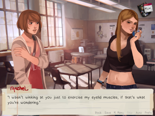
LOVE IS STRANGE (TEAM RUMBLEBEE)
Blog Tagline: "A fanwork based off of Life is Strange.”
Genre(s): Slice of life, romance.
Release Date: April 1st, 2016.
Content Warnings: Drug use; underage drinking; mentions of severe bullying.
Do those characters and that title look familiar? If you’ve paid attention to the gaming scene at large in the past three years, you probably recognize the acronym "LiS” or Max Caulfield’s character design — Team Rumblebee’s 2016 debut project, Love is Strange, came to life as a Life is Strange (DONTNOD Entertainment) fanmade visual novel! In Love is Strange, set a year later after the original game in a completely different timeline, protagonist Max never gained her canonical magical powers and many of the tragedies that gripped Arcadia Bay never came to pass. Instead, she’s given a week to team up with one of her four love interests — Chloe, Kate, Rachel, or Victoria — and win a photography contest together.
There’s a lot to love about it beyond any connection you may or may not have to Life is Strange itself — everything, from the art to the music to the writing, pulls together seamlessly. But the biggest strength of Love is Strange as a fanwork, in my opinion, is the way it’s not trying to totally remove itself from the original canon tonally or trying too hard to conform to that tone without it seeming natural. Max’s character arc is reflective of some anxieties she’d had in the original story, which goes doubly for the explorations of her love interests’ arcs, but it’s fundamentally a different story where her priorities are different. Love is Strange loses what isn’t necessary or what doesn’t help the story — including the teacher-turned-[spoilers] from the original series, Mr. Jefferson — then fills in a lot of the blanks with the same charm and same compelling characters that captivated fans in the first place.
My favorite example here is Rachel Amber, one of the four routes but the lone one who never appeared in the text of the original Life is Strange itself, and a route that felt as wholly comprehensive as the rest. Love is Strange takes the perpetually absent, long-since-departed Rachel and recreates her from whole cloth, giving her a distinctive speech pattern, a history, and a set of beliefs that all work together as a perfect answer for the void around her character in the original text. She feels as real and authentic as the rest of the pitch-perfect cast, a character it’s difficult to imagine the original Life is Strange without. So in both enhancing the original text’s characterizations without ever losing its charm and standing alone as its own thoughtful, genuine F/F dating sim that is just as enjoyable without any fondness for the canon, Love is Strange easily cemented itself as one of my favorite visual novels — so strongly, in fact, that I’m still planning to cheer on Team Rumblebee’s individual and collective outputs for years to come.
Love is Strange is available now for free on the development blog. You can also follow Team Rumblebee on Twitter, Tumblr, and Itch.io to be the first to know if they decide to release anything next!

//TODO: TODAY (BOYS LAUGH PLUS)
Itchio Tagline: "A visual novel about figuring out life with the help of an AI.”
Genre(s): Modern sci-fi.
Release Date: March 31st, 2017 (Part 1); August 2018 (Part 2).
Content Warnings: Depictions of severe depression.
Player personalization is one of the more tricky things for developers, largely in part because there’s no way to write something every player will be happy with; while some people prefer being able to insert themselves entirely into a protagonist with minimal predefined personality and more vague actions, so they can headcanon more easily, other audiences would rather explore specific situations with a smaller number responses that each more clearly reflect the defined protagonist’s personality. It’d be nearly impossible to please both of those groups at once — and there’s dozens of other, more specific takes that other players can have on visual novel protagonists!
As someone in the latter camp out of just those two examples, I thought //TODO: today’s handling of their protagonist Teal (plus their love interests Joyce and Phoenix) was right up my alley, so I reached out to Felix and Rohan of Boys Laugh+ to talk about their work on its story!
IVAN: Pleasure to be talking to you both today! Can you give me the elevator pitch of //TODO: today that you might give to an interested attendee at a con? You're both free to answer this if you'd like, haha.
FELIX: Sure, thanks for having us! //TODO: today is a slice of life visual novel about the aspiring artist Teal who already struggles to make ends meet but things get a little more complicated when an AI suddenly appears in their computer, with the intention to help Teal get their life back in order.
Perfectly put! (I like the phrasing of "aspiring artist Teal", haha, I feel like I'm reading their Twitter bio.) The gender/sexuality/pronoun options (and what I've seen of the dialogue variations) for the protagonist plus the romanceable characters are comprehensive, but never in a way that feels insincere or bland. I really feel like Teal's character — and that of both love interests — shines through strongly no matter what! What went into designing the personalization system as it currently exists, and why did you choose to include it in the first place?
ROHAN: Haha, yeah, Teal is the type who's a bit insecure about their art. So it's easier to say "aspiring artist" even though Teal has been drawing for a while. :'D Although our protagonist has their quirks and own background story we wanted the player to be able to identify with Teal. The player can choose to change Teal's name in the beginning of the game too. And the gender and sexuality options are based on this idea. :3
Back when we were developing the concept for //TODO: today in 2017, we had a close look at other recent VNs. And Date Nighto's Hustle Cat got us thinking about using "they" pronouns then. Hustle Cat's protagonist "Avery" has a gender-neutral design too. That got the ball rolling for us to think how we could make the typical romance situation in //TODO: today inclusive and enjoyable for queer people as well!^u^
FELIX: We also tried to keep the additional work for this fairly small. For the three main characters all pronouns and their variations are stored in variables. That makes it pretty easy to use the same base dialogue regardless of the characters' gender. But in addition to that, we used conditional statements to add some custom dialogue whenever it made sense. The romantic preferences are pretty much the same. They mainly decide the gender of the romanceable characters but there are a few moments where dialogue varies depending on the preferences the player chooses.
That also means that there are some things that people will miss if they don't make a specific selection of gender or romantic preferences but we wanted to make sure that those choices are also part of the characters and the writing and not purely cosmetic. All in all we tried to make the game as inclusive of LGBTQ identities as we could without making the scope unrealistically big for a two person team.
I think you definitely struck a good balance there! If I'm not mistaken, the two of you work in Ren'Py, right? What kind of Ren'Py limits or perks do you take into consideration when working to augment a story with more complex pieces of code other than dialogue variables, like deciding what your upcoming project Defaction's cellphone (?) can do? Anything you've unfortunately had to give up on? (And are there any lines of dialogue or features you're especially proud of including in //TODO: today?)
FELIX: Yeah, we're working in Ren'Py. I can't really think of any limits aside from smaller issues where different systems and languages intersect but there have definitely been a lot of perks! I really like Ren'Py's screen system which is where at least 80% of the work for the phone in Defaction happens.
The python integration is also really nice. In //TODO: today I barely used any python aside from if-statements and variables but being able use custom code pretty much anywhere in the script makes the engine really flexible!
As for feature decisions, so far we mainly based them on what we wanted to include from a narrative design standpoint and then tried to figure out how or if we would be able to implement them. I can't think of anything we had to cut for technical reasons so I think it worked out pretty well so far :'D
//TODO: today was the first bigger visual novel I worked on and aside from the gender and preference options for the characters, something I'm pretty proud of are the optional work and gaming scenes. They are pretty much the first piece of non-linear writing I ever did and it was a fun challenge to make sure they make sense regardless of what in-game day the player sees them on.
ROHAN: I think the most obvious feature we're proud of are the preference options we included, haha. We really wanted to take a few steps aside of the otome or exclusively hetero male-oriented genres out there. And to make the experience feel tailored to the player there are the dialogue features Felix has described before in combination with the visual designs of Joyce, the AI, and Phoenix, Teal's bookstore co-worker.
It's integrated into the story that Joyce has been made just for the Teal. Other AIs in the world would look different depending on their owners. That's why you get a feminine or masculine looking Joyce that match the player's preferences.
Of course there are limitations, I mean, we can't read the players mind to know what they like. And we couldn't include too many unique character sprites due to the scope. But I'm very happy about how the different designs turned out in the end. It was generally fun to visually design the game. Cute colours everywhere! >u<
On another note I think what really went well, too, was how AI Joyce behaves. We took some liberties with sci-fi magic, but Joyce is a being with their own set of characteristics, goals and values. They were made to serve, yet they're on eye-level with Teal and you get some funny situations out of it.
That's right, I'd completely forgotten that the work and art contest scenes weren't confined to the story's timeline on any specific dates — they definitely always felt like they matched up. And I'm so glad you brought up the designs, Rohan, that was actually my next question! The overall world design and character stylization of //TODO: today clearly had a considerable amount of care put into making sure they all meshed well and looked good individually! Can you talk a little bit about why you settled on the design aesthetic you did and what influenced //TODO: today's style or character designs? (Also, who are each of your favorite characters out of the cast, visually or personality-wise?)
ROHAN: Ah, well. First and foremost we were under a good amount of time-pressure during the NaNoRenO '17. Thus I had to decide for an artstyle that I could pull off for the game's assets to be produced in time. There's no complicated shading, not too much intriciate line-work. It was also the first time for me to create art for a visual novel. I was mostly a concept artist before. So I wanted to play it safe. That's one part of the story at least.
The other thing was that by the end of 2016 a lot of artists have emerged online who experimented with reduced palettes, pastel tones and comic and anime inspired shading. I was really intrigued by the charm of this combination. I wanted to make myself feel okay that although I'm a guy I can express myself in shades of pink, haha. This kind of aesthetic also matches the overall cute but realistic story of //TODO: today. I wanted the reality of the game to feel like our world but with some intense photo filters on top, haha. And my favourite character(s)? As the artist who designed them, I'd say visually all of them! xD But character wise, I think it's a close head-to-head of Joyce and SuuJ. <3
FELIX: I think my favorite character is Snow. I also really like Zen's design and his relaxed personality, but Snow was really fun to write! They're reserved and don't show much about their insecurities or problems, but Snow is still fairly confident and mature for their age.
I think a lot of that personality was also inspired by the art. Snow's design really brings across how introverted they are and because Snow doesn't have a lot of facial expressions, this definitely influenced the way I wrote some of their dialogue.
As a big fan of pastels/pinks, I can definitely empathize with that desire to express it more in art regardless of gender, haha! If you could each add any one feature to your projects that's currently beyond of your technical/artistic capabilities, a "wildest dreams" kind of thing, what would those two features be?
FELIX: I'm really intrigued by the idea of procedural narrative. Not in the sense that a story is random, but rather that it's systemic and somewhat non-linear. That's not really something you can just add to any project though and it probably also involves a lot of trial and error before it works but maybe one day :'D
ROHAN: Oh, nice question! I think it would be super cool to have hand-drawn animated cutscenes in a game. But that's completely beyond our budget of...everything...right now. TuT
Haha, I would love to play a procedural visual novel with animated cutscenes! (Although those two things combined would add even more work to each other, huh? #gamedev!) One final question — do you two have any LGBTQ visual novel recommendations from any other teams or creators?
FELIX: Ladykiller In a Bind left a pretty strong impression on me. In general, Christine Love's visual novels are usually really interesting mechanically in addition to their LGBTQ themes.
Most people probably already heard of Butterfly Soup but I really liked how heartfelt it is and the way the story is told!
And we already mentioned Hustle Cat, which is interesting in the way the main story and the romance routes are intertwined in addition to allowing you to romance all characters regardless of gender.
ROHAN: Hahaha, just imagine creating cutscenes for every generatable piece of story. That would be a killer xD And yes, I'd agree with what Felix wrote. The games by Christine Love, are really well written. Butterfly Soup is a fun ride and way too relatable for people growing up with Asian families. I also play The Arcana on my phone right now. I don't like the payment system too much but the story and characters are well-developed. And the artstyle is just gorgeous!
But one should also keep an eye on indie devs who aren't too well-known. Visual novels seem to generally be on the rise right now and we'll surely find some nice surprises if we keep looking! :3
Definitely agreed that people can find some really pleasant surprises by doing deep dives into places like Itchio's VN tag — or hopefully even from my list and these interviews, haha! Thank you both so much for talking to me, Rohan and Felix, it's been a pleasure.
The first half of //TODO: today is available now for free, or you can follow Boys Laugh + on their Twitter and Itchio accounts to find out more about their progress on the second half!
24 notes
·
View notes
Text
7 Tips to Customize Your Infographic Template
https://120profit.com/?p=2040&utm_source=SocialAutoPoster&utm_medium=Social&utm_campaign=Tumblr
Infographic templates can be a total life-saver. They make it possible to create beautiful infographics quickly and easily, without hiring a professional designer. But when you’re designing from a template, you might worry that your infographic will end up looking like every other infographic out there. I’m here to tell you that with the right techniques, it’s possible to transform any infographic template into a design that’s totally on trend and true to your personal style. GET THIS TEMPLATE Here are my top 7 tips for customizing your infographic template to give it that unique, personal touch: Add texture with a fun patterned background Make your design unique with a distinctive color scheme Follow the trends with a vibrant gradient Stay true to your brand with brand colors, fonts, and logos Add flair with a header font that pops Add or remove sections to resize any template for your needs Switch up chart types for a unique visualization GET THIS TEMPLATE With these tips, transforming a template to reflect your brand, your taste, and your content is a breeze. 1. Add texture to the infographic template with a fun patterned background A patterned background can bring a lot to the design of an infographic. By adding depth, texture, and character, a patterned background really sets the tone of a design. Basic patterns like stripes often help an infographic feel more complete and refined, while playful patterns like dots, scallops, and squiggles can make a design feel more approachable, natural, and organic (like in the example below). Source Personally, I love to use patterned backgrounds to elevate bland, boring designs – to add visual interest when an infographic feels a bit bare. Even a very simple background pattern, like the one in the infographic below, can add a lot to the overall style and feel of an infographic. GET THIS TEMPLATE We’ve got a selection of background patterns to Venngage to help you add some extra style to our infographic templates. You can find them under the Background section in the Venngage Editor – just click to apply to your design! 2. Make your infographic design unique with a distinctive color scheme Color is a huge component visual style, and a distinctive color scheme will go a long way towards changing the look and feel of your infographic template. Just check out these color-forward posters for the Global Fund for Change. The bright, colorful palettes completely dominate the designs, defining the style of the poster and making them thoroughly eye-catching. To create an infographic with a completely unique look, try switching up the color scheme to something bold, modern, and trendy. A new color scheme is the easiest way to add your own personal touch to a pre-designed template. Check out how much each color palette below impacts the tone of the template below: GET THIS TEMPLATE To switch up the color schemes in your infographic, you could go through the template and change the color of each element one at a time. But who has time for all that!? With our new and improved Brand Kit, you can try out new color schemes with a single click! Just pick one of our curated color schemes under My Brand Kit and click to apply it to your design. If you don’t like the way it looks, simply click again to shuffle – you’ll get a slightly different version of the same color scheme. via GIPHY Don’t like the default colors in the Brand Kit or need some more inspiration? Or use my favorite trick: steal a color scheme from another infographic template! 3. Follow the trends: add a vibrant gradient to your infographic template If you’re up on this year’s graphic design trends, you’ll know that gradients are pretty hot right now. Equally popular in web design and graphic design, vibrant gradients seem to be popping up left, right, and center in tons of posters, flyers, advertisements, website landing pages, and mobile apps. Sources: Tubik Studio, Magdiel Lopez The trends in infographic design are no exception – gradients are simply appearing everywhere! Probably because they can add depth to designs that feel flat, and can spice up designs that lack that “wow” factor. GET THIS TEMPLATE To help you keep up with this trend, we’ve added a few gradient options in Venngage (with more to come soon). You can find them under Backgrounds in the left panel. 4. Create an infographic that’s true to your brand with brand colors, fonts, and logos Visual consistency is incredibly important for brand recognition and brand visibility. If you’re repeatedly producing visuals to promote or represent a business, you should be designing with your brand in mind. You can customize your infographic template with your brand elements in three simple steps: Replace the template’s dominant color with your core brand color Add your logo to the infographic header or footer Use your brand font as the title font GET THIS TEMPLATE If you don’t want to make all of these changes manually, get your hands on your company’s brand style guide and add your brand elements to your Brand Kit in Venngage. Once you’ve added your brand fonts, colors, and logos to your Brand Kit, you can apply your brand to any template with just a few clicks. TRY OUT THE BRAND KIT NOW 5. Add flair to your infographic with a header font that pops Creative typography has become another big trend in graphic design lately, and adding a bold, decorative header font is the perfect way to take your infographic to the next level. Not only will this draw readers’ attention to your infographic, it will allow you to inject some of your personal style into the design. A strong header will also help reinforce the visual hierarchy of the design, giving your infographic a clear, structured flow. Many infographic templates (like the one below) are designed with sans-serif header fonts. These fit well into clean, modern design style that’s popular these days, but be lacking in personality. GET THIS TEMPLATE For a more eye-catching effect that showcases your personal design style, switch the header font up to something more stylized. Whether it’s playful, dramatic, geometric, or delicate, find a custom font that complements your personal style. Besides helping your header stand out from the rest of the text, this can help your infographic stand out from the crowd. In the example below, it’s easy to see the massive difference a unique header font makes in the overall impact of an infographic design. You don’t even need to change up all the fonts in the template – even just changing the header font makes a huge difference! GET THIS TEMPLATE That said, you don’t want to have too many type styles or typefaces in one design. If you add a strong, stylized header, it’s a good idea want to pair that with more minimal sans-serif fonts for subheader and body text. Fonts like Roboto, Source Sans Pro, and Verdana make perfect pairings for stylized headers. 6. Add or remove sections to resize any infographic template for your needs A lot of the time the template you like isn’t going to be exactly the right size for your content. Sometimes you’ll love a template that’s much too small for your content. Other times you’ll love the style of a long scrolling template, but you’ll need to print it on letter size paper. That doesn’t mean you can’t use those templates, it just means you have to play with the template a bit to make it work perfectly for your content. You can make almost any template work for your content by duplicating sections you love or cutting out sections you don’t like, then resizing the page to fit the required specs. GET THIS TEMPLATE This is where Venngage’s multi-select function comes in handy. You can click and drag to select multiple elements at once, which makes it easy to add, delete, and move entire sections of a template at once. You can even copy and paste elements from one template to another. So if you see something you love in one template, but you want to use a different template, you really can have the best of both worlds! Once you’ve added or removed the sections you need and don’t need, Venngage’s Magic Resize will help you automatically customize your design to any standard page size. Head to Settings and choose the page size you’d like under Magic Resize. We do the heavy lifting for you, resizing the whole design to fit the new page size. Once you get used to changing the page size and adding and removing sections, you can make pretty much any template work for your content. 7. Switch up chart types for a unique visualization A great infographic uses unique charts to make data engaging and memorable. Infographic designers will either dress up traditional charts like bar and pie charts with fancy labels or use unconventional charts like word clouds or icon charts to grab their readers’ attention. That’s because the success of a statistical infographic (like the visual content marketing infographic below) hinges on the visual presentation of the data. Each set of data must be shown with the right chart type for the data, all the while being visually interesting and engaging. GET THIS TEMPLATE So to make your infographic unique and visually engaging, try to branch out a little. Vary the types of data visualizations you use based on the type of information you’re trying to communicate. Use the visual presentation of the data to enhance your audience’s understanding of the data. Don’t be afraid to try something new like a bubble cloud, donut chart, or icon chart! At the very least, add some stylized data labels to draw attention to important data points. Venngage’s Chart Type function makes it easy to give your infographic that data visualization edge. Once you’ve added your data, you can swap chart types with just one click! MAKE A STATISTICAL INFOGRAPHIC Conclusion Just because you’re using an infographic template doesn’t mean you have no creative freedom. These 7 tips can help you elevate your infographic template to give it that unique, personal touch: Add texture with a fun patterned background Make your design unique with a distinctive color scheme Follow the trends with a vibrant gradient Stay true to your brand with brand colors, fonts, and logos Add flair with a header font that pops Add or remove sections to resize any template for your needs Switch up chart types for a unique visualization Try them out with your next infographic, and you’ll soon be making custom designs like a pro! CREATE AN INFOGRAPHIC (function(d, s, id) { var js, fjs = d.getElementsByTagName(s)[0]; if (d.getElementById(id)) return; js = d.createElement(s); js.id = id; js.src = "http://connect.facebook.net/en_US/sdk.js#xfbml=1&version=v2.0"; fjs.parentNode.insertBefore(js, fjs); }(document, 'script', 'facebook-jssdk')); 120profit.com - https://120profit.com/?p=2040&utm_source=SocialAutoPoster&utm_medium=Social&utm_campaign=Tumblr
0 notes
Text
Tumblr Favorites
By: Kathleen Pandeli

http://www.dailykos.com/story/2016/8/10/1558692/
Source: Bugra Cakar
I chose this post because it is funny. Bugra went into great detail on the background of this cartoon, and I would like to add that this is a single-panel cartoon and the fact that the president’s expression is very much exaggerated makes it a caracature, and a great one at that. With the one sentence that Trump is saying it should be understood by the reader. It is also a satirical piece because the fact that the president was so positive that the elections were rigged, once he won, that whole belief went out the window.

http://www.bbc.com/news/blogs-trending-35968787
Source: Geovanni Botticella
This second post that I chose in on Cultural Dominance (negotiated reading), and I decided it was one of my favorites because it such strong photo and not in a positive way. It is definitely an appropriated meaning, and of course those who are apart of the dominant culture won’t see anything wrong with it. This photo was taken from an ad and was meant to empower young girls with a quote, “girls can do anything”, while all the girls are seen actually doing something except the black girl who stands there almost being dismissive. Instead of the creator recontextualizing, it is the reader who is finding a different meaning in this context.

http://newsactivist.com/en/articles/gendered-world-views-section-10-winter-2016/tom-ford-sexist-advertisement
Source: Mae Mou + Darya Hariri (Porkchopgrinds)
The third post I chose was on Oppisitional reading and feel very strongly towards this. This ad was for the Tom Ford clothing line. With oppositional reading the reader is to understand what the concept is but doesn’t necessarily have to agree or like what the ad is trying to perceive. Like most designer ads, the woman is in the photo is all the way naked and “doing” what women do for their men. While the man is reading the paper as she irons his pants. And as stated in the text, most oppositional readings are produced by feminists and you’re damn right I’m a feminist. The background of this photo is very neutral, so that the woman’s skin and body can pop out more to the viewer as well as for the man in the photo. But we all know that he isn’t intended to be the main focus of this ad.

http://www.nikkiarnell.net/design-blog-2015/gestalt-law-of-common-fate
Source: Sofia Gutierrez
The fourth post was focusing on the law of common fate. I chose this picture because I love The Beatles and is a very famous photo from their Abbey Road album. The fact that they are all going in the same direction, single line, shows they were a unit. Sofia sums up how this photo demonstrates common fate, but I would like to focus on the lighting and coloring of it. John Lennon is seen to be wearing white, the total and complete opposite of what the rest of the group members are wearing. But then again, they all wore different outfits and showed their uniqueness. Lennon was very spiritual and definitely his own person. I believe it was for a subjective reason, seeing white can bring the viewer to a calming state.

http://wikihowo.blogspot.com/2014/08/what-are-most-shocking-anti-smoking-ads.html
Source: Jamontae Hickman
This last post that I chose, is another I feel strongly about and would agree that it is a very effective ad against smoking cigarettes. It is meant to visually persuade the viewer to quit smoking. I would definitely say that this is shock advertisement because it’s basically telling the viewer if your gonna kill yourself, you might as well do it quicker and go with a gun. I understand that’s not what the creator really wants, but it’s meant to get the viewer thinking about his choices with smoking. The words “quick” and “slow” are white, in a dark almost black background, to help them stand out, being that they are they only words used to promote awareness.
0 notes
Last Seen Blogs

ascullerymaid
Movies are in my blood

jimtroth
Jim Troth

anis-syazwane
Personal

celine-en-cuir
Sans titre

digitadigita
Untitled