#ImageAlignment
Explore tagged Tumblr posts
Visit Tumblr Blog
Explore Tumblr blogs with no restrictions, modern design and the best experience.
Last Seen Tumblr Blogs


Fun Fact
The most popular pages on Tumblr are about Minecraft, GIFs, and David J. Peterson.
Text
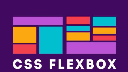
Creating Responsive Images with CSS Flexbox
Introduction to Responsive Design
Responsive design is an essential aspect of modern web development. It refers to the approach of designing and building websites to provide an optimal viewing and interaction experience across a wide range of devices and screen sizes, from large desktop monitors to small mobile phones. The primary goal of responsive design is to ensure that your website adapts seamlessly to different screen resolutions and orientations, allowing users to access your content without the need for excessive zooming or horizontal scrolling. This enhances user experience, improves accessibility, and can positively impact search engine rankings. Key principles of responsive design include: - Fluid Grid Layouts: Using relative units like percentages to create flexible grid systems that adjust to screen size. - Flexible Images: Scaling images proportionally to prevent distortion or overflow on smaller screens. - Media Queries: Employing CSS media queries to apply different styles and layouts based on the device's characteristics, such as screen width, height, or orientation. - Mobile-First Approach: Starting the design process with mobile devices in mind and progressively enhancing the design for larger screens. By embracing responsive design, you can reach a broader audience and ensure your website looks and functions well on various devices, ultimately improving user satisfaction and engagement.
Understanding the Issue: Image Alignment in Responsive Design
One of the common challenges in responsive web design is achieving consistent and pleasing image alignment as the screen size changes. In the scenario you've described, you have an image with a float: right property, and when you resize the page, the image remains on the right side of the content. However, you want it to move to the left as the screen size decreases.

The problem with using float: right for image alignment is that it's not inherently responsive. It positions the image to the right, but it doesn't adapt to different screen sizes effectively. This can lead to undesirable results, such as images overlapping text or becoming too small to see on small screens. Responsive design aims to resolve these issues by providing a flexible and adaptive layout that responds to the available screen space. To address image alignment in a responsive manner, we can use more modern CSS techniques like Flexbox, which allow for precise control over the positioning of elements without the need for explicit floats. In the upcoming sections, we will explore the benefits of using CSS Flexbox for image alignment and demonstrate how to make your images responsive while maintaining a visually pleasing layout across a variety of devices and screen sizes.
The Problem with Using Floats for Alignment
Floats have been a traditional method for aligning elements on webpages, including images. They were widely used in the past to make text wrap around images or to create multi-column layouts. However, using floats for alignment in responsive design presents several challenges:
- Lack of Predictability: Floats are not inherently responsive. When you float an element, it's removed from the normal flow of the document, which can lead to unpredictable behavior, especially on smaller screens or when the content changes. Images floated to the right, for example, tend to stay on the right side regardless of the available space, causing layout issues. - Clearing Floats: When you use floats, you often need to add clearing elements (e.g., clear: both;) to prevent subsequent content from flowing around the floated elements. This can result in extra markup and CSS, making the code less clean and maintainable. - Overlapping and Collapsing: Floats can cause elements to overlap or collapse in unexpected ways, especially when the screen size changes. This can lead to issues like text flowing underneath floated images or elements not aligning as intended. - Complexity and Fragility: Implementing complex layouts with floats can be challenging, and small changes to the content or styles may break the layout. This makes it harder to maintain and update your website over time. For these reasons, floats have become less suitable for creating responsive layouts. To address the challenges of image alignment in responsive design, it's advisable to explore more modern CSS techniques like Flexbox, which provide better control and flexibility while maintaining a responsive and predictable layout.
Introduction to CSS Flexbox
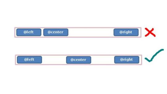
CSS Flexbox, short for "Flexible Box Layout," is a powerful layout model that provides a more efficient way to design complex web layouts with a high degree of control and flexibility. It was introduced to address the limitations and challenges associated with traditional methods like floats and positioning when creating responsive designs. Flexbox is designed to simplify the alignment and distribution of elements within a container, making it ideal for tasks like centering elements, creating equal-height columns, and achieving responsive image alignments. Key features and concepts of Flexbox include: - Container and Items: In Flexbox, you have a parent container and child items that you want to arrange. The container is often referred to as the "flex container," and the items are the "flex items." - Main Axis and Cross Axis: Flexbox operates along two axes, the main axis (usually horizontal) and the cross axis (usually vertical). You can control how items are arranged on both axes using Flexbox properties. - Flex Properties: CSS properties like display: flex;, justify-content, and align-items enable you to control the layout of items within the container, making it easy to center items or distribute them evenly. - Flexibility and Adaptability: One of the primary advantages of Flexbox is its inherent responsiveness. It adjusts the size and position of items based on the available space, making it an excellent choice for responsive web design. Throughout this tutorial, we will explore how to harness the power of Flexbox to create responsive and visually pleasing layouts, including addressing the issue of image alignment that you mentioned. By the end of this tutorial, you'll have a solid understanding of how Flexbox works and be equipped to use it in your web design projects to achieve modern and responsive layouts.
Applying Flexbox to Align Images Responsively
Step 1: Modifying the CSS for the Image Container CSSsection.QuemSou{ float: left; overflow-wrap: break-word; font-size: 1.3em; margin-top: 40px; margin-left: 5%; font-family: 'Century Gothic', sans-serif; } p#Quem_Sou{ line-height: 30px; } /* IMAGE */ div.divimgMAIN{ /* float: right; REMOVING FLOAT PROPERTY */ margin-top: 40px; margin-right: 10%; margin-bottom: 2%; display: flex; /* APPLYING FLEXBOX */ flex-direction: row; /* SETTING FLEX DIRECTION TO ROW */ justify-content: space-between; /* ADJUSTING ITEM SPACING */ align-items: center; /* ALIGNING ITEMS TO CENTER VERTICALLY */ } Step 2: Adjusting the Flexbox Properties for Responsive Behavior Now, to make the image responsive, you can adjust the flex properties to control the behavior of the image within the flex container. By fine-tuning the flex properties, you can ensure that the image adapts to different screen sizes while maintaining its alignment and proportions. In the upcoming section, we will integrate these changes into the provided HTML code to demonstrate how the modified CSS, combined with Flexbox properties, enables the image to align responsively and adapt to varying screen dimensions.
Implementing the Changes in the Provided HTML Code
Now, let's apply the changes to the HTML code to achieve responsive image alignment. We'll modify the 'divimgMAIN' class, remove the 'float: right' property, and add Flexbox properties for responsive alignment. Modifying the 'divimgMAIN' Class HTML In the HTML code, ensure that the 'divimgMAIN' class is applied to the container div that holds the image you want to align. This class will be used to apply the Flexbox properties for responsive alignment. Removing the 'float: right' Property CSSdiv.divimgMAIN{ /* float: right; REMOVING FLOAT PROPERTY */ margin-top: 40px; margin-right: 10%; margin-bottom: 2%; display: flex; /* APPLYING FLEXBOX */ flex-direction: row; /* SETTING FLEX DIRECTION TO ROW */ justify-content: space-between; /* ADJUSTING ITEM SPACING */ align-items: center; /* ALIGNING ITEMS TO CENTER VERTICALLY */ } As a responsive design strategy, remove the 'float: right' property from the 'divimgMAIN' class to allow the image to adapt to different screen sizes without being stuck to the right side. Adding Flexbox Properties for Responsive Alignment With the 'float: right' property removed, apply the following Flexbox properties to the 'divimgMAIN' class to achieve responsive image alignment: CSSdisplay: flex; /* APPLYING FLEXBOX */ flex-direction: row; /* SETTING FLEX DIRECTION TO ROW */ justify-content: space-between; /* ADJUSTING ITEM SPACING */ align-items: center; /* ALIGNING ITEMS TO CENTER VERTICALLY */ These Flexbox properties will help you create a layout where the image adjusts its position and spacing within the container to fit the available space while maintaining alignment with other content. With these modifications in place, you are well on your way to achieving responsive image alignment using CSS Flexbox. In the next section, we will test the changes to ensure that your design behaves as expected on various devices and screen sizes.
Testing the Changes and Responsive Behavior
After applying the Flexbox properties and making modifications to your HTML and CSS, it's crucial to test the design to ensure that it behaves as expected on various devices and screen sizes. Testing will help you confirm that the responsive image alignment is working effectively. Step 1: Resize the Browser Window Start by resizing the browser window to various dimensions, including both larger and smaller screen sizes. Observe how the image and text content within the 'divimgMAIN' container respond to changes in the available space. You should see the image adapting its position and spacing while maintaining alignment with the text. Step 2: Test on Different Devices For a more comprehensive test, view your web page on different devices, such as smartphones, tablets, and desktop computers. Ensure that the design remains visually appealing and functional across the entire spectrum of screen sizes. Step 3: Inspect for Anomalies Pay close attention to any anomalies or issues that may arise during testing. Check for any text overlapping the image, visual distortions, or unexpected behavior. If you encounter any problems, review your HTML and CSS code to identify and resolve the issues. By thoroughly testing your design, you can confirm that the changes you've made to achieve responsive image alignment are effective and that your web page looks and functions as intended on all devices. Responsive design aims to provide a seamless and optimal user experience, and testing is a critical step in achieving that goal. With successful testing and confirmation of responsive behavior, you can now confidently implement these techniques in your web design projects to create modern and adaptable layouts that cater to a wide range of devices and screen sizes.
Conclusion: Achieving Optimal Responsive Image Alignment
In this tutorial, we've explored the challenges of achieving responsive image alignment and the limitations of using traditional methods like 'floats.' We introduced the powerful CSS Flexbox layout model as a solution for creating responsive and visually pleasing designs. By following the steps outlined in this tutorial, you've learned how to: - Modify the CSS for the image container by adding Flexbox properties. - Remove the 'float: right' property to ensure that the image adapts to different screen sizes. - Apply Flexbox properties like 'display: flex,' 'flex-direction,' 'justify-content,' and 'align-items' to achieve responsive alignment. - Test the design on various devices and screen sizes to confirm its responsive behavior. By implementing these techniques, you've taken a significant step toward creating web designs that cater to a diverse audience using different devices. Responsive design not only enhances the user experience but also contributes to better accessibility, improved search engine ranking, and overall user satisfaction. As you continue to develop your web design skills, remember that responsive design is an ongoing process. Keep testing, refining, and adapting your designs to meet the ever-evolving landscape of web technologies and user expectations. With the knowledge gained from this tutorial, you can confidently create modern and responsive layouts that align images optimally across a wide range of devices, ensuring a seamless and engaging user experience. Thank you for joining us on this journey to achieve optimal responsive image alignment using CSS Flexbox. We hope you find this knowledge valuable in your web design endeavors.
Final Thoughts and Additional Resources
Congratulations on completing this tutorial on achieving optimal responsive image alignment using CSS Flexbox. You've gained valuable insights into creating web designs that adapt seamlessly to different devices and screen sizes. As you continue to explore the world of web development and design, here are some final thoughts and additional resources to guide you: Keep Learning and Experimenting Web design is a dynamic field, and there's always something new to learn. Stay curious and keep experimenting with different design techniques, layout models, and frameworks. The more you practice and explore, the more proficient you'll become in creating outstanding web experiences. Stay Updated with Web Standards Web standards and best practices evolve over time. Stay updated with the latest trends, technologies, and standards in web development. This will help you create designs that are not only responsive but also performant and accessible. Explore CSS Grid While Flexbox is excellent for certain layout tasks, you may also want to explore CSS Grid Layout, another powerful CSS layout system. CSS Grid can be especially useful for creating grid-based designs and complex layouts. Combining both Flexbox and CSS Grid in your projects can provide a comprehensive toolkit for handling various design challenges. Additional Resources Here are some additional resources to further enhance your web design skills: - MDN Web Docs: Flexbox - In-depth documentation and tutorials on CSS Flexbox. - MDN Web Docs: Grid Layout - Comprehensive guides on CSS Grid Layout. - A Complete Guide to Flexbox - A helpful resource by CSS-Tricks, offering a detailed guide to Flexbox. - Smashing Magazine - A valuable source for web design articles, tutorials, and best practices. Remember that web design is both an art and a science. It's a creative process that combines aesthetics with technical expertise. Keep exploring, learning, and pushing the boundaries of your skills to create remarkable web experiences that captivate and engage users. Thank you for choosing to expand your knowledge with us. We wish you all the best in your web design journey! Read the full article
0 notes
Text


0 notes
Text
網站作品:高雄網路行銷、網頁設計、專業小編、鋒樂網路行銷
New Post has been published on https://imayday.co/fengleseo/
網站作品:高雄網路行銷、網頁設計、專業小編、鋒樂網路行銷
.elementor-1676 .elementor-element.elementor-element-d3b3146margin-top:20px;margin-bottom:20px;.elementor-1676 .elementor-element.elementor-element-5fe592btext-align:center;.elementor-1676 .elementor-element.elementor-element-5fe592b.elementor-widget-heading .elementor-heading-titlecolor:#000000;.elementor-1676 .elementor-element.elementor-element-e20304dtext-align:center;.elementor-1676 .elementor-element.elementor-element-e20304d.elementor-widget-heading .elementor-heading-titlecolor:#000000;.elementor-1676 .elementor-element.elementor-element-f4946dfmargin-top:20px;margin-bottom:20px;.elementor-1676 .elementor-element.elementor-element-571ea26text-align:center;.elementor-1676 .elementor-element.elementor-element-571ea26 .ee-device__media__screen--imagealign-items:flex-start;.elementor-1676 .elementor-element.elementor-element-571ea26 .ee-device__media__screen--image .ee-device__media__screen__innertop:auto;.elementor-1676 .elementor-element.elementor-element-571ea26 .ee-video-player__controls .ee-player__controls__overlay .ee-player__control, .elementor-1676 .elementor-element.elementor-element-571ea26 .ee-video-player__controls .ee-player__controls__bar .ee-player__control--progressborder-radius:100px 100px 100px 100px;.elementor-1676 .elementor-element.elementor-element-571ea26 .ee-video-player__controls .ee-player__controls__bar .ee-player__control--progress__innerborder-radius:0 100px 100px 0;.elementor-1676 .elementor-element.elementor-element-571ea26 .ee-video-player__controls .ee-player__controls__overlay .ee-player__control, .elementor-1676 .elementor-element.elementor-element-571ea26 .ee-video-player__controls .ee-player__controls__barcolor:#000000;background-color:#FFFFFF;opacity:0.9;.elementor-1676 .elementor-element.elementor-element-571ea26 .ee-video-player__controls .ee-player__control--progress__innerbackground-color:#000000;.elementor-1676 .elementor-element.elementor-element-104097fmargin-top:20px;margin-bottom:20px;.elementor-1676 .elementor-element.elementor-element-fab796atext-align:center;.elementor-1676 .elementor-element.elementor-element-fab796a .ee-device__media__screen--imagealign-items:flex-start;.elementor-1676 .elementor-element.elementor-element-fab796a .ee-device__media__screen--image .ee-device__media__screen__innertop:auto;.elementor-1676 .elementor-element.elementor-element-fab796a .ee-video-player__controls .ee-player__controls__overlay .ee-player__control, .elementor-1676 .elementor-element.elementor-element-fab796a .ee-video-player__controls .ee-player__controls__bar .ee-player__control--progressborder-radius:100px 100px 100px 100px;.elementor-1676 .elementor-element.elementor-element-fab796a .ee-video-player__controls .ee-player__controls__bar .ee-player__control--progress__innerborder-radius:0 100px 100px 0;.elementor-1676 .elementor-element.elementor-element-fab796a .ee-video-player__controls .ee-player__controls__overlay .ee-player__control, .elementor-1676 .elementor-element.elementor-element-fab796a .ee-video-player__controls .ee-player__controls__barcolor:#000000;background-color:#FFFFFF;opacity:0.9;.elementor-1676 .elementor-element.elementor-element-fab796a .ee-video-player__controls .ee-player__control--progress__innerbackground-color:#000000;.elementor-1676 .elementor-element.elementor-element-e94ddcatext-align:center;.elementor-1676 .elementor-element.elementor-element-e94ddca .ee-device__media__screen--imagealign-items:flex-start;.elementor-1676 .elementor-element.elementor-element-e94ddca .ee-device__media__screen--image .ee-device__media__screen__innertop:auto;.elementor-1676 .elementor-element.elementor-element-e94ddca .ee-video-player__controls .ee-player__controls__overlay .ee-player__control, .elementor-1676 .elementor-element.elementor-element-e94ddca .ee-video-player__controls .ee-player__controls__bar .ee-player__control--progressborder-radius:100px 100px 100px 100px;.elementor-1676 .elementor-element.elementor-element-e94ddca .ee-video-player__controls .ee-player__controls__bar .ee-player__control--progress__innerborder-radius:0 100px 100px 0;.elementor-1676 .elementor-element.elementor-element-e94ddca .ee-video-player__controls .ee-player__controls__overlay .ee-player__control, .elementor-1676 .elementor-element.elementor-element-e94ddca .ee-video-player__controls .ee-player__controls__barcolor:#000000;background-color:#FFFFFF;opacity:0.9;.elementor-1676 .elementor-element.elementor-element-e94ddca .ee-video-player__controls .ee-player__control--progress__innerbackground-color:#000000;.ee-tooltip.ee-tooltip-feb6ab6.to--top, .ee-tooltip.ee-tooltip-feb6ab6.to--bottommargin-left:0px;.ee-tooltip.ee-tooltip-feb6ab6.to--left, .ee-tooltip.ee-tooltip-feb6ab6.to--rightmargin-top:0px;.elementor-1676 .elementor-element.elementor-element-28ac912 a.elementor-button, .elementor-1676 .elementor-element.elementor-element-28ac912 .elementor-buttonbackground-color:#EA3E3E;@media(min-width:1025px).elementor-1676 .elementor-element.elementor-element-571ea26 .ee-video-player__controls .ee-player__controls__overlay .ee-player__control:hover, .elementor-1676 .elementor-element.elementor-element-571ea26 .ee-video-player__controls .ee-player__controls__bar:hoveropacity:1;.elementor-1676 .elementor-element.elementor-element-fab796a .ee-video-player__controls .ee-player__controls__overlay .ee-player__control:hover, .elementor-1676 .elementor-element.elementor-element-fab796a .ee-video-player__controls .ee-player__controls__bar:hoveropacity:1;.elementor-1676 .elementor-element.elementor-element-e94ddca .ee-video-player__controls .ee-player__controls__overlay .ee-player__control:hover, .elementor-1676 .elementor-element.elementor-element-e94ddca .ee-video-player__controls .ee-player__controls__bar:hoveropacity:1;
鋒樂網路行銷
Feng Le Seo
RWD響應 | 購物型設計 | Facebook經營 | 小編經營 | 網站設計
網站心得:
這是我人生中第一個Wordpress網站,也是因為杭媽媽招牌辣椒,我才開始了Wordpress網頁之路
這網站上套用了 Avada + Woocommerce + 結帳簡化、社群註冊購買 + 綠界科技
我還記得是那時還不懂Avada的主題去哪買,於是找到NT150買了一堆GPL的外掛和主題…
基本上這網站再過不久,等杭媽媽招牌椒麻新產品一出來,就會請專業攝影師拍照
網站與包裝就會做大改版了,寫這篇文章算是給杭媽媽招牌辣椒做的留念吧!
還是簡單介紹一下杭媽媽
這是從我爺爺流傳一甲子獨家辣椒醬,很特別的是辣椒內有絞肉,你吃起來就像在吃肉燥飯
不油不膩,使用的是上等芥花油並非沙拉油,而且我們不加任何防腐劑
不管拿來直接拌飯、炒麵、炒菜都可以,由於沒有防腐劑,一般建議兩個月內吃完就可以~
如果你喜歡吃辣,不訪可以試試看我們家的辣椒醬,可以說是高雄必吃的推薦辣椒醬
吃過我們家辣椒的人回購率都很高唷,歡迎找我下訂或是直接透過網站購買也可以
如果你剛好住在高雄、屏東,一罐我也可以免費外送唷!
View Website
0 notes
Text
網站設計:Raytrex-ictesting 鴻泰科技
New Post has been published on https://imayday.co/raytrex-ictesting/
網站設計:Raytrex-ictesting 鴻泰科技
.elementor-1661 .elementor-element.elementor-element-7d0e6a3margin-top:20px;margin-bottom:20px;.elementor-1661 .elementor-element.elementor-element-23e15bctext-align:center;.elementor-1661 .elementor-element.elementor-element-23e15bc.elementor-widget-heading .elementor-heading-titlecolor:#000000;.elementor-1661 .elementor-element.elementor-element-51f54b9text-align:center;.elementor-1661 .elementor-element.elementor-element-51f54b9.elementor-widget-heading .elementor-heading-titlecolor:#000000;.elementor-1661 .elementor-element.elementor-element-c0db46emargin-top:20px;margin-bottom:20px;.elementor-1661 .elementor-element.elementor-element-938703atext-align:center;.elementor-1661 .elementor-element.elementor-element-938703a .ee-device__media__screen--imagealign-items:flex-start;.elementor-1661 .elementor-element.elementor-element-938703a .ee-device__media__screen--image .ee-device__media__screen__innertop:auto;.elementor-1661 .elementor-element.elementor-element-938703a .ee-video-player__controls .ee-player__controls__overlay .ee-player__control, .elementor-1661 .elementor-element.elementor-element-938703a .ee-video-player__controls .ee-player__controls__bar .ee-player__control--progressborder-radius:100px 100px 100px 100px;.elementor-1661 .elementor-element.elementor-element-938703a .ee-video-player__controls .ee-player__controls__bar .ee-player__control--progress__innerborder-radius:0 100px 100px 0;.elementor-1661 .elementor-element.elementor-element-938703a .ee-video-player__controls .ee-player__controls__overlay .ee-player__control, .elementor-1661 .elementor-element.elementor-element-938703a .ee-video-player__controls .ee-player__controls__barcolor:#000000;background-color:#FFFFFF;opacity:0.9;.elementor-1661 .elementor-element.elementor-element-938703a .ee-video-player__controls .ee-player__control--progress__innerbackground-color:#000000;.elementor-1661 .elementor-element.elementor-element-5befaddmargin-top:20px;margin-bottom:20px;.elementor-1661 .elementor-element.elementor-element-9f497b5text-align:center;.elementor-1661 .elementor-element.elementor-element-9f497b5 .ee-device__media__screen--imagealign-items:flex-start;.elementor-1661 .elementor-element.elementor-element-9f497b5 .ee-device__media__screen--image .ee-device__media__screen__innertop:auto;.elementor-1661 .elementor-element.elementor-element-9f497b5 .ee-video-player__controls .ee-player__controls__overlay .ee-player__control, .elementor-1661 .elementor-element.elementor-element-9f497b5 .ee-video-player__controls .ee-player__controls__bar .ee-player__control--progressborder-radius:100px 100px 100px 100px;.elementor-1661 .elementor-element.elementor-element-9f497b5 .ee-video-player__controls .ee-player__controls__bar .ee-player__control--progress__innerborder-radius:0 100px 100px 0;.elementor-1661 .elementor-element.elementor-element-9f497b5 .ee-video-player__controls .ee-player__controls__overlay .ee-player__control, .elementor-1661 .elementor-element.elementor-element-9f497b5 .ee-video-player__controls .ee-player__controls__barcolor:#000000;background-color:#FFFFFF;opacity:0.9;.elementor-1661 .elementor-element.elementor-element-9f497b5 .ee-video-player__controls .ee-player__control--progress__innerbackground-color:#000000;.elementor-1661 .elementor-element.elementor-element-3c9694ctext-align:center;.elementor-1661 .elementor-element.elementor-element-3c9694c .ee-device__media__screen--imagealign-items:flex-start;.elementor-1661 .elementor-element.elementor-element-3c9694c .ee-device__media__screen--image .ee-device__media__screen__innertop:auto;.elementor-1661 .elementor-element.elementor-element-3c9694c .ee-video-player__controls .ee-player__controls__overlay .ee-player__control, .elementor-1661 .elementor-element.elementor-element-3c9694c .ee-video-player__controls .ee-player__controls__bar .ee-player__control--progressborder-radius:100px 100px 100px 100px;.elementor-1661 .elementor-element.elementor-element-3c9694c .ee-video-player__controls .ee-player__controls__bar .ee-player__control--progress__innerborder-radius:0 100px 100px 0;.elementor-1661 .elementor-element.elementor-element-3c9694c .ee-video-player__controls .ee-player__controls__overlay .ee-player__control, .elementor-1661 .elementor-element.elementor-element-3c9694c .ee-video-player__controls .ee-player__controls__barcolor:#000000;background-color:#FFFFFF;opacity:0.9;.elementor-1661 .elementor-element.elementor-element-3c9694c .ee-video-player__controls .ee-player__control--progress__innerbackground-color:#000000;.ee-tooltip.ee-tooltip-3970bd3.to--top, .ee-tooltip.ee-tooltip-3970bd3.to--bottommargin-left:0px;.ee-tooltip.ee-tooltip-3970bd3.to--left, .ee-tooltip.ee-tooltip-3970bd3.to--rightmargin-top:0px;@media(min-width:1025px).elementor-1661 .elementor-element.elementor-element-938703a .ee-video-player__controls .ee-player__controls__overlay .ee-player__control:hover, .elementor-1661 .elementor-element.elementor-element-938703a .ee-video-player__controls .ee-player__controls__bar:hoveropacity:1;.elementor-1661 .elementor-element.elementor-element-9f497b5 .ee-video-player__controls .ee-player__controls__overlay .ee-player__control:hover, .elementor-1661 .elementor-element.elementor-element-9f497b5 .ee-video-player__controls .ee-player__controls__bar:hoveropacity:1;.elementor-1661 .elementor-element.elementor-element-3c9694c .ee-video-player__controls .ee-player__controls__overlay .ee-player__control:hover, .elementor-1661 .elementor-element.elementor-element-3c9694c .ee-video-player__controls .ee-player__controls__bar:hoveropacity:1;
杭媽媽招牌辣椒
Hang Mama Chili
RWD響應 | 購物型設計 | Facebook經營 | 高雄辣椒推薦 | Woocommerce | 祖傳辣椒
網站心得:
這是我人生中第一個Wordpress網站,也是因為杭媽媽招牌辣椒,我才開始了Wordpress網頁之路
這網站上套用了 Avada + Woocommerce + 結帳簡化、社群註冊購買 + 綠界科技
我還記得是那時還不懂Avada的主題去哪買,於是找到NT150買了一堆GPL的外掛和主題…
基本上這網站再過不久,等杭媽媽招牌椒麻新產品一出來,就會請專業攝影師拍照
網站與包裝就會做大改版了,寫這篇文章算是給杭媽媽招牌辣椒做的留念吧!
還是簡單介紹一下杭媽媽
這是從我爺爺流傳一甲子獨家辣椒醬,很特別的是辣椒內有絞肉,你吃起來就像在吃肉燥飯
不油不膩,使用的是上等芥花油並非沙拉油,而且我們不加任何防腐劑
不管拿來直接拌飯、炒麵、炒菜都可以,由於沒有防腐劑,一般建議兩個月內吃完就可以~
如果你喜歡吃辣,不訪可以試試看我們家的辣椒醬,可以說是高雄必吃的推薦辣椒醬
吃過我們家辣椒的人回購率都很高唷,歡迎找我下訂或是直接透過網站購買也可以
如果你剛好住在高雄、屏東,一罐我也可以免費外送唷!
0 notes