#Joanna Pettit
Text
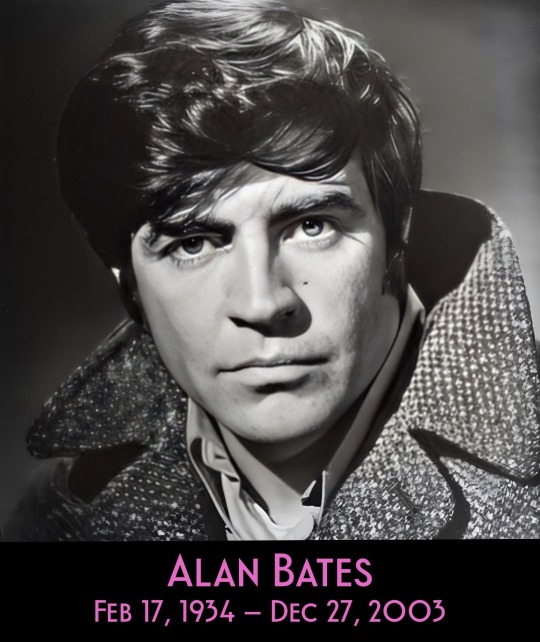
GAY ICONS - ALAN BATES
Alan Bates appeared in one of the most homoerotic scenes in movie history - wrestling nude with Oliver Reed in “Women in Love” (1969) - but I never considered he might be gay or bisexual… until…

Recently I watched “Tea With the Dames” (2018) a documentary where Maggie Smith and Judi Dench gossip about their careers. When talking about Shakespeare’s “Anthony and Cleopatra”, Maggie off-handedly mentions that Alan Bates would have preferred to play the role of Cleopatra!
That remark sent me off researching … and sure enough, several sites mention that Bates, although he was married with twin sons, had several male lovers throughout his life. This was confirmed in a biography “Otherwise Engaged: The Life of Alan Bates” which was written in cooperation with Bates’ surviving son Benedict.
In the 1960s, Bates starred in a string of international hits, including “Zorba the Greek” (1964), “Georgie Girl” (1966), “King of Hearts (1966), and “Far from the Madding Crowd” (1967).
What was unknown by the public at that time, Bates lived with and was in a 10 year relationship with actor Peter Wyngarde. (Wyngarde himself was outed in 1975 when he was arrested for 'gross indecency' with a truck driver in the toilets of a bus station.)
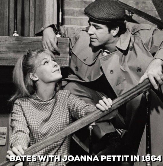
But Bates was attracted to women as well. In 1964 Bates met actress Joanna Pettet when the both appeared on Broadway in “Poor Richard”. According to Pettit the two had an affair during the run of the show.

In 1970, Bates married Victoria Ward who was pregnant at the time. She gave birth to their twin sons the next year. From all accounts their relationship was rocky. They separate but both were involved in raising their children. Tristan, one of the twin, died of a suspect overdose in 1990. His mother Victoria couldn’t recover from the shock and she died in 1992.

In 1972, Bates met actor Nickolas Grace while they both were performing with the Royal Shakespeare Company. Grace was 25 at the time and described the relationship as:
“very close and very loving, in an intense affair that was one of the most important relationships of my life"
Bates denied to Nickolas that he was homosexual.
“(Alan) was free and happy, and … he took me to meet his family in Derby, where we had lovely weekends. But at other times he was reserved and frightened… he didn't want me to be seen with him.”
Bates later had a two year relationship with English Olympic skater John Curry. Curry was outed prior to the 1976 Olympics but the international press largely ignored it. In 1987 Curry was diagnosed with AIDS and died in 1994. It’s been reported that Bates helped to care for his former lover and was with him when he died.
Bates had relationships with other men and women but the ones I mention above seemed the most significant.
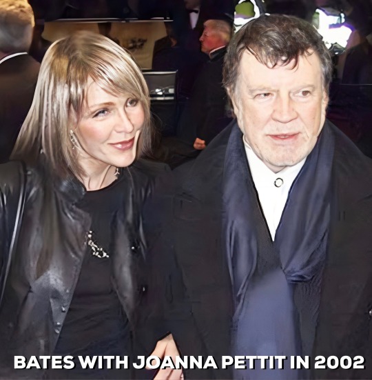
Bates and Maggie Smith were reunited in Robert Altman’s “Gosford Park” (2001), the movie that inspired “Downton Abbey”. The next year Bates was knighted by Queen Elizabeth when she bestowed him with a CBE. The same year Bates rekindled his friendship with Joanna Pettit and she moved from the US to live with him. They had a common bond - her son had died of an overdose as well.
Bates needed hip replacement surgery in 2003. While recovering doctors discovered he had pancreatic cancer. And the final insult, a stroke. Alan Bates slipped into a coma with his son Benedict and friend Joanna Pettit by his side.
#gay icons#Alan Bates#gay or bisexual#women in love#men wrestling in the nude#homoerotic#Joanna Pettit#Peter Wyngarde#gross indecency#John Curry Olympian
69 notes
·
View notes
Video
vimeo
Benjamin Earl Turner "HEADSPACE/BENT" from Abteen Bagheri on Vimeo.
Directed by Abteen Bagheri
Produced by Joon Projects
In Partnership with Love Song, Merchant, Anorak, The Lift
Executive Producers: Elise Tyler, Daniel Wolfe
Director of Photography: Katelin Arizmendi
Editor: Fouad Gaber
Producers Paige Kauffman, Ryan Schemmel
Starring: Benjamin Earl Turner, Dane DiLiegro
Animatronics by Studio Gillis: Alec Gillis, Jon Miller, Zachery Teller, Keaton Blue, Consuelo Duran, Michael Heintzelman,
Luna R Imagawa, Tim Leach, Peter Murphy, Dave Penikas,
Andrew Penikas, Nick Reisinger, Alice Rijn, Sara Villareal, Garth Winkless
1st ADs: Guy Forgaard, Henry Minzes
2nd AD: Christopher Silver
Production Designer: Andrew Clark
Art Director: Chris Steidel
Prop Master: Brendan Sharkey
Armorers: Clay Van Sickle, Mike Tristano
Costume Designer: Astrid Gallegos
Costumers: Mariam Pirouz, Nicole Aprea, Alexis Aquino
Seamstress: Keeva Halferty
Hair and Make-up: Alyssa Holbrook
1st AC: Riley Keeton
2nd ACs: Michael Enos, Kyle Petijean
Loaders: Chris Morgan, Brittany Meadows
Additional Camera: Melisse Rahi, Michael Ragen
1st ACs B-Cam: Guido Raimondo, Mindy Kelly
2nd AC B-cam: Marco Brochie
Camera PA: Matt Adler
Set Photographer: Kalynn Youngblood
Gaffer: Jake Lyon
BBE: Anderson Ko
Electricians: Brandon Alperin, Mark Belcher, Chelsea Pettit, Aaron Mercado, Justin Usami
Hyphenate: Darrel D’itri
Key Grip: Steve Forbes
BBG: Adrian Estrella
Grips: Kyle Sorvig, Matt Cole, Gaither Narron, Cody Ingham, Daniel Kusenada
Sound Recordist: Hanna Collins
Location Manager: Nicholas Reinoso
Medic: Joey De la Rose
PAs: Nadeem Haddad, Claire Schaefer, Allen Baldwin, Jordan Epperson
Driver: Jimmy Valdez
Heshers: Andrew Miller, Ryan Rasberry, Liborio Moreno, Larry Andrews, Stephen Blakeslee, Akkaraj Ak
Restaurant Owner: Jennifer
Server: Joanna Yeh
Editorial Facilities: Trim
Post VFX: Dan Williams
VFX Facilities: The Mill London
Colorist: Jason Wallis
Color Facilities: Electric Theatre Company
Sound Design: Gus Koven
Sound Facilities: Barking Owl
Titles: Sam Smith
Storyboard Artist: Jian Giannini
Casting: Nimzo Casting
Hesher Theme Song: Korvapuusti
Camera: Panavision
Film Processing: Fotokem
Filmstock: Motion Picture Film Stock
For Christopher Black
0 notes
Photo
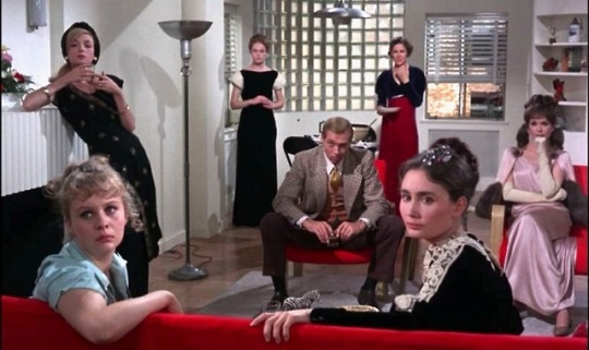


Candice Bergen, Jessica Walter, Joanna Pettit, Joan Hackett, Elizabeth Hartman, Mary Robin-Redd, Kathleen Widdoes and Shirley Knight are The Group (1966), directed by Sidney Lumet. Sid has four entries on the TSPDT list of the 1,000 Greatest Films, and nine entries on the New York Times list, but The Group Is on neither list.
#Candice bergen#Jessica walter#Joanna pettit#joan hackett#Elizabeth hartman#mary robin redd#Kathleen widdoes#Shirley knight#group
27 notes
·
View notes
Text
JSCC Spring Semester Honor Roll Announced
Spring Semester Honor Roll Announced
Jackson, Tenn (June 21, 2017) – The Office of Admissions and Records at Jackson State Community College released the honor roll for the Spring 2017 semester. On the honor roll, there were 307 full-time students who achieved a quality point average over 3.00. There were 381 students who made the dean’s list by achieving a quality point average of 3.50 or better.
Honor Roll is reserved for students who are enrolled for twelve (12) or more hours of college-level work (Learning Support excluded) and who complete a semester’s work with a quality point average between 3.00 and 3.49.
Dean’s List is reserved for students who are enrolled for twelve (12) or more hours of college-level work and who complete a semester’s work with a quality point average between 3.50 and 4.00.
JSCC Dean’s List Spring 2017
Page 1 of 5
BENTON
Dylan Blake Furr
Tanner David Johnson
Kaitlyn Annette Page
William C Vick
John Henry Benjamin York
CARROLL
Samantha Madison Barrow
Kristina Marie Cannon
Kimberly Ryan Canoy
Jonathan Thomas Cash
Leslie Marie Cathey
David Michael Deloach
Samantha Leigh Ferguson
Scott Eugene Force
Kalee Jo Fountain
Whitney Nicole Hicks
Dan Ellsworth Hoffman
Carl William Joyner
Kirsten L Joyner
Mitchell Brandon McCartney
Cheyenne Harley Moran
Rachel E Noles
Russell Lee Noles
Deborah Ann OBryant
Steven Hunter Peterson
Lacy Jolene Pride
Channa Larame Ragsdale
Alysia Marlana Shear
Sarah C Taylor
Brittany Nicole Watson
Brittany Nicole Webb
Matthew Tyler Williams
Michael Elihu Wilson
Christopher Wesley Wood
CHESTER
James Howard Barber
Trae Daniel Brewer
Loleta Dorilean Carothers
David Gaddy Carroll
Christopher Edward Cox
Landon Thomas Cupples
McKinley Brooke Farley
Ashley Michelle Faulkner
Ashley Dianne Frye
Johnny Alfred Glass
Heath S Graves
Cameron Lane Greer
CHESTER continued:
Tori Brooke Hill
Haley Elaine Hughes
Coty Alan Laudermilk
Brooklyn Rene Miller
Peyton Randal Millner
Carlee Elizabeth Morris
Brand Edward Nicolay
Kenneth E Page
Eva Perez
Colton L Plunk
Reba Marie Price
Chase Colton Ross
Caitlin Jenee Sanchez
Michael Sinclair Segerson
Ezekiel Joesph Smith
Kendyl Dawn Smith
Peyton Wesley Stewart
Amber Dawn Thompson
Sydney Blair Watson
Marcus Lee White
COFFEE
Ryan Yates Dye
CROCKETT
Jesus Aguirre
Telisa Shuntel Brown
Jill Anna Castellaw
Aaron Christopher Dennison
Kelsey Ann Gadberry
Meleah Rose Gateley
Michelle Lynn Jones
Candice Woods Kellough
Anthony Chance Lovelace
Jennifer Mooney
Whitney M Revelle
Micah C Riley
Ana Julissa Rios
Kayce Abigail Stallings
DAVIDSON
Latoya Antionette Gibbs
DECATUR
Whitlee Adraianna Camper
Lauren Ashlee Hays
JSCC Dean’s List Spring 2017
Page 2 of 5
Kyla Bree Linton
Stephanie Lynn Mitchell
Jessica Brooke Patton
Macy Camille Sumler
Decatur continued:
Bryan Wood Swafford
Misty R Swindle
Brandon M White
DYER
Talia Suzanne Alley
Dalton Wayne Harrison
Cara Lee Rose
Erica D Tipps
Chloe Jo West
GIBSON
Peyton Charles Adams
Karen Nicole Allen
Bryan Kevin Barnett
Seth Brayden Burchett
Dylan Warner Cole
Kendall Nicole Cox
Michael Scott Evans
Robert Mcgregor Fly
Andrew Joseph Gordon
Nicholas Grant Gutierrez
Hailey Brooke Hudgings
Kahmadre Jay-Quan Hudson
Hannah B Hutchison
Ryan Daniel Jones
Kaitlyn Michelle Kelly
Ryan Dennison Mayfield
Amy Alison McCoy
Madison Brooke Michael
Sa'Liyah Ann Newbill
Andrew Lloyd Oliver
Samantha Kelly Palmer
Ashley McClain Pierce
Alexander Popp
Benjamin Douglas Powell
Dylan Ray Powers
Jonathan Chase Prescott
Courtney Michelle Reese
Katelyn Nicole Rickman
Crystal Lee Rogers
Tasha N Romero
Gage Michael Schneeberger
Brooklyn Victoria Schrupp
Katherine Michelle Stephens
Hunter Michael Taylor
Michael Sean Threadgill
Colton R Tucker
Katherine Walters
Deonte Tyshawn Watson
HARDEMAN
Alexis Rebekah Beibers
Hannah Rose Black
Tyler D Callahan
Rachel Elise Davis
Austin Wade Greene
Luz D Gutierrez
Katlin Leigh Kelley
William Stewart Koimn
Brittany L Luttrell
Hannah Grace Scott
Marissa Drew Thweatt
Carly Rae Weems
HARDIN
Dustin Blake Ayers
Teara Genea Bearden
William Warren Bond
Amber Nicole Bowling
James Caleb Crotts
Kaylee Renea Gillis
Julia Renee Hall
Chandler Davis Harris
Caden Charles Holt
Savanna Cheyenne Liford
Sarah Ann Marshall
Katy Carroll Nix
Samantha Dawn Oaks
Sasia Sewilta Patterson
Savana Rae Payne
Hannah Lynne Roberts
Amanda Grace Sandusky
LauraAnn M Shiver
Jodie Lee Smith
Kaila Grace Smith
Lauren G Smith
Peggy Ann Snyder
Jessica Lee Ann Stricklin
Alexis Alley Thurman
Jennifer Michelle Vandiver
Destiny Brooke Weeks
Alison R Whaley
JSCC Dean’s List Spring 2017
Page 3 of 5
Haley LeAnne White
Kanesha L Wright
HAYWOOD
Henry Stanley Clement
Mary Catherine Currie
Presley Grace Gaters
Danielle Nicole House
HAYWOOD continued:
Caroline Elizabeth Newcom
Elizabeth Blair Simpson
Ashton Muriel Taylor
Kristin Brooke Turner
Emily H Wright
HENDERSON
Anthony Glynn Anderson
Jaclyn Devin Arnold
Andrew B Austin
Bethany Jo Autry
Emily Gore Baughn
Trent Cavalier Beacham
Justin Andrew Brown
Molly Brooke Brown
Leighann Nicole Burkett
Eduardo Carreto-Salgado
Charles Michael Carrington
Lauren Rae Cole
Tonie L Coleman
Emily Anne Dyer
Paul Leo Fowler
Cassidy O Garner
Johnathan Keith Goodman
Melissa Allean Gray
Andrew Garrett Grice
Bethany G Hayes
Crystal Renee James
Haley Nichole James
Kristen F Lawler
Sarah Michelle Lindsey
Abigail Marie Maness
Morgan Elizabeth Maness
Jessica Brooke Montgomery
Fernando Gonzales Munoz
Vanessa Ann Nelms
Jimmy Hunter Powell
Katelynn Allison Nichole Pratt
Allyson C Reeves
Alyssa L Reeves
Kaley Elizabeth Rogers
Jacob Daniel Smith
Kersten L Springer
Dalton Bryce Womack
HENRY
Samantha Frances Dixon
Taylor Brooke French
Seth Zachary Gibbs
Courtland Nicole Hester
David Penick
HUMPHREYS
Ashley Nicole Bates
LAUDERDALE
Andrew Carver Dunavant
Conner Clayton McLemore
John Daniel Moore
Jakara L Snipes
MADISON
Remoun Abdo
Cassidi Grace Adams
Malarie Alexander
Sajedah Alghunaim
Rami Amer Al-Jafari
Kimbrielle Elise Allen
Kaitlan Sheree Anthony
Faith Selene Atherton
Colin Andrew Barnett
Marietta Nicole Barnett
Sydney Taylor Brookshire
Ethel Louise Brown
Megan Fairchild Buehler
Michael Aaron Campbell
Jessica Dianne Carter
LeeAnne Madison Clement
Rachael Merriem Clenney
Curtis Andrew Cobb
Jacqueline Brooke Cole
Vania Evette Comer
Claire Allison Cooke
Humberto Coronado
JSCC Dean’s List Spring 2017
Page 4 of 5
Alberto Coronado Chavez
Christian Taylor Cotner
Melissa Anne Craigie
Sarah Mae Craigie
Jarius Okuria Curry
Kiley Renee Douglas
Sarah Elizabeth Droke
Diana Steffy Escober
Chloe Nicole Espitia
Jessica Danielle Gibson
Damian Jordan Gladney
Zia Goli
MADISON continued:
James Tucker Goodwin
Sydney Gail Grammer
Brianna Madison Gregory
Eric Michael Gunn
Olivia Marie Guzzo
Alex James Haggard
Marshall Britton Hammill
Korean Nichele Harris
Garry E Harvey
Sarah Elaine Harvey
Amanda Nicole Haynes
Berlie Grace Hieagle
Edith Charity Horst
Cody Lynn Hunt
Kayla Nichole Johnson
Kassidy Blair Jones
Hailey Renee Jones
Meagan Hope Kitchen
Janelle Nicole Kyle
JuliaAnne Frances Lansdale
Dillion Robert Larimore
Patrisha Dannielle Leadbetter
Sarah Fulton Lim
Philippe Lumpkin
Lance Austine McElroy
Michael Todd McFadden
Natalie Mendoza
Blanca Estela Mireles Valdez
Madison Marie Montchal
Michael Lee Montgomery
Stephen Houston Morse
Belinda Sue Murchison
Andrew Steven Murley
Justin Robert Mutschler
Callyn Leonard Nims
Rebekah June Pennington
Nicholas Anthony Pica
Brittney Michelle Pickens
Anthony Daniele Previtera
Paige Marie Ramage
Teena Maree Rea
Nicolas N Reyes
Anna Belle Robertson
Xavius K Robinson
Eric Lee Rooks
Rachel Elizabeth Royer
Adriana Salinas
John Louis Santana
Sandra Shari Santiago-Bullington
Heaven Leigh Schatz
MADISON continued:
Tempestt Bernice Seward
Hailey Elizabeth Shephard
Joseph Michael Shephard
Mya Taylor Spivey
Allison Claire Stutts
Victoria Lynn Subia
Kimberly Nichole Sullivan
Brooklyn Marie Taylor
Debra Taylor
Allison Faith Thomas
Robert Mikael Utley
Ryne Vinson
Jordan Breanne Warren
Kenneth Connor Weaks
Clay E Webb
Kaylyn Alyra Weddle
Jacob Dylan Weidner
Destiny Marie Westbrook
Elizabeth Renee Williams
Ashton Vernard Willis
Kameron Dean Wilson
Noah Alyssa Wilson
Brooke Ashlyn Woodard
Brinlea Madison Woodard
Ryan K Woods
Alexander Ryan Wortham
Jeremy Dean Yates
Kelci Nicole Zabriskie
McNAIRY
Kathrine Rose Atkinson
Joanna Elizabeth Barlow
Jonathan Ray Bauer
Carrie Elizabeth Clausel
JSCC Dean’s List Spring 2017
Page 5 of 5
Haylie Marissa Crum
Elizabeth Hope Doucette
Shelbi Elise Doucette
Eric Ryan Gowler
Evan Parker Harris
Kateryna Kucherenko
Warren Austin Lowrance
Mary-Elizabeth Adale Lyons
Payton James Mast
Elizabeth Nicole Miller
Andrew Vinson Pettit
Tamara A Pickens
Samuel Reid Pierce
Jacob Alan Qualls
Ashton Brooks Rich
Josiah David Rininger
McNAIRY continued:
Dakota LeighAnn Russell
Angela Michelle Taylor
Jon Michael Williams
OBION
Stevie Brooke Mers
PERRY
Sandra Marie Dicks
SHELBY
Ian Jose' Bibiloni
Nicholas Jordan Blankenship
Issac James
Brandon Tyler Maxwell
Michael Hoang Nguyen
TIPTON
Theresa Donyelle Allison
Carlye Kay Dixon
WAYNE
Amy Lois Bartlett
Brittany Nikole Bunch
Jessica Gable
Nicholas Caden Grace
WEAKLEY
Tom Eric Jehnzen
Lyndsey Brooke Scott
JSCC HONOR ROLL SPRING 2017
Page 1 of 4
BENTON
Lindsey Nicole Baker
Michael Keith Coady
Corina Nicole Hensley
Jearleh Generale Obas
Justin Lee Smothers
Kelsey Jordan Yates
CARROLL
Kallie Cheyenne Berry
Hannah Olivia Boroughs
Jennifer Renee Bratton
Stephanie Marie Brown
Layla Dawn Byrum
James Zach Cagle
Meagan Renee DeLaney
Joshua Cody Douglas
Austin Chase Ezell
Chadwick Heath Futrell
Hunter Lynn Harris
Sara Beth Hayes
Kaitlyn E McAlpin
Jackie F McClain
Hannah Lea McWilliams
Charles Neil Prestwood
Charles Neil Prestwood
Jazzlyn Janae Ray
Michael Ray Rogers
Kelsey Layne Runions
Rachel N Sellers
Heath D Spain
Riley N Toombs
Kasey M White
Amanda Michelle Williams
Danielle Leigh Williams
Kevin Wayne Williams
Kelsey L Wortham
CHESTER
Brianna Gayle Allen
Erin Michelle Barnes
Zackary Jordan Bethune
Jonathan Trey Ervin
Sydney Taylor Frank
Kelsey Lynne Grissom
Haley Cheyenne Hardwick
Morgan Elizabeth Hays
Bayley Madison Holder
CHESTER continued:
Austin Tyler Holman
Dylan Wesley King
William James Lampley
Dustin William Tyler Montgomery
Austin Edward Moore
Amber Shalane Mosley
Jaylan Dewayne Northern
Jared Patrick Page
Christine LaShae' Puckett
Trenity B Puente
Cody Allen Riley
Kendall Anne Shaw
Payton A Wilkinson
CROCKETT
Yulissa Bautista
Makalah Carter Buckner
Hilary Brooke Butler
Yeltsin Chapina
Meraleigh Peyton Holland
Erin Yessenia Juarez
Kevin Scott Kail
Anthony J Merriweather
Joseph Braden Nace
Lauren Breanna Pender
Lionardo Sanchez
Seth Daniel Shewmaker
Kordell Jay Smith
DAVIDSON
Lee Rice
DECATUR
Brett William Bell
Jesse Alan Burns
Morgan Anna Crews
Lacey Leann Hicks
Geovany Jimenez
Jacob Christopher Maness
Tiffani Cheyenne Shea
Kayleigh Morgan Smith
Jase Lee Taylor
Jordan C Tubbs
DICKSON
Leslie Ann Darrow
JSCC HONOR ROLL SPRING 2017
Page 2 of 4
DYER
Elizabeth Ann Fisher
Allison C Hodge
Kyndal Riddick
Chari A Swift
FAYETTE
Jaleesa Shavon Blade
Kelsey Roxanne Wilson
GIBSON
Reagan Wesley Barnhart
Bethany Carol Lynn Bolin
Kayla Gabrielle Bowie
Seth Everett Brown
Zachary Monroe Case
Lila Marie Cauley
Andrew Tyler Chambers
Andria Marey Cole
Charles Benjamin Coleraine
Madison Paige Ellis
Taina Bronjour Escalera
Carly A Fry
Heather Michelle Frye
Emily Jerene Galvan
Melissa D Goodrich
Alyssa Faith Hartig
Matthew Davis Hawks
Braydon Gregory Hendrix
Baylea Alexandra Holmes
Olivia Langston Hunt
Rachel Nicole Jones
Amanda D Littleton
Lauren Elizabeth Miller
Raquel Taylor Miranda
Austin Eli Moore
Jessica N Paz
Haley Nicole Rainey
Kayla Michelle Reeves
Anna Sison
Kyle Martin Trompower
Mackenna Grace Upchurch
Bailey Anne Vandiver
Brandt Gage Wright
HAMILTON
Austin Zinkann
HARDEMAN
Luis Santiago Ayala
Kamryn Nicole Brown
Kenylsha D Bryant
Lashara Shavay Burkley
Megan Ashley Caicedo
Ethan Scott Grantham
Timothy Landon Lee Harris
Joshua M Kennamore
Michael Brandon Knepp
Rianna V Lewis
Christopher Z Luciano
Keylon D Muex
Andrea Lashae Mullins
Keanna Monee Pirtle
Patric D Stewart
HARDIN
Taylor Brooke Alexander
Bailey Reese Brasher
Jenny Marie Briley
Alyssa Mariah Dilday
Ricki Kay Lynn Ford
Ryan Mitchell Guyer
Tori Ann Haggard
Austin Wade Henson
Makaila Cheyenne Keymon
Dustin Kane Moore
Mickay Vaschelle Qualls
Jefferson Charles Rey
Serenate N Searles
Jordan Luke Sledge
Elizabeth Diane Talley
Delaney Jean Timberman
Ronita D Walker
HAYWOOD
Brooklyn Paige Anderson
John Burton Friedman
Jennifer Marie Hendrix
Amye Ann Pitts
Nakesia Monique Shephard
Leigh Anne Stanley
JSCC HONOR ROLL SPRING 2017
Page 3 of 4
HENDERSON
Jordan Ray Bartholomew
Adam Clayton Briggs
Timothy Dovone Clark
Martice Daniel Crawford
Drake Daniel Eason
Jacob Alan Ewell
Zachary Robert Haynes
Shanna L Lindsey
Destiny Lanette Moody
Alaina Elizabeth Moore
Jordan L Morris
Jessica Marie Nowell
William Survan Pickering
Eli Tyler Plunk
Dylan Frank Powers
Holly Duncan Pratt
Brandi Sheree Reeves
Caitlin Ashlee Scott
Samuel Paul Shannon
Jacob Randall Thomas
Lyndsey P Tosh
Haven Nicole Trull
Emily Nicole Vinson
Trevor Chase Wood
Lilly M Woods
Trey M Wright
HENRY
Erika N Barlow
Brianna Leigh Houlle
Allie Joy Murphy
Chelsea N Phifer
Holly Nicole Potts
Rachel Gayle Ragan
David Ian Sarnik
Rachel Tioni Silvester
Mikala Cheyenne Spry
LAKE
Joel Tyler Estes
LAUDERDALE
Beau Bradford Simpson
Kolie J Smith
Simonne Janae Snipes
LEWIS
Kenzie Owen
MADISON
Brittany Zinelle Anderson
Samuel Davis Anderson
Isaac H Andrews
Amie Lee Scales Autrey
Crystal Linda Autry
Mark Anthony Bedwell
Matthew Elliot Blackwell
Shelbi Leigh Bond
Cameron D'Anne Briley
Chelsea Lane Brown
Hunter Daniel Brown
Marcus Wayne Brown
Ryan Mitchell Butler
Kimberly Renee Carpenter
Richard Jacob Crosnoe
Yulissa DeLaCerda
Mouhamd Elsebae
Hunter Mckinley Finan
Eric Nicholas Forsythe
Russell E Fowler
Brooke Lauren George
James Jacob Gross
Olivia Grace Hall
Jayda McKenzie Hampton
Christian Carter Hays
Janet Diane Hilliard
Angel Mae Hodgin
Brian Jacob Honey
Haleigh Elizabeth Hooper
Garrett Carson Jeanes
James Edward Johnson
Kalesha Rachelle Jones
Shalanda Denise Jones
Jessica Ellen Kirby
Dylan Alexander Kyle
Shea Elizabeth LaFont
Annabel Leon
Bishop Jones Lewis
Elizabeth E Macon
Hunter Allen Massey
Banks Christian Mayo
Jacob Lee McCord
Abby Leigh McNeal
Michael Patrick Mills
JSCC HONOR ROLL SPRING 2017
Page 4 of 4
MADISON continued:
Jacob Weston Morford
Jennifer Lynn Nieves
Lauren Marie Nieves
Ryan Joseph Palmatier
Carson Mitchell Parker
Chiquita Lashon Perry
Shainia Danielle Perry
Jessica Lynn Pittman
Andrew Christopher Pope
Naydelin Ramirez-Gonzalez
Desiree Ransom
Kaylee Renae Riddle
Cheterra Nicole Rogers
Julie Amanda Rouse
Joshua Bryant Shuford
Allison Taylor Smith
Mia Kayley Spivey
William A Swift
Christina Leigh Tall
Zachary Chase Taylor
Nicholas ONeil Teague
Anna June Thompson
Blake Martin Tims
Shelby M Tisdale
Hayden L Towater
Kayla Jordan Vaughn
Jesse A Williamson
Taylor Nicole Willis
Haley Nicole Worsham
Sarah Janine Yelverton
MAURY
Joshua Avery Frantz
McNAIRY
Tina Bailey Bennett
Brandon Kyle Brown
Jacob Ryan Cox
Kendall Shae Dickerson
Zachary Alan Howell
Sarah Elizabeth Hurst
Caleb Tate Kennedy
William Homer Lescheck
Landon Troy McAfee
Anna Marie Moore
Megan Nichole Morris
Haven D Phelps
Krista D Ray
Joshua Lee Shelby
Lauren Elizabeth Steele
Emily Katherine Surratt
MONTGOMERY
Kayla Renee Bradley
Michelle Amber Donner
Lucas W Veltri
OBION
Kristian Alisha Davis
Bethany N Workman
PERRY
William Blake Qualls
SHELBY
Sadler Allen Goodwin
Marcus Andrew Lytle
Annamarie B Pugh
WAYNE
Jerrica Katline Hicks
WEAKLEY
Brennen Zachary Cobb
Denise Rae Cook
Audrey Louise Grooms
Jeffery Lynn Hampton
Starr Anne Petersen
Lawson Michael Roberts
WHITE
Darin Reed Cole
17 notes
·
View notes
Text
Track Changes Bonus Episode: Panel Conversation With Abigail Hing Wen, author of Loveboat Taipei; Literary Agent Joanna Volpe of New Leaf Literary & Media; and Alvina Ling, VP and Editor in Chief at Little, Brown Books for Young Readers
Track Changes Bonus Episode: Panel Conversation With Abigail Hing Wen, author of Loveboat Taipei; Literary Agent Joanna Volpe of New Leaf Literary & Media; and Alvina Ling, VP and Editor in Chief at Little, Brown Books for Young Readers
A conversation between an author, agent, and editor to cover the ins and outs of the publishing process. The panel features Abigail Hing Wen, debut author of Loveboat Taipei; agent Joanna Volpe, president and literary agent at New Leaf Literary & Media; and Alvina Ling, Vice President and Editor-in-Chief at Little Brown Books for Young Readers (and co-host of the Book Friends Forever podcast).
This conversation was held as part of A Mighty Blaze’s YA Weekend, and many thanks to Joseph Moldover (author of Every Last Breath) and Jennifer de Leon (author of Don’t Ask Me Where I’m From) for all the help putting that entire celebration together.
Links and Topics Mentioned In This Episode
This is My Brain In Love by I. W. Gregorio
Stephen Barbara, literary agent at Inkwell Management
Holly Black, The Cruel Prince series, The Spiderwick Chronicles, and many more (hear her First Draft interview here)
Laini Taylor, author of the Daughter of Smoke and Bone series and the Strange the Dreamer series (hear her First Draft interview here)
Brandy Colbert, author of The Voting Booth, The Only Black Girls in Town, Little & Lion, and more (listen to her First Draft interviews here and here, and her mailbag episode here)
Emily X. R. Pan, author of The Astonishing Color of After (listen to her First Draft interview here)
Samira Ahmed, author of Internment
Kirsten Pettit, Executive Editor at HarperChildren’s
Alvina Ling contributed to the Track Changes episode After the Book Deal: What Next?
Adam Silvera, author of They Both Die at the End, Infinity Son, and History is All You Left Me (hear his First Draft interview here)
Lea Salonga, singer, actress, and the voice of Jasmine in Disney’s animated Aladdin
Black Brother Black Brother by Jewell Parker Rhodes
Agnes at the End of the World by Kelly McWilliams
Vermont College of Fine Arts MFA in writing for children’s and teens
Kathi Appelt, author of The Underneath and The True Blue Scouts of Sugar Man Swamp
We Need Diverse Books
I want to hear from you!
Have a question about writing or creativity for Sarah Enni or her guests to answer? To leave a voicemail, call (818) 533-1998 or send an email to mailbag @ firstdraftpod dot com!
Subscribe To First Draft with Sarah Enni
Every Tuesday, I speak to storytellers like Veronica Roth, author of Divergent; National Ambassador for Young People’s Literature Jason Reynolds; Leigh Bardugo, author of Ninth House and the Grishaverse series; Creator of Sex and the City Candace Bushnell; YouTube empresario and author Hank Green; Actors, comedians and screenwriters Jessica St. Clair and Lennon Parham; author and host of NPR’s Pop Culture Happy Hour podcast Linda Holmes; Bestselling authors and co-hosts of the Call Your Girlfriend podcast, Ann Friedman and Aminatou Sow; Michael Dante DiMartino, co-creator of Avatar: The Last Airbender; John August, screenwriter of Big Fish and co-host of the Sciptnotes podcast; or Rhett Miller, musician and frontman for The Old 97s. Together, we take deep dives on their careers and creative works.
Don’t miss an episode! Subscribe in Apple Podcasts, Spotify, Stitcher, or wherever you get your podcasts.
Track Changes
If you’re looking for more information on how to get published, or the traditional publishing industry, check out the Track Changes podcast series, and sign up for the Track Changes weekly newsletter.
Support the Show
Love the show? Make a monthly or one-time donation at Paypal.me/FirstDraft.
Rate, Review, and Recommend
Take a moment to rate and review First Draft with Sarah Enni in Apple Podcasts or wherever you listen to podcasts. Your honest and positive review helps others discover the show -- so thank you!
Is there someone you think would love this podcast as much as you do? Just click the Share button at the bottom of this post!
Thanks again!
Listen now!
0 notes
Text
How to Turn Product Pages into High Converting Landing Pages [14 Examples of The Good & The Bad]
When we talk about website optimization for conversion, the term we encounter almost immediately is “landing page.”
When referring to a marketing campaign, the usual questions are:
“Are your landing pages optimized?”
“Do you have a specific landing page for that?”
It’s enough to make you think that landing pages are only reached through specific portals, like ads — a common misconception.
If only ecommerce customers arrived on your website in so linear a fashion.
But they don’t. They won’t. They’re squirrelly that way.
So let’s take a step back for a moment and ask:
What is a landing page?
The term gets thrown around with little explanation. Essentially, a landing page is the first page on the site that a visitor sees or hits.
It’s where you get your first (and very likely only) chance to impress a first-time visitor and persuade them to look around your site.
Landing pages come in two main groups:
Accidental
Intentional
Landing page type #1: Accidental or organic
“Oops, I made a landing page.”
“Accidental” landing pages are pages on your website that you never specifically intended to use as a visitor’s first touchpoint.
These pages just happened to be indexed by search engines and offered up as responses to keywords, or maybe someone shared the links through email or social media.
The problem is that you never expect anyone to see that page without first seeing any introductory content on your homepage or intentional landing pages (the ones you planned).
Unless the visitor is already familiar with your website, they will likely end up being confused. Without the right visual cues, they might take a quick look around and leave.
That’s why you should treat every page as a landing page.
Before you think “But I have too many pages for this!”, know that some pages should be optimized over others.
First, check your Google Analytics to see which pages get the highest traffic, especially traffic consisting of unique visitors, and focus your efforts there.
The rule of thumb is that the page should attract at least 10% of your total website traffic to be worth the effort of optimizing it.
You can optimize these accidental landing pages by using qualitative research, conducting user testing, and experimenting with potential keywords in the search engines.
Only attempt this time-intensive process if you detect a significant amount of traffic — and if, based on your research, you find that a certain page has significant potential to directly convert users or lead to their conversion.
Don’t worry, I haven’t forgotten about the special case of ecommerce product pages and category pages.
Thanks to search engines doing their work, visitors sharing links to their favorite products, or your own marketing efforts, many users will reach your product pages directly.
That makes these pages -– i.e. product pages –– landing pages in their own right.
By using tried-and-tested techniques for making product pages and with small adjustments these can successfully act as landing pages.
Be careful though: limiting navigational options on these pages may result in a high bounce rate. Make sure the content is clear and conveys trust, relevance and purpose to visitors, otherwise visitors may get confused.
When Product Pages are Landing Pages, You Must…
Solve uncertainties in advance by answering any questions your customers may have.
‘Do they have my size?’
‘Can I pick up in store?’
‘What’s the expected delivery time?’
‘Is this item in stock in store so I can go try it on?’
Your customers need to know everything about the purchase as soon as they can in their buying journey!
– Donald Pettit, Sales & Partners Manager, SalesWarp
Landing page type #2: Intentional landing pages
“I totally meant to do that!”
Type 2 landing pages are highly targeted, very specific pages on your website. They’re typically linked to popular search keywords, ads, PPC content, banners, and social media advertising campaigns.
The content of these pages is specifically tailored to support the message of your marketing campaign and address the intent and interest that your visitor has already expressed by clicking the relevant ad.
And, importantly, these pages should visually and tonally match the page to which they’re linked — because clicking on an ad and arriving on a landing page that isn’t consistent with the ad’s message is an easily avoidable conversion killer.
Each landing page has a job to do, and a specific conversion event to influence.
Each one should also, ideally, speak to one target audience to be effective. For more information about planning and writing your landing page copy, check out this interview with conversion copywriter Joanna Wiebe.
Product landing pages are built to generate conversions
Landing pages –– i.e. your product pages –– are specifically created to increase conversions. It’s why they’re so important to get right.
A conversion is any defined action that you’d like your page visitors to take:
signing up for your emails or deals
subscribing to your blog
downloading an e-book
following your store on Instagram.
And, of course, that conversion can be a sale.
Sure, your homepage is (by far) your most frequently viewed landing page — but that doesn’t necessarily make it your strongest conversion-generating asset.
In fact, other pages or entry points of the website might be your real conversion magnets, or have the potential to be.
And while you’re spending time and resources optimizing your homepage, you’re neglecting your other landing pages.
Let’s look at the structure of visitors on an ecommerce site, for example.
The site below is the Google Analytics demo account, which features Google’s own web store selling merchandise. Here, we have a landing page report displaying the main metrics – bounce rate, conversion rate, visit duration, etc.
Obviously, the homepage is where most visitors end up — nearly 90% of them. But what about the homepage’s other metrics?
The bounce rate on the homepage is by far the highest of all the observed landing pages.
Its engagement rate is also the lowest, at 90 seconds average time on page.
And its conversion rate is a meager 0.75%.
This is not at all uncommon.
Many homepages today serve as portals to the pages where your visitors really want to be, and those visitors don’t waste any time getting where they’re going.
So if you see similar metrics on your homepage, don’t worry. Your conversions might just be taking place elsewhere.
On the other side of the spectrum, we have the same web store’s landing page for the Nest thermostat, which shows a conversion rate of 28.35% and a bounce rate of only 13.73%.
Obviously this is a highly successful landing page. And this is the sort of result you can expect to achieve with properly designed and optimized landing pages.
The product page as a landing page has only a single call to action: “Add to cart”
How do people come to your website? And why?
It’s a question for the ages. So before we delve into more landing page analysis, let’s take a moment to talk about visitors.
After all, your website — and every page and product on it — was built for them.
Visitors to your website can be divided into a million different categories, but here are two main ones:
1. Window Shoppers
They’re curious about your company, but don’t have any specific reason or motive for visiting. They come to your website because they might have heard of your company from their friends or read something about you.
They may be vaguely interested in your offer, but they will most likely just browse a bit and leave.
If they find something and buy it, this will be the exception rather than the rule.
Think of them as window shoppers who might poke their heads in for a moment, maybe check prices, and then leave.
2. Seekers
They’re motivated and seeking a solution to a specific problem. These visitors most likely don’t randomly stumble upon your website; they’re driven by the result of a specific search keyword, ad, or post that pointed to your website as the solution to their problem.
Naturally, the conversion rate of these visitors should be higher.
The operative word here is “should.”
In brick-and-mortar terms, these are people who need shoes and go to a shoe store looking to buy. They have a clear idea of what sort of shoe they want and will search for the size, style, and price they want. If you have what they’re looking for and you treat them well, you’ve got the sale.
The same idea works with websites… but it’s a little more complicated online.
The question that immediately comes to mind is, “What can I do to ensure that Seekers will actually convert?”
It sounds simple, but it’s not.
Unless you’re the only ecommerce store in the universe offering your product or service, the people who come to your page via search engine (and who are motivated to solve their existing problem) may turn elsewhere.
And they will — if they don’t see immediate confirmation that your website, product, or service is the solution they’re looking for. To make them convert, you need to provide them with a very compelling reason not to choose your competitor.
Your product page has the job of convincing that Seeker that you can offer an immediate solution and that you understand their problem.
For your page to do its job successfully, you have to have a solid understanding of what they need.
Oh, behave! Understanding visitor behavior
To create a landing page with a high conversion rate, you first need to understand the behavior and motivation of your visitors.
I like using B.J. Fogg’s behavioral model to graphically represent this.
As you can see, converting an individual visitor depends on three things:
Motivation
Ability
A trigger
Visitors with higher motivation are more likely to respond to conversion triggers, even if it’s hard to do. And the flip side is also true: the easier it is to convert, the lower the motivational threshold required.
This is a basic model that is useful to keep in mind for your entire website.
The other popular model of visitor behavior I find useful is called the LIFT model, defined by Chris Gowan at WiderFunnel.
This model has become a virtual industrial standard.
The LIFT model uses six main factors to explain visitor behavior and what influences the decision to convert.
These factors are:
Value proposition
Relevance
Clarity
Urgency
Distraction
Anxiety
Your landing page must take these factors into account to have a chance at converting your visitors. Here’s how the model looks in graphic form:
So, to optimize your landing pages for conversion, you need to:
Have a brilliantly written, relevant and clear value proposition.
Add action –– i.e. an element of urgency (also known as a trigger) to compel your visitor to act now.
Show them the way forward to minimize and neutralize their anxiety, and you’ve got to make an effort to eliminate distractions on the page.
Omit any of these factors, and your conversion rate will suffer. Getting them right is what product page optimization is all about.
And you have to get them right fast.
Research from Google shows that you have less than 5 seconds (sometimes as low as 17 milliseconds) to impress your visitors enough for them to stay on your site. To keep the attention of your visitor, you need to make your unique value proposition obvious, clear, and attractive.
Your page also has to be attractive and, most importantly, relevant to your customer’s issue. But this is only the beginning of the landing page optimization process.
On product landing pages, focus on trust
There’s so much that goes into ecommerce product page optimizations including things like product focus, great images, copy quality, product reviews, button placement, access to important information, etc.
The list goes on and on.
My #1 piece of advice is to focus on aspects of your product page that instills trust while diminishing anxiety. These usually come in the form of reviews, shipping, return policies, etc.
– David Feng, Co-Founder and Head of Product, Reamaze
Step-by-step guide to landing those product pages
So how do you go about optimizing a landing page?
Unlike your homepage, where the visitor may have ended up out of sheer curiosity (or *gulp* your poorly devised promotional campaign), visits to a landing page or product page are generally the result of your visitor’s direct, conscious effort to find a solution to their problem.
Armed with this knowledge, you can make a conscious effort to make it easier for your potential new customer to actualize their initial desire.
Let’s take a closer look at the six factors of the LIFT model, and how you can create an “offer they can’t refuse.”
1. Create a clear, unique value proposition
What’s a value proposition?
This copy contains the most important benefits that your product or service delivers to your visitor, plus what differentiates you from your competition.
Because it’s such an important conversion tool, your value proposition should be present in some form (and prominently and consistently placed) on every page of your website.
Here’s a Soundwall product page example with a unique value proposition. See the full product page as landing page here.
You will frequently encounter the advice that you should keep your value proposition short. While this advice is meant well, it is not absolute.
For some products and services, especially those that are expensive or require deliberation, you might need a longer value proposition in order to explain all the benefits to your potential customer.
When creating a landing page for a particular product or service, concentrate only on the benefits of that single product, since the customer who arrives on that page will likely care only about that product.
Native Union also does this well. Here’s an image of the top of the product page serving as a landing page. Click on over to see the full thing.
Here, Native Union creates an experience above and beyond any other product page design in their industry.
Be different, but track your metrics.
Don’t be afraid to go above and beyond the status quo. Most product page designs are very generic and follow a similar pattern as the competition.
That said, the most important metrics for ecommerce product page optimization range from social and referral traffic to conversion rates.
You want to see referral traffic coming to your site because it indicates that the story your product page is telling is compelling. You want to track conversion rates because it’s important that your visits are turning into sales.
– Ross Simmonds, Founder, Foundation Marketing
2. Ensure you match the message
Relevance is the essence of effective landing pages.
If you fail to be relevant to your prospect, all of your efforts, no matter how brilliant, will be wasted — and your prospect will bounce right off the page.
The stakes are high, but this part isn’t hard.
You just have to make sure that the copy, images, and branding of your ad or promotion (the link that brought the visitor to your landing page) is consistent with what’s on the page itself. This is also known as message-matching, or creating a “scent” for your prospect to follow.
For example, if your promotion or ad promises the visitor a 20% discount on a specific product, your landing page should reinforce this message immediately.
It sounds simple, but you’d be surprised at how many ads lead to pages that seem entirely unrelated.
Here’s an example of a Greg Norman product ad –– leading back to a product page serving as a landing page:
And here’s the product page example it takes the user to:
Be sure your ads leading to your landing pages have all the same information you advertised.
3. Prioritize clarity in your product description and product page design
Clarity goes hand-in-hand with your value proposition, because clarity begins with clearly stating why and how your product benefits the buyer.
But clarity also involves using language that your ideal customer uses, understands, and identifies with.
For example, the language you’d use to sell a niche smartphone would be very different from the language you’d use to sell a T-shirt to a teenager.
In fact, to target your best existing customers and attract similar people, try this copywriter hack:
Use some of the exact words and phrases your customers use in their reviews, blog posts, social media interactions, forums, and other sources of user feedback.
Doing this type of “message mining” means your new visitors will be more likely to readily identify with your content, and feel like they belong.
Now, let’s look at the the product descriptions on a niche smartphone site versus a teenager tee site.
Here’s an image from Kodak’s product page design. You can see they call out network capabilities, keep the colors simple and the photos clean.
What isn’t shown here, but what you can see here, is the amount of technical information and videos this product page includes –– which helps serious buyers drill down into if this is the right product for them.
Here is their product description. Clear, concise and to the point.
Bring powerful imaging wherever life takes you. Classic styling that’s iconic in design, the KODAK EKTRA brings the DSLR experience to smartphones for the first time.
Network Compatibility: The KODAK EKTRA is an open market unlocked GSM (Global System for Mobile Communications) device, which means it is compatible and will work on the AT&T and T-Mobile networks in the USA. It is not CDMA (Code Division Multiple Access) compatible so will NOT work with Sprint, Verizon or US Cellular.
And here is The Mountain, a T-shirt company that sells meme-like t-shirts mostly to college students.
You’ll notice immediate differences in the offers being promoted (end of summer), the colors used and the overall “fun vibe” of the page.
Here is their product description. Fun, light and relatable.
King Kitten is at it again, but this time the mice are fighting back! The details on this cat apparel are so spectacular; the city buildings are immaculately detailed, the airplanes are flawless, and even one mouse has managed to escape it’s flaming plane and is parachuting to safety. There is action, humor, and a fearsome fluffy kitten all realistically depicted in this scene. Who will win this epic battle? Wear this cool cat shirt to find out!
Base your landing pages (i.e. your product page design) on the personality of those you are targeting –– using their words and their aesthetic to get them to convert.
Get Inside Your Customer's Head
You need to get inside the head of your buyer and know what vital statistics about your product are most likely to drive a purchase decision for your product. Ensure all of that information clearly displayed along with a high-quality, attractive product image and a highly-visible “Buy Now” button above the fold on your product page.
Remember, these vital statistics include important elements such as price, but could also include some summary technical specifications, information about your business or your suppliers, or a shipping cost estimate if your customers are liable to believe your products will be costly to ship (e.g. you are selling bedroom furniture).
The best metric to measure here is simply the “time on page” for the product page when a customer’s interaction results in a successful sale. The less time a customer had to spend on this page in order to make the purchase decision, the more certain it is they’ve got everything they need to make that decision.
– James Brown, Client Engagement Manager, RANDEM
4. Make your prospect feel a sense of urgency
To increase the likelihood that your visitor will convert (and boost their motivation to buy), add an element of urgency.
You can create a sense of urgency by creating a limited-time offer, and/or “agitating” a user into imagining how much worse their life will be if they don’t buy.
You can also try creating urgency through scarcity, meaning that you display the limited number of products available, or note how fast the product is selling.
Beatific uses an app from the BigCommerce App Store to remind page visitors that people are buying the products they want. This serves as both social proof and a scarcity tactic. Fomo is a good option.
BombTech Golf includes availability on each of the products, reminding customers that these items sell out –– FAST. This is how you add action to your product page.
It is a well-known economic fact that scarcity increases the perceived value of a product.
But don’t be the guy with the permanent “Going Out of Business Sale” sign in the window — people will catch on if your scarcity claim or limited-time offer isn’t legit.
You’ll undermine consumer trust that way, and trust is key to generating conversions and retaining customers.
Play Up Your Scarcity
In terms of scarcity, adding things in like “only 4 left” or putting something on preorder almost always has a positive impact on conversion.
One of the most overlooked metrics on product pages is the time to load the site and with a lot of ecommerce traffic coming from mobile, this becomes even more important. We’ve seen with several brands massive improvements in conversion just by increasing the site speed.
– Eric Carlson, Co-Founder, 10X Factory
5. Avoid potential distractions
Distraction refers to any element that hinders the conversion potential of your prospect.
On landing pages, distraction often occurs as a result of your page trying to do too much, or being cluttered with things that aren’t directly related to the “one job” your page is setup to do.
Distractions can come in many forms, but the most frequent distractions are links that lead outside of the site (like social media icons) or links to pages not directly relevant to the product or offer (like links in header or footer navigation).
Avoid including distractions on your landing page at all costs.
Your landing page should be only about one thing: conversion. That means one reader, one call to action, one product or offer.
See how BPI Sports uses a clean landing page design to promote their sales and promotions. There’s nothing here but a few products that encourage you to take action.
See the full page.
Take Simplification One Step Further
Product page optimization should be someone’s full-time job. This process should be codified in your procedures, measured and executed continually.
The three metrics we currently use are 1: Search Results Page Rank, 2: Sub-Category-Page-Rank (online marketplaces), and 3: Sales Volume.
Sometimes when sales volume dips against historical numbers it is due to changes in the way pages are ranked. If you’re keeping an eye on these metrics and trends, daily, weekly, monthly you can adjust pretty quickly in order to regain your sales volume.
– Jason Boyce, Co-founder & CEO, Dazadi
6. Ease anxiety and fear
Anxiety is anything that creates doubt and uncertainty with your visitors. These emotions are major conversion inhibitors — so a big part of conversion optimization is devoted to reducing them.
Note that this is true both for your entire website and your specific landing pages.
Professional copy and design can play huge roles in increasing your prospects’ confidence and trust in your product and company. But you need more than just a nice website to successfully overcome customer anxiety.
To increase trust, we recommend adding security indicators like:
Seals of memberships in professional organizations
Security signatures
User-generated social proof
Testimonials
And anything else that shows users that they will get what they pay for
At the same time, be careful not to overdo it. Too many security indicators, and your customers may intuit that “The lady doth protest too much.”
Of these options, your best bet to increase trust is to include:
Social proof from satisfied customers, either in the form of reviews, testimonials, Facebook likes, Twitter tweets, and other positive social media engagement.
Reviews by third-party sites (like professional magazines or community sites) also go a long way toward making your offer more trustworthy.
See below how Andie Swim incorporates both of these on their homepage.
See their full homepage here.
Build more trust with your audience
You need to build more trust with your audience.
I continually see ecommerce sites that put very little energy into making their product pages look better than just a generic page with no social proof.
Obviously you want to make it easy for the buyer to buy the product, but you don’t necessarily want a empty page.
Displaying reviews below the product and testimonials from major magazines or other outlets can be incredibly effective at building trust.
Overall, it’s important to provide real evidence that your ecommerce store is more than just another generic site.
– Daniel Wallock, Marketing Strategist, Wallock Media
Real-life landing page teardowns
Let’s now apply what we’ve just gone over to a few real-life landing pages.
First, we searched for a specific digital camera model (a Canon 5t SLR). The search keyword was “digital camera slr canon t5”. The search engine returned the following results:
Now let’s look at the landing pages to which these keywords led us.
The first result is from Abt.com:
We landed directly on the product page of the product we searched for — that’s great!
The first thing we see is a Canon T5i digital camera, and directly next to it is the call to action button “Add to Cart,” along with social proof in the form of 60 reviews and a 4.5 star rating.
We also see some value adds, like free shipping and a low price guarantee. If we scroll below the fold, we can find out basic information about this camera.
Since we clicked this site’s paid ad after searching for this specific item and found what we were looking for, we can safely say that this landing page is good.
There are a few distractions on this page, and the design could be updated, but we got what we were promised by the ad: A T5i digital camera, requiring just one step to buy. (Ease is a huge factor in conversions!)
On a 10-point scale, with 10 being the highest and best score, we’d give Abt the following ranking:
Relevance score: 10. This page is highly relevant to the searched keyword.
Clarity score: 7. While the offer is clear, it lacks content. There is no real copy to speak of.
Value proposition score: 5. The value proposition is basically nonexistent. This business could have much better results if they added copy pointing out the awesome advantages of this camera, and the benefits of purchasing it from their store (rather than the thousands of other stores offering the same camera).
Urgency score: 6. Beyond the mention of Cyber Week deals in the banner (though more of a distraction at this stage as we’re already viewing a specific product), additionally, there is an indication of an end date for rebate price.
Distraction score: 5. There are a few distracting links and content. Navigation bar at the top of the page could be less prominent and only breadcrumb navigation left for this to serve as a proper landing page. To alleviate the risk of distraction, I’d make the call to action a bit larger and more prominent.
Anxiety score: 5. While there is ample evidence of the product quality (provided by the 60 reviews), the only indicator of trust in the company is the top banner, where it says the company was founded in 1936, and where the phone number is given. Security indicators are at the bottom of the page, far below the fold and after very long copy listing all the device specifications. These indicators should be moved above the fold for greater impact.
Total score: 6.5.
For a landing page, this is a very fine effort. While it could be improved, it fulfills the purpose by providing a matching message, urgency and clarity.
Go for the Long Tail
The longer the keyword tail, the better generally speaking. Search for your keyword phrase to see how “busy” the Google listings are for it. If it looks crowded, go farther down the long tail.
Google’s autocomplete feature on searches is an easy way to get ideas for alternate search phrases.
Also make sure you use your browser in Incognito Mode while doing these searches, so that Google doesn’t mess with your results.
– Brett Owens, Marketing Director & Co-Founder, LeadDyno
The second result was for a store called Adorama:
Notice that after having us click their paid ad, this company took us to their homepage.
While we were looking for a specific product, we now have to take an extra step to see if they even carry the camera we want. That’s reason enough for most people to bounce.
Their ad also promised deals with prices 80% lower than competitors, but none of this is evident on the page we see here.
This is a perfect example of a poorly made landing page — because even if it is the home page, it’s what we landed on! As it stands, this company is wasting their money on that paid advertisement.
Relevance score: 1. This landing page has no relevance to the search keyword or even the search result. It gets 1 point for being a camera store, and not a petting zoo.
Clarity score: N/A. Keeping in mind that this is (or rather should be) a product page, there is no content that could be rated for clarity.
Value proposition score: 4. “More than a camera store”. This value prop is so vague as to be meaningless, and doesn’t show benefits to potential customers. In fact, “more than a camera store” actually works against them if the customer arrives — from the very ad we just clicked — looking for a camera!
Urgency score: 1. The ad promised Cyber Monday deals of up to 80%, but we don’t see any of that on this page. Also, free same-day shipping or free expedited shipping on Cyber Monday could add a sense of urgency to buy.
Distraction score: 0. The entire page can be viewed as a distraction. If we are going to judge it as a landing page, it’s a failure.
Anxiety score: 5. The website makes a concerted effort to appear trustworthy, but the very fact that we arrived here looking for a particular item on the promise of a steep discount, and don’t see that item, undermines trust and bolsters anxiety immediately. The site gets points for having security indicators, but they are at the bottom of the page instead of above the fold. They also get points for displaying their phone number and offering a live chat: two options that can help put prospects at ease.
Total score: 2.
This page is a homepage of the store and not a landing page. If you have a paid advertising campaign, never direct prospects to a homepage.
Of the two examined pages above, the first is closest to an effective landing page. Some parts of it could be changed, but on the whole it serves the purpose.
The second landing page is an example of a mistake too many businesses make. If you have an in-progress campaign, the least you can do is to make a dedicated landing page that is consistent with your ad.
Grammarly subscription landing page
If you’ve ever used a grammar correction tool named Grammarly, you’ve certainly received their email offers for a subscription to the premium version of their tool.
When you click that button, you arrive on this page:
It’s a landing page containing all the necessary elements we’ve described. Let’s see how it stacks up according to our rubric.
Relevance score: 5. The email offer nowhere mentions the things that are visible on the landing page, and the page headline does not match. However, the offer itself is identical, and in both instances the same price is prominently featured.
Clarity score: 8. The value proposition is very clear as is the task that are expected of user. There is not that much to improve here.
Value proposition score: 4. While the headline is catchy, it consists of largely empty words (“full power of Grammarly”) that don’t make for an immediately clear, attractive, unique value proposition.
Urgency score: 1. While the headline of an email offer mentions the sentence “Time is running out,” this claim is not substantiated by any other element that indicates there is limited time to use this offer.
Distraction score: 9. There are a very limited number of distractions from the main call to action. In fact, the only two links you can click aside from the call to action are the links on the security indicator icons.
Anxiety score: 2. The landing page does a fine job in most areas, but there are a couple of critical failures that likely increase anxiety with prospects. The first is the message mismatch we mentioned in above in the “relevance” score. The second, and potentially even more serious issue is the lack of any choice in terms of payment plans. Although the “Choose your special offer” copy above the call to action button leads you to believe you can select different payment schedule options, this is not the case. When you click on “Select Plan,” you are given only the option to pay $72 for an annual plan, and no option for a monthly subscription. This may have a serious consequences in terms of credibility, as prospects will expect a choice but get none.
Total score: 5.
We can conclude that Grammarly’s intention is to get as many users as they can to commit to the annual plan and reduce their monthly churn rate. However, they do this in a way that may leave prospects feel cheated out of the monthly option.
Although a $72 annual subscription is an improvement over the higher regular-price annual subscription, most prospects would probably like to try the service for a month or two before committing to a year.
By locking prospects into a single option, Grammarly actually creates a seed of suspicion as to the quality of service. If the service is really valuable, people would certainly keep subscribing or even sign up for an annual package.
ManCrates – Unique Gifts for Guys
ManCrates offers unique, customizable gift boxes for men. This is the ad they use to get prospects to the site:
The ad headlines with “Awesome Gifts for Guys and Men”
The ad invites you in –– promising awesome gifts. Let’s see where this ad leads us:
The landing page for the ad.
What we see here is their homepage –– rather than a specific landing page. This could be seen as a negative, except that their homepage language and product options mimic the ad and brings someone further down the purchasing funnel.
That experience actually works well for a general search. However, the brand is using the homepage as a catch all even for specific ad copy –– where things get a bit mismatched and the relevancy goes down.
Here’s an example ad that also leads to that homepage:
Let’s see how this page stacks up according to our rubric:
Relevance score: 2. The ad offers a specific product, yet clicking the link lands visitors to a homepage, where they need to go below the fold to find the ‘Jerkygrams’, not related to the ad headline in any way.
Clarity score: 8. Overall, offer is clearly presented on the page and copy aims to steer emotion in the prospects. Call to action button is prominent, though in no way related to a specific product.
Value proposition score: 6. The value proposition is a promise of an awesome and exciting gift for men. While it could be a bit more specific, it manages to evoke emotions.
Urgency score: 0. There’s no urgency created by any message on the site for prospects.
Distraction score: 4. As the page we landed on is a homepage, there is remarkably little to distract us. All the navigational menus lead to gift categories and prominent Shop All Gifts leads to a page that allows easy filtering of the gifts. However, a better approach would be to direct a prospect directly to the jerky categories, which is indicated in the ad headline.
Anxiety score: 8. The homepage does its best to alleviate anxiety. The page displays two security and trust seals at the bottom and they should try with moving them above the fold or featuring more prominently.
Total score: 5.
Mancrates has specific ecommerce product pages and linking them to the ad, especially ads as specific as ‘Awesome Jerky Gifts Basket’, should be preferred to landing prospects on homepage.
What is that advantage, you might ask? Well, research shows that dedicated landing pages are 25% or even more likely to convert on average than regular product pages.
Primal Pit Paste – Natural Deodorant
Primal Pit Paste sells natural deodorant both B2C and B2B. Here’s a look at their ad.
This is a general search ad, and it leads us to the following landing page.
Let’s see how this stacks up:
Relevance score: 5. Since the ad does not offer any specific product, landing on the homepage is somewhat more justified in this example. A prospect searched for a natural deodorant and landed on the page that has a sub-headline ‘Long Lasting Natural Deodorant’ so it is relevant to the search term. Other elements of the ad are also present on the page, such as $49 free shipping and it features a video made by the owner displaying how the product is made. The ad message is further reinforced by a number of indicators mentioned in the ad copy.
Clarity score: 8. Clarity of the offer is good and the message ‘Natural Deodorant That Actually Works’ is used both in video and on the pages to highlight what the page is about. This should be clear to all prospects within seconds of landing on the page.
Value proposition score: 6. The value proposition is ‘Smell Awesome, Worry Less’. The value proposition reflects the fact that it is a natural product, made from organic stuff, so you don’t have to worry about its influence on your health. It also alleviates a worry that it was tested on animals, making it acceptable to a large share of audience conscientious about animal rights. Finally, it promises customers they will smell better.
Urgency score: 0. The homepage features no urgency indicators either in the form of items remaining in stock, time to shipping or special time limited offers or deals. They should attempt to experiment with the time limited offers or ‘shipped today if ordered by’ to increase conversions.
Distraction score: 7. Despite the page the prospect landed on is a homepage, there are few distracting elements that may drive prospects away from the site and conversion.
Anxiety score: 8. Homepage employs several methods to alleviate any distrust. First off, there are expert opinions about the products. Secondly, there is a testimonials page linked to the store’s Instagram account. There a prospect can see the real customers and read their opinion on the product.
Total score: 6.
Although the prospect landed on the homepage of the store, this was the result of the too general search term. The homepage as such has a relatively good score in terms of the elements we graded.
Having said this, it still would be better to take the prospect directly to the deodorant category (or even a specific deodorant – for example most popular product), rather than the homepage itself.
Ways to deploy your landing page improvements
Landing pages are an essential ingredient of any marketing campaign, especially those involving paid ads.
If you’re already paying to attract visitors interested in your offer, but you’re not matching your ad message to a landing page with relevant, clear, urgent content… you’re wasting a large part of your investment.
Remember, all the practices and advice in this post are only general guidelines.
Prior to creating your own landing page, or turning your product pages into landing pages, you must analyze your target audience and develop your value proposal to match their expectations.
The best practices listed above can help you in this, but any solution should always (if possible) be tested.
If you have multiple landing page designs, sufficient traffic, and a relatively limited time during which those pages will be relevant, at our agency we often recommend using bandit testing (if your website traffic volume allows for that).
Bandit testing involves setting up multiple variations of your landing page, and discarding the worst-performing variations sequentially until you get a clear winner. For more on bandit testing, read this post.
And remember, your landing pages have only an instant to impress your visitors.
Use that instant wisely… and make them an offer they can’t refuse!
Want more insights like this?
We’re on a mission to provide businesses like yours marketing and sales tips, tricks and industry leading knowledge to build the next house-hold name brand. Don’t miss a post. Sign up for our weekly newsletter.
Email*
jQuery(document).bind('gform_post_render', function(event, formId, currentPage){if(formId == 1) {if(typeof Placeholders != 'undefined'){ Placeholders.enable(); }} } );jQuery(document).bind('gform_post_conditional_logic', function(event, formId, fields, isInit){} ); jQuery(document).ready(function(){jQuery(document).trigger('gform_post_render', [1, 1]) } );
How to Turn Product Pages into High Converting Landing Pages [14 Examples of The Good & The Bad] published first on http://ift.tt/2wGG0YJ
0 notes
Photo


http://www.youtube.com/watch?v=MBEABybuCz8
34 notes
·
View notes
Last Seen Blogs

animansoul-blog
animans life

artistaspiring
artistaspiring

tfnatalie
beauty has a price

hopelessly-hopeful-romantic
Are we one or are we two? Are we me or are we you?