#Logo_design
Explore tagged Tumblr posts
Visit Tumblr Blog
Explore Tumblr blogs with no restrictions, modern design and the best experience.
Last Seen Tumblr Blogs


Fun Fact
Tumblr was named as a finalist in Lead411’s New York City Hot 125 in Aug 2010.
Text
Discover the creative journey behind the Fresh Kit brand. From conception to market impact, see how we revolutionised branding. What makes it stand out? Read more to find out! The Fresh Kit brand icon is a masterclass in symbolic minimalism, capturing the essence of the brand's commitment to freshness and quality in the home and garden lifestyle. We approached the creation of this icon to distil the brand's values into a simple yet profound visual statement. Introduction to the Fresh Kit Brand Design The inception of this icon began with the idea of duality – the harmonious balance between home and garden, inside and outside, freshness and growth. The green and purple blocks represent these complementary concepts. Green stands for vitality and the lushness of nature, which is at the heart of any garden. At the same time, purple represents creativity and quality, reflecting the sophistication that Fresh Kit brings to the home. The creative process was iterative and thoughtful, involving a deep dive into the brand's vision, target audience, and market positioning. We knew the icon needed versatility, scaling from small digital spaces like favicons to more extensive marketing materials while maintaining its integrity and impact. In crafting this icon, we stripped away the superfluous, focusing on colour and form. The choice of a vertical split conveys a modern edge. It is intentional in its nod to digital interfaces, often representing a list or menu—elements fundamental to the user experience in e-commerce and digital browsing. In the context of Fresh Kit, this icon is not just a visual identifier; it's a promise and a reminder of the brand's ethos. It's designed to resonate with consumers who value quality, simplicity, and a connection to the natural world, even amid their busy, technology-driven lives. Our signature as designers is evident in the icon's balance and the purpose behind each choice. This icon is set to become a timeless piece of Fresh Kit's visual identity, embodying the brand's core values and speaking without words to the discerning consumer. AIO Spark's icon design for Fresh Kit's social media profiles. #image_1849993380 { width: 100%; } #image_1537098260 { width: 100%; } #col-1711419731 > .col-inner { padding: 0px 0px 0px 0px; } #image_1744142543 { width: 100%; } #col-757005665 > .col-inner { padding: 0px 0px 0px 0px; } #row-188978868 > .col > .col-inner { padding: 30px 30px 30px 30px; } The Fresh Kit brand we've designed is both sleek and modern, perfectly encapsulating the essence of their home, garden, and lifestyle brand. A clean, sans-serif typeface ensures legibility across various devices and sizes, from app icons to larger displays. For the app icon or favicon, we've opted for a solid background that brings forth the vibrancy of the brand colours. The choice of green symbolises growth and renewal, which aligns with home and garden themes, while the purple adds a touch of sophistication, hinting at the quality of lifestyle products Fresh Kit offers. The horizontal corporate logo set against a crisp white background embodies simplicity and impact. The complementary dark background version offers versatility in use. This minimalistic approach makes the brand's name stand out and instantly recognisable. The spacing between the letters in "FRESH KIT" is carefully calibrated to enhance readability and create a visual harmony pleasing to the eye. In a digital world where first impressions are crucial, this logo sets the tone for a brand that is accessible, trustworthy, and on the cutting edge of home and lifestyle trends. It's not just a logo; it's a statement of the brand's commitment to freshness, quality, and modern living. Project Overview Client: Fresh Kit Industry: Home, Garden, and Lifestyle Project Duration: January - March 2023 Deliverables: Brand and Visual Assets for Digital and Print Media Brief Fresh Kit approached us with a clear vision: to create a brand that encapsulates their freshness, vitality, and contemporary living ethos.
The challenge was to design a versatile symbol for various applications that was distinctive enough to stand out in a competitive market. The icon needed to be recognisable at a glance, functional as an icon for digital presence, and scalable for print materials. Objectives The objectives outlined for the project were to: Establish a strong visual identity that resonates with the target audience. Enhance brand recall with a simple yet impactful design. Create a versatile icon that maintains its integrity across multiple platforms and sizes. Strategy Our strategy revolved around three key pillars: Simplicity: Craft a minimalist icon that strips away complexity in favour of clean lines and bold colours that convey the brand's core values. Memorability: To ensure the design is easily remembered and instantly associated with the Fresh Kit brand. Versatility: To create an icon that is as effective on the small scale of a mobile app as it is on the large canvas of a billboard. Challenges The primary challenge was to balance simplicity with recognisability. Fresh Kit's brand icon had to be straightforward enough to be understood quickly and contain enough unique elements to be distinguishable from competitors. Another challenge was the technical requirement for the icon to be legible and clear at petite sizes, such as when displayed as a browser tab icon (favicon). Solution The solution was a bold, dual-coloured icon that uses green and purple to represent the harmony between home and garden—the core of Fresh Kit's brand. The vertical split was chosen for its modernity and implication of growth, which reflects both personal change in lifestyle and natural development in gardening. #section_110848354 { padding-top: 30px; padding-bottom: 30px; margin-bottom: 40px; background-color: #3f8a8c; } #section_110848354 .section-bg-overlay { background-color: rgba(255, 255, 255, 0.785); } Market Research Research Duration: October - December 2022 Methodology: Consumer Surveys, Competitor Analysis, Trend Forecasting Consumer Insights Our research began with gathering insights into the lives and preferences of Fresh Kit's target demographic. We learned through surveys and focus groups that our audience favours designs that marry form with function. They are tech-savvy consumers who appreciate a minimalist aesthetic and seek a sense of connection to the natural world in their home and garden spaces. Competitor Analysis A thorough analysis of competitors revealed a trend towards organic shapes and earthy colour palettes. While these elements resonated with consumers, there was a gap in the market for a brand icon that communicated modernity and sophistication—qualities that Fresh Kit embodies. Trend Forecasting We consulted with industry trend forecasters to predict upcoming home and garden design shifts. The data pointed towards a rise in digital integration within the lifestyle sector, indicating a need for a brand icon that would thrive in an increasingly online marketplace. Design Influences Our research led us to look beyond the immediate industry, drawing inspiration from contemporary art and architecture. We looked at movements that emphasised bold colour blocking and geometric forms, which informed the development of the brand icon. Research Conclusion The market research confirmed the need for a simple, memorable icon that could stand out in a crowded digital landscape. The consumer's desire for a brand representing innovation and connection to nature was a guiding star for the design process. Concept Development Ideation Phase: December 2022 Conceptualisation Tools: Sketching, Mind Mapping, Digital Prototyping Mind Mapping To ensure every facet of Fresh Kit's ethos was considered, we created mind maps that linked their values to potential visual representations. This exercise led to exploring natural and geometric shapes, eventually guiding us toward the final dual-coloured concept. Digital Prototyping Early sketches
transitioned into digital prototypes, allowing us to test various colour combinations and forms in a dynamic digital environment. This phase was crucial in determining the scalability and adaptability of the designs. Concept Refinement Through an iterative process, we refined our concepts, focusing on the simplicity and functionality of each design. The team consistently returned to the brand's core values as our measure of success, ensuring the icon would represent Fresh Kit. Selection and Finalisation The final concept—a vertical split using green and purple—emerged as the frontrunner. This design was chosen for its visual impact and ability to communicate the brand's narrative of balance between modern living and natural well-being. Concept Development Conclusion The concept development phase was marked by creativity and strategic thinking. Our team's dedication to capturing the essence of Fresh Kit in a singular graphic form resulted in an icon that is visually striking and rich with meaning. #gap-690862754 { padding-top: 30px; } Design Rationale Finalisation Phase: January 2023 Key Considerations: Brand Messaging, Colour Psychology, Symbolism Brand Messaging Alignment In the final design, every element was chosen for its ability to convey Fresh Kit's message. The brand's commitment to providing fresh, high-quality home and garden solutions is symbolised through vibrant, lively colours and a bold, straightforward design. Colour Psychology We selected green for its universal association with growth, nature, and sustainability—central themes for any garden-centric brand. Purple was chosen for its connotations of luxury, creativity, and sophistication, reflecting the lifestyle aspect of Fresh Kit. The specific shades were meticulously chosen to stand out in the digital landscape and to be accessible to those with visual impairments. Geometry and Symbolism The vertical split represents a literal and figurative window between the consumer and the fresh possibilities that Fresh Kit offers. It is a doorway to the balance between the natural and the modern, the personal and the universal. Scalability and Adaptability The icon was designed to be scalable, from the smallest favicon to the most giant billboard, without losing its essence or impact. Its adaptability extends to various mediums and contexts, whether online or in print, ensuring brand consistency across all platforms. Inclusion of Negative Space The negative space was deliberate, providing a visual pause that enhanced the icon's readability and recognition. It allows the brand to stand out in a cluttered marketplace and creates an enduring visual hook in the consumer's mind. Design Rationale Conclusion The Fresh Kit brand icon is a testament to the brand's vision, distilled into a single, powerful graphic. It embodies the brand's dual focus on the natural and the cultivated, the practical and the aspirational. The rationale behind its design is rooted in a deep understanding of colour theory, brand strategy, and consumer psychology, ensuring the icon captures attention and encapsulates the essence of Fresh Kit. #section_1755836700 { padding-top: 30px; padding-bottom: 30px; margin-bottom: 40px; background-color: #d76112; } #section_1755836700 .section-bg-overlay { background-color: rgba(255, 255, 255, 0.767); } User Experience Considerations Testing Phase: February 2023 User Interaction Studies: Digital Mockups, A/B Testing, Focus Groups Digital Presence Understanding the increasing significance of digital presence, we tested the icon extensively across various digital platforms. This included app icons, website favicons, and social media profiles, ensuring the design was visually appealing, functional, and easily navigable. A/B Testing We used A/B testing with different user groups to gather data on the icon's performance. This empirical approach provided insights into user preferences and interaction patterns, informing slight adjustments to the icon's size and colour contrast for optimal digital display.
Accessibility Accessibility was a priority. We ensured that the icon's colours passed Web Content Accessibility Guidelines (WCAG) for contrast and were distinguishable to individuals with colour vision deficiencies. The clear delineation between the two colour blocks aids in recognition for users with visual impairments. Versatility Across Media The icon was tested in print and digital, in colour and monochrome, and at various scales to ensure its design maintained integrity and impact. This versatility is critical to a cohesive brand experience, no matter the user's point of entry or interaction with the brand. User Experience Conclusion The user experience considerations were instrumental in validating the design's effectiveness. Our iterative process, guided by user feedback, ensured the icon met aesthetic and brand goals and functioned seamlessly within the user's daily interactions with Fresh Kit. #gap-1529282245 { padding-top: 30px; } Brand Strategy Alignment Integration Phase: March 2023 Strategic Goals: Brand Recognition, Market Positioning, Brand Experience Cohesive Brand Identity The icon is a cornerstone of Fresh Kit's visual identity, designed to seamlessly integrate with existing brand elements such as typography, colour scheme, and imagery. This coherence ensures that the icon reinforces the brand identity at every touchpoint, from product packaging to marketing campaigns. Market Positioning In a competitive marketplace, distinct visual assets are crucial to standing out. The Fresh Kit icon plays a pivotal role in the brand's market positioning strategy, offering an instantly recognisable symbol that conveys the brand's unique selling propositions: modernity, quality, and a connection to the natural world. Multi-Platform Consistency The icon was crafted to maintain its visual impact across various platforms and devices. This consistency is vital for building a reliable brand presence that consumers can trust, whether browsing on a smartphone, shopping on a tablet, or engaging with printed materials. Enhancing Brand Experience We have woven the icon into the fabric of the brand experience. It appears where users interact with the brand, such as in the Fresh Kit app's user interface and the watermark on instructional videos. This omnipresence reinforces brand recognition and loyalty. Future-Proofing the Brand Anticipating future trends and changes in the industry, the icon's design is versatile enough to evolve with the brand. It can adapt to new product lines, special editions, and international markets while maintaining Fresh Kit's core identity. Brand Strategy Conclusion The Fresh Kit icon is a design element and a strategic tool that enhances the brand's value and appeal. It is a visual ambassador that communicates Fresh Kit's vision and aligns with the company's strategic goals of growth, recognition, and consumer connection. #section_416969278 { padding-top: 30px; padding-bottom: 30px; margin-bottom: 40px; background-color: #3f8a8c; } #section_416969278 .section-bg-overlay { background-color: rgba(17, 17, 17, 0.331); } Impact Assessment Evaluation Period: April - June 2023 Metrics Analysed: Brand Recognition, User Engagement, Conversion Rates Brand Recognition Studies Post-launch, we conducted studies to assess the icon's impact on brand recognition. Early indicators showed a significant increase in brand recall during consumer surveys. The icon's distinctiveness made it easier for customers to identify Fresh Kit products and services in a crowded market. User Engagement Metrics The deployment of the icon across digital platforms resulted in measurable changes in user engagement. Metrics such as click-through rates on digital ads and social media interactions showed an uptick, suggesting that the icon captured user interest and enhanced brand engagement. Conversion Rate Analysis Perhaps most critically, we observed an improvement in conversion rates following the icon's introduction. This was
particularly evident on the Fresh Kit website and mobile app, where the icon's prominence correlated with an increased rate of transactions. Customer Feedback Customer feedback was solicited and gathered through social media, surveys, and focus groups. The responses were overwhelmingly positive, with many customers expressing that the icon made the brand more relatable and trustworthy. Internal Feedback and Performance Internally, the Fresh Kit sales and marketing teams reported that the new icon facilitated a more coherent and effective communication strategy. This harmonisation across branding efforts contributed to a cohesive narrative that bolstered performance. Impact Assessment Conclusion The data gathered during the impact assessment phase demonstrates the value added by the new brand icon. It has strengthened Fresh Kit's visual identity and translated into tangible business outcomes, including enhanced brand recognition, user engagement, and sales. #gap-551576269 { padding-top: 30px; } Future Applications Forecasting Phase: July 2023 Innovation Workshops: Animated Variations, Seasonal Adaptations, Cross-Market Extensions Animated Variations As digital platforms increasingly support dynamic content, we see opportunities to animate the Fresh Kit icon. This could include subtle movements that bring the icon to life when a user interacts with it on the app or website, enhancing the user experience and reinforcing brand engagement. Seasonal Adaptations The flexibility of the icon's design allows for seasonal adaptations without losing the brand's core identity. For instance, integrating seasonal motifs or colours can keep the brand relevant and engaging throughout the year. This could be particularly effective in marketing campaigns and special product releases. Cross-Market Extensions The icon's simplicity and adaptability make it an excellent candidate for cross-market branding. As Fresh Kit expands into international markets, the icon can be tailored to meet cultural nuances while maintaining the global brand identity. Extended Product Lines The icon can serve as a foundational element for new product lines, ensuring that the brand remains cohesive even as Fresh Kit grows and diversifies. This could involve creating product-specific icon variations that reflect the primary brand identity. Licensing Opportunities The icon's strength and recognisability open possibilities for licensing partnerships, extending Fresh Kit's reach into new markets and mediums, such as merchandise or collaborative projects with other lifestyle brands. Future Applications Conclusion The design of the Fresh Kit icon is not just about meeting today's needs but also anticipating and facilitating tomorrow's growth. The icon's design principles allow for creative and strategic future applications, ensuring the brand remains innovative and adaptable in an ever-changing market. #section_468770793 { padding-top: 30px; padding-bottom: 30px; margin-bottom: 40px; background-color: #d76112; } #section_468770793 .section-bg-overlay { background-color: rgba(17, 17, 17, 0.488); } Reflections and Lessons Learned Project Debriefing: August 2023 Team Reflection Sessions: Collaborative Reviews, Feedback Analysis Creative Process Insights Reflecting on the project, one of the key insights was the importance of aligning design with strategic brand objectives. The creative process was about aesthetics and crafting a visual language that communicates the brand's ethos and resonates with the target audience. Collaboration and Communication The project highlighted the value of collaboration, both within our design team and with Fresh Kit stakeholders. Open communication channels and regular feedback loops were crucial in refining the icon and ensuring it met our creative standards and the client's expectations. Market Research Importance The in-depth market research conducted at the project's outset was instrumental in guiding our design decisions. It reinforced
that effective design is rooted in deeply understanding the client's industry and the end user's needs and preferences. Flexibility and Adaptation We learned the importance of being adaptable in our design approach. Responding to user feedback and being willing to make adjustments, even late in the process, was crucial for achieving a final product that met the project's objectives. Future Thinking The project taught us to consistently design with the future in mind. The digital landscape is ever-evolving, and creating a design that can adapt and grow with technological and market changes is essential for long-term brand success. Overall Project Success Overall, the Fresh Kit brand icon project was a resounding success. It demonstrated our ability to merge creativity with strategic thinking, resulting in a design that enhances the brand's visual identity and contributes to its business goals. Project Conclusion As we conclude this case study, we reflect on the journey with pride and a sense of accomplishment. The Fresh Kit brand icon is a testament to the power of thoughtful design and its impact on brand storytelling. It's a project that not only met its immediate goals but also set a new standard for how we approach brand identity projects in the future. This article was first published on AIO Spark: New Brand Cool. Fresh Kit Brand Design by AIO Spark.
0 notes
Text
youtube
#professional_designer#professionaldesigner#business_slogan#businesslogo#business_logo#businesslogodesign#business_logo_design#name#domain#domainname#domain_name#logo#slogan#logomaker#logo_maker#logodesign#logo_design#beauty#store#center#shop#beautycentername#beauty_center_name#beautycenterslogan#beauty_center_slogan#beautycenterdomain#beauty_center_domain#beautycenterlogo#Youtube
0 notes
Link
The Power of m13 Graphics: A Comprehensive Guide to Elevate Your Visual Communication Definition and significance of m13 graphics m13 graphics, also known as motion graphics, are a powerful form of visual communication that combines graphic design, animation, and storytelling. They are dynamic, engaging, and highly effective in conveying complex information in a concise and visually appealing manner. In today's digital age, where attention spans are short, m13 graphics have become an essential tool for capturing and retaining audience attention. [caption id="attachment_62624" align="aligncenter" width="464"] m13 graphics[/caption] Overview of the MECE Framework for Organizing Content The MECE (Mutually Exclusive, Collectively Exhaustive) Framework is a structured approach used to organize content logically and comprehensively. It helps ensure that all relevant information is covered without any overlap or gaps. By applying the MECE Framework to m13 graphics, you can create visually compelling and well-structured visual communication materials. Understanding m13 Graphics What are m13 graphics and their key characteristics? m13 graphics are a form of visual communication that combines graphic design, animation, and storytelling to convey information effectively. They are characterized by their dynamic nature, use of motion, and ability to engage and captivate audiences. Unlike traditional static graphics, m13 graphics have the power to bring concepts to life, making them more memorable and impactful. How do m13 graphics differ from traditional graphics? m13 graphics differ from traditional graphics in their ability to incorporate movement and animation. While traditional graphics are static and rely on still images or illustrations, m13 graphics utilize motion, transitions, and effects to enhance the visual storytelling experience. This dynamic nature sets m13 graphics apart and makes them more engaging and attention-grabbing. Benefits of using m13 graphics in visual communication There are several benefits to using m13 graphics in visual communication: Enhanced engagement: The dynamic and captivating nature of m13 graphics helps capture and maintain audience attention, leading to better engagement and message retention. Improved comprehension: By visually demonstrating concepts through motion and animation, m13 graphics facilitate better understanding and comprehension of complex information. Increased memorability: The combination of visuals, motion, and storytelling in m13 graphics makes them more memorable, ensuring that the message sticks with the audience long after the presentation or viewing. Effective storytelling: m13 graphics provide a powerful medium for storytelling, enabling the presenter to convey emotions, narratives, and key messages in a compelling and impactful way. Versatility: m13 graphics can be used across various platforms and mediums, including presentations, websites, social media, and digital advertising, making them a versatile tool for visual communication. Exploring the MECE Framework Introduction to the MECE Framework The MECE (Mutually Exclusive, Collectively Exhaustive) Framework is a structured approach used to organize content logically and comprehensively. It ensures that the content is divided into mutually exclusive categories, meaning that each category addresses a distinct aspect or theme. Additionally, the framework ensures that the categories collectively cover all possible aspects or themes, leaving no gaps in the content. Explanation of the MECE concept The MECE concept is based on the principle that any given set of categories should be mutually exclusive, meaning that no overlap exists between the categories. This ensures that each piece of information falls under only one category, avoiding confusion and redundancy. Additionally, the categories should be collectively exhaustive, meaning that together they cover all possible aspects or themes related to the content, leaving no gaps or missing information. Advantages of using the MECE Framework for content organization The MECE Framework offers several advantages when applied to content organization: Clarity and structure: By organizing content into mutually exclusive categories, the MECE Framework provides clarity and structure, making it easier for the audience to understand and follow the information presented. Elimination of redundancy: The MECE Framework ensures that there is no overlap or redundancy in the content, as each piece of information is assigned to a specific category, eliminating confusion and repetition. Comprehensive coverage: By requiring the categories to be collectively exhaustive, the MECE Framework ensures that all relevant aspects or themes are covered, leaving no gaps in the content. Efficient communication: The organized and structured nature of the MECE Framework enables efficient communication, as the audience can quickly grasp the main points and key takeaways without being overwhelmed by excessive information. Applying the MECE Framework to m13 Graphics MECE Framework as a tool for organizing m13 graphics content The MECE Framework can be effectively applied to organize the content within m13 graphics, ensuring that the information is presented logically and comprehensively. By categorizing the content into mutually exclusive and collectively exhaustive sections, m13 graphics can deliver a clear and impactful message to the audience. A step-by-step guide to applying the MECE Framework to m13 graphics When applying the MECE Framework to m13 graphics, follow these steps: Identifying mutually exclusive categories for m13 graphics 1. Analyze the content: Break down the content of your m13 graphics and identify the main themes or aspects that need to be addressed. 2. Group-related information: Organize the content into distinct categories based on their relevance and relationship to each other. Ensure that each category addresses a unique aspect or theme. 3. Avoid overlap: Review the categories and ensure that there is no overlap or duplication of information between them. Each piece of information should fall under only one category. Ensuring collective exhaustiveness in m13 graphics 1. Review the categories: Ensure that the categories collectively cover all the relevant aspects or themes related to the m13 graphics content. No important information should be left out. 2. Fill any gaps: If you find any missing or incomplete information, create additional categories or subcategories to cover those aspects. This will ensure that the content is collectively exhaustive. 3. Validate the organization: Step back and review the overall organization of the content within the m13 graphics. Ensure that it flows logically and that the categories are comprehensive and well-structured. The Power of Vector Representation in m13 Graphics Introduction to vector representation in m13 graphics Vector representation is a key component of m13 graphics, as it allows for scalability and flexibility in creating and manipulating visual elements. Unlike raster or pixel-based graphics, vector representation uses mathematical equations to define shapes, lines, and colors, resulting in smooth and resizable graphics. Advantages of using vector representation for m13 graphics There are several advantages to using vector representation in m13 graphics: Scalability and flexibility: Vector graphics can be scaled up or down without losing any quality or resolution. This makes them ideal for m13 graphics, as they can be easily adapted to different screen sizes or formats. Smooth and precise lines: Vector graphics are defined by mathematical equations, resulting in smooth and precise lines and curves. This allows for clean and professional-looking m13 graphics. Exploring different techniques for vector representation in m13 graphics Scalability and flexibility of vector representation One of the key advantages of vector representation in m13 graphics is its scalability and flexibility. Vector graphics are resolution-independent, meaning that they can be scaled up or down to any size without losing quality or becoming pixelated. This makes them highly versatile, as they can be used across various platforms and devices, from large-scale displays to mobile screens. Whether you need to present your m13 graphics on a billboard or a smartphone, vector graphics will adapt seamlessly to any size or resolution. Creating dynamic animations with vector representation Vector representation also enables the creation of dynamic animations in m13 graphics. By manipulating the mathematical equations that define the vector shapes, you can animate the graphics, bringing them to life with motion and transitions. This adds a layer of interactivity and engagement to your m13 graphics, making them more captivating and memorable. With vector representation, you have the freedom to create smooth and fluid animations that can convey complex concepts or narratives in an engaging and visually appealing way. Frequently Asked Questions What software is recommended for creating m13 graphics? There are several software options available for creating m13 graphics, including Adobe After Effects, Adobe Animate, and Cinema 4D. This software provides powerful tools and features specifically designed for motion graphics creation. Can m13 graphics be used for both print and digital media? While m13 graphics are primarily used in digital media, they can also be adapted for print media. However, it's important to consider the limitations of print in terms of motion and interactivity. When using m13 graphics in print, focus on creating visually appealing static images that convey the essence of the motion graphics. Are there any limitations to using m13 graphics? While m13 graphics offer numerous benefits, there are a few limitations to consider. They require specialized software and skills to create, and the production process can be time-consuming. Additionally, m13 graphics may not be suitable for all types of content or audiences, so it's important to assess their relevance and effectiveness in each specific case. How can m13 graphics enhance storytelling in presentations? m13 graphics provide a powerful storytelling tool in presentations by combining visuals, motion, and narrative elements. They can evoke emotions, create memorable experiences, and effectively convey complex information concisely and engagingly. By incorporating m13 graphics into presentations, you can captivate your audience and leave a lasting impression. What are some best practices for designing m13 graphics? When designing m13 graphics, consider the following best practices: Keep it simple: Focus on clear and concise messaging. Avoid cluttering the graphics with excessive information. Maintain consistency: Use consistent branding elements, colors, and typography throughout the graphics to create a cohesive visual identity. Consider the audience: Tailor the design and animation style to resonate with the target audience and their preferences. Optimize for performance: Optimize the file size and compression of the m13 graphics to ensure smooth playback and fast loading times. Test and iterate: Gather feedback and continuously refine your m13 graphics to improve their effectiveness and impact. Conclusion: m13 graphics, with their dynamic nature and ability to engage and captivate audiences, offer numerous benefits in visual communication. They enhance engagement, improve comprehension, increase memorability, facilitate effective storytelling, and provide versatility in various mediums. Embracing m13 graphics in your visual communication endeavors can elevate your message and captivate your audience. By leveraging the MECE Framework for content organization, harnessing the power of vector representation, and following best practices, you can create impactful m13 graphics that leave a lasting impression. Start exploring the possibilities of m13 graphics and unlock their potential for enhanced visual communication.
#3D_modeling#advertising#animation#branding#digital_art#Digital_Marketing#Game_Design#Graphic_design#graphic_software#illustration#logo_design#m13_graphics#motion_graphics#multimedia_design#print_design#raster_graphics#typography#user_experience_design#vector_graphics#visual_communication#Web_Design
0 notes
Text
"Are you looking for a distinctive graphic design and an attractive website that catches the eye? We offer you the best creative solutions to meet your needs. Make your brand shine online with our unique and innovative designs. Contact us now and get a special offer!"

"Are you looking for a distinctive graphic design and an attractive website that catches the eye? We offer you the best creative solutions to meet your needs. Make your brand shine online with our unique and innovative designs. Contact us now and get a special offer!"
- #Graphic_Design
- #Web_Design
- #Web_Development
- #Brand
- #Digital_Marketing
- #Logo_Design
- #Professional_Design
- #Entrepreneurship
- #Creativity
- #Marketing
- #Abstract_Design
- #Visual_Identity_Design
- #Electronic_Marketing
2 notes
·
View notes
Text

We Created This Logo Design JLS Installations based in Bilston, Wolverhampton.
Industrial shelving and racking specialist in Bilston, Wolverhampton.
If you require a logo design, letterheads, business cards or a website design please contact us via our website 4ccreatives.com
#doncasterisgreat #Doncaster #logodesign #logodesigner #businesscards #logo_design #websitedesign
Image © copyright 4C Creatives 2023
#logo design#graphic design#logodesign#logodesigners#logomaker#creative logo#graphic designer#branding#logos
2 notes
·
View notes
Text

اكتشفوا المزيد من اعمالنا على Behance!"
https://www.behance.net/.../Nour-Academy-visual-identity
#adsamy #visual_identity #logo #logo_design #branding
0 notes

Text
طراحی لوگو
هر کسب و کار و یا شغلی برای رشد کردن و پیدا کردن جایگاه خود در بازار و درمیان رقبا باید هویت خود را به طور کامل ترسیم کند، اهداف خود را دانسته و در راستای رسیدن به این اهداف تلاش نماید تا بتواند به این اهداف تعیین شده برسد. تاثیر لوگو در کسب و کار شگفت انگیز بوده و طراحی لوگو برای یک سازمان یا کسب و کار از درجه اهمیت بالایی برخوردار است و میتواند یک راه عالی برای نشان دادن حرفهای بودن کسب و کار موردنظر شما باشد.
هر کسب و کاری نیازمند یک لوگو و نشان تجاری است و هر چه این نشانواره حرفهای تر باشد و بر اساس اهداف کسب و کار مورد نظر و هویت اصلی فعالیت ترسیم شود، به صورت عالی تر میتواند در مقابل رقبا و مخاطب خود را نمایان سازد. بدون داشتن یک لوگوی زیبا و بی نقص امکانی برای اقدام کردن به ساخت برند مطرح وجود ندارد. علاوه بر این بدون برندسازی کسب و کارها امکان رشد نخواهند داشت. یک لوگوی حرفه ای دارای سخنهای بسیاری برای مخاطبان خود است.
1 note
·
View note
Text
Dentist smile logo https://youtube.com/shorts/lP60LrAXr-E
#professional_designer#professionaldesigner#logo#logomaker#logo_maker#logodesign#logo_design#freelogomaker#free_logo_maker#logocreator#logo_creator#businesslogodesign#business_logo_design#famouslogos#famous_logos#coollogos#cool_logos#fiverrlogodesign#fiverr_logo_design#logoexamples#logo_examples#servicelogo#service_logo#generatelogo#generate_logo#logomakeronline#logo_maker_online#slogo#s_logo#logo_online
0 notes
Link
The Power of m13 Graphics: A Comprehensive Guide to Elevate Your Visual Communication Definition and significance of m13 graphics m13 graphics, also known as motion graphics, are a powerful form of visual communication that combines graphic design, animation, and storytelling. They are dynamic, engaging, and highly effective in conveying complex information in a concise and visually appealing manner. In today's digital age, where attention spans are short, m13 graphics have become an essential tool for capturing and retaining audience attention. [caption id="attachment_62624" align="aligncenter" width="464"] m13 graphics[/caption] Overview of the MECE Framework for Organizing Content The MECE (Mutually Exclusive, Collectively Exhaustive) Framework is a structured approach used to organize content logically and comprehensively. It helps ensure that all relevant information is covered without any overlap or gaps. By applying the MECE Framework to m13 graphics, you can create visually compelling and well-structured visual communication materials. Understanding m13 Graphics What are m13 graphics and their key characteristics? m13 graphics are a form of visual communication that combines graphic design, animation, and storytelling to convey information effectively. They are characterized by their dynamic nature, use of motion, and ability to engage and captivate audiences. Unlike traditional static graphics, m13 graphics have the power to bring concepts to life, making them more memorable and impactful. How do m13 graphics differ from traditional graphics? m13 graphics differ from traditional graphics in their ability to incorporate movement and animation. While traditional graphics are static and rely on still images or illustrations, m13 graphics utilize motion, transitions, and effects to enhance the visual storytelling experience. This dynamic nature sets m13 graphics apart and makes them more engaging and attention-grabbing. Benefits of using m13 graphics in visual communication There are several benefits to using m13 graphics in visual communication: Enhanced engagement: The dynamic and captivating nature of m13 graphics helps capture and maintain audience attention, leading to better engagement and message retention. Improved comprehension: By visually demonstrating concepts through motion and animation, m13 graphics facilitate better understanding and comprehension of complex information. Increased memorability: The combination of visuals, motion, and storytelling in m13 graphics makes them more memorable, ensuring that the message sticks with the audience long after the presentation or viewing. Effective storytelling: m13 graphics provide a powerful medium for storytelling, enabling the presenter to convey emotions, narratives, and key messages in a compelling and impactful way. Versatility: m13 graphics can be used across various platforms and mediums, including presentations, websites, social media, and digital advertising, making them a versatile tool for visual communication. Exploring the MECE Framework Introduction to the MECE Framework The MECE (Mutually Exclusive, Collectively Exhaustive) Framework is a structured approach used to organize content logically and comprehensively. It ensures that the content is divided into mutually exclusive categories, meaning that each category addresses a distinct aspect or theme. Additionally, the framework ensures that the categories collectively cover all possible aspects or themes, leaving no gaps in the content. Explanation of the MECE concept The MECE concept is based on the principle that any given set of categories should be mutually exclusive, meaning that no overlap exists between the categories. This ensures that each piece of information falls under only one category, avoiding confusion and redundancy. Additionally, the categories should be collectively exhaustive, meaning that together they cover all possible aspects or themes related to the content, leaving no gaps or missing information. Advantages of using the MECE Framework for content organization The MECE Framework offers several advantages when applied to content organization: Clarity and structure: By organizing content into mutually exclusive categories, the MECE Framework provides clarity and structure, making it easier for the audience to understand and follow the information presented. Elimination of redundancy: The MECE Framework ensures that there is no overlap or redundancy in the content, as each piece of information is assigned to a specific category, eliminating confusion and repetition. Comprehensive coverage: By requiring the categories to be collectively exhaustive, the MECE Framework ensures that all relevant aspects or themes are covered, leaving no gaps in the content. Efficient communication: The organized and structured nature of the MECE Framework enables efficient communication, as the audience can quickly grasp the main points and key takeaways without being overwhelmed by excessive information. Applying the MECE Framework to m13 Graphics MECE Framework as a tool for organizing m13 graphics content The MECE Framework can be effectively applied to organize the content within m13 graphics, ensuring that the information is presented logically and comprehensively. By categorizing the content into mutually exclusive and collectively exhaustive sections, m13 graphics can deliver a clear and impactful message to the audience. A step-by-step guide to applying the MECE Framework to m13 graphics When applying the MECE Framework to m13 graphics, follow these steps: Identifying mutually exclusive categories for m13 graphics 1. Analyze the content: Break down the content of your m13 graphics and identify the main themes or aspects that need to be addressed. 2. Group-related information: Organize the content into distinct categories based on their relevance and relationship to each other. Ensure that each category addresses a unique aspect or theme. 3. Avoid overlap: Review the categories and ensure that there is no overlap or duplication of information between them. Each piece of information should fall under only one category. Ensuring collective exhaustiveness in m13 graphics 1. Review the categories: Ensure that the categories collectively cover all the relevant aspects or themes related to the m13 graphics content. No important information should be left out. 2. Fill any gaps: If you find any missing or incomplete information, create additional categories or subcategories to cover those aspects. This will ensure that the content is collectively exhaustive. 3. Validate the organization: Step back and review the overall organization of the content within the m13 graphics. Ensure that it flows logically and that the categories are comprehensive and well-structured. The Power of Vector Representation in m13 Graphics Introduction to vector representation in m13 graphics Vector representation is a key component of m13 graphics, as it allows for scalability and flexibility in creating and manipulating visual elements. Unlike raster or pixel-based graphics, vector representation uses mathematical equations to define shapes, lines, and colors, resulting in smooth and resizable graphics. Advantages of using vector representation for m13 graphics There are several advantages to using vector representation in m13 graphics: Scalability and flexibility: Vector graphics can be scaled up or down without losing any quality or resolution. This makes them ideal for m13 graphics, as they can be easily adapted to different screen sizes or formats. Smooth and precise lines: Vector graphics are defined by mathematical equations, resulting in smooth and precise lines and curves. This allows for clean and professional-looking m13 graphics. Exploring different techniques for vector representation in m13 graphics Scalability and flexibility of vector representation One of the key advantages of vector representation in m13 graphics is its scalability and flexibility. Vector graphics are resolution-independent, meaning that they can be scaled up or down to any size without losing quality or becoming pixelated. This makes them highly versatile, as they can be used across various platforms and devices, from large-scale displays to mobile screens. Whether you need to present your m13 graphics on a billboard or a smartphone, vector graphics will adapt seamlessly to any size or resolution. Creating dynamic animations with vector representation Vector representation also enables the creation of dynamic animations in m13 graphics. By manipulating the mathematical equations that define the vector shapes, you can animate the graphics, bringing them to life with motion and transitions. This adds a layer of interactivity and engagement to your m13 graphics, making them more captivating and memorable. With vector representation, you have the freedom to create smooth and fluid animations that can convey complex concepts or narratives in an engaging and visually appealing way. Frequently Asked Questions What software is recommended for creating m13 graphics? There are several software options available for creating m13 graphics, including Adobe After Effects, Adobe Animate, and Cinema 4D. This software provides powerful tools and features specifically designed for motion graphics creation. Can m13 graphics be used for both print and digital media? While m13 graphics are primarily used in digital media, they can also be adapted for print media. However, it's important to consider the limitations of print in terms of motion and interactivity. When using m13 graphics in print, focus on creating visually appealing static images that convey the essence of the motion graphics. Are there any limitations to using m13 graphics? While m13 graphics offer numerous benefits, there are a few limitations to consider. They require specialized software and skills to create, and the production process can be time-consuming. Additionally, m13 graphics may not be suitable for all types of content or audiences, so it's important to assess their relevance and effectiveness in each specific case. How can m13 graphics enhance storytelling in presentations? m13 graphics provide a powerful storytelling tool in presentations by combining visuals, motion, and narrative elements. They can evoke emotions, create memorable experiences, and effectively convey complex information concisely and engagingly. By incorporating m13 graphics into presentations, you can captivate your audience and leave a lasting impression. What are some best practices for designing m13 graphics? When designing m13 graphics, consider the following best practices: Keep it simple: Focus on clear and concise messaging. Avoid cluttering the graphics with excessive information. Maintain consistency: Use consistent branding elements, colors, and typography throughout the graphics to create a cohesive visual identity. Consider the audience: Tailor the design and animation style to resonate with the target audience and their preferences. Optimize for performance: Optimize the file size and compression of the m13 graphics to ensure smooth playback and fast loading times. Test and iterate: Gather feedback and continuously refine your m13 graphics to improve their effectiveness and impact. Conclusion: m13 graphics, with their dynamic nature and ability to engage and captivate audiences, offer numerous benefits in visual communication. They enhance engagement, improve comprehension, increase memorability, facilitate effective storytelling, and provide versatility in various mediums. Embracing m13 graphics in your visual communication endeavors can elevate your message and captivate your audience. By leveraging the MECE Framework for content organization, harnessing the power of vector representation, and following best practices, you can create impactful m13 graphics that leave a lasting impression. Start exploring the possibilities of m13 graphics and unlock their potential for enhanced visual communication.
#3D_modeling#advertising#animation#branding#digital_art#Digital_Marketing#Game_Design#Graphic_design#graphic_software#illustration#logo_design#m13_graphics#motion_graphics#multimedia_design#print_design#raster_graphics#typography#user_experience_design#vector_graphics#visual_communication#Web_Design
0 notes
Text


Logo Design - 2021
Diari (Gelim products) | Diari means : Sign, relic, token and memory
34 notes
·
View notes
Photo

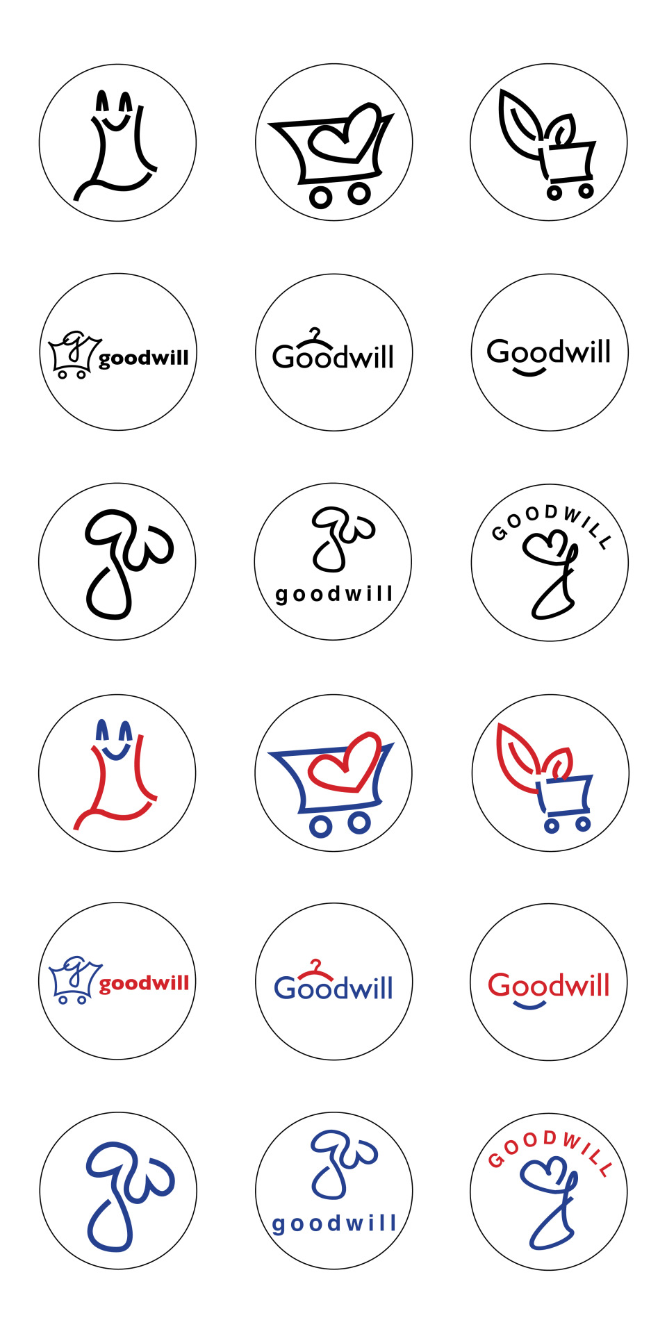
Shopping Cart Logo Design
This is a shopping cart logo design. can be used for shopping business.
#logotype#cart#business#ecommerce#shopping#e-commerce#minimalist#minimalist_Logo#logo_design#online#creative#marketing#supershop#shop#online_shop#online_shopping#shopping_cart
2 notes
·
View notes
Text
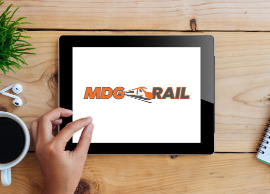
We Created This Logo Design for MDG Rail based in Doncaster, South Yorkshire.
Train Rail recruitment specialists in Doncaster, South Yorkshire.
If you require a logo design, letterheads, business cards or a website design please contact us via our website 4ccreatives.com
#doncasterisgreat #Doncaster #logodesign #logodesigner #businesscards #logo_design #websitedesign
Image © copyright 4C Creatives 2023
0 notes