#Matrix Representation of Graphs
Explore tagged Tumblr posts
Visit Tumblr Blog
Explore Tumblr blogs with no restrictions, modern design and the best experience.
Last Seen Tumblr Blogs


Fun Fact
Average visit duration of Tumblr.com is 10 mins and 25 secs.
Note
i need to grow up do i?
im doing graph theory and theyre all like "you can create a clustering algorithm by using the second smallest eigenvalue of this specific matrix representation of the graph, and it works because the matrix forms an orthonormal eigenbasis"
any reasonable reaction to this will involve crying
yeah for me it would be tears of joy. oh linear algebra so beautiful. yay
8 notes
·
View notes
Text
An adjacency list in a graph is a series of numbers that tells you how many nodes are adjacent to each node. So if you imagine a 3x3 square of rooms that all connect with a door in the center of each wall, the corner rooms would have a value of 2 (the side rooms adjacent to them), the side rooms would have a value of 3 (the adjacent corner rooms and the center), and the center would have a value of 4 (being adjacent to all 4 side rooms).
An adjacency matrix for a graph is possibly more confusing, depending on how your brain works, but defaults to containing more info and has faster lookups in terms of computer processing. It would represent those 9 rooms as a 9x9 grid and mark each door you could go out of as a 1 instead of a 0. So

becomes

And you can see it's symmetrical (split down the line of Xs), because you can go through a door either direction. If these were streets in a city and the street going from intersection E to F was a one-way street, the E,F would be a 1 but the F,E would be a 0.
To get a 2-hop option - everything available in 2 jumps from each point, allowing for overlap - you do slightly different things depending on whether List or Matrix is your representation.
For a List, you have a nested for loop, grabbing the set of adjacent options in the outer loop, and asking for them to spit out a list of their adjacent options in the inner loop. Imagine a 4-square of rooms
J Q K A
the outer loop would say, What's adjacent to J? Q- What's adjacent to Q? J and A are adjacent to Q K- What's adjacent to K? J and A are adjacent to K What's adjacent to Q? J- What's adjacent to J? Q and K are adjacent to J A- What's adjacent to A? Q and K are adjacent to A and so on. So the 2-hop for J ends up with J,A,J,A, for Q it's Q,K,Q,K, for K it's Q,K,Q,K, and for A it's J,A,J,A.
For matrices you do Matrix Multiplication. For square matrices of the same size (which works perfectly for us because we're trying to square the matrix in the first place) you take the row and column that meet at each point in the matrix and multiply across. If you were squaring a matrix
your new A would be A*A + B*D + C*G. Your new B would be A*B + B*E + C*H.
So the square of
For A,A it's a,a(0)*a,a(0) + b,a(1)*a,b(1) ... + i,a(0)*a,i(0) = 2 For B,A it's a,a(0)*b,a(1) + b,a(1)*b,b(1) ... + i,b(0)*b,i(0) = 0
And this makes sense. Remember, this is representing how many paths there are to go from one space to another in exactly 2 jumps. A,A means "how many paths go from A back to A in 2 steps." You can see there are 2: A -> B -> A and A -> D -> A. There's no way to actually take 2 steps starting from B and get to A. Using this logic we can guess by looking at the "map" that B,H would give us a value of 1, because there's only one way to get from B to H in 2 hops.
If we do the same cross-section trick to multiply it out, we have 1*0 + 0*0 + 1*0 + 0*0 + 1*1 + 0*0 + 0*1 + 0*0 + 0*1 and sure enough, we have just one spot where the numbers match up.
1 note
·
View note
Text
SAS Tutorial for Data Visualization: Creating Charts and Graphs That Tell a Story
In today's data-driven world, the ability to visualize data effectively is crucial for analysts and decision-makers. SAS offers robust tools for creating insightful visualizations that can uncover hidden patterns and trends. This SAS tutorial provides a step-by-step guide to crafting compelling charts and graphs using SAS, enabling you to tell a meaningful story with your data.
Understanding the Importance of Data Visualization
Data visualization transforms raw data into graphical representations, making complex information more accessible and understandable. Effective visualizations can highlight key insights, facilitate comparisons, and support data-driven decisions. In SAS, various procedures and tools are available to create a wide range of visualizations, from simple bar charts to complex heat maps.
Getting Started with SAS Visualization Tools
SAS provides several procedures for data visualization:
PROC SGPLOT: Ideal for creating single-cell graphs like bar charts, line plots, and scatter plots.
PROC SGPANEL: Useful for generating multi-cell graphs, allowing comparisons across different categories.
PROC SGSCATTER: Designed for creating scatter plot matrices to explore relationships between multiple variables.
PROC SGPIE: Enables the creation of pie and donut charts.
PROC SGMAP: Facilitates the rendering of maps with overlaid plots, useful for geographical data analysis.
These procedures are part of the ODS (Output Delivery System) Graphics, which provide a flexible and powerful framework for generating high-quality graphics.
Creating Basic Charts with PROC SGPLOT
Let's start with a simple bar chart using PROC SGPLOT. Suppose you have a dataset containing sales figures for different regions:
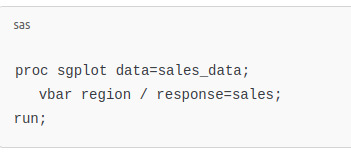
This code generates a vertical bar chart displaying sales by region. The vbar statement specifies the categorical variable (region), and the response option indicates the numerical variable (sales) to be plotted.
Enhancing Visualizations with Customizations
SAS allows extensive customization of charts to improve clarity and aesthetics:
Titles and Labels: Use title and label statements to add descriptive titles and axis labels.
Colors and Styles: Customize colors, line styles, and markers to differentiate data points.
Legends: Add legends to identify different groups or categories within the chart.
Annotations: Incorporate annotations to highlight specific data points or trends.
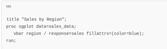
For example, to add a title and customize the color of bars:
Creating Multi-Panel Charts with PROC SGPANEL
When comparing data across multiple categories, PROC SGPANEL is invaluable. It allows the creation of panel charts, where each panel represents a subset of the data:
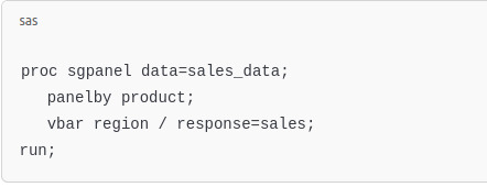
This code generates a series of bar charts, one for each product, facilitating easy comparison across regions.
Visualizing Relationships with PROC SGSCATTER
To explore relationships between numerical variables, scatter plots are effective. PROC SGSCATTER can create scatter plot matrices:
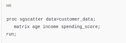
This produces a matrix of scatter plots, allowing you to observe pairwise relationships among age, income, and spending_score.
youtube
Creating Pie Charts with PROC SGPIE
Pie charts are useful for showing proportions. PROC SGPIE simplifies their creation:
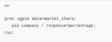
This code generates a pie chart illustrating each company's market share.
Best Practices for Effective Data Visualization
To create impactful visualizations:
Know Your Audience: Tailor the complexity and type of visualization to your audience's needs.
Choose the Right Chart Type: Select chart types that best represent the data and highlight key insights.
Simplify: Avoid clutter by focusing on essential information and removing unnecessary elements.
Use Consistent Scales: Ensure axes are scaled appropriately to allow accurate comparisons.
Highlight Key Data: Use color or annotations to draw attention to significant data points or trends.
Conclusion
Mastering data visualization in SAS empowers you to convey complex data insights clearly and effectively. By leveraging procedures like PROC SGPLOT, PROC SGPANEL, and others, you can create a variety of charts and graphs that not only represent data accurately but also tell a compelling story. As you become more proficient, you'll be able to craft visualizations that drive informed decisions and communicate findings with impact.
#sas tutorial#sas tutorial for beginners#sas programming#data analyst#data analytics#Data Visualization#Youtube
0 notes
Text
CS590 homework 6 – Graphs, and Shortest Paths
Develop a data structure for directed, weighted graphs G = (V, E) using an adjacency matrix representation.. The d.atatype int is used to store the weight of edges. int does not allow one to represent ±co. Use the values INTYIN and IN’T_MAX (defined in limits .h) instead. include <limits-h5 in.t d, e; d = INT_MAX; e = INT_MIN; if (e == ih–r_mir;) if (d I = IN–1_102A10 . Develop a…
0 notes
Text

In network science, embedding refers to the process of transforming nodes, edges, or entire network structures into a lower-dimensional space while preserving the network's essential relationships and properties. Network embeddings are particularly valuable for machine learning applications, as they allow complex, non-Euclidean data (like a social network) to be represented in a structured, high-dimensional vector format that algorithms can process.
Building on the concept of embeddings in network science, these transformations unlock several advanced applications by enabling traditional machine learning and deep learning methods to operate effectively on graph data. A key advantage of embeddings is their ability to encode structural and relational information about nodes in a network into compact, dense vectors. This allows complex, sparse graphs to be represented in a way that preserves both local connections (like close friendships) and global structure (like communities within the network).
There are multiple approaches to generating these embeddings, each with its own strengths:
Random Walk-based Methods: Techniques like DeepWalk and node2vec use random walks to capture the network’s context for each node, similar to how word embeddings like Word2Vec capture word context. By simulating paths along the graph, these methods learn node representations that reflect both immediate neighbors and broader network structure.
Graph Neural Networks (GNNs): Graph neural networks, including variants like Graph Convolutional Networks (GCNs) and Graph Attention Networks (GATs), use neural architectures designed specifically for graph data. GNNs aggregate information from neighboring nodes, creating embeddings that adaptively capture the influence of each node’s surroundings. This is especially useful in tasks that require understanding both individual and community-level behavior, such as fraud detection or personalized recommendations.
Matrix Factorization Techniques: These methods, like LINE (Large-scale Information Network Embedding), decompose the graph adjacency matrix to find latent factors that explain connections within the network. Matrix factorization can be effective for representing highly interconnected networks, such as knowledge graphs, where the relationships between entities are intricate and abundant.
Higher-order Proximity Preserving Methods: Techniques like HOPE (High-Order Proximity preserved Embeddings) go beyond immediate neighbors, capturing higher-order structural relationships in the network. This approach helps model long-distance relationships, like discovering latent social or biological connections.
Temporal Network Embeddings: When networks evolve over time (e.g., dynamic social interactions or real-time communication networks), temporal embeddings capture changes by learning patterns across network snapshots, allowing predictive tasks on network evolution, like forecasting emerging connections or trends.
Network embeddings are powerful across disciplines. In financial networks, embeddings can model transaction patterns to detect anomalies indicative of fraud. In transportation networks, embeddings facilitate route optimization and traffic prediction. In academic and citation networks, embeddings reveal hidden relationships between research topics, leading to novel insights. Moreover, with visualization tools, embeddings make it possible to explore vast networks, highlighting community structures, influential nodes, and paths of information flow, ultimately transforming how we analyze complex interconnections across fields.
0 notes
Text
What is TensorFlow? Understanding This Machine Learning Library

In this developing era of machine learning and deep learning, a question always arises: what is TensorFlow? It is a free to use library for artificial intelligence and ML. It can be used to perform various tasks but is specifically focused on integration and training of deep neural networks. It was developed in Google by the Google Brain team in 2015.
In the starting of 2011, Google released an updated version with various features. Since then, it has received a huge demand in the industry for its excellent features. Considering its huge popularity, people always ask "what does TensorFlow do?" This article gives the proper understanding of this library along with its benefits and applications.
What is TensorFlow?
It is an open-source library introduced by Google primarily for deep learning operations. It was firstly developed to perform huge numerical computations, but not for deep learning applications. Now it supports numerical computations for various workloads, such as ML, DL and other predictive and statistical analysis.
It collects data in the form of multi dimensional arrays of higher dimensions called tensors. These arrays are very convenient and helpful to collect and store a huge amount of data. This tool works according to data flow graphs that have edges and nodes. It is very simple to execute its code in a distributed manner among a cluster of computers.
How Does TensorFlow Work?
This library enables users to create dataflow graphs for a better representation of data flow in graphs. The graph has two factors: nodes and edges. Nodes represent a mathematical operation and the connection between nodes is called edge. This process takes inputs in the form of a multidimensional array. Users can also create a flowchart of operations that has to perform on these inputs.
What is TensorFlow in Machine Learning?
What is TensorFlow in machine learning? It is an open-source machine learning framework. It is mostly used in developing and deploying ML models. Its demand in this field is due to its excellent flexibility. It helps to implement a variety of algorithms to perform operations. These operations includes:
Robotics
Healthcare
Fraud Detection
Generative Models
Speech Recognition
Reinforcement Learning
Recommendation Systems
Natural Language Processing (NLP)
Image Recognition and Classification
Time Series Analysis and Forecasting
Components of TensorFlow
The working of this tool can be easily understood by breaking it into its components. It can be divided into the following factors:
Tensor
The name TensorFlow is borrowed from its main framework, “Tensor”. A tensor is a vector of a n-dimensional matrix that demonstrates all kinds of data. All values in tensor are similar in data types with an informed shape. The shape of the data represents the dimension of the matrix. It can be generated by inputs or results of the process.

Graphs
This tool mostly works on graph framework. The chart collects and describes all the computations completed during the process. It can run on multiple CPUs or GPUs and mobile operating systems. The portability of the graph allows it to conserve the computations for current or later use. All of the computation is executed by connecting tensors together.
For instance, consider an expression, such as: a= (b+c)*(c+2)
This function can be break into components as: d=b+c, e=c+2, a=d*e
Graphical representation of the expression -

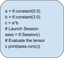
Session
A session is used to exclude the operation out of the graph. It helps to feed the graph with the tensor value. Inside a session, an operation must run in order to create an output. It is also used to evaluate the nodes. Here is an example of session:
Features of TensorFlow
This tool has an interactive multi-platform programming interface. It is more reliable and scalable compared to other DL platforms. The following features proves the popularity of this library:
Flexible
Open Source
Easily Trainable
Feature Columns
Large Community
Layered Components
Responsive Construct
Visualizer (with TensorBoard)
Parallel Neural Network Training
Availability of Statistical Distributions
Applications of TensorFlow
Many newcomers to the field of artificial intelligence often ask, 'What does TensorFlow do?’ It is an open-source platform designed for machine learning and DL operations. Here are some the applications of this library-

1. Voice Recognition
It is one of the most popular use cases of this library. It is built on neural networks. These networks are capable of understanding voice signals if they have a proper input data feed. It is used for voice search, sentimental analysis, voice recognition and understanding audio signals.
The use case is widely popular in smartphone manufactures and mobile OS developers. This is used for voice assistance, such as Apple’s Siri, Microsoft Cortana and Google Assistance. It is also used in speech-to-text applications to convert audios into texts.
2. Image Recognition
This use case is majorly used in social media and smartphones. Image recognition, image search, motion detection, computer vision and image clustering are its common usage. Google Lens and Meta’s deep face are examples of image recognition technology. This deep learning method can identify an object in an image never seen before.
Healthcare industries are also using image recognition for quick diagnosis. TensorFlow algorithms help to recognise patterns and process data faster than humans. This procedure can detect illnesses and health issues faster than ever.
3. Recommendation
Recommendation is another method used today to form patterns and data forecasting. It helps to derive meaningful statistics along with recommended actions. It is used in various leading companies, such as Netflix, Amazon, Google etc. These applications always suggest the product according to customer preferences.
4. Video Detection
These algorithms can also be used in video data. This is used in real-time threat detection, motion detection, gaming and security. NASA is using this technology to build a system for object clustering. It can help to predict and classify NEOs (Near Earth Objects) like orbits and asteroids.
5. Text-Based Applications
Text-based applications are also a popular use case of this library. Sentiment analysis, threat detection, social media, and fraud detection are some of the basic examples. Language detection and translation are other use cases of this tool. Various companies like Google, AirBnb, eBay, Intel, DropBox, DeepMind, Airbus, CEVA, etc are using this library.
Final Words
This article has explained 'what is tensor flow'. It is a powerful open-source tool for machine learning and deep learning. It helps to create deep neural networks to support diverse applications like robotics, healthcare, fraud detection, etc. It is also used to perform large numerical computations. It provides data flow graphs to process multi-dimensional arrays called tensors. You can learn TensorFlow and get TensorFlow Certification.
Its components, such as tensors, graphs and sessions, helps in computation across CPUs, GPUs, and mobile devices. It has various features including flexibility, ease of training and extensive community support. It provides robust abilities, such as parallel neural network training and visualizations with TensorBoard. This makes it a cornerstone tool in the AI and ML landscape.
1 note
·
View note
Text
10 Data Visualization Tips for Impactful Decks
1.How do you display data in a creative way?
Displaying data in a creative way is crucial in capturing the attention of your audience and effectively communicating your message.
One effective method using data visualizations, such as charts, graphs, and infographics, which can help simplify complex information and make it more engaging and easier to understand.
Utilizing colour, typography, and imagery can also enhance the visual appeal of your data presentation. Additionally, incorporating interactive elements, such as animations or interactive dashboards, can further engage your audience and allow for a more immersive experience.
By combining creativity with data visualization techniques, you can effectively convey your data in a visually compelling and impactful way.
2.What are the 4 pillars of data visualization?
The four pillars of data visualization are simplicity, clarity, efficiency, and consistency. Simplicity involves presenting information in a straightforward and easy-to-understand manner, avoiding unnecessary complexity that may confuse the audience.
Clarity is essential for ensuring that the message being conveyed is clear and easily comprehensible, with the use of appropriate labels, colours, and visual elements.
Efficiency refers to the ability to present data in a way that maximizes the audience's understanding without overwhelming them with unnecessary details.
Consistency is crucial for creating a cohesive and unified visual representation of data, ensuring that all elements are aligned and harmonious. By adhering to these four pillars, data visualization can effectively communicate complex information in a compelling and impactful way.
At the core of data visualization lies an intricate framework supported by four fundamental principles: the depiction of distribution, the exploration of relationships, the analysis of comparisons, and the synthesis of compositions.
3. How to structure a consulting deck?
When creating a consulting deck, it is crucial to structure it in a clear and concise manner to effectively communicate your message to clients.
Start by outlining the key objectives and scope of the project at the beginning of the deck. Follow this with a detailed analysis of the current situation, including any challenges or opportunities that need to be addressed.
Present your recommendations and proposed solutions with supporting data and evidence to build credibility. Use visuals, such as charts and graphs, to help explain complex information and make the content more engaging.
4.What are the 5 C 's of data visualization?
There are five key characteristics that apply universally to all types of data: cleanliness, consistency, conformance, currency, and comprehensiveness. These attributes, commonly referred to as the five Cs of data, are essential considerations regardless of the size or nature of the data in question.
5.What are the different techniques of data visualization?
Data visualization is an essential component of data analysis, allowing for the clear and concise representation of complex information.
Among the various forms of data visualization available, some of the most utilized include bar charts, line charts, scatter plots, pie charts, and heat maps.
Each of these visualization techniques serves a specific purpose in conveying data insights effectively.
Bar charts are frequently employed to compare categories of data, while line charts are useful for displaying trends over time.
Scatter plots are valuable for identifying relationships between variables, and pie charts are ideal for showing the distribution of data within a whole.
Heat maps are particularly effective in visualizing data density or patterns across a geographic area or matrix.

#Presentation Design#Presentation Design Services#Presentation Design Agency#Consulting Presentation#Business & Consulting Presentation#McKinsey Style Presentation#Slides Design
0 notes
Text
CS590 homework 6 – Graphs, and Shortest Paths
Develop a data structure for directed, weighted graphs G = (V, E) using an adjacency matrix representation.. The d.atatype int is used to store the weight of edges. int does not allow one to represent ±co. Use the values INTYIN and IN’T_MAX (defined in limits .h) instead. include <limits-h5 in.t d, e; d = INT_MAX; e = INT_MIN; if (e == ih–r_mir;) if (d I = IN–1_102A10 . Develop a…

View On WordPress
0 notes
Text
How to Visualize 3D Data Distributions in Python with 7 Astonishing Techniques
Introduction
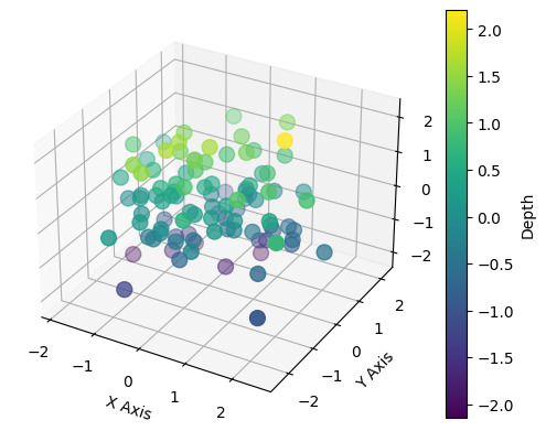
Data visualization is an essential component of data analysis, allowing us to effectively communicate insights and patterns hidden within complex datasets. By visually representing data, we can gain a better understanding of the information at hand and make informed decisions. In addition to traditional 2D data visualization, the use of three-dimensional (3D) visualization techniques has become increasingly popular. 3D data visualization offers a unique perspective, enabling the exploration of data in multiple dimensions and providing a more immersive and intuitive way to interpret information. https://rahularaj.com/what-is-retrieval-augmented-generation-rag/ Overview of Data Visualization and Its Importance Data visualization involves transforming raw data into visual representations such as charts, graphs, and plots. It plays a crucial role in data analysis as it helps us identify trends, patterns, and relationships that might be challenging to comprehend through raw data alone. The importance of data visualization lies in its ability to simplify complex data and present it in a visually appealing and understandable format. By visualizing data, we can: - Gain insights: Visual representations make it easier to identify patterns, outliers, and trends that may not be evident in raw data. - Communicate effectively: Visualizations serve as a means of conveying findings and insights to stakeholders, making it possible to share information in a clear and concise manner. - Make data-driven decisions: Visualizations empower decision-makers by providing a visual context that aids in understanding the implications of data, allowing for informed and strategic decision-making. Introduction to 3D Data Visualization and Its Benefits While 2D visualizations are effective in many cases, they often fall short when representing data with multiple variables or complex relationships. This is where 3D data visualization comes into play. 3D data visualization enables the exploration and representation of data in three dimensions, incorporating depth and perspective into the visualization. This additional dimension allows for a more comprehensive understanding of complex relationships and can reveal hidden patterns and insights. Some benefits of 3D data visualization include: - Enhanced depth perception: By adding depth to the visualization, 3D data visualizations provide a more realistic representation of the data, making it easier to perceive relative distances and relationships between different data points. - Improved spatial understanding: 3D visualizations allow users to view data from different angles and perspectives, facilitating a better understanding of spatial relationships within the dataset. - Increased interactivity: 3D visualizations often offer interactive features that enable users to manipulate the visualization, explore different viewpoints, and gain a more holistic understanding of the data. - Better representation of complex relationships: 3D visualizations can more accurately represent complex relationships between multiple variables, making it easier to analyze and interpret complex datasets. https://rahularaj.com/exploring-pythons-visual-power-10-mind-blowing-heatmap-and-correlation-matrix-examples/ Python provides a range of libraries and tools, such as Matplotlib, Plotly, and Mayavi, that support 3D data visualization. With these libraries, you can create stunning and interactive 3D visualizations to explore and communicate your data effectively. In conclusion, 3D data visualization is a powerful technique that enhances our ability to analyze and interpret complex datasets by providing a more immersive and intuitive representation. By leveraging Python’s capabilities and libraries, you can unlock the full potential of 3D data visualization and gain deeper insights from your data. Technique 1: Scatter Plot in 3D In this section, we will explore the scatter plot function in Python and learn how to create visually appealing and interactive plots in three dimensions. Exploring the Scatter Plot Function in Python Python provides a powerful library called Matplotlib that offers numerous plot types, including scatter plots. Scatter plots are useful for visualizing relationships between multiple variables in a dataset. To create a scatter plot, we can use the scatter() function from the Matplotlib library. This function takes the x, y, and z coordinates of the data points as input and plots them as individual markers on a three-dimensional plane. Using Colors and Sizes to Enhance the Plot One way to enhance a scatter plot is by incorporating colors and sizes to convey additional information about the data points. We can assign different colors to different groups or categories present in the dataset, making it easier to distinguish between them. Similarly, the size of the markers can represent another dimension of the data, such as the magnitude or importance of a variable. In Python, we can achieve this by specifying the c parameter in the scatter() function, which takes an array of colors, and the s parameter, which takes an array of sizes corresponding to each data point. Implementing Interactivity and Tooltips Interactivity adds another layer of engagement and functionality to our scatter plot. With interactivity, users can explore the plot in more detail and obtain additional information about individual data points. Python provides various libraries, such as Plotly and Bokeh, that allow us to create interactive plots. These libraries offer features like tooltips, which display additional information about a data point when the user hovers over it. By integrating interactivity and tooltips into our scatter plot, we can provide users with a richer and more informative visualization experience. To summarize, the scatter plot function in Python is a powerful tool for visualizing data points in three dimensions. By incorporating colors, sizes, interactivity, and tooltips, we can create visually appealing and interactive plots that enhance data exploration and analysis.import matplotlib.pyplot as plt from mpl_toolkits.mplot3d import Axes3D import numpy as np # Generating sample data x = np.random.standard_normal(100) y = np.random.standard_normal(100) z = np.random.standard_normal(100) fig = plt.figure() ax = fig.add_subplot(111, projection='3d') # Creating a scatter plot scatter = ax.scatter(x, y, z, c=z, cmap='viridis', s=100) # Adding color bar and labels fig.colorbar(scatter, ax=ax, label='Depth') ax.set_xlabel('X Axis') ax.set_ylabel('Y Axis') ax.set_zlabel('Z Axis') plt.show()
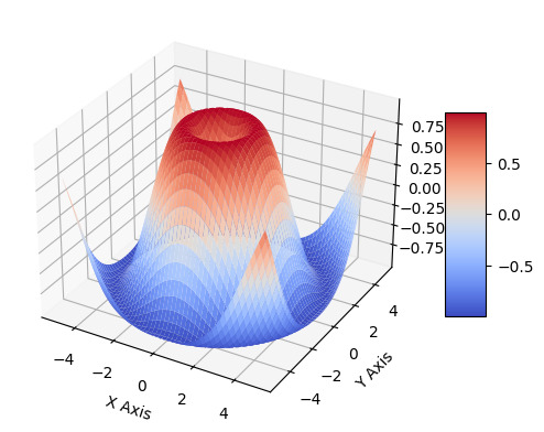
Technique 2: Surface Plotting Surface plotting is a powerful technique for visualizing three-dimensional surfaces using Python. It allows us to explore complex data in a more intuitive and comprehensive manner. Visualizing 3D Surfaces with Python Python provides various libraries that make it easy to visualize 3D surfaces. One popular library is Matplotlib, which offers a wide range of functions and tools for creating high-quality plots. To visualize a 3D surface using Matplotlib, we can use the plot_surface() function. This function takes in three main parameters: the coordinates of the points on the surface, the corresponding values at each point, and an optional colormap for coloring the surface. By representing the X, Y, and Z coordinates of the surface points as arrays, we can create a meshgrid and calculate the corresponding Z values based on a mathematical function or real-world data. We can then pass these arrays to the plot_surface() function to generate the surface plot. Creating Contour Plots for Better Understanding Contour plots are another useful tool for visualizing 3D surfaces. They provide a way to represent the variation of a surface in two dimensions by using contour lines. In Python, we can create contour plots using the contour() or contourf() functions from the Matplotlib library. The contour() function displays contour lines, while the contourf() function fills the areas between the contour lines with colors, which can be specified using a colormap. To create a contour plot, we need to provide the X and Y coordinates of the points on the surface, as well as the corresponding Z values. We can then call the appropriate function and specify the number of contour levels we want to display. Applying Color Maps and Shading Techniques Color maps and shading techniques play a crucial role in enhancing the visual appeal and readability of surface plots. Matplotlib offers a wide range of predefined color maps that can be used to color the surface based on the corresponding values. These color maps can be customized to suit the specific requirements of the plot. Additionally, we can apply shading techniques to the surface plot to further enhance its appearance. One commonly used technique is the use of lighting effects. By simulating the interaction of light with the surface, we can create a more realistic and visually appealing representation. To apply shading techniques, we can use the shade() function in Matplotlib. This function calculates the shading at each point on the surface based on the surface normals and the position of the light source. It then applies the shading to the surface plot, resulting in a more visually appealing output. In conclusion, surface plotting in Python is a powerful technique for visualizing 3D surfaces. By leveraging libraries like Matplotlib, we can create interactive and informative plots that help us better understand complex data.
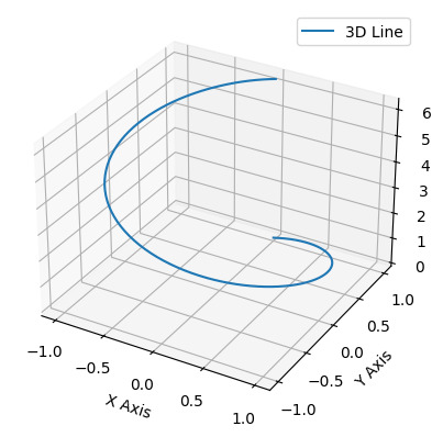
Technique 3: 3D Line Plotting In the realm of data visualization, plotting lines in 3D space is a powerful technique that allows us to represent complex relationships and patterns. With this technique, we can effectively communicate information and insights by visualizing data in three dimensions. Let’s explore some key aspects of 3D line plotting: Introduction to Plotting Lines in 3D Space Plotting lines in 3D space involves representing data points as coordinates in x, y, and z axes. This technique allows us to visualize relationships between three variables simultaneously. By plotting lines, we can observe trends, patterns, and correlations within the data, providing a comprehensive understanding of the information. Visualizing Time-Dependent Data with Animations One of the strengths of 3D line plotting is its ability to visualize time-dependent data. By animating the lines over a specific time range, we can observe how the data changes and evolves over time. This dynamic representation not only enhances understanding but also allows us to identify temporal trends and patterns that may not be evident in static displays. Adding Labels and Annotations to Enhance Clarity To ensure clarity and comprehension, it is crucial to include labels and annotations in our 3D line plots. Labels can represent the different variables or data points, making it easier to interpret the visual information. Annotations, such as arrows or text, can provide additional context or highlight specific observations within the plot. Including clear and concise labels and annotations helps the audience understand the significance of the plotted lines and facilitates effective communication of the insights derived from the data. In summary, 3D line plotting is a valuable technique for visualizing complex relationships in data. By plotting lines in 3D space, we can observe patterns, trends, and correlations within the data and effectively communicate information. Adding labels and annotations enhances clarity, ensuring that the audience can interpret the plot accurately.import matplotlib.pyplot as plt import numpy as np fig = plt.figure() ax = fig.add_subplot(111, projection='3d') # Generate data t = np.linspace(0, 2*np.pi, 100) x = np.sin(t) y = np.cos(t) z = t # Plot a 3D line ax.plot(x, y, z, label='3D Line') ax.legend() ax.set_xlabel('X Axis') ax.set_ylabel('Y Axis') ax.set_zlabel('Z Axis') plt.show()
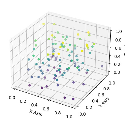
Technique 4: Volumetric Data Visualization Volumetric data visualization is a technique used to represent and visually communicate information contained in three-dimensional datasets. By converting volumetric data into graphical representations, researchers and professionals can gain valuable insights and make informed decisions in various fields, including medicine, engineering, and scientific research. Understanding Volumetric Data and its Applications Volumetric data refers to three-dimensional datasets that contain information about the density, composition, or intensity of a particular variable. This type of data is typically obtained through techniques such as computed tomography (CT) scans, magnetic resonance imaging (MRI), or scientific simulations. Volumetric data finds applications in various domains: - Medical Imaging: Volumetric data from CT or MRI scans can be visualized to assist in the diagnosis and treatment planning of diseases. For example, visualizing volumetric data can help identify abnormalities in organs or tumors. - Scientific Simulations: When simulating complex physical phenomena, such as fluid dynamics or molecular interactions, volumetric data can provide detailed insights into the behavior and properties of the simulated systems. - Engineering and Design: Volumetric data visualization aids engineers and designers in analyzing and optimizing the performance of structures or products. For instance, visualization techniques can be used to examine stress distributions in mechanical components or fluid flow patterns in aerodynamics Using Python Libraries to Render Volumetric Visualizations Python offers several powerful libraries that facilitate the rendering and visualization of volumetric data. Some commonly used libraries include: - Mayavi: Mayavi provides a high-level interface for interactive 3D visualization. It supports the rendering of volumetric data using techniques such as volume rendering, isosurface extraction, and slicing. - PyVista: PyVista is a versatile Python library that enables the creation of interactive 3D visualizations from volumetric data. It offers a wide range of visualization capabilities, including volume rendering, contouring, and slicing. - VisPy: VisPy is a library for high-performance scientific visualization. It provides functionalities for rendering volumetric data using GPU acceleration, allowing for real-time interaction and exploration. These libraries provide a range of customizable options to enhance the visual representation of volumetric data, such as adjusting color maps, applying shading effects, and selecting different rendering techniques.import numpy as np import matplotlib.pyplot as plt from mpl_toolkits.mplot3d import Axes3D # Generate synthetic data data = np.random.rand(100, 3) x, y, z = data, data, data fig = plt.figure() ax = fig.add_subplot(111, projection='3d') # Simple scatter plot to represent volumetric data points ax.scatter(x, y, z, c=z, cmap='viridis') ax.set_xlabel('X Axis') ax.set_ylabel('Y Axis') ax.set_zlabel('Z Axis') plt.show()
Applying Transfer Functions and Opacity Mapping Transfer functions and opacity mapping are fundamental techniques used in volumetric data visualization to control the visual appearance and highlight specific properties of the data. - Transfer Functions: Transfer functions map the raw data values to visual attributes, such as color and transparency. By assigning different colors and opacities to different data values, transfer functions can emphasize certain features or structures present in the volumetric data. - Opacity Mapping: Opacity mapping determines the transparency of the rendered voxels based on their data values. It allows users to control the visibility of specific regions within the volumetric dataset. For example, by adjusting the opacity mapping, one can make certain structures more transparent or completely opaque, depending on their significance. By applying transfer functions and opacity mapping techniques, users can effectively extract meaningful information from volumetric data and highlight specific areas of interest. In conclusion, volumetric data visualization is a powerful technique that enables the exploration and analysis of three-dimensional datasets. By using Python libraries and applying transfer functions and opacity mapping, professionals can create informative and visually appealing renderings that facilitate data interpretation and decision-making in various fields. Technique 5: 3D Bar Plotting In this section, we will explore the technique of creating 3D bar plots using Python. These plots allow us to visualize data in a three-dimensional space, adding an extra dimension to the information being represented. We will cover the process of customizing bar colors, sizes, and orientations in our plots. Additionally, we will learn how to add error bars and confidence intervals to our 3D bar plots. Creating Bar Plots in 3D Space with Python To create 3D bar plots with Python, we can use various libraries such as Matplotlib, Plotly, and Seaborn. These libraries provide functions and tools to generate visually appealing and informative plots. Customizing Bar Colors, Sizes, and Orientations To customize the appearance of our 3D bar plots, we can modify different attributes such as bar colors, sizes, and orientations. For example, using Matplotlib, we can set the color of the bars by specifying a color map or assigning specific colors to each bar. Similarly, we can adjust the size of the bars using the width parameter and control their orientation with the align parameter. Adding Error Bars and Confidence Intervals Error bars and confidence intervals are essential for visualizing the uncertainty associated with our data. They provide a range of values that represent the variability or confidence of our estimated measurements. In 3D bar plots, we can add error bars or confidence intervals by using the appropriate functions provided by the plotting library. These functions allow us to specify the error or confidence values for each bar and visualize them accordingly. By incorporating error bars and confidence intervals into our 3D bar plots, we can provide additional information to our audience, making the plots more informative and reliable. Read the full article
0 notes
Text
Sparse Matrix
A sparse matrix is a special type of matrix in mathematics wherein the majority of its elements are zero. In contrast to dense matrices, which contain a significant number of non-zero elements, sparse matrices have very few non-zero values.
Sparse matrices are not just theoretical constructs but have practical applications in diverse fields. From large-scale simulations in engineering, bioinformatics, and physics to graph representations and machine learning algorithms, sparse matrices are extensively utilized in real-world scenarios.
Sparse matrices often arise in text mining and natural language processing (NLP) applications, such as the bag-of-words model (BoW) or term-document matrices, where word occurrences in each document are stored.
Various machine learning models and algorithms benefit from sparse matrices when dealing with sparse data inputs, such as in feature extraction or dimensionality reduction techniques.
sparse matrices are widely used in machine learning to handle high-dimensional data, where data sets often contain many zeros and only a few relevant values.
0 notes
Text
Vector Database Market: Industry Potential, Trends and forecast to 2032
Vector database market size is projected to expand at over 20.5% CAGR from 2023 to 2032, propelled by the increasing volumes of complex data and the surging demand for efficient storage and retrieval solutions. Vector databases offer superior performance in handling spatial data and have emerged essential for applications like mapping and geolocation. Several industries like finance, healthcare, and logistics are increasingly adopting vector databases to handle geospatial and multidimensional data effectively.
Request for Sample Copy report @ https://www.gminsights.com/request-sample/detail/7334
The rise of location-based services, real-time analytics, and the IoT will also drive the market growth. For instance, in February 2023, Microsoft Dynamics 365 Copilot integrated AI capabilities to aid the sales teams. Copilot AI utilizes data from Microsoft 365 Graph and CRM for generating editable product descriptions for sales sites and suggesting responses to customer emails. Additionally, the increasing data complexity will position vector databases as integral components of modern data management strategies.
The vector database industry is segregated into technology, type, industry vertical, and region.
Based on type, the industry value from the services segment is estimated to rise at substantial CAGR between 2023 and 2032. The growth can be attributed to the increasing demand for professional services, including consulting and maintenance, to effectively implement and manage vector database solutions. The rising prominence of service providers in optimizing vector databases for diverse applications will also boost the segment growth.
Vector database market share from the computer vision segment is projected to witness significant CAGR through 2032. This is due to the rising adoption of computer vision technologies in applications like image recognition and analysis. Vector databases facilitate the efficient storage and retrieval of vector representations crucial for computer vision tasks. This is contributing to their growing demand in diverse industries.
Request for customization this report @ https://www.gminsights.com/roc/7334
Regionally, the Asia Pacific vector database industry is slated to expand at rapid pace between 2023 and 2032. This is owing to the rapid expansion of e-commerce platforms requiring efficient logistics and transportation networks. Vector databases play a vital role in route optimization, warehouse management, and delivery services for ensuring timely and cost-effective deliveries for e-commerce businesses across the region.
Partial chapters of report table of contents (TOC):
Chapter 1 Methodology & Scope
1.1 Market scope & definition
1.2 Base estimates & calculations
1.3 Forecast calculation
1.4 Data sources
1.4.1 Primary
1.4.2 Secondary
1.4.2.1 Paid sources
1.4.2.2 Public sources
Chapter 2 Executive Summary
2.1 Vector database market 360º synopsis, 2018 - 2032
2.2 Business trends
2.2.1 Total Addressable Market (TAM), 2023-2032
2.3 Regional trends
2.4 Technology trends
2.5 Type trends
2.6 Industry vertical trends
Chapter 3 Vector Database Industry Insights
3.1 Impact of COVID-19
3.2 Industry ecosystem analysis
3.3 Vendor matrix
3.4 Profit margin analysis
3.5 Technology & innovation landscape
3.6 Patent analysis
3.7 Key news and initiatives
3.7.1 Partnership/Collaboration
3.7.2 Merger/Acquisition
3.7.3 Investment
3.7.4 Technology launch & innovation
3.8 Regulatory landscape
3.9 Impact forces
3.9.1 Growth drivers
3.9.1.1 Growing data volume and complexity
3.9.1.2 Rising adoption of Artificial Intelligence (AI) and Machine Learning (ML) across industries
3.9.1.3 Increasing need for real-time analytics
3.9.1.4 Rising demand for geospatial and time-series data analysis
3.9.2 Industry pitfalls & challenges
3.9.2.1 High cost of commercial vector databases
3.9.2.2 Complex setup and management
3.10 Growth potential analysis
3.11 Porter’s analysis
3.12 PESTEL analysis
About Global Market Insights:
Global Market Insights, Inc., headquartered in Delaware, U.S., is a global market research and consulting service provider; offering syndicated and custom research reports along with growth consulting services. Our business intelligence and industry research reports offer clients with penetrative insights and actionable market data specially designed and presented to aid strategic decision making. These exhaustive reports are designed via a proprietary research methodology and are available for key industries such as chemicals, advanced materials, technology, renewable energy and biotechnology.
Contact us:
Aashit Tiwari Corporate Sales, USA Global Market Insights Inc. Toll Free: +1-888-689-0688 USA: +1-302-846-7766 Europe: +44-742-759-8484 APAC: +65-3129-7718 Email: [email protected]
0 notes
Text
QUESTIONS (Write a program to find the adjacency list of a given directed graph)
Write a program to find the adjacency list of a given directed graph G which is represented as adjacency matrix. Input Format: The first line of the input contains a positive integer n, the number of vertices in the graph, in the range 1 to 1000. The next lines represents the Adjacency matrix representation of the given graph. Output Format: Then lines contain the adjacency list of each node…
0 notes
Text
32. What are the different types of data visualizations available in SSRS?
Interview questions on SSRS Development #etl #ssrs #ssrsdeveloper #reportingservices #eswarstechworld #sqlserverreportingservices #interview #interviewquestions #interviewpreparation
Data visualizations in SSRS (SQL Server Reporting Services) refer to the graphical representation of data to facilitate better understanding and analysis. SSRS provides various types of visualizations that transform raw data into meaningful charts, graphs, and maps. Categories or Classifications: Basic Charts: Bar charts, line charts, pie charts, etc. Matrix and Tablix Reports: Display data…

View On WordPress
#eswarstechworld#etl#interview#interviewpreparation#interviewquestions#reportingservices#sqlserverreportingservices#ssrs#ssrsdeveloper
0 notes
Text
Boost Intel CPU Speed for(GNN) Graph Neural Network Training

Graph Neural Network Training (GNN) Accelerated on Intel CPU with Hybrid Partitioning and Fused Sampling
High points
A novel graph sampling technique dubbed “fused sampling,” created by Intel Labs and AIA, may speed up the training of Graph Neural Networks (GNNs) on CPUs by up to two times. One of the most widely used libraries for GNN training, the Deep Graph Library (DGL), now includes the updated sample process.
With the use of a novel graph partitioning technique called “hybrid partitioning,” Intel Labs has been able to significantly accelerate the distributed training of Graph Neural Networks (GNNs) on huge networks. Popular graph benchmarks have seen epoch durations reduced by as much as 30%.
Using 16 2-socket computers, each with two 4th Gen Intel Xeon Scalable Processors (Sapphire Rapids), the combination of fused sampling and hybrid partitioning set a new CPU record for training GNNs on the well-known ogbn-papers100M benchmark, achieving a total FP32 training time of just 1.6 minutes.
In several graph-related tasks, including link prediction in recommendation graphs, molecular graph physical property prediction, and high-level semantic feature prediction of nodes in citation graphs and social networks, Graph Neural Networks (GNNs) have achieved state-of-the-art performance. In many fields, graphs may include billions of edges and millions of nodes.
Training over the whole graph at once may rapidly deplete memory. Sampling-based training is one of the most widely used techniques for training GNNs on big graphs: we randomly select a small portion of the graph (small enough to fit in available memory) for each training iteration and train the GNN on this graph sample. However, as a illustrates, the time required for the graph sampling during each iteration may easily eclipse the time for the forward and backward runs of the GNN.
The graph is often divided among many computers to speed up sampling-based training, as seen in the machines are in charge of producing their own graph samples and using them to train the GNN model. Each computer would need to speak with other machines in order to create a graph sample since the graph topology is divided across the devices. As we generate bigger graph samples, this communication cost will increase. When the GNN model includes additional layers, the graph sample size usually grows.
In the following, we outline two complimentary methods that tackle the significant communication cost associated with distributed sample-based training and the high sampling CPU sampling overhead now experienced by popular machine learning libraries.
1. Combining Sampling
Every training iteration must include graph sampling. Thus, it is essential to sample graphs as quickly as feasible. Popular GNN libraries, like DGL (a popular GNN training library), provide a typical sample pipeline that consists of several phases that each produce intermediate tensors that must be written to and subsequently read from memory.
2. Adaptable partitioning
When a graph becomes too large to store in the memory of one training machine, it is often divided among many machines. The relevant graph data required for each machine to train the GNN model is requested and provided via inter-machine communication. We have noticed that the majority of the graph representation size is often occupied by the characteristics connected to the graph nodes. More than 90% of the RAM required to display the graph is often occupied by the node characteristics.
Inspired by this finding, we created a novel partitioning technique called hybrid partitioning, which, as splits the graph exclusively according to its node properties while reproducing the relatively tiny graph topology information (the graph’s adjacency matrix) across all training machines. Because the machines only need to communicate node characteristics, this results in a significant decrease in the number of communication rounds in distributed sampling based GNN training trials.
As a fused sampling in conjunction with hybrid partitioning resulted in a significant decrease in epoch durations for distributed sample-based GNN training. Even on its own, hybrid partitioning improves performance; when combined with fused sampling, it increases epoch times by more than two times. We obtain a record-breaking total FP32 training time of under 1.6 minutes on 16 2-socket computers by using hybrid partitioning and fused sampling.
Read more on Govindhtech.com
0 notes
Text
A matrix representation of a graph of a square with doors going from 1-2 and back, 2-3 and back, 3-4 and back, and 4-1 and back, would look like this 0101 1010 0101 1010 Each node has a total degree of 4. In spite of using a door as an analogy the "degree" counts the fact that there's a path out to and in from those adjacent rooms. Looking at the matrix you can get the same result by adding up the number of 1s in the matching row and column. In row 3 there are two 1s, indicating the means to go out to rooms 2 and 4. In column 3 there are two 1s, indicating the ability to come in from rooms 2 and 4.
Now imagine the same square but it's all 1-way streets. You can only go from 1-2, from 2-3, from 3-4, and from 4-1. It looks like so: 0100 0010 0001 1000 You can see that the matrix still shows the correct information. Row 1 column 2 has a 1 in it, so you can go from 1 to 2. Row 4 column 1 has a 1 in it, so you can go from 4 to 1. And between row 1 and column 1 you have a total of two 1s, so the first node has a degree of two.
The adjacency list representation of the "doorways" is like this:
1 - (2,4) 2 - (1,3) 3 - (2,4) 4 - (1,3)
The list representation is nice when you've got big areas described, because you may have noticed that even with just a square there's a lot of needless 0s telling you "there's not a line between these two points going this direction." With the list you only bother to say something exists when it's something existing.
0 notes
Text
Exploring Data Visualization Techniques in Data Science
Data visualisation is an essential part of data science that aids in comprehending complicated data sets and gaining insightful conclusions. Visualising data allows us to identify outliers, outlier patterns, and trends that may not be readily apparent from raw data alone. We shall examine several data visualisation methods employed by organisations like 360DigiTMG institution in this post.
Bar Charts and Histograms:
Categorical data is displayed using bar charts, wherein every category is denoted by a bar and its height or length reflects the value of the data. A particular kind of bar chart called a histogram is used to show how a continuous numerical quantity is distributed. The data science institutes in hyderabad is divided into bins, and the frequency or number of data points that fall into each bin is shown.
Line Charts:
Line charts are effective for displaying trends over time or across a continuous variable. They are commonly used to visualize stock prices, weather trends, or any data that has a sequence or order.
Scatter Plots:
Scatter plots display individual data points as dots on a 2D plane, with one variable on the x-axis and another on the y-axis. They are useful for identifying relationships, correlations, and clusters within data points.
Pie Charts:
Elements of a whole are represented using pie charts. They are effective when you want to show the distribution of a categorical variable as a percentage of the whole.
Heatmaps:
Heatmaps use color to represent the values of a matrix or a 2D dataset. They are often used to visualize correlations in large datasets, where each cell represents the relationship between two variables.

Box Plots:
Box plots (or box-and-whisker plots) display the distribution of a dataset's summary statistics such as median, quartiles, and potential outliers. They are useful for identifying skewness, variability, and outliers in the data.
Bubble Charts:
Bubble charts are similar to scatter plots but add an additional dimension by varying the size of the data points (bubbles) to represent a third variable. This can provide insights into relationships between three variables.
Treemaps:
Treemaps represent hierarchical data structures by dividing a rectangular area into smaller rectangles, where each rectangle represents a category or sub-category. Different variables can be represented by changing the rectangles' size and colour.
Violin Plots:
Violin plots combine the features of box plots and kernel density plots. They show the distribution of data analytics courses in hyderabad with placements across different categories or groups and provide a visual representation of the data's probability density.
Network Graphs:
Network graphs (or node-link diagrams) are used to visualize relationships and connections between different entities. Edges represent connections between nodes, which represent entities.
Word Clouds:
Word clouds are a way to visualize textual data by displaying words in varying sizes, with more frequently occurring words appearing larger. They are often used to summarize large amounts of text data.
Geospatial Maps:
Geospatial maps use geographic data to visualize information on maps. They are particularly useful for showing regional variations, distribution patterns, and spatial relationships.
It's crucial to take your data's nature, the insights you wish to express, and your target audience into account when selecting a data visualisation approach. In data science, organisations like 360DigiTMG institute, a well chosen and well-designed visualisation may considerably improve comprehension of complicated data and promote more informed decision-making.
Become a Data Science and AI expert with a single program. Go through 360DigiTMG's data science offline course in Hyderabad! Enroll today!
youtube
For more information
360DigiTMG - Data Analytics, Data Science Course Training Hyderabad
Address - 2-56/2/19, 3rd floor,,
Vijaya towers, near Meridian school,,
Ayyappa Society Rd, Madhapur,,
Hyderabad, Telangana 500081
099899 94319
360DigiTMG - Data Analytics, Data Science Course Training Hyderabad
Source Link : What are the Best IT Companies in ECIL
Data Science Roadmap 2023
#data science certification course in hyderabad#data science course in hyderabad#data science training institute in hyderabad#Youtube
0 notes