#Meisterbuch der Schrift
Text


Typography Tuesday
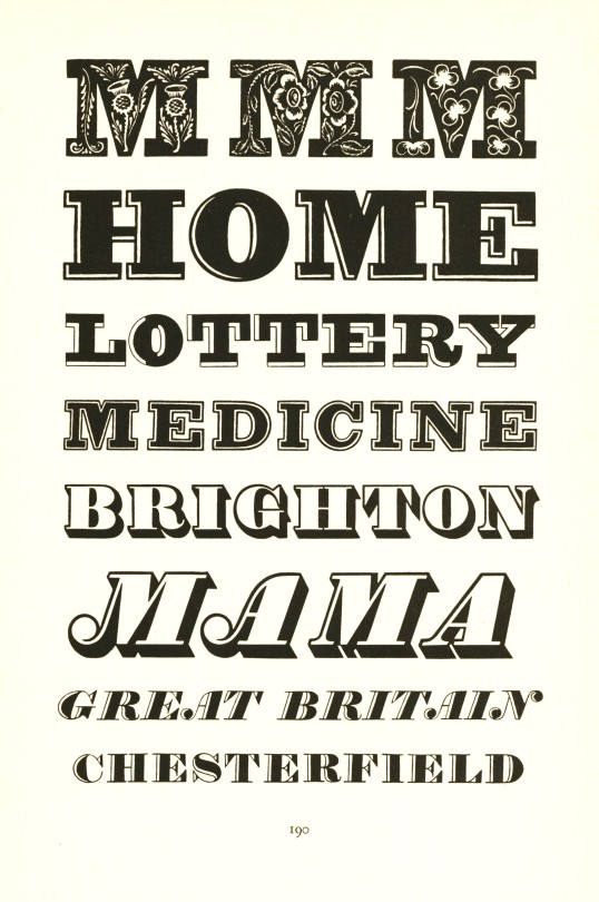
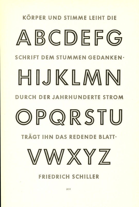
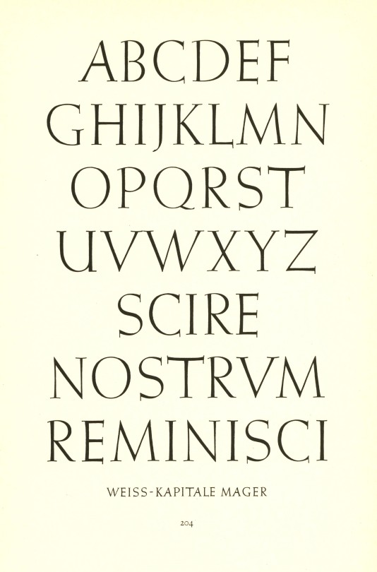
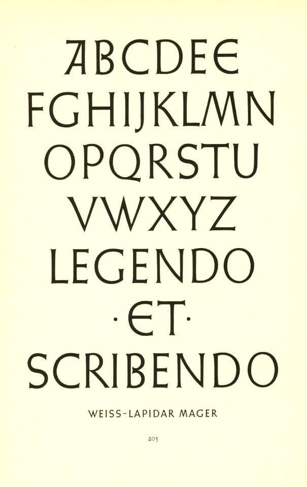
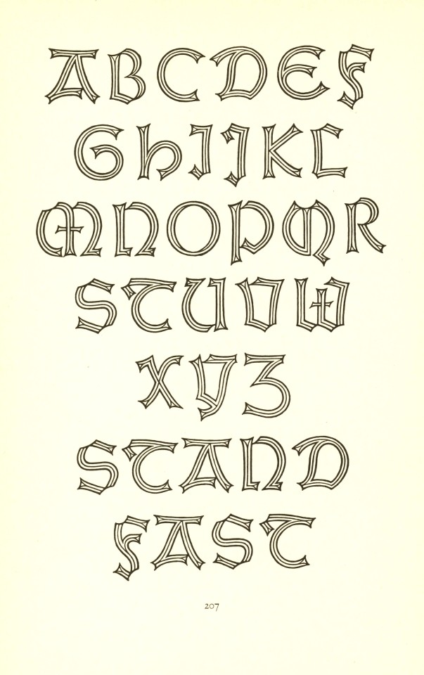
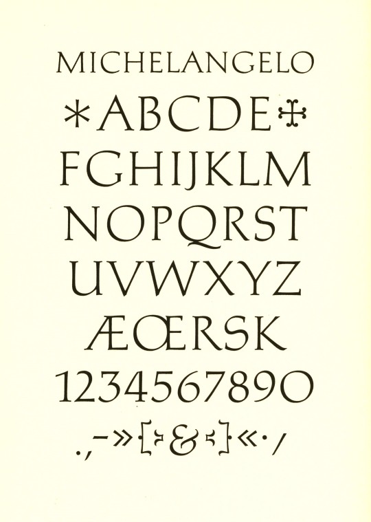
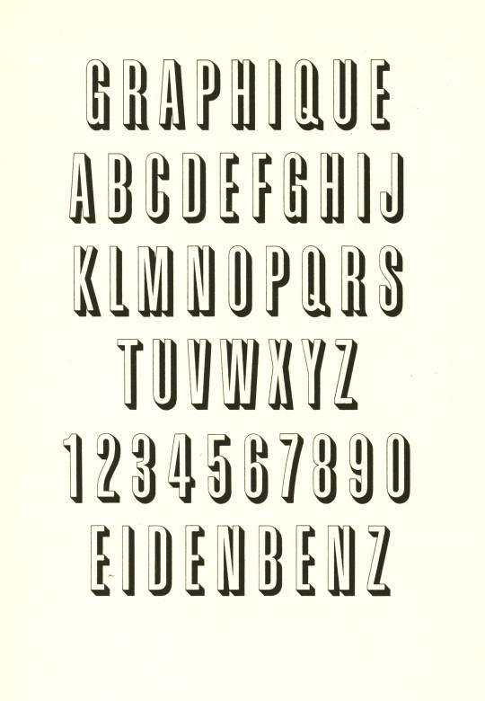
Meisterbuch der Schrift is German-Swiss book and type designer Jan Tschichold's 1952 textbook on historical and contemporary type design published in Ravensburg, Germany by Otto Maier Verlag. From top to bottom:
Type samples from early 19th-century English fashion publications.
Playbill from Stephenson Blake & Co., Sheffield, England.
Futura by German designer Paul Renner, 1927.
Futura Light, also by Renner.
Two sets of capitals by Emil Rudolf Weiss for the Bauer Type Foundry.
A shadowed Weiss Gothic by Emil Rudolf Weiss.
Michelangelo by Hermann Zapf for the Stempel Type Foundry, 1950.
Sistina by Hermann Zapf, also for Stempel, 1951.
Graphique by Hermann Eidenbenz for the Haas Type Foundry, 1945.
Jan Tschichold (1902-1974) was one of the most noted type and book designers of the 20th century. He is remembered most for his two-year stint with Penguin Books (1947-1949), during which he established Penguin’s characteristic design identity, and for his typefaces Transit (1931), Saskia (1931/1932), Zeus (1931) and Sabon (1966/1967).
View more posts with work by Jan Tschichold.
View more Typography Tuesday posts.
#Typography Tuesday#typetuesday#type designers#Jan Tschichold#Meisterbuch der Schrift#Otto Maier Verlag#type display books#type specimen books#type design#20th century type
38 notes
·
View notes
Text
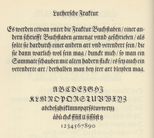

luthersche fraktur
first illustration is from plate 122 in jan tschichold’s excellent source book Meisterbuch der Schrift [otto maier verlag, ravensburg, 2nd ed., 1965]. in the note to the plate tschichold tells us [translation mine]: «Fraktur, the script of the German Renaissance, was utilized unchanged in the baroque until into the rococo. The example before us, a cut originating with the famous, ancient Frankfurt type-foundry Egenolff-Luther, is the most noble of still available ancient fraktur types. The plate shows the gorgeous Text-size, which first turned up in 1708 on an Augsburg type specimen. The typeface now belongs to the type-foundry D. Stempel AG in Frankfurt am Main.» text-size is the old founders’ specification for a casting-mould (body-size) of approximately twenty didot points—approximately twenty-four english-american points. i always read tschichold as gospel, but i’m not sure why tschichold refers to «the 1708 specimen»—it would have been helpful if he had mentioned the publisher‘s name: the text-size certainly appears on the luther fraktur-specimen of 1678.
second illustration is a section from Fraktur-Schriftprobe des Schriftgießers Johann Erasmus Luther, Frankfurt a. M. 1678 [plate 9 in Frankfurter Schriftproben aus dem 16. bis 18. Jahrhundert, d. stempel ag, frankfurt am main, 1955]. in his introduction to the folio dr robert diehl notes [translation mine]: «However, also a new proprietary cut of fraktur face was begun under the directorship of Erasmus Luther. It became known by the name Luther fraktur, and was later recut & reissued by the type-foundry D. Stempel AG in Frankfurt.» [ibid., introduction, p4]. stempel acquired the type- foundry department of w. drugulin, the famous leipzig printing company, in 1919; & drugulin held strikes of original luther fraktur. as stempel issued its luthersche fraktur revival that same year, matrices for the revival must have been pantographically engraved (from the original luther matrices)—to have engraved new punch sets in so short a span would have been a mammoth task!
4 notes
·
View notes
Last Seen Blogs

ziejue
Untitled

fabuloussmilesfromcharlie
Hope Is The Thing With Feathers.


bestclayton98
The Love of Willadsen 926

waste-land-artist
Not Your China Doll