#Responsive design tutorial 2015
Explore tagged Tumblr posts
Visit Tumblr Blog
Explore Tumblr blogs with no restrictions, modern design and the best experience.
Last Seen Tumblr Blogs


Fun Fact
69% of Tumblr users are millennials.
Text
Over a decade ago, back when Kevin, Molly, and I started EA1, I used to give a talk at entertainment and media conferences that explained the new world of online fandoms to producers, marketers, and executives.
It had a bit of science, a lot of fan work, and bunch of storytelling to explain the social psychology and peer-oriented technologies that enabled people to connect to each another around the things that they loved.
The crowd was really into it -- especially the bits about what fans were doing on the site called Tumblr "without an 'e'".
But then I'd almost always lose them with the last slide. Here's my v/o from my presenter notes:
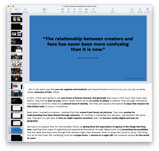
…But in the same way that you can organize and motivate peer-based fandoms around Love, you can just as easily create networks of hate. In fact, I think we’re going to see new forms of hatred, fascism, and genocide that many in this room have never seen before. They will be peer-to-peer which means there will be no center to attack or defend. They will align themselves not based on common orders but a shared bond of identity. And they will express themselves in ways that menace but hide behind veils of irony or irreverence. Back when I worked on memes, I realized that they weren’t just funny cat pictures. They were proxies for understanding how ideas flowed through networks. I’m working in marketing now because I see fandoms the same way. They give us a glimpse at how we might organize ourselves when we become mostly digital and lose our geography. My hope is to prepare fans for that possible future, by giving them the expectation of agency in the things that they love, teaching them ways of organizing and expressing themselves through digital tools, and presenting the possibility that the skills that they build through their fandom might help empower them to shape the world to come. This thing you all do that looks like marketing could be a trojan horse. A sermon in a sugar pill that prepares people for the world to come.
I don't know if this was the way other 'official' tumblrs operated but this was always the point behind the gif tutorials, premiere watch parties, and 30 day memes on Orphan Black and Doctor Who (and maybe a bit for Killing Eve). If we taught you Photoshop, you knew how to make a flyer or a protest sign. If you got a guide on how to host a watch party, you could host a meetup. And if you had to work with others to do a 30 day meme, you knew what it meant to cooperate and check in on one another towards a common goal.
These were designs for participation. The goal was never for anyone to recognize why we were doing it (it looks like 'marketing' to me) but to give people a model and some mechanics for taking action in the world.
This was in 2013. By 2015, I stopped getting invited to do this talk. One person who saw it really got it and, b/c she was well connected, she invited me to give the talk to some folks in leadership at a national political campaign. Their response at the end was "thanks, but we've got this". (They didn’t have it.)
It can feel like there is a lot to do to respond to the right now (which is part of the point, btw), but you can also do things -- quiet things, strategic things, driven by values -- that help lay bricks for a foundation.
240 notes
·
View notes
Text
Front end web developer skills you need to know
To become a successful front-end web developer, you’ll need a solid foundation in key skills. Mastering HTML & CSS is essential for creating the structure and style of websites.
JavaScript and ES6 add interactivity and modern functionality, while CSS & JS frameworks like Bootstrap and React streamline development.
Understanding GIT & GITHUB for version control and implementing responsive design ensures your projects work seamlessly across all devices.
In this article, we will review some of the key skills required for expert front web development.

Download Infographic
HTML & CSS
HTML (HyperText Markup Language) and CSS (Cascading Style Sheets) are the backbone of front-end web development. HTML structures the content of a web page, using elements like headings, paragraphs, links, and images.
CSS styles that content, controlling layout, colours, fonts, spacing, and responsiveness. Together, they allow developers to create visually engaging and well-structured websites.
Mastering HTML & CSS is crucial before moving on to more advanced topics like JavaScript or frameworks. You’ll need to understand concepts such as semantic HTML, CSS selectors, the box model, and media queries.
There are plenty of free and paid resources to help you learn. Great starting points include MDN Web Docs, W3Schools, and freeCodeCamp’s Responsive Web Design certification.
Platforms like Codecademy and Coursera also offer beginner-friendly courses. Practising by building small projects is one of the most effective ways to reinforce your learning.
JavaScript
JavaScript is a core technology of front-end web development, used alongside HTML and CSS to create dynamic, interactive websites. While HTML provides the structure and CSS handles styling, JavaScript enables user interaction by manipulating elements on the page in real-time.
It’s responsible for features such as form validation, image sliders, dropdown menus, modal windows, and dynamic content updates without reloading the page (using AJAX). JavaScript interacts with the Document Object Model (DOM), allowing developers to modify HTML and CSS based on user actions like clicks, scrolls, or keystrokes.
Modern front-end development often uses JavaScript libraries and frameworks such as React, Vue.js, or jQuery to streamline development and enhance functionality. Understanding JavaScript fundamentals is essential before diving into these tools.
There are excellent resources to learn JavaScript, whether you’re a beginner or looking to advance your skills. Top recommendations include JavaScript.info, MDN Web Docs, and freeCodeCamp. You can also find interactive tutorials on Codecademy, as well as comprehensive courses on platforms like Udemy and Coursera.
For in-depth understanding, the book Eloquent JavaScript is highly regarded in the developer community. Practising through small projects and coding challenges will solidify your knowledge.
ES6
ES6 (ECMAScript 2015) is a major update to the JavaScript language, introducing powerful new features that make coding more efficient and maintainable. It brought significant improvements to JavaScript syntax and functionality, including let and const for block-scoped variable declarations, arrow functions for cleaner, more concise function expressions, template literals for easier string formatting, and destructuring for simplifying data extraction from arrays and objects.
ES6 also introduced promises for better handling of asynchronous operations, modules for organising code into reusable components, and classes for a more structured, object-oriented approach to JavaScript development.
ES6 has become a standard in front-end web development, forming the backbone of modern frameworks like React, Vue.js, and Angular, where these features are heavily utilised to create fast, scalable, and maintainable web applications. It also improves code readability and reduces common bugs, making it an essential skill for front-end developers.
To learn ES6, great resources include MDN Web Docs, JavaScript.info, freeCodeCamp’s JavaScript course, and Codecademy’s interactive tutorials. The book Eloquent JavaScript also covers ES6 in depth, while platforms like Udemy and Coursera offer structured courses for more in-depth learning. Practising with real-world projects is the best way to master ES6.
CSS & JS Frameworks
CSS and JavaScript frameworks play a vital role in front-end web development by streamlining the coding process and reducing development time.
CSS frameworks like Bootstrap, Tailwind CSS, and Foundation provide pre-written CSS classes and components for creating responsive layouts, navigation menus, buttons, and more. They help ensure consistent design and save developers from writing repetitive code.
JavaScript frameworks such as React, Vue.js, and Angular offer structured approaches to building interactive user interfaces and managing complex application states. These frameworks simplify DOM manipulation, improve performance, and enable the creation of reusable components.
By using these frameworks, developers can build modern, responsive, and scalable web applications more efficiently.
To learn CSS frameworks, explore the official documentation for Bootstrap or Tailwind CSS, as well as tutorials on freeCodeCamp and W3Schools. For JS frameworks, the React and Vue.js official docs, MDN Web Docs, Codecademy, and Scrimba offer excellent learning paths.
GIT & GITHUB
GIT and GitHub are essential tools for front-end web developers, enabling efficient version control and collaboration. GIT is a distributed version control system that tracks code changes, allowing developers to manage project history, revert to earlier versions, and work on multiple features simultaneously using branches.
GitHub is a cloud-based platform that hosts GIT repositories, making it easy for developers to collaborate, share code, and contribute to open-source projects. It also offers features like pull requests, code reviews, and issue tracking to streamline development workflows.
In front-end web development, GIT and GitHub are used to manage code for websites and applications, ensuring version control and seamless collaboration. They also make it easy to showcase projects in a professional portfolio.
To learn GIT and GitHub, consider GitHub Learning Lab, freeCodeCamp, Codecademy, and MDN Web Docs. Platforms like GitHub Docs and GitKraken also provide excellent guides and tutorials for beginners.
Responsive Design
Responsive design is a crucial aspect of front-end web development, ensuring that websites look and function well across a wide range of devices, from mobile phones to large desktop screens.
It focuses on creating flexible layouts, images, and components that automatically adjust to different screen sizes and orientations. This approach enhances user experience, boosts SEO, and reduces bounce rates by delivering a consistent browsing experience, regardless of the device.
Responsive design relies on key techniques like media queries, flexbox, and CSS grid to control the layout and structure of a website. Fluid grids and responsive images ensure content scales appropriately, while mobile-first design prioritises smaller screens before scaling up to larger devices.
Many front-end frameworks, like Bootstrap and Tailwind CSS, include built-in responsive design features, making it easier to create flexible layouts.
In modern front-end development, responsive design is essential, as mobile traffic continues to grow. It’s a core requirement for building professional websites and web applications.
To learn responsive design, consider resources like MDN Web Docs, W3Schools, and freeCodeCamp’s Responsive Web Design certification.
Books like Responsive Web Design with HTML5 and CSS by Ben Frain and platforms like Codecademy also offer comprehensive tutorials.
Building small projects and experimenting with media queries is a practical way to master this vital skill, ensuring your web pages deliver a seamless experience across all devices.
Conclusion
Mastering front-end web development skills like HTML & CSS, JavaScript, ES6, CSS & JS frameworks, GIT & GitHub, and responsive design is essential for building modern, high-performing websites.
These skills form the foundation of interactive, responsive, and visually appealing web pages. By leveraging powerful frameworks and adopting best practices, you can streamline your workflow and create exceptional user experiences.
With countless online resources available, from MDN Web Docs to freeCodeCamp, there’s never been a better time to start your front-end development journey. Keep practising, stay curious, and continue expanding your skill set to become a proficient developer.
Article first published: https://dcpweb.co.uk/blog/front-end-web-developer-skills-you-need-to-know
0 notes
Text
What Is React Native? A Beginner’s Guide

In case you have ever puzzled how your favorite apps run nicely on both iOS and Android it is likely that React Native had a role. You will hear the term "React Native" a lot in IT circles, but exactly what is React Native and why is it so important? This article will explain everything in plain language, regardless of if you are a beginner developer or someone who loves technology.
What Is React Native?
React Native is an open framework developed by Facebook that lets developers create mobile apps using JavaScript. But here is the trick: By choice of building separate apps for iOS and Android React Native enables developers to write the code once and use it across both platforms. Think of it as the Swiss Army knife for app development efficient versatile and saves a ton of effort.
It launched in 2015 React Native fastly gained popularity because it bridges the gap in native app development or web development. It is based on React a JavaScript library used for building user interfaces but customized for mobile platforms.
How Does React Native Work?
Here is where the magic happens. React Native does not exactly create a single app that runs on both iOS and Android; instead it uses a combination of JavaScript and native code (the stuff specific to each platform) to create apps that feel native.
When you use React Native you are essentially writing JavaScript code that interacts with native APIs. For example if you want to access a phone’s camera or GPS React Native taps into the device’s native capabilities. Behind the scenes it uses a “bridge” to communicate between the JavaScript and native code. This approach allows for high performance and a user experience that feels truly native.
Why Do Developers Love React Native?
Now that we have got the technical jargon out of the way let’s talk about why developers and businesses are head over heels for React Native.
Cross Platform Development:- This is the big one. With React Native developers can write code once and use it for both iOS and Android apps. It is a big time saver and cuts down on the costs of maintaining separate codebases.
Hot Reloading:- Imagine tweaking your app’s design and seeing the changes instantly no need to recompile the entire app. React Native’s hot reloading feature makes this possible which speeds up development and keeps the creative juices flowing.
Rich Ecosystem and Community:- React Native has a massive community of developers who contribute libraries tools and tutorials. Whether you are stuck on a problem or looking for a plugin to add a feature chances are someone has already built a solution.
Native Like Performance:- While it is not 100% the same as building a fully native app React Native gets pretty darn close. The apps feel smooth responsive and “native” enough that most users would not notice the difference.
Backed by Big Names:- React Native is used by tech experts like Facebook, Instagram Airbnb (before they moved away) and even Tesla. If it is good enough for them it is probably good enough for your project too!
What Are the Downsides?
Of course React Native is not all sunshine and rainbows. Any technology it has its quirks and limitations:-
Performance Limitations:- For apps that require heavy animations or complex functionalities fully native development might still be a better option.
Learning Curve:- If you are coming from a purely web development background understanding native modules and platform specific nuances can take some time.
Dependency Management:- Relying on third party libraries can sometimes lead to headaches specially if those libraries are not actively maintained.
Who Should Use React Native?
React Native is perfect for:-
Startups:- With limited resources startups can save time and money by developing apps for both platforms simultaneously.
Web Developers Transitioning to Mobile:- If you already know JavaScript and React moving into React Native is a logical next step.
Companies Needing Faster Development:- Businesses that want to roll out updates or test features quickly can benefit from React Native’s speed and flexibility.
However if you are building a highly specialized app (like a high performance game or one with intricate animations) native development might still be the way to go.
Getting Started with React Native
Ready to dip your toes into the React Native pool? Here is a quick roadmap to get started:-
Set Up Your Environment:- Install Node.js a code editor like VS Code and the React Native CLI.
Create Your First App:- Use npx react native init YourAppName to generate a basic project structure.
Test on Simulators:- Run your app on an iOS or Android emulator to see it in action.
Start Building:- Explore React Native components like and to build your UI.
Dive Deeper:- Learn how to handle navigation manage state with libraries like Redux and integrate native modules through React Native Online Training.
Final Thoughts
When it comes to app development React Native is unique. It integrates the best of both web and mobile making it a excellent choice for designing robust cross platform apps. If there are certain difficulties or the advantages continuously increase the disadvantages and the particularly for small teams and businesses trying to save costs.
So if you are someone who’s curious about app development but feels intimidated by the idea of mastering both iOS and Android platforms React Native might just be your new best friend. Grab your laptop install React Native and start building you might be surprised at how quickly you can create something amazing!
You can also read: React Native Interview Questions
0 notes
Text
Understanding Google’s RankBrain and User Intent: Adapting Your SEO for Web Design Services in Perungalathur
In the digital landscape, it truly becomes necessary to shift the SEO approaches, especially for businesses doing web designing in Perungalathur. Google's core algorithm RankBrain can play a significant role in how well your site can rank in searches. Knowing more about RankBrain and user intent can help you develop your SEO approaches toward better visibility and engagement.
RankBrain is what?
RankBrain is a component of Google's search algorithm and part of artificial intelligence that interprets the meaning and intent behind all requests. RankBrain was first unveiled in 2015 and has three crucial elements:
Query Interpretation: It breaks down ambiguous or ambiguous requests in order to determine what the user intends to look for.
Result Evaluation: It evaluates users' reactions to the search results, which can later influence the search results on such based information.
Learning: RankBrain is always learning about the users and their way of expression and trends; it adapts according to trends in language in addition.
Why RankBrain Matter for SEO?
It is very important for businesses, especially those businesses operating in competitive fields, and designing and developing websites in Perungalathur. Therefore, once one understands how RankBrain works, they are that much closer to getting their SEO strategies aligned with the user's expectations.
Key benefits are: it improves relevance because of user intent.
More Relevant Results: The closer a website is to the user's intention, the higher on the SERP it will rank.
More User Interactions: Relevant content leads to more interactions and higher conversion while bringing down the bounce rates.
Understanding User Intent
User intent is simply the purpose a user has when he or she searches. It usually falls in three types:
Informational Intent: Users wish to know something or an answer to a question (for example, "What makes best practices in web design?").
Navigational Intent: A user is looking to find a particular website (for example, "web design services Perungalathur").
Transactional Intent: User is ready to spend their hard earned money and hire some service or make a buy (for example, "Hire web design services in Perungalathur").
Importance of Matching Content with User Intent
To rank highly on a search engine, your content needs to be serving a purpose for your target audience. Here's how you can use that to your advantage
Keyword Research: Use tools such as the Google Keyword Planner or SEMrush to understand what keywords are heavily related to web design services in Perungalathur. Long-tail keywords based on user intent might be a good focus point.
Content Creation : Design content which answers questions, provides insight, and addresses pain points with regard to web design services. Some such articles can be like "how to choose the right web design services in Perungalathur".
On-page SEO: Use relevant keywords with your titles, headings, and meta descriptions. Your writing must be structured logically using headings and bullet points to make it easier on the eyes.
Some Tips to Adapt Your SEO Strategy
If you wish to adopt your SEO strategy to rank higher under RankBrain and satisfying user intent, here are some tips that are very actionable:
1. Develop High-Quality Relevant Content
Your content should be informative and insightful for your readers. To state the obvious, as a web designer from Perungalathur, create how-to guides, tutorials, and case studies that reflect your skillset.
2. User Experience
Google likes websites that have amazing user experiences. Make sure your site loads fast, is mobile-friendly, and is easy to use. Here are some UX best practices
Responsive Design: Make sure your website is mobile-friendly.
Quick Load Times: Use tools like Google PageSpeed Insights to audit and optimize the load time.
Clear Navigation: Organize your content so it is easy for your users to find what they need.
3. Use Structured Data
Structured data helps you improve on SEO because search engines are better at understanding your content. You could use schema markup for your web design services, which will increase your possibilities of being on rich snippets.
4. Monitoring and Analyzing Performance
Scan your website's performance consistently with the help of tools, such as Google Analytics and Google Search Console. At times, you must also be able to see whether any time-based growth in metrics like- Organic Traffic?
Bounce Rate: Does the user stay long on your site, or is he leaving it quickly?
Conversion Rates: Are users actually reaching out to you for the service you offer, etc.?
Conclusion
In the very competitive domain of web design services in Perungalathur, adapting your SEO strategy to Google's RankBrain and user intent is important for success. Here, you will understand how RankBrain reads user queries and devise strategies that focus on user intent so that your website will be visible, you can engage with your audiences, and thereby increase conversions.
Remember, SEO is not a one-time activity but it is an ongoing process. Keep track of changes in search engines' algorithm and the recent trends of user behavior to ensure that your SEO remains effective. With proper planning, your web design services can be really successful in today's digital world.
#seo services#seo#digital media#digital media marketing#search engine optimization#digital marketing#web development#web developers#web developing company#web design
1 note
·
View note
Text
Fluttering High: The Rise of Flutter in Mobile App Development
What is Flutter?
Flutter is an open-source mobile SDK designed for building native-looking Android, iOS, and Windows applications using the same codebase. Launched by Google in December 2018, it has been in beta since 2015 and is popular among mobile app development companies due to its performance-saving features.
How Flutter Works?
Flutter is a user interface (UI) framework that focuses on the use of widgets to create a complete UI. Users can create their own widgets or use premade widgets based on Material Design or Cupertino standards. Flutter also allows for reactive-style views, as it compiles Dart into native code for multiple platforms, reducing the need for a JavaScript bridge.
This results in faster app startup times. Flutter also uses Dart's generational garbage collection to refresh the view tree for each new frame, and its "tree shaking" compiler helps eliminate unused code. Additionally, Flutter offers access to Dart's extensive widget library and software package repository.
Why Flutter?
In the rapidly evolving world of mobile app development, Flutter has emerged as a game-changer, capturing the attention of businesses and developers alike. As a cross-platform framework, Flutter app developers allows to create high-performance, visually stunning apps for multiple platforms using a single codebase. This unique approach has made Flutter a preferred choice for businesses looking to streamline their mobile app development process and stay ahead of the competition.
Cross-Platform Efficiency
One of the primary reasons for Flutter's popularity is its ability to deliver cross-platform apps with a single codebase. This means that developers can write code once and deploy it on both Android and iOS platforms, saving time, effort, and resources. This efficiency is particularly beneficial for startups and small businesses with limited budgets and tight deadlines.
Exceptional Performance
Flutter's use of the Dart programming language and its own rendering engine allows for exceptional performance. Apps built with Flutter are known for their smooth animations, fast rendering, and overall excellent user experience. This performance advantage is crucial in today's competitive market, where users expect seamless and responsive apps.
Vibrant Community and Ecosystem
Flutter boasts a rapidly growing community of developers, designers, and enthusiasts who contribute to its growth and development. This vibrant ecosystem provides a wealth of resources, including plugins, packages, and tutorials, making it easier for developers to build and deploy high-quality apps.
Reduced Time-to-Market
Flutter's hot reload feature allows developers to instantly see the changes they make to the code reflected in the app. This significantly reduces development time and enables faster iteration, ultimately leading to a quicker time-to-market for businesses.
Consistent User Experience
Flutter's rich set of customizable widgets and flexible UI framework ensures a consistent user experience across different platforms. This consistency helps to build brand recognition and familiarity among users, ultimately leading to higher engagement and loyalty.
Future-Proof Investment
Flutter's continuous development and support from Google, its parent company, make it a future-proof investment for businesses. As the framework continues to evolve and expand its capabilities, businesses can be confident that their Flutter-based apps will remain relevant and competitive in the long run.
Conclusion
Flutter's ability to streamline development processes, reduce costs, and ensure exceptional user experiences makes it a compelling choice for businesses in today's mobile-centric world. As the framework continues to mature and gain wider adoption, Flutter is poised to shape the future of mobile app development.
#flutter app development#hire app developer#hire developers#hire flutter developer#mobile app development#hire mobile app developers
0 notes
Text


Trying to create a better formatted website for mobile.
Whilst the website for desktop is important for me, I think its more important for me to shift my attention to the mobile site as this is where the traffic in relation to my target audience comes from.
For contemporary audiences, the most common way to access websites is through mobile devices like smartphones. This trend reflects the increasing use of mobile technology for everyday tasks, including browsing the internet, shopping online, and engaging with content on social media platforms. Mobile-friendly websites with responsive design are essential for catering to this audience and providing a seamless user experience across different devices.
Percentage of mobile device website traffic worldwide from 1st quarter 2015 to 4th quarter 2023

Statista (2020). Mobile percentage of website traffic 2019 | Statista [online]. Available from: https://www.statista.com/statistics/277125/share-of-website-traffic-coming-from-mobile-devices/.
Mobile access to websites is rapidly increasing in recent years and has become the substantial majority.

When I handed the mobile website over to one of my tutors, Emily, for some user testing, I took note that the first 2 buttons she clicked on were the logo and the wordmark 'heralded'. Ironically, these are the only 2 buttons which don't navigate anywhere.
It was mentioned the reason for this was because they take up the most screen space and are the biggest on the page, so it would make sense why someone would go to these buttons first. I need to reconsider hierarchy.
Some more feedback was that the video was quite jarring and snappy. The video cuts very quickly and can make the viewer feel uneasy. During my tutorial, the video was playing in the corner of my eye and it felt irritating and jarring. Definitely need to slow the video down.
0 notes
Text
Final Major Project - Thoughts 3
If I were to change my idea I would explore music within the shoe gaze genre. It aligning within my current taste in music but also to my last project where I explored All About Lily Chou-Chou and the soundtrack which is considered a shoe gaze & pop fusion.
I have explored the genre within this project when considering the music that would inspire the design of my type. I was led to Death Metal within a discussion within a tutorial and I sort of just ran with it even though I am not really interested within the genre of music. This is why I feel to have lost interest within the project as it pivoted into a very different direction.
If I were to change my project I would explore a range of albums however right now I am heading towards I Am Not Shinzo Abe by Xinlinsupreme which is one of my favourites and holds a very strong message.
Mentioned within the name Shinzo Abe was Former Prime Minister of Japan. He was the longest-serving prime minister in Japanese history, serving for almost nine years in total. On the 8 July 2022 Shinzo Abe was assassinated while delivering a campaign speech in Nara.
On Xinlinsupreme's website they say: There was no other prime minister like this who was such a liar and dictator. Shinzo Abe emerged with his tough stance against the North Korean affairs, etc. and took office as the prime minister in 2006. He called for the creation of a 'beautiful country' by departing from the postwar regime to amend the Basic Act on Education, etc; however, he resigned the following year to take responsibility for defeat in the Upper House election as well as for health reasons. In December 2012, Shinzo Abe returned as the prime minster upon the LDP's substantial victory in the Upper House election. Claiming the necessity of nuclear power for Japan, he declared promotion to resume operation of nuclear power plants and raised the basic philosophy of constitutional amendment onthe premise of 'asserting foreign policy' on the axis of the Japan-U.S. alliance, education rebuilding by focusing on public spirit and moral senses, and maintenance ofthe self-defense forces; however what gathered attention at the time of the Cabinet's inauguration was the economic policy known as Abenomics. Departure from deflation was attempted with 'three arrows' of fiscal stimulus, monetary relaxation, and growth strategy, aiming at renewal of the Japanese economy.
The Nikkei Stock Average recovered to the20,000 yen level with Abenomics, and the business recovery of large corporations became evident in particular. On the other hand, the actual wage of workers decreased, domestic consumption cooled, the number of public assistance recipients continued to renew the record high, temporary employment increased even more than the beginning of Abenomics, and disparity and poverty expanded. Especially, 40% of females earn two million yen or less per year with which economic independence is supposed to be difficult, comparing with approximately 10% of males who earn two million yen or less.
Article 9 of the Japanese Constitution prohibits intimidation with military power or use of military power as a method to resolve international conflicts and was interpreted as not possible to exercise military power for purposes other than defence of one's homeland.
The postwar Cabinet in the past had prohibited exercise of the right of collective defence that uses military power to protect other countries, and only allowed military power as the right to individual self-defence to protect one's homeland under the Constitution; however in July 2014, the Cabinet of Shinzo Abe made a cabinet decision to change interpretation of the Constitution and approve exercise of the collective defence under certain conditions.
On July 15, 2015, bills relating to national security including approval of exercise of the collective defence were railroaded through the Lower House special committee.
A Japanese record label canceled the production of Xinlisupreme`s works and terminated the contract with Xinlisupreme because Xinlisupreme created a protest song 'I Am Not Shinzo Abe' to criticize Shinzo Abe, a prime minister of Japan. It has now become a taboo in Japan to criticize Shinzo Abe in music and other creative activities. In 2015, Southern All Stars, a popular band in Japan, was made to apologize for publically ridiculing him on TV. Also in 2016, there were fierce repercussions on the internet against the appearance of Aki Okuda, a leader of SEALDs, a student group to protest against Shinzo Abe, in the Fuji Rock, the biggest music festival in Japan. Even the phrase 'Do not politicize music' became a top trend on Japan's twitter. We all have the right to freedom of expression when criticizing Prime Minister Shinzo Abe, an extreme right-wing politician who allows discrimination, social gaps and nuclear power plants.
With this Album, Xinlisupreme want to criticize Shinzo Abe and also change the atmosphere of the Japanese society which does not allow music to become political. Xinlisupreme hope is that this album will stimulate a discussion for the change.
I believe that the album is really powerful and designing for the album would be an interesting topic to explore.
0 notes
Text
About Asif Mughal

Education
Virtual University of Pakistan
ADP, Web Design and Development
2020–2022
Grade: A
Bise BWP
ICS, Computer Science
2016–2018
Grade: A
BISE BWP
Matriculation, Computer and Information Sciences, General
2014–2015
Grade: A
Writing and Content Creation
At CodeHim, my primary focus is on curating and providing high-quality frontend code samples for HTML, CSS, JavaScript, Bootstrap, and more. I understand the importance of having access to well-structured and reusable code snippets that can help developers streamline their projects and enhance their frontend development skills.
With a deep understanding of modern web development practices and the latest frontend frameworks, I strive to curate code samples that cater to a wide range of requirements. From responsive layouts and interactive user interfaces to custom animations and dynamic content, the code samples available on CodeHim cover various aspects of frontend development.
Through CodeHim, I aim to make it easier for web designers and developers to find and utilize code snippets that save time and effort. Whether you need a starting point for your project or want to learn by studying real-world examples, the frontend code samples provided on CodeHim are designed to be easily accessible and ready for implementation.
Areas of Focus
My areas of focus include:
HTML5 structures and semantic elements
CSS styling and layout techniques
JavaScript interactions and event handling
Bootstrap framework for responsive designs
Frontend libraries and frameworks like React and Angular
Animation effects using CSS and JavaScript
Integration of third-party APIs and libraries
Contributing to the Developer Community
I strongly believe in the power of community and collaboration. I actively participate in coding forums, open-source projects, and developer communities. By sharing my knowledge and engaging with fellow developers, I aim to foster a supportive environment where we can learn and grow together.
Let’s Connect
I am excited to be a part of the CodeHim community and contribute to your programming journey. Feel free to explore my articles and tutorials to enhance your coding skills. If you have any questions, suggestions, or collaboration opportunities, don’t hesitate
CONTACT:
Address: St 4, Islamia Colony, Bahawalpur, Punjab 63100, Pakistan
Phone: +923061364492
Website: https://www.codehim.com/
Asif Mughal: https://www.codehim.com/asif-mughal-experienced-software-engineer-and-writer-at-code-him/
Facebook: https://www.facebook.com/asifmughal93
Twitter: https://twitter.com/asifmughal93
Pinterest: https://asifmughal93.blogspot.com/
Tumblr: https://asifmughal93.tumblr.com/
Youtube: https://www.youtube.com/channel/UChMeHUwtbtGIJyuFMM3xTvA
1 note
·
View note
Text
Responsive design tutorial 2015

RESPONSIVE DESIGN TUTORIAL 2015 HOW TO
RESPONSIVE DESIGN TUTORIAL 2015 FULL
RESPONSIVE DESIGN TUTORIAL 2015 SERIES
By specifying particular rules in the CSS stylesheet, you will be able to define how the various elements of a web page will be displayed on the device, in this case, depending on the orientation of the device we use. orientation - it sets a vertical or horizontal orientation.Even in this case, you can still use the min and max prefixes. device-width/height - These properties set the width and the height of the rendering surface, that is, the width and height of the entire screen of the device and not simply of the display area of the document.width / height - With these properties, you can set the width and height of the display area including any scroll bar.There are many more valid properties associated with media queries. Thinking about responsive web design, there is a tendency to focus exclusively on the width property, but there quite a few other attributes to consider when designing for a variety of screen sizes. It includes the function to be evaluated (in this case, the minimum width of the browser window) and the corresponding value to test that the rule has been applied (in this case, a value of 500px). ( min-width: 500px) - The second part is the query itself.You might recognize this syntax from writing your own CSS styles, especially if you used this method before when designing printing options for your website. media screen - The first part of a media query is the type of support.Media queries are composed of two main parts: Let’s start by getting our hands dirty with media queries they represent one the most important tools that a web designer has to make their website responsive and mobile-friendly. One of the foundations or responsive design is media queries, which ultimately make the site accessible and usable by the largest number of users, including those who do not use recent versions of popular browsers such as Internet Explorer, Mozilla Firefox, and Chrome.
RESPONSIVE DESIGN TUTORIAL 2015 HOW TO
You’ll see how to implement some rules related to responsive web design, by applying what we have analyzed conceptually in prior articles.
RESPONSIVE DESIGN TUTORIAL 2015 FULL
You’ll learn how to take full advantage of modern web technologies, namely HTML5 and CSS3, applying them step-by-step to each component of your web content.The mockup of the website won’t be unique to one platform, and it’ll provide an example of the possible structure of a portal from several standpoints-imagining the view on three different devices: smartphones, tablets, and desktop PCs. You’ll learn how to create a responsive design mockup, taking into account the main features of a website, the users’ needs, and the way to effectively combine responsive graphics and web design.Let’s start with defining the objectives of this new series, and highlight what you’ll learn. Now it’s time to demonstrate some real-world technical applications of the responsive web design and build a real responsive website. Finally, we’ve explored the problem of cross-browser compatibility and proposed different ways to achieve it. We’ve covered some common problems that a web designer may encounter when managing responsive images (and pointed out potential solutions). We’ve explored the characteristics of four different layout types and their respective fields of implementation. We have explored the various measurement options for fonts in a website, and we’ve covered the best way to approach typography in terms of responsive web design. We’ve seen that there are many aspects to take into consideration throughout the responsive design process: screen size, operating platform, user behavior, and so on. Now, let’s set the stage for a more concrete work.
RESPONSIVE DESIGN TUTORIAL 2015 SERIES
In the last series (“ Understanding Responsive Web Design“), I defined the basic features of this new and important responsive approach to mobile-friendly, device-agnostic design.
0 notes
Note
do you have any tips for newbie theme makers? how did you start learning/gain enough confidence to release your works? thank you 💜
this is going to be long, since i haven’t answered this before, so strap in!
i actually didn’t start learning with the goal of ever releasing my own themes. to start with, my eyesight has always been terrible and back in 2012/2013 when the trend in thememaking was stuff like 7px light pink font on a light pink background, i always had to go into the code to bump the font up to a size i could read. eventually by doing that, i figured out the syntax of basic HTML and CSS, and from there i started by playing around with base codes and followed a bunch of tutorials i found on tumblr and the web. it wasn’t actually that hard to make my own themes for personal use (although they were all pretty crappy looking when i think back on it) and i just continued doing that as basically a hobby. so i’ve actually been making themes for myself since around 2014 or 2015. if you’re learning, i’d still recommend following a similar path - there’s tons of stuff you can use to learn basic HTML and CSS, like codeacademy/w3schools/khan academy, and then finding a base code and just playing with it to get familiar with the basic structure of themes and tumblr’s variables.
i’m a very shy, introverted person and i NEVER thought i’d do anything other than make stuff for myself because putting yourself out there is super scary. but last year, after i graduated, i was really bored and on a whim, i thought maybe i’d just see what happened if i posted one of my own. because the worst thing that could happen would be nothing - as in, nobody would use or look at my work, which would SUCK, but in the grand scheme of things, it’s really not a big consequence at all. and after i’d finally finished a really intense, stressful degree where if i screwed up it could have massive consequences for my future career, it didn’t seem scary at all, so i just made this blog, cleaned up an old theme of mine, and posted in like four days later. and you can see what happened from there. posting stuff publicly has actually made me a lot better at coding because it’s pushed me to learn new things and think about stuff i’d never thought about before, like responsiveness and how users would interact with the stuff i’ve made.
as for tips:
make stuff for yourself and that you want to use. i honestly think that’s the best way to feel good about your work, and chances are, if you want to use it, others will too. both of my most popular themes are ones i made for myself first with no intention of releasing.
don’t do it if you aren’t getting anything out of it or it feels like a chore.
don’t let the number of notes on your theme posts immediately after you post it get you down. it’s hard when tumblr is doing everything it can to prevent people from finding your posts, but the number of notes on your themes isn’t reflective of how good your work is or anything. plus, it takes weeks to months for people to find your work, because most people find your work by seeing it in action on someone else’s blog and clicking your credit link.
just the usual stuff - credit people if you use something they’ve made, don’t copy people’s designs, if you take inspiration, credit the original maker, etc.
don’t make themes with 8px font. the thememaking community is a lot better about this now, but as long as i’ve been here, there’s been this weird perception that the smaller the font, the more “aesthetic” your theme will be? but it’s really hard for even perfectly-sighted people to read that, and i think it puts a lot of people off.
good luck with your coding!
36 notes
·
View notes
Text
Download Pes

Download Pes4
Download Pes Embroidery Designs
Download Pes
Download Pes 6 Full Version For Pc
Download PES 2021 ISO file (this is the PS4 camera version) using this link. Download SAVE DATA with this link. Installation guide. Extract the ISO file using ZArchiver pro app. Copy the PES 2021 unzipped ISO file to the PSP game folder on your Android mobile device. You can find the PPSSPP emulator folder in your SD card or internal storage. Softonic review Pro Evolution Soccer Made Even Better. Pro evolution soccer is back with a shiny new name and plenty of exciting features.eFootball PES 2020 is the 19th edition of the PES franchise that promises to continue the series' dedication to bringing a near, life-like soccer experience. Download PES 2015. Recent update to the popular soccer simulation game. Download PES 2017. New downloadable version of the popular soccer game.
Android 5.0 +
Version: 5.3.0
1708.8Mb
KONAMI
Download PES 2017-Pro Evolution Soccer Latest version 5.3.0 for Android. Play with official partnerships and realtime mode.
eFootball PES 2021 - realistic football manager with elements of a simulator, developed by the well-known studio KONAMI. In general, the game mechanics are built in the classical style for the genre, hire athletes, coaches, managers, build the necessary buildings and even stadiums, train your team and try to bring your players to victory. The main focus of the game is on realism, more than 1000 real-life athletes, real stadiums and competitions will allow you to fully experience the atmosphere of the football world.
Download Pes4
Unzip/Extract the downloaded OBB, and put in the given path: Android → obb
Updated
Price$0
Installs 50 000 000+
Rated for 3+ years
On our site you can easily download eFootball PES 2021.apk! All without registration and send SMS!
Version: 1.0.0 Filesize: 124MB
Open Source
In English
Scanned
3.83
(441 Downloads)
Pro Evolution Soccer 2016, also known as PES 2016 (known as Winning Eleven 2016 in Japan), is published by Konami and is developed by PES production. The game is a type of Football Simulation and is available for PlayStation 3 and 4, Microsoft Windows, and Xbox One and 360. It is the 15th edition in the PES series, and the cover features Neymar Jr. (currently in Paris Saint Germain F.C.). The release of the game also celebrates the 20th anniversary of the series. The game was released in the US on September 15, 2015, and in Japan on October 1, 2015. The game is made on the Fox gaming engine. The game was also nominated for Best Sports Game.
The PES 2016 has many leagues and tournaments, like the La Liga, Ligue 1, UEFA Champions League, UEFA Super Cup, an unlicensed Premier League, Ligue 2, and many others. The game also consists of some officially licensed teams, like Manchester United, and three other teams from the Bundesliga (Wolfsburg, Bayern Munich, and Borussia Monchengladbach). The demo version of the game played on August 13, 2015, had teams played as AS Roma, Juventus, Bayern Munich, Brazil National Football Team, Palmeiras, and France National Football Team.
Features
The game has a myClub mode with which you can make a ‘dream team’ like in the FIFA series Ultimate Team mode. The myClub is also available as a free-to-play and stand-alone game. It was released on December 8, 2015, for the PlayStation 3 and 4; it was also released for Steam on February 3, 2016.
PES 2016 has several stadiums from around the world, including some of the very famous ones, are St. Jakob-Park, San Siro, Arena Corinthians, Estadio Mineirao, Estadio do Morumbi, Saitama Stadium, Estadio Beira-Rio, and Saitama Stadium. Some stadiums were also released later, like Estadio do Maracana (only available Xbox One and PlayStation 4) and Stade de France as downloadable content.
PES 2016 comes with an in-built commentary. The English commentary is n the voice of Jim Begin and Peter Drury, Drury replaced Jon Champion as the leading commentator. The Japanese edition of the game features Tsuyoshi Kitazawa and Jon Kabira as commentators.
Improved AI performance, so that you can pass the ball to your allies without the fear of going over from the winning to the losing side in a single moment. The AI is made in such a way that the game’s unpredictability remains.
As the 22 players are Ais, it is interesting to see that they all think independently as a player, not like the branches of a single machine. Thus, inviting them to work with them as a team and not considering them as a group of lone-wolfs.
The game isn't only based on playing to achieve the goals but, but you also have to focus on every aspect of the game like reflexes, accuracy and cool-headedness while playing. In PES 2016, winning doesn't come single-handedly by playing solo; it comes by playing as a team keeping all aspects of the game in mind. And when it comes, it feels like its earned.
How to download on PC (Windows)
1. Click on the Download button given on the top-right corner of the screen.
2. After the Pro Evolution Soccer 2016 setup is downloaded; double-click on it to start the installation process.
3. On the license, agreement page click on 'I Agree' to continue the installation.
4. Specify the path of the installation files for PES 2016, either a custom one or continue with the default one.
5. After the setup is complete click on Finish to exit the setup.
6. Run Pro Evolution Soccer 2016 from the desktop shortcut, and you're ready to play.
Pros
A large number of modes
Right controls and response time
Improved physics and AI
Better gameplay
Cons
Licenses are less that FIFA 16
Its a copy of PS3 version
Poor tutorials
App Name: PES 2016
License: Open Source
OS: Windows XP / Vista / Windows 7 / Windows 8 / Windows 10
Latest Version: V1.0.0
Download Pes Embroidery Designs
Latest Update: 2020-12-02
Developer: Konami Digital Entertainment
User Rating: 3.83

Download Pes
Category: Games
Download Pes 6 Full Version For Pc
Please enable JavaScript to view the comments powered by Disqus.
2 notes
·
View notes
Text
Reference List
1 Granary (2019) Designers. Available at: https://1granary.com/designers-3/schools/parsons/bugs-garson-dressing-the-letters-my-grandmother-wrote/ [Accessed 30 May 2021].
1 Granary (2019) Designers [fig.1]. Available at: https://1granary.com/designers-3/schools/parsons/bugs-garson-dressing-the-letters-my-grandmother-wrote/ [Accessed 30 May 2021].
About Pattern (2021) New Arrivals [fig.34]. Available at: https://www.aboutpattern.com [Accessed 15 April 2021].
Amusing Planet (2014) Yareta the 3,000 Years Old Plant [fig.14-16]. Available at: https://www.amusingplanet.com/2014/05/yareta-3000-years-old-plant.html [Accessed 30 March 2021].
Artnet News (2019) In the Vast Beauty of the Coachella Valley, Desert X Artists Emphasize the Perils of Climate Change [fig.57]. Available at: https://news.artnet.com/art-world/desert-x-2019-2-1462891 [Accessed 1 April 2021].
Art of the Movies (n.d.) The Day of The Triffids 1962 [fig.41]. Available at: https://artofthemovies.co.uk/products/the-day-of-the-triffids-1962-linen-backed-ss-os-01 [Accessed 14 April 2021].
BBC (2018) Melting ice art installation opens at London's Tate Modern. Available at: https://www.bbc.co.uk/news/av/science-environment-46524260 [Accessed 30 March 2021].
Buro (2019) Dior SS20: Climate change, feminism, and gardener chic, according to Maria Grazia Chiuri. Available at: https://www.buro247.sg/fashion/collections/dior-ss20-climate-change-feminism-and-gardener-chic-according-to-maria-grazia-chiuri.html [Accessed 25 March 2021].
Cactus Care (n.d.) How Does a Cactus Survive in The Desert Without Water? [fig.11]. Available at: https://cactuscare.com/desert-survive/ [Accessed 30 March 2021].
Chic Obsession (2014) Daria Werbowy – Vogue UK [fig.56]. Available at: https://www.chicobsession.com/editorials-daria-werbowy-vogue-uk-march-2014/ [Accessed 20 May 2021].
Del Core Official (2021) A time-lapse intertwining classicism and glamour. Instagram, 19 March [fig.25]. Available at: https://www.instagram.com/p/CMm6KknnWbK/ [Accessed 25 March 2021].
Desserto (2021) Adriano Di Marti. Available at: https://desserto.com.mx/adriano-di-marti-1 [Accessed 1 April 2021].
Dion Lee (2021) Collections [fig.6-7]. Available at: https://www.dionlee.com/collections [Accessed 24 March 2021].
Energy Environment Trade (2019) How Climate Change is Affecting us All [fig.8]. Available at: https://energyenvironmenttrade.com/2019/08/25/how-climate-change-is-affecting-us-all/ [Accessed 30 May 2021].
Family Friend Poems (2015) Environment Poem. Available at: https://www.familyfriendpoems.com/poem/warned [Accessed 30 May 2021].
Fashion Design and Society (2019) Bugs Garson [fig.2-3]. Available at: http://www.fashiondesignandsociety.com/bugs-garson/2xafvry3rxltfnn2afj5i4myygc3or [Accessed 30 May 2021].
Fine Art Storehouse (2016) Charles Harker [fig.12]. Available at: https://www.fineartstorehouse.com/magical-world-illustration/quirky-art-illustrations-charles-harker-art-photography/desert-scene-cactus-mountains-arizona-13811883.html#openModal [Accessed 30 March 2021].
Happy Folding (2018) Silent Origami Tutorial: Triangular Pyramid. YouTube, 24 March. Available at: https://www.youtube.com/watch?v=wZBs9JW3Qc0 [Accessed 25 March 2021].
Iris Van Herpen (2021) Couture Collections [fig.18]. Available at: https://www.irisvanherpen.com/haute-couture [Accessed 30 May 2021].
Issey Miyake (2021) Flower Yawn [fig.24]. Available at: https://uk-store.isseymiyake.com/search?q=flower%20YAWN&type=product [Accessed 25 March 2021].
Jamida (n.d.) Designers [fig.4]. Available at: https://www.jamidaofsweden.com/en/designers/michael-angove/orange-blossom/ [Accessed 30 May 2021].
Jesse Treece Collage (2016) Race for The Prize. Instagram, 18 May [fig.58]. Available at: https://www.instagram.com/p/BFiLqpEsAqk/?hl=en-gb [Accessed 20 May 2021].
Karl Lagerfeld (2021) Karl X Amber Valletta Pleated Folded Tote [fig.32&33]. Available at: https://www.karl.com/us/tote_cod45575458ob.html [Accessed 1 April 2021].
M Auditia (2021) Bloom. Instagram, 19 March [fig.19]. Available at: https://www.instagram.com/m_auditia/ [Accessed 30 March 2021].
Michael Angove (n.d.) Collaborations. Available at: http://www.michaelangove.com/portfolio/jamida-of-sweden/ [Accessed 30 May 2021].
My Modern Met (2017) Side-By-Side Photos Reveal How High-Fashion is Inspired by Nature. Available at: https://mymodernmet.com/where-i-see-fashion-inspiration/ [Accessed 25 March 2021].
Nasa (n.d.) The Effects of Climate Change. Available at: https://climate.nasa.gov/effects/ [Accessed 25 March 2021].
National Geographic (2015) Cactus Flowers: Mother Nature’s Fireworks [fig.47]. Available at: https://www.nationalgeographic.com/photography/article/cactus-flowers-mother-natures-fireworks [Accessed 20 April 2021].
National Geographic (2019) Causes and Effects of Climate Change. Available at: https://www.nationalgeographic.com/environment/article/global-warming-overview [Accessed 30 May 2021].
National Geographic (n.d.) Desert Threats. Available at: https://www.nationalgeographic.com/environment/article/desert-threats [Accessed 30 May 2021].
National Geographic Kids (n.d.) Desert Habitat [fig. 49]. Available at: https://kids.nationalgeographic.com/nature/habitats/article/desert [Accessed 20 April 2021].
Natural History Museum (n.d.) Saguaro twist [fig.48]. Available at: https://www.nhm.ac.uk/wpy/gallery/2017-saguaro-twist [Accessed 20 April 2021].
One (n.d.) How climate change will affect African farmers [fig.17]. Available at: https://www.one.org/international/blog/how-climate-change-will-affect-african-farmers/ [Accessed 30 March 2021].
Paper (2016) Trends with Benefits: Why Are Cacti Everywhere in Fashion Right Now? [fig.22]. Available at: https://www.papermag.com/cactus-1668820843.html [Accessed 25 March 2021].
Paper (2016) Trends with Benefits: Why Are Cacti Everywhere in Fashion Right Now? [fig.30]. Available at: https://www.papermag.com/cactus-1668820843.html [Accessed 25 March 2021].
Paper (2016) Trends with Benefits: Why Are Cacti Everywhere in Fashion Right Now? [fig.52&53]. Available at: https://www.papermag.com/cactus-1668820843.html [Accessed 25 March 2021].
Paper Kawaii (2017) Origami Cactus Tutorial. Available at: https://www.paperkawaii.com/origami-cactus-tutorial/ [Accessed 25 March 2021].
Paul Heaston (2020) Some object still lifes from over the years in anticipation of a coming exhibition. Instagram, 16 August [fig.28]. Available at: https://www.instagram.com/p/CD9rvkIgQzh/ [Accessed 1 April 2021].
Racked (2016) Crazy Ex-Girlfriend’s Costume Designer on the Show’s ���Wacky’ Clothes [fig.23]. Available at: https://www.racked.com/2016/10/10/13153976/crazy-ex-girlfriend-costumes [Accessed 25 March 2021].
Raeburn (2020) Artefact IV – Life Raft [fig.50]. Available at: https://www.raeburndesign.co.uk/blogs/round-up/artefact-iv-life-raft [Accessed 14 January 2021].
Raeburn (2021) Products [fig.51]. Available at: https://www.raeburndesign.co.uk/products/parachute-ripstop-nylon-olive [Accessed 28 April 2021].
Raeburn (2021) Products [fig.55]. Available at: https://www.raeburndesign.co.uk/pages/search-results-page?q=fabric [Accessed 28 April 2021].
Raeburn (n.d.) Responsibility. Available at: https://www.raeburndesign.co.uk/pages/responsibility [Accessed 14 January 2021].
Royal Mail (2021) Classic Science Fiction Stamp Set [fig.43]. Available at: https://shop.royalmail.com/classic-science-fiction-stamp-set [Accessed 14 April 2021].
Science Clarified (n.d.) Dune and Other Desert Features [fig.13]. Available at: http://www.scienceclarified.com/landforms/Basins-to-Dunes/Dune-and-Other-Desert-Features.html [Accessed 30 March 2021].
Society 6 (n.d.) Palimpsest No.18 Art Print [fig.27]. Available at: https://society6.com/product/palimpsest-no-18_print [Accessed 30 May 2021].
Spoon Flower (n.d.) Fabric [fig.35 – 38]. Available at: https://www.spoonflower.com/en/fabric/6275070-green-paddle-cactus-small-by-ivieclothco [Accessed 16 April 2021].
Stamp Active (n.d.) Art Stamped: Bringing stamps into our lives [fig.44]. Available at: https://www.stampactive.co.uk/art-stamped-bringing-stamps-lives/ [Accessed 14 April 2021].
Stine Goya (2020) Collections. Available at: https://stinegoya.com/collections/autumn-winter-2020/products/dean-dress-dress-landscape. [Accessed 11 November 2020].
Sustainable Nano (2015) Mimicking Nature’s Nanotechnology: From a butterfly wing to anti-counterfeit technologies [fig.40]. Available at: https://sustainable-nano.com/2015/01/20/mimicking-natures-nanotechnology/ [Accessed 19 April 2021].
Telegraph (2018) News [fig.9]. Available at: https://www.telegraph.co.uk/news/2018/12/11/artist-olafur-eliasson-installs-melting-icebergs-heart-london/ [Accessed 1 April 2021].
The Met (n.d.) Henri Matisse [fig.31]. Available at: https://www.metmuseum.org/art/collection/search/490000 [Accessed 1 April 2021].
The Prop Gallery (n.d.) The Day of the Triffids [fig.42]. Available at: https://www.thepropgallery.com/the-day-of-the-triffids-full-size-triffid-plant [Accessed 14 April 2021].
Vogue (2005) Maison Margiela Spring 2006 Ready to Wear. Available at: https://www.vogue.com/fashion-shows/spring-2006-ready-to-wear/maison-martin-margiela [Accessed 24 March 2021].
Vogue (2005) Maison Margiela – Spring 2006 Ready to Wear [fig.5]. Available at: https://www.vogue.com/fashion-shows/spring-2006-ready-to-wear/maison-martin-margiela/slideshow/collection#17 [Accessed 24 March 2021].
Vogue (2011) Viktor & Rolf – Fall 2011 Ready to Wear [fig.26]. Available at: https://www.vogue.com/fashion-shows/fall-2011-ready-to-wear/viktor-rolf/slideshow/collection#10 [Accessed 26 March 2021].
Vogue (2012) Mary Katrantzou – Spring 2013 Ready to Wear [fig.45]. Available at: https://www.vogue.com/fashion-shows/spring-2013-ready-to-wear/mary-katrantzou/slideshow/collection#1 [Accessed 14 April 2021].
Vogue (2018) Mary Katrantzou – Spring 2019 Ready to Wear [fig.39]. Available at: https://www.vogue.com/fashion-shows/spring-2019-ready-to-wear/mary-katrantzou/slideshow/collection#1 [Accessed 16 April 2021].
Vogue (2021) Noir Kei Ninomiya – Fall 2021 Ready to Wear. Available at: https://www.vogue.com/fashion-shows/fall-2021-ready-to-wear/noir-kei-ninomiya [Accessed 25 March 2021].
Vogue (2021) Noir Kei Ninomiya – Fall 2021 Ready to Wear [fig.20-21]. Available at: https://www.vogue.com/fashion-shows/fall-2021-ready-to-wear/noir-kei-ninomiya/slideshow/collection [Accessed 25 March 2021].
Vogue Runway (2021) Today, there’s the need of a new warmth, of more humanity. Instagram, 5 May [fig.54]. Available at: https://www.instagram.com/p/COgcTJrF2-N/ [Accessed 1 May 2021].
VPR (2021) Why are Cactuses Spiky? [fig.10]. Available at: https://www.vpr.org/post/why-are-cactuses-spiky#stream/0 [Accessed 30 March 2021].
WGSN (2021) Womenswear Forecast A/W 22/23: Rerooted Nature [fig.46]. Available at: https://www-wgsn-com.ezproxy.bcu.ac.uk/fashion/article/89994#page5 [Accessed 20 April 2021].
3 notes
·
View notes
Text
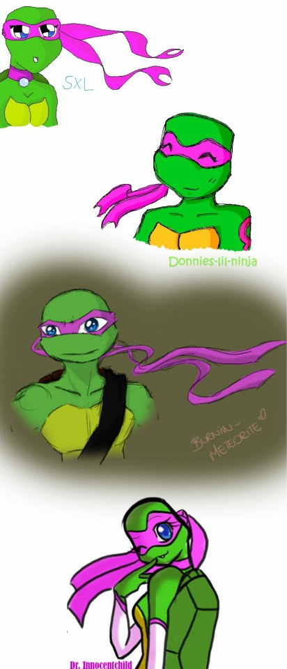
https://www.facebook.com/photo.php?fbid=1397345663749316&set=a.140393839444511&type=3&theater < - In response to this
1- Oldest OC-
Kimiko Hamato, my precious ninja turtle girl <3 created her in fourth grade, which was when I started getting into art. But because I was a child and did not like losing nor did I understand the purpose of storytelling or making sense, she so DISGUSTINGLY overpowered. Always needing to win, had magic powers with a magic orb, and a Phoenix dragon hybrid thing spirit that would let her go full Avatar/ Super Saiyan destructo mode when reaching a level of enragement...yeah it was horrible.
Kimiko originally started off as the baby sister of the turtles, aside from her 2007 movie incarnation where she was in love with Leonardo, which I scrapped some time after because I again, I was a stupid child and thought Renoir and everything MNT Gaiden was actually cannon to the 2003 series...and I paired her with Renoir not knowing he was a simple OC who belonged to someone else...trust me, I STILL hate that.
I officially posted the original drawing of her (I sadly lost the picture and you can't see it very well) around 2008 when I discovered the internet and fanfiction and the TMNT fandom and deviantart and roleplay. Needless to say, I was HORRIBLE at everything I did, that and I was a brat xD
The first time I showed her to someone, an old friend and the first person I ever met in the internet, Erika, who also went by NinjaDoodler/Donnies-lil-Ninja, she liked my character a lot, though I thought it was silly myself..she even drew her too!
That was also when I started drawing digitally with good ole' MS Paint! I used to use bases because I was terrible at free hand, later, one of the TMNT artists (Pinkstickerz) I greatly looked up to started making tutorials when it came to making OCs with bases, she kind of issued a base challenge which I tried, and thus, Kimiko was given a makeover and hair. At some point, I tried moving away from using bases, then stuck with pen and paper for a while.
At that point, I was having a dilemma when it came to Kimiko's weapons and was trying to limit the magic she wielded. I gave her many different weapons, from a bow and arrow, to daggers, eventually giving in and giving back her swords because I felt like they were apart of her character.
I wanted to make her more unique as well, so I sized down her shell as a side effect of the mutagen that mutated her.
I roleplayed with her some, but eventually stopped as I felt it was better for her to be a story character than an RPC. That moment, I started to like writing stories more than roleplay. I love to roleplay, but I really only stuck to only very few people because I was super shy...
By 2015, I started using Paint Tool Sai after relying on Paint. NET for a large period of time, I redesigned Kimiko again as I had gotten better at character design and was starting to get into writing fanfiction. I completely took off the magic powers and gave her more personality and ultimately paired her with Leonardo again because I felt they were perfect together. She's dark and edgy but also bubbly and carefree.
There were also two different stories for her, one for 2003 and one for 2012, and I am currently in the middle of writing both.
My friend Erika, from before, had drawn her with these markings on her arm and leg, which I really liked, but younger me forgot about them, but later I ended up using this idea for her Ninja Tribunal markings.
The images shown are pictures of Kimiko, a timeline from her initial creation to one of her most recent pictures, two pictures done by Erika, the tiny one being the picture she drew for me so long ago. And a quilt that other artists had joined in on ouo
Sometimes when I think about it, Kimiko shows just how much of an artist and a person I've grown into..I love her so so much <3


#tmnt oc#teenage mutant ninja turtle oc#rottmnt oc#my bby#precious baby#tmnt#tmnt 2003 oc#tmnt 2003#oc#teenage mutant ninja turtles#Rise of the teenage mutant ninja turtles#tmnt fandom
6 notes
·
View notes
Photo


History of Lip Sync & Industry Examples In the process of lip synchronization, the animator must have an understanding of how phonetics work, and how our mouths are positioned in order to produce certain sounds which are represented by letters and letter combinations. In this post, I want to briefly delve into the history of the technique and the basics of lip syncing for animation.
What is lip sync? Lip sync, which is short for lip synchronization, is a technical term for matching a speaking or singing person’s lip movements with prerecorded sung or spoken vocals that listeners hear through an audio output system. The term can refer to any number of different techniques and processes from film production, concerts, and dubbing, but for the purposes of this assignment, we are exploring the use of lip sync in animation.
This is the art of making an animated character appear to speak, to a pre-recorded track of dialogue or sound. This technique of making an animated character appear to talk involves a range of key ideas, but mainly figuring out the timings of the speech and the actual animation of the lips and mouth to match the dialogue track.
A Brief History Historically, the earliest examples of lip synchronization in animation were attempted by Max Fleischer in the 1926 short My Old Kentucky Home, but for obvious reasons (racial discrimination and insensitivity) I will not show it here. The technique, however, has since been refined and honed since this early example and is a staple of the animation industry to this day. The technique is used by all types of animated works, from feature films such as Cloudy with a Chance of Meatballs to American animated sitcoms like The Simpsons and Family Guy.
Lip synchronization typically begins by analyzing sound frame by frame, a method which dates back to the late 1920s with the origin of sound cartoons. Traditionally, this would involve transferring the dialogue tracks for animated films ‘onto sprocketed optical sound film’. The holes on this film material would exactly match ‘with those of the motion picture film’, which enabled sound and image to be mechanically locked together on editing and sound mixing machines.
This process is called 'track reading'. The dialogue track is analyzed and the information is charted up onto camera exposure sheets, sometimes called 'dope sheets' or 'camera charts', as a guide for the animator. With contemporary animation, we have the ability to analyze a sound using digital sound tools such as Audacity or the sound workspace within TVPaint itself. These allow us to scrub back and forth over ‘a graphical depiction’ of a sound wave, and see where the sound begins and finishes.
Industry Practices Approaches to the lip synchronization process can be just as varied as the character designs themselves: simple, elaborate, restrained or exaggerated. Every individual animator’s approach to the process is different, so in larger studios where more than one animator is in charge of the same character, extensive notes, drawings and sketches will be created to instruct the rest of the team how to animate the mouth consistently throughout a series. This can be seen in Adventure Time, where creator Pendleton Ward and lead designers for the show instruct animators working overseas how to keep protagonist Finn’s mouth shapes on-model at all times. For a large production like Adventure Time where the animation is done externally, this is a key industry practice.
Often, the way a mouth works is determined by the character’s head design: animators use tricks and techniques to cut down the workload by subtly separating the head or just the mouth, in the form of beards, necklaces or neckties that allow animators to work solely on the mouth and faces during the lip sync process. Sometimes, the mouth is hidden behind a wiggling mustache or replaced altogether with a mask in the example of The Spectacular Spider-Man animated series.
The Importance of Gesture Something that contemporary animation, in particular, has been found guilty of doing is the use of talking heads: this is commonly seen in shows such as Family Guy and similar digital 2D animated sitcoms where the characters don’t move and simply talk to each other. This can quickly get boring and is something I am going to try and consciously avoid during this project. A solution to this problem would be the use of gestures and body movement. Despite the fact we are encouraged to solely focus on the lip sync itself, gestures and body movements can communicate something about the personality of a character and the way it is feeling to an audience. This also makes for something much more interesting and engaging to watch, rather than simply watching the mouth. Small movements and gestures such as shrugging the shoulders or pointing can communicate ideas of emotion and what the character is thinking, helping sell the performance to the viewer.
Economical Animation When a character’s head remains static during a passage of dialogue, animators will take this opportunity to simply cycle the mouths onto a different layer, and place these onto of a character without a mouth. This is a key industry practice and saves lots of time and energy on the animator’s part. It’s important to maintain the same sort of perspective view in the mouth, otherwise, it will look separated from the face.
A more effective and engaging technique is treating the whole head as the lip-sync component. This allows movement of the bottom jaw that can actually open and drops lower, and also allows animators to work stretch and squash into the entire face. It is ‘rare for one mouth position to be onscreen for less than two frames’, as animating on ones tends to look far too quick. This is a lesson that I had to learn myself in my initial response to the assignment, animating the sequence frame by frame in TVPaint.
The Hold One important principle of modern lip sync animation is ‘the hold’. This is a technique which describes the animation of the body, which is held for numerous frames whilst the lip sync takes place. As a rule, animators work on gestures and body language first, and then go back and add the mouth in afterward. This will inform my own process in TVPaint, as I will begin the animation by developing the body movements first before moving onto the actual mouth shapes.
Whilst classic Disney animated films featured characters that rarely actually stopped moving, it is far more commonplace to have still illustrations be held for multiple frames whilst the lip sync animation takes place. This saves time and effort but also places the focus on a handful of expressive gestural poses that work to convey the emotion of the scene. This approach can be seen in almost any animated television production, we can see this in the example from Regular Show, in which only select parts of the two main characters move. The face and arms are animated, but the body stays still as to not detract from the lip sync.
As a rule, lip synchronization is ‘best underplayed’, with the exception of important accents and vowel sounds. Emphasis on the size and mechanics on the mouth can detract from a good lip-sync animation - this is an idea that I will be considering with my own animation.
It’s in the Eyes A final interesting idea that I found is the focus on the eyes of the characters: ‘the audience often watch the eyes, so emphasis and accents can be initiated here’ before the rest of the face and mouth is considered. It’s often said that the eyes are the window to the soul: it’s a powerful way of getting a character to communicate their inner feelings without actually saying anything, and even the act of thinking of words can speak can be expressed in the eyes. This is something that I found to be true in my own video reference for this assignment, as I observed how my eyes would move around as I was delivering the dialogue, in character.
Summary Through my own independent research into the history of lip synchronization in animation and other online sources presented below, I have been able to really develop my understanding of this crucial animation process. Having looked at a few industry examples here, next I want to continue this line of inquiry further and explore some actual tutorials by animators on some more basic principles of lip synchronization for animation.
References:
The Little Whirlwind | A Classic Mickey Short. (2017). Mickey Mouse. https://www.youtube.com/watch?v=REHJ1lz_HLQ
Damo and Darren 3 - Centrelink. (2015). Michael Cusack. https://www.youtube.com/watch?v=s96drQkfpPI
Regular Show. (2014). JG Quintel. https://www.youtube.com/watch?v=KOSdKV2z7_Q&t=45s
The Simpsons. (1987). Matt Groening. https://www.youtube.com/watch?v=nekvVuoiTyA&t=1s
The Spectacular Spider-Man. (2012). Disney Animation. https://www.youtube.com/watch?v=8v4PL2-EC1Q&t=5s
Lip Sync. (2015). AIM Animation. http://minyos.its.rmit.edu.au/aim/a_notes/anim_lipsync.html
2 notes
·
View notes
Text
Responsive Web Design Services
UX has been the point of interest of recent net development for fairly some time now. This is influenced by several factors, including page loading velocity, readability, usability, and design. But now that extra customers prefer mobile web looking over using desktops, any website-be it a niche blog or an e-commerce retailer should start prioritizing mobile friendliness.
Nowadays, it’s easy to apply a cell-responsive theme and use tools like Google’s Mobile-Pleasant Test to receive extra suggestions on find out how to optimize your site. However if you wish to take issues to the next stage, you can develop a Progressive Internet App (PWA) to ship recent and memorable new experiences to your cellular users.
What’s a Progressive Net App? A PWA leverages trendy net technologies to enable app-like features. Not like conventional mobile web sites, a PWA doesn’t must refresh your complete page when loading new content material-nor does it need internet connectivity to be accessible. They’re additionally installable, meaning users can simply reuse them by adding a home display shortcut.
Progressive web purposes have the potential to be the next massive factor for the mobile web. This was initially proposed by Google just a couple of years back in 2015. However, within such a short while, it has already attracted numerous attention as a result of it’s relatively straightforward to develop and for the appliance’s person experience delivery. Rahul Varshneya, cofounder of app development company Arkenea.
A PWA is an enormous undertaking that may lead the direction of your mobile internet presence within the future. But if you happen to’re completely new to PWAs, here are 7 tools and resources that may put you heading in the right direction:
PWA.rocks With regards to creating a PWA, it's essential have a deeper understanding on what they are succesful of.
To see PWAs in action, you'll be able to confer with PWA.rocks for examples underneath a number of categories, including enterprise, games, procuring, and social. This can enable you to visualize what your future PWA could look like. It's also possible to borrow inspiration from the obtainable examples when conceptualizing what your PWA will offer cell users.
Knockout Knockout is a free, open supply device that may enable you to with Model-View-View Mannequin or MVVM bindings. This allows you to simplify the method of coding JavaScript UIs by letting you define views and declarative bindings that are controlled by viewmodel properties.
The platform runs purely on JavaScript, which works with all main browsers and any web framework. The Knockout library can also easily be built-in with present web sites without extensive rewrites.
PWABuilder The fastest strategy to create a PWA is to make use of PWABuilder and shortly construct a service employee for offline functionality, which works by pulling and serving the “offline.html” out of your internet server whenever customers lose web connectivity. It's also possible to submit your PWA to the app retailer for Android and iOS devices.
To use PWABuilder, all you'll want to do is insert your web site’s URL and then fill in the further details like your name, website description, and preferred icon. You too can easily modify certain properties resembling your PWA’s screen orientation, language, and background color. The platform will then routinely generate a manifest primarily based on the data you provide.
AngularJS JavaScript is often the introductory language realized by college students who wish to be taught web development. When you’re an skilled Java or .NET developer, then AngularJS is likely one of the greatest JavaScript frameworks you need to use for web applications. Even so, their website gives a ton of guides, tutorials, and resources that may show you how to be taught your way across the platform.
The newest version, Angular v4.zero, gives the same surroundings whether or not you’re creating for cell or desktop. In case you assume Angular is just too complex for your wants, you might choose as a substitute for React-a JavaScript library tailored to UI development. Another various is Polymer, which might give you templates and different reusable parts that can velocity up the method of PWA development.
Google Developers A PWA just isn't precisely a DIY project for self-made bloggers or affiliate marketers, but it might probably still be done with the right resources. If you have already got experience with Website Design Services content management programs however are clueless about developing internet purposes, then you may get the fundamentals down via Google Developers, a library of assets that can assist you discover ways to code.
Google Developers have a complete tutorial on how PWAs work, easy methods to construct one, and how you can make it run correctly. It additionally covers different basics such as enabling the “add to home screen banner” and using HTTPS.
Webpack Webpack is an especially useful tool for bundling your JavaScript app assets, including non-code belongings like fonts and images. These shall be treated as JavaScript objects, which in flip allows them to be loaded faster. The platform additionally makes it considerably simpler to handle dependencies.
Simply keep in mind that Webpack has a steep learning curve, that means you could possibly be looking at hours of searching for tutorials and guides. Nonetheless, the educational sources and documentation out there on their web site aren’t beginner-friendly. The good news is, Webpack is widely lined in different websites, together with Angular 4.0’s documentation section.
youtube
GitHub Lastly, GitHub is a neighborhood-pushed website that maintains repositories of projects. It covers a broad vary of programming-associated topics, including JavaScript and PWA service workers. The truth is, you can find the PWA.rocks and Webpack repositories within the platform. This will provide help to deepen your understanding and even contribute to additional development.
At this time, there’s a handful of repositories involving PWAs on GitHub. You'll be able to study from these projects or start your personal repository as you experiment with your first PWA. GitHub now additionally has venture management options, allowing you to seamlessly collaborate with other builders remotely.
Conclusion Progressive Web Apps are the future of mobile web experiences, however not lots of brands at the moment use them. With the instruments above, you’re now fully able to making a standout PWA and establishing an authoritative presence. Just take notice that PWA instruments, sources, and practices evolve with the constantly evolving applied sciences of major online browsers.
1 note
·
View note
Video
iMock-Up Real Footage Vol 4 Toolkit Motion Design from Antony Parker on Vimeo.
✔️ Download here: templatesbravo.com/vh/item/imockup-real-footage-vol-4-toolkit/23247143
iMock-Up Real Footage Vol 4 Toolkit
Promote your website and app with these responsive devices film shots. A Collection of 100+ Mock-Up Footage of Desktop, Laptop, Tablet and Mobile
Features:
CS6 CC CC2014 CC 2015 CC 2017 CC 2018 CC 2019 Compatible Project Full HD resolution (1920×1080, 3840×2160) No plugins required. 100+ Mock-Up Footage Each Composition Footage is about 10sec Each Composition has its own placeholder Drag & Drop your Images or Videos and Hit Render Fast Render Tutorial with voice over included.
10 Gestures Included (Alpha Channel)
Scroll Up Single Scroll Up Double Single Click Double Click Swipe Left Single Swipe Left Double Zoom In Zoom Out Scroll Down Single Scroll Down Double
F
0 notes