#Stanley Donwood
Photo
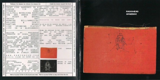


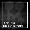
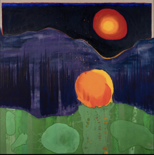
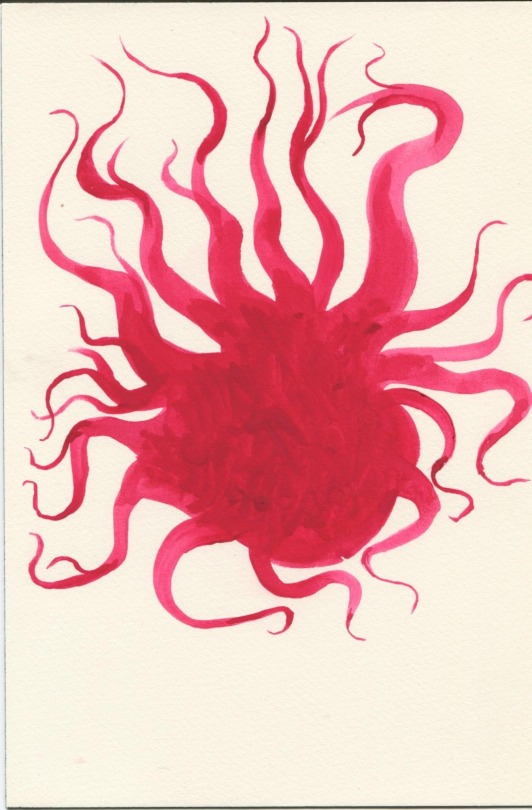
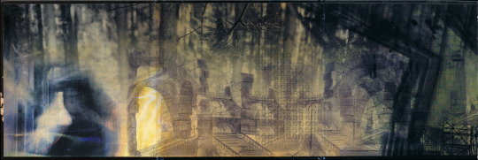
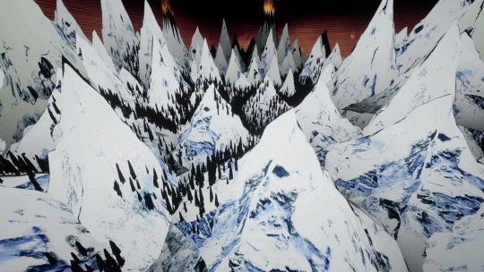
Fading Memories: Album Artworks for Radiohead's Amnesiac
#illustration#abstract#amnesiac#surreal#thom yorke#painting#stanley donwood#music-inspired#contemporary#radiohead
236 notes
·
View notes
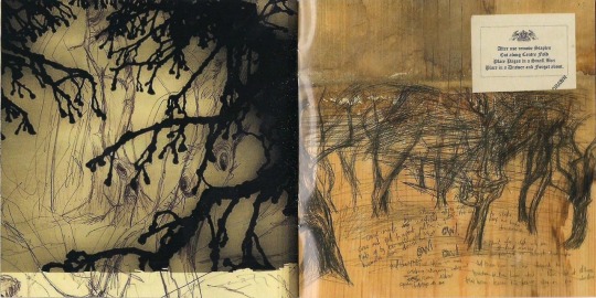
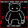
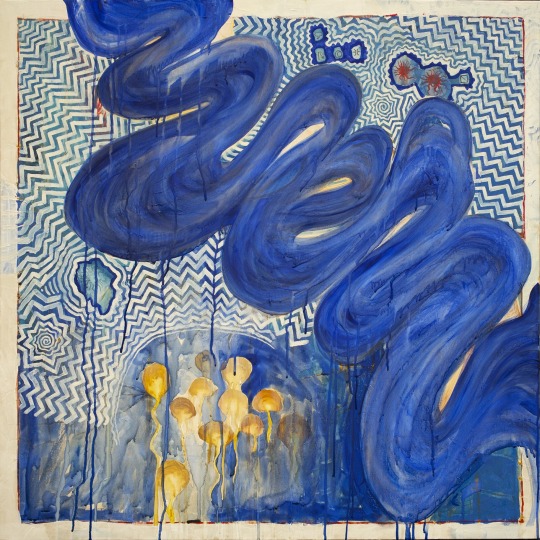
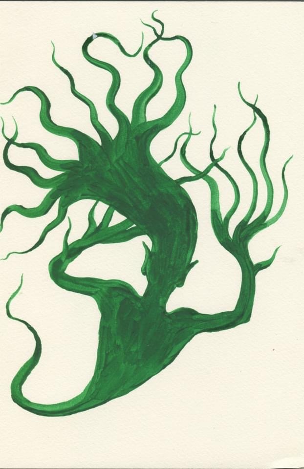
Photo

From Radiohead's Kid A Mnesia Exhibition
1K notes
·
View notes
Text
Look---here he comes, his bones are willow & he sings in birds. He rises in marsh, slips forwards by ripple & shiver. Between his tree-ribs birds flutter, then swoop ahead to settle, sing, quiver. His head is a raven’s, his eyes are wrens’ nests. By day from his throat fly finch & fire-crest & in anger he speaks only in swifts.
Look---here she comes, her skin is lichen & her flesh is moss & her bones are fungi, she breathes in spores & she moves by hyphae. She is a rock-breaker, a tree-speaker, a place-shaper, a world-maker.
Robert Macfarlane and Stanley Donwood, from Ness, Ghostways: Two Journeys in Unquiet Places (W. W. Norton & Company, 2020; orig. pub. 2018)
421 notes
·
View notes

Note
Got any Radiohead related web graphics? Like just transparent PNGs, can be animated or not. Anything is fine with me
(love ur blog btw <3)
Hi! Sorry this took so long, I've working through all of my requests and also actually working lol.
YES Radiohead is my favorite band. Here's what I have:
first and foremost, this lovely archive I was recently shown.
@sillynet has made a ton of amazing Radiohead blinkies that are definitely worth checking out.
Here's some other stuff:


Hope this helps. I'll probably add more on my blog as I find/make it.
#neocities#web graphics#old internet#blog resources#blinkies#old web#carrd graphics#web resources#animated gif#stamps#gifs#gifset#pngs#banners#da stamps#deviant art stamps#tw eyestrain#transparent#radiohead#jonny greenwood#thom yorke#colin greenwood#philip selway#phil selway#ed o'brien#stanley donwood#request#requests#🎧
60 notes
·
View notes
Text


382 notes
·
View notes
Text

RARE fight captured between thom yorke and stanley donwood of radiohead, 1999 (COLOURIZED)
#..............................#radiohead#thom#thom yorke#stanley donwood#radiohead fanart#modified bear#is that your fucking fursona#my art#art
295 notes
·
View notes
Text


my favorite Amnesiac-era Radiohead AIM icons (via)
#radiohead#gif#AIM#AOL#icons#old web#amnesiac#im so getting fucked up crying amnesiac minotaur tattooed on me#probably on my forearm#I also want regular (amnesiac album cover) crying man tattooed somewhere#stanley donwood
61 notes
·
View notes
Text

Hail to the thief!
Radiohead art digital collage
#radiohead#thom yorke#hail to the thief#stanley donwood#political cartoon#collage#digital collage#digital art#digital aritst#2+2=5#hail to the king#radiohead art#kid a#in rainbows#visual art#visual poetry#my stuff
69 notes
·
View notes
Text


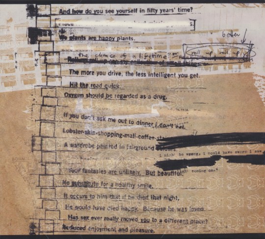
from the radiohead website (~1996-99)
#i find these so cool#idk why#the sites have song lyrics and writing too#and more art#radiohead#stanley donwood#thom yorke#the smile#ok computer#the bends#kid a#cybercore#90s#aesthetic#cyber#old web
243 notes
·
View notes
Text
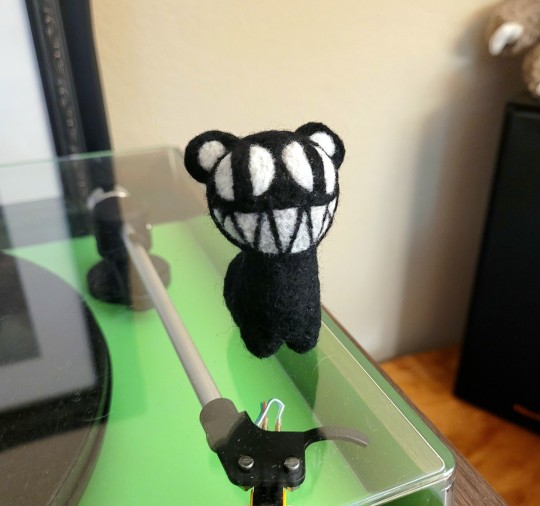

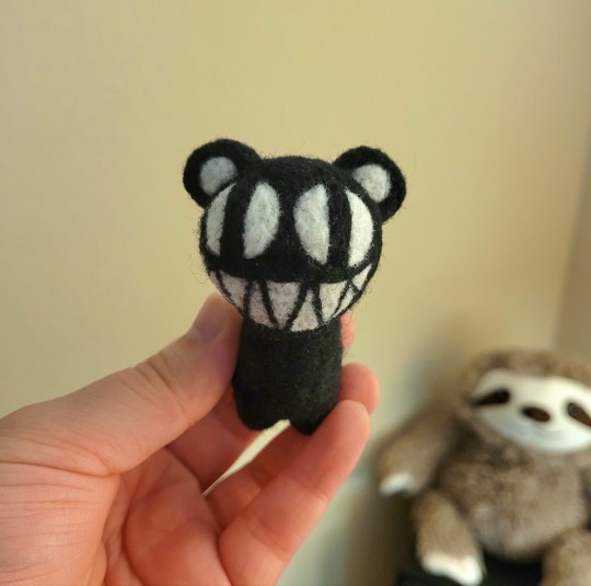
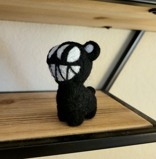
needle felted Radiohead mod bear i made! just a little evil man
#radiohead#art#needle felting#mod bear#modified bear#kid a#amnesiac#radiohead art#my stuff#crafts#fan art#stanley donwood#dr tchock
159 notes
·
View notes
Text
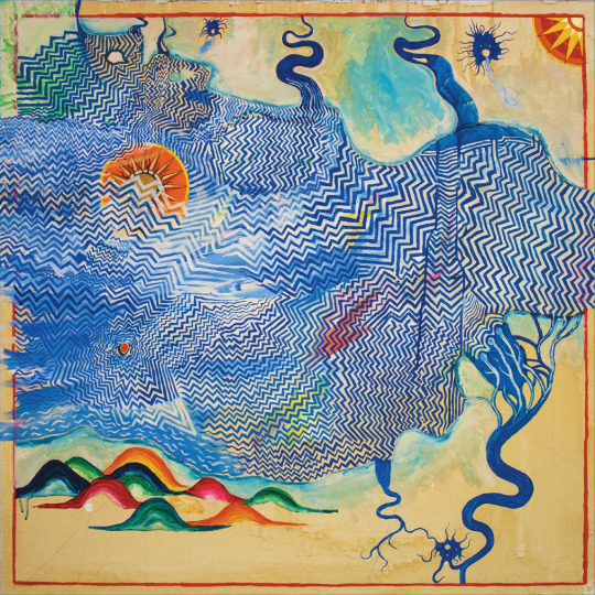
Pacific Coast by Stanley Donwood, 150cm x 150cm. Acrylic and blackboard paint on canvas. 2003. Submitted by @bryng

Apparently, this is also the cover for Radiohead’s Hail to the Thief. Huh.
Pretty obviously, this one, much like the album it graces the cover of, is pretty political. I mean the words make it pretty clear. “Drugs”, “security” (possibly anti security), “AIDS”, “Oil”, “God” and “Sale” all being crammed together feels pretty clearly political. These little squares invoke the feeling of signs you might see along roads. Ads for video stores, tanning salons, pools, oil changes, gasoline, vacancies at long stay motels, 24hr stores. But also, the way they’re arranged transforms these single words, originally simple ways of conveying information, into a political statement.
The way the black leaks into the blue and white ocean-like background invokes an oil spill, as well as all of these ideas spilling out and corrupting it (perhaps even the consumerism as a corrupting force).
I will say, seeing Grand Guignol definitely caught me off guard! I have no idea what this is referring to in 2003, I’m only familiar with the historical Parisian theatre.

Though, one could extrapolate meaning from this being placed just under “Girls”, a sign which would usually indicate some sort of strip club advertisement. (Something something violent horrific exploitation of women? Idk, I’ll let you guys do some of the thinking yourselves).
Cool historical facts aside... More than anything, I agree with Donwood on his art. It feels unsettling. The bright colors especially. The removal of advertising language from it’s context feels off-putting and just reminds one how off-putting it can be to be sold something...
It doesn’t really get my goat though, y’know? It’s good, it’s got this creeping sense of unease that accompanies it, but I don’t find it strictly erotic. 1/10, just personally.
8 notes
·
View notes
Photo

Kid A Mnesia Exhibition tea set, designed by Stanley Donwood
272 notes
·
View notes
Text
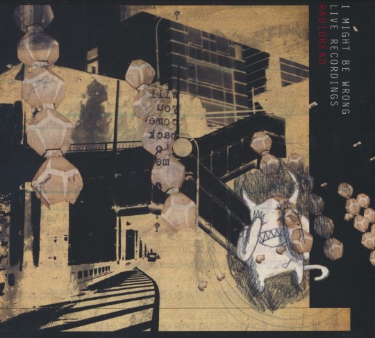
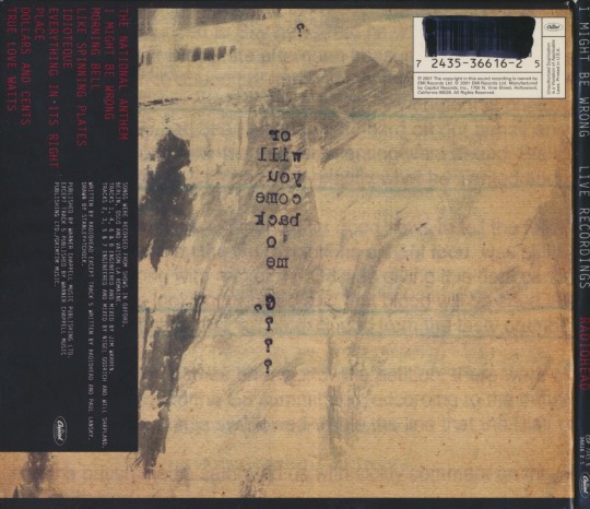
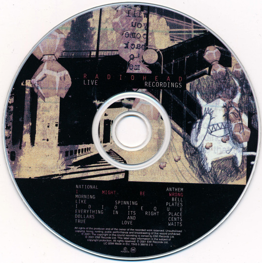
"I Might Be Wrong" (2001), Radiohead.
Arte digitalizado del álbum compilatorio en el que se encuentran algunas de las presentaciones en vivo de Radiohead durante su gira de promoción del "Kid A" (2000) y del "Amnesiac" (2001). Publicado un 12 de noviembre del 2001.
#radiohead#radiohead art#i might be wrong#kid a#amnesiac#stanley donwood#thom yorke#jonny greenwood#colin greenwood#ed o'brien#phil selway#radiohead live
20 notes
·
View notes
Text
127 notes
·
View notes
Text
Can you believe Creep hit ONE BILLION views on YouTube? Baby Shark better watch its back! We’ve got a new episode for you tomorrow, from Creep to Confidenza…
#radiohead#podcast#thom yorke#jonny greenwood#colin greenwood#ed o'brien#eob#philip selway#phil selway#nigel godrich#stanley donwood#the smile#tom skinner#robert stillman#sam petts-davies#wall of eyes#confidenza#daniele luchetti#creep
10 notes
·
View notes
Last Seen Blogs

neungxedge
YuthbÖyz

simhirai
simblr?

somereaderinblue
Just another reader who likes blue

yusury
제목 없음

ryanhillgroup
Ryan Hill Group