#The process was blocking out the sections with the lasso tool and then using the dithering brushes I have instead of just.
Text
panda panda circus circus
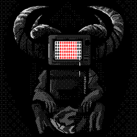
#Panda Circus#Daniel Mullins Games#Pony Island#<- Does that tag apply??? No idea.#Found a slightly quicker way to do this. Emphasis on slightly though it... doesn't work 100% of the way </3#The process was blocking out the sections with the lasso tool and then using the dithering brushes I have instead of just.#Doing it pixel-by-pixel. Then I added random black and white pixels everywhere for weirdness because it looked too uniform otherwise.#Anyway pro tip don't do this when you have a migraine. You will regret it. Quickly.#Hrokkall Art
533 notes
·
View notes
Photo

✧ TEXTURES – A TUTORIAL BY EVANSYHELP.
In this (long and image-heavy) tutorial, I’ll be showing you how I make textures, as requested by a very kind anon. I use Photoshop CC 2019 but you should be able to replicate my methods on most editing software. Please like or reblog this post if you find this helpful!
Index.
Ethically Sourcing Your Images.
Finding The Right Image.
Making Your Texture.
Other Tricks I Use.
Quick Recap.
Making Textures Without Images: Speedrun.
Outro.
Ethically Sourcing Your Images.
I will be explaining a couple quick ways to make textures without any images at the end of the tutorial, but since my personal favourite way involves images and that’s specifically what the anon requested, that’s what the majority of the tutorial will be focused on.
The first step, naturally, is finding an image to use. My personal favourite site is Unsplash, but there are plenty of options out there.
What you need to keep in mind is what kind of license the images have. Unsplash is free for personal and commercial use with no attribution required, which makes it perfect for things like this. There are more sites like this in my free for commercial use masterlist (linked at the end of the post), but unless you’re using them in products you’re selling (like graphic commissions), the commercial aspect isn’t something you need to worry about. Just check the site/photographer’s rules to make sure you’re allowed to edit the images for personal use, and whether attribution (credit) is required.
Another important thing to keep in mind is that these sites typically never allow you to redistribute the images as they are. That means you can’t just go to Unsplash’s texture category, save the images without any changes, and reupload them in a texture pack on Tumblr. That’s stealing. We don’t do that.
Finding The Right Image.
Knowing what kinds of images will make good textures is a learning curve. My first couple texture packs are rough compared to what I make now, because I basically taught myself with no guidance and learned through trial and error. But with practice, I learned what worked and what didn’t.
You want your images to be HQ, either with no ‘subject’ (ie. a person) or with a large background. Higher contrast is better but not super necessary. You should hopefully be able to envision what kind of texture you want to make before you even touch the image.
Making Your Texture.
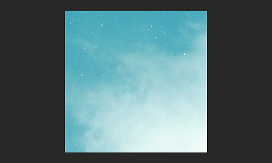
For the majority of the tutorial, this is the image I’ll be working with. Credits can be found in the link at the end of the post.

Open your canvas. You can make specialised textures, like 100px for icons or 540px for Tumblr graphics, but I personally prefer to make them large for versatility. I’m using 800px in this tutorial. Once you’ve chosen your size, upload your full-size image into the canvas. This is where the fun begins!
Drag the image around into a nice position. Or use Edit > Transform to rotate, flip, and warp the image in different ways. Or use Edit > Free Transform (Ctrl+T) to change the size or the angle more precisely. Or probably some combination of all three! With Free Transform, make sure this aspect ratio anchor is selected so you don’t butcher the quality of the image, unless you’re warping it intentionally:

This is all very individual to each image you use. You might want to flip one, shrink another, put another at a 30 degree angle. Just experiment until you end up with something you think would look awesome as a texture. For the sake of providing a good example, I flipped this image vertically, shrunk it to 80% its original size, and rotated it until it looked like the smoke/cloud was coming from the bottom right corner. This is what we have:
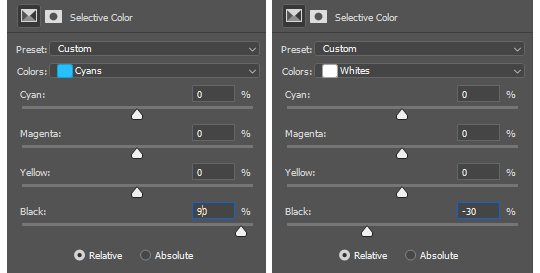
Then we move onto enhancing. Textures work best when there’s a lot of contrast because it’s easier to manipulate the blending modes. So if your image isn’t already high contrast, these adjustment layers (Brightness/Contrast, Levels, and Selective Colour) are your new best friends:

If you don’t see this on your Photoshop, go to Window > Adjustments and it should pop up. Again, just experiment, because different images will require different things. Essentially, you want to make the darks darker and the lights lighter. Something I like to do is add a Selective Colour layer and use the Black slider. Pick out the primary colour of the image, and then Whites, in the drop-down menu, and move the bottom slider (left to lighten, right to darken) until you’re satisfied. Like so:
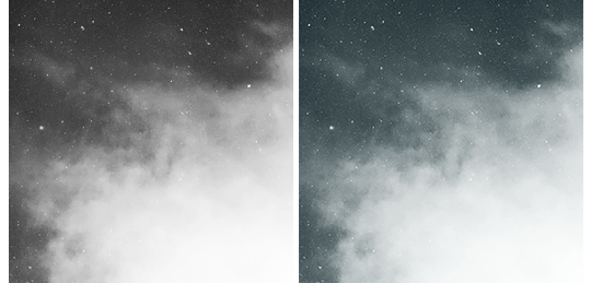
So with those Selective Colour settings and the following Levels settings, here’s the before and after of my image.


Much better contrast! If you want to end here, you can, but I personally prefer grayscale textures a lot of the time because it makes it more versatile. Instead of being forced to make a blue graphic because this image is blue, I can make any colour graphic I want with one simple black and white Gradient layer. Photoshop does have a default Black & White adjustment feature, but I prefer using Gradients.
Pro tip: if your image doesn’t have a pure black, you can keep the darkest parts of your image dark by using the left slider, shown below.


A lot of the time, I’ll also decrease the opacity of that Gradient layer, to somewhere between 80% and 95%, so just a hint of the original colour comes through. This gives it more dimension in my opinion, while still keeping it mostly neutral. Here’s 100% vs. 85%:
You may find that you want to add a little more contrast after. With this texture, I decided to grab another Selective Colour layer, pick ‘Black’ in the drop-down menu, and pull the Black slider up to +40. I also settled on 95% opacity for the Gradient. And here’s the final product!

Other Tricks I Use.
That covers how I make a lot of my easier textures, but here’s a quick run-through of other, slightly more complex tricks. I’ll be working with this image (again, credit at the end of the post):
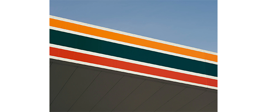
This, of course, is not as obviously texture-worthy as the previous example, but I love textures with strong lines, so here’s how the magic happens! I wanted to get rid of the detail on the bottom half, so I used the Polygonal Lasso tool to select it:

Then I used the eyedropper tool (the 4th symbol under the polygonal lasso in the image above) to select the blue of the sky and, on a new layer, painted that selection completely blue. I decreased the opacity to 90% just so it wasn’t a total block colour, but not enough that you can really see the lines. I repeated this process for the sky, so it looked more consistent with the bottom half.
Then, using the eyedropper tool again and making a new layer for every colour, I went in with a small soft paintbrush and painted out the harsh vertical lines on each segment of the stripes. I didn’t want to make them totally perfect, but I painted over the bulkiest interruptions.
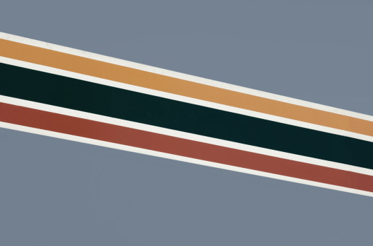
I added a black and white Gradient layer, using the slider tool I showed you before to darken the darks and lighten the lights, and decreased it to 50% so that it wasn’t totally black and white but still more neutral than the original. Here’s the result:
Another fun way to shake things up, which unfortunately will require Photoshop (CS6 should be fine, not sure about earlier versions), is the Filter Gallery. Go to Filter > Filter Gallery, and you’ll find a TON of effects that change your image drastically. Most of the default settings are nightmarish, but you can play around with the settings panel on the right.

Here’s just a few results that are possible with the Filter Gallery, labelled for convenience. You can view the HQ versions in the link at the end of the post.

Quick Recap.
So you don’t have to reread this obnoxiously large tutorial every time you want to reference it in the future:
Choose a HQ image.
Resize, rotate, flip, and/or warp.
Enhance the contrast.
Black and white!
Paint over problem areas!
Filter > Filter Gallery.
Making Textures Without Images: Speedrun.
We’re almost done! There are some tools built directly into Photoshop that can allow you to make textures completely from scratch, and I’ll briefly cover my favourites here.
The first is pattern fill layers. I spent too many years not appreciating the patterns feature in Photoshop, but they’re great. Go to Layer > New Fill Layer > Pattern, click ‘OK’ on the box that pops up, and another box will pop up to let you choose your pattern.
By themselves, they are UGLY. It can take a while to figure out how to use them. But if you change the scale, change the blending mode, and change the opacity, you have thousands of textures at your fingertips. And if you add two or three together? Billions of possibilities. I can do a more in-depth tutorial on patterns if y’all are interested, but here’s two examples I just whipped up in a matter of minutes, using two patterns on each:

The next feature is gradient fill layers, and the gradient tool. Go to Layer > New Fill Layer > Gradient… to select a gradient (or make your own!) and an angle, OR use the gradient tool (featured below) to drag the gradient across your canvas manually. On its own, boom, that’s a gradient texture. Paired with a pattern or put through the Filter Gallery? Even better!


The last is brushes. Brushes can be great for textures because there are so many kinds. You want to make a paint splatter texture? Paint splatter brush sets are everywhere! You want to make a smoky texture? You can get brushes that look like smoke! Smudged? Scratchy? Grunge? Halftone? Light leaks? Torn paper? Brushes have your back.

With all of these features (and things like actions, too!), your saving grace is going to be this little cog wheel shown below, and the list you’ll find under the Reset/Save/Load section. There are SO many more options built directly into Photoshop that you don’t even see right away, because you have to add them manually from this little cog wheel.

And you can download countless more patterns, gradients, and brushes from sites like Brusheezy and DeviantART. A couple tutorials on downloading and installing them can be found in the link at the end of the post, but remember, download these things ethically. If you want to sell products that use a custom brush, it’s your responsibility to find brushes that are free for commercial use. If you don’t want to credit the creator, it’s your responsibility to find resources that don’t require attribution.
Outro.
I think that’s everything, guys! If you found this tutorial helpful or otherwise enjoy my content, please consider supporting me on Ko-fi! I offer exclusive rewards, like custom graphics, to everyone who donates.
Due to Tumblr’s latest rules about links, you can find the credits list, the promised bonus tutorials, other important links, and the full-size HQ versions of the textures made in this tutorial over here.
Thanks for reading!
#rph#allresources#completeresources#itsphotoshop#chaoticresources#photoshop tutorial#photoshop resources#photoshop help#ps resources#ps tutorial#eh#eh: tutorial#tutorial#ps help#texture#*100#*250
365 notes
·
View notes
Photo

D.va Line Art Tutorial: Basic Level
I’ve been wanting to create some art tutorial for some time and I’ve finally did it! I hope there is some wisdom you get from this Tutorial, so let’s start!
Now this is a simple tutorial, so there wouldn’t be many advanced techniques, but the good thing is, it is simple, so that almost everyone can follow through, of course in the future, I will create even better tutorials that are easier to learn and understand.
I’ve always like illustrative art, and with my passion in digital painting, sometimes I try to combine them both together, and this is one of the result. In the future, I will try to constantly create many such illustrative art.
Software Used: Photoshop CS6, Corel Painter (optional)
Dimension: Approx 3000px x 3000px
1. Drawing stage
Now this is the part that I cannot teach you here: drawing.
It really depends on your drawing skills, and for those who can;t draw so well, my strong advice is: draw on paper.
While I did this in digital out of convenience, nothing beats drawing straight on paper. Drawing digitally will hardly improve your drawing skills at all if any (my observation & exp), but drawing on paper will improve your accuracy and drawing memory much much faster and better.
Take your time drawing, if you have a good base drawing, then everything else will be nice and easy, so don’t rush it.
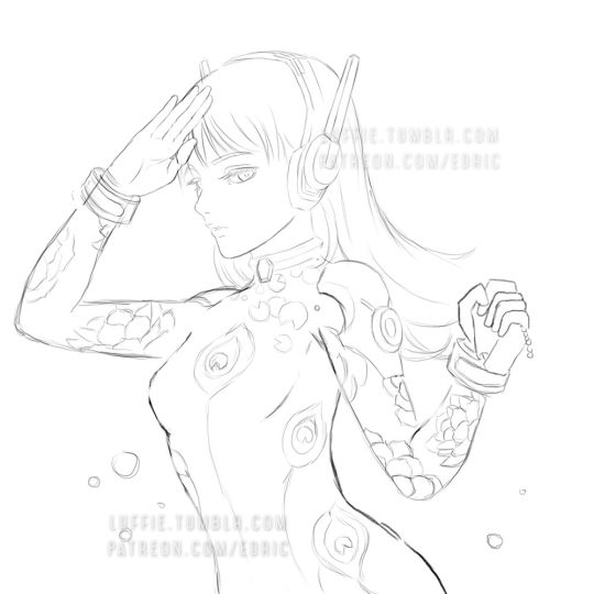
2. Outlining Digitally
Depending on your preferences, you can just draw any patterns, but my design here is about Peacock & Lotus design, with the Peacock symbolizing Dva’s penchant for showing off, as for the Lotus... well it’s pretty!
As you can see here, some of my outlines are pretty sleek and smooth, and that’s because I create a new clean outline on top of my previous rough drawing. This is usually quite important in terms of line drawing/painting. It makes the process easier and the whole image more clean and finished.
Painter Technique: Now, I create my drawing in my favorite app Photoshop, but Photoshop it’s not for being very bad in making smooth lines, so you have to use another program to do that.
Currently, my favorite program for creating such smooth lines is Corel Painter. You can search for “Brush Smoothing” setting, and set the “Damping” to around 80 for a good line stabilization.
While I forgot which brush I use for this, I now recommend the 2B pencil with 100% opacity (The blue lines). Make them on a different layer.
Try and create the lines with as little strokes as possible. For long curved lines like the hair, you can utilized Painter’s awesome “Paint on a path” feature, just check it on the top toolbar settings. It allows you to create a path and paint straight onto it, thus saving the frustration of redrawing again and again to get that smooth long lines.
For the red lines, “Concept Art Jitter Smooth” Under the Chalk section.
Other Software Technique: This line art technique can also be done with other software with brush stabilization feature like SAI, or Clip Paint Studio, and many others, so don’t worry if you don’t have Painter.
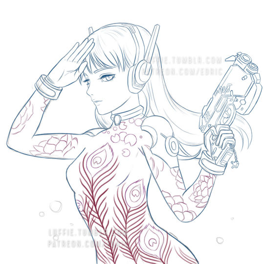
3. Base Colors
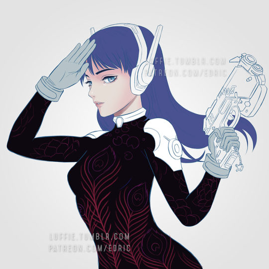
Now the next step is to bring the image back to Photoshop for coloring. Use the pen tool and create the basic shapes and fill them with block colors in different layers.
Now it is tempting to use the Lasso or the Paint bucket to fill, but don’t. The lasso tool has problem in creating smooth lines (which we need), and also the paint bucket (I’ll explain next time how to use it in another Tutorial).
If you have created the paths and shapes in different layers, then you can lock the layer transparency and start painting with the real desired colors.
Here I used the soft Airbrush in PS to paint it some reddish hue around her cheeks and forehead. Don’t worry about getting the colors very accurate for now, since you have separated them to different layers, it is very easy to make adjustments later on. Also, don’t forget to add a background, preferably grey or some neutral colors. It helps better to gauge the value of the colors later on, if you put white, most colors seem too dark, and of you put black, colors will seem too bright.
4. Start Painting

On a layer above the body, I painted the peacock leaves by using the Lasso tool, fill colors, and use airbrush to paint it highlights and shadow.
For the Lotus leaves, I use the Lasso, but I don’t fill it, since I want the blackness of the suit to come through. And instead of using the Airbrush, I use the PS standard round brush, with shape dynamic off and opacity pressure on, I painted with downward strokes lightly to create the leaf textures, and painted the same way again with brighter colors, and add a final highlight and the tip of most leafs.
5. More Painting
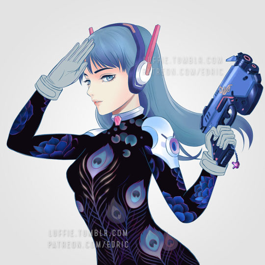
Continue painting the leafs, and the the shoulders, before moving to other parts like the gun. I’ve also added more leafs underneath the original leaf layer, since I felt it looked a bit empty. For the glow of the feathers, I simply create a layer on top of the outline layer, and set it to “color dodge”, and add some bright colors.
If the colors look weird/off, simply use Hue/Saturation to edit them till it looks right, then color pick from that section and paint the rest.
6. Finishing/Editing
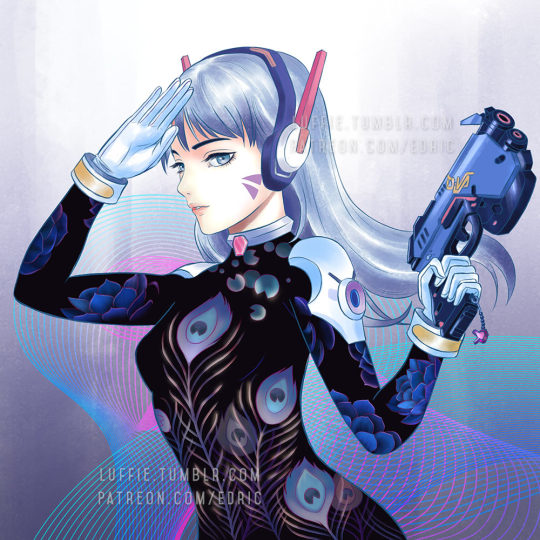
As you can see, I changed the hair, since I wasn’t satisfied with the previous color. To get the bright look, you need to start with a white base. And as with the gloves, shoulders and hair, I changed their base colors to white.
Then with my texture brush, I simply painted according to the form, and leave some white shining through in the middle. This will created those “white sheen” you see here. Then for the hair, I painted darker colors near the tip/end of the hairs. I’ve also brighten the her face in the process.
For the background, I was actually a little clueless on what to paint. So I just painted some light strokes using the same textured brush and add a design element on it. Maybe next time, with better planning, I will create better backgrounds.
End Note:
So there you have it, and as you have learnt, there isn’t any complicated techniques behind this picture, and if you have prepared each stage accordingly step by step, everything later will become easier. Of course this is not the most detailed tutorial as some steps can be broken down even further to make it clearer, but that is for future tutorials!
If you like my work and would like to learn more and support me, please do consider supporting me at Patreon.com/edric . It truly helps me a lot to devote more time to create this tutorials and art, plus you will also get my custom brushes and PSD file so that you learn better, and of course, Patrons receive special tutorials. Every bit of support helps, and are truly truly appreciated!!!
Or you can buy me a coffee for late night painting too here :https://ko-fi.com/edricartist
53 notes
·
View notes
Text
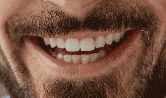
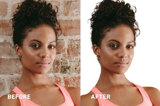
How to Whiten Teeth in Photoshop + More Retouching Tips
Learn fast & easy ways to retouch your portraits, whiten teeth, edit hair, and more using Photoshop.
This article will get to the heart of the most frequently used retouching techniques. You’ll learn how to easily whiten teeth, edit hair, and fix red eye and blemishes in your portraits. Not only will it elevate your overall skill set, it will make quick work of fixing common problems that may have seemed too complicated.
How to Whiten Teeth in Photoshop
Using selection tools and adjustment layers, this simple process can brighten the smiles of your subjects without looking fake, which should always be the goal when retouching.

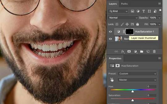
Step 1: Make a selection around the teeth
We need to isolate the teeth to make adjustments, so we’ll make a selection with the Lasso tool. Hit L on the keyboard, or select Lasso from the Tools window. Click and draw a line around just the top teeth. Then hold Shift and do the same on the bottom row to add it to the existing selection. You don’t have to worry about being exact because we’ll feather the selection to soften the edges.
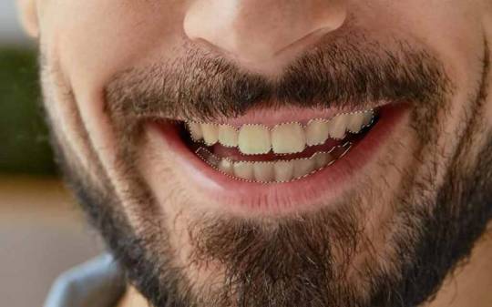
This accuracy level is just fine. No need to slave over the initial selection. Step 2: Feather with Select and Mask
Click the Select and Mask button at the top of the Application Window. Then choose On Black from the View menu at the top right corner of the window. In the Global Adjustments section beneath that, adjust the Feather slider until the selection shows the teeth but is softened enough to eliminate jagged edges.
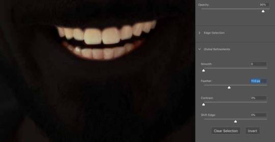
Well Feathered, but still shaped accurately.
Depending on the resolution and dimensions of your image, you want the Feathered edge to look fuzzy, but still maintain the shape of the original selection. The goal is to make a soft, subtle transition that also fixes any sloppiness in your selection path. For this image I set the amount to 11.0 px but yours may be smaller or larger.
Hit OK, and you will return to the image with the modified selection.
Step 3: Create a yellow Saturation Adjustment Layer
For the next steps we’ll use Adjustment Layers with Masks. These are fantastic ways Photoshop lets you make detailed adjustments without committing to them; as long as you don’t flatten or delete the layers, they will always remain editable if you save them as layer files.
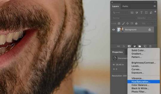
At the bottom of the Layers window, click the half-shaded half-white dot in the middle, Create New Fill or Adjustment Layer. Choose Hue/Saturation from the drop-down menu. Choosing this will place a mask above the current layer using the live selection, only showing and allowing the selected area to change.
In the Properties window (if it doesn’t automatically open, go to Window > Properties), click the drop-down that says Master, and choose Yellow. This way, any of the selection that runs into the gums or lips won’t be effected, as there is very little yellow information in those areas.
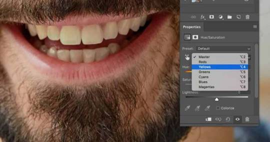
Drag the Saturation slider to the left, to where the teeth aren’t gray but the yellow is significantly reduced. We want to maintain a natural tooth color.
Step 4: If necessary, fine-tune the mask
Take a final look at your work. If you notice that areas either outside or inside the teeth are also brightened, you need to paint that out with the Brush tool.
Make sure the Layer Mask Thumbnail is selected, and hit B on the keyboard, or select the Brush tool from Tools window. Make sure the Foreground Color is Black at the bottom of the Tools window.
Right-click in the image to bring up a temporary Brush Settings window. Adjust the Size to match the level of detail you want to apply when changing the mask. Adjust the Hardness to between 50% and 75%.
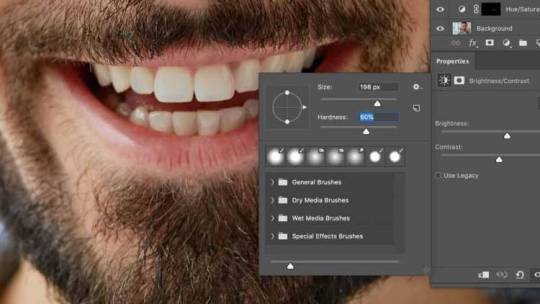
Now just paint the errant mask out to hide that part. This blocks the adjustment from being applied to the image. If you hide too much or make a mistake, simply change the Foreground Color to White by hitting X on the keyboard, or clicking the Foreground/Background switch icon at the bottom of the Tools window. Then reveal the area until you have good definition.
Step 5: Create a Brightness/Contrast Adjustment Layer
Hold Command on the keyboard and click the layer mask thumbnail for the Hue/Saturation Adjustment Layer in the Layers window. This will reselect the teeth area with the feathering intact.
The Layer Mask Thumbnail is the black rectangle icon in the Hue/Saturation layer.
Click the Create New Fill or Adjustment Layer icon at the bottom of the Layers window again, but choose Brightness/Contrast from the list. Make sure the Brightness/Contrast Layer appears above the Hue/Saturation Layer, so it affects the overall image and not just the original. The stack order of Adjustment Layers can make a pretty significant difference. If you’re not getting results you like, try reordering layers before seeking a different solution.
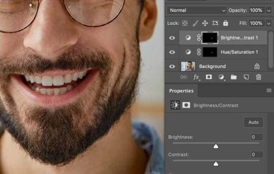
Make these next adjustments very carefully. If the person has a blindingly white smile, you’ve gone too far. In the Properties window move the Brightness slider to the right very slightly. You usually won’t need to adjust the Contrast, but if you want to see if it helps, move it even more delicately than the Brightness to maintain a natural look.
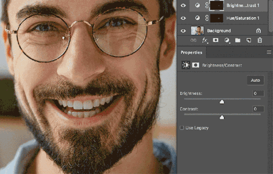
These steps will improve the appearance of teeth in the majority of images. Just try to keep it natural, using low values in the Adjustment Layers, and only you will know why their smiles looks so great.
How to Select Hair in Photoshop Like a Pro
Selecting hair in images used to be a nightmare: it was nearly impossible, took hours to finish, and you rarely got it to look right. Now we have the Refine Edge Brush Tool and life just couldn’t be better.
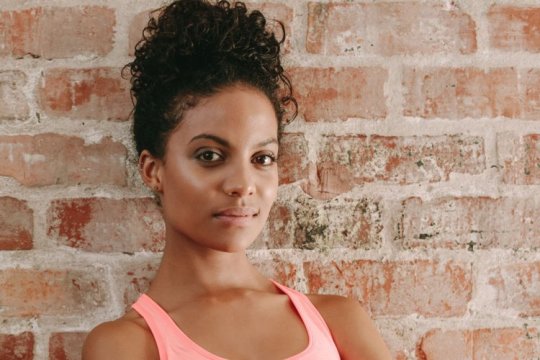
Selecting hair against a similarly colored backdrop is not the nightmare it once was – not even close.
To start, make a selection around the hair as best as you can. Don’t labor, just get what is gettable with the Magic Wand, Lasso, or a combination of the two. Now hit the Select and Mask button at the top of the Application Window, or hit Command + Option + R.
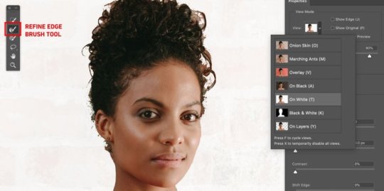
The View Mode is set to “On White,” which makes the hair easier to see.
In the top left of the window is a small tools window. Click the Refine Edge Brush Tool. Start painting the edges of the hair a little at a time. It helps to set the View Mode to either On Black or On White, with Opacity set pretty high, to track your progress.
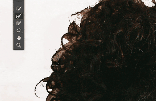
After you’ve used the brush on all the edges where the hair meets the background, click the Output Settings section to expand it. Under Output To: you have choices. You can either choose Selection to return to the image and keep working on other areas of the selection, or you can make a new mask or layer or combination straight from Select and Mask.
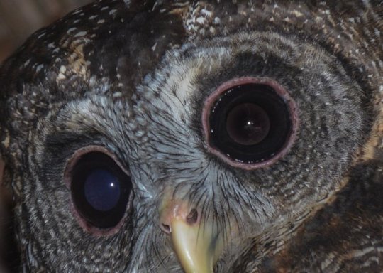
Unbelievable. Witchcraft? Artificial intelligence that is now tracking my every move? I don’t care, thank you Mr. Photoshop! How to Fix Red Eye in Photoshop
Yes, even in these modern times we are still dealing with “red eye” — the photography problem where the flash of a camera reflects off the back of the subject’s retina, causing a disconcerting red glow. Fortunately, we have a solution that includes a couple variable parameters to get custom results.
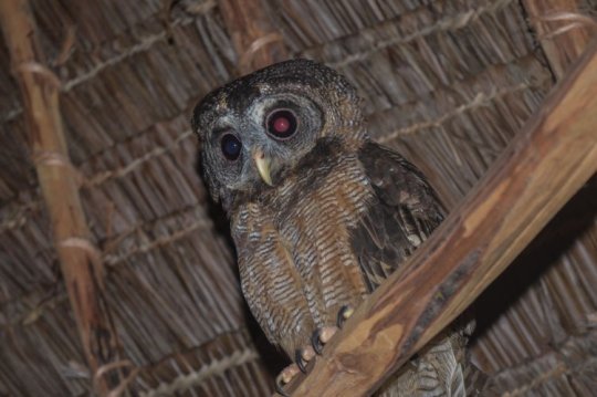
This technique works for people, too.
With your red-eye image open, select the Red Eye tool from the Tools window. It’s within the sub-menu headed by Spot Healing Brush Tool.
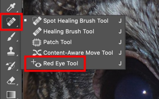
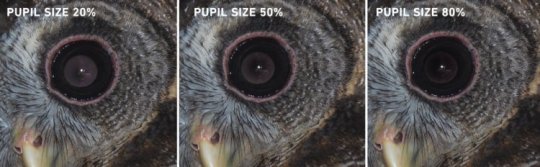
All you have to do is click in the red area of the eye. If you are not satisfied with the results, there are two setting in the upper left of the window, Pupil Size and Darken Amount. These let you fine tune the tool.
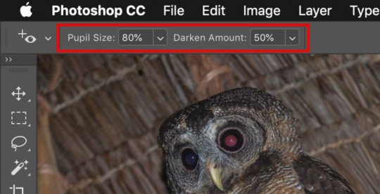
Pupil Size 80%, Darken Amount 50%
Pupil Size will set the coverage of the dark center within the total red area of the eye. This sort of rebuilds the natural pupil area. Then you can set the Darken Amount to match the photo’s overall tone.
How to Remove Blemishes in Photoshop
Removing blemishes, whether natural or from specks of dust on the scanner, is crucial to creating great images. Lucky for us, Photoshop includes several tools to do accomplish this. The easiest to use is the Spot Healing Brush. This tool will work in probably 90% of the cases you’ll need it.
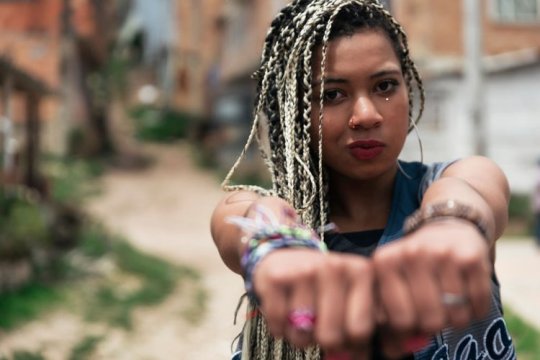
Great shot – but those dust specks under her eye needs to be fixed.
Activate the Spot Healing Brush by clicking on it in the Tools window. You can cycle through all of these tools by holding Shift and hitting J on the keyboard.
Adjust the size appropriate to the blemish you need to fix by hitting the open bracket key to decrease. Then either click on the blemish or swipe across it in a short stroke.
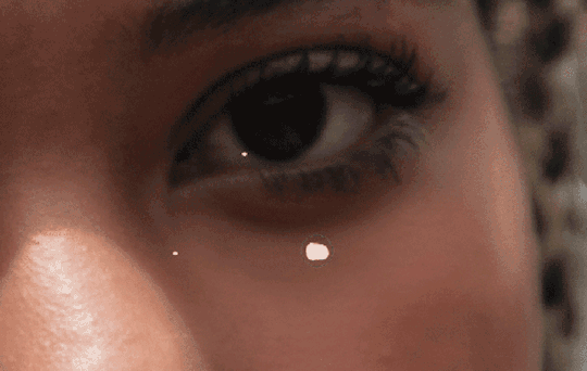
Either method will gather the texture and color information from nearby to replace the blemish with similar pixels. Swiping works when one click doesn’t yield satisfactory results. It even works in tough areas, like where the cornea meets the iris in an eyeball.
With these techniques you’ll be retouching your images with skill and speed, like a pro. Be sure to click on the links in each section for more in-depth articles on the tools used here. Those will give you even more info on how to become a Photoshop guru.
Looking for more on using the tools in Photoshop? Check these out.
How to Make a Background Transparent in PhotoshopDesign Tutorial: Get the Linocut Look in PhotoshopHow to Smooth Edges in Photoshop After Making a SelectionPhotoshop Basics: Learn How to Use Layers in Your DesignsGuide: How to Remove Backgrounds from Images
Top image via Look Studio
The post How to Whiten Teeth in Photoshop + More Retouching Tips appeared first on The Shutterstock Blog.
Read more about this at shutterstock.com
https://bestcamaccessories.com/how-to-whiten-teeth-in-photoshop-more-retouching-tips/
0 notes
Text
Question 4: How did you use media technologies in the construction and research and research, planning and evaluation stages?
Tumblr
The blogging site Tumblr was useful during the planning stage as it allowed me to accumulate all my research in one place. This included theories and theorists, audience research, a production log and analyses of music videos and digipaks. The chronological structure of the site allowed for sections to form naturally, showing the progression of our music video from basic research through to evaluation.
The ability to embed videos and images is invaluable as it allowed me to visually punctuate any point I made, whether on my music video or during an analysis. This can be seen in my analysis of Dead End Street by the Kinks or Another Brick in the Wall by Pink Floyd. However, when it came to posting my digipak on my blog, the quality of the image decreased. This was frustrating as I couldn’t work out how to fix it and the image seems to be decent quality before posting.
I have also had issues with Tumblr because of poor wifi connection. If there isn’t a strong connection, Tumblr has at times taken hours to submit a post or even embed a video. This was especially tricky in the research phase when it came to analysing music videos. At one point the video took so long to load I tried to cancel it to start again and ended up losing the essay I had just written.
Overall, Tumblr’s layout and accessibility to my whole group is beneficial in organising research and keeping track of progress because of its linear structure, but its technical flaws have been a detriment at times.
Prezi
Prezi has enabled me to create an in-depth critique of my own work, in which I was able to break down individual points and section off answers into appropriate and easy-to-navigate sections. It includes many sleek designs for free that presented my work in a succinct and flowing manner and allowed me to provide evidence or visual aid to my points through embedding videos and images into sections.
This program came into most use during my evaluation in which I was able to analyse each of my original media texts in appropriate groups (e.g., discussing the ‘minimalistic style’ in my music video, digipak and magazine cover). My biggest problem with it was that it ran very slow, with each action taking twice the time that it would if running smoothly. This is again most likely because of poor internet connection. The only real drawback was that it was tedious and took longer.
Mobile Phones
These were beneficial in the traditional sense; I was able to keep in contact with my group whenever I needed them, mostly for help organising filming days during production. We were able to set up a group chat through Facebook and having that easy, reliable communication between everyone meant that we were all ‘in the loop’, receiving the same information and discussing the video as it was being made.
Mobile phones also came in handy when we needed to take photos of filming days for the production log. This, coupled with the social media access it brings, allowed for easy sharing of pictures and thus, improved blogs.
PCs
The computers at school were what the music video itself was edited on and it caused a lot of trouble. While the extensive storage space on the iDrive is useful, the speed at which post-production had to go because of the poor processing speeds was tragic.
This was mainly an issue with rendering, which can take up to 3 hours to complete with lots of footage. This forced us to be selective from the get-go with what shots we actually wanted to import and render, which ultimately meant that Premiere Pro didn’t become cluttered and only the best shots made it into the final cut.
Similarly, the slowness of the PC meant that cutting in time with the beat of the song was more difficult. There were lots of lagging issues that meant we couldn’t tell with any accuracy whether our edits lined up with the beat of the song. It was partially because of the trouble we had with these PCs that resulted in me editing the Directors’ Commentary, Final Focus Group and Animatic on iMovie on my laptop from home.
DSLR Camera
Using a DSLR Camera is a significant technical step-up for me from year 12, where I used a camcorder to film our film opening. Getting used to the digital camera was relatively easy as I never found the need to white-balance or anything like that, something that I would have to do several times every time I used a camcorder.
The primary reason digital cameras are superior is the video quality which far exceeds that of a camcorder. Similarly, using the DSLR meant I was able to use a 35-millimetre lens to create a small field of focus and giving a sense of intimacy and insight into Lola’s life through the slider shots and still shots of alcohol bottles.
The one problem I ran into with this camera was that creating effective zooms is very difficult as it requires a perfectly smooth manual extension of the lens, something that I couldn’t manage to perfect, resulting in some zooms in the video looking uneven and unprofessional.
Adobe Premiere Pro
This software was ideal during the post-production process as it was logical and accurate with cuts, transitions and video corrections software, such as colour, lighting and rotation. It was easy to cut to the beat of the song when things were running smoothly as the audio track allowed me to view the frequency of the song and judge confidently where the edits should be.
The main issue we ran into during post-production was that the tool Warp Stabiliser, used to stabilise shaky footage, was missing from the program, resulting in us having to resort to importing the clips into Adobe After Effects and stabilising it there. This led to complications during our re-edit as some of the clips that had been put through After Effects vanished or stopped working, meaning that we were unable to tighten up a few minor sections of the video.
Adobe Photoshop
This was my first time using photoshop and at first, I found it tricky to get the hang of. I used it for my digipak and magazine cover. My design for the digipak required me to use an Intuos Wacom tablet in order to effectively draw in the black and white block design of the final product. Once I started using photoshop in conjunction with the tablet it became easier and I enjoyed being able to work in layers.
The lasso tool, magic wand tool and paint bucket tool made the blotting out much quicker and smoother, meaning that I was able to finish the panels for my digipak in two days. The style was to mimic somewhat the style of the original album cover while incorporating a Banksy-inspired graffiti style to appeal to my youth audience. I also utilised the blur tool and added a yellow and red tint to some of my panels to convey a 70s style to the photography.
Youtube and Facebook
After all the editing and exporting was complete, our final music video for Lola was uploaded to YouTube, where it currently stands at 666 views. YouTube is the most convenient and effective way of publishing video content as it is the leader in the online video market and has almost zero competitive alternatives. It was the best way to get our video online in an easy-to-share format, such as through Facebook. Meg shared Lola through her Facebook account and received lots of positive feedback, encouraging us that the purpose of our video (to show the struggle a person goes through in discovering their gender identity) was conveyed.
0 notes
Last Seen Blogs

voixtek
Made For Your Voice

anglorryn-blog
Untitled

ciinammon
Cinammons
6wronka9
sup cowboy

sexymaturelady
Sexymaturelady