#Too bad they don't have eyespots on their wings
Text
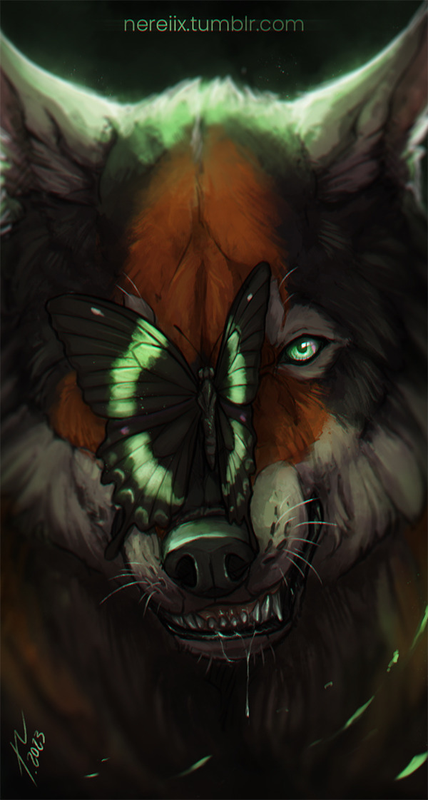
A random angry Akal.
#OC akal#wolf#butterfly#canine#painting#personal art#digital art#my OCs#——#This butterfly is probably bigger than it should be#It's an Emerald Swallowtail#Too bad they don't have eyespots on their wings
22 notes
·
View notes
Note
perhaps maybe some bad guy moth crumbs? Mayhaps? Maybe?
ok ok o kok ok jokojokjfokdsjfokjokJLFKDSLKFJDSKF i love you anon, good question. This also ties in very well to all the fae thoughts I've been having.
Horror has the wings of a great big ragged peacock moth. They're large, heavy, and thick with fur. They drag behind him like a cape when he walks. With the way the mass of fur around his neck clumps and curls, it gives him the appearance of a lumbering bear - if he can fly, he seems to prefer not to, instead stalking the ground and picking off anything that can't get away from him.
His wings are very matted, very dirty. They have been for a long time. He... he would really, really like it if you brushed him. He doesn't mind how long it takes. It's been so long since someone touched him with care. Just... please brush him.
Dust resembles a muslin moth. Smooth, silky, grey. Too smooth - too untouched. The air around him smells strange, when you touch him its hard to tell what's the usual fine powder moths shed and what's something else. The rest of Nightmare's men have cuts and scrapes and imperfections in their wings, tears from battles they lost. Dust has no such imperfections. Almost like... he just doesn't lose. In some lights, when he raises his wings to attack, it's like the edges glow red and cyan. He is not the creature he purports to be.
You're curious about his wings? Cute. Why don't you come closer, have a better look? Why don't you stand close enough for him to see your lovely face. Then you both get something you want.
Whatever Killer was before, it's hard to tell now. His wings have been stained completely black, the only colours are the vivid red of two perfect eyespots, one on either wing. There's probably another moth pattern under all that black. Who knows.
Moth monsters often tend to shed a kind of fine powder, but it's hardly visible and pretty easy to ignore. Killer? His powder is dark, like soot, it clings to anything he frequently touches. Everyone around you can tell that Killer likes you, because his affection comes with great big black marks across your clothes and body. It's his way of declaring ownership. If he thinks someone is getting too cosy he sneaks up on you and hugs you to stain you for the rest of the day.
The exterior of Nightmare's wings looks like a pipevine swallowtail, with a lovely black fading into an equally lovely dark blue. Regal and elegant enough already. He keeps them folded around himself, as a makeshift cloak, and frequently decorates them with silver chains and precious gems.
The interior of his wings sports large, cyan eyespots. If he wants to, he can open his wings and flare the eyespots, causing a sudden rush of uncontrollable terror in whoever witnesses it. It's his decision how the fear affects the victim. He might want to make someone so scared they blab the truth. He might want someone to flee his presence because he's sick of them.
... Or... he might want to stop someone he's interested in from leaving.
510 notes
·
View notes
Note
cool to take a look at the Scyther line~?

One of the many, many reasons I like Kadabra so much is that it's kind of a mammal/bug hybrid if you squint, so unsurprisingly, I really like Scyther's combo praying mantis (though it looks a bit more like a mantidfly) and ambiguous-not-mantis aesthetic a lot. Interestingly, we actually have Scyther's beta sprite, and it looks hilarious:

This actually clarifies that Scyther is half mantid and half dragon, and that those three prongs on the head used to once be horns. Unsurprisingly, the final design looks a lot better, but it's fun to see where those design elements come from. You can also see that the head in its first sprite was still semi dragon-ish:

In addition to the sort of half-dragon-half-bug aesthetic, I really like the giant blades; they have a cool shape to them, and are a solid, monster-y way of playing with a praying mantis' forelegs. Likewise, the exoskeleton look and the fierce expression are always winners in my book.
Though one weird thing I have to point out is that, logically, the points on the side of its head should be exoskeleton too, right? Because according to the anime, they're fur, which raises a lot of questions:

Textures aside, I only have two minor nitpicks. First, the way the green wraps around the cream on the upper legs is... weird. It feels like they should just be all green and one solid orb with the pointy bits coming off of them. Also, the feet always looked clunky to me, with their undefined shape and tacked-on claws. Note how in the first final sprite shown above, there's a defined foot; this would've looked a lot better than the clunky blobs we got. That's it, though; otherwise, this is a very cool mantis.

I have kind of mixed feelings on Scizor. It's not that it doesn't look cool—it does—nor is it that it looks bad. In fact, it's very nicely designed; I love the striking red color, how the black parts give the body some extra definition, and the almost robotic look to the wings. While I ultimately prefer Scyther's more organic appearance, Scizor's slick and streamlined body is excellent, and appropriate for a steel-type.
Also, I LOVE those eyespots on the claws, which it uses to confuse its opponents by making them think it has three heads. This is true of many IRL species of insects, including some kinds of mantids:

However, as excellently designed as Scizor is, for some reason it just never felt right to me as a Scyther evo despite obviously looking like it. It look me a while to place why, but I think it's because of this:
Normally when a Pokemon evolves, it keeps the same themes and elements as the originals and just expands upon them, along with giving the Pokemon a more powerful appearance. But Scyther doesn't keep Scyther's blades, instead using clamps that seem a lot less threatening. It looks different than Scyther, but not really more powerful, and even its stats aren't really higher than Scyther's, just distributed differently.
Basically, when I'm getting at is that Scizor, to me, feels more like a regional than an evolution. It has parallel, but ultimately different, themes to the original appearance, and looks similar to the original while not really looking stronger. It's not that it's bad as an evo per say, but I think this is why it's never quite felt right to me despite the great design.

Mega Scizor... exists. I don't hate it, but it doesn't really enhance or improve the design, nor is it doing something fun or conceptual with it. It at least gives Scizor the higher stats you'd expect from an evo, but visually, it's just There.
The pincers feel appropriately expanded upon, at least, and the black parts of the body are... fine, but also kind of ruin Scizor's sleekness. The legs are weirdly angular compared to the rest of the body, and the second set of ridges on the white parts of the claws aren't needed. Also, why did the accent color change from yellow to blue? I don't mind the blue, but why, exactly...?
I think that if I was designing a Scizor evo, I'd maybe expand the wings and give it another set of eyespots there, and then add some teeth-like blades to the claws. The claws are already mimicking heads, so expanding the mimicry idea while referencing Scyther's blades would at least give it more of a clear direction.

The line feels a bit more balanced with the addition of Kleavor here; at least now we have a trio of three mantids with three different types of weapons, making Scizor feel a little less out of place. It also makes for a nice contrast with Scizor, having a very angular and bulky appearance instead of Scizor's sleek minimalism.
With that said, I'm not huge on Kleavor. The design is just really hard to read at first; I couldn't figure out what I was looking at when we first saw it in that one PLA trailer. I think some of this is due to unnecessary clutter; having the beard and topknot combo feels unneeded (not like any of the rest of the line has a theme), but combined with those giant spikes around the shoulders and it's really over-detailed and crowded in that spot. Meanwhile, the face is weirdly pointed and elongated in a way that doesn't look natural, and the upper legs are really cubic while the rest of the tan parts of the body are smoother. There are also those random white things coming out of the back—maybe the remains of its wings?—that don't accomplish much.
Those giant axes also look odd to me. Scyther's blades are based off of mantises, Scizor's are lobster claw-esq, but the axes are just very inorganic and unnatural. Not helped is the very long and skinny arms that look like they should snap when it swings those things, and the way the arm goes through (??) the axe handle.
What I can say, however, is that I like how the axes feel like a continuation of Scyther's blades, more so than Scizor's clamps. It still feels a bit like a Hisuian Scizor, but it has that much going for it at least.
Overall: Scyther is a pretty cool bug-dragon creature. Scizor is super streamlined and nicely designed, even if it ultimately feels a little more like a regional than an evolution. Mega Scizor Exists, and Kleavor has a good concept but is a bit too messy visually for the design to work.
Also, side note: Why did XY give this line blue wings for five minutes before they were immediately changed back in subsequent gens?

35 notes
·
View notes
Last Seen Blogs

fariyaaah
Untitled

absolutely-correct-mcyt
I Don’t Remember That In Minecraft

realtorfox43
realtorfox

dhuwad
www.dhuwad.com

rainstormfrost
hanax