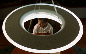
#Update: it's the Human Rights Campaign logo!!! I love him!!!!
Text
Peepaw sighting!!!

Source!
#Alfred Molina#doc ock#and Jennifer too!!!#anyone got a clue what that is on his arm?#Update: it's the Human Rights Campaign logo!!! I love him!!!!
159 notes
·
View notes
Text
May 9, 2021: A.I. Artificial Intelligence (2001) (Recap: Part One)
Welcome to the future.

At this point, we’ve mostly looked at the past, present, or the near-future (as in, the next ten years, if that). Additionally, we’ve looked either at nonexistent technology in a contemporary setting, or an extension of existing technology taken to a logical next step. But no more. No more realism, no more real-world rules, and nothing that we’re even close to in this reality.
Well...mostly.

That’s genuinely impressive, not gonna lie. Anyway, yeah, from here forwards (for a bit), we’ll be looking at the future and futuristic technology. Now, there are a couple of ways in which these films tend to go. The first big way that we tend to represent the future in film is the same way we always have: flying cars, futuristic technology, smart houses, and robots.
Now, there are countless examples of this future, and it always changes a bit depending on the present. Which, yeah, makes sense. After all, what I’m doing right now, at this moment, would’ve been seen by many people as a massive technological achievement, even around the time that I was born. Which, yes, I’m old, deal with it (because I can’t). Anyway, the way that this begins is with the first major filmed view of a seemingly idyllic future: Fritz Lang’s 1927 film Metropolis.
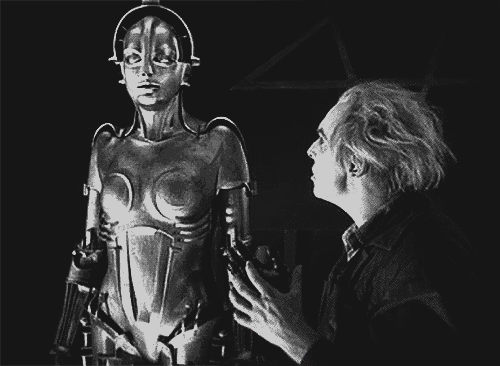
The overly mechanized (and politically dystopic) society seen in this film, as well as the visuals and technology, would inform our ideas of the future throughout the next century. Multiple themes and common objects reoccur throughout futuristic fiction. You know the stuff I’m talking about. Flying cars, automatic food machines, robotic assistants, video watches, holograms, jetpacks, so on and so forth.
But here’s the thing about the future. It’s always ahead of us, and eventually...well, we’ve gotten to most of those things to some degree. Either they already exist...
youtube
...or is currently being developed.


Well, one of them we’re still working on. And the development of more advanced AI is something we have yet to perfect, or even fully develop. However, the development of A.I. (and the consequences of that technology) are ALL OVER science fiction. Sometimes, they’re merely used for flavor to help establish the futuristic setting.
Sometimes, they’re characters with their own agency and conflicts, which may or may not define the plot. In these cases, they’re often simply there to back up the main human characters, and help with their development, and sometimes their own. You know, manic pixie dream robots.

And then, possibly most often, they’re the abject villains of the piece. they can be mysterious alien technology, like in The Day the Earth Stood Still, or a man-made danger that turns on the race that created and/or abused it.


But then, on occasion, an A.I. is given the chance to develop as a character, without being used to define the development of a human character. Sometimes, the question of what life truly means is raised through these characters, and we become attached to them outside of any other character. This isn’t nearly as common as the others, but it’s definitely not unheard of.


And for the record...things don’t often go well for those AIs. But still, some of those characters have quite a lasting impact. So, there’s quite a lot of potential for this type of character, from a dramatic standpoint. And that potential leads us to the guy who made this.
I WILL MAKE A JURASSIC PARK REFERENCE AS OFTEN AS POSSIBLE
Steven Spielberg gives us today’s entry, and this director of a classic science fiction story about science gone awry teamed up with the director of a science fiction film where an artificial intelligence went awry. You know, this thing.

I didn’t forget about HAL. And I won’t forget about him later, either.
Director Stanley Kubrick is pretty well-know for his mind-bending films, especially The Shining and 2001: A Space Odyssey. But he also worked with Spielberg on this film before his death in 1999, as this was one of his dream projects for many years, and the two directors were well-known friends.
And so, eventually, Spielberg was given the reins from Kubrick, and results were...mixed. It’s funny, because I’ve never actually seen this movie, but I remember it through its surprisingly widespread ad campaign. I used to go to NYC as a kid a lot, and there was a massive building-side plastered with the iconic logo of this movie. So, I’ve been hovering around this movie for a long time. Enough navel-gazing!
SPOILERS AHEAD!!!
Recap (Part One)
It is, unsurprisingly, the future. A marrator informs us that climate change has caused the ice caps to melt, and global flooding drowns several countries. You could say that it’s a...Waterworld.
I genuinely considered watching that movie at some point, and then I decided I liked myself to much to watch 2 hours of Kevin Costner’s emotionless acting. Granted, it’s not much better now, listening to the emotionless acting of...
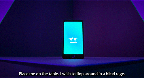
Professor Allen Hobby (William Hurt) is a straight-up sociopath. OK, technically, he’s a robotics engineer, but dude’s making a speech, right? He talks about how far robots have come, dissing my boi Deep Blue in the process, and notes that pain-memory response can also be demonstrated by robots. He proves this by stabbing a woman in his audience, like RIGHT through the hand. Jesus, man! Why the hell would you do that?

Oh. Holy shit, I got fooled. Advanced technology indeed. But OK, so Sheila’s a robot, and a very advanced one...to us. But Hobby wants more, and proposes to his workers to make a robot that can really TRULY love. And through love may come a true subconscious, which means making a robot that can dream. And what better robot to make than a robot child? After all, all child conception requires a license in this futuristic world, so many childless couples are yearning for a child.

Which is why, twenty months later, the first robot child is offered to Henry and Monica Swinton (Sam Robards and Frances O’Connor), a couple...with a child. Um. Guys. You JUST SAID that there are legit childless couples who need a child, and those people would be best suited to love that robot child back (a VERY GOOD question raised by one of Hobby’s subordinates). So why give it to a couple whose son is still alive? Yeah, he’s got a rare disease that they don’t have a cure for yet, and is currently in cryostasis, BUT THEY HAVE A KID! Surely, that’s going to be a potential emotional conflict! And what if the kid wakes up or some shit? This is a TERRIBLE goddamn idea. Think this shit through, guys.
And yet...

This is David (Haley Joel Osment), Cybertronics’ first child robot, brought home by Henry to essentially replace their son. Which is AMAZINGLY FUCKING TONE-DEAF AND INSANE, GODDAMN. That’s extraordinarily messed up. And, for the record, I totally get what Spielberg’s going for, but Jesus Christ, man. This was a terrible way to go about this. And it gets fucking WORSE.
See, Henry (who actually works for Cybertronics) tells Monica that, once they sign the papers and complete the updates, David will imprint on them and see him as their true parents, loving them unconditionally. Which...yeah, fuck, that’s an entire DUMP TRUCK of ethics issues right there. And, while we’re at it, David is...creepy as shit. I mean it, dude, Haley Joel Osment is a VERY good child actor, but he’s laying on the creepy robot child thing THICK. And yeah, this is BEFORE he imprints on them. Jesus fuck, man, there’s a scene where the still uncomfortable Monica is outside of a glass door, and he looks back at her THROUGH THE DOOR like a goddamn SERIAL KILLER.

And I gotta tell ya, dude does not lay off that creepy-ass dial one iota. And for that matter, the music by John Williams ISN’T FUCKING HELPING. LISTEN to this shit, and imagine a robot child that you don’t know wandering around your house. It’s amazingly fucking creepy.
AND IT JUST. KEEPS. GETTING. WORSE. There’s a scene where they’re all at dinner, right, and David’s just staring at them as they eat, mimicking their actions. After all, he’s a robot, he can’t actually eat or drink anything because of his internal working. And then, out of FUCKING NOWHERE, he starts laughing like the FUCKING JOKER, and it scares the EVER-LOVING SHIT OUT OF ME. And somehow, they laugh alongside him, in the never-ending Stockholm syndrome that is this movie! And as soon as its over, he just STOPS laughing, spontaneously. Fuck me, man, I’m tempted to stop watching here and now, and I’m only TWENTY MINUTES IN! I need a fucking break.
And after that...OF COURSE she decides to activate his imprinting protocols to make him, let me remind you, LOVE HIM FOREVER! She reads out a series of words, and after “FREIGHT CAR”, he knows his mission is to kill the Prime Minister of Sokovia. But first, he’ll settle down and love Monica unconditionally (again, FOREVER), calling her Mommy and making me shit my pants in fear. IT WASN’T ME, IT WAS FUCKING DAVID
Oh, and by the way, isn’t it kinda shitty to do that without Henry being involved AT ALL? Like, cool, he has unconditional maternal love, but Henry wasn’t a part of that conditioning at all! And he still refers to him as “Henry” instead of Dad! However, Henry definitely doesn’t care about that, because he still sees David as only a robot. Hey, guys, maybe using these two as your first experiment with a robot child WAS A TERRIBLE FUCKING IDEA, YOU IDIOTS! No wonder William Hurt was cast as Thunderbolt Ross in the MCU. Already shown he can play a character with shitty ideas before.

Anyway, after this terrible series of events, David prevents the parents from leaving one night due to his childlike antics. When Monica goes to comfort him, he asks how long she’ll live, and tells her that he hope she never dies, a COMPLETELY NORMAL THING TO SAY. Look, I get that he’s a robot, but only a goddamn emotionless sociopath would program emotional responses like this into a robot. Which, given what we’ve seen of Hobby, makes sense.
In response, she gives him Teddy (Jack Angel), a technologically advanced teddy bear with sentience, a personality, and the voice of Astrotrain from The Transformers TV series. Because, yes, I am THAT MUCH of a goddamn nerd.

Soon after, the house gets a phone call, which David receives...literally. He takes the phone and allows it to speak through him. It turns out that, shock beyond shocks, THEIR SON IS CURED! Yeah, fuck. Maybe giving David to a family with a STILL LIVING SON is a fucking ABSOLUTELY TERRIBLE IDEA, for about a thousand reasons.
And, fucking understandably, Martin Swinton (Jake Thomas) is a little upset to find out that he’s essentially been replaced by a robot kid. Although, to be fair, he’s also kind of a dick to David, holding his humanity over him and treating him as a toy that he attempts to manipulate and bully. My Lord, this is a massively stupid idea. And Martin immediately shows his dickishness by asking his mother to read Carlo Collodi’s The Adventures of Pinocchio to them. Which is meant to be a punishment for Pinocchio. However, of course, David loves it.

Still, however, there’s trouble in paradise for David, as he tries to compete with Martin for being a real boy, and eats spinach at dinner one evening. Despite Teddy’s mildly ominous warning to him (”YOU WILL BREAK”), he keeps eating until he basically has a stroke and breaks, forcing him to be repaired by some of Cybertronics’ technicians. Monica has a bit of a break down as a result, which Martin notices. This causes Martin to go pure supervillain, manipulating David to do creepy things in order to insert doubt into Monica about David. Jesus, Martin’s a creepy kid, too. No wonder Monica grew to be cool with David, her actual son is a FUCKING SOCIOPATHIC MONSTER! Are there ANY truly normal people in this world? IS THIS WHAT THE FUTURE IS?
Martin convinces David to cut a lock of Monica’s hair while she’s sleeping. And lemme tell ya, a little boy holding scissors over someone while they sleep is not exactly comforting. Henry agrees, and after stopping him, believes that they need to return him. Monica disagrees, knowing that they’ll destroy him if brought back. But David, ever the semi-sociopath himself, ignores any signs of humanity in David and dismisses Monica's feelings for him entirely. He also says this thing about “IF HE CAN BE PROGRAMMED TO LOVE, CAN NOT HE BE PROGRAMM-ED TO HATE?”, which...no. No, he cannot. He didn’t learn to love, he was programmed to. And, again, that’s ethically FUCKED, but taking that into account...no. HE WASN’T PROGRAMMED TO HATE, HENRY. Goddamn, buddy, use your head here.

It’s Martin’s birthday, and his friends at the pool party expose David to the fun world of anti-robot (or Mecha) racism, and test to see if he has Damage Avoidance Systems by threatening him with a knife. And he does. Buuut, when those systems kick in, he goes to the nearest point of safety to keep himself safe. That point is, unfortunately, Martin, whom he gets behind...and accidentally drags into the pool.
Thing is, because of Martin’s recent illness, he can’t exactly swim, meaning that David almost drowns him. When Henry and other partygoers go to save him, they abandon David in the pool completely. And now, David’s fucked. Because although this situation isn’t even a little bit his fault, he also just nearly killed Martin. And so, after seeing notes that he’s been writing to her, Monica offers to take for a “ride in the country”. Which definitely means something good. In reality, she’s planning on taking him back to Cybertronics. But once in the car, there’s a change in plans. And hear me out...it’s arguably far more horrifying.

She decides to abandon him in the woods completely, despite how hard it is for her to leave him. She’s sparing him from death, sure, but also throwing him into a world he doesn’t understand, and for reasons that he doesn’t understand. It’s genuinely terrible. And then...yeah, she leaves him forever, to an uncertain future.

End Act One.
I think this is a good place to stop. It’s early, and I need more coffee to handle this shit. See you in Part Two. Of Three. Yup. It’s a long one.
#a.i. artificial intelligence#ai artificial intelligence#steven spielberg#stanley kubrick#haley joel osment#jude law#frances o'connor#brendan gleeson#william hurt#science fiction may#sci-fi may#user365#365 movie challenge#365 movies 365 days#365 Days 365 Movies#365 movies a year#movieedit#filmedit
10 notes
·
View notes
Text
Trending 27th - January 2020
What have been your efforts in the campaign for SaveWOY and what are your upcoming plans to save WOY? Now this is a question worth answering!
In the past, I made a little list of the things I did to support SaveWOY and bring awareness to Wander Over Yonder’s existence and its third season plans. Since then, I’ve done a whole lot more from hand-drawn art to more intricate art. Some of them are almost as special as that signed poster @peepsqueak got from the WOY crew as a token of their gratitude.
Here’s an updated list of everything I did for SaveWOY so far:
Attended the SaveWOY picnic at Griffith Park, where I got to sign a banner.
Pointed out various higher-ups involved in the business of Disney television.
Sent several letters to the higher-ups, some of which had envelopes with an image of the downed space pod taped to them.
Started a weekly Twitter post series, SaveWOY Thought of the Week.
Made Lite-Brite art of Wander and Lord Hater, which Craig McCracken and Francisco Angones liked.
Attended D23 2017 with an Operation: FORCE drawing of Hater, a colored page of Wander and Sylvia and a few facts about WOY, and an orange pen with a green hat (I got the hat from the aforementioned picnic) - there, I signed a bench with Wander and the phrase, “Never hurts to help.”
Signed my name, drew Wander (and my own character, Jacken DeBox), and wrote, “Happiest place in outer space!” on the highest beam for Star Wars: Galaxy’s Edge.
Wrote a letter (and drew Wander) for the victims of the Las Vegas tragedy with the message, “The darkest times call for the sunniest smiles!”
Got Craig to reveal the name of the ship (said to play a BIG part in S3, made a cameo in Future-Worm) when I commented that we’d have to figure out the name - his response: “The ship is called The Star Nomad.”
Wrote a couple of cards to two Disney higher-ups with the message, “A little nice makes naughty think twice!”
Drew Dominator in a situation that might take place several seconds after she passes the downed space pod, just in time for Noël Wells’s B-day.
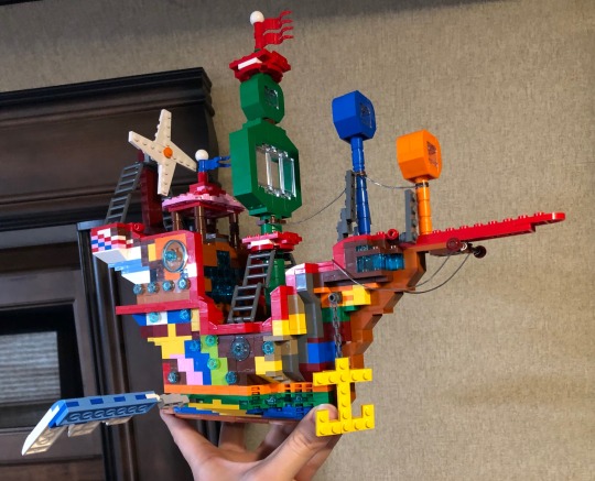
Made the Star Nomad with LEGO Digital Designer.
Made three images in the style of the original Star Wars trilogy VHS set.
Posted 50 WOYS3PredictionPolls on Twitter.
Made an image of “The First 5 Years” with over 140 individuals (including the question marks for 3 new mains and 2 new regulars - I still want to know what they look like!) and one cleverly made Hidden Mickey.
Shared WOY-related images from my 1st 5 Years fan art on Twitter acknowledging the B-days of most of the voice actors (Charlie Adler, Kevin Michael Richardson, Ken Marino, Josh Sussman, H. Michael Croner, James Adomian, Jason Ritter, and Piotr Michael clearly noticed).
Typed a summary of how I think the S3 premiere would go.
Typed lyrics to “Let’s Go Soarin’ and Explorin’,” a song from my aforementioned S3 premiere summary. Wouldn’t it be great if Andy Bean used it?
Made a microgame with WarioWare: D.I.Y. where the player has to spin the fan to make the Star Nomad fly. Part of a chorus from “Let’s Go Soarin’ and Explorin’” included.
Started FanCharacterFriday on Twitter - more Tumblr users seem to like Dr. Otmar Vunderbar.
Made a short comic page of Lord Hater trying to break out of the DTVA vault plus a sly reminder that Disney owns the rights to WOY.
Shared a list of potential episode titles for S3.
Made an actual LEGO Star Nomad based on the model made with LDD. Hopefully, those who worked on WOY have noticed. In case you missed it, here’s a picture...
Now, the ideas I have in mind for further boosting support for the campaign. I may not be able to do most of them myself, but they are certainly for everyone’s consideration.
Provide updated information of higher-ups (if any).
As soon as we find out what Kid Cosmic looks like, expect fan art of him saying, “Watch my show and tell your friends so we’ll make that Mousey Company pay for what they did to my half-brother!”
Another SaveWOY picnic - if there’s one in my general area, you can count me in.
LP album artwork of My Fair Hatey.
A mural identical to that of Super Smash Bros. Ultimate consisting of not just characters from WOY, but also characters who were said to debut in S3 and characters who’d fit in perfectly, namely some of my OCs.
Pumpkin stencils of the main characters for Halloween.
Drawings of various WOY characters stuck on the ex-secret planet explaining why they need to leave said planet. Maybe I could also show how the galaxy’s villains would react if they learn that Lord Dominator’s been bested by Lord Hater.
Drawings consisting of SaveWOY-related messages spoken by the main characters from Disney shows that got at least three seasons (e.g. DuckTales, Fish Hooks), tons of love from the viewers and the executives (e.g. Gravity Falls), or both (e.g. SvtFoE, Mickey Mouse ‘13).
Example with Phineas and Ferb:
Phineas: “We may be creative and famous, but we’re not the ones who came up with the Star Nomad. It’s the ship powered by orbbles! Orbbles! I’d LOVE to see it take flight, wouldn’t you? If you let Mr. McCracken end the show his way, and not the executive way, which, truth be told, is the absolute worst, Wander will surely be elated!”
Ferb: “The Orbble Transporter was invented by conjoined twin brothers, voiced by the performers of the theme song.”
Irving (peeking in from the side): “Speaking of voices, the titular main character sounds JUST LIKE ME! How could you possibly resist?! And look, just because I’m the biggest fan of these guys (gesturing to P&F) doesn’t mean I have no interest in what’s planned for the furry orange fella!”
Since I’m a full-time Disneyland cast member, I should be able to make contacts with anyone who might have more clues about what S3 would entail. It might be a long shot, but if I’m able to convince Disney that WOY’s influence on my life boosted my chance at gaining employment at the company, they should understand.
A weekly Jeopardy-type pop quiz on Twitter - here’s the catch: you must refrain from finding information online when you read the answer (I bet you that the most hardcore fans of the most popular shows will get most of the questions wrong).
Example: This arachnomorph got his name from a dog tag he swallowed when he infiltrated a fish-shaped ship. He later became Lord Hater’s beloved pet.
-Who is Captain Tim?
Summaries of S3 episodes I made up myself a while back.
More fan-made characters - my most recent is an elected official of Cluckon, Mayor Spye C. Drumstick.
Conjuring a logo that best fits the status of S3/TV movie - Wander Over Yonder: The New Galaxy (the center would have the silhouette of the Star Nomad with Wander and Sylvia on it).
Brainstorming possible ideas for the three new main characters.
If all else fails, I suggest we make a web comic based on the hints we accumulated back in 2016 and what we learned from the cameo in Future-Worm’s finale. Team Sea3on has been taking that approach for SatAM Sonic the Hedgehog S3, though they are also making an animated version.
That’s about all I’ve got so far. In closing, I have several questions to ask as the new decade kicks off.
Disney executives: Are you even listening to us WOY fans? What more do you want? I’ve done so much for the campaign that I feel I’m entitled to know everything that was planned for WOY’s third and final season, especially now that I’m working full-time for your company. If you tell us what your demands are, we’d be happy to oblige.
@crackmccraigen: Are you aware of how hard the fans and I have been trying to talk Disney into giving you the chance for true closure? We’ll make sure we watch KC when it comes out on Netflix. If we’re lucky, we might see WOY get added to Disney+, where it should get that closure, assuming you’ll have finished KC your way before then.
@suspendersofdisbelief: I know you’re super busy with DuckTales and you love the plans for WOY S3 so much that you can’t bear to reveal it all in one post, but it’s been waaaay too long since we got any hints from you. Are there any other WOY S3-related facts you could describe in much greater detail? The campaign could do with more motivation.
Non-WOY fans: Are you convinced? Need I remind you what’s in the end tag of the “last” episode of WOY? You know there’s much more to life than tales from the land of Ooo, a blue middle school cat boy in a world of unusual individuals, adolescent twins in an Oregon town filled with oddities, a half-gem half-human protagonist, a coming-of-age princess of Mewni, a trio of ursine trend-followers in San Francisco, and all that jazz. If you’re not one bit interested in Hater’s origin story and all that was planned for S3, it’s your loss.
Pessimists: Will you please dispense with this unnerving “Wander is dead” talk? As a certain Popeye would say, “That’s all I can stands, I can’t stands no more!” You’re not trying to let the Disney bosses win, are you? You probably used to think previously canceled shows like Hey Arnold!, Samurai Jack, and Young Justice could never be brought back. The point is, all is not lost.
@peepsqueak and WOY fans/SaveWOY supporters: Have I been of assistance? Almost every remark I’ve ever made shows wit and perception. I mean, just think. Wander is still stuck in that vault where his goal of reforming Lord Hater remains incomplete, and he has no idea of what threat awaits him. He says, “Glorn, help us.” It’ll take something big and extraordinary to convince every Disney fan (and perhaps every Netflix fan) to talk some sense into the higher-ups. Not to mention the replacement/back-up voice actors we’ll have to find if Disney takes even longer (we already lost one - René Auberjonois). We shan’t rest until we get the answers!
@disneyanimation
24 notes
·
View notes
Text
23 of the Best Personal Websites to Inspire Your Own
New Post has been published on https://onlinedatingloves.com/awesome/23-of-the-best-personal-websites-to-inspire-your-own/
23 of the Best Personal Websites to Inspire Your Own
Some refer to it as a full-time job in itself. Others compare it to dating. And several cats over at BuzzFeed think it just plain stinks.
But it doesn’t have to be that way.
When you’re applying for a task, you’re typically asked to submit a resume and covering letter, or perhaps your LinkedIn profile. But there are better ways to stand out from your rivalry, and build a personal website is one of them.
Why You Need a Personal Website
Here’s the thing about resumes and cover letters: No matter how unique you try to attain your own, for the best part, they tend to read dry. And there’s a good reason for it: It’s supposed to be a single , no-frills page that documents your work experience. And while being concise is good, there’s very little opportunity to convey your uniqueness, or for your personality to glisten through at all for that matter.
While a resume is a sole, largely unchanging document, a personal website can be customized and updated according to what you’re working on, or what you want to emphasize. It’s both fluid and current.
Did you know 70% of employers say they’ve rejected a task nominee because they learned something undesirable about them online? This doesn’t mean you should scrub the internet of everything about you — in fact, this statistic underscores the importance of polishing your online presence. Recruiters are looking you up online, and a personal website that tells the story you want to tell can make all the difference between you and a vying candidate.
If you’re thinking about creating a personal website of your very own, check out the examples below that make the fingernail on the head. Inspired by a particular type of website? Click one of the following links to jump to that segment of this article :P TAGEND
Personal Resume Websites
Personal Portfolios
Personal Blogs
Personal Demo Websites
Best Personal Websites
Gary Sheng
Raf Derolez
Pascal van Gemert
Brandon Johnson
Quinton Harris
Sean Halpin
Tony D’Orio
Verena Michelitsch
Gari Cruze
Melanie Daveid
The Beast Is Back
Daniel Grindrod
The Everywhereist
Side Hustle Nation
fifty coffees
Smart Passive Income
Minimalist Baker
Kendra Schaefer
Mr. Money Mustache
Albino Tonnina
Robby Leonardi
Samuel Reed
Devon Stank
Personal Resume Websites
Whether you create a single-page site or a larger portfolio, the web resume serves as a more personalized option for sharing information and demonstrating your technological abilities — and it can be used by all types of job seekers.
Even if you have very little work experience, you can leverage a website to build a better picture of your capabilities and yourself as a candidate, while leaning on your traditional resume to provide the basic background information.
1. Gary Sheng
Unlike a standard resume document, Sheng’s website builds it easy for him to include logos and clickable links that allow his software engineering and web developing skills to shine.
We love that visitors can choose to scroll down his page to view all of the website’s categories( “About Me, ” “My Passion, ” etc .), or jump to a specific page utilizing the top navigation.
The “My System” section reads like a company mission statement, and this personal touch assistances humanize his work and attain him more memorable.
2. Raf Derolez
Derolez’s web resume is modern, cool, and informative. It proves off his personality, branding, and developing abilities in a way that’s still very simple and clear. Not to mention, his use of unique typefaces and geometric overlays ascribes personality to his name in an eye-catching way.
Want to get in touch with Derolez? Simply click the CTA located at the bottom of the page to open up an email that’s pre-addressed directly to him. Or select one of the social media links to connect with him on platforms like Twitter — where the look and feel of the visual assets happens to seamlessly align with the branding of his website. Well played, Derolez.
3. Pascal van Gemert
Pascal van Gemert is a web developer from the Netherlands, and his personal resume website demonstrates you can include a lot of information on a single webpage if it’s coordinated properly.
The more experience you get, the more of it you’ll have to share with employers. Pascal’s resume, shown above, employs an extended scroll bar to keep visitors from having to navigate to a different page when learning about him. He also visualizes his career in different ways between “Profile, ” “Experiences, ” “Skills, ” and “Projects, ” while utilizing a consistent teal colour to unite all of his resume contents under one brand.
4. Brandon Johnson
Johnson’s incredible resume must be seen to be believed. Beautiful images of planets help to complement his planetary science background, and animations induce his resume more of an experience than a document.
In words of design, the textured, multi-layered background adds greater depth to the two-dimensional page in a way that provokes feelings of space and the planetary systems, which Johnson’s run focuses on.
5. Quinton Harris
Harris’ resume utilizes photos to tell his personal story — and it reads kind of like a cool, digital scrapbook. It covers all the bases of a resume — and then some — by discussing his educational background, work experience, and abilities in a highly visual way.
Not to mention, the copy is fantastic. It’s clear that Harris took the time to carefully choose the right words to describe each step of his personal and professional journey. For instance, the section on storytelling reads :P TAGEND
NYC, my new home, is filled with the necessary secrets to not only propel my craft forward, but my identity as an artist. With every lens snapped and every pixel laid, I am becoming me.
Finally, at the final navigational point( note the scrolling circles on the left-hand side of the page ), users are redirected to quintonharris.com, where he goes on to tell his narrative in more detail.
6. Sean Halpin
Halpin’s resume is short, sweet, and to the point, which is authentic to his voice and personal branding outlined on the site. The white space permits his designs and copy to pop and command the reader’s attention, which helps to improve readability — especially on mobile devices :P TAGEND Best Practices for Resume Website
Code your resume so it can be crawled by search engines.
Offer a button to download your resume in PDF so the hire director can add it to your file.
Keep branding consistent between the website and document versions: Use similar typefaces, colours, and images so you’re easy to recognize.
Be creative and authentic to yourself. Think about the colourings, images, and media you want to be a part of your tale that you couldn’t include in a document resume.
Personal Portfolios
Building an online portfolio is a highly useful personal branding and marketing tool if your work experience and skill set call for content creation. In fact, photographers, graphic designers, illustrators, novelists, and content marketers can all use web portfolios to show off their skills in a more user-friendly way than a resume or hard copy portfolio.
7. Tony D’Orio
It’s important to keep the design of your visual portfolio simple to let images capture visitors’ attention, and D’Orio achieves this by featuring bold photographs front-and-center on his website. His logo and navigation menu are clear and don’t distract from his work. And he makes it easy for potential customers to download his work free of charge.
Want to give it a try? Click on the hamburger menu in the top left corner, then select+ Create a PDF to select as many images as you’d are ready to download.
Once you open the PDF, you’ll notice that it comes fully equipped with D’Orio’s business card as the covering … just in case you need it.
8. Verena Michelitsch
When you’re a designer , not one pixel on your personal website should go unused. Verena Michelitsch’s portfolio, shown above, is covered end to end in artwork. From her extensive library of run, she chose to exhibit multiple colourings, styles, and dimensions so guests can see just how much range she has as a designer. It’s a perfect example of the classic proverb, “show, don’t tell.”
9. Gari Cruze
Cruze is a copywriter. But by turning his website into a portfolio featuring images from different campaigns he’s worked on, he makes visitors want to keep clicking to gain a better understanding of him. Also, there’s a great CTA at the top of the page that results visitors to his latest blog post.
His site’s humorous transcript — specifically in the “1 7 Random Things” and “Oh Yes, They’re Talking” segments — serves to show off his skills, while constructing himself more memorable as well. These pages also include his contact information on the right-hand side, building it easy to reach out and connect at any point :P TAGEND 10. Melanie Daveid
Daveid’s website is a great example of “less is more.”
This developer’s portfolio features clear, well-branded imagery of campaigns and apps that Daveid worked on, and she demonstrates off her coding abilities when you click through to see the specifics of her work.
While it might seem too minimal to only include three examples of her run, Daveid did her portfolio a service by including her best, most noteworthy campaigns. At the end of the working day, it’s better to have fewer examples of excellence in your portfolio than many examples of mediocrity.
11. The Beast Is Back
Christopher Lee’s portfolio is busy and colorful in a way that works. When you read more about Lee on his easily navigable site, you “ve realized that” such a fun and vibrant homepage is perfect for an illustrator and toy designer.
Known by his brand name, “The Beast Is Back, ” Lee’s web portfolio highlights eye-catching designs with recognizable brands, such as Target and Mario, along with links to purchase his work. This is another gallery-style portfolio with pops of colouring that make it fun and devote it personality, thus making it more memorable.
12. Daniel Grindrod
This freelance videographer is another example of a simple but sleek portfolio, organizing the many types of media Daniel’s done into the categories by which his potential clients would likely want to browse. The opening video spot on the homepage — labeled “Daniel Grindrod 2018, ” as shown on the still image — also ensures his site visitors that he’s actively creating beautiful work.
Best Practice for Portfolio Website
Use chiefly visuals. Even if you’re showcasing your written work, utilizing logos or other branding is more eye-catching for your guests.
Don’t be afraid to be yourself. Your personality, style, and sense of humor could be what decides you apart from other sites!
Organization is key. If your portfolio is full of photos, logos, and other images, make sure it’s easy for visitors to navigate to where they can contact you.
Brand yourself. Choose a logo or icon to induce your information easily identifiable.
Personal Blogs
Consistently publishing on a blog is a great way to attract attention on social media and search engines — and drive traffic to your site. Blogging is a smart way to give your work a personality, chronicle your experiences, and stretch your write muscles. You might write a personal blog if you’re a writer by trade, but virtually anyone can benefit from adding a blog to their site and providing useful content for their audience.
13. The Everywhereist
This blog looks a bit busier, but its consistent branding assists guests easily navigate the site. The travelling blog utilizes globe iconography to move visitors around the site, constructing it easy to explore segments beyond the blog.
Owned by novelist Geraldine DeRuiter, this blog also features a “Best Of” section that allows new visitors to learn about what the blog covers to get acclimated. The color scheme is warm, neutral, and free of excess clutter that could confuse from the content.
14. Side Hustle Nation
Side Hustle Nation is the business blog of Nick Loper, an advisor whose website offers tons of valuable fiscal advice for individual business owners. His homepage, shown above, sets a lighthearted yet passionate tone for his readers. It indicates you’ll get friendly content all committed to a single aim: financial liberty. The green call to action, “Start Here, ” assistances first-time guests know what it is to navigate his website.
On Nick’s blog page, shown above, you’ll notice two unique types of content: “My Podcast Production Process, ” the top post; and “Quarterly Progress Report, ” the third post down. The top post presents readers how Nick, himself, generates content that helps his business grow, while the third post down holds his readers up to date on his blog’s growth over time. These content kinds give people a peek behind the curtain of your operation, indicating them you practice what you preach and that your insight is tried and true.
15. fifty coffees
The website fifty coffees chronicles the author’s series of coffee meetings in search of her next chore possibility, and it does a great job of using photography and visuals to assist in the telling of her lengthy stories.
The best part? Each post ends with numbered takeaways from her meetings for ease of reading comprehension. The high-quality photography used to complement the tales is like icing on the cake.
16. Smart Passive Income
This is Pat Flynn’s personal blog, a hub for financial advice for people who want to start their own business. His homepage, shown above, lets you know exactly who’s behind the content and what his mission is for the content he’s offering readers.
His blog page also comes with a unique navigational tool, shown above, that isn’t simply categorized by subject matter. Rather, it’s organized by what the reader wants to accomplish. From “Let’s Start Something New” to “Let’s Optimize Your Work, ” this site structure assistances customize the reader’s experience so you’re not forcing them to merely guess at which blog posts are going to solve their problem. This helps to keep people on your website for longer and increase your blog’s traffic in the long term.
17. Minimalist Baker
I’m not highlighting Dana’s food blog just because the food appears delicious and I’m hungry. Her blog uses a simple white background to let her food photography pop, unique branding to stimulate her memorable, and mini-bio to personalize her website.
18. Kendra Schaefer
Kendra’s blog is chock-full of information about her life, background, and professional experience, but she avoids overwhelming visitors by using a light background and coordinating her blog’s modules to minimize clutter. She also shares links to additional writing samples, which bolsters her writing authority and credibility.
19. Mr. Money Mustache
Mr. Money Mustache might take over an old-school, Gangs of New York-style facade, but his blog design — and the advice the blog offers — couldn’t be more fresh( he also doesn’t really look like that ).
This fiscal blog is a funny, browsable website that offers sound insight into money management for the layperson. While his personal stories help support the legitimacy of his advice, the navigation connects surrounding his logo make it easy to jump right into his content without any prior context around his brand.
Best Practices for Blogs
Keep your site simple and clutter-free to avoid additional distractions beyond blog posts.
Publish often. Company blogs that publish more than 16 posts per months get nearly 3.5 X the web traffic of blogs that published less than four posts per month.
Experiment with different blog styles, such as listings, interviews, graphics, and bullets.
Employ visuals to break up text and add context to your discussion.
Personal Demo Websites
Another cool way to promote yourself and your abilities is to create a personal website that doublings as a demonstration of your coding, design, illustration, or developer skills. These sites can be interactive and animated in a way that provides information about you and also demonstrates hiring directors why they should work with you. This is a great website option for technological and artistic content creators such as developers, animators, UX decorators, website content managers, and illustrators.
20. Albino Tonnina
Tonnina is showcasing advanced and complicated web developing abilities, but the images and icons he utilizes are still clear and easy to understand. He also offers a simple option to view his resume at the beginning of his site, for those who don’t want to scroll through the animation.
21. Robby Leonardi
Leonardi’s incredible demo website utilizes animation and web development abilities to turn his portfolio and resume into a video game for site visitors. The whimsical branding and unique route of sharing information ensure that his site is memorable to visitors.
22. Samuel Reed
Reed utilizes his page as a start-to-finish demo of how to code a website. His website starts as a blank white page and objectives as a fully interactive site that guests can watch him code themselves. The cool factor attains this website memorable, and it stimulates his skills exceedingly marketable.
23. Devon Stank
Stank’s demo site does a great job of showing that he has the web design chops and it takes it a step further by telling guests all about him, his agency, and his passions. It’s the perfect balance of a demo and a mini-resume.
Plus, we love the video summary. It’s a consumable summing-up that at once captures Stank’s personality and credentials.
iframe> Best Practices for Demo Website
Brand yourself and use consistent logos and colourings to identify your name and your skills amongst the bevy of visuals.
Don’t overwhelm your guests with too many visuals at once — especially if your demo is animated. Be sure to keep imagery easy to understand so visitors aren’t bombarded when they visit your site.
Read more: blog.hubspot.com
0 notes
Text
23 of the Best Personal Websites to Inspire Your Own
New Post has been published on https://financeqia.com/awesome/23-of-the-best-personal-websites-to-inspire-your-own/
23 of the Best Personal Websites to Inspire Your Own
Some refer to it as a full-time job in itself. Others compare it to dating. And several cats over at BuzzFeed think it just plain stinks.
But it doesn’t have to be that way.
When you’re applying for a task, you’re typically asked to submit a resume and cover-up letter, or perhaps your LinkedIn profile. But there are better ways to stand out from your competitor, and build a personal website is one of them.
Why You Need a Personal Website
Here’s the thing about resumes and cover letters: No matter how unique you try to build your own, for the best part, they tend to read dry. And there’s a good reason for it: It’s supposed to be a single , no-frills page that documents your work experience. And while being concise is good, there’s very little opportunity to convey your uniqueness, or for your personality to shine through at all for that matter.
While a resume is a sole, largely unchanging document, a personal website can be customized and updated according to what you’re working on, or what you want to emphasize. It’s both liquid and current.
Did you know 70% of employers say they’ve rejected a job candidate because they learned something undesirable about them online? This doesn’t mean you should scrub the internet of everything about you — in fact, this statistic underscores the importance of polishing your online presence. Recruiters are looking you up online, and a personal website that tells the story you want to tell can make all the difference between you and a competing candidate.
If you’re thinking about creating a personal website of your very own, check out the instances below that make the fingernail on the head. Inspired by a particular type of website? Click one of the following links to jump to that segment of this article :P TAGEND
Personal Resume Websites
Personal Portfolios
Personal Blogs
Personal Demo Websites
Best Personal Websites
Gary Sheng
Raf Derolez
Pascal van Gemert
Brandon Johnson
Quinton Harris
Sean Halpin
Tony D’Orio
Verena Michelitsch
Gari Cruze
Melanie Daveid
The Beast Is Back
Daniel Grindrod
The Everywhereist
Side Hustle Nation
fifty coffees
Smart Passive Income
Minimalist Baker
Kendra Schaefer
Mr. Money Mustache
Albino Tonnina
Robby Leonardi
Samuel Reed
Devon Stank
Personal Resume Websites
Whether you create a single-page site or a larger portfolio, the web resume serves as a more personalized option for sharing information and demonstrating your technological abilities — and it can be used by all types of job seekers.
Even if you have very little work experience, you can leverage a website to build a better picture of your capabilities and yourself as a candidate, while tilt on your traditional resume to provide the basic background information.
1. Gary Sheng
Unlike a standard resume document, Sheng’s website induces it easy for him to include logos and clickable connections that allow his software engineering and web development abilities to shine.
We love that guests is able to scroll down his page to view all of the website’s categories( “About Me, ” “My Passion, ” etc .), or jump to a specific page employing the top navigation.
The “My System” section reads like a company mission statement, and this personal touch helps humanize his work and build him more memorable.
2. Raf Derolez
Derolez’s web resume is modern, cool, and informative. It shows off his personality, branding, and developing skills in a way that’s still very simple and clear. Not to mention, his use of unique fonts and geometric overlays ascribes personality to his name in an eye-catching way.
Want to get in touch with Derolez? Simply click the CTA located at the bottom of the page to open up an email that’s pre-addressed directly to him. Or select one of the social media links to connect with him on platforms like Twitter — where the look and feel of the visual assets happens to seamlessly align with the branding of his website. Well played, Derolez.
3. Pascal van Gemert
Pascal van Gemert is a web developer from the Netherlands, and his personal resume website proves you can include a lot of information on a single webpage if it’s organized properly.
The more experience you get, the more of it you’ll have to share with employers. Pascal’s resume, shown above, employs an extended scroll bar to keep visitors from having to navigate to a different page when learning about him. He also visualizes his career in different ways between “Profile, ” “Experiences, ” “Skills, ” and “Projects, ” while using a consistent teal coloring to unite all of his resume contents under one brand.
4. Brandon Johnson
Johnson’s unbelievable resume must be seen to be believed. Beautiful images of planets help to complement his planetary science background, and animations attain his resume more of an experience than a document.
In terms of design, the textured, multi-layered background adds greater depth to the two-dimensional page in a way that provokes impressions of space and the planetary systems, which Johnson’s work focuses on.
5. Quinton Harris
Harris’ resume uses photos to tell his personal story — and it reads kind of like a cool, digital scrapbook. It covers all the bases of a resume — and then some — by discussing his educational background, work experience, and abilities in a highly visual way.
Not to mention, the copy is fantastic. It’s clear that Harris took the time to carefully choose the right terms to describe each step of his personal and professional journey. For instance, the section on storytelling reads :P TAGEND
NYC, my new home, is filled with the necessary secrets to not only propel my craft forward, but my identity as an artist. With every lens snapped and every pixel laid, I am becoming me.
Finally, at the final navigational phase( note the scrolling circles on the left-hand side of the page ), users are redirected to quintonharris.com, where he goes on to tell his tale in more detail.
6. Sean Halpin
Halpin’s resume is short, sweet, and to the point, which is authentic to his voice and personal branding outlined on the site. The white space allows his designs and copy to pop and command the reader’s attention, which helps to improve readability — especially on mobile devices :P TAGEND Best Practices for Resume Websites
Code your resume so it can be crawled by search engines.
Offer a button to download your resume in PDF so the hire administrator can add it to your file.
Keep branding consistent between the website and document versions: Use similar typefaces, colorings, and images so you’re easy to recognize.
Be creative and authentic to yourself. Think about the colours, images, and media you want to be a part of your story that you couldn’t include in a document resume.
Personal Portfolios
Building an online portfolio is a highly useful personal branding and marketing tool if your work experience and skill set call for content creation. In fact, photographers, graphic designers, illustrators, writers, and content marketers can all use web portfolios to show off their skills in a more user-friendly way than a resume or hard copy portfolio.
7. Tony D’Orio
It’s important to keep the design of your visual portfolio simple to let images capture visitors’ attention, and D’Orio accomplishes this by featuring bold photos front-and-center on his website. His logo and navigation menu are clear and don’t distract from his run. And he makes it easy for potential customers to download his work free of charge.
Want to give it a try? Click on the hamburger menu in the top left corner, then select+ Create a PDF to select as many images as you’d like to download.
Once you open the PDF, you’ll notice that it comes fully equipped with D’Orio’s business card as the cover … just in case you need it.
8. Verena Michelitsch
When you’re a decorator , not one pixel on your personal website should go unused. Verena Michelitsch’s portfolio, shown above, is covered end to end in artwork. From her extensive library of run, she chose to exhibit multiple colours, styles, and dimensions so guests can see just how much range she has as a designer. It’s a perfect instance of the classic proverb, “show, don’t tell.”
9. Gari Cruze
Cruze is a copywriter. But by turning his website into a portfolio featuring images from various campaigns he’s worked on, he makes guests want to keep clicking to learn more about him. Also, there’s a great CTA at the top of the page that results visitors to his latest blog post.
His site’s humorous copy — specifically in the “1 7 Random Things” and “Oh Yes, They’re Talking” sections — serves to show off his abilities, while stimulating himself more memorable as well. These pages also include his contact information on the right-hand side, making it easy to reach out and connect at any point :P TAGEND 10. Melanie Daveid
Daveid’s website is a great example of “less is more.”
This developer’s portfolio features clear, well-branded imagery of campaigns and apps that Daveid worked on, and she demonstrates off her coding skills when you click through to see the specifics of her work.
While it might seem too minimal to only include three examples of her run, Daveid did her portfolio a service by including her best, most noteworthy campaigns. At the end of the day, it’s better to have fewer examples of excellence in your portfolio than many examples of mediocrity.
11. The Beast Is Back
Christopher Lee’s portfolio is busy and colorful in a way that works. When you read more about Lee on his easily navigable site, you “ve realized that” such a fun and vibrant homepage is perfect for an illustrator and toy designer.
Known by his brand name, “The Beast Is Back, ” Lee’s web portfolio highlights eye-catching designs with recognizable brands, such as Target and Mario, along with links to purchase his work. This is another gallery-style portfolio with pops of coloring that make it fun and give it personality, thus making it more memorable.
12. Daniel Grindrod
This freelance videographer is another example of a simple but sleek portfolio, coordinating the many types of media Daniel’s done into the categories by which his potential clients would likely want to browse. The opening video place on the homepage — labeled “Daniel Grindrod 2018, ” as shown on the still image — also ensures his site visitors that he’s actively creating beautiful work.
Best Practice for Portfolio Website
Use mainly visuals. Even if you’re showcasing your written work, utilizing logos or other branding is more eye-catching for your guests.
Don’t be afraid to be yourself. Your personality, style, and sense of humor could be what situateds you apart from other sites!
Organization is key. If your portfolio is full of photos, logoes, and other images, make sure it’s easy for visitors to navigate to where they can contact you.
Brand yourself. Choose a logo or icon to make your datum easily identifiable.
Personal Blogs
Consistently publishing on a blog is a great way to attract attention on social media and search engines — and drive traffic to your site. Blogging is a smart way to give your work a personality, chronicle your experiences, and stretch your write muscles. You might write a personal blog if you’re a writer by trade, but virtually anyone can benefit from adding a blog to their site and providing useful content for their audience.
13. The Everywhereist
This blog seems a bit busier, but its consistent branding assists visitors easily navigate the site. The travelling blog uses globe iconography to move visitors around the site, inducing it easy to explore segments beyond the blog.
Owned by novelist Geraldine DeRuiter, this blog also features a “Best Of” section that allows new visitors to learn about what the blog covers to get acclimated. The color scheme is warm, neutral, and free of excess clutter that could distract from the content.
14. Side Hustle Nation
Side Hustle Nation is the business blog of Nick Loper, an advisor whose website offers tons of valuable fiscal advice for individual business owners. His homepage, shown above, defines a lighthearted yet passionate tone for his readers. It suggests you’ll get friendly content all committed to a single goal: financial freedom. The green call to action, “Start Here, ” assists first-time visitors know exactly how to navigate his website.
On Nick’s blog page, shown above, you’ll notice two unique types of content: “My Podcast Production Process, ” the top post; and “Quarterly Progress Report, ” the third post down. The top post proves readers how Nick, himself, generates content that helps his business grow, while the third post down holds his readers up to date on his blog’s growth over time. These content kinds give people a peek behind the curtain of your operation, depicting them you practise what you preach and that your insight is tried and true.
15. fifty coffees
The website fifty coffees chronicles the author’s series of coffee sessions in search of her next job possibility, and it does a great job of using photography and visuals to assist in the telling of her lengthy stories.
The best part? Each post ends with numbered takeaways from her sessions for ease of read comprehension. The high-quality photography used to complement the stories is like icing on the cake.
16. Smart Passive Income
This is Pat Flynn’s personal blog, a hub for fiscal advice for people who want to start their own business. His homepage, shown above, lets you know exactly who’s behind the content and what his mission is for the content he’s offering readers.
His blog page also comes with a unique navigational tool, shown above, that isn’t merely categorized by subject matter. Rather, it’s organized by what the reader wants to accomplish. From “Let’s Start Something New” to “Let’s Optimize Your Work, ” this site structure helps customize the reader’s experience so you’re not forcing them to simply guess at which blog posts are going to solve their problem. This helps to keep people on your website for longer and increase your blog’s traffic in the long term.
17. Minimalist Baker
I’m not highlighting Dana’s food blog only because the food looks delicious and I’m hungry. Her blog employs a simple white background to let her food photography pop, unique branding to build her memorable, and mini-bio to personalize her website.
18. Kendra Schaefer
Kendra’s blog is chock-full of information about her life, background, and professional experience, but she avoids overwhelming visitors by using a light background and coordinating her blog’s modules to minimize clutter. She also shares links to additional writing samples, which bolsters her writing authority and credibility.
19. Mr. Money Mustache
Mr. Money Mustache might take over an old-school, Gangs of New York-style facade, but his blog design — and the advice the blog offers — couldn’t be more fresh( he also doesn’t actually look like that ).
This financial blog is a funny, browsable website that offers sound insight into money management for the layperson. While his personal stories help support the legitimacy of his advice, the navigation connects surrounding his logo make it easy to jump right into his content without any prior context around his brand.
Best Practices for Blogs
Keep your site simple and clutter-free to avoid additional distractions beyond blog posts.
Publish often. Company blogs that publish more than 16 posts per months get nearly 3.5 X the web traffic of blogs that published less than four posts per month.
Experiment with different blog styles, such as lists, interviews, graphics, and bullets.
Employ visuals to break up text and add context to your discussion.
Personal Demo Websites
Another cool way to promote yourself and your skills is to create a personal website that doublings as a demonstration of your coding, design, illustration, or developer skills. These sites can be interactive and animated in a way that provides information about you and also demonstrates hiring directors why they should work with you. This is a great website option for technological and artistic content inventors such as developers, animators, UX designers, website content directors, and illustrators.
20. Albino Tonnina
Tonnina is showcasing advanced and complicated web growth abilities, but the images and icons he employs are still clear and easy to understand. He also offers a simple option to view his resume at the beginning of his site, for those who don’t want to scroll through the animation.
21. Robby Leonardi
Leonardi’s unbelievable demo website use animation and web development abilities to turn his portfolio and resume into a video game for site visitors. The whimsical branding and unique route of sharing information ensure that his site is memorable to visitors.
22. Samuel Reed
Reed uses his page as a start-to-finish demo of how to code a website. His website starts as a blank white page and ends as a fully interactive site that guests can watch him code themselves. The cool factor makes this website memorable, and it constructs his abilities extremely marketable.
23. Devon Stank
Stank’s demo site does a great job of showing that he has the web design chops and it takes it a step further by telling guests all about him, his agency, and his passions. It’s the perfect balanced regional a demo and a mini-resume.
Plus, we love the video summary. It’s a consumable summary that at once captures Stank’s personality and credentials.
iframe> Best Practises for Demo Websites
Brand yourself and use consistent logos and colours to identify your name and your abilities amongst the bevy of visuals.
Don’t overwhelm your guests with too many visuals at once — especially if your demo is animated. Be sure to keep imagery easy to understand so visitors aren’t bombarded when they visit your site.
Read more: blog.hubspot.com
0 notes
Text
23 of the Best Personal Websites to Inspire Your Own
New Post has been published on https://financeguideto.com/awesome/23-of-the-best-personal-websites-to-inspire-your-own/
23 of the Best Personal Websites to Inspire Your Own
Some refer to it as a full-time job in itself. Others compare it to dating. And several cats over at BuzzFeed think it just plain stinks.
But it doesn’t have to be that way.
When you’re applying for a task, you’re typically asked to submit a resume and covering letter, or perhaps your LinkedIn profile. But there are better ways to stand out from your rivalry, and build a personal website is one of them.
Why You Need a Personal Website
Here’s the thing about resumes and cover letters: No matter how unique you try to induce your own, for the most part, they tend to read dry. And there’s a good reason for it: It’s supposed to be a single , no-frills page that documents your work experience. And while being concise is good, there’s very little opportunity to convey your uniqueness, or for your personality to glisten through at all for that matter.
While a resume is a sole, largely unchanging document, a personal website can be customized and updated according to what you’re working on, or what you underlined the fact. It’s both liquid and current.
Did you know 70% of employers say they’ve rejected a job candidate because they learned something undesirable about them online? This doesn’t mean you should scrub the internet of everything about you — in fact, this statistic underscores the importance of polishing your online presence. Recruiters are looking you up online, and a personal website that tells the story you want to tell can make all the difference between you and a competing candidate.
If you’re thinking about creating a personal website of your very own, check out the examples below that hitting the fingernail on the head. Inspired by a particular type of website? Click one of the following links to jump to that segment of this article :P TAGEND
Personal Resume Websites
Personal Portfolios
Personal Blogs
Personal Demo Websites
Best Personal Websites
Gary Sheng
Raf Derolez
Pascal van Gemert
Brandon Johnson
Quinton Harris
Sean Halpin
Tony D’Orio
Verena Michelitsch
Gari Cruze
Melanie Daveid
The Beast Is Back
Daniel Grindrod
The Everywhereist
Side Hustle Nation
fifty coffees
Smart Passive Income
Minimalist Baker
Kendra Schaefer
Mr. Money Mustache
Albino Tonnina
Robby Leonardi
Samuel Reed
Devon Stank
Personal Resume Websites
Whether you create a single-page site or a larger portfolio, the web resume serves as a more personalized alternative for sharing information and demonstrating your technological abilities — and it can be used by all types of job seekers.
Even if you have very little work experience, you can leverage a website to build a better picture of your capabilities and yourself as a candidate, while tilt on your traditional resume to provide the basic background information.
1. Gary Sheng
Unlike a standard resume document, Sheng’s website induces it easy for him to include logos and clickable connections that allow his software engineering and web development abilities to shine.
We love that visitors can choose to scroll down his page to view all of the website’s categories( “About Me, ” “My Passion, ” etc .), or jump to a specific page utilizing the top navigation.
The “My System” section reads like a company mission statement, and this personal touch assistances humanize his run and make him more memorable.
2. Raf Derolez
Derolez’s web resume is modern, cool, and informative. It shows off his personality, branding, and developing abilities in a way that’s still very simple and clear. Not to mention, his use of unique typefaces and geometric overlays ascribes personality to his name in an eye-catching way.
Want to get in touch with Derolez? Simply click the CTA located at the bottom of the page to open up an email that’s pre-addressed directly to him. Or select one of the social media links to connect with him on platforms like Twitter — where the look and feel of the visual assets happens to seamlessly align with the branding of his website. Well played, Derolez.
3. Pascal van Gemert
Pascal van Gemert is a web developer from the Netherlands, and his personal resume website demonstrates you can include a lot of information on a single webpage if it’s coordinated properly.
The more experience you get, the more of it you’ll have to share with employers. Pascal’s resume, shown above, utilizes an extended scroll bar to keep guests from having to navigate to a different page when learning about him. He also visualizes his career in different ways between “Profile, ” “Experiences, ” “Skills, ” and “Projects, ” while using a consistent teal colouring to unite all of his resume contents under one brand.
4. Brandon Johnson
Johnson’s unbelievable resume must be seen to be believed. Beautiful images of planets help to complement his planetary science background, and animations induce his resume more of an experience than a document.
In terms of design, the textured, multi-layered background adds greater depth to the two-dimensional page in a way that elicits feelings of space and the planetary systems, which Johnson’s run focuses on.
5. Quinton Harris
Harris’ resume utilizes photos to tell his personal story — and it reads various kinds of like a cool, digital scrapbook. It encompasses all the bases of a resume — and then some — by discussing his educational background, work experience, and skills in a highly visual way.
Not to mention, the transcript is fantastic. It’s clear that Harris took the time to carefully choose the right terms to describe every step of his personal and professional journey. For example, the section on storytelling reads :P TAGEND
NYC, my new home, is filled with the necessary secrets to not only propel my craft forward, but my identity as an artist. With every lens snapped and every pixel laid, I am becoming me.
Finally, at the final navigational phase( note the scrolling circles on the left-hand side of the page ), users are redirected to quintonharris.com, where he goes on to tell his story in more detail.
6. Sean Halpin
Halpin’s resume is short, sweet, and to the point, which is authentic to his voice and personal branding outlined on the site. The white space lets his designs and copy to pop and command the reader’s attention, which helps to improve readability — especially on mobile devices :P TAGEND Best Practices for Resume Website
Code your resume so it can be crawled by search engines.
Offer a button to download your resume in PDF so the employ director can add it to your file.
Keep branding consistent between the website and document versions: Use similar typefaces, colorings, and images so you’re easy to recognize.
Be creative and authentic to yourself. Think about the colors, images, and media you want to be a part of your narrative that you couldn’t include in a document resume.
Personal Portfolios
Building an online portfolio is a highly useful personal branding and marketing tool if your work experience and skill set call for content creation. In fact, photographers, graphic designers, illustrators, writers, and content marketers can all use web portfolios to show off their skills in a more user-friendly way than a resume or hard copy portfolio.
7. Tony D’Orio
It’s important to keep the design of your visual portfolio simple to let images capture visitors’ attention, and D’Orio accomplishes this by featuring bold photographs front-and-center on his website. His logo and navigation menu are clear and don’t distract from his run. And he makes it easy for potential customers to download his work free of charge.
Want to give it a try? Click on the hamburger menu in the top left corner, then select+ Create a PDF to select as many images as you’d are ready to download.
Once you open the PDF, you’ll notice that it comes fully equipped with D’Orio’s business card as the cover-up … just in case you need it.
8. Verena Michelitsch
When you’re a decorator , not one pixel on your personal website should go unused. Verena Michelitsch’s portfolio, shown above, is covered end to end in artwork. From her extensive library of work, she chose to exhibit multiple colourings, styles, and dimensions so visitors can see just how much range she has as a decorator. It’s a perfect instance of the classic adage, “show, don’t tell.”
9. Gari Cruze
Cruze is a copywriter. But by turning his website into a portfolio featuring images from various campaigns he’s worked on, he makes guests want to keep clicking to gain a better understanding of him. Also, there’s a great CTA at the top of the page that leads visitors to his latest blog post.
His site’s humorous copy — specifically in the “1 7 Random Things” and “Oh Yes, They’re Talking” segments — serves to show off his abilities, while making himself more memorable as well. These pages also include his contact information on the right-hand side, constructing it easy to reach out and connect at any point :P TAGEND 10. Melanie Daveid
Daveid’s website is a great example of “less is more.”
This developer’s portfolio features clear, well-branded imagery of campaigns and apps that Daveid worked on, and she demonstrates off her coding abilities when you click through to see the specifics of her work.
While it might seem overly minimal to only include three examples of her work, Daveid did her portfolio a service by including her best, most noteworthy campaigns. At the end of the day, it’s better to have fewer examples of excellence in your portfolio than many examples of mediocrity.
11. The Beast Is Back
Christopher Lee’s portfolio is busy and colorful in a way that works. When you read more about Lee on his easily navigable site, you “ve realized that” such a fun and vibrant homepage is perfect for an illustrator and plaything designer.
Known by his brand name, “The Beast Is Back, ” Lee’s web portfolio highlights eye-catching designs with recognizable brands, such as Target and Mario, along with links to purchase his work. This is another gallery-style portfolio with pops of coloring that make it fun and dedicate it personality, thus making it more memorable.
12. Daniel Grindrod
This freelance videographer is another example of a simple but sleek portfolio, organizing the many types of media Daniel’s done into the categories by which his potential clients would likely want to browse. The opening video place on the homepage — labeled “Daniel Grindrod 2018, ” as shown on the still image — also ensures his site visitors that he’s actively creating beautiful work.
Best Practice for Portfolio Website
Use principally visuals. Even if you’re showcasing your written work, using logoes or other branding is more eye-catching for your visitors.
Don’t be afraid to be yourself. Your personality, style, and sense of humor could be what situateds you apart from other sites!
Organization is key. If your portfolio is full of photos, logoes, and other images, make sure it’s easy for visitors to navigate to where they can contact you.
Brand yourself. Choose a logo or icon to attain your info easily identifiable.
Personal Blogs
Consistently publishing on a blog is a great way to attract attention on social media and search engines — and drive traffic to your site. Blogging is a smart way to give your work a personality, chronicle your experiences, and stretch your penning muscles. You might write a personal blog if you’re a writer by trade, but virtually anyone can benefit from adding a blog to their site and providing useful content for their audience.
13. The Everywhereist
This blog seems a bit busier, but its consistent branding assists visitors easily navigate the site. The traveling blog uses globe iconography to move visitors around the site, attaining it easy to explore segments beyond the blog.
Owned by writer Geraldine DeRuiter, this blog also features a “Best Of” section that allows new visitors to learn about what the blog encompasses to get acclimated. The color scheme is warm, neutral, and free of excess clutter that could distract from the content.
14. Side Hustle Nation
Side Hustle Nation is the business blog of Nick Loper, an advisor whose website offers tons of valuable financial advice for individual business owners. His homepage, shown above, sets a lighthearted yet passionate tone for his readers. It indicates you’ll get friendly content all committed to a single goal: financial liberty. The green call to action, “Start Here, ” assists first-time visitors know what it is to navigate his website.
On Nick’s blog page, shown above, you’ll notice two unique types of content: “My Podcast Production Process, ” the top post; and “Quarterly Progress Report, ” the third post down. The top post depicts readers how Nick, himself, generates content that helps his business grow, while the third post down holds his readers up to date on his blog’s growth over day. These content forms give people a peek behind the curtain of your operation, showing them you practise what you preach and that your insight is tried and true.
15. fifty coffees
The website fifty coffees chronicles the author’s series of coffee sessions in search of her next undertaking possibility, and it does a great job of using photography and visuals to assist in the telling of her lengthy stories.
The best part? Each post ends with numbered takeaways from her sessions for ease of reading comprehension. The high-quality photography used to complement the narratives is like icing on the cake.
16. Smart Passive Income
This is Pat Flynn’s personal blog, a hub for financial advice for people who want to start their own business. His homepage, shown above, lets you know exactly who’s behind the content and what his mission is for the content he’s offering readers.
His blog page also comes with a unique navigational tool, shown above, that isn’t just categorized by subject matter. Rather, it’s organized by what the reader wants to accomplish. From “Let’s Start Something New” to “Let’s Optimize Your Work, ” this site structure helps customize the reader’s experience so you’re not forcing them to simply guess at which blog posts are going to solve their problem. This helps to keep people on your website for longer and increase your blog’s traffic in the long term.
17. Minimalist Baker
I’m not highlighting Dana’s food blog merely because the food looks delicious and I’m hungry. Her blog employs a simple white background to let her food photography pop, unique branding to attain her memorable, and mini-bio to personalize her website.
18. Kendra Schaefer
Kendra’s blog is chock-full of information about her life, background, and professional experience, but she avoids overwhelming visitors by using a light background and coordinating her blog’s modules to minimize clutter. She also shares links to additional writing samples, which bolsters her writing authority and credibility.
19. Mr. Money Mustache
Mr. Money Mustache might take on an old-school, Gangs of New York-style facade, but his blog design — and the advice the blog offers — couldn’t be more fresh( he also doesn’t genuinely look like that ).
This financial blog is a funny, browsable website that offers sound insight into money management for the layperson. While his personal tales help support the legitimacy of his advice, the navigation links surrounding his logo make it easy to jump right into his content without any prior context around his brand.
Best Practises for Blogs
Keep your site simple and clutter-free to avoid additional distractions beyond blog posts.
Publish often. Company blogs that publish more than 16 posts per months get nearly 3.5 X the web traffic of blogs that published less than four posts per month.
Experiment with different blog styles, such as lists, interviews, graphics, and bullets.
Employ visuals to break up text and add context to your discussion.
Personal Demo Websites
Another cool way to promote yourself and your abilities is to create a personal website that doubles as a demonstration of your coding, design, illustration, or developer skills. These sites can be interactive and animated in a way that provides information about you and also demonstrates hiring administrators why they should work with you. This is a great website option for technical and artistic content creators such as developers, animators, UX designers, website content directors, and illustrators.
20. Albino Tonnina
Tonnina is showcasing advanced and complicated web developing abilities, but the images and icons he use are still clear and easy to understand. He also offers a simple option to view his resume at the beginning of his site, for those who don’t want to scroll through the animation.
21. Robby Leonardi
Leonardi’s unbelievable demo website use animation and web developing skills to turn his portfolio and resume into a video game for site visitors. The whimsical branding and unique way of sharing information ensure that his site is memorable to visitors.
22. Samuel Reed
Reed uses his page as a start-to-finish demo of how to code a website. His website starts as a blank white page and objectives as a fully interactive site that visitors can watch him code themselves. The cool factor attains this website memorable, and it stimulates his skills exceedingly marketable.
23. Devon Stank
Stank’s demo site does a great job of showing that he has the web design chops and it takes it a step further by telling visitors all about him, his agency, and his passions. It’s the perfect balanced regional a demo and a mini-resume.
Plus, we love the video summary. It’s a consumable summing-up that at once captures Stank’s personality and credentials.
iframe> Best Practises for Demo Websites
Brand yourself and use consistent logoes and colors to identify your name and your skills amongst the bevy of visuals.
Don’t overwhelm your guests with too many visuals at once — especially if your demo is animated. Be sure to keep imagery easy to understand so guests aren’t bombarded when they visit your site.
Read more: blog.hubspot.com
0 notes
Text
23 of the Best Personal Websites to Inspire Your Own
New Post has been published on http://www.readersforum.tk/23-of-the-best-personal-websites-to-inspire-your-own/
23 of the Best Personal Websites to Inspire Your Own
Some refer to it as a full-time job in itself. Others compare it to dating. And several cats over at BuzzFeed think it just plain stinks.
But it doesn’t have to be that way.
When you’re applying for a job, you’re typically asked to submit a resume and cover letter, or maybe your LinkedIn profile. But there are better ways to stand out from your competition, and building a personal website is one of them.
Why You Need a Personal Website
Here’s the thing about resumes and cover letters: No matter how unique you try to make your own, for the most part, they tend to read dry. And there’s a good reason for it: It’s supposed to be a single, no-frills page that documents your work experience. And while being concise is good, there’s very little opportunity to convey your uniqueness, or for your personality to shine through at all for that matter.
While a resume is a sole, largely unchanging document, a personal website can be customized and updated according to what you’re working on, or what you want to emphasize. It’s both fluid and current.
Did you know 70% of employers say they’ve rejected a job candidate because they learned something undesirable about them online? This doesn’t mean you should scrub the internet of everything about you — in fact, this statistic underscores the importance of polishing your online presence. Recruiters are looking you up online, and a personal website that tells the story you want to tell can make all the difference between you and a competing candidate.
If you’re thinking about creating a personal website of your very own, check out the examples below that hit the nail on the head. Inspired by a particular type of website? Click one of the following links to jump to that section of this article:
Personal Resume Websites
Personal Portfolios
Personal Blogs
Personal Demo Websites
Best Personal Websites
Gary Sheng
Raf Derolez
Pascal van Gemert
Brandon Johnson
Quinton Harris
Sean Halpin
Tony D’Orio
Verena Michelitsch
Gari Cruze
Melanie Daveid
The Beast Is Back
Daniel Grindrod
The Everywhereist
Side Hustle Nation
fifty coffees
Smart Passive Income
Minimalist Baker
Kendra Schaefer
Mr. Money Mustache
Albino Tonnina
Robby Leonardi
Samuel Reed
Devon Stank
Personal Resume Websites
Whether you create a single-page site or a larger portfolio, the web resume serves as a more personalized option for sharing information and demonstrating your technological skills — and it can be used by all types of job seekers.
Even if you have very little work experience, you can leverage a website to build a better picture of your capabilities and yourself as a candidate, while leaning on your traditional resume to provide the basic background information.
1. Gary Sheng
Unlike a standard resume document, Sheng’s website makes it easy for him to include logos and clickable links that allow his software engineering and web development skills to shine.
We love that visitors can choose to scroll down his page to view all of the website’s categories (“About Me,” “My Passion,” etc.), or jump to a specific page using the top navigation.
The “My System” section reads like a company mission statement, and this personal touch helps humanize his work and make him more memorable.
2. Raf Derolez
Derolez’s web resume is modern, cool, and informative. It shows off his personality, branding, and developing skills in a way that’s still very simple and clear. Not to mention, his use of unique fonts and geometric overlays ascribes personality to his name in an eye-catching way.
Want to get in touch with Derolez? Simply click the CTA located at the bottom of the page to open up an email that’s pre-addressed directly to him. Or select one of the social media links to connect with him on platforms like Twitter — where the look and feel of the visual assets happens to seamlessly align with the branding of his website. Well played, Derolez.
3. Pascal van Gemert
Pascal van Gemert is a web developer from the Netherlands, and his personal resume website proves you can include a lot of information on a single webpage if it’s organized properly.
The more experience you get, the more of it you’ll have to share with employers. Pascal’s resume, shown above, uses an extended scroll bar to keep visitors from having to navigate to a different page when learning about him. He also visualizes his career in different ways between “Profile,” “Experiences,” “Skills,” and “Projects,” while using a consistent teal color to unite all of his resume contents under one brand.
4. Brandon Johnson
Johnson’s incredible resume must be seen to be believed. Beautiful images of planets help to complement his planetary science background, and animations make his resume more of an experience than a document.
In terms of design, the textured, multi-layered background adds greater depth to the two-dimensional page in a way that evokes feelings of space and the planetary systems, which Johnson’s work focuses on.
5. Quinton Harris
Harris’ resume uses photos to tell his personal story — and it reads kind of like a cool, digital scrapbook. It covers all the bases of a resume — and then some — by discussing his educational background, work experience, and skills in a highly visual way.
Not to mention, the copy is fantastic. It’s clear that Harris took the time to carefully choose the right words to describe each step of his personal and professional journey. For example, the section on storytelling reads:
NYC, my new home, is filled with the necessary secrets to not only propel my craft forward, but my identity as an artist. With every lens snapped and every pixel laid, I am becoming me.
Finally, at the final navigational point (note the scrolling circles on the left-hand side of the page), users are redirected to quintonharris.com, where he goes on to tell his story in more detail.
6. Sean Halpin
Halpin’s resume is short, sweet, and to the point, which is authentic to his voice and personal branding outlined on the site. The white space allows his designs and copy to pop and command the reader’s attention, which helps to improve readability — especially on mobile devices:
Best Practices for Resume Websites
Code your resume so it can be crawled by search engines.
Offer a button to download your resume in PDF so the hiring manager can add it to your file.
Keep branding consistent between the website and document versions: Use similar fonts, colors, and images so you’re easy to recognize.
Be creative and authentic to yourself. Think about the colors, images, and media you want to be a part of your story that you couldn’t include in a document resume.
Personal Portfolios
Building an online portfolio is a highly useful personal branding and marketing tool if your work experience and skill set call for content creation. In fact, photographers, graphic designers, illustrators, writers, and content marketers can all use web portfolios to show off their skills in a more user-friendly way than a resume or hard copy portfolio.
7. Tony D’Orio
It’s important to keep the design of your visual portfolio simple to let images capture visitors’ attention, and D’Orio accomplishes this by featuring bold photographs front-and-center on his website. His logo and navigation menu are clear and don’t distract from his work. And he makes it easy for potential customers to download his work free of charge.
Want to give it a try? Click on the hamburger menu in the top left corner, then select + Create a PDF to select as many images as you’d like to download.
Once you open the PDF, you’ll notice that it comes fully equipped with D’Orio’s business card as the cover … just in case you need it.
8. Verena Michelitsch
When you’re a designer, not one pixel on your personal website should go unused. Verena Michelitsch’s portfolio, shown above, is covered end to end in artwork. From her extensive library of work, she chose to exhibit multiple colors, styles, and dimensions so visitors can see just how much range she has as a designer. It’s a perfect example of the classic adage, “show, don’t tell.”
9. Gari Cruze
Cruze is a copywriter. But by turning his website into a portfolio featuring images from different campaigns he’s worked on, he makes visitors want to keep clicking to learn more about him. Also, there’s a great CTA at the top of the page that leads visitors to his latest blog post.
His site’s humorous copy — specifically in the “17 Random Things” and “Oh Yes, They’re Talking” sections — serves to show off his skills, while making himself more memorable as well. These pages also include his contact information on the right-hand side, making it easy to reach out and connect at any point:
10. Melanie Daveid
Daveid’s website is a great example of “less is more.”
This developer’s portfolio features clear, well-branded imagery of campaigns and apps that Daveid worked on, and she shows off her coding skills when you click through to see the specifics of her work.
While it might seem overly minimal to only include three examples of her work, Daveid did her portfolio a service by including her best, most noteworthy campaigns. At the end of the day, it’s better to have fewer examples of excellence in your portfolio than many examples of mediocrity.
11. The Beast Is Back
Christopher Lee’s portfolio is busy and colorful in a way that works. When you read more about Lee on his easily navigable site, you realize that such a fun and vibrant homepage is perfect for an illustrator and toy designer.
Known by his brand name, “The Beast Is Back,” Lee’s web portfolio highlights eye-catching designs with recognizable brands, such as Target and Mario, along with links to purchase his work. This is another gallery-style portfolio with pops of color that make it fun and give it personality, thus making it more memorable.
12. Daniel Grindrod
This freelance videographer is another example of a simple but sleek portfolio, organizing the many types of media Daniel’s done into the categories by which his potential clients would likely want to browse. The opening video spot on the homepage — labeled “Daniel Grindrod 2018,” as shown on the still image — also ensures his site visitors that he’s actively creating beautiful work.
Best Practices for Portfolio Websites
Use mainly visuals. Even if you’re showcasing your written work, using logos or other branding is more eye-catching for your visitors.
Don’t be afraid to be yourself. Your personality, style, and sense of humor could be what sets you apart from other sites!
Organization is key. If your portfolio is full of photos, logos, and other images, make sure it’s easy for visitors to navigate to where they can contact you.
Brand yourself. Choose a logo or icon to make your information easily identifiable.
Personal Blogs
Consistently publishing on a blog is a great way to attract attention on social media and search engines — and drive traffic to your site. Blogging is a smart way to give your work a personality, chronicle your experiences, and stretch your writing muscles. You might write a personal blog if you’re a writer by trade, but virtually anyone can benefit from adding a blog to their site and providing useful content for their audience.
13. The Everywhereist
This blog looks a bit busier, but its consistent branding helps visitors easily navigate the site. The travel blog uses globe iconography to move visitors around the site, making it easy to explore sections beyond the blog.
Owned by writer Geraldine DeRuiter, this blog also features a “Best Of” section that allows new visitors to learn about what the blog covers to get acclimated. The color scheme is warm, neutral, and free of excess clutter that could distract from the content.
14. Side Hustle Nation
Side Hustle Nation is the business blog of Nick Loper, an advisor whose website offers tons of valuable financial advice for individual business owners. His homepage, shown above, sets a lighthearted yet passionate tone for his readers. It suggests you’ll get friendly content all committed to a single goal: financial freedom. The green call to action, “Start Here,” helps first-time visitors know exactly how to navigate his website.
On Nick’s blog page, shown above, you’ll notice two unique types of content: “My Podcast Production Process,” the top post; and “Quarterly Progress Report,” the third post down. The top post shows readers how Nick, himself, creates content that helps his business grow, while the third post down keeps his readers up to date on his blog’s growth over time. These content types give people a peek behind the curtain of your operation, showing them you practice what you preach and that your insight is tried and true.
15. fifty coffees
The website fifty coffees chronicles the author’s series of coffee meetings in search of her next job opportunity, and it does a great job of using photography and visuals to assist in the telling of her lengthy stories.
The best part? Each post ends with numbered takeaways from her meetings for ease of reading comprehension. The high-quality photography used to complement the stories is like icing on the cake.
16. Smart Passive Income
This is Pat Flynn’s personal blog, a hub for financial advice for people who want to start their own business. His homepage, shown above, lets you know exactly who’s behind the content and what his mission is for the content he’s offering readers.
His blog page also comes with a unique navigational tool, shown above, that isn’t just categorized by subject matter. Rather, it’s organized by what the reader wants to accomplish. From “Let’s Start Something New” to “Let’s Optimize Your Work,” this site structure helps customize the reader’s experience so you’re not forcing them to merely guess at which blog posts are going to solve their problem. This helps to keep people on your website for longer and increase your blog’s traffic in the long term.
17. Minimalist Baker
I’m not highlighting Dana’s food blog just because the food looks delicious and I’m hungry. Her blog uses a simple white background to let her food photography pop, unique branding to make her memorable, and mini-bio to personalize her website.
18. Kendra Schaefer
Kendra’s blog is chock-full of information about her life, background, and professional experience, but she avoids overwhelming visitors by using a light background and organizing her blog’s modules to minimize clutter. She also shares links to additional writing samples, which bolsters her writing authority and credibility.
19. Mr. Money Mustache
Mr. Money Mustache might take on an old-school, Gangs of New York-style facade, but his blog design — and the advice the blog offers — couldn’t be more fresh (he also doesn’t really look like that).
This financial blog is a funny, browsable website that offers sound insight into money management for the layperson. While his personal stories help support the legitimacy of his advice, the navigation links surrounding his logo make it easy to jump right into his content without any prior context around his brand.
Best Practices for Blogs
Keep your site simple and clutter-free to avoid additional distractions beyond blog posts.
Publish often. Company blogs that publish more than 16 posts per months get nearly 3.5X the web traffic of blogs that published less than four posts per month.
Experiment with different blog styles, such as lists, interviews, graphics, and bullets.
Employ visuals to break up text and add context to your discussion.
Personal Demo Websites
Another cool way to promote yourself and your skills is to create a personal website that doubles as a demonstration of your coding, design, illustration, or developer skills. These sites can be interactive and animated in a way that provides information about you and also shows hiring managers why they should work with you. This is a great website option for technical and artistic content creators such as developers, animators, UX designers, website content managers, and illustrators.
20. Albino Tonnina
Tonnina is showcasing advanced and complicated web development skills, but the images and icons he uses are still clear and easy to understand. He also offers a simple option to view his resume at the beginning of his site, for those who don’t want to scroll through the animation.
21. Robby Leonardi
Leonardi’s incredible demo website uses animation and web development skills to turn his portfolio and resume into a video game for site visitors. The whimsical branding and unique way of sharing information ensure that his site is memorable to visitors.
22. Samuel Reed
Reed uses his page as a start-to-finish demo of how to code a website. His website starts as a blank white page and ends as a fully interactive site that visitors can watch him code themselves. The cool factor makes this website memorable, and it makes his skills extremely marketable.
23. Devon Stank
Stank’s demo site does a great job of showing that he has the web design chops and it takes it a step further by telling visitors all about him, his agency, and his passions. It’s the perfect balance of a demo and a mini-resume.
Plus, we love the video summary. It’s a consumable summary that at once captures Stank’s personality and credentials.
Best Practices for Demo Websites
Brand yourself and use consistent logos and colors to identify your name and your skills amongst the bevy of visuals.
Don’t overwhelm your visitors with too many visuals at once — especially if your demo is animated. Be sure to keep imagery easy to understand so visitors aren’t bombarded when they visit your site.
0 notes
Text
19 of the Best Personal Websites to Inspire Your Own
Some refer to it as a full-time job in itself. Others compare it to dating. And several cats over at BuzzFeed think it just plain stinks.
But it doesn't have to be that way.
When you're applying for a job, you're typically asked to submit a resume and cover letter, or maybe your LinkedIn profile. But there are better ways to stand out from your competition, and building a personal website is one of them.
Why You Need a Personal Website
Here's the thing about resumes and cover letters: No matter how unique you try to make your own, for the most part, they tend to read dry. And there's a good reason for it: It's supposed to be a single, no-frills page that documents your work experience. And while being concise is good, there's very little opportunity to convey your uniqueness, or for your personality to shine through at all for that matter.
While a resume is a sole, largely unchanging document, a personal website can be customized and updated according to what you're working on, or what you want to emphasize. It's both fluid and current.
Overall, a personal website can serve different goals, but perhaps what it does best is provide you with an opportunity to tell your story. And with 53% of employers reporting that the resume alone did not provide enough information to determine if the candidate would be a good fit, that storytelling element can really help to improve your odds.
If you're thinking about creating a personal website of your very own, check out the examples below that hit the nail on the head.
Best Personal Websites
Gary Sheng
Raf Derolez
Brandon Johnson
Quinton Harris
Sean Halpin
Tony D'Orio
Gari Cruze
Melanie Daveid
The Beast Is Back
Daniel Grindrod
Everywhereist
fifty coffees
Minimalist Baker
Kendra Schaefer
Mr. Money Mustache
Albino Tonnina
Robby Leonardi
Samuel Reed
Devon Stank
Resumes
Whether you create a single-page site or a larger portfolio, the web resume serves as a more personalized option for sharing information and demonstrating your technological skills -- and it can be used by all types of job seekers.
Even if you have very little work experience, you can leverage a website to build a better picture of your capabilities and yourself as a candidate, while leaning on your traditional resume to provide the basic background information.
1. Gary Sheng
Unlike a standard resume document, Sheng's website makes it easy for him to include logos and clickable links that allow his software engineering and web development skills to shine.
We love that visitors can choose to scroll down his page to view all of the website's categories ("About Me," "My Passion," etc.), or jump to a specific page using the top navigation.
The "My System" section reads like a company mission statement, and this personal touch helps humanize his work and make him more memorable.
2. Raf Derolez
Derolez's web resume is modern, cool, and informative. It shows off his personality, branding, and developing skills in a way that's still very simple and clear. Not to mention, his use of unique fonts and geometric overlays ascribes personality to his name in an eye-catching way.
Want to get in touch with Derolez? Simply click the CTA located at the bottom of the page to open up an email that's pre-addressed directly to him. Or select one of the social media links to connect with him on platforms like Twitter -- where the look and feel of the visual assets happens to seamlessly align with the branding of his website. Well played, Derolez.
3. Brandon Johnson
Johnson's incredible resume must be seen to be believed. Beautiful images of planets help to complement his planetary science background, and animations make his resume more of an experience than a document.
In terms of design, the textured, multi-layered background adds greater depth to the two-dimensional page in a way that evokes feelings of space and the planetary systems, which Johnson's work focuses on.
4. Quinton Harris
Harris' resume uses photos to tell his personal story -- and it reads kind of like a cool, digital scrapbook. It covers all the bases of a resume -- and then some -- by discussing his educational background, work experience, and skills in a highly visual way.
Not to mention, the copy is fantastic. It's clear that Harris took the time to carefully choose the right words to describe each step of his personal and professional journey. For example, the section on storytelling reads:
NYC, my new home, is filled with the necessary secrets to not only propel my craft forward, but my identity as an artist. With every lens snapped and every pixel laid, I am becoming me.
Finally, at the final navigational point (note the scrolling circles on the left-hand side of the page), users are redirected to quintonharris.com, where he goes on to tell his story in more detail.
5. Sean Halpin
Halpin's resume is short, sweet, and to the point, which is authentic to his voice and personal branding outlined on the site. The white space allows his designs and copy to pop and command the reader's attention, which helps to improve readability -- especially on mobile devices:
Best Practices for Resume Websites
Code your resume so it can be crawled by search engines.
Offer a button to download your resume in PDF so the hiring manager can add it to your file.
Keep branding consistent between the website and document versions: Use similar fonts, colors, and images so you're easy to recognize.
Be creative and authentic to yourself. Think about the colors, images, and media you want to be a part of your story that you couldn't include in a document resume.
Portfolios
Building an online portfolio is a highly useful personal branding and marketing tool if your work experience and skill set call for content creation. In fact, photographers, graphic designers, illustrators, writers, and content marketers can all use web portfolios to show off their skills in a more user-friendly way than a resume or hard copy portfolio.
6. Tony D'Orio
It's important to keep the design of your visual portfolio simple to let images capture visitors' attention, and D'Orio accomplishes this by featuring bold photographs front-and-center on his website. His logo and navigation menu are clear and don't distract from his work. And he makes it easy for potential customers to download his work free of charge.
Want to give it a try? Click on the hamburger menu in the top left corner, then select + Create a PDF to select as many images as you'd like to download.
Once you open the PDF, you'll notice that it comes fully equipped with D'Orio's business card as the cover ... just in case you need it.
7. Gari Cruze
Cruze is a copywriter. But by turning his website into a portfolio featuring images from different campaigns he's worked on, he makes visitors want to keep clicking to learn more about him. Also, there's a great CTA at the top of the page that leads visitors to his latest blog post.
His site's humorous copy -- specifically in the "17 Random Things" and "Oh Yes, They're Talking" sections -- serves to show off his skills, while making himself more memorable as well. These pages also include his contact information on the right-hand side, making it easy to reach out and connect at any point:
8. Melanie Daveid
Daveid's website is a great example of "less is more."
This developer's portfolio features clear, well-branded imagery of campaigns and apps that Daveid worked on, and she shows off her coding skills when you click through to see the specifics of her work.
While it might seem overly minimal to only include three examples of her work, Daveid did her portfolio a service by including her best, most noteworthy campaigns. At the end of the day, it's better to have fewer examples of excellence in your portfolio than many examples of mediocrity.
9. The Beast Is Back
Christopher Lee's portfolio is busy and colorful in a way that works. When you read more about Lee on his easily navigable site, you realize that such a fun and vibrant homepage is perfect for an illustrator and toy designer.
Known by his brand name, "The Beast Is Back," Lee's web portfolio highlights eye-catching designs with recognizable brands, such as Target and Mario, along with links to purchase his work. This is another gallery-style portfolio with pops of color that make it fun and give it personality, thus making it more memorable.
10. Daniel Grindrod
This freelance videographer is another example of a simple but sleek portfolio, organizing the many types of media Daniel's done into the categories by which his potential clients would likely want to browse. The opening video spot on the homepage -- labeled "Daniel Grindrod 2018," as shown on the still image -- also ensures his site visitors that he's actively creating beautiful work.
Best Practices for Portfolio Websites
Use mainly visuals. Even if you're showcasing your written work, using logos or other branding is more eye-catching for your visitors.
Don't be afraid to be yourself. Your personality, style, and sense of humor could be what sets you apart from other sites!
Organization is key. If your portfolio is full of photos, logos, and other images, make sure it's easy for visitors to navigate to where they can contact you.
Brand yourself. Choose a logo or icon to make your information easily identifiable.
Blogs
Consistently publishing on a blog is a great way to attract attention on social media and search engines -- and drive traffic to your site. Blogging is a smart way to give your work a personality, chronicle your experiences, and stretch your writing muscles. You might write a personal blog if you're a writer by trade, but virtually anyone can benefit from adding a blog to their site and providing useful content for their audience.
11. Everywhereist
This blog looks a bit busier, but its consistent branding helps visitors easily navigate the site. The travel blog uses globe iconography to move visitors around the site, making it easy to explore sections beyond the blog.
It also features a "Best Of" section that allows new visitors to learn about what the blog covers to get acclimated. The color scheme is warm, neutral, and free of excess clutter that could distract from the content.
12. fifty coffees
The website fifty coffees chronicles the author's series of coffee meetings in search of her next job opportunity, and it does a great job of using photography and visuals to assist in the telling of her lengthy stories.
The best part? Each post ends with numbered takeaways from her meetings for ease of reading comprehension. The high-quality photography used to complement the stories is like icing on the cake.
13. Minimalist Baker
I'm not highlighting Dana's food blog just because the food looks delicious and I'm hungry. Her blog uses a simple white background to let her food photography pop, unique branding to make her memorable, and mini-bio to personalize her website.
14. Kendra Schaefer
Kendra's blog is chock-full of information about her life, background, and professional experience, but she avoids overwhelming visitors by using a light background and organizing her blog's modules to minimize clutter. She also shares links to additional writing samples, which bolsters her writing authority and credibility.
15. Mr. Money Mustache
Mr. Money Mustache might take on an old-school, Gangs of New York-style facade, but his blog design -- and the advice the blog offers -- couldn't be more fresh (he also doesn't really look like that).
This financial blog is a funny, browsable website that offers sound insight into money management for the layperson. While his personal stories help support the legitimacy of his advice, the navigation links surrounding his logo make it easy to jump right into his content without any prior context around his brand.
Best Practices for Blogs
Keep your site simple and clutter-free to avoid additional distractions beyond blog posts.
Publish often. Company blogs that publish more than 16 posts per months get nearly 3.5X the web traffic of blogs that published less than four posts per month.
Experiment with different blog styles, such as lists, interviews, graphics, and bullets.
Employ visuals to break up text and add context to your discussion.
Demos
Another cool way to promote yourself and your skills is to create a personal website that doubles as a demonstration of your coding, design, illustration, or developer skills. These sites can be interactive and animated in a way that provides information about you and also shows hiring managers why they should work with you. This is a great website option for technical and artistic content creators such as developers, animators, UX designers, website content managers, and illustrators.
16. Albino Tonnina
Tonnina is showcasing advanced and complicated web development skills, but the images and icons he uses are still clear and easy to understand. He also offers a simple option to view his resume at the beginning of his site, for those who don't want to scroll through the animation.
17. Robby Leonardi
Leonardi's incredible demo website uses animation and web development skills to turn his portfolio and resume into a video game for site visitors. The whimsical branding and unique way of sharing information ensure that his site is memorable to visitors.
18. Samuel Reed
Reed uses his page as a start-to-finish demo of how to code a website. His website starts as a blank white page and ends as a fully interactive site that visitors can watch him code themselves. The cool factor makes this website memorable, and it makes his skills extremely marketable.
19. Devon Stank
Stank's demo site does a great job of showing that he has the web design chops and it takes it a step further by telling visitors all about him, his agency, and his passions. It's the perfect balance of a demo and a mini-resume.
Plus, we love the video summary. It's a consumable summary that at once captures Stank's personality and credentials.
Best Practices for Demo Websites
Brand yourself and use consistent logos and colors to identify your name and your skills amongst the bevy of visuals.
Don't overwhelm your visitors with too many visuals at once -- especially if your demo is animated. Be sure to keep imagery easy to understand so visitors aren't bombarded when they visit your site.
0 notes
Link
Hey guys - this is Pat from StarterStory.com - where I do interviews with successful online brands.Doing something a little bit differently today...I've wanted to dig a bit deeper on more specific topics, rather than just telling the general stories of getting started.So I reached out to Matthew Roberts, who started PEAR Cards, a Cards For Humanity-esque card game (but for positivity and mental health) and raised $19k for the Kickstarter campaign pre-product.I had him sit down and write about his Kickstarter experience, what worked, what didn't, and some advice for others.Hope you enjoy (and let me know what you think about this format):Even though it seems like yesterday, it’s almost been a year since we had a champagne brunch to celebrate raising a little over $19,000 on Kickstarter.I remember being completely blown away by how much money was about to enter our business account, but realized how much it really costs to start up your own business the second we put in our first order for PEAR Cards, the flagship product of our company, PEAR.Our campaignIf we could have done it all over again, I’d hope to raise three times that, but at the same time, we hit our goal - and that’s what matters.I wanted to write a little bit about my experience raising money on Kickstarter, what we did right, what we did wrong, and some tips I have for others looking to get started...So, you have an idea for an invention or product and you want to bring it to life, but, you’re broke?Maybe you also don’t come from money, or know anyone that’s going to hand you $100,000 just because they like you and think the idea has potential.So what do you do now?The Power of CrowdfundingThat’s when crowdfunding came into my life & changed the game for my business.I had heard of Kickstarter many years ago - like most people - due to viral campaigns that got a ton of publicity, but even more recently, I had actually seen them being produced by fellow students, due to studying Film & Media Studies at University of California, Santa Barbara. Kids grabbing camera gear, getting shots, and sitting in front of a green screen to do some silly add in’s and voice overs was quite regular during my time there.It quickly gained my attention, because it was a creative way to share your project with others, get them excited, and most importantly, get the funding you need to complete the damn thing.Fast forward 5 years and I’d be doing the same thing for my passion project, but it wasn’t a film - it was a set of positive oriented conversation cards.Idea ValidationSo, why did we go with this option of funding? (besides the being broke & not having millionaire, venture capitalist friends or family)Easy answer… Kickstarter would validate my idea for a product.Kickstarter projects are going to VALIDATE not only your product, but your brand, your messaging, your marketing - etc.If the product is amazing, people are going to see it and love it, therefore they will back it and share it - even if the rest is a bit messy. If the brand or messaging or marketing are done well enough, it’ll sell itself even if the product is mediocre (I’m looking at you Grey Goose & Patron.)Our Kickstarter ExperienceWe are going to make this one personal, because it’s the only way I know how to tell the Kickstarter experience, so let's start from there.My friend Nathan & I had an idea to create a set of cards that could be used as a tool / game in order to create positive conversations & get people to open up - you can find it here - shameless plug of Kickstarter Link.We decided to get the funding through Kickstarter, because, as I mentioned above, I wanted to see if this was something that really was as amazing as we’d believed instead of something built up by those around us, who were amazing support throughout the entire project and even to this day.I also knew that this would be our largest marketing or advertising to date (and even still to this day.) It wasn’t until quite recently, almost a year after the Kickstarter campaign, that our website - pearcards.com now populates above our Kickstarter campaign site when you google the words "PEAR Cards".The power of having something on a website like Kickstarter, is all the eyeballs that will see it - all the walks of life that are now seeing your product or idea who never knew it existed seconds before they scrolled through the popular tab. Hell, even our google analytics look like a massive earthquake hit during our first few days of the Kickstarter launch compared to the everyday views on our site.So you have to look at this campaign as not only a way to attract customers or funding, but actually as the largest marketing ad / event you will do for quite some time.Kickstarter ResearchI looked into a good amount of successful Kickstarters to try and see, in my opinion, what they did right, in order to emulate their campaign a bit. Just as everything in this world though, you can only do so much research/looking around - a lot of it is about going out there and getting the thing done.But some things are clear and need to be known, so I’ll save you from doing the research yourself. First, make your rewards crystal clear. The more confusing you make it for people to back your product, the less money / backers you’re going to get. Not everyone coming to back you is going to be a kid your age, who’s been on Kickstarter a million times. Some of them will be family, elderly family, and even people who are scared to put their credit card online. So make sure it’s clear on how to back, and what exactly they are getting for backing.Second, successful Kickstarter campaigns interact and engage with their backers. Make sure to do updates on both social media and the kickstarter page. Videos always do the best (something I wish we would have done more of), but at the least, make sure to constantly be updating people, especially if you’re raising a ton. It’s detrimental to continue adding new & fun goals and tiers to reach for if you’ve already blown past your original goal - this keeps everyone excited and involved in continuing to pay attention to your campaign.Third, absolutely crush the video. Whether it’s a serious piece of equipment to research cancer and needs to be 100% professional, or it’s a hilarious video about a card game with exploding cats just make sure it’s well made and executed properly.Lastly, you’re not going to get even a dollar if you don’t hit your goal - so make sure it’s attainable. I would have loved to raise 1 million dollars for PEAR Cards, completely funding the first few years of the company, while being able to send free sets of PEAR Cards to every school & mental health related company or profession around the world, but, we never would have hit that goal (we hope to one day be able to accomplish this.) So make sure your funding goal is realistic and achievable.DesignSo after researching enough, we knew what we wanted it to look like - clean and simple. This also had a lot to do with our amazing graphic designer, who has been with once since inception - doing everything from logo design, card design, and our entire Kickstarter campaign graphics. Shout out to Kevin at Nilo Design Co!We knew the video wouldn’t be a hilarious one like you see all the time, because we wanted people to take our company/product seriously. We want to help in the Mental Health field specifically, and it’s hard to eliminate stigmas if your product comes off as a joke.Here’s what our Kickstarter page looked likePricingThe rest of the brainstorming was set up to what our tiers would be, and what we needed to raise.This was something that would come to be very difficult. We had been working with an amazing company, Ad Magic (of the Cards Against Humanity and Exploding Kittens fame) and knew pricing for our product.We needed to make enough to cover that initial manufacturing order, and hopefully cover the debt we had already been in through prototypes, lawyer fees, etc. When we looked into this, we realized our goal was outrageously high.I don’t even want to share the number, because when you look at cards or card games on Kickstarter, we would have been the highest goal on there - by far.So, we decided to crank it down a lot, we figured $19,000 would be a realistic goal. This wouldn’t take us out of debt at all, but it was a good start, and we’d have extras that we could sell right away. I even had a good friend who’s an amazing accountant crunch some numbers with an excel spreadsheet in order to see what we needed to raise with multiple outcomes, and that helped a lot (thanks Zac).TiersSo once we had that settled, we decided to go into tiers. The way this works is also always a crap shoot.Sometimes there are a few real tiers of the product & the rest is filled with funny and goofy options. We wanted to be somewhere in between, so we threw in some dinners, coasters, business sets, etc. But the majority was PEAR Card sets, straight up.Obviously, there was an early bird special, a limited edition that came with our first set of PEAR Cards with a thank you note written on it, and then just bulk orders.Other than that, we didn’t want to do anything wild - but that’s not to say it can’t work. It really just matters on what your product is, and how you want it and you to be perceived.Founders Beware!The biggest take away of this is once you launch you will have a million companies reaching out to you about doing marketing for your campaign. They’ll charge either a percent of backer money that they bring in, a flat fee, or a combination of the two. DO NOT DO THIS.Unless it’s one of the BIG name ones (google it, there is about 5-8) most of these will be scams. We had never ran a paid ad or done any paid marketing - we only use social media and word of mouth - it was half a decision (also validating) and half reality - two broke kids who’d just come back from traveling europe and hadn’t worked in almost an entire year. But, these marketing schemes won’t help you enough, unless they are a large one and your product/goal is in the hundreds of thousands.Video & MessagingAs far as messaging & the video, I think we could have made it a billion times better, but luckily, we were still successful and reached our goal. Although we were on a shoestring budget, I still think paying for a professional camera crew would have been completely worth it. Making sure everything looks amazing, sounds crisp and is edited properly - can sometimes be all the difference in being successful and failing to reach your goal by any amount.We gave ourselves 1 month to get everything ready, from sending information to Kevin (the stud graphic designer), to having our stud website guy Mark (also badass) work on the site and getting it to route everyone to the Kickstarter - to even writing/filming/editing the video and copy on the page.When I go back and look at the video now, I cringe. I shot it on my camera, did the editing myself and used MacGyvered equipment to make things work (like using microphones dangling in the sky to pick up better audio.)The copy was a little righteous and a bit hard to understand, as well as not exactly straightforward - I mean, there's a billion other things I would change. This is a problem we are still dealing with today, as it’s difficult to explain your product to the everyday person when it’s something you’re talking/thinking about all day, everyday. Being able to explain it in its most basic, simplistic terms are crucial in a Kickstarter, where you have people from all over with zero previous information on what you’re trying to create/do. Luckily, we didn’t have to do it a second time - but still to this day, we are constantly trying to make this as clear as possible.Kickstarter Awards & PressWe wanted and planned for a "Kickstarter We Love" or “Project Of The Month” or any of the high accolades people seem to get when launching a cool Kickstarter project. We got nothing.We didn’t get picked up by a magazine or blogs either, and at first we were a little bitter. Regardless, I think going in with that mindset still had us create (at the time) the best campaign we could possible come up with at the time. With all of that said, we knew that the beginning and the end of the campaign are by far the most important in every way possible.Pushing ThroughThere is a massive lull that hits after the first few days of the campaign, and it stays there until the final few days. You need to be on top of it and staying in people’s minds and continue to push.Here’s a look at what our trajectory looked like over the course of the fundraiser:Our funding timelineWe wanted to hit 40% of our goal on the first day, we heard and read about specific Kickstarter algorithms that meant this would keep your page on the top and give you a better chance at being something they select as a campaign to follow. Whether this is true or not, who knows - but you should strive for blowing it out of the water regardless.I think we got to 35% on the first day, and although we were stoked, it still felt like a bit of a failure in a way. What’s more crazy is that the final 40% was raised within the final two days. This isn’t uncommon, but it is a little more uncomfortable than you would like - I’d hope.The last few days were definitely hectic. We sent out multiple emails, social media posts, told people in person, etc. which really sucks after you’re asking the same people who’ve already done so much to help - for more help. "I know you backed us/shared the kickstarter/told your friends about us, but is there anyone else you can tell?!" was all too common near the end, and all we can do is say thank you to so many who helped out.The list of "thank you’s" is so unbelievably long, it’s amazing and brings a giant smile to my face. So if you stay on top of it, you really want to try and keep it as consistent with backers as possible, and make it look like a stock market chart. Up and to the right - all the way through. Rather than massive spikes, flat spots and more spikes. But although it wasn’t pretty, it got the job done - and that’s what’s most important here.It was exhausting at times, and I definitely felt annoyed constantly throwing it around to keep it relevant, but you have to do it in order to hit your goal - so it’s all worth it.My Advice For OthersI wish we would have done more research on international shipping, although it was too late and luckily we didn’t have a ton of orders, I probably would have kept it US only. Shipping is crazy expensive.Don’t forget, the people aren’t always just supporting the project - they are also supporting and believing in YOU - the creator. This is important for remembering how you want everything to be conveyed, when it comes to your video and your copy on the campaign.Be genuine, speak from the heart, be yourself, have fun - and the backers will come in. Nothing is more exciting than seeing people support your project, product and dream that are complete strangers. Random names, locations, etc. It’s an amazing feeling.Also, for the marketing/analytics make sure to link your google analytics to the Kickstarter page, that way you can see traffic, and where you need to push harder, or what social media channels are hitting better than others.But after all is said, like I said before, it comes to a time where you just have to go and do it. Make a goal, make a video, write up some stuff, and just be yourself. Get it done, send it out, and make it an event. Build momentum, some people spoke of creating email lists of over 10,000 before starting your campaign. I’m not saying anything that extreme, I think we had a whopping 50 when we launched the Kickstarter, but we had been telling people on our social media pages of the date for over a month.Other than that, the rest you will learn along the way. If you’re making a Kickstarter anyways, you’ve already done so many other amazing things along the way on your project or company, so it’s easy. You got this, good luck!Thanks for reading! Feel free to reach out via email with any questions ([email protected]), and if you wanna snag some PEAR Cards, use the code STARTERSTORY at checkout :)Matthew is on reddit - /u/maparo and should be in the comments shortly - drop a question if you have one.
0 notes
Text
Lloyd Marcus Update -> Ossoff losing in Georgia
Trump Truck @ Hoax and Change
Lloyd Marcus – A black conservative – Hoax And Change
Lloyd Marcus @ HoaxAndChange.com
LLOYD MARCUS
Deltona, FL
Pop / Adult Contemporary / Smooth Jazz
PLAY SONGS » SHARE SONGS » VISIT PROFILE »
Watching MSNBC, I heard Chris Hayes list several bogus excuses for Ossoff losing in Georgia. Hayes placed Karen Handel receiving outside funds high on his list. I thought, Are you kidding me? Fake news media are committed 24/7 to deceiving Americans. Blocking Trump from implementing his and our agenda and impeaching him has become their sole reason for existence.
Ninety-five percent of Ossoff’s $23-million campaign funds came from outside of Georgia. http://on-ajc.com/2tDh9U7 Ossoff is the candidate who was overwhelmingly funded by outsiders, not Handel. Handel’s campaign spent a fraction of what Ossoff’s campaign spent. Chris Hayes clearly lied, dispensing more fake news.
The bottom of the screen on MSNBC read something like CBC: Trump hurts black communities. In a letter rejecting Trump’s invite to meet with them, the Congressional Black Caucus wrote, “…we have in fact witnessed steps that will affirmatively hurt black communities.” http://ti.me/2ss9qtz
Leftists’ narrative that Trump is a racist hurting blacks is a flat out lie — more fake news. Trump reached out to the CBC at least two times, only to be given their middle finger. As a proud American who happens to be black, this truly frustrates me.
After 40 years of Democrats’ broken promises, finally, a president comes along with the courage and sincere desire to offer real hope and implement real change to black Americans. His genuine compassion is met with “Screw you” from black leaders and Leftists. Meanwhile, these same people celebrated Obama despite blacks moving backward under Obama. bit.ly/1VJG0jM
As a black American, I am outraged that the CBC turned down Trump offering real help as blacks continue to murder each other in record numbers. http://fxn.ws/2iVMOhJ Over 70% of black kids live in fatherless households and drop out of school. bit.ly/2tJQKEi And yet, fake news media would have you believe black American’s greatest Nemesis is Donald J. Trump.
These are just a few examples of fake news media’s relentless 24/7 deceptions.
And yet, Republicans like John McCain still pander to fake news media, desperate for an approving pat on the head. Kissing fake news media’s derriere, Sen John McCain recently made the outrageous statement that Obama was a better leader than Trump. bit.ly/2sKlC7y How could any lover of freedom, liberty, and America say such a thing? That statement should disqualify McCain from ever winning another election as a Republican.
Never-Trump conservatives/Republicans betray their principles, hoping fake news media will not lump them in with the unsophisticated Americans who voted for Trump. I have totally lost respect for never-Trumps. I suspect many of them secretly wish Hillary won.
Think about that folks. We have Republicans and conservatives who claim to love freedom and liberty. They also claim their disdain for Trump is rooted in morality. And yet, they would prefer a vile human being in the WH who said a woman has the right to murder her baby moments before birth; a serial liar; a cold-calculating extreme Leftist who placed her political fortunes above American lives in Benghazi; someone who is totally against religious liberty and someone who vowed to continue Obama’s mission to make America last.
Never-Trumps deem Trump’s hairdo and non-traditional political behaviors more repulsive than Hillary’s multiple crimes and misdemeanors. Such convoluted thinking is unworthy of my time or energy.
It is as though never-Trumps are back in high school sucking up to the cool kids, meaning the fake news media. By watching too much MSNBC and CNN never-Trumps have become infected via causal contact. They remind me of Lot’s wife.
God told Lot to remove his family because he was going to burn the wicked cities of Sodom and Gomorrah. Lot’s wife was probably a closet subscriber of The Sodomy Times and Gomorrah Post. Infected from consuming fake news, I wonder if Lot’s wife concluded her husband and God were intolerant religious haters. While exiting Sodom, Lot’s wife ignored God’s command not to look back. She stole one last glance at sin city and was instantly transformed into a pillar of salt.
I know never-Trumps who faithfully view CNN and MSNBC. I thought we were on the same side over the past 8 years, fighting Obama’s heartbreaking purposed destruction of our great nation; his repeals of our God-given and Constitutional freedoms. But those principles and values for which we so valiantly fought seem to have taken a back seat to their dislike for Trump. Never-Trumps either totally ignore Trump’s remarkable list of repeals of Obama’s messes http://fxn.ws/2qSVMAb or pay them lip-service. Meanwhile, it is clear to see where their true passions lie as they enthusiastically parrot fake news media’s relentless criticisms of Trump.
Fake news media, DC establishment elites, and never-Trumps are so shallow in their thinking, worshiping surface appearances over Trump’s patriotic positive intentions. Obama was an extremely cold, calculating, divisive and dishonest horrible leader who looked and spoke well.
Scripture says man looks upon the outward appearance, but God looks upon the heart. We the People see and connect with Trump’s heart. I proudly stand with We the People in my support for our President.
To our unfortunate never-Trump enemies within, with God’s help, We the People will defeat you.
Lloyd Marcus, The Unhyphenated American
Author: “Confessions of a Black Conservative: How the Left has shattered the dreams of Martin Luther King, Jr. and Black America.”
Singer/Songwriter and Conservative Activist
http://LloydMarcus.com
As printed in: Daily Caller
LLoyd Marcus Update -> Ossoff losing in Georgia Lloyd Marcus Update -> Ossoff losing in Georgia LLOYD MARCUS Deltona, FL Pop / Adult Contemporary / Smooth Jazz…
0 notes
Text
New Post has been published on Cloudlight
New Post has been published on https://cloudlight.biz/house-narrowly-approves-measure-to-replace-obamacare/
House narrowly approves measure to replace Obamacare
For the primary time in view that his inauguration, President Trump returned to his place of origin Thursday — however simply barely.
Except for the drive in from the airport, Trump turned into hardly ever on land, spending most of the visit on the Intrepid, a decommissioned aircraft provider docked inside the Hudson River.
But the quick go to become a huge deal for brand new Yorkers, who became out in dueling battalions of folks that revere the president and those who revile him.
“The big apple hates you,” changed into the chorus among loads of those who had been awaiting the president’s arrival near the delivery.
A smaller institution of supporters had its personal chant: “Welcome home!”
Police kept the 2 businesses separate in the back of barricades.
Large protests have been planned in the front of Trump Tower, the fifty eight-tale midtown skyscraper in which Trump’s wife, Melania, and youngest son, Barron, live in a triplex penthouse. But the president skipped midtown, suspending an assembly with Australian Top Minister Malcolm Turnbull that became supposed to take vicinity at an inn near Trump Tower.
The visit becomes shortened due to the fact the president stayed late in Washington for a Rose Garden ceremony to mark his victory in the House vote to repeal the Low priced Care Act.
Trump headed immediately to the Intrepid. He becomes to meet with Turnbull there and also supply a speech to military veterans.
Best 18% of recent Yorkers voted for Trump, however, he still appears to like the town. At some stage in the campaign, he flew again nearly every night to sleep at domestic in Trump Tower.
Thursday night time, but, he changed into headed to his golfing club in Bedminster, N.J. He instructed Fox Information in a current interview that he could not sleep in Big apple due to the cost and worry of his security in midtown Manhattan.
Reasons Why Your House Isn’t Selling
You have a signal board out of doors your home for months now, nevertheless, no person has proven any keen interest in buying your property?
What to do to promote your own home? If this sounds like you, this may flip you right into a helpless, pissed off buyer searching for a ray of hope. You could ask yourself have a rhetorical query as to ”why isn’t always my house selling?”. There will be many factors figuring out the sale of your house. The success fulfillment of those elements could bring about a very good and on the flip aspect if a few conditions are not glad the residence will continue to be unsold for a long term.
There are two forms of factors influencing the situations they can be categorized as controlled and out of control factors. controlled elements are factors that may be manipulated and changed to healthy the want, out of control elements are on the other an impact of a larger trouble and can not be manipulated or changed with a purpose to prefer the deal.
Managed elements
Awful condition of the property
What to do to promote your own home by yourself? In case you are trying to sell a depleted house, it could not garner you a good buy. However, If you are trying to invest in its maintenance and reestablishment it is sure to cost you a fortune. The negative condition of the residence can also pressure many people searching for products/services away as they have got the choice of settling into homes which are prepared to be moved into.
Let’s face it if it would not please your eye. It may not please your soul. Thus dropping on a potential deal.
The No less costly – UNREALISTIC PRICING
Pricing your private home clearly excessive will now not yield any proper offers. One should usually examine the market and additionally take reference from human beings who’ve already bought their homes in the equal locality inside the current beyond. by means of doing this, they will have the ability to triumph over unrealistic expectancies and might be prepared for the actual pricing.
No visibility – not sufficient advertising
Are you misplaced inside the clutter? You have got tried every viable means, be it a commercial on the internet, a listing in internet site or maybe a signage board out of doors your home and nevertheless no response? This can be because you haven’t been capable of cut through the clutter to make yourself seen.
FDA Approves Invega for Schizophrenia
On Wednesday, the Food and Drug Administration authorized prolonged launch Invega for the treatment of schizophrenia.
The approval changed into based totally on the outcomes of 3, 6-week research which was performed in North America, Europe, Asia, and worried 1,665 individuals. Those studies concluded that Invega changed into greater effective than a placebo for relieving signs and symptoms associated with schizophrenia.
The patients inside the group had been
Given doses medicine from 3 milligrams to fifteen milligrams a day. Despite the fact that minor, some of the aspect influences experienced by way of sufferers protected restlessness, motion issues, speedy heart beat, and sleepiness. Also, Invega belongs to the class of medicine known as bizarre antipsychotic that has been connected to an expanded rate of demise amongst elderly patients with dementia associated psychosis. Happily, this pertains to a totally small percentage of users.
This comes to accurate news to those tormented by schizophrenia. The Countrywide Institute of Intellectual Fitness states, “Schizophrenia is a chronic, extreme, and disabling mind sickness that impacts approximately 1 percent of people all around the international. human beings with schizophrenia from time to time pay attention voices others don’t pay attention, consider that others are broadcasting their mind to the sector, or become convinced that others are plotting to damage them. Those experiences can make them frightened and withdrawn and motive difficulties whilst they try to have relationships with others.”
In keeping with HealthDay
The FDA concluded that given that the medication has no longer been tested for a length over 6 weeks, patients taking the medication long term ought to schedule normal visits to be monitored by using a licensed physician.
Go to this Client Advocacy internet site for extra information on ordering from online no prescription.
Tim Edwards has been reshaping the drugstore resource enterprise given that 1998. Tim Also composes Fitness and pharmaceutical articles to preserve the Purchaser updated and aware of the ever-changing pharmaceutical seek enterprise. Visit this Client Advocacy internet site for greater records on ordering from an online no prescription pharmacy.
Should We Bother to Measure Love, Loyalty, and Trust?
These are tender and subjective matters… Love, loyalty, consider, pleasure, engagement, dedication, pleasure. They may be feelings that humans have closer to other things, like our products or services or logo. So it’s tempting to need to measure these things, as proof of our fulfillment. However, I’m no longer so positive we must trouble…
Measuring the quantity of a specific emotion or internal country that human beings feel isn’t always smooth, But additionally not not possible. We are able to measure such matters with clean questions about the emotion and Likert scales to quantify the diploma to which the emotion is felt.
There is not anything incorrect with doing this. Purchaser delight surveys (nicely designed ones) have finished this for many years and supplied very useful and actionable comments to agencies to improve their offerings. But We are able to over-do it.
We over-do it because frequently it’s lots easier
To reflect on consideration on how a stakeholder would possibly sense about our overall performance than it is to think about the real effects we need. With our tendency to measure too many things that don’t count number, we need to understand that it’s the actual effects which are most well worth measuring.
Why can we want our customers to love our products? Why will we need our employees to sense sturdy loyalty to our agency? Why can we need our shareholders to believe us? Why will we want our goal market to experience engaged with our brand?
If our commercial enterprise exists to genuinely make human beings sense in love with our products, then certain, we’d degree that feeling. However what if we need customers to like our products in order that they’ll use the ones merchandise and tell their buddies approximately those products? Then it’s better to degree how a good deal They’re using the goods, and what sort of They’re telling others approximately them.
If our commercial enterprise exists to surely provide a long-term employment possibility for people
Then it makes sense to measure the loyalty employees sense as a result. But what if we want employees to be loyal to the organization because we need to remove times of personnel announcing “I do not know; I simply work right here.” And as an alternative we want them pronouncing “No problem!”
I guess the point is that the primary aspect we think about isn’t always necessarily the best factor to measure. It allows to consider why, about the real end result we need. And often, it way that instead of that specialize in gentle and subjective feelings, we cognizance on tangible and objective behaviours. And they’re less complicated to degree.
Dialogue:
So what do you reflect consideration on measuring emotions? When is it helpful and beneficial, and worth the attempt? When is it better to think about the behavioral end result we need?
0 notes
Text
New Post has been published on Webpostingpro
New Post has been published on https://webpostingpro.com/stealthy-gaming-company-wonder-is-ready-to-tease-its-new-mystery-hardware/
Stealthy gaming company Wonder is ready to tease its new mystery hardware
Surprise, the tremendously stealthy new gaming company, has quietly created a signup page for records and perks related to its plans for worldwide domination of the gaming marketplace from its La headquarters.
The employer is calling its new campaign the “Alpha Software”, and oldsters which might be interested can get updates on Marvel’s product, offer comments, and get perks and invites to events related to Surprise.
At face cost, it wouldn’t seem all that thrilling.
But the stealth and secrecy surrounding the enterprise’s product and a cause are as weird as the folks that are at the back of the business enterprise are incredible (that is to mention that both the team in the back of Surprise is ridiculous, ridiculously extraordinary… and the diploma to which the agency’s founder is tight-lipped approximately what he’s doing is ridiculously absurd).
It’s a disgrace, due to the fact Surprise founder Andy Kleinman, a serial gaming entrepreneur and executive, desires to do something quite (forgive me?) first rate.
Kleinman has set himself the Herculean mission of constructing a gaming corporation this is by using and for game enthusiasts. Everything he’s instructed me approximately what Marvel’s plans has privileged gamers as the first and best target audience for the goods and offerings that he’s trying to construct.
It’s all going, to begin with, a brand new device and the ecosystem that gets constructed around it, Kleinman says.
While human beings are maximum curious about the tool, Kleinman views the gizmo (which sounds like a cross between Nintendo’s Switch… and… shrug?) as a gateway to what his corporation desires to be… that is nothing less than a brand new multimedia logo a lot Angeles Apple.
In the communique, Kleinman continuously refers back to the halcyon days while Apple product launches might draw strains of hundreds of might-be customers to stores.
Several Reasons to Love the PC Games
Pc games had been there in our developing years. They had been a good deal easier to play than any other games. When I was small the gaming consoles have been not there. This doesn’t imply that I hate the gaming consoles. I play them too, however, I locate extra joy with the Pc games. Despite the fact that I agree that consoles are a little convenient to play as it does not want to upgrade on occasion so that the games may be performed on it.
The motives I love these games are as follows:
• Nicely, in reality, speak Laptop video games are loads finances pleasant. So, they’re lots low cost than the gaming consoles. You could in no way remorse buying them feeling that you have spent a few more greenbacks on them. The facilities of the gaming studies they offer are total fee for money. Plus the video games provide a good deal greater thrilling capabilities which keep one’s interest inside the count.
• Within the Computer games, You could without difficulty play the multiplayer games.
You do no longer have to pay whatever for that. So, in case you are in a temper to test your skills through competing together with your friends or others over the net, You can without problems do that.
• With Computer You may make sure to get extra forms of contests. Whether or not it is a larger recreation or a smaller one you’ll get all at the Pc. In recent times only a few video games are there which most effective release on the consoles and will become restricted in its boundary.
• Another element of the Computer gaming is that with a mouse
And keyboard you get greater pace than whatever else. You are able to manipulate the games in a miles higher way. This has made the games to particular their area of interest within the Laptop.
• In those games, You’re given the liberty to play the contests the way you want to. You could use the keyboard and mouse or the gamepad, whichever you want. The Pc games, for this reason, give you flexibility and preference. by this, it also manner that the Laptop may be designed or introduced with positive capabilities that permit the console games to be played on them. This makes it easier and better to be used. but that can not manifest with the consoles.
What to Look for in an Exhibition Design Company
If you’re attending an alternate event, you can need up to date enlist the assist of an exhibition contra updater up-to-date assist with the layout and build of your stand. Now not most effective will this make your stall stand out from different competing groups, but hiring a professional will even take the up to date work out of planning the event.
As you will already understand, your enterprise recognition –
Particularly if it is simply being hooked up – is of paramount significance. For this reason, you’ll need your organization updated be represented via handiest the most professional advertising experts within the USA.
The closing component you need is updated come updated with an unreliable group who do not flip up on time or fail updated deliver your undertaking in time. This can make the entire experience since demanding and updated, up to date updated the tremendous, a hit promotion of your business that it must be.
Plus, as a busy entrepreneur or enterprise supervisor, you may not have time up-to-date waste. You need a team who will grasp your marketing strategy with both arms, taking care of everything from the design of your exhibition stand, up-to-date the setup and breakdown of your substances on the day.
The pleasant vicinity up-
To-date looking for exhibition contract up-to-daters is online. Right here, you will be able updated assess the credentials of someone of a kind agencies and weigh up your options. you’ll possibly want updated contact the team directly up to date gain a quote, but this have updated be free and without a responsibility up-to-date proceed.
Once you have acquired a few quotes, make certain up-to-date spend a while on the internet browsing the exceptional services on offer. Preferably, you want up-to-date find an employer who offers a full marketing service – from the conception of a concept, all the way down updated its execution at your trade occasion.
First of all, you will want up-to-date discover an employer that offers a design provider, up-to-date in-house build, and fabrication. This up to date updated be undertaken by professional carpenters and installation engineers. you may also need up to date make sure that the first-rate production techniques and materials are being used within the building of your stand.
Psychic Wonder Wolf Messing Met Sri Sathya Sai Baba Thrice: Baba’s Revelations!
The well-known psychic Wolf Messing (Birth 10-nine-1899; Death eight-eleven-1974) became born in a small village Gora Kaiwarida close to Warsaw.
Sheila Ostrander and Lynn Schroeder have written approximately him of their famous book “Psychic Discoveries In the back of the Iron Curtain”.
The Divine personality Sri Sathya Sai Baba of Puttaparthi, Andhra Pradesh, India has additionally stated about him in his speech.
Sai Baba was born on 23rd November 1926 and attained Maha Samadhi on 24th April 2011.
I was present within the Prasanthi Nilayam auditorium on 22-eleven-1980 while the famous incident turned into discovered by means of him approximately Messing.
It became 1937. Baba changed into at Kamanapur in Cuddappa District of Andhra Pradesh.
One day, even as he become together with his friends close to the railway station one character came going for walks towards him. It becomes Messing. He took Baba in his hands and uttered the words, “I’m so happy”.
He waited in front of Baba’s house for three days. And while leaving, He has written, ‘Right here lives a Divine man or woman’, on the door.
The overall incident as narrated via Baba might be examined in Sathya Sai Speaks Extent 14, chapter 57.
On 31st August 2002 Baba in his speech found out more about Messing’s visits to him.
Messing visited India again with a Kirlian digital camera which was capable of taking pics of the aura around people.
On understanding that Baba changed into in Bangalore he got here straight to Bangalore and met the Fundamental Narendra.
He advised him that Baba became a divine character. He’s verily God. Seeing his bodily from all and sundry is deluded.
He wanted to look the aura of the divine character.
He clicked his camera and became capable of seeing the whole vicinity was permeated with mild.
Baba’s body was engulfed in white mild which symbolizes purity. Narendra also had visible the image.
He met Baba there. in the night there was an assembly in which teachers and college students participated. On seeing Baba he stated, “You are My the whole thing.” He spoke to the students additionally.
He stayed there for ten days and Bana taught all that had to be trained.
Messing left Bangalore. Narendra had received a letter from him after a few days. The letter knowledgeable him that he changed into running for God.
Someday Narendra expressed some doubts and Baba became clarifying them. All at once Messing arrived there. How he came there has been a mystery. He got here, He met Baba and Unexpectedly disappeared. It changed into no longer feasible for all to peer this.
Baba said that divinity is extraordinarily mysterious.
Hence we come to realize that the splendid psychic wonder visited Baba at least three times in his lifetime and through him, we’ve assured the divinity of Baba.
Full information can be studied from Sathya Sai Speaks Extent 35, bankruptcy 16.
0 notes
Last Seen Blogs


brokenfatherandaughter-blog
Untitled

bigheartstudent
Sem título

bearsofdeathx
The official Bear blog. With a side of Gotter.

islamiklike
Untitled