#WPtouch
Explore tagged Tumblr posts
Visit Tumblr Blog
Explore Tumblr blogs with no restrictions, modern design and the best experience.
Last Seen Tumblr Blogs


Fun Fact
12.7% of mobile users access Tumblr.
Text
Nowadays, due to increasing popularity and usage of tablets, Smartphone, and other mobile devices, business owners who runs websites and blogs for their business, cannot afford not to own a mobile friendly website. Since mobile devices are hand-free and wearable most of the people today accessing website through it and according to the studies in a near future the mobile online usage will advance and increase. Now, if your business website is not mobile friendly, potential customers and clients will not stay around for long, so meaning you may lose a potential clients and profits as well. Actually there are number of methods and dozens of inspiring books on how to build a mobile-friendly website. If you want to create website through CMS like WordPress, then you may use free plugin such as WPTouch that improves the display of you web pages in iPhone, iPad and other popular Smartphone. If you want to have a flawless display of web pages on all phone screen sizes then you may use premium responsive theme. Usually the exceptional premium themes costs $25 dollars, but believe me investment is worth the price. However, plugins and responsive design are not enough, website design as well plays an important role to have a mobile friendly website. The following are some tips: Make It Short & Simple Your website has to be light, make it simple and brief and include only the elements that are important to your business like contact, company profile, and shopping cart to name a few. A website loaded with a lot of pages will come out messy on mobile gadgets, as well it load slowly. Avoid Flash Flash can augment the look of your site but not necessarily helpful for a mobile friendly website. Since iPhone don’t favor flash, users of this device don’t prefer to visit website with Flash animations. Just stick to the plain text-based content that makes your site to have a well display on all types and sizes of screen and most probably visitors will love your site. Disable all Pop-Ups For desktop user pop-ups are annoying but for mobile users it’s quite terrible. Pop-ups are quite good but only for desktop and laptop users but for the mobile users it could be a dreadful experience. Check Your Mobile Website on Other Devices Actually there are varieties of screen differences, it means that though your mobile website displaying well in iPad and iPhone, still there is a tendency that it will not show well on other lesser-known gadgets. You may use Screenfly to test website display on different screen sizes. You can use analytics to see what type of devices are being used for viewing your site and focus more on them. You need to understand that not all smartphones have touch screen - the operating systems, screen resolution used on different mobile devices can be very different. So remember that you may not be able to address 100% of the devices. Make sure to focus on the ones most people are using for your site. Put Importance on Usability This can be done by creating obvious buttons and links that are noticeable and easy to “hit”, then provide a location and contact information on the homepage, or else, build it only just a click away, and opt to a font that is readable with proper size that suit to the phone screen width. Optimize the Size of Videos and Images Videos and images definitely can slow down you website significantly and ruining the mobile experience of the user. But without video and images it makes your site plain and dull. What you need to do is to reduce or limit the sizes of your videos and images and make it available for non-HD video mobile users. Response time is utmost important The best mobile sites are fast, elegant and to the point. Most of the mobile users are going to drive away from your site if it does not load quickly. Understand the needs of your clients and make sure the important information is accessible easily and immediately. Explore client and server side caching options for best performance. You may also want to try one of the cheapest CDN options based on location of your customers.
If CDN options are not available or you can not afford it you may want to spin your own CDN using open source cdn server softwares. Let the Mobile User to Have an Option to View the Whole Site This is very important because there are some users that only want to access a resource or a page of your site that is not accessible by default for the mobile website. Hence the link leading to whole version of the website should be located at the bottom of the page, where it doesn’t interfere. Creating a mobile friendly website is not easy, there is no magic that can make your site mobile friendly instantly. There’s a lot of things need to consider and most importantly you need to recognize what kind of devices your target visitors are using, and then design and build your site for those. Stacy Carter is a tech writer and freelance blogger laying out for tech news via online exposures. She is the author of the site: Cell Phone Spy where you can get valuable information about spy software program on your cell phone.
0 notes
Text
The Advantages of Using WordPress for Web Design and Mobile Application Development
Introduction
In today’s digital age, having a robust online presence is crucial for businesses and individuals alike. WordPress, a popular content management system (CMS), has emerged as a go-to platform for web design and mobile application development. This blog explores the numerous advantages of using WordPress for these purposes, providing insights into its features, benefits, and why it stands out as a preferred choice.
Advantages of Using WordPress for Web Design
1. User-Friendly Interface
Ease of Use: WordPress offers an intuitive and user-friendly interface, making it accessible to users with varying technical expertise.
Drag-and-Drop Functionality: With plugins like Elementor and WPBakery, users can easily design and customize their websites without any coding knowledge.
2. Customizability
Themes and Plugins: WordPress boasts a vast library of themes and plugins, allowing users to tailor their websites to their specific needs and preferences.
Open-Source Platform: Being open-source, WordPress provides developers with the flexibility to modify and enhance the platform as needed.
3. SEO-Friendly
Built-In SEO Tools: WordPress comes with built-in SEO tools and plugins like Yoast SEO, helping users optimize their websites for search engines.
Clean Code: The platform’s clean and well-structured code ensures better search engine rankings.
4. Mobile Responsiveness
Responsive Themes: WordPress offers a wide range of responsive themes that automatically adjust to different screen sizes, ensuring a seamless user experience across devices.
Mobile Optimization: Plugins like WPtouch help optimize websites for mobile devices, enhancing performance and usability.
5. Cost-Effective
Free and Premium Options: WordPress offers both free and premium themes and plugins, catering to different budget requirements.
Reduced Development Costs: The platform’s ease of use and extensive resources reduce the need for extensive development, saving time and money.
6. Community Support
Vibrant Community: WordPress has a large and active community of developers, designers, and users who contribute to forums, tutorials, and resources.
Regular Updates: The community ensures that WordPress is regularly updated with new features, security patches, and improvements.
7. Scalability
Scalable Solutions: WordPress can handle websites of all sizes, from small blogs to large e-commerce sites, making it a versatile choice for businesses.
Performance Optimization: With the right plugins and hosting, WordPress websites can be optimized for high performance and fast loading times.
Advantages of Using WordPress for Mobile Application Development
1. Enhanced User Experience
Streamlined Interface: Mobile applications built with WordPress offer a more streamlined and user-friendly experience compared to mobile browsers.
Faster Performance: Applications provide faster and more responsive interfaces, improving user satisfaction.
2. Increased Engagement
Push Notifications: Mobile apps can send push notifications to users, keeping them informed and engaged with personalized content.
Offline Accessibility: WordPress-based mobile apps can offer offline functionality, allowing users to access certain features even without an internet connection.
3. Versatility
Multiple Approaches: Developers can use plugins, application builders, or progressive web apps (PWAs) to create mobile applications with WordPress.
Customization: The platform’s flexibility allows for extensive customization to meet specific business needs.
4. Cost-Effective Development
Affordable Solutions: WordPress provides cost-effective solutions for mobile app development, making it accessible to small businesses and startups.
Reduced Time to Market: The platform’s ease of use and extensive resources enable faster development and deployment of mobile applications.
5. Integration Capabilities
Seamless Integration: WordPress can seamlessly integrate with various third-party services and APIs, enhancing the functionality of mobile applications.
E-commerce Integration: Plugins like WooCommerce allow for easy integration of e-commerce features into mobile apps, enabling businesses to sell products and services directly through their applications.
6. Security
Robust Security Features: WordPress offers various security plugins and features to protect mobile applications from threats and vulnerabilities.
Regular Updates: The platform is regularly updated with security patches to ensure the safety of applications.
7. Analytics and Tracking
Built-In Analytics: WordPress mobile apps can integrate with analytics tools to track user behavior, engagement, and performance.
Data-Driven Decisions: The insights gained from analytics help businesses make informed decisions to improve their mobile applications.
Conclusion
WordPress has proven to be a versatile and powerful platform for both web design and mobile application development. Its user-friendly interface, customizability, SEO-friendliness, mobile responsiveness, and cost-effectiveness make it an ideal choice for businesses and individuals looking to establish a strong online presence. By leveraging the advantages of WordPress, users can create engaging, high-performing websites and mobile applications that cater to their specific needs and preferences.
FAQs
1. Is WordPress suitable for beginners?
Yes, WordPress is highly suitable for beginners due to its user-friendly interface and extensive resources, including tutorials and support forums.
2. Can I use WordPress for e-commerce websites?
Absolutely! WordPress offers plugins like WooCommerce that enable users to create fully functional e-commerce websites with ease.
3. How secure is WordPress?
WordPress is secure, but it is essential to keep the platform, themes, and plugins updated regularly. Additionally, using security plugins and following best practices can enhance security.
4. Can I create a mobile app with WordPress?
Yes, you can create mobile apps with WordPress using various approaches, including plugins, application builders, and progressive web apps (PWAs).
5. Is WordPress free to use?
WordPress itself is free to use, but there may be costs associated with premium themes, plugins, and hosting services.
Question for audience-
Have you used WordPress for mobile app development? Share your experience!
Comment your Answer guys
Learn More: Website Design
#Custom Software Development#custom software development companies#custom digital marketing solutions#custom marketing solutions#customer engagement solutions market#Custom Software Development services#custom software development company in india#Custom application Software Development services#software application development service#software application development services#software application development tools#application development software tools#application development software tools & techniques#application software development services#mobile application development software tools#marketing management software#marketing serices software#tailored marketing solutions#digital marketing management software#digital marketing software solutions#marketing software solutions#ai powered marketing#ai powered marketing tools#ai driven markeitng solutions#ai powered digital marketing#generic software solutions#marketing solutions software#customized marketing solutions#ai-powered marketing solutions
0 notes
Text
Responsive Web Design with WordPress: A Complete Guide
In today's digital age, a website's responsiveness is non-negotiable. As more and more users access the web from a variety of devices, creating a mobile-friendly WordPress website is no longer an option; it's a necessity. In this guide, we'll explore the importance of responsive web design and walk you through the steps to ensure your WordPress site adapts seamlessly to all screen sizes.
The Importance of Responsive Web Design
Responsive web design is an approach that ensures a website looks and functions optimally on a wide range of devices, including desktop computers, laptops, tablets, and smartphones. This adaptability is crucial for several reasons:
1. Improved User Experience : Responsive design enhances user experience by providing easy navigation and readability regardless of the device being used. It reduces the need for excessive zooming, panning, or horizontal scrolling.
2. SEO Benefits : Search engines like Google favor mobile-friendly websites. Responsive design can positively impact your search engine rankings, making it easier for users to find your site.
3. Increased Engagement : A responsive site encourages users to stay longer and explore your content, resulting in lower bounce rates and higher conversion rates.
4. Cost Effectiveness : Keeping a single responsive website is less expensive than keeping separate desktop and mobile versions.
Creating a Mobile-Friendly WordPress Website
Now, let's delve into the steps to create a mobile-friendly WordPress website:
1. Choose a Responsive Theme :
Start by selecting a responsive WordPress theme. Most modern themes are responsive by default, but it's essential to double-check. Look for themes that offer customization options for mobile layouts.
**2. Optimize Images:**
Large images can slow down your site's loading speed, especially on mobile devices. Use image optimization plugins to automatically compress and resize images for different screen sizes.
**3. Use a Mobile-Friendly Menu:**
Implement a mobile-friendly navigation menu. A "hamburger" menu icon is a popular choice, as it conserves screen space while providing easy access to site navigation.
**4. Content Formatting:**
Pay attention to your content's formatting. Use legible fonts, appropriate font sizes, and ample white space. Avoid using tiny text that's hard to read on smaller screens.
5. Test Across Devices:
Regularly test your site on various devices and browsers to ensure it displays correctly. There are online tools and browser extensions that can help you with cross-device testing.
6. Implement CSS Media Queries:
CSS media queries enable you to provide various styles for different screen sizes. You may maximize the user experience on mobile devices by adjusting your site's layout, font sizes, and spacing.
7. Mobile Optimization Plugins:
Consider using mobile optimization plugins like WPtouch or WP Mobile Menu. These plugins can help fine-tune your site's mobile appearance.
8. Ensure Fast Loading:
Optimize your website for speed. Use caching plugins, minimize HTTP requests, and enable lazy loading to reduce load times, especially on mobile networks.
In conclusion, responsive web design is vital for the success of your WordPress website. It's not only about accommodating mobile users but also about improving your site's SEO, user experience, and overall performance. By following the steps outlined in this guide, you can ensure that your WordPress site is not just mobile-friendly but provides an outstanding experience on all devices, keeping your visitors engaged and satisfied.
Elevate Your Web Presence with Sarovar Infotech - A Top Website Development Company in Bangalore
In a digital world where responsive web design is crucial, Sarovar Infotech stands out as a top website development and web design company in Bangalore. We take pride in being your premier choice for website development services in Bangalore, ensuring your online presence thrives on all devices.
Our experts understand the importance of responsive design. We're not just a web development company; we're your digital partner, delivering tailor-made solutions that guarantee an exceptional user experience. Our innovative and user-centric design philosophy ensures that your website captivates your audience, while our comprehensive services cover all your web development needs, from e-commerce solutions to content management systems.
At Sarovar Infotech, we offer affordable excellence, respecting your time and budget. With a proven track record of success, we've helped countless businesses achieve their online goals. If you're in search of the top web development companies in Bangalore, look no further. Contact us today, and let Sarovar Infotech transform your digital dreams into reality. Your online success story begins here!
0 notes
Text
How to Optimize Your WordPress Website for Mobile Devices 📱
Mobile devices are everywhere, and they are not going anywhere anytime soon. According to Statista, there are over 7.1 billion smartphone users worldwide in 2021, and this number is expected to grow to 7.49 billion by 2025.
This means that more and more people are accessing the internet from their mobile devices, and they expect fast, smooth, and engaging experiences when they visit websites. If your website is not optimized for mobile devices, you are missing out on a huge opportunity to reach and convert more customers.
But how do you optimize your WordPress website for mobile devices? 🤔
WordPress is the most popular and powerful website platform in the world, powering over 40% of all websites on the internet. WordPress offers many benefits for website owners, such as:
Free and easy to use
SEO friendly
Scalable and secure
Flexible and versatile
Compatible and integrable
However, WordPress is not automatically optimized for mobile devices. You need to take some steps to make sure your WordPress website is mobile-friendly and delivers a great user experience on any screen size.
In this article, I will show you how to optimize your WordPress website for mobile devices in six easy steps:
1. Test your website’s mobile-friendliness
The first step to optimizing your WordPress website for mobile devices is to test your website’s mobile-friendliness. You can use Google’s Mobile-Friendly Test tool to test whether your website is mobile-friendly.
Enter your website URL and click on “Test URL”. The tool will analyze your website and give you a score of either “Page is mobile-friendly” or “Page is not mobile-friendly”. It will also show you a screenshot of how your website looks on a mobile device and give you some suggestions on how to improve it.
You can also use other tools like Lighthouse or PageSpeed Insights to test your website’s performance and usability on mobile devices. These tools will give you more detailed metrics and recommendations on how to optimize your website for speed, accessibility, SEO, and best practices.
2. Use a mobile-friendly theme or plugin
The second step to optimize your WordPress website for mobile devices is to use a mobile-friendly theme or plugin that adapts to different screen sizes and touch controls. A mobile-friendly theme or plugin will make sure that your website’s layout, design, navigation and content are responsive and user-friendly on any device.
There are thousands of themes and plugins available for WordPress that can help you create a mobile-friendly website. Some of the best ones are:
Astra - A fast, lightweight, and customizable theme that comes with dozens of pre-made templates for different niches and purposes.
Elementor - A powerful and popular plugin that lets you create beautiful and dynamic websites with drag-and-drop tools and widgets.
WPtouch - A simple and effective plugin that automatically adds a mobile-friendly version of your website without affecting your desktop version.
Jetpack - A plugin that adds many features to WordPress, including a mobile theme option that optimizes your website for mobile devices.
To use a theme or plugin for your WordPress website, go to your WordPress dashboard and click on “Appearance” > “Themes” or “Plugins” > “Add New”. You can search for the theme or plugin name or upload a zip file if you downloaded it from another source. Then, click on the “Install” button and activate the theme or plugin.
3. Optimize images and code
The third step to optimize your WordPress website for mobile devices is to optimize images and code to reduce loading time and improve site performance. Images and code are the main factors that affect your website’s speed, especially on mobile devices where bandwidth and data are limited.
To optimize images, you should:
Resize images to fit the maximum display size on your website
Compress images to reduce file size without losing quality
Use lazy loading to load images only when they are visible on the screen
Use WebP format instead of JPEG or PNG for better compression and quality
To optimize images, you can use plugins like Smush, ShortPixel, or Imagify that can automatically resize, compress and convert your images.
To optimize code, you should:
Minify HTML, CSS, and JavaScript to remove unnecessary spaces, comments, and characters
Combine multiple files into one to reduce the number of HTTP requests
Defer or async scripts that are not critical for the initial rendering of the page
Use a CDN (Content Delivery Network) to deliver your files from the nearest server to your visitors
To optimize code, you can use plugins like WP Rocket, Autoptimize, or W3 Total Cache that can automatically minify, combine and defer your code.
4. Avoid using pop-ups and other elements that might interfere with the user experience
The fourth step to optimize your WordPress website for mobile devices is to avoid using pop-ups and other elements that might interfere with the user experience. Pop-ups and other elements like sliders, banners, overlays, etc. can be annoying and distracting for mobile users, especially if they are not responsive or easy to close.
Pop-ups and other elements can also affect your SEO performance, as Google penalizes websites that use intrusive interstitials that block the main content of the page. Google recommends using banners or dialogs that use a reasonable amount of screen space and are easily dismissible.
If you want to use pop-ups or other elements on your WordPress website, you should:
Use them sparingly and only for important purposes, such as collecting email addresses or offering discounts
Make them responsive and adaptive to different screen sizes and orientations
Make them easy to close with a clear and visible button or gesture
Make them load after the main content of the page
Use plugins like OptinMonster, Thrive Leads, or Popup Maker that offer mobile-friendly and SEO-friendly options for creating pop-ups and other elements
5. Use Google Accelerated Mobile Pages (AMP) to make your site load faster on mobile devices
The fifth step to optimize your WordPress website for mobile devices is to use Google Accelerated Mobile Pages (AMP) to make your site load faster on mobile devices. AMP is a web framework that creates lightweight and fast-loading versions of your web pages that are optimized for mobile devices.
AMP pages have several benefits, such as:
They load up to 85% faster than regular pages
They rank higher on Google’s mobile search results
They have a higher click-through rate and lower bounce rate
They have a better user experience and engagement
To use AMP on your WordPress website, you can use plugins like AMP for WP, Official AMP Plugin for WordPress, or WP AMP Ninja which can automatically generate AMP versions of your pages and posts.
6. Use mobile-friendly opt-ins and responsive media to engage your visitors
The sixth and final step to optimizing your WordPress website for mobile devices is to use mobile-friendly opt-ins and responsive media to engage your visitors. Opt-ins and media are essential elements of any website, as they can help you capture leads, increase conversions, build trust and provide value.
Opt-ins are forms or buttons that invite your visitors to take an action, such as subscribing to your newsletter, downloading a free ebook, signing up for a webinar, etc. Media are images, videos, audio, etc. that enhance your content and make it more appealing and informative.
To use opt-ins and media on your WordPress website, you should:
Use opt-ins that are responsive and fit the screen size of your visitors
Use opt-ins that are clear and compelling, with a catchy headline, a strong value proposition and a clear call-to-action
Use opt-ins that are relevant and timely, with a personalized offer based on the visitor’s behavior, location, device, etc.
Use media that are responsive and adapt to the screen size of your visitors
Use media that are optimized and compressed to reduce loading time and bandwidth consumption
Use media that are relevant and engaging, with a captivating title, a captivating thumbnail, and a captivating caption
To use opt-ins and media on your WordPress website, you can use plugins like Bloom, ConvertPro, or WPForms for creating opt-ins and plugins like Envira Gallery, Smart Slider
or Embed Plus for YouTube for adding media.
Conclusion
Optimizing your WordPress website for mobile devices is not hard if you follow the steps in this article. By making your website mobile-friendly, you can improve your site speed, performance, usability, and SEO, and provide a better user experience for your visitors.
By doing so, you can also increase your traffic, engagement, and conversions, and grow your online business. 🚀
If you found this article helpful, please share it with your friends and colleagues. And if you have any questions or feedback, please leave a comment below. I would love to hear from you. 💬
#WordPress #Mobile #Optimization #Website #Business
0 notes
Text
WPtouch Pro4 にAdSense広告を表示する
WordPress+WPtouch Pro+Google AdSense WPtouch のサポートの説明はちょっと言葉少なめ - そのことを見ても、このプラグインは敷居が高く感じますね^^; それでも、そのサポートの説明を頼りに、WPtouch が提供してくれるモバイルページにGoogle AdSense の広告を表示する方法を確認しました�� Google AdSenseやGoogle Analyticsを利用しようとするのであれば、WPtouch は、その動作原理を理解することが必要なのです。ですから、広告の表示というのは、その動作原理を理解したあとのステップということになるでしょう。 私の環境は WordPress 5.1.4(この記事の初版を書いた時点では4.7.3) WPtouch Pro 4.3.32(この記事の初版を書いた時点では4.3.10) AdSense…

View On WordPress
0 notes
Text
Make Your WordPress Mobile- Friendly
With This Simple Trick
There’s no question that we live in a mobile world. More and more people are using their smartphones and tablets to access the internet, which will continue. As a website owner, ensuring your site is responsive and can be viewed on all devices is important.
The key to making your website responsive is understanding how to design for different screen sizes. When designing a website, you’re creating optimized for a specific width, like a desktop or laptop. But when someone visits your website on a mobile device, the screen is a lot smaller, so that same layout doesn’t work.
So, how do you make your website responsive? It all starts with understanding the width of your website. You need to know the width of your website in pixels, so you can use that to create a layout optimized for different screen sizes.
Once you know the width of your website, you can start to make it more responsive.
Several tools can help you create a device-agnostic website using WordPress.
Plugins such as WPtouch and WPTinyMCE can resize content for different-sized devices automatically.
Additionally, you can customize the theme of your site with CSS Media Queries, allowing you to define breakpoints where certain elements of the page will rearrange, resize or shift to fit different screen sizes.
Using these tools, you can create a website that looks great no matter what device it’s being viewed on.
Ultimately, making your website responsive is an easy way to ensure that all visitors have a great experience when they visit your site. Unsatisfied?
Read the blog https://bit.ly/3RdBElw
11 notes
·
View notes
Text
Creating a Mobile-Friendly WordPress Website: Why It Matters for Your Moncton Business
With the growing number of mobile users, having a mobile-friendly website is no longer an option but a necessity for businesses in Moncton. As the leading content management system (CMS), WordPress offers robust features and tools to create mobile-responsive websites that provide an optimal user experience across devices. In this blog post, we will explore the importance of mobile responsiveness in web design and how WordPress enables Moncton businesses to build mobile-friendly websites.
The Rise of Mobile Users: Mobile devices have become an integral part of people's lives, with an increasing number of users relying on smartphones and tablets for browsing the internet. Having a mobile-friendly website ensures that you cater to this growing audience and provide a seamless browsing experience. Neglecting mobile optimization can lead to high bounce rates, frustrated users, and missed business opportunities.
Improved User Experience: Mobile-responsive websites adapt to different screen sizes and resolutions, providing an optimized user experience regardless of the device used. A mobile-friendly website offers easy navigation, legible content, and touch-friendly elements, allowing users to interact with your site effortlessly. By prioritizing user experience, you enhance customer satisfaction, engagement, and ultimately, conversion rates.
Search Engine Optimization (SEO) Benefits: Search engines, like Google, prioritize mobile-friendly websites in their search results. With the mobile-first indexing approach, Google primarily uses the mobile version of a website for indexing and ranking. Having a mobile-friendly WordPress website increases your chances of ranking higher in search engine results pages (SERPs), driving more organic traffic to your site and improving your online visibility.
WordPress Mobile Responsiveness: WordPress offers a wide range of mobile-responsive themes and plugins, making it easy to create a mobile-friendly website. When selecting a theme, look for "responsive" or "mobile-friendly" designations. These themes automatically adjust the layout, font sizes, and images based on the user's device. Additionally, plugins like WPtouch and Jetpack's Mobile Theme provide additional mobile optimization features.
Customizable and Flexible Design: WordPress's flexibility allows you to customize and tailor your website's design to suit different devices. With the help of plugins like Elementor or Divi, you can create responsive designs, rearrange content, and optimize elements specifically for mobile users. WordPress's block editor, Gutenberg, also offers responsive block options for better control over your website's mobile appearance.
Performance Optimization: Mobile users expect fast-loading websites. WordPress offers various performance optimization techniques to enhance the speed and responsiveness of your mobile site. Utilize caching plugins, such as WP Rocket or W3 Total Cache, to store static versions of your site and minimize server requests. Compress and optimize images using plugins like Smush or Imagify to reduce file sizes without compromising quality, leading to faster load times.
Mobile-Friendly Testing: WordPress provides built-in tools and plugins that allow you to test your website's mobile responsiveness. Use the Mobile-Friendly Test tool from Google Search Console to identify any mobile usability issues and receive recommendations for improvement. Additionally, plugins like WP Mobile Menu and WP Mobile Detect help customize menus and content specifically for mobile devices.
Continuous Mobile Optimization: As technology and user expectations evolve, ongoing mobile optimization is crucial. Regularly monitor your website's mobile performance, analyze user behavior through analytics tools, and seek feedback from your mobile users. Stay updated with the latest WordPress releases, themes, and plugins to leverage new features and advancements in mobile optimization.
Conclusion: Having a mobile-friendly website is essential for businesses in Moncton to reach and engage with their target audience effectively. WordPress provides the necessary tools, themes, and plugins to create mobile-responsive websites that adapt seamlessly across devices. By prioritizing mobile responsiveness, you enhance user experience, improve search engine visibility, and drive business growth in the mobile era. Invest in a professional WordPress agency in Moncton to ensure your website is mobile-friendly and optimized for success.
0 notes
Text
WordPress is the future of web development
New Post has been published on https://www.justwebdevelopment.com/blog/wordpress-is-the-future-of-web-development/
WordPress is the future of web development
Discover WordPress revolutionizing the future of web development. Use WordPress to build beautiful, useful, and long-lasting websites for your company.
Over 70 million websites are powered by a platform that began with a few lines of code. This research indicates that the future of WordPress site development is promising.
Website owners must monitor web development trends to adopt new best practices proactively.Even if it’s hard to foretell the future, it is crucial to consider how the sector develops and foresee the variables that will have the most significant impacts.
This blog will discuss upcoming upgrades that might have a promising future for WordPress. Do read!
WordPress is the future of web development for many reasons. Do check!
WordPress sites’ use and creation will change due to technological advancements. Next, prepare for an introduction to the cutting-edge technologies and methods shaping the future of WordPress development.
User-friendly:
Due to its adaptability and user-friendliness, WordPress may be used by many users. Using its user-friendly interface, you can update your website, add content, make new pages, and do much more.
Furthermore, WordPress can be used with highly developed web-building abilities to utilize. For example, with WordPress, updating your website with new content, images, and videos is straightforward and doesn’t need hiring a web developer.
It has AI chatsboot:
All indications are that AI chatbots will get smarter in 2023 to suit consumer needs. Machine learning, natural language processing, and information retrieval techniques will allow bots to better adapt to users’ behaviors.The startup OpenAI’s creation of ChatGPT is one of the most current instances of an AI chatbot.
AnAI chatbot may gather data, respond to frequently asked questions, and create content. Customers get a smooth digital experience as a consequence.
Mobile-friendly website:
Given the ubiquity of mobile devices, having a mobile-responsive website is essential. Several WordPress themes automatically adjust to the screen size of any mobile device available.
Consequently, computers, tablets, and mobile devices will display your website beautifully.
Additionally, you may use plugins like WPtouch to create a distinctive mobile version of your website. As a result, youcan see increased website traffic by making your website more user-friendly on mobile devices.
Best for content marketing:
One of the most critical marketing strategies used nowadays is content marketing. Almost all companies are using content marketing.With content, marketing is complete, so you require a platform designed for content marketing because of all these factors.
Now, WordPress comes in the frame! With WordPress, you can quickly and as frequently as you like update the information on your website.
Cloud-based architecture:
Technology that lowers system bloat, data loss, and development costs is still being sought after. Serverless technology could be the solution.
Thanks to serverless architecture built on the cloud, users may run code for practically any application or backend service without management. As a result, provisioning, managing, or upgrading servers is optional. Thus, other businesses should enter this market starting in 2023 and continuing through 2025.
Serverless functions will be used by more products, including chatbots, IoT apps, and APIs, to carry out tasks, including downloading file backups, delivering alarms, and exporting objects.
Voice search options:
With the advancement of technology, these gadgets will be able to recognize other people’s voices and deliver a customized AI experience by next year.Voice-activated self-standing gadgets and voice optimization for applications and web pages are the most recent advancements in web development.
It functions effectively in online retailers where customers may browse and conduct voice-simplified product searches.
WordPress VIP:
WordPress moved to the WordPress VIP version in 2023, enabling the creation of complicated business websites.Large companies can now build sophisticated and intricate websites with it, for example.
WordPress VIP is a well-managed WP hosting platform for big organizations and busy websites. The best option for developing WordPress web applications is due to its superior speed, safety, and high coding standards.
Its widespread use is a WordPress online trend that meets the demands of businesses looking to transform and expand their operations.
WooCommerce expansion:
Almost all businesses and individuals will use WooCommerce in 2023. In order to outperform these sales earnings in 2023, WooCommerce plans to incorporate more WordPress SEO features.
Implement upgrades to marketing features, payment methods, and inventory management.Businesses may also anticipate the expanded usage of chatbots and augmented reality as future advancements.
Takeaway!
Several modifications have been made to the website construction.Nevertheless, WordPress has transformed business and given those pursuing careers in their selected fields a new path.
Not only in web development, but it will also take a step into the e-commerce field. So, any WordPress user can now plugin with their e-commerce to have better reach and comfort.
Therefore, from the talks mentioned above and observations, it is clear that WordPress is here to stay. WordPress continually gains strength and security. The WordPress community has greatly aided the development of the platform.
Ankita Guha is an insightful and creative content writer with over a year of experience. Upon completing her Master’s Degree, she embarked on a content writing career. She currently works as a Content Writer for DigitilizeWeb, providing services like web design and development services, app development, e-commerce solution, etc. Her areas of expertise include content writing and technical writing. Through her work, Ankita aims to convey information in a way that educates and inspires readers.
Justwebdevelopment can also help you in... WordPress Development | WordPress Theme Development | PSD To WordPress
1 note
·
View note
Text
Wp plugin for responsive columns

Wp plugin for responsive columns upgrade#
Wp plugin for responsive columns android#
Wp plugin for responsive columns pro#
Wp plugin for responsive columns code#
If you’re looking for a simple mobile-optimization plugin to make your site mobile responsive then Any Mobile Theme Switcher is definitely worth trying out. User reviews suggest that most webmasters were impressed with its sub-theme feature saying that their visitors were easily able to access their website.
Wp plugin for responsive columns code#
In addition to all of this, it also comes with integrated QR code for easy mobile bookmarking.
Wp plugin for responsive columns pro#
The pro version of the plugin works seamlessly with the W3 Total Cache plugin and serves separate homepages to different mobile devices. The free version of the Any Mobile Theme Switcher plugin doesn’t have a ton of features on offer but it’s a great way to kickstart things. This standout feature makes it so webmasters can apply the settings once and not have to worry about them ever again.
Wp plugin for responsive columns android#
The plugin can detect iPhones, iPods, Palm OS, Android, Android Tab, Windows Mobile, Blackberry, and Opera Mini from the get-go. Users can select a different theme to display for different mobile devices and browsers. The plugin offers a ton of settings for the user to navigate through once they’ve installed and activated it. This simple, intuitive plugin can help you create a fully mobile responsive site effortlessly. The plugin works by detecting the mobile browser of the device that’s trying to open your website and displays a theme accordingly based on the pre-set options. The Any Mobile Theme Switcher plugin is an appropriately named WordPress solution for creating mobile-optimized sites. The WPtouch Mobile Plugin is truly one of the best (and most downloaded) mobile site plugin out there that offers great value to both webmasters and their site’s visitors. For even more information, users can check out the plugin’s comprehensive, mobile-friendly guide to get started. The plugin isn’t just loaded with amazing features it also comes with support from the developers through the WordPress forums. The premium version ships with a ton of niche-specific, mobile-optimized themes to help users setup a flawless mobile site in minutes. With the premium version, users can add advertising to their site’s mobile version and potentially increase revenue through clicks.
Wp plugin for responsive columns upgrade#
The free version is incredibly easy to come to grips with and when you’re prepared to take things further, you can upgrade to the pro version for even more advanced functionality. WPtouch Mobile Plugin passes on the Google Mobile test which adds to its popularity among webmasters. In fact, most users who are new to WordPress report that the WPtouch Mobile Plugin is a well-coded solution that offers a premium quality user experience. The WPtouch Mobile Plugin features an intuitive user-interface which makes it easy to use for all kinds of users regardless of their technical expertise. This means that you’ll essentially have two versions of your website ready to go at all times. When a visitor accesses your website from a mobile device, the WPtouch Mobile Plugin automatically displays a mobile-optimized version of your site to them. The plugin also comes with an elegant theme to help you get started. With its wide range of customization options and settings, you’ll be able to make your site look exactly how you want it to. The WPtouch Mobile Plugin is a lightweight mobile site plugin for WordPress which allows users to easily create a mobile responsive site. With this mind, I’ll run the rule over seven absolutely fantastic WordPress plugins that you can use to make your site mobile responsive. This simple mobile marketing strategy goes a long way in delivering value to your visitors by providing them with an improved browsing experience. One of the most important things you need to do to grow your site’s viewership is mobile-optimize your website. According to Statista, 33.4% of the total share of traffic comes from mobile devices and it’s increasing rapidly.
0 notes
Text
フィルムと私とフューチャーフォン
先日、バチンとフィルムが カメラの中で切れてしまって 困ってしまっ���ので いつも親切にしてもらっているカメラ屋さんに カメラごと持っていった

電池部分も少しおかしかったので見てもらった。 Nikon F2にも沢山種類があって色々教えてもらった。

結局無事フィルムを巻き上げてもらって 現像してもらった。 よかったよかった。 いつも親切にしているので 直に対応してもらえた よかったよかった。

フューチャーフォンがかっこよくて 未だにフューチャーフォンを使っているのだけれど、 スマートな人達にも写真を見てもらいたかったので ポチポチと簡素だけれどWPtouchを入れ設定しました。 サムネイル表示で現在postしているので post内で重複してしまったりしていますが とりあえずの対応という事で。 よかったよかった
29 notes
·
View notes
Link
WPtouch Pro Premium Free Download; Today we have shared WPtouch Pro Premium for free download to everyone. The shared file is not WPtouch Pro Premium nulled or cracked; it’s a 100% genuine GPL file, and you can use this WPtouch Pro Premium GPL file on unlimited websites. Make your WordPress website mobile friendly with just a few clicks using WPtouch Pro. Designed for the modern mobile web, WPtouch themes are polished and powerful. Choose from a variety of themes, each designed and developed to make mobile easy. WPtouch Pro Premium Key Features Supports WordPress 5.8.2 – CurrentCompatible with the Top 30 WordPress plugins on WordPress.orgWorks with all modern WordPress featuresSupports Multisite installationsOptimized, low-memory server footprintInstall package is just 1.9MBEasy install wizardFull WordPress customizer supportSwitch themes, add/remove extensions within the productIntuitive, auto-save admin panelCloud install themes, extensions languages and iconsControl devices and browser support, custom user agentsDisable other plugins from running within WPtouch Whats New On WPtouch Pro Premium v4.3.34 (Changelog) Fixed subsequent menu icon jQuery error.Fixed menu icon jQuery error.Fixed additional CSS issues that disrupted Pro configure wizard.Fixed CSS issues that disrupted usability.Added: SMS sharing option to base Foundation theme.Added: kinsta.com check so they can optimize WPtouch plugin caching on their hosting platform.Added: Tested up to date.Fixed: Issue where links with sms protocols would get stripped from content.Fixed: Issue where settings being saved as arrays wouldn’t save.Fixed: Issue where iframe height might be cut off + additional Gutenberg/block related styling changes.Fixed: Gutenberg/blocks compatibility.Fixed: Fixed issue with YouTube embeds and AdSense code could white screen page.Fixed: PHP7+ warning. WPtouch Pro Premium Plugin Live Demo Please remember that if you want technical support for these files, you can purchase it separately from original developer of these scripts. This will help them financially for further development as well Live Demo – https://www.wptouch.com/ WPtouch Pro Premium Plugin Free Download From Here We have shared here 100% GPL licensed file so you can use this file on your website or your client’s website without any worry. The shared file is not WPtouch Pro Premium Plugin nulled or cracked file. We downloaded these files from the original GPL file provider and shared them here for free to download for everyone. Copy below Mega or Mediafire link and open in a new tab and download WPtouch Pro Premium Plugin GPL file for free. Mirror:
0 notes
Text
Reasons to Hire WordPress Website Development Company
WordPress is a well-known platform for promoting businesses and services that is used by millions of individuals all over the world. In any event, WordPress is simple to use, has a myriad of plugins to enhance the end-user experience, and is packed with unique features. A custom WordPress development company in NY can help you create a website that boosts sales and visibility for a business.
What Are the Benefits of Hiring a WordPress Website Development Company?
The majority of new businesses use pre-made designs, WordPress themes, and plugins for their new websites. This is a simple task that does not necessitate the employment of a specific development business or coder; anyone can do it. Some entrepreneurs, on the other hand, wish to develop a more personalized and well-designed website to attract more customers.
At this point, the vast majority of clients prefer to hire a WordPress development business. It will surely cost you money to hire a WordPress site development business, but the difference you will notice afterward will be well worth it. You can hire a WordPress development business for a variety of reasons, including building a new website from the ground up, renovating an existing website, inventing something new, or adding new functionality to an existing website.

Why Should You Use WordPress?
Popular CMS
WordPress is currently used by roughly 75 million websites. Trade associations, educational institutions, non-profits, publications, government portals, and, of course, corporate websites all benefit from it.
User-friendly interface
WordPress enables adding new content, photographs, links, pages, and other data straightforwardly, making it the CMS of choice for most businesses across the world.
Maintenance Costs are Reduced
WordPress is a more cost-effective CMS because of its cheaper setup, maintenance, and customization costs. This open-source CMS is very popular among managers and businesses because of the little time it takes to set up.
Mobile-friendly
The plugins WordPress Mobile Pack, Jetpack, WPTouch, and WP Mobile Edition can all help you create mobile-friendly WordPress sites. As a result, mobile-friendly WordPress sites are clean, uncluttered, and straightforward to read, with enough hyperlink space and no full-page pop-ups.
If you want to create a website for your company, WordPress is an excellent platform to use because it allows you to create a visually beautiful website. Hiring a Wordpress development agency in NY will give you a high-quality website that has all of the features necessary to market your business.
#wordpress website development company#wordpress development agency#Wordpress development agency NY#custom wordpress website development ny
0 notes
Text
Your Website Is a Mess Because of This
Hey there, have you ever been browsing a website on your phone and found that it's just not quite right?
The text is too small, the images are squished, and you have to zoom and scroll all over the place to navigate.
Well, you're not alone. Many websites aren't optimized for mobile devices, but the good news is that it's pretty easy to fix!
The key to making your website responsive is understanding how to design for different screen sizes. When designing a website, you're creating optimized for a specific width, like a desktop or laptop. But when someone visits your website on a mobile device, the screen is a lot smaller, so that the same layout doesn't work.
That's where responsive design comes in. Responsive design is a way of designing websites that automatically adapt to viewing devices. This means that your website will look great on a desktop, a laptop, and a mobile device, without you having to create a separate version of your website for each device.
So, how do you make your website responsive? It all starts with understanding the width of your website. You need to know the width of your website in pixels, so you can use that to create a layout optimized for different screen sizes.
Once you know the width of your website, you can start to make it more responsive.
Several tools can help you create a device-agnostic website using WordPress.
You can use plugins such as WPtouch and WPTinyMCE to resize content for different-sized devices automatically.
Additionally, you can customize the theme of your site with CSS Media Queries, allowing you to define breakpoints where certain elements of the page will rearrange, resize or shift to fit different screen sizes.
Using these tools, you can create a website that looks great no matter what device it's being viewed on.
Ultimately, making your website responsive is an easy way to ensure that all visitors have a great experience when they visit your site.
That's the basics of responsive design! It's a bit more involved than just making a website, but by following these steps, you'll be able to create a website that looks great on any device. So give it a try and let us know how it goes!"
Read the full blog.
Thank you for reading. If you received value from what you read, please engage with my story or let me know your thoughts.
Love this article? Get me a Ko-fi.
Love my writing? Join my email list.
Let's be friends on Twitter | Facebook | LinkedIn
0 notes
Text
5 plugins that will definitely boost UX
Here a brief list of WordPress plugins that will definitely boost the user experience of any website.
UX is something you should care a lot about when designing a website, whatever the goal of the website is, a good UX will help a lot to achieve the objective.
Good UX can make the difference. It can lead to a buying decision, take the desired action or just to perceive confident feeling when visiting a website.
After all, that’s what's UX is all about, to give the visitor a nice trustly felling.
These 5 plugins will help to improve UX in different ways. There are many others that also can help. Here we mention just a few of them:
WP Smush
WP Smush is one of the best plugins for image optimization. If you’re asking how can that help to improve UX, the answer is speed.
Page load speed is one of the most important things when talking about UX, if a web page loads slowly, UX drops drastically.
Users don’t like to wait to much time for a page to load. You should aim to load all pages of your website in 2 seconds or less.
So it’s important to have all images well optimized to enhance UX, or at least to maintain same level without harm.
QuadMenu
This is a plugin that let you create awesome menus, with rich content such as images, galeries and much more within tabs. This is what is known as mega menu.
This kind of plugins will really boost the UX of any website giving a stunning appearance to the menu, and that's very important when talking about UX since its one of the first things users view when accessing a website.
A mega menu will also improve greatly the navigability, gathering all website sections and content within the menu. Something very useful in website with many pages and different kinds of content.
A mega menu makes things easier to find, especially for users that don't want to waste time searching what they're looking for. And that improves UX a lot.
WP Super Cache
Talking about page load speed, this plugin will also help with that.
We are not going to explain what caching it's about, that deserves a full post.
All you have to know is that this plugin, and other cache plugins too, will definitely speed up your entire website.
And that’s one of the better way to improve user experience.
A fast website gives a high quality felling to user.
It will help to achieve the objectives of website making things easy to visitor.
Meta Slider
There’s a big discussion about sliders and UX. Some argue that it’s not good idea to use slider because they slow down pages and that visitors often view them as banners and don’t pay attention to them.
By the other hand, some experts says that users stay engaged while switching images, and that those images consolidate the message that images intend to give.
The real thing is that sliders looks great in website headers, of course it all depends on the images quality. And it’s also not recommended for all websites.
But if well implemented, sliders can improve UX. And this plugin is one of the best of its kind.
WPTouch
More and more people surf the Internet from their smartphones every day. That’s a fact and that is why responsive design is so important to give a good UX to visitors.
But sometimes responsiveness is not enough and can be improved. Many responsive designs lacks touch screen features.
Same happens with some other functions that optimizes UX when accessing website from smartphones and other devices.
With this plugin, you can be sure that your website is fully optimized for mobile devices. It provides your WordPress installation a full new theme, that will be shown to visitors when accessing from smartphones.
4 notes
·
View notes
Text
10 tips for starting a WordPress blog in 2021
In case you’re beginning a WordPress blog in 2021, congrats! You are on another excursion that will be loaded up with imparting your words to the world, and meeting individuals. It’s likewise an excursion simply figuring out how to blog, and to do it effectively.
1. Blog consistently, and even better, blog frequently. At the point when you begin publishing content to a blog, it very well may be hard to get into its mood. Nonetheless, on the off chance that you plan time to blog, you can assemble a propensity for contributing to a blog. First and foremost, take a stab at publishing content to a blog on more than one occasion per week, and afterward, increment the recurrence as you settle in.
You may think that it is simpler to plunk down one time per month and plan your posts for the month utilizing a blog schedule or an article schedule. A publication schedule can keep you on target and assist you with getting sorted out your blog subjects around month-to-month topics, forthcoming efforts and the sky is the limit from there.
2. Do keyword research to tackle topics that people are actually looking for. When beginning a WordPress blog, many individuals will blog about everything under the sun with the expectation that this mixed bag of content will catch some interest. Actually, with no kind of content technique (see publication schedule above) you’re simply tossing things at the divider and trusting that something sticks.
Catchphrase research empowers you to zero in on the themes that individuals are really searching for when they enter search terms into Google and other web search tools. Apparatuses like Yoast Suggest and Google Trends can help you track down the right catchphrases, yet in addition permit you to keep steady over what’s moving in your industry or space of interest.
3. Make it easy for your blog visitors to share your articles. Assuming you need individuals to see your posts, you need to give them an approach to share your articles. Putting social offer catches on your site will help. In WordPress, you can utilize Jetpack’s social sharing module, or a module like MashShare, which was intended to seem to be like Mashable.com’s social offer catches.
4. Make sure your blog is easy to navigate. Make it simple for guests to your blog to get around your site through a basic route structure. Keep away from a great deal of menu things or submenu things. Additionally, ensure individuals realize how to return to the landing page. In the event that you’d prefer to dive deeper into making a more SEO-accommodating route for your site, Yoast has an incredible little aide on location structure.
5. Use vivid and enticing images to enhance your content. Lamentably, text alone will not cut it. Your guests need something to separate the text and keep it captivating. Indeed, having an included picture shown with your posts can at times be the selling point on whether a guest will snap to peruse your blog article. Clearly, not every person has the ability for making a picture, and it can get costly when you purchase stock photographs. Here is a gathering of a huge number of free stock photographs and pictures that you can alter, and afterward use on your site. These pictures have licenses that permit you to alter and use without the credit required.
6. Make sure your blog has a newsletter. At the point when individuals go to your site, they will either peruse your blog, get in touch with you, share your articles, or leave. Why not give them the motivation to return or if nothing else buy in to be informed of new substance? A bulletin is an incredible answer for deals to your blog guests. The vast majority browse their email each day, so when you have a pamphlet, your latest posts and news can be conveyed to them.
7. Create a short intro to let people know who you are and what your blog is about. At the point when you’re simply beginning a WordPress blog, individuals need to know what your identity is and what’s going on with your blog … or they may be befuddled. You don’t really have to have an intricate portrayal, simply something straightforward and forthright. You can generally connect to your About page assuming individuals need to dive more deeply into you and your blog. Spot a custom text gadget in your blog’s sidebar, or introduce a module like Easy Profile Widget that will permit you to show an image, a short snippet about you, and a connection to your About page.
8. Make sure your blog is mobile-friendly. As indicated by KCPB versatile innovation patterns, grown-ups are investing 51% of their energy internet utilizing cell phones, versus 42% in the work area. Your blog needs to have a responsive plan that can be seen on gadgets like cell phones and tablets. In the event that your site isn’t presently responsive, you ought to pick a WordPress topic that can be seen on most gadgets. In the event that you don’t have the opportunity or cash for your optimal responsive topic, introduce a module like the WPtouch Mobile module for WordPress. This adds a versatile subject that your PDA and tablet clients will see, rather than your standard topic.
9. Make sure your blog loads quickly. Particularly for portable clients, your WordPress blog needs to stack quick. Google recommends that your site should stack in 2 seconds. In the event that your site isn’t at present responsive, pick a WordPress topic that can be seen on many gadgets.
10. Make posts easy for readers to consume. Regardless of whether you have a short blog entry or a more drawn-out article, make it simple for individuals to peruse. Use features, blockquotes, pictures, and video to separate the text. Likewise, utilize more limited passages.
Contact us for website designing
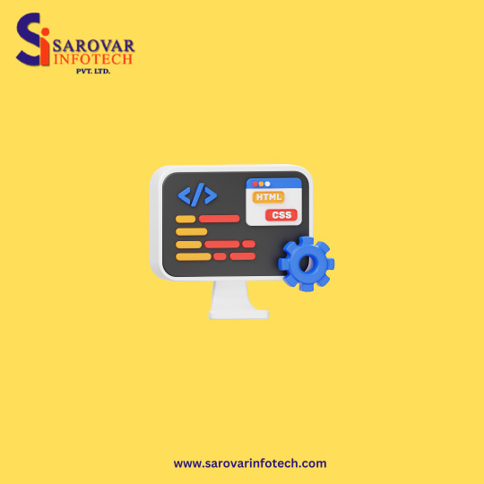
0 notes
Photo

Being fully responsive, WordPress supports all mobile platforms and screen sizes. Unlike custom-made HTML websites, you don’t have to create a separate version of your website for smartphones and tablets.
WordPress is a fully responsive content management system. Any user can run and update the website separately on different screens and reduce the hassle to check out the websites.
Themes of WordPress like Divi, Hestia, Astra, OceanWP, Tusant, etc. have the inbuilt responsive capability in the theme directory. They are pre-optimized for mobile screens, especially when you buy premium WordPress themes. Also, WordPress offers different plugins to develop a mobile version like WPTouch, Jetpack, WPTouch, etc.
0 notes