#Wabb Art
Text

I have finished my Lizzie painting!!! :)
#wabb art#fanart#ddvau#lizzie#ldshadowlady#lizzie ldshadowlady#cutie pie#finished piece#traditional art#GOD DAMM I LOVE HER#meow meow#my art <3#hand painted
29 notes
·
View notes
Photo
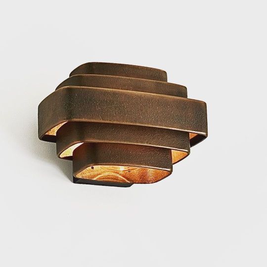
SMALL WALL LAMP (INTERIOR) RAW BRONZE, 1969. This wall-lamp was designed by Jules Wabbes and manufactured by General Decoration from 1969. Made of five rings of cast bronze. Other model by the creator were designed in the same way but in brass. Wabbes often utilized a series of curved flat portions of different dimensions. This lamp is suitable for indoor and outdoor use thanks to a system of glass which protects the bulb. The bronze takes a beautiful patina with time and weather. 📸 @nicolas_schimp #bronze #craft #madeinbelgium #juleswabbes #handmade #art #architect #interiorarchitecture #interiordesign #design #bronzecast #craftmanship #original #designer #art https://www.instagram.com/p/CdfZLTottuM/?igshid=NGJjMDIxMWI=
#bronze#craft#madeinbelgium#juleswabbes#handmade#art#architect#interiorarchitecture#interiordesign#design#bronzecast#craftmanship#original#designer
2 notes
·
View notes
Text
Peeter Allik
Sobre el artista

Peeter Allik (Junio 28 de 1966, Põltsamaa, Estonia) es un artista gráfico y pintor con enfoque surrealista y tendencias dactiloscópicas en blanco y negro. Allik estudió gráfica y pintura en el departamento de Bellas Artes de la Universidad de Tartu y en la Academia Estonia de las Artes entre los años de 1987 a 1993.
En 1988, en conjunción con los artistas Albert Gulk, Ilmars Kruusamae, Priit Pangsep y Priit Pajos, fundó el grupo Kursi Koolkond. Allik ha recibido varios premios gracias a su trabajo: el premio Ado Wabbe (1997), premio Konrad Mägi (2001), Gran Premio de la VIII Bienal Internacional de los estados Bálticos en Kaliningrado (2002), entre otros.
Sus obras han formado parte de exhibiciones alrededor del mundo, tanto individualmente como en grupo. Por mencionar algunos de los países en los que se ha presentado están Estados Unidos, Alemania, Francia, Corea, Brasil, Rusia, Canadá, China...

Melancholia, 53 x 74 cm. Linografía, 1999.
Sobre su trabajo, Allik dice:
My work is about the present situation. It is not an art of eternity or eternal beauty! Just todays situation – this is my eternal beauty. If you live your life now, you know what the past is, and what the future is.
Obra
Como él mismo menciona, sus trabajos tiene como motivo principal temas de actualidad, sin ajustarse a los estándares de belleza del mundo del arte. Es completamente salvaje, brutal y libre.

Eternal social practices, 80 x 60 cm. Linografía, 2013.
La técnica que utiliza para sus grabados es la linografía, donde la matriz de grabado es el linóleo. Este material le permite grabar la imagen en negativo sobre la superficie con ayuda de gubias y cuchillas.

Brainwashing-machine, 55 x 79 cm. Linografía, 2006.
Opinión
Personalmente, me llamó mucho la atención las distintas piezas de la serie How to become rich and beautiful porque gira en torno a ciertas actitudes apáticas e inmorales que ciertamente suceden en el mundo real pero frecuentemente hacemos la vista gorda ante su presencia.

How to Become Rich and Beautiful I, 60 x 80 cm. Linografía, 2006.

How to Become Rich and Beautiful II, 60 x 80 cm. Linografía, 2006.

How to Become Rich and Beautiful III, 60 x 80 cm. Linografía, 2006.
Consumismo, odio, egocentrismo son algunas de las actitudes que nos presenta con visuales impactantes. La dactiloscopía está presente en la mayoría de sus trabajos de grabado y le dan un carácter hipnotizante a sus piezas.
Su trabajo se enfoca en la realidad, como también lo hace Gabriela Jolowicz, de quien hable en la entrada pasada; sin embargo, la perspectiva que él toma es más oscura, hablando de tópicos que usualmente se evitan en la típica conversación.
Peeter Allik es sin duda un artista que utiliza el arte como crítica de alto impacto a la sociedad. Conocer su trabajo me ayuda a expandir la visión de las posibilidades del arte, no sólo como herramienta estética, sino también para causar shock, criticar y comunicar fuertes mensajes que merecen ser escuchados.
𝘌𝘴𝘰 𝘦𝘴 𝘵𝘰𝘥𝘰 𝘱𝘰𝘳 𝘮𝘪 𝘱𝘢𝘳𝘵𝘦, 𝘤𝘢𝘮𝘣𝘪𝘰 𝘺 𝘧𝘶𝘦𝘳𝘢.
0 notes
Text
Zensur in der Musik - Das Jahr 1955
Die Polizei von Bridgeport im Bundesstaat Connecticut sagt eine Tanzveranstaltung im Ritz ab. Auftreten sollte dort Fats Dominio. Die Behörden sagen daraufhin, dass die Absage deshalb erfolgt ist, weil man ihnen sagte, es soll Rock’n’Roll getanzt werden. Rechtfertigen tun sie diese Aktion damit, dass in der nahen New Haven Arena Unruhen ausgebrochen waren, weil dort eben gerade Rock’n’Roll getanzt wurde
Der in Mobile (Alabama) stationierte Radiosender WABB bekommt über 15’000 Reklamationsschreiben weil sie «schmutzige» Musik spielen würden. Die Antwort des Senders liess nicht lange auf sich warten und sie versprachen in Zukunft keine fragwürdige Musik mehr zu spielen, vorallem keinen Rhythm und Blues mehr
Eine Änderung des Urheberrechtsgesetzes wurde zum Glück vom amerikanischen Kongress ausgeschlagen. Die Änderung, eingereicht von Sänger LaVern Baker, sah nämlich vor, weissen Musikern das Covern von R&B Songs zu verbieten. Sehr zum Glück von Künstlern wie Pat Boone und vielen anderen damaligen recht erfolgreichen weissen Musikern die sich dieser Stilart bedienten. Übrigens wurde ihr Klassiker Tweedlee Dee von Georgia Gibbs gecovert und ein grosser Hit. Georgia Gibbs selbst war eine weisse Künstlerin. Baker verklagte die Plattenfirma von Gibbs in der Folge auf geistigen Diebstahl, weil der Song Ton für Ton so übernommen wurde, verlor aber den Prozess. Ich selbst hintersinne mich dann vorallem bei der Tatsache, dass LaVern Baker gegen Ende ihrer Karriere mit dem Komponisten und Produzenten Duo Jerry Leiber und Mike Stoller zusammenarbeitete, beides Weisse, die vorallem durch ihre Arbeit mit Elvis Presley bekannt waren.
Zensur in der Musik – Das Jahr 1955 was originally published on The Art 2 Rock
#1955#Elvis Presley#Georgia gibbs#Jerry Leiber#LaVern Baker#Mike Stoller#Pat Boone#Rock'n'Roll#Zensur#theart2rock
0 notes
Text
9 Small-Space Ideas to Steal from a Tiny Paris Apartment
Paris architect Philippe Harden likes to work on a human scale. Paying close attention to “materials, proportions, and colors that let you feel good,” he creates rooms that are minimalist but also intimate and tailored for living. Case in point: this one-bedroom apartment in an Art Deco building close to the Eiffel Tower that Harden remodeled for a man who works in publishing.
Borrowing from Peter to pay Paul, the architect reorganized the 592-square-foot space: The former kitchen was turned into a TV room, a closet became the kitchen, and the bedroom fireplace got replaced by a wardrobe—all of which now revolve around a central living area with a new hearth. Join us for a look at the many ways Harden artfully makes the most of every inch.
Photographs by Philippe Garcia and Philippe Harden.
1. Paint a recessed area a darker shade to create depth.
Above: The living room’s new feature wall has a gas fireplace and shelf tucked into a niche. Harden painted it a space-enhancing green-black that references the 1930s heritage of the building (and was also inspired, he says, by the bold tones of Adolph Loos’s Villa Müller in Prague, which he visited last year).
Framed by Farrow & Ball Wimborne White walls, the niche, painted in Farrow & Ball Green Smoke, gives the room added depth and visual interest. “Green is complementary with the brown wood of the floor,” notes Harden. “Dark colors are interesting because they change color according to the different moments of the day.”
2. Choose versatile furniture pieces.
Above: For the furnishings, the owner requested modernist icons, including a Noguchi coffee table, Eames Walnut Stool, and Eames Lounge. To make these pieces work well together—with maneuvering space—Harden pulled apart the Eames lounge chair and ottoman to create two seating opportunities. The standing lamp in the foreground is the Ella from Caravane.
Harden’s advice for arranging a room is to do it by instinct: “Forget about the rules; think with your feelings.”
3. Position a round dining table in an unused corner.
Above: How to fit a dining table into a small living room? Neatly tucked into a corner, a round Saarinen Tulip Table is a lot less imposing than a rectangular dining table, and gives the room a dual purpose without feeling crowded.
4. Keep sight lines unobstructed.
Above: Eames Side Chairs with see-through bases that reference the Eiffel Tower keep the corner looking airy. So do the windows; Harden was able to forgo window treatments thanks to pocket shutters. The white on the walls is Farrow & Ball’s Wimborne White.
5. Use mirrors to enhance a sense of space.
Above: A flea market mirror in the niche adds dimension, as does the vintage Roger Prigent fashion photograph hanging outside the new kitchen.
6. Unite spaces by using a single flooring material.
Above: In the streamlined kitchen, Harden installed a new floor stained to match the apartment’s existing wood floor and create coherence.
He also introduced subtle color and texture: The backsplash tiles are Zelliges from Emery & Cie and the cabinets are two-toned: The lower cabinets are painted Farrow & Ball Mouse’s Back, a neutral stone color (as is the wall outside the room), and the upper are Farrow & Ball Old White.
7. Install wall sconces whenever possible.
Above: Sconces take up less space than floor lamps, and some, such as the TV room’s 1960s Art Deco design, pattern the wall with light. They’re by Belgian architect Jules Wabbes, reissued by J.J. M. Wever & Ducré. Another space saver: The Bruce Sofa by Zanotta doubles as a guest bed.
8. Use pocket doors.
Above: Doors require swing space; they also add to the visual busyness of a room. For a tidy division between the bedroom and living room (which has several doors), Harden installed a pocket door.
Another graceful detail worth noting: The living room’s built-in bookshelves turn the corner and continue in the bedroom. The shelves are evenly spaced and sized to fit the owner’s literature collection; his art books go in the living room niche.
9. Splurge on luxe materials in the tiniest space.
Above: Square footage gained for the living room meant the bathroom had to be tiny—but not uncelebrated. In a small space, you can splash out on materials because not a lot are required. Harden lined the walls and shower with natural marquina marble tiles and the sink top with marquina marble. The sink is glazed steel—”which allows for a very thin contour”—and is from Alape. The overhead light is a DIY, made “from spare parts: a glass globe and brass tube mounted by our work crew; it’s inexpensive bespoke.”
Above: The floor plan details the allocation of space—and the way Harden was able to carve out the addition of a TV room by relocating the kitchen. The compact bathroom is situated on one side of the fireplace, which is flanked on the other by a WC.
Take a look at another Philippe Harden small-space design, The Perfect Paris Pied-à-Terre, Ikea Kitchen Included.
And for more small-space remodeling wisdom, go to:
Small-Space Solutions: 17 Affordable Tips from a NYC Creative Couple
Build It for Less: 5 Tips from a Spec House Designer
The No-Cost Remodel: Carmella’s 7-Step Plan to Clutter-Free Living
from garage2 http://ift.tt/2m26Swr via great info
0 notes
Text

I have finished my painting and he is beautiful!!
#ddvau#tango#art#tango fanart#tango tek#i love him#Wabb Art#my little guy#fanart#cutie pie#tangotek#Gaaaaaaaaaaaaaaaa My Skrungly#finished piece#He’s love struck
31 notes
·
View notes
Text
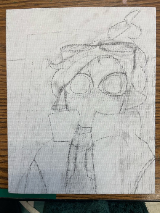
I’m working on another painting and this one shall be ✨Lizzie✨ just finished the sketch earlier today!

#lizzie ldshadowlady#ddvau#fanart#meow meow#honestly she is so pretty I want to be friends with her!!#ldshadowlady#sketch#wip#Wabb Art#I have actually started painting already so y’all will see her soon#Lizzie
15 notes
·
View notes
Text
A sketch Iv done for a painting I’m working on right now:)
#tango#tangotek#tango tek#tango fanart#fanart#ddvau#sketch#work in progress#cutie pie#I really like this sketch and that is unusual for me#Gaaaaa my skrungely#my little guy#this is a lot of tags#Wabb Art#art
16 notes
·
View notes
Text

God I love drawing Canaries!!
#canary#you know who this reminds me of#jimmy#aka#jimmy solidarity#my art <3#wabb art#drew him for my art final 
3 notes
·
View notes
Text

My latest painting :3
1 note
·
View note
Last Seen Blogs

fiatmihi
ora pro nobis

fgfghgjgh
Untitled

lesbian-axalotl-13
Lesbian Axalotl

skamtuturo
skam (remakes) sideblog

kayleecrossing
あつまれ!