#adding paper textures and playing with layer modes results in some really nice textures
Explore tagged Tumblr posts
Visit Tumblr Blog
Explore Tumblr blogs with no restrictions, modern design and the best experience.
Last Seen Tumblr Blogs


Fun Fact
Tumblr has a low social media market share in South America.
Text


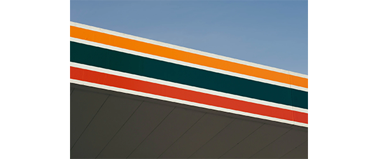
📷 Bewit Bridge, The Talons, Central Rosaria
More experiments under the cut:
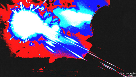

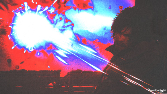
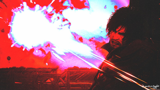
#final fantasy xvi#clive rosfield#jill warrick#sir wade#torgal#ffxvi#final fantasy 16#ff16#final fantasy#ff#virtual photography#vp#dayasanxv#i didnt like the colour editing on the original screenshot so i decided to just fuck them up completely lol#adding paper textures and playing with layer modes results in some really nice textures
16 notes
·
View notes
Text
Development | Blue Hat Animation in After Effects

After some light colour correction on Photoshop, I brought the scan into After Effects and started playing with the Basic Correction values on the Lumetri Colour effect. After this, I brought in my main text animation and set it against the background. Then, I animated the position of the background and the text such that it looked like the text was pinned to the scrap paper I intended to be the title section.

Then, I began work on the handwritten text animation. I chose a suitable script font and created a stroke everywhere I wanted the text to be "written." The, I used a stroke effect to animate the strokes as a sequence of masks, et voila! It was done.

After this, I added the text to my final render composition and timed everything in a way that made sense. I also made minor corrections to the main text, like lifting the values a bit using an Exposure effect and adding a Noise effect to make the type more interesting.

I wanted some of the texture to show through the main type, so I changed the blend mode of that layer to overlay. Similarly, I felt like the halftone pattern I used prior could be used in the background, so I tried it out. It looked nice, but I was losing out on all the juicy details from the scan. My solution to this was to change the blend mode to Overlay (I later changed it to screen, as it was more subtle), creating a mask and subtracting the pattern from the middle, such that only the edges were patterned, and feathering that mask. Off screen, I also changed the subtitle colour to a dark blue, to emulate a ballpoint pen, and slightly softened the edges of the text using a Gaussian Blur. This was the end result;
Overall, I am incredibly satisfied with the result. Initially, I was planning on creating the background as a graphic on Illustrator, however the stroke of genius of using real life elements really lended itself to the feel of this project, as I wanted to incorporate a hand made element as part of the cohesion between videos. I may go back and fix the easing on the subtitle if I'm tempted to, but for now I'm going to press onward. Two down, four to go!
0 notes
Photo

✧ TEXTURES – A TUTORIAL BY EVANSYHELP.
In this (long and image-heavy) tutorial, I’ll be showing you how I make textures, as requested by a very kind anon. I use Photoshop CC 2019 but you should be able to replicate my methods on most editing software. Please like or reblog this post if you find this helpful!
Index.
Ethically Sourcing Your Images.
Finding The Right Image.
Making Your Texture.
Other Tricks I Use.
Quick Recap.
Making Textures Without Images: Speedrun.
Outro.
Ethically Sourcing Your Images.
I will be explaining a couple quick ways to make textures without any images at the end of the tutorial, but since my personal favourite way involves images and that’s specifically what the anon requested, that’s what the majority of the tutorial will be focused on.
The first step, naturally, is finding an image to use. My personal favourite site is Unsplash, but there are plenty of options out there.
What you need to keep in mind is what kind of license the images have. Unsplash is free for personal and commercial use with no attribution required, which makes it perfect for things like this. There are more sites like this in my free for commercial use masterlist (linked at the end of the post), but unless you’re using them in products you’re selling (like graphic commissions), the commercial aspect isn’t something you need to worry about. Just check the site/photographer’s rules to make sure you’re allowed to edit the images for personal use, and whether attribution (credit) is required.
Another important thing to keep in mind is that these sites typically never allow you to redistribute the images as they are. That means you can’t just go to Unsplash’s texture category, save the images without any changes, and reupload them in a texture pack on Tumblr. That’s stealing. We don’t do that.
Finding The Right Image.
Knowing what kinds of images will make good textures is a learning curve. My first couple texture packs are rough compared to what I make now, because I basically taught myself with no guidance and learned through trial and error. But with practice, I learned what worked and what didn’t.
You want your images to be HQ, either with no ‘subject’ (ie. a person) or with a large background. Higher contrast is better but not super necessary. You should hopefully be able to envision what kind of texture you want to make before you even touch the image.
Making Your Texture.
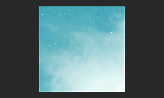
For the majority of the tutorial, this is the image I’ll be working with. Credits can be found in the link at the end of the post.

Open your canvas. You can make specialised textures, like 100px for icons or 540px for Tumblr graphics, but I personally prefer to make them large for versatility. I’m using 800px in this tutorial. Once you’ve chosen your size, upload your full-size image into the canvas. This is where the fun begins!
Drag the image around into a nice position. Or use Edit > Transform to rotate, flip, and warp the image in different ways. Or use Edit > Free Transform (Ctrl+T) to change the size or the angle more precisely. Or probably some combination of all three! With Free Transform, make sure this aspect ratio anchor is selected so you don’t butcher the quality of the image, unless you’re warping it intentionally:

This is all very individual to each image you use. You might want to flip one, shrink another, put another at a 30 degree angle. Just experiment until you end up with something you think would look awesome as a texture. For the sake of providing a good example, I flipped this image vertically, shrunk it to 80% its original size, and rotated it until it looked like the smoke/cloud was coming from the bottom right corner. This is what we have:
Then we move onto enhancing. Textures work best when there’s a lot of contrast because it’s easier to manipulate the blending modes. So if your image isn’t already high contrast, these adjustment layers (Brightness/Contrast, Levels, and Selective Colour) are your new best friends:

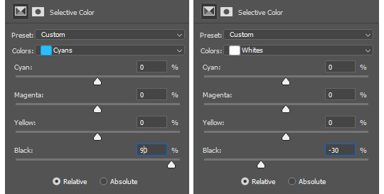
If you don’t see this on your Photoshop, go to Window > Adjustments and it should pop up. Again, just experiment, because different images will require different things. Essentially, you want to make the darks darker and the lights lighter. Something I like to do is add a Selective Colour layer and use the Black slider. Pick out the primary colour of the image, and then Whites, in the drop-down menu, and move the bottom slider (left to lighten, right to darken) until you’re satisfied. Like so:
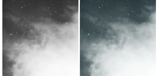
So with those Selective Colour settings and the following Levels settings, here’s the before and after of my image.


Much better contrast! If you want to end here, you can, but I personally prefer grayscale textures a lot of the time because it makes it more versatile. Instead of being forced to make a blue graphic because this image is blue, I can make any colour graphic I want with one simple black and white Gradient layer. Photoshop does have a default Black & White adjustment feature, but I prefer using Gradients.
Pro tip: if your image doesn’t have a pure black, you can keep the darkest parts of your image dark by using the left slider, shown below.


A lot of the time, I’ll also decrease the opacity of that Gradient layer, to somewhere between 80% and 95%, so just a hint of the original colour comes through. This gives it more dimension in my opinion, while still keeping it mostly neutral. Here’s 100% vs. 85%:
You may find that you want to add a little more contrast after. With this texture, I decided to grab another Selective Colour layer, pick ‘Black’ in the drop-down menu, and pull the Black slider up to +40. I also settled on 95% opacity for the Gradient. And here’s the final product!

Other Tricks I Use.
That covers how I make a lot of my easier textures, but here’s a quick run-through of other, slightly more complex tricks. I’ll be working with this image (again, credit at the end of the post):
This, of course, is not as obviously texture-worthy as the previous example, but I love textures with strong lines, so here’s how the magic happens! I wanted to get rid of the detail on the bottom half, so I used the Polygonal Lasso tool to select it:

Then I used the eyedropper tool (the 4th symbol under the polygonal lasso in the image above) to select the blue of the sky and, on a new layer, painted that selection completely blue. I decreased the opacity to 90% just so it wasn’t a total block colour, but not enough that you can really see the lines. I repeated this process for the sky, so it looked more consistent with the bottom half.
Then, using the eyedropper tool again and making a new layer for every colour, I went in with a small soft paintbrush and painted out the harsh vertical lines on each segment of the stripes. I didn’t want to make them totally perfect, but I painted over the bulkiest interruptions.
I added a black and white Gradient layer, using the slider tool I showed you before to darken the darks and lighten the lights, and decreased it to 50% so that it wasn’t totally black and white but still more neutral than the original. Here’s the result:
Another fun way to shake things up, which unfortunately will require Photoshop (CS6 should be fine, not sure about earlier versions), is the Filter Gallery. Go to Filter > Filter Gallery, and you’ll find a TON of effects that change your image drastically. Most of the default settings are nightmarish, but you can play around with the settings panel on the right.

Here’s just a few results that are possible with the Filter Gallery, labelled for convenience. You can view the HQ versions in the link at the end of the post.

Quick Recap.
So you don’t have to reread this obnoxiously large tutorial every time you want to reference it in the future:
Choose a HQ image.
Resize, rotate, flip, and/or warp.
Enhance the contrast.
Black and white!
Paint over problem areas!
Filter > Filter Gallery.
Making Textures Without Images: Speedrun.
We’re almost done! There are some tools built directly into Photoshop that can allow you to make textures completely from scratch, and I’ll briefly cover my favourites here.
The first is pattern fill layers. I spent too many years not appreciating the patterns feature in Photoshop, but they’re great. Go to Layer > New Fill Layer > Pattern, click ‘OK’ on the box that pops up, and another box will pop up to let you choose your pattern.
By themselves, they are UGLY. It can take a while to figure out how to use them. But if you change the scale, change the blending mode, and change the opacity, you have thousands of textures at your fingertips. And if you add two or three together? Billions of possibilities. I can do a more in-depth tutorial on patterns if y’all are interested, but here’s two examples I just whipped up in a matter of minutes, using two patterns on each:

The next feature is gradient fill layers, and the gradient tool. Go to Layer > New Fill Layer > Gradient… to select a gradient (or make your own!) and an angle, OR use the gradient tool (featured below) to drag the gradient across your canvas manually. On its own, boom, that’s a gradient texture. Paired with a pattern or put through the Filter Gallery? Even better!


The last is brushes. Brushes can be great for textures because there are so many kinds. You want to make a paint splatter texture? Paint splatter brush sets are everywhere! You want to make a smoky texture? You can get brushes that look like smoke! Smudged? Scratchy? Grunge? Halftone? Light leaks? Torn paper? Brushes have your back.

With all of these features (and things like actions, too!), your saving grace is going to be this little cog wheel shown below, and the list you’ll find under the Reset/Save/Load section. There are SO many more options built directly into Photoshop that you don’t even see right away, because you have to add them manually from this little cog wheel.

And you can download countless more patterns, gradients, and brushes from sites like Brusheezy and DeviantART. A couple tutorials on downloading and installing them can be found in the link at the end of the post, but remember, download these things ethically. If you want to sell products that use a custom brush, it’s your responsibility to find brushes that are free for commercial use. If you don’t want to credit the creator, it’s your responsibility to find resources that don’t require attribution.
Outro.
I think that’s everything, guys! If you found this tutorial helpful or otherwise enjoy my content, please consider supporting me on Ko-fi! I offer exclusive rewards, like custom graphics, to everyone who donates.
Due to Tumblr’s latest rules about links, you can find the credits list, the promised bonus tutorials, other important links, and the full-size HQ versions of the textures made in this tutorial over here.
Thanks for reading!
#rph#allresources#completeresources#itsphotoshop#chaoticresources#photoshop tutorial#photoshop resources#photoshop help#ps resources#ps tutorial#eh#eh: tutorial#tutorial#ps help#texture#*100#*250
371 notes
·
View notes
Text
Pixio PXC273 Curved Gaming Monitor Review: 144Hz and DCI-P3 on Budget
When shopping for a new monitor, the first thing most consider is price. Features and performance are important, but price is king, especially if you’re on a tight budget. A relatively new brand, Pixio offers the PXC273 with specs that can challenge some of the best gaming monitors. That includes a speedy 144Hz refresh rate in a 27-inch FHD (1920 x 1080) resolution package. The best part is it sells for just $200 at the time of writing. But that low price also means making some sacrifices, including around image quality
Pixio PXC273 Specs
The PXC273 starts with a high-contrast VA panel running at 1080p resolution. The biggest surprise is its wide color gamut. Pixio doesn’t specify the coverage, and since there’s no HDR here, we’d expect a screen that sticks to the sRGB color gamut. But after testing, we discovered it covers more of the DCI-P3 spec than nearly every other monitor we’ve tested. A little more digging revealed a Samsung-sourced panel with a quantum-dot backlight. Users looking for maximum color will certainly want to check out the PXC273.
Like most monitors today, the PXC273 has a flicker-free backlight. Pixio specs it with a max brightness of 200 nits and contrast ratio of 3,000:1, but we found higher numbers in our testing. Right out of the box, this display offers some nice surprises.
At $200, the value ratio is high when you take specs and features into account. But the proof is in the testing and gameplay.
Unpacking and Accessories
The only bundled cable is DisplayPort, which you’ll need to use the maximum 144Hz refresh rate. If you use the HDMI port you’re limited to 120Hz, and DVI tops out at 60Hz. The power supply is a small wall-wart. You must assemble the stand and base, but tools aren’t required.
Product 360
The PXC273 features a no-frills design that leaves out things like lighting effects, USB ports and speakers. The screen is surrounded by thin 8mm bezels and flush-mounted. There’s a tight-fitting anti-glare layer that minimizes the air gap to the TFT (thin film transistor), resulting in a clear picture with no grain. There was no bleed or glow on our sample.
The stand is quite light and offers only a 15-degree tilt adjustment. It’s made from plastic and attaches near the bottom of the panel. There’s a bit of wobble, thanks to a small mount point. The base is small, saving some desktop space but sacrificing a little stability. The back also features a 75mm VESA lug pattern if you want to use your own stand or bracket.
The curve radius is 1800mm, which is a little more open than recent screens we’ve reviewed that are 1500mm in the same size and aspect ratio. In practice, the curve was barely noticeable and neither enhanced or detracted from the image. The curve only showed a significant impact if we were using two or three monitors simultaneously. But at the PXC273’s price, three screens aren’t out of the question.
The PXC273’s simple design extends to its on-screen display (OSD) control, which is a single joystick that works well with a solid click and feel.
The input panel has one each of DisplayPort 1.2, HDMI 1.4 and DVI. We don’t see the latter much on newer screens, and in this application, due to its 60 Hz refresh rate limit. Even though the monitor is only certified to support FreeSync with AMD graphics cards, we also found that the monitor is G-Sync compatible, even though Nvidia hasn’t officially certified it as such, with the DisplayPort .
In lieu of speakers, there’s a 3.5mm headphone jack and volume control in the OSD.
OSD Features
The OSD appears as a strip across the bottom of the screen, similar to AOC’s method but far less intuitive. Large icons represent different functions, not all of which are obvious at first glance.
The first three options are easy enough to understand. DCR is a dynamic contrast feature, which we recommend leaving off. The PXC273 has excellent contrast already, and DCR will just clip highlight and shadow detail. There are five picture modes, but only Standard comes anywhere close to providing accurate color. The native and only available gamut is DCI-P3; there’s no sRGB mode or HDR. This means you see more color than intended for all content, which may be attractive to some users.
Color adjustments have two color temp presets, plus a user mode with RGB sliders. They work well and can improve the PXC273’s image with a few tweaks. Gamma presets are in a menu called Adjust. Confusingly, that menu shows a picture of an aiming point, which made us think that’s where one adjusts the aiming point. Nevertheless, Adjust features two gamma presets. The gamma presets also have two options for DVI only: auto adjust and auto color.
The Other menu includes overdrive (on or off) and a FreeSync toggle. With the FreeSync toggle on, our Nvidia control panel instantly recognized the PXC273 as G-Sync Compatible, even though Nvidia hasn’t officially certified the display.
All menu screens show the input resolution and refresh rate at the top left and the firmware version at the top right.
Setup and Calibration
Only the Standard picture mode offers accurate color and only in the DCI-P3 gamut. There is no sRGB mode. The default color temp preset is Custom, which needs some tweaking for best results. We only needed a few clicks to bring grayscale tracking to a high standard. The default gamma is quite dark, but changing the gamma from 2 to 1 improved the luminance curve; although, it still wasn’t perfect. Overall color was good once we made these changes.
Gaming and Hands-on
On paper, the PXC273 looks like a winner, but specs don’t always translate to gaming performance. Luckily, in the PXC273’s case, it did. We had to make a few adjustments after calibration, but eventually, we tweaked the monitor to a point where it stood up well against other 27-inch gaming displays costing more, like the Aorus CV27F and Samsung C27RG5. We saw no difference in video processing quality between playing with FreeSync or using G-Sync (unofficially, again, see our article on how to run G-Sync on a FreeSync monitor). Neither platform showed any artifacts. Frame rates hovered around 100 frames per second (fps) with an AMD Radeon R9 285 graphics card and stayed near the max 144 fps with a Nvidia GeForce GTX 1080 Ti FE.
We fired up Tomb Raider and noted quickly that it looked a little drab. Color was nicely saturated and detail was excellent, but the pop expected from a monitor that delivers, according to our test, 4,100:1 contrast wasn’t there. The culprit was a dark gamma curve, which, even after changing the preset from 2 to 1, made the picture murkier. Turning up the backlight to its maximum improved things.
The overdrive worked well at managing motion blur, which was almost invisible at the highest frame rates. There were neither artifacts nor ghosting. Control response was as expected for a 144Hz monitor: instant with no stutter or lag. We’re getting more accustomed to playing sRGB games in extended color. Since the PXC273 runs in DCI-P3 all the time, there was no other choice. But it didn’t diminish the experience for us.
Call of Duty: WWII is a good test of a monitor’s shadow detail rendering. The Pixio had no issues there. As we holed up in a bombed-out church we saw fine texture among the rubble with clearly visible splinters of wood and fine dust. Characters’ faces had an ideal level of sweat and dirt that really added to the game’s depth and realism. Once we played for a few hours, we forgot that the monitor was just FHD. Fast frame rates and high contrast have a greater impact on gaming image quality than high resolution.
After working in Windows for an afternoon, we missed having a higher pixel density. Our sweet spot is 109 pixels per inch (ppi), but the PXC273 has just 81.6ppi. Tiny fonts in a spreadsheet were harder to read. Workday tasks are the only limitation for an FHD monitor; QHD (2560 x 1440) is still an ideal resolution that works well for just about everything one does with a computer.
Uncalibrated – Maximum Backlight Level
Today’s group are all 27-inch VA panels. Besides offering HDR, the Aorus CV27F and Aorus CV27Q are similar to the PXC273 in every other way. Also here is Samsung’s C27RG5, the MSI Optix G27C4 and MSI Optix MAG271CQR.
Pixio claims 250 nits max brightness for the PXC273, but our sample delivered about 322 nits. That’s plenty of light for any application or environment. There’s no backlight strobe or HDR here, so any more brightness would be unnecessary.
The black level is very low at just 0.0776 nit. Only the two Aorus screens can get darker, but they don’t quite match the PXC273’s performance in the intra-image test (3rd chart). For sequential contrast, Pixio is the best of the rest with a super result of 4,147.8:1. The PXC273’s dynamic range is among the best we’ve tested.
After Calibration to 200 nits
Calibration (see our recommended settings) didn’t change the PXC273’s contrast much at all. It’s still nearly 4,000:1, which puts it ahead of every display here, save the Aorus screens. This is all thanks to an excellent black level that helped up the ANSI test results. Coupled with a large color gamut, this monitor delivers a really good picture with lots of depth and highly saturated color.
For the best color, stick with the PXC273’s Standard picture mode and Custom color temp. They deliver reasonable color accuracy out of the box. Improvements are possible with a few adjustments.
Grayscale and Gamma Tracking
Out-of-the-box Standard mode (graph 1) has grayscale tracking running a bit green from 40% brightness and on. Given the PXC273’s price point, we can forgive this default performance. What’s more concerning is the gamma tracking. It makes the picture darker than it should be and reduces the effect of all that wonderful contrast. You can compensate somewhat by turning up the brightness, but gamma tracking closer to 2.2 would be a better solution.
Once we adjusted the gamma presets in the Adjust menu (2nd chart), we improved the curve visibly, but it was still darker than it should be. The PXC273 would have more pop if the upper brightness steps were at the correct output levels instead of slightly under. This could be fixed with a firmware update that included a more-accurate gamma preset. However, our grayscale calibration had a positive effect, with all errors moving below the visible threshold.
Comparisons
In the recent past, a 4.27 Delta E (dE) average grayscale error would be typical for a gaming monitor. But today’s displays boast better out-of-box accuracy, as evidenced by our sample group. The top four monitors in the grayscale error chart don’t require calibration. However, the PXC273 should be calibrated for the best possible picture (see our settings on page 1).
We couldn’t completely fix the PXC273’s gamma tracking with our adjustments. Changing the preset from 2 to 1 made a visible difference, but it still didn’t track as well as the two Aorus or Samsung monitors. Ultimately, we like the Pixio’s image, but it could be even better if the gamma were more accurate.
Color Gamut Accuracy
It’s obvious from the initial gamut chart that the PXC273 is a DCI monitor. All colors are oversaturated in the sRGB realm except for blue. The average error is increased by a low color luminance level, which is largely due to the high gamma values we recorded.
Calibration brought the secondary colors onto their hue targets, but the over-saturation didn’t change. If you’re looking for an accurate sRGB gaming monitor, the PXC273 is not it. But if you like a more colorful presentation, it will suit just fine. You can see in the final chart that it covers a large part of the DCI-P3 gamut, coming up short only in the green primary. Again, the average error is inflated by low color luminance. Fixing the gamma to a proper 2.2 level would address that issue.
Comparisons
With a calibrated color error of 2.62dE average, you won’t see any major issues in the PXC273’s image presentation. Our recommended settings make things visibly better with greater image depth and a more natural look.
In the gamut volume calculation, the PXC273 turned out to have one of the largest gamuts we’ve seen in a gaming display. It covers almost 85% of DCI-P3, which is more than some HDR-capable screens, like the Aorus CV27F. With over 124% coverage of sRGB, you’ll need a custom profile to rein in the gamut if you do anything color-critical. For gaming, however, many will welcome the extra color.
Viewing Angles
The PXC273 acquit itself well in the viewing angle test. Our photo shows a green shift at 45 degrees to the sides and a 30% light reduction. Detail remains solid in both the horizontal and vertical planes with all steps still visible. From the top, the gamma is much lower, making lighter shades harder to see. Performance is typical of other VA panels we’ve reviewed.
Screen Uniformity
Our PXC273 sample has some of the best screen uniformity we’ve ever measured. There are no visible hotspots, bleed or glow. This is impressive, given the tight fit of its anti-glare layer. Dark material was artifact-free and remained well-detailed down to the zero-signal level. This is excellent performance.
Pixel Response and Input Lag
A gaming monitor must deliver speed and smooth game performance above anything else. The PXC273 manages both. Its 8ms screen draw time is 1ms slower than typical 144Hz screens, but in practice we couldn’t see a difference. Motion blur was barely visible, and there was no stutter, no matter how fast on-screen movements were.
Input lag is last place among our comparison sample, but 29ms is by no means slow. Unless you’re a highly skilled gamer, you won’t notice any lag when playing fast-paced games on the PXC273. To casual gamers, control response will feel every bit as fast as with the other screens here. Those with more frag cred will want to check out the Samsung C27RG5, which recently set a new speed record in our testing. For everyone else though, the $200 PXC273 is more than qualified for the weekly LAN party.
When shopping for a gaming monitor, the principal considerations come down to price, performance and features, and in most cases you’ll have to sacrifice one of those. But if you’re willing to give up features like speakers, USB ports, RGB lighting and fancy styling, the Pixio PXC273 is worth considering. It has a few flaws; but when gaming it manages to deliver a lot for just $200.
On the positive side, it supports both FreeSync and G-Sync (unofficially) up to 144Hz, has an effective overdrive that eliminates motion blur and low input lag. Contrast is better than many other VA panels, and it delivers nearly 85% coverage of the DCI-P3 color gamut.
To get the best possible image, including nixing a green tint, some adjustments are required. Once we made those changes, we enjoyed a decent picture in both games and video. That means an artifact-free experience without frame tears, stuttering or overdrive ghosting. The extra color afforded by its native DCI-P3 gamut will appeal to many, but if you want an sRGB mode, you’re out of luck.
The Pixio PXC273 has room for improvement, but when considering its price it’s hard to fault. At $200, it undercuts similar displays by at least $100, and that may be enough to overcome what’s been left out. For the price-conscious gamer, we have no problem recommending the PXC273.
0 notes