#alma using serifs!!
Text
just remembered how we have canon madrigals handwriting drops
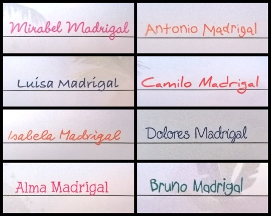
#encanto#encanto disney#disneys encanto#mirabel madrigal#isabela madrigal#disney’s encanto#bruno madrigal#luisa madrigal#camilo madrigal#dolores madrigal#antonio madrigal#abuela alma madrigal#let’s talk about how similar mirabels is to isas….#you are NOT fooling me mirabel madrigal#it’s kinda cute how she definitely admires isa but would rather shoot herself in the foot than admit it#alma using serifs!!#Antonio’s is actually really neat for a 5 year old but I can see it#Bruno’s is the actual 5 year old one💀
254 notes
·
View notes
Text
Top 11 Minimalistic Fonts That You Must Know
With 8.25 seconds of human attention span, it becomes difficult to grab the attention of potential customers. In the world of branding, the choice of fonts can be just as important as the choice of colors or imagery. When it comes to creating a minimalist aesthetic, the right font can be the key to success. Minimalism is all about simplicity, clean lines, and clear messaging, and the right font can help to reinforce those ideas. Branding agency in ahmedabad can be your guiding light in choosing
But here the good news is that today we have listed down top fonts that can help to create modern and minimalistic fonts. Choosing a font for a logo can be an overwhelming process.
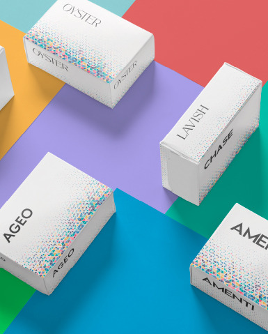
Amenti
Amenti is a font that has become increasingly popular in recent years, thanks to its clean lines and simple elegance. It is a sans-serif font that is perfect for headlines and other text that needs to stand out. Amenti is easy to read and has a modern feel that works well for brands that want to convey a sense of sophistication and style. When people see your brand’s name or logo, they should be able to read it quickly and easily.
Vesper
Vesper is another sans-serif font that is ideal for minimalistic branding. It has a slightly more vintage feel than Amenti, with slightly rounded edges that give it a softer look. This font is perfect for brands that want to convey a sense of history or tradition, while still maintaining a minimalist aesthetic.
Alma Sans
Alma Sans is a versatile font that can be used in a wide range of branding contexts. It is a sans-serif font with a classic feel that is easy to read and works well in both print and digital contexts. This font is perfect for brands that want to convey a sense of professionalism and reliability, while still maintaining a minimalist aesthetic.
Equinox
Equinox is a font that is designed for use in digital contexts. It has a sleek, modern look that is perfect for websites, apps, and other digital media. This font is easy to read on screens of all sizes, and it has a futuristic feel that works well for brands that want to convey a sense of innovation and progress.
Ageo
Ageo is a minimalist font that is designed for use in print media. It has a clean, modern look that is perfect for magazines, brochures, and other print materials. Ageo is easy to read and has a contemporary feel that works well for brands that want to convey a sense of style and sophistication.
Chase
Chase is a font that is designed for use in branding and advertising contexts. It has a bold, attention-grabbing look that is perfect for headlines and other text that needs to stand out. This font is easy to read and has a modern, edgy feel that works well for brands that want to convey a sense of excitement and energy.
SuperLine
SuperLine is a sans-serif font that is modern and minimalistic. It has a clean, geometric design that works well for headlines and other text that needs to stand out. It’s simple, uncluttered look makes it easy to read, even at smaller font sizes. SuperLine is a great choice for brands that want to convey a sense of innovation and cutting-edge technology.
Mentalist
Mentalist is a clean and elegant sans-serif font that has a minimalist feel. It has a modern, stylish design that makes it perfect for branding, advertising, and graphic design. Mentalist has a unique and distinctive look that sets it apart from other fonts, making it a great choice for brands that want to stand out from the competition.
Lavish
Lavish is a minimalist font with a timeless, elegant feel. Its clean, simple design makes it easy to read and perfect for branding and advertising. Lavish has a classic look that works well for brands that want to convey a sense of tradition and history while maintaining a modern aesthetic.
Oyster
Oyster is a sans-serif font that has a minimalistic, futuristic feel. Its clean lines and bold design make it perfect for headlines and other text that needs to stand out. Oyster is easy to read even at smaller font sizes, making it a great choice for branding and advertising.
Athena
Athena is a modern, minimalist font that has a sleek, stylish look. Its clean lines and simple design make it easy to read, while its unique and distinctive style makes it perfect for branding and advertising. Athena works well for brands that want to convey a sense of sophistication and elegance.
Concluding Words
When it comes to choosing a font for your minimalist branding, it’s important to consider your brand’s personality and the message you want to convey. Being a trustable logo design company in Ahmedabad, we choose font to represent your brand. By choosing the right font for your brand, you can create a minimalist aesthetic that is both visually appealing and effective at communicating your message.
Artical Source : https://www.pixenite.com/top-11-minimalistic-fonts-that-you-must-know/
0 notes
Text
book review yvonne
the book i have chosen is the look-book from Alma for Un/divided, a concept for a clothing store that aims to break down gender-norms.
i love the layout of the look book from the general art direction and typography in this one, especially the creamy, off-white paper stock.
i love how the font used is similar to geneva which is very simplistic and no serifs or fancy turns. the font is very straight forward and easy to read and leave space for the pictures
the use of color blocks also help to highlight the words and messages expressed

0 notes
Text
Visions of Alma
First off, I just want to say that I believe the Instagram poet Alma Perpetua is Misha, and that all the poems attributed to her are written by him. I also believe that the purpose of writing in the persona of Alma is a way for Misha to compose and to make public anonymously some of his love poems he has written for and about Jensen. I want to add that the handwriting analyses and most other convincing proofs posted on Tumblr are crucial to this argument and are not duplicated here.
Post compiled with the help of @glamrockcas
@theyarebothgunshot, this is the post that I’ve been talking to you about.
There is not just one “proof” that convinced me of Alma’s identity (although a few are so compelling that I actually do not need the totality of the evidence people have gathered to believe so). I am also fully aware that these are not “proofs” as such—they are “circumstantial evidence.” When taken as a whole, however, they acquire gravitas.
I would never, and will never, contact Misha or Jensen on the subject of Alma. I realize the delicacy of discussing Alma in a public forum.
The “Alma” account never specifies personal pronouns, so for the purposes of this post I will use she/her.
[NOTE: Sometimes Alma titles her poems by including the title in the caption for a specific poem. I will use titles when they have been given by Alma.]
1). The first item in itself compels me to believe that not only is MC the poet Alma, but that the subject of the Alma poems is Jensen. Here is the Alma poem in question:
https://www.instagram.com/p/B192_-bAI9k/
My Tumblr collaborator found this post. It’s from a GISH task from 2012, undoubtedly conceived of by Misha. First, here’s a close-up of the Times Square “Misha-centric” GISH-created image. (Maybe look for Jensen too…..)

And here’s the full task as posted for GISH-- the image is actually interactive. Take a look, and be sure to wait a moment for the second screen to appear:
https://farthngdr.tumblr.com/post/649223013634555904/jenmisheel-ok-misha
(The original source blog is inaccessible, so this link is to a reblog.)
I confess, no one can convince me that the Alma poem and the GISH post are coincidence.
2). Another proof concerns an esoteric term known primarily to those familiar with the lingo of typography. One of the Alma poems mentions the term “kerning and leading,” which I did not know and had to look up. It refers to the spaces between characters in old-school type:
https://www.instagram.com/p/BsOb7YxFVvo/
I was intrigued by this obscure term and did some sleuthing. On the Wikipedia page for GISH, click GISHWES in the dropdown bar; if you scroll down the page to sample tasks that have been assigned to GISHers over the years, you will see this:
“2012, No. 124: ‘Shoot an erotically charged scene. [...] The film must involve a pizza man and the actors can ONLY talk about grammar and fonts. Please use at least three of the following terms, 'kerning,' 'serif,' 'gerund,' 'participle,' and 'imperfective.’”[ Credited to Misha Collins.]
I do not believe that the use of the word “kerning” in both an Alma poem and a Misha Collins GISH task is coincidence. Because it’s not.
3). An Alma poem titled “Re-purposed” refers to the Japanese art of repairing broken pottery so that the result is a bowl that is stronger structurally than the original unbroken piece:
https://www.instagram.com/p/BtTYp2_HXiD/
My Tumblr collaborator found this post by someone else on Tumblr, where Misha discusses the Japanese art of Kintsugi:
https://subbydean.tumblr.com/post/638310349163069440/alma-tinhatting-time-do-i-think-alma-is-misha
This knowledge is esoteric, and it is therefore not coincidence that both Alma and Misha are invoking it in their work.
4). In my close reading of Alma, I see that she uses the phrase “at my desk,” as she likes to write there in the mornings:
https://www.instagram.com/p/B-NM48eHLTu/
In his real-time-composed poem titled “Composted,” Misha also uses the phrase “at my desk,” because that is where he prefers to write in the mornings. Note as well the similarity of the handwriting for this phrase in both poems:
https://www.facebook.com/watch/?v=651417731985615
[Yes, I know about Misha’s/Alma’s parrot, which sat on his/her shoulder as he/she wrote at his/her desk. Again: not a coincidence.]
5). My collaborator sent me an email with their observations concerning the idiosyncrasy of referring to the mornings as “the a.m.’s”: this ultimately circles back to Alma’s most recent poem about walking along the shore with her lover. From my collaborator’s email:
“I know this is just one detail, but I keep noticing how many times Misha uses ‘a.m.’ instead of the word ‘morning.’ So he probably wrote that poem in the video that he claimed was by a ‘favorite poet’ (and sounds like a love poem to Jensen):
https://myhumanweakness.tumblr.com/post/179608114443/beefcakemish-misha-poem-with-you-the-sugar-is
“Because it sounds just like this:
https://zoelilyreads.tumblr.com/post/177573955400/adjusts-tin-hat-firmly-no-matter-how-hard-i
“AND I somehow missed before that he has an entire poem called ‘A.M.’
https://angelica128.tumblr.com/post/189354229194/i-dont-know-why-it-touches-me-so-much-but-it
“Also: an even smaller detail, but he signs his poems (or at least that one) with just his first name in all caps at the bottom right, ‘-MISHA.’
“It reminds me of how ‘X ALMA’ is also always a single name in all caps at the bottom right.”
*****************************************************************************
6). From Misha's poems, I recognize the following reoccurring words and imagery:
"Sweet" or “sweetness”: “You make sugar sweeter.” And here with Alma:
https://www.instagram.com/p/B0ZYOt9Hbp-/
Any imagery involving light-- "Morning" light is Alma’s analog for her lover. The moon, stars, and night sky images occur with frequency in her work. Misha is clearly moved by natural light as well. The instances of the importance of light, mostly sun, moon, and stars, occur so frequently with both poets that I won’t bother to supply more examples unless requested.
A line from the poem Misha recites in the video: “The sand is softer.”
From Alma’s most recent poem titled “RESUMED”:
https://www.instagram.com/p/CNEG5Uznt9R/
The soft sand yields beneath the feet of Alma and her lover.
******************************************************************************
One last thought: Why “Alma”?
Recently I watched Brokeback Mountain, which I haven’t seen since its initial release. We all know that both Jensen and Misha have seen the movie. Jensen semi-joked about how it “ruined cowboy movies for him,” which to my mind is him performing masculinity, which he has been known to do on more than one occasion. Misha obviously thinks well of the movie, as he live tweeted the SPN cowboy episode and used the hashtag #Brokebacknatural. He would not have invoked the memory of this film unless he enjoyed the comparison.
Ennis Del Mar would be the analog to Jensen in his discomfort with owning his gay identity and his continuing to assert performative masculinity as a way of coping with his love and desire for Jack Twist. Others have posted about directorial choices in an episode of SPN where a scene with Dean paralleled a scene featuring Ennis Del Mar.
https://grumpycas.tumblr.com/post/634151636525367296/brokeback-mountain-2005-supernatural-season
One scene in the film occurs after the two cowboys’ magical summer on Brokeback Mountain as employees of a rancher whose herd they must oversee. After that experience has ended, Jack asks Ennis with hope in his heart if he would be interested in signing up for the same job for the upcoming summer. Ennis hesitates, then haltingly explains that he is engaged, and that his wedding is scheduled to take place that summer.
Ennis’ fiance’s name is Alma.
******************************************************************************
Final note: Alma’s poems are things of great beauty and delicacy, and she bares her soul in the most unprotected and vulnerable manner. Of course we on Tumblr treat her and her work with respect and discretion.
I am tagging accounts of those who I think might be interested in this content. If you are tagged and do not wish to be, please let me know and I will remove your tag:
@theyarebothgunshot @livebloggingmydescentintomadness @dimples-of-discontent @cocklesofmyheartt @zoelilyreads
136 notes
·
View notes
Last Seen Blogs