#also making a halftone tutorial for those asking
Explore tagged Tumblr posts
Visit Tumblr Blog
Explore Tumblr blogs with no restrictions, modern design and the best experience.
Last Seen Tumblr Blogs


Fun Fact
The KCSC sent more than 20K requests to delete posts related to prostitution and porn to Tumblr from January to June 2017.
Note
Hiiii you posted a poll some time ago asking if people were interested in you showing what brushes you use for your pieces .. i don't ever recall seeing you post about it more, but I'd really love to see your brushes 🥺 <3

SOON I PROMMY
#I’m finishing up a bunch of other shop stuff this week like fucking taxes and whatever#and then I’ll work on putting this up. I use like 30 different packs so it’s gonna take a bit#also making a halftone tutorial for those asking#I’m just lazy and slow ahh AHHHH#ask#I’ll be posting the brushes here when finished but they’ll have a permanent spot on my website under the gallery
27 notes
·
View notes
Note
nsnnndnhfur
I love your art so much-and I don’t know if this question has been asked before-
But I was wondering how you go about rendering things? Cause you do it so pretty and knjkdkjchdkjhcoehcoiheouch
ur just awesome
AWh Sorry it took me so long to answer! V flattered QQ) But now since I'm out of the perpetual remission that's called college- I'm gonna tackle this now HAH
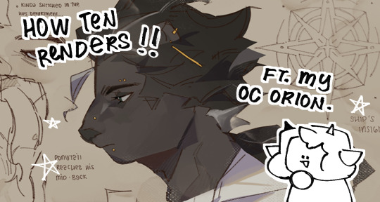
We're gonna use my (unwilling) OC Orion for this little compilation
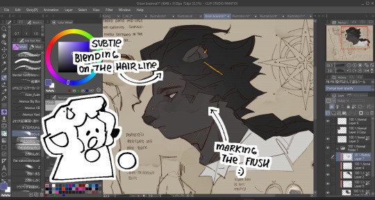
Base colors comes first as always, I also do -some- marking? Mostly for blush or any flush-ed-er areas uu)
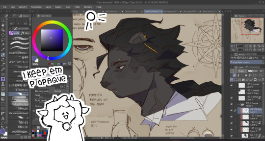
Then I do base shadows! Usually on a multiply layer above everything at like 40-50% opacity since I like making them dark ! Gives me more incentive to play around with hues and building form. I'm a little wishy-washy on where shadows go since I usually just wing it once I know where the lighting is supposed to be,,
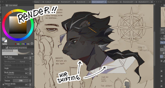
Then it's basically rendering at that point-! I paint a layer above my lineart, coloring the lineart also adds into this! I didn't do much here since it was for a character page Usually it's just me defining the face plans and adding more oomph to the hair (if that makes sense) and hue shifting for the darkest shadows and rim lights!
BONUS ONE SORT-OF:
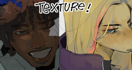
It depends whether or not I make them obvious but I love adding texture and abusing gritty brushes and halftones to add more pizzazz to everything, I just go ham honestly
And that's kinda it! Not sure if this was a good tutorial in any shape or form ngl I'm bad at those- BUTTT AGAIN I APPRECIATE THE SENTIMENT HUHU
43 notes
·
View notes
Note
yo eliza! I wanted to ask how do you do all those vintage texture effects on your drawings? idk if you've explained it before or not, but it's really cool!
HI PEYTON!!! SOOOO…
mainly the magic’s all from RetroSupply Co’s great vintage brushes! i bought their Color Lab pack a few months ago which has a great assortment of halftone brushes and distressers, BUT they also have a bunch of freebies available on their site which i’ve been using liberally!
i don’t really have any magic explanation on how i do it—i actually need to think MORE about how i apply my textures!! EITHER WAY, i made a video recently recording my process; it’s sped up so it’s kind of difficult to see exactly how i do it, but it’s mainly a lot of trial and error! slathering textures on top, fiddling with the opacity, etc.
before i had any of these brushes, i’d just search up vintage paper textures on Google and paste it over top my art, the layer set to “multiply”!
FOR NOW THOUGH, i’d just say snag some freebies from R.S.C. if ya can! they have tutorials available on their website too which i myself need to skim through so i can get more purposeful with my effects HAHA. maybe one day i’ll make a proper tutorial (well, really an explanation LOL) on my process! i hope this helps though, if only just a little!
#AND THANK YOU SO MUCH!! you’re one to talk about cool art BC MY GOODNESS I LOVE YOUR WORK!!!#partyhorn
28 notes
·
View notes
Note
heyo! it's padawin (or wan??) anon again!! thank you for your very kind words ;////; huu, who knows, maybe you'll be able to see them one day! but for now i have another question ~as usual i am dum~ i recently got csp and i have 0 idea how to work it? not asking for a whole tutorial just a basic review on why it's so good since i won't lie i almost deleted it and had a heart attack o(-( thank you! hope ur having a good day!
AH! hello young padawan!
This is ganna be long so I’ll put this under a readmore!
thats great news! honestly from experience once you’ve learnt how to use CSP you can master pretty much adobe (Photoshop and illustrator) The program can be really intimidating at first thats for sure take it easy and stick to the basics and once you’re comfortable with that
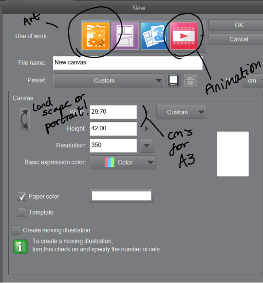
Once you’ve opened the program you’d want to work on an illustration so click on the top bar file > new. You’ll see something like this-
The Illustration one is for drawing and is overall best and easy! The comic ones are little more over whelming with shapes and layout hh and animation is more so timeline (little like flash animation and photoshop sorta)
This tool bar here is mainly useful for layers hhh
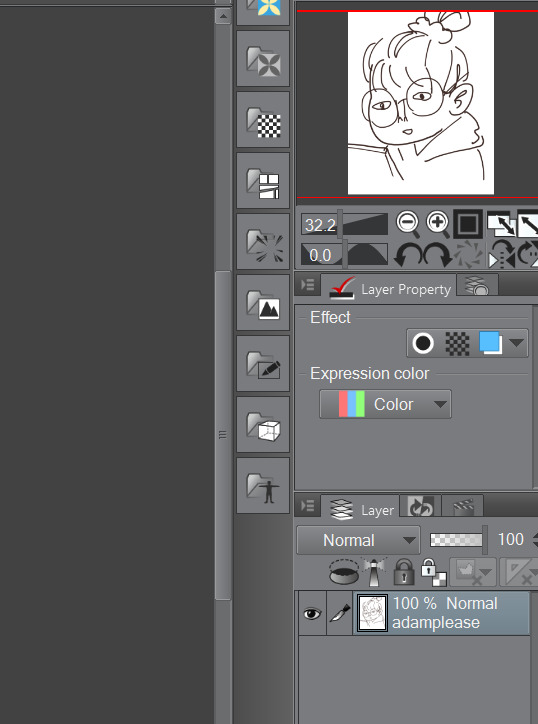
I don’t really touch much from there hhh, I only use expression colour to really look at the work in grayscale!
The three most important tools that’ll help give your work dimensions!
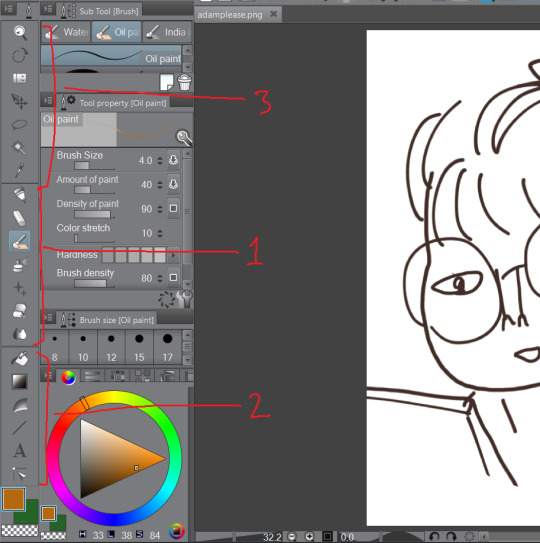
1) These are the tools for drawing, Each tool here represents the mediums they look like/ named after. Listed in order!
The pen - Thick lines, different options mess around to see which one suits you, I mainly use this for lineart or bulky shape work
Chalk - in the name! I use this tool for sketches!
Paint brush - This one is best for colour and for defined work! this is biased but the best is the oil paint brush, it just HMMM it just GLides from One colour to another and helps me create this effect -
The spray - Similar to the chalk but is more so identical to the mspaint spray one hhh from experience so I dont really USe THAT one
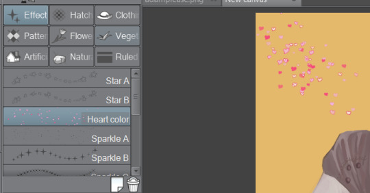
Stars - these are shapes! If you’ve used gimp you’d know how this one works! your brush turns into the pattern and shapes you chose like so -
Eraser - Self explanatory!
Blend tool - alot of people like this hhh but I’d recommend the oil painbrush over this but this basically makes blending alot more smoother and easier!
2) this is more so layout, some of these activate a new layer (like text)
fill bucket - my lazy butts fav tool, It fills in the pixilated or selected area, be careful tho if the colour is weak it’ll leak out and fill other areas!
Gradient - This… I dont use this at all hhh
Contour Line paint - This tool I dont use either hh, it basically bucket fills and area that is similar to the line around that area
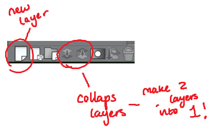
TYPEEE!! - this is where you add text! the text on this program is kinda annoying but hey you can rotate it! how you rotate it, after you’ve chosen what type face (font) you want and size and colour COLLAPSE IT to a EMPTY LAYER!!! then use the selection tool and rotate it! (I will discuss the rotation took in part three!)
NO idEa WHat THIS tOOL IS IF IM HONEST
3) This is basically cropping and editing!
Zoom - This will help you zoom in and out!
Rotation - helps you turn your canvas around, upside down and so on to make difficult angles easy to reach!
— no clue
Movement - helps you move selected layer around! can be a pain if done by accident but hey what is ctrl + z for!
Selection/ lasso! - THIS TOOL wILL bE yoUR SAVOIR! I use to to fix layout as well as anatomy and perspective. When you select an area this will pop up!. The first one on the left is to cancel selection, 7th from the left is the one where you can move, resize! Those are really the important ones hh

Wand - The iconic select took, that selects an area you click and the same options from the selection/ lasso will pop up!
eyedropper - this tool will basically copy a colour on any canvas that is advisable, helps to reuse a colour! it auto works if you just right click on your mouse or pen so you dont have to keep changing from your pen,painbrush or bucket tool!
I think thats the basics? now I’ll talk about all the aspects CSP has to offer in Edit that makes life a blessing such as colour corrector, change line of drawing and change canvas size (which is a million times easier than photoshop, which makes you use math and NUmBERS)
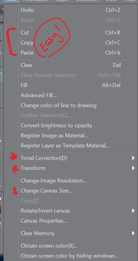
Tonal correction is what I use to basically fix the colours of my artworks, Its easier than redrawing the entire piece hhh, sometimes we all draw a little off colour pallette! so when you click that you’ll get -
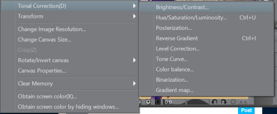
Brightness and contrasts - brightness really just makes its more white and black but contrast makes the colour more vibrant and pop, its a scale option so its really fiddling around with the two bars until what you see is something you’re happy with!
Hue, saturation hhhh - This will help you change YOUR ENTIRE hue aka the CMY (the primary colours, magenta cyan yellow) and the saturation tones the contrast making it easier on the eyes! same as the last one it’ll be sliders! so really mess with it and pick which one is pleasing to you!
the rest i dont use hhh but
Colour BALANCE - this helps me hhh basically you change the entire colour layout beyond CMY, it has three effects, the highlight, shadow and halftone! same as before sliders! mess around with until youre happy with how it looks! (It’ll auto preview)
I think that’s really it? any more questions please shoot me up!
OH! CSP is known to crash, its the only downside tbh, it also auto saves alot, so save alot! SAVE ALOT!! i’ve lost whole works like 6 hours from csp crashing as it was overwhelmed from my layers hh
here is how you can look for backup files incase it does crash! -
My documents -> CELSYS -> Clip studio PAINT DATA-> -Document BackUp or -Initial Backup.
5 notes
·
View notes
Link
It’s that time of year when Spoon Graphics gets a little older, with 2020 marking 13 years of tutorial creating, freebie sharing and article writing on what started as a blog that was attached to my portfolio website in 2007. Every April I take some time to reflect on the past 12 months and talk about how things have changed. Last year I talked about how much the landscape of the Internet has changed since I started Spoon Graphics and my worry for what the future might hold, so let’s take a look at the latest stats and figures and see how things are going another year on.
I always start these anniversary posts with links to my previous yearly celebrations. It’s interesting to go back and see how my blog has evolved:
Spoon Graphics Turns 12 Years Old — What Does the Future Hold?
Spoon Graphics Turns 11 Years Old — Down But Not Out!
Spoon Graphics Turns 10 Years Old — A Decade of Blogging!
Spoon Graphics Turns 9 – The Growth Was Incredible This Year
Blog.SpoonGraphics Turns 8 – Onwards and Upwards
Blog.SpoonGraphics Turns 7 – Surviving the Apocalypse
Blog.SpoonGraphics Turns 6 Years Old – Staying Fresh
Blog.SpoonGraphics Turns 5 Years Old – Thank You!
Blog.SpoonGraphics Turns 4 – A Look Back in Time
Blog.SpoonGraphics Turns 3 – Win Yourself a Poster!
Two Years of Blog.SpoonGraphics
One Year of Blog.SpoonGraphics
Spoon Graphics Traffic Stats
Traffic change: -23% Top Content: 25 Adobe Illustrator Brush Sets You Can Download For Free (2016) & 45 T-Shirt Mockup Templates You Can Download for Free (2017) (NEW) Email Subscribers: 189,773 (up 14% from 2019)* YouTube Channel Subscribers: 332,014 (up 30% from 2019) Highest Traffic Peak (This Year): Tuesday May 14th 2019 – 17,517 visitors (10 Distressed Vector Halftone Patterns for Illustrator) Highest Traffic Peak (All Time): Tuesday November 11th 2014 – 44,592 visitors (How To Create a Realistic Painted Effect in Photoshop) *I gave my mailing list a spring clean which removed almost 65,000 inactive subscribers, so that total figure would have been even larger!
Unfortunately, traffic levels have nosedived this year by the largest amount ever with a 23% reduction in visitors, taking me back to the kind of figures I was getting in 2008, just a year after creating Spoon Graphics. That’s down -56% from its peak in 2012. The biggest factor seems to be a 30% decrease in Google Search traffic, which might explain why there’s a new entry in my Top Content this year. My roundup of 20 Free PSD Templates to Mockup Your Poster Designs had been my most-trafficked content for several years until it dropped to 2nd place last year. In its place is a roundup of T-Shirt mockup templates from 2017, so it seems like Google might have dropped many of my older posts from their established search rankings.
While traffic levels have plummeted, it is good to see my subscriber counts are continuing to rise, by an additional 24,000 email subscribers, and 77,000 YouTube subscribers. One success story I have to share is a tweak to one of my newsletter signup forms that tripled my daily new subscriber rate! Previously, a popup window prompting users to subscribe to receive my free bundle would appear when they had clicked to download one of my resources. It was my most successful signup form, but it appeared after the file was supplied. I’ve never wanted to make it mandatory to supply an email address in order to download an item, so instead I made a ‘forced interaction’ popup, which appears the first time someone clicks a download. It asks whether you want ALL my resources in one go by subscribing or to just download that individual file. The signup stats clearly show a huge increase in new subscribers, with only a minimal increase in the number of unsubscribes.
Views stats over at my Spoon Graphics YouTube Channel had also been in a slow decline in mid-2018 to early-2019, but thankfully I struck gold with the YouTube algorithm with a tutorial titled How to Give Your Photos the Cyberpunk Look in Photoshop. Within a week my channel saw a large spike in views that set a new all-time high. It was short-lived as traffic returned to normal by the end of the month, but I’ve seen a steady trend upwards in views since.
Technical stats
Powered by: WordPress Hosted on: Bare Metal Server (NEW) Server location: Dallas Monthly bandwidth: 13TB Average running costs: $1870 per month (up 22% from 2019)
My server setup was upgraded again this year, this time from a VPN to a Bare Metal Server setup. Even though I previously upgraded to a 10TB bandwidth package, I was still seeing overage charges every month due to the sheer number of free downloads I host. A deal came up on a Bare Metal Server with a 20TB bandwidth limit, which has saved me a large chunk of money each month by avoiding those overage charges. Despite this, growth in my mailing list has still resulted in a 22% increase in costs!
Website vs YouTube?
One of the difficult decisions I now have is how I should divide my time between my Spoon Graphics website and my Spoon Graphics YouTube Channel. The subscriber and view stats on YouTube are dramatically outperforming my website, so maybe that’s where the future lies for Spoon Graphics? On the other hand, it’s this Spoon Graphics website that allows me to pay the bills and earn a living through the Access All Areas membership, the affiliate promotions I send out to my mailing list, and the recent paid products I released. It sounds like I need to think of ways to funnel those 300,000 YouTube subscribers over to Spoon Graphics! As always, thank you to all my readers, from veteran subscribers who have been around since the early days, to newcomers who have just discovered my content. I appreciate all your support!
The post Spoon Graphics Turns 13 Years Old — Traffic Down, Subscribers Up! appeared first on Spoon Graphics.
source https://blog.spoongraphics.co.uk/latest_news/spoon-graphics-turns-13-years-old-traffic-down-subscribers-up
0 notes
Text
T-Shirt Design Ideas That Will Inspire You to Design a T-Shirt
Are you in need of a few T-shirt design ideas? Cause there are some cool ones in this article.
Ever since their rapid rise to popularity in the 1960s, t-shirts have been more than just clothing.
They’re worn by everyone, and they’re pretty much the new billboards.
They’re better than the old kind, because they’re mobile, and they give you the credibility of the approval of whoever wears them.
They’re the perfect place if you want to get viral advertising and precious brand recognition. But, that only works if you have a good t-shirt design.
A few key design considerations
The base of your t-shirt is the shirt design that it displays. You want it to represent your brand, and you want it to stand out. That isn’t easy, as there are almost as many t-shirt designs as there are t-shirts. Here are four things you should consider if you want to design your own, or if you’re just looking at t-shirt design ideas.
Look at it as a piece of art. The street can be a gallery as much as any museum, so creating a cool t-shirt design that will spark a conversation is a good idea.
Whoever is wearing your t-shirt, is introducing you to potential clients. Use it to show people who you are, and what you do.
Consider how your t-shirts will be worn. Ideally, for street-strutting moments, you’ll want something sleek, and not something that will only be seen by the wearer’s other half.
Sure, you want it to seem cool and exclusive. But if you want to get the most wear out of it, make sure the design is applicable to as many target markets as possible.
… and 5 practical things to keep in mind
In addition to the theory, practicality is also required. There are limits to what a printer can do for your budget, and these limitations when you want to design a shirt are best addressed at the beginning. Here are a few of those technical considerations when you want to see how to design a t-shirt.
Simplify the line, color and texture. They’ll all come into play, and all have an influence over the possibilities and budget. More complex designs cost more, and a simple t-shirt design can look good too. Solid colors, clean lines and less shading are the way to go when you want to design a t-shirt, especially on a budget.
Everything is easier if you have fewer colors. Speaking of which, use Pantone, your designer will be thankful.
Don’t want to sound like we’re repeating ourselves, but avoid imagery that is hard to print, such as subtle gradients and fine details. They’ll only give you a headache, and the end result won’t look anything like your design, even if it does cost a fortune.
For a bold impact, add dark outlines. That will be REALLY BOLD. Sorry for yelling.
The t-shirt design size should be drawn to scale, exactly like it will be printed on the t-shirt. Don’t let the printer do the rescaling, unless you want to be disappointed. The t-shirt design dimensions aren’t something you want to be having issues with.
Sure, your definition on how to design t-shirts may be nothing more than your logo on a chest pocket. However, if you want it to stand out, you want to be creative and you need T-Shirt design ideas. Keep the technical limits in mind, and play with the design.
Explore your concept and take your time
Make a sketch, go out for a walk. Make a few variations, eat something, and do a full brainstorming process. Afterwards, sleep on it. Then do it all over again. Sure, if it comes to you straight away, that’s amazing, but other options should be explored just in case.
Imagine how it would look like on a shirt
A design on screen and a printed piece can be vastly different. Mock it up on a photo of a model, even print it out if necessary and put it on an actual tee. Of course, your artwork should be created at actual size.
Keep things simple, but don’t neglect details
Attention to detail is something everyone appreciates.
Seeing a well-executed masterpiece on a tee can look stunning, and you can study that for hours. However, some of the most classic, timeless designs have been dead simple, and the message is conveyed through the simplest form. Get in the middle, and delivering a successful design might prove to be a struggle.
Consider your target market
This is important. Who are you designing for? Male or female, young or old? You’re making something you want people to wear, and like any good marketer, you should write down who you want to attract to your design. Who they are, what other brands they like, what about them, everything, and start from there.
Keep the humor subtle
If you want a humorous design, it shouldn’t come across as a low-cost joke shirt. Even some of the most successful loud, in your face designs have subtle humour.
Color matters more than you think
The t-shirt color should be used effectively, and you should go for complementary colors.
If you’re using Illustrator, turn on Global Colors – it’ll save you time and it’s a life saver. Halftones are also good if you have a restricted color palette.
Properly prepare your artwork
When screen printing, use CMYK colors – the printers will love you. Outlining text and expanding strokes are another thing they’ll love, and there are plenty of other tutorials regarding this, depending on whether you’re using Illustrator or Photoshop.
Find a good printer
Even though your design is finished and prepared properly, the tee is only as good as the printer. Give it to a reputable company, or give your local guys a call, but taking time to learn about the type of tee you’ll be printing on is important.
Sizes, weight, labeling options, cost etc., they’re all things that affect the final product. Sure, this takes a while, but you should end up with a company that wants to treat your tee as an end product, and they’ll handle your work carefully.
Educate yourself
If you want a good understanding of basically anything, studying and understanding its context is important, and that is also the case for tees. They’ve come out of every subculture ever, from skateboarders, street art, general pop culture etc. This is where T-Shirt design ideas play an important role.
Stay ahead of the game
Inspire yourself with the latest trends, but don’t copy them. By the time you’ve seen that t-shirt already produced, designers are already moving on to something else and you won’t know it.
Use PMS colors
You might be used to CMYK and RGB, but for accurate colors using a silk screener, go with PMS colors. Color separations are both easier and more accurate here as well. The printer shouldn’t charge you extra for color matching, as you’re actually doing them a favour by being more particular with your colors.
Convert your text to outlines
Your artwork may require a custom designed font, and when you’re sending it off for print, a substituted font is the last thing you want to see. If you convert the text to outlines, regardless of the computer where the artwork is opened, the text will be shown as an image, thus eliminating the need for any substitutions.
Your artwork should be created at actual size
The printer’s judgement isn’t something to trust without discussing it with them. The vision you have of your end product might not match with what your printer has assumed is your vision. The safest way to defend yourself is actually creating the artwork in its final size. If you don’t know what size you want to use, get a ruler and slap it to the shirt you have on you. It may sound dead simple, but it does work.
Use vector art as often as possible
This isn’t an argument about vector and raster, but a suggestion to go with vector as often as possible. Color separations are much easier, and the small details will be much cleaner when printed. This is also a general rule for everyday jobs, but shouldn’t be an automatic in all situations.
Expand the strokes
If your colors are properly set to PMS swatches, the color separations software shouldn’t have any problems. This is more often a human error that happens because strokes might be overlooked.
Half-tones should be set with PMS colors
Sometimes your budget, or design, may require halftones to save on how many colors are printed. The best way to achieve this is to slide that color scale down, to a percentage of the PMS color, thus leaving the color separations software to handle the rest.
A few tips on creating an inspiring t-shirt design
Make it feel comfortable
Before you even think about the design, make sure the shirt is comfortable. Choosing a material that is cheap and uncomfortable will result in people buying the shirt but not wearing it. Do you want your customers to think that you’re low grade, or high-quality? Your base shirt should be something that customers want to wear over and over again.
Choose a color scheme
Next, review your color palette, and come up with the right hue. Darker colors are usually more expensive to print, and certain colors may have limited availability. Common colors may include black, white and grey, and red and navy are also good choices. Picking well-known colors may be good for appealing to your target audience, you shouldn’t be neglecting your brand’s color scheme. Keeping the number of colors down is another thing to try, as complex color patterns aren’t only more expensive, but they may not appeal to your audience’s taste either.
Reduce, and then reduce some more
For a screen printed design, less colors can keep prices low. If the artwork is complex, or has too many colors, ask for a digital print, that should net better results. You should also identify the custom ink colors in order for the printers to be able to match it. As mentioned above, use the Pantone Matching System.
Expand and outline
Forgetting to outline your elements is a big mistake. As mentioned earlier, not every computer will have the font you chose, so outlining it is a good option. Outline all your objects, and expand the borders and strokes for things to remain proportional.
Make a mock-up
This is the key to a beautiful shirt. Once your design is done, print it and hold it up to a t-shirt. It should look at the scale of your design, so you know whether or not it works on a t-shirt. If you have someone holding it up on their chest, several feet away from you, can you still make out the images, as well as read the words? You should know what works and what doesn’t before you even think about printing it on the t-shirts.
Ask for help
At the end of the day, if you’re having problems, the screen printing company undoubtedly has designers, and you can go ahead and ask them to give you an engaging design from your rough sketches. They may also offer help when you’re choosing colors, as well as offer some additional tips.
Ending thoughts on T-Shirt design ideas
T-shirts are a key part of any casual ensemble at work, and they’ve been ‘in vogue’ for around half a century.
They’re an easy and quick option, and they are also a great way to get noticed. When you look at them from a business standpoint, a great t-shirt design is a great advertisement, since you can turn customers into a walking billboard for your company.
If you liked this article with T-Shirt design ideas, you should check out these as well:
Poster Printing: How To Print A Poster Flawlessly
Book Cover Design: Ideas, Layout, Fonts, And How to Create One
Japanese Graphic Design: Beautiful Artwork and Typography
The post T-Shirt Design Ideas That Will Inspire You to Design a T-Shirt appeared first on Design your way.
from Web Development & Designing http://www.designyourway.net/blog/graphic-design/t-shirt-design-ideas/
0 notes
Text
10 expert tips for charcoal drawing
Drawing with charcoal, pastel and chalk is addictive. Maybe it’s because the results are so fast and immediate, or maybe because the look is so dang cool, but people love to learn how to draw with charcoal. Even the great Michelangelo loved drawing with charcoal.
How to draw and paint – 100 pro tips and tutorials
Whatever the reasons for charcoal’s popularity as a medium, and there are many, these charcoal drawing techniques are used by many artists every day. So let’s jump in, to reveal some handy tips and tricks.
Check out the video below, then follow the steps to success.
Any type of charcoal will do for these tips. Just ask at your local art store and they will guide you (see point nine for a little about different types).
If this inspires you to educate yourself further, why not head over to Schoolism.com to discover courses, workshops and more. It’s an amazing way to study with the pros.
01. Concentrate on the essence
This image is all about Paul and everything supports or revolves around that main idea or essence
It’s been said, “The main thing is to keep the main thing the main thing.” Artistically speaking, the main thing is called the essence. Remember when creating a piece the primary question to be asking yourself is, “What is this image about?”, or “What do I want to say?”.
Once you settle that – the ‘main idea’ or the essence – then everything you do from that point on, every move and every detail you put in or leave out, should strengthen the ‘main thing’ or the essence of the piece.
02. Learn the value of value
Learn how to organise lights and darks
The word ‘value’ gets thrown around a lot in art and can seem confusing. What we mean by ‘value’ in art is simply a walk from white to black (light to dark) using one to 10. One is the white of the page and 10 is black, so a five, 50% or ‘halftone’ is a medium grey, halfway between white and black. Make sense? So every image is composed of values (darks or lights) regardless of colour.
To help you with this, work from the middle out, keeping your darkest dark (the shadows) no darker than a six or a seven value and your lightest (the light effect or everything in the light) a three or four value. Work your way towards the darks (accents) and your whites (highlights).
Think of accents and highlights as twins just living in different neighbourhoods. They are not the most important element of your image. They serve the whole.
03. Use the hierarchy of value
You can control the eye using value. Whaaa?
It’s safe to say that a successful image is one that quickly reads well and has power to touch you. Using value or tone and assigning different areas of the image to lesser or darker tones can be a very helpful tool.
In the image above, based on a photograph by Josiah Bice, the darkest values are used on the subject. Notice the lightest value on his cheek and the darkest value reserved for the mass of his body.
Using a hierarchy of value allows you to direct the viewer to what you want them to see first. In this case, it’s Steve smoking his pipe. Everything else becomes less important. He is the essence of the image.
04. Squint
Squinting your eyes simplifies things
Sometimes 20/20 vision is not helpful. When we observe whatever we are drawing there is a ton of information going in through the eye gate. And an image filled with needless details cripples the effect of a piece. The goal is to edit and simplify.
Squinting our eyes just enough simplifies values and over all helps us to see a simplified version of what we are looking at. Squinting also helps you to see simple shapes very clearly. Nailing those simple shapes helps with the overall essence of the piece.
05. Try thick and thin lines
Not all lines are created equal
Using thick and thin lines is an interesting idea and it’s funny how many artists miss this very helpful concept/tool in drawing. In a drawing, if every line has the same width or is drawn using the same exact pressure it looks like a colouring book drawing and can come across as very monotonous and boring. So using thick and thin lines in your drawing can make it so much livelier.
So how do you use it, and what do you need to know? The simple rule of thumb is that lines on top of things are thinner since light is hitting them and lines underneath objects can be thicker since there are usually shadows underneath things. That’s it. Wow – that was simple. Check out the various dancing lines and thickness on the dog drawing. Now you know.
06. Use an eraser
Sometimes light can be ‘erased’ out
The cool thing about charcoal is that it’s easy to control it. You can move it around easily. Once you apply charcoal you can remove it or erase out where you don’t desire it. In the picture above, the erased part is marking out where the light is hitting the model’s head.
07. Get a few tools
You just might need a tool belt
There are many tools of the trade for an artist, and for charcoals there are cool ones to have. The image above shows some great ones: a really small fine line eraser, a kneaded eraser that you can bend and squash, and a hardcore eraser pen for those tough heavy lifting erasing jobs.
Make a one-stroke mass of charcoal
Using charcoal or pastels requires us to ‘move’ or apply the medium, and there are many ways to accomplish this. Your finger is the most obvious, yet can be streaky or too small. A Webril Wipe is a great tool for making a large mass in one stroke.
08. Wear a glove
This is an oil-free zone
Did you know that your hand has oils on the surface that can damage the purity of your paper or stock and fight against you? The oils on your hand can even attach to your paper and repel your medium. To stop this problem, wear a glove or place another piece of paper under your hand to protect your artwork.
09. Charcoal pencils
These are a good place to start
Charcoals come in many forms, from pencils to thick sticks to chunks, and whatever you decide to use is up to you. In the above photo are three good examples of charcoal pencils. Know that they can be messy, so afterward using them you can spray your drawing with a workable fixative to control them.
10. Press on
You can fly – just keep on trying
Remember that drawing is difficult and at times frustrating. Stay at it. Creating art is extremely hard to pull off and feeling happy about your progress can take time.
Learning and growing is a community project. Reach out and network with a few artists you admire. Be humble and teachable and ask them for insight about your work. Ask ‘What are my weaknesses?’ and ‘Where should I start or what should I focus on?’ Ask them to be honest. Those are good questions and a great place to start.
The good thing is that everyone has been down in the dumps as well, and even to this day there are really discouraging days full of doubt, and yet days where we can fly! So press on and open your wings and jump and catch the wind!
This article originally appeared in Paint and Draw magazine. Subscribe here.
Related articles:
7 must-know painting techniques for artists
How to get started with oil painting
How to use the rule of thirds in art
This post comes from the RSS feed of CreativeBlog, you can find more here!
The post 10 expert tips for charcoal drawing appeared first on Brenda Gilliam.
from Brenda Gilliam http://brendagilliam.com/10-expert-tips-for-charcoal-drawing/
0 notes