#also tfw the hardest part about making these posts is the formatting
Text
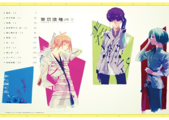
zakki:re translations Part 1 (pg. 10-29, Vol. 1-2 illustrations)
Hello and welcome to the zakki:re translations post! It took a bit of time to think about how I’d have to structure these translations, but I’ve figured it out for the most part.
What this series of posts will be is a text translation of Ishida’s comments accompanied by the art he’s referring to (the actual art itself that’s been available online, not a picture taken from zakki:re. It’ll make more sense once you start going through the post, I promise). It will also include some commentary from me for some additional context, which will be marked as “T/N” for “translator notes”.
What this will NOT include are photographs of the book. If I take pictures of the book, they will be contained in a different post since I don’t want the translations posts to be more cluttered than they already are. I also won’t include any illustrations that don’t have commentary attached to them unless they’re somehow relevant to it.
They will be posted every 1-2 days depending on my schedule, and have roughly 10 pieces of commentary each which I found was a good length.
And lastly, some terminology before I begin. TG = Tokyo Ghoul (overall, like the fandom tag), OG = the first Tokyo Ghoul series, :re = Tokyo Ghoul:re.
Anyhow, I hope you enjoy!
[T/N: This illustration was a magazine cover that included the blurb, "Justice has now been commenced." Presented this way since this is how it appears in zakki:re.]
zakki:re has now begun.
Just like zakki, the comments on the paintings and such will be referred to as accordingly.
I hope you enjoy.
This is the first cover on which :re began.
It gives off a certain vibe, hence the "Justice, commence!" blurb.
At least that's probably what my editor thought.
I thought at the time that I was seriously going to fail to hand in my manuscript in time.
It almost became, “Justice, commence (starting next week)!”
Weekly Young Jump
2014, Issue no. 46, Cover illustration

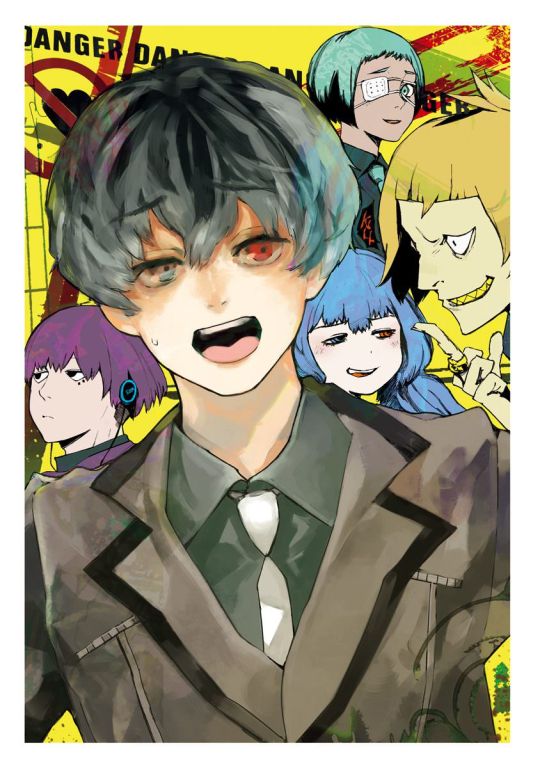
Volumes 1-4 of :re were prefaced with colour pages.
Hinami was a member of Aogiri Tree, and Kanae was distressed over Tsukiyama.
Shirazu’s character looks kinda dangerous here for some reason, doesn’t he?
Weekly Young Jump
2014, Issue no. 46, Opening colour page
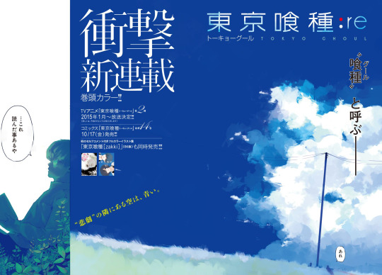
An image of a sky, as if it’s connected to the sky from the last chapter of OG.
A certain three people from the final chapter are also standing here.
Weekly Young Jump
2014, Issue no. 46, Opening colour page

The cover illustration for volume 1 of :re. I used up all my energy drawing Haise.
But he turned out quite well, don’t you think?
He’s holding a Kitahara Hakushuu book in his hand.
I thought I should draw the story from the CCG perspective, so I introduced the character known as Sasaki Haise, an investigator who is a half-ghoul.
Before :re began I also created the Qs characters all at once for the shock factor.
I took a break in between OG and :re, but it was only 3 weeks if I recall.
I remember at the time I was working on the setting and drawing, so I ended up busier than usual during that writing period.
When OG ended, one of the staff asked, “Is it really over?” in confusion, and I answered, “Yeah, it’s really over.”
It wasn’t really a lie since it was OG that had ended.
2014, Volume 1, Cover illustration
[T/N: The quality of this illustration isn’t good since I took it from the table of contents in Volume 1. But the neat thing is in zakki:re, the quality is so good that you can clearly read the words in the book that Haise is reading. Right now he’s reading Hakushuu’s poem “Blue Dragonfly.”]

Ui-kun has risen the ranks. Looks like he’s gone through a lot.
2014, Volume 1, Frontispiece
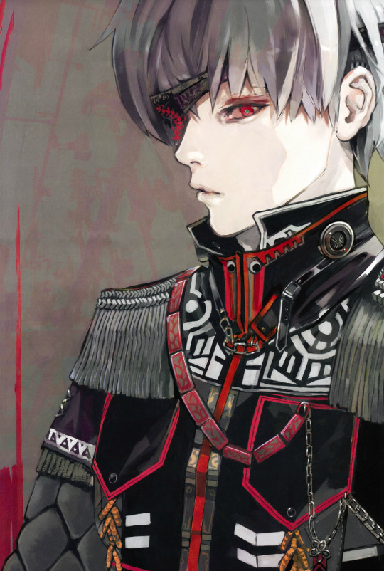
The exterior of the pinup, I think.
From the series of mysterious outfits.
Seems it’s based off a military uniform?
Weekly Young Jump
2015, Joint issue no. 6~7, Special long pinup

This is an illustration I drew using CLIP STUDIO.
I’ve always used Sai for drawing, but when I was drawing the ending cards for the 2nd season of the OG anime (the ones that moved along with amazarashi’s “Seasons Die One After Another”), I decided to try drawing using CLIP STUDIO on a whim, and I kept using it for a while.
Later I also drew the Trump card illustrations using CLIP STUDIO.
I don’t use it anymore but looking back, the end product has a really distinct look to it, which makes me wonder if I should try using this program again...
Weekly Young Jump
2015, Issue no. 12, Cover illustration

[T/N: Couldn’t find the raw version of this illustration. This page was scanned by Imperial Scans (RIP).]
At the time it seems I pressed my editor, “What’s ‘On Christmas Eve the Qs bell is ringing’ supposed to mean?” for answers.
But hey, doesn’t “Qs bell” sound kinda cool?
Weekly Young Jump
2015, Joint issue no. 4~5, Center colour illustration
[T/N: Not completely raw, but close enough. Scan for this illustration done by Twisted Hel Scans (also RIP).]
You’ve probably realized it by now, but the opening pages and the center colour illustrations from the YJ magazines were printed as they originally were back then.
Since the magazine design would be lost for those who didn’t buy the magazine back then, it would’ve been a shame since L.S.D. (the design company) worked extremely hard to make it look good.
I also think the blurbs that my editor came up can be considered a work of their own (such as ‘Qs bell’).
Of course, I’m sure there are people who want to see the paintings in their original state. I felt the same way which was why I was conflicted about it, but I’ve accepted it in this form for this time.
The volume illustrations and the magazine illustrations have been arranged in chronological order as much as possible.
I hope you can enjoy it together with the circumstances of my editor’s work.
If I ever get another opportunity, I’d like to have an art book with just illustrations only.
Weekly Young Jump
2015, Joint issue no. 6~7, Opening colour page

[T/N: The version of this illustration in zakki:re doesn’t include any text.]
Colour pinup from the appendix of YJ magazine.
I added in Scarecrow who hadn’t appeared in the story yet (I didn’t know when I would add him in).
I had fun drawing the 4 people above. I really like Nutcracker in particular.
Weekly Young Jump
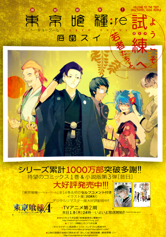
2015, Joint issue no. 6~7, Special long pinup

The character popularity poll illustration contest (I think it was with Nico Nico Seiga).
I drew some shikishi and gave them as gifts to those who submitted illustrations.
This illustration itself feels nostalgic.
Weekly Young Jump
2015, Issue no. 12, Opening colour page
[T/N: Updated with HQ scans from TG_Hub. Thank you!]
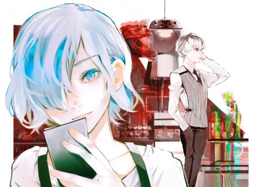
The cover of :re volume 2 featuring Touka.
I chose something relaxing for the off-centre composition while still following the general flow of the OG volume, conveying that she has become more cunning. A reference to "zakki", so it'd be great if you could compare between the two.
Haise looks good in shades of brown.
This is the interior of the Chateau where the Qs resided, and it was designed by a good friend who I’ll call J-chan.
A luxury home with the Qs’ bedrooms, common room, kitchen, Haise’s room, and the training room, fully furnished.
I got the data from him so that I could preview it and look around in 3-D, so I included it in the instructions for drawing the backdrop as a reference. Thanks!
[T/N: If you want to see the comparison to OG zakki, click here. Also, the Qs chateau that Ishida’s friend designed...is ripped from The Sims 4. No, I’m not kidding.]
Weekly Young Jump
2015, Volume 2 cover
I took a bunch of my scribbles and reused them for the colour pages in the volume.
At the very beginning I drew Mucchan (Mutsuki Tooru), and moved on to other characters from there.
As Saiko hadn't appeared in the story yet, her face isn't shown here.
"Saiko absolutely won't show up for an entire volume," was my iron will.
2015, Volume 2, Frontispiece
next
#Tokyo Ghoul#zakki:re#Ishida Sui#Translations#my translations#zr translations#first part done!!#please be excited with me!!#also tfw the hardest part about making these posts is the formatting
364 notes
·
View notes
Last Seen Blogs

cafe-genshin
Open For Business!

gnoxis-blog
gnoxis

meganekareshi
not a bot

xtremerxpist
dad

ekobox
🌻🪻🌹