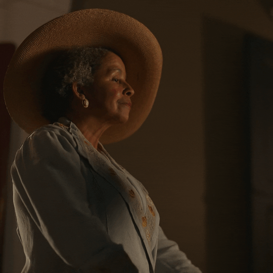
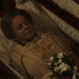
#also the only instances we see louis in his little sunglasses are when he's face to face with his mother post death rebirth coming out
Text


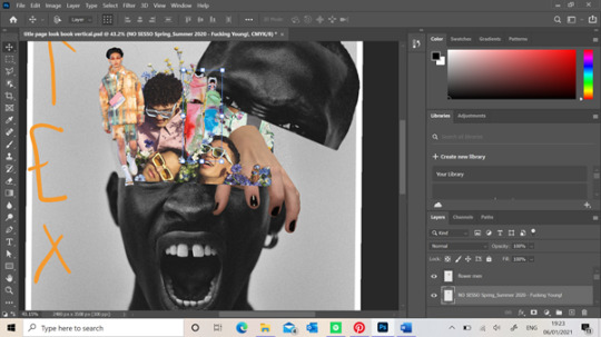
INTERVIEW WITH THE VAMPIRE
Louis + Florence
#someone please stop me#there's already so much going on here but i wish we'd gotten a liiitle bit more florence#society if we ever got deleted scenes#also the only instances we see louis in his little sunglasses are when he's face to face with his mother post death rebirth coming out#even after she's dead!#interview with the vampire#louis de pointe du lac#florence du pointe du lac#jacob anderson#rae dawn chong#vcsource#iwtvedit#amc iwtv#max.gif
568 notes
·
View notes
Text
Starting my Lookbook-Title page
Title pages are important as they need to show enough content that will not only portray their own message but additionally have something that would engage a person to read on willingly. It was important I did this yet not getting too carried away with it at the same time. My original idea which I had drawn out before hand is to portray the mess inside a males mind with the use of multiple images layered on top of each other near the head region of the model. I also want to add some dripping art illustrations using the Pen tool which I have also drawn in my last page to tie the book pages together. Here is my progress of this first page.

I used this portrait from the Phase One photography blog website because I felt as though it was good representation of emotion rather than a standard apathetic face. I also liked how the colour of the picture was black and white as this benefited my message being more visible. My main focus of this page was the middle of the models head and the content I will put inside their “mind” rather than the whole of the models face. I had to duplicate this image twice so I could cut the top of his head off and use it as a lid. I did this using the Polygon Lasso Tool going around the areas I wanted and then right click the selected area so I could inverse the image making the selected area still on the page rather than the background. I was now able to move the top of the head once making it into its own layer but now I was left with a gap where the image once was. This is why I needed a copy of the image so I could select some of the background of the image using the Marquee Tool and enlarging it to slot in this gap. I also clicked on the Image heading ,running across the bar at the top, and adjusted this slightly using the Brightness/Contrast feature so it could blend into the background without any harsh lines as I realised some areas of the images background were different shades. Using the Smudge and Blur Tool also helped me get rid of any harsh lines from the Lasso Tool.

I decided I wanted to add more primary images into this trend rather than majority of them being found of the internet. I decided to take a bunch of pictures of my hand positioned in a claw shape that could help portray an eerie environment to the page. I wanted my hand to look as though it was climbing out of the models head as if it was escaping itself to portray this concept a little better. I felt as though a hand crawl of the hand helps symbolise this escape and needs some people may feel in their life. I think majority of my work may be overemphasised as I find it hard to portray escapism and psychedelia through images without every image looking similar.

When working on my flyer I picked up this idea of cutting the bottom half of a model and turning the image upside down to shift the dynamic of the page a little more. I wanted to do this again but with this image of No Sesso SS20 collection so when I added it into the models head it made the work look as though a person has opened the models head and seen all its clutter. I didn't want these images to look neatly placed but as though they are all crammed together to help portray a persons mind better and how busy and drastic a humans thoughts can be. I used the Masque Tool again and then inverted the image so I could use the Lasso tool to cut around the the models legs and remove the background.
Here you can see where I've positioned this previous result. I've added my hand into the image aswell using the Lasso tool to remove the background. I have also added a Louis Vuitton campaign photo which takes up majority of the space. What I liked about this image was that the models not only had different poses which helps make make the work look more messily put together, but they were surrounded by flowers. When reading the article their intentions were to show the new popularity of men who aren't afraid of showing their “feminine” side, removing any toxic masculinity which I liked the concept of. I wanted to add this image to this particular page make it look as though it were the models thoughts which were completely different to his angry exterior. And I think how his head is now opened up and looked as though it is spilling out of his mind shows how dangerous bottling up these emotions can be and showing these trapped feelings doesn't cause anyone harm. Not only this but this image matched the colour palette quite easily as there is so many different colours in the palette rather than a few similar shades. I felt like I needed some more fashion content onto this page which is why I added the image on the left. The printed co-ord is by Wooyoungmi’s SS20 collection and helps gives the reader a glimpse of the potential garments within this trend.
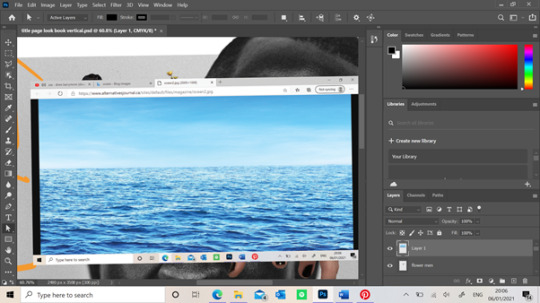


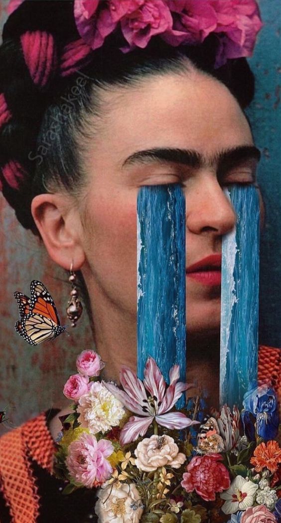
I decided to create a mood board on Pinterest for this module as it find this app useful when finding relatable images to one another. When researching psychedelic art, I came across the Etsy artist Anna Sorokina that had created loads of abnormal editorials which I loved the idea of including in my work to show the abnormality of someone's thoughts when hallucinating into certain places within their mind. A piece of her work which inspired this stage of work is below. I started with a image of the ocean which I found of google. I realised a lot of these types of art were set in front of different landscapes which is what makes then so abnormal and what I might do throughout this lookbook. I used the Marquee tool to cut out thin, long rectangles of the ocean that could look like tears when I add them into the models eyes. I then used the Eraser tool to cut around any unwanted areas of the ocean around the models eyes so it looked more realistic. I realised that where these “tears” were positioned, they would flow over another models face. I decided to progress further with this step and use the Eraser tool again to neatly cut some of the ocean so the sunglasses on the models face were visible. This made it look like the tears were flowing behind the models eyes now which I loved the look of. I also kept the ocean image that filled the lenses area of the models face and used a filter on the right of the screen to make the ocean blend behind the lens. You can see above that the sunglasses still had their lenses colour but if you look closer you can still see the textures of the waves within the ocean image. Overall I loved this outcome of this section of the page as it further explains the emotions a man may not portray to others and keep trapped within themselves.

When looking at my work from far away, all the images blended in nicely which is what I wanted however not to the extent where you can’t see the different images. I decided to use the Pen/ Brush Tool to outline certain images with the colours from the colour palette so they were visible slightly. Also when adding the Louis Vuitton image on top the hand, a certain area fell over the top of my hand which I didn't want. I had to duplicate the image of the Louis Vuitton models and Marque the area I wanted and then used the Eraser tool to cut around the areas which covered parts of my hand. Doing this made it look like my hand was pressing into the flowers and reaching out over the models head. This could portray certain dark tendencies or triggers within a mind that influencing the need to escape. For instance a person may break their diet by eating some chocolate which was triggered by seeing it in their cupboard. Although this doesn't sound like the standard form of escapism you may picture in your mind, knowing the chocolate will give a person a short feeling of happiness from its taste, it is considered as escaping their everyday habits. As I stated earlier, I also wanted to add some sort of trippy art which I had already made in the back page of the book so I decided to add some coming out of the models mouth. When I finished this, I didn't really like how it looked against the other pieces of work so I decided against keeping this in my title page.

Here is the final result of the title page without any typography which I will complete in InDesign. I enjoyed creating this page because I hadn't really seen the any other lookbook laid out like this from the examples I've looked at. When showing this work to the tutors, I was slightly worried that there wasn't much dark psychedelia which is often perceived by a person however I didn't want to over think this as I know I will show this in the other pages of my look book. However, I will add aim to show some of this through the typography of the title name. One of my tutors also complimented my layout of the photoshop page, saying he hadn't seen anyone use a square page layout yet. Although I didn't plan on doing this any way and I just didn't know the ideal page size, it worked in my favour. This is because he said this size would be suitable for an Instagram post. I realised as because we aren't printing these out unlike previous years, it would be interesting if these where posted on social media instead as a way of showing the lookbook. As the world of work is taken over by technology, this could've been a cool way to show my look book to others if it was to be shown to businesses looking at trends, moving the fashion industry forward.
0 notes
Last Seen Blogs

sreevaishnavi
Untitled

morgdefteri-blog
İsimsiz

pasiqipofu
Untitled

stigolafson
edvin deserved better
macolegacy
help me obi juan...