#and 3d printed tiles for all my floors
Text
YOU'RE KIDDING ME
IT'S BEEN TWO MONTHS AND NOT ONLY DO WE HAVE AN APERIODIC MONOTILE, BUT NOW WE ALSO HAVE A CHIRAL ONE?!?!
2 notes
·
View notes
Text


The Met ~ 09/27/2022
For my trip to The Metropolitan Museum of Art today, I decided to focus my attention on the temporary exhibition, Chroma: Ancient Sculpture in Color, since it may not be here the next time I visit. This exhibition puts on display polychromatic recreations/replicas of some of the famous Greek and Roman statues we typically think of as solid marble in its natural all-white coloring or the untouched surface of bronze. Historians have discerned that these classic monochrome ancient artworks were actually, at their original time of creation and display, painted with many bright, expressive colors. This exhibition displays multiple 3D printed and hand-painted recreations of how the sculptures on display today likely looked thousands of years ago.
I entered through the left side of The Great Hall and was immediately surprised by the subtlety and scattered nature of the featured pieces. Yes, the Reconstruction of the marble funerary statue of Phrasikleia was front and center right away upon entering the Greek and Roman Art hallway, but aside from her, I was not seeing nearly the amount of pigmented portraits I was expecting. I knew the exhibition was spread out amongst thirteen different closely-related gallery rooms, but I was not anticipated the little number of colored replica statues that I ended up seeing. The Greek and Roman Art space was as white and spacious as ever. The informational Chroma posters and large description plaques were mostly just black with white text. Although I found this a bit ironic considering the subject matter, I thought the completely neutral color scheme of the text material and the Met walls/floors was completely appropriate for the exhibit, so that no additions were unnecessarily taking away from the main aspect of the show.
Once I walked around and was able to discover and observe all of the Chroma replica pieces, I came to appreciate the setup much more. The Greek and Roman Art section at The Met is so grandiose and elegant. It has white walls, high ceilings, bright windows, and a tiled mosaic floor that compliments the permanent works in the collection beautifully. Each connected gallery is filled with so many dignified marble statues and architectural fragments that your eye almost doesn't know what to look at at first, usually. But with Ancient Sculpture in Color on display, my eye immediately discovered the new additions when quickly scanning the spaces.
My favorite moments of the exhibition were the replicas that were displayed directly next to or surrounding their authentic, original inspiration. I enjoyed comparing the colorful Caesar's bust to the monochromatic ones I am used to seeing in museums and history books and imagining it being displayed in Ancient Rome in all its colorful glory. I found that whenever a colorful replica was displayed on its own, or in a separate section than its original, such as the reconstruction of a marble archer in the costume of a horseman, I found it to be a much less interesting experience. I enjoyed being impressed by the direct comparison of original and replica and allowing my eyes to travel back and forth between each piece during close observation.
Although I, of course, trust the historians and artists who worked on the replicas for this show, at times I did take note that the painting style seemed much less realistic, elegant, and refined than the actual sculpting style of the statues underneath. I wondered about this disconnect and wished I had more information on how the researchers on this project had come to the conclusion of what original colors had been washed off the works by history. I finally got answers to my questions when I reached the portion of the exhibition in the Mezzanine area (which I definitely would not have found had I not picked up a special Exhibitions Program pamphlet at the ticket counter). Upon walking up the stairs next to the famous big marble column, I arrived at a small, discreet room with a few display cases, some more replica art, and a couple of screens playing slides and clips that yielded much of the information I had desired downstairs. It was here that I learned about how scientists can study particles of leftover materials engrained in the statues' surfaces and match them to materials used in certain pigments used back in Ancient times. Another screen provided a detailed timeline of the recreation process. The display cases showed smaller, less damaged original artifacts which had paint jobs that survived well enough to convince me that the replicas were, indeed, true to the original Ancient Greek and Roman painting styles. The room was empty when I arrived in it, and I had wished that it was made more obvious to passersby that this was an important extension to the Chroma: Ancient Sculpture in Color show, in which many visitors seemed interested enough to want more background on. Also a note, there were elevators up to the mezzanine, but I think putting the most informational portion of the exhibition in a more accessible location would have been a better move.
Overall, I thought I knew what to expect going into this exhibition but I quickly realized I was wrong. I was surprised, however, not disappointed. I enjoyed how the exhibit pieces were spread out. It was a bit confusing at first (as is the Met in general to newcomers). I personally enjoyed having to explore a little to find all the pieces, but I'm not sure that part of the experience would appeal to everyone. I do respect how the curators managed to fit in each new work in an appropriate way. If one was unaware that this was a temporary exhibit, I don't think the Chroma pieces would have stuck out as something that did not belong. The biggest thing I would have changed would be putting the informational background videos and original color sculptures either at the beginning of the exhibit or having much clearer signage and directions to get to that portion of the show. I might also have put at least one recreation in each room, so as to eliminate confusion about whether or not the exhibition spans the entire Greek and Roman wing or not, as there were multiple times that I thought I had come to the end of the show when, in fact, there was still more to be seen in other rooms.
2 notes
·
View notes
Text
Honeycomb backsplash

#Honeycomb backsplash free#
Save my name, email, and website in this browser for the next time I comment. Your email address will not be published. Posted in Kitchen Backsplash Tagged black honeycomb tile backsplash, gray honeycomb tile backsplash, honeycomb backsplash tile ideas, honeycomb hexagon tile backsplash, honeycomb mosaic tile backsplash, honeycomb tile backsplash, honeycomb tile backsplash kitchen, large honeycomb tile backsplash, white honeycomb tile backsplash Post navigation Kitchen backsplash doesn't solely shield your wall from splatters of oil however it'll additionally function ornament and add model to the kitchen. Staining the partitions would require you to wash and scrub them when you can be resting already or tasting your delectable meals. Aspect Peel and Stick Backsplash 11in x 4in Honeycomb Stainless Matted Metal Tile for Kitchen and Bathrooms (3-Pack) 4. You positively do not wish to stain your kitchen partitions due to these. If you do not know the way to make a design your self, you should purchase pre-made mosaics which are prepared for installations.Spills, splatters, leaks and falls principally occur within the kitchen. The mosaic tiles may also be an ornamental ingredient in your wall. In case your countertop's colour is impartial, select a backsplash that may give accent to the entire kitchen. Select a cloth that may match your countertop. Colamo 5-Sheet Peel and Stick Hexagon Mosaic Stainless Steel Tiles Backsplash, Sliver Aluminum Honeycomb 3D Wall Panel, Self-Adhesive Tiles for Kitchen Bathroom Living Room, Sitck on Tile 4. There are glass tiles, pure stone tiles, mosaic tiles and porcelain tiles. Tiles have a number of types, measurement, supplies and designs you'll be able to select from. The most typical kind of kitchen backsplash is the kitchen tiles. Stick to our tips, and we promise you a perfect result that will keep you up-to-date.Marble Hexagon Follow Us On Instagram Concepttiles Toowoomba Tile Kitchen Wall Tiles Retro Floor Patterns All you have to do is go one more time through the ideas provided by us and stop at the one that suits you. Therefore, we suggest you consider it when deciding in this sense.Īs a finishing point, we would like to encourage you for something regarding the kitchen design. As mentioned earlier, the core concept of the 2022 trends is simplicity. Furthermore, such eye-catching designs will not bring a point of interest to the room but rather spoil the picture. SODA POP Design Black honeycomb floor tiles contrasted with white grout lead to a lime green washstand adorned with polished nickel pulls and a gray marble countertop finished with a trough sink. They have been out of trend for a long time now. Light gray and black butlers pantry boasts black honeycomb backsplash tiles merge with white quartz countertops and a pantry sink with a gooseneck faucet. We suggest you avoid such prints on the backsplash as fruits, flowers, cities. Even the slightest touch of a particular color or shape on a plain backsplash will bring a new sparkle. There is a wide range of stunning designs that would enrich a kitchen of any style. Don’t leave this space blank, as it will make the picture of the kitchen blurry. Why choose this out-trended type of tiles when there are various possibilities in this sense, particularly the up-to-date ones mentioned earlier? Furthermore, it can spoil the picture of your kitchen and reduce the softness of the environment. This type of decoration for the backsplash has been out-of-date for a long time. Therefore, we suggest you better look at those as much as it requires to find the perfect combination for your kitchen. There is a wide range of options in this sense that would match any preferences. Of course, it would save you money and offer freedom for an original design, but we suggest you don’t play with that unless you are an expert in the field. Although you can opt for a bolder shade, don’t forget to preserve a balance while playing with colors. If your kitchen is covered by neutral colors, we suggest you apply the same idea to the backsplash.
#Honeycomb backsplash free#
You can consider plain colors or a specific design that will match the kitchen style and the room decor. Shop for Walplus Shimmering Green Honeycomb Hexa Wall Peel and Stick Backsplash Tile Stickers and more at everyday discount prices with free shipping over. Furthermore, it will be practical as it is easy to take care of, especially if you like to cook a lot. A glass backsplash will bring a new sparkle to your kitchen and enlarge the space. Glass has become an alternative to ceramic tiles and gained popularity due to its functionality. We suggest you go through the backsplash ideas of 2022 that we provided you with. Aspect Peel and Stick Backsplash 11in x 4in Honeycomb Champagne Matted Metal Tile for Kitchen and Bathrooms (3-Pack) 4.2 out of 5 stars 58 1 offer from 15. Therefore, you will be able to combine functionality with aesthetics. Regarding the backsplash design, you can opt at the same time for elements from all the styles mentioned earlier. The main idea consists of the fact that you have to arrange a space that will feel comfortable to you. We would like to bring good news to you in this sense as the 2022 trends regarding this aspect do not imply any strict rules.
0 notes
Photo


[image description: 6 photos of a combination letterpress and hand-drawn print of Megaera from the game Hades, and the formes of lead type used to print it. it’s a 5.375x10 inch piece, black pen drawing illustrating Megaera wielding her whip inside a loose & lightweight frame of sharp black rods, climbing roses, and a podium-like base featuring small elements from her chamber in Tartarus. The letterpress elements are her name, bordered with a Greek key pattern, and the blue color of her chiton, pants, and wrapped forearms, rendered in a relief-printed repeating geometric pattern. individual photo IDs under the cut.]
part of a set of Hades prints i donated to Desert Bus 2021, which are scheduled for giveaway in the noon-6 pm slot Thursday the 18th!
I can’t quite put my finger yet on when i feel it’s beneficial for the printed pattern to be very regular and flat, vs. this kind, which is a bit more randomized and almost pretends to be morphed by 3D folds. The printing on it was pretty straightforward, but i did do this one in multiple passes as well, tilting different parts of her outfit at different angles so her pants and tunic patterns didn’t align across the barrier of her skirt trim. I also needed to be pretty careful to get printed color coverage in a whole bunch of corners, otherwise the tunic especially is missing some important information to parse it.
picking elements from her boss fight chamber to put in the frame was super fun :) there’s so much Good Geometry in Hades’ environment design!! sadly i don’t have nearly enough of the Greek keys to cover the clothing area, so i put it in her titling block and made her a whole podium about it. Name set in Invitation.
more wip : Thanatos : Zagreus
1: a photo of the complete print, where Megaera stands with her whip looping around her, wing out and preparing to grasp the hilt tighter. the bottom of the frame implies a pedestal, decorated with hooded heads and and geometric shapes like the statues and floor tiles of Megaera’s boss fight chamber. The iron rods implying the sides of the border end in twisting helixes, also like the tiles on her floor, and are covered in thorny rose vines. Hanging from the roses are her Skull Earring keepsake and Companion Battie.
2: a closeup of the finished print, showing details like the line texture of her hair and whip, and large areas where the pattern was relief-printed in blue.
3: a photo of the handset forme used to print the blue pattern on her clothes. It’s a slightly random arrangement of geometric pieces intended to be a decorative border, looping over and under itself sort of like a blocky Celtic knot pattern. The pieces are in this case set to turn corners and double back on themselves to cover more of the area.
4: a photo of a proof of the printed pattern, and the mylar mask positioned on top of it that will allow the pattern to print only in the desired, irregular area of the shape of Meg’s chiton. the decorative pieces cover a larger, rectangular area, and the print is protected from printing in the negative space by a hand-cut mask made from mylar. The print will be put underneath the mylar mask, and printed only through the hole in the mylar.
5: a closeup of the finished print, focusing on the lower half, her wide stance, the pedestal, and the impression where Megaera’s name is printed with the Greek key border.
6: a photo of the handset formes used to print Meg’s name. these formes need to be lifted up, carried, and held vertically in the bed of the clamshell press, so all negative space around the individual letters and decorative pieces are filled with shorter pieces, too low to ink or print. then pressure is applied by wedges to two sides of the forme, inside a rectangular cast iron frame, so that the whole frame and all the assembled pieces inside it can be lifted up.
#hades#megaera#hades game#letterpress#letterpress printing#printmaking#desert bus for hope#db2021#desert bus 2021#finished works#db hades
54 notes
·
View notes
Text
A Beginner's Guide To Acoustic Treatment
An account of an acoustic newbie's journey from bare walls to a well‑balanced, sonically pleasant space.
The physics of the propagation of sound is immensely complicated, and when the assortment of materials that make up the walls, floors and ceiling (plus any windows, doors and furniture) are added to the equation, it's very difficult to predict what will happen to sound waves once they've left their source. What's more, every room is different, and it's not just the dimensions that will dictate how the room will sound... Imagine two rooms of the same shape and size. One has two‑metre-thick concrete walls, and the other a single‑layer plasterboard stud-wall. Even with those brief, albeit extreme descriptions, you probably know already that the two rooms will sound very different. Add in the multitude of room shapes, sizes, wall‑construction methods and surfaces found in home studios, and it becomes impossible to provide a one-size-fits-all guide to acoustic panel treatment.
The subject of acoustics is regularly discussed in SOS, but plenty of readers still ask for the subject to be covered from a much more basic starting point. What follows is a look at installing acoustic treatment from a complete beginner's perspective: some basic, essential information, along with a bit of advice from acoustics professionals that should give you the confidence to get started. I'll follow this up by taking you step by step through my own recent experience of treating a room.
Why Bother With Acoustic Treatment?
Untreated rooms have an uneven frequency response, which means that any mixing decisions you make are being based on a sound that is 'coloured', because you can't accurately hear what's being played. In short, you can't possibly tell how your mix will sound when played back anywhere else. It isn't just an issue for mixing, though, because any recordings you make of acoustic instruments will bear all the hallmarks of the space in which you record them. That may be a good thing if the space in question is Ocean Way or SARM West, but probably preposterously bad if it's your living room or bedroom. So, if you want your mixes to transfer well, and your recordings to be free of room 'honk', you need to pay attention to the acoustic properties of your environment — no matter how good the gear you're using.
First Things First
The first thing to grasp is the outcome you want to achieve. It's a common misconception that acoustic treatment with acoustic ceilings or acoustic baffles should kill all reverberation, and that you want a room covered floor‑to‑ceiling with foam tiles: this isn't what you're aiming for. You also need to bear in mind the limitations imposed by space and budget: most home studios are small in comparison with the Abbey Roads and AIR Lyndhursts of this world, and many home‑studio owners simply don't have the funds for bespoke treatment solutions.
So what is the aim? Andy Munro, acoustic design specialist, remarks, "acoustic design is the science that restores a neutral sound balance”. Applying that science means interfering with the path of sound to control the sound energy. Jorge Castro, chief acoustician at Vicoustic, says that "in the case of affordable treatment, we need to control the energy of the sound first. Then we can take care of the sound quality. With small spaces, bass frequencies are always a problem, and we should control the low frequencies as much as we can.” In fact, he continues, "In small rooms, I've never heard people saying they have too much absorption of low frequencies.”
Absorption & Diffusion: What, Where, Why?
To achieve the right balance, there are two main approaches: absorption and diffusion. Products that have absorptive properties include foam and rigid mineral-wool (see the 'DIY & Rockwool' box), and they 'soak up' the sound energy, turning it into heat, through friction. Most effective on high‑frequencies, absorption is essential for reducing flutter echoes and for taming bright‑sounding or 'ringy' rooms. Bass trapping is also a type of absorption, but is specifically designed to absorb low‑frequency energy. A clever combination of soft, hard, thick and thin materials, including air, is used to make the most efficient bass trap, and an empty gap between the wall and the back of the trap helps to make it even more effective.
Diffusion is the scattering of sound energy using multi‑faceted surfaces. Diffusers are commonly made of wood, plastic, or even polystyrene. Jorge Castro explains: "diffusion helps in energy control and improves the sound quality in frequencies throughout the middle and high range of the spectrum, and also improves sweet‑spot image.” The 'sweet spot' is the place between the speakers where you should be sitting to get the best stereo image (imagine that your head and the two speakers form an equilateral triangle). That pretty much concludes the theory: now for the practice!
Getting Started
Before undertaking this project, I'd read plenty about acoustics, but had never attempted to properly treat a room myself: the nearest I'd come was propping foam panels against the walls to tame flutter in the spare‑room‑cum‑studio of my rented house. I hadn't been able to glue or screw anything to the walls, for fear of incurring my landlord's wrath, and the thought of retouching the paintwork after tearing strips of self‑adhesive velcro pained me too! So this was very much a learning experience.
The space in question included an area that would provide a reasonable‑sized live room, and another that would serve as a small control room, and although both were important, I really wanted to get the performance space right. I decided that I'd buy commercially available panels, because I simply didn't have the time, space or inclination for the DIY option. Most manufacturers of acoustic products also offer a consultation service, and they often have free on‑line calculators to help you decide on a suitable treatment option, too, so even if you choose the DIY route this can be a sensible place to start, and fabric acoustic panels are also available.
I chose to get my treatment from Vicoustic, a company relatively new to the UK acoustic‑treatment market who make a range of products for studios and home theatres. I told them that, as this was the only live room for a small project studio, it needed to be quite versatile, with both a 'dead' corner for dry recordings and a more ambient space to liven up acoustic recordings where needed. I'd expected a solution with almost complete wall coverage, foam panels and diffusers covering every square inch, but Vicoustic came back with a plan that surprised me, which suggested that total coverage wasn't necessary.
In fact, Jorge says that the typical home studio needs only between 30 and 40 percent coverage to adequately treat it. So don't go over the top: remember that we're trying to control the energy, or "restore the natural sound balance,” and not to kill the sound completely.
As for the proportion of diffusion to absorption, Jorge says, "some believe it should be 50 percent absorption and 50 percent diffusion. In the home studio, because of budget and space constraints, the actual proportion can vary considerably.”
Planning
So, you've decided on your acoustic foam treatment, you've had it delivered, and it's piled in the middle of the room. The next step is sticking it up on the walls, right? Well yes... but you also want to make sure that it goes in the right place, partly to optimise its acoustic performance, and partly because you don't want it to look like it's been put up by a two‑year old! As a first‑timer, I found it useful to have the 3D drawings Vicoustic had supplied, as they enabled me to plan precisely where each panel would go. You can create a computer‑generated version of your room yourself using a freeware 3D drawing programme such as Google Sketchup (http://sketchup.google.com). This may seem a bit over the top (sketches on the back of an envelope would do the job), but it can provide a useful guide to print out and use like a map during installation. What's more, you can plan the look of a room, moving tiles and panels around on the computer instead of having to rip them off the wall if they look silly.
Measure Twice, Stick Once
With my 'map' in hand, it was time to mark up the walls. The Vicoustic plans showed the panels equally spaced along the walls, but without any dimensions or measurements to indicate how to space the tiles, so I measured the whole room and planned the position of all the panels supplied. A quick and easy formula for plotting the position of a row of equally spaced panels soon emerged. To calculate the distance between each panel, and between the end panels and the walls, you just measure the length of the wall, subtract the total width of all the panels to be fixed to it, then divide that figure by the number of gaps between panels (or by the number of panels plus one). Marking up is then a cinch, but to get things looking good, you'll need to mark the corner points and will require a spirit level and a spare pair of hands. Once plotted and marked, it's also a good idea to double‑check that you have the same number of actual panels as you have on your plan!
Stick 'Em Up!
With the planning done, it's time to stick the panels to the walls and ceiling. The way you do this depends on the type of treatment you're applying. Large, framed panels will come with brackets and (hopefully) sturdy fixings, whereas foam‑based tiles will need to be glued, using an aerosol‑based product or a tube of paste‑like glue that needs a skeleton gun. Spray‑mounting can often give less than satisfactory results, so I was glad to discover that the Vicoustic delivery included the tube variety. With just two tubes supplied, though, I soon had to resort to alternatives, and found that the sticky gunk used to fix mirrors to walls worked exceptionally well.
To prevent the glue squidging out from the sides of the panels, I piped the glue on no less than an inch from the guide line on the wall and on the back of the panel itself, in different patterns, to increase the adhesion. With this kind of glue, I found that it would begin to set in about a minute, allowing just enough time to pull the panel off and turn it if it was the wrong way up. When sticking panels to the ceiling, I took the same approach. It was a textured ceiling, which called for lots of glue and a firm hand to seat the panels: again, it's useful if you can get a friend to lend a hand.
Hearing The Result
Once in place, the Vicoustic treatment worked very well. The main part of the room is now nicely controlled, if a bit on the 'live' side, and the diffusers ensure excellent intelligibility of speech: a sure‑fire sign of good acoustic control. I had a few spare corner traps, which were put into the dry corner, to make it even more 'dead', and it will be easy to add a few smaller foam tiles to dampen the sound further if it's found to be too 'roomy' further down the line.
Having tried some recordings in the room, I'm happy to say that excellent sound barrier can be achieved between acoustic instruments and vocals by using the different areas of the room. Because the sound inside the room is controlled, the ambience can be used to good effect if a roomy sound is desired on the recording.
Ultimate Control
So far, I've only addressed the dedicated live/recording space, and most home studios are single rooms, with both the monitoring and performance areas in the same space, so I asked Andy Munro to explain how to approach treating such a space. "The best approach,” he said, "is to sketch the room out, then divide each dimension into thirds. If the mixing position is on a third ratio, and so are the speakers, they will not stand on any of the half or quarter 'standing' wavelengths that cause a peak or trough in the bass [see the 'Standing Waves' box for more information]. The result will be a smoother sound, with fewer problems when the acoustic absorption and sound barrier is added. Ironically, most professional rooms are set up about the centre line, which tends to result in a 'hole' at certain frequencies.”
Also important in monitoring rooms is the control of early reflections. When a speaker cone is driven, it disperses acoustic energy to the listener's ears directly, and also to the walls and ceiling of the room, and the best example may be acoustic diffuser. Uncontrolled, these early reflections bounce back into the room and reach the listener a few milliseconds later than the direct sounds, because of the additional distance they've had to travel. Unless in a large room, this delay is not perceivable as a different sound; instead it disturbs the phase, and therefore the clarity, of the sound. To keep early reflections on a tight leash, the 'mirror points' of the room should be identified and treated. To do this, sit in the listening position and 'guesstimate' where a mirror would have to be placed to enable you to see each monitor cone from the sweet spot. Then apply absorption to these points. A 'ceiling cloud' can be positioned in a similar way, to control vertical reflections.
Conclusion
No matter how much you spend on instruments, amps, speakers and recording gear, you still need to pay attention to the space in which you use them. The treatment of home studios is tricky, because of their size and the construction materials used, not to mention the budget of the average home‑studio owner. It's impossible to get a 'pro-studio sound' from a space that's built as a spare bedroom, mainly due to the laws of physics, but also because 'proper' studios might have big bucks spent on acoustic design with soundproof materials. But if you can get your head around what you're trying to achieve, you can still make such a space perfectly usable, with only a small amount of money, some forward planning and a little bit of knowledge.
1 note
·
View note
Text
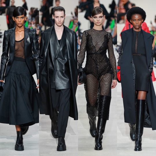
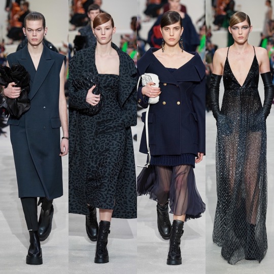
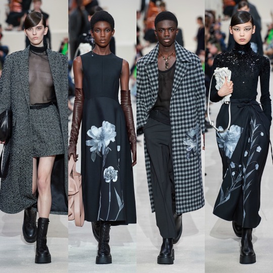
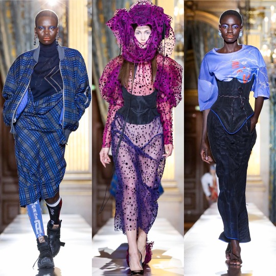
A/W 2020 Fashion Month & Top 20 Collections: Before Vogue Went Blank (Part 4)
Hi all,
Welcome to part 4! It’s gonna be a bit of a shorter one because I wasn’t sure if I could fit the last few collections into my part 3 since I also want to include a ranking of my favourite F/W20 shows. I have so many ideas for what I’d like my next few posts to be (there’ll probably be a bit of gap between them as I would like to try and get some fiction writing in too) and I need help and recommendations on one post in particular so I thought I’d open by explaining that if anyone would like to send me suggestions! The post is basically going to highlight the often under-appreciated personal style of PoC, and I’d also like to make sure I include all types of bodies and genders and ethnicities (other than white girls, as we get enough credit as it is, all a tall, skinny blonde woman has to do is wear some light wash jeans, heels and a blouse and high fashion Twitter are posting non-stop about how incredible her style is)! This can be a celebrity, a model, an influencer or even just one of your friends if you think they deserve some hype too! Obviously there’s only so many photos I can include but I will make sure to look at any suggestions, though of course I’m gonna be biased towards the grungier looks; I gave Dolls Kill a pass for a long time because I thought the brand had changed and become more responsible over the last few years but since Shoddy Lynn’s thoughtless Instagram post during the protests last month and then her lacklustre response video, I say fuck that “goth is white” bullshit, alternative black women are hot af. I’ll also make sure to include a list of my favourite black owned clothing lines I’ve seen people talking about on Twitter and Instagram so again, if you have any suggestions feel free to inbox me. Other than that, I have a couple of lookbooks planned and after, either a post about my favourite shows for style inspiration OR a lookbook depending on whether I have the clothes to do it already/can source a few things from Depop-Depp-I’ve made a commitment not to buy anything new for the next couple of months and I want to stick to that this time round! I’d also like to do a general collation of my favourite summer outfits, an almost scrapbook-y kinda post, and another post on some of my favourite fashion icons (I’ll probs end up repeating a lot of the women from the post I was talking about above but I’ll try and include different outfits to keep it varied!).
Now, into the final part, and the top 20, starting with Tory Burch (I’m really pissed off because I added an unnecessary E in after the R and now Tumblr is once again being stupid and not saving any of my editing changes-also I said on the next post instead of in in the last paragraph and my anal-retentiveness is kicking into high gear).


You’d think it’s a kinda anti-climatic one to open with but I do like this collection! It reminds me a bit of last season’s Miu Miu but more so of Brock’s general aesthetic, though with more layers and in some ways to its detriment, a lot more wearable. Looking like something from a bygone era is part of what gives Brock its mystique, but Burch’s designs are practically made for the Chelsea born and bred lifestyle blogger who dresses for a cold spell in the Coachella valley all year long and treats trawling Pimlico’s furniture shops and meeting their girlfriends for coffee like it’s a full-time job. She’s probably born into money and doesn’t work all that hard but hey, she looks angelic holding a bouquet of flowers and in 2020 we all low-key want her life, right? It’d go against my ethics but...*whispers* it would be nice to be that girl just for a couple of days. It is a gorgeous collection, with a lush colour palette and an ever graceful variety of prints and textures, and it toes the line of being accessible and being worthy of a fashion week spot with dexterity. 8/10 and it only loses marks because it’s safe for the brand.
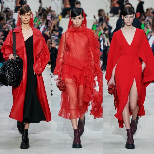


When it comes to Valentino, they’re a pretty reliable favourite for me, and this season’s collection doesn’t break tradition; this one is slightly grittier than usual too which is a big win for me. Whilst the usual sophistication and delicate details are there, quirky embroidery, sequins and tulle, we also get a lot of leather and more black than usual, which I pray doesn’t a herald a return to people thinking “I only own black clothes and listen to Artic Monkeys” is a personality trait. I don’t know if it’s intentional, but there seems to be a lot of aquatically inspired pieces in this collection too; the 3d roses resemble scales to me (and are a really unique texture), and the way the tulle is placed kinda reminds me of fins and has a mermaid on land feel. It wouldn’t surprise me, since Valentino does tend to draw from nature quite a bit. Highs for me were the Valentino red tulle piece and the tulle pieces in general, of course with the embroidered florals as well which the basic bitch in me always looks forward to. The few lows were concentrated in the leopard print section, a print that for me is really overdone and reminds me of recent Dolce and Gabbana. It was cool when layered with the matching coat but I otherwise could’ve done without it.


Vera Wang is another one of my reliable faves-I think I like this collection even more than the last, it really is a fucking DREAM. The overly floral pieces I wasn’t too keen on but I’ll ignore that on the basis that as with Gucci, the tulle-harness combo is everything I look for in a dress and more. I know manic-pixie-dream-girl is a bit of a slur (not a slur slur but you know what I mean) in terms of the associated character, but this 90s Courtney Love grunge twist on that aesthetic is gold, fully realised big anarchist fairy energy (which is a screen name I’m surprised I don’t see more often and which I might now steal). These dresses were made for someone like Zoe Kravitz or FKA Twigs on the red carpet, and if god forbid I somehow ever ended up on one, I would go to the ends of the earth to be wearing one of the dresses from this collection. Aside from the dresses, I appreciated the moody doesn’t-want-to-be-at-the-family-function teenager inspired sleeves and the 2014 Tumblr Cruel Intentions style knee high socks. Love, love, LOVE it.


So, Versace started off strong with the all black looks-the cut outs were cute if impractical and the fit and flare trousers in particularly were really well fitted (from a distance, at least). I hated the film Red Sparrow but the visuals were very cool, and this section reminded me of that, like a high fashion collection based on Jennifer Lawrence’s character. There were some stunning colour combos in the Ashish like hyper-floral part too, and the houndstooth, marble and Versace tile prints were sick. The black jumper with the flowers on reminds me of a jumper of my nan’s I always wanted that my aunty ended up donating to a charity shop after she died not knowing I liked it. Gutted (not just about the jumper obviously, looool).
HOWEVER, as with many 91 look collections, it was sloppy at times. A lot of pieces I at first liked (I.E the silver dress we saw Kendall Jenner in, included above) are kind of unfinished up close. There was also a big varsity inspired section which was nice at times but got pretty repetitive and occasionally looked like it could pass for Jack Wills or a bad Michael Kors collection. On the whole, it had both its pros and its cons which puts it directly in the middle of the pack.


Victoria Beckham’s collection is near the lower-middle quartile when it comes to plotting the highs and lows of the F/20 collections. The pieces are pretty and accessible, I’d definitely wear them, but they’re predictable and mostly a rip-off of other brands who did something similar in a more interesting way. Though her collections are never really experimental, this one is particularly safe, and she and whoever helped design this season’s pieces were clearly avoiding the edges of the box like a child playing the floor is lava. It’s alright, and I hate coming towards the end of the post with negativity, but I have to be honest, and this just doesn’t really interest me beyond a “yeah, that’s nice” glance.
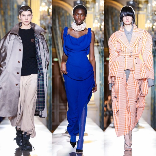


Vivienne Westwood, on the other hand, is always interesting whether I would actually wear it myself or not. Despite the mix and matchiness that is essential to the deconstructed look, which being the basic bitch I am I often struggle to see past, there were some gorgeous pieces and eurgh, I could really talk about that Bella Hadid look all day. The contrast between the exaggerated femininity of the waist cinchers against the androgyny of the less structured, oversized pieces is a really interesting one and the colour combinations work beautifully together. I also love the idea behind the collection, which is, in the words of Andreas Kronthaler about “rites of spring, and the good and the bad, and conflict, and the good prevailing over evil”. Ahhh, I hear you say. THAT’S what’s with the garlic necklace. Can I get another pat on the back for summing up this collection as “vampire slaying uniform” in my notes? I mean, that’s kind of a good vs. evil situation, isn’t it? I know it’s hard to ignore how hot vampires always are in TV series and movies but just think of the true forms of the ones off Penny Dreadful and remember THEY DRINK BLOOD (I personally think being a vampire would be really cool, just need to work out how to do it “ethically”).


Lastly, Zimmerman, and I really can’t say how happy I am to end on a positive note because this collection was stunning. Not without all the characteristically ornate, indulgent and painstakingly detailed efforts we’ve come to expect from Nicky and Simone Zimmerman, these looks (in an icy winter themed colour palette as well) are the offspring of a sophisticated flower child and a 70s glam rocker and I think with this sentence I’ve finally put my style aspirations into words. Honestly, give me the money to produce a modern day Almost Famous and I’ll make my character this no-nonsense intersectional feminist front woman of a fictional Haim-like band who sings with the voice of an angel but is rock and roll as fuck and eats men for breakfast and I’ll put her in this collection and (deep breath) it would be ICONIC. There. Got to the point eventually. Am I talking about a 2020s version of Steve Nicks? Possibly. After all, I do have a framed illustration of her on my wall. But regardless, I need those lace-up velvet BOOTS, that mesh dress with the celestial embroidery, the flame detail pieces, the white pussy bow blouse with the eyes on it. Everything is sooo dreamy; when I was looking through the collection for my favourites, I saved pretty much every. single. look. IT’S EVERYTHING I STRIVE TO BE. WHY CAN’T I AFFORD ZIMMERMAN GOD DAMN IT!?
See, I’ll be going on about Zimmerman in a couple of paragraphs again because it will be very high in my top 20, which I’m so glad is a top 20 BTW. I know I said it would be a top 10 in my last post because I thought that was how I structured it last time but I double checked and it is 20, which is a relief; once again, picking only 10 collections would be very hard. SO! Let’s get into it!
1. Gucci

I hate being predictable but Gucci once again holds the top spot for me. How could I not love this? I would say that I hope Alessandro Michele fucks up next season so I don’t come off as a boot licker but when the boots in question are platform Mary Janes and knee high socks and they’re underneath tulle with BDSM inspired harnesses on top...maybe boot sole doesn’t taste so bad after all.
2. Zimmerman
Well, I did say it wouldn’t be long until you were seeing the same outfits again, so at least you know my word is good.
3. Moschino

Wow, as if putting Gucci first again wasn’t bad enough, Moschino’s also a non-mover. But...Marie Antoinette this season and Picasso last? And this campy? It’s like Jeremy Scott reached into my brain magician-into-a-top-hat-style, picked out an interest of mine at random, and tried to communicate this to me through the medium of design with THE most chaotic energy humanly possible. I an only commend the man, because he succeeded, and I approve. It’s weird because before I always saw Jeremy Scott’s designs as tacky and yet I’ve loved all the collections I’ve reviewed, so I must ask...are the collections getting less tacky or am I getting more tacky? Much to think about.

4. Vera Wang
The battle armour of a punk princess. Not very good at protecting against knives, arrows, bullets or...anything really, but I’ve never really been the kind of person to get into physical fights (apart with a bouncer who tried to push me down the stairs once at an ABBA night but I was really drunk and she was mean, alright!?), so who cares? Nobody can make you do anything in dresses this pretty.
5. Lanvin

I’m a few years behind everyone else but I’m still on the Mad Men hype train and I don’t ever want to get off. All I wish is that Betty Draper had *SPOILERS* divorced Don’s detty arse earlier and rode off into the sunset in that white Bella Hadid coat with the red lip to match (or the checkered one above will do).
6. Etro

As long as she remains the queen of dreamy bohemian fashion, I’m not gonna do Etro dirty by putting her any lower than this ever again on the basis that she’s not conceptual enough which ashamedly is what I implied in my last ranking-yes, Etro is a she because just as most women deserve more from men, she is beautiful and deserves better than my previous disrespect! I said what I said.
7. Dilara Findikoglu
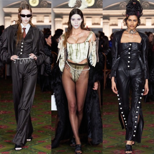
I see your Thom Browne and your Commes Des Garcons and I raise you my “weird”-though-not-actually-that-weird-at-all-can-we-all-just-dress-like-this-on-a-day-to-day-basis-please? fave, Dilara.
8. Paco Rabanne

Battle armour that actually COULD protect you against knives, arrows, and bullets. Maybe. Well, you’d hope so anyway for the price.
9. Rodarte

Suddenly my phobia of spiders has evaporated. And no, it doesn’t have anything to do with the fact that these ones are diamond encrusted, what are you on about?
10. Alberta Ferretti

The colour combinations in this collection were stunning. Honestly. I just picked a really bad pic to illustrate that. Go read my first post to see (grifting 101: complete)!
11. Charlotte Knowles

I saw Bella Hadi wearing a Charlotte Knowles two piece, so I bought a Charlotte Knowles two piece.
LMAOOO, I wish.
12. Balenciaga

It’s occurred to me a couple of posts too late now on the basis that Tumblr is being a dick and won’t go back and let me edit stuff, even little typos, but I’m now wondering if there’s a link between the climate change theming of the show and the exaggerated structures of the pieces? Ya know, the whole abundance is killing the planet line of thinking? I know analysis isn’t exactly on brand with these silly mini captions and that oversized and exaggerated proportions is one of Balenciaga’s running motifs anyway buuut just a thought I had! And sidenote: I do believe overconsumption is killing the planet! The way I phrased that made it seem like I’m a climate change denying dickhead! That I am not! Maybe if I shave my head, legally change my name to Steve, get a British flag tattoo on my bicep, and spend every waking moment in my nearest Spoons I’ll get there but it’s not on the agenda quite yet!
13. Christopher Kane

If fashionable robots took over the world, they’d raid Christopher Kane’s studio and fry us all with laser beams whilst wearing his dresses.
14. Fendi

Siri, play Vroom Vroom by Charli XCX.
15. Olivier Theyskens

Mandarin collar. Mandarin collar. Mandarin collar. NEXT TIME I WILL REMEMBER WHAT THE PROPER NAME IS INSTEAD OF NEEDING TO GOOGLE IT AGAIN. Come on brain, you’re supposed to be good at this kinda thing, make it happen.
16. Elie Saab

Blair Waldorf’s wet dream. Add in some platform boots and chain jewellery and now it’s my wet dream too.
Because Chuck Bass is creepy as FUCK and maybe it’s because I watched Gossip Girl at the ripe old age (lol) of 21 and most people watch it as teenagers but I don’t know why YOU WERE ALL SO OBSESSED WITH HIM! He tries to sexually assault Jenny who is about 14 in the VERY FIRST EPISODE. I think I went off on a tangent here but it had to be said. You girls have no taste.

Don Draper was an absolute dog, but he was played by Jon Hamm, and he might be one of the finest men on the planet. What’s your excuse, Chuck and Blair enthusiasts?
17. Miu Miu

As someone who has probably been/met many a spoilt brat in her time, I appoint Miu Miu as the official sponsor of the Spoilt Brat™ aesthetic and yeah, that’s something I just made up but I’m on the money here. Imagine one of those “daddy, can you get me a pony?” types all grown up. Are you telling me you don’t picture her in Miu Miu? Because that sounds like a lie.
18. YSL

The war flashbacks I get of the Friends episode where Ross tries to get out of those leather trousers aside (I know it’s PVC her not leather but they have the same sheen, you can’t deny it), these outfits turn me into the irl version of the heart eyes emoji. It’s not like I think this is the best collection I’ve ever seen, YSL could def push the boat out a bit in terms of experimentation, but there aren’t many people who wouldn’t look hot as fuck in one of these pieces
19. Balmain

I didn’t like ALL of it, but the looks that I did like were amongst the ones that stuck out to me most when I was reflecting on the collections I’ve reviewed: the breast plates and silk capes and the scorpion detailing are real chef’s kiss moments.
20. Marques Almeida
Miss the collection that gave us this coat off the list? Never.
SO!
That is the end! Wow! I started saving the photos for this review back in late January/early February or whenever it was that the first fashion week began and now it’s mid-fucking July!? I don’t know if that speaks more to my incompetency or what a state the last few months have been. I’m not gonna write a super long ending paragraph because you’ve heard enough from me already and it’s 2:30am and I’m being hassled by Trump supporters on Twitter (literally just for stating that it’s a privilege to be able to pursue a career you truly have a passion for rather than having to be practical about finances first) anddddd I’ve got a closing shift tomorrow so I should probably log the fuck off and remove my clown makeup before it’s time to start my shift, lol!
Quick recommendation before I wrap this up, there was a really interesting debate on ITV literally a few hours ago on the Stephen Lawrence case that I thought I would recommend (they also showed the 1999 dramatic portrayal of events afterwards) about racism in England and whether or not much has changed since the murder. I didn’t catch the whole thing but from what I did see, there were some really strong points being made and I think it could be a good thing to sit and watch with your family members if you want to get talking about the Black Lives Matter movement and aren’t sure how to broach the topic. I bring it up because I feel like most middle-aged white people trust ITV so they’re less likely to turn their noses up (lol, I wish I was joking) at it and maybe go in with a more open mind. I’d like to keep the conversation about social issues going so if there’s anything you’d like me to get some information together on and make a post about-I read yesterday that there’d been arrests of THE PEOPLE PROTESTING the way Breonna Taylor’s death has been handled. No, not the police officers responsible for her death, the people simply pointing out that those police officers have done wrong. It’s a ridiculous situation and just shows how deeply embedded a police officer’s supposed right to kill and to use force is in upholding the American status quo. I wish I could end the post on better news, but let’s hope that next time I post, there is some, and as always thank you for reading til the end if you did get this far! I really don’t have all that many followers on here but do et me know if there’s anything I can reblog or share to help.
Lauren x
#fashion week#fashion#fashion inspo#style#style inspo#style critic#pfw#nyfw#balmain#balenciaga#paco rabanne#gucci#haute couture#designer#runway#ysl#brock#adut akech#bella hadid#model#street style#lfw
29 notes
·
View notes
Text
Ch 10 So You Wanna Spin
Max swings open the bright red motel door with a welcome door knocker with an orange chili pepper wearing a sombrero on it. His eyes try to make sense of what he is seeing and he loses his grip on his suitcase in surprise. The room is a lot. Liz’s mouth gapes open as she takes in the shades of white, red, orange and yellow in chili peppers on every visible surface- from the carpet to the wall paper to the comforter on the bed.
Max takes a tentative step into the room and a few chords of a popular Red Hot Chili Peppers song ring out. “What the heck?” Max looks around, confused. He takes a step back into the cement hallway, then a steps forward back into the room.
“Give it away, give it away, now!” The Red Hot Chili Peppers ring out once again and Liz giggles.
“The room is trying to give us a hint.” Liz smirks at Max, rolling her pink suitcase into the room. It is the ugliest thing she has ever seen and she is absolutely obsessed with the dedication it took to make it look that way. Not one object in the room isn’t pepper themed.
“Do you think all the rooms are like this? Surely they have multiple sets of pepper sheets” Max eyes the motel sheets worriedly. He usually stays at much nicer hotels.
“Que demonios? Does it smell like enchiladas in here to you?” Liz sniffs the air absolutely convinced she can smell grilled chili peppers. She follows the scent to the bathroom, which is just as covered in peppers from the tiles to the toilet seat. “I found the smell! There’s a Tex Mex scented candle in the bathroom.” Liz calls out to Max.
“They just left that lit? That’s a fire hazard.” Max answers her, concerned. He hopes this place is up to fire code.
“Don’t worry, I blew it out Grandpa.” Liz sasses him from the other room, a little disoriented by all the colors and patterns mixed together in the bathroom.
“You tease but candles are a leading cause of house fires, Liz.” Max shakes his head. “So, our best hope for finding an open tire shop is in the morning since they are all closed. What do you want to do for dinner? I can let you go crazy in that sketchy vending machine we passed outside or we can see if the bar across the street has food?”
Liz comes out of the bathroom, coiling her long dark hair up into a bun and back down again. “Let’s try the bar across the street. All bars have wings and burgers, right? The snacks in that vending machine are probably as old as this carpet.”
“You’re not wrong.” Max laughs before turning serious. “Hey, don’t let me get drunk. I don’t want to fall on this psychedelic carpet when we come back.” He gestures at the black, orange and yellow carpet with a mirage that makes it look like there are 3D red jalapenos flying across the floor.
—————————————
The Mineshaft Tavern is a rowdy panhandling pioneer themed dive bar covered in a smoky haze. Like most small towns, the locals can still smoke inside. In the background, there are off key locals singing karaoke on stage over crackling speakers.
“Oh, Max, karaoke might be fun!” Liz looks up at Max imploringly and he avoids her doe eyed trap.
“Let’s see if we can find something to eat first” He half smiles down at her hoping she forgets about the idea, heading for an empty wooden table that is probably older than they are.
A middle aged brunette waitress comes over and sets down two menus with jaunty gold toothed panhandlers on the cover. “Hi, I’m Lisa. How can I get you started?”
“We need two shots of top shelf tequila and two waters, please.” Liz beams at the waitress. After the waitress walks off to get their orders, she explains to Max, “Tequila will replace the electrolytes you lost sweating in the heat.”
“I’m not sure that’s true, Liz. Alcohol dehydrates the body.” Max raises an eyebrow at her. Liz is the smartest person he knows but everyone who lives in the desert knows to watch their alcohol intake around the heat.
“Sure, if you drink the whole bottle. The lime and salt have electrolytes too. Who’s the scientist here?” Liz smiles at the waitress as she sets down their drinks.
“You are.” Max rolls his eyes goodnaturedly. “I don’t really drink liquor.”
“Give me your wrist.” Liz instructs him sternly. Max looks at her confused, but doesn’t hesitate to slide his arm palm up across the table towards her. When he gets close enough, Liz lifts his large wrist with her small hand towards her face. Waiting until Max looks into her eyes, she licks a line along the seam of his wrist, tasting the salt of his skin and his cologne. At his gasp of surprise, she smiles, bringing his arm gently back to the table to sprinkle salt where she just licked.
Liz extends her arm across the table in invitation and Max follows suit, gently cradling her much smaller wrist in his large hand as he brings it up to his lips. He nips her wrist softly once, before running his tongue along the inside of her wrist and returning her arm to the table. Based on how flushed she is, it effects Liz as much as it effected him. Max sprinkles salt across her wet skin then waits for further instructions.
Liz leans down and licks the salt from Max’s skin, her long dark hair briefly covering her face before taking her shot. She watches him lick the salt from her skin and take his own shot before placing a lime in her mouth. Gesturing to come closer, Liz waits for Max to come share the lime.
Surprising her, Max cups her cheeks and pulls her closer, pecking her lips before slipping his tongue inside. He pulls back with the lime, smirking at her as he settles back in his seat and sets the lime next to his water glass. Liz looks a little dazed after their kiss.
Max clears his throat. “So what are you going to order?”
“Hmm?” Liz looks up at him confused. She was daydreaming about doing another one of those shots.
“I’m thinking about getting a burger, although you can never go wrong with wings.” Max looks from one item to the other. If he orders the burger with the fried egg and bacon on it, Liz will just tease him for eating a heart attack with a bun. But if he orders the one flame rated barbecue wings, Liz will think he’s a wuss. He will get all the spicy he needs from kissing her after whatever terrifying concoction she orders.
“I’m going to get these fire loco wings. They claim no one can handle them but I’ve been eating spicy since I was a toddler so I think I’ll be alright. There’s no way they compare to Papi’s diablo sauce.” Liz closes her menu decisively.
—————————————
“I can’t believe I got you to do karaoke!” Liz bounces happily across the dusty white rock parking lot back towards their motel room.
“You hypnotized me with your Bambi eyes and tequila. I had no chance.” Max pouts before perking right back up. “We sounded just like Rachel and Finn on Glee.”
“I didn’t know you watched that show. No wonder you suggested ‘Don’t Stop Believing’” Tequila makes Liz bouncy and she’s practically skipping to keep up with Max’s longer legs.
“You can’t tell anybody but I watch it with my sister sometimes.” Max tells her, completely serious. In high school, his sister tried to create a Glee club at their private school but there were so few students that it was practically just the two of them singing songs at assemblies. He makes a mental note to have Noah hide all the evidence of that ever happening before Liz comes over for family dinner.
“I promise, I won’t. Besides,” Liz pokes Max’s side playfully and he jumps a little because he’s ticklish in that spot. “I think it’s sexy that you’re so close with your family.”
Max smiles lopsidedly at her, pulling out the sparkly jalapeño keychain as they approach their room. Swinging open the door, they are once again overwhelmed by the decor.
“Why would someone put a bright illusion carpet in a room across the street from a bar?” Liz muses, feeling a little disoriented by the flying jalapeno illusion.
“Don’t worry. I’ll carry you across it to safety.” Max bends down, offering Liz a piggyback ride. They’re only a little bit tipsy so she doesn’t see the harm in hopping up onto his back.
Max rises up with Liz on his back and steps across the threshold, startling as the bouncy Red Hot Chili Peppers song rings out. Then he has trouble finding his footing due to the busy carpet and finds himself swaying with Liz on his back. “I’m going down, Liz!” He warns, rolling over to cushion her fall on the way down as she squeals from the sudden drop.
Liz stares down at Max, catching her breath. “You okay? We probably shouldn’t spend prolonged time on this carpet. It’s seen things.”
“Oh my god, Liz, I dropped you! I’m so sorry.” Max kisses her left eye, then her right eye, then her nose. “Are you okay?”
“Yes, you cushioned my fall.” Liz rests her forehead on his, her breath brushing his cheek each time she exhales.
“Then I’m okay.” Max’s voice softens like it does when he is asking her something personal. It’s his Liz Voice. “Do you want to get ready for bed or…”
“I definitely think we should go to bed. I don’t want to wait anymore, Max.” Liz looks down at him nervous he will find a reason to delay things once again.
Max looks up at Liz relieved they are having the same thought. “Me neither.” He clears his throat, a bit choked up before rumbling out a joyful laugh. “I consent. I’m going to eat you out until you’re begging to ride me.”
Liz gasps and pushes back, brushing against his growing erection. For a second, Max thinks he has said something wrong until he realizes she has a coy smile and she brushes against his erection again. “Not on this dirty carpet though.”
“What carpet? Oh! Oh.” Max realizes he is laying across a carpet from the 70s that would definitely light up bright blue with a black light and sits up quickly. Liz wraps her arms around his neck and her legs around his waist. She clings to his torso like a koala as he stands up from the carpet, heading to the much less shady looking white and jalapeno printed bed set.
When he is over the bed and it is safe, he drops Liz playfully and she hits the bed with a bounce and a squeal. They kiss furiously, all tongues and wet and teeth until Max suddenly pulls back breathing heavily. “I need to be naked with you.”
“Si” Liz agrees, whipping her pink top up over her head and tossing it at Max.
He growls at her, trying to pull his navy button up over his head before it gets stuck on his ears. Liz pulls his shirt back down and his mouth back to hers, getting to work on unfastening the buttons on his shirt. Max runs his hands down her sides, gripping two handfuls of ass and pulling her closer to grind against each other in their jeans.
Liz bites her lip and looks up at him through her lashes, unbuttoning the top button of his jeans and sliding the zipper down. Max toes off his boots and shucks off his jeans, leaving them in a forgotten pile on the floor. He crawls back onto the bed in just his black boxer briefs, tattoos on full display.
He climbs on top of Liz and nibbles his way up her neck, his hands deftly undoing the four button closure of her jeans in between them. She smells like vanilla, desert rose and something spicy and he is completely intoxicated by it. She wiggles out of her jeans and looks up at him through her long dark lashes, feeling the significance of the moment.
Liz nips along the edge of his jaw, running a small hand along his abdomen towards his boxers.
“Not yet.” Max chastises her, stopping her hand at his navel with his own larger one.
Liz flops back onto the pillows in frustration, hooking her legs around Max’s waist trying to pull him closer. “What’s the problem?”
“I want to savor you. I’ve wanted this a long time.” Max allows her to pull him in between her legs, then holds himself up above her like he is doing a pushup above her. Liz grunts at him in frustration and he laughs, rolling his hips against her center one time. He nuzzles into her neck, breathing in the salt of her skin. “How did you get this scar?” He whispers, running his tongue along a 1” scar along her neck.
“My sister was really manic and accidentally stabbed me.” Liz runs a nail along Max’s side inspecting one of his tattoos.
“That tattoo is from my 21st birthday. I got very drunk and woke up with that. That’s why I don’t often drink liquor. Now, can you stop being sassy and let me make love to you for at least an hour?” Max pecks Liz’s lips, raising an eyebrow at her in challenge.
Liz raises an eyebrow back at him. “You think you’re going to last for an hour?”
“I’ve been trying not to touch you every day for over a month while working in close proximity to you. I plan on dragging this out for hours.” He kisses her again before she can think up a comeback, their tongues stroking against each other. He can’t get enough of the way she tastes of the way her body feels underneath his.
They kiss, separating long enough for Liz to whip off her bra so quickly that Max almost wonders if it is magic. The last time he saw her topless and laid out before him was at the convention where they met. He wasn’t sober enough to fully appreciate the view like he does now, and he swears he will never take her body for granted again.
Max cups her breasts, perky and the perfect size to fit in the palm of his hand with her mauve nipples peaking as the hotel AC clicks on. He circles them with his thumbs and pushes them together, nuzzling into the valley between them.
“You’re so fucking luscious.” Max bites the swell kissing one and then the other, savoring the salty taste of her skin before taking her right nipple into his mouth and sucking on the tender flesh.
Liz gasps and arches, her fingers combing through his dark waves and latching on to pull his head closer. Max traces the nipple with his tongue and scrapes along the tip with his teeth, smiling when Liz’s fingernails dig into his scalp as a warning.
“It’s payback time, Elizabeth.” Max smolders down at her.
“For what?” Liz asks breathlessly, her fingers gently running through his hair as he begins licking the left breast.
“For weeks of short pencil skirts, looking like a librarian fantasy in my cruiser and smelling like heaven but not being allowed to touch you.”
“Oh.”
“Yeah. Oh. I haven’t masturbated this much since I hit puberty, Liz.” Max sucks the other nipple roughly, nipping her hard enough to make her gasp.
“So you’re going to punish my nipples because you got chafed? You tortured me too, you know.” Liz’s eyes are on Max’s mouth where he has pulled back, close but no longer touching her. She can feel his breath washing across her wet skin.
“You got yourself off when you went home? How often?” Max rolls her nipple between his fingers while he waits on her to answer him.
“Every night.” Liz admits, avoiding his eyes and suddenly feeling vulnerable.
“What did you think about while you got yourself off, Liz?” He needs this to be the same on both sides, for her to have been going crazy not being able to touch him either.
Her cheeks are flush before finally she admits, “You.”
“Jesus. I can’t wait to hear you begging me to let you come.” Max starts sucking her nipple again, and Liz drags her nails along the back of his skull causing a shot of icy heat to run down his spine.
Max settles between her legs and they shamelessly make out, rubbing against each other. Liz manages to wiggle her fingers down the back of his boxer briefs, nails biting into his ass and knees pressed against his ribs. Max feels like his brain is completely rebooting from all of the contact, which is crazy because he is hardly a virgin but the things this woman does to him are unreal.
Liz’s hand is on the move again and suddenly her warm fingers wrap around his hard cock. Max groans and thrusts into her hand seeking friction. Liz tilts her hips down, providing wiggle room for her fingers which slide further into his pants. Nipping the edge of his jaw, she asks. “You know what I think?”
“Hm?” Max answers, lifting his hips to give her more room to explore.
“Before you fuck my pussy, I want you to fuck my hand.” Max’s cock kicks in her hand at the idea as her fingers glide along the shaft. “And my mouth, of course.”
“Jesus christ, Liz.” Max has taken the Lord’s name in vain more times in 5 minutes in bed with Liz than he has in his entire life and he can’t seem to stop himself. Maybe taking the edge off is a good idea. Then his mind will be clear to dish out more to Liz when it is his turn.
He rolls onto his back and Liz straddles his thighs in just her black thong, long black hair cascading down her back and curling in waves around her nipples. She places a palm on the center of his chest, mouth hovering just over his. She sucks his bottom lip and slips her hand inside his boxers, pulling his cock out.
Sitting up, she rubs her thong covered sex along his shaft, and they both gasp at the feeling of just being separated by thin fabric. On the next stroke forward, Liz slides his cock under the crotch of her panties so he’s gliding across her most sensitive bare skin.
“Oh fuck, Liz.” Max’s eyes roll up and his erection jumps in her hand as the head glides past her clit. He holds onto her thighs trying to hold on to his last shred of control.
“Don’t come yet if you want my mouth on you.” Liz warns him and Max lets her torture him. He lays back and enjoys the view as she shifts to kneel between his thighs, naked apart from her panties which are askew from their grinding.
She wraps one hand around his shaft and cups his balls with the other and bows forward. Her eyes stay on Max as her tongue drags from the base of his shaft to the ridge. She lets out a breath and presses a kiss to the tip. Her dark hair cascades across his thighs and she places wet open mouthed kisses along his shaft. She takes him a few inches then suddenly pops off, the AC hitting his wet sensitive skin.
“Hey, Max?” Liz purrs at him.
Max grunts a response because he isn’t sure he is capable of speaking right now.
“Can you hold this for me so it’s not in the way? Please?” Liz wraps her long hair up into a loose ponytail and Max quickly replaces her hands with his so he can get her mouth back on him again. He is happy to help.
Liz grins against the head of his erection, thinking she has him right where she wants him. Max wraps her hair once around his wrist to make sure it is completely out of her way and Liz takes him back into her mouth. She teases him, not allowing him in very deep and just sucking the tip of his erection before Max finally has enough and growls.
Liz pulls him in deeper, bracing her weight on his thighs. “I’m going to come soon, Liz.” Max warns her, thrusting up experimentally. When Liz groans at him controlling her movement, he does it again. “Liz, I’m gonna…” He warns her again, his eyes rolling up in the back of his head when she takes him deeper instead of pulling away as he comes.
As soon as he regains control of his mind and his body, Max grabs Liz by the waist and flips her onto her back. He captures her swollen, wet lips and sweeps his tongue inside kissing her. She tries to wrap her legs around his waist and rub on him again but he shifts so his legs are bracketing hers and sits down on her thighs to keep them tight together preventing any friction.
“Oh, no you don’t. It’s my turn and I have weeks of torture to make up for.”
4 notes
·
View notes
Text
I was standing in my room, looking at my bed, and there was a small brown hamster staring back at me. He had spoken, but I couldn’t recall his words, so I asked him to repeat himself. The hamster just rolled his eyes and gestured for me to follow him as he ran across my bed to the white headboard. I hesitated for a moment before climbing carefully onto the bed as well, conscious that my weight could send him tumbling. When he reached the headboard, he turned back for a second to make sure I was following, then reached out with his tiny paw and pushed on the smooth white surface.
The face of the headboard broke open, sharp parallel lines breaking across the surface and the newly revealed panels folded in on themselves to make an opening. the opening was just big enough for a human to crawl into, but just a few inches into it, there was a tiny storefront with display windows showing little models in clothes.
The hamster strolled up to the store’s door, and motioned for me to follow before disappearing inside. I got down on my stomach and used my elbows to pull myself forward into the space. The doorway was just big enough to allow for my head, but the storefront was not wide enough for my shoulders. I stuck my head in and looked around.
It was a tiny department store, filled with racks of clothing and more plastic models. Everything was white, including the clothes and all the furniture and the walls and floor. The hamster was further in the back of the store and gestured for me to continue. I told him that the walls were in the way, that it was too narrow for anything but my head. He told me I was being ridiculous and to just push them out of the way.
Gently I pushed my shoulder into the display window at the front of the store, and found that it was actually hinged at the side and easily pushed out of my way. I found the same to be true of the display window on my other side, as well as all the clothing racks and other furniture. I slowly crawled forward, pushing the pieces of the store to the side.
I reached the point where only my thighs and below were still on my bed in my room when the hamster approached me and told me I had gone far enough. He turned and gestured to the far wall where the clothes had finally started to shift from white to various bright colors. There was another tiny doorway that led to somewhere else, and as I watched with curiosity, it opened to reveal a white ermine.
The ermine sniffed cautiously at me for a moment before deciding that I was harmless, and let himself in. as he browsed the clothing racks, the hamster helped him pick a nice yellow outfit and checked him out at the tiny register by the door, with me watching quietly the whole time, my arms pulled tightly against my body as I tried not to disturb the room any more than I had to.
When the ermine was done with his purchase, he waved a farewell and headed back through the tiny door. I realized that I couldn’t go forward any further, and I think the hamster was done showing me whatever it was that he thought important, so I started to slowly shimmy my way back out of the hole, the walls and racks sliding back into place as I did so.
Once I pulled out completely, I sat up on my bed and looked around my room. Suddenly the white ermine, dressed in his new yellow clothes, jumped out from behind my bookshelf and onto the bed, bowing an introduction before starting to speak to me. I couldn’t understand his words though, to me it just sounded like squeaks, but he seemed excited about something.
As I was trying to understand his wild gestures and high pitched chirps, my door burst open and a tall and stern looking woman, with glasses and her grey hair pulled up into a bun, informed me that I was late to the exam! With a panic, I hurried off of my bed and followed her through the doorway.
The room on the other side was a dark library, all of the shelves, floor and ceiling painted a deep navy, and the books lining the shelves were worn leather tomes and ancient scrolls, dusty from disuse. In the middle of the room were several rows of heavy wooden desks, each of which had a wood chair, a large white poster displayed on a wooden stand, and a stack of papers neatly arranged next to it.
a dozen or so students shuffled their way into the room, each taking a seat at one of the desks, pulling out their pencils and shuffling their papers preparing for the exam. I recognized one of the young women and excitedly made my way to the front of the room to join her. As I sat down next to her, the proctor immediately smacked the desk before me and informed me sternly that the test was to be done with one student per desk.
Disappointed, I stood up and took the next available desk, which was one row over and two seats back from where my friend was sitting. Content with my new position, the woman nodded and announced that the class may begin their test. I looked at the materials before me, and saw that the large white poster next to me listed the rules for the exam, which included info on how to write the answers, and where to turn them in.
On the desk next to the poster was a stapled and folded set of pages, with some kind of story typed out on it, and a small notepad, whose pages were all the same; white with thin grey lines, for writing out answers, and a thick bright blue border and a large blue number on the top. I looked at the blue number ‘1′ and then at the story and realized that it corresponded to a series of questions on the back page.
I glanced through the story and it turned out to be a reading comprehension test and mine had something to do with a research paper about the placement and disposition of several planets in a solar system that had been observed and measured by scientists. I happily found that the questions were very easy for me to answer, and quickly went to work.
The problem came when I was trying to write in the notepad that they had provided. the pencil I had been given was blunt and the line spacing on the pages were too narrow for my clumsy and large handwriting. I kept trying to wire out the answers but ended up erasing my words over and over again because I couldn’t write small enough to get it to fit.
As I struggled with my writing, The student next to me kept trying to see my answers to the test, but he wasn’t being very subtle about it. He would stand up and lean over me, or pick up my sheets that I had finished. The proctor would snap at him to return to his seat, but that didn’t stop him from trying again in only a few moments.
I finally got frustrated with the writing and the interruptions from the other student, and loudly informed him that it was no good cheating off me since it looked like everyone was given a different story to read anyway. The proctor shushed at me, but told the young man that I was right, and to knock it off.
Then I turned back to my own booklet and notepad and scoffed at how ridiculous this was. I could type way better than I could write anyway, so I picked up the notepad and then placed it back down on the desk, and as I did so, it turned into a small black laptop, with a writing program open on one of several browser tabs.
I quickly typed the answers to my test without any more problems, at least, until I had to turn it in. I had to find the printer, but every time I clicked on the print button, the program would open a different browsing tab instead. Some had music or videos, others were articles, and one turned out to be a 3D map of the room that I was in.
Frustrated by all the trouble I was having struggling with this test, I decided that I was done, that it was stupid and pointless anyway since it wasn’t real, and I stood up from my desk. The sound of my wooden chair being shoved backwards across the tile floor echoed around the previously quiet room.
Every single person stopped what they were doing and slowly turned their heads to look at me, without a sound, and stared intensely. The proctor approached me and with a whisper demanded to know where I thought I was going. I just rolled my eyes, done with the whole thing, and turned to walk away. She grabbed my shoulder and spun me back around, and the last I saw was a glimpse of her rage-filled screaming face.
... Then I woke up.
0 notes
Photo


So tonight I sat down and tried to make some D&D tiles.
Normally I just draw my maps on paper, but personally I think it would be a lot of fun to make actual 3D maps. But, I’m not going to put hours of work in a map I’m only going to use for 1 simple encounter, so I wanted to figure out how much work it takes to make these type of walls.
I started out with cardboard, the kind your delivery boxes are made of. The thick kind made out of layers.

Pro: You can bend the different layers at the bottom so the walls stand up all by itself.
Con: Takes effort to cut, and they’re all separate pieces and there’s no easy way to join them (and therefore transport them). Not very handy.
So I wondered how I could join them. I tried to make slots in the ends of the cardboard so you can slot the different pieces together... This made the whole thing a million times more stable, but again, with thick cardboard it’s harder to cut and also you have to be precise with your measurements... cardboard doesn’t really bend, so if your walls aren’t measured right you’re going to have problems joining them together to make rooms.
However, I realised if I was joining the walls anyway, I didn’t need the thick cardboard because the walls didn’t need to stand up all on their own anymore. I could achieve the same effect with very thin cardboard-like paper, you know the type they make cereal boxes out of?
Pro: Much easier to cut (you can even use scissors) and because the material is very thin you can bend them in neat, new shapes without having to cut shorter walls! And another pro is that you can easily make longer walls because the material is so thin... you can literally pull the joints between 2 pieces flush with the walls and make a longer shape. Put some floors on top of the walls and you can even easily create multi-level buildings!
Con: I don’t know? It’s bendy so the structure isn’t as ‘rigid’, but like I mentioned above; I see this more as a feature than a bug.
I’m going to explore this a bit more. Making these is a breeze, making 1 wall takes less than 30 seconds, so I could make like a hundred and make all kinds of structures. And if I wanted to be fancy I could paint them or print patterns on the outside of the walls to add detail.
Fun stuff!
8 notes
·
View notes
Text
First term September 2019
On Our Very First Lesson-
We were introduced to our opening brief which would also be our first encounter with completing a job for a external workforce as a incentive towards our work experience which is a key part of our course and enables us to work on our first brief which isn’t a scenario chosen by the college. This meant we had to work to a certain level of expectations in order to truly succeed.
THE DESIGN BRIEF-
We were given the task to design a piece of street art/Guerilla art for Melbourne festival the aim was to create a bold structure as a form of decoration into the festival for different audiences to engage and enjoy the art piece.
The design could be as playful and creative as we wanted or it could be bold and illustrative in order to provide a strong view point and message to the viewers.
The focus was on our creativity and functional skills and our mental capabilities were due to be tested.
The design brief required not only imagination but a sense of reasoning as the design had to be able to withstand the test of British weather for 2 days and nights and also we faced the challenge of our design being a reasonable size as it had to be able to fit inside the minibus belonging to Derby College which would provide the transportation link between Derby College and Melbourne Village.
The structural piece of art work would be displayed on the trail which is a annual platform put out for aspiring artists or established artists to display their work and also to buy and sell art pieces
The festival is attended by all age groups and not only by art fans but by anyone who has a slight interest in creativity. It is held annually and attended by hundreds of people.
This year the college was assigned with the opportunity to create several art pieces to be displayed within the festival
THE INITIAL APPROACH-
In order to fully understand the brief and have a good attempt at it we carried out our INITIAL RESEARCH this was in the form of secondary research we were required to find 30 images of Guerilla street art and analyse them after this task I understood the concept of street art a lot better and realised that it is more than just graffiti and can feature 3D sculptures and paintings and they can be placed virtually anywhere from trees to roads
In the morning we started in ceramics and looked over our deformed pots which we chucked last week and left to air dry they had not been fettled and sponged yet so had rough edges along it and also the joining line from the mould was still visible, we lined these up and created a shadow over them with a torch to show silhouettes and shadows created by the unordinary shapes. We left the pots and moved swiftly onto our lesson objective which was to deconstruct and reconstruct using moulds to make our object which would undergo the process. We got the same moulds we used last week and repeated the same process as last time by adding the slip into the mould after tying it then pouring it back out and letting the mould set off.
Whilst I was waiting for the pot to set off I started my caigrighy plate, I first traced my design onto the plate then tried to remove the plate from within the letters however this didn't work at first and i struggled heavily but then Phil suggested cutting around the edge deeply and this allowed the plate to come out alot easier
In order to develop our understanding of perspective further Pete went through some key points with the class and also gave us a demonstration after which we had our own attempt at perspective drawings for some of us this was our first ever attempt and we had a solid go at it.
The lesson started with a brief explanation on Perspective. Pete explained that perspective is utilised by designers to show something and to clarify the amount of ‘space’ you have or that is surrounding an object, perspective also helps us to visualise our world by drawing what we can see onto paper but at the same proportion as what is visible to the eye so what’s seen at a distance will be portrayed as distant this helps designers to create true, real life representations of their ideas. Perspective represents depth in an drawing creating a 3D landscape. Pete emphasised the importance of the Horizon lines which are a representation of where the human eye level is and also mentioned the vanishing point which is where the objects origin lies.One point perspective drawings work at 90 degrees whereas a 2 point perspective drawing works at 45 degrees or more.
Pete then moved onto demonstrating a one point perspective drawing he was looking towards a cabinet and the door and his eye level was equivalent to the mannequins on top of the cabinet so he started by drawing the horizon line and placed his vanishing point off centre and slightly towards the left side he did this as he wanted his key object to be the cabinet and so on the right hand side he started by marking the door in the door doesn't have perspective and is flat and he then drew the cabinet and chair and table in perspective and roughly sketched the mannequin in.
After the demo we moved onto doing our own I was placed in the corridor and drew the corridor in perspective utilising a square and a pencil the drawing was completed standing up on an easel and I found drawing the door was relatively straight forward as long as the different section were in proportion however i found placing the walls slightly difficult but with the assistance of Pete we managed to place the walls in scale and then moved onto the borders and door frames after which I placed the pillar in alongside the ceiling and floor which once I understood the scale I found the task enjoyable.
We then commenced onto the two point perspective drawing which was initiated by a talk from Pete he drew 3 drawings in single perspective and then transformed them into 2 point perspective.
A key note was if the vanishing points are really close it gives an extreme perspective however, if the vanishing points are further apart the perspective is much more realistic. And with 2 point perspective it is necessary to always make the scale much smaller and focus the drawing into the middle.
I enjoyed the two point perspective drawing and it was focused on a corner of the room featuring a pillar, notice board, edges and the TV, I found it quite difficult initially but Pete helped me get started by helping with the placement of the pilar after which I continued to add features however, I stumbled upon an obstacle when I attempted to draw the wall as one ws ahead of the other overshadowing it and I struggled to represent the overlap with which Phil helped me and recommended starting another line to signify the end of one wall and beginning of the other, It was then a smooth journey to the end however the ceiling had yet to be done as it added depth to the drawing and the ceiling had a weight of its own and created a heaviness over the floor which is very plain and light as it has no pattern whereas the ceiling has a tiled pattern which contradicts heavily to the remainder of the room which is plain white with no decoration.
Collagraph plates
As I had finished designing my Collagraph plate and cut out the design I could now colour it to darken or lighten certain areas to create tones on to my plate. I achieved this by peeling away certain areas by cutting around them and then edging them up I could also add glue to certain areas to make them lighter than others or add a powder after applying glue by shaking it on and then dusting off excess this process would make areas darker or i could just leave areas peeled this would give a medium tone after adding the different techniques I was ready to print but we left the plates to dry for a day and then printed them the next day with oil based paints. The process was quite long but worth it we had to scrape on paint and layer it on to the plate and then wipe it away with a cloth in a circular motion leaving some paint on after which we wet a piece of paper and then placed it among two fabric pieces leaving it damp then placed it inside the print machine and turned the wheel twice and then it was printed we did this twice to allow the print to show through properly
0 notes
Text
New Style Bathroom Designs Anaheim California
Contents
Los angeles california
Cal-ital. chef cathy pavlos notices
Bathroom remodel ideas 2016
Soap science kit
Bohemian enclave todos
Kehoe Custom Wood Designs, Anaheim, California. Kitchens, entertainment centers, home offices, bathrooms … function and budgetary needs. We can create your new cabinetry in a wide variety of styles and finishes. KehoeCustomWood-bath-01.jpg … We’ll work with you to design a kitchen or bathroom that meets your style, function and budgetary …
Thank you again for your help Signature Design Center in Anaheim! … We just completed a bathroom renovation with Signature Design. Fred came up with a design for our bathroom. It turned out beautifully.Everything put into our new bathroom is top quality. My favorite is the beautiful thick, sparkling quartz countertop that Fred supplied for …
California Faucets creates beautifully designed, high quality, … new product … the option to order our faucets as you see it here, or to design your own faucets if …
Bathtubs aren’t the only product rising in popularity in bathroom design; the installation … Erica Moir, v.p. new product development & engineering for Jacuzzi Luxury Bath in Chino Hills, CA says je…
Find individual business listings for businesses located within the city of Anaheim in California. All Bathroom Planning & Remodeling listings in Anaheim, ca. YellowPagesGoesGreen.org provides an environmentally friendly search engine and directory vigorously supporting the green movement.
Small Bathroom Renovations Anaheim Ca My wife and I stayed at a LaQuinta located at 5800 Quebec St. in Lake Worth Tx. on both fri,02/15/2019 & Sat.02/16/2019.On Friday night at
Affordably priced bathroom vanities and vanity cabinets provided by Builders Surplus. Serving customers in Southern California. … We also have many furniture style and leg vanities in stock. Many of the styles below come in an extended adult height for a taller vanity. … Wholesale Kitchen and Bathroom Cabinets in los angeles california …
Sep 17, 2013 · This is a whole house remodel that we recently completed in the beautiful city of Anaheim Hills Orange County. We literally rebuild the house from scratch. From raising ceilings, brand new …
A pair of Southern California restaurateurs … own restaurant to address new realities, and she’s changing the menu to reflect one of OC’s favorite styles, cal-ital. chef cathy pavlos notices the cha…
Small Bathroom Tile Ideas Irvine Ca Store details for your local Daltile dealer in Irvine, CA. Visit us for your Tile, Stone Wall, and Flooring needs. … Free Design Consultation. ⇧.
Dec 15, 2018 … Orange County’s Finest Kitchen and Bath Remodeling Specialists, a Turnkey Solution Helping You From 3D Design to Final Construction.

Browse Hansgrohe in Anaheim, CA at Azzari Appliances . … high-quality, design- oriented products around the world, as well as trendsetting bathroom concepts …
Parga Designs. California (CA) Anaheim; Claim and edit this place. Download Card; print; report content; … wine mr build co bathroom remodeling orange county ca 92782 bar and bathroom(s) in my last and present homes. He has also done cabinetry work for about 4 of my neighbors. … New Panda Kitchen & Bath 1130 North Kraemer Boulevard, Anaheim, CA 92806 +1 714-630-5888
Guest Bathroom Remodel Irvine California bathroom remodel ideas 2016 Orange County Ca Employees at both Southern California … to Orange County.” The closure of Macy’s in Laguna Hills, previously reported
I surveyed her toys, strewn jubilantly around the living room: a Cool Maker Sew N’ Style machine, made in Vietnam; a Klutz Make Your Own soap science kit, made in Taiwan; a pair of Kuxuan Doodle Desig…
Save on diverse styles and stunning finishes that take your bathroom from blasé to … Kohler Walk-In Baths blend the best in safety, comfort and design for a true …
Whether its ritzy Los Cabos, artsy San José del Cabo or laid-back bohemian enclave todos Santos that appeals, Mexico’s Baja California … today style-conscious types are drawn to the area thanks to a…
The estate at 9 Kimberly Drive in Moraga features about 3,600 square feet of living space with five bedrooms and five bathrooms … design of the local landmarks including St. Mary’s College and the H…
via Check This Out
More Resources
0 notes
Text
Lovely Stocks Of Interior Design 3d Model Bedroom
3d interior design firms concept house home cgi drawings we can enrich your power of visualization e design your interiors with our pany we can work wonders on your property yantram interior design studio add the elegance you dream for your property interior design 3d interior design software for everyone interior design 3d is a convenient piece of software aimed to help you create a stylish home design it ll save you tons of hours and hundreds of dollars that you d normally spend on decorating or remodeling your house or flat bedroom free download 3d models bedchamber 3d model all the resources on this website are the website users upload all the resources are not allowed for mercial use otherwise you will be free 3d model 3d furniture model interior design 3d model website we provide more than 100 000 high quality 3d interior models and furniture models in x and m format download 3d model interior model living room crazy 3ds living room model download download free 3d models 3ds models 3d model download 3d max models page
Home » bedroom » Lovely Stocks Of Interior Design 3d Model Bedroom
interior design bedroom bedroom designed and rendered by helena michel this bedroom is my proposal of the adaptation and modernisation of the old stone house in provence south of france the picture situated beside this model is my favourite little "village" brantes i lived there i took this picture two years ago bedroom 3d models bedroom 3d models 7 584 3d bedroom models available for 3d bedroom models are ready for animation games and vr ar projects use filters to find rigged animated low poly or free 3d models bedroom 3d models for download bedroom 3d models for files in 3ds max c4d maya blend obj fbx with low poly animated rigged game and vr options interior 3d models interior 3d models 53 904 interior 3d models are available for and include elements and details used in architecture construction and engineering interior design to premium or a free 3d model browse the categories listed above download 3d model interior model bedroom crazy 3ds max bedroom model download download free 3d models 3ds models 3d model download 3d max models page interior design 3d interior design software for everyone interior design 3d is a convenient piece of software aimed to help you create a stylish home design it ll save you tons of hours and hundreds of dollars that you d normally spend on decorating or remodeling your house or flat
new chinese style bedroom 3d model max 2, source: noordinaryhome.com
House Plan 3d Model Beautiful General Contractor School Lovely House Plan 3d Model Custom House, source: stevehollandforcongress.com
Mix Interior Renderings 3D model Apartment Bedroom Interior Rendering done by 3ds max vray ps, source: pinterest.com
House Plan 3d Model Lovely 2 Bedroom House Plans 3d New 3d Floor Plan Best House Plan 3d Model, source: dirtotal.com
bedroom modern bedroom interior design 3d max 3d render, source: pinterest.com
fresh japanese small apartment interior design inspirational od blow dry inspiration Sensational Small e Bedroom Interior Design Model, source: noordinaryhome.com
House Plan 3d Model Fresh Cad Home Design Beautiful House Design Software For Macs House Plan, source: dirtotal.com
3d Floor Plan Awesome Draw Floor Plans Unique 40 X House New Design Plan 0d and Fancy 7 dirtotal dirtotal, source: dirtotal.com
Bedroom by Syriana Bedroom 3D model Bedroom Modern Design Hope u like it Vray sun, source: in.pinterest.com
House Plan 3d Model Unique Elegant Indian Home Design 3d Plans Best House Plan 3d Model, source: dirtotal.com
art3d 3d wall panels for interior wall decoration brick about plant fiber 3d wall panels plant firber 3d wall panel is an exciting wall material that from natural plant fiber bamboo fiber which is recycled the tile offers a dramatic alternative to traditional flat wall panels bespoke villa interior design in dubai by luxury at luxury antonovich design we are experts in the creation of exclusive styles in dubai our pleted villa interior design projects are a bination of elegance nobility and unique atmosphere 3d models this category contains elements and details of architecture construction and engineering design to or a free 3d model browse the categories below home design by 3d printer robot for $300 000 business branch technology will soon 3d print the prototype of a home designed by the architecture firm watg urban in chattanooga tennessee
Related Posts:
Source: https://blimeyoreilly.org/interior-design-3d-model-bedroom/
0 notes
Text
On the Set of Jurassic World: Fallen Kingdom | Part Three | Moving Deeper into A Fallen Kingdom
Welcome back to the third and final part of my sit-down with Andy Nicholson – Production Designer on Jurassic World: Fallen Kingdom.
If you missed the first part of our sit-down, you can check it out HERE and you can also check out the second part HERE.
Last time, we were talking about the Lockwood Manor museum-style displays which appear in Jurassic World: Fallen Kingdom, and we touched on some of the inspirations for the dinosaur choices such as the Dimetrodon and the Dilophosaurus. Continuing to talk about the set design for the Lockwood Manor dioramas, Andy spoke a little about the lighting:
“We noticed that if you stood inside any of the dioramas because they were much brighter than the room beyond you couldn’t see out, J.A. decided to take the opportunity to explore some of the finer details in the sequence, when Maisie, Owen and Claire are in dioramas and they can’t see whether the Indoraptor is outside - which was nice.”
We also touched on the Mattel model of the Concavenator at one point – with Andy noting how lovely it looks and how accurate it is to the model on the set. We also touched on the LEGO version of Lockwood Manor and how LEGO got some concept art beforehand, alongside some phone calls, to design the Lockwood Manor set. It was nice, as it this point, I could show Andy the LEGO Dimetrodon which features as a little nod in the LEGO set which was cool!
Andy explained that very early on, they knew that the diorama room idea would be an important part Lockwood House.
“I remember going to the Natural History Museum as a kid and seeing all the dioramas. They were amazing and incredibly detailed, so I had always wanted to tackle them and it really made sense to try that here. Originally, the Diorama Room was only scripted as containing fossils and skeletons – but once JA and I started talking we developed the room you see in the film. I did a lot of photographic research – including photos of the Los Angeles Natural History Museum and studied other museum dioramas in detail. We used scenic artists to paint the backdrops, which was lovely. As much as possible we placed each of the dinosaurs in environments which were authentic for them. The Mononykus were interesting as there has been a lot of discussions as to whether they were feathered, so we used porcupine spikes and added them to the tail to hint at that.
Until a few years ago we couldn’t have done these individual dino dioramas to the cost. But, with a 3D Printer and 3D sculpting software like zBrush we could sculpt the dinos, then print in pieces, assemble and paint them. Each piece of the the Concavenator, for example, took up to sixty hours to print but it allowed us to manufacture one-off dinosaurs at fraction of the price of traditional sculpting and casting. The one dinosaur which we did fully sculpt and cast was the Ceratopsian Skull as it needed to be very robust.
An interesting fact – all of the other dinosaurs in the room (The Skeletons) were hired from a company in Arizona for the shoot.”
I then wanted to change from the grandiose nature of Lockwood Manor, to look more at the other indoor sets – so we chatted a little bit more about the spaces which were used for Lockwood Manor before we then moved onto the other sets – like the DPG office. One interesting thing to note here was the Diorama Room was the same room as the Auction Room – albeit remodelled drastically to appear much different on screen.
“We took the balcony out and filled all the dioramas in with glazed tiles, but if you look at the ceiling at the top of the room you’ll be able to see that it’s the same room. When you’re designing sets you’re always trying to maximise what you can do with your budget, so if you can reuse or adapt something you do. We painted all the woodwork black, changed the floor to concrete and added the large metal door where the original door to the diorama room was. Wu’s laboratory and the Dino-Containment set filled another whole stage.
The DPG office was a completely contrast to this. It was in San Francisco, and it went from a very run-down office in the script to something which was slightly more operable and buzzing. That set was built at a warehouse in Langley which was quite a low space to start with which even with a large scenic backing out of the windows leant itself nicely to our eight foot ceilings, creating a low office space feeling. We made the space look repurposed, but also keep it looking slightly run-down, the DPG didn’t have a lot of money! The background for San Francisco outside was painted. The key feature here was the elevator though, and having an environment which we could use to introduce Claire’s character & replay the gag from the first Jurassic World film.
The key focus here was to contrast to what Claire was doing before – so the DPG office needed to reflect a charitable organisation that was just getting by, with half the space falling into disrepair because they didn’t have the high-end budgets of the Masrani corporation. We also wanted it to emulate a functional office – so it had a lot of areas like a break area, computer desks, etc. It was important to structure the office around the script and what needed to happen in the space.”
We discussed the bunkers which we saw constructed in Hawaii. I asked why these buildings had a slightly older, more run-down feel to them, I was interested as to whether this was a conscious decision which Andy and his team had made:
I liked the idea that there are service tunnels running throughout the island and that they have been a part of the infrastructure since Jurassic Park. When Jurassic World was built, they upgraded some of this so that it could work as part of the new park.
“The idea was we weren’t saying whether they were from Jurassic World or Jurassic Park. They have elements of architecture from both. I liked the idea that there are service tunnels running throughout the island and that they have been a part of the infrastructure since Jurassic Park. When Jurassic World was built, they upgraded some of this so that it could work as part of the new park. The transition of time was also important on Main Street. We needed to show that time had passed since Jurassic World and events had occurred! A lot of the damage you see – such as the Monorail – has been caused by caused by the volcano’s the seismic activity. There is a lot of damage, much more than could be caused by something like say, a rampaging T-Rex.
However, that does not explain the movement of the hotel complex on the far side of the lagoon from Main Street. That was a conscious decision. We evaluated how many times you see the hotel complex in Jurassic World – and we then decided to move it slightly to allow us to create the gate. This was important as we had decided against sending the Mosasaur down a tunnel but rather gave it direct access to the ocean through the gates. Design-wise I took inspiration from the original Jurassic Park gate, but on steroids! I also used the Three Gorges Damn and the Panama Canal as reference for the gates themselves and the new waterfront section for the park. Because we were shooting all of the opening Main Street sequence at night we were able to work with bold shapes and the more dynamic elements of the buildings, rather than have to worry about details. At night, in the rain, you just wouldn’t see them.”
I asked Andy how he tackled the difference between creating static locations, like the buildings we see on main street, to a mobile location like the interior of the Arcadia.
“I looked at the US Military vessels which have well-decks to house and deploy armoured personnel carriers, landing craft and hovercraft. I liked how these decks could be flooded and thought about using that idea as a way to get vehicles on and off the Arcadia. The truck-stunt sequence was developed and the rest of the space was used as you see it (although we never used the flooding idea). We re-arranged the trucks a couple of times to create the illusion of a much longer ship interior that we had space on stage. The exterior of the Arcadia was carefully designed as well – it had to feel capable of high speed considering the journey it needed make in the time. But I didn’t want it to feel too Science Fiction in nature. I looked at the bow-forms of high-speed vessels that transport crew to Oil Rigs and started there.
We did originally have some shots written in for the engine room, and the bridge, but eventually we just had the sequence with the T-Rex and Blue, so we only needed the big cargo bay. We thought it would make sense to use big shipping containers for the transportation for the dinosaurs here as well – as it isn’t exactly a legal operation, so it made sense that the antagonists transporting the dinosaurs would want something a little more covert. We made sure to do research here to make sure that the dinosaurs would be able to fit in the containers and cages we had designed for them in the film. I imagined children being driven home from the cinema, noticing a container truck drive past them, and wonder whether there was a dinosaur inside! Considering the transportation also influenced the choice of the big Russian cargo plane seen at the end of the film – it flew in from the Ukraine. We really wanted it to look like it would belong to a villain or a least be heading somewhere a bit dodgy.”
We then moved on to touch on my favourite location – which was the Jurassic World perimeter fences. I loved how rugged and utilitarian they felt – but I was never quite sure if they were part of the old park infrastructure, or were a temporary haven for Wheatley’s crew.
“The fences had to feel like they were keeping something BIG out. In Jurassic Park, the wire fencing was big and electric, but I felt we needed to update this for existing Jurassic World infrastructure. We used a sturdier design and one that would work with many different sizes & species of dinosaurs. This was a contrast to the Jurassic Park T-Rex paddock, which was designed with large gaps as obviously, it was only expected to hold the T-Rex. I also wanted the gate to be is setup like an airlock, and once they enter the space between the gates and the first gate shuts behind them, it suddenly becomes serious! They are heading into the wild parts of the park. It makes a big impression and has a sense of scale and helps with the sense of fear & suspense.”
One set we hadn’t touched on at this point was the secret, almost Sci-Fi-esque laboratory, which is where we see Doctor Henry Wu for most of the film.
“The idea behind the lab was that it was the same space that Lockwood and Hammond had used when they first cloned dinosaurs. The space had been kept on after Wu went to work with Hammond, with Lockwood continuing to work there on his own projects. As Wu had then returned I designed the lab to look refitted with more high-tech elements for their development of the Indoraptor. We brought back a few key JW props such as the incubators as Wu had then returned with some of the tech he used in Jurassic World .
We were also able to use the Lab to introduce sequences like Owen training the Baby Raptors. For that location, we used a very small space which utilises a mural inspired by the mural which is on the wall in the Visitor’s Centre from Jurassic Park. The Mural in Jurassic Park has two species of dinosaurs on it, but we removed them for the backdrop of where Owen trains Blue. It was fun, we got to make it feel like a mesh floor in a Zoo, and we also got to think about the toys that the Baby Raptors would play with (we used toys for BIG dogs!). JA & Chris shot many different & very funny takes of Owen training the Raptors with Blue biting his arm.”
I asked Andy what his favourite set or location had been on the film.
“Well – there all so different, I don’t think I have favourite! A lot of work went into the Diorama room to get it looking right. It was also nice that the Diorama room had so much functionality within the script. I also was happy with how well the transformation to the Auction Room worked. The auction room was inspired by a crazy Victorian house I visited near Nottingham that has an underground ballroom, complete underground two elevators for carriages. It was a fascinating, eccentric building! We decided to make the Auction room feel like a repurposed underground carpark (or ballroom) which had been quickly re-purposed to host the auction.
The Dinosaur Containment and Lab set had a lot of work which went into it to make it feel like something which could have many different functions to it. There was a lot demanded from it, so it had a lot of functionality within the scene. Owen’s log cabin was a simple set but fun as it had a lot of direct input from Chris Pratt – who is very much an outdoors man!
I was very happy with how the Arcadia turned out as well.”
We finished our chat by talking a little bit about the Stygimoloch. He mentioned how it was fun getting to destroy the set with Stiggy – and we spoke a little about how popular it was. I also took the opportunity to show Andy one of the Mattel versions of Stiggy – why not! I then asked Andy if, to finish our chat, he could offer some feedback for anyone looking to get into a similar role in the film industry.
“Having a background in architecture was beneficial for me, but a lot of it is learning on the job and being really interested in films and art in general. There’s a lot of drawing involved – so it’s important to have a knowledge of draughting and maybe teach yourself some of that. The real important thing is embracing opportunities and learning as much as you can. Get hands on with software if you can, embrace it and learn how it works.
Whatever the scale of project you work on it will teach you a hell of a lot. Getting into the industry can take a long time, but if you’re committed to what you’re doing and you’re willing to listen and learn you’ll do well. There’s rarely a boring moment, it’s usually enjoyable, always educational & an interesting way to make a living. I worked on Jurassic for fourteen months, and then moved onto Captain Marvel - a completely different Design challenge! It really highlights the variety this job can offer.”
Wow – what an incredible discussion about Andy’s experience working on Jurassic World: Fallen Kingdom. It was an absolute privilege getting to talk to Andy, and I really, really appreciate his time.
I hope you have all enjoyed this three-piece behind the scenes look, and please make sure you are following Andy on Instagram and that you check out his website to see the full portfolio of incredible films he has worked on.
As always – stay tuned to The Jurassic Park Podcast for more great dino-themed content soon!
Written by:
Tom Fishenden
#article#andy nicholson interview#andy nicholson jurassic world#andy nicholson production designer#andy nicholson set photos#andy nicholson#tom fishenden#jurassic world fallen kingdom set design#behind the scenes#fallen kingdom behind the scenes
0 notes
Text
Logs 1335 - 1337
Spoiler for Log 1335 - Street Flight Chase Awareness and Other Assorted Stories:
Created Monday 24 December 2018
Two LDs and a bunch of scraps.
Scrap Group 1
Watching one of my brothers play Sonic (3) and Knuckles. Skip to Sandopolis Zone Act 2. The background transitions to blue crystal, somewhat like in Lava Reef.
At home. A old friend showed up to visit. He was in prison jumpers, and was being escorted by guards. He showed me gameplay footage of a 3D Mortal Kombat game, supposedly released in 2013. I asked questions about it, which he thought had obvious answers. Thought him kinda a jerk for that.
Dream 1 - Suicide School
The visuals were blurred. I was rushing through a school's hallways. I was almost late for my next class. Actually, I felt I was already doing so poorly, with no way of recovering grades. No idea why I bothered. Anyway, I shouted "Tiid Klo Ul!", stopping time long enough to barely make it.
Skip ahead. While leaving class, I realized I forgot a book of mine. So, I commanded it to float to my hand.
Reloop a few times. Later in the hallways, I saw a chilling sight: figures hanging from the ceiling. Many were kids, and a few were characters from kids shows, like Elmo and several other Sesame Street puppets. All of them had paper sheets on their faces, which themselves had small smiley faces printed on them. There were a few victims that were plainly alive, and even one or two were still only preparing their suicide. However, I did nothing to help them, and in fact just passed them by, only mildly perturbed. Looking back, such lack of conscience is... disturbing...
Skip ahead to another set of corridors. An art teacher and her students were setting up a big paper mache display. Contents included huts about 5'5'' tall. Cartoon animals were plopped behind roofs, appearing as if they were climbing on. Something about this creeped me out. Maybe the creatures' expressions? Dunno.
Things get unclear. Not sure how this ended.
Scrap Group 2
In a room in an unknown facility. Below me, an ethereal message box appeared. There were blurbs of a "Grass Titan" attacking people, yet ironically, it was described as being friendly. Later, the Titan barged through. It appeared as a stumpy 20ft humanoid made of grass. Besides a feminine shape, it lacked other distinguishing qualities. The creature snatched a hapless guy, and carried him off. It initially seemed fond of him. But, messages indicated the man was being torn alive out of sight. By the time I went to investigate, I found only his battered remains. So much for being friendly...
Repeated clips of the infamous "Press X to Shaun" glitch from Heavy Rain.
Dream 2 - Street Flight Chase Awareness
The visuals were a bit blurred. I was free-falling from the sky at daytime. About a minute in, control panels sprung up around me, like a plane's cockpit. Fancied this was a giant robot. All of this equipment vanished half a minute later.
I landed on a city's streets, where I finally realized the dream. Suddenly, a futuristic, chrome colored cop car chased me down. I flew backwards, barely keeping ten feet ahead. I then found myself in the back seat of a moving vehicle. Anyway, I fired a golden energy blast to the sky. The projectile then split itself, and rained down in the path of the police cruiser. That's the end of that.
I turned my attention to the driver, to find it was actually my guide, E, in her naga form. Made me wonder how she could drive like that, but oh well.
The dream collapsed soon after. DEILD two minutes later.
Dream 3 - Cold Dawn Pool
The visuals were a bit dim. DEILD transition in bed. I overhear housemates arguing about something in the kitchen. I go there, but didn't find anyone. Instead, I noticed the walls were colored blue, green, and red, respectively.
Hand rub. I fly out the window. Suddenly, I found myself elevated over a huge pool surrounded by forestry, cloudy dawn sky above. This setting "reminded" me of a dream (actually a false memory) I had earlier. Anyway, I try breathing ice, but all I really saw was vapor, as if I were in the cold.
The dream collapsed soon after.
Spoiler for Log 1336 - Power Sites, Car Trunk, MSH, and Demonic Ward Scraps:
Created Tuesday 25 December 2018
Just fragments, though I got close a few times.
Scrap Group 1
Something about loitering around in random locales, of which were said to give wealth and power to those that waited long enough.
False awakening in the truck of a vehicle.
Playing a Marvel fighting game, likely Marvel Super Heroes. I used Magneto. First fight was against Iron-Man. I was zoning too much for my own good, not helped that Iron-Man's projectiles were much faster than usual.
False awakening in the floor of an unknown apartment room. I was imagining various scenes, when E appeared beside me. She shifted between various monstrous and demonic forms. It felt as if she was warding me from danger.
Spoiler for Log 1337 - Clumsy Babysitting Unexpected Guest Polluted Storm Swim Bridge and Near Accident Fragments:
Created Wednesday 26 December 2018
Just fragments. At least my back pain mostly subsided. Now I just need to get focused again...
Scrap Group 1
Something about taking care of babies. One of them fall on their head on tiled flooring, yet they remain perfectly fine.
Mom's boss unexpectedly visits home.
At a hotel with family. Later, Vegeta appears out of nowhere in a small, hovering vehicle. He has me and my brother, Chaz, go with him to do some unknown tasks. Vegeta drops us off at an empty, exceedingly long bridge, stormy skies above. My bro and I walked through the road for a bit, when he suddenly jumped into polluted waters below. He claimed it would be faster that way. I followed suit. After a while, we stop at an inlet to dry up, only to go for a swim yet again. Eventually, we arrive in a city.
Riding around in a highway at daytime. Chaz was there, and my other brother, Sebastian was driving. The road was very crowded. Other drivers get impatient. A few of them even make change dangerous lane changes into opposing traffic, almost getting us into an accident.
from RSSMix.com Mix ID 8297989 https://www.dreamviews.com/blogs/fireflyman/logs-1335-1337-85951/
0 notes
Text
Eliminate Your Fears And Doubts About Design Interiors House | design interiors house
A BEAUTIFUL interior-design book may assume the ideal anniversary allowance for a acquaintance who knows Carrera is a Porsche and Carrara is an big-ticket white marble. But you’ll absolutely amuse the besetting room-rearranger on your account if the book does added than abridge attractive adumbration and additionally advises on how to adapt his or her appliance best strategically. Our selections for this year’s best giftable volumes amount bristles aesthetics and attitudes, from bohemian Paris to neoclassical New York and, in anniversary case, allegorize applicative advice. Result: They’re added acceptable to become affectionately ailing than to accompany your friend’s abundance of admirable architecture tomes cat-and-mouse to be regifted. For anniversary of these decorating bibles, we agreeably advance the almsman best acceptable to amount its accurate gospel.
Tips and Tricks to Decorate the House Interior Design … – design interiors house | design interiors house
The Power of Pattern: Interiors and Inspiration, A Resource Guide Rizzoli, $45
Somewhere amid the vertigo-inducing appearance of accepted chintz and the Cold War arctic of gray-and-white palettes lies the adult use of blooming bolt and wallpaper. Susanna Salk, columnist of several interiors books and the host of affairs blog Quintessence’s “At Home With” video series, guides us through interiors of pattern-happy designers including alluring Angeleno Mary McDonald and Atlanta-born maximalist Miles Redd. Anniversary affiliate presents copious riffs on specific styles, such as chinoiserie, stripes, bittersweet and ikat, while unlocking the secrets to acknowledged layering.
More: Creative Ideas for Floor Tiling
LESSONS: Cover an absolute allowance in toile—it grows stronger, not redundant, in bulk. Use the “wrong side” of block-printed floral linens—the flowers attending like they were corrective with watercolors. Ikats’ adventurous geometric shapes are softer than abreast geometric patterns and accordingly added versatile.
THEN AGAIN: The book runneth over with resources, abounding of which will runneth over your budget.
IDEAL FOR: Those who adore a active aggregate of blooming tie, shirt and anorak but nervously stick to fleet and biscuit themselves. Friends who can lose themselves in a wallpaper store’s sample books.
F. Martin Ramin/The Wall Street Journal
Terrain: Ideas and Inspiration for Decorating the Home and Garden Artisan, $35
Beach Bungalow Interior Design Beach House Interior Design … – design interiors house | design interiors house
Whether your giftee’s thumbs are blooming or black, they’ll addled the pages of this chiral from the aggregation abaft Terrain, Anthropologie’s garden and affairs retail brand. Creative administrator Greg Lehmkuhl and Terrain’s gardeners adorn with flora central and out, all year round. With a aesthetics of “there’s boilerplate like home,” the books sends us out to beat adjacent twigs, berries and buds and actualize naturalistic, arresting arrangements.
LESSONS: Account ample leaves with accomplished foliage in a planter. Pair a blaze pit with comfortable throws, abating drinks and ad-lib seating, and you’ll accept a prime atom from which to acknowledge a albino world.
THEN AGAIN: Of the actual accessible projects, 25% are wreaths.
IDEAL FOR: Earthy DIY sorts. Wreath zealots.
More: How to Actualize a Modern Country Kitchen
F. Martin Ramin/The Wall Street Journal
Classical Principles for Modern Design: Lessons from Edith Wharton and Ogden Codman’s The Decoration of Houses The Monacelli Press, $50
New York artist Thomas Jayne starts with the angelic credo of Edith Wharton and Ogden Codman’s 1897 “Decoration of Houses” (yes, the admired biographer wrote a book on décor that pros still consult) and expresses them with 21st-century appearance that goes aloft the Vanderbilt manses of Wharton’s world.
kerala interior design ideas from designing company thrissur – design interiors house | design interiors house
LESSONS: Traditional damask-patterned wallpaper makes an adept antithesis to abreast paintings. A mud room’s black functionality can be account with abundantly black beadboard walls and additional but handsome furniture.
THEN AGAIN: Detailed instructions on how to acrylic the arcade of a Palm Beach alcazar may accomplish the clairvoyant feel beneath than mirthful.
IDEAL FOR: The 1% as able-bodied as your acquaintance whose bookcases sag with 19th aeon literature.
More: Bringing Hygge Into Your Home
F. Martin Ramin/The Wall Street Journal
Maison: Parisian Chic at Home Flammiron, $40
Fifteen Parisian apartments that abandon “decorated” for “lived in” are toured by Marin Montagut, a watercolorist, and Ines de la Fressange, author, archetypal and architect of an eponymous French appearance and home-accessories brand.
LESSONS: A board awning on an accommodation terrace creates a abstruse abode aerial aloft the city. The abate the space, the added you should ample it; the beyond it is, the added it needs apple-pie lines.
Amazing House Interior Design – Decoholic – design interiors house | design interiors house
THEN AGAIN: This book may validate hoarders.
IDEAL FOR: Your sister who jets to Paris but hasn’t got a absolute bed.
More: Accomplished Art Collectors Are in a Buying Mood
F. Martin Ramin/The Wall Street Journal
It’s Beautiful Here Thames & Hudson, $45
Australian artist Megan Morton shares the voyeuristic amusement of peeking into the homes of an all-embracing accumulation of writers and artists.
LESSONS: Accomplish a aces headboard by adhering a abandoned rug to a metal frame. Add ball by blind your arcade of art all the way to the ceiling.
THEN AGAIN: When Ms. Morton asks contributors, “If your abode was a phrase, what would it be?” it smacks of pretension, not practicality.
Washington DC ~ Toutorsky Mansion ~ 16th Street Historic District ~ My Photo 1996 – design interiors house | design interiors house
IDEAL FOR: Those who are according genitalia Martha Stewart, Dorothy Parker and Cindy Sherman.
Eliminate Your Fears And Doubts About Design Interiors House | design interiors house – design interiors house
| Pleasant for you to my personal blog, in this time period I’m going to show you concerning keyword. And after this, here is the 1st picture:
Beautiful 3D interior designs – Kerala home design and … – design interiors house | design interiors house
How about photograph earlier mentioned? is which awesome???. if you think consequently, I’l l show you some picture again down below:
So, if you wish to have all these amazing graphics related to (Eliminate Your Fears And Doubts About Design Interiors House | design interiors house), click on save link to save these pics in your computer. There’re all set for save, if you love and wish to obtain it, just click save symbol in the article, and it’ll be directly down loaded to your computer.} At last if you desire to find new and recent picture related with (Eliminate Your Fears And Doubts About Design Interiors House | design interiors house), please follow us on google plus or book mark this page, we attempt our best to give you daily up grade with fresh and new pics. Hope you love staying here. For most up-dates and recent news about (Eliminate Your Fears And Doubts About Design Interiors House | design interiors house) graphics, please kindly follow us on twitter, path, Instagram and google plus, or you mark this page on bookmark section, We attempt to present you update periodically with all new and fresh graphics, love your exploring, and find the right for you.
Here you are at our site, articleabove (Eliminate Your Fears And Doubts About Design Interiors House | design interiors house) published . Nowadays we are excited to declare we have found an incrediblyinteresting topicto be reviewed, that is (Eliminate Your Fears And Doubts About Design Interiors House | design interiors house) Many people searching for info about(Eliminate Your Fears And Doubts About Design Interiors House | design interiors house) and definitely one of them is you, is not it?
gatsby house interior | Interior Design Ideas. – design interiors house | design interiors house
Apartment, Room, House – design interiors house | design interiors house
New classical interior works at Trivandrum – Kerala home … – design interiors house | design interiors house
Interior design condo, kitchen design philippines interior … – design interiors house | design interiors house
15 Contemporary Home Interior Designs – Interior … – design interiors house | design interiors house
Living Room, House, Interior, Design – design interiors house | design interiors house
model home interior design – design interiors house | design interiors house
Luxury Home Interior Design Luxury Interior Designer … – design interiors house | design interiors house
Kitchen, Real Estate, Interior Design – design interiors house | design interiors house
19 Simple Ideas For Home Interior Design – Interior Design … – design interiors house | design interiors house
Top Interior Design Schools | Design Interior Ideas – design interiors house | design interiors house
16 Tiny House Interior Design Ideas – Futurist Architecture – design interiors house | design interiors house
Bathroom, Sink, Mirror, Apartment, Room – design interiors house | design interiors house
Dining Room, Table, Chairs, Decor – design interiors house | design interiors house
Awesome 3D interior renderings | House Design Plans – design interiors house | design interiors house
The post Eliminate Your Fears And Doubts About Design Interiors House | design interiors house appeared first on Home Devise.
from WordPress https://homedevise.com/eliminate-your-fears-and-doubts-about-design-interiors-house-design-interiors-house/
0 notes
Link
For the Hollywood power couple, creating an artfully curated and dazzling space is second nature.
Baz Luhrmann and Catherine Martin are known for their amazing and carefully inquired about work on movies like Moulin Rouge and Romeo + Juliet and a challenging 2002 Broadway organizing of the musical drama La Bohème. It's little amazement, at that point, that their New York City townhouse involved a high-scale creation esteem.
In the second-floor White Room of their downtown-Manhattan townhouse, Baz Luhrmann wears a Gosha Rubchinskiy suit with a turtleneck and tennis shoes by Prada, and Catherine Martin is in an Isabel Marant dress and Vanessa Bruno boots. A couple of West Elm couches is shrouded in a texture from Martin's accumulation for Mokum. The crystal fixture is unique to the house, and the divider photo (right) is by Rex Dupain.
There is the record verification that Martin, an ensemble and set planner, did on both the house—worked in 1852 by a Brooklyn-based dealer—and the encompassing Stuyvesant Park neighborhood—she can cite insights about the school instruction level, racial decent variety, semantic abilities, and single-sex parentage of the statistic. There are the four months it took for the couple to move from their Greenwich Village rental into their new home (amid which time Luhrmann, an executive, and essayist, would routinely summon Waiting for Godot). And afterward, there are the Photoshop ridicule ups, 3D illustrations, test sheets, and insides introductions that Martin and her group collected for her better half's close down.
"I must have the capacity to impart it to Baz in a way that he comprehends as an executive," says Martin of her innovative accomplice of 30 years.
The honor winning Australian couple—who together run a generation organization, Bazmark—moved to New York City from Sydney while taking a shot at their 2013 blockbuster The Great Gatsby. In the wake of missing out on an offer to buy their Greenwich Village rental and exceeding another home—they have a high school girl, Lillian, and child, William—they tried to plant firm roots in the city by acquiring this Anglo-Italianate-style house.
"I have somewhat of a theory: Dream in Paris, have a fabulous time in London, work in Los Angeles, Sydney is home, yet live in New York," says Luhrmann.
What's more, regardless of Martin's tremendous experience administering scopes far bigger than a 28 vast brownstone, she concedes that basic leadership in one's own space can demonstrate all the more overwhelming.
"When I'm dealing with sets, it's less demanding to commit errors," says Martin, known as CM, who planned the house herself. "You must keep the point of view that it won't murder anybody on the off chance that you settle on the wrong paint decision."
The couple's showy sensibilities are obvious all through. A hazily sensational passage plays up the house's Victorian legacy with a red Louis de Poortere stair sprinter and an antique Thonet side table, captured from the arrangement of their 2008 film Australia. The Green Room's verdant, ruby-emphasized stylistic theme was motivated by the first green tiles surrounding the chimney. A panther printed vintage chaise blends with an English-style couch and easy chair from RH, Restoration Hardware; a dynamic painting by companion Anthony White grounds one divider while an overflowing acacia shelf grapples another. The emerald-designed backdrop and all the upholstery textures are Martin's very own plans for New Zealand– based material and wallcoverings organization Mokum, with whom she has teamed up since 2011.
LEFT: The antique Thonet table in the passage originated from the arrangement of Australia. The backdrop is from Martin's Mokum line, the sconces in the stairwell are by RH Modern, and the sprinter is by Louis de Poortere. The entryway, stairs, and railing are in Benjamin Moore's Space Black. Appropriate: In the primary floor, Green Room, the RH, Restoration Hardware couch and rocker, vintage chaise, custom footrest, and cushions are altogether canvassed in textures from Martin's Mokum gathering. The calfskin seat is by Anthropologie, the mixed drink table is by Tracey Boyd, and the light fixture is by Jonathan Adler. The shelf is unique, and the work of art is by Anthony White.
On the second floor, Martin and Luhrmann looked for a more peaceful setting. There, space they call the White Room flaunts 16-foot roofs and is outfitted with cold shaded vintage rockers and bending couches, balancing the first classical light fixture and windows sitting above Stuyvesant Square Park. "It's the place CM and I will go to sit. It's perfect and has a lot of respectfulness about it," notes Luhrmann. The main room, in the interim, takes its warm, tropical signs from an Indochina-style Tracey Boyd bed outline that Martin bought while she and Luhrmann were taking a shot at the overhaul of the Deco-themed Faena inn in Miami.
"They are simply so naturally imaginative that the manner in which they carry on with their life is workmanship itself," says on-screen character Nicole Kidman, who featured in Moulin Rouge and Australia and is a dear companion of the couple. "I would call them both Renaissance individuals—they know such a great amount about everything."
"We are exceptionally centered around endeavoring to make life a top-notch involvement. It's not about elitism: It's endeavoring to locate the best, most quintessentially valid minute in all things," clarifies Martin. "I sit in my informal lodging, Oh my God, I am a major adult young lady in a lovely room. This feels great."
0 notes
Last Seen Blogs

dancethewolf
DenOfEarth

ambicagroups
Ambica Group Of Companies

fantasydixie
Fantasy Dixie Work Blog


kamiandkaze-blog
KAMI & KAZE