#and Crellans character in general
Explore tagged Tumblr posts
Visit Tumblr Blog
Explore Tumblr blogs with no restrictions, modern design and the best experience.
Last Seen Tumblr Blogs


Fun Fact
Users from the US are the majority of Tumblr visitors.
Text
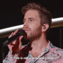
We all face challenges we're not prepared for, but the challenges themselves are not important. What matters is how we face them.
~Codemaster Crellan Chaotic S1-E13
#lets get chaotic#chaotic cartoon#love this quote#and Crellans character in general#also this episode in general is just#probably gonna rewatch the series and post quotes.
15 notes
·
View notes
Text
@bobosmith01 said: You know, visually, I’m really reminded of a character, but I can’t figure out who.
Dunno man, it’s supposed to look like me. Chaotic wise, my guess goes to Crellan-

-because he also has the basic block in of ‘dark shirt - mid-tone pants’. Honestly tho, the persona’s not meant to stand out since a lot of Chaotic’s human designs are just enough to keep interest. When I make OCs/sonas for a world, I typically try to not have their designs over-power those of the main cast; since Chaotic already lives in that ‘these are generic but comfortable’ range, most designs I do are often easy to look at, but intentionally also play around in that sandbox.
I mostly do this because some series struggle with it. Take RWBY for example, it’s got TONS of eye-catching and nice designs, but that’s actually a problem? Secondary characters usually have less presence visually speaking, and that’s done so that they don’t take up the same amount of importance on the visual hierarchy as the main protagonists. HOWEVER, RWBY has a problem: there’s too much to look at. There are too many iconic character designs, and while yes, they’re often pleasing to look at, some of them are way more interesting and engaging than the protagonists. Thus, it makes the audience more interested in those characters, not necessarily the ones we should be following.
So, to avoid this, I have a picture of one of the main cast -for this design I used Kaz- and thought, ‘okay, how do I not over-power this?’ Answer: mainly a dark and mid-tone design with a lot of cool colors that are still in the complementary pair zone (blue and orange).
@ravanaugh-runner said: hey without unnecessary neon colours and that idea of ‘cool outfit’ that can only be found in mid-2000s fashion interpreted through a kids’ cartoon, would it really be a chaotic player? unnecessary meaning unexplained, of course
The neon is actually because I’m on a huge retro-wave/retro future aesthetic binge right now because I’m writing a D&D campaign that’s a space opera. My NPC is a Druid, although I came really close to making a wizard, so little bits of the wizard’s would-be design are still fresh in my head. :D Tbh, because of what I said above, I just went on Pintrest, typed in ‘sci fi vest’ and found a bunch of cool looking designs. I just picked one I liked the shapes of, made it less memorable, threw on some neon (I NEED some value contrast or else I go nuts) and was like ‘there, it fits the world now.’ So yeah, that’s how I ended up at a mix of ‘this nerd probably LARPs on the weekends’ and ‘I fly interplanetary racing ships’.
If you’re interested, I can do a version where I sink more time in and actually make an interesting character design, usual method of ‘don’t over-power the cast’ be damned. I plan on finishing an old ‘player and team’ meme from around two years ago with this sona.
8 notes
·
View notes