#and wallpaper that is enclosed. vintage chairs
Photo
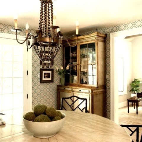
Enclosed - Transitional Dining Room
#Ideas for remodeling a mid-sized transitional dining room with multicolored walls#a beige floor#and wallpaper that is enclosed. vintage chairs#grand piano#chandelier#étagère#painted wood dining table#enclosed#wallpaper
0 notes
Text
The Ranch in Orlando, Florida
The Ranch, Orlando House, Florida Real Estate, American Luxury Architecture Interior, Images
The Ranch in Orlando
Aug 31, 2020
The Ranch in Florida
Architects: VSHD Design
Location: Orlando, Florida, USA
Tuscan Transformation: Dubai-based VSHD Design expands its international portfolio with the completion of their first U.S. residential project – The Ranch
VSHD Design, a Dubai-based interior architecture firm specializing in residential and commercial projects, is proud to unveil a luxurious residential design within the Four Seasons Orlando Resort in Florida. With 22,000 sq. ft. this project marks the first residential undertaking of the firm in the United States.
“From the onset, we realized that we were facing numerous challenges with this project,” notes Rania Hamed, interior architect and founder of VSHD Design. “In addition to strict regional building and environmental codes, there were requirements imposed by Four Seasons Resorts to ensure that the residence blended stylistically with its neighboring properties.”
A modern Tuscan approach
In approaching the external Tuscan theme exhibited by homes within the exclusive development, the challenge was to maintain some existing structural elements, while delivering on the client’s vision of a modern home that would be luxurious, yet warm, comfortable, and ideal for entertaining guests. The client envisioned a sort of boutique-style hotel environment that would provide family and friends with privacy and luxurious amenities, even in the absence of its owners. To achieve that challenging balance, Hamed embarked on a mission to modernize the external Tuscan façade, while infusing contemporary luxury into the home’s interior to align with the client’s vision.
While Tuscan architecture in its purest form embraces natural, rustic elements, VSHD Design avoided abundant use of materials such as brick and wrought iron in lieu of a modern interpretation. Gray brick overhangs positioned above the external façade’s windows and passages pay homage to Tuscan influences. Black frames of expansive French windows, certified to hurricane standards, provide contemporary contrasts to the façade’s white walls, culminating in a modern Mediterranean style that adheres to the Four Seasons aesthetic requirements.
To complement the structural design, VSHD Design developed all of the home’s outdoor spaces, beginning with its swimming pool. European limestone tiles, stylistic planters, and luxurious sunbeds from the Italian design house, Gervasoni, provide the exterior spaces with an authentic Mediterranean look and feel.
Seamless transitions
While the exterior exudes modern interpretations of mandated styles and standards, VSHD Design approached the interior of the house as somewhat of a blank canvas. Working with a timber structure, as opposed to concrete columns and beams, was a new experience, however, Hamed found inspiration in the challenge.
“I saw beauty in some of the original structural elements and I wanted to maintain as many of them as possible,” she explains. “I decided to leave some of the exposed beams intact, as opposed to hiding them behind a layer of gypsum.”
Exposed wooden beams reflecting the original structure’s integrity were maintained, with layers of dark stain and black metal trim added to provide a more industrial feel. Hamed also focused on ensuring seamless continuity between the home’s interior and exterior spaces. Upon entering the house, Carrara marble flooring carries the influences inward, where Tuscan-style arches define the separation of the home’s interior spaces, reinforced by clean, modern, and slightly protruding architraves. The architraves, composed of black matte stained oak, contrast with the interior’s white walls and light gray marble flooring, providing the home’s public areas with a very contemporary look and feel. In living spaces designed for more intimate experiences, Carrara marble flooring gives way to hardwood floors.
“Marble can have a bit of a cold feel to it, particularly when framed by white ceilings and walls,” explains Hamed. “We created a transition to hardwood floors to provide certain spaces, like the living room and the study, with a much warmer ambiance.”
Boutique-style accommodations
The main floor houses the master bedroom, highlighted by a luxurious contemporary décor and direct access to the adjacent pool area and outdoor shower, designed as part of VSHD’s vision of an indoor/outdoor lifestyle. The master bedroom’s spa-inspired adjoining spaces include a freestanding bathtub as the centerpiece of a spacious bathroom that also features an individual toilet and shower cubicles. The bathtub is flanked by a wall of floor-to-ceiling French windows on one side and dual washbasins with custom-designed mirrors on the other. Completing the spa-like theme, a small spiral staircase leads to an upper-level gym area featuring a steam room and waterjet shower.
The spa-like feel and amenities extend to the home’s 6 upper-level guest suites, half of which offer private external access for guest stays while the owners are away. Each self-sufficient guest suite features a unique decorative style and is equipped with a mini kitchen, a small pantry, and a spa-inspired bathroom.
“The client’s brief focused on a concept where each room should have a completely different, yet thoroughly modern theme,” explains Hamed. “We incorporated Chinese, Spanish, and multiple other influences in order to provide each suite with its own distinct character and mood.”
The client’s vision of a boutique-style hotel extends to the home’s main dining room, inspired by Italian architect Ettore Sottsass. A ‘modern-retro’ black and white console from Italy contrasts against a wall panel of gold leaf wallpaper, bordered by marble. The panel’s adjacent walls are characterized by ribbed white paneling with a stained wood base, while a cloud lighting fixture from New York’s Apparatus Studio provides adds a celestial touch to the room.
Pièce de résistance
In order to tie the interior spaces together, VSHD Design embarked on an ambitious plan to develop a new patio space at the center of the house to create stimulating visual links between multiple areas of the house. To separate the pool area from the patio, and to connect the master bedroom to the living spaces, the design team built an enclosed lanai with four expansive French windows on each side, which infuse the passage with natural light. The abundantly lit corridor is lined with wicker chairs, creating a fabulous reading room with the feel of an open space courtesy of pool views to the left, and patio views and greenery to the right. At the end of the passageway, a staircase to the left ascends to the second level of the home alongside floor-to-ceiling windows that overlook the patio and offer views of the lanai and other external spaces.
“By blending traditional elements with a modern contemporary mix, we succeeded in achieving a contrast that works well,” notes Rania Hamed. “We didn’t want that contrast to be too soft, so the use of black and white, with Carrera marble flooring, provides the home with a strong modern-vintage look.”
The Ranch, Orlando, FL – Building Information
Architects: VSHD Design
Location: Orlando, FL, USA
Area: 2200 sqm
Lead Designer: Rania M Hamed
About VSHD Design
Founded in Dubai in 2007 by interior architect, Rania Hamed, VSHD Design is a multiple award-winning interior architecture firm renowned for the style, functionality, quality, and attention to detail of its projects in Dubai, Abu Dhabi, Cairo, London, Amman, and Florida. The firm combines extraordinary talent and global experiences to create exceptional spaces that are as “cutting edge” or “timeless” as each client’s vision.
VSHD’s mission is to develop architectural and interior design experiences that are distinctive, compelling, and of superb quality. Infusing modesty and elegance into the transformation and repurposing of spaces, the firm has garnered international recognition for the beauty and subtle luxury of its projects.
Photographer: Koen Van Damme
The Ranch in Orlando images / information received 310820
Location: Orlando, Florida, USA
Orlando Architecture
Orlando International Airport South Terminal Complex, Florida
Design: Fentress Architects
image from architecture office
Orlando International Airport Building
1600 Lakeside Residence, Audubon Park
Design: Interstruct, Inc.
photograph : Steven Allen
1600 Lakeside Residence in Audubon Park, Orlando
Guidewell Innovation Orlando, Lake Nona Medical City
Design: Affiniti Architects & Marc Thee
image from architects
Guidewell Innovation Orlando Building
Citrus Bowl Stadium, Orlando
Design: HOK Sport
image : HOK Sport
Orlando Venues Building
Florida Architecture
Grove at Grand BayBuildings, Miami Beach
Design: BIG architects
image from architects firm
This sold-out development mark Bjarke Ingels’ first completed condominium design in the USA. The pair of twisting 20-story glass towers is helping to lead the rejuvenation of Coconut Grove’s business district.
Miami Marine Stadium Building Renovation
photo : Rick Bravo
Georgia Architecture
Comments / photos for the The Ranch in Orlando page welcome
Website: Orlando
The post The Ranch in Orlando, Florida appeared first on e-architect.
1 note
·
View note
Text
Top 5 Home Design Trends for a New Decade
Whether you’re planning a simple refresh or a full-scale renovation, it’s important to stay up-to-date on the latest trends in home design. Sellers who make tasteful updates can generate increased buyer interest and, in some cases, a premium selling price. And buyers should consider which features of a home will need updating immediately (or in the near future) so they can factor renovation costs into their overall budget.
Even if you have no immediate plans to buy or sell, we advise our clients to be thoughtful about the colors, materials, and finishes they select when planning a remodel, or even redecorating. Choosing over-personalized or unpopular options could hurt a home’s value when it does come time to list your property. And selecting out-of-style or overly-trendy elements could cause your home to feel dated quickly.
To help, we’ve rounded up five of the hottest home design trends for 2020. Keep in mind, not all of these will work well in every house. If you plan to buy, list, or renovate your property, give us a call. We can help you realize your vision and maximize the impact of your investment.
1. IN: Sustainability / OUT: Fast Furniture
Consumers have become increasingly eco-conscious. Many are shunning the mass-produced, “fast furniture” popularized by retailers like IKEA, opting instead for higher-quality pieces that are built to last. And the availability of non-toxic, environmentally-friendly furniture and decor options is set to grow in 2020 and beyond.
At the same time, there’s been a noticeable shift toward individuality in today’s interior design. Instead of following the latest fad, more homeowners are opting to embrace their personal style and invest in items they believe will “spark joy” (à la Marie Kondo) for years to come.
To incorporate this trend, designers recommend layering old and new pieces for a curated look that you can build over time. Instead of purchasing a matching furniture set from a big-box retailer, buy one or two sustainably-sourced pieces that complement what you already own. Try searching estate sales and Craigslist for vintage classics or well-built furniture that can be refinished. And to accessorize your room, mix sentimental items with newer finds to create a truly personalized space.
2. IN: Cozy / OUT: Cold
Designers are moving away from cool grays, industrial finishes, and stark modernism. In 2020, there’s a big emphasis on creating warm and cozy spaces through color, texture, and shape.
Gray has dominated the color palette for the past decade. This year, expect to see a move toward warmer neutrals, earth tones, and nature-inspired shades of blue and green. Warm metals, like gold and brass, will also continue to trend. And hardwood floors are heating up, as cool gray and whitewashed finishes fade in popularity. Expect to see a rise in classic choices like walnut, mahogany, and oak in richer and darker tones.
Furniture will also get cozier—and curvier—in 2020. From rounded sofas and curved-back chairs to oval dining tables, softened-angles are dominating the furniture scene right now. And designers expect softly-textured fabrics—like velvet, shearling, and mohair—to be big this year, as homeowners strive to add a touch of “hygge” (the Danish concept of calming comfort).
Want to warm up your home decor? Try one of the top paint colors for 2020: Benjamin Moore’s First Light (soft pink), Sherwin Williams’s Naval (rich blue), or Behr’s Back to Nature (light green).
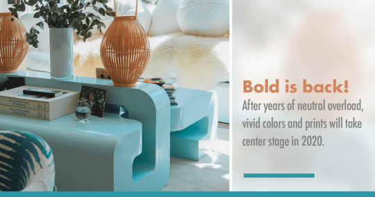
3. IN: Bold / OUT: Boring
Bold is back! After years of neutral overload, vivid colors and prints will take center stage in 2020. Expect to see geometric designs, color blocking, and floral and botanical patterns on everything from pillows to rugs to wallpaper.
The hottest trend in interior paint right now is bold trim and ceilings. Monochromatic rooms (e.g., walls, ceilings, and millwork painted the same color) will be big this year, as well as high-contrast pairings, like white walls with black trim. Color is coming back to kitchens, too, and two-toned color schemes continue to gain steam. In 2019, 40% of remodelers chose a contrasting color for their kitchen island.[1] While white was still the top choice for cabinets, blue and gray are increasingly popular alternatives.
If you’re ready to “go bold,” separated spaces like laundry and powder rooms are great places to start. It’s easier to incorporate busy wallpaper or a bright wall color in an enclosed area because it doesn’t have to flow with the rest of your decor.
Of course, clients always want to know how design choices could impact their home’s value. The reality is, neutral finishes are still the safest bet for resale. If you’re prepping your home to go on the market, stick with non-permanent fixtures—like artwork and accessories—to brighten your space.
4. IN: Nature / OUT: Industrial
Biophilic design has been big the past few seasons, and it isn’t going anywhere in 2020. It centers around the health and wellness benefits of connecting with nature, even while indoors, and it’s impacted the latest trends in color, prints, and materials.
As we mentioned previously, floral and botanical patterns are hot right now, along with nature-inspired hues, like blues, greens, and earth tones. We’re also seeing a heightened use of organic shapes and sustainable materials in furniture and furnishings, including wood, wicker, rattan, and jute. This infusion of nature coincides with a decline in the popularity of urban-industrial fixtures. Designers predict that concrete floors and Edison light bulbs are on the way out.
Want to bring in elements of biophilic design on a budget? Houseplants are a great place to start. But you can also enhance your home’s natural light and create a visual sightline to the outdoors by removing heavy curtains and blinds. And when the weather is nice, open your windows and enjoy the breeze, sounds, and smells of nature. These simple acts are scientifically proven to help reduce stress, boost cognitive performance, and enhance mood![2]
5. IN: Functional / OUT: Fussy
In 2020, homeowners want design that’s beautiful, but also liveable. With the rise in remote workplaces, online shopping, and virtual exercise classes, many of us are spending more time at home than ever before. Cue the growing appeal of multi-functional spaces, like a combination kitchen/office or gym/playroom. Real life—and rising housing prices—necessitates creative use of limited space.
Durable, low-maintenance materials will also surge in popularity this year. Engineered quartz—which is more stain, heat, and chip-resistant than natural stone—is now the #1 choice for kitchen countertops.[1] Waterproof, wood-look luxury vinyl is the fastest-growing segment in the flooring industry.[3] And improvements to water and stain-resistant performance fabric has made it a mainstream option for both indoor and outdoor upholstery.
Now that functional is hot, what’s not? Designers say that mirrored furniture, open shelving, and all-white kitchens are too impractical for today’s busy families.
So how can you start enjoying the time and energy-saving benefits of this design trend? Begin by structuring each room so that it best suits your needs. And when purchasing furniture or fixtures, choose options that are durable and easy-to-clean. The truth is, design fads come and go. But a comfortable and relaxed home (that you don’t spend every spare minute maintaining!) can help create memories to last a lifetime.
DESIGNED TO SELL
Are you contemplating a remodel? Want to find out how upgrades could impact the value of your home? Buyer preferences vary greatly by neighborhood and price range. We can share our insights and offer tips on how to maximize the return on your investment. And if you’re in the market to sell, we can run a Comparative Market Analysis on your home to find out how it compares to others in the area. Contact us to schedule a free consultation!
Sources:
1. Houzz
2. Terrapin Bright Green
3. Remodeling Magazine
4. Elle Decor
5. Forbes
6. Wall Street Journal
7. Good Housekeeping
8. Architectural Digest
9. Los Angeles Times
Reposted from LinkedIn
0 notes
Text
How to Make Your Apartment Look Bigger
How to Make Your Apartment Look Bigger
No matter your living situation — your first place with a college roommate, that studio you found in your price range, or that tiny apartment you and your partner nabbed in the most sought-after neighborhood — most of us have had a small apartment at one point in our lives. And as the years go on, that will likely be increasingly the case. The largest cohort of working-age folks, millennials, are moving to urban and metro areas in record numbers. This can only mean one thing: more people and fewer apartments.
RELATED: How Often You Should Be Replacing Your Sheets
Once you’re all moved in, your goal is to maximize your space to the best of your ability. Short of knocking down walls to the neighbor's apartment, how can you make a small space seem more open? It’s easier than you may think. We spoke with expert interior designers who work regularly in city-sized spaces to get quick and easy design and décor hacks that will make you (and anyone else you might entertain) feel like your apartment is practically the Red Keep.
Seeing Is Believing
One of design’s most basic functions is influencing how you perceive and respond to what you are seeing through visual cues. While simple design can’t literally enlarge your surroundings, it can help do so figuratively. You can start with the walls enclosing your space.
“Textures or small patterns on wallpaper create the effect of appearing to be farther away than they actually are,” says Stefan Steil, New York School of Interior Design faculty member and principal of Steilish Interiors & Architecture. Thus, they extend your perspective past the actual wall. And you can even apply the same concept to ceilings.
Fallyn Flaherty-Earp, DuPont’s market and business development manager, agrees. She points to their Celestial vinyl (commercial grade and consequently pricier) wallcovering collections inspired by the heavenly bodies — rings of Saturn stripes and “flying fish” patterns from the Volan constellation that “create the illusion of a much larger space.”
Steilish Interiors and Architecture
Should you choose to paint instead, be aware that there is some debate on the merits of a light or dark color in enhancing space. But Brian del Toro, who honed his artistry working at Parish-Hadley and with interiors legend Bunny Williams, feels it’s more important to create consistency.
“[I favor] a monochromatic color scheme,” he says, adding it blurs any distinction of areas and provides uninterrupted continuity throughout. Contrasting colors, he explains, tend to look crowded, while tones from the same hue will keep things unified, adding a feeling of harmony. Benjamin Moore has a helpful guide to finding what color works best for you.

Anthony George Home
Finish the Wall
Now, turn your attention to what’s actually on the walls. If you have large windows, you’re already ahead of the game. The more natural light you allow in, the airier your room will seem. Otherwise, you can also benefit from that magician’s ploy of using mirrors.
“[Using mirrors] is an easy trick,” says Anthony Gianacakos, the founder of Anthony George Home. “A well placed mirror will reflect light and make it appear that there are more windows in the space. I recommend positioning one either across or perpendicular to an existing window.”
Brian del Toro
Art can fulfill the same function, he suggests. “Hang frames in different heights and widths to draw the eye in many different directions and add dimensions in a space.” Similarly, del Toro decided to decorate his own apartment with several pieces of framed art and photography to serve as various “views” or “windows” into panoramic scenes.

Peter Sandel
Size Matters
There are many misconceptions about design. When it comes to furniture, interior designer Patrick J. Hamilton, whose work has appeared on HGTV, wants to clarify a common design fallacy: “You can use bigger pieces in smaller rooms!”
RELATED: Everything You Need for a Home Bar
This may initially come across as counterintuitive, but according to him, the problem lies more in buying one piece to serve one function, then another, then another, until you end up with what he describes as “a parade of too-small pieces that look like they are all on clearance ... a small bookcase, a side table, a filing cabinet.” And it is the all-too-common accumulation of these disparate items that build up into clutter.
Instead of more trendy and tedious methods meant to “spark joy,” Hamilton has another suggestion: “Look at all your needs at once and address them with one bigger piece, [such as] a chest or console that serves some, if not all, of those functions.” This allows form and function to meet in the middle. “Similarly, pick chairs that double for dining as well as pull-up living room chairs. I always tell clients to think fewer, better, bigger.” With that in mind also consider pieces with multiple uses: couches that collapse into daybeds or ottomans with inside storage.

Steilish Interiors & Architecture
Peter Sandel may be a Texas native accustomed to wide open spaces, but this talented interior designer and founder of Peter Sandel Design once lived in a studio apartment in one of New York City's most notorious neighborhoods for diminutive domiciles, lower Manhattan’s West Village, for 12 years. He knows what he’s talking about when it comes to furniture size relative to space.
“Incorporating a large, key [piece of furniture] tricks the eye, making the room appear [more grand],” he tells us. “Investing in quality furniture actually saves money in the long run. Online shopping for vintage and antique furniture in sites [such as] Sotheby's Home and Chairish have made what was once an expensive and time consuming hobby into a cost-effective and sustainable way to furnish your home.” Other great sites for serious furniture shoppers include AptDeco, One Kings Lane, even eBay.
As a finishing touch, Steil advises that to anchor your furniture while seemingly creating space around it, add a textured and broad multi-patterned striped rug to stretch your view of the room.

Steilish Interiors and Architecture
If all this decorating inspiration has you thinking about turning a simple design project into a more substantial renovation, every expert we spoke to echoes the same sentiment: Leave it to the professionals. You will be dodging untold (and likely expensive) DIY disasters. These tips and tricks will help create the illusion of more space in smaller, often rented apartments. If you use this time and (lack of) space to your advantage, you’ll be ready to tackle bigger jobs once you move onto a mortgage.
You Might Also Dig:
10 Best Vodkas You Can Buy How To Automate Your Home Without Spending A Fortune How to Bring Pantone's Color of the Year Into Your Home
from AskMen Style https://www.askmen.com/style/fashion_advice/how-to-make-your-apartment-look-bigger.html
0 notes
Text
50 Craft Room Ideas for Your Handmade Business
If you’re interested in starting a handmade business, a quality craft room is a must. Whether you’re interested in jewelry making or woodworking, such a space can help you effectively store your supplies and inventory while also giving you a dedicated space to hone your creative skills.
When you’re setting up your crafts business, having an organized and inspiring spot to work is key. Here are 50 craft room ideas to get you started.
Craft Room Ideas
Vintage Inspired Decor
Having a theme for the decor in your craft room can help it feel like a cohesive space. There are tons of vintage accents that make a perfect home in a crafty space.
Accent Wall
Photo Credit: madebymood.com
If you want to add some exciting visuals into your craft room without overwhelming the space, consider an accent wall in a bright paint color or patterned wallpaper.
Ambient Lighting
The lighting can make a major impact on the vibe of a room, and task lighting over desks or underneath cabinets can also help your projects.
Photo Collages
Photo Credit: Oh Happy Day
Running a craft business requires constant inspiration. Keep yours top of mind with a colorful photo collage right behind your desk.
Products on Display
Your handmade goods can pull double duty as decor for your craft room thanks to wall mounted shelves.
Bulletin Board
Photo Credit: Flickr
You can also constantly change out your inspiration by mounting bulletin boards around your craft room.
Decorative Letters
Another decorative element you can add to your space, craft some letters that spell out something significant to your business, like “art” or your company name.
Craft Room for Kids
Photo Credit: abduzeedo.com
With a few simple adjustments or extra pieces of furniture, you can turn your craft room into a space that works for the whole family.
Chalkboard Paint
A large chalkboard can help you brainstorm and organize ideas. You can also cover a wall with chalkboard paint to accomplish this.
Abstract Collage
Photo Credit: Infarrantly Creative
If you want to add some color and texture to your walls without painting them, consider a large scale collage like this one.
Gallery Wall
To adorn the walls of your craft room with all of your favorite artists, set up a gallery wall with framed pieces.
Logo Wall Hanging
Photo Credit: logoprint.biz
Put the name of your business front and center in your craft room with a custom made wall hanging.
Closet Craft Room
If you don’t have a full room to work with, consider placing a small desk and some built-in shelves inside a closet and use that for your projects.
Wall Calendar
Photo Credit: Oh Happy Day
Keep all your craft projects and business tasks front and center with a giant wall calendar that’s featured prominently.
Color Coordinated Craft Room
If you love color and want to keep tons of different supplies in your space, consider laying out your craft room according to the colors of the rainbow.
Craft Room Organization
Built-in Shelves
Photo Credit: Hey, Let’s Make Stuff!
If you want to keep a ton of storage on hand, floor to ceiling shelves are the way to go.
Overhead Cabinets
For those who want to keep their storage more enclosed, you could repurpose kitchen cabinets.
Pegboard
Photo Credit: Craftaholics Anonymous
A pegboard can give you storage for everything from scissors to yarn. And you can paint it the color or pattern of your choice.
Open Shelving
You can also mount smaller shelves to the wall for an open look.
Fabric Wall Organizer
Photo Credit: Spoonflower
This DIY fabric organizer is perfect for holding small craft supplies right on your wall.
Upcycled Can Storage
Store things like pens, paint, and knitting needles in small recycled cans that you’ve painted or covered in paper or fabric.
Labeled Drawers
Photo Credit: jennifermaker.com
Whether you have drawers on your desk or elsewhere, custom labels can help you stay organized.
Hanging Buckets
Put up a rack that includes small hanging buckets or bins to keep your most-used supplies easily accessible.
Curtain Rods
Photo Credit: jennifermaker.com
Curtain rods and hangers can pair up to provide easily accessible storage for papers or other light items.
Magazine Racks
Magazine racks are perfect for storing papers or small, flat objects in your craft room.
Fabric Bins
Photo Credit: The Craft Patch
For those who need storage but want to stick to a specific color scheme, consider purchasing or making fabric bins.
Clear Jars
If you need craft room storage for tiny items like buttons or patches, clear jars are the perfect solution.
Wooden Bins
Photo Credit: Lolly Jane
For those who want a rustic look in their craft room, recycled wooden bins like these could work.
Baskets
Baskets can help you keep various supplies or inventory out of sight.
Ribbon Rolls
Photo Credit: organizeyourstuffnow.com
If you have a lot of ribbon or any supplies that are kept on spools, a rolling storage solution like this may be helpful.
Ladder
If you need craft room ideas for fabric, consider leaning a ladder against the wall and draping your supplies over it.
Clothespin Art Display
Photo Credit: Atlanta Parent
For those who need to store artwork, keep it on your wall by stringing them up on clothespins along a piece of wire or twine.
Clothes Hangers
Skirt hangers or pants hangers can also hold fabric or artwork, especially if you have a closet or clothes rack in your craft room.
Closet Door Storage
Photo Credit: The Container Store
If you have access to a closet, or even the back of a door, mount small wire shelves to hold small supplies.
Magnetic Strip
To store metal pieces like scissors or needles, hang up a magnetic strip above your desk.
Craft Room Furniture
Basic Desk
A desk is essential for pretty much any kind of craft workspace.
Desk With Shelving
Photo Credit: Craftaholics Anonymous
If you want a workspace and storage in one, consider a desk that has shelves on the side.
Standing Desk
You might prefer to do some of your crafting while standing up, using either a standing desk or adjustable desk.
Kitchen Island
Photo Credit: HGTV
A detached kitchen island can actually serve as a standing workstation and storage in one.
Oversized Table
A large table can also serve as your crafting area, especially if you work on large scale projects or collaborate with others.
Dresser
Photo Credit: HGTV
A basic dresser can be the perfect solution for holding fabric, yarn, or other supplies.
Folding Table
If you don’t have a ton of space to work with, you might consider using a table that has a leaf that folds down.
Card Catalog
Photo Credit: momhomeguide.com
For storing small supplies, you might repurpose an old card catalog or piece of furniture with lots of tiny drawers.
Coat Rack
A hanging coat rack can help you store a variety of supplies that you want to keep easily accessible.
Shoe Rack
Photo Credit: favecrafts.com
A shoe rack can also be perfect for storing things like yarn or completed inventory.
File Cabinet
Your craft business probably also has tons of documents that you need to keep safe using a file cabinet.
Rolling Cart
Photo Credit: Craftaholics Anonymous
If you want to keep your supplies accessible from all parts of your room, a rolling cart can really come in handy.
Rolling Chair
Similarly, a rolling chair can help you easily move around your craft room to work on various projects.
Console Table
Photo Credit: Craftaholics Anonymous
A console table or entertainment unit can provide extra storage and display opportunities.
Glass Front Cabinet
If you want to store items but still keep them visible, a glass front cabinet provides the best of both worlds.
Image: Depositphotos.com
This article, “50 Craft Room Ideas for Your Handmade Business” was first published on Small Business Trends
https://smallbiztrends.com/
The post 50 Craft Room Ideas for Your Handmade Business appeared first on Unix Commerce.
from WordPress https://ift.tt/2TlIdH1
via IFTTT
0 notes
Text
Before & Afters Of Our Beach House: Downstairs
I’m not sure I’ve ever been so excited to share before and after photos as I am today. Last month marked the 2-year anniversary of buying the beach house and while we never like to declare a home “done,” this place has come so far that this felt like a good moment to look back at everything (and to document what’s still ahead).
We’ve dug up dozens of before photos (including many that we haven’t ever shared!) and we’ve done our best to find or take similar angles to match up with them. There are so many angles to show you, and so much to cover, we’re just doing the downstairs today – and then we’ll follow up soon with the upstairs once we can shoot those photos and organize another big before-and-after-fest of a post.
We’ll link some of the key items in each “after” for you, but remember you can always visit our Shop Our Beach House page for the paint colors and source info of each room (it’s always linked up in our menu bar right under our blog header). And before we dive into the photos, you may want to treat yourself to this walk down memory lane: the before video tour! Note: if you’re reading this post in a feed reader like Bloglovin or Feedly and can’t see the video below, you may have to click into our post to view it – but trust me, it’s worth it.
The Exterior
Before we head into the downstairs, let’s look at the outside. This is a shot of it from the sidewalk back when we bought it. Did you even remember that “the pink house” was once “the greenish-gray house?” Complete with cream trim, mismatched windows (some of which were boarded up), and cinderblock steps.
And here it is from a similar angle (a little closer up). We snapped this photo this summer:
Here’s another before shot. The cinderblock steps and the sad rotting siding weren’t gorgeous… but we loved the old bones.
Thanks to a new roof, new siding, new windows, new steps, and a repointed brick foundation, we got the house looking a lot happier. After much debate, a takeout coffee cup helped us choose pink for its new color scheme (Sherwin William’s Mellow Coral, with SW Snowbound for the trim).
Here’s another angle of the front of the house. Fun fact: that vine had snaked its way into the house and was growing in there as well as on the porch. For real.
We actually repainted both the porch ceiling and the floor their original colors, or at least the best we could match. The ceiling is Sherwin William’s Breaktime and the floor is Behr’s Pacific Fog. The ceiling also already had hooks in it for a porch swing, so we ordered one, popped it up, and called it done.
We still haven’t done most of the landscaping or hardscaping that we have planned for the side and backyard yet, but we could resist sharing one last angle. Remember how rotten this side of the house was??? This was a former porch that someone enclosed with interior wood floorboards instead of actual weather-proof siding (they had rotted so badly that you could stick your fist through the siding and into the house in a bunch of places). So yeah, it had nowhere to go but up.
This was the side of the house that had to be completely torn off and rebuilt due to a sinking foundation and a ton of weather damage to the support beams. So at one point this whole section was completely missing! This is where the mudroom, pantry, bathrooms, and bunk room now are. So, for reference, that exposed wall on the second floor that’s all black is where the bunk beds now hang. Crazy!
Now it’s looking more like this (minus that giant bush in the front that we learned is actually a tree that would grow taller than our house – so we had to get it outta there before it wrecked our freshly fixed foundation). We still have to landscape the entire side of the house and add a stone pathway to lead people back to the outdoor shower, but it’s a far cry from where we started.
The Entryway
Despite the crumbling plaster, unfinished drywall, and water damage – this view into the foyer was immediately charming to us. That fireplace mantle was not original, it was just one of many items that the previous owner had collected over the years (there were also two old stoves, various rolls of paintable wallpaper, and even an old boat in the shed out back).
This is the entry now. It, like the rest of the house, got fresh drywall and paint, refinished floors, and a whole lot more. We were able to salvage enough of the home’s original trim to use it throughout the first floor – and the original color of it in this foyer (see it in that photo above around the doorway?) is what inspired us to use non-white trim throughout the downstairs. The color is Sherwin William’s Stone Isle. The walls in the entire house are painted Sherwin Willaim’s White Heron and the floors – OH THE FLOORS! They’re the original heart pine that we had refinished and clear sealed with water based sealer (extremely durable but it won’t yellow over time like poly). It’s so hard to believe they’re the same floors in some of these photos because they were looking so rough when we bought this house.
mirror | similar light | similar lamp | similar dresser
It’s worth noting that we attempted to keep the railing wood (but stain it to match the floors since it was much redder than they were), but it proved impossible since it’s not heart pine like the floors and steps are. So we painted it a slightly deeper gray color than the trim, which allows the floors to sing instead of competing with a different tone of wood all the way up the stairs.
The Kitchen, Dining Room, & Pantry
Through the foyer is the largest room of the house, which we turned into a kitchen/dining space. It was a giant mess when we first bought it, but have no fear, that beautiful original light fixture is the one we had rewired that now hangs in the pantry!
Before jumping to the after on this one, I’m actually going to take you through the progression of this angle, since it tells a nice story about the journey this house went through. Below is what it looked like during demo. The mess was cleared (mostly) but there was still a long way to go.
Then here it is being rebuilt. That area to the left that’s all new wood is the side that had to be completely torn down and rebuilt – and a lot of the ceiling joists in the kitchen had to be reinforced with new boards.
I won’t bore you with photos of all of the new plumbing and electrical that got added (we redid those systems as well as installing new HVAC throughout the house), so let’s jump to drywall. It’s starting to look like a house again.
And now another big jump forward to present day. After some debate about the floor plan, we actually ended up with both the dining and the kitchen functions in relatively the same spot as they originally were. Let the record state that we love this downstairs layout so much that if we could blink our eyes and have our Richmond house laid out this way – complete with the back staircase – we would in a heartbeat. It’s not huge but it feels nice and open, and when we spend time downstairs we all feel close and connected but not cramped.
dining chair | chandeliers | sconces | pendants | barstools
Here’s the before photo again for comparison:
Here’s another view of this space. You can see the previous stove there next to the back door. And note that pink beadboard that runs along the back wall. We didn’t even register that it was there until way after we painted the house pink and it caught our eye in old photos from our initial walk-throughs. Sherry swears the house wanted to be pink all along and it was trying to send us signals (all of which we missed until after the fact).
Here’s that same view now. Even though it made floor planning a little more challenging, we were intent on keeping the placement of the original back door and that back staircase (some of our neighbors with similar houses don’t have them anymore) and we’re SO GLAD we did. They limited the useable wall space for the kitchen itself, but we ended up shifting that doorway on the left that you see above (which used to lead to the rotted side porch) to give us room for the wall that hosts the vintage pink stove now.
hood | cabinet pulls | similar runner | sconces | pendants | faucet | pink letterboard
It basically just got moved about 5′ further down the wall towards the dining area and it now leads to the laundry room/mudroom (which you enter through the house’s side door) as well as a full downstairs bathroom.
And that doorway that you see in the back left corner of the kitchen leads into our pantry, but that room used to be a full bathroom…. complete with pink trim. See it’s like this house wanted to be pink! There was a plastic shower stall between those exposed studs and a toilet tucked behind it.
You saw that the full bathroom downstairs shifted over by the mudroom, which freed up this space for another super functional area that took some trial-and-error to figure out: our walk-in pantry. We’ve got a full tutorial on building pantry shelves like these if you’re interested. Also, there’s the original light fixture that used to hang in the kitchen – we had it rewired so it’s safe.
Sherry often declares the pantry to be her favorite room in the house (especially this time of year because she stands on the floor vent to heat her feet while snacking). As weird as it sounds to declare a pantry your favorite, I’m going to top that. My favorite = the back stairs… which I know isn’t really a room… but hear me out! This is what they looked like before:
The old door on the third step up from the floor wasn’t to code anymore (you’d need a landing to stand on when opening a door) and we knew the stairs would look much better being open. So now we’ve got doors at the top of the stairs instead – which provide some nice privacy to anyone sleeping in that bedroom without blocking the view of the stairs from the kitchen.
I know this is a downstairs tour, but this photo will help to explain what I mean. Now when you reach the top of the stairs there’s a landing with a built-in dresser and these pocket doors can be closed for privacy.
Ok, back to the downstairs tour. I love these old stairs because (1) they’re such a cool quirky original detail and (2) they’re crazy functional. We weren’t even sure if we’d use them much (we thought maybe just the kids would love sneaking up them) but they act kind of like a private entry into the upstairs master bedroom for us, and I’m now so spoiled that I wish we had them in our Richmond house too.
Here is a view from the stairs themselves. It’s a “before” angle you probably haven’t seen before (probably because it’s blurry – ha!) but it’s looking towards where the pink stove now sits. The main thing to notice here is the blue door….
…that’s the one we kept as is (well, after carefully removing the flaking paint and clear sealing it with Safecoat Acrylacq so any old lead paint is completely encapsulated – you can read how to deal with lead here – BE SAFE GUYS). So that’s the very same door, it just got rehung in the doorway to the mudroom. We leave it open 95% of the time, only closing it while laundry is running, because it adds a nice dose of age and color to the room. This photo is from before we finished the backsplash, hence no finish piece across the top, but you get the idea:
If you’re wondering in all of this: “Well, where was the kitchen before?” allow me to show it to you. Since we bought the house in the midst of some stage of demo, we’re not entirely sure where appliances went (remember there was no working water meter that led to this house when we bought it, so it’s very possible it hadn’t had a functional kitchen in decades), and these clearly aren’t the original cabinets from 1920, but they were cornered against this wall that the previous owner was in the process of taking down. Btw, we donated all of the cabinets and appliances to the local Habitat ReStore, which was an easy way to dispose of them without them going to waste. They even came and picked them up, so that’s an option if you’re renovating – just call to schedule a pickup!
This is that same view now. I almost laughed out loud looking at this photo because it feels like the sink ended up in almost exactly the same spot.
framed art | curtains | curtain rods | sconces | pendants | barstools | similar runner
Stepping forward in this room, here’s another view of the previous dining area. There’s a lot to take in here – the giant hole in the floor (lower right), the vine creeping through the window (lower left), that hit of bright green trim (?!), and that second stove sitting in the living room.
But here we are today. At some point the secondhand table needs to be refinished (the leaf is a darker color than the rest of it) and we sometimes think we’d like to add a rug under the table (although we love the ease of cleaning the room just like this – so maybe not). Either way – still a big improvement over the before!
dining chairs | dining benches | similar chandeliers |curtains | curtain rods
The Living Room
If you step forward through the dining room doorway, this is the view you see – well, or would’ve seen two years ago. Again, there’s a lot to take in: the always-damp couch, maroon trim, that second stove. Not pictured are the new rolls of paintable wallpaper piled in the corner. The funny thing is that by the time we bought the house, no amount of paintable wallpaper was gonna save it.
Here’s how that same angle is looking lately. The fireplace mantel in the before photo wasn’t original and actually didn’t even fit on the wall (it overhung the far corner by an inch or two). So we donated the mantle and exposed the cool old brick chimney that had been hiding behind the plaster.
chandelier | rug | bookshelf | media cabinet | curtains | curtain rods
In this before photo you can sort of see better how the fireplace mantel didn’t fit on the wall (it was too wide on that left side). And while we didn’t rehang that door in that exact spot, this is one of the many original wood doors we had stripped down to the original pine, clear sealed, and then rehung throughout the house. I can’t say where this exact door ended up, but you’ll see one of them in a minute on the downstairs bathroom. All of the interior doors on the house are original (and all of the exterior ones except for the side door – which was a dinged up 50’s metal one – are too!).
Looking at this area today, you can better see how the exposed brick chimney adds a little bit of age and interest to the room. The warm tones of the brick also look great with the warm pine floors, which are balanced by the gray trim and some of the cooler colors we worked into the space, like the rug and the media cabinet.
rug | media cabinet | curtains | curtain rods | similar chair | similar table
And if you thought a second stove in the living room was weird, I dug up this before photo from another angle that featured a doorless fridge in there too. And there’s all that paintable wallpaper I mentioned.
Here’s that same angle now – taken from standing in that doorway that used to have the wood door on it. This is one of the first views you see when you walk into the foyer (when you step into the house, this is immediately on your right) and we love how light and bright this room has become.
rug | bookshelf | curtains | curtain rods | similar chair | similar fig
Here’s a similar vantage point, just looking slightly back toward the dining room. This must’ve been after closing since the doorless fridge is gone (the seller took that out before we closed), but at least now you can see the open bag of concrete left on the floor… WHICH HAD COMPLETELY HARDENED. I guess I shouldn’t be mad at that though, since it made it less messy to clean up.
Here’s an after from a similar POV. This room actually didn’t have an overhead fixture before, so we had one wired and added a decorative medallion to balance out the modern chandelier. We’re planning to swap out our 7-year-old Ikea sectional for the Mellow sofa from our own furniture line whenever we bring a moving truck out for the duplex. Can’t wait!
chandelier | rug | bookshelf | curtains | curtain rods | similar table
Okay, one last angle of the stove, I mean, living room. This is standing in the living room looking back through into the dining and kitchen area.
And here’s a similar view now, which shows you how the dining table helps act as overflow seating for the living room, since someone can easily sit on the bench and face into the living room to chat. We love how flexible it is, and we’ve had big groups over for a casual meal and it works so well.
rug | dining chairs | dining benches | similar chandeliers
The Mudroom & Bathroom
The last two rooms to show you downstairs are some of our hardest working spaces in the house. The mudroom and the downstairs bathroom, (along with the pantry) were located in the section of the house that had to be completely torn off and rebuilt. Remember that rotted exterior side of the house that we showed you with fist-sized holes? Well, this is the room behind it (note the sunlight streaming in between the gaps in the “siding”).
I can’t get quite far back enough to take that same angle now, because we added a wall to split the space into two rooms: the mudroom and the bathroom. But the wall seen above is now home to our laundry area and – since this is the room you enter from the side door – it acts as a mudroom of sorts too, complete with an oversized wall hook rail, a bench, and baskets for shoes. That tall Ikea cabinet also hides our tankless water heater while storing brooms, a vacuum, and other cleaning supplies.
floor tile | washer | dryer | light | shelf brackets | towels | similar bench | shelf basket
Turning around, this was the view of the other side of that room when we first bought it (standing where the washer & dryer are now). It’s a little hard to orient yourself since we changed the layout, but just note the location of the door and window on the left side.
Now, looking from the washer and dryer today, the door and window stayed in the same spot – but there’s a wall between them to create the downstairs bathroom (which now has that window in it). And in this photo you can see one of the original wood doors after it was stripped and resealed. Plus, see that trio of photos? Those are “before” photos that we had framed so anyone who visits can appreciate how far this house has come.
Now I’ll show you the bathroom up close. I don’t really have comparable “before” photos because this didn’t exist as a separate room before, but in many ways it matches the layout of the original downstairs bathroom (which is now the pantry).
floor tile | shower wall tile | wall art | shower curtain | toilet | tp holder
And here’s the view of the other side of that wall, where you can see the vanity area. Just like the picture frames above the toilet, we chose a mirror with wood accents to pick up on the original wood doors. This one was actually a more recent swap (we had a larger rectangular one there before) and this suits the space much better.
mirror | vanity | faucet | light | hand towel | floor tile
So now that you’ve seen the entire downstairs both before and after, I’m gonna end with a deep dark confession. We filmed a video tour of the beach house on the last weekend before it started to get overtaken with duplex materials (think tile piled up in the foyer and extra furniture and frames everywhere) and when we got home, the video was a fail. I won’t bore you with the details, but it was a focusing issue I couldn’t detect until we got it home and uploaded. So rather than subject you to it, we’re going to try to take a better one in a few weeks. So stay tuned for that AND the before and after photos of the upstairs!
PS: If there’s any source you missed you can probably find it (or something similar) on our Shop Our Beach House page. You can also browse all of our beach house posts and projects here.
*This post contains affiliate links*
The post Before & Afters Of Our Beach House: Downstairs appeared first on Young House Love.
Before & Afters Of Our Beach House: Downstairs published first on https://bakerskitchenslimited.tumblr.com/
0 notes
Text
Before & Afters Of Our Beach House: Downstairs
I’m not sure I’ve ever been so excited to share before and after photos as I am today. Last month marked the 2-year anniversary of buying the beach house and while we never like to declare a home “done,” this place has come so far that this felt like a good moment to look back at everything (and to document what’s still ahead).
We’ve dug up dozens of before photos (including many that we haven’t ever shared!) and we’ve done our best to find or take similar angles to match up with them. There are so many angles to show you, and so much to cover, we’re just doing the downstairs today – and then we’ll follow up soon with the upstairs once we can shoot those photos and organize another big before-and-after-fest of a post.
We’ll link some of the key items in each “after” for you, but remember you can always visit our Shop Our Beach House page for the paint colors and source info of each room (it’s always linked up in our menu bar right under our blog header). And before we dive into the photos, you may want to treat yourself to this walk down memory lane: the before video tour! Note: if you’re reading this post in a feed reader like Bloglovin or Feedly and can’t see the video below, you may have to click into our post to view it – but trust me, it’s worth it.
The Exterior
Before we head into the downstairs, let’s look at the outside. This is a shot of it from the sidewalk back when we bought it. Did you even remember that “the pink house” was once “the greenish-gray house?” Complete with cream trim, mismatched windows (some of which were boarded up), and cinderblock steps.
And here it is from a similar angle (a little closer up). We snapped this photo this summer:
Here’s another before shot. The cinderblock steps and the sad rotting siding weren’t gorgeous… but we loved the old bones.
Thanks to a new roof, new siding, new windows, new steps, and a repointed brick foundation, we got the house looking a lot happier. After much debate, a takeout coffee cup helped us choose pink for its new color scheme (Sherwin William’s Mellow Coral, with SW Snowbound for the trim).
Here’s another angle of the front of the house. Fun fact: that vine had snaked its way into the house and was growing in there as well as on the porch. For real.
We actually repainted both the porch ceiling and the floor their original colors, or at least the best we could match. The ceiling is Sherwin William’s Breaktime and the floor is Behr’s Pacific Fog. The ceiling also already had hooks in it for a porch swing, so we ordered one, popped it up, and called it done.
We still haven’t done most of the landscaping or hardscaping that we have planned for the side and backyard yet, but we could resist sharing one last angle. Remember how rotten this side of the house was??? This was a former porch that someone enclosed with interior wood floorboards instead of actual weather-proof siding (they had rotted so badly that you could stick your fist through the siding and into the house in a bunch of places). So yeah, it had nowhere to go but up.
This was the side of the house that had to be completely torn off and rebuilt due to a sinking foundation and a ton of weather damage to the support beams. So at one point this whole section was completely missing! This is where the mudroom, pantry, bathrooms, and bunk room now are. So, for reference, that exposed wall on the second floor that’s all black is where the bunk beds now hang. Crazy!
Now it’s looking more like this (minus that giant bush in the front that we learned is actually a tree that would grow taller than our house – so we had to get it outta there before it wrecked our freshly fixed foundation). We still have to landscape the entire side of the house and add a stone pathway to lead people back to the outdoor shower, but it’s a far cry from where we started.
The Entryway
Despite the crumbling plaster, unfinished drywall, and water damage – this view into the foyer was immediately charming to us. That fireplace mantle was not original, it was just one of many items that the previous owner had collected over the years (there were also two old stoves, various rolls of paintable wallpaper, and even an old boat in the shed out back).
This is the entry now. It, like the rest of the house, got fresh drywall and paint, refinished floors, and a whole lot more. We were able to salvage enough of the home’s original trim to use it throughout the first floor – and the original color of it in this foyer (see it in that photo above around the doorway?) is what inspired us to use non-white trim throughout the downstairs. The color is Sherwin William’s Stone Isle. The walls in the entire house are painted Sherwin Willaim’s White Heron and the floors – OH THE FLOORS! They’re the original heart pine that we had refinished and clear sealed with water based sealer (extremely durable but it won’t yellow over time like poly). It’s so hard to believe they’re the same floors in some of these photos because they were looking so rough when we bought this house.
mirror | similar light | similar lamp | similar dresser
It’s worth noting that we attempted to keep the railing wood (but stain it to match the floors since it was much redder than they were), but it proved impossible since it’s not heart pine like the floors and steps are. So we painted it a slightly deeper gray color than the trim, which allows the floors to sing instead of competing with a different tone of wood all the way up the stairs.
The Kitchen, Dining Room, & Pantry
Through the foyer is the largest room of the house, which we turned into a kitchen/dining space. It was a giant mess when we first bought it, but have no fear, that beautiful original light fixture is the one we had rewired that now hangs in the pantry!
Before jumping to the after on this one, I’m actually going to take you through the progression of this angle, since it tells a nice story about the journey this house went through. Below is what it looked like during demo. The mess was cleared (mostly) but there was still a long way to go.
Then here it is being rebuilt. That area to the left that’s all new wood is the side that had to be completely torn down and rebuilt – and a lot of the ceiling joists in the kitchen had to be reinforced with new boards.
I won’t bore you with photos of all of the new plumbing and electrical that got added (we redid those systems as well as installing new HVAC throughout the house), so let’s jump to drywall. It’s starting to look like a house again.
And now another big jump forward to present day. After some debate about the floor plan, we actually ended up with both the dining and the kitchen functions in relatively the same spot as they originally were. Let the record state that we love this downstairs layout so much that if we could blink our eyes and have our Richmond house laid out this way – complete with the back staircase – we would in a heartbeat. It’s not huge but it feels nice and open, and when we spend time downstairs we all feel close and connected but not cramped.
dining chair | chandeliers | sconces | pendants | barstools
Here’s the before photo again for comparison:
Here’s another view of this space. You can see the previous stove there next to the back door. And note that pink beadboard that runs along the back wall. We didn’t even register that it was there until way after we painted the house pink and it caught our eye in old photos from our initial walk-throughs. Sherry swears the house wanted to be pink all along and it was trying to send us signals (all of which we missed until after the fact).
Here’s that same view now. Even though it made floor planning a little more challenging, we were intent on keeping the placement of the original back door and that back staircase (some of our neighbors with similar houses don’t have them anymore) and we’re SO GLAD we did. They limited the useable wall space for the kitchen itself, but we ended up shifting that doorway on the left that you see above (which used to lead to the rotted side porch) to give us room for the wall that hosts the vintage pink stove now.
hood | cabinet pulls | similar runner | sconces | pendants | faucet | pink letterboard
It basically just got moved about 5′ further down the wall towards the dining area and it now leads to the laundry room/mudroom (which you enter through the house’s side door) as well as a full downstairs bathroom.
And that doorway that you see in the back left corner of the kitchen leads into our pantry, but that room used to be a full bathroom…. complete with pink trim. See it’s like this house wanted to be pink! There was a plastic shower stall between those exposed studs and a toilet tucked behind it.
You saw that the full bathroom downstairs shifted over by the mudroom, which freed up this space for another super functional area that took some trial-and-error to figure out: our walk-in pantry. We’ve got a full tutorial on building pantry shelves like these if you’re interested. Also, there’s the original light fixture that used to hang in the kitchen – we had it rewired so it’s safe.
Sherry often declares the pantry to be her favorite room in the house (especially this time of year because she stands on the floor vent to heat her feet while snacking). As weird as it sounds to declare a pantry your favorite, I’m going to top that. My favorite = the back stairs… which I know isn’t really a room… but hear me out! This is what they looked like before:
The old door on the third step up from the floor wasn’t to code anymore (you’d need a landing to stand on when opening a door) and we knew the stairs would look much better being open. So now we’ve got doors at the top of the stairs instead – which provide some nice privacy to anyone sleeping in that bedroom without blocking the view of the stairs from the kitchen.
I know this is a downstairs tour, but this photo will help to explain what I mean. Now when you reach the top of the stairs there’s a landing with a built-in dresser and these pocket doors can be closed for privacy.
Ok, back to the downstairs tour. I love these old stairs because (1) they’re such a cool quirky original detail and (2) they’re crazy functional. We weren’t even sure if we’d use them much (we thought maybe just the kids would love sneaking up them) but they act kind of like a private entry into the upstairs master bedroom for us, and I’m now so spoiled that I wish we had them in our Richmond house too.
Here is a view from the stairs themselves. It’s a “before” angle you probably haven’t seen before (probably because it’s blurry – ha!) but it’s looking towards where the pink stove now sits. The main thing to notice here is the blue door….
…that’s the one we kept as is (well, after carefully removing the flaking paint and clear sealing it with Safecoat Acrylacq so any old lead paint is completely encapsulated – you can read how to deal with lead here – BE SAFE GUYS). So that’s the very same door, it just got rehung in the doorway to the mudroom. We leave it open 95% of the time, only closing it while laundry is running, because it adds a nice dose of age and color to the room. This photo is from before we finished the backsplash, hence no finish piece across the top, but you get the idea:
If you’re wondering in all of this: “Well, where was the kitchen before?” allow me to show it to you. Since we bought the house in the midst of some stage of demo, we’re not entirely sure where appliances went (remember there was no working water meter that led to this house when we bought it, so it’s very possible it hadn’t had a functional kitchen in decades), and these clearly aren’t the original cabinets from 1920, but they were cornered against this wall that the previous owner was in the process of taking down. Btw, we donated all of the cabinets and appliances to the local Habitat ReStore, which was an easy way to dispose of them without them going to waste. They even came and picked them up, so that’s an option if you’re renovating – just call to schedule a pickup!
This is that same view now. I almost laughed out loud looking at this photo because it feels like the sink ended up in almost exactly the same spot.
framed art | curtains | curtain rods | sconces | pendants | barstools | similar runner
Stepping forward in this room, here’s another view of the previous dining area. There’s a lot to take in here – the giant hole in the floor (lower right), the vine creeping through the window (lower left), that hit of bright green trim (?!), and that second stove sitting in the living room.
But here we are today. At some point the secondhand table needs to be refinished (the leaf is a darker color than the rest of it) and we sometimes think we’d like to add a rug under the table (although we love the ease of cleaning the room just like this – so maybe not). Either way – still a big improvement over the before!
dining chairs | dining benches | similar chandeliers |curtains | curtain rods
The Living Room
If you step forward through the dining room doorway, this is the view you see – well, or would’ve seen two years ago. Again, there’s a lot to take in: the always-damp couch, maroon trim, that second stove. Not pictured are the new rolls of paintable wallpaper piled in the corner. The funny thing is that by the time we bought the house, no amount of paintable wallpaper was gonna save it.
Here’s how that same angle is looking lately. The fireplace mantel in the before photo wasn’t original and actually didn’t even fit on the wall (it overhung the far corner by an inch or two). So we donated the mantle and exposed the cool old brick chimney that had been hiding behind the plaster.
chandelier | rug | bookshelf | media cabinet | curtains | curtain rods
In this before photo you can sort of see better how the fireplace mantel didn’t fit on the wall (it was too wide on that left side). And while we didn’t rehang that door in that exact spot, this is one of the many original wood doors we had stripped down to the original pine, clear sealed, and then rehung throughout the house. I can’t say where this exact door ended up, but you’ll see one of them in a minute on the downstairs bathroom. All of the interior doors on the house are original (and all of the exterior ones except for the side door – which was a dinged up 50’s metal one – are too!).
Looking at this area today, you can better see how the exposed brick chimney adds a little bit of age and interest to the room. The warm tones of the brick also look great with the warm pine floors, which are balanced by the gray trim and some of the cooler colors we worked into the space, like the rug and the media cabinet.
rug | media cabinet | curtains | curtain rods | similar chair | similar table
And if you thought a second stove in the living room was weird, I dug up this before photo from another angle that featured a doorless fridge in there too. And there’s all that paintable wallpaper I mentioned.
Here’s that same angle now – taken from standing in that doorway that used to have the wood door on it. This is one of the first views you see when you walk into the foyer (when you step into the house, this is immediately on your right) and we love how light and bright this room has become.
rug | bookshelf | curtains | curtain rods | similar chair | similar fig
Here’s a similar vantage point, just looking slightly back toward the dining room. This must’ve been after closing since the doorless fridge is gone (the seller took that out before we closed), but at least now you can see the open bag of concrete left on the floor… WHICH HAD COMPLETELY HARDENED. I guess I shouldn’t be mad at that though, since it made it less messy to clean up.
Here’s an after from a similar POV. This room actually didn’t have an overhead fixture before, so we had one wired and added a decorative medallion to balance out the modern chandelier. We’re planning to swap out our 7-year-old Ikea sectional for the Mellow sofa from our own furniture line whenever we bring a moving truck out for the duplex. Can’t wait!
chandelier | rug | bookshelf | curtains | curtain rods | similar table
Okay, one last angle of the stove, I mean, living room. This is standing in the living room looking back through into the dining and kitchen area.
And here’s a similar view now, which shows you how the dining table helps act as overflow seating for the living room, since someone can easily sit on the bench and face into the living room to chat. We love how flexible it is, and we’ve had big groups over for a casual meal and it works so well.
rug | dining chairs | dining benches | similar chandeliers
The Mudroom & Bathroom
The last two rooms to show you downstairs are some of our hardest working spaces in the house. The mudroom and the downstairs bathroom, (along with the pantry) were located in the section of the house that had to be completely torn off and rebuilt. Remember that rotted exterior side of the house that we showed you with fist-sized holes? Well, this is the room behind it (note the sunlight streaming in between the gaps in the “siding”).
I can’t get quite far back enough to take that same angle now, because we added a wall to split the space into two rooms: the mudroom and the bathroom. But the wall seen above is now home to our laundry area and – since this is the room you enter from the side door – it acts as a mudroom of sorts too, complete with an oversized wall hook rail, a bench, and baskets for shoes. That tall Ikea cabinet also hides our tankless water heater while storing brooms, a vacuum, and other cleaning supplies.
floor tile | washer | dryer | light | shelf brackets | towels | similar bench | shelf basket
Turning around, this was the view of the other side of that room when we first bought it (standing where the washer & dryer are now). It’s a little hard to orient yourself since we changed the layout, but just note the location of the door and window on the left side.
Now, looking from the washer and dryer today, the door and window stayed in the same spot – but there’s a wall between them to create the downstairs bathroom (which now has that window in it). And in this photo you can see one of the original wood doors after it was stripped and resealed. Plus, see that trio of photos? Those are “before” photos that we had framed so anyone who visits can appreciate how far this house has come.
Now I’ll show you the bathroom up close. I don’t really have comparable “before” photos because this didn’t exist as a separate room before, but in many ways it matches the layout of the original downstairs bathroom (which is now the pantry).
floor tile | shower wall tile | wall art | shower curtain | toilet | tp holder
And here’s the view of the other side of that wall, where you can see the vanity area. Just like the picture frames above the toilet, we chose a mirror with wood accents to pick up on the original wood doors. This one was actually a more recent swap (we had a larger rectangular one there before) and this suits the space much better.
mirror | vanity | faucet | light | hand towel | floor tile
So now that you’ve seen the entire downstairs both before and after, I’m gonna end with a deep dark confession. We filmed a video tour of the beach house on the last weekend before it started to get overtaken with duplex materials (think tile piled up in the foyer and extra furniture and frames everywhere) and when we got home, the video was a fail. I won’t bore you with the details, but it was a focusing issue I couldn’t detect until we got it home and uploaded. So rather than subject you to it, we’re going to try to take a better one in a few weeks. So stay tuned for that AND the before and after photos of the upstairs!
PS: If there’s any source you missed you can probably find it (or something similar) on our Shop Our Beach House page. You can also browse all of our beach house posts and projects here.
*This post contains affiliate links*
The post Before & Afters Of Our Beach House: Downstairs appeared first on Young House Love.
Before & Afters Of Our Beach House: Downstairs published first on https://ssmattress.tumblr.com/
0 notes
Text
Before & Afters Of Our Beach House: Downstairs
I’m not sure I’ve ever been so excited to share before and after photos as I am today. Last month marked the 2-year anniversary of buying the beach house and while we never like to declare a home “done,” this place has come so far that this felt like a good moment to look back at everything (and to document what’s still ahead).
We’ve dug up dozens of before photos (including many that we haven’t ever shared!) and we’ve done our best to find or take similar angles to match up with them. There are so many angles to show you, and so much to cover, we’re just doing the downstairs today – and then we’ll follow up soon with the upstairs once we can shoot those photos and organize another big before-and-after-fest of a post.
We’ll link some of the key items in each “after” for you, but remember you can always visit our Shop Our Beach House page for the paint colors and source info of each room (it’s always linked up in our menu bar right under our blog header). And before we dive into the photos, you may want to treat yourself to this walk down memory lane: the before video tour! Note: if you’re reading this post in a feed reader like Bloglovin or Feedly and can’t see the video below, you may have to click into our post to view it – but trust me, it’s worth it.
The Exterior
Before we head into the downstairs, let’s look at the outside. This is a shot of it from the sidewalk back when we bought it. Did you even remember that “the pink house” was once “the greenish-gray house?” Complete with cream trim, mismatched windows (some of which were boarded up), and cinderblock steps.
And here it is from a similar angle (a little closer up). We snapped this photo this summer:
Here’s another before shot. The cinderblock steps and the sad rotting siding weren’t gorgeous… but we loved the old bones.
Thanks to a new roof, new siding, new windows, new steps, and a repointed brick foundation, we got the house looking a lot happier. After much debate, a takeout coffee cup helped us choose pink for its new color scheme (Sherwin William’s Mellow Coral, with SW Snowbound for the trim).
Here’s another angle of the front of the house. Fun fact: that vine had snaked its way into the house and was growing in there as well as on the porch. For real.
We actually repainted both the porch ceiling and the floor their original colors, or at least the best we could match. The ceiling is Sherwin William’s Breaktime and the floor is Behr’s Pacific Fog. The ceiling also already had hooks in it for a porch swing, so we ordered one, popped it up, and called it done.
We still haven’t done most of the landscaping or hardscaping that we have planned for the side and backyard yet, but we could resist sharing one last angle. Remember how rotten this side of the house was??? This was a former porch that someone enclosed with interior wood floorboards instead of actual weather-proof siding (they had rotted so badly that you could stick your fist through the siding and into the house in a bunch of places). So yeah, it had nowhere to go but up.
This was the side of the house that had to be completely torn off and rebuilt due to a sinking foundation and a ton of weather damage to the support beams. So at one point this whole section was completely missing! This is where the mudroom, pantry, bathrooms, and bunk room now are. So, for reference, that exposed wall on the second floor that’s all black is where the bunk beds now hang. Crazy!
Now it’s looking more like this (minus that giant bush in the front that we learned is actually a tree that would grow taller than our house – so we had to get it outta there before it wrecked our freshly fixed foundation). We still have to landscape the entire side of the house and add a stone pathway to lead people back to the outdoor shower, but it’s a far cry from where we started.
The Entryway
Despite the crumbling plaster, unfinished drywall, and water damage – this view into the foyer was immediately charming to us. That fireplace mantle was not original, it was just one of many items that the previous owner had collected over the years (there were also two old stoves, various rolls of paintable wallpaper, and even an old boat in the shed out back).
This is the entry now. It, like the rest of the house, got fresh drywall and paint, refinished floors, and a whole lot more. We were able to salvage enough of the home’s original trim to use it throughout the first floor – and the original color of it in this foyer (see it in that photo above around the doorway?) is what inspired us to use non-white trim throughout the downstairs. The color is Sherwin William’s Stone Isle. The walls in the entire house are painted Sherwin Willaim’s White Heron and the floors – OH THE FLOORS! They’re the original heart pine that we had refinished and clear sealed with water based sealer (extremely durable but it won’t yellow over time like poly). It’s so hard to believe they’re the same floors in some of these photos because they were looking so rough when we bought this house.
mirror | similar light | similar lamp | similar dresser
It’s worth noting that we attempted to keep the railing wood (but stain it to match the floors since it was much redder than they were), but it proved impossible since it’s not heart pine like the floors and steps are. So we painted it a slightly deeper gray color than the trim, which allows the floors to sing instead of competing with a different tone of wood all the way up the stairs.
The Kitchen, Dining Room, & Pantry
Through the foyer is the largest room of the house, which we turned into a kitchen/dining space. It was a giant mess when we first bought it, but have no fear, that beautiful original light fixture is the one we had rewired that now hangs in the pantry!
Before jumping to the after on this one, I’m actually going to take you through the progression of this angle, since it tells a nice story about the journey this house went through. Below is what it looked like during demo. The mess was cleared (mostly) but there was still a long way to go.
Then here it is being rebuilt. That area to the left that’s all new wood is the side that had to be completely torn down and rebuilt – and a lot of the ceiling joists in the kitchen had to be reinforced with new boards.
I won’t bore you with photos of all of the new plumbing and electrical that got added (we redid those systems as well as installing new HVAC throughout the house), so let’s jump to drywall. It’s starting to look like a house again.
And now another big jump forward to present day. After some debate about the floor plan, we actually ended up with both the dining and the kitchen functions in relatively the same spot as they originally were. Let the record state that we love this downstairs layout so much that if we could blink our eyes and have our Richmond house laid out this way – complete with the back staircase – we would in a heartbeat. It’s not huge but it feels nice and open, and when we spend time downstairs we all feel close and connected but not cramped.
dining chair | chandeliers | sconces | pendants | barstools
Here’s the before photo again for comparison:
Here’s another view of this space. You can see the previous stove there next to the back door. And note that pink beadboard that runs along the back wall. We didn’t even register that it was there until way after we painted the house pink and it caught our eye in old photos from our initial walk-throughs. Sherry swears the house wanted to be pink all along and it was trying to send us signals (all of which we missed until after the fact).
Here’s that same view now. Even though it made floor planning a little more challenging, we were intent on keeping the placement of the original back door and that back staircase (some of our neighbors with similar houses don’t have them anymore) and we’re SO GLAD we did. They limited the useable wall space for the kitchen itself, but we ended up shifting that doorway on the left that you see above (which used to lead to the rotted side porch) to give us room for the wall that hosts the vintage pink stove now.
hood | cabinet pulls | similar runner | sconces | pendants | faucet | pink letterboard
It basically just got moved about 5′ further down the wall towards the dining area and it now leads to the laundry room/mudroom (which you enter through the house’s side door) as well as a full downstairs bathroom.
And that doorway that you see in the back left corner of the kitchen leads into our pantry, but that room used to be a full bathroom…. complete with pink trim. See it’s like this house wanted to be pink! There was a plastic shower stall between those exposed studs and a toilet tucked behind it.
You saw that the full bathroom downstairs shifted over by the mudroom, which freed up this space for another super functional area that took some trial-and-error to figure out: our walk-in pantry. We’ve got a full tutorial on building pantry shelves like these if you’re interested. Also, there’s the original light fixture that used to hang in the kitchen – we had it rewired so it’s safe.
Sherry often declares the pantry to be her favorite room in the house (especially this time of year because she stands on the floor vent to heat her feet while snacking). As weird as it sounds to declare a pantry your favorite, I’m going to top that. My favorite = the back stairs… which I know isn’t really a room… but hear me out! This is what they looked like before:
The old door on the third step up from the floor wasn’t to code anymore (you’d need a landing to stand on when opening a door) and we knew the stairs would look much better being open. So now we’ve got doors at the top of the stairs instead – which provide some nice privacy to anyone sleeping in that bedroom without blocking the view of the stairs from the kitchen.
I know this is a downstairs tour, but this photo will help to explain what I mean. Now when you reach the top of the stairs there’s a landing with a built-in dresser and these pocket doors can be closed for privacy.
Ok, back to the downstairs tour. I love these old stairs because (1) they’re such a cool quirky original detail and (2) they’re crazy functional. We weren’t even sure if we’d use them much (we thought maybe just the kids would love sneaking up them) but they act kind of like a private entry into the upstairs master bedroom for us, and I’m now so spoiled that I wish we had them in our Richmond house too.
Here is a view from the stairs themselves. It’s a “before” angle you probably haven’t seen before (probably because it’s blurry – ha!) but it’s looking towards where the pink stove now sits. The main thing to notice here is the blue door….
…that’s the one we kept as is (well, after carefully removing the flaking paint and clear sealing it with Safecoat Acrylacq so any old lead paint is completely encapsulated – you can read how to deal with lead here – BE SAFE GUYS). So that’s the very same door, it just got rehung in the doorway to the mudroom. We leave it open 95% of the time, only closing it while laundry is running, because it adds a nice dose of age and color to the room. This photo is from before we finished the backsplash, hence no finish piece across the top, but you get the idea:
If you’re wondering in all of this: “Well, where was the kitchen before?” allow me to show it to you. Since we bought the house in the midst of some stage of demo, we’re not entirely sure where appliances went (remember there was no working water meter that led to this house when we bought it, so it’s very possible it hadn’t had a functional kitchen in decades), and these clearly aren’t the original cabinets from 1920, but they were cornered against this wall that the previous owner was in the process of taking down. Btw, we donated all of the cabinets and appliances to the local Habitat ReStore, which was an easy way to dispose of them without them going to waste. They even came and picked them up, so that’s an option if you’re renovating – just call to schedule a pickup!
This is that same view now. I almost laughed out loud looking at this photo because it feels like the sink ended up in almost exactly the same spot.
framed art | curtains | curtain rods | sconces | pendants | barstools | similar runner
Stepping forward in this room, here’s another view of the previous dining area. There’s a lot to take in here – the giant hole in the floor (lower right), the vine creeping through the window (lower left), that hit of bright green trim (?!), and that second stove sitting in the living room.
But here we are today. At some point the secondhand table needs to be refinished (the leaf is a darker color than the rest of it) and we sometimes think we’d like to add a rug under the table (although we love the ease of cleaning the room just like this – so maybe not). Either way – still a big improvement over the before!
dining chairs | dining benches | similar chandeliers |curtains | curtain rods
The Living Room
If you step forward through the dining room doorway, this is the view you see – well, or would’ve seen two years ago. Again, there’s a lot to take in: the always-damp couch, maroon trim, that second stove. Not pictured are the new rolls of paintable wallpaper piled in the corner. The funny thing is that by the time we bought the house, no amount of paintable wallpaper was gonna save it.
Here’s how that same angle is looking lately. The fireplace mantel in the before photo wasn’t original and actually didn’t even fit on the wall (it overhung the far corner by an inch or two). So we donated the mantle and exposed the cool old brick chimney that had been hiding behind the plaster.
chandelier | rug | bookshelf | media cabinet | curtains | curtain rods
In this before photo you can sort of see better how the fireplace mantel didn’t fit on the wall (it was too wide on that left side). And while we didn’t rehang that door in that exact spot, this is one of the many original wood doors we had stripped down to the original pine, clear sealed, and then rehung throughout the house. I can’t say where this exact door ended up, but you’ll see one of them in a minute on the downstairs bathroom. All of the interior doors on the house are original (and all of the exterior ones except for the side door – which was a dinged up 50’s metal one – are too!).
Looking at this area today, you can better see how the exposed brick chimney adds a little bit of age and interest to the room. The warm tones of the brick also look great with the warm pine floors, which are balanced by the gray trim and some of the cooler colors we worked into the space, like the rug and the media cabinet.
rug | media cabinet | curtains | curtain rods | similar chair | similar table
And if you thought a second stove in the living room was weird, I dug up this before photo from another angle that featured a doorless fridge in there too. And there’s all that paintable wallpaper I mentioned.
Here’s that same angle now – taken from standing in that doorway that used to have the wood door on it. This is one of the first views you see when you walk into the foyer (when you step into the house, this is immediately on your right) and we love how light and bright this room has become.
rug | bookshelf | curtains | curtain rods | similar chair | similar fig
Here’s a similar vantage point, just looking slightly back toward the dining room. This must’ve been after closing since the doorless fridge is gone (the seller took that out before we closed), but at least now you can see the open bag of concrete left on the floor… WHICH HAD COMPLETELY HARDENED. I guess I shouldn’t be mad at that though, since it made it less messy to clean up.
Here’s an after from a similar POV. This room actually didn’t have an overhead fixture before, so we had one wired and added a decorative medallion to balance out the modern chandelier. We’re planning to swap out our 7-year-old Ikea sectional for the Mellow sofa from our own furniture line whenever we bring a moving truck out for the duplex. Can’t wait!
chandelier | rug | bookshelf | curtains | curtain rods | similar table
Okay, one last angle of the stove, I mean, living room. This is standing in the living room looking back through into the dining and kitchen area.
And here’s a similar view now, which shows you how the dining table helps act as overflow seating for the living room, since someone can easily sit on the bench and face into the living room to chat. We love how flexible it is, and we’ve had big groups over for a casual meal and it works so well.
rug | dining chairs | dining benches | similar chandeliers
The Mudroom & Bathroom
The last two rooms to show you downstairs are some of our hardest working spaces in the house. The mudroom and the downstairs bathroom, (along with the pantry) were located in the section of the house that had to be completely torn off and rebuilt. Remember that rotted exterior side of the house that we showed you with fist-sized holes? Well, this is the room behind it (note the sunlight streaming in between the gaps in the “siding”).
I can’t get quite far back enough to take that same angle now, because we added a wall to split the space into two rooms: the mudroom and the bathroom. But the wall seen above is now home to our laundry area and – since this is the room you enter from the side door – it acts as a mudroom of sorts too, complete with an oversized wall hook rail, a bench, and baskets for shoes. That tall Ikea cabinet also hides our tankless water heater while storing brooms, a vacuum, and other cleaning supplies.
floor tile | washer | dryer | light | shelf brackets | towels | similar bench | shelf basket
Turning around, this was the view of the other side of that room when we first bought it (standing where the washer & dryer are now). It’s a little hard to orient yourself since we changed the layout, but just note the location of the door and window on the left side.
Now, looking from the washer and dryer today, the door and window stayed in the same spot – but there’s a wall between them to create the downstairs bathroom (which now has that window in it). And in this photo you can see one of the original wood doors after it was stripped and resealed. Plus, see that trio of photos? Those are “before” photos that we had framed so anyone who visits can appreciate how far this house has come.
Now I’ll show you the bathroom up close. I don’t really have comparable “before” photos because this didn’t exist as a separate room before, but in many ways it matches the layout of the original downstairs bathroom (which is now the pantry).
floor tile | shower wall tile | wall art | shower curtain | toilet | tp holder
And here’s the view of the other side of that wall, where you can see the vanity area. Just like the picture frames above the toilet, we chose a mirror with wood accents to pick up on the original wood doors. This one was actually a more recent swap (we had a larger rectangular one there before) and this suits the space much better.
mirror | vanity | faucet | light | hand towel | floor tile
So now that you’ve seen the entire downstairs both before and after, I’m gonna end with a deep dark confession. We filmed a video tour of the beach house on the last weekend before it started to get overtaken with duplex materials (think tile piled up in the foyer and extra furniture and frames everywhere) and when we got home, the video was a fail. I won’t bore you with the details, but it was a focusing issue I couldn’t detect until we got it home and uploaded. So rather than subject you to it, we’re going to try to take a better one in a few weeks. So stay tuned for that AND the before and after photos of the upstairs!
PS: If there’s any source you missed you can probably find it (or something similar) on our Shop Our Beach House page. You can also browse all of our beach house posts and projects here.
*This post contains affiliate links*
The post Before & Afters Of Our Beach House: Downstairs appeared first on Young House Love.
Before & Afters Of Our Beach House: Downstairs published first on https://novaformmattressreview.tumblr.com/
0 notes
Photo
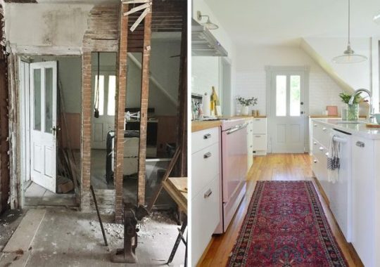
Before & Afters Of Our Beach House: Downstairs https://ift.tt/2K596YW
I’m not sure I’ve ever been so excited to share before and after photos as I am today. Last month marked the 2-year anniversary of buying the beach house and while we never like to declare a home “done,” this place has come so far that this felt like a good moment to look back at everything (and to document what’s still ahead).
We’ve dug up dozens of before photos (including many that we haven’t ever shared!) and we’ve done our best to find or take similar angles to match up with them. There are so many angles to show you, and so much to cover, we’re just doing the downstairs today – and then we’ll follow up soon with the upstairs once we can shoot those photos and organize another big before-and-after-fest of a post.
We’ll link some of the key items in each “after” for you, but remember you can always visit our Shop Our Beach House page for the paint colors and source info of each room (it’s always linked up in our menu bar right under our blog header). And before we dive into the photos, you may want to treat yourself to this walk down memory lane: the before video tour! Note: if you’re reading this post in a feed reader like Bloglovin or Feedly and can’t see the video below, you may have to click into our post to view it – but trust me, it’s worth it.
The Exterior
Before we head into the downstairs, let’s look at the outside. This is a shot of it from the sidewalk back when we bought it. Did you even remember that “the pink house” was once “the greenish-gray house?” Complete with cream trim, mismatched windows (some of which were boarded up), and cinderblock steps.
And here it is from a similar angle (a little closer up). We snapped this photo this summer:
Here’s another before shot. The cinderblock steps and the sad rotting siding weren’t gorgeous… but we loved the old bones.
Thanks to a new roof, new siding, new windows, new steps, and a repointed brick foundation, we got the house looking a lot happier. After much debate, a takeout coffee cup helped us choose pink for its new color scheme (Sherwin William’s Mellow Coral, with SW Snowbound for the trim).
Here’s another angle of the front of the house. Fun fact: that vine had snaked its way into the house and was growing in there as well as on the porch. For real.
We actually repainted both the porch ceiling and the floor their original colors, or at least the best we could match. The ceiling is Sherwin William’s Breaktime and the floor is Behr’s Pacific Fog. The ceiling also already had hooks in it for a porch swing, so we ordered one, popped it up, and called it done.
We still haven’t done most of the landscaping or hardscaping that we have planned for the side and backyard yet, but we could resist sharing one last angle. Remember how rotten this side of the house was??? This was a former porch that someone enclosed with interior wood floorboards instead of actual weather-proof siding (they had rotted so badly that you could stick your fist through the siding and into the house in a bunch of places). So yeah, it had nowhere to go but up.
This was the side of the house that had to be completely torn off and rebuilt due to a sinking foundation and a ton of weather damage to the support beams. So at one point this whole section was completely missing! This is where the mudroom, pantry, bathrooms, and bunk room now are. So, for reference, that exposed wall on the second floor that’s all black is where the bunk beds now hang. Crazy!
Now it’s looking more like this (minus that giant bush in the front that we learned is actually a tree that would grow taller than our house – so we had to get it outta there before it wrecked our freshly fixed foundation). We still have to landscape the entire side of the house and add a stone pathway to lead people back to the outdoor shower, but it’s a far cry from where we started.
The Entryway
Despite the crumbling plaster, unfinished drywall, and water damage – this view into the foyer was immediately charming to us. That fireplace mantle was not original, it was just one of many items that the previous owner had collected over the years (there were also two old stoves, various rolls of paintable wallpaper, and even an old boat in the shed out back).
This is the entry now. It, like the rest of the house, got fresh drywall and paint, refinished floors, and a whole lot more. We were able to salvage enough of the home’s original trim to use it throughout the first floor – and the original color of it in this foyer (see it in that photo above around the doorway?) is what inspired us to use non-white trim throughout the downstairs. The color is Sherwin William’s Stone Isle. The walls in the entire house are painted Sherwin Willaim’s White Heron and the floors – OH THE FLOORS! They’re the original heart pine that we had refinished and clear sealed with water based sealer (extremely durable but it won’t yellow over time like poly). It’s so hard to believe they’re the same floors in some of these photos because they were looking so rough when we bought this house.
mirror | similar light | similar lamp | similar dresser
It’s worth noting that we attempted to keep the railing wood (but stain it to match the floors since it was much redder than they were), but it proved impossible since it’s not heart pine like the floors and steps are. So we painted it a slightly deeper gray color than the trim, which allows the floors to sing instead of competing with a different tone of wood all the way up the stairs.
The Kitchen, Dining Room, & Pantry
Through the foyer is the largest room of the house, which we turned into a kitchen/dining space. It was a giant mess when we first bought it, but have no fear, that beautiful original light fixture is the one we had rewired that now hangs in the pantry!
Before jumping to the after on this one, I’m actually going to take you through the progression of this angle, since it tells a nice story about the journey this house went through. Below is what it looked like during demo. The mess was cleared (mostly) but there was still a long way to go.
Then here it is being rebuilt. That area to the left that’s all new wood is the side that had to be completely torn down and rebuilt – and a lot of the ceiling joists in the kitchen had to be reinforced with new boards.
I won’t bore you with photos of all of the new plumbing and electrical that got added (we redid those systems as well as installing new HVAC throughout the house), so let’s jump to drywall. It’s starting to look like a house again.
And now another big jump forward to present day. After some debate about the floor plan, we actually ended up with both the dining and the kitchen functions in relatively the same spot as they originally were. Let the record state that we love this downstairs layout so much that if we could blink our eyes and have our Richmond house laid out this way – complete with the back staircase – we would in a heartbeat. It’s not huge but it feels nice and open, and when we spend time downstairs we all feel close and connected but not cramped.
dining chair | chandeliers | sconces | pendants | barstools
Here’s the before photo again for comparison:
Here’s another view of this space. You can see the previous stove there next to the back door. And note that pink beadboard that runs along the back wall. We didn’t even register that it was there until way after we painted the house pink and it caught our eye in old photos from our initial walk-throughs. Sherry swears the house wanted to be pink all along and it was trying to send us signals (all of which we missed until after the fact).
Here’s that same view now. Even though it made floor planning a little more challenging, we were intent on keeping the placement of the original back door and that back staircase (some of our neighbors with similar houses don’t have them anymore) and we’re SO GLAD we did. They limited the useable wall space for the kitchen itself, but we ended up shifting that doorway on the left that you see above (which used to lead to the rotted side porch) to give us room for the wall that hosts the vintage pink stove now.
hood | cabinet pulls | similar runner | sconces | pendants | faucet | pink letterboard
It basically just got moved about 5′ further down the wall towards the dining area and it now leads to the laundry room/mudroom (which you enter through the house’s side door) as well as a full downstairs bathroom.
And that doorway that you see in the back left corner of the kitchen leads into our pantry, but that room used to be a full bathroom…. complete with pink trim. See it’s like this house wanted to be pink! There was a plastic shower stall between those exposed studs and a toilet tucked behind it.
You saw that the full bathroom downstairs shifted over by the mudroom, which freed up this space for another super functional area that took some trial-and-error to figure out: our walk-in pantry. We’ve got a full tutorial on building pantry shelves like these if you’re interested. Also, there’s the original light fixture that used to hang in the kitchen – we had it rewired so it’s safe.
Sherry often declares the pantry to be her favorite room in the house (especially this time of year because she stands on the floor vent to heat her feet while snacking). As weird as it sounds to declare a pantry your favorite, I’m going to top that. My favorite = the back stairs… which I know isn’t really a room… but hear me out! This is what they looked like before:
The old door on the third step up from the floor wasn’t to code anymore (you’d need a landing to stand on when opening a door) and we knew the stairs would look much better being open. So now we’ve got doors at the top of the stairs instead – which provide some nice privacy to anyone sleeping in that bedroom without blocking the view of the stairs from the kitchen.
I know this is a downstairs tour, but this photo will help to explain what I mean. Now when you reach the top of the stairs there’s a landing with a built-in dresser and these pocket doors can be closed for privacy.
Ok, back to the downstairs tour. I love these old stairs because (1) they’re such a cool quirky original detail and (2) they’re crazy functional. We weren’t even sure if we’d use them much (we thought maybe just the kids would love sneaking up them) but they act kind of like a private entry into the upstairs master bedroom for us, and I’m now so spoiled that I wish we had them in our Richmond house too.
Here is a view from the stairs themselves. It’s a “before” angle you probably haven’t seen before (probably because it’s blurry – ha!) but it’s looking towards where the pink stove now sits. The main thing to notice here is the blue door….
…that’s the one we kept as is (well, after carefully removing the flaking paint and clear sealing it with Safecoat Acrylacq so any old lead paint is completely encapsulated – you can read how to deal with lead here – BE SAFE GUYS). So that’s the very same door, it just got rehung in the doorway to the mudroom. We leave it open 95% of the time, only closing it while laundry is running, because it adds a nice dose of age and color to the room. This photo is from before we finished the backsplash, hence no finish piece across the top, but you get the idea:
If you’re wondering in all of this: “Well, where was the kitchen before?” allow me to show it to you. Since we bought the house in the midst of some stage of demo, we’re not entirely sure where appliances went (remember there was no working water meter that led to this house when we bought it, so it’s very possible it hadn’t had a functional kitchen in decades), and these clearly aren’t the original cabinets from 1920, but they were cornered against this wall that the previous owner was in the process of taking down. Btw, we donated all of the cabinets and appliances to the local Habitat ReStore, which was an easy way to dispose of them without them going to waste. They even came and picked them up, so that’s an option if you’re renovating – just call to schedule a pickup!
This is that same view now. I almost laughed out loud looking at this photo because it feels like the sink ended up in almost exactly the same spot.
framed art | curtains | curtain rods | sconces | pendants | barstools | similar runner
Stepping forward in this room, here’s another view of the previous dining area. There’s a lot to take in here – the giant hole in the floor (lower right), the vine creeping through the window (lower left), that hit of bright green trim (?!), and that second stove sitting in the living room.
But here we are today. At some point the secondhand table needs to be refinished (the leaf is a darker color than the rest of it) and we sometimes think we’d like to add a rug under the table (although we love the ease of cleaning the room just like this – so maybe not). Either way – still a big improvement over the before!
dining chairs | dining benches | similar chandeliers |curtains | curtain rods
The Living Room
If you step forward through the dining room doorway, this is the view you see – well, or would’ve seen two years ago. Again, there’s a lot to take in: the always-damp couch, maroon trim, that second stove. Not pictured are the new rolls of paintable wallpaper piled in the corner. The funny thing is that by the time we bought the house, no amount of paintable wallpaper was gonna save it.
Here’s how that same angle is looking lately. The fireplace mantel in the before photo wasn’t original and actually didn’t even fit on the wall (it overhung the far corner by an inch or two). So we donated the mantle and exposed the cool old brick chimney that had been hiding behind the plaster.
chandelier | rug | bookshelf | media cabinet | curtains | curtain rods
In this before photo you can sort of see better how the fireplace mantel didn’t fit on the wall (it was too wide on that left side). And while we didn’t rehang that door in that exact spot, this is one of the many original wood doors we had stripped down to the original pine, clear sealed, and then rehung throughout the house. I can’t say where this exact door ended up, but you’ll see one of them in a minute on the downstairs bathroom. All of the interior doors on the house are original (and all of the exterior ones except for the side door – which was a dinged up 50’s metal one – are too!).
Looking at this area today, you can better see how the exposed brick chimney adds a little bit of age and interest to the room. The warm tones of the brick also look great with the warm pine floors, which are balanced by the gray trim and some of the cooler colors we worked into the space, like the rug and the media cabinet.
rug | media cabinet | curtains | curtain rods | similar chair | similar table
And if you thought a second stove in the living room was weird, I dug up this before photo from another angle that featured a doorless fridge in there too. And there’s all that paintable wallpaper I mentioned.
Here’s that same angle now – taken from standing in that doorway that used to have the wood door on it. This is one of the first views you see when you walk into the foyer (when you step into the house, this is immediately on your right) and we love how light and bright this room has become.
rug | bookshelf | curtains | curtain rods | similar chair | similar fig
Here’s a similar vantage point, just looking slightly back toward the dining room. This must’ve been after closing since the doorless fridge is gone (the seller took that out before we closed), but at least now you can see the open bag of concrete left on the floor… WHICH HAD COMPLETELY HARDENED. I guess I shouldn’t be mad at that though, since it made it less messy to clean up.
Here’s an after from a similar POV. This room actually didn’t have an overhead fixture before, so we had one wired and added a decorative medallion to balance out the modern chandelier. We’re planning to swap out our 7-year-old Ikea sectional for the Mellow sofa from our own furniture line whenever we bring a moving truck out for the duplex. Can’t wait!
chandelier | rug | bookshelf | curtains | curtain rods | similar table
Okay, one last angle of the stove, I mean, living room. This is standing in the living room looking back through into the dining and kitchen area.
And here’s a similar view now, which shows you how the dining table helps act as overflow seating for the living room, since someone can easily sit on the bench and face into the living room to chat. We love how flexible it is, and we’ve had big groups over for a casual meal and it works so well.
rug | dining chairs | dining benches | similar chandeliers
The Mudroom & Bathroom
The last two rooms to show you downstairs are some of our hardest working spaces in the house. The mudroom and the downstairs bathroom, (along with the pantry) were located in the section of the house that had to be completely torn off and rebuilt. Remember that rotted exterior side of the house that we showed you with fist-sized holes? Well, this is the room behind it (note the sunlight streaming in between the gaps in the “siding”).
I can’t get quite far back enough to take that same angle now, because we added a wall to split the space into two rooms: the mudroom and the bathroom. But the wall seen above is now home to our laundry area and – since this is the room you enter from the side door – it acts as a mudroom of sorts too, complete with an oversized wall hook rail, a bench, and baskets for shoes. That tall Ikea cabinet also hides our tankless water heater while storing brooms, a vacuum, and other cleaning supplies.
floor tile | washer | dryer | light | shelf brackets | towels | similar bench | shelf basket
Turning around, this was the view of the other side of that room when we first bought it (standing where the washer & dryer are now). It’s a little hard to orient yourself since we changed the layout, but just note the location of the door and window on the left side.
Now, looking from the washer and dryer today, the door and window stayed in the same spot – but there’s a wall between them to create the downstairs bathroom (which now has that window in it). And in this photo you can see one of the original wood doors after it was stripped and resealed. Plus, see that trio of photos? Those are “before” photos that we had framed so anyone who visits can appreciate how far this house has come.
Now I’ll show you the bathroom up close. I don’t really have comparable “before” photos because this didn’t exist as a separate room before, but in many ways it matches the layout of the original downstairs bathroom (which is now the pantry).
floor tile | shower wall tile | wall art | shower curtain | toilet | tp holder
And here’s the view of the other side of that wall, where you can see the vanity area. Just like the picture frames above the toilet, we chose a mirror with wood accents to pick up on the original wood doors. This one was actually a more recent swap (we had a larger rectangular one there before) and this suits the space much better.
mirror | vanity | faucet | light | hand towel | floor tile
So now that you’ve seen the entire downstairs both before and after, I’m gonna end with a deep dark confession. We filmed a video tour of the beach house on the last weekend before it started to get overtaken with duplex materials (think tile piled up in the foyer and extra furniture and frames everywhere) and when we got home, the video was a fail. I won’t bore you with the details, but it was a focusing issue I couldn’t detect until we got it home and uploaded. So rather than subject you to it, we’re going to try to take a better one in a few weeks. So stay tuned for that AND the before and after photos of the upstairs!
PS: If there’s any source you missed you can probably find it (or something similar) on our Shop Our Beach House page. You can also browse all of our beach house posts and projects here.
*This post contains affiliate links*
The post Before & Afters Of Our Beach House: Downstairs appeared first on Young House Love.
0 notes
Text
Before & Afters Of Our Beach House: Downstairs
I’m not sure I’ve ever been so excited to share before and after photos as I am today. Last month marked the 2-year anniversary of buying the beach house and while we never like to declare a home “done,” this place has come so far that this felt like a good moment to look back at everything (and to document what’s still ahead).
We’ve dug up dozens of before photos (including many that we haven’t ever shared!) and we’ve done our best to find or take similar angles to match up with them. There are so many angles to show you, and so much to cover, we’re just doing the downstairs today – and then we’ll follow up soon with the upstairs once we can shoot those photos and organize another big before-and-after-fest of a post.
We’ll link some of the key items in each “after” for you, but remember you can always visit our Shop Our Beach House page for the paint colors and source info of each room (it’s always linked up in our menu bar right under our blog header). And before we dive into the photos, you may want to treat yourself to this walk down memory lane: the before video tour! Note: if you’re reading this post in a feed reader like Bloglovin or Feedly and can’t see the video below, you may have to click into our post to view it – but trust me, it’s worth it.
The Exterior
Before we head into the downstairs, let’s look at the outside. This is a shot of it from the sidewalk back when we bought it. Did you even remember that “the pink house” was once “the greenish-gray house?” Complete with cream trim, mismatched windows (some of which were boarded up), and cinderblock steps.
And here it is from a similar angle (a little closer up). We snapped this photo this summer:
Here’s another before shot. The cinderblock steps and the sad rotting siding weren’t gorgeous… but we loved the old bones.
Thanks to a new roof, new siding, new windows, new steps, and a repointed brick foundation, we got the house looking a lot happier. After much debate, a takeout coffee cup helped us choose pink for its new color scheme (Sherwin William’s Mellow Coral, with SW Snowbound for the trim).
Here’s another angle of the front of the house. Fun fact: that vine had snaked its way into the house and was growing in there as well as on the porch. For real.
We actually repainted both the porch ceiling and the floor their original colors, or at least the best we could match. The ceiling is Sherwin William’s Breaktime and the floor is Behr’s Pacific Fog. The ceiling also already had hooks in it for a porch swing, so we ordered one, popped it up, and called it done.
We still haven’t done most of the landscaping or hardscaping that we have planned for the side and backyard yet, but we could resist sharing one last angle. Remember how rotten this side of the house was??? This was a former porch that someone enclosed with interior wood floorboards instead of actual weather-proof siding (they had rotted so badly that you could stick your fist through the siding and into the house in a bunch of places). So yeah, it had nowhere to go but up.
This was the side of the house that had to be completely torn off and rebuilt due to a sinking foundation and a ton of weather damage to the support beams. So at one point this whole section was completely missing! This is where the mudroom, pantry, bathrooms, and bunk room now are. So, for reference, that exposed wall on the second floor that’s all black is where the bunk beds now hang. Crazy!
Now it’s looking more like this (minus that giant bush in the front that we learned is actually a tree that would grow taller than our house – so we had to get it outta there before it wrecked our freshly fixed foundation). We still have to landscape the entire side of the house and add a stone pathway to lead people back to the outdoor shower, but it’s a far cry from where we started.
The Entryway
Despite the crumbling plaster, unfinished drywall, and water damage – this view into the foyer was immediately charming to us. That fireplace mantle was not original, it was just one of many items that the previous owner had collected over the years (there were also two old stoves, various rolls of paintable wallpaper, and even an old boat in the shed out back).
This is the entry now. It, like the rest of the house, got fresh drywall and paint, refinished floors, and a whole lot more. We were able to salvage enough of the home’s original trim to use it throughout the first floor – and the original color of it in this foyer (see it in that photo above around the doorway?) is what inspired us to use non-white trim throughout the downstairs. The color is Sherwin William’s Stone Isle. The walls in the entire house are painted Sherwin Willaim’s White Heron and the floors – OH THE FLOORS! They’re the original heart pine that we had refinished and clear sealed with water based sealer (extremely durable but it won’t yellow over time like poly). It’s so hard to believe they’re the same floors in some of these photos because they were looking so rough when we bought this house.
mirror | similar light | similar lamp | similar dresser
It’s worth noting that we attempted to keep the railing wood (but stain it to match the floors since it was much redder than they were), but it proved impossible since it’s not heart pine like the floors and steps are. So we painted it a slightly deeper gray color than the trim, which allows the floors to sing instead of competing with a different tone of wood all the way up the stairs.
The Kitchen, Dining Room, & Pantry
Through the foyer is the largest room of the house, which we turned into a kitchen/dining space. It was a giant mess when we first bought it, but have no fear, that beautiful original light fixture is the one we had rewired that now hangs in the pantry!
Before jumping to the after on this one, I’m actually going to take you through the progression of this angle, since it tells a nice story about the journey this house went through. Below is what it looked like during demo. The mess was cleared (mostly) but there was still a long way to go.
Then here it is being rebuilt. That area to the left that’s all new wood is the side that had to be completely torn down and rebuilt – and a lot of the ceiling joists in the kitchen had to be reinforced with new boards.
I won’t bore you with photos of all of the new plumbing and electrical that got added (we redid those systems as well as installing new HVAC throughout the house), so let’s jump to drywall. It’s starting to look like a house again.
And now another big jump forward to present day. After some debate about the floor plan, we actually ended up with both the dining and the kitchen functions in relatively the same spot as they originally were. Let the record state that we love this downstairs layout so much that if we could blink our eyes and have our Richmond house laid out this way – complete with the back staircase – we would in a heartbeat. It’s not huge but it feels nice and open, and when we spend time downstairs we all feel close and connected but not cramped.
dining chair | chandeliers | sconces | pendants | barstools
Here’s the before photo again for comparison:
Here’s another view of this space. You can see the previous stove there next to the back door. And note that pink beadboard that runs along the back wall. We didn’t even register that it was there until way after we painted the house pink and it caught our eye in old photos from our initial walk-throughs. Sherry swears the house wanted to be pink all along and it was trying to send us signals (all of which we missed until after the fact).
Here’s that same view now. Even though it made floor planning a little more challenging, we were intent on keeping the placement of the original back door and that back staircase (some of our neighbors with similar houses don’t have them anymore) and we’re SO GLAD we did. They limited the useable wall space for the kitchen itself, but we ended up shifting that doorway on the left that you see above (which used to lead to the rotted side porch) to give us room for the wall that hosts the vintage pink stove now.
hood | cabinet pulls | similar runner | sconces | pendants | faucet | pink letterboard
It basically just got moved about 5′ further down the wall towards the dining area and it now leads to the laundry room/mudroom (which you enter through the house’s side door) as well as a full downstairs bathroom.
And that doorway that you see in the back left corner of the kitchen leads into our pantry, but that room used to be a full bathroom…. complete with pink trim. See it’s like this house wanted to be pink! There was a plastic shower stall between those exposed studs and a toilet tucked behind it.
You saw that the full bathroom downstairs shifted over by the mudroom, which freed up this space for another super functional area that took some trial-and-error to figure out: our walk-in pantry. We’ve got a full tutorial on building pantry shelves like these if you’re interested. Also, there’s the original light fixture that used to hang in the kitchen – we had it rewired so it’s safe.
Sherry often declares the pantry to be her favorite room in the house (especially this time of year because she stands on the floor vent to heat her feet while snacking). As weird as it sounds to declare a pantry your favorite, I’m going to top that. My favorite = the back stairs… which I know isn’t really a room… but hear me out! This is what they looked like before:
The old door on the third step up from the floor wasn’t to code anymore (you’d need a landing to stand on when opening a door) and we knew the stairs would look much better being open. So now we’ve got doors at the top of the stairs instead – which provide some nice privacy to anyone sleeping in that bedroom without blocking the view of the stairs from the kitchen.
I know this is a downstairs tour, but this photo will help to explain what I mean. Now when you reach the top of the stairs there’s a landing with a built-in dresser and these pocket doors can be closed for privacy.
Ok, back to the downstairs tour. I love these old stairs because (1) they’re such a cool quirky original detail and (2) they’re crazy functional. We weren’t even sure if we’d use them much (we thought maybe just the kids would love sneaking up them) but they act kind of like a private entry into the upstairs master bedroom for us, and I’m now so spoiled that I wish we had them in our Richmond house too.
Here is a view from the stairs themselves. It’s a “before” angle you probably haven’t seen before (probably because it’s blurry – ha!) but it’s looking towards where the pink stove now sits. The main thing to notice here is the blue door….
…that’s the one we kept as is (well, after carefully removing the flaking paint and clear sealing it with Safecoat Acrylacq so any old lead paint is completely encapsulated – you can read how to deal with lead here – BE SAFE GUYS). So that’s the very same door, it just got rehung in the doorway to the mudroom. We leave it open 95% of the time, only closing it while laundry is running, because it adds a nice dose of age and color to the room. This photo is from before we finished the backsplash, hence no finish piece across the top, but you get the idea:
If you’re wondering in all of this: “Well, where was the kitchen before?” allow me to show it to you. Since we bought the house in the midst of some stage of demo, we’re not entirely sure where appliances went (remember there was no working water meter that led to this house when we bought it, so it’s very possible it hadn’t had a functional kitchen in decades), and these clearly aren’t the original cabinets from 1920, but they were cornered against this wall that the previous owner was in the process of taking down. Btw, we donated all of the cabinets and appliances to the local Habitat ReStore, which was an easy way to dispose of them without them going to waste. They even came and picked them up, so that’s an option if you’re renovating – just call to schedule a pickup!
This is that same view now. I almost laughed out loud looking at this photo because it feels like the sink ended up in almost exactly the same spot.
framed art | curtains | curtain rods | sconces | pendants | barstools | similar runner
Stepping forward in this room, here’s another view of the previous dining area. There’s a lot to take in here – the giant hole in the floor (lower right), the vine creeping through the window (lower left), that hit of bright green trim (?!), and that second stove sitting in the living room.
But here we are today. At some point the secondhand table needs to be refinished (the leaf is a darker color than the rest of it) and we sometimes think we’d like to add a rug under the table (although we love the ease of cleaning the room just like this – so maybe not). Either way – still a big improvement over the before!
dining chairs | dining benches | similar chandeliers |curtains | curtain rods
The Living Room
If you step forward through the dining room doorway, this is the view you see – well, or would’ve seen two years ago. Again, there’s a lot to take in: the always-damp couch, maroon trim, that second stove. Not pictured are the new rolls of paintable wallpaper piled in the corner. The funny thing is that by the time we bought the house, no amount of paintable wallpaper was gonna save it.
Here’s how that same angle is looking lately. The fireplace mantel in the before photo wasn’t original and actually didn’t even fit on the wall (it overhung the far corner by an inch or two). So we donated the mantle and exposed the cool old brick chimney that had been hiding behind the plaster.
chandelier | rug | bookshelf | media cabinet | curtains | curtain rods
In this before photo you can sort of see better how the fireplace mantel didn’t fit on the wall (it was too wide on that left side). And while we didn’t rehang that door in that exact spot, this is one of the many original wood doors we had stripped down to the original pine, clear sealed, and then rehung throughout the house. I can’t say where this exact door ended up, but you’ll see one of them in a minute on the downstairs bathroom. All of the interior doors on the house are original (and all of the exterior ones except for the side door – which was a dinged up 50’s metal one – are too!).
Looking at this area today, you can better see how the exposed brick chimney adds a little bit of age and interest to the room. The warm tones of the brick also look great with the warm pine floors, which are balanced by the gray trim and some of the cooler colors we worked into the space, like the rug and the media cabinet.
rug | media cabinet | curtains | curtain rods | similar chair | similar table
And if you thought a second stove in the living room was weird, I dug up this before photo from another angle that featured a doorless fridge in there too. And there’s all that paintable wallpaper I mentioned.
Here’s that same angle now – taken from standing in that doorway that used to have the wood door on it. This is one of the first views you see when you walk into the foyer (when you step into the house, this is immediately on your right) and we love how light and bright this room has become.
rug | bookshelf | curtains | curtain rods | similar chair | similar fig
Here’s a similar vantage point, just looking slightly back toward the dining room. This must’ve been after closing since the doorless fridge is gone (the seller took that out before we closed), but at least now you can see the open bag of concrete left on the floor… WHICH HAD COMPLETELY HARDENED. I guess I shouldn’t be mad at that though, since it made it less messy to clean up.
Here’s an after from a similar POV. This room actually didn’t have an overhead fixture before, so we had one wired and added a decorative medallion to balance out the modern chandelier. We’re planning to swap out our 7-year-old Ikea sectional for the Mellow sofa from our own furniture line whenever we bring a moving truck out for the duplex. Can’t wait!
chandelier | rug | bookshelf | curtains | curtain rods | similar table
Okay, one last angle of the stove, I mean, living room. This is standing in the living room looking back through into the dining and kitchen area.
And here’s a similar view now, which shows you how the dining table helps act as overflow seating for the living room, since someone can easily sit on the bench and face into the living room to chat. We love how flexible it is, and we’ve had big groups over for a casual meal and it works so well.
rug | dining chairs | dining benches | similar chandeliers
The Mudroom & Bathroom
The last two rooms to show you downstairs are some of our hardest working spaces in the house. The mudroom and the downstairs bathroom, (along with the pantry) were located in the section of the house that had to be completely torn off and rebuilt. Remember that rotted exterior side of the house that we showed you with fist-sized holes? Well, this is the room behind it (note the sunlight streaming in between the gaps in the “siding”).
I can’t get quite far back enough to take that same angle now, because we added a wall to split the space into two rooms: the mudroom and the bathroom. But the wall seen above is now home to our laundry area and – since this is the room you enter from the side door – it acts as a mudroom of sorts too, complete with an oversized wall hook rail, a bench, and baskets for shoes. That tall Ikea cabinet also hides our tankless water heater while storing brooms, a vacuum, and other cleaning supplies.
floor tile | washer | dryer | light | shelf brackets | towels | similar bench | shelf basket
Turning around, this was the view of the other side of that room when we first bought it (standing where the washer & dryer are now). It’s a little hard to orient yourself since we changed the layout, but just note the location of the door and window on the left side.
Now, looking from the washer and dryer today, the door and window stayed in the same spot – but there’s a wall between them to create the downstairs bathroom (which now has that window in it). And in this photo you can see one of the original wood doors after it was stripped and resealed. Plus, see that trio of photos? Those are “before” photos that we had framed so anyone who visits can appreciate how far this house has come.
Now I’ll show you the bathroom up close. I don’t really have comparable “before” photos because this didn’t exist as a separate room before, but in many ways it matches the layout of the original downstairs bathroom (which is now the pantry).
floor tile | shower wall tile | wall art | shower curtain | toilet | tp holder
And here’s the view of the other side of that wall, where you can see the vanity area. Just like the picture frames above the toilet, we chose a mirror with wood accents to pick up on the original wood doors. This one was actually a more recent swap (we had a larger rectangular one there before) and this suits the space much better.
mirror | vanity | faucet | light | hand towel | floor tile
So now that you’ve seen the entire downstairs both before and after, I’m gonna end with a deep dark confession. We filmed a video tour of the beach house on the last weekend before it started to get overtaken with duplex materials (think tile piled up in the foyer and extra furniture and frames everywhere) and when we got home, the video was a fail. I won’t bore you with the details, but it was a focusing issue I couldn’t detect until we got it home and uploaded. So rather than subject you to it, we’re going to try to take a better one in a few weeks. So stay tuned for that AND the before and after photos of the upstairs!
PS: If there’s any source you missed you can probably find it (or something similar) on our Shop Our Beach House page. You can also browse all of our beach house posts and projects here.
*This post contains affiliate links*
The post Before & Afters Of Our Beach House: Downstairs appeared first on Young House Love.
Before & Afters Of Our Beach House: Downstairs published first on https://carpetgurus.tumblr.com/
0 notes
Text
Before & Afters Of Our Beach House: Downstairs
I’m not sure I’ve ever been so excited to share before and after photos as I am today. Last month marked the 2-year anniversary of buying the beach house and while we never like to declare a home “done,” this place has come so far that this felt like a good moment to look back at everything (and to document what’s still ahead).
We’ve dug up dozens of before photos (including many that we haven’t ever shared!) and we’ve done our best to find or take similar angles to match up with them. There are so many angles to show you, and so much to cover, we’re just doing the downstairs today – and then we’ll follow up soon with the upstairs once we can shoot those photos and organize another big before-and-after-fest of a post.
We’ll link some of the key items in each “after” for you, but remember you can always visit our Shop Our Beach House page for the paint colors and source info of each room (it’s always linked up in our menu bar right under our blog header). And before we dive into the photos, you may want to treat yourself to this walk down memory lane: the before video tour! Note: if you’re reading this post in a feed reader like Bloglovin or Feedly and can’t see the video below, you may have to click into our post to view it – but trust me, it’s worth it.
The Exterior
Before we head into the downstairs, let’s look at the outside. This is a shot of it from the sidewalk back when we bought it. Did you even remember that “the pink house” was once “the greenish-gray house?” Complete with cream trim, mismatched windows (some of which were boarded up), and cinderblock steps.
And here it is from a similar angle (a little closer up). We snapped this photo this summer:
Here’s another before shot. The cinderblock steps and the sad rotting siding weren’t gorgeous… but we loved the old bones.
Thanks to a new roof, new siding, new windows, new steps, and a repointed brick foundation, we got the house looking a lot happier. After much debate, a takeout coffee cup helped us choose pink for its new color scheme (Sherwin William’s Mellow Coral, with SW Snowbound for the trim).
Here’s another angle of the front of the house. Fun fact: that vine had snaked its way into the house and was growing in there as well as on the porch. For real.
We actually repainted both the porch ceiling and the floor their original colors, or at least the best we could match. The ceiling is Sherwin William’s Breaktime and the floor is Behr’s Pacific Fog. The ceiling also already had hooks in it for a porch swing, so we ordered one, popped it up, and called it done.
We still haven’t done most of the landscaping or hardscaping that we have planned for the side and backyard yet, but we could resist sharing one last angle. Remember how rotten this side of the house was??? This was a former porch that someone enclosed with interior wood floorboards instead of actual weather-proof siding (they had rotted so badly that you could stick your fist through the siding and into the house in a bunch of places). So yeah, it had nowhere to go but up.
This was the side of the house that had to be completely torn off and rebuilt due to a sinking foundation and a ton of weather damage to the support beams. So at one point this whole section was completely missing! This is where the mudroom, pantry, bathrooms, and bunk room now are. So, for reference, that exposed wall on the second floor that’s all black is where the bunk beds now hang. Crazy!
Now it’s looking more like this (minus that giant bush in the front that we learned is actually a tree that would grow taller than our house – so we had to get it outta there before it wrecked our freshly fixed foundation). We still have to landscape the entire side of the house and add a stone pathway to lead people back to the outdoor shower, but it’s a far cry from where we started.
The Entryway
Despite the crumbling plaster, unfinished drywall, and water damage – this view into the foyer was immediately charming to us. That fireplace mantle was not original, it was just one of many items that the previous owner had collected over the years (there were also two old stoves, various rolls of paintable wallpaper, and even an old boat in the shed out back).
This is the entry now. It, like the rest of the house, got fresh drywall and paint, refinished floors, and a whole lot more. We were able to salvage enough of the home’s original trim to use it throughout the first floor – and the original color of it in this foyer (see it in that photo above around the doorway?) is what inspired us to use non-white trim throughout the downstairs. The color is Sherwin William’s Stone Isle. The walls in the entire house are painted Sherwin Willaim’s White Heron and the floors – OH THE FLOORS! They’re the original heart pine that we had refinished and clear sealed with water based sealer (extremely durable but it won’t yellow over time like poly). It’s so hard to believe they’re the same floors in some of these photos because they were looking so rough when we bought this house.
mirror | similar light | similar lamp | similar dresser
It’s worth noting that we attempted to keep the railing wood (but stain it to match the floors since it was much redder than they were), but it proved impossible since it’s not heart pine like the floors and steps are. So we painted it a slightly deeper gray color than the trim, which allows the floors to sing instead of competing with a different tone of wood all the way up the stairs.
The Kitchen, Dining Room, & Pantry
Through the foyer is the largest room of the house, which we turned into a kitchen/dining space. It was a giant mess when we first bought it, but have no fear, that beautiful original light fixture is the one we had rewired that now hangs in the pantry!
Before jumping to the after on this one, I’m actually going to take you through the progression of this angle, since it tells a nice story about the journey this house went through. Below is what it looked like during demo. The mess was cleared (mostly) but there was still a long way to go.
Then here it is being rebuilt. That area to the left that’s all new wood is the side that had to be completely torn down and rebuilt – and a lot of the ceiling joists in the kitchen had to be reinforced with new boards.
I won’t bore you with photos of all of the new plumbing and electrical that got added (we redid those systems as well as installing new HVAC throughout the house), so let’s jump to drywall. It’s starting to look like a house again.
And now another big jump forward to present day. After some debate about the floor plan, we actually ended up with both the dining and the kitchen functions in relatively the same spot as they originally were. Let the record state that we love this downstairs layout so much that if we could blink our eyes and have our Richmond house laid out this way – complete with the back staircase – we would in a heartbeat. It’s not huge but it feels nice and open, and when we spend time downstairs we all feel close and connected but not cramped.
dining chair | chandeliers | sconces | pendants | barstools
Here’s the before photo again for comparison:
Here’s another view of this space. You can see the previous stove there next to the back door. And note that pink beadboard that runs along the back wall. We didn’t even register that it was there until way after we painted the house pink and it caught our eye in old photos from our initial walk-throughs. Sherry swears the house wanted to be pink all along and it was trying to send us signals (all of which we missed until after the fact).
Here’s that same view now. Even though it made floor planning a little more challenging, we were intent on keeping the placement of the original back door and that back staircase (some of our neighbors with similar houses don’t have them anymore) and we’re SO GLAD we did. They limited the useable wall space for the kitchen itself, but we ended up shifting that doorway on the left that you see above (which used to lead to the rotted side porch) to give us room for the wall that hosts the vintage pink stove now.
hood | cabinet pulls | similar runner | sconces | pendants | faucet | pink letterboard
It basically just got moved about 5′ further down the wall towards the dining area and it now leads to the laundry room/mudroom (which you enter through the house’s side door) as well as a full downstairs bathroom.
And that doorway that you see in the back left corner of the kitchen leads into our pantry, but that room used to be a full bathroom…. complete with pink trim. See it’s like this house wanted to be pink! There was a plastic shower stall between those exposed studs and a toilet tucked behind it.
You saw that the full bathroom downstairs shifted over by the mudroom, which freed up this space for another super functional area that took some trial-and-error to figure out: our walk-in pantry. We’ve got a full tutorial on building pantry shelves like these if you’re interested. Also, there’s the original light fixture that used to hang in the kitchen – we had it rewired so it’s safe.
Sherry often declares the pantry to be her favorite room in the house (especially this time of year because she stands on the floor vent to heat her feet while snacking). As weird as it sounds to declare a pantry your favorite, I’m going to top that. My favorite = the back stairs… which I know isn’t really a room… but hear me out! This is what they looked like before:
The old door on the third step up from the floor wasn’t to code anymore (you’d need a landing to stand on when opening a door) and we knew the stairs would look much better being open. So now we’ve got doors at the top of the stairs instead – which provide some nice privacy to anyone sleeping in that bedroom without blocking the view of the stairs from the kitchen.
I know this is a downstairs tour, but this photo will help to explain what I mean. Now when you reach the top of the stairs there’s a landing with a built-in dresser and these pocket doors can be closed for privacy.
Ok, back to the downstairs tour. I love these old stairs because (1) they’re such a cool quirky original detail and (2) they’re crazy functional. We weren’t even sure if we’d use them much (we thought maybe just the kids would love sneaking up them) but they act kind of like a private entry into the upstairs master bedroom for us, and I’m now so spoiled that I wish we had them in our Richmond house too.
Here is a view from the stairs themselves. It’s a “before” angle you probably haven’t seen before (probably because it’s blurry – ha!) but it’s looking towards where the pink stove now sits. The main thing to notice here is the blue door….
…that’s the one we kept as is (well, after carefully removing the flaking paint and clear sealing it with Safecoat Acrylacq so any old lead paint is completely encapsulated – you can read how to deal with lead here – BE SAFE GUYS). So that’s the very same door, it just got rehung in the doorway to the mudroom. We leave it open 95% of the time, only closing it while laundry is running, because it adds a nice dose of age and color to the room. This photo is from before we finished the backsplash, hence no finish piece across the top, but you get the idea:
If you’re wondering in all of this: “Well, where was the kitchen before?” allow me to show it to you. Since we bought the house in the midst of some stage of demo, we’re not entirely sure where appliances went (remember there was no working water meter that led to this house when we bought it, so it’s very possible it hadn’t had a functional kitchen in decades), and these clearly aren’t the original cabinets from 1920, but they were cornered against this wall that the previous owner was in the process of taking down. Btw, we donated all of the cabinets and appliances to the local Habitat ReStore, which was an easy way to dispose of them without them going to waste. They even came and picked them up, so that’s an option if you’re renovating – just call to schedule a pickup!
This is that same view now. I almost laughed out loud looking at this photo because it feels like the sink ended up in almost exactly the same spot.
framed art | curtains | curtain rods | sconces | pendants | barstools | similar runner
Stepping forward in this room, here’s another view of the previous dining area. There’s a lot to take in here – the giant hole in the floor (lower right), the vine creeping through the window (lower left), that hit of bright green trim (?!), and that second stove sitting in the living room.
But here we are today. At some point the secondhand table needs to be refinished (the leaf is a darker color than the rest of it) and we sometimes think we’d like to add a rug under the table (although we love the ease of cleaning the room just like this – so maybe not). Either way – still a big improvement over the before!
dining chairs | dining benches | similar chandeliers |curtains | curtain rods
The Living Room
If you step forward through the dining room doorway, this is the view you see – well, or would’ve seen two years ago. Again, there’s a lot to take in: the always-damp couch, maroon trim, that second stove. Not pictured are the new rolls of paintable wallpaper piled in the corner. The funny thing is that by the time we bought the house, no amount of paintable wallpaper was gonna save it.
Here’s how that same angle is looking lately. The fireplace mantel in the before photo wasn’t original and actually didn’t even fit on the wall (it overhung the far corner by an inch or two). So we donated the mantle and exposed the cool old brick chimney that had been hiding behind the plaster.
chandelier | rug | bookshelf | media cabinet | curtains | curtain rods
In this before photo you can sort of see better how the fireplace mantel didn’t fit on the wall (it was too wide on that left side). And while we didn’t rehang that door in that exact spot, this is one of the many original wood doors we had stripped down to the original pine, clear sealed, and then rehung throughout the house. I can’t say where this exact door ended up, but you’ll see one of them in a minute on the downstairs bathroom. All of the interior doors on the house are original (and all of the exterior ones except for the side door – which was a dinged up 50’s metal one – are too!).
Looking at this area today, you can better see how the exposed brick chimney adds a little bit of age and interest to the room. The warm tones of the brick also look great with the warm pine floors, which are balanced by the gray trim and some of the cooler colors we worked into the space, like the rug and the media cabinet.
rug | media cabinet | curtains | curtain rods | similar chair | similar table
And if you thought a second stove in the living room was weird, I dug up this before photo from another angle that featured a doorless fridge in there too. And there’s all that paintable wallpaper I mentioned.
Here’s that same angle now – taken from standing in that doorway that used to have the wood door on it. This is one of the first views you see when you walk into the foyer (when you step into the house, this is immediately on your right) and we love how light and bright this room has become.
rug | bookshelf | curtains | curtain rods | similar chair | similar fig
Here’s a similar vantage point, just looking slightly back toward the dining room. This must’ve been after closing since the doorless fridge is gone (the seller took that out before we closed), but at least now you can see the open bag of concrete left on the floor… WHICH HAD COMPLETELY HARDENED. I guess I shouldn’t be mad at that though, since it made it less messy to clean up.
Here’s an after from a similar POV. This room actually didn’t have an overhead fixture before, so we had one wired and added a decorative medallion to balance out the modern chandelier. We’re planning to swap out our 7-year-old Ikea sectional for the Mellow sofa from our own furniture line whenever we bring a moving truck out for the duplex. Can’t wait!
chandelier | rug | bookshelf | curtains | curtain rods | similar table
Okay, one last angle of the stove, I mean, living room. This is standing in the living room looking back through into the dining and kitchen area.
And here’s a similar view now, which shows you how the dining table helps act as overflow seating for the living room, since someone can easily sit on the bench and face into the living room to chat. We love how flexible it is, and we’ve had big groups over for a casual meal and it works so well.
rug | dining chairs | dining benches | similar chandeliers
The Mudroom & Bathroom
The last two rooms to show you downstairs are some of our hardest working spaces in the house. The mudroom and the downstairs bathroom, (along with the pantry) were located in the section of the house that had to be completely torn off and rebuilt. Remember that rotted exterior side of the house that we showed you with fist-sized holes? Well, this is the room behind it (note the sunlight streaming in between the gaps in the “siding”).
I can’t get quite far back enough to take that same angle now, because we added a wall to split the space into two rooms: the mudroom and the bathroom. But the wall seen above is now home to our laundry area and – since this is the room you enter from the side door – it acts as a mudroom of sorts too, complete with an oversized wall hook rail, a bench, and baskets for shoes. That tall Ikea cabinet also hides our tankless water heater while storing brooms, a vacuum, and other cleaning supplies.
floor tile | washer | dryer | light | shelf brackets | towels | similar bench | shelf basket
Turning around, this was the view of the other side of that room when we first bought it (standing where the washer & dryer are now). It’s a little hard to orient yourself since we changed the layout, but just note the location of the door and window on the left side.
Now, looking from the washer and dryer today, the door and window stayed in the same spot – but there’s a wall between them to create the downstairs bathroom (which now has that window in it). And in this photo you can see one of the original wood doors after it was stripped and resealed. Plus, see that trio of photos? Those are “before” photos that we had framed so anyone who visits can appreciate how far this house has come.
Now I’ll show you the bathroom up close. I don’t really have comparable “before” photos because this didn’t exist as a separate room before, but in many ways it matches the layout of the original downstairs bathroom (which is now the pantry).
floor tile | shower wall tile | wall art | shower curtain | toilet | tp holder
And here’s the view of the other side of that wall, where you can see the vanity area. Just like the picture frames above the toilet, we chose a mirror with wood accents to pick up on the original wood doors. This one was actually a more recent swap (we had a larger rectangular one there before) and this suits the space much better.
mirror | vanity | faucet | light | hand towel | floor tile
So now that you’ve seen the entire downstairs both before and after, I’m gonna end with a deep dark confession. We filmed a video tour of the beach house on the last weekend before it started to get overtaken with duplex materials (think tile piled up in the foyer and extra furniture and frames everywhere) and when we got home, the video was a fail. I won’t bore you with the details, but it was a focusing issue I couldn’t detect until we got it home and uploaded. So rather than subject you to it, we’re going to try to take a better one in a few weeks. So stay tuned for that AND the before and after photos of the upstairs!
PS: If there’s any source you missed you can probably find it (or something similar) on our Shop Our Beach House page. You can also browse all of our beach house posts and projects here.
*This post contains affiliate links*
The post Before & Afters Of Our Beach House: Downstairs appeared first on Young House Love.
Before & Afters Of Our Beach House: Downstairs published first on https://landscapingmates.blogspot.com
0 notes
Text
Before & Afters Of Our Beach House: Downstairs
I’m not sure I’ve ever been so excited to share before and after photos as I am today. Last month marked the 2-year anniversary of buying the beach house and while we never like to declare a home “done,” this place has come so far that this felt like a good moment to look back at everything (and to document what’s still ahead).
We’ve dug up dozens of before photos (including many that we haven’t ever shared!) and we’ve done our best to find or take similar angles to match up with them. There are so many angles to show you, and so much to cover, we’re just doing the downstairs today – and then we’ll follow up soon with the upstairs once we can shoot those photos and organize another big before-and-after-fest of a post.
We’ll link some of the key items in each “after” for you, but remember you can always visit our Shop Our Beach House page for the paint colors and source info of each room (it’s always linked up in our menu bar right under our blog header). And before we dive into the photos, you may want to treat yourself to this walk down memory lane: the before video tour! Note: if you’re reading this post in a feed reader like Bloglovin or Feedly and can’t see the video below, you may have to click into our post to view it – but trust me, it’s worth it.
The Exterior
Before we head into the downstairs, let’s look at the outside. This is a shot of it from the sidewalk back when we bought it. Did you even remember that “the pink house” was once “the greenish-gray house?” Complete with cream trim, mismatched windows (some of which were boarded up), and cinderblock steps.
And here it is from a similar angle (a little closer up). We snapped this photo this summer:
Here’s another before shot. The cinderblock steps and the sad rotting siding weren’t gorgeous… but we loved the old bones.
Thanks to a new roof, new siding, new windows, new steps, and a repointed brick foundation, we got the house looking a lot happier. After much debate, a takeout coffee cup helped us choose pink for its new color scheme (Sherwin William’s Mellow Coral, with SW Snowbound for the trim).
Here’s another angle of the front of the house. Fun fact: that vine had snaked its way into the house and was growing in there as well as on the porch. For real.
We actually repainted both the porch ceiling and the floor their original colors, or at least the best we could match. The ceiling is Sherwin William’s Breaktime and the floor is Behr’s Pacific Fog. The ceiling also already had hooks in it for a porch swing, so we ordered one, popped it up, and called it done.
We still haven’t done most of the landscaping or hardscaping that we have planned for the side and backyard yet, but we could resist sharing one last angle. Remember how rotten this side of the house was??? This was a former porch that someone enclosed with interior wood floorboards instead of actual weather-proof siding (they had rotted so badly that you could stick your fist through the siding and into the house in a bunch of places). So yeah, it had nowhere to go but up.
This was the side of the house that had to be completely torn off and rebuilt due to a sinking foundation and a ton of weather damage to the support beams. So at one point this whole section was completely missing! This is where the mudroom, pantry, bathrooms, and bunk room now are. So, for reference, that exposed wall on the second floor that’s all black is where the bunk beds now hang. Crazy!
Now it’s looking more like this (minus that giant bush in the front that we learned is actually a tree that would grow taller than our house – so we had to get it outta there before it wrecked our freshly fixed foundation). We still have to landscape the entire side of the house and add a stone pathway to lead people back to the outdoor shower, but it’s a far cry from where we started.
The Entryway
Despite the crumbling plaster, unfinished drywall, and water damage – this view into the foyer was immediately charming to us. That fireplace mantle was not original, it was just one of many items that the previous owner had collected over the years (there were also two old stoves, various rolls of paintable wallpaper, and even an old boat in the shed out back).
This is the entry now. It, like the rest of the house, got fresh drywall and paint, refinished floors, and a whole lot more. We were able to salvage enough of the home’s original trim to use it throughout the first floor – and the original color of it in this foyer (see it in that photo above around the doorway?) is what inspired us to use non-white trim throughout the downstairs. The color is Sherwin William’s Stone Isle. The walls in the entire house are painted Sherwin Willaim’s White Heron and the floors – OH THE FLOORS! They’re the original heart pine that we had refinished and clear sealed with water based sealer (extremely durable but it won’t yellow over time like poly). It’s so hard to believe they’re the same floors in some of these photos because they were looking so rough when we bought this house.
mirror | similar light | similar lamp | similar dresser
It’s worth noting that we attempted to keep the railing wood (but stain it to match the floors since it was much redder than they were), but it proved impossible since it’s not heart pine like the floors and steps are. So we painted it a slightly deeper gray color than the trim, which allows the floors to sing instead of competing with a different tone of wood all the way up the stairs.
The Kitchen, Dining Room, & Pantry
Through the foyer is the largest room of the house, which we turned into a kitchen/dining space. It was a giant mess when we first bought it, but have no fear, that beautiful original light fixture is the one we had rewired that now hangs in the pantry!
Before jumping to the after on this one, I’m actually going to take you through the progression of this angle, since it tells a nice story about the journey this house went through. Below is what it looked like during demo. The mess was cleared (mostly) but there was still a long way to go.
Then here it is being rebuilt. That area to the left that’s all new wood is the side that had to be completely torn down and rebuilt – and a lot of the ceiling joists in the kitchen had to be reinforced with new boards.
I won’t bore you with photos of all of the new plumbing and electrical that got added (we redid those systems as well as installing new HVAC throughout the house), so let’s jump to drywall. It’s starting to look like a house again.
And now another big jump forward to present day. After some debate about the floor plan, we actually ended up with both the dining and the kitchen functions in relatively the same spot as they originally were. Let the record state that we love this downstairs layout so much that if we could blink our eyes and have our Richmond house laid out this way – complete with the back staircase – we would in a heartbeat. It’s not huge but it feels nice and open, and when we spend time downstairs we all feel close and connected but not cramped.
dining chair | chandeliers | sconces | pendants | barstools
Here’s the before photo again for comparison:
Here’s another view of this space. You can see the previous stove there next to the back door. And note that pink beadboard that runs along the back wall. We didn’t even register that it was there until way after we painted the house pink and it caught our eye in old photos from our initial walk-throughs. Sherry swears the house wanted to be pink all along and it was trying to send us signals (all of which we missed until after the fact).
Here’s that same view now. Even though it made floor planning a little more challenging, we were intent on keeping the placement of the original back door and that back staircase (some of our neighbors with similar houses don’t have them anymore) and we’re SO GLAD we did. They limited the useable wall space for the kitchen itself, but we ended up shifting that doorway on the left that you see above (which used to lead to the rotted side porch) to give us room for the wall that hosts the vintage pink stove now.
hood | cabinet pulls | similar runner | sconces | pendants | faucet | pink letterboard
It basically just got moved about 5′ further down the wall towards the dining area and it now leads to the laundry room/mudroom (which you enter through the house’s side door) as well as a full downstairs bathroom.
And that doorway that you see in the back left corner of the kitchen leads into our pantry, but that room used to be a full bathroom…. complete with pink trim. See it’s like this house wanted to be pink! There was a plastic shower stall between those exposed studs and a toilet tucked behind it.
You saw that the full bathroom downstairs shifted over by the mudroom, which freed up this space for another super functional area that took some trial-and-error to figure out: our walk-in pantry. We’ve got a full tutorial on building pantry shelves like these if you’re interested. Also, there’s the original light fixture that used to hang in the kitchen – we had it rewired so it’s safe.
Sherry often declares the pantry to be her favorite room in the house (especially this time of year because she stands on the floor vent to heat her feet while snacking). As weird as it sounds to declare a pantry your favorite, I’m going to top that. My favorite = the back stairs… which I know isn’t really a room… but hear me out! This is what they looked like before:
The old door on the third step up from the floor wasn’t to code anymore (you’d need a landing to stand on when opening a door) and we knew the stairs would look much better being open. So now we’ve got doors at the top of the stairs instead – which provide some nice privacy to anyone sleeping in that bedroom without blocking the view of the stairs from the kitchen.
I know this is a downstairs tour, but this photo will help to explain what I mean. Now when you reach the top of the stairs there’s a landing with a built-in dresser and these pocket doors can be closed for privacy.
Ok, back to the downstairs tour. I love these old stairs because (1) they’re such a cool quirky original detail and (2) they’re crazy functional. We weren’t even sure if we’d use them much (we thought maybe just the kids would love sneaking up them) but they act kind of like a private entry into the upstairs master bedroom for us, and I’m now so spoiled that I wish we had them in our Richmond house too.
Here is a view from the stairs themselves. It’s a “before” angle you probably haven’t seen before (probably because it’s blurry – ha!) but it’s looking towards where the pink stove now sits. The main thing to notice here is the blue door….
…that’s the one we kept as is (well, after carefully removing the flaking paint and clear sealing it with Safecoat Acrylacq so any old lead paint is completely encapsulated – you can read how to deal with lead here – BE SAFE GUYS). So that’s the very same door, it just got rehung in the doorway to the mudroom. We leave it open 95% of the time, only closing it while laundry is running, because it adds a nice dose of age and color to the room. This photo is from before we finished the backsplash, hence no finish piece across the top, but you get the idea:
If you’re wondering in all of this: “Well, where was the kitchen before?” allow me to show it to you. Since we bought the house in the midst of some stage of demo, we’re not entirely sure where appliances went (remember there was no working water meter that led to this house when we bought it, so it’s very possible it hadn’t had a functional kitchen in decades), and these clearly aren’t the original cabinets from 1920, but they were cornered against this wall that the previous owner was in the process of taking down. Btw, we donated all of the cabinets and appliances to the local Habitat ReStore, which was an easy way to dispose of them without them going to waste. They even came and picked them up, so that’s an option if you’re renovating – just call to schedule a pickup!
This is that same view now. I almost laughed out loud looking at this photo because it feels like the sink ended up in almost exactly the same spot.
framed art | curtains | curtain rods | sconces | pendants | barstools | similar runner
Stepping forward in this room, here’s another view of the previous dining area. There’s a lot to take in here – the giant hole in the floor (lower right), the vine creeping through the window (lower left), that hit of bright green trim (?!), and that second stove sitting in the living room.
But here we are today. At some point the secondhand table needs to be refinished (the leaf is a darker color than the rest of it) and we sometimes think we’d like to add a rug under the table (although we love the ease of cleaning the room just like this – so maybe not). Either way – still a big improvement over the before!
dining chairs | dining benches | similar chandeliers |curtains | curtain rods
The Living Room
If you step forward through the dining room doorway, this is the view you see – well, or would’ve seen two years ago. Again, there’s a lot to take in: the always-damp couch, maroon trim, that second stove. Not pictured are the new rolls of paintable wallpaper piled in the corner. The funny thing is that by the time we bought the house, no amount of paintable wallpaper was gonna save it.
Here’s how that same angle is looking lately. The fireplace mantel in the before photo wasn’t original and actually didn’t even fit on the wall (it overhung the far corner by an inch or two). So we donated the mantle and exposed the cool old brick chimney that had been hiding behind the plaster.
chandelier | rug | bookshelf | media cabinet | curtains | curtain rods
In this before photo you can sort of see better how the fireplace mantel didn’t fit on the wall (it was too wide on that left side). And while we didn’t rehang that door in that exact spot, this is one of the many original wood doors we had stripped down to the original pine, clear sealed, and then rehung throughout the house. I can’t say where this exact door ended up, but you’ll see one of them in a minute on the downstairs bathroom. All of the interior doors on the house are original (and all of the exterior ones except for the side door – which was a dinged up 50’s metal one – are too!).
Looking at this area today, you can better see how the exposed brick chimney adds a little bit of age and interest to the room. The warm tones of the brick also look great with the warm pine floors, which are balanced by the gray trim and some of the cooler colors we worked into the space, like the rug and the media cabinet.
rug | media cabinet | curtains | curtain rods | similar chair | similar table
And if you thought a second stove in the living room was weird, I dug up this before photo from another angle that featured a doorless fridge in there too. And there’s all that paintable wallpaper I mentioned.
Here’s that same angle now – taken from standing in that doorway that used to have the wood door on it. This is one of the first views you see when you walk into the foyer (when you step into the house, this is immediately on your right) and we love how light and bright this room has become.
rug | bookshelf | curtains | curtain rods | similar chair | similar fig
Here’s a similar vantage point, just looking slightly back toward the dining room. This must’ve been after closing since the doorless fridge is gone (the seller took that out before we closed), but at least now you can see the open bag of concrete left on the floor… WHICH HAD COMPLETELY HARDENED. I guess I shouldn’t be mad at that though, since it made it less messy to clean up.
Here’s an after from a similar POV. This room actually didn’t have an overhead fixture before, so we had one wired and added a decorative medallion to balance out the modern chandelier. We’re planning to swap out our 7-year-old Ikea sectional for the Mellow sofa from our own furniture line whenever we bring a moving truck out for the duplex. Can’t wait!
chandelier | rug | bookshelf | curtains | curtain rods | similar table
Okay, one last angle of the stove, I mean, living room. This is standing in the living room looking back through into the dining and kitchen area.
And here’s a similar view now, which shows you how the dining table helps act as overflow seating for the living room, since someone can easily sit on the bench and face into the living room to chat. We love how flexible it is, and we’ve had big groups over for a casual meal and it works so well.
rug | dining chairs | dining benches | similar chandeliers
The Mudroom & Bathroom
The last two rooms to show you downstairs are some of our hardest working spaces in the house. The mudroom and the downstairs bathroom, (along with the pantry) were located in the section of the house that had to be completely torn off and rebuilt. Remember that rotted exterior side of the house that we showed you with fist-sized holes? Well, this is the room behind it (note the sunlight streaming in between the gaps in the “siding”).
I can’t get quite far back enough to take that same angle now, because we added a wall to split the space into two rooms: the mudroom and the bathroom. But the wall seen above is now home to our laundry area and – since this is the room you enter from the side door – it acts as a mudroom of sorts too, complete with an oversized wall hook rail, a bench, and baskets for shoes. That tall Ikea cabinet also hides our tankless water heater while storing brooms, a vacuum, and other cleaning supplies.
floor tile | washer | dryer | light | shelf brackets | towels | similar bench | shelf basket
Turning around, this was the view of the other side of that room when we first bought it (standing where the washer & dryer are now). It’s a little hard to orient yourself since we changed the layout, but just note the location of the door and window on the left side.
Now, looking from the washer and dryer today, the door and window stayed in the same spot – but there’s a wall between them to create the downstairs bathroom (which now has that window in it). And in this photo you can see one of the original wood doors after it was stripped and resealed. Plus, see that trio of photos? Those are “before” photos that we had framed so anyone who visits can appreciate how far this house has come.
Now I’ll show you the bathroom up close. I don’t really have comparable “before” photos because this didn’t exist as a separate room before, but in many ways it matches the layout of the original downstairs bathroom (which is now the pantry).
floor tile | shower wall tile | wall art | shower curtain | toilet | tp holder
And here’s the view of the other side of that wall, where you can see the vanity area. Just like the picture frames above the toilet, we chose a mirror with wood accents to pick up on the original wood doors. This one was actually a more recent swap (we had a larger rectangular one there before) and this suits the space much better.
mirror | vanity | faucet | light | hand towel | floor tile
So now that you’ve seen the entire downstairs both before and after, I’m gonna end with a deep dark confession. We filmed a video tour of the beach house on the last weekend before it started to get overtaken with duplex materials (think tile piled up in the foyer and extra furniture and frames everywhere) and when we got home, the video was a fail. I won’t bore you with the details, but it was a focusing issue I couldn’t detect until we got it home and uploaded. So rather than subject you to it, we’re going to try to take a better one in a few weeks. So stay tuned for that AND the before and after photos of the upstairs!
PS: If there’s any source you missed you can probably find it (or something similar) on our Shop Our Beach House page. You can also browse all of our beach house posts and projects here.
*This post contains affiliate links*
The post Before & Afters Of Our Beach House: Downstairs appeared first on Young House Love.
Before & Afters Of Our Beach House: Downstairs published first on https://aireloomreview.tumblr.com/
0 notes
Text
50 Craft Room Ideas for Your Handmade Business
If you’re interested in starting a handmade business, a quality craft room is a must. Whether you’re interested in jewelry making or woodworking, such a space can help you effectively store your supplies and inventory while also giving you a dedicated space to hone your creative skills.
When you’re setting up your crafts business, having an organized and inspiring spot to work is key. Here are 50 craft room ideas to get you started.
Craft Room Ideas
Vintage Inspired Decor
Having a theme for the decor in your craft room can help it feel like a cohesive space. There are tons of vintage accents that make a perfect home in a crafty space.
Accent Wall
Photo Credit: madebymood.com
If you want to add some exciting visuals into your craft room without overwhelming the space, consider an accent wall in a bright paint color or patterned wallpaper.
Ambient Lighting
The lighting can make a major impact on the vibe of a room, and task lighting over desks or underneath cabinets can also help your projects.
Photo Collages
Photo Credit: Oh Happy Day
Running a craft business requires constant inspiration. Keep yours top of mind with a colorful photo collage right behind your desk.
Products on Display
Your handmade goods can pull double duty as decor for your craft room thanks to wall mounted shelves.
Bulletin Board
Photo Credit: Flickr
You can also constantly change out your inspiration by mounting bulletin boards around your craft room.
Decorative Letters
Another decorative element you can add to your space, craft some letters that spell out something significant to your business, like “art” or your company name.
Craft Room for Kids
Photo Credit: abduzeedo.com
With a few simple adjustments or extra pieces of furniture, you can turn your craft room into a space that works for the whole family.
Chalkboard Paint
A large chalkboard can help you brainstorm and organize ideas. You can also cover a wall with chalkboard paint to accomplish this.
Abstract Collage
Photo Credit: Infarrantly Creative
If you want to add some color and texture to your walls without painting them, consider a large scale collage like this one.
Gallery Wall
To adorn the walls of your craft room with all of your favorite artists, set up a gallery wall with framed pieces.
Logo Wall Hanging
Photo Credit: logoprint.biz
Put the name of your business front and center in your craft room with a custom made wall hanging.
Closet Craft Room
If you don’t have a full room to work with, consider placing a small desk and some built-in shelves inside a closet and use that for your projects.
Wall Calendar
Photo Credit: Oh Happy Day
Keep all your craft projects and business tasks front and center with a giant wall calendar that’s featured prominently.
Color Coordinated Craft Room
If you love color and want to keep tons of different supplies in your space, consider laying out your craft room according to the colors of the rainbow.
Craft Room Organization
Built-in Shelves
Photo Credit: Hey, Let’s Make Stuff!
If you want to keep a ton of storage on hand, floor to ceiling shelves are the way to go.
Overhead Cabinets
For those who want to keep their storage more enclosed, you could repurpose kitchen cabinets.
Pegboard
Photo Credit: Craftaholics Anonymous
A pegboard can give you storage for everything from scissors to yarn. And you can paint it the color or pattern of your choice.
Open Shelving
You can also mount smaller shelves to the wall for an open look.
Fabric Wall Organizer
Photo Credit: Spoonflower
This DIY fabric organizer is perfect for holding small craft supplies right on your wall.
Upcycled Can Storage
Store things like pens, paint, and knitting needles in small recycled cans that you’ve painted or covered in paper or fabric.
Labeled Drawers
Photo Credit: jennifermaker.com
Whether you have drawers on your desk or elsewhere, custom labels can help you stay organized.
Hanging Buckets
Put up a rack that includes small hanging buckets or bins to keep your most-used supplies easily accessible.
Curtain Rods
Photo Credit: jennifermaker.com
Curtain rods and hangers can pair up to provide easily accessible storage for papers or other light items.
Magazine Racks
Magazine racks are perfect for storing papers or small, flat objects in your craft room.
Fabric Bins
Photo Credit: The Craft Patch
For those who need storage but want to stick to a specific color scheme, consider purchasing or making fabric bins.
Clear Jars
If you need craft room storage for tiny items like buttons or patches, clear jars are the perfect solution.
Wooden Bins
Photo Credit: Lolly Jane
For those who want a rustic look in their craft room, recycled wooden bins like these could work.
Baskets
Baskets can help you keep various supplies or inventory out of sight.
Ribbon Rolls
Photo Credit: organizeyourstuffnow.com
If you have a lot of ribbon or any supplies that are kept on spools, a rolling storage solution like this may be helpful.
Ladder
If you need craft room ideas for fabric, consider leaning a ladder against the wall and draping your supplies over it.
Clothespin Art Display
Photo Credit: Atlanta Parent
For those who need to store artwork, keep it on your wall by stringing them up on clothespins along a piece of wire or twine.
Clothes Hangers
Skirt hangers or pants hangers can also hold fabric or artwork, especially if you have a closet or clothes rack in your craft room.
Closet Door Storage
Photo Credit: The Container Store
If you have access to a closet, or even the back of a door, mount small wire shelves to hold small supplies.
Magnetic Strip
To store metal pieces like scissors or needles, hang up a magnetic strip above your desk.
Craft Room Furniture
Basic Desk
A desk is essential for pretty much any kind of craft workspace.
Desk With Shelving
Photo Credit: Craftaholics Anonymous
If you want a workspace and storage in one, consider a desk that has shelves on the side.
Standing Desk
You might prefer to do some of your crafting while standing up, using either a standing desk or adjustable desk.
Kitchen Island
Photo Credit: HGTV
A detached kitchen island can actually serve as a standing workstation and storage in one.
Oversized Table
A large table can also serve as your crafting area, especially if you work on large scale projects or collaborate with others.
Dresser
Photo Credit: HGTV
A basic dresser can be the perfect solution for holding fabric, yarn, or other supplies.
Folding Table
If you don’t have a ton of space to work with, you might consider using a table that has a leaf that folds down.
Card Catalog
Photo Credit: momhomeguide.com
For storing small supplies, you might repurpose an old card catalog or piece of furniture with lots of tiny drawers.
Coat Rack
A hanging coat rack can help you store a variety of supplies that you want to keep easily accessible.
Shoe Rack
Photo Credit: favecrafts.com
A shoe rack can also be perfect for storing things like yarn or completed inventory.
File Cabinet
Your craft business probably also has tons of documents that you need to keep safe using a file cabinet.
Rolling Cart
Photo Credit: Craftaholics Anonymous
If you want to keep your supplies accessible from all parts of your room, a rolling cart can really come in handy.
Rolling Chair
Similarly, a rolling chair can help you easily move around your craft room to work on various projects.
Console Table
Photo Credit: Craftaholics Anonymous
A console table or entertainment unit can provide extra storage and display opportunities.
Glass Front Cabinet
If you want to store items but still keep them visible, a glass front cabinet provides the best of both worlds.
Image: Depositphotos.com
This article, “50 Craft Room Ideas for Your Handmade Business” was first published on Small Business Trends
https://smallbiztrends.com/
The post 50 Craft Room Ideas for Your Handmade Business appeared first on Unix Commerce.
from WordPress https://ift.tt/2TlIdH1
via IFTTT
0 notes
Text
Before & Afters Of Our Beach House: Downstairs
I’m not sure I’ve ever been so excited to share before and after photos as I am today. Last month marked the 2-year anniversary of buying the beach house and while we never like to declare a home “done,” this place has come so far that this felt like a good moment to look back at everything (and to document what’s still ahead).
We’ve dug up dozens of before photos (including many that we haven’t ever shared!) and we’ve done our best to find or take similar angles to match up with them. There are so many angles to show you, and so much to cover, we’re just doing the downstairs today – and then we’ll follow up soon with the upstairs once we can shoot those photos and organize another big before-and-after-fest of a post.
We’ll link some of the key items in each “after” for you, but remember you can always visit our Shop Our Beach House page for the paint colors and source info of each room (it’s always linked up in our menu bar right under our blog header). And before we dive into the photos, you may want to treat yourself to this walk down memory lane: the before video tour! Note: if you’re reading this post in a feed reader like Bloglovin or Feedly and can’t see the video below, you may have to click into our post to view it – but trust me, it’s worth it.
The Exterior
Before we head into the downstairs, let’s look at the outside. This is a shot of it from the sidewalk back when we bought it. Did you even remember that “the pink house” was once “the greenish-gray house?” Complete with cream trim, mismatched windows (some of which were boarded up), and cinderblock steps.
And here it is from a similar angle (a little closer up). We snapped this photo this summer:
Here’s another before shot. The cinderblock steps and the sad rotting siding weren’t gorgeous… but we loved the old bones.
Thanks to a new roof, new siding, new windows, new steps, and a repointed brick foundation, we got the house looking a lot happier. After much debate, a takeout coffee cup helped us choose pink for its new color scheme (Sherwin William’s Mellow Coral, with SW Snowbound for the trim).
Here’s another angle of the front of the house. Fun fact: that vine had snaked its way into the house and was growing in there as well as on the porch. For real.
We actually repainted both the porch ceiling and the floor their original colors, or at least the best we could match. The ceiling is Sherwin William’s Breaktime and the floor is Behr’s Pacific Fog. The ceiling also already had hooks in it for a porch swing, so we ordered one, popped it up, and called it done.
We still haven’t done most of the landscaping or hardscaping that we have planned for the side and backyard yet, but we could resist sharing one last angle. Remember how rotten this side of the house was??? This was a former porch that someone enclosed with interior wood floorboards instead of actual weather-proof siding (they had rotted so badly that you could stick your fist through the siding and into the house in a bunch of places). So yeah, it had nowhere to go but up.
This was the side of the house that had to be completely torn off and rebuilt due to a sinking foundation and a ton of weather damage to the support beams. So at one point this whole section was completely missing! This is where the mudroom, pantry, bathrooms, and bunk room now are. So, for reference, that exposed wall on the second floor that’s all black is where the bunk beds now hang. Crazy!
Now it’s looking more like this (minus that giant bush in the front that we learned is actually a tree that would grow taller than our house – so we had to get it outta there before it wrecked our freshly fixed foundation). We still have to landscape the entire side of the house and add a stone pathway to lead people back to the outdoor shower, but it’s a far cry from where we started.
The Entryway
Despite the crumbling plaster, unfinished drywall, and water damage – this view into the foyer was immediately charming to us. That fireplace mantle was not original, it was just one of many items that the previous owner had collected over the years (there were also two old stoves, various rolls of paintable wallpaper, and even an old boat in the shed out back).
This is the entry now. It, like the rest of the house, got fresh drywall and paint, refinished floors, and a whole lot more. We were able to salvage enough of the home’s original trim to use it throughout the first floor – and the original color of it in this foyer (see it in that photo above around the doorway?) is what inspired us to use non-white trim throughout the downstairs. The color is Sherwin William’s Stone Isle. The walls in the entire house are painted Sherwin Willaim’s White Heron and the floors – OH THE FLOORS! They’re the original heart pine that we had refinished and clear sealed with water based sealer (extremely durable but it won’t yellow over time like poly). It’s so hard to believe they’re the same floors in some of these photos because they were looking so rough when we bought this house.
mirror | similar light | similar lamp | similar dresser
It’s worth noting that we attempted to keep the railing wood (but stain it to match the floors since it was much redder than they were), but it proved impossible since it’s not heart pine like the floors and steps are. So we painted it a slightly deeper gray color than the trim, which allows the floors to sing instead of competing with a different tone of wood all the way up the stairs.
The Kitchen, Dining Room, & Pantry
Through the foyer is the largest room of the house, which we turned into a kitchen/dining space. It was a giant mess when we first bought it, but have no fear, that beautiful original light fixture is the one we had rewired that now hangs in the pantry!
Before jumping to the after on this one, I’m actually going to take you through the progression of this angle, since it tells a nice story about the journey this house went through. Below is what it looked like during demo. The mess was cleared (mostly) but there was still a long way to go.
Then here it is being rebuilt. That area to the left that’s all new wood is the side that had to be completely torn down and rebuilt – and a lot of the ceiling joists in the kitchen had to be reinforced with new boards.
I won’t bore you with photos of all of the new plumbing and electrical that got added (we redid those systems as well as installing new HVAC throughout the house), so let’s jump to drywall. It’s starting to look like a house again.
And now another big jump forward to present day. After some debate about the floor plan, we actually ended up with both the dining and the kitchen functions in relatively the same spot as they originally were. Let the record state that we love this downstairs layout so much that if we could blink our eyes and have our Richmond house laid out this way – complete with the back staircase – we would in a heartbeat. It’s not huge but it feels nice and open, and when we spend time downstairs we all feel close and connected but not cramped.
dining chair | chandeliers | sconces | pendants | barstools
Here’s the before photo again for comparison:
Here’s another view of this space. You can see the previous stove there next to the back door. And note that pink beadboard that runs along the back wall. We didn’t even register that it was there until way after we painted the house pink and it caught our eye in old photos from our initial walk-throughs. Sherry swears the house wanted to be pink all along and it was trying to send us signals (all of which we missed until after the fact).
Here’s that same view now. Even though it made floor planning a little more challenging, we were intent on keeping the placement of the original back door and that back staircase (some of our neighbors with similar houses don’t have them anymore) and we’re SO GLAD we did. They limited the useable wall space for the kitchen itself, but we ended up shifting that doorway on the left that you see above (which used to lead to the rotted side porch) to give us room for the wall that hosts the vintage pink stove now.
hood | cabinet pulls | similar runner | sconces | pendants | faucet | pink letterboard
It basically just got moved about 5′ further down the wall towards the dining area and it now leads to the laundry room/mudroom (which you enter through the house’s side door) as well as a full downstairs bathroom.
And that doorway that you see in the back left corner of the kitchen leads into our pantry, but that room used to be a full bathroom…. complete with pink trim. See it’s like this house wanted to be pink! There was a plastic shower stall between those exposed studs and a toilet tucked behind it.
You saw that the full bathroom downstairs shifted over by the mudroom, which freed up this space for another super functional area that took some trial-and-error to figure out: our walk-in pantry. We’ve got a full tutorial on building pantry shelves like these if you’re interested. Also, there’s the original light fixture that used to hang in the kitchen – we had it rewired so it’s safe.
Sherry often declares the pantry to be her favorite room in the house (especially this time of year because she stands on the floor vent to heat her feet while snacking). As weird as it sounds to declare a pantry your favorite, I’m going to top that. My favorite = the back stairs… which I know isn’t really a room… but hear me out! This is what they looked like before:
The old door on the third step up from the floor wasn’t to code anymore (you’d need a landing to stand on when opening a door) and we knew the stairs would look much better being open. So now we’ve got doors at the top of the stairs instead – which provide some nice privacy to anyone sleeping in that bedroom without blocking the view of the stairs from the kitchen.
I know this is a downstairs tour, but this photo will help to explain what I mean. Now when you reach the top of the stairs there’s a landing with a built-in dresser and these pocket doors can be closed for privacy.
Ok, back to the downstairs tour. I love these old stairs because (1) they’re such a cool quirky original detail and (2) they’re crazy functional. We weren’t even sure if we’d use them much (we thought maybe just the kids would love sneaking up them) but they act kind of like a private entry into the upstairs master bedroom for us, and I’m now so spoiled that I wish we had them in our Richmond house too.
Here is a view from the stairs themselves. It’s a “before” angle you probably haven’t seen before (probably because it’s blurry – ha!) but it’s looking towards where the pink stove now sits. The main thing to notice here is the blue door….
…that’s the one we kept as is (well, after carefully removing the flaking paint and clear sealing it with Safecoat Acrylacq so any old lead paint is completely encapsulated – you can read how to deal with lead here – BE SAFE GUYS). So that’s the very same door, it just got rehung in the doorway to the mudroom. We leave it open 95% of the time, only closing it while laundry is running, because it adds a nice dose of age and color to the room. This photo is from before we finished the backsplash, hence no finish piece across the top, but you get the idea:
If you’re wondering in all of this: “Well, where was the kitchen before?” allow me to show it to you. Since we bought the house in the midst of some stage of demo, we’re not entirely sure where appliances went (remember there was no working water meter that led to this house when we bought it, so it’s very possible it hadn’t had a functional kitchen in decades), and these clearly aren’t the original cabinets from 1920, but they were cornered against this wall that the previous owner was in the process of taking down. Btw, we donated all of the cabinets and appliances to the local Habitat ReStore, which was an easy way to dispose of them without them going to waste. They even came and picked them up, so that’s an option if you’re renovating – just call to schedule a pickup!
This is that same view now. I almost laughed out loud looking at this photo because it feels like the sink ended up in almost exactly the same spot.
framed art | curtains | curtain rods | sconces | pendants | barstools | similar runner
Stepping forward in this room, here’s another view of the previous dining area. There’s a lot to take in here – the giant hole in the floor (lower right), the vine creeping through the window (lower left), that hit of bright green trim (?!), and that second stove sitting in the living room.
But here we are today. At some point the secondhand table needs to be refinished (the leaf is a darker color than the rest of it) and we sometimes think we’d like to add a rug under the table (although we love the ease of cleaning the room just like this – so maybe not). Either way – still a big improvement over the before!
dining chairs | dining benches | similar chandeliers |curtains | curtain rods
The Living Room
If you step forward through the dining room doorway, this is the view you see – well, or would’ve seen two years ago. Again, there’s a lot to take in: the always-damp couch, maroon trim, that second stove. Not pictured are the new rolls of paintable wallpaper piled in the corner. The funny thing is that by the time we bought the house, no amount of paintable wallpaper was gonna save it.
Here’s how that same angle is looking lately. The fireplace mantel in the before photo wasn’t original and actually didn’t even fit on the wall (it overhung the far corner by an inch or two). So we donated the mantle and exposed the cool old brick chimney that had been hiding behind the plaster.
chandelier | rug | bookshelf | media cabinet | curtains | curtain rods
In this before photo you can sort of see better how the fireplace mantel didn’t fit on the wall (it was too wide on that left side). And while we didn’t rehang that door in that exact spot, this is one of the many original wood doors we had stripped down to the original pine, clear sealed, and then rehung throughout the house. I can’t say where this exact door ended up, but you’ll see one of them in a minute on the downstairs bathroom. All of the interior doors on the house are original (and all of the exterior ones except for the side door – which was a dinged up 50’s metal one – are too!).
Looking at this area today, you can better see how the exposed brick chimney adds a little bit of age and interest to the room. The warm tones of the brick also look great with the warm pine floors, which are balanced by the gray trim and some of the cooler colors we worked into the space, like the rug and the media cabinet.
rug | media cabinet | curtains | curtain rods | similar chair | similar table
And if you thought a second stove in the living room was weird, I dug up this before photo from another angle that featured a doorless fridge in there too. And there’s all that paintable wallpaper I mentioned.
Here’s that same angle now – taken from standing in that doorway that used to have the wood door on it. This is one of the first views you see when you walk into the foyer (when you step into the house, this is immediately on your right) and we love how light and bright this room has become.
rug | bookshelf | curtains | curtain rods | similar chair | similar fig
Here’s a similar vantage point, just looking slightly back toward the dining room. This must’ve been after closing since the doorless fridge is gone (the seller took that out before we closed), but at least now you can see the open bag of concrete left on the floor… WHICH HAD COMPLETELY HARDENED. I guess I shouldn’t be mad at that though, since it made it less messy to clean up.
Here’s an after from a similar POV. This room actually didn’t have an overhead fixture before, so we had one wired and added a decorative medallion to balance out the modern chandelier. We’re planning to swap out our 7-year-old Ikea sectional for the Mellow sofa from our own furniture line whenever we bring a moving truck out for the duplex. Can’t wait!
chandelier | rug | bookshelf | curtains | curtain rods | similar table
Okay, one last angle of the stove, I mean, living room. This is standing in the living room looking back through into the dining and kitchen area.
And here’s a similar view now, which shows you how the dining table helps act as overflow seating for the living room, since someone can easily sit on the bench and face into the living room to chat. We love how flexible it is, and we’ve had big groups over for a casual meal and it works so well.
rug | dining chairs | dining benches | similar chandeliers
The Mudroom & Bathroom
The last two rooms to show you downstairs are some of our hardest working spaces in the house. The mudroom and the downstairs bathroom, (along with the pantry) were located in the section of the house that had to be completely torn off and rebuilt. Remember that rotted exterior side of the house that we showed you with fist-sized holes? Well, this is the room behind it (note the sunlight streaming in between the gaps in the “siding”).
I can’t get quite far back enough to take that same angle now, because we added a wall to split the space into two rooms: the mudroom and the bathroom. But the wall seen above is now home to our laundry area and – since this is the room you enter from the side door – it acts as a mudroom of sorts too, complete with an oversized wall hook rail, a bench, and baskets for shoes. That tall Ikea cabinet also hides our tankless water heater while storing brooms, a vacuum, and other cleaning supplies.
floor tile | washer | dryer | light | shelf brackets | towels | similar bench | shelf basket
Turning around, this was the view of the other side of that room when we first bought it (standing where the washer & dryer are now). It’s a little hard to orient yourself since we changed the layout, but just note the location of the door and window on the left side.
Now, looking from the washer and dryer today, the door and window stayed in the same spot – but there’s a wall between them to create the downstairs bathroom (which now has that window in it). And in this photo you can see one of the original wood doors after it was stripped and resealed. Plus, see that trio of photos? Those are “before” photos that we had framed so anyone who visits can appreciate how far this house has come.
Now I’ll show you the bathroom up close. I don’t really have comparable “before” photos because this didn’t exist as a separate room before, but in many ways it matches the layout of the original downstairs bathroom (which is now the pantry).
floor tile | shower wall tile | wall art | shower curtain | toilet | tp holder
And here’s the view of the other side of that wall, where you can see the vanity area. Just like the picture frames above the toilet, we chose a mirror with wood accents to pick up on the original wood doors. This one was actually a more recent swap (we had a larger rectangular one there before) and this suits the space much better.
mirror | vanity | faucet | light | hand towel | floor tile
So now that you’ve seen the entire downstairs both before and after, I’m gonna end with a deep dark confession. We filmed a video tour of the beach house on the last weekend before it started to get overtaken with duplex materials (think tile piled up in the foyer and extra furniture and frames everywhere) and when we got home, the video was a fail. I won’t bore you with the details, but it was a focusing issue I couldn’t detect until we got it home and uploaded. So rather than subject you to it, we’re going to try to take a better one in a few weeks. So stay tuned for that AND the before and after photos of the upstairs!
PS: If there’s any source you missed you can probably find it (or something similar) on our Shop Our Beach House page. You can also browse all of our beach house posts and projects here.
*This post contains affiliate links*
The post Before & Afters Of Our Beach House: Downstairs appeared first on Young House Love.
Before & Afters Of Our Beach House: Downstairs published first on https://bakerskitchenslimited.tumblr.com/
0 notes
Last Seen Blogs

harryosbornmybeloved
harry osborn's true lover

uraffordabledesignteam20-blog
Untitled

chicasguapasespana
chicas guapas espana

may-cardoso
World, Watch Me

joey-vol2
Joey McCormick