#and142
Text
Group Project
Our final assignment for first year was to create six animated shorts, twenty five seconds in length each, for a local film festival to use as idents before their showreels. To accomplish this, we were split into several groups (stop motion, cutout, smudge and click, 3D and compositing) to tackle storyboarding, making assets, animating said assets and then editing all of the footage and mediums together into a final product.
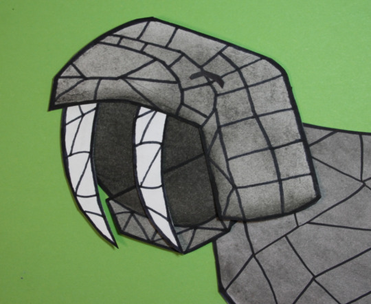
I was placed in the compositing team. This meant that for a large portion of the project, I didn't have any work to do, so in order to combat that I was put on standby for the 3D team as well as helped the cutout group with making a few of their assets, more specifically the sun, the moon and parts of a walrus yawning. I did not animate these but helped with cutting them out and colouring them.

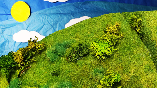
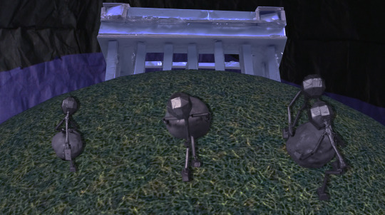
Once the footage was handed over to the compositing team, I was able to get started. I'd been assigned to the Sisyphus animation, in which several statue men pushed boulders up a hill and then sat at the top, turned on a projector and the film festival logo would come into view.
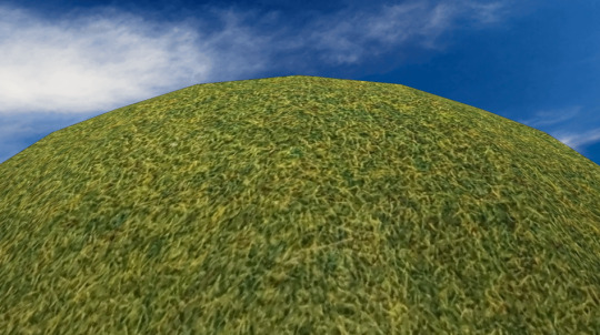
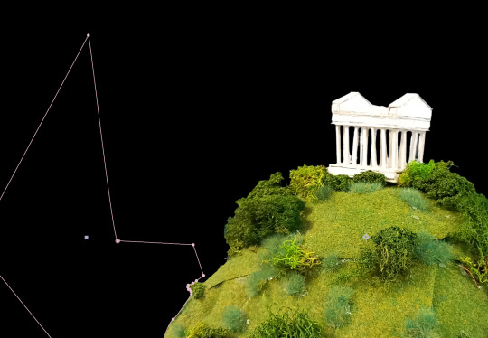
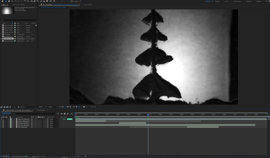
The ident in question is composed of three shots, so I decided to work on the middle one first as I felt that this would be the easiest to tackle first. The shot would be from behind the statues as they walked up the hill, using a rotating 3D ball to give the impression of motion. The Penshaw Monument would gradually come into view.
I started by laying out where I wanted the backdrop to be and how much sky was to be visible. For this, I used a stock image of a blue sky as a placeholder and then imported the rotating 3D ball.
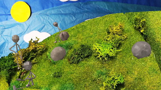
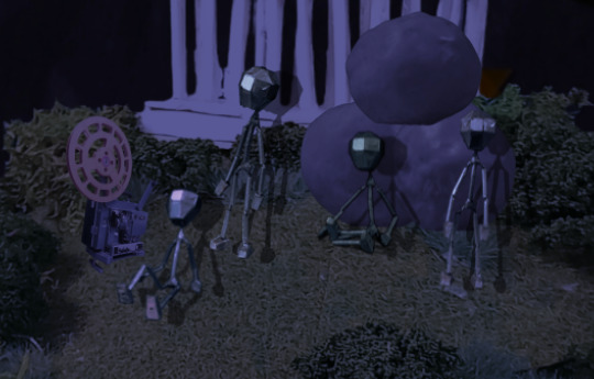
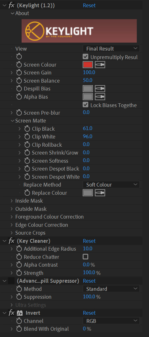
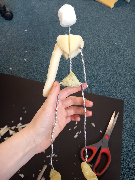
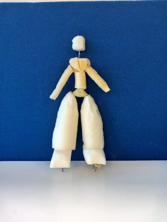
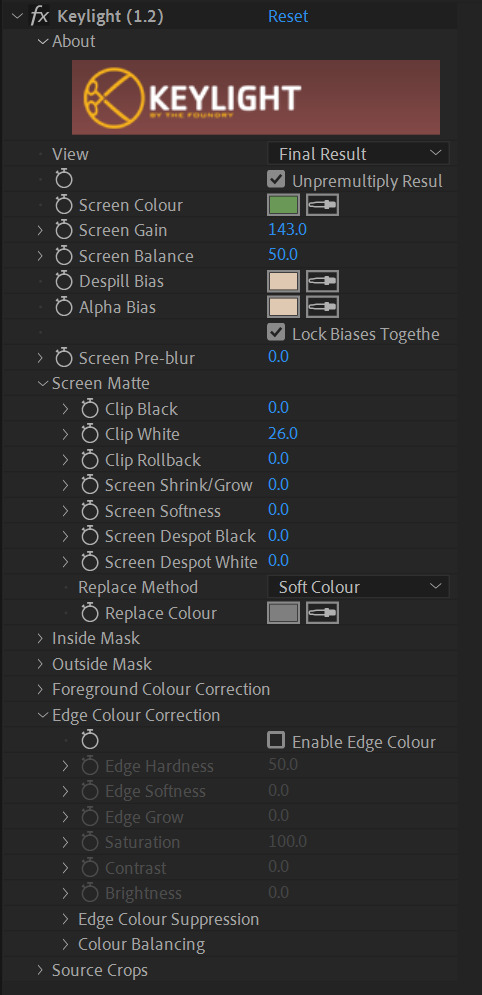
This was moving as intended, so I then started to add in some of the figures. The original footage for these was shot against a green screen, so I started to isolate them by masking around them loosely and then used a keylight filter to remove the green background. I quickly encountered a problem with this, however. As the figures were painted metallic silver, they were reflecting some of the green and therefore parts of them were being lost in the keylight. To fix this, I set the keylight so that all of the model would be visible and then subtract masked over parts of the green screen that also became visible to hide them. I repeated this for every frame of the walk cycle and then duplicated it to have all three figures cleanly walking up the hill.
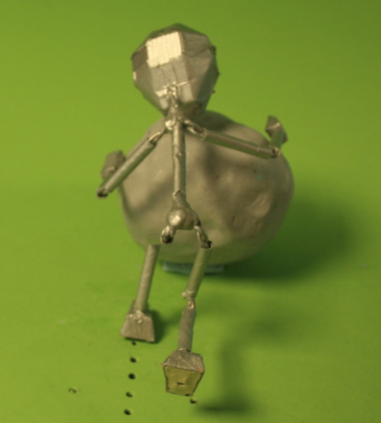


I also had some difficulties with one of the models in particular. Whilst in the other footage the models all walked in place, one of them moved forward, which didn't fit the moving hill. To fix this, I keyframed in scale and position transformations to keep every frame of the model as close to the same position as I could get. This made it look like the character was walking in place.
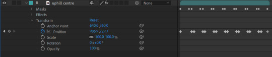
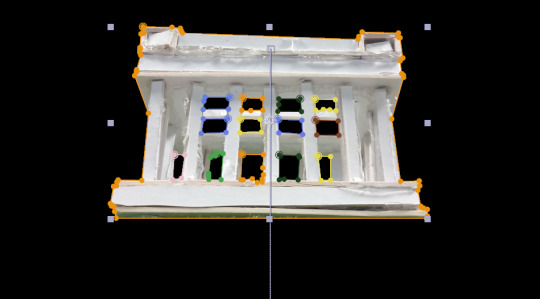
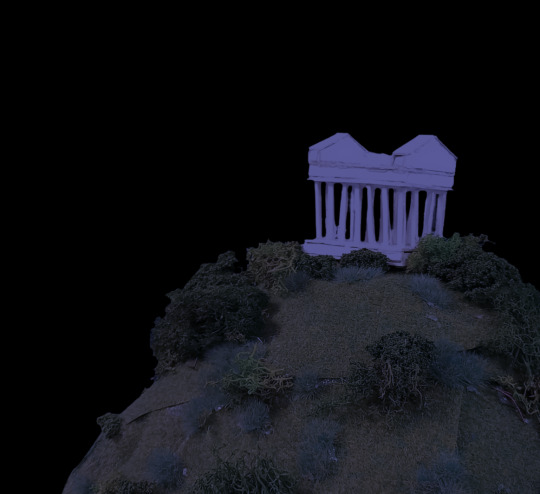
I then added the Penshaw Monument in. To do this, I took a photo of the model made by the stop motion team and removed the background using masks. I then placed it behind the rotating hill layer and keyframed a position transformation with a slow-in to the final keyframe so that it would gradually come into view.
For now, I opted to keep the stock image of the sky in the composition as I wanted to complete all three shots before adding it so that the time of day would be consistent across each of them.
There were some issues with this shot. A lot of back-and-forth was spent on the models, as the animators wanted there to be five characters going up the hill, two of which worked as a duo. This was added in, however I was unable to see the footage for the fifth character in the first shot on OneDrive. This may have been entirely my own error and I likely missed it despite checking, however because of this I cut the fifth character out of the other shots.
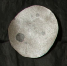
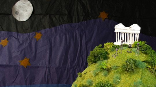
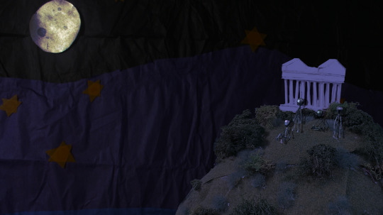
The ending shot was what I tackled next. I knew from the reference animatic that this shot would definitely take place at night, so I was confident using the cutout footage for the night sky for this straight away. I also took a photo of the Penshaw Monument model on top of the hill model that the stop motion team had made, then keylit out the blue screen background and masked out any stray pieces that weren't meant to be there.
I then started to add in the statue characters from footage, using the aforementioned method of keylight and masking to clean the footage up. These characters were then positioned on top of the hill.
The sky background animation was moving very fast, so I also added a time stretch effect of 800 to it to extend it and slow it down, which had the desired effect. This was where I left the final shot for now.
The last shot I tackled was the opening one. I knew that this would start with the sun up, so I imported that background and the sunset straight away. I also added a time stretch of 200 to slow the descent of the sun slightly.
The ground, however, was where I ran into my first issue. I was unable to find any flooring for this section within the shared OneDrive folder as presumably one had not been made. To fix this, I used the photo I'd reviously taken of the hill and monument for the final shot, turned it onto its side and then zoomed in to give the look of a gentler slope. I then keylit and masked around the edges to remove the background. This solution was far lower quality than I would have liked, especially up close, however given that there was no alternative flooring I couldn't see another way forward.
I then added in the statue men walking up the hill and used the same keylighting and masking method as before to remove the background from each bit of footage.
Now that I'd finished a basic first pass for all three shots, I started to go back through and refine them with things like colour grading and redoing the keylight in places to make it cleaner (patches of the figures were missing in some sections, which needed fixing. I also wanted to fix some of the model colours, as I'd colour range adjusted them to clumsily remove the green reflections, however had since learned of a simpler way to do this).
The first one I sorted out the colour grading for was the ending shot. The scene was set at night but the separate assets were filmed with during the day, so to fix this I would need to darken them, lower the saturation and make everything more blue toned. I first worked this out on the hill, on which I used a combination of curves, colour balance and colorize - moonshadows to achieve a darker, nighttime look.
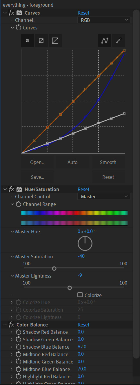
I then repeated a similar process on the sky and the characters so that they fit in with the rest of the environment. A glow effect was added onto the moon in the background as well to give the impression of light.
Additionally, upon checking the reference animatic I realised that boulders and a projector were supposed to be present in this shot. The projector photos were quickly provided by part of the stop motion team, which I was able to cut out and then colour grade to fit. For the boulders, however, I was unable to find any photos of them on OneDrive so I instead took screenshots of footage for the first shot and cut them out in Photoshop, then saved them as transparent images and imported them into After Effects. This allowed me to place and colour grade them in with the rest of the scene.

At one point, there was a fifth figure sat on top of the boulders added in after they were, however this was later removed due to the previously mentioned continuity issue.
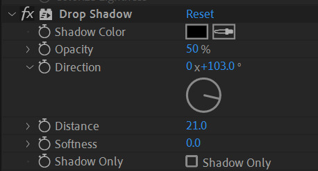
Some of the final visual tuning for this scene included adding shadows and a light beam to the projector. As there was no footage that could be used to make accurate shadows for the figures and time constraints prevented me from making some, I instead used the drop shadow effect to add some in, which were not as accurate as I'd hoped but still helped to add some depth and detail to the scene.
For the light beam, I used the pen tool to create a light yellow cone shape starting at the projector. Using keyframing, I was able to make the opacity flicker as it turned on. Following feedback, I also decreased the opacity of the beam closer to the projector using a subrtract mask with the feather transformation, which allowed for a transparency gradient.

Lastly, at the end of the beam was supposed to be the logo, which the camera would pan over to. To do this, I pre-composed all of the footage into one folder, the shape for the light beam and a flat yellow background into another and then added in two versions of the logo on top. On one version of the logo, I used keylight to remove the background and then used an invert filter to make the text on it black. The other I left alone.

I used keyframing and position transformations to have the animated section move off screen to the right while the logo would glide into frame, giving the effect of a camera panning over. Following feedback, I added in slow-ins and outs to the movement to make it look less robotic.
The final thing I did for this shot was to add in a fade between the black text logo and the official logo using keyframed opacity transformations.
The next shot I adjusted was the middle one. This took far less time as there was a lot less to add.
Having already done the nighttime colour grading for the final shot, I had more confidence in what I was doing and was able to complete this a lot faster using a similar combination of curves adjustments, colour balance editing and brightness/contrast effects.
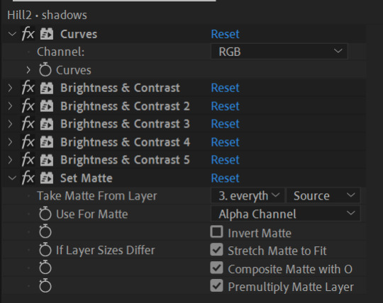
One issue I ran into was with the drop shadows on the models, as I wasn't sure how to make the effect clip to the hill and it would occasionally spill out onto the sky. To fix this, I avoided using drop shadows entirely for this shot and duplicated the pre-comp of the figures moving. I then used several brightness/contrast layers to silhouette them, lowered their opacity and then moved them to sit underneath the figures like shadows. I was then able to use a set matte layer to clip the shadows to the hill. With some small adjustments to the sizing of the monument, this shot was complete.
The last shot I had left to tackle was the opening one. This was set during the day which would make colour grading easier, however also included a sunset, which would make things slightly more difficult.
I found that I was struggling to use the same colour grading method I'd used before as it didn't allow for transitioning between colours smoothly, at least not in a way that I was able to see. Instead, I opted to use the gradient ramp effect, which allowed the colour grading to shift from one colour to another. This quickly created the desired effect on the grass, so I copied it across to the sky and the colour grading for this scene was quickly complete.
Following feedback, I adjusted the boulder men masks in this shot so that they would appear to go behind the bushes. I used subtract masks to achieve this. I also added shadows - as the footage was taken from the side this time, I was able to duplicate the footage, flip it upside down, darken them into silhouettes and then reduce the opacity to create more realistic shadows than drop shadows would allow for. I also used subtract masks with the feathering transformation to cut out the spaces where the bushes were so that the shadows wouldn't go over them. This was the last thing needed to complete the shot.

The final thing that was needed was to add in sound. All of the required sound effects had been recorded by other members of the compositing team and were available on OneDrive, so all that was needed was to put them in order in After Effects.
For the first shot, I layered some leafy sounds for the grass and some birdsong that I keyframed using an audio levels transformation to fade out as the sun set. For the second shot, I added the same leaf sound effect although slightly quieter as well as a wind sound. For the final shot, the characters were still so no leaf sounds were needed and the wind was quieter. Cricket sounds were also added, as was the hum of a microwave to mimic the sound of the projector turning on and running. I cut the audio for this and made some minor volume edits in order to match the flickering.
With some final adjustments to the sound, the ident was finished.
This project was a good learning experience and I feel significantly more confident with After Effects afterwards. Were I to do this again, I'd likely try to work faster, which would be possible as I have more knowledge of the program now and how to find solutions to problems that I encounter.
0 notes


Text
Just Dial Share: History and Trends
Established in 1996, Justdial was founded by the current Managing Director and Chief Executive Officer of the company, V.S.S. Mani N.B, M.B. He began the company with six employees, some of them rented computers and borrowed furniture in a rented garage space. The idea was conceptualized by Mr. Mani while working for United Database India (UDI), a yellow pages company, in the year 1987. The number 2888-8888 originally belonged to Kandivali Exchange based in Mumbai but it was later acquired by Mani. He launched this concept after understanding the benefit of presenting such information over a call instead of it being stored in a book. However, the official institution of the company was on standby as Mani was unable to make the investment of 15,000 rupees for a landline service. The company was later launched with a seed capital of 50,000. With the internet penetration in the country rising, Mani decided to go online with Justdial.com in 2007.
In December 2015 Justdial had 10,198 employees. Justdial has a database of roughly 22.7 million listings and 452,900 actively paid campaigns June 2018.
In March 2012, Justdial had gained approval from Securities and Exchange Board of India (SEBI) for its aimed Initial public offering (IPO). Justdial had originally filed its draft red herring prospectus held by the Tiger Global Four JD Holdings, roughly one million shares held by Sequoia Capital, 1.55 million shares held by Tiger Global Five Indian Holdings, 347, 64,779 shares held by SAP Ventures and142 shares held by EGCS.
Justdial went public on May 2013 at a share price between Rs. 897-898. Out of the 17.5 million shares, 13.5 million shares were granted to the public and 3,936,925 shares were proposed to by 15 Anchor Investors at 530 rupees per equity share, for a cumulative amount of about 208.65 crores. Justdial had affirmed 75% of its IPO for institutional investors,15% for high-net-worth individuals (HNIs) and remaining 10% for common retail investors. CRISIL had assigned grade 5/5 to the recommended IPO of Justdial. This grade symbolizes that the fundamentals of the IPO are strong relative to other listed equity securities in India.
Unlike former public offers, Justdial embraced a scheme "safety net" for retail investors which was suggested by capital market regulator, SEBI in 2012 when the company promoters assured that they will buy back shares from the retail claimants at the Initial Public Offering price if its stock falls sharply during the initial six months after listing. On the end of day 1, a majority of the bids came from Foreign Institutional Investors and around 72% of total shares were bought on proposition for QIBs. Retail investor's appetite was low, with only 14% of shares sold to the retail investors, whereas 1,749,745 shares were tendered to them.
At the end of day 2, the retail investor participation grew almost fivefold after a relatively low-key participation on day one of Justdial’s IPO; around 70% of the total 1,749,745 shares that retail investors were offered, had been bid for, and most of them had been at the cut-off price. Participation from Qualified Institutional Buyers (which include FII’s and Mutual Funds) also rose, with Mutual Funds finally participating, but they were bidding only for 56200 shares of the company. FII bid for 8141850 shares in total. Participation from corporates and individuals apart from retail investors had been vapid then. Overally, around 69.62% of the shares which were offered were bid for by mostly the QIBs
The company’s opening price on the listing was 590 rupees on the NSE, which was at roughly an 18.1% premium to the IPO price of 483 rupees for the retail investors. Within six months time of its listing, JustDial gained 172% return. The stock reached an all-time high of 1,894.70 rupees on August 5, 2014, but only a year later, it reduced to triple digits.
0 notes
Text
3D Model
On the other side of the module, we were tasked with designing and creating a 3D character model (using ZBrush) along with an environment (using Maya).
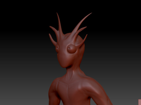
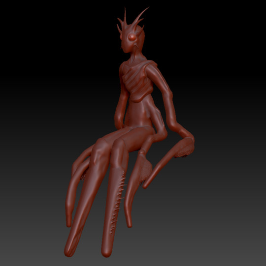
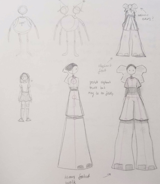
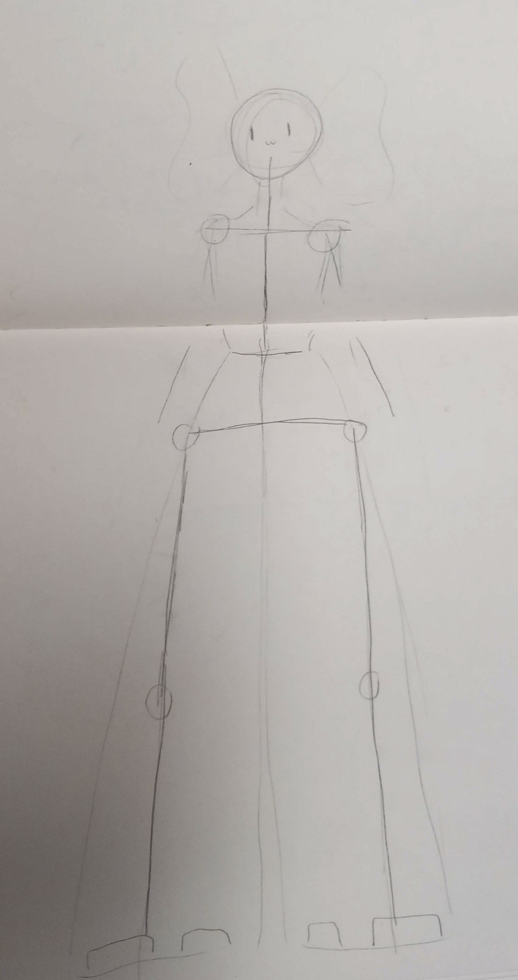
I started with creating a moodboard and sketching some ideas. I wanted my character to be nature-themed in some way, and I decided to do this by basing them off of a preying mantis. I initially also wanted to include elements of a willow tree, however this was cut due to issues with modelling it as well as my own concerns with how well it could be 3D printed.
Once I had a design down, I took to ZBrush to start sculpting it. I started out with a zsphere base, allowing me to block out the general shape of the character and where their arms, legs and head would be.
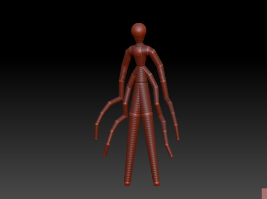
After this was done, I started using the clay buildup brush to start forming actual muscle definition and shape on top of the basic skeleton model, allowing me to make the body look more like an actual body.

I then worked on adding a face and eyes, intended to have an emphasis on being buglike. I also continued to refine the rest of the model, such as cleaning up the muscles.
Once the main body was done, I started on sculpting some clothes. As per my design sketches, I wanted to keep it simple so I started with a wrap top and added creases in an attempt to mimic fabric. I also modelled shorts, although this took a few iterations as I was struggling to get them to fit the model as well as having issues with keeping the mesh intact and stable when sculpting.

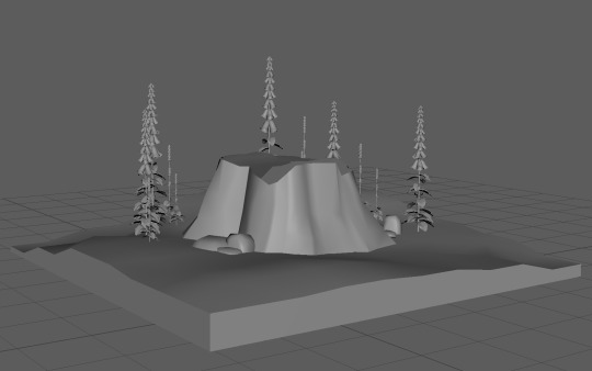
After the model was done, I started on the environment in Maya. I wanted my character to sit on a tree stump surrounded by flowers. While initially, the plan had been to make my models using photogrammertry, I was unable to find and photograph a tree stump, and the flowers I'd decided on were out of season and therefore not yet growing, meaning I instead opted to do it myself.
Other than general teething issues with Maya (struggling with subdivisions and random polygons), this went pretty well. I used photo references of tree stumps I'd found online to make the stump as well as references of foxglove flowers to model one.
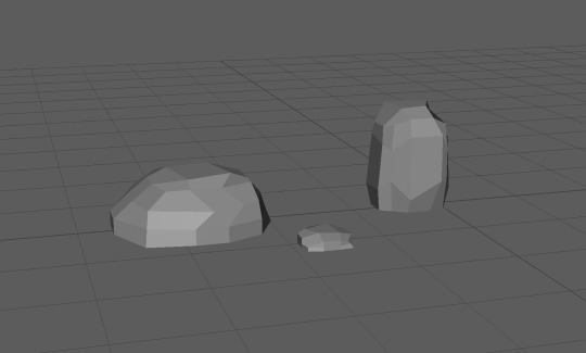
After combining the flower (which I duplicated to fill out the environment) and stump in ZBrush, teacher feedback led me to make a second version of the flower to help add some variation to the environment, as one type of plant made it too monotonous. I also made some rocks to scatter about that would help fill the space.
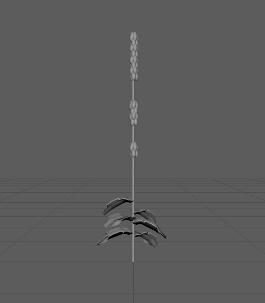
I then added the extra two models into the full environment and added some undulating terrain underneath, which gave me my final result for the Maya section of my work.

I then went back to ZBrush and posed the 3D model using the masking brush tool in order to pose the character to be sitting. To do this, I used a cube as a stand-in for the tree stump, which I deleted when the character was fully posed and ready to export.

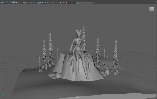
Lastly, I loaded the posed model into Maya and had my finished result.
One issue I had during this project was struggling to merge the separate zspheres, which then led to problems loading the ZBrush sculpt into Maya, as I had to load and position each .obj separately. This was solved later down the line.
If I could do this project again, I would try to be more ambitious. As this was my first time making a 3D model, I was apprehensive at first and therefore made my initial design simpler in order to compensate for that. Now that I'm more familiar with ZBrush and Maya, attempting something more complex seems far less daunting.
0 notes
Text
Stop-Motion Animation
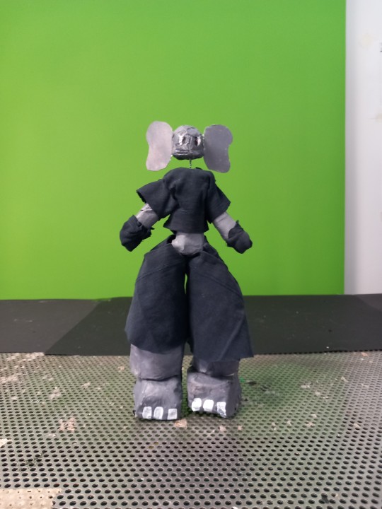
For our fourth assignment of the semester, we were tasked with making a stop-motion puppet from scratch and then animating it into a walk cycle.
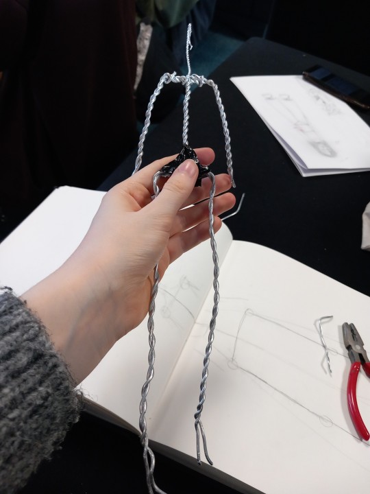
I started out with some concept work in my sketchbook. I knew that I wanted my model to have large feet as we'd discussed in class how stop-motion models need to be able to balance and I didn't want mine to be top-heavy. My solution to this was to base it off of an animal with large feet, and the first that came to mind was an elephant, so I started drawing the idea after some initial doodles of other possibilities such as a two-headed witch (which I decided against due to the proportions of the body). I quickly decided that I was very happy with it and proceeded to move forward with the design, drawing out the plan for the wire frame to scale.
I then set out to make the armature for the model, basing the measurements off of the drawing I'd done for reference. To make the wire frame sturdier, we were shown how to use a drill to twist two pieces of wire together so that they would hold more easily. I used wire cutters to cut the wire to the length that I wanted and then started twisting them together to form the frame.
Once I was happy with this, I used tape to hold it together while mixing milliput together, which I then used to solidify some of the places where separate pieces joined, such as the hips. I also used this to fashion the feet, as we needed to put slots in for bolts that would help secure the model to a specific table when filming a walk cycle. I then left it to dry.
After the milliput had properly hardened, I started making the overall shape of the model using sponge that I cut to shape with scissors. I also used hot glue to help secure pieces into place. One adjustment I had to make was to the feet - while in the original drawing they were essentially a flat stump at the end as part of the leg, the way I made the armature meant that this would be far more difficult to line up properly and risked causing problems with the legs bending, so I modified it slightly to have more typically shaped feet.
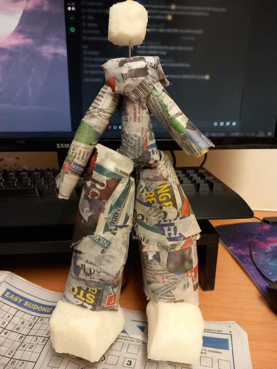
With the shape down, I then started to paper mache over the model so that it would be easier to paint. I did this by painting a water and glue mixture onto the newspaper, which allowed it to stick together and form a solid, smoother surface. It struggled to stick to the sponge, however, which is something I'd keep in mind were I to do this project again.
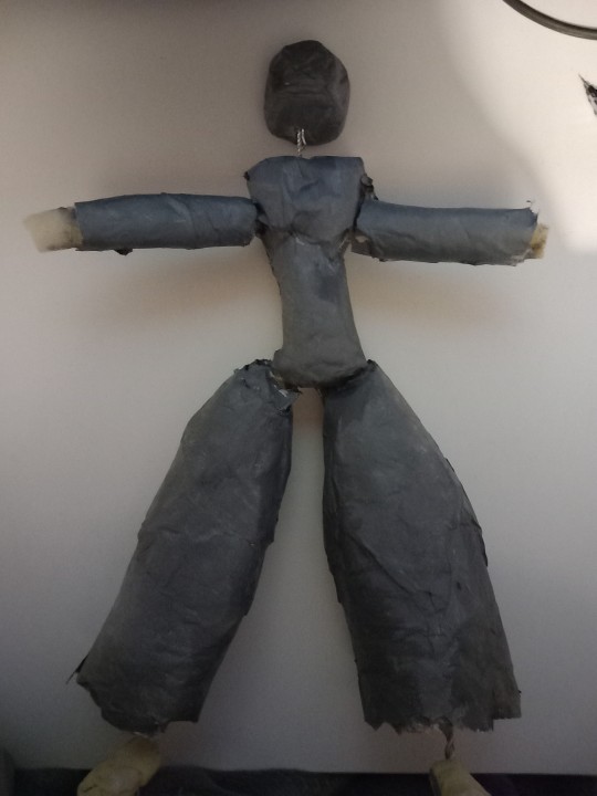
The newspaper indeed served its purpose and made the model far easier to paint. I started by painting a layer of white paint to block out the newspaper print, then covered the several parts in grey paint meant to imitate an elephant. I also sponged on some lighter and darker patches just for some variation in skin tone. I also painted some white toenails onto the feet and some eyes onto the head.
The last parts of the model were the clothes and the ears. The ears were simple as I cut out some card and painted it, then hot glued them onto the head of the model. The clothes were far more difficult. To make them, I took one of my dad's old t-shirts that he no longer wore and cut pieces out in order to make pieces for a shirt and trousers, which I then stitched together to the best of my ability. I also realised I hadn't made any hands and wasn't sure how to so I covered the ends of the arms with gloves, which were bits of fabric tied on with string. The headband in the original design was scrappped because I tried and failed to make it work, as was the more complex version of the outfit as I have little to no textiles experience and therefore reframed it to be something more realistically attainable.
With the model made, the last thing to do was make a walk cycle. I used reference images of people walking online to get a general idea of how I wanted it to look before doing so, using Dragonframe to get the images for the video.
Were I to do this again, I would definitely try to include more personality into the walk, potentially making a 2D animation as reference beforehand. I would also try to remake the clothes sp that they look more robust and potentially more complex as well.
0 notes
Text
Smudge and Click Animation
Our third assignment was to create a short 15-second animation using the smudge and click animation technique. This allowed for the use of sand, paint, whiteboard pens and so on.
The first thing we did as part of the assignment was make a reference animation to go off of. We decided that we would use sand for this and therefore wanted to have a guide showing where to place the sand when making the animation in Dragonframe. As Tumblr only allows for one video per post, this will be shown alongside the finished result.
We then used a rostrum to place a light underneath of a glass panel which the sand rested on. This meant that the sand was silhouetted and allowed for a clear view of the animation. Once this was set up with Dragonframe, we overlaid the animation and lowered the opacity, then making each frame after the reference video.
Once this was done, we took the finished animation into after effects and added in the appropriate sound effects.
Were I to do this project again, I'd like to experiment more and see what the limits are with the medium, leaning more into its differences and using that to my advantage while animating.
0 notes
Text
Cutout Animation
Our second assignment of the semester was to make a 15 second animation using paper cutout. The criteria for this was to use audio with speech so that we could work with lipsync.
We started out by choosing a trending audio on social media at the time, then made a storyboard to follow the sound. This allowed for us to block out the expressions that we would need.

After that, we then drew the design out on paper and started to cut out the separate pieces. The head, neck and hair were one part, the clothes another and then the eyes, pupils, eyebrows and mouth were all separate pieces.
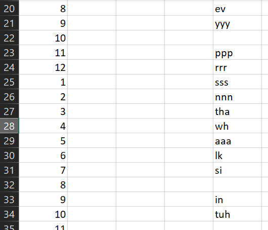
We also made a dope sheet in Excel. This included breaking down the speech in the audio into sounds synced up with the frame number they lined up with. We then made the associated mouth shapes needed to make all of the sounds.
Once the dope sheet and cutouts were done, we started animating using dragonframe and a green screen background. To do this, we followed the storyboard and moved the individual paper parts in line with our plan.

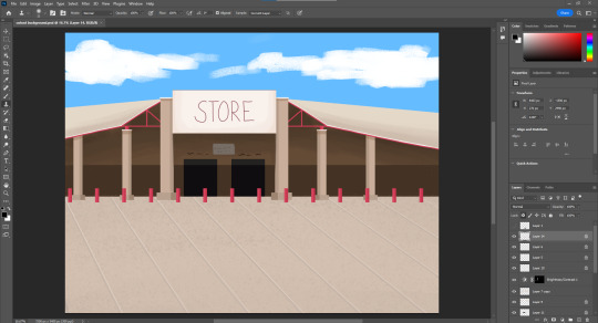
After this was done, we took the image sequence into Adobe After Effects to edit it into a video. We also were able to key out the green background and replace it with a 2D shop car park drawn in Photoshop.
One issue we came across was that the video was flickering a lot in After Effects. We tried to reduce this however weren't able to find a solution and don't know what caused it so it ended up visible in the final animation.
0 notes
Text
Pixellation Assignment
Our first task at the beginning of the second semester was to create a short, fifteen second animation using pixillation. The theme included in the brief was magic.
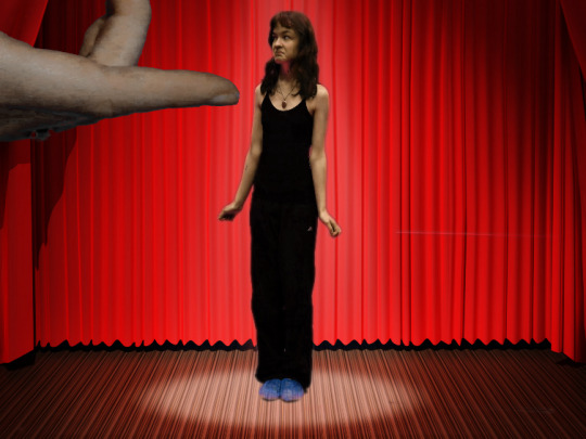
To start out with, we made a brief storyboard after bullet pointing some ideas. Our plan was to use a combination of green screened hand photographs and green screened person photographs to make an animated short in which they both interacted, demonstrated below.
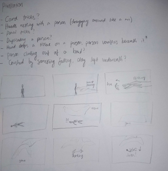
We then recorded the footage (or photos in this case) that we needed by having the actor move slowly while the person behind the camera took several photos as they moved. We were also able to use the green box pictured to attempt the effect of the actor flying through the air, although this ended up looking more cartoonish than we'd initially intended.


We realised partway through filming, however, that we were yet to include the theme of magic anywhere in our animation. Therefore we chose to improvise. The final few frames of the storyboard include the actor falling from the tissue being shaken in the large hand, but we decided to change the person into a different object. Luckily, there was a plush toy in the same room that we opted to use instead.
In order to get the photos required for this, somebody threw the toy into the air and then dove behind the green box mentioned prior in order to not be caught in the photos that were quickly taken. This was repeated several times in order to get the required results. We also did some brief editing of some photos in Photoshop later due to issues with keylighting and the variation in the green shades. This essentially included copying and pasting sections of the green screen over sections that weren't keylighting properly in After Effects even after adjusting the keylight filter parameters.


Once this was done, we took the image sequences into Adobe After Effects and used key lighting to remove the green background and replace it with a stock image.
Once this was done however, we realised that the resulting footage was not long enough for what the brief had specified and therefore had to quickly come up with an extra segment.
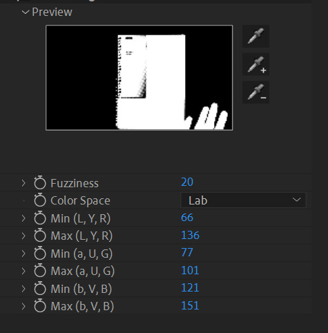
Due to time constraints and green screen room availability, hand pixillation is what we went for. The hand would make a notebook appear out of nowhere, spawn a very basic version doodle of the later footage, then disappear the notebook and transition into the next section. This was going well, however it was not until editing later that day that we realised the notebook used had green on the front. As this was against a green background, keylight was not working and there wasn't time to reshoot.
To fix this, we instead chose to use the colour range filter instead of keylight, allowing us to pinpoint the specific shade of green used in the background green screen, separating it from the green on the front of the notebook. While the final result was choppy in comparison to if it had been two separate colours (some parts of the notebook cover were too similar in shade to the background to work), the front of the notebook was not transparent and we were able to edit in a stock background with relative success.

We then edited all of the footage together and added comical stock music to it, which resulted in our final outcome.
0 notes
Text
Blog Navigation
AND143 - Fundamentals Of Animation
#AND143
AND144 - Fundamentals Of Games Art
#AND144
AND142 - Creative Exploration
#AND142
0 notes
Last Seen Blogs

nguyenngocblogs
Untitled

asimpleplacee
brainrot!

roccosphere-blog
roccosphere

um-huh-whuh
someone humming

c-xunt
tripple six